Can you decorate a home with just black and white? This modern cottage proves it's an option
For this guest house in Connecticut, the interior designers used a strict black and white color scheme. Here's how they made it work
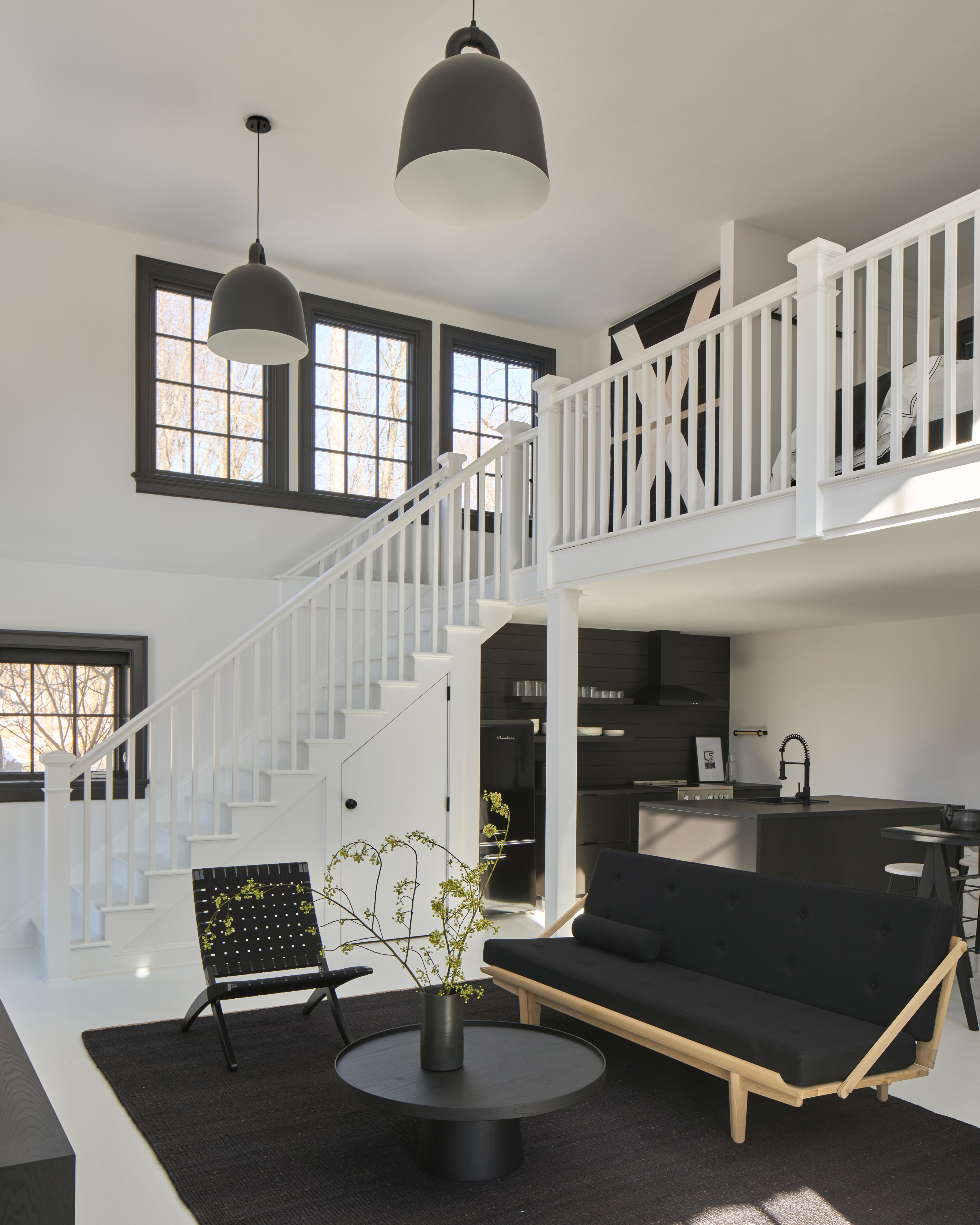

Decorating a home with a simple, monochromatic scheme isn't unheard of, in fact some of our favorite modern design schemes are completely devoid of color. However, when we talk about decorating with black and white, the depth and texture of these designs often come from greyscale - that is, including grey tones between black and white as part of the palette - alongside other 'neutral' touches, like wood and metal.
More unusual, then, is a room (let alone a whole home) designed using just black and white at their purest values. However, that's exactly what interior designers Chelsea Reale and Diana Rice of SISSY+MARLEY Interiors did for this modern guesthouse cottage in Connecticut.
'We love monochrome spaces,' Chelsea tells us, 'especially in smaller settings as it gives your eyes the chance to flow through the space without interruption.' The resulting cottage, which sits adjacent to a 6,700-square-foot main home on top of a hill overlooking the city, is not only bright and welcoming, but feels like a modern home with a cool graphic edge.
We asked the designers to talk us through exactly how they used this limited color palette to such an effect.
1. Painting the floor white
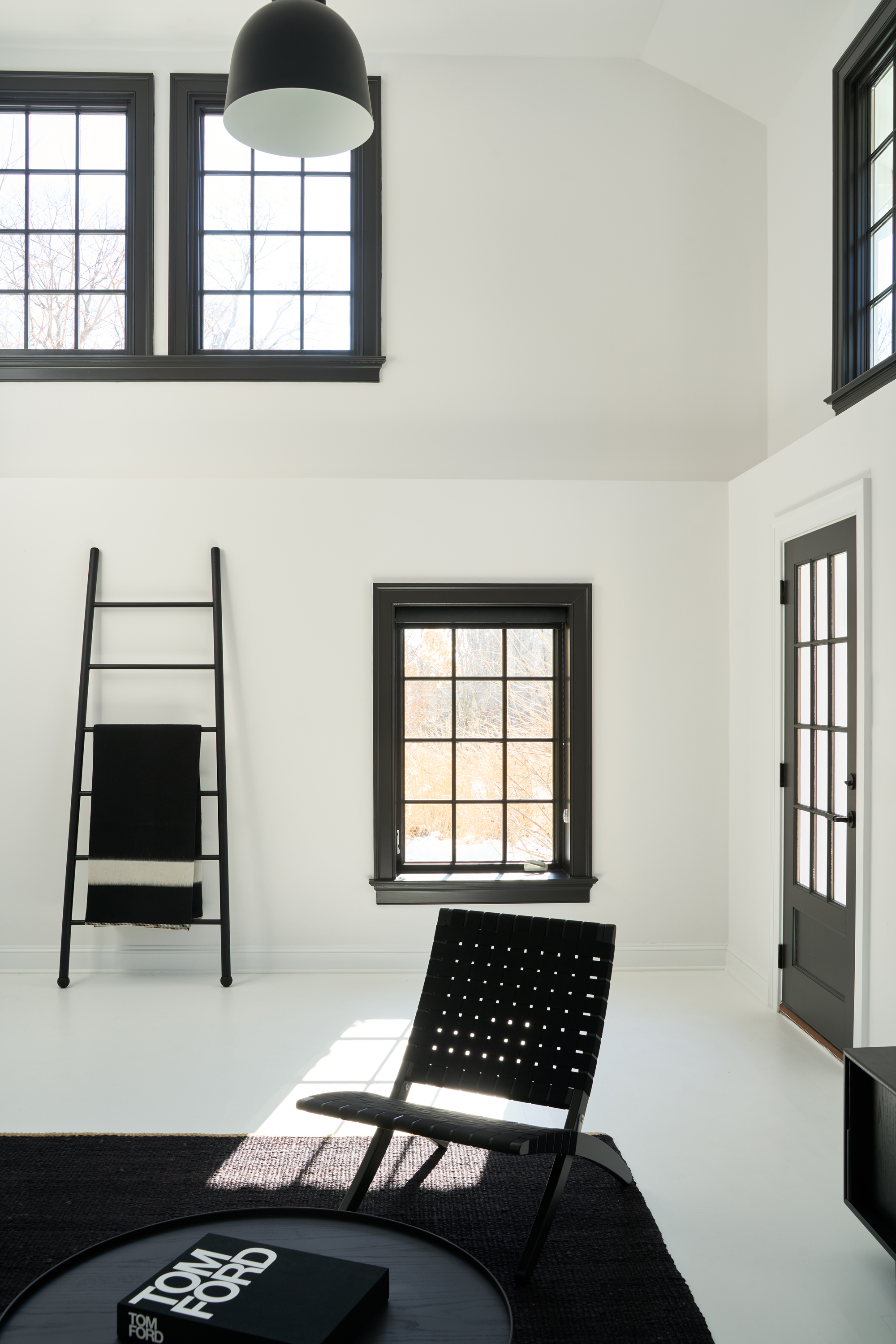
With its crisp white walls and lofty double-height space, it's hard to imagine this cottage as anything but this bright, airy space. 'The cottage needed some cosmetic changes when the owners purchased it,' Chelsea explains. 'It was dark, dated and depressing. It’s hard to imagine it now, but the transformation is impressive. It’s amazing what some white paint will do to a space.'
However, it wasn't just the walls that were painted white. 'We painted the walls and wood floors, too, which really brought the space to life,' Chelsea says. While this white floor paint idea might not be the most durable choice for a busy family home, it's something that has transformed this guest house space. 'Hands down the white painted floors changed the entire look and feel of this space.'
Maybe the most striking element of the space is the stark contrast between the pure white walls and windows and doors. 'Outlining the window frames in black beauty was the key to giving this space a Scandinavian vibe,' Chelsea tells us.
Be The First To Know
The Livingetc newsletters are your inside source for what’s shaping interiors now - and what’s next. Discover trend forecasts, smart style ideas, and curated shopping inspiration that brings design to life. Subscribe today and stay ahead of the curve.
2. Layering black
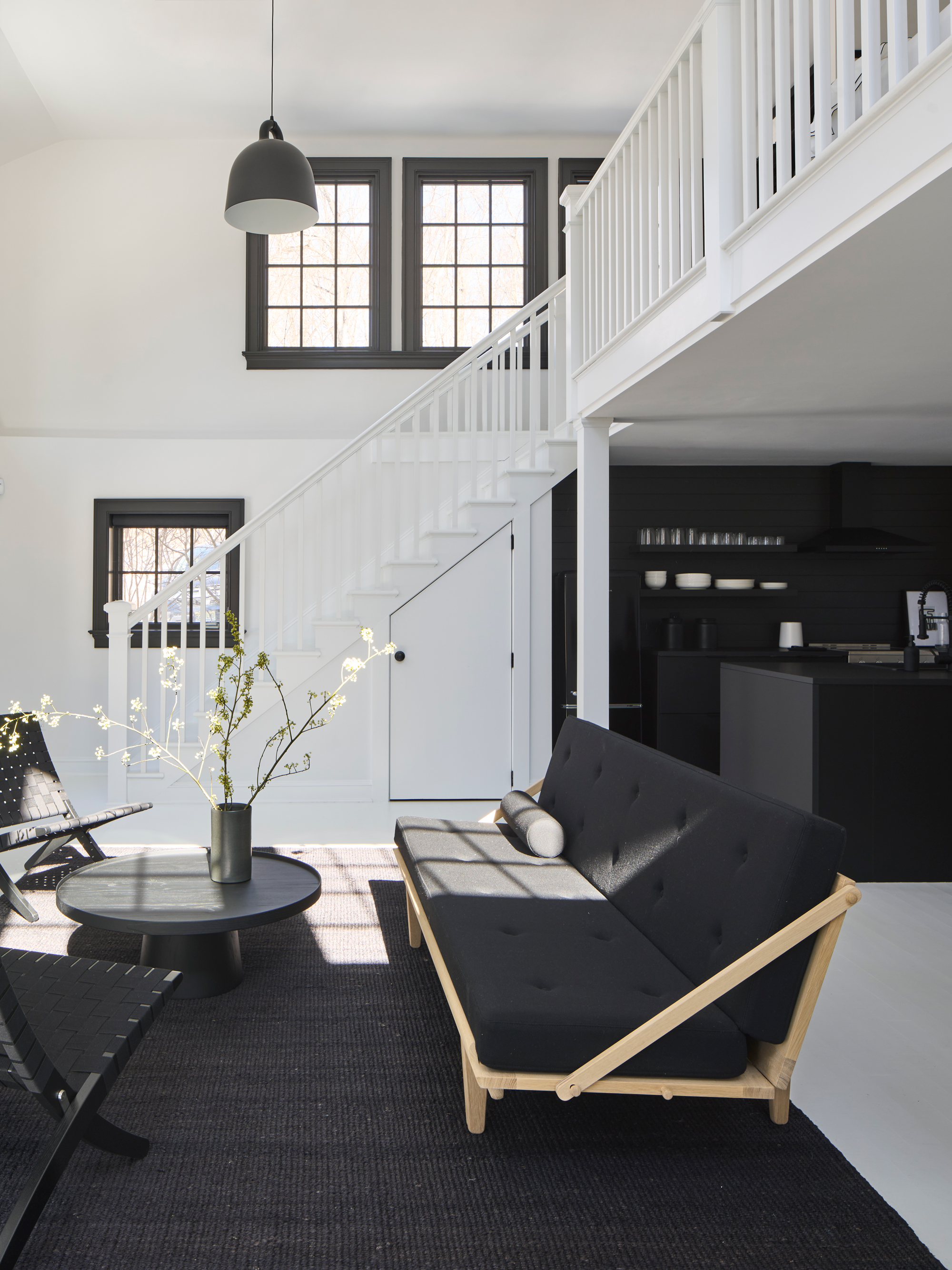
While the instinct when using such a limited color palette might be to create as much contrast and interest as possible in any one space, many of the elements of this home feel modern and relevant just by layering black on black.
The key is making interesting choices, Chelsea says. 'While the color palette is monochromatic. the pieces throughout this cottage are well curated and feel very special.'
The black and white living room is contained by a large area rug with casual seating and a large coffee table - the sofa bed, interestingly the only non-monochromatic element in the entire home.
3. Using texture subtly
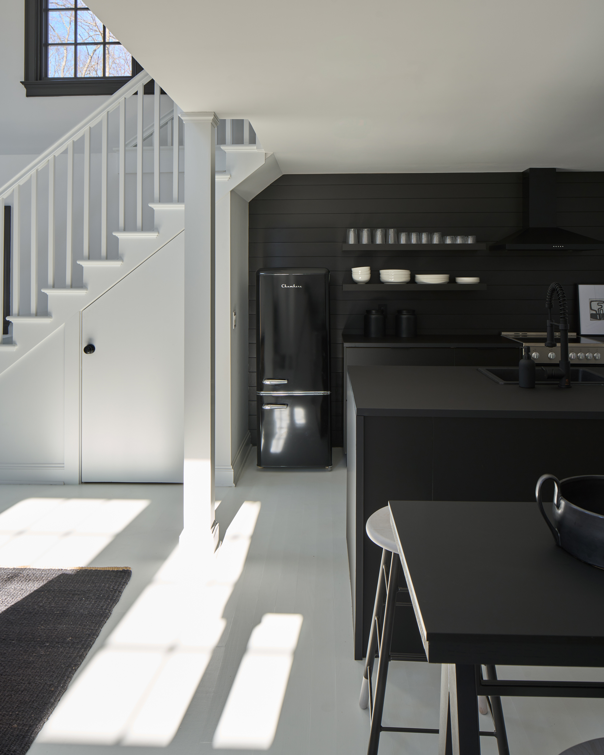
Another assumption would be that a purely black and white scheme would need to go big on texture to make it work, yet largely the cottage is filled with modern, matte finishes. Texture is more subtly applied than creating bold contrast between rough and smooth surfaces.
In the living room, webbed chairs and a jute rug stop the space from feeling too sleek, while the old dated kitchen was removed and replaced with a modern all-black kitchen from IKEA. 'For texture, we added shiplap to the walls,' Chelsea says.
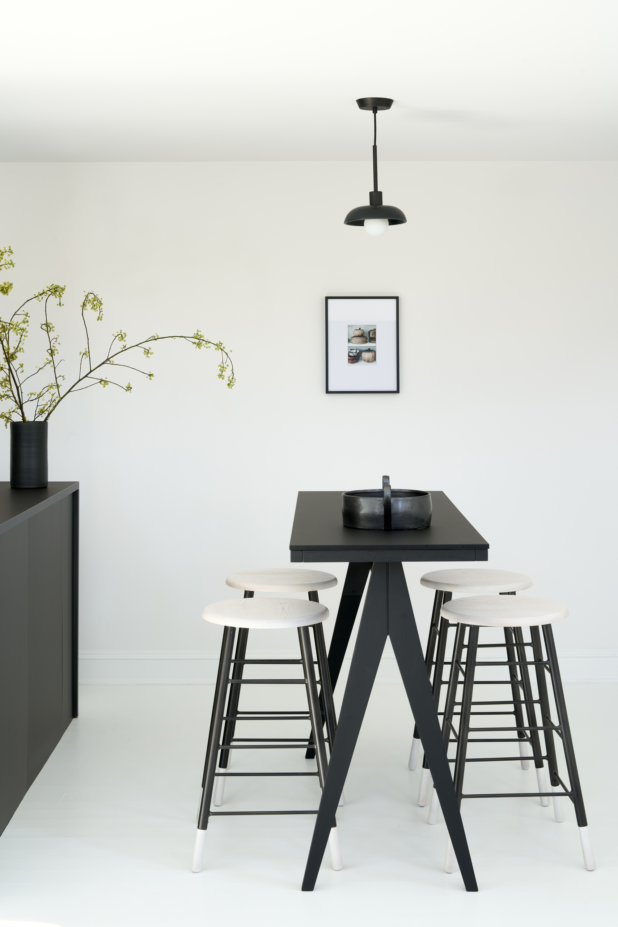
A small dining area neighbors the kitchen, with a breakfast bar-style table with stools, providing casual seating for guests who are more likely to eat dinners at the main house. All the light fittings in the house are also black and white.
4. Be strict with the color scheme
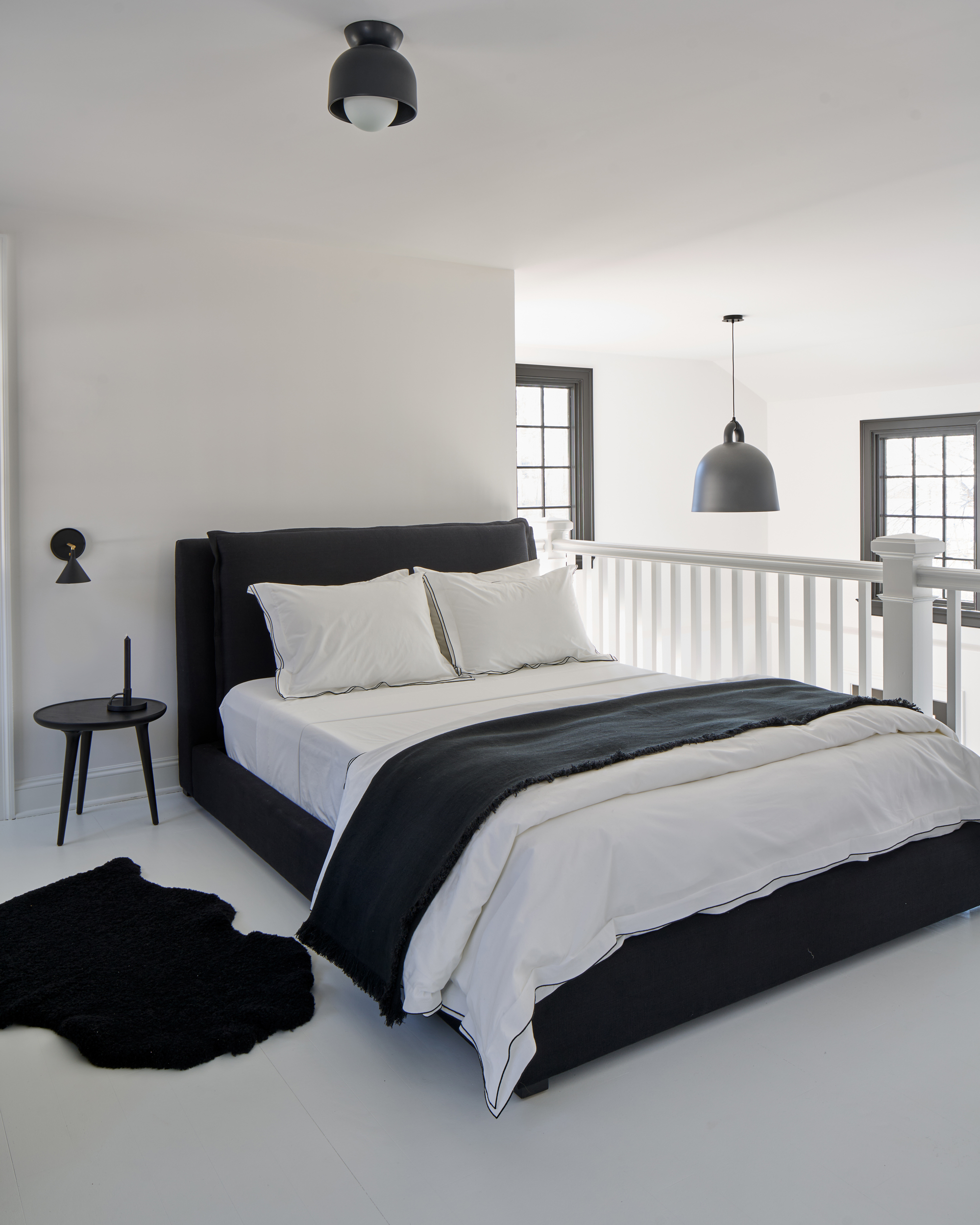
By sticking to the strong monochromatic aesthetic, the design of the cottage feels special and purposeful. It also plays particularly well to this completely open plan concept, as the bedroom and main bathroom are both located on a mezzanine level.
'The key to open floor plans is really focusing on maintaining a flow throughout so there are no visual interruptions in the overall experience,' Chelsea says. 'It's all about creating small special moments throughout that all compliment one another.'
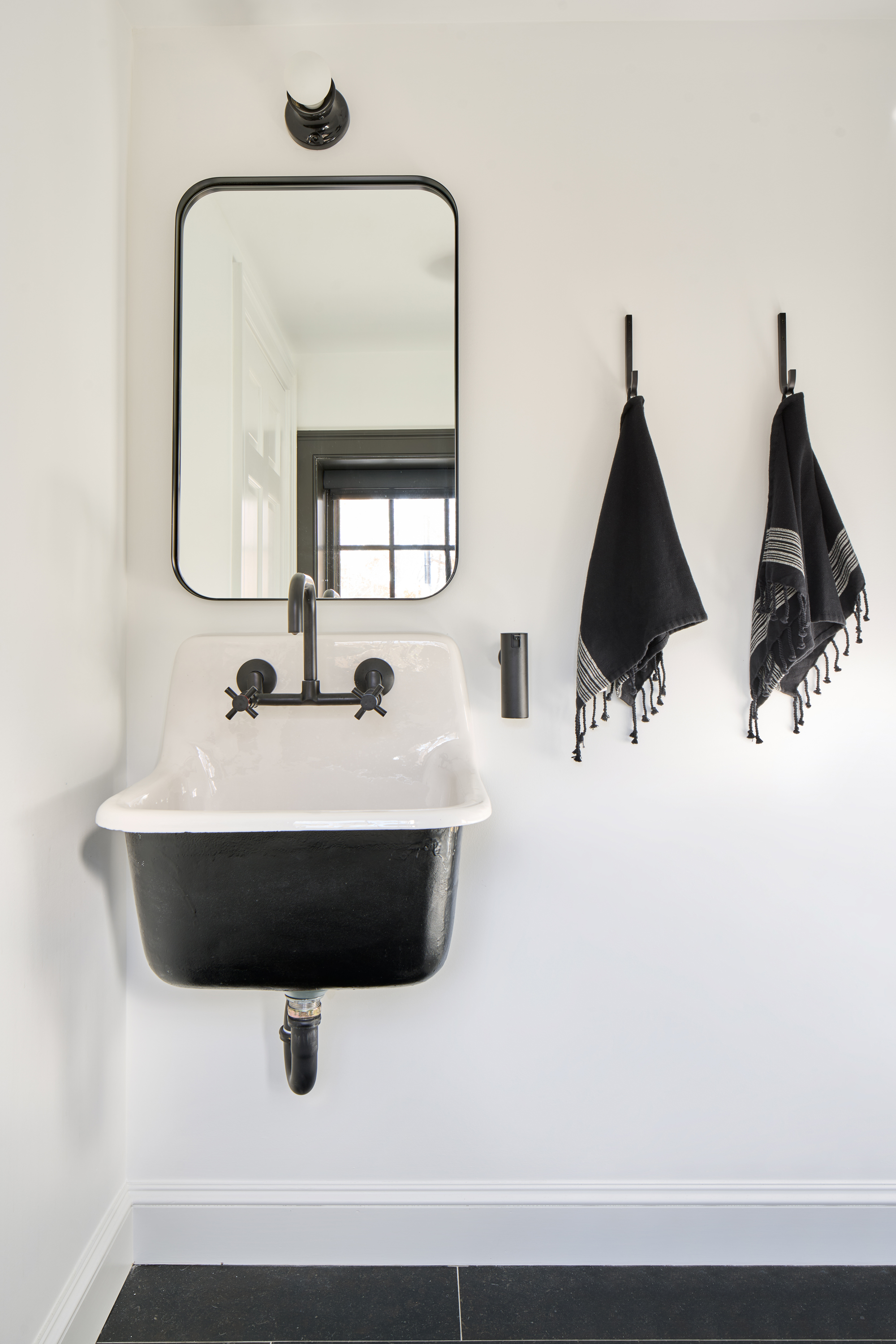
The powder room, with its wall hung basin, is one such moment. 'Updated the powder room to feel like a modern farmhouse,' Chelsea says. 'Although the budget was restrained, the outcome far exceeded all of our expectations.'

Hugh is Livingetc.com’s editor. With 8 years in the interiors industry under his belt, he has the nose for what people want to know about re-decorating their homes. He prides himself as an expert trend forecaster, visiting design fairs, showrooms and keeping an eye out for emerging designers to hone his eye. He joined Livingetc back in 2022 as a content editor, as a long-time reader of the print magazine, before becoming its online editor. Hugh has previously spent time as an editor for a kitchen and bathroom magazine, and has written for “hands-on” home brands such as Homebuilding & Renovating and Grand Designs magazine, so his knowledge of what it takes to create a home goes beyond the surface, too. Though not a trained interior designer, Hugh has cut his design teeth by managing several major interior design projects to date, each for private clients. He's also a keen DIYer — he's done everything from laying his own patio and building an integrated cooker hood from scratch, to undertaking plenty of creative IKEA hacks to help achieve the luxurious look he loves in design, when his budget doesn't always stretch that far.
-
 My 10 Favorite Designs at Milan Design Week 2025 — Out of the Hundreds of Pieces I Saw
There is a new elegance, color, and shape being shown in Milan this week, and these are the pieces that caught my eye
By Pip Rich
-
 Iridescence Is Chrome’s More Playful, Hard-to-Define Cousin — And You're About to See It Everywhere
This kinetic finish signals a broader shift toward surfaces that move, shimmer, and surprise. Here's where to find it now
By Julia Demer
-
 White walls, but never bland! This Italian apartment's colorful designer touches create an uplifting home
Studio Venturoni has transformed this Italian apartment, using vibrant color pops to bring character and charm to the space
By Oonagh Turner
-
 'It's a place to stay still and slow down' - how this Connecticut home took its cue from the 'slow living' trend
From a starting point of creating a home that was an antidote to the hustle and bustle of the city, the design of this project look to nature for inspiration
By Hugh Metcalf
-
 The 10 best living rooms of the year – our pick of the most beautiful designs we've seen
We've trawled through the archives to cherry-pick the living rooms that have stood out to us this year
By Oonagh Turner
-
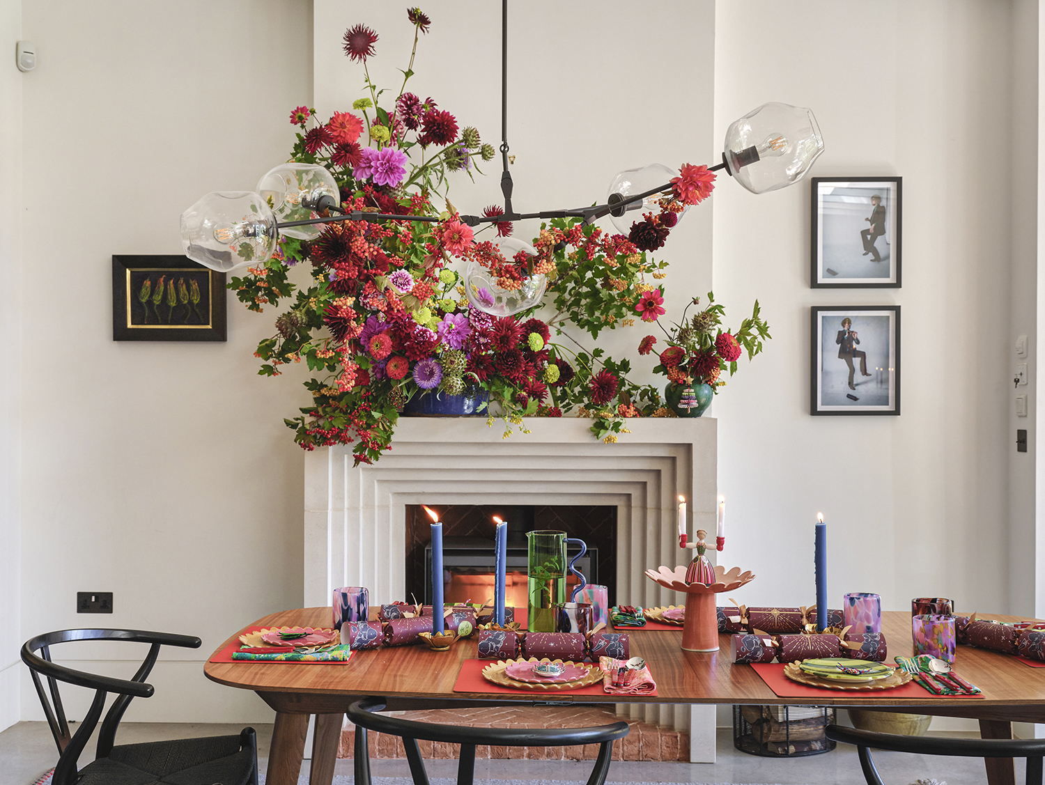 The more joy the better! This designer home shows how to do stylishly maximalist Christmas decor
Bursting with happiness, this colorful home is dressed for Christmas in the most abundant and beautiful of ways
By Mary Weaver
-
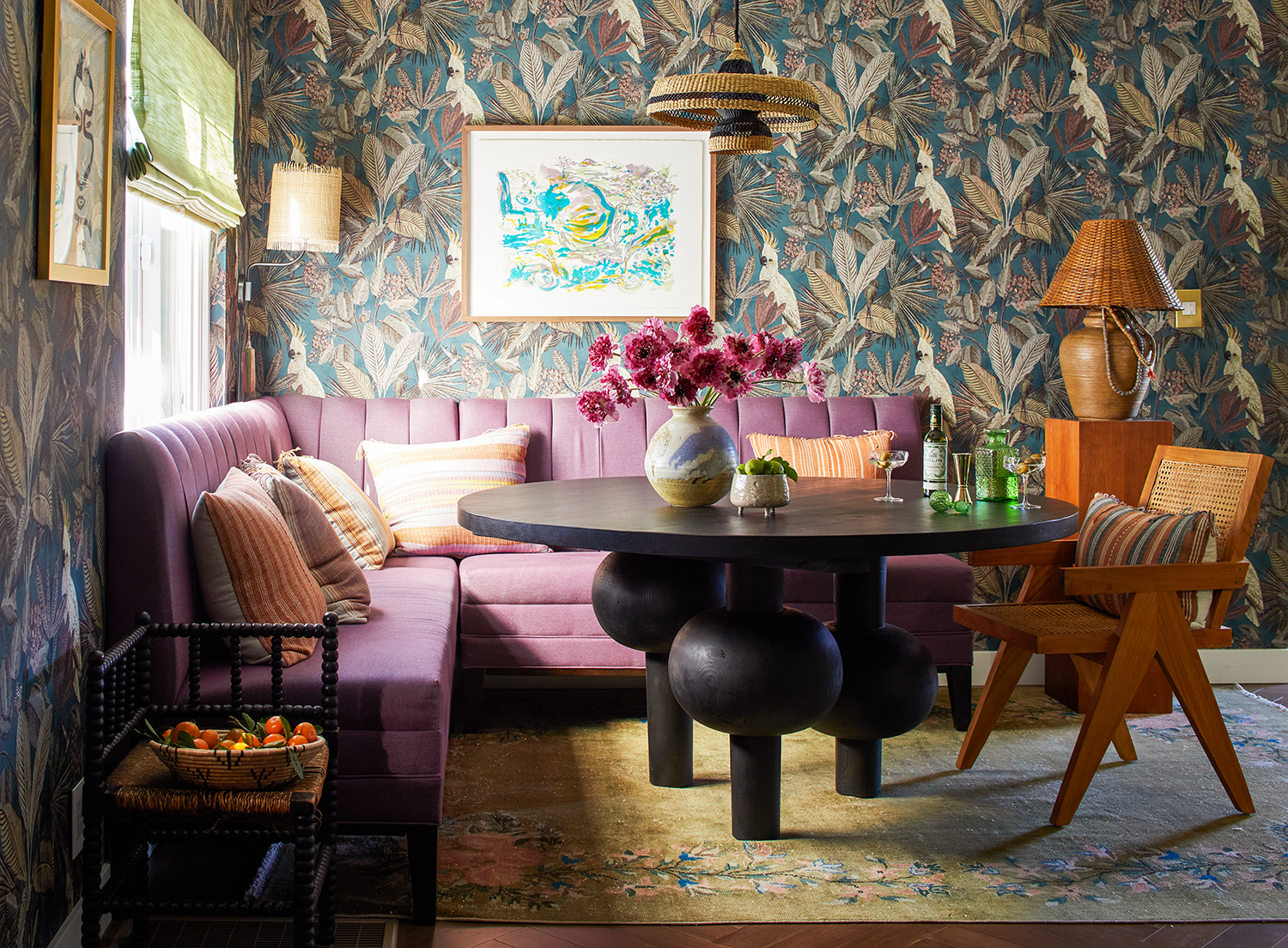 This LA home shows how to do modern eclectic style perfectly - with a utility room of dreams
Creative director Dabito used his interiors know-how to treat his 1950s bungalow to a medley of pattern and color
By Emma J Page
-
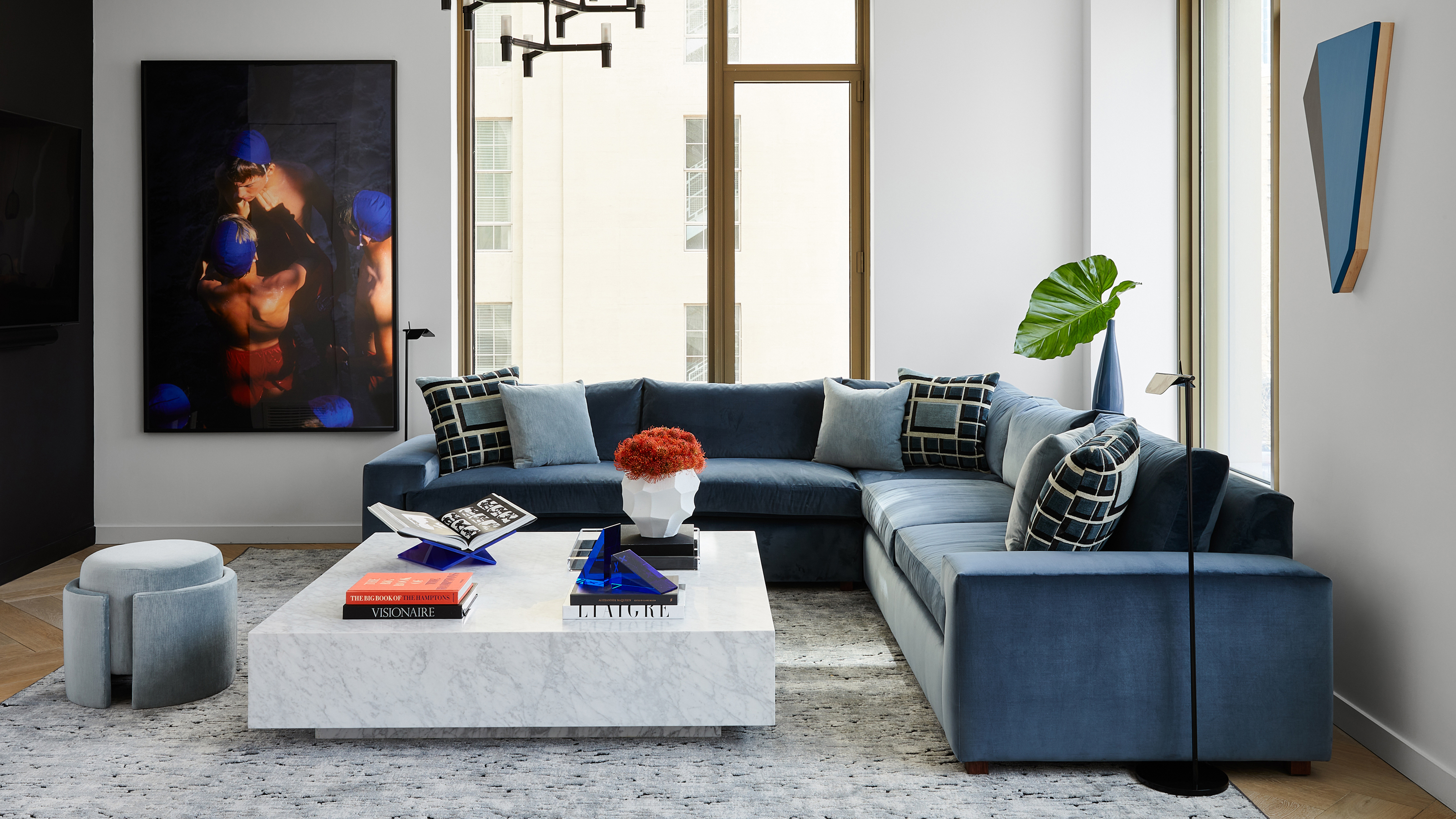 An interior designer completely redesigned this Manhattan apartment in just 90 days from start to finish
Justin Charette proved that a challenging deadline doesn't have to get in the way of creating a beautiful home
By Hugh Metcalf
-
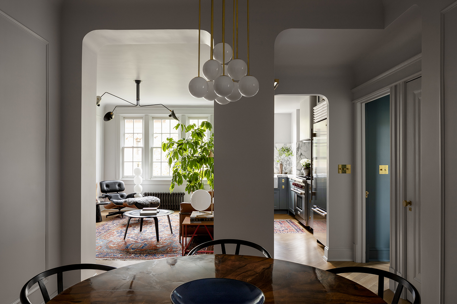 This architect's apartment is a masterclass in how to make a small space feel luxe
Architect Nicholas Potts has turned every corner of his city apartment into an art-filled space that feels opulent yet homely
By Pip Rich
-
 This family home in Washington, D.C. is full of ideas to steal for displaying art in brilliantly personal ways
Designer Zoe Feldman has created a modern home full of contrast, clever color choices and inspiring ways to showcase art
By Pip Rich