The sliding divider in this New York apartment creates a 'temporary room' – a genius trick for flexible open plan living
This once-cramped Manhattan apartment is now a sophisticated sun-soaked space with an open floorplan that maximizes every inch
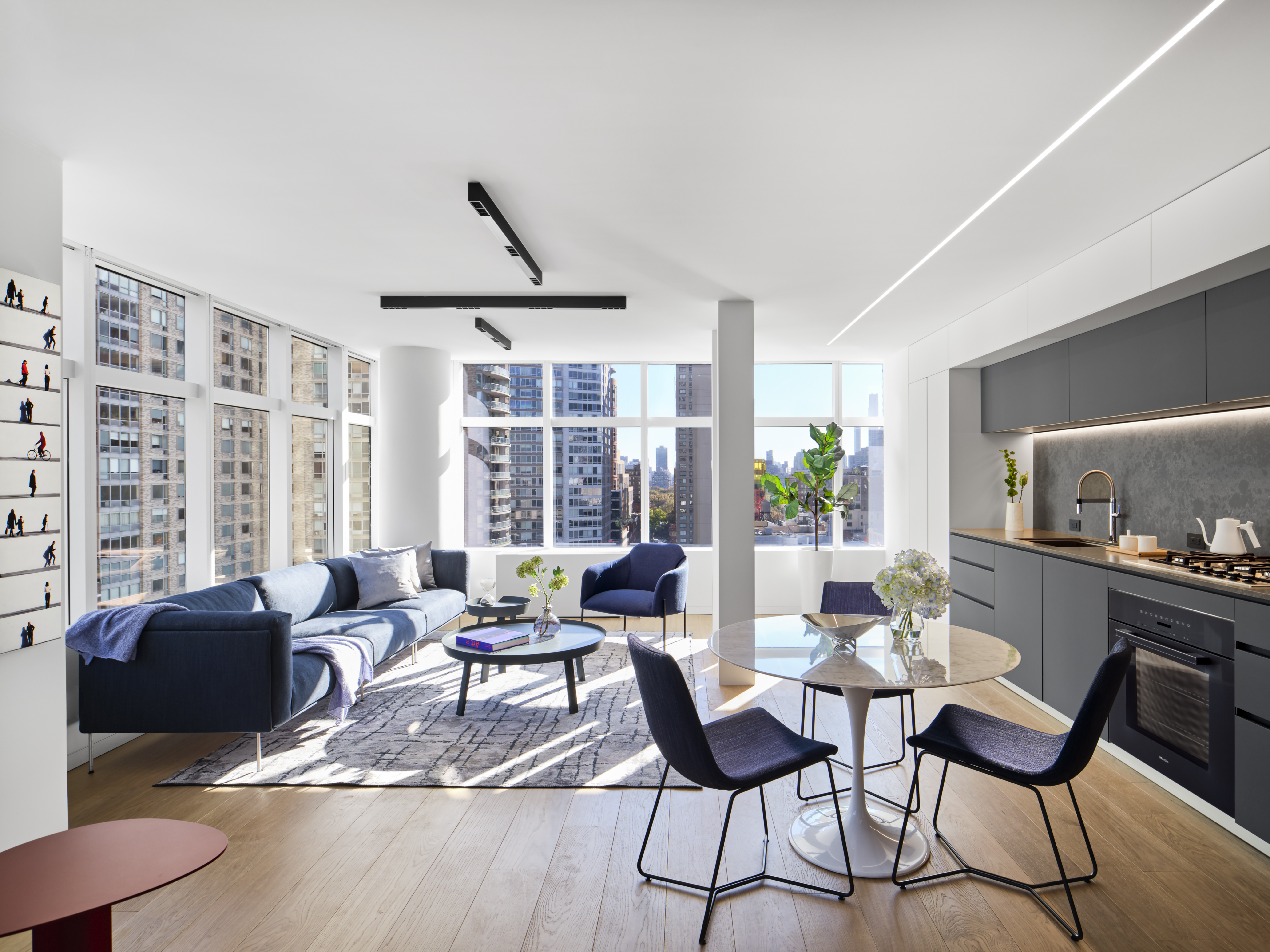

In The Big Apple, not everything is ample-sized. After moving to NYC, the young homeowners of this Lincoln Square apartment needed a multifunctional space suitable for working, relaxing, and entertaining - all within the confines of 1,087 square feet - but thanks to designers at Maydan Architects, that was made possible.
Known for introducing their ultra-modern style to more spacious Silicon Valley homes, Maydan Architects set to work transforming this 30-year-old residence into a sophisticated sun-soaked apartment, complete with one of the most genius sliding partition walls we've ever seen.
'My clients are a young couple in their twenties, both building their professional careers,' explains Mary Maydan, founder and principal of Maydan Architects. 'Our goal was to design a modern, minimalistic apartment that would also be warm and comfortable.'
To do that, Mary's renovation opened up several walls to create a flexible open floorplan that maximizes usability and natural light, as well as vistas of the surrounding Manhattan skyline. Styled with high-end furnishings from brands such as Poliform, Living Divani, and Muuto, the fresh layout and decor culminate in the ideal modern home. Here, we take a look inside.
Kitchen
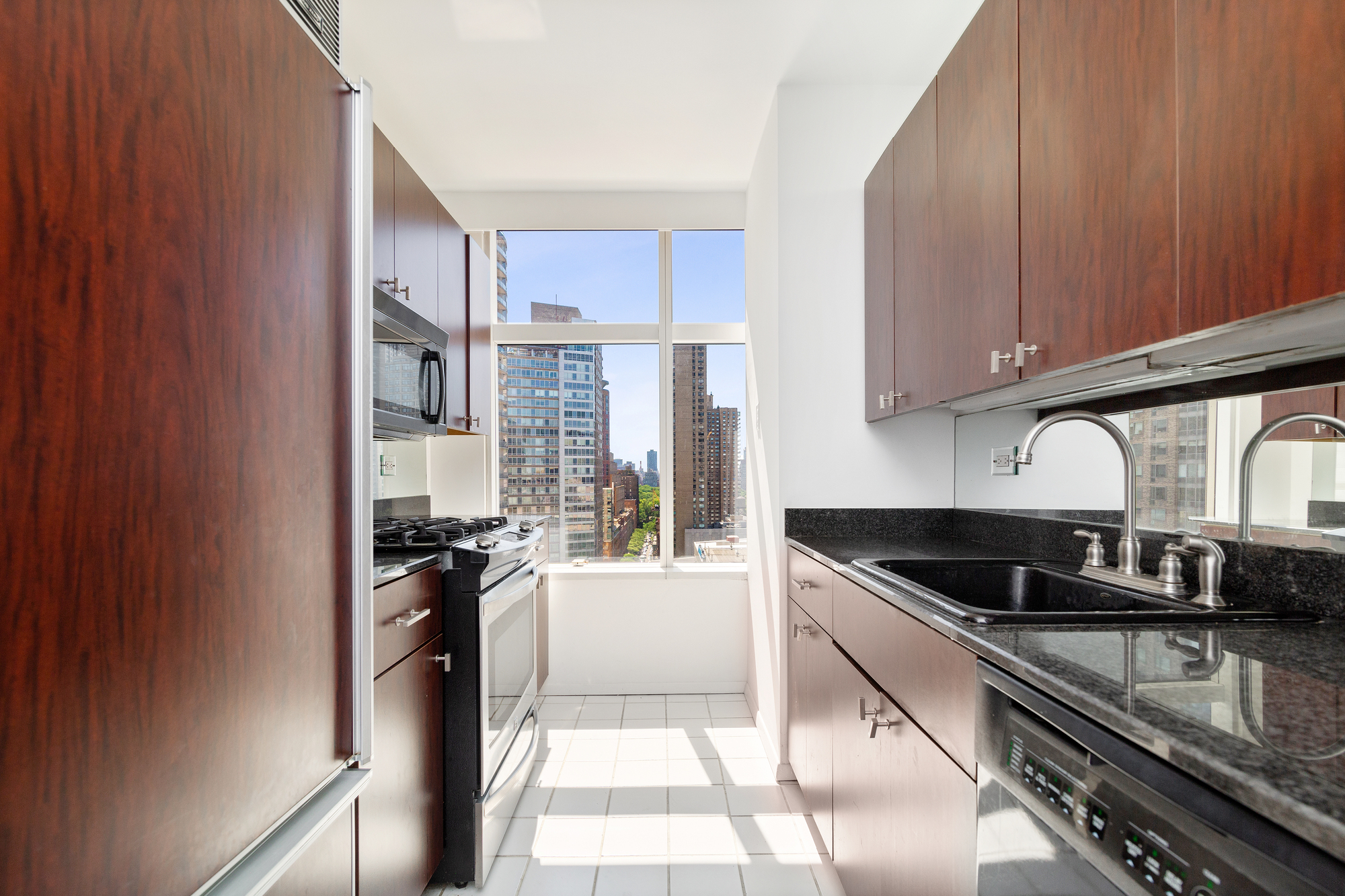
Before Mary and her team worked their magic, the closed layout of the apartment meant there was very little space left for a kitchen. The small existing galley kitchen was extremely narrow, with dark wood-effect cabinetry and granite worktops that dimmed the bright space.
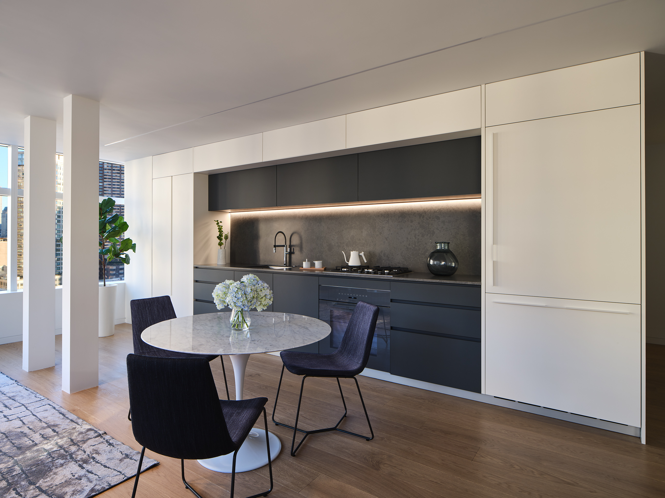
Recognizing the potential of the west-facing windows, Maydan Architects opened up the entire living space to maximize the natural lighting, incorporating a kitchen that stretched 20 feet along the side wall of this common space.
Amongst the bright and airy white walls, the black slab kitchen units - which are slightly recessed into the wall - offer a stark contrast. The grey tones offer a moody feel, demonstrating the power of the darker kitchen trend that's dominated the last few years. 'The apartment is washed with natural light and we wanted to add some dark colors so the design is not too white and faded,' explains Mary. 'Combining two colors made the kitchen brighter and less austere, while still adding contrast and drama.'
Be The First To Know
The Livingetc newsletters are your inside source for what’s shaping interiors now - and what’s next. Discover trend forecasts, smart style ideas, and curated shopping inspiration that brings design to life. Subscribe today and stay ahead of the curve.
Adding yet more drama to the monochromatic kitchen, the backlit under-cabinets help to bring out the nuanced shades in the mottled backsplash. 'We added this both for functionality and for a design effect,' says Mary. 'It illuminates the work surface really well, and also adds beauty and interest.'
Living Room
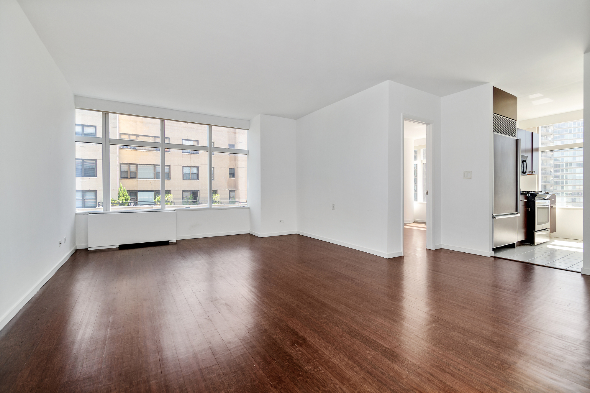
The adjoining living room had a lot of potential, but the layout obscured the stunning city views from this primary living space, with the awkward corner room minimizing the natural light. Met with the blank canvas, the team at Maydan Architects knew an entire reworking of the floorspace was needed.
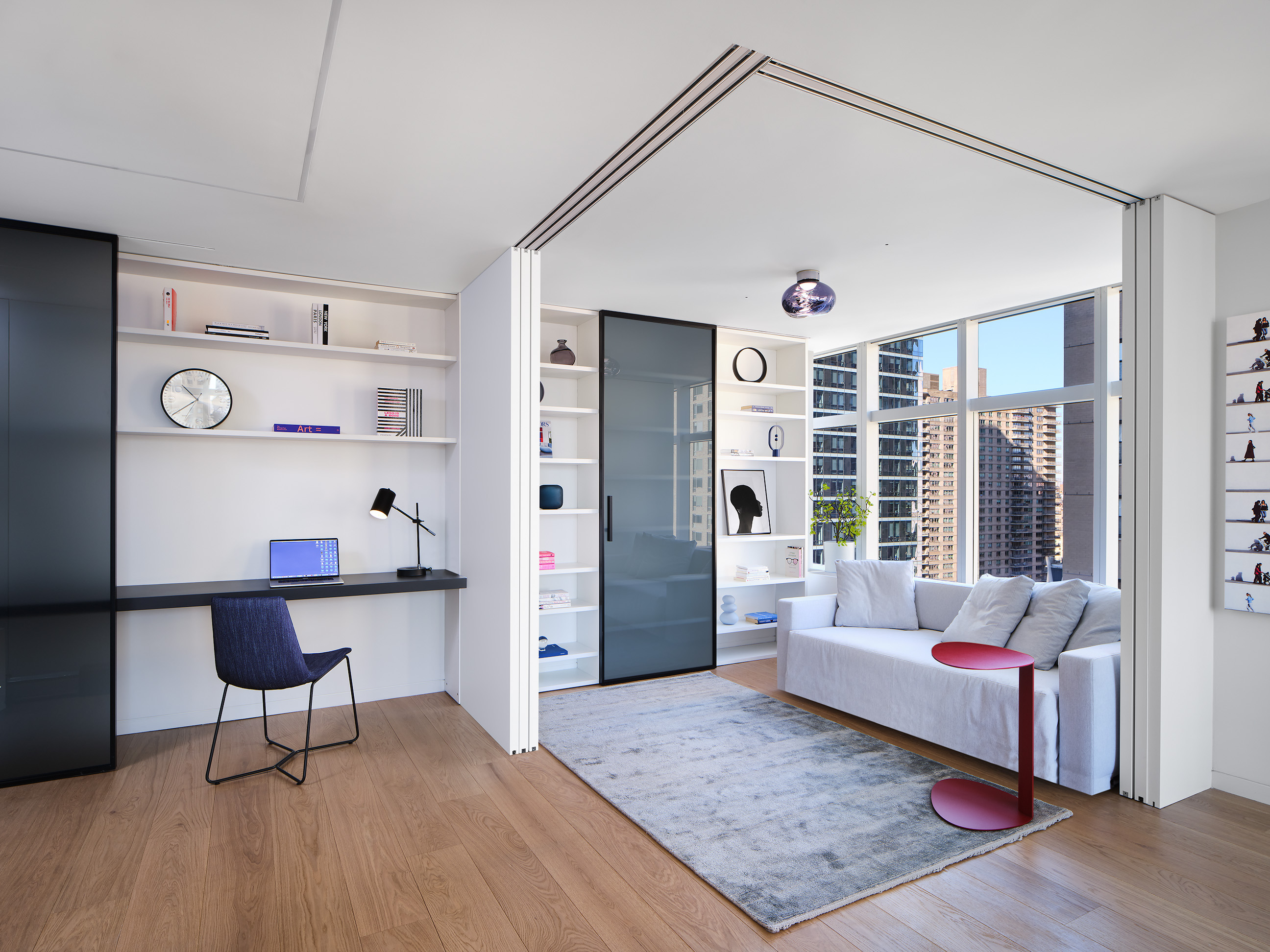
After knocking down the walls in the corner, the designers made space for a 16-foot-wide Lema library and work desk spanning the wall on one side of the living area. High-end sliding partition doors were then fitted into ceiling tracks allowing the space to be transformed into a separate enclosed room as needed, serving either as an office or a second bedroom.
According to Mary, the trend for room dividers gained momentum during Covid. 'The pandemic changed the way we think about spaces,' she says. 'It created a need to make our homes work for us 24/7. Since many people still work from home in some capacity, we still want our homes to provide an area to work, exercise, entertain, and relax. We were trying to make each square foot usable, so multifunctional rooms were critical.'
This versatile living space is full of other space-saving solutions that help maximize the limited space. 'We selected a beautiful sofa by Flexform that opens into a bed,' says Mary. 'The desk also has a sliding door that can hide part of the 7’-6” desk if there are messy papers or anything functional that you don't want to see. The key to making it work was to think of each space separately and make sure that it's well designed both as part of the whole open space, and on its own when used for a certain function.'
Main bedroom
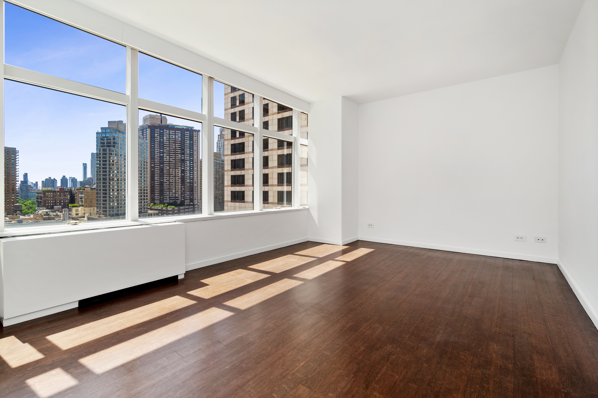
Unrivaled skyline views in the main bedroom offered great potential for a calming and relaxing sleep zone, but the limited space required an innovative eye when it came to design.
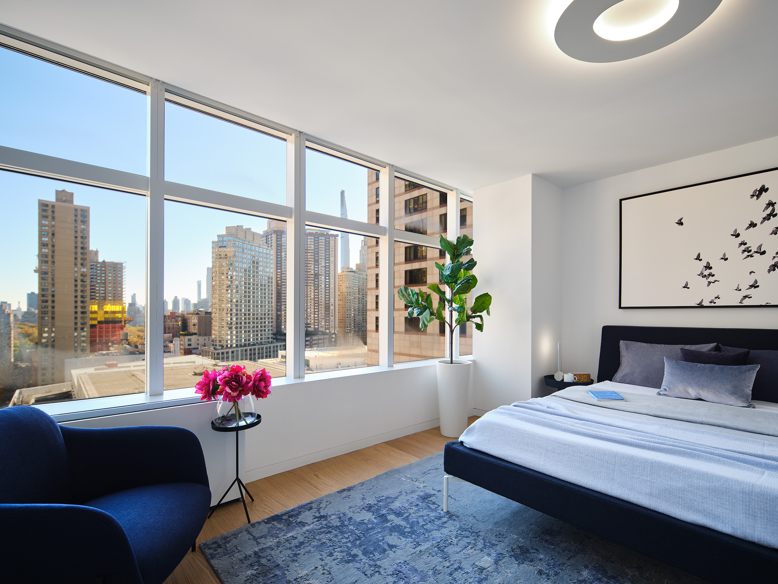
To help achieve such a calming environment, Mary departed from the bolder, contrasting colors in the rest of the small apartment. Instead, she opted for a calming blue palette in the bedroom to mirror the sky stretching outside the large wall-to-wall window.
'I avoided stark colors for the walls or the art,' she says. 'I selected a white color with a subtle touch of grayish-blue for the walls and ceiling to create a peaceful atmosphere.' Thanks to the amount of sunlight the space receives, the color choice also avoids feeling too cool-toned.
'At the beginning of each project I always spend a lot of time in the space or property at different hours of the day and take note of how the sun hits the house,' Mary adds. 'In the bedroom, I was fascinated by the light streaming through the large glass wall and decided to design a continuous closet along the entire wall, which served as a screen for the sun to cast its shadows on.'
Bathroom
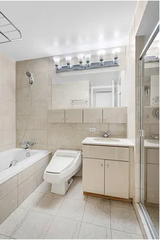
The aging primary bathroom was in desperate need of an upgrade, the beige floor and wall tiles giving the space a washed-out look worsened by the lack of natural light.
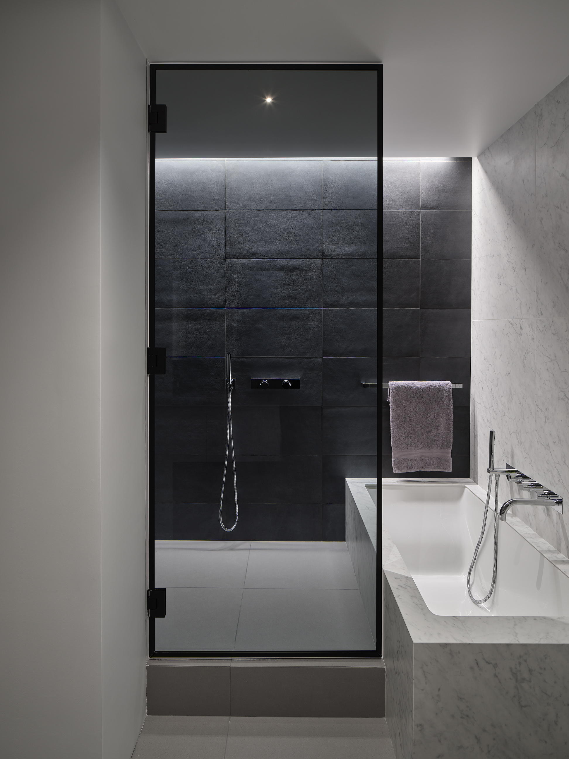
Maydan Architects modernized the space, enlarging it to fit a large double vanity and a six-foot shower which cleverly adjoins the built-in bath. The monochrome scheme echoes the mood in the kitchen and works with the lack of natural light, rather than against it.
Light grey flooring, Carrera porcelain slabs for the bathtub, and a statement grey textured shower wall with a linear light fixture make for a seriously luxurious spa-like bathroom. It's this play on color that contributes to such a stylish space. 'I personally don't tend to design dark spaces, but rather add a dark element to make a statement and provide contrast to the lighter colors,' Mary explains. 'My takeaway advice is to not be afraid of using dark colors, but balance it with lighter ones. It will provide drama and interest without taking over the room and making it somber.'
Inspired? Maximize your home with these space-saving ideas
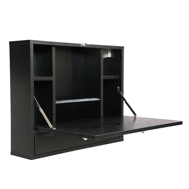
When space is at a premium, smart space-saving solutions like this are a must. This foldout floating desk features multiple storage compartments and a compact drawer, and it's multifunctional too. Use it as a laptop desk, a dressing table, an additional kitchen cupboard - whatever your heart desires.
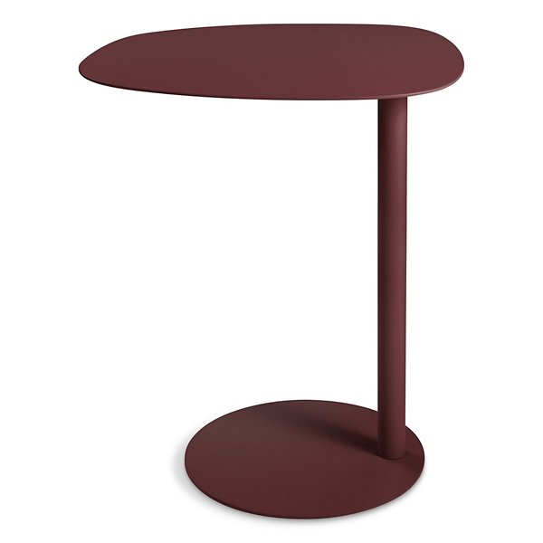
Turn your WFH set-up into WFS - Work From Sofa. The Swole Tall Table by Blu Dot, available at Lumens, is organically shaped with a curved top perfect for pulling in close to a chair, sofa, or bed. By night, it can double up as a convenient side table for setting drinks on thanks to its fresh and modern design.

Lilith Hudson is a freelance writer and regular contributor to Livingetc. She holds an MA in Magazine Journalism from City, University of London, and has written for various titles including Homes & Gardens, House Beautiful, Advnture, the Saturday Times Magazine, Evening Standard, DJ Mag, Metro, and The Simple Things Magazine.
Prior to going freelance, Lilith was the News and Trends Editor at Livingetc. It was a role that helped her develop a keen eye for spotting all the latest micro-trends, interior hacks, and viral decor must-haves you need in your home. With a constant ear to the ground on the design scene, she's ahead of the curve when it comes to the latest color that's sweeping interiors or the hot new style to decorate our homes.
-
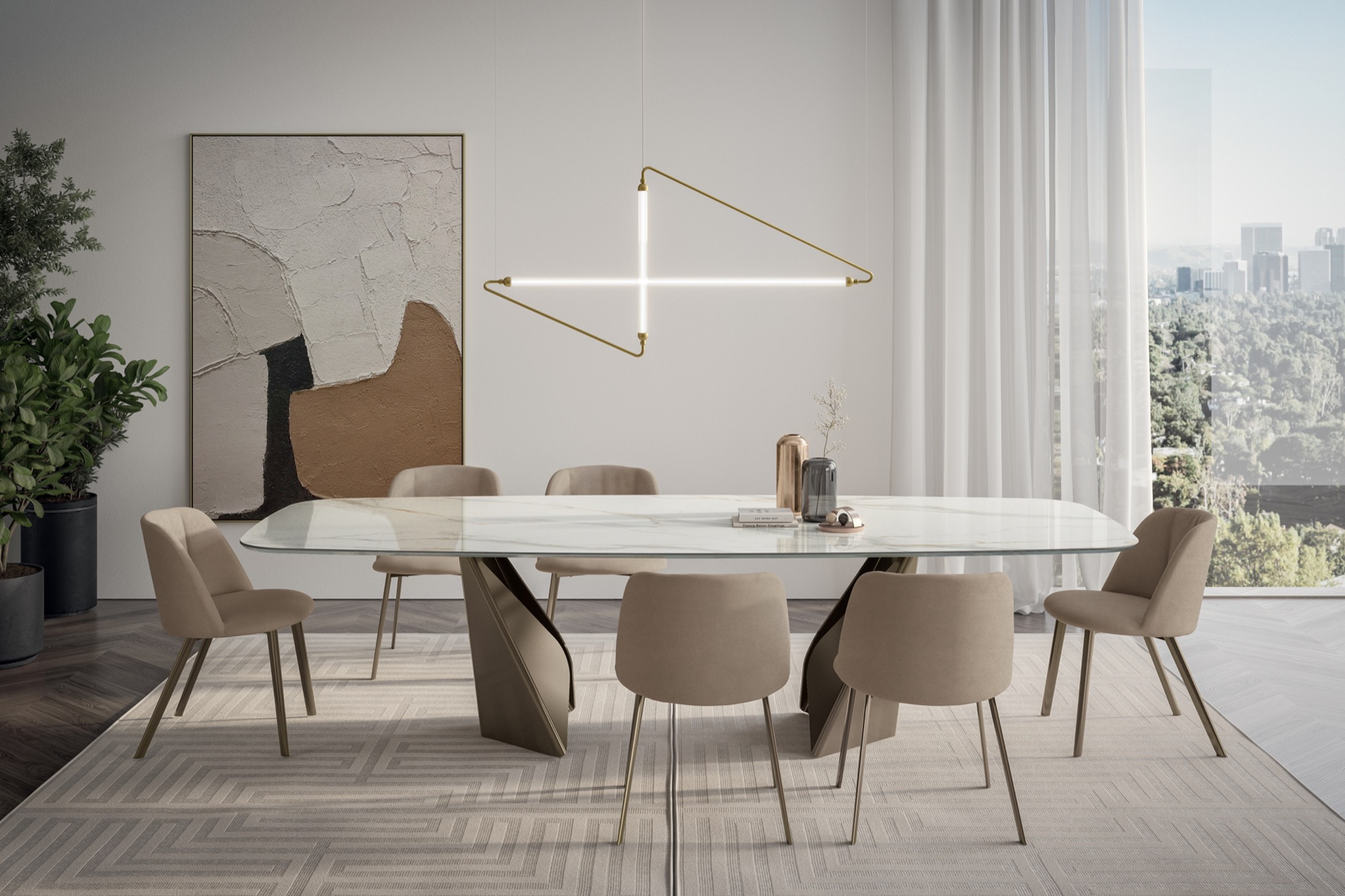 My 10 Favorite Designs at Milan Design Week 2025 — Out of the Hundreds of Pieces I Saw
There is a new elegance, color, and shape being shown in Milan this week, and these are the pieces that caught my eye
By Pip Rich
-
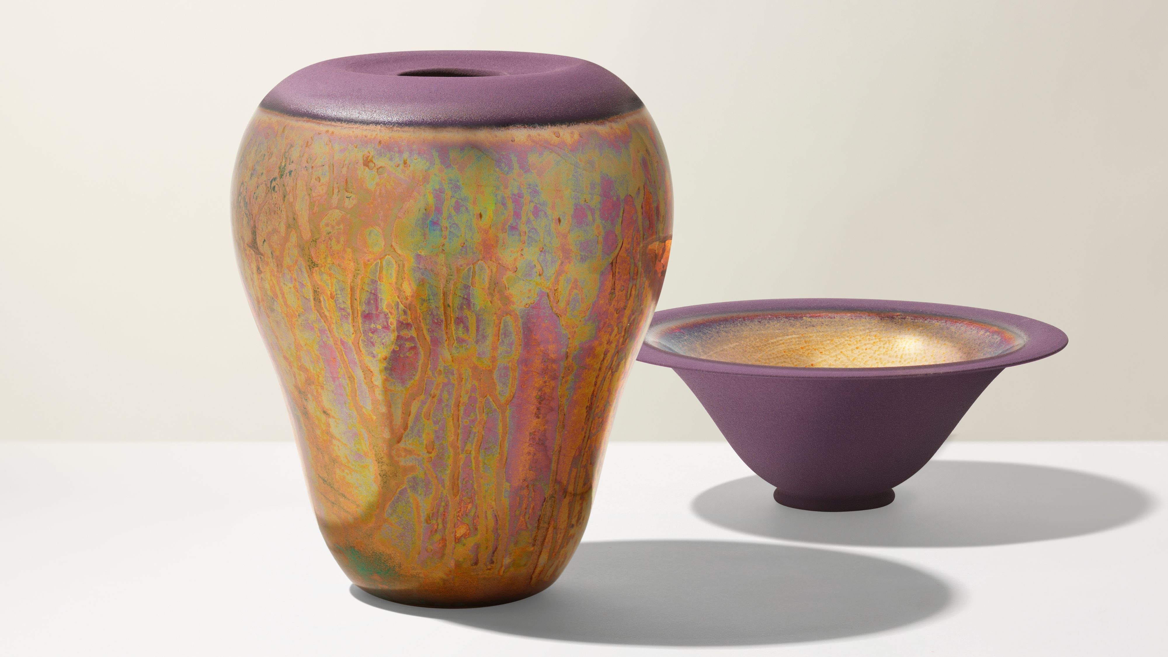 Iridescence Is Chrome’s More Playful, Hard-to-Define Cousin — And You're About to See It Everywhere
This kinetic finish signals a broader shift toward surfaces that move, shimmer, and surprise. Here's where to find it now
By Julia Demer
