Is this the world's best bookcase? Inside a Parisian home where incredible shelving takes a starring role
Designed by NJ+ Arquitetura, this home in Paris has myriad outstanding features, but a unique bookcase in the living room takes centerstage
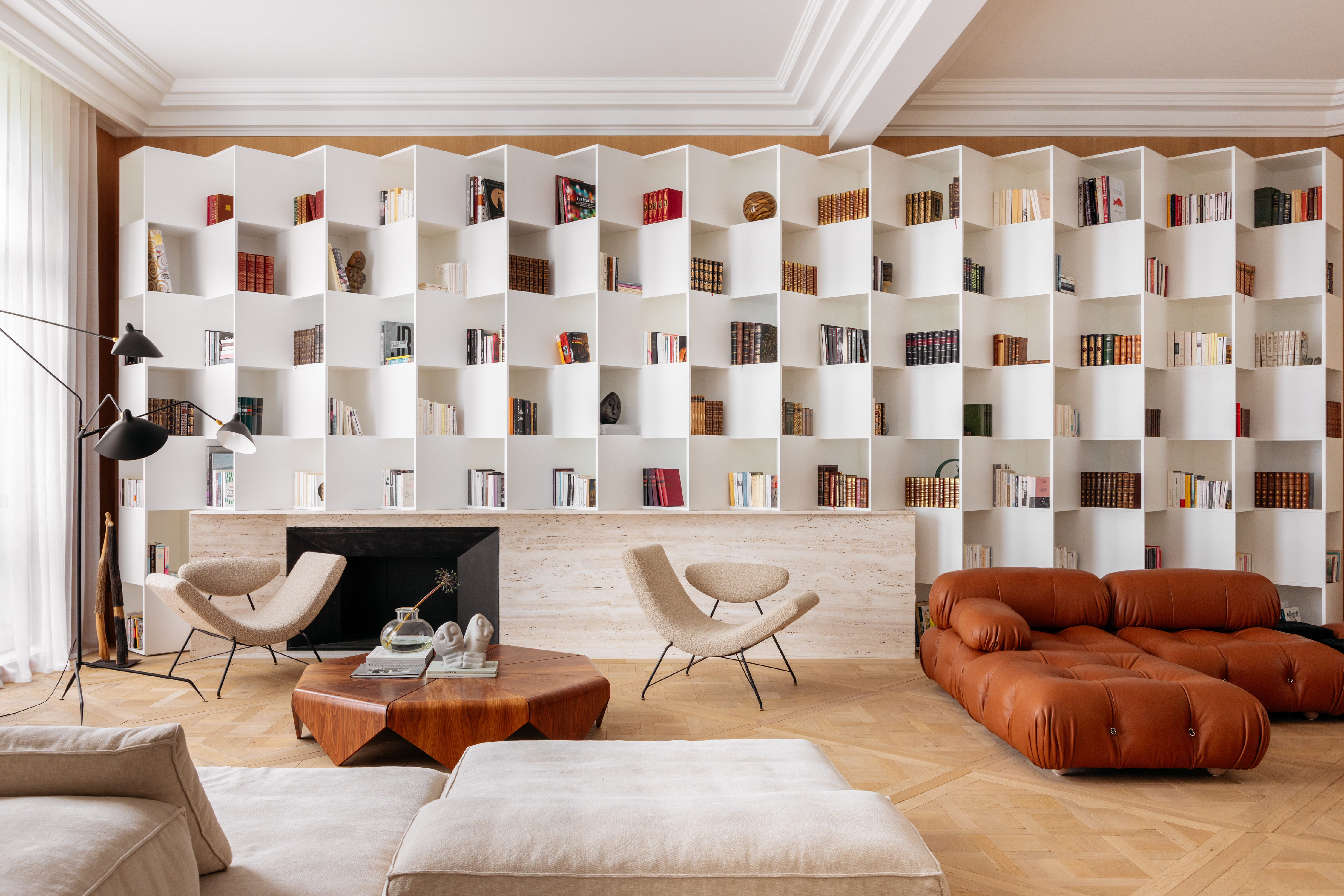

Sometimes, interior design can stop you in your tracks. Such is the story of this 5,166-square-feet Parisian home in which the living room's cleverly designed shelving has become somewhat of a viral sensation online. It's the definition of a scrollstopper.
But it's not the only masterpiece in this modern home designed by Nildo José Virgínia Lopes, Danielle Groszamann, and Anna Clara of Brazil-based NJ+ Architects. 'The French clients, with three teenage children, wanted a home with personality and a mix of Brazilian art, architecture, and furniture,' Nildo tells us. 'The home is located in an upscale neighborhood in Paris, and the clients wanted it to represent exemplary design.'
Exemplary design is something these designers deliver in spades, throughout the home, with specially commissioned pieces made by craftspeople used to highlight the magnificence and scale of the home.
Entryway
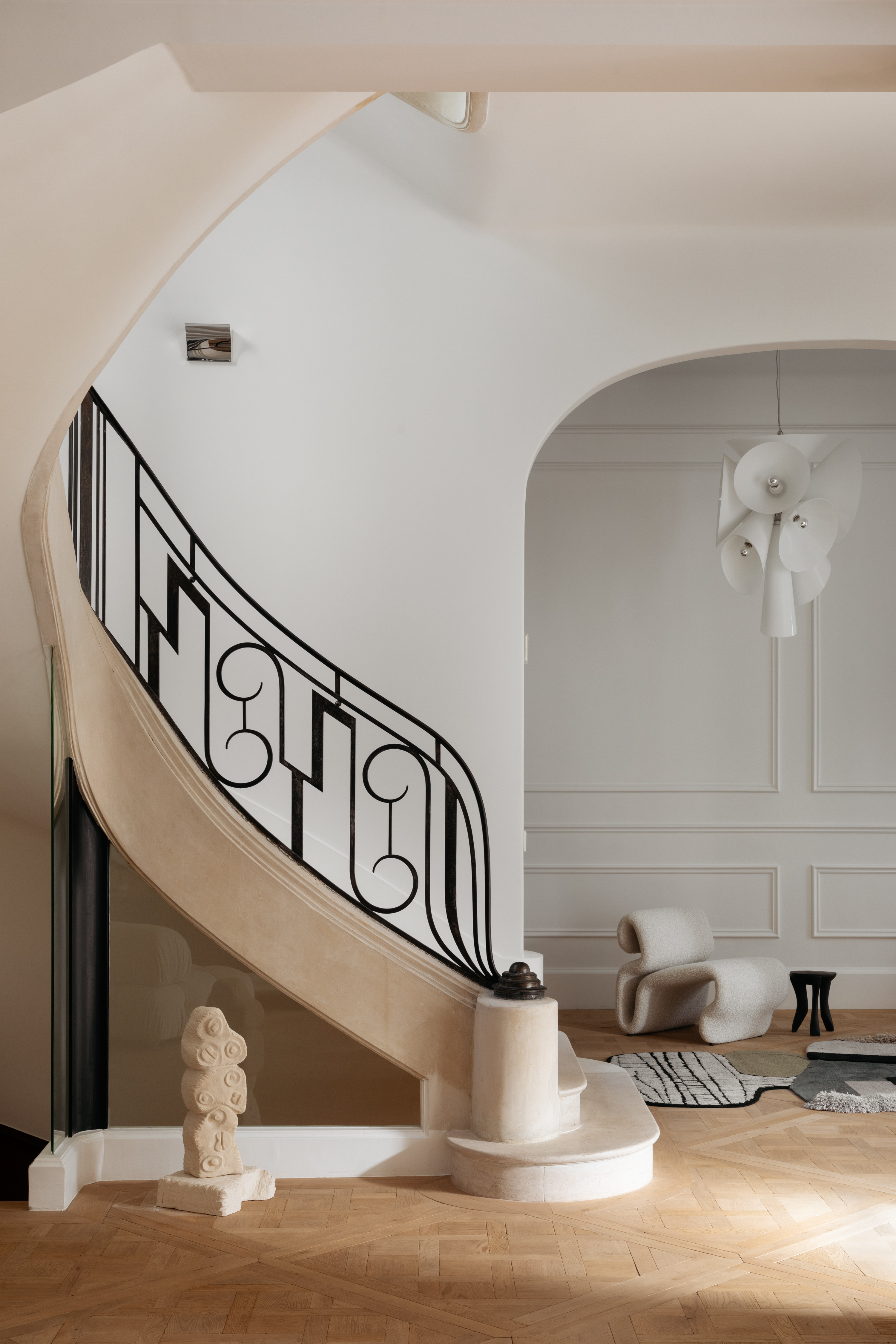
The home opens up to a whimsical entrance with paneled walls, where a small, comfortable chair welcomes guests. 'The existing architecture of the house was a huge inspiration as it already had beautiful elements,' says Nildo. 'This gave us a great starting point for the design. High ceilings, a sculptural staircase that connects the main floors, generous windows overlooking the treetops and more became our anchor points.'
'Plus, the family is deeply interested in literature, art, and history, so their input too became valuable in the design of this home,' Nildo adds. 'For us, the staircase along with the home's spaciousness became the starting point of the interior design.'
'What also sets this home apart is how we took advantage of the great repertoire of finishes that we have available in Europe. We worked with European oak flooring, Italian marble, and more. The project was developed in Brazil (amid the pandemic) and executed remotely in France.'
Living room
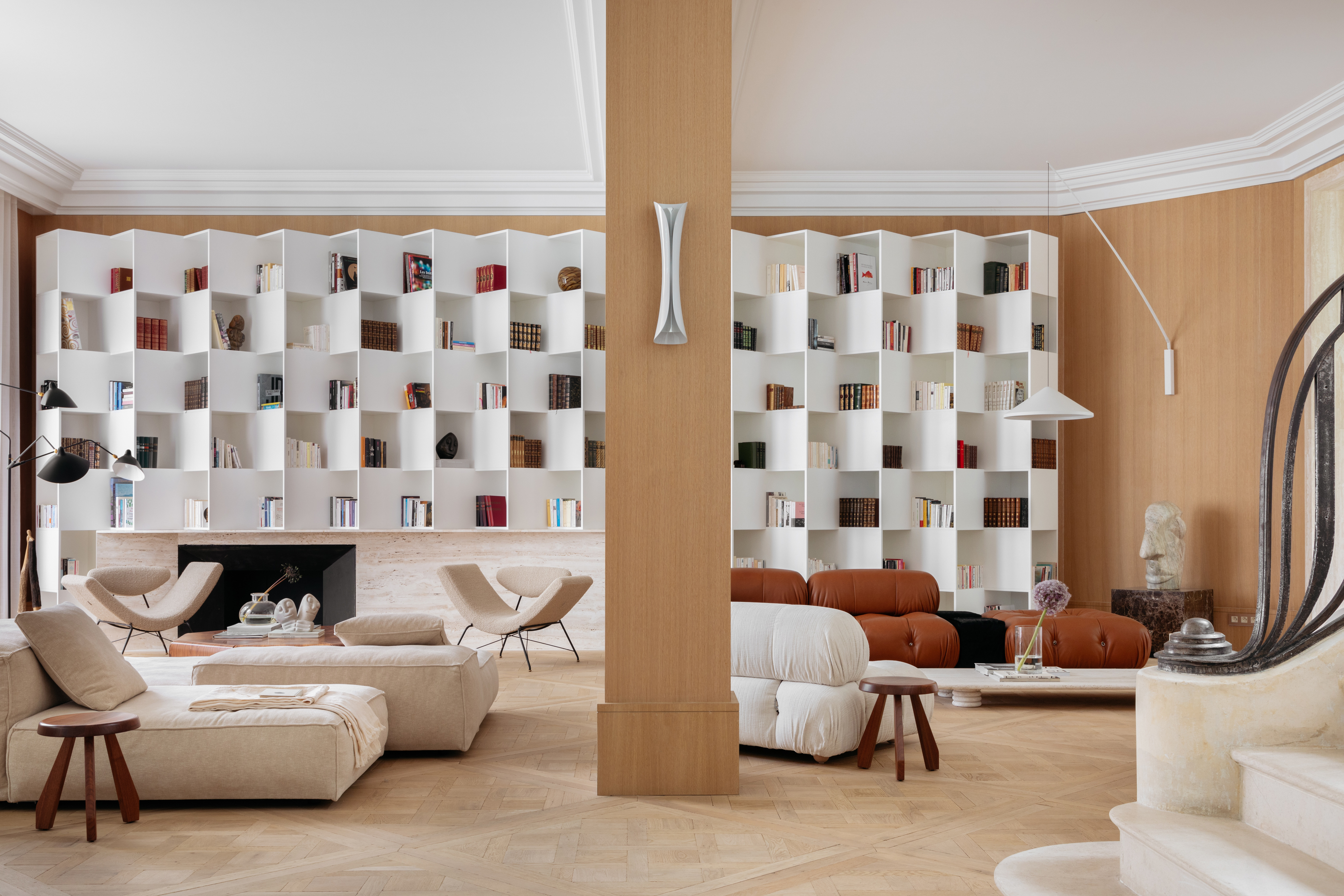
The heart of the home is the living room, with two comfortable seating systems, designed for various needs, moods, and socializing situations. The muted palette with rich material tones creates a soft, relaxing mood.
Be The First To Know
The Livingetc newsletters are your inside source for what’s shaping interiors now - and what’s next. Discover trend forecasts, smart style ideas, and curated shopping inspiration that brings design to life. Subscribe today and stay ahead of the curve.
'This is the main room of the house, with high ceilings, generous windows, European oak flooring, along with a mix of European and Brazilian living room furniture,' says Nildo. 'Two main elements take centerstage here, one being the existing staircase, which brings with it all the charm and history of the house, and the second, the large white shelf, with a contemporary design, which houses the family's collection of books and art. This is a room used for reading and relaxing. To add a little bit of fun to the area, we specially commissioned sculptures of the faces of the couple's children, made in solid marble, peppered across the bookshelf.'
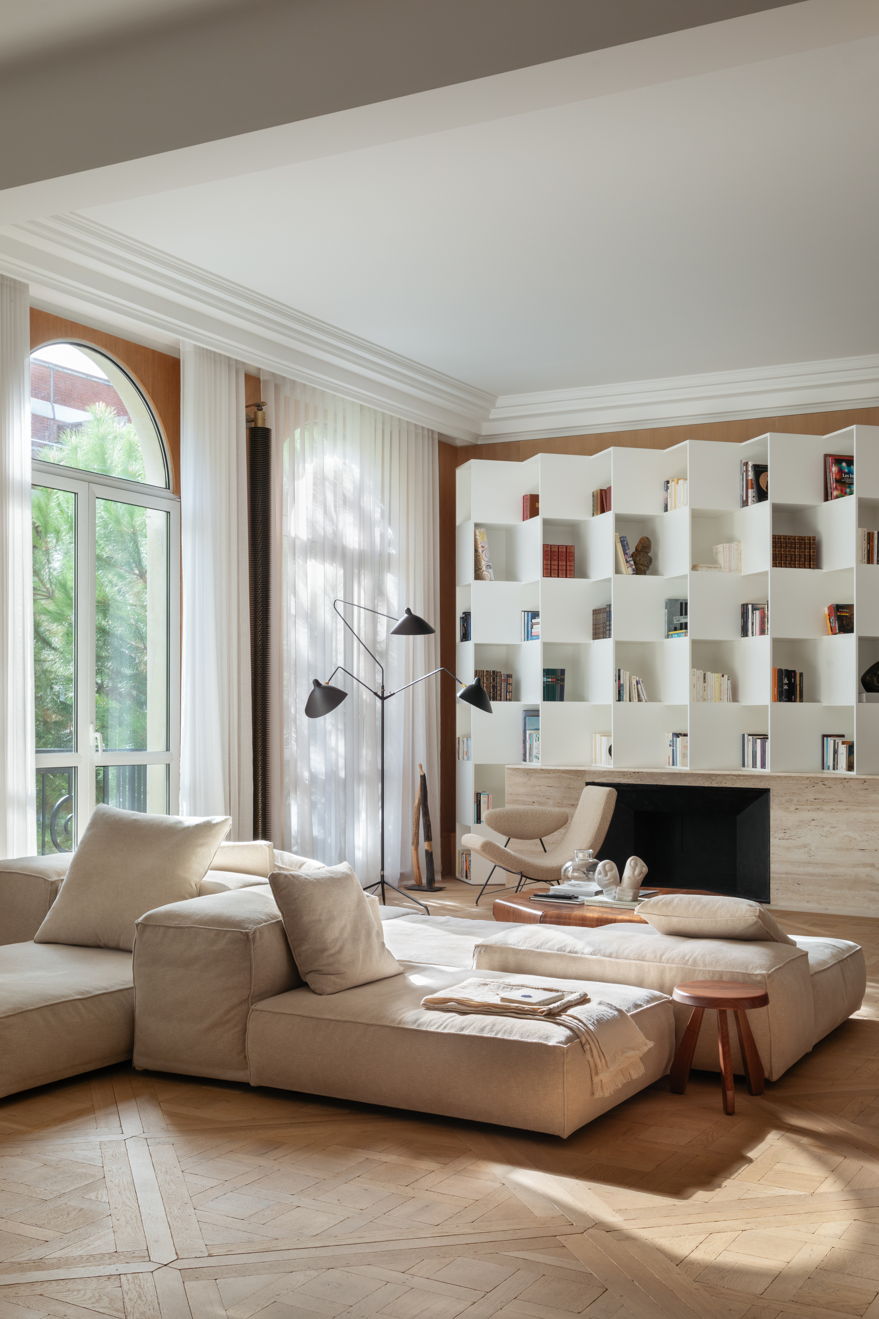
The low floor seating and the bookshelf help create a cozy living room; one that encourages you to settle down with a book or spend long afternoons just lounging around.
'The theme of the space was to value Brazilian and European design, in harmony with the clients' books and objects,' says Nildo. 'Here, the fan-shaped lacquered shelf was designed by us and surrounds the Travertine marble fireplace,' says Nildo. 'Along with that, we paired Reversible armchairs, designed by Martin Eisler for Tacchini, with the floor lamp by Serge Mouille and the Pétala coffee table, by Jorge Zalszupin, along with the Camaleonda sofa, by Mario Bellini for B&B Italia, in caramel leather.'
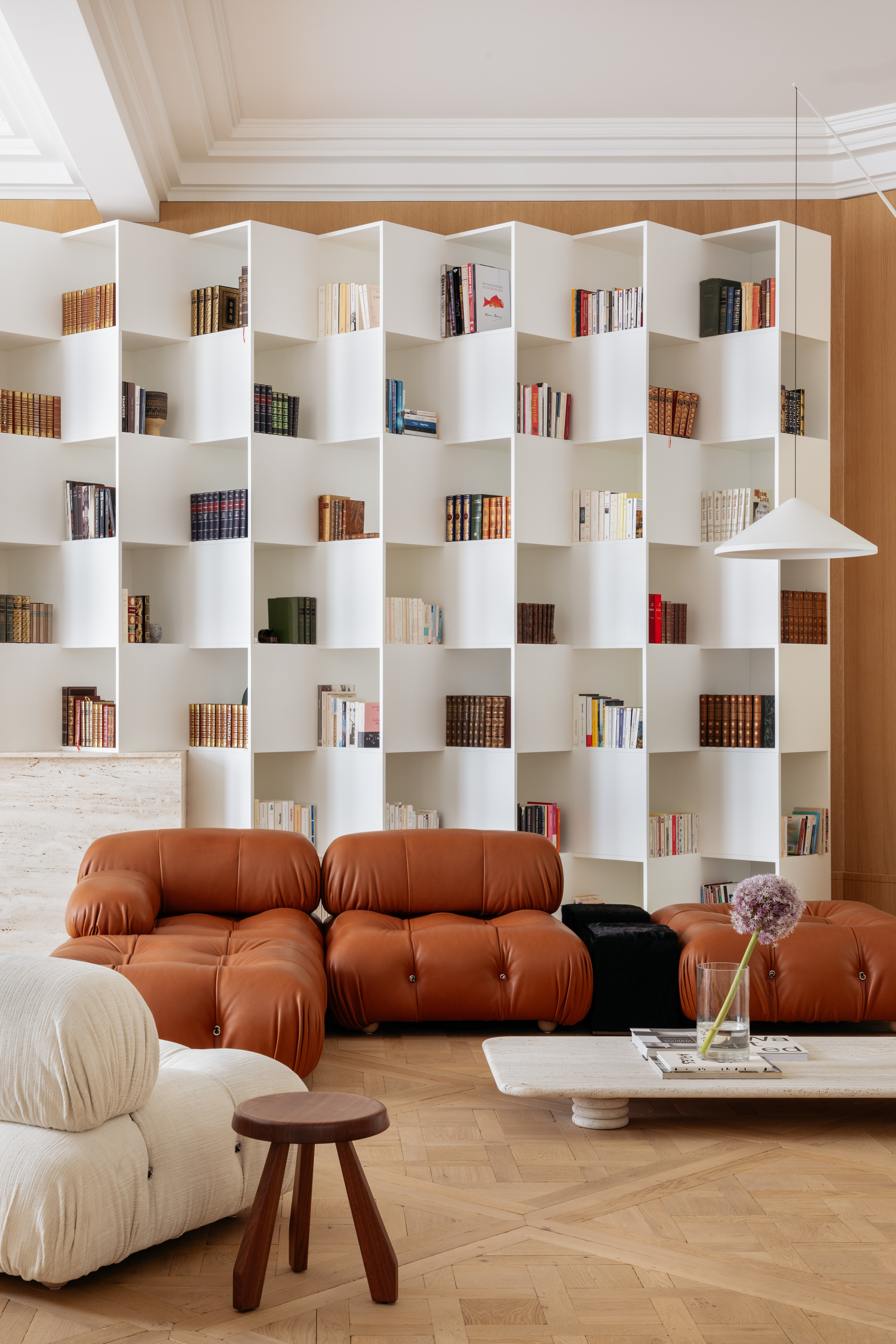
'The bookshelf is made in matte white lacquer,' says Nildo. 'It was prefabricated and assembled in three weeks by craftsmen, and was produced in the region; the true star of the decor. Its form gives movement to the space's design, and gives the feeling of boosted dimensions to the room.'
Kitchen
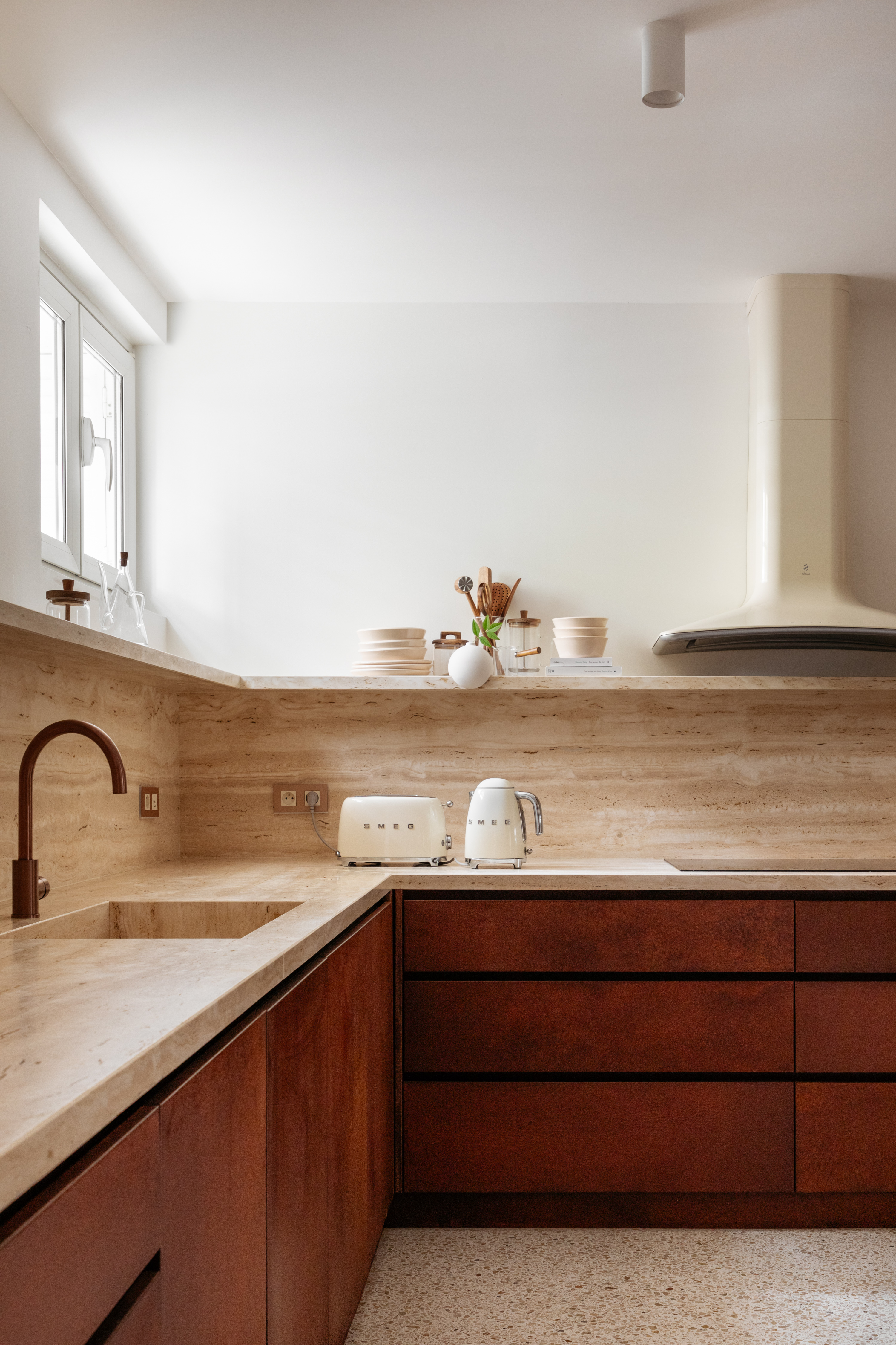
'The kitchen is a calm, muted space, situated on the ground floor at street level and it opens onto a bamboo garden,' says Nildo.
The kitchen shelves and pantry are finished in timber, while the terrazzo flooring keeps the indoor environment calm and relaxing. This space extends out to a breakfast nook for quick meals, and then to the larger dining room where the family, along with guests, can enjoy a cozy and leisurely meal.
Dining room
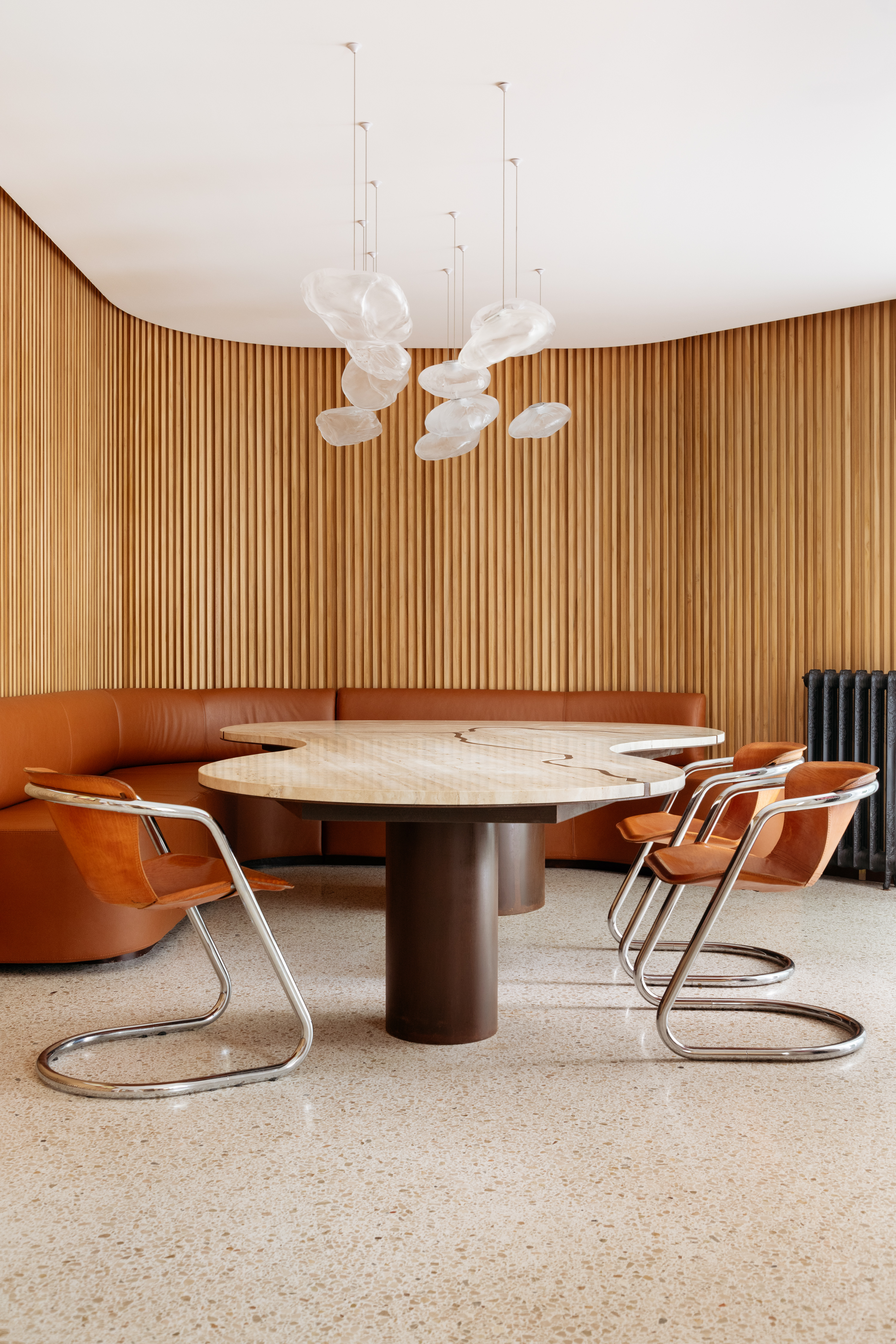
The luxury dining room has an eye-catching quality, thanks to its rich materiality and carefully chosen elements. The circular seating creates a cocooning environment; one that encourages long, indulgent meals. While the palette is restrained, the overall feeling is still luxe and high concept.
'The dining room is a more cozy environment, clad in wooden slatted panels,' says Nildo. 'The organic table with a marble top is one of the protagonists of the space, and above it floats a set of lamps. Covering part of the table is a curved sofa covered in caramel leather, while the other half features vintage chairs – a collectors' item – which follow the same finish.'
Main bedroom
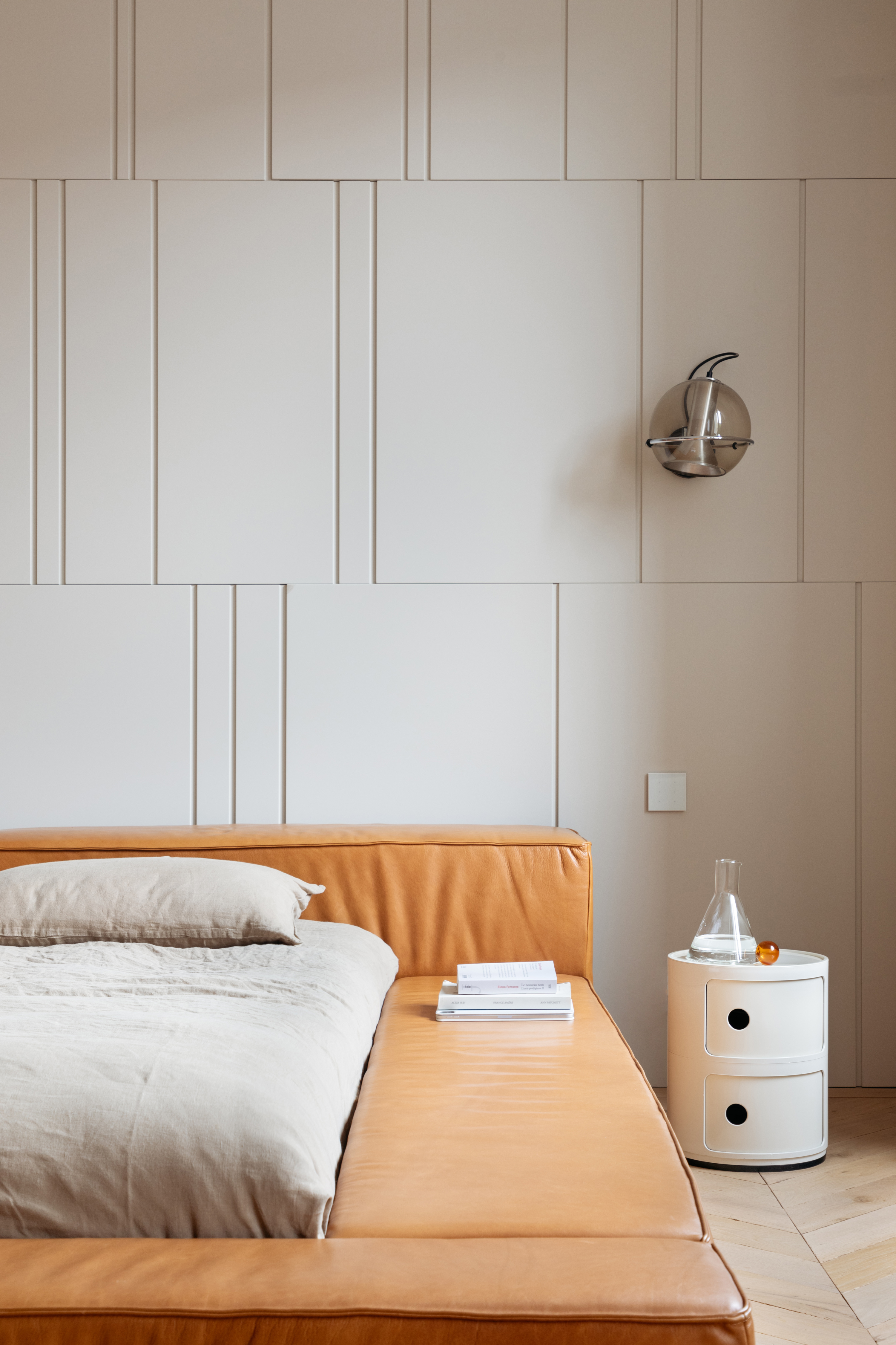
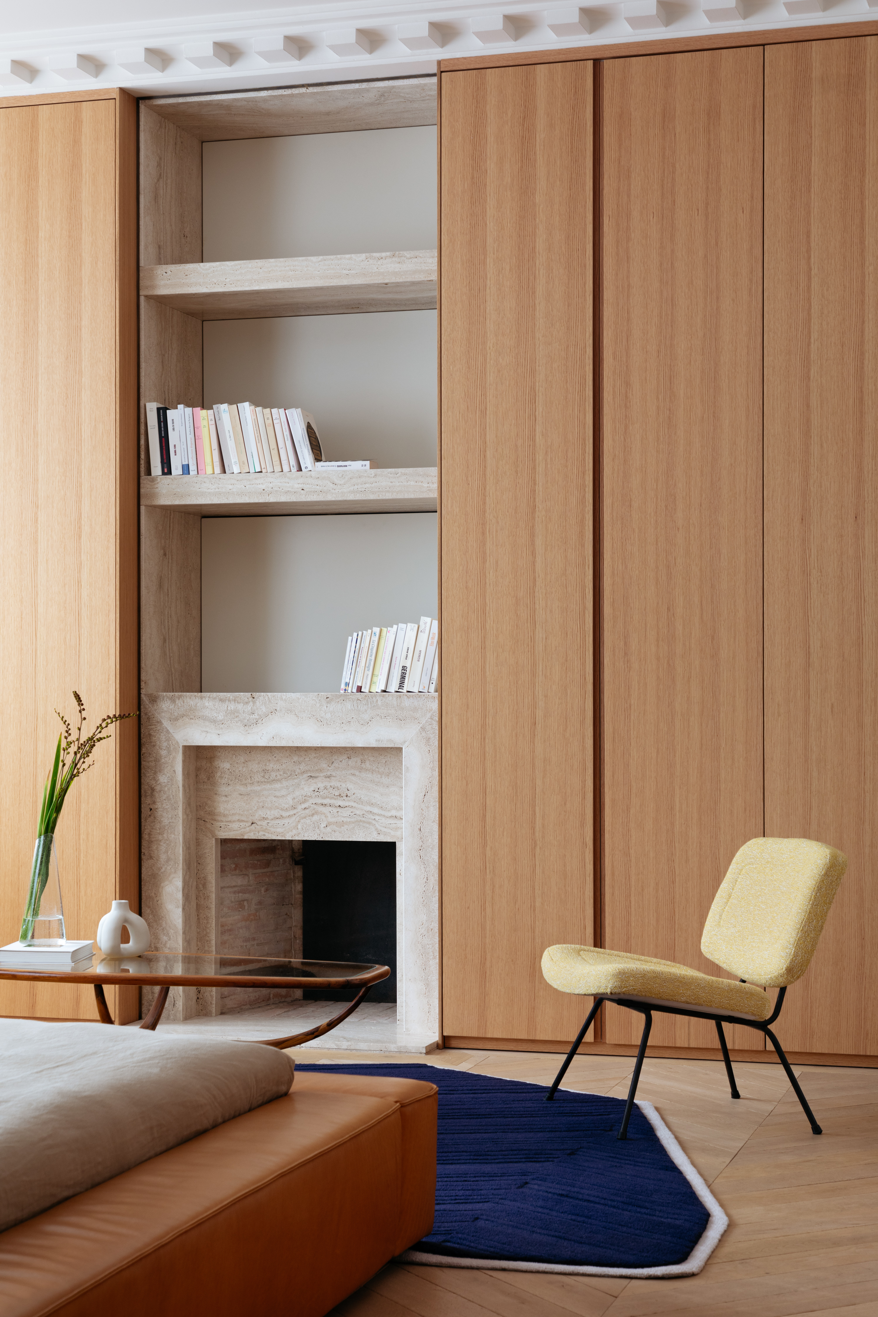
The main bedroom is a picture of quiet luxury, and the theme of close-to-floor furniture continues here.
'This bedroom is a truly special space in the house,' says Nildo. 'We left the fireplace in its original state but added a new travertine coating. The shelves above it accommodate books and works of art from the residents' collection. The cupboards in the room are in natural wood veneer, with discreet handles that look like large panels. The low bed by Gervasoni was chosen to give the room a feeling of spaciousness. Behind it, we designed a joinery panel, with mismatched rulers and a matte lacquer panel.'
In front of the bed are two vintage armchairs in mustard fabric, and a bedroom rug in a pop-colored navy tone.
Kids' rooms
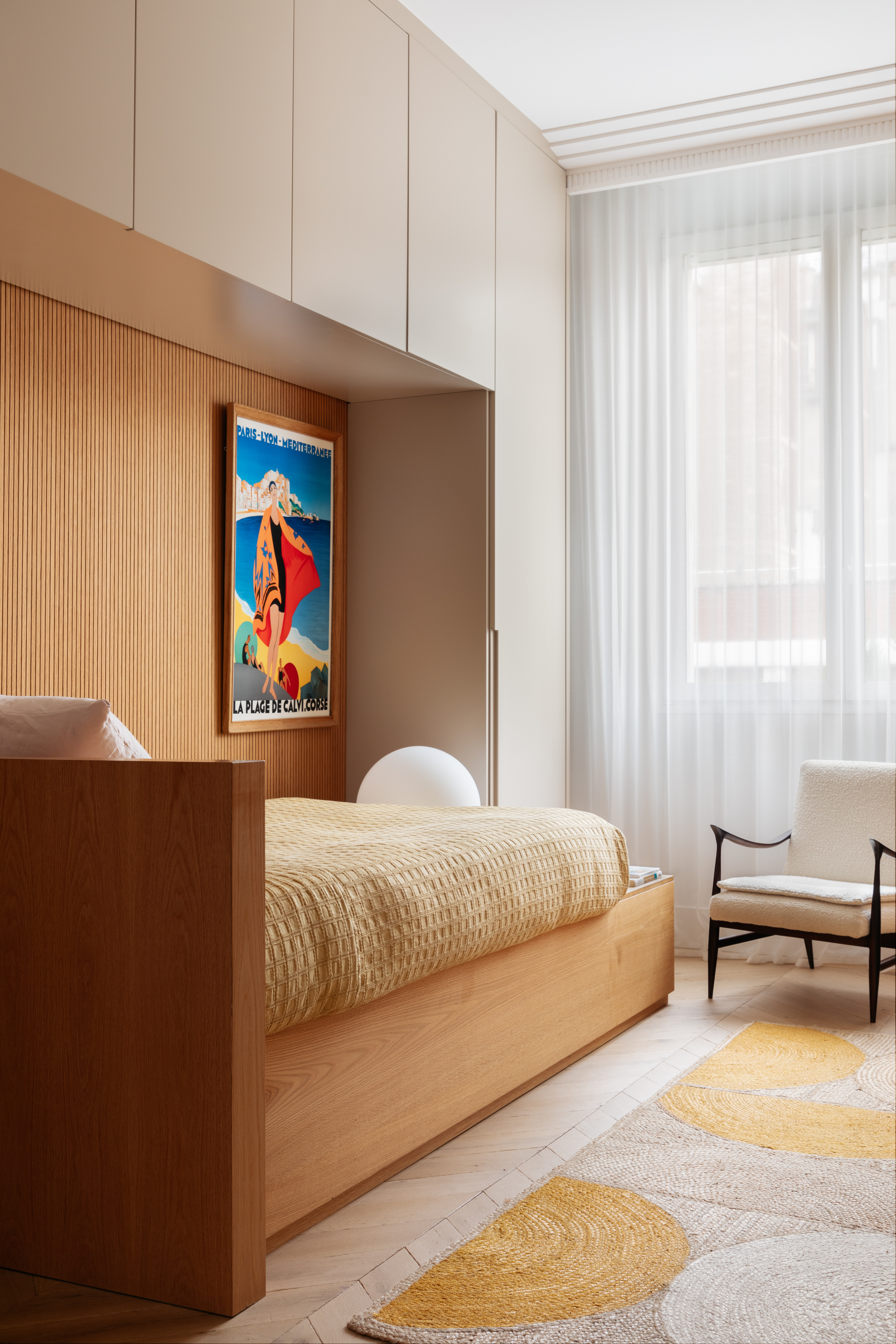
The small bedroom layout of the daughter is made infinitely functional with a built-in bed and storage all around the walls. So much so, that the room also houses a study table for homework and art.
'In this room, we designed joinery that holds the bed and storage,' says Nildo. 'There's a closet on the side and at the top to optimize the space. In front of the bed, we placed a sturdy bench where one of the couple's daughters collects drawings, travel guides, and stationery materials.'
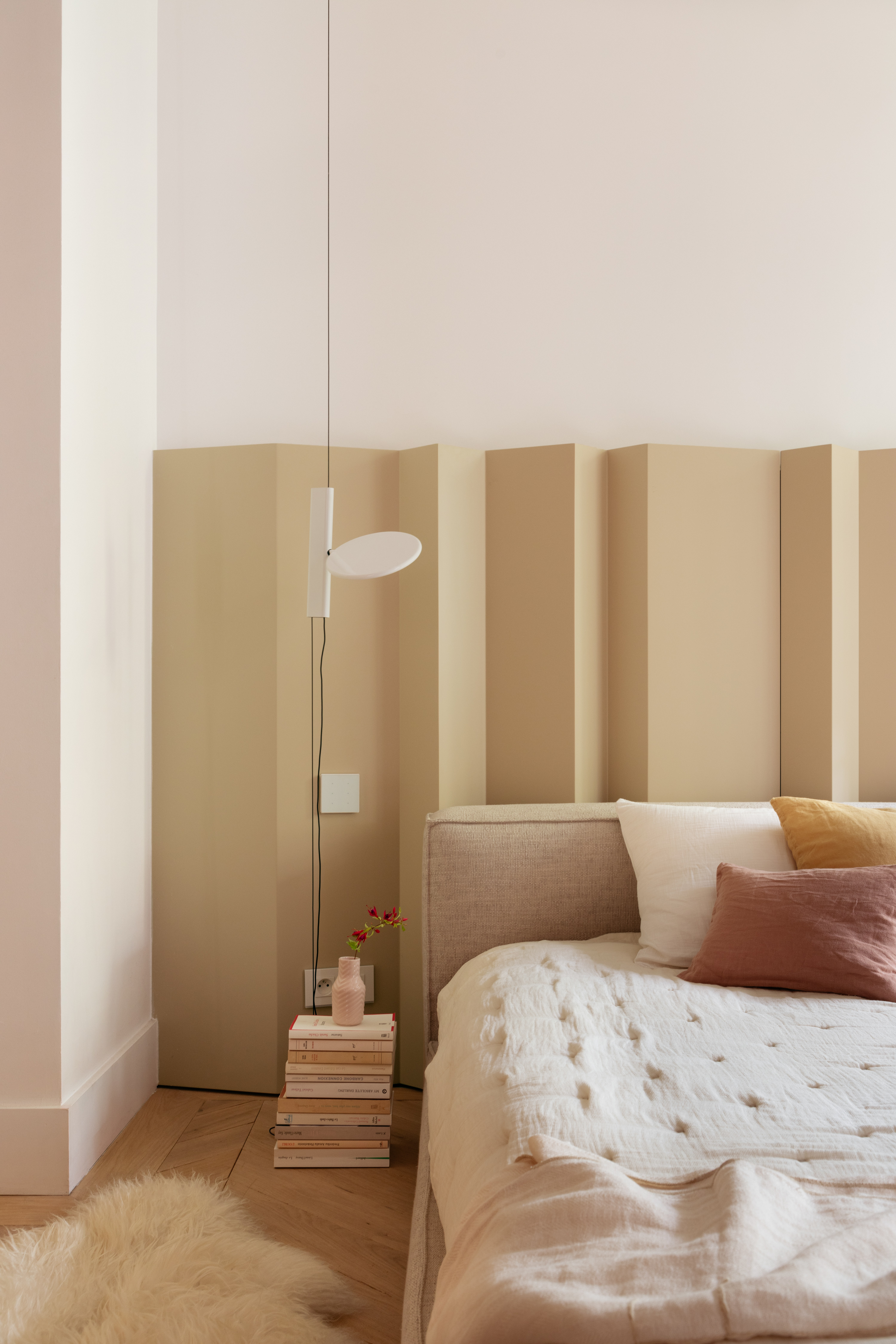
The second daughter's bedroom is another key example of craftsmanship. The muted color tones and the statement headboard along with a sense of spaciousness and softness take over the decor.
'This is one of the most charming rooms in the house, full of interesting details,' says Nildo. 'One of them is the woodwork headboard, designed by us, with a sloping form, finished in matte nude lacquer. In front of the headboard is a low bed, upholstered in linen.'
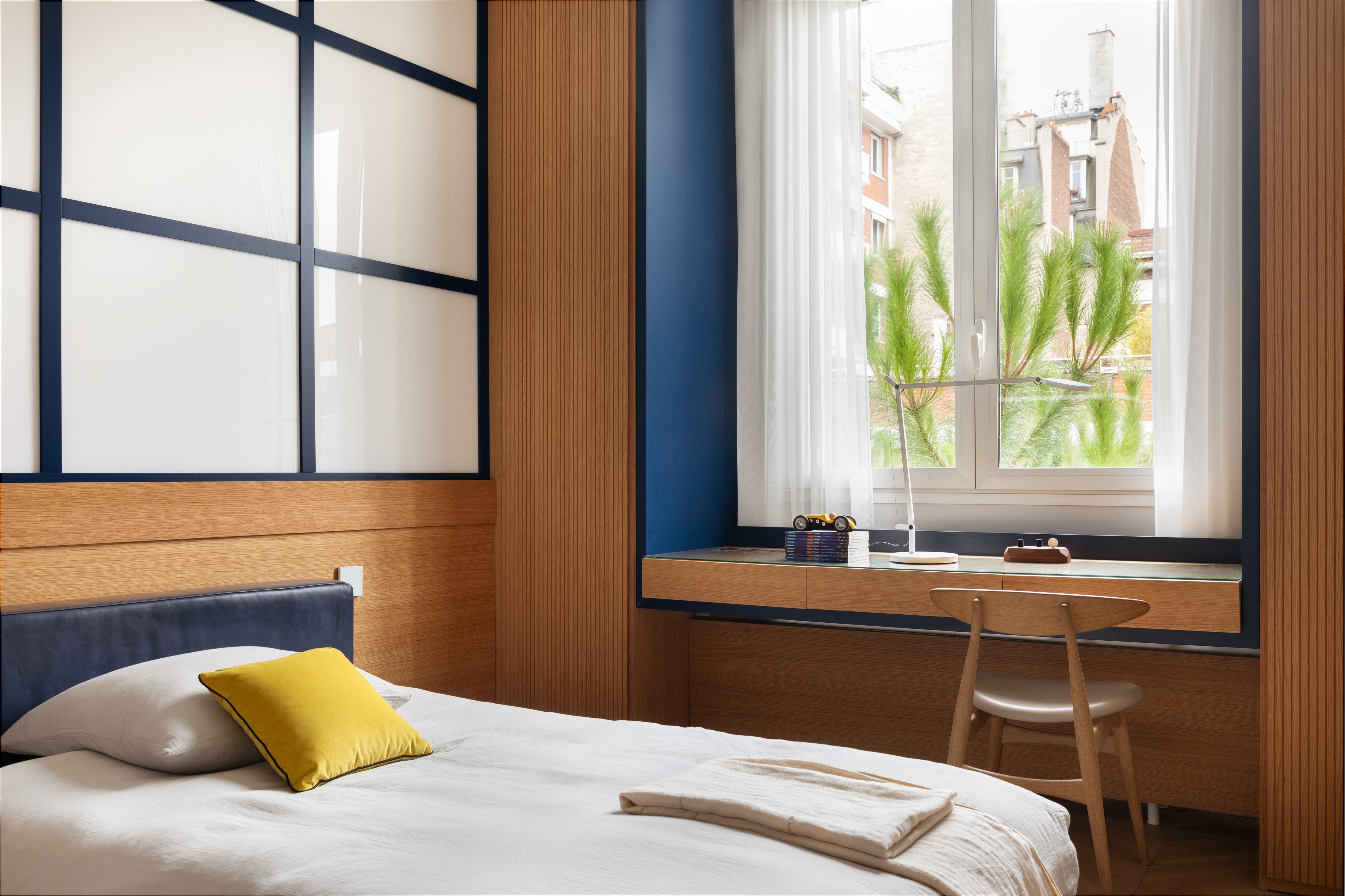
A modern small bedroom, the son's room is filled with character thanks to the custom headboard (a common theme in all bedrooms), and a deeper, bolder color palette.
'The youngest son's room has a more youthful and masculine energy; for this space, we worked with wood tones and a navy blue palette,' says Nildo. 'The headboard is made in joinery, designed to create a feeling of frames, windows, and a feeling of playfulness. The study table is under the window, where he has natural light for most of the day.'
Terrace
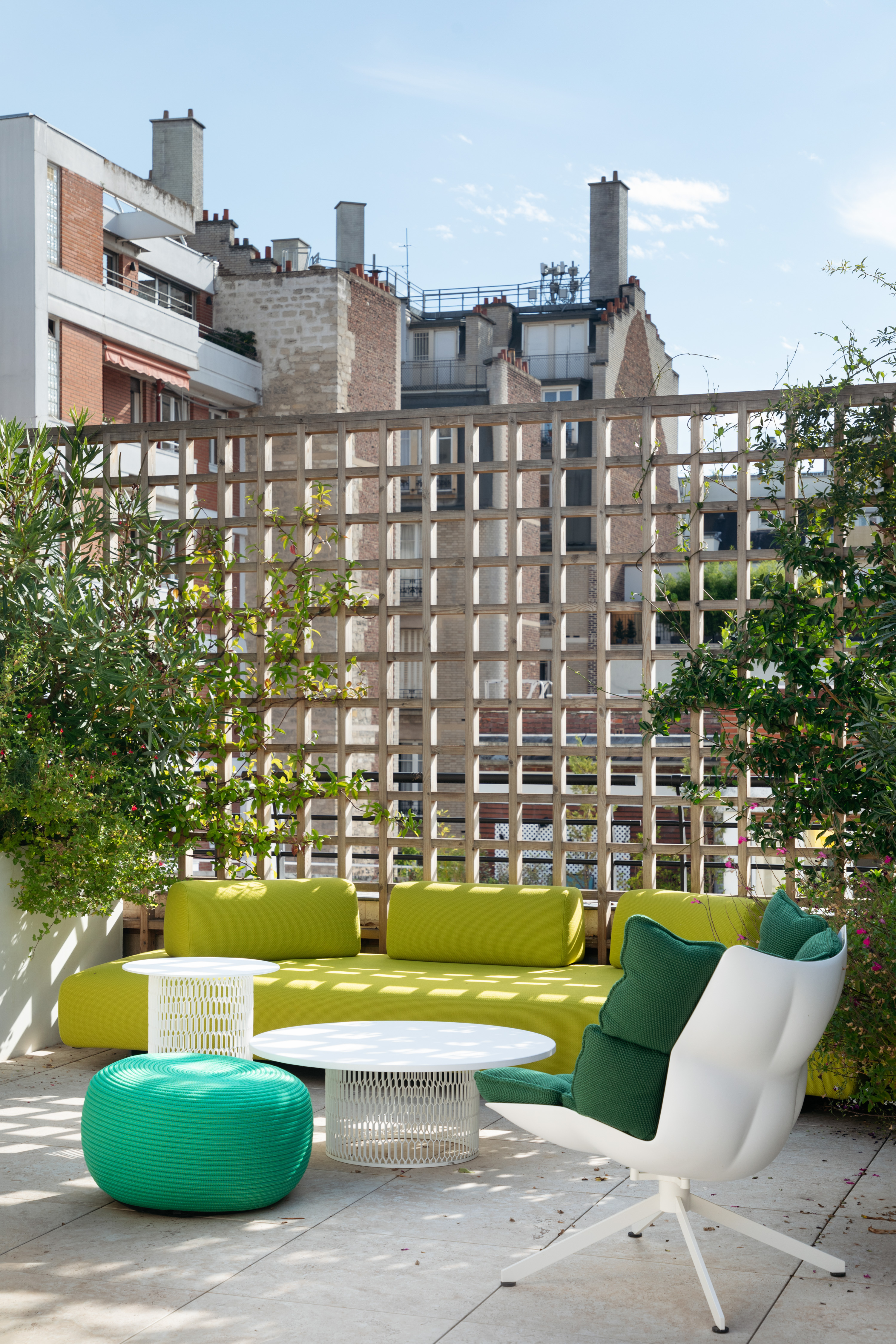
A small yet significant terrace garden is another communal space for the family to spend quality time. The space overlooks the neighborhood and is well-landscaped with plush seaters and even a kitchen. Tall plants evoke a feeling of rejuvenation and this is the only space in the home where bold tones take over.
'The terrace is completely uncovered, and is a space frequently used by the family, especially on hot summer days,' says Nildo. 'We added a support kitchen here that serves intimate dinners, and added a seating area where the homeowners could spend time together or with friends. The abundant garden greenery around makes this space look like a small oasis. In terms of colors, we choose fresh, citric tones.'
More projects by NJ+ Architects

Aditi Sharma Maheshwari started her career at The Address (The Times of India), a tabloid on interiors and art. She wrote profiles of Indian artists, designers, and architects, and covered inspiring houses and commercial properties. After four years, she moved to ELLE DECOR as a senior features writer, where she contributed to the magazine and website, and also worked alongside the events team on India Design ID — the brand’s 10-day, annual design show. She wrote across topics: from designer interviews, and house tours, to new product launches, shopping pages, and reviews. After three years, she was hired as the senior editor at Houzz. The website content focused on practical advice on decorating the home and making design feel more approachable. She created fresh series on budget buys, design hacks, and DIYs, all backed with expert advice. Equipped with sizable knowledge of the industry and with a good network, she moved to Architectural Digest (Conde Nast) as the digital editor. The publication's focus was on high-end design, and her content highlighted A-listers, starchitects, and high-concept products, all customized for an audience that loves and invests in luxury. After a two-year stint, she moved to the UK and was hired at Livingetc as a design editor. She now freelances for a variety of interiors publications.
-
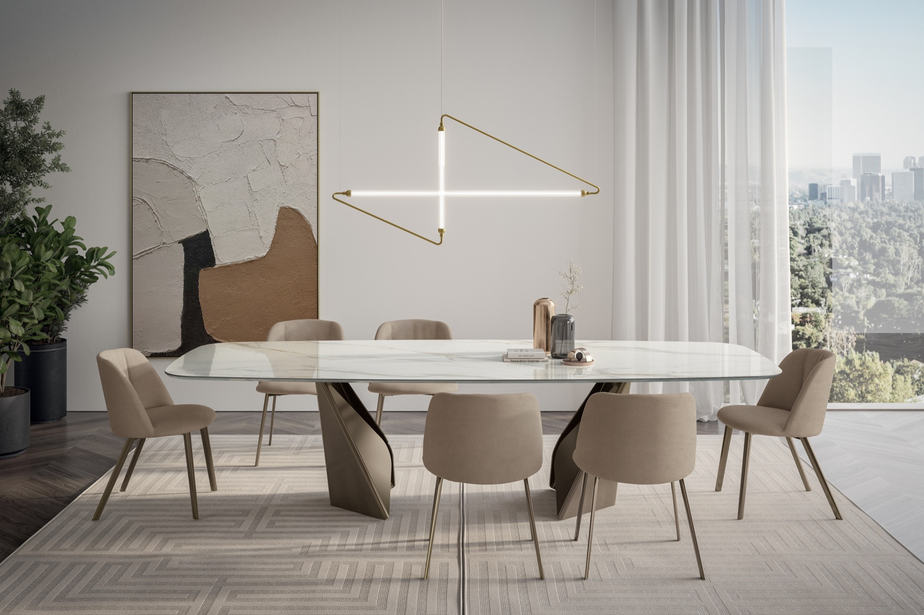 My 10 Favorite Designs at Milan Design Week 2025 — Out of the Hundreds of Pieces I Saw
There is a new elegance, color, and shape being shown in Milan this week, and these are the pieces that caught my eye
By Pip Rich
-
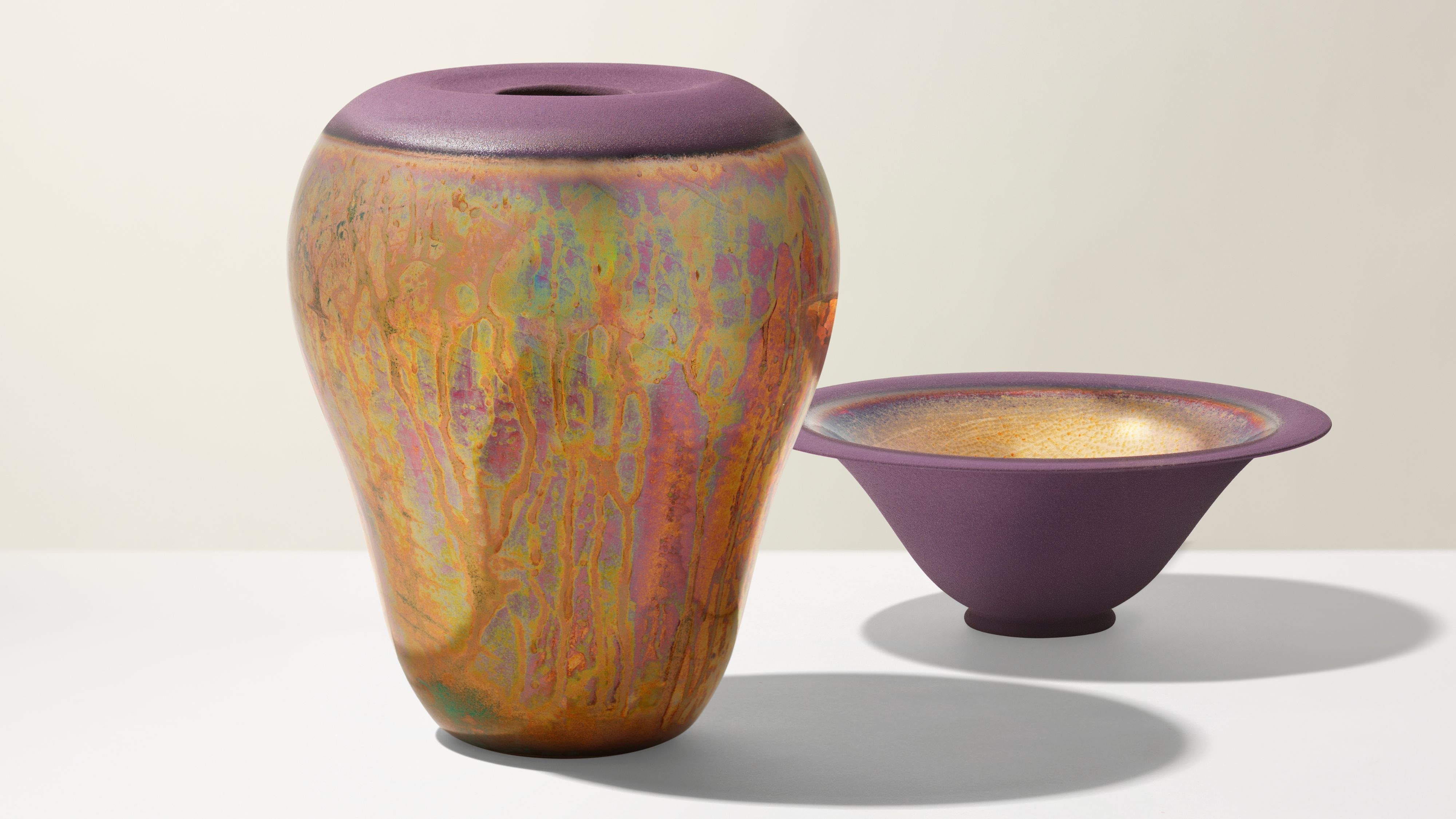 Iridescence Is Chrome’s More Playful, Hard-to-Define Cousin — And You're About to See It Everywhere
This kinetic finish signals a broader shift toward surfaces that move, shimmer, and surprise. Here's where to find it now
By Julia Demer