This 'quirky' Victorian home in Toronto is filled with unusual features, from its red kitchen to 'broken-plan' layout
What used to be an odd Victorian house is now a modern home filled with light, curved lines and open spaces for a family of four to enjoy
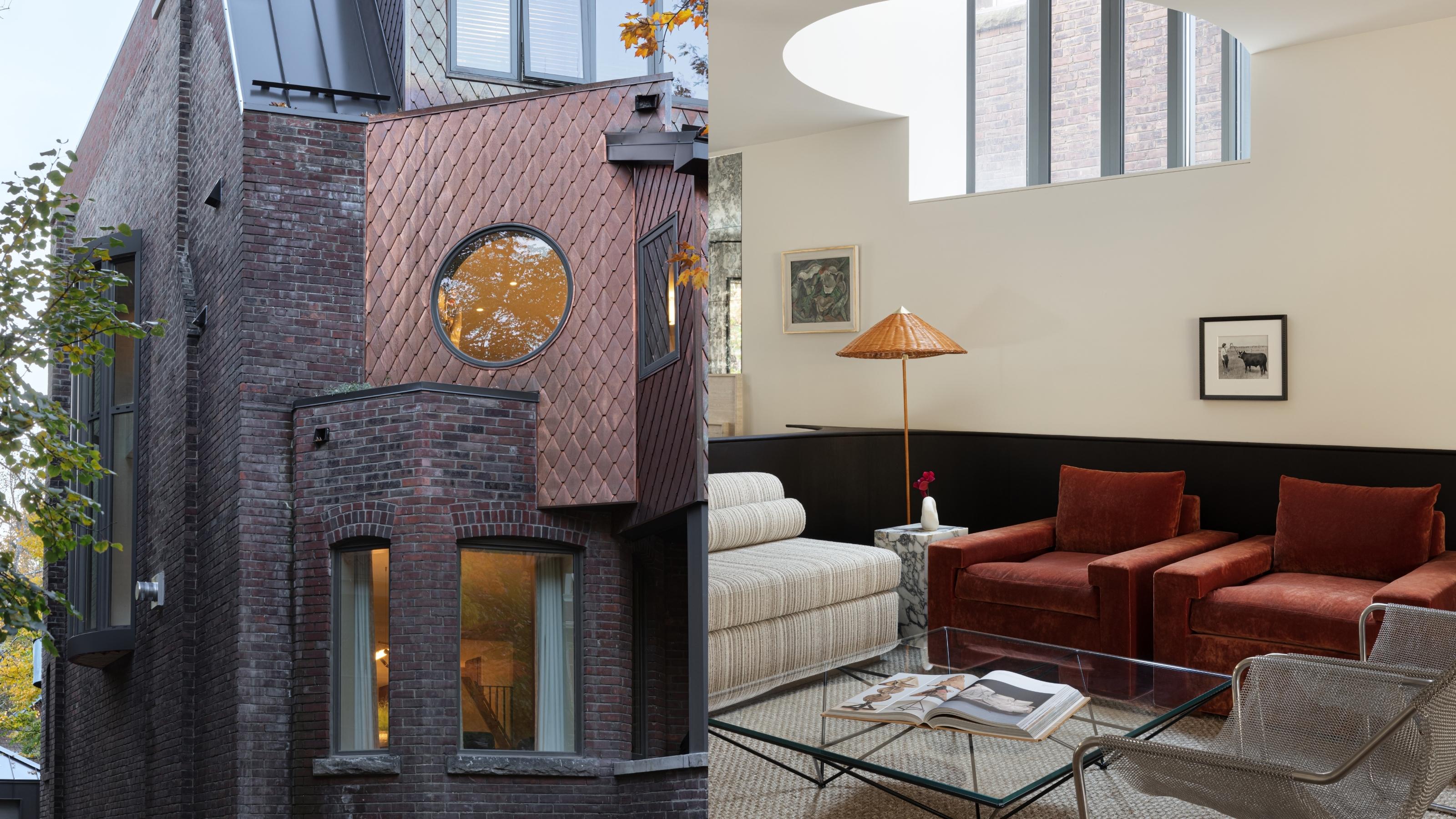
A quirky Victorian house in Toronto was the subject of a transformation that respected the uniqueness of the architectural style and injected a shot of modernity that made it suited for a family to call home. A mix of angular and rounded shapes visible on the exterior reflect inside the space, in a play of shapes, light, and carefully curated accents of color.
The building consists of 3800 sq ft. 4.5 bathrooms and 4 bedrooms, over 4 levels, and is the full-time home of a family of four, located in the Annex, one of the most charming neighborhoods in Toronto. The area is well known for its Victorian and Edwardian architecture with houses built mostly in the late 1800s and early 1900s, giving it a particular kind of charm. Even though the houses might be old, the individuality and character of the façade of this home has its own character and is typical of the area.
A home interior was thought through and inspired by the clients and their lifestyle, allowing for an exquisite open space and a broken-plan living area which makes sense and creates a feeling of flow. In a color-infused blend of contemporary, traditional, and art deco-inspired elements, this home is an example of uniting the old with the new, to create a modern home that functions.
A living space that is open, but zoned for multiple usage
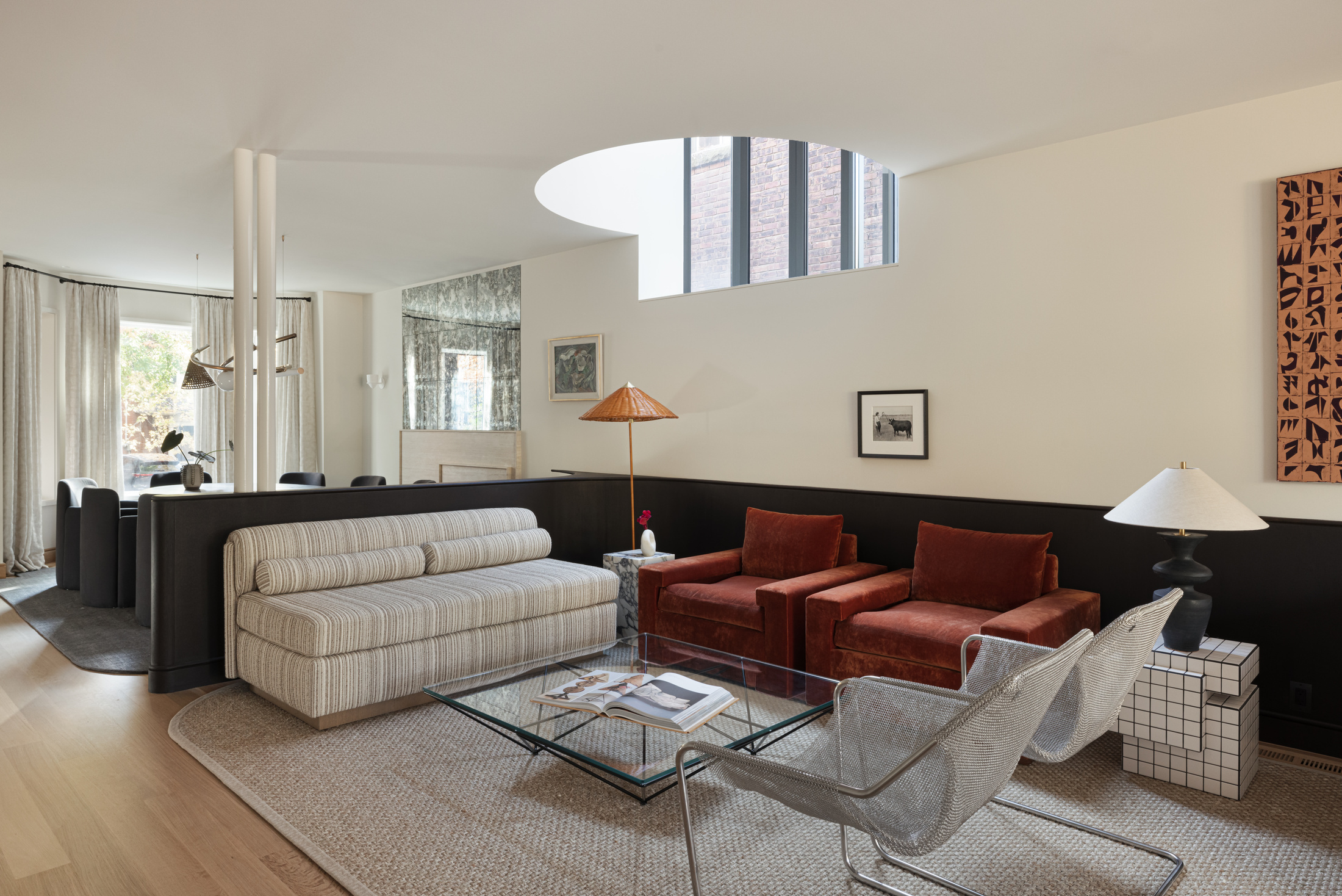
The main living area of this home creates an impression. It is filled with light and gives off a feeling of ample space. However, one notices that each inch of this wide living area has been given its own purpose, and the open plan has been ‘broken’ into several zones where different activities can be carried out. ‘We wanted to create a space that felt warm, playful, and sophisticated at the same time,’ explains interior designer Gillian Segal, and the careful partitioning of the space achieves just that.
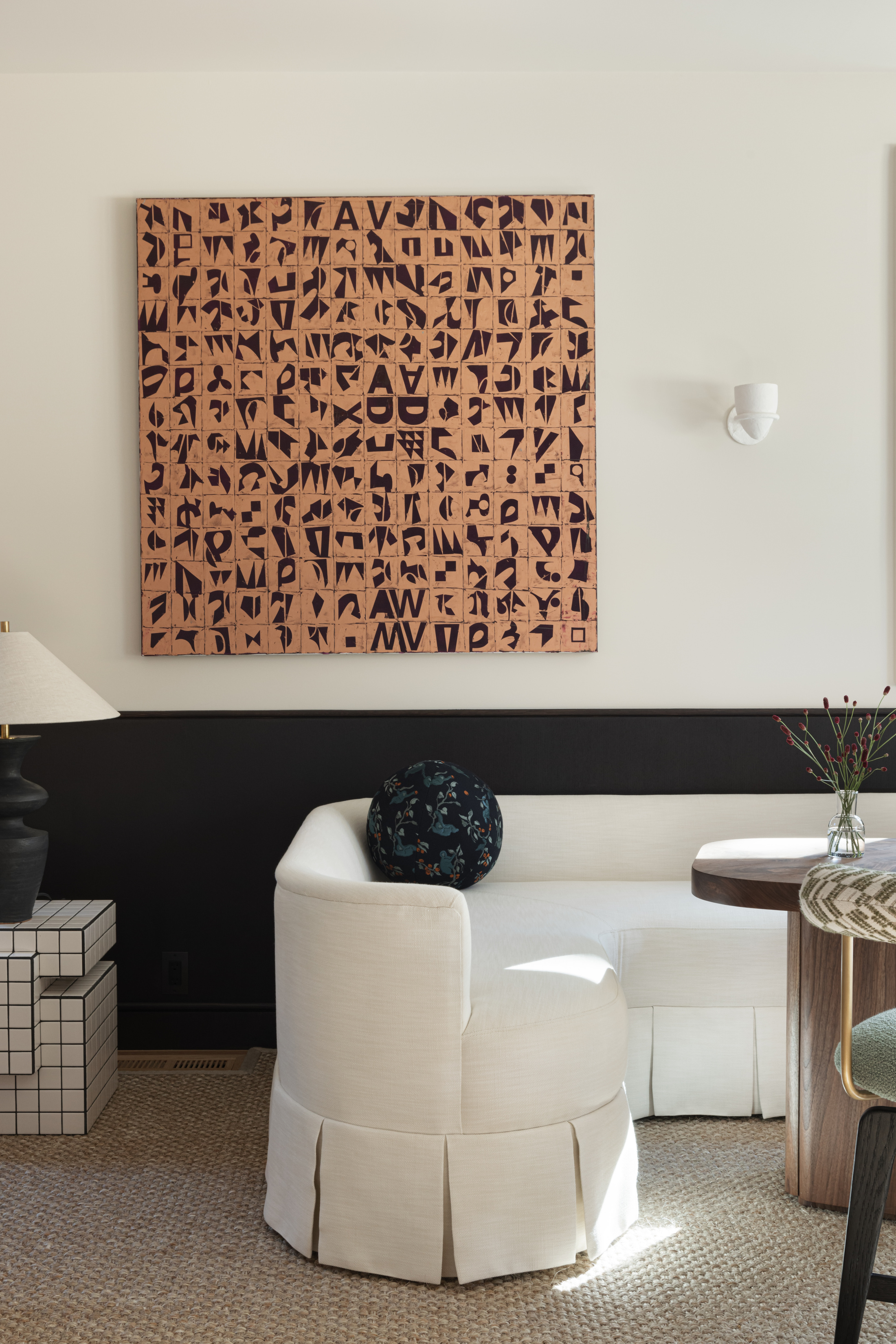
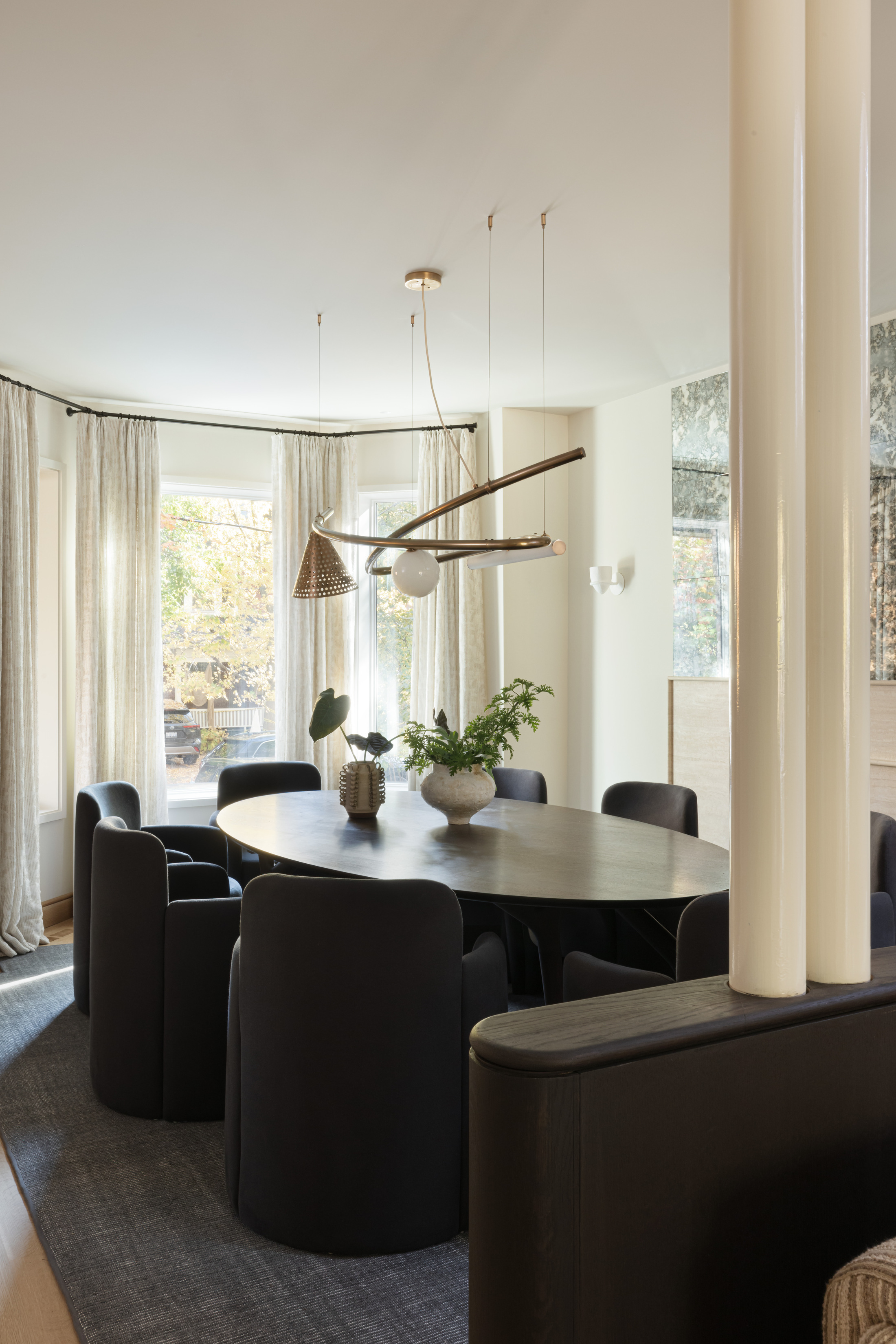
Although an important feature, it’s so beautifully incorporated into the design that it won’t immediately stand out but is an aid to the balanced zoning of the space. A dark-colored panel runs along the wall where the living area is placed and turns a curved corner on one side to enclose it only so slightly and separate it from the dining room area, where the table and chairs pick up the same dark color and create an intimate space within the open plan.
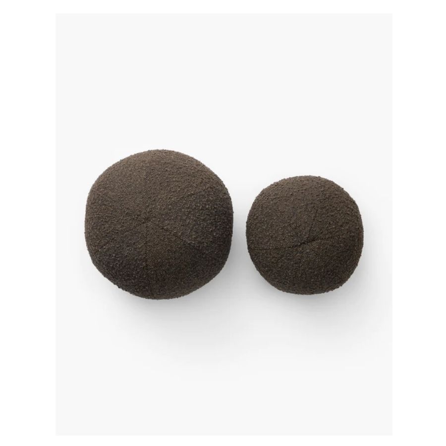
A black dining table is a great way to create an elegant, moody look. The breakfast nook, on the opposite side of the wall, but facing the kitchen, is zoned yet again through the use of a white sofa, with beautiful round throw pillows.
Colors played a role in creating these rooms within a room without interrupting the flow. ‘The team of Gillian Segal was remarkably sensitive to the spatial inclinations in the building, and their confidence in color and material was key,’ says the architect Brian O’Brian. While the living room area feels lighter and more playful with the use of red accent chairs and a light-colored sofa, the dining room is separated through the use of darker colors which give it a more intimate feel.
Be The First To Know
The Livingetc newsletters are your inside source for what’s shaping interiors now - and what’s next. Discover trend forecasts, smart style ideas, and curated shopping inspiration that brings design to life. Subscribe today and stay ahead of the curve.
‘The design was also very strategic about area rugs with custom cut unique shapes and curved corners to fill out the curves of the space perfectly,’ adds the interior designer, and we notice how the rugs almost create the ‘boundaries’ of these separate spaces.
A choice of bold colors and materials that add character
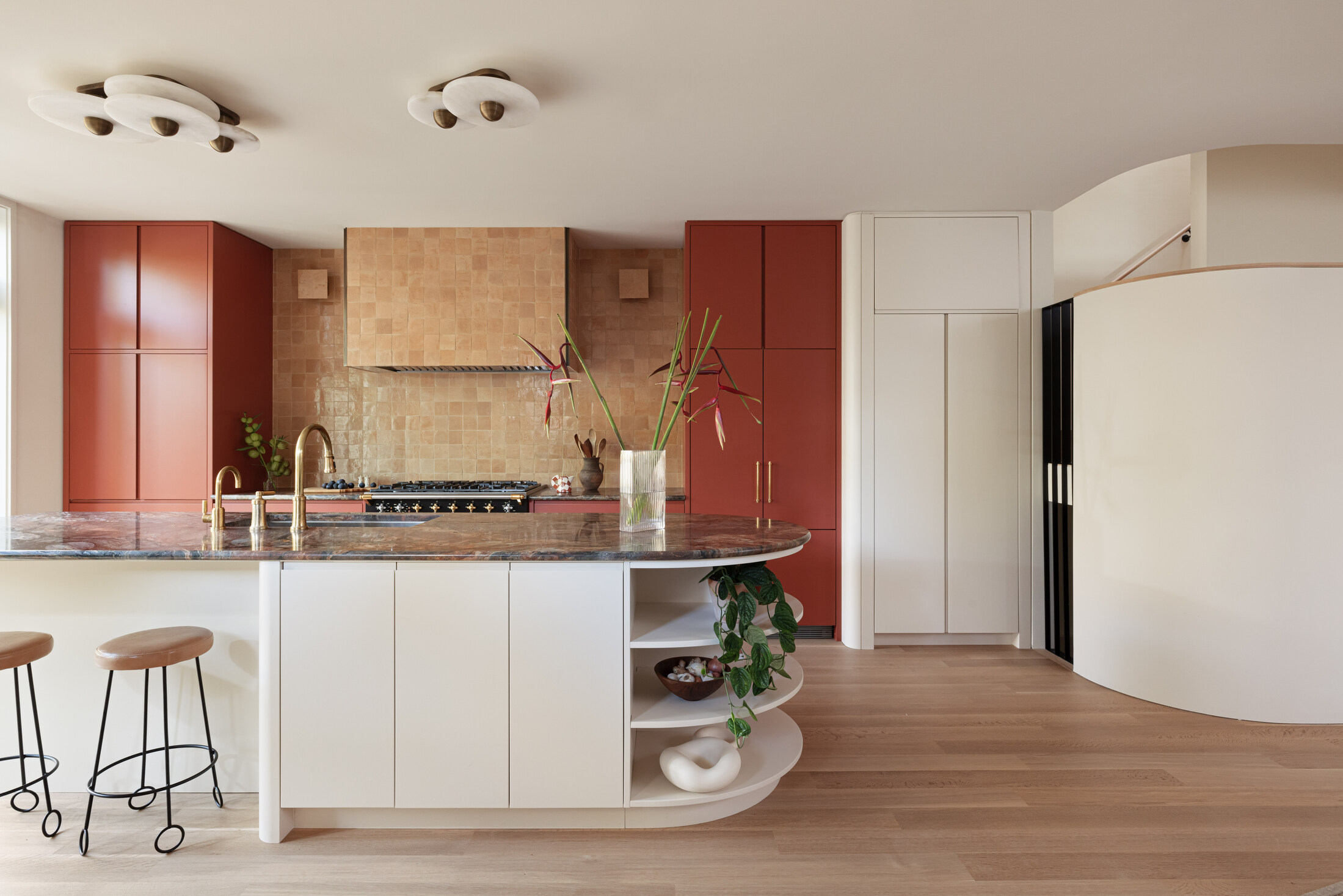
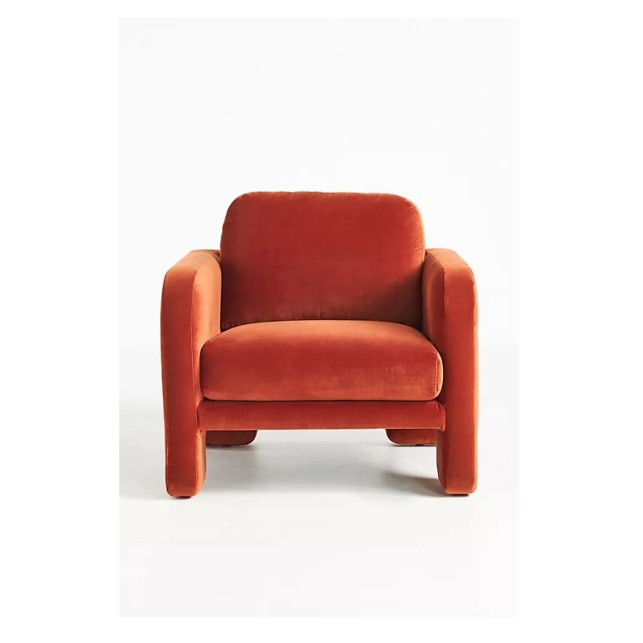
Although most walls of this home are painted in a beautifully warm and sunny off-white, color was brought in through bold accents that create a sense of both fun and sophistication. ‘Our client brief was that she wanted bold, she wanted unique and she wanted color - this was music to our ears,’ Segal explains. A beautifully rich, rusty red was used on the kitchen cabinets, mirroring the accent armchairs in the same color, on the other side of the space, in the living area. These accent chairs from Anthropologie will be a sure way to recreate the look. This creates a balance and grounds the space. The kids’ rooms are both color-drenched in blue and green, creating a very soothing atmosphere.
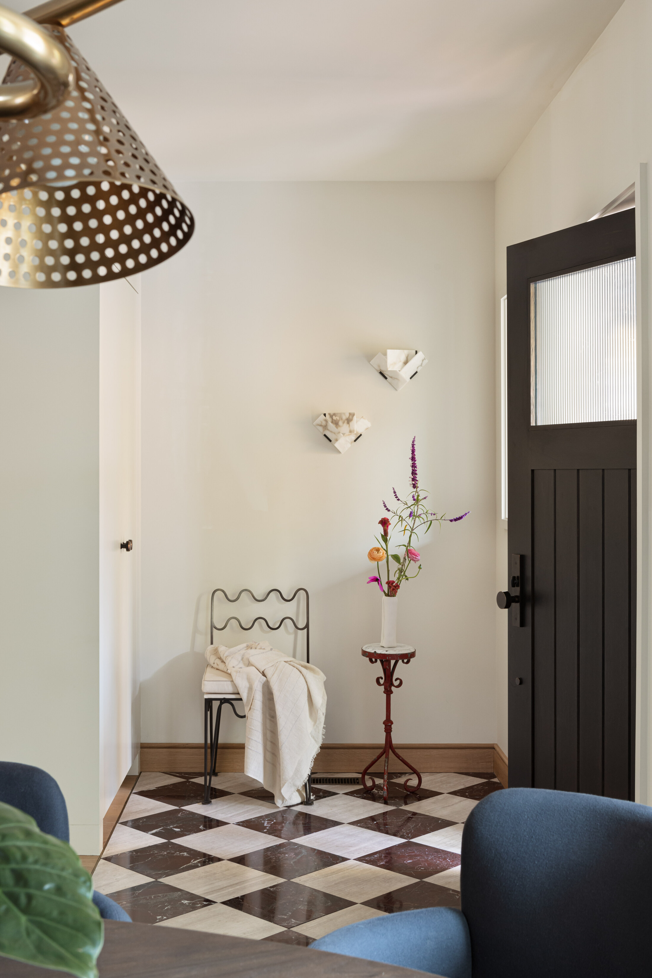
Color is brought in through the choice of materials too, particularly bold marble, which is both a hallmark of Gillian Segal’s work and suited the homeowners’ sensibilities. ‘We chose to use the materials in a way that had historical reference - such as the contemporary cement tile used in a classic checkerboard print or stained wood wainscoting used in a streamlined and contemporary method,' Gillian says.
'We wanted materiality choices to support the overarching design contempt which was a tension between the older elements of the original home and new contemporary features,’ she explains.
The look of the bathrooms was elevated through the use of the material: a deep green marble vanity worktop in one of the bathrooms, while another features a beautiful red-brown with white veining.
An atmosphere that is inspired by a quirky aesthetic
This design works so well because it’s all in respect of the architecture of the space, and its traditional references. A modern, unique home was created by mixing the old with the new in a balanced way, the new complementing the traditional.
‘I think traditional references paired with elements of unexpected quirk and some dramatic choices (like the red kitchen) give this home gravitas while feeling extremely approachable at the same time,’ says interior designer Gillian Segal adding that ‘it was a colour-infused blend of contemporary, traditional and art deco inspired elements that really had us thinking outside the box,’ and we love the result.
Recreate the look of this perfectly zoned living space with these buys
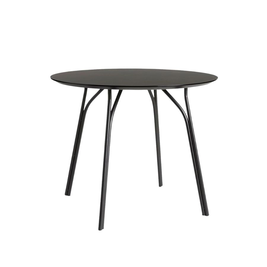
Price: $1,799
Recreate the look of this elegant dining room with a black table and chairs. Keep the walls a soft white, and accessorize with artwork and flowers.
Raluca formerly worked at Livingetc.com and is now a contributor with a passion for all things interior and living beautifully. Coming from a background writing and styling shoots for fashion magazines such as Marie Claire Raluca’s love for design started at a very young age when her family’s favourite weekend activity was moving the furniture around the house ‘for fun’. Always happiest in creative environments in her spare time she loves designing mindful spaces and doing colour consultations. She finds the best inspiration in art, nature, and the way we live, and thinks that a home should serve our mental and emotional wellbeing as well as our lifestyle.
-
 My 10 Favorite Designs at Milan Design Week 2025 — Out of the Hundreds of Pieces I Saw
There is a new elegance, color, and shape being shown in Milan this week, and these are the pieces that caught my eye
By Pip Rich
-
 Iridescence Is Chrome’s More Playful, Hard-to-Define Cousin — And You're About to See It Everywhere
This kinetic finish signals a broader shift toward surfaces that move, shimmer, and surprise. Here's where to find it now
By Julia Demer
