This Designer's "Room by Room" Reno of Her Own Home Features the Most Magical Glass Furniture
By embracing a colorful piece of contemporary design, designer Sha Wang has brought an unexpected joy to a 1960s ranch style house made modern

The Livingetc newsletters are your inside source for what’s shaping interiors now - and what’s next. Discover trend forecasts, smart style ideas, and curated shopping inspiration that brings design to life. Subscribe today and stay ahead of the curve.
You are now subscribed
Your newsletter sign-up was successful
There are some pieces of furniture that are so bold, so truly out there, that even as a design editor, I struggle to imagine the sort of home they fit into in the real world. It's how I've often felt about 'Shimmer' by Glas Italia — a series of colorful iridescent glass furniture that's undoubtedly beautiful, ethereal even, but steals the show to such a degree that it's hard to visualize the type of everyday interior it lives in.
That is, until you step into a house like Sha Wang's. In the West Vancouver home that Sha, the founder of design studio Atelier Fēn, has designed for her family (husband Jason, 10-year-old son Emjae and a shiba inu puppy Kenji), the designer has worked out the formula for integrating exciting pieces of design, including a Shimmer console and table, into a cozy, liveable and modern home, that never feels like an art gallery.
The interior scheme Sha has created hangs on the tension of color vs non-color throughout the spaces — but it's a space of texture and nuance, that feels like a collection of her favorite things, drawn together cohesively, rather than chasing a trend or too narrow a style. It feels authentic, no doubt thanks to the process by which Sha had to design it while living there with her family.
Article continues below"Since we were residing in the house during the renovation, we tackled one area at a time before moving on to the next," the designer says. "The project began with the redesign of the kitchen and dining room, followed by the bathrooms, and so on. "This room-by-room approach meant her ideas, her opinions, even her taste, evolved over the course of the project.
Here, the designer walks us through the spaces she's curated, and the hero pieces of the design that inspire her daily.
Light and color
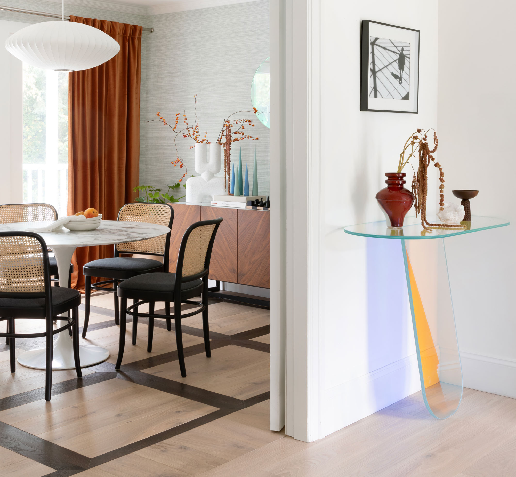
From the outset, it's clear that there's going to be more than meets the eye to the design of this home. Glas Italia's Shimmer console greets you in the home's entryway, a statement of intent for how this home plays with color in an unexpected way.
"What I love about the iridescent Glas Italia table and console is their ability to transform the ambiance of a room with their vibrant, ever-changing hues," Sha tells us. "They introduce a dynamic element that captures and reflects light in a captivating way, adding depth and interest to the space. Their unique color play make them standout pieces that elevate the overall aesthetic," she adds.
The Livingetc newsletters are your inside source for what’s shaping interiors now - and what’s next. Discover trend forecasts, smart style ideas, and curated shopping inspiration that brings design to life. Subscribe today and stay ahead of the curve.
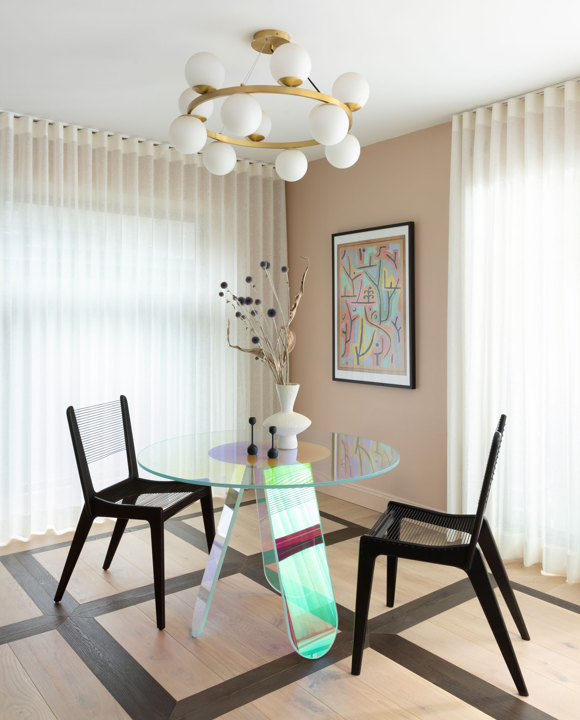
It's a piece of furniture that evokes a feeling — be that the joy of the color, or the dreaminess of its iridescent shine.
"These pieces make me feel inspired and invigorated," Sha says. "In a real space, their interaction with light creates a mesmerizing display of colors and reflections that change throughout the day. This play of light and color brings a sense of movement and energy, making the space feel alive and constantly evolving."
Liveable art
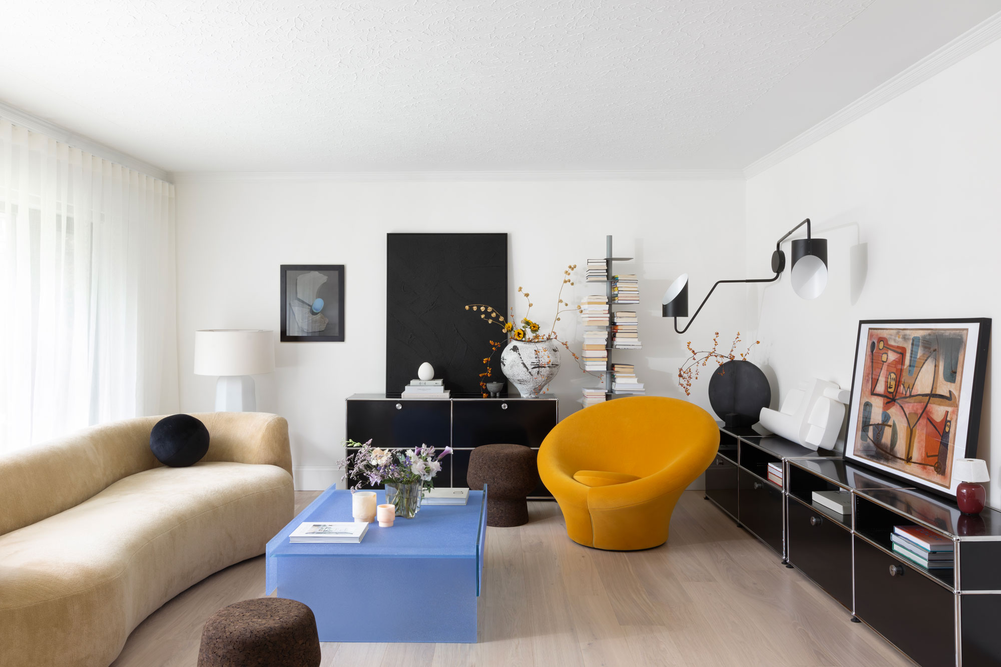
In Sha's living room, another piece of glass furniture takes centerstage, albeit with a different feel to her other pieces. Called the Simoon, by Glas Italia, the coffee table has a milky-blue, opaque finish — a block of color that at the same time has a hazy lightness that makes it feel less solid. "Living with it feels like having a piece of functional art that effortlessly blends with its surroundings," Sha says. "The surface is coated with a special grit in ground Murano glass so it is not smooth, it has some subtle texture and exudes a sense of chic and understated glamor."
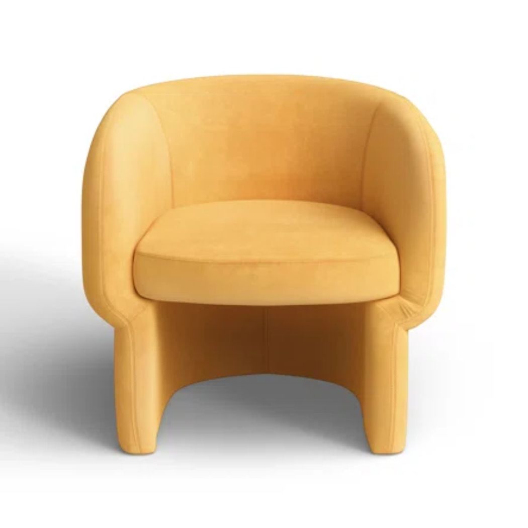
Along with a bold yellow accent chair and a sinuously-curved mohair couch ( the FAO sofa by Christophe Delcourt), Sha opted for freestanding units over built-in storage ideas with these modular USM cabinets. "I find joy in rearranging furniture, and this decision provides me with the flexibility I like,” she says. “The sculptural aesthetics of the furniture pieces and accessories bring daily delight into my space."
A good base
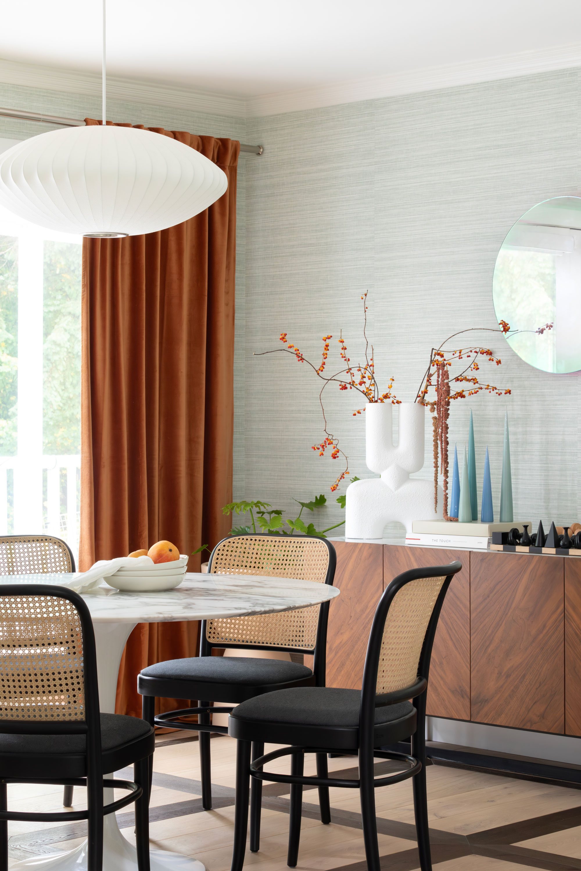
A clever idea instantly elevates the dining and kitchen flooring — a simple mix of dark oak and light oak floor arranged into a gridlike pattern that gives this room a sense of grandeur, like a modern take on a parquet design.
This dining room opens out onto the second floor terrace and, seeking to blend the indoor and outdoor spaces, Sha opted for Phillip Jeffries linen wall covering, introducing a subtle green hue that harmonizes with the scenic views from the terrace. Complementing the wall decor, an iridiscent yellow-tinged mirror, again from Glas Italia, brings a modernity to the room, while the addition of orange velvet curtains brings a warm and substantial texture, enhancing its fullness and inviting ambiance.
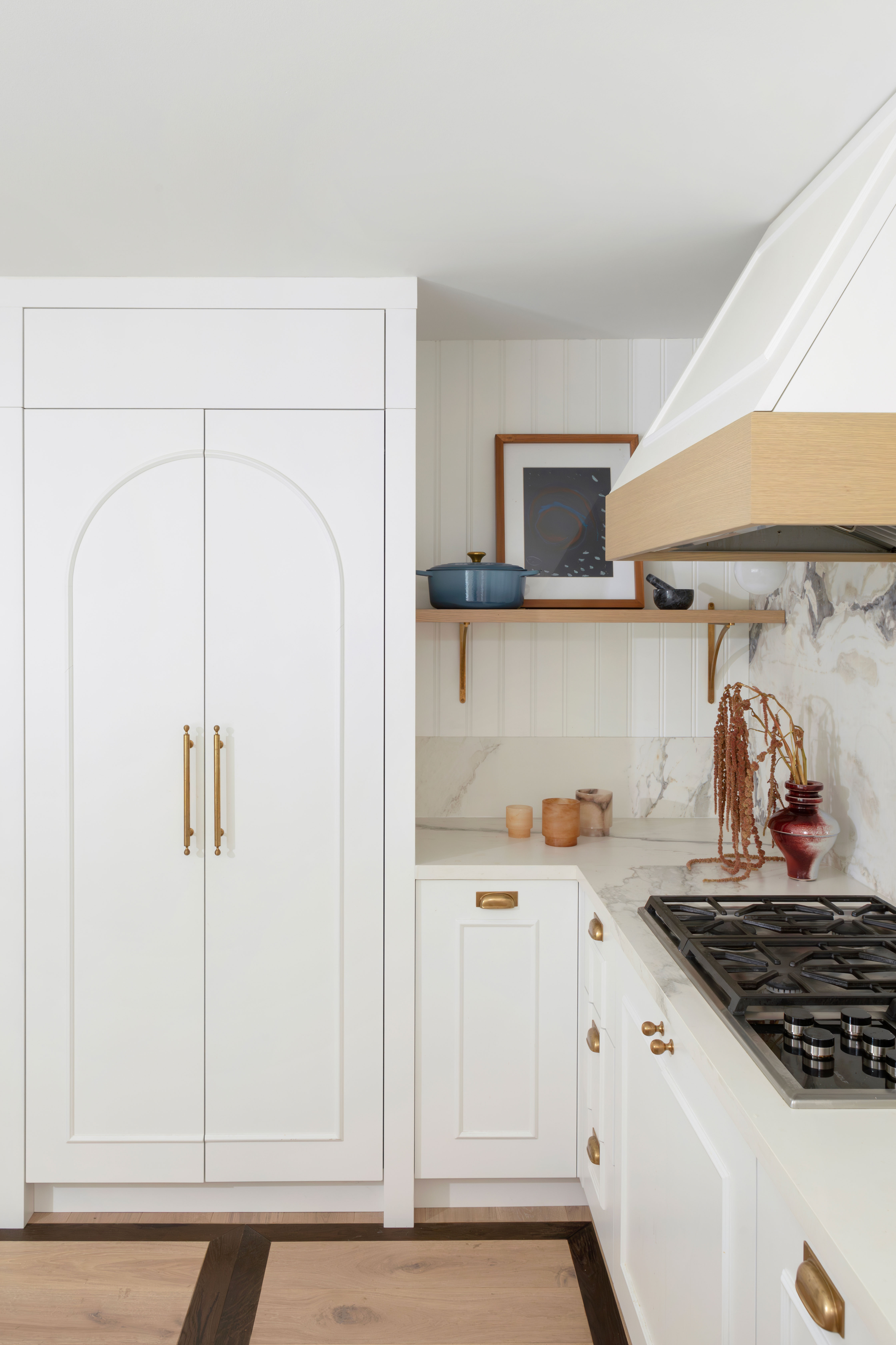
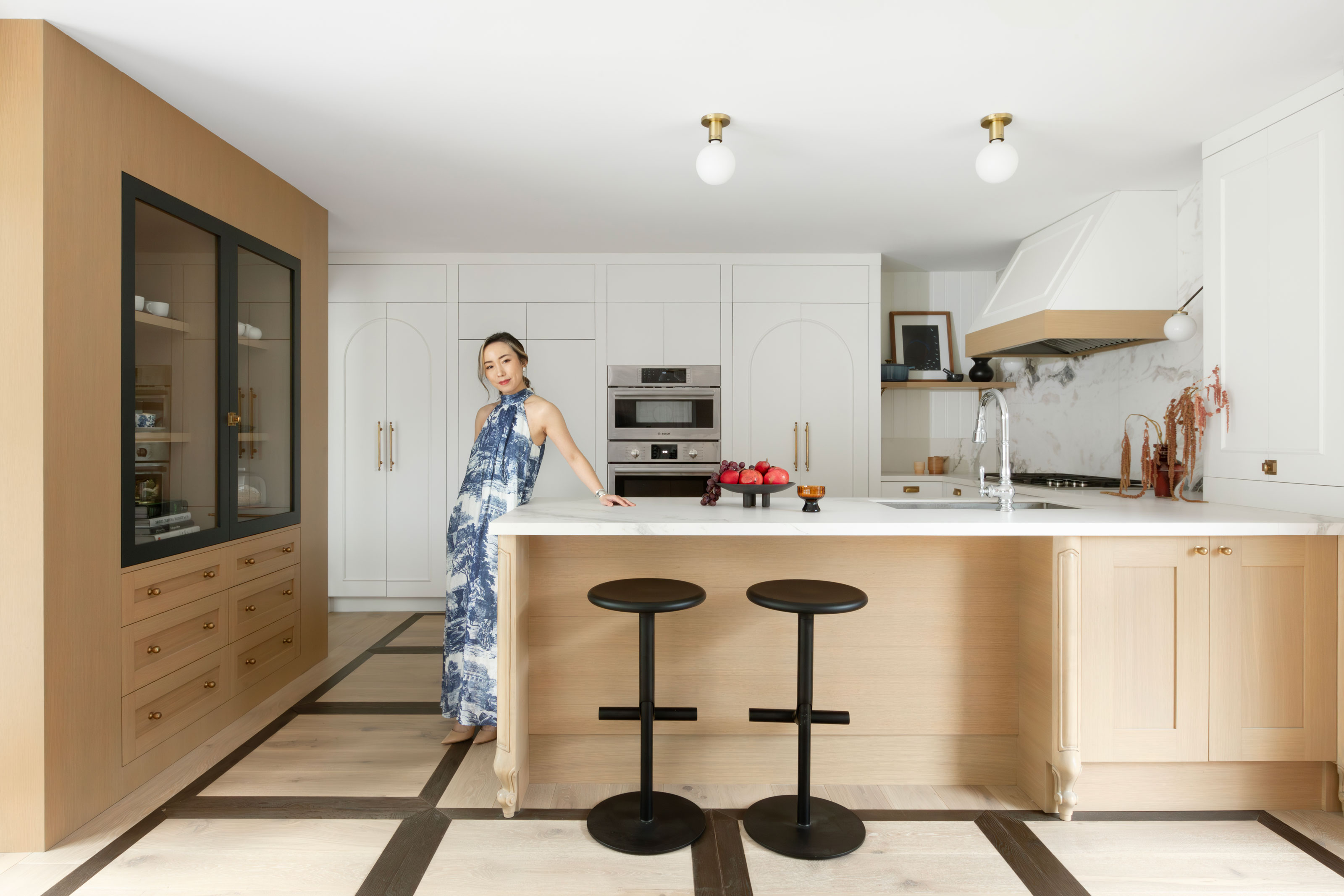
Though a simpler palette than some of the other rooms in the house, Sha's white kitchen isn't without its own whimsy. “I've always envisioned having a white kitchen with white oak elements,” says Sha. “While it might not be the trendiest or make a bold statement, the calm and warm feeling it gives me is timeless."
To elevate the design beyond the ordinary, the designer opted for a slab door with kitchen cabinet molding and trim, over a classic Shaker, which culminates in a fun arched motif on the larger pantry doors.
For the surfaces, Sha has matched beauty with practicality — large porcelain slabs for the kitchen countertops for this material's functional superiority, with a pretty marble for the backsplash to bring something extra to this neutral space. "Oyster white marble introduces character to the white kitchen without being too busy or overwhelming," she says. "It serves as a statement piece with organic vine patterns."
Sha maintained the original layout of all the kitchen appliances but upgraded them with new ones. This decision proves crucial as it significantly saves costs and time on plumbing and electrical work.
Saving graces
In spite of the litany of designer pieces throughout this Vancouver home, it wasn't a renovation with a carte blanche budget. Sha's experience as a designer allowed for an organized project and condensed timeline, which kept costs down. She took proactive measures, such as ordering kitchen cabinets and countertops two months in advance. From the demolition's commencement to the completion of the kitchen, the process of this space took just three weeks, with the whole house renovation lasting only a year.
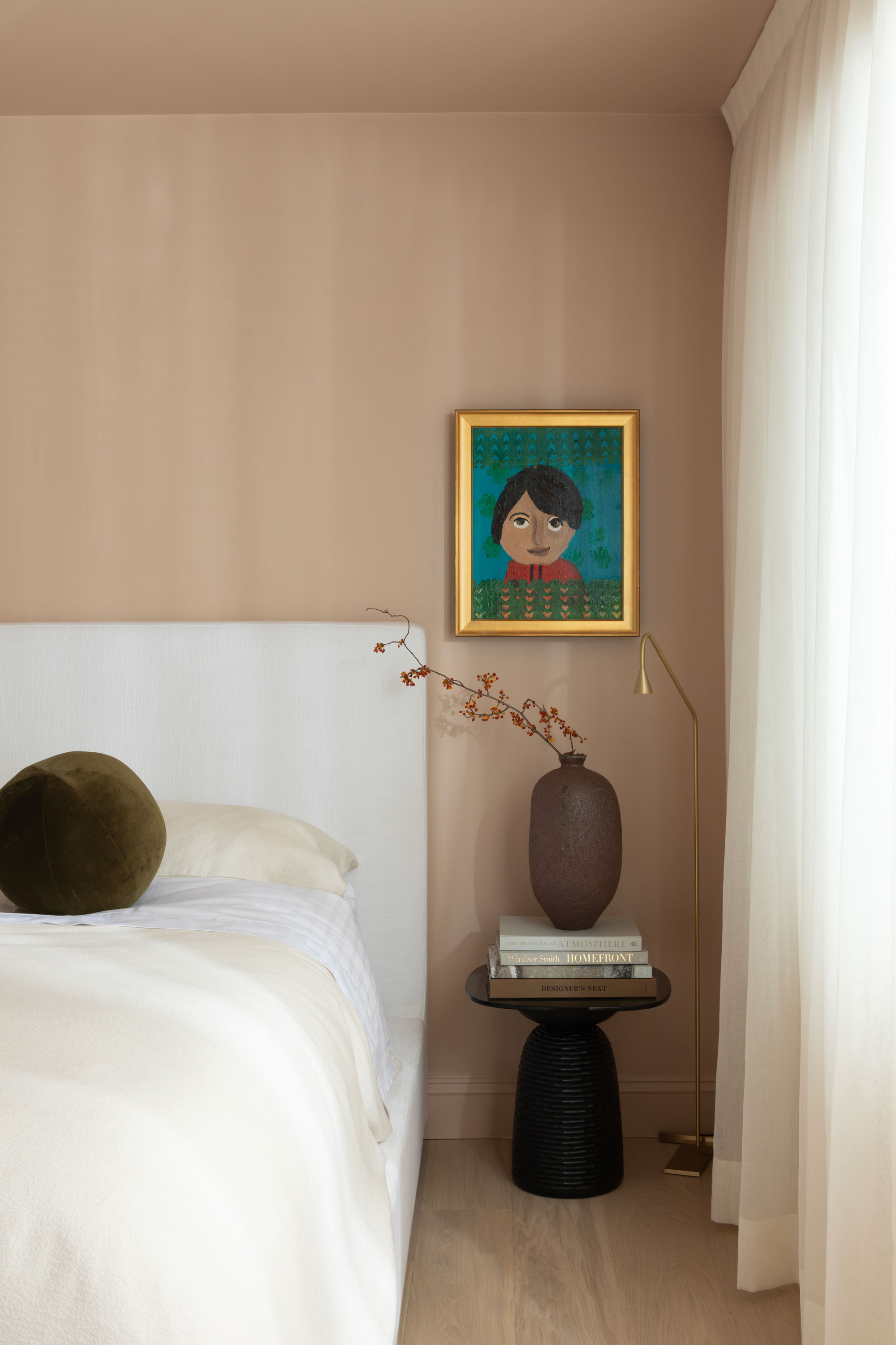
Moreover, Sha had to make compromises between her ideal vision and the practical constraints of staying within a budget. A space like the bedroom was one such compromise, not that the design suffers for it. While Sha had originally wanted to use a wall covering, due to budget constraints, she opted for paint instead. "Fortunately, my husband concurred on the color choice — a remarkably refined shade of pink," she says. "For the walls, ceiling, and trim, we settled on Farrow and Ball's Setting Plaster No. 231."
Now color-drenched in pink, this retreat feels cozy and comforting.
For the interior designer, designing a home for her own family was a unique challenge compared to her studio's other projects.
"Designing my own house becomes more intricate due to my tendency to overthink, and the pursuit of perfection sometimes leads me to carefully consider and refine my choices," Sha says. "As a designer, I'm aware of an extensive range of design possibilities and styles, making it challenging to narrow down options and establish a specific design direction for my home."
Yet, it's undoubtedly one of the strengths of this design — as much as it feels like an expression of Sha's most interesting ideas as a designer, it also feels original and authentically curated.

Hugh is Livingetc.com’s editor. With 8 years in the interiors industry under his belt, he has the nose for what people want to know about re-decorating their homes. He prides himself as an expert trend forecaster, visiting design fairs, showrooms and keeping an eye out for emerging designers to hone his eye. He joined Livingetc back in 2022 as a content editor, as a long-time reader of the print magazine, before becoming its online editor. Hugh has previously spent time as an editor for a kitchen and bathroom magazine, and has written for “hands-on” home brands such as Homebuilding & Renovating and Grand Designs magazine, so his knowledge of what it takes to create a home goes beyond the surface, too. Though not a trained interior designer, Hugh has cut his design teeth by managing several major interior design projects to date, each for private clients. He's also a keen DIYer — he's done everything from laying his own patio and building an integrated cooker hood from scratch, to undertaking plenty of creative IKEA hacks to help achieve the luxurious look he loves in design, when his budget doesn't always stretch that far.

