This designer chose two "supersized" couches over a sectional for one reason only – and it makes so much sense
This welcoming open plan living room is at the heart of a modern home on Seattle's waterfront

The Livingetc newsletters are your inside source for what’s shaping interiors now - and what’s next. Discover trend forecasts, smart style ideas, and curated shopping inspiration that brings design to life. Subscribe today and stay ahead of the curve.
You are now subscribed
Your newsletter sign-up was successful
The owners of this modern home in Seattle, with views out over the waterfront, are transplants from Los Angeles, moving with their 10-year-old twins to the property. It's not a particularly old house, the architects and designers at Hoedemaker Pfeiffer, who were tasked with renovating the home, explain, but it still needed modernization. 'This was a renovation of a home built in 2012; the interior architecture was not very old, but it did not fit the aesthetic parameters of the client, or our firm,' explain Tim Pfeiffer and Peak Petersen, of Hoedemaker Pfeiffer.
The design team transformed the traditional interiors of the home with a fresh, Spanish-Colonial look, using textiles and materials that would patina well - something that would help this home stay timeless, even with two young children.
It was important that they create a modern home that evokes tranquil living where they can relax and unwind, as both homeowners are passionate about sustainability and living a well-rounded lifestyle. And nowhere can this idea be better seen than the home's beautifully proportioned living room, with its deep, inviting sofas. It's a space that sets the tone for a home that encourages calm, that feels like a retreat. Here's how the designers did it.
Article continues belowLiving room
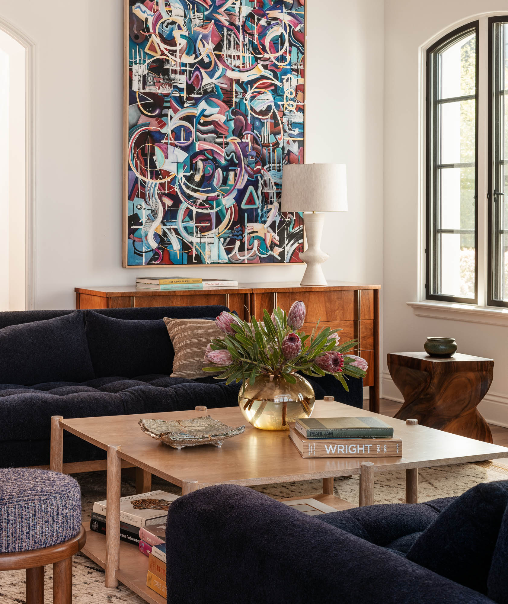
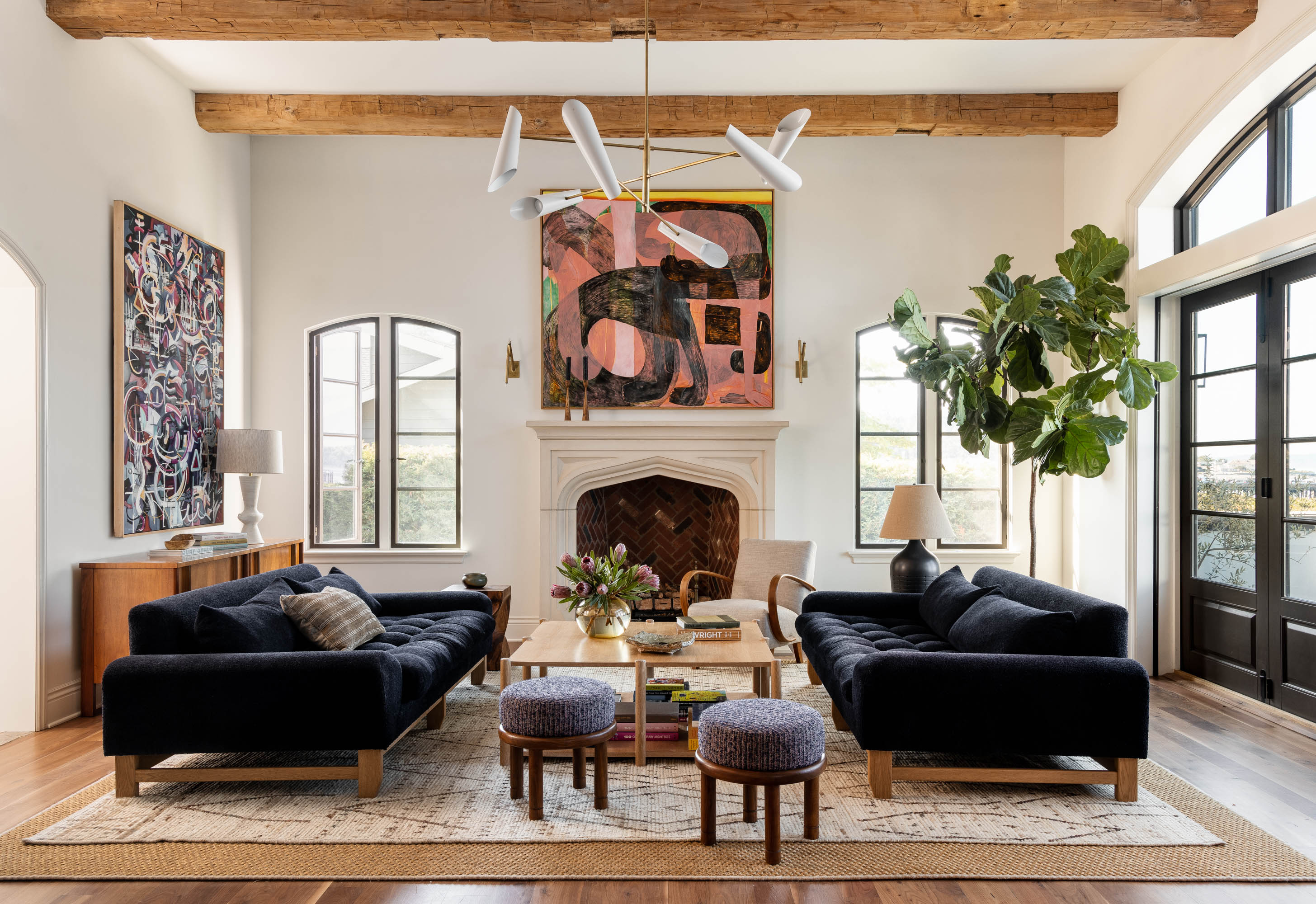
There's something about the sofas that the designers specified for the living room that draw you in and make you want to linger in the space. It's a room that most designers would look to a large, oversized living room sectional to fill, but Tim Pfeiffer and Peak Petersen took a different approach.
'We wanted this room to feel open, flexible in use, and not too precious,' Tim and Peak explain. 'To achieve this goal, we positioned deep, ultra-comfortable Lawson Fenning sofas facing each other for easy conversation with pull-up stools for guests.'
'The room could handle a large sectional, but we did not want to block the entry point from the kitchen to the seating space,' the designers add. 'The sofa pair solved this issue, allowing for easy entry and exit. There are hardy textiles on all pieces so crumbs or small spills are not a stress point, and soft lighting overhead adds a gentle ambiance.'
Kitchen
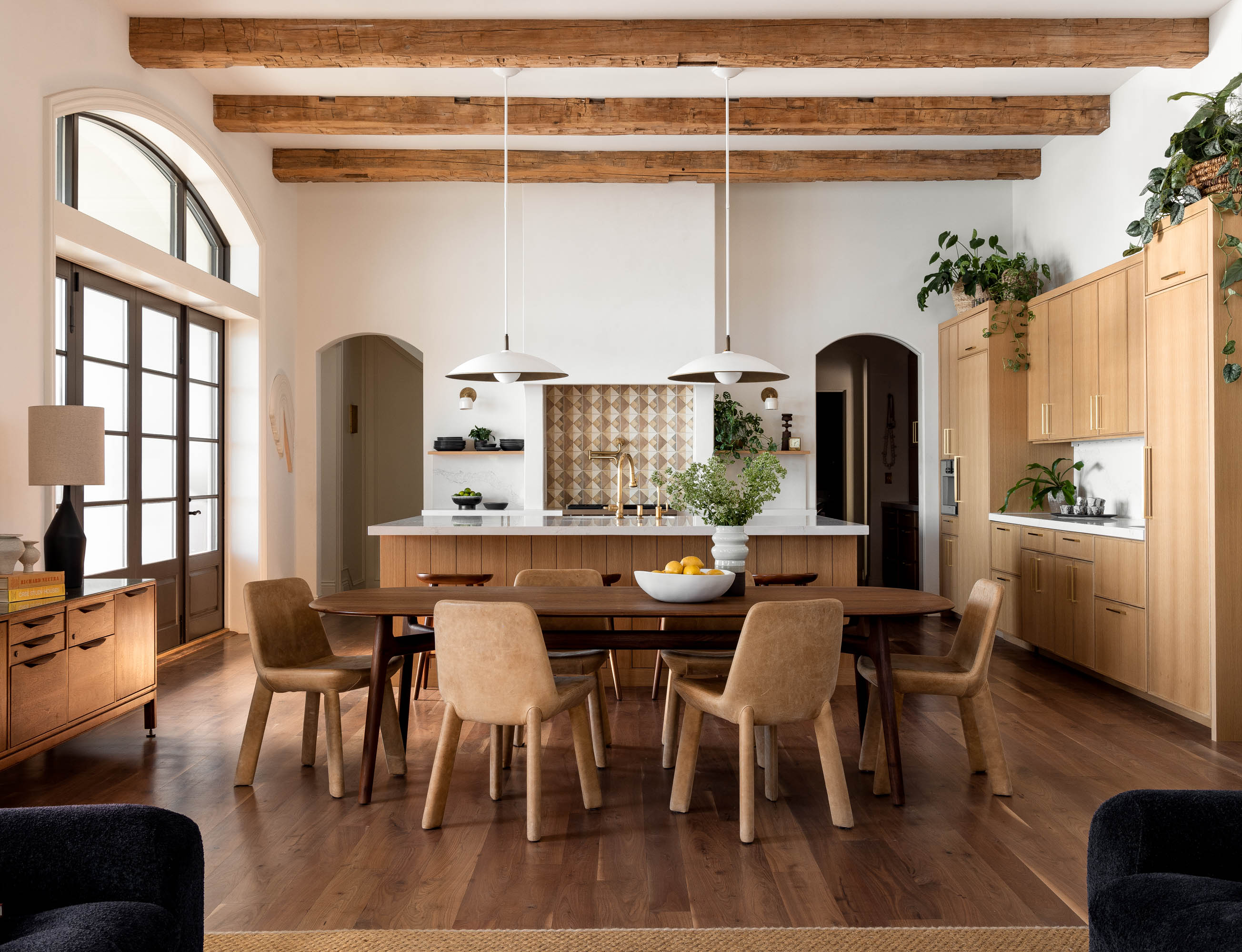
The home's open plan layout sees the main living space divided into three zones - the living room, dining room and the modern kitchen, and for Hoedemaker Pfeiffer, it was important that these spaces felt interconnected.
The Livingetc newsletters are your inside source for what’s shaping interiors now - and what’s next. Discover trend forecasts, smart style ideas, and curated shopping inspiration that brings design to life. Subscribe today and stay ahead of the curve.
'We wanted the kitchen to be reoriented so that the family member preparing food was facing the dining table/seating group,' Tim explains. 'Previously, the island faced the water side of the house, which was not conducive to the connected feeling this tight-knit family was after in the room of the house they would occupy most frequently.'
It's a kitchen that feels pared back and minimalist, mainly thanks to an extra 'back kitchen' that allows for extra storage and appliances to be out of sight of the main kitchen. 'There is a small galley leading to a small laundry room,' Tim explains. 'It is highly functional and has a freezer, microwave and tons of storage.'
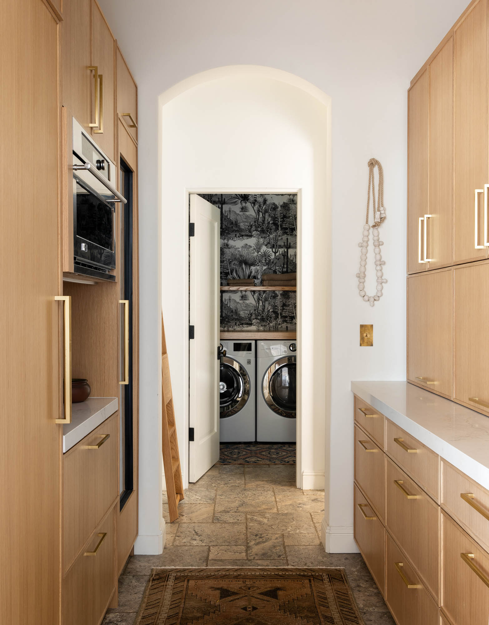
The materials are simple and unimposing, but bring a Spanish Colonial feel to the space. 'The goal was also to keep the materiality natural, free of any sheen, and highly functional,' Peak tells us. 'The natural oak cabinetry and unlacquered brass plumbing and hardware will patina beautifully over time, a characteristic the clients love and appreciate.'
'The countertop material is Caesarstone, a comfortable option for a family with young children who both eat and create artwork while seated at the island,' Peak adds. 'We selected a Tabarka tile for the kitchen backsplash as the hand-painted, one-of-a-kind nature of the product really appealed to us and felt perfect with the unlacquered brass pot filler.'
Main bedroom
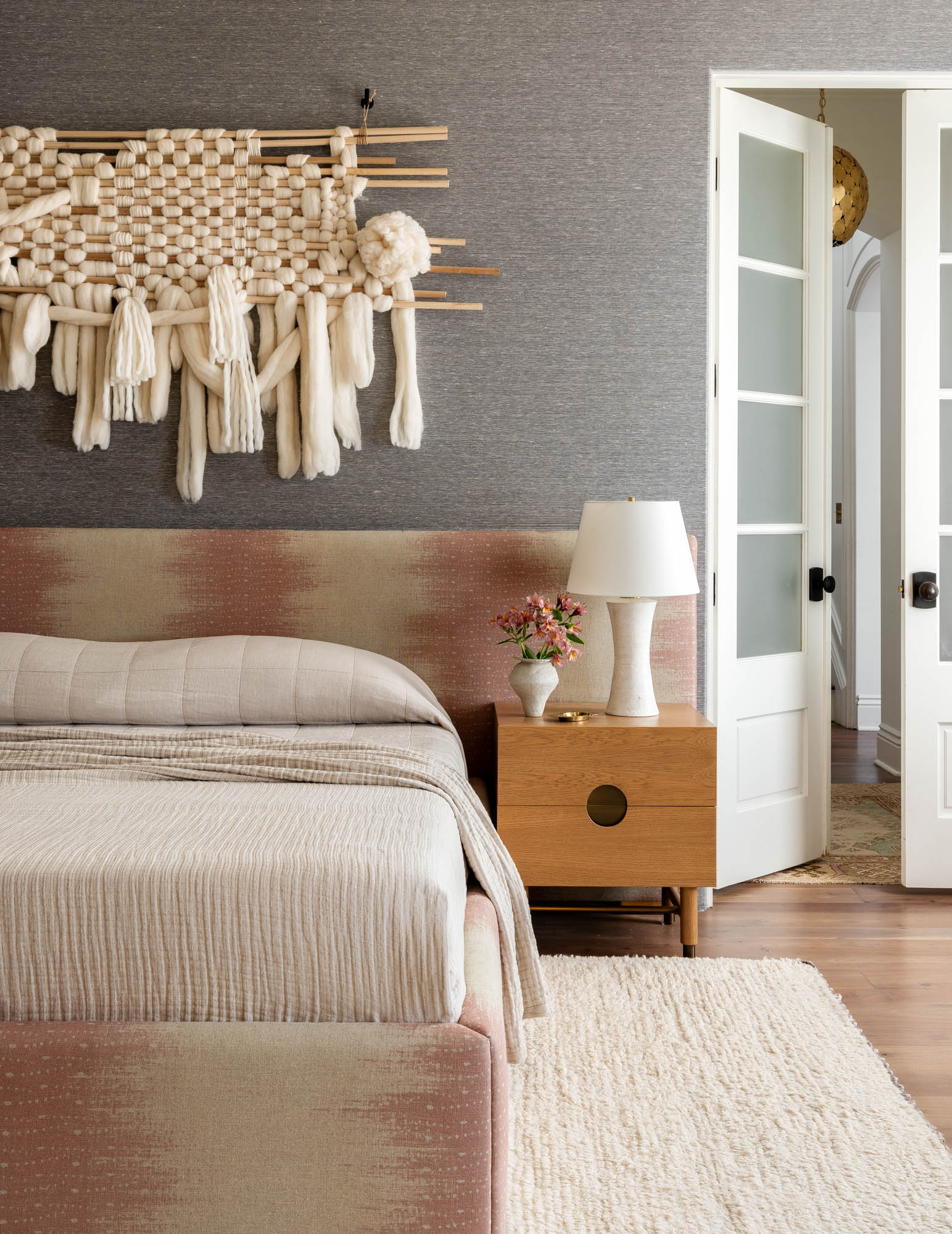
The main bedroom design walks the line between relaxed and elevated perfectly. 'Our collective goal was to make the primary bedroom feel like a tranquil, high-end resort,' Peak tells us. 'We kept the palette neutral and materiality soft. The rug is ivory wool, the custom bed is wrapped in a playful Jennifer Shorto linen, the drapery is a quiet warm white and natural wood is sprinkled throughout the space.'
Some of the more classic elements, from the flooring, coffered ceiling and textured grasscloth, are enlivened with contemporary furniture and art for a more modern bedroom scheme.
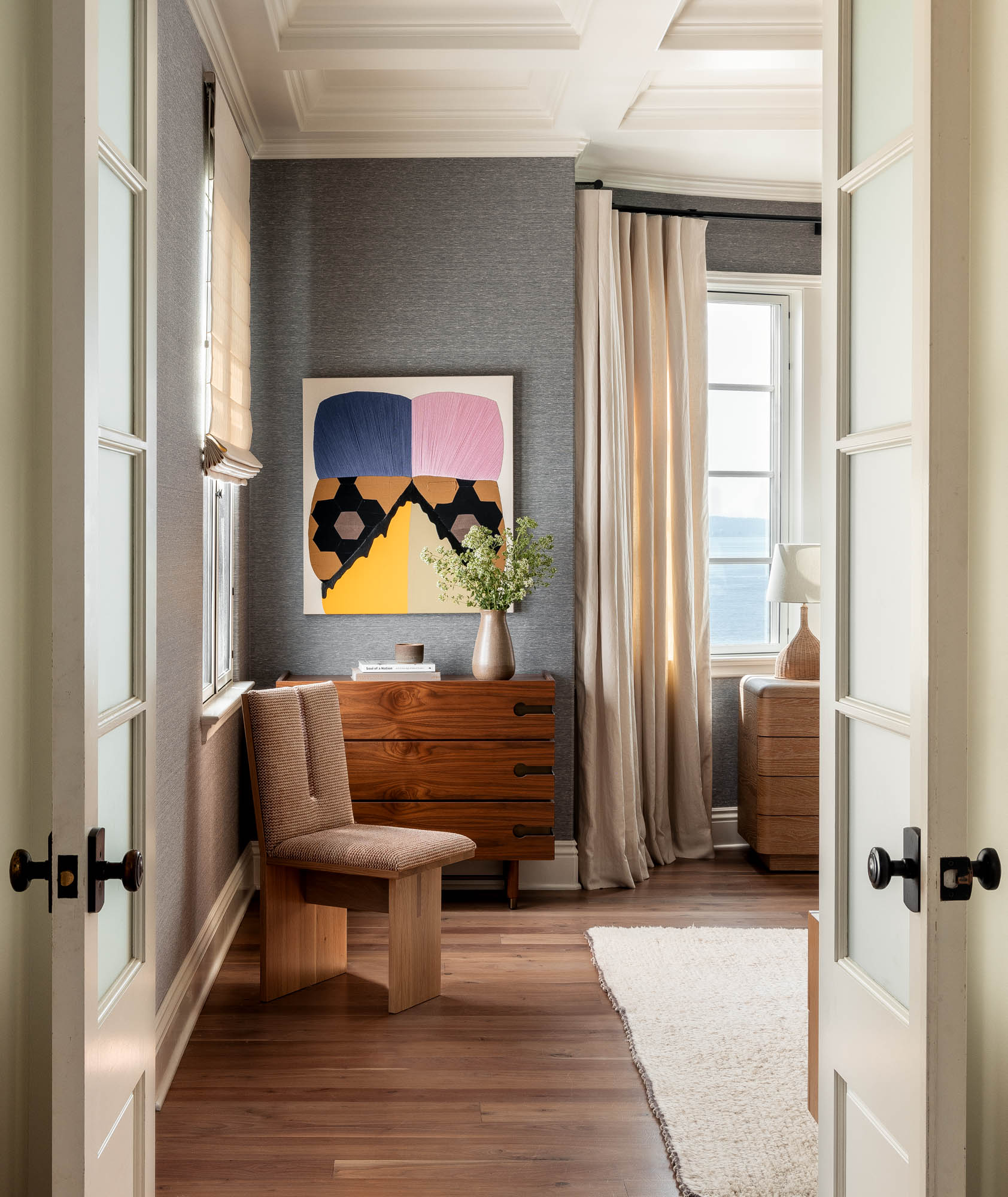
Throughout the home, the property's original walnut flooring was re-finished for a less traditional look. 'When the clients purchased the home, the floor was dark, hand-scraped walnut with a glossy sheen,' Tim explains. 'Refinishing the floors was one of the most impactful changes we made, and high on our list.'
'Our refinisher sanded the walnut below the hand-scraped layer and applied a matte oil stain which lightened the floor and brought the house closer in line to our desired aesthetic,' Tim says.
Main bathroom
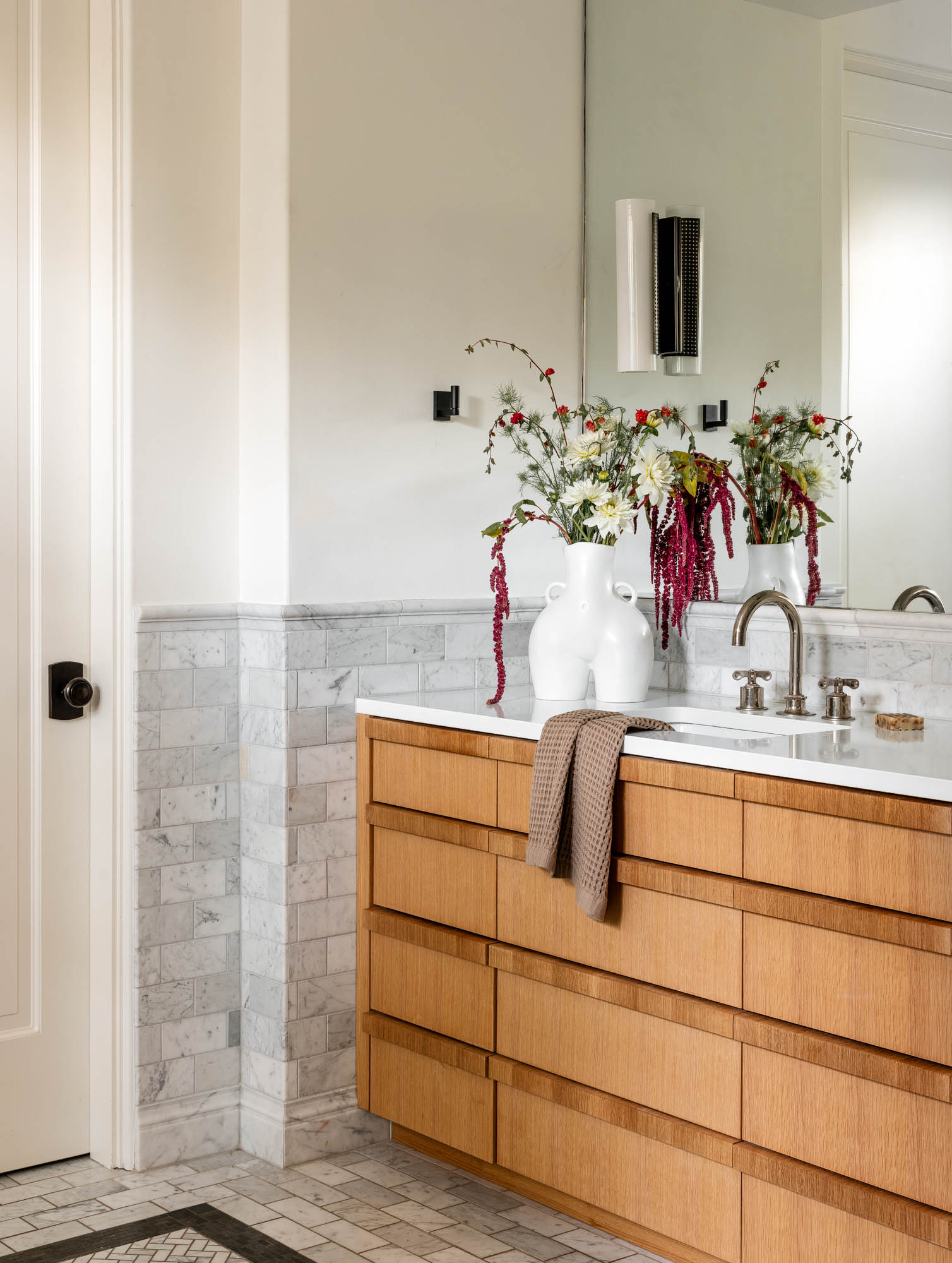
The existing bathroom's layout worked well for the family of four, so it was a space that only required minimal, superficial changes. 'The layout of the primary bath stayed the same, but the casework, lighting, countertop, and plumbing were replaced,' Tim explains. This included a new bathroom vanity and countertop for the space.
'We gave the home a fresh, warm white interior and exterior paint color,' Tim and Peak conclude. And it's this backdrop that provides the perfect canvas for what the designers have done with the space.
It's timeless in that way, with its neutral backdrop and Spanish Colonial styling offering an aesthetic that's "trend-proof", while modern touches through bold artwork and interestingly sculptural furniture pieces make the home feel modern and relevant to now.

Hugh is Livingetc.com’s editor. With 8 years in the interiors industry under his belt, he has the nose for what people want to know about re-decorating their homes. He prides himself as an expert trend forecaster, visiting design fairs, showrooms and keeping an eye out for emerging designers to hone his eye. He joined Livingetc back in 2022 as a content editor, as a long-time reader of the print magazine, before becoming its online editor. Hugh has previously spent time as an editor for a kitchen and bathroom magazine, and has written for “hands-on” home brands such as Homebuilding & Renovating and Grand Designs magazine, so his knowledge of what it takes to create a home goes beyond the surface, too. Though not a trained interior designer, Hugh has cut his design teeth by managing several major interior design projects to date, each for private clients. He's also a keen DIYer — he's done everything from laying his own patio and building an integrated cooker hood from scratch, to undertaking plenty of creative IKEA hacks to help achieve the luxurious look he loves in design, when his budget doesn't always stretch that far.
