With a designer's help, this small apartment's once-awkward corner kitchen is now its highlight
In this small, open-plan apartment, a designer's touch turned this uncomfortable kitchen layout into the heart of this home
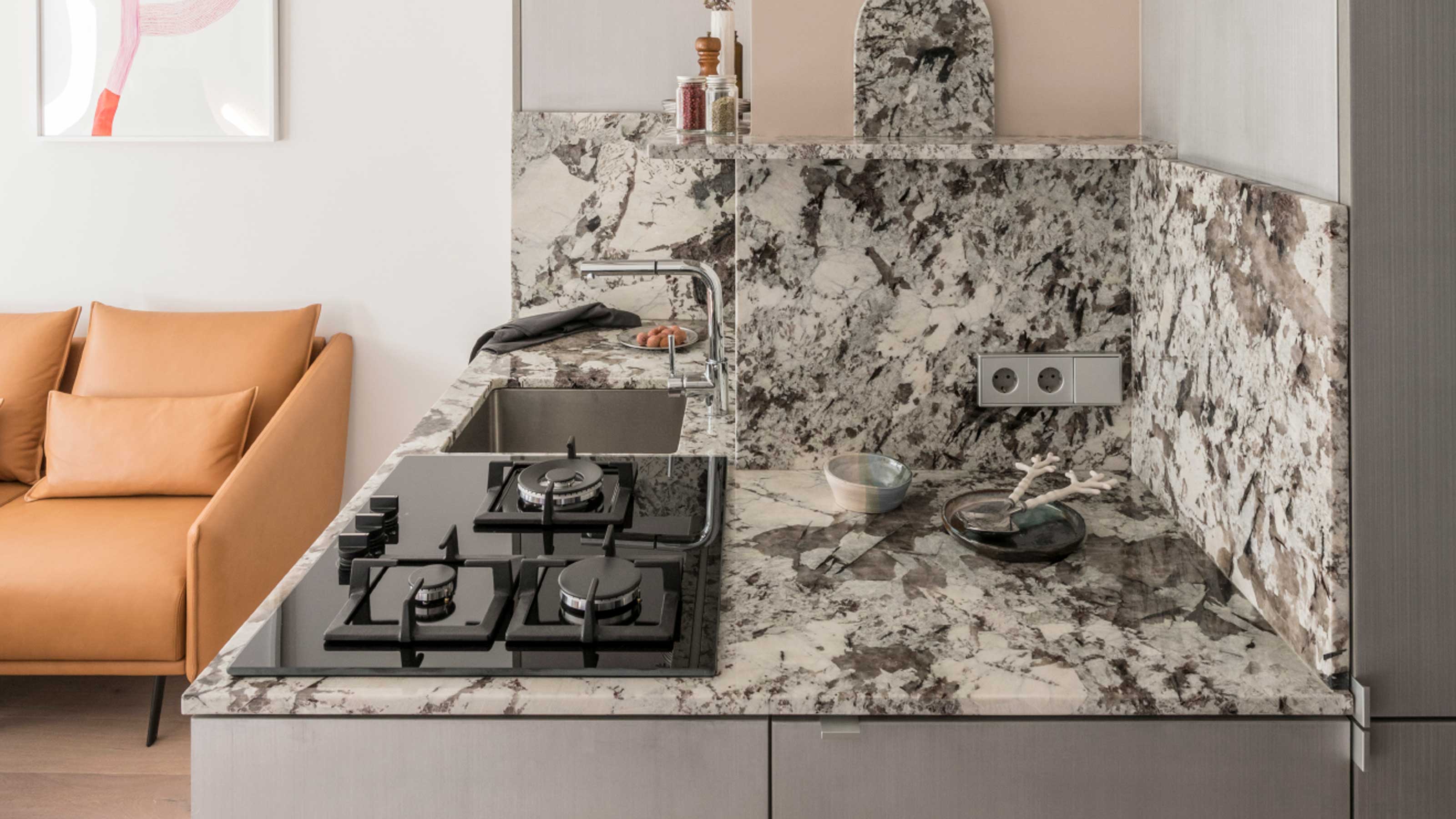

Sometimes, there's little you can do with an inherited floorplan. For this small apartment in Barcelona, for example, there was little the owner could do about the awkward arrangement of the space which saw a kitchen wrapping around an external corner.
'The apartment had a very poorly distributed living area that created an uncomfortable kitchen corner that narrowed and darkened the space,' explains Andrea Serboli and Matteo Colombo, cofounders of Colombo and Serboli Architects. 'The project had to revert this without changing the existing partitions.'
However, by embracing the right materials, this kitchen has become the highlight of this modern home – while also become a more functional room to use. Take a tour below.

Hugh is Livingetc.com's deputy editor, and an experienced homes and design journalist. Here, he shows you around a compact apartment in Barcelona with an interesting layout.
Style and substance
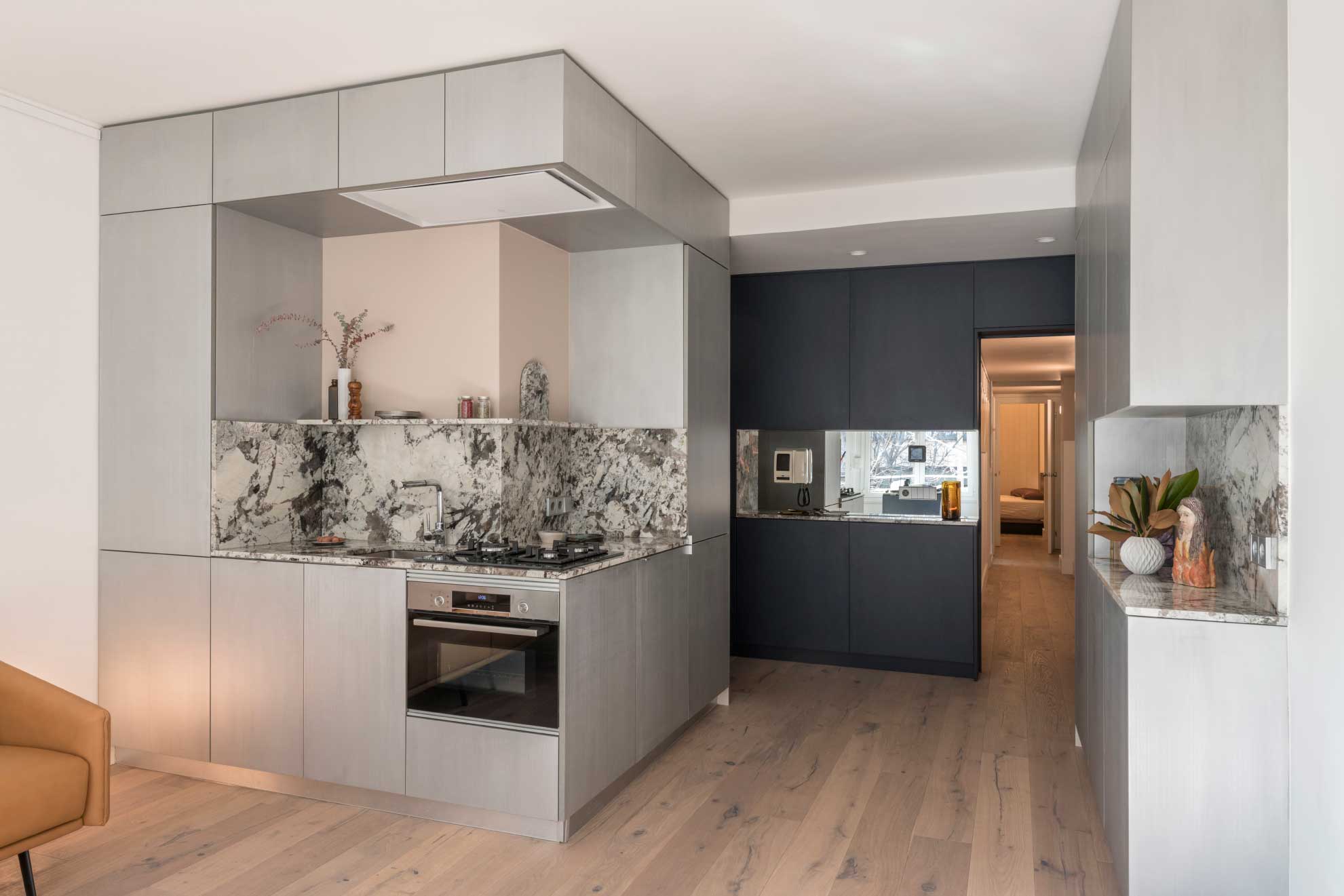
Decorating the apartment saw the architects introduce three units to define the scheme. 'On the side of the entrance, [we introduced] a blue-black storage unit separated the day area from the night area, while dramatically creating a backdrop to the new central piece of the project: the kitchen and bar area.' Andrea and Matteo of Colombo and Serboli Architects explain. 'Clad in hand-brushed aluminum panels, they form two elements in conversation, that wrap around existing pillars and installation, regularizing shapes.'
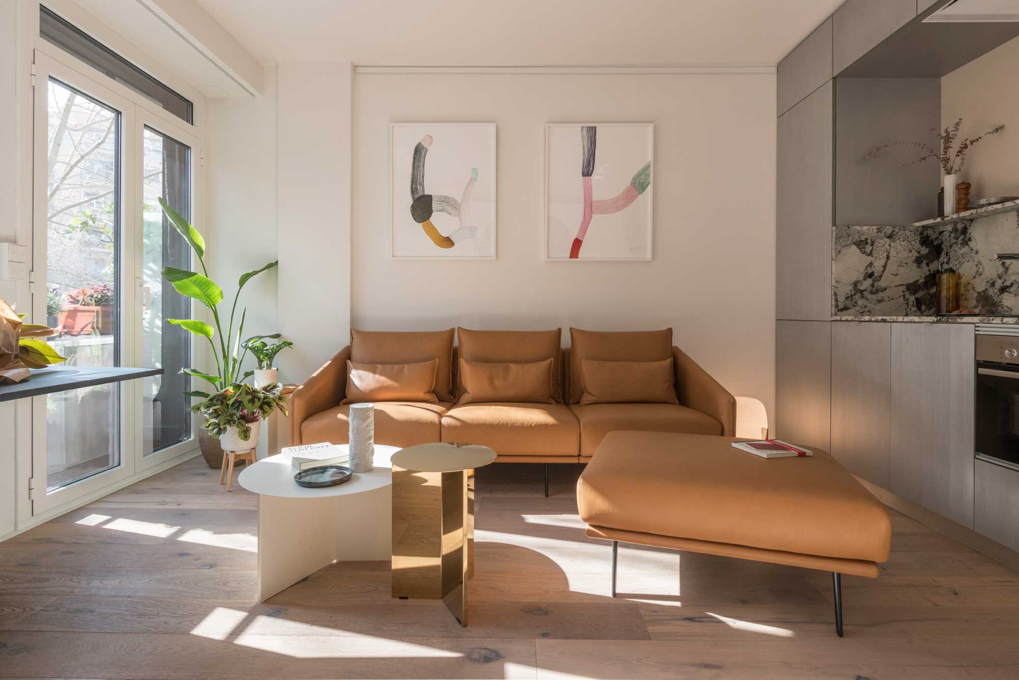
The aluminum cabinetry softly reflects the light, too, helping bounce it around the small apartment.
Meanwhile, the range top sits on the corner of the small kitchen, effectively increasing the access and adjacent countertop space available, helping improve the functionality of the kitchen.
Receding volumes
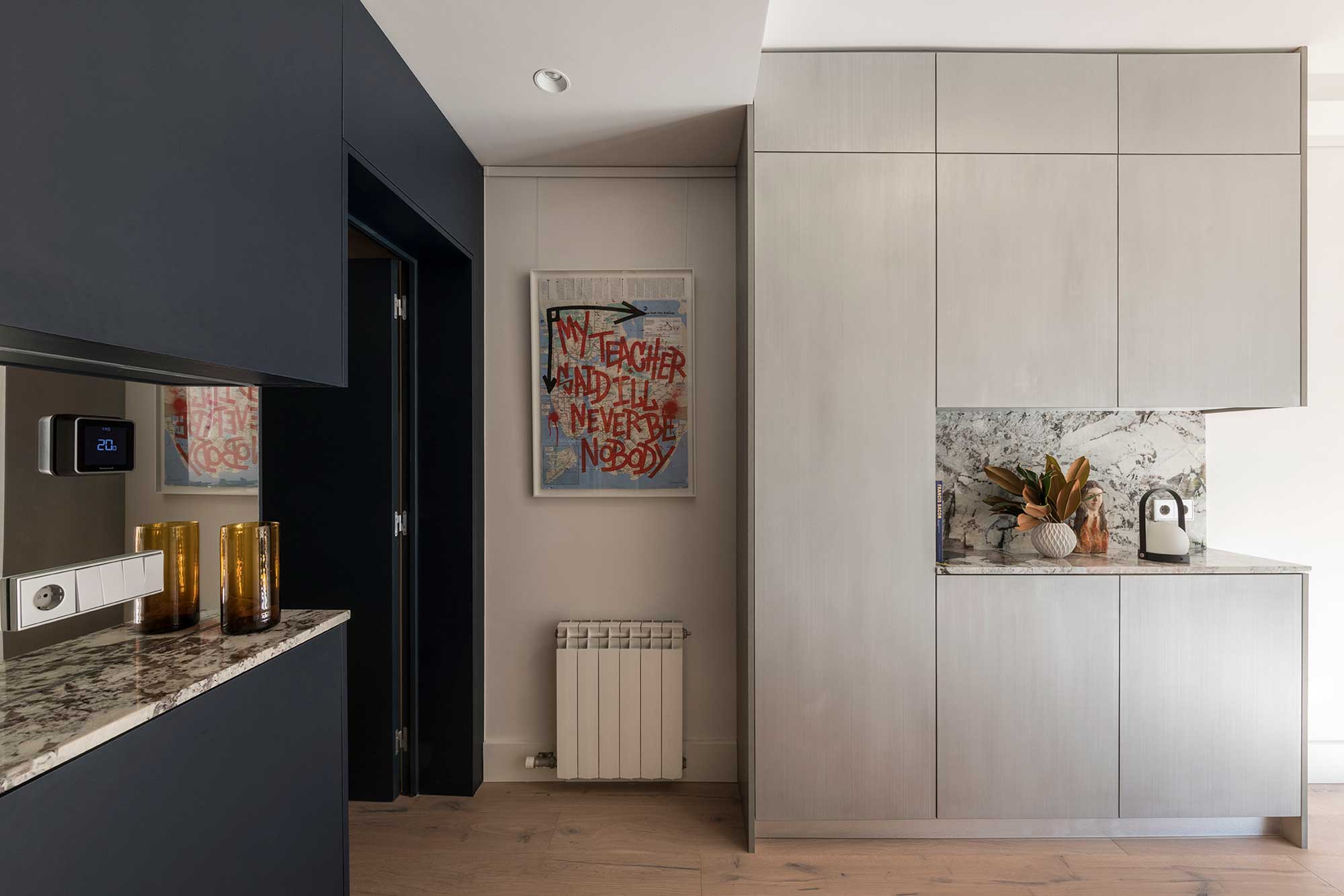
While two of the built-ins embrace this metallic finish, the third is designed to recede into the background. 'The blue-black entrance unit creates a very dark background for the whole living area, making the space feel deeper and disguising the entrance,' Matteo and Andrea explain.
Be The First To Know
The Livingetc newsletters are your inside source for what’s shaping interiors now - and what’s next. Discover trend forecasts, smart style ideas, and curated shopping inspiration that brings design to life. Subscribe today and stay ahead of the curve.
For another trick to make this area look bigger, a mirrored kitchen backsplash has been introduced. 'To enhance the contrast with the dark blue lacquered surfaces, the carved unit has a mirror strip reflecting the large living room windows,' the designers say.
Creating daylight
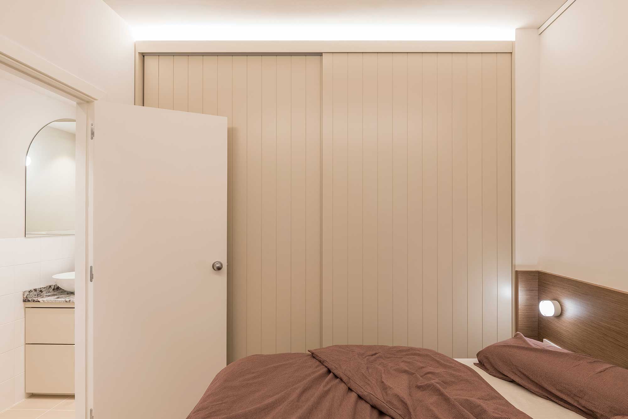
Beyond the kitchen, the inner volumes of the apartment are small and starved of natural light. The architects' solution? Introduce clever LED lighting that creates the suggestion of natural light creeping in from a hidden window.
To make the most of this particularly small bedroom, built-ins have been utilized. 'The suite has a quite simple, made to measure bed in walnut, designed to integrate two small side tables, a bedhead with dimmable lights,' Andrea and Matteo explain. 'The same walnut is used to create a small unit in an existing niche, topped in Tourmaline Sky granite.'
'Two large, grooved and lacquered sliding doors hide the capacious wardrobe,' the designers add.
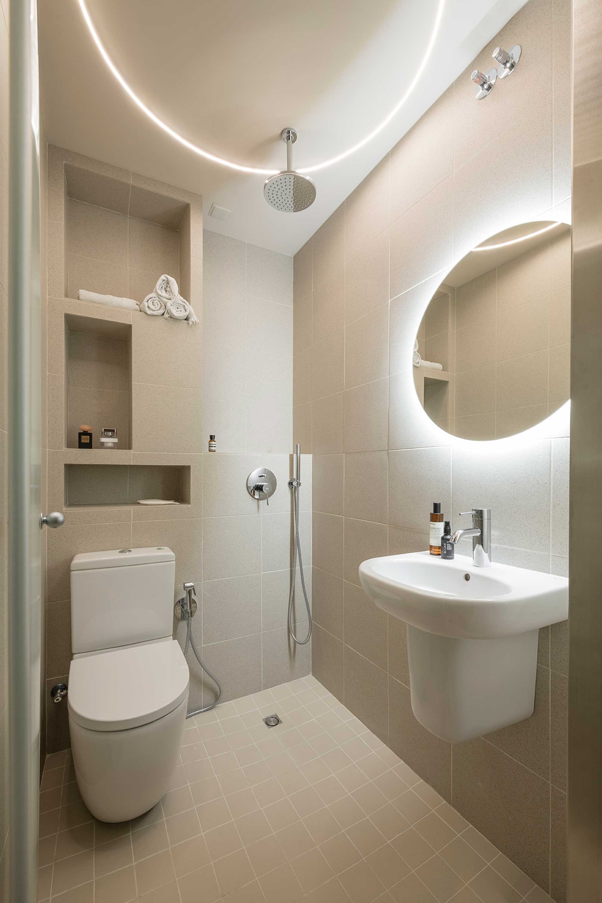
The trick has also been utilized in the apartment's small bathroom, which was transformed into a wet room to make the best use of the space. 'It features niches, and a custom-made ring of light mounted on the celling around the shower faucet and a micro ribbed glass door.'

Hugh is Livingetc.com’s editor. With 8 years in the interiors industry under his belt, he has the nose for what people want to know about re-decorating their homes. He prides himself as an expert trend forecaster, visiting design fairs, showrooms and keeping an eye out for emerging designers to hone his eye. He joined Livingetc back in 2022 as a content editor, as a long-time reader of the print magazine, before becoming its online editor. Hugh has previously spent time as an editor for a kitchen and bathroom magazine, and has written for “hands-on” home brands such as Homebuilding & Renovating and Grand Designs magazine, so his knowledge of what it takes to create a home goes beyond the surface, too. Though not a trained interior designer, Hugh has cut his design teeth by managing several major interior design projects to date, each for private clients. He's also a keen DIYer — he's done everything from laying his own patio and building an integrated cooker hood from scratch, to undertaking plenty of creative IKEA hacks to help achieve the luxurious look he loves in design, when his budget doesn't always stretch that far.
-
 My 10 Favorite Designs at Milan Design Week 2025 — Out of the Hundreds of Pieces I Saw
There is a new elegance, color, and shape being shown in Milan this week, and these are the pieces that caught my eye
By Pip Rich
-
 Iridescence Is Chrome’s More Playful, Hard-to-Define Cousin — And You're About to See It Everywhere
This kinetic finish signals a broader shift toward surfaces that move, shimmer, and surprise. Here's where to find it now
By Julia Demer