A terracotta-drenched room and a curvaceous kitchen bring a joyful glamour to this Sydney bungalow
Vivid hues, curvilinear forms and graphic applications of black and white showcase this Australian bungalow's 1960s modernism at its best
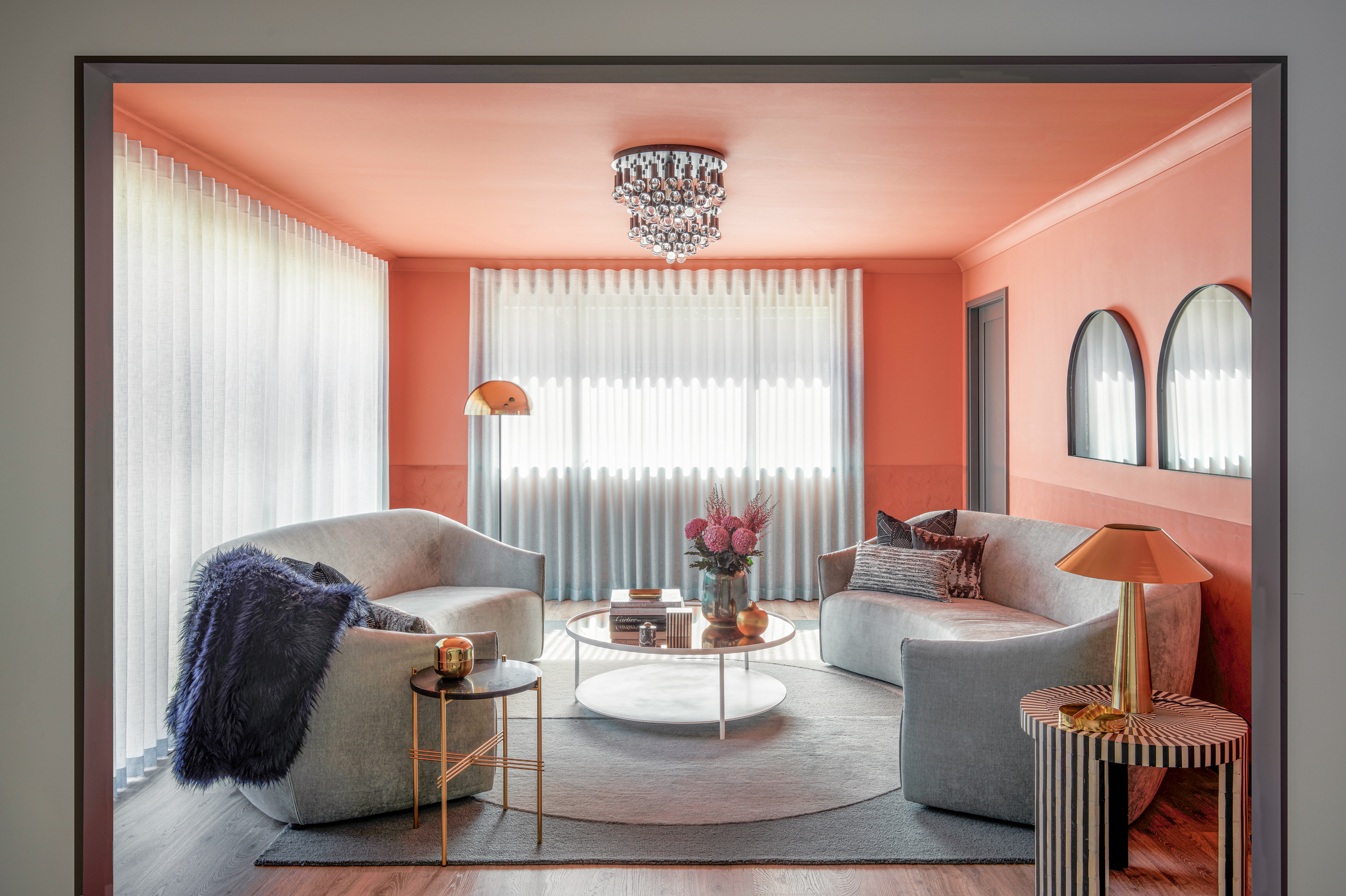
Each room in Ara and Janine Campell’s home has amazing visual impact, but it’s been a creative design journey to get this standout aesthetic and one that began when the couple decided they needed more space as their family grew.
‘Our house was getting small and we always had our hearts set on finding a bigger block with a swimming pool,’ says Ara. After looking for a while, the couple came across this place, which convinced them to move forward. ‘We loved the fact it was single storey and relatively open plan, but the biggest selling point was the potential. We knew that with the right designer we could take it to the next level,’ explains Janine.
Nic Kaiko, founder and principal at Kaiko Design, was the perfect creative mind to tackle the challenge of reorganising the spaces of the single skin, one-level bungalow - a typical construction for this area of Sydney in the 1980s and 1990s - to turn it into a modern home fit for the family.
‘The original layout of the home featured two under-utilised living rooms,’ says Nic. ‘Through careful replanning, we have added a bedroom toward the front of the house for the clients’ daughter as well as a guest powder room.’
Take a tour of the highlights of this creative home below.

Sydney-based interior designer Nicholas Kaiko has a bold eclecticism and the power to make every home he designs reflect the personality of his clients, as well as its environment. We take a tour of his renovation of a bungalow in Sydney.
Living room
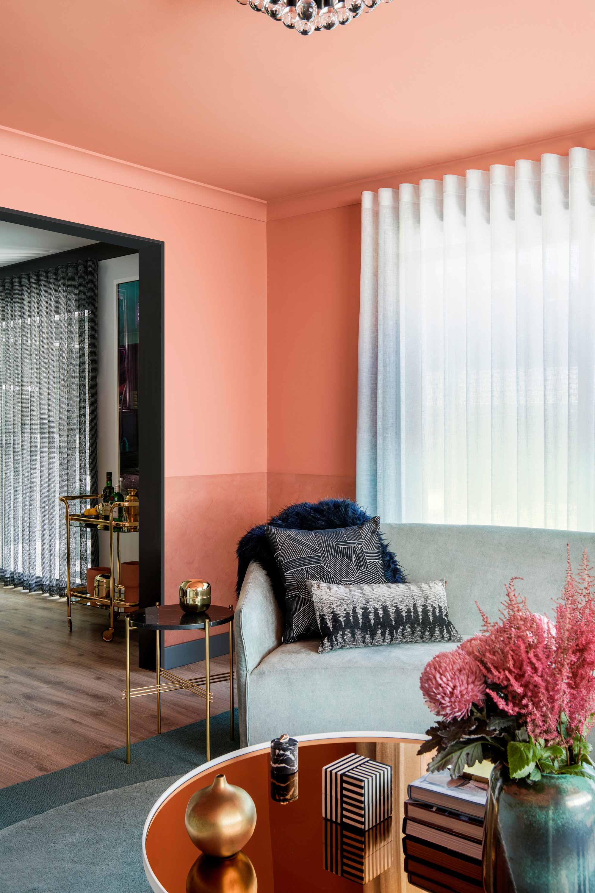
The jumping off point for the materials grew from Ara and Janine’s love of red travertine. ‘Upon that we built a story of color and texture that referenced the bold character of that stone,’ adds Nic.
In the colorful living room, the walls and ceiling are painted in a vibrant terracotta, grounded by subtler monochrome accents. The mix of vivid hues, graphic applications of white and black and curvilinear forms reflects a contemporary nod to 1960s modernism as well as influences from American abstract artist Frank Stella, who Nic is endlessly inspired by. ‘It was pleasing to be able to reference this language in these spaces,’ the interior designer says.
Be The First To Know
The Livingetc newsletters are your inside source for what’s shaping interiors now - and what’s next. Discover trend forecasts, smart style ideas, and curated shopping inspiration that brings design to life. Subscribe today and stay ahead of the curve.
‘We like how it’s elegant but also not stuffy and overly formal,’ Ara and Janine say of the space.
Kitchen
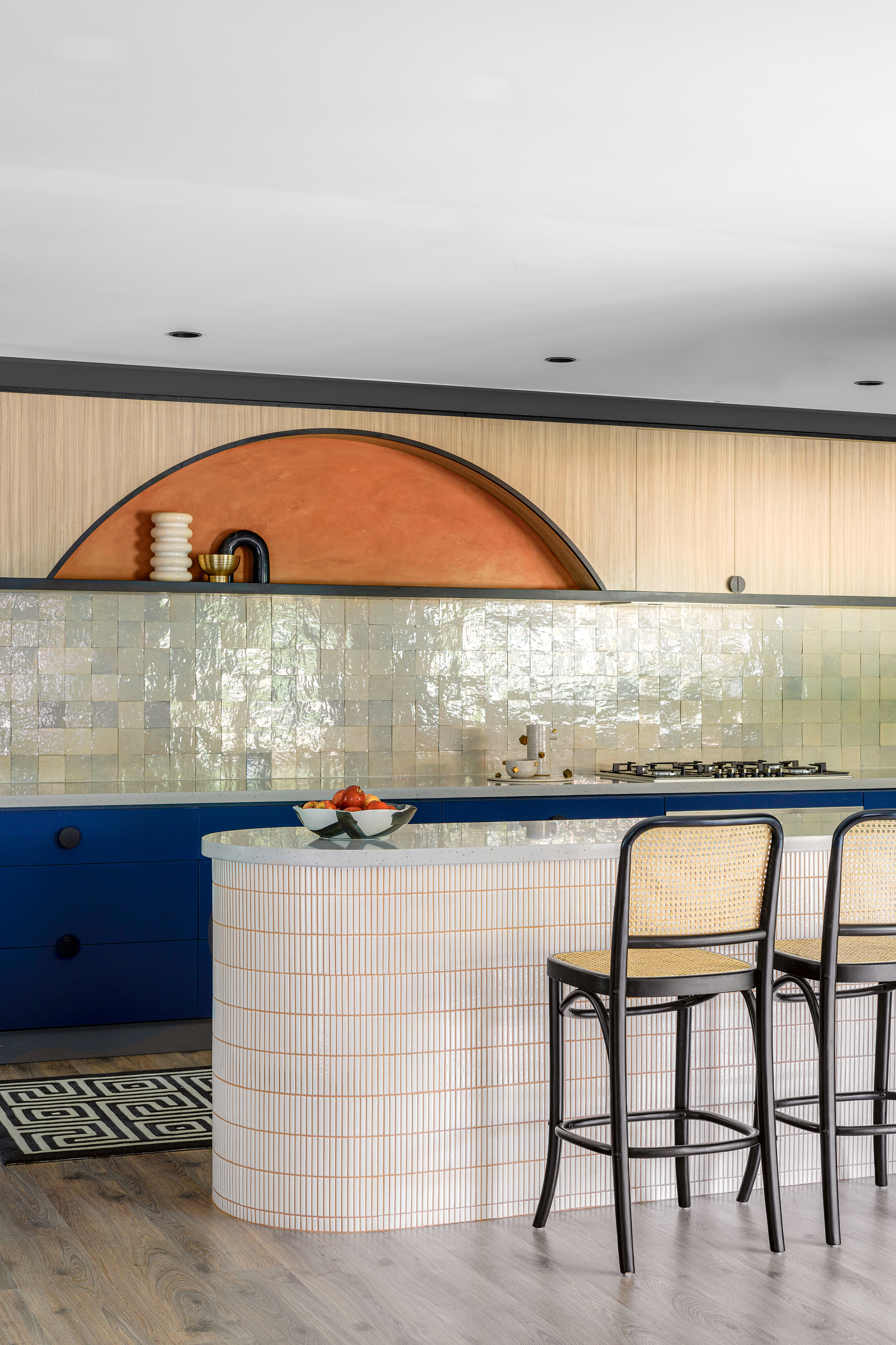
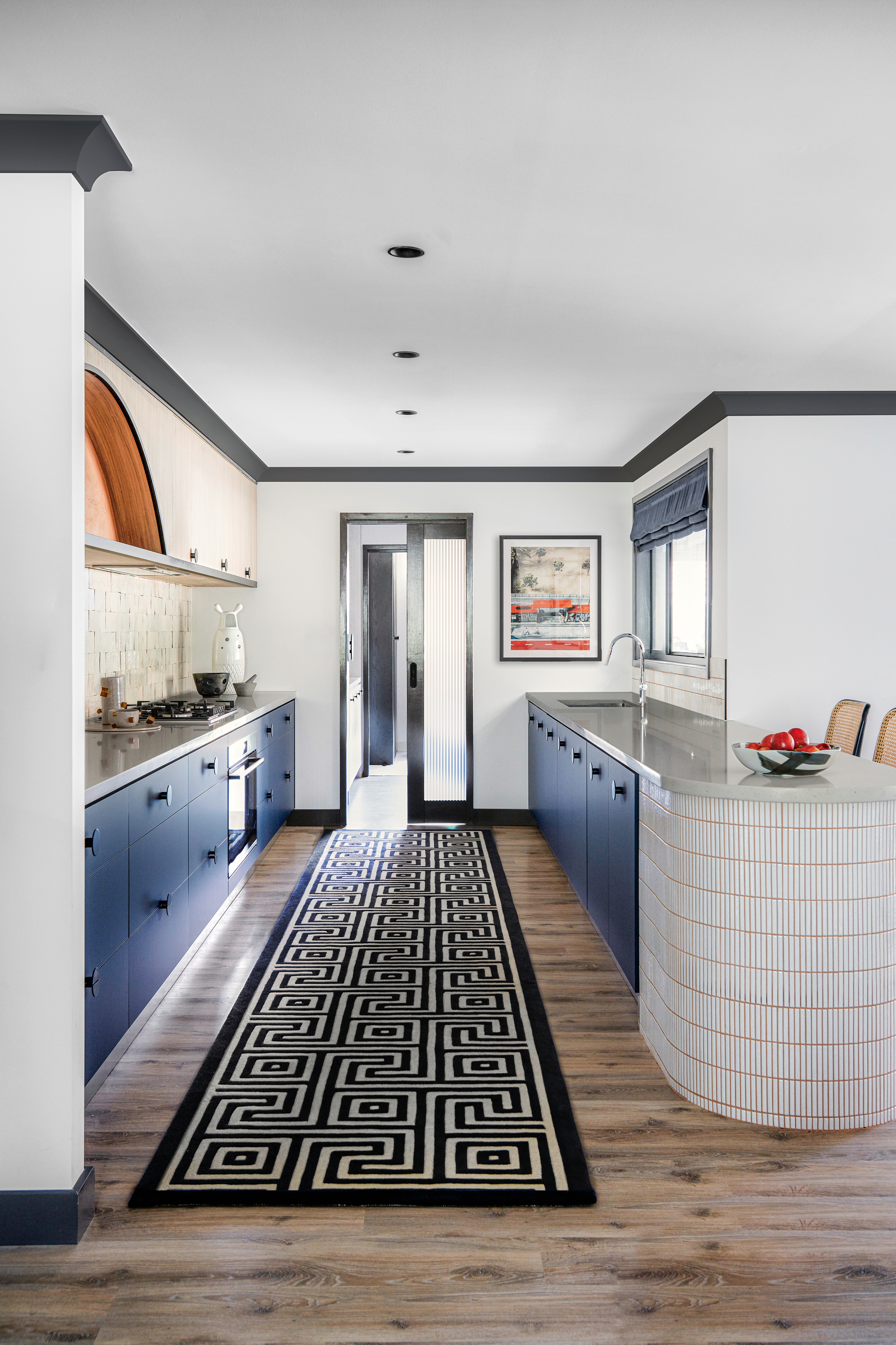
Adorned with plaster, tiles, marble and ceramics, the kitchen reveals its new look after a complete redesign, while a butler’s pantry and family-sized laundry have been installed.
Tiling the island upped the style stakes, while also enhancing its beautiful curves, making it one of the stars of the show, alongside the mix of materials and bold flooring. The sun-like arch and grout on the kitchen's curved peninsula also carry through the terracotta color story.
‘Bespoke and unique – I’m sure there is no kitchen like ours!’ says Ara. Their new modern kitchen also contains one of the couple's favorite, and most extravagant buys. 'The material of the tiles on the kitchen splashback is one of our most lust-worthy materials. These were quite expensive but we are so glad we went with them – they add so much texture to the space.'
Dining room
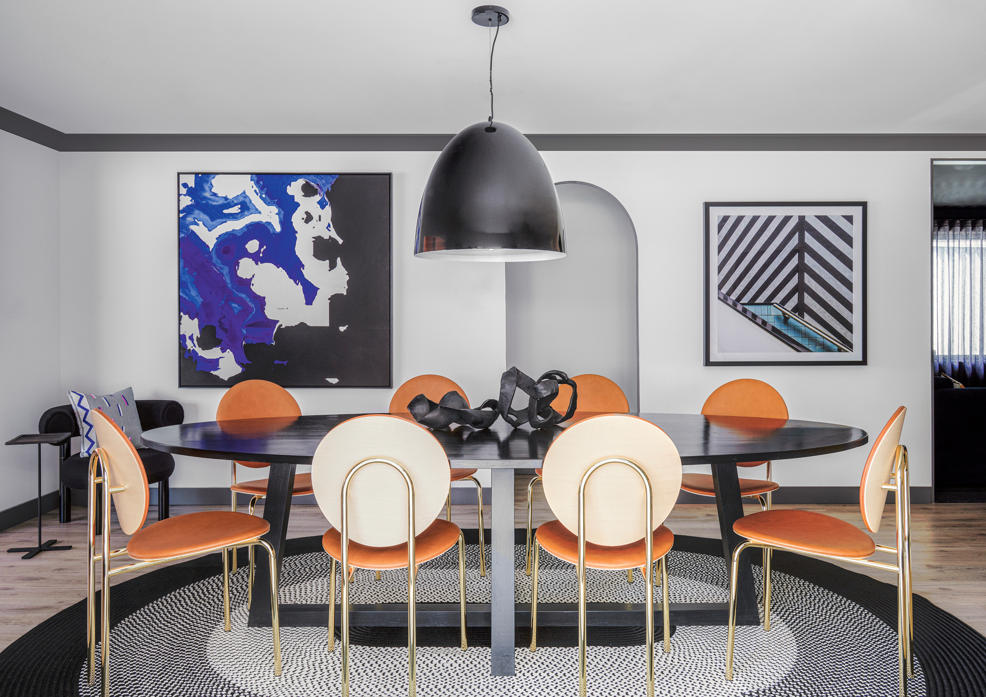
Throughout the home, Nic balanced practicality with visual impact. ‘The original dwelling had a series of brick archways, which we have incorporated into the design across both structural and decorative layers,’ he says. These curves can be seen connecting spaces, like in the dining room, while also echoed by Nic's decor choices.
Each piece was carefully curated to contribute to the whole design story while having its own character, such as the striking Michelle chairs by SP01 in the modern dining room. ‘These were a real splurge for us, but we are so happy with them,’ Janine says.
There's a graphic theme seen throughout the home, which has been enhanced by painting the skirting and coving black.
Main bedroom
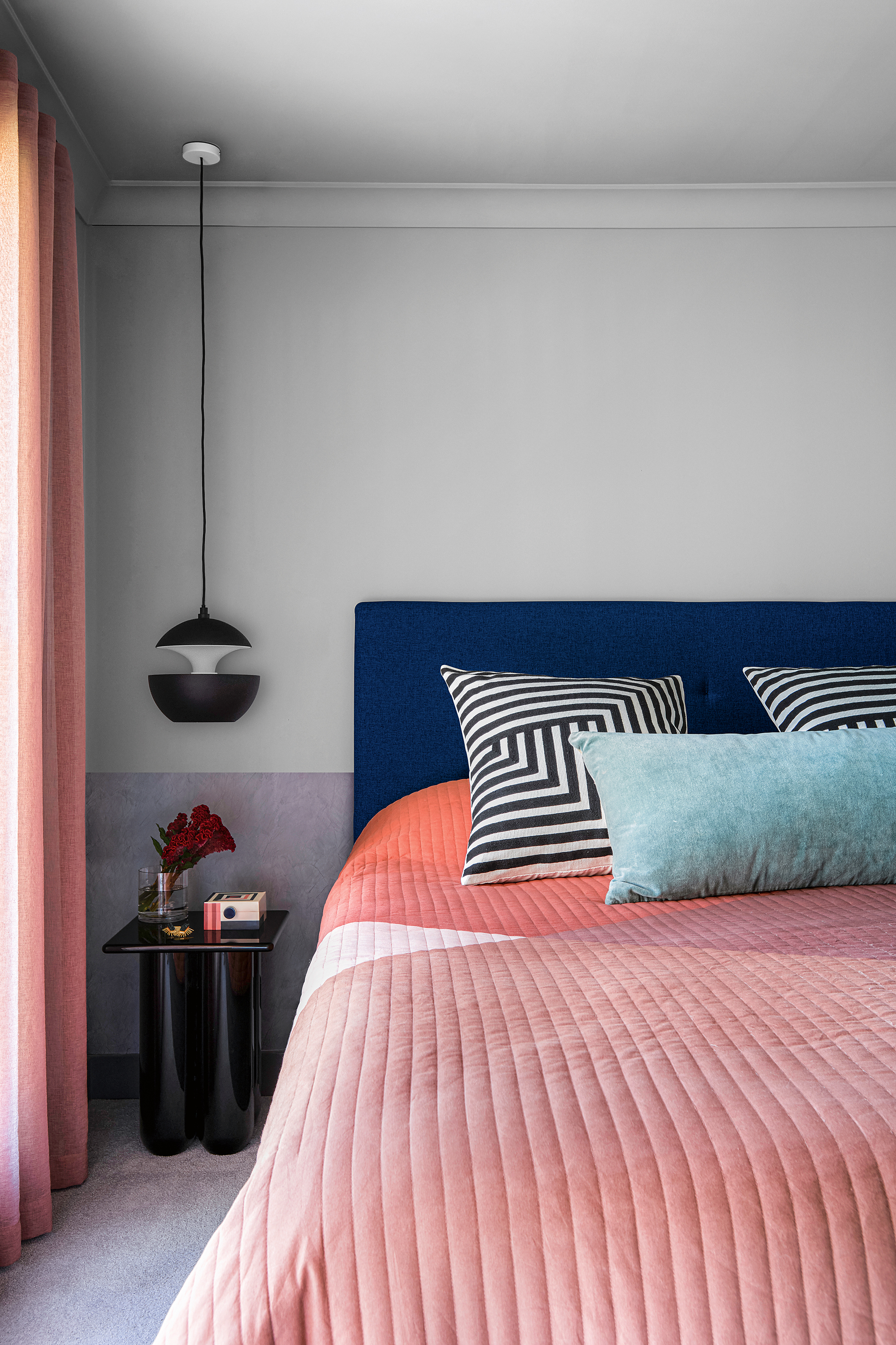
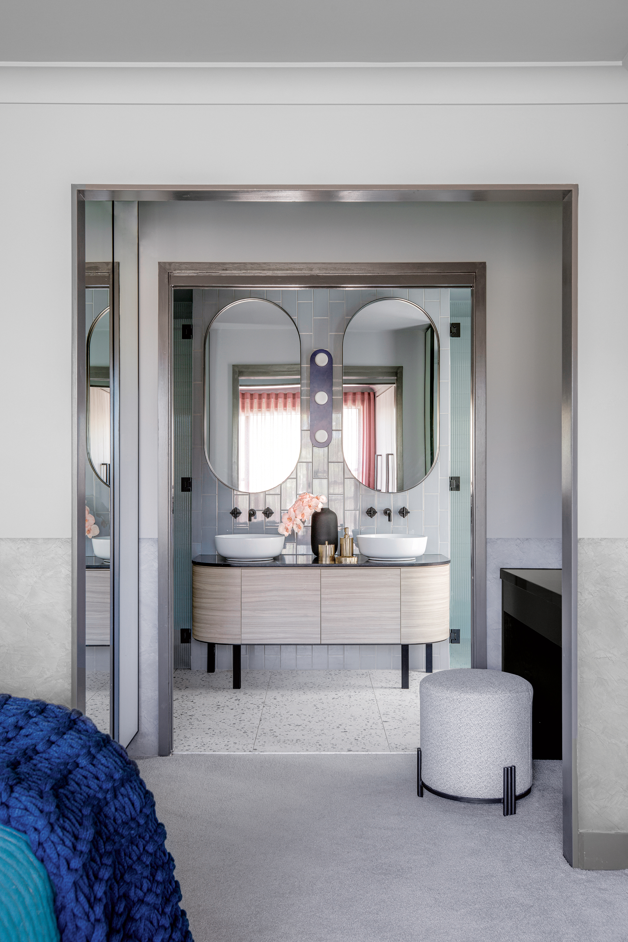
With its additional wardrobe space and a dressing/make-up area, the main bedroom has also been transformed. ‘It’s our favourite space,’ Janine says. ‘It has a fantastic luxe hotel feel, which speaks to who we are as travel bugs!’
Coral tones energize the grey backdrop and even the throw has a linear look for a modern edge. Textured paint was used on the lower part of the walls for a creative two-tone effect, a trick also seen used in the living room.
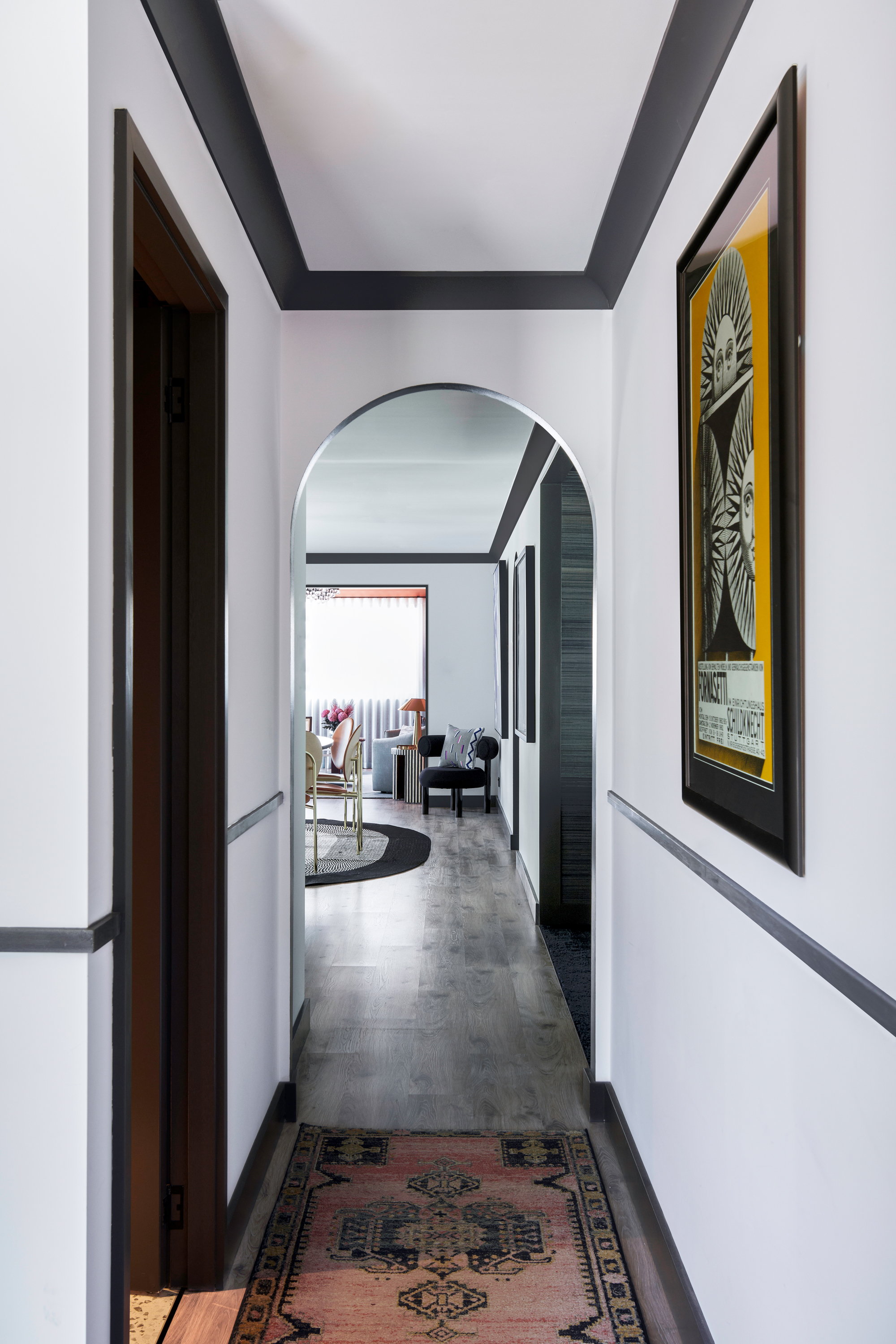
Completely at ease in this environment, Ara and Janine love every detail of their house. ‘Walking from room to room, there is always something to trigger your senses: unique artwork, unexpected furniture – they all catch your eye,’ Janine concludes. ‘At the same time, it is very comfortable. It’s perfect.’ who used cool greys on most of the walls and ceilings and textured paint as a lower dado in the private areas.
A French trilingual editor, content creator, and interior stylist living in Southern California. A compulsive reader of design, architecture, and lifestyle magazines, and an avid traveler, Karine lives and breathes interiors and is inspired by designers Nika Zupanc, Charles and Ray Eames, and Marcel Wanders; architects Luis Barragán and Frank Gehry; artists Gerhard Richter, Beatriz Milhazes, and Anish Kapoor. For the past 12 years, Karine has been contributing to international design, architecture, and fashion publications including Architectural Digest, ELLE Decor, Vogue Living, Design Anthology and MilK Decoration, among many others.
-
 Turns Out the Coolest New Café is Actually In Your Kitchen — Here's How to Steal the Style of TikTok's Latest Trend
Goodbye, over-priced lattes. Hello, home-brewed coffee with friends. TikTok's 'Home Cafe' trend brings stylish cafe culture into the comfort of your own home
By Devin Toolen Published
-
 5 Bathroom Layouts That Look Dated in 2025 — Plus the Alternatives Designers Use Instead for a More Contemporary Space
For a bathroom that feels in line with the times, avoid these layouts and be more intentional with the placement and positioning of your features and fixtures
By Lilith Hudson Published