Before & after – this once-dated Victorian house in Washington DC is now a modern, monochromatic home
This period property embraces the transitional style with its monochromatic scheme and original Victorian features

Transforming dated Victorian homes to make them look and feel modern isn't easy. There's so much beauty in traditional architectural features - high ceilings, bay windows, ornamental moldings - but it can be difficult to incorporate those within a more contemporary scheme. Well, that's where the transitional style comes in, and this home totally masters it.
The Grand Corner Victorian Mansion in Washington, D.C.'s historic Bloomingdale neighborhood has had a full restoration. Originally designed in 1904 and built by notable DC developer Harry Wardman, the 3,984-square-foot home features five bedrooms, three full baths, and two half baths. DC-based designers at Third Street Architecture, have now restored the century-old building to its original glory with some modern twists thrown in, including a dramatic monochromatic color scheme.
Here, we take a peek inside the almost unrecognizable home before the renovation, and its eventual evolution into an on-trend modern home as a result.
Front porch
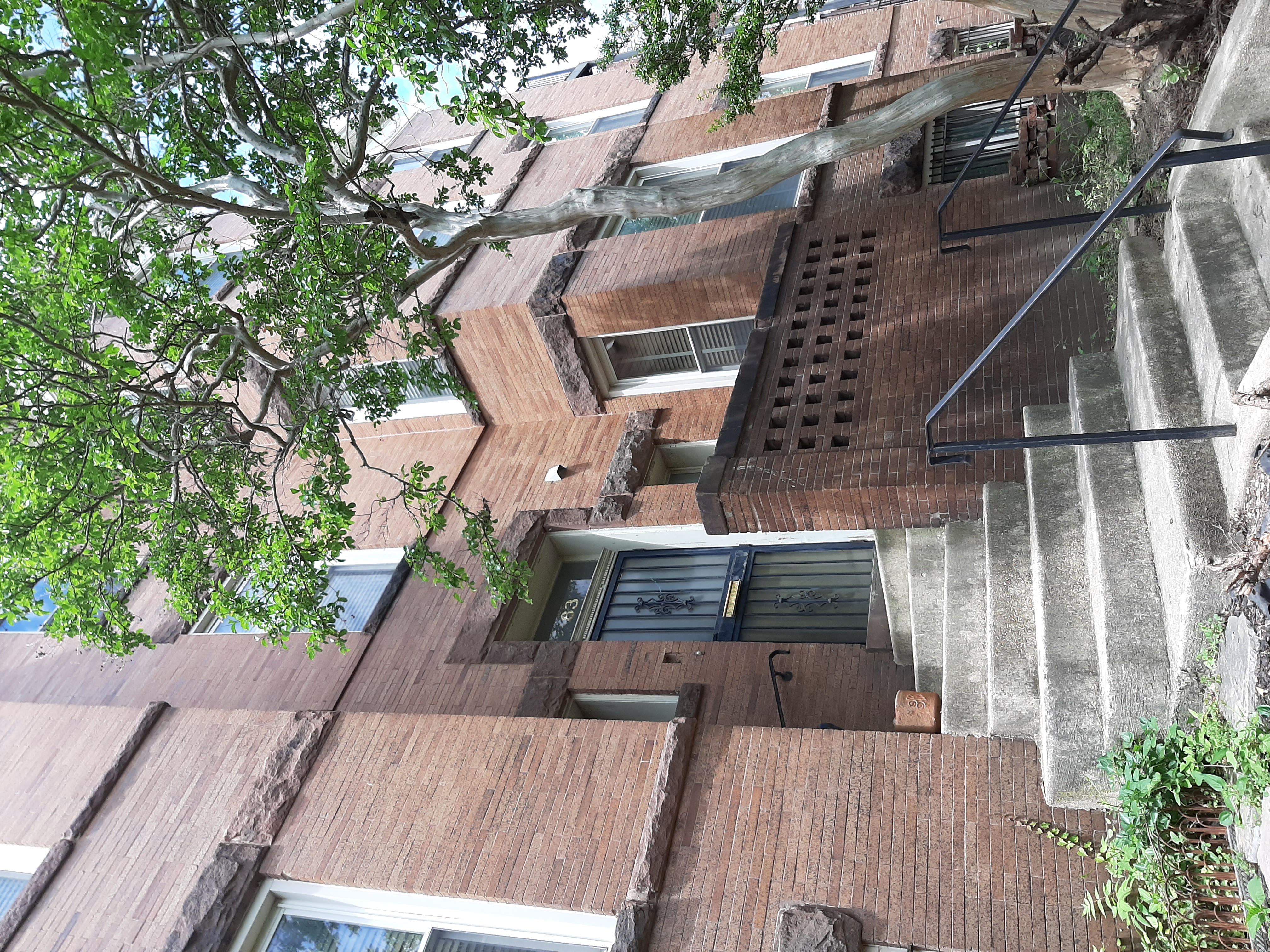
Like most Victorian rowhomes, access to the front porch of number 83 is up a set of concrete steps. The beauty of this period property is evident from the outset, with the red brick walls and cast iron railings that are so quintessential of the era, but the surrounding landscape had been neglected for some time. Despite isn't ornate features, this meant the entrance was far from inviting.
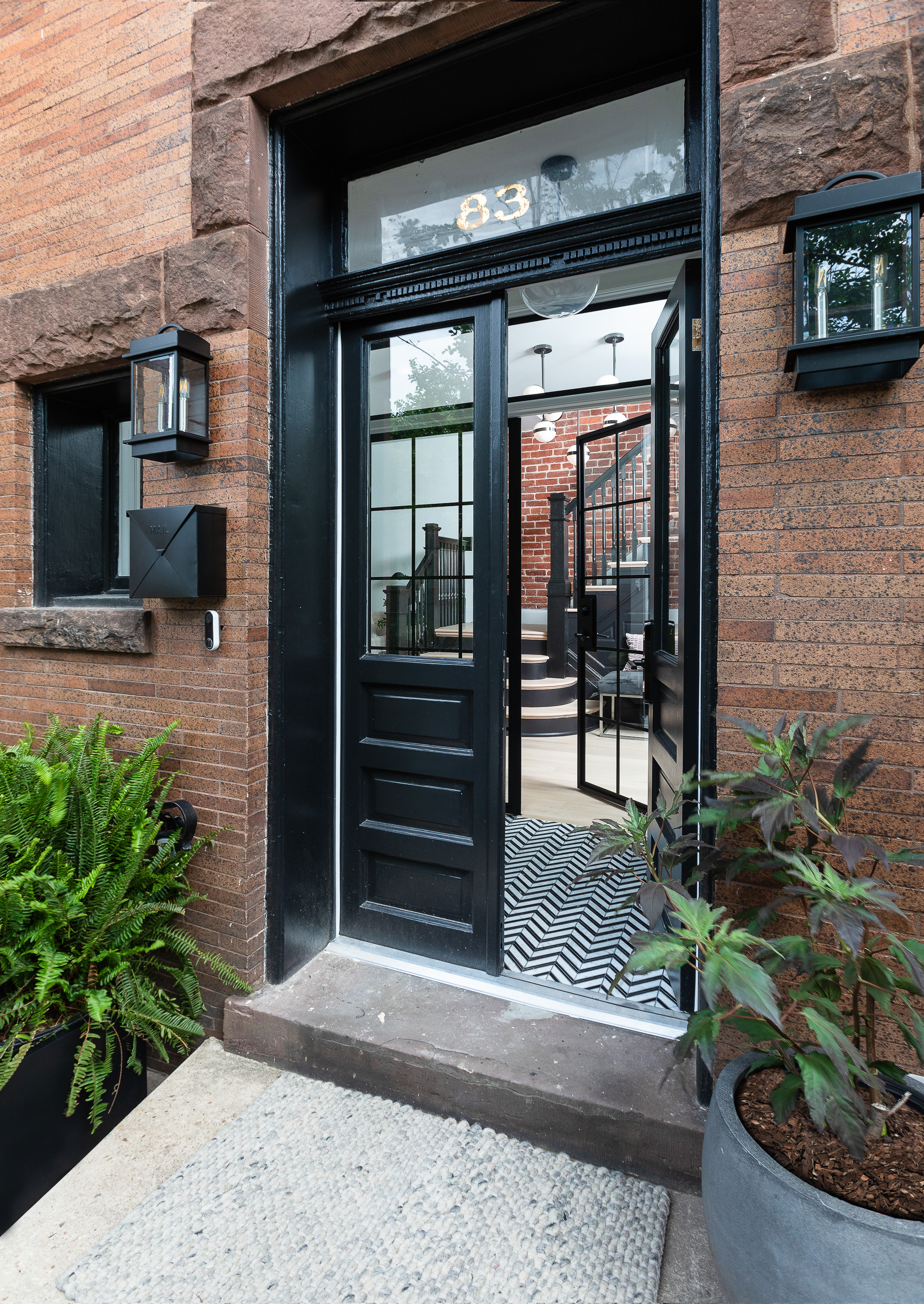
Third Street Architects got to work with the help of local company, Kraydi Builders, to re-install the original front door. The double doors with recessed panels look far more stately, in keeping with the period, and a lick of fresh paint does wonders to brighten the space. The intense black gloss draws the eye to the front door, hinting at the monochromatic theme to come as soon as you step over the threshold.
For a contemporary upgrade, black lantern-style lights flank the door, alongside some outdoor container plants for a warmer welcome to guests. Boston ferns, as shown here on the left, are one of my personal favorites for a classy-looking entrance.
Entryway
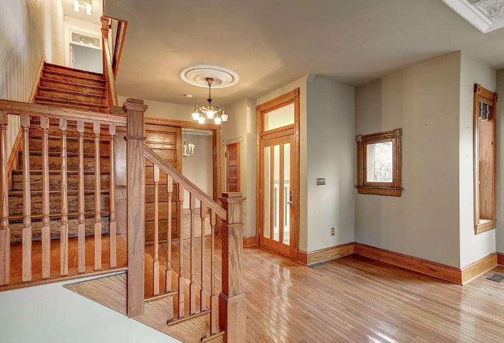
Prior to the renovation, the entryway was dated and bland, magnolia walls, light wooden trim, and wooden flooring all blending into an overwhelming amount of beige. The room lacked any brightness despite the lofty space and the high ceilings, and was screaming out for some detailed decor to draw the eye.
Be The First To Know
The Livingetc newsletters are your inside source for what’s shaping interiors now - and what’s next. Discover trend forecasts, smart style ideas, and curated shopping inspiration that brings design to life. Subscribe today and stay ahead of the curve.
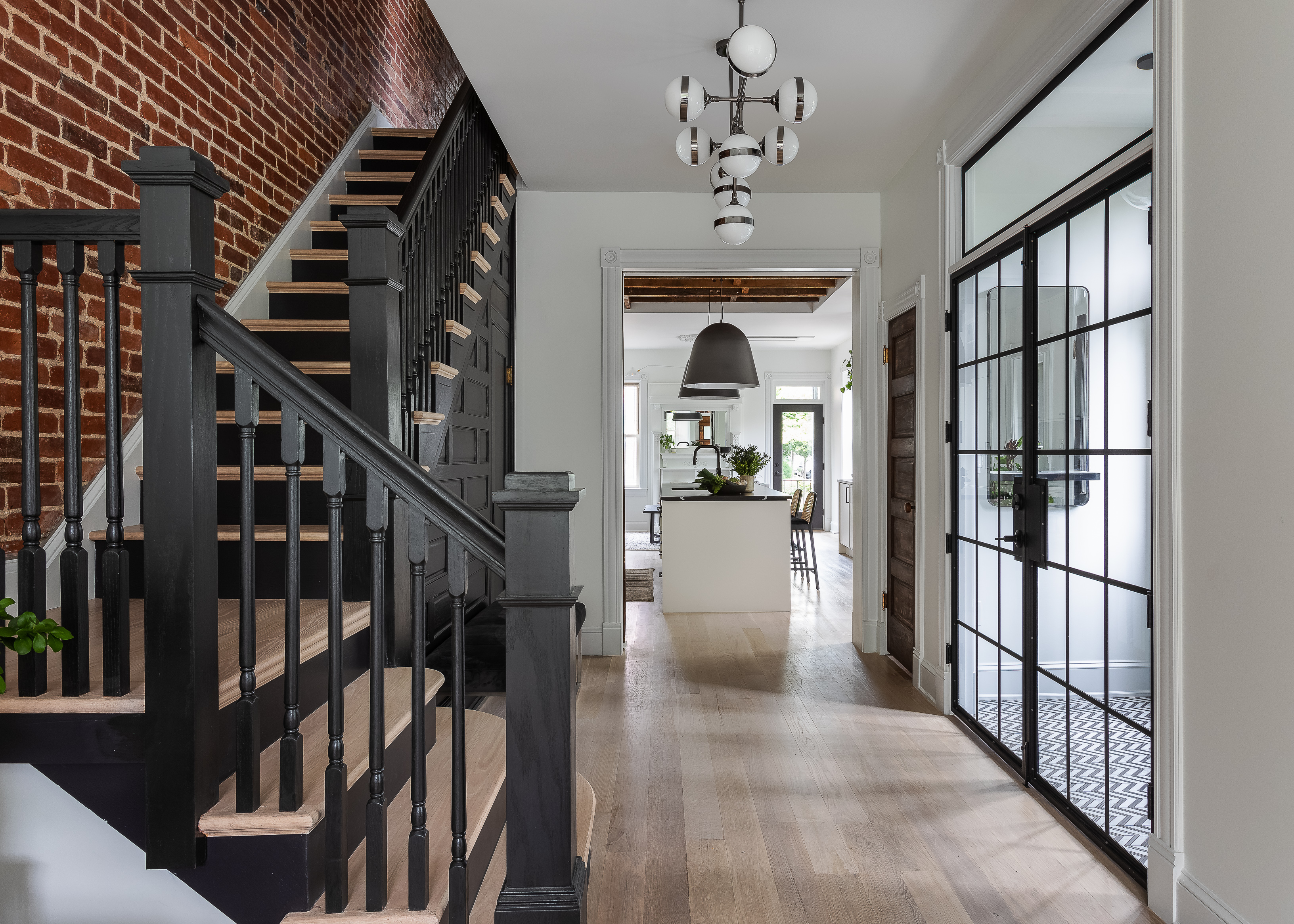
After speaking with the homeowners, the designers decided their overall goal was to blend the original architectural characteristics such as the staircase and pocket door leading to the kitchen with a clean, modern aesthetic; and that's exactly the vibe the new entryway emits.
The original staircase and paneling have been painted a bold matt black, contrasting with the light oak wood on the floors and the crisp white on the walls. For an element of industrial interior design reminiscent of the Victorian era, the design team also exposed the brick along the staircase, which was hiding behind drywall. The result is a far more dynamic space, full of rich texture and contrast for a more striking visual appeal.
Kitchen
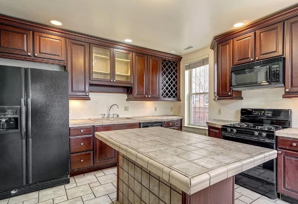
At first glance of the original kitchen, it's hard to picture its potential as a bright and airy family space. The dark cabinetry, an epitome of twentieth-century kitchen design, makes for a tired, lackluster room while the awkwardly positioned island interrupts the floorplan, meaning that such a functional space lacks any cohesion.
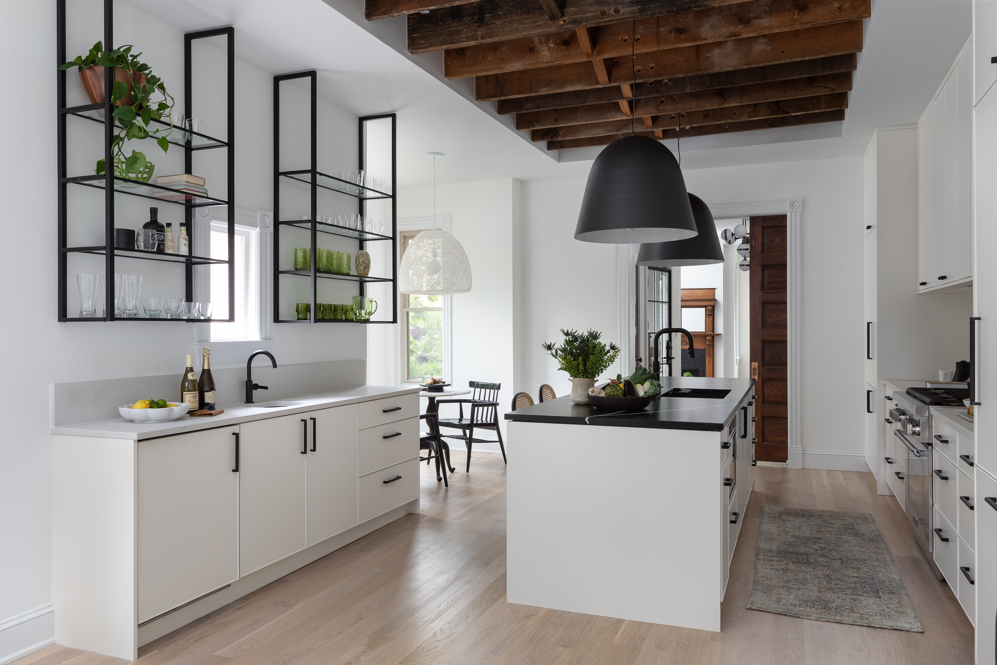
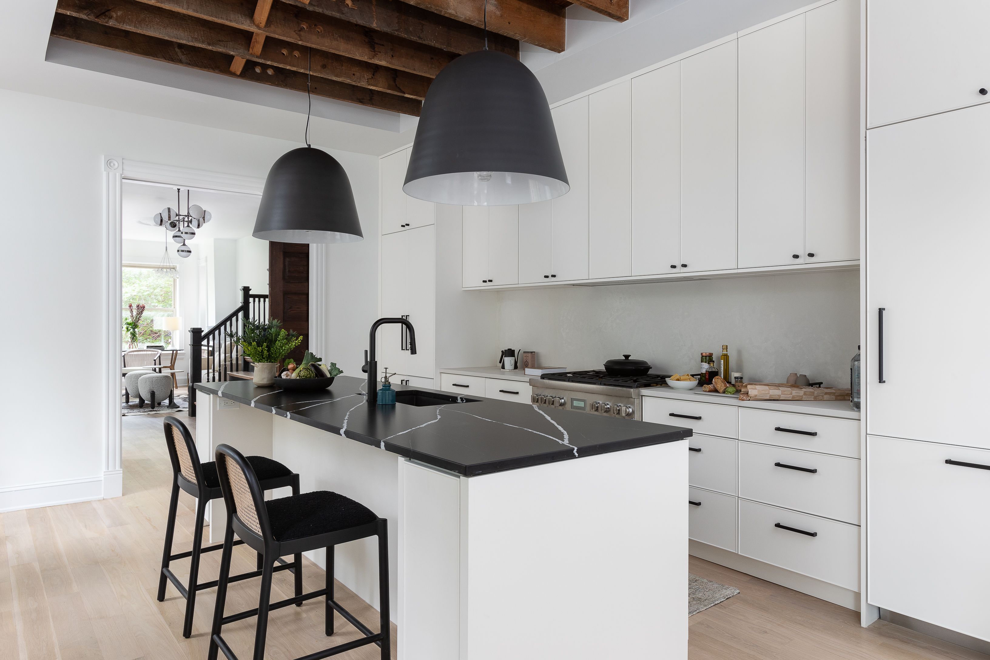
The clients had a clear vision for their new space, however. From the beginning of the project, they knew they wanted the first floor to have a monochromatic color scheme, keeping the characterful feel of the original architecture but introducing modern cabinetry in the kitchen. So that's exactly what the designers did.
Opening up the layout, keeping the beautiful pocket door in place, and peeling back the ceiling to expose the original floor joists instantly makes the kitchen brighter and airier while highlighting those stunning original features. The wooden beams juxtapose with the stark white kitchen cabinets, adding just enough warmth and softness with natural materials to ground the space and avoid feeling too clinical.
Get the look for a monochrome kitchen
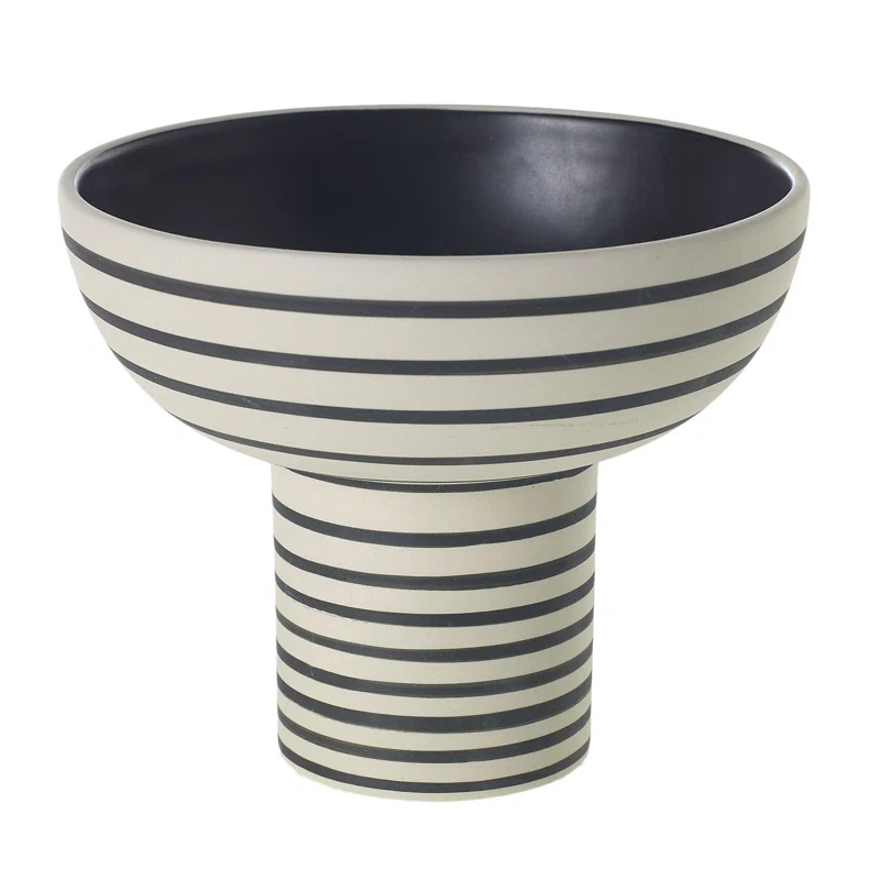
For a monochrome touch, try this ceramic bowl from Joss & Main. The beautiful black and white stripe design will introduce contrast to your space. Use it for florals or as a decor piece on kitchen shelves or a plain white countertop.
Living Room
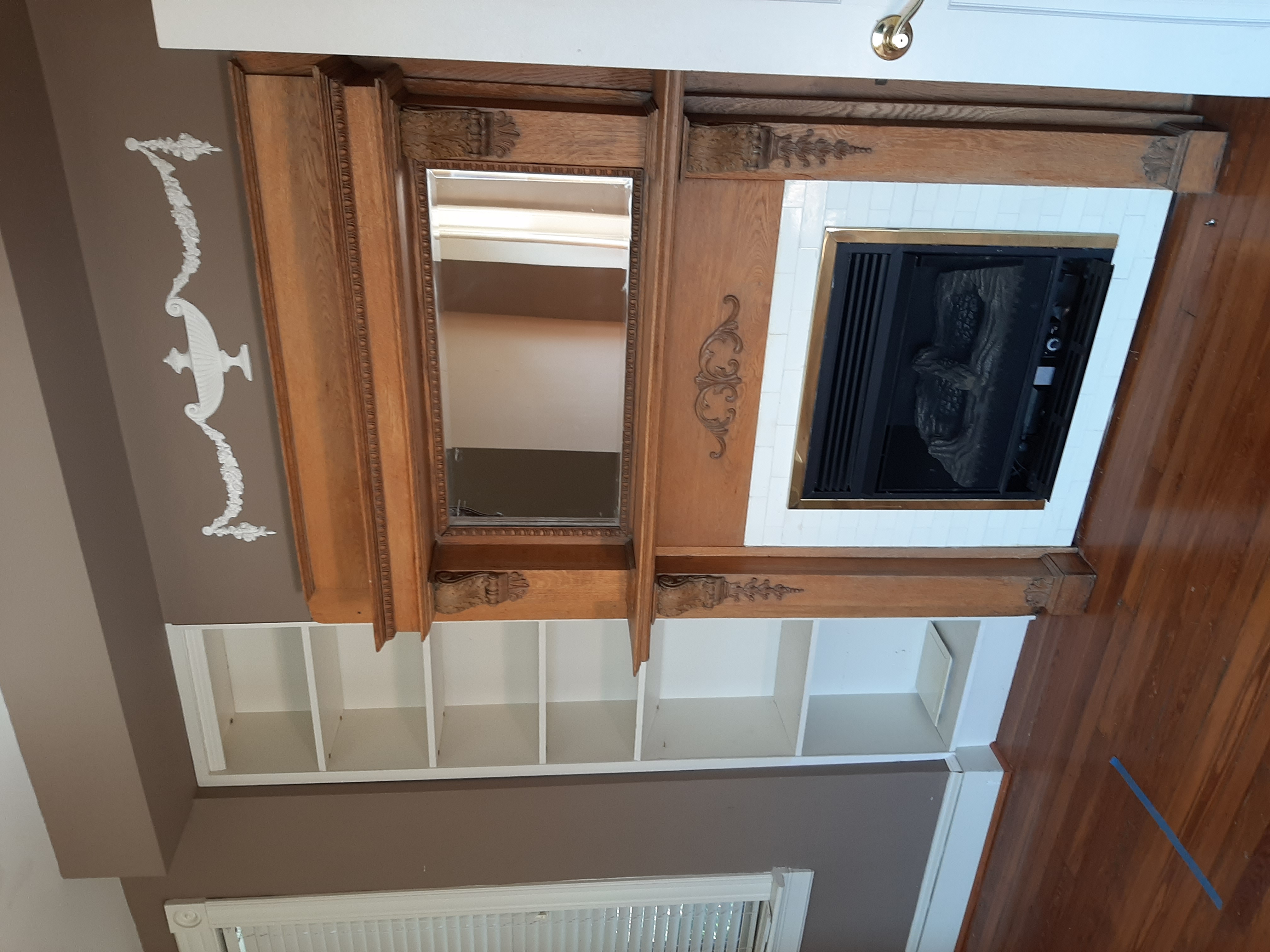
A beautiful wooden fireplace made for a timelessly beautiful focal point in the living room, but the surrounding decor failed to emphasize it. It was clearly a feature that needed to influence the surrounding design in this room.
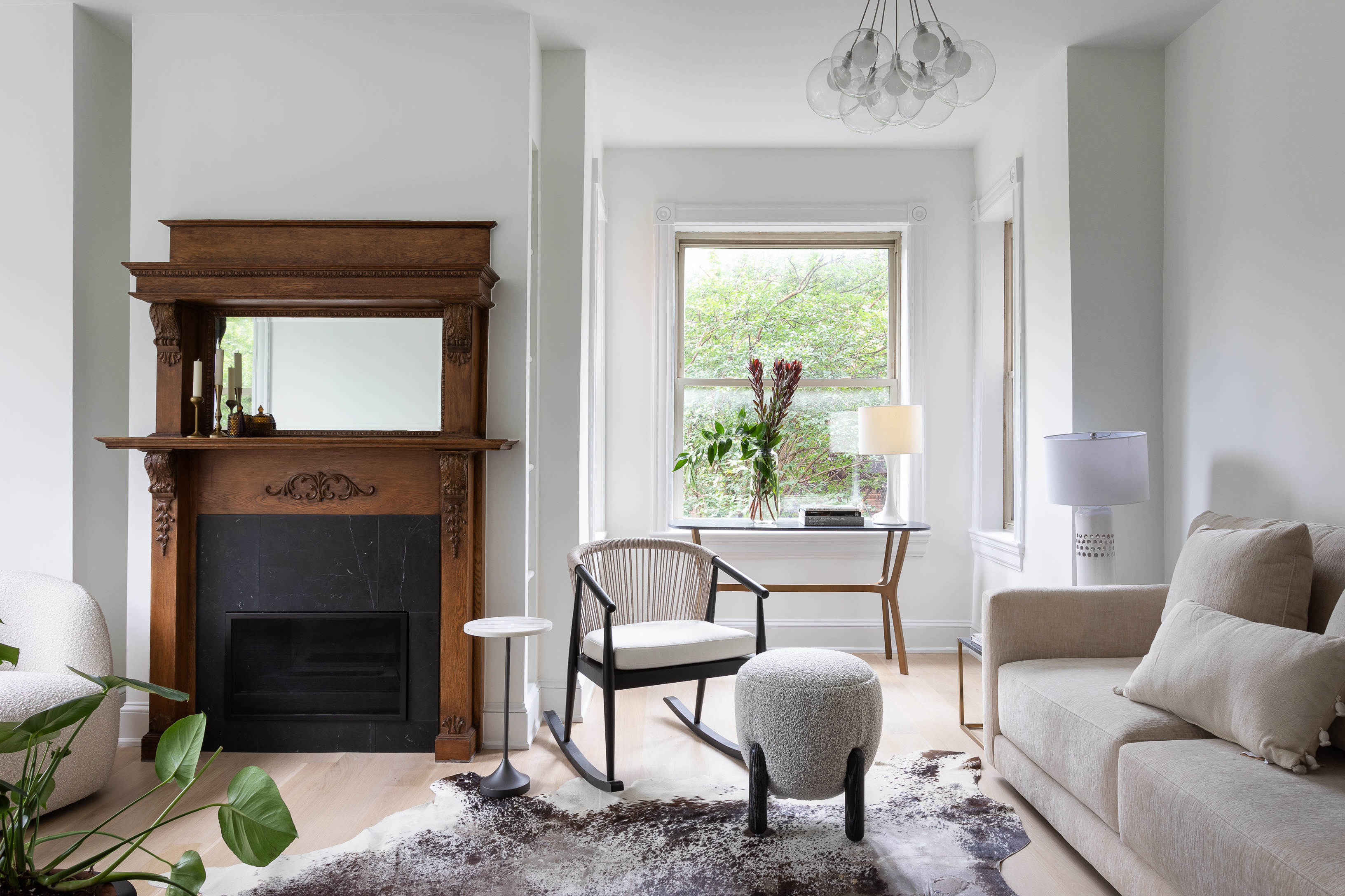
Now, the fireplace takes center stage. Surrounded by the lighter, white color scheme, it makes this space feel instantly cozy and calming. Designers re-installed the mantels which had been moved around in the 1990s renovation, keeping all the original trim and giving it a fresh lick of paint. The original ceiling medallions were also re-installed in the living room. These decorative features are a reminder of the property's history, and, when paired with the mid-century modern furniture, contribute to the overall transitional style.
Bedroom
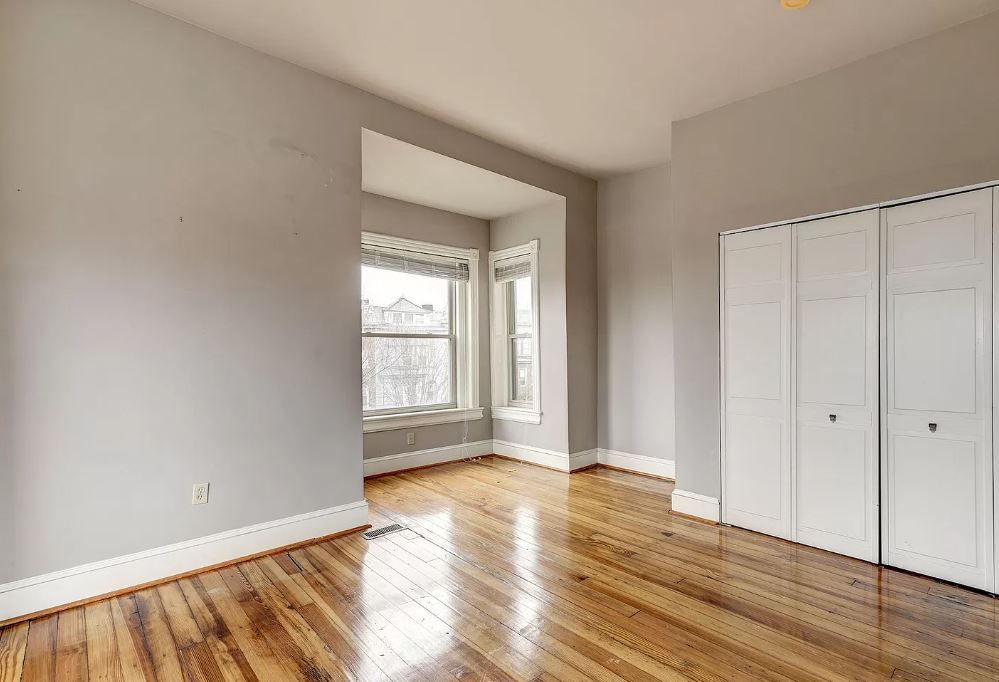
The architecture of the four storey home means turret designs translate to alcove spaces in the corner of the upstairs rooms. These nooks naturally lend themselves well to cozy, enclosed spaces - the perfect chill out spot in a bedroom.
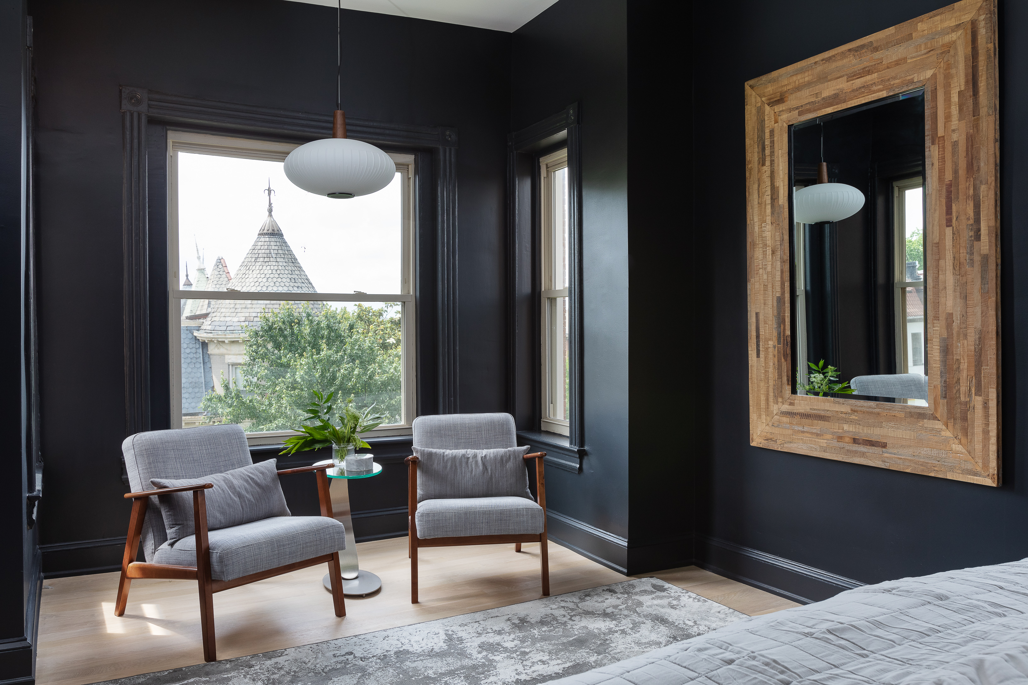
The bay window in the master bedroom is now a relaxed spot for two mid-century-modern style chairs, which work beautifully against the dark navy background of the walls. The homeowners wanted a more intimate and sheltered gradient as you move up the levels - the first floor is an open and bright space designed around entertaining while the second and third floors are for more private spaces. As a result, paint colors are darker as you move up and furniture selection exists of larger, comfier pieces.
Bathroom
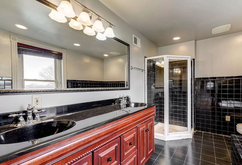
Monochrome was very much the theme of the old primary bathroom on the third floor with its black tiles and granite countertops, but the feel was overbearing, making for an enclosed space despite the large size. With the dark cabinetry of the vanity, it was far from fresh and modern.
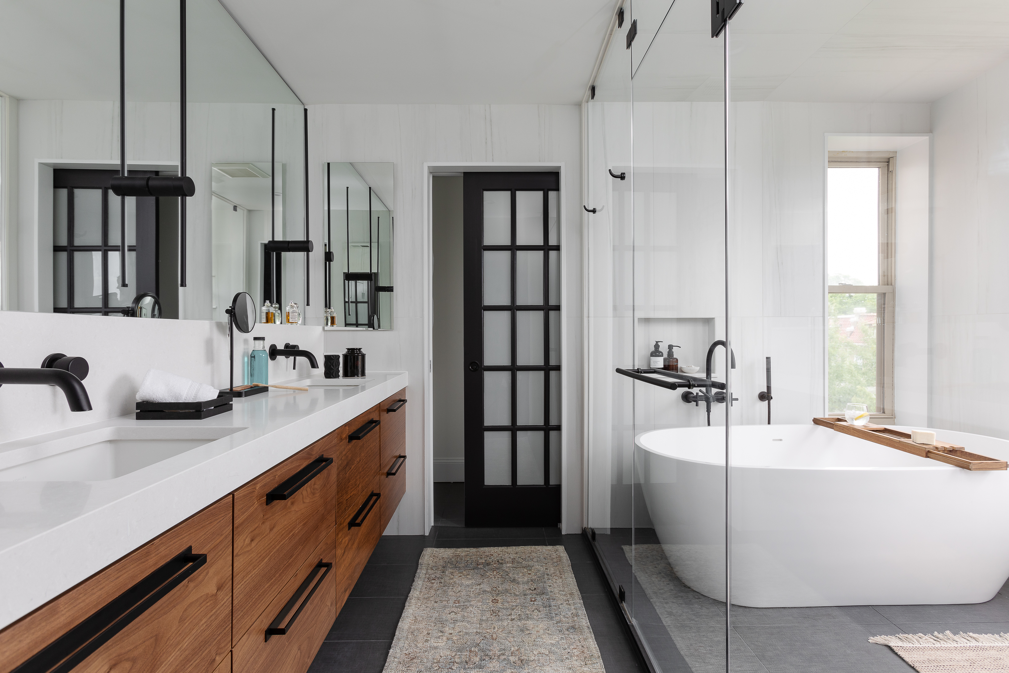
Now, the modern bathroom is one of the highlights of the home. As one of the bays of the property, the design team decided to install a large round freestanding tub in the space, which is surrounded by 270-degree windows and flooded with light. The double walnut vanity is paired with a white counter and matt black plumbing fixtures and hardware for a contemporary contrast that gives this bathroom a spa-like feel. Bathrooms really don't get better than this.

Lilith Hudson is a freelance writer and regular contributor to Livingetc. She holds an MA in Magazine Journalism from City, University of London, and has written for various titles including Homes & Gardens, House Beautiful, Advnture, the Saturday Times Magazine, Evening Standard, DJ Mag, Metro, and The Simple Things Magazine.
Prior to going freelance, Lilith was the News and Trends Editor at Livingetc. It was a role that helped her develop a keen eye for spotting all the latest micro-trends, interior hacks, and viral decor must-haves you need in your home. With a constant ear to the ground on the design scene, she's ahead of the curve when it comes to the latest color that's sweeping interiors or the hot new style to decorate our homes.
-
 My 10 Favorite Designs at Milan Design Week 2025 — Out of the Hundreds of Pieces I Saw
There is a new elegance, color, and shape being shown in Milan this week, and these are the pieces that caught my eye
By Pip Rich
-
 Iridescence Is Chrome’s More Playful, Hard-to-Define Cousin — And You're About to See It Everywhere
This kinetic finish signals a broader shift toward surfaces that move, shimmer, and surprise. Here's where to find it now
By Julia Demer
