This 100-year-old bungalow was the neighborhood eyesore – now it's the 'prettiest house on the block'
Architect and interior designer Davide Casaroli took a chance on a run-down Spanish bungalow, breathing new life into its interior, and exterior too
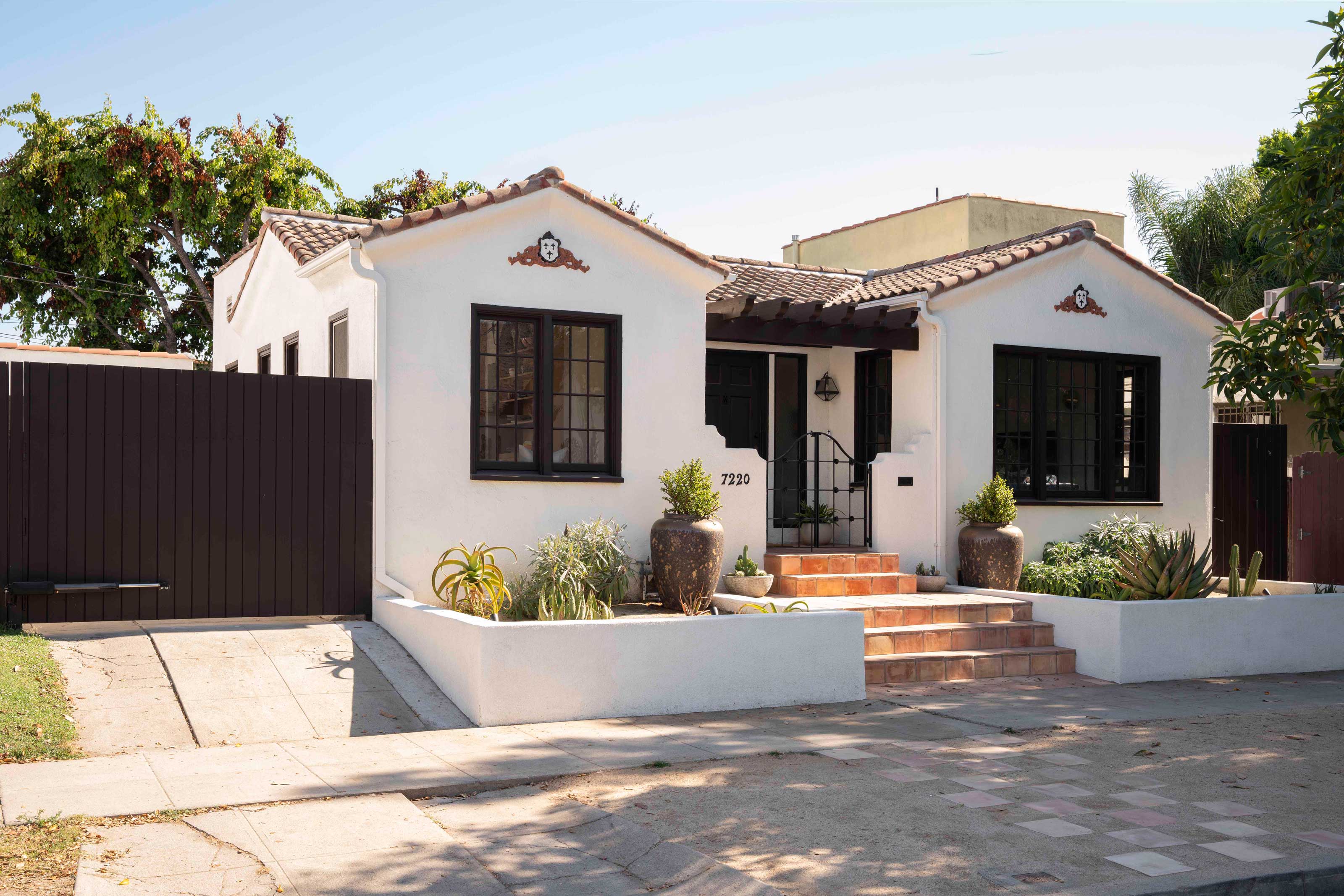

They always say the best investment when it comes to property is the worst house on the best street. For interior designer Davide Casaroli's client and friend, this home in Los Angeles' Fairfax District was the perfect example of a fixer-upper with real potential.
'The house was in extremely bad condition,' Davide tells us. 'Deciding to restore and remodel it was not an easy task. Everything was in a very bad shape.' Far from a modern home, this 1100 square foot bungalow dates back to 1927, but despite not being in good shape, 'it felt very special,' Davide says.
Davide's plan to help his friend and client turn the run-down property into a dream home was a large undertaking. 'I directed the construction team, and we worked on the roof, the foundations and much more,' he explains. Beyond the structural work, the home also needed a facelift, inside and out, and Davide was keen to honor the property's Spanish heritage. The result is a compact home that feels warm and inviting, but has a certain sense of luxury, thanks to a few "jewels" in its crown.
Curb appeal
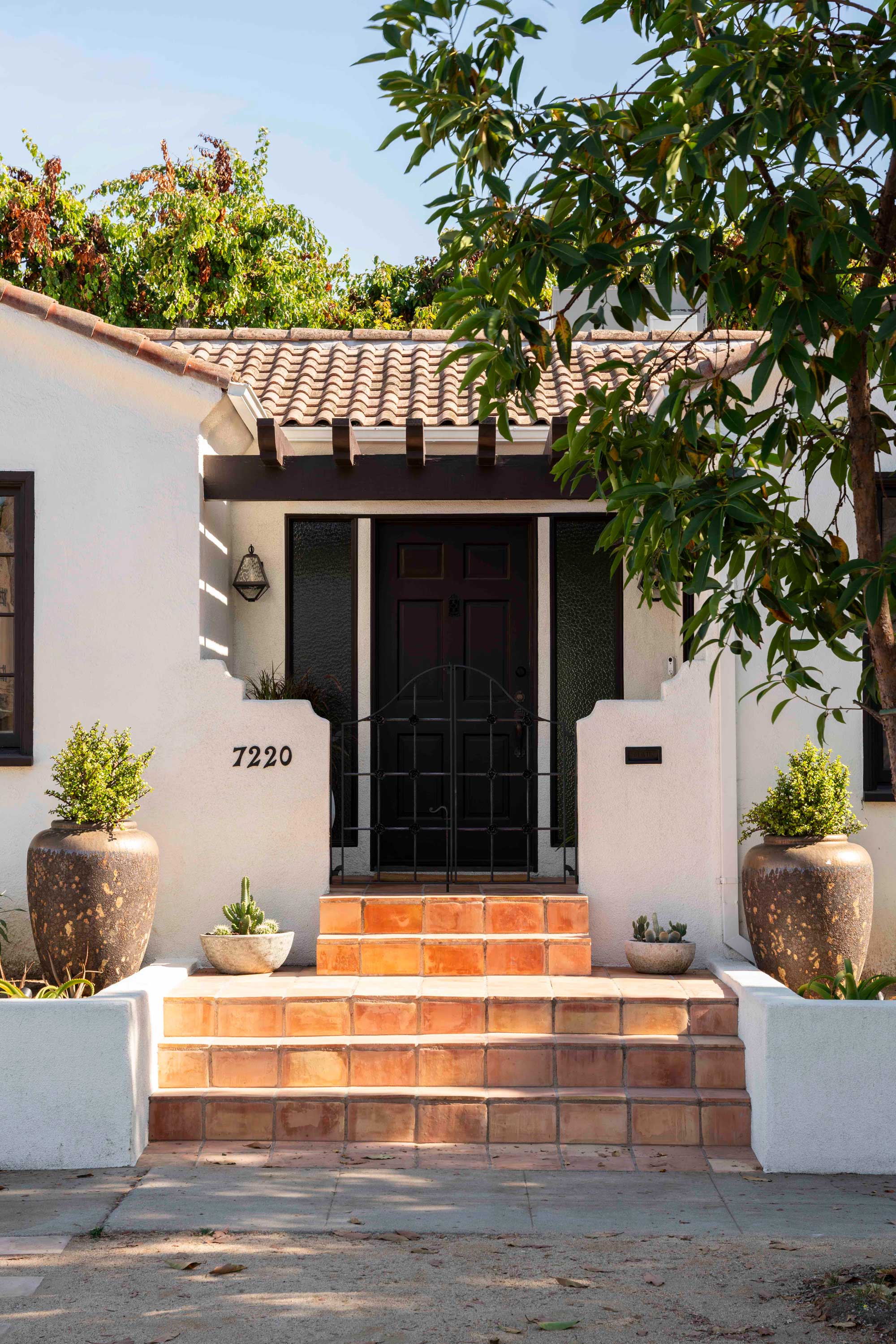
For what once was an ugly house, the new-look bungalow feels like a fresh take on the traditional Spanish-inspired architecture often found in Los Angeles. 'I updated the exterior adding Spanish-style elements like the gardens and the steps in terracotta tiles,' Davide explains. 'Even from the exterior, the espresso color of the windows, the gates, the trellis, and the black matte iron gate preview what you see on the inside of the house.'
The front yard landscaping has been selectfully 'greened' with plants that work for dry gardens - ideal for the local climate. 'The owner selected rare succulents for these gardens,' Davide says.
'While I was working at the house, many neighbors stopped by to compliment us, and thanked me for my work,' Davide recalls. 'The house, I guess, was looked at as an eyesore, and now it’s the prettiest house on the block!'
A re-imagined Spanish style

Those colors that you see on the exterior of the home play into the interior color scheme, too. 'I wanted the house to work on a specific palette that was within the Spanish style,' Davide says. 'We had browns, black, earth tones, and terracotta colors. Together these colors are very well connected.'
Be The First To Know
The Livingetc newsletters are your inside source for what’s shaping interiors now - and what’s next. Discover trend forecasts, smart style ideas, and curated shopping inspiration that brings design to life. Subscribe today and stay ahead of the curve.
However, it's actually a shade of white that's the real base for the home's palette. 'The primary color of the house that allows this combination to work beautifully is the white stucco, prime ingredient of Spanish architecture,' Davide says. 'We painted all the walls with the white stucco, and the windows with an espresso color, quite similar to the color of the floors.
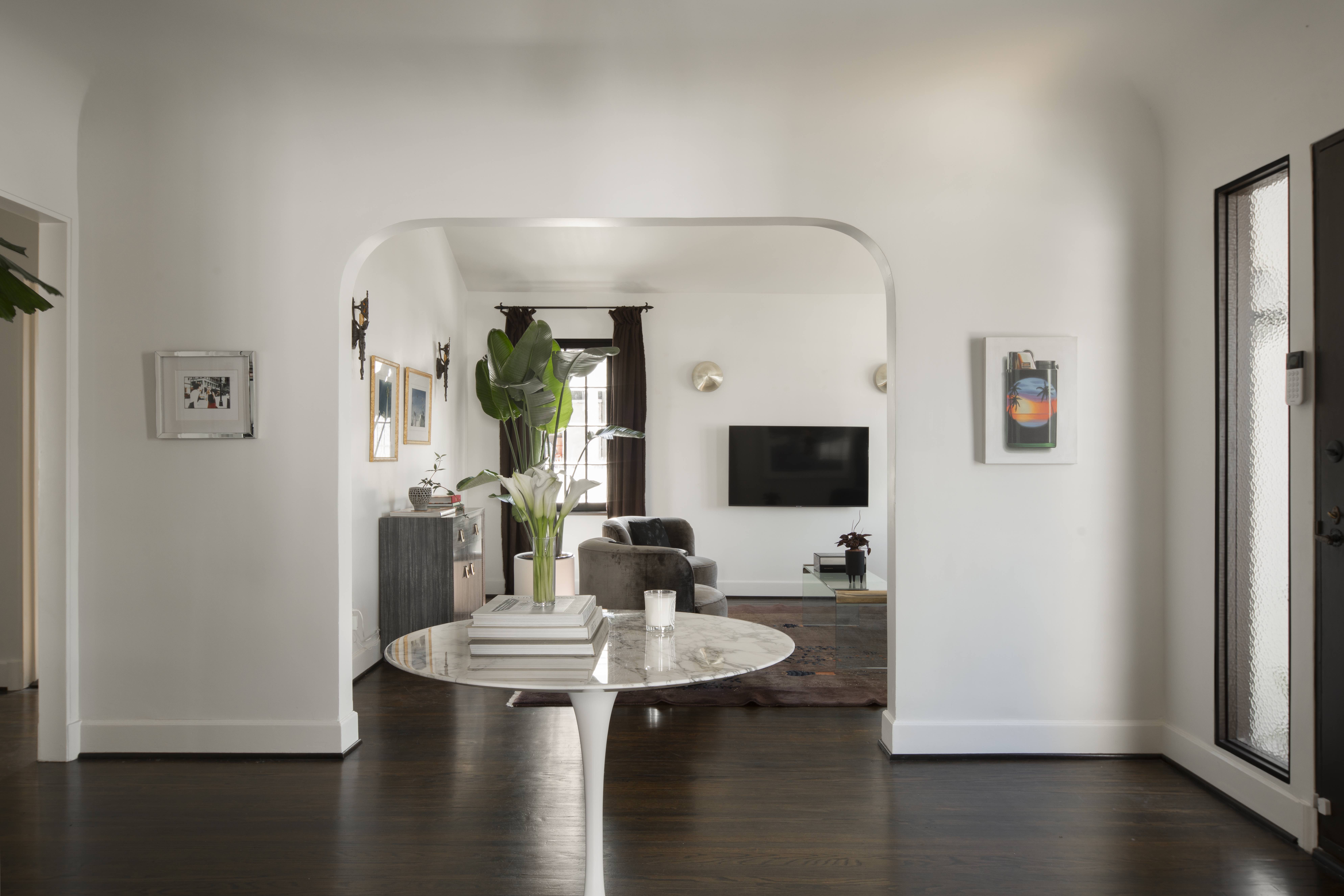
But beyond the aesthetics, the home required some tweaks to its layout, too. 'We decided to unify the spaces of kitchen, breakfast nook and laundry room to create a straight shot for the kitchen space,' Davide explains 'The kitchen and the living room balance themselves, on opposite sides of the house. The first one is the heart of the house, but for aperitivo time, the living room was design to accommodate family and friends casually.'
The right materials
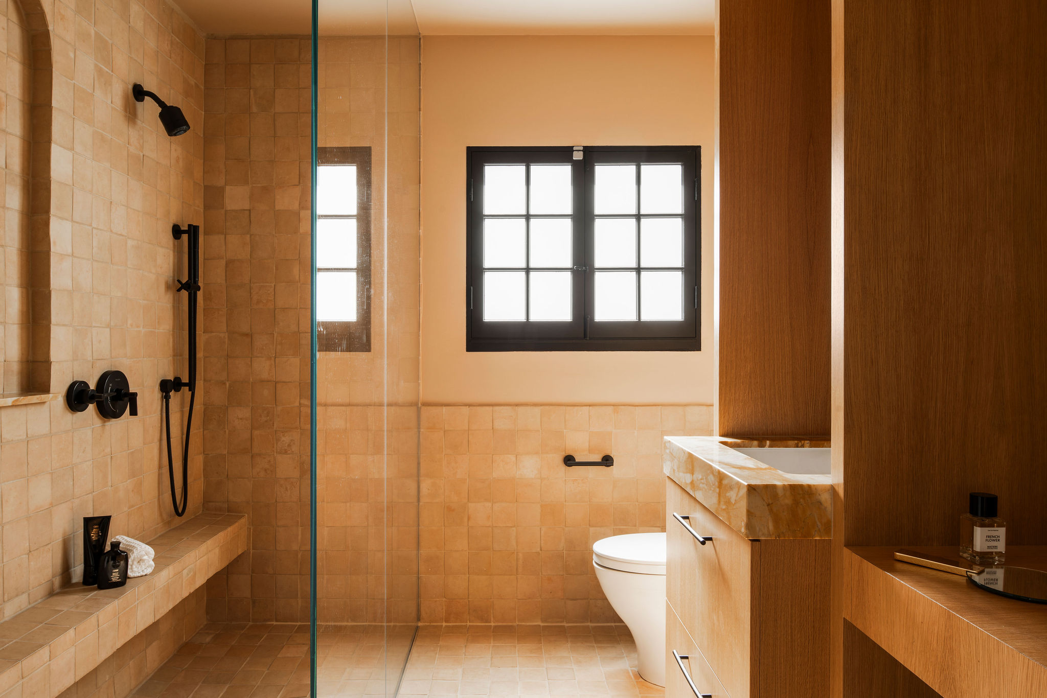
Alongside colors, materiality was important to Davide's design. 'Terracotta and Zellige Moroccan tiles were selected in earthy tones,' he says. 'The floors were stained and repaired with a dark chocolate coat. Then like every real jewel you need your stone. I proposed a powerful marble with movement and color.'
Davide's choice of type of marble, Giallo Siena, is one of the defining moments of this design. 'My friend and I fell in love with it instantly,' Davide says. 'The bold movement and the mix of gold-cream, white and tangerine colors make it an art piece.'
In the modern bathroom, the marble countertop informs the color palette. 'The bathroom is the only room that features the earthy-pink walls, too. I selected a tone-on-tone color to better compliment the countertop and zellige tiles,' Davide says.

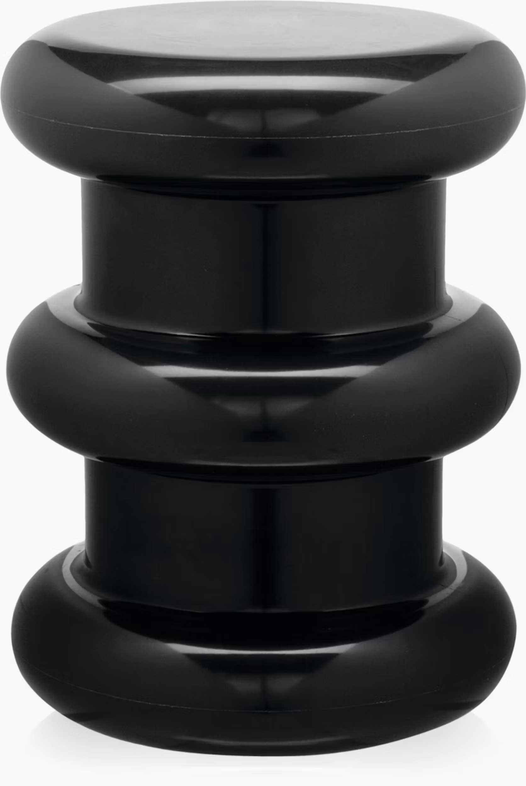
He makes an interesting choice in using a stark black contrast for this soft, organic color palette. 'I specified a Kartell stool in black for the space under the makeup vanity in the bathroom. Just like in the kitchen black features stand out in the earthy earthy bathroom,' the designer says.
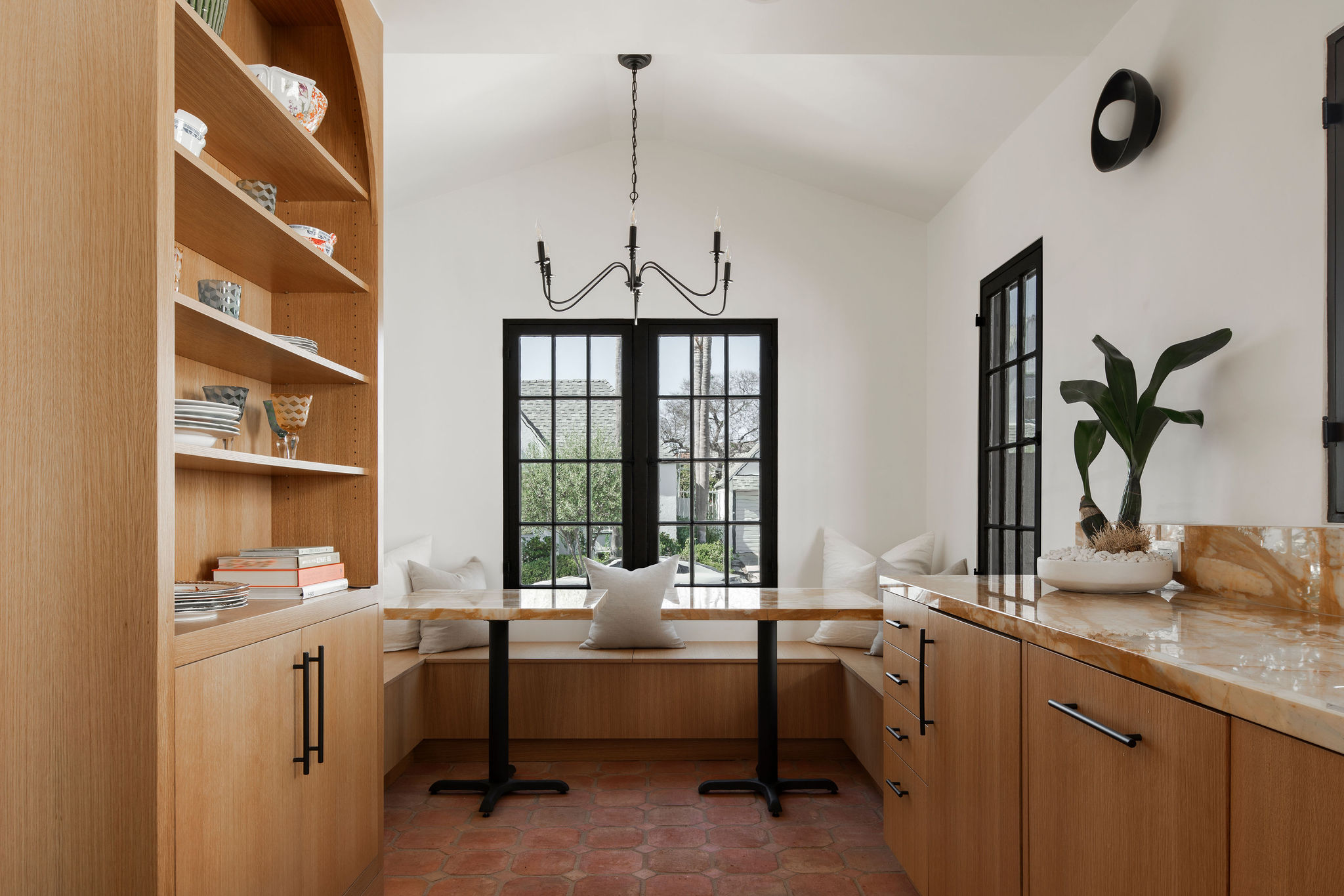
In the kitchen, the Giallo Siena is used in a similar manner for the countertops and kitchen cabinets. 'The counter in the kitchen is 20' long and the choice of not using the upper cabinet was mine. I wanted the counter to have space to breathe and shine,' Davide says. 'You don't put anything above a crown, and the Giallo Siena is our crown.'
'American white oak cabinets in a natural stain were designed to meticulously conceal all the appliances,' Davide adds. 'Even the hood is concealed in the ceiling.'
Its the context of this home that really grounds its design and, for Davide, that was the goal of the restoration of this property. '90% of the buyers would have not restored it,' he says. 'Americans tend to build from scratch in these instances. I was so happy I was able to save an authentic Spanish bungalow. It will stand for another 100 years!'

Hugh is Livingetc.com’s editor. With 8 years in the interiors industry under his belt, he has the nose for what people want to know about re-decorating their homes. He prides himself as an expert trend forecaster, visiting design fairs, showrooms and keeping an eye out for emerging designers to hone his eye. He joined Livingetc back in 2022 as a content editor, as a long-time reader of the print magazine, before becoming its online editor. Hugh has previously spent time as an editor for a kitchen and bathroom magazine, and has written for “hands-on” home brands such as Homebuilding & Renovating and Grand Designs magazine, so his knowledge of what it takes to create a home goes beyond the surface, too. Though not a trained interior designer, Hugh has cut his design teeth by managing several major interior design projects to date, each for private clients. He's also a keen DIYer — he's done everything from laying his own patio and building an integrated cooker hood from scratch, to undertaking plenty of creative IKEA hacks to help achieve the luxurious look he loves in design, when his budget doesn't always stretch that far.
-
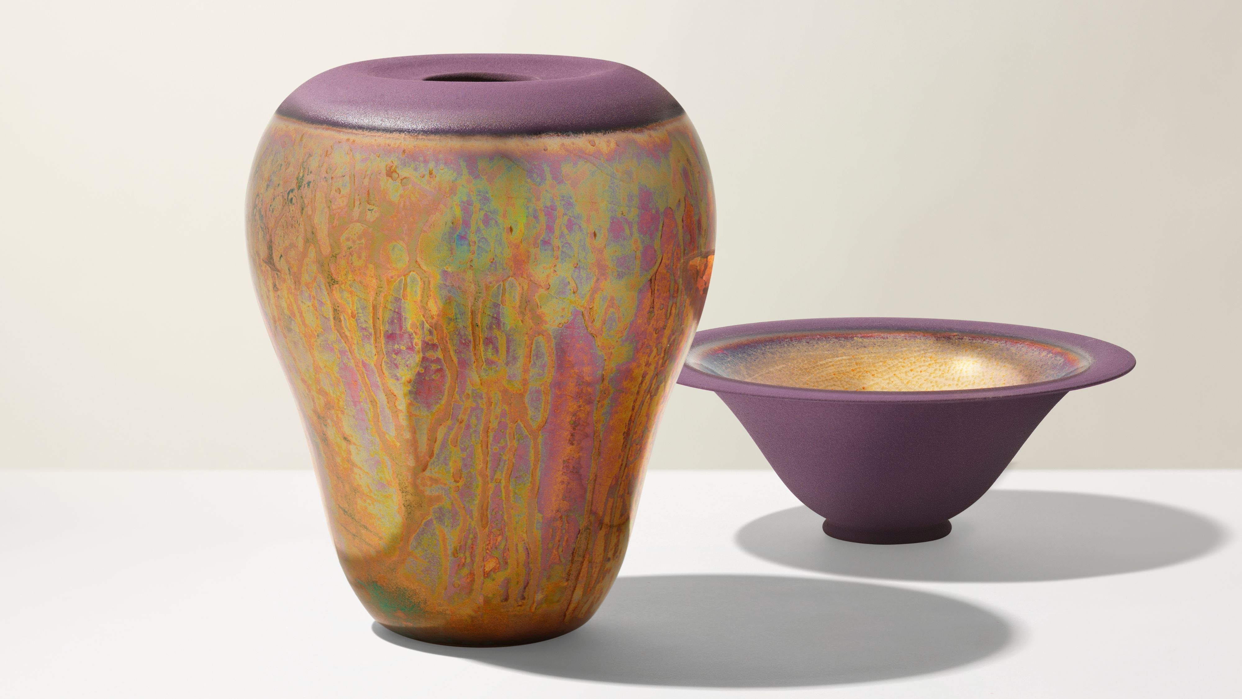 Iridescence Is Chrome’s More Playful, Hard-to-Define Cousin — And You're About to See It Everywhere
This kinetic finish signals a broader shift toward surfaces that move, shimmer, and surprise. Here's where to find it now
By Julia Demer
-
 Biophilic Decluttering — What to Take Out of Your Home (and What to Put in) for a More Natural Home
Try your hand at biophilic decluttering to ground your interiors, connect to the environment, and cure chronic clutter in one go. Here's how.
By Amiya Baratan
