Before & After — A 1940s Baroque-Style Home With an Awkward Layout Has Been Given a Fabulously Functional Flow and Glam Parisian Flair
This glamorous home refurbished by Nicole Lanteri became the ideal canvas for romantic eclecticism and a timeless aesthetic

“It was all yellow,” explains Nicole Lanteri of Nicole Lanteri Design. This historic residence, located in a wooded enclave bordering Washington, D.C.’s tranquil Rock Creek Park, was steeped in rich history — a 1948 Baroque-style dwelling with spacious rooms and 7,400 square feet of living space. However, it was plagued by awkward layouts, butter yellow walls, and outdated design, making it ripe for modernization.
The owners, Rachel and Henry, dreamed of a space that would reflect a blend of Art Deco and Parisian charm, with clean, interesting, and whimsical elements thoughtfully incorporated throughout. “Rachel, in fact, had saved several design ideas and was deeply involved in shaping the modern home's new aesthetic,” shares Nicole. “This six-bedroom home took about seven months to complete, and we focused primarily on addressing awkward layouts while infusing the space with fresh colors, patterns, and unique finds.”
Key changes included a reimagined statement fireplace and the creative use of drapery and paint. “The unconventional application of drapery and strategic color trims allowed us to define distinct spaces while creating areas that flowed seamlessly,” adds Nicole. “These touches, like optical illusions created through color, helped balance the feel and flow of certain rooms.”
We take a closer look at the full transformation below.
The Entrance
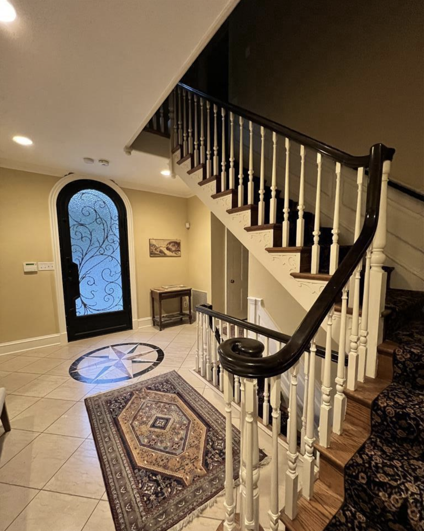
The entryway was once a dull, yellow space with “this awful compass in the middle of the floor,” explains Nicole Lanteri.
While guests often found the existing grand staircase impressive, Nicole wanted to find a new staircase idea that would transform its visual appeal from ostentatious to something more invigorating and stylish for the homeowners.
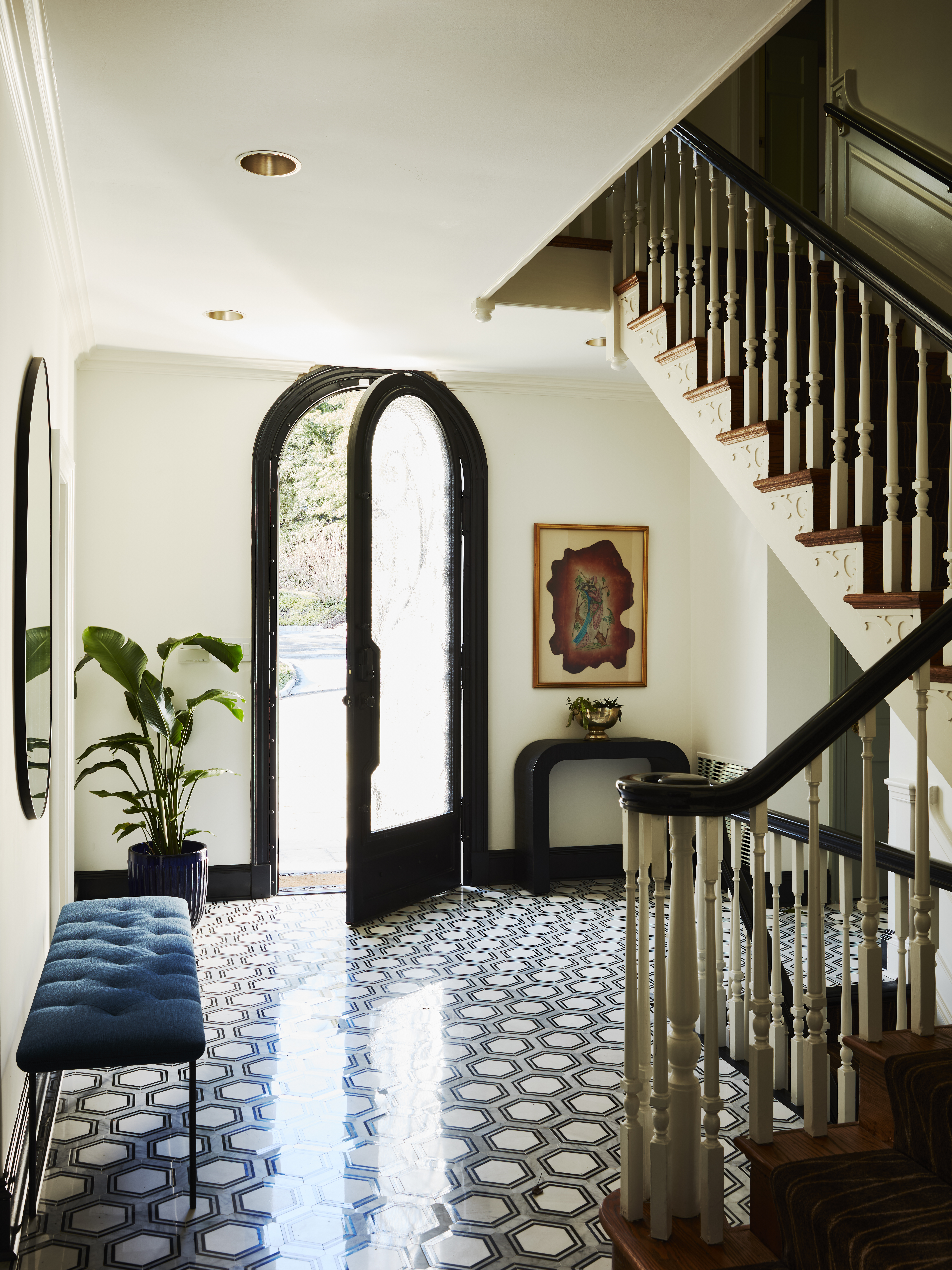
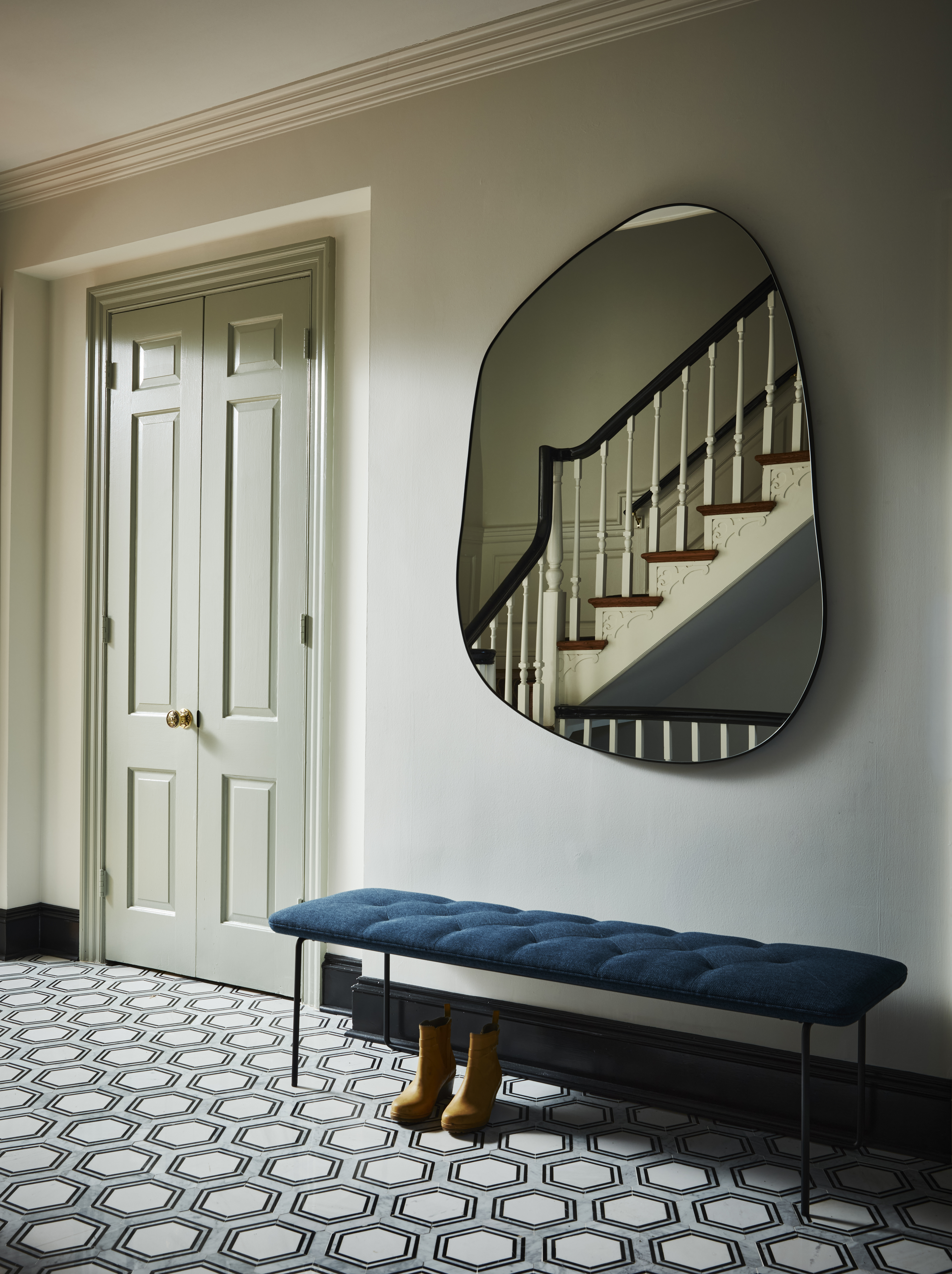
The designer changed the flooring, wall paints, and the stair runner to inject a fresher and more contemporary vibe. "We replaced the outdated tile (and compass) with edgy black and white hex Mosaic tile and paired it with Milliken Streamline II staircase runner," shares Nicole.
Be The First To Know
The Livingetc newsletters are your inside source for what’s shaping interiors now - and what’s next. Discover trend forecasts, smart style ideas, and curated shopping inspiration that brings design to life. Subscribe today and stay ahead of the curve.
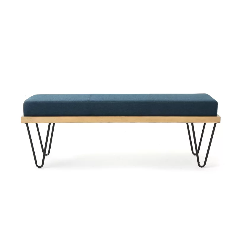
To further balance the sharp shades and colors in the space, Nicole sourced an upholstered bench seat from Article, CB2's curved Lacquered Linen Console, and an organically-shaped mirror from Ethink Living.
To round out the space, all the walls in the house were repainted in Benjamin Moore White Dove.
The Living room
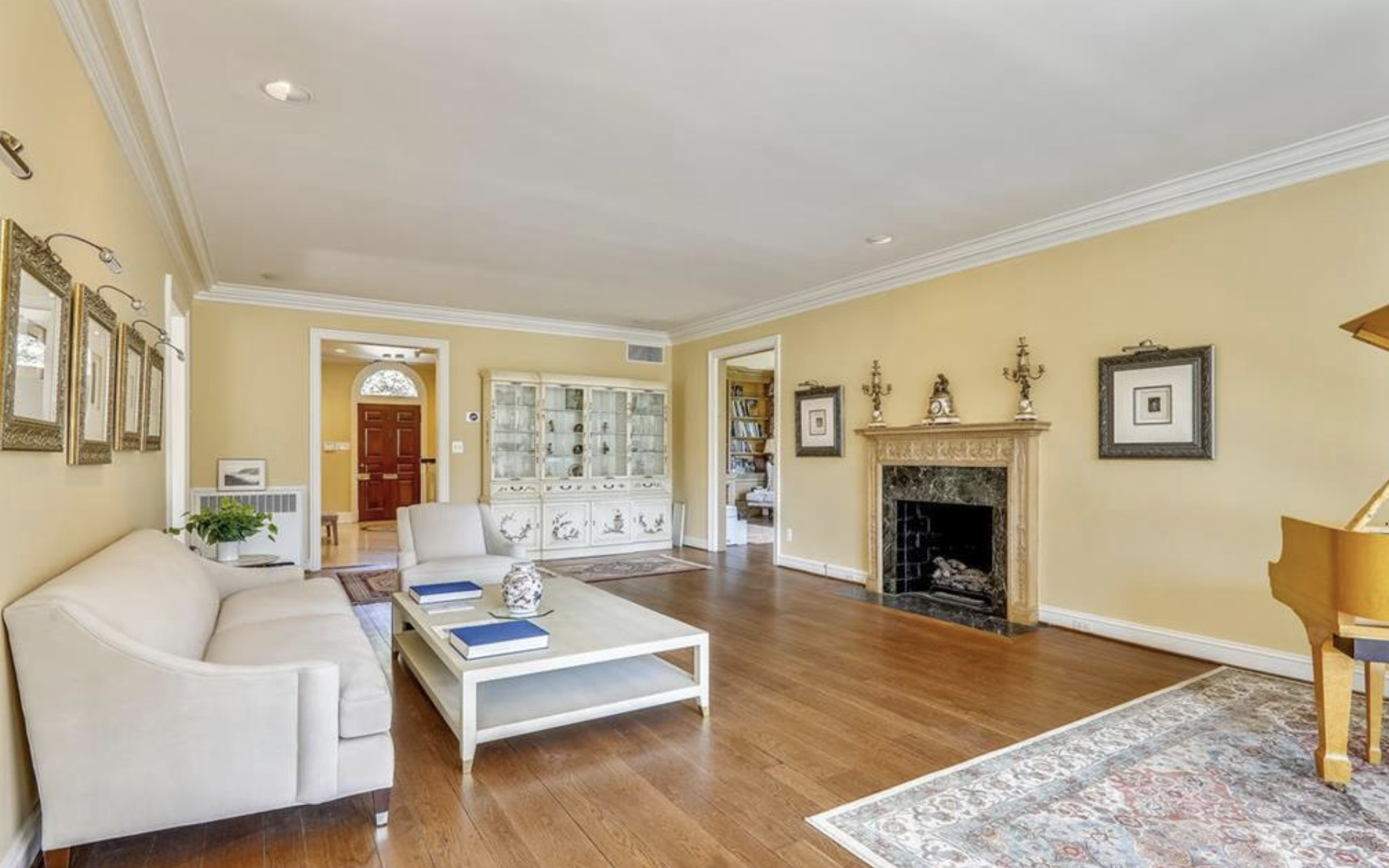
While large and spacious, the existing living room layout was awkward. The long and narrow room featured entrances to and from the dining room, and sunroom, with prominent windows and a large fireplace. While all these structural elements were hard to replace, its interior design too was begging to be updated.
“For the living room I wanted a muted, warm mix of tones, and a mix of textures,” explains Nicole. “I knew we wanted some patterned rugs throughout the house too.” The clients wanted to enjoy this flexible space as much as possible — whether to entertain during big holiday gatherings or intimate game nights.


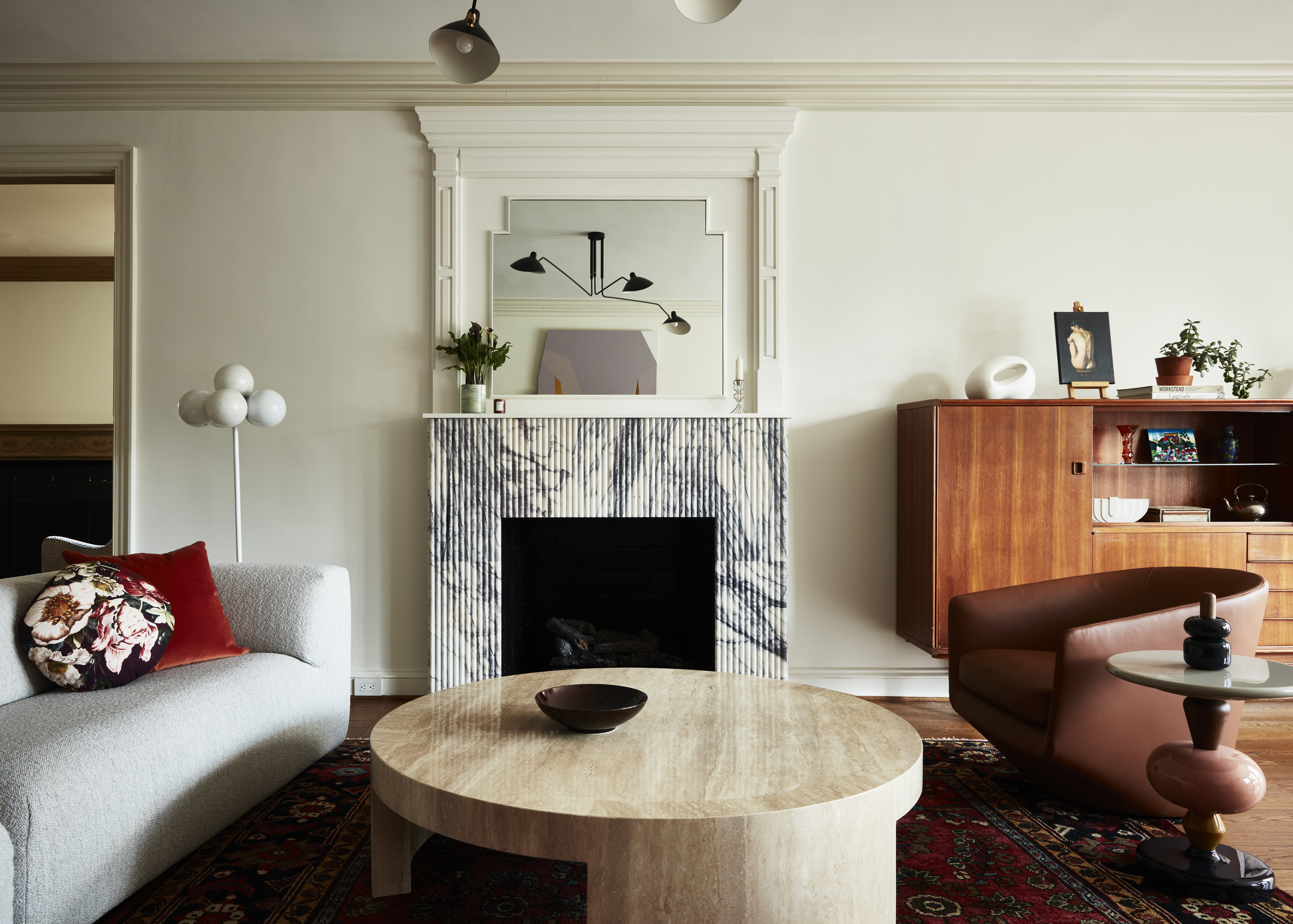
The room was transformed into a cozy living room and games room with neutral colors, warm wood, and a mix of soft and glossy surfaces. "We incorporated multiple layers of vintage and modern furnishings, including a vintage walnut dry bar our client loved," says Nicole. "An engaging painting by Baltimore-based artist Emma Childs hangs majestically over a beige long piece by Swiss maker USM and brings the room into beautiful harmony by complimenting and pulling key colors."
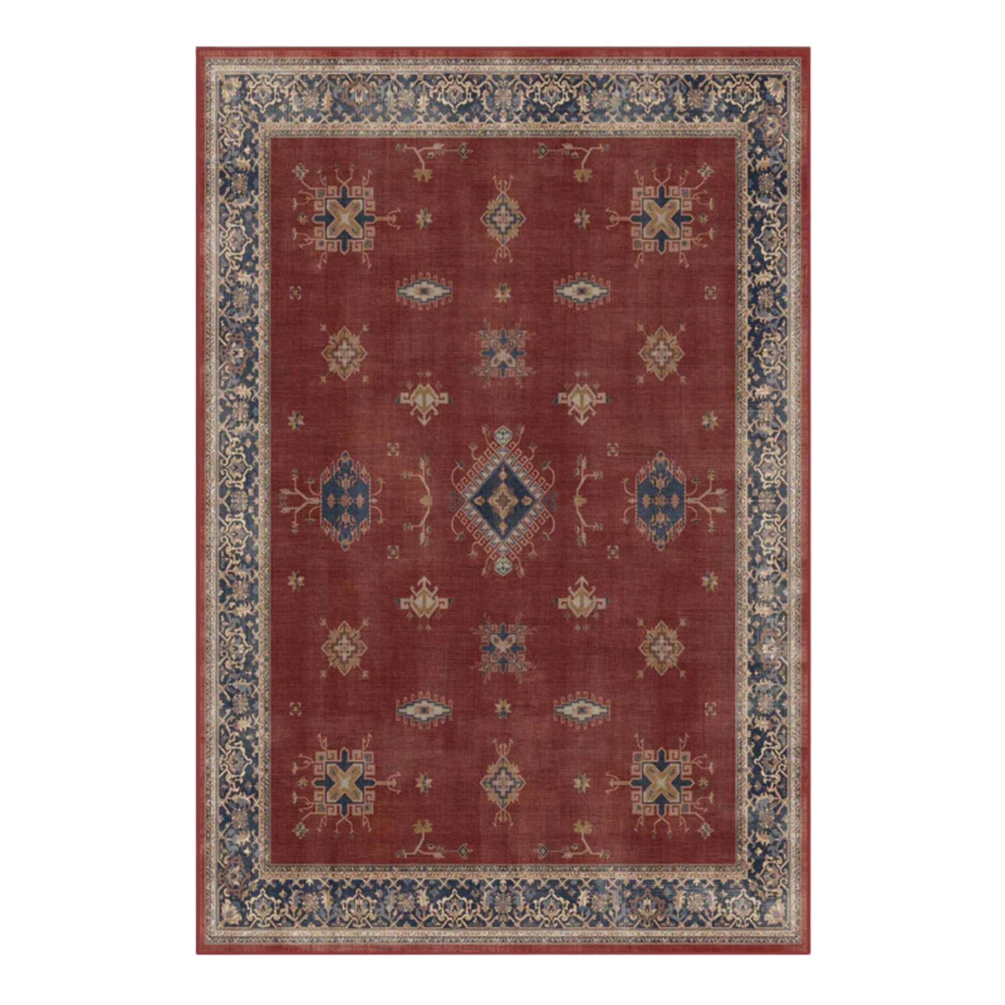
A robust yet squishy Aztec sofa by Montis sits in front of a travertine coffee table, and mixed side chairs, including a navy Reversível by Tacchini and two U-Turns by Bensen in brown and light gray, are all warmly showcased. Plus, there's a 1920s Antique Mahal rug adding to the setting.


The statement fireplace idea creates a special moment in the room, too. "We designed it with a stunning Belcaro white and deep lilac fluted marble from Ann Sacks which anchors the room and presents as an artistic focal point that centers the comfortable sitting area," explains the designer. "Additionally, we installed Schumacher’s Freeform fabric as soothing drapery on bump-out walls to mimic the effect of drapery on a window and break up the space to hold a table perfect for game nights."
The games table was designed as a functional solution for the awkward layout. “There wasn't quite enough room for another large seating room, and the family does like to play games and needed a space for the kids to do their homework,” says Nicole. “Since the grand dining is used for meals, this was a nice spot where you could sit and work, or socialize.”
The Dining room
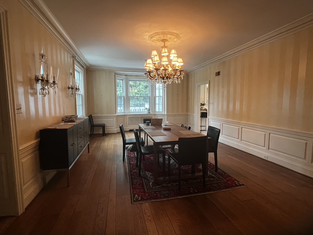
This large, and rather unconventional dining room was riddled with a few challenges: it had four separate entrances, nothing was centered (lights, windows, doors), and the walls had been painted in white and yellow stripes — a previous design choice that would prove difficult and surprisingly expensive to paint over.
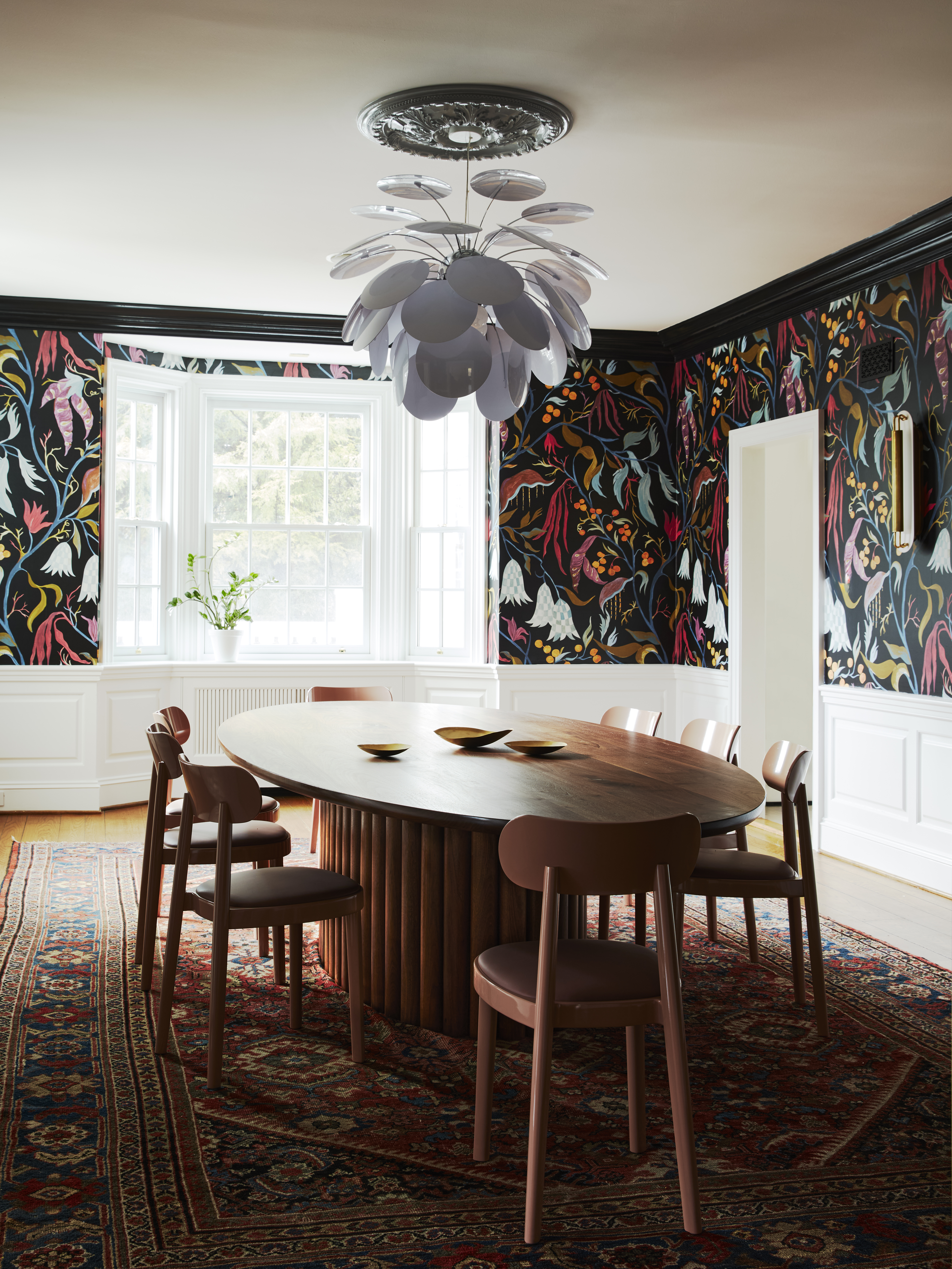
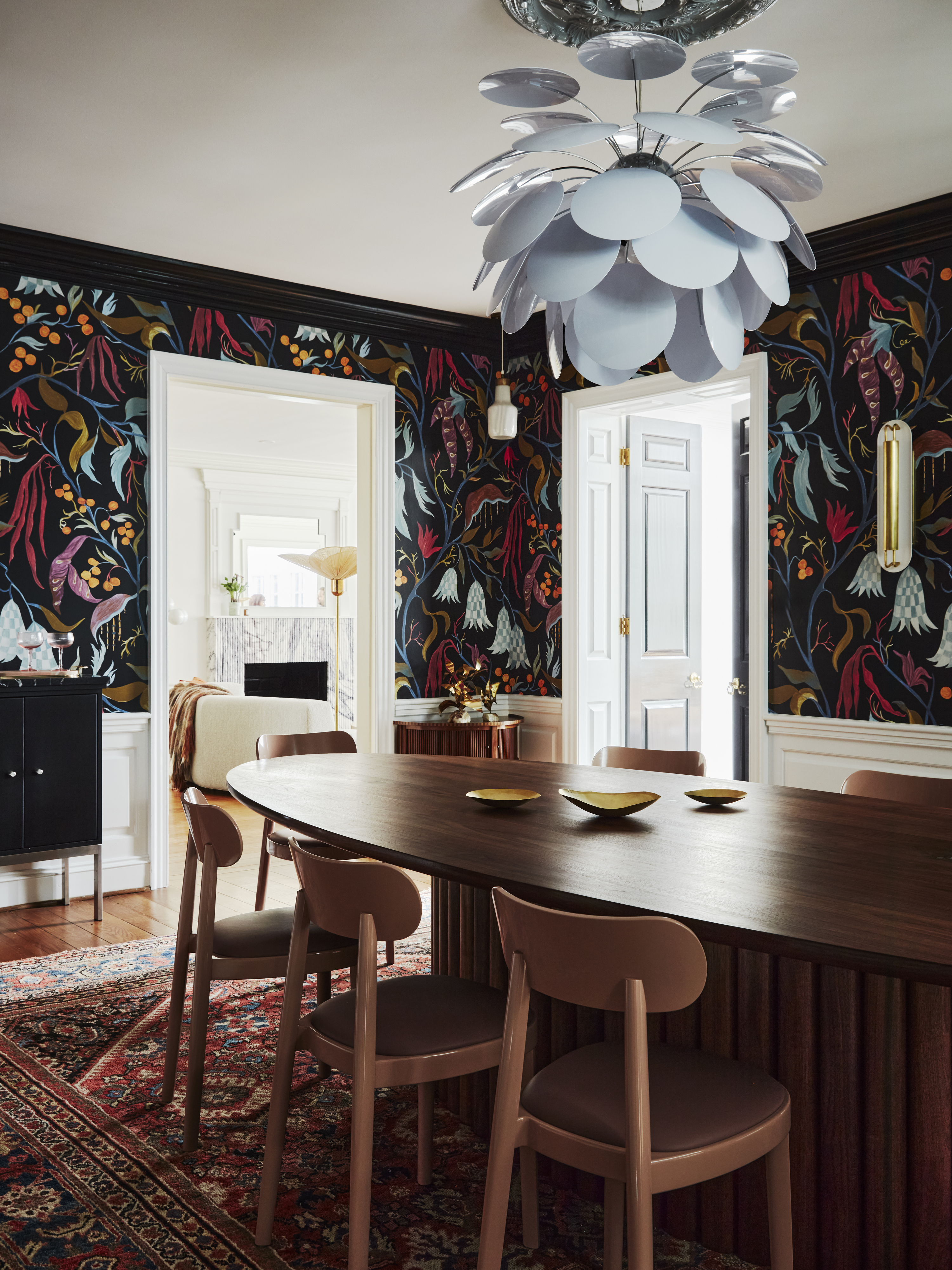

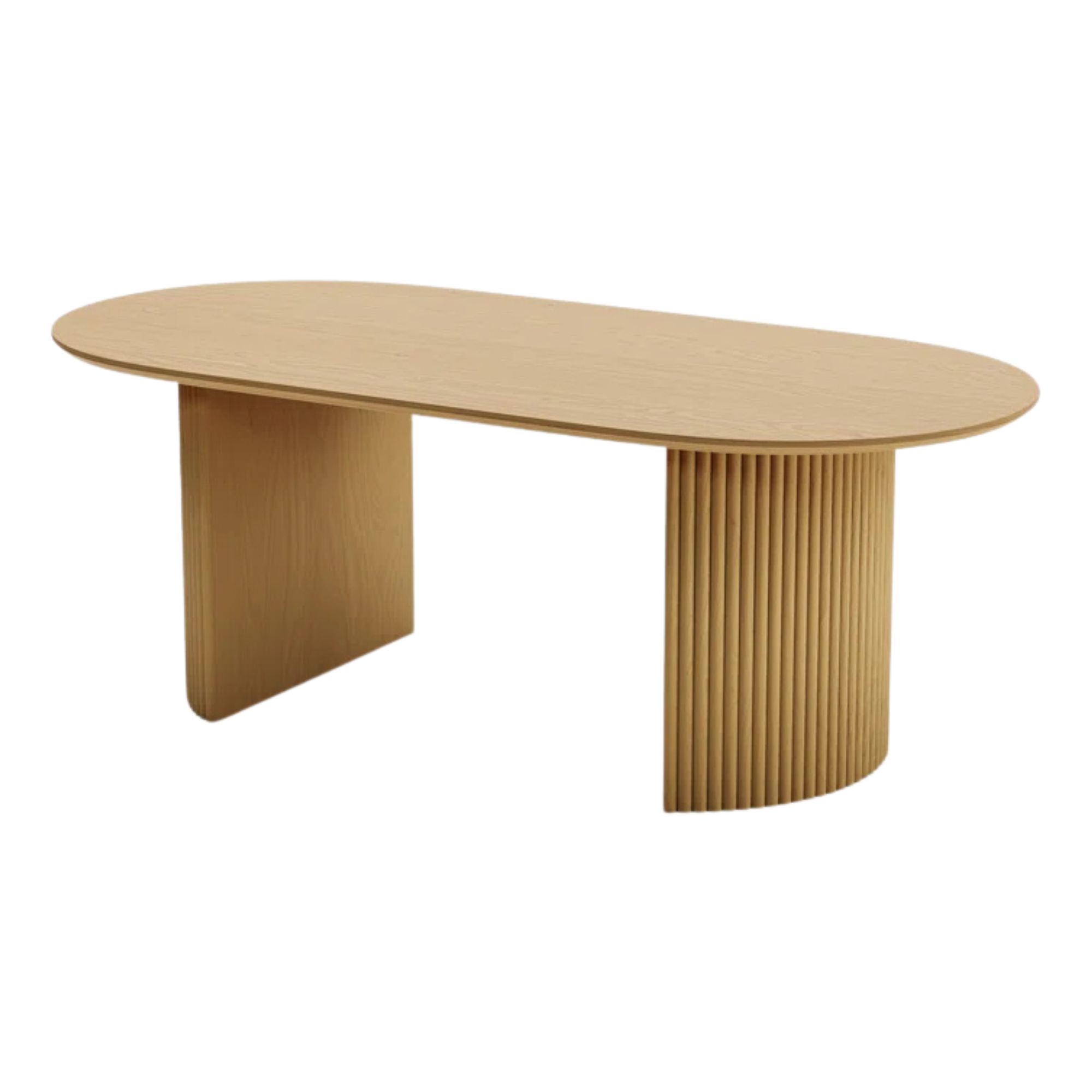
The solution hinged on the large, oval dining table that broke the awkward lines in the room, and gave the room movement. "We worked with DC artisan Trey Jones Studio to build a custom walnut table designed for at least twelve guests comfortably seated in pink Thonet 118 SP Chairs," says Nicole. "The ellipse table features an impressive fluted base and metallic detailing."
The lights and wallpaper installation was the next course of action, but both proved to be surprisingly challenging tasks. “We had to drill into the ceiling to add the hanging lights, and that’s when we realized the ceiling had beams that were super old,” shares the designer. “And these can be hard to drill into."
And replacing the wallpaper "was a journey," she describes. "We knew we wanted wallpaper on the walls but it had to have the right scale. And we knew we wanted something dark but not too moody so we ended up with this surrealist pattern in Pierre Frey’s Lucille — its design works for both dinner or breakfast. And then the big move was to paint the wainscoting white, and the trim on the top black — I think that brought it all together.”
The Powder Room
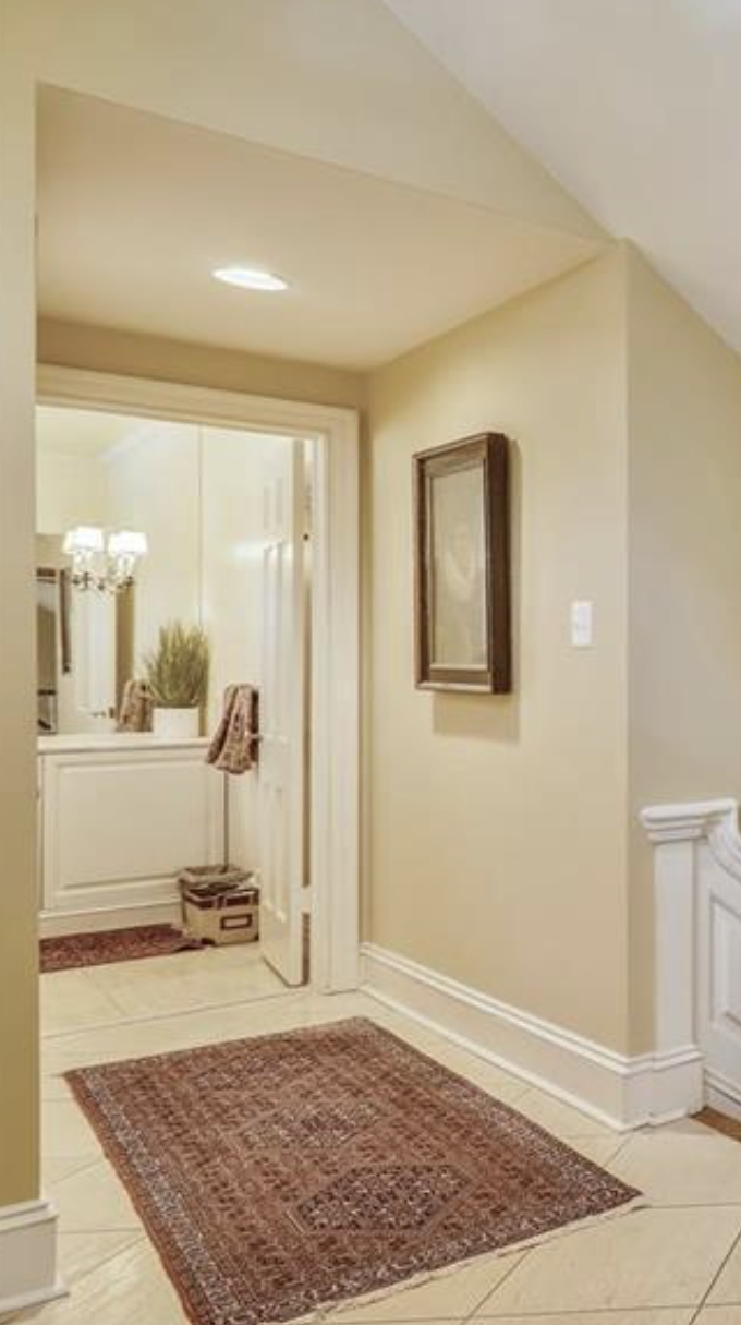
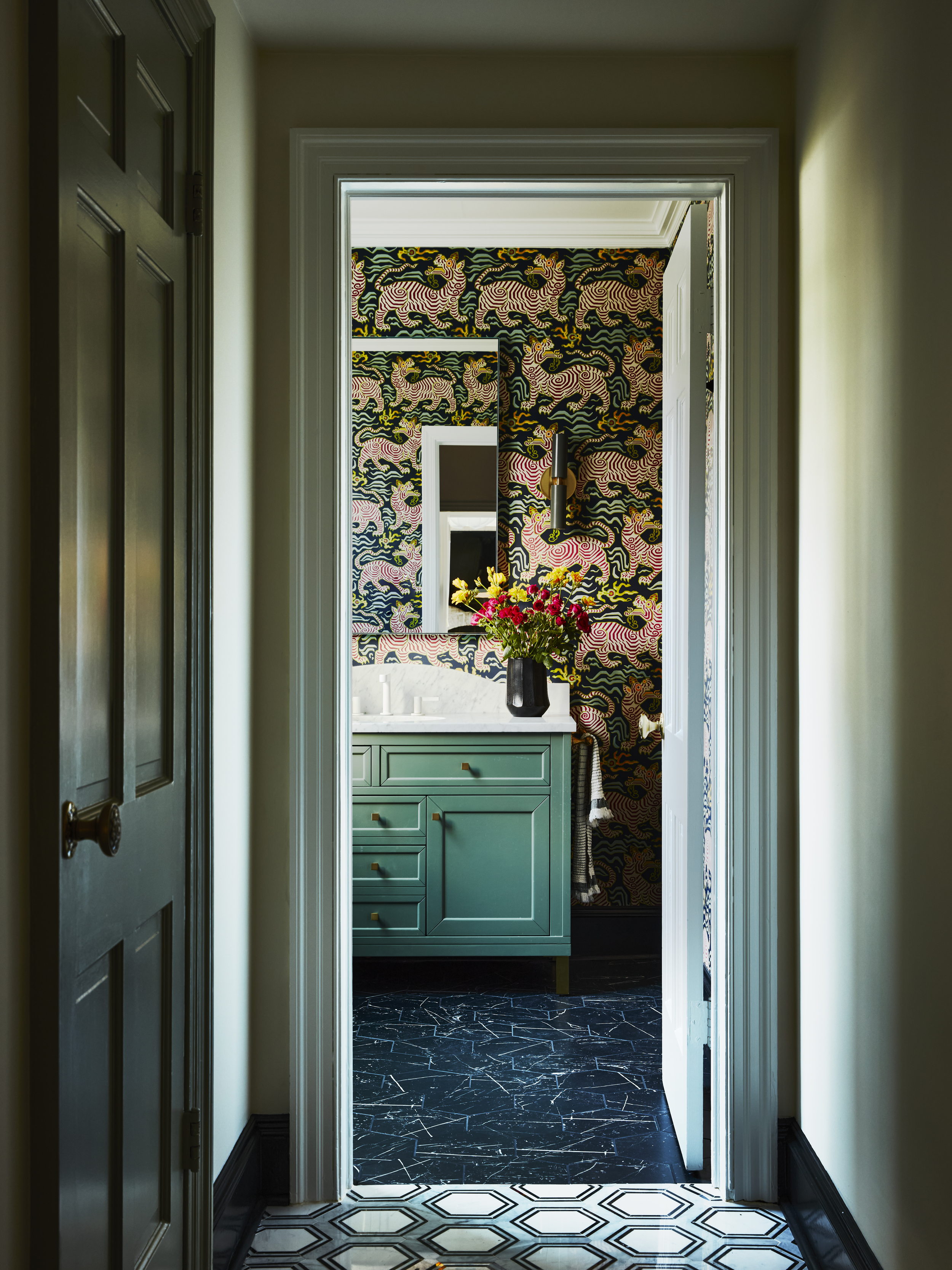
Located close to the entrance hall is the freshly refurbished powder room; a bright, welcoming, and print-rich canvas.
"Continuing the hexagon motif at the entrance, we installed a contrasting style that captures the appearance of a black marble look in the Timeless Hex Marquina Tile," says Nicole. "Delightful, graphic tigers dance in the Tibet wallpaper by Clarence House and are balanced with modern fixtures including the crisp Infinity Mirror and cylindrical wall sconces from Dutton Brown, and a smokey celadon James Martin vanity topped with white Carrara honed marble and a sleek white matte Hansgrohe faucet."
A home that was once a relic of the past has been transformed into an exemplary modern dwelling, perfect for a young family. “I think the biggest challenge while designing this home was working with the existing rooms,” says Nicole Lanteri. “They were very large but also awkwardly shaped. For instance, the dining room had multiple door openings, and the living room was extremely narrow. Making these spaces functional was a real challenge.”
However, through clever design solutions, custom furniture pieces, and carefully chosen paint colors and wallpapers, Nicole successfully addressed these challenges, creating a harmonious and practical family home.

Aditi Sharma Maheshwari started her career at The Address (The Times of India), a tabloid on interiors and art. She wrote profiles of Indian artists, designers, and architects, and covered inspiring houses and commercial properties. After four years, she moved to ELLE DECOR as a senior features writer, where she contributed to the magazine and website, and also worked alongside the events team on India Design ID — the brand’s 10-day, annual design show. She wrote across topics: from designer interviews, and house tours, to new product launches, shopping pages, and reviews. After three years, she was hired as the senior editor at Houzz. The website content focused on practical advice on decorating the home and making design feel more approachable. She created fresh series on budget buys, design hacks, and DIYs, all backed with expert advice. Equipped with sizable knowledge of the industry and with a good network, she moved to Architectural Digest (Conde Nast) as the digital editor. The publication's focus was on high-end design, and her content highlighted A-listers, starchitects, and high-concept products, all customized for an audience that loves and invests in luxury. After a two-year stint, she moved to the UK and was hired at Livingetc as a design editor. She now freelances for a variety of interiors publications.
-
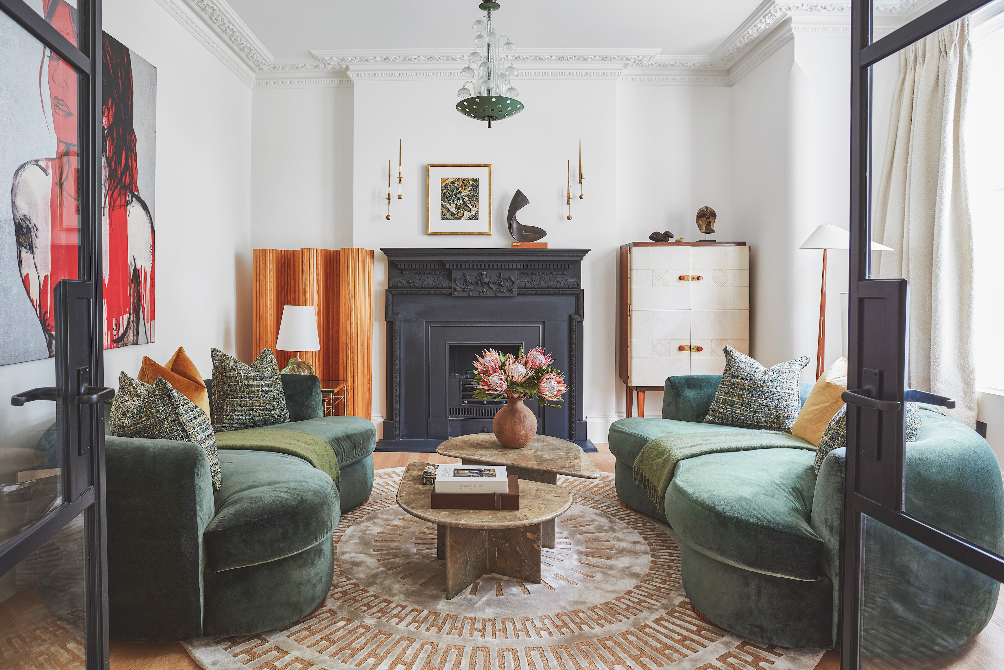 The 'New British' Style? This Victorian London Home Embraces Its Owners' Global Background
Warm timber details, confident color pops, and an uninterrupted connection to the garden are the hallmarks of this relaxed yet design-forward family home
By Emma J Page
-
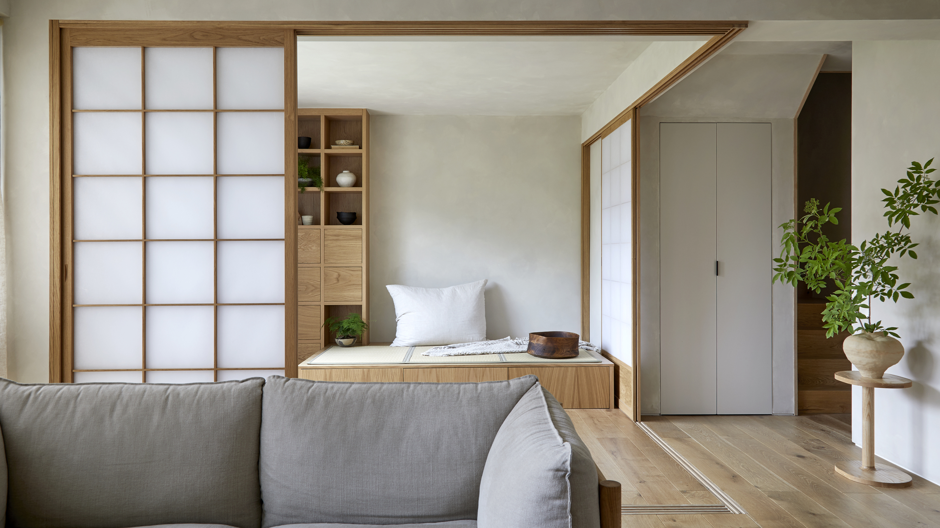 Muji Living Room Ideas — 5 Ways to Harness The Calming Qualities of This Japanese Design Style
Inspired by Japanese "zen" principles, Muji living rooms are all about cultivating a calming, tranquil space that nourishes the soul
By Lilith Hudson

