Behind its bright yellow front door, this Ladbroke Grove villa is a lesson in fun, playful interiors
An eclectic interior was top priority when a French couple revamped their west London Victorian home with a mix of traditional touches and amusing ideas
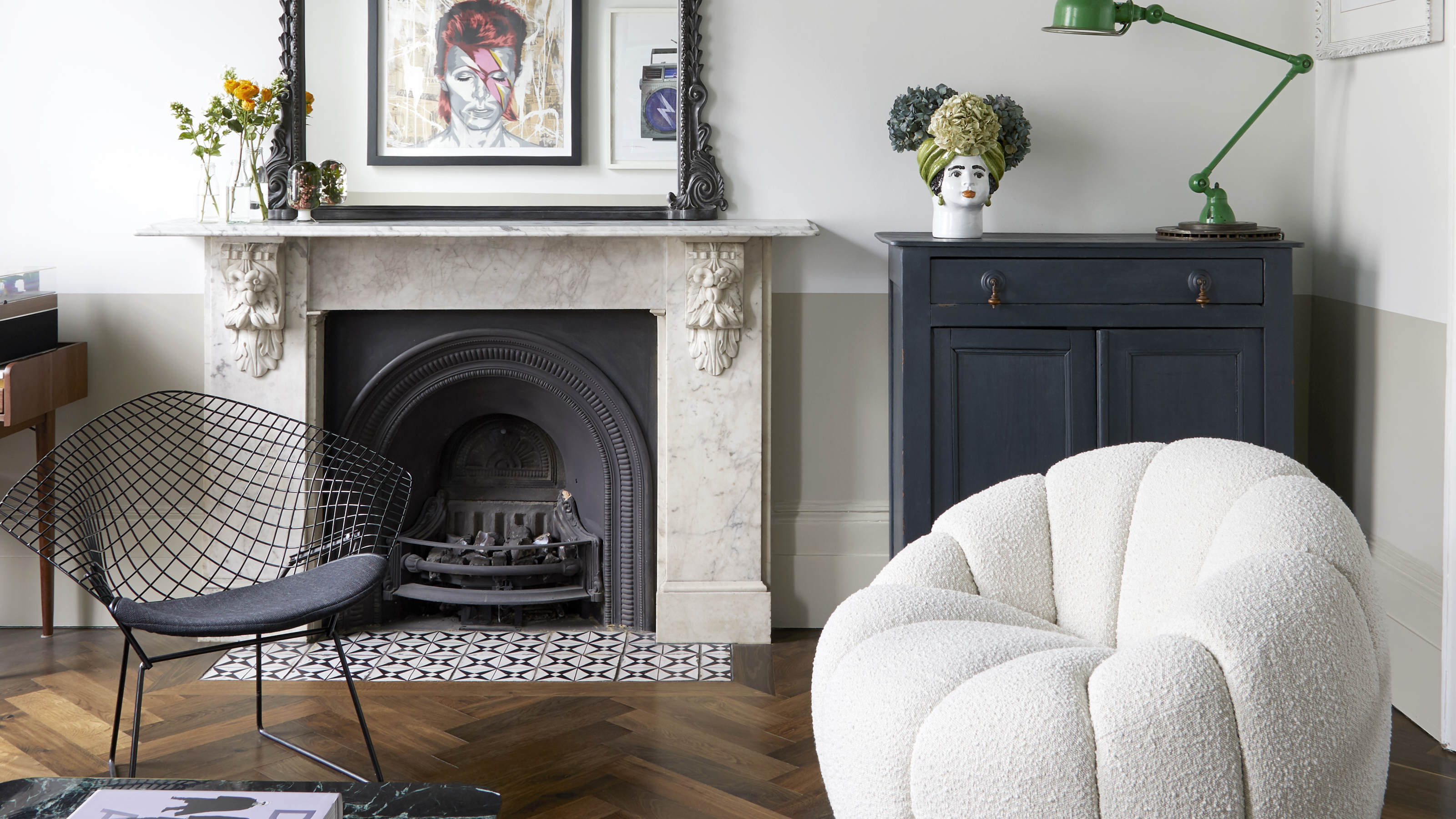
Behind its blue and yellow facade, this Victorian end of terrace modern home in west London belongs to a couple and their two sons. As their names suggest, Amandine and Julien Vanhaesebroucke are French born and bred but when they found their dream of a west London Victorian terrace house two years ago, top of the list was to honor its heritage and big up its British roots.
Having already lived in the neighborhood for 10 years, the couple and their two boys, Gabriel and Camille, have come to love Le style Anglais. ‘Our design mantra for the house was eclectic, cozy and playful, a modern take on how people here restore period properties,’ says Amandine, who works in a French school. ‘It had to be warm and inviting for friends of ours and the boys, and have plenty of storage for family paraphernalia too.’ Plus accommodate their art - Julien, who works in finance, is a big collector.
As a recently renovated townhouse - by McLaren Excell architects - it ticked all the boxes. ‘We were too busy for the upheaval of building work and all that entails but we very much wanted to put our own stamp on the home,’ says Amandine. The family moved in at the beginning of lockdown so they had plenty of time to get to know the house before deciding on how to reshape it. ‘We realized how lucky we were that it came with two home offices,’ she says.
Amandine met French/British designer Celine Erlam of Indie & Co because their husbands knew each other. ‘It felt like fate and Celine and I had an instant rapport which eliminated a lot of the stress,’ she says.
Exterior
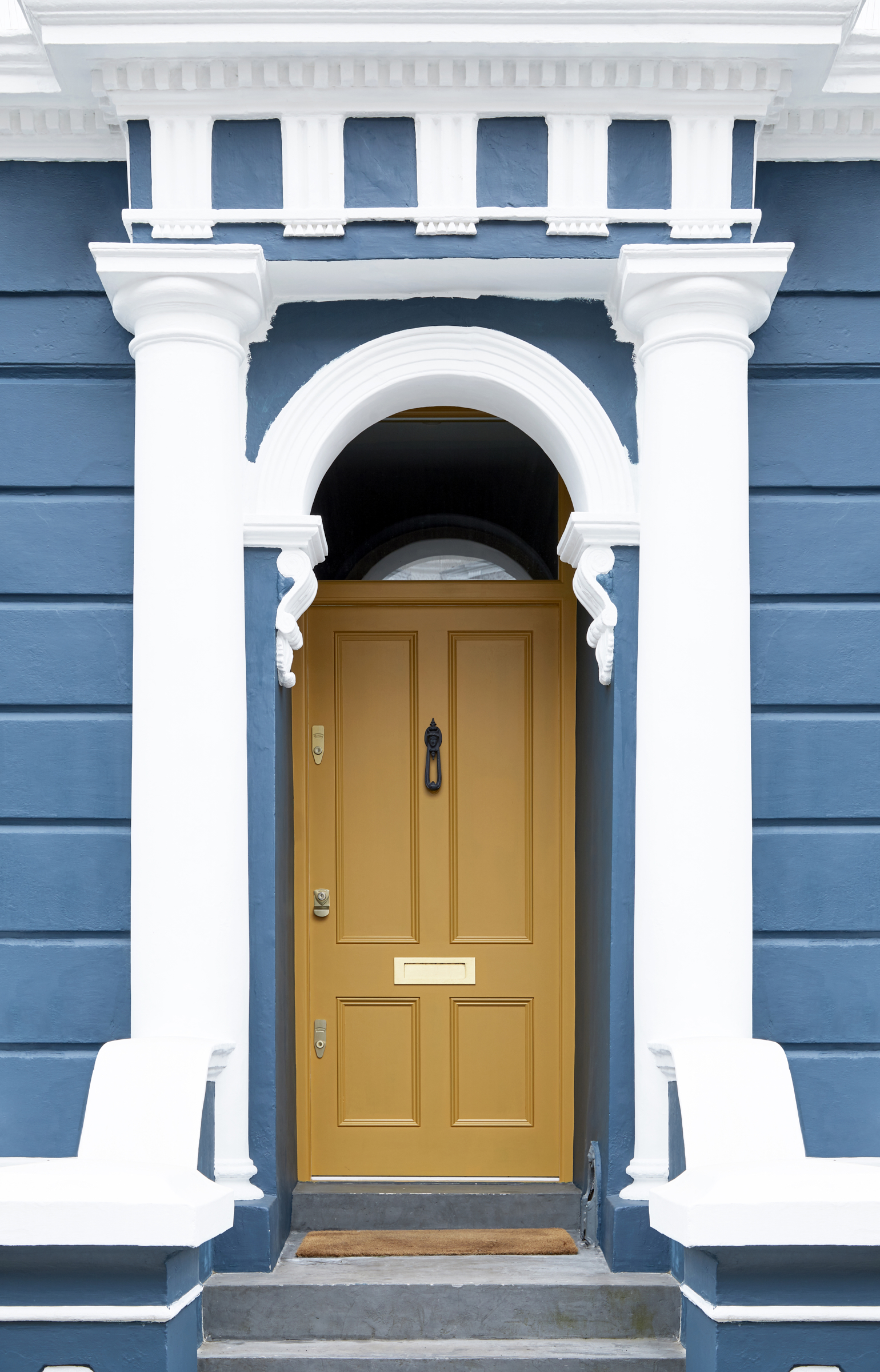
The outside of the house was painstakingly restored with bold color that give an indication of what lies behind. ‘The bones of the house were great - we just wanted to add personality and make it more vibrant,' says Amandine. ‘We wanted our friends from France to get the feel of what it was like to be in a British house.’
Hallway
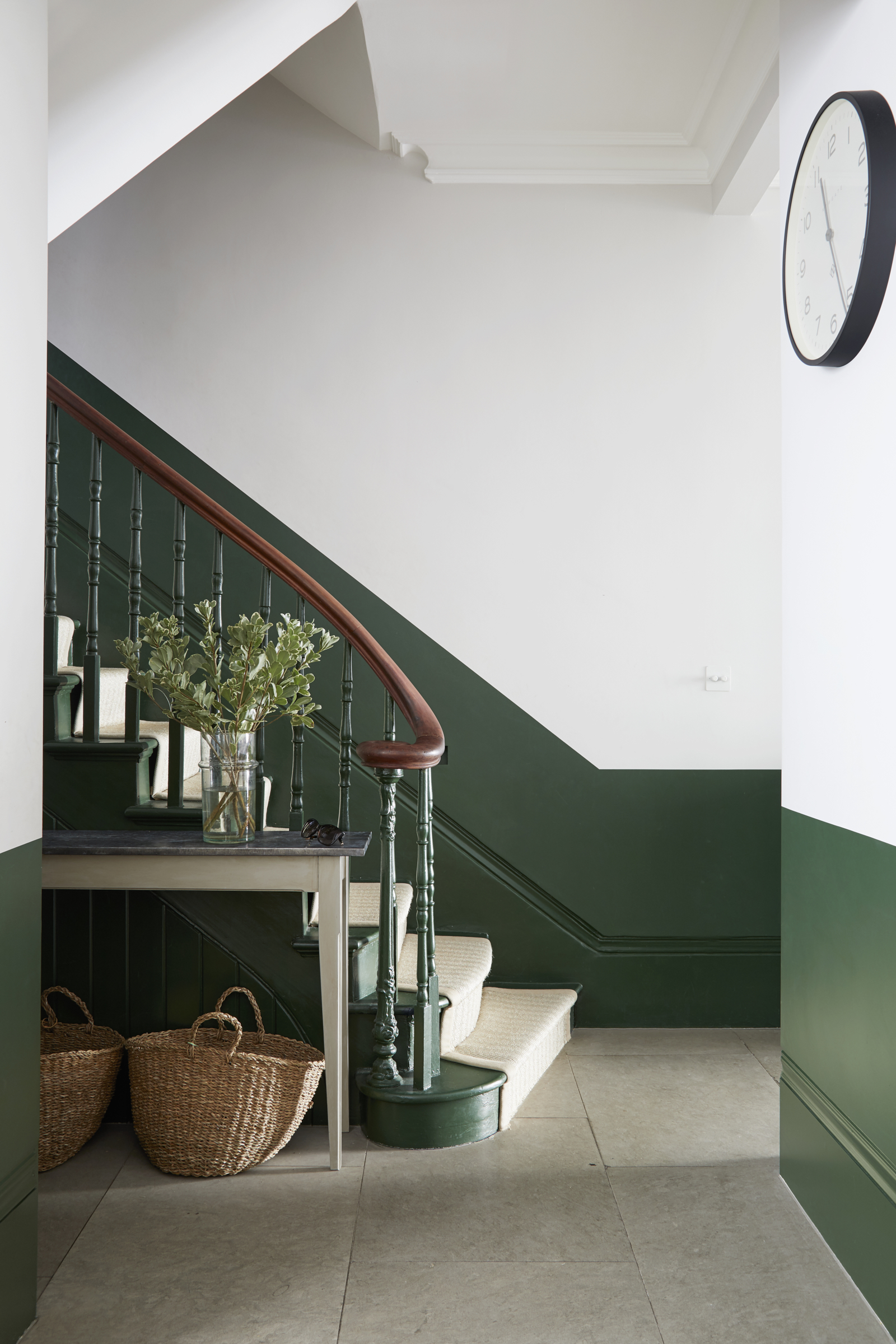
The brief to Celine was for a super-speedy turnaround in terms of getting the work done. ‘We took the boys to France for the summer holidays and gave her six weeks to have the crucial elements in place - which was pushing it, but, thankfully for us, it happened!’ says Amandine. Then it took around another six weeks for finishing touches like furniture and furnishings to be installed.
Walls are painted in Strong white and Duck Green by Farrow & Ball. ‘It was important to make a statement here in the hall as it sets the tone and gives you the initial impression,’ she adds.
Be The First To Know
The Livingetc newsletters are your inside source for what’s shaping interiors now - and what’s next. Discover trend forecasts, smart style ideas, and curated shopping inspiration that brings design to life. Subscribe today and stay ahead of the curve.
Living room
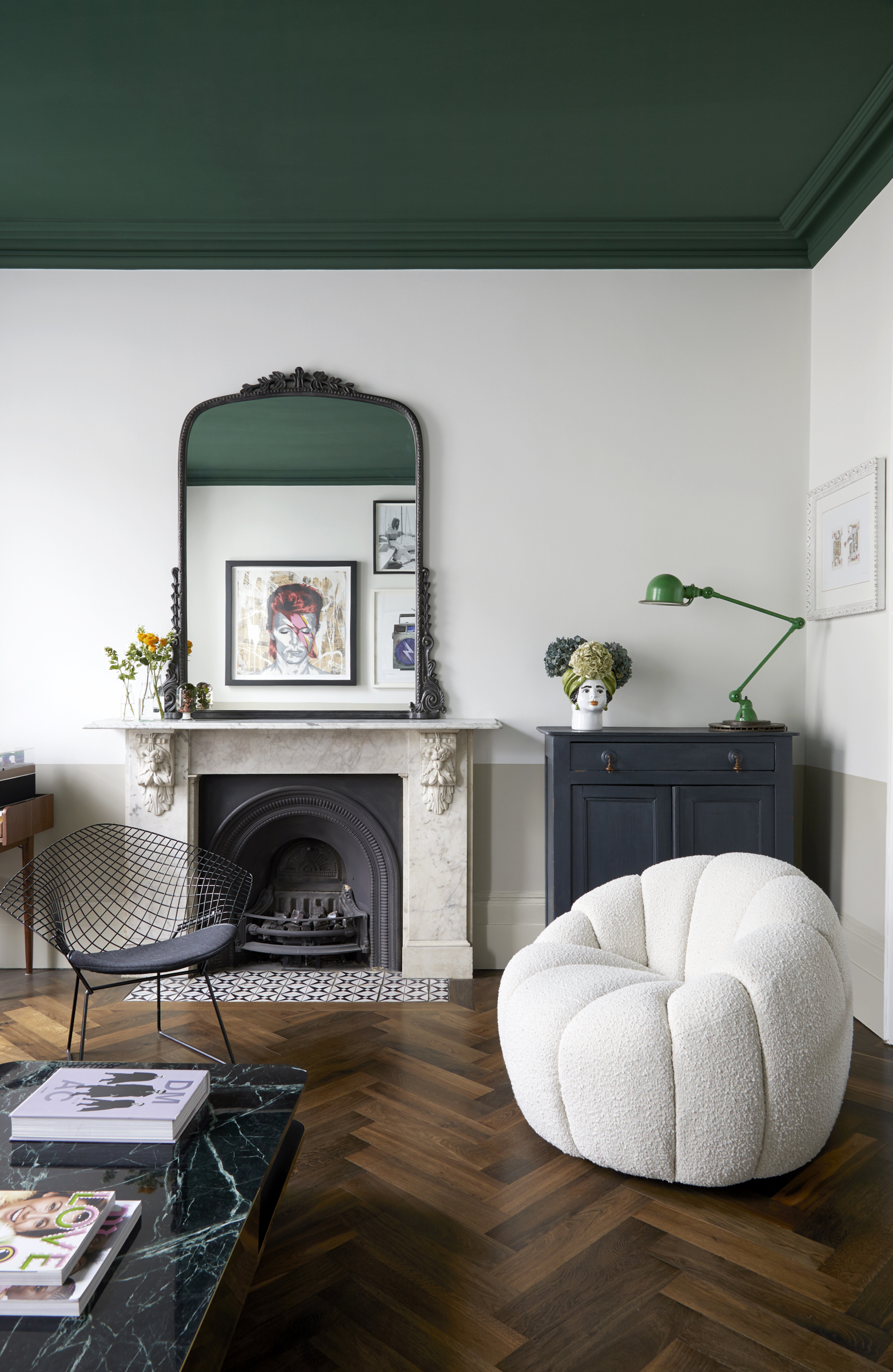
After coming up with a concept to suit the ‘vibrant, fun and family-friendly brief’, Celine and her team presented Amandine with options for each decision - from paint colors to extra storage, from wallpaper ideas, armchairs and accessories. ‘We knew we were in safe hands because we trusted her style and taste so it was easy to make decisions,’ says Amandine. ‘We broke the rules by having a dramatically dark ceiling and white walls. It’s a simple way of making a strong impact.’
Walls here were kept deliberately plain so Julien’s eclectic collection of art would sing out. ‘This is the most grown up part of the house where we relax with friends, so we wanted a timeless and calm feel,’ she adds. Each room has its own identity, yet is still connected. The boys can be in the family room while the grown ups are in the living room - separate, yet together.
Bottom wall painted in Drop Cloth, middle section in Strong White, both Farrow & Ball and ceiling and cornicing in Hunter Dunn, Paint & Paper Library.
Kitchen
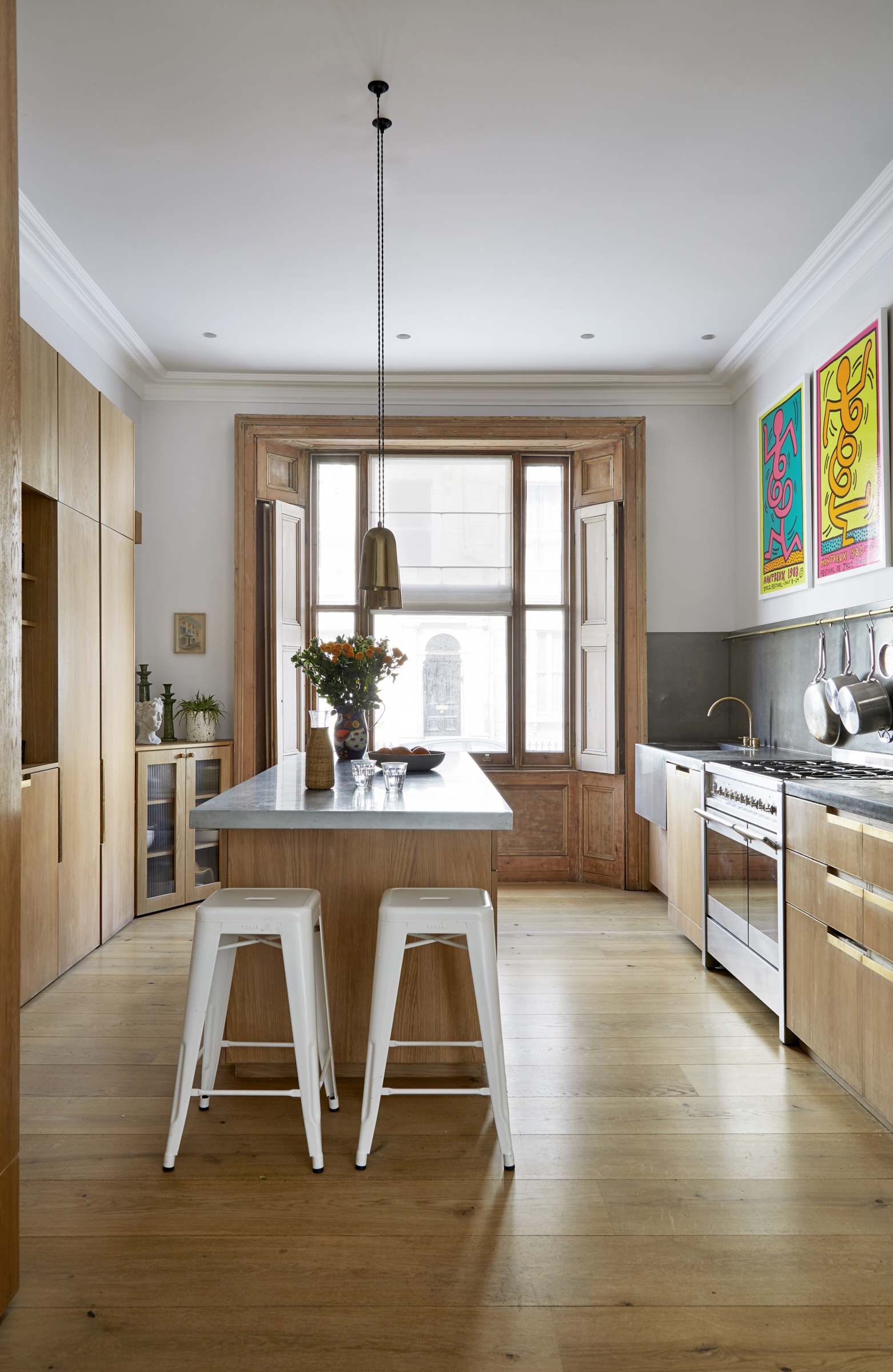
Although there were no structural changes thanks to the wonderful work of the architects, including the oak and concrete kitchen and the beautiful terrace off the dining room, the couple wanted to ‘warm up’ the house. ‘Celine was brilliant at injecting color with easy yet effective ideas using paint trends - the gorgeous green dado in the hall, the dramatic ceiling in the living room and my pink home office which is a little sanctuary away from this very male household,’ says Amandine.
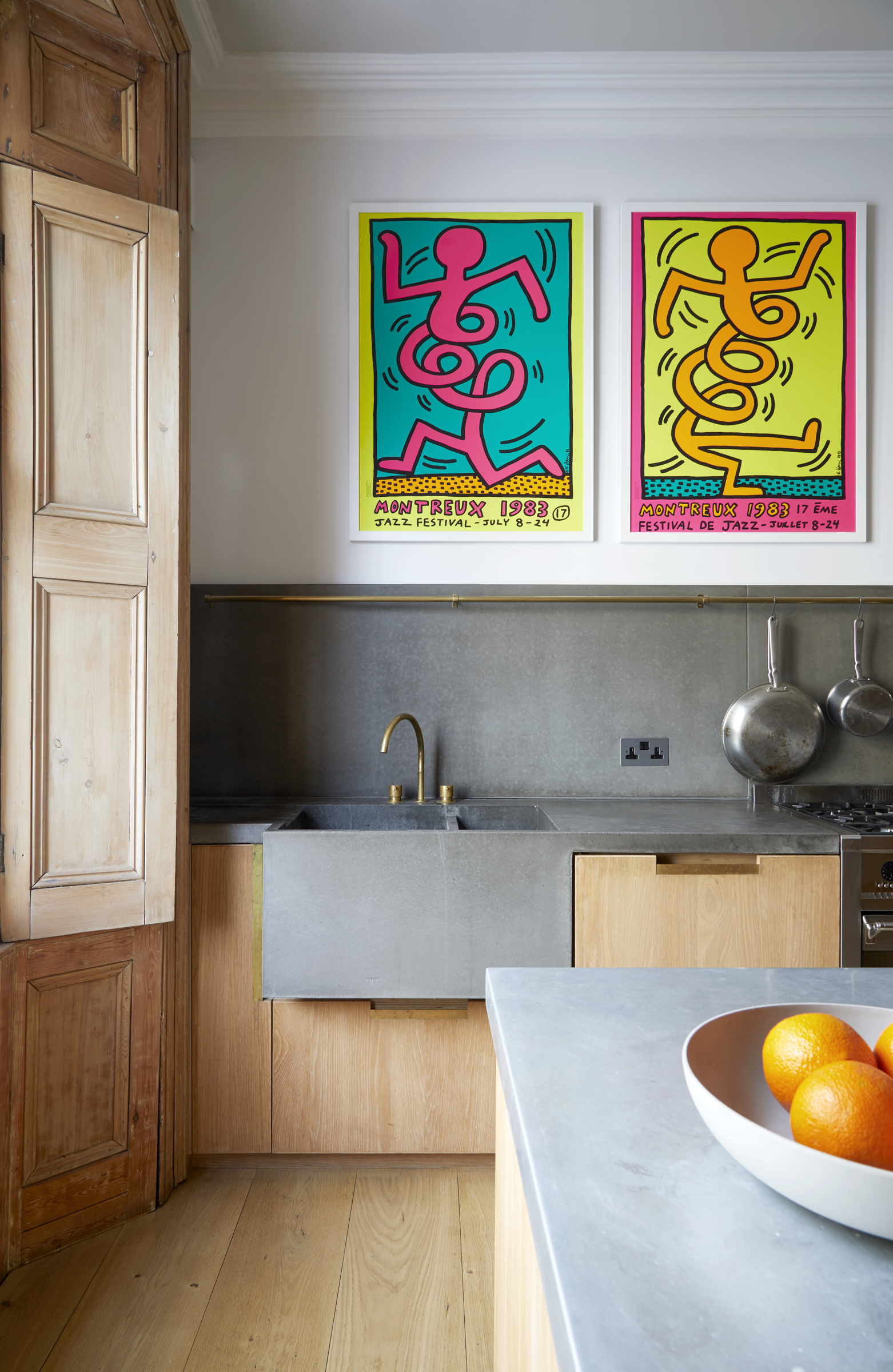
‘The kitchen was too stark for us so we made the colors softer and added vibrant art,' she adds. ‘We snuck in a corner storage cupboard in matching oak, which is really useful.’
Main bedroom
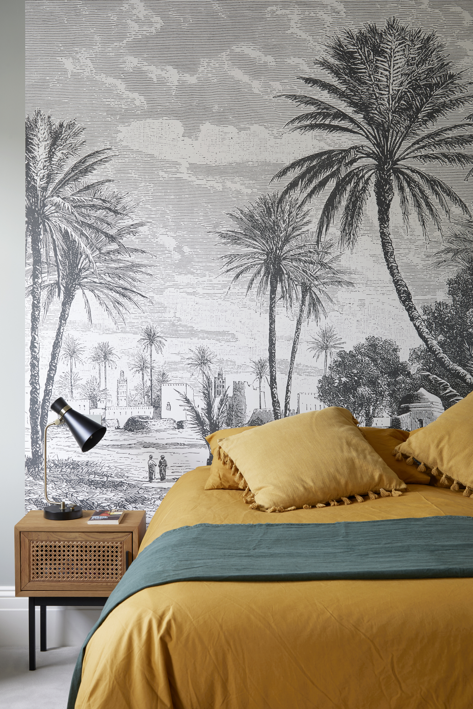
Wallpaper was a game changer too, a great way of instantly adding drama and personality and features throughout the house. ‘In fact I think I would have had even more if Celine hadn’t calmed me down. She is right, there is such a thing as too much,’ she says. ‘We weren't after statement headboard ideas so Celine offered to create a focal point with wallpaper. The palm print reminds us of our many trips to Morocco.’
Study
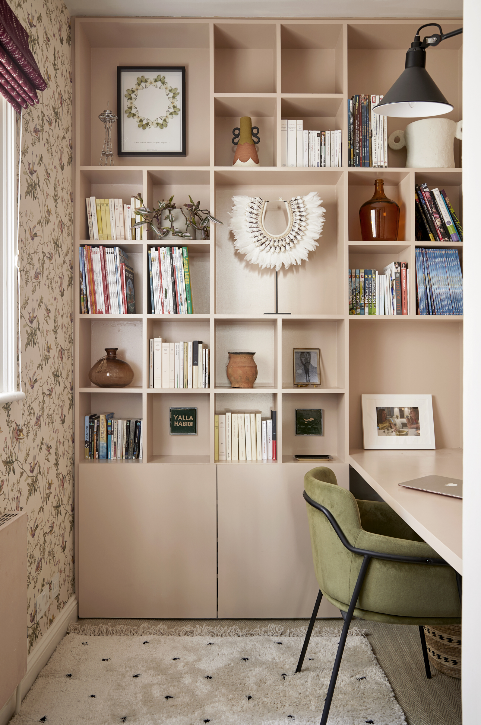
Amandine chose an ultra feminine modern home office idea as an antidote to living with football-mad males! Extra storage was snuck into nooks and crannies - like this office desk and wall unit. Elsewhere Amandine adopted that chic French trick of using straw baskets to hold everything from the children’s shoes to extra towels.
Bathroom
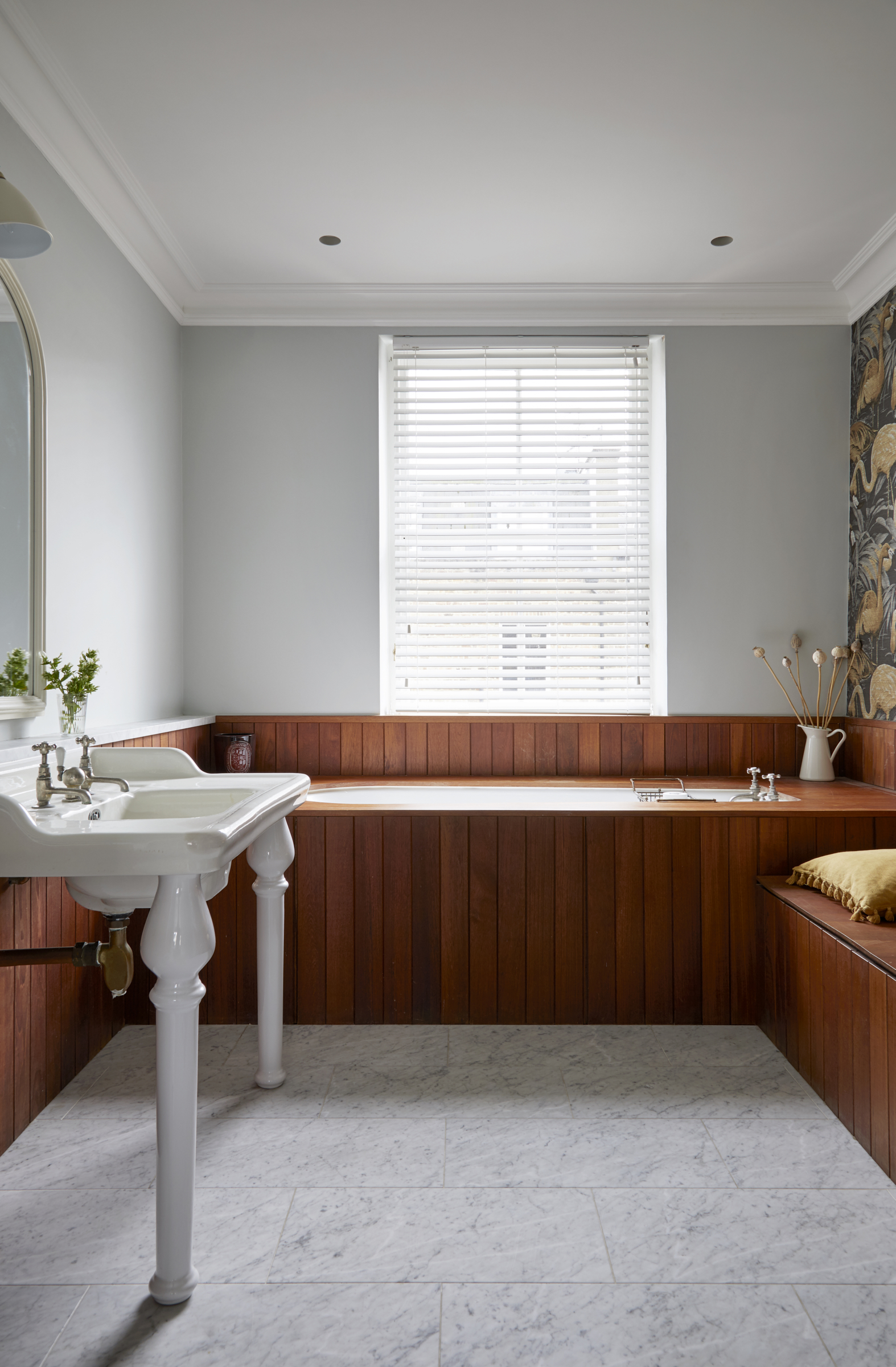
In a nod to its Victorian roots, the WC is hidden under the wooden panelling. ‘It’s unusual, but you soon get used to it!’ says the couple.
The most important thing for the family is that it’s a happy house. ‘I light candles, put on music and dim the lights whether it’s just us, or friends visiting,’ says Amandine. ‘People say it has good vibes which is a lovely compliment.’
See more: A mix of rustic textures and countryside colors gives this cottage a sense of belonging
A legendary houses editor, Mary Weaver held the job of Homes Editor on Livingetc for over a decade. She set the aesthetic for which the brand has become known. She is now a freelance stylist, art director and writer, regularly contributing to Livingetc and overseeing the brand's successful House Tours franchises of live and webinar events.
-
 These Are the Flower Crowns I’m Wearing This Spring (Spoiler: They’re Actually for My Door)
Coachella confirmed the comeback of flower crowns. At home, they just go by another name: the spring wreath
By Julia Demer
-
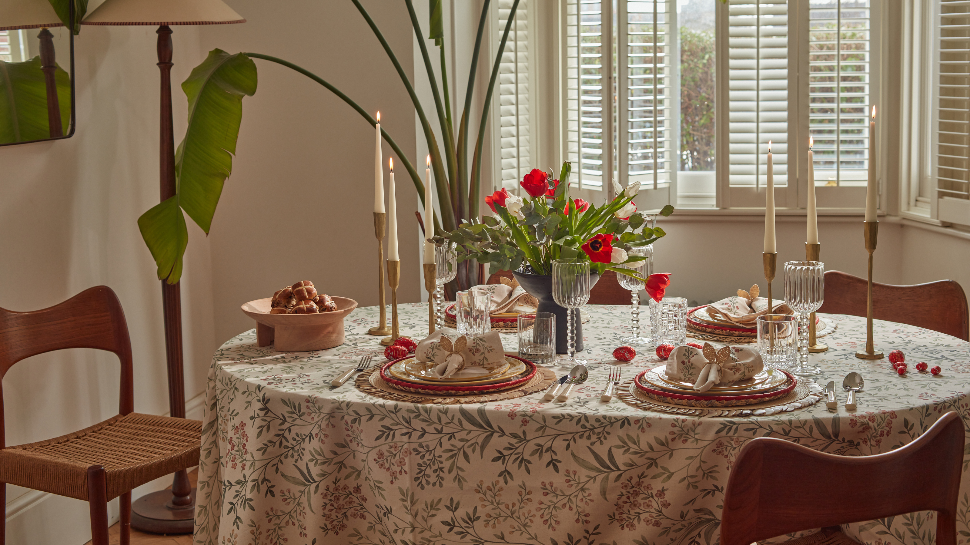 Bunny Ears, Be Gone — 7 Easter Table Styling Mistakes That Will Take Your Setting from Tawdry to Tasteful
From fussy floral displays that disrupt conversation to over-relying on tacky tropes, don't fall victim to these errors when decorating your Easter table
By Lilith Hudson