Pastel colors and natural materials shine in this Sydney family home
It might be compact, but it’s far from bijoux – this cottage made contemporary shows how embracing bright light and clean colors can create a modern space suited to city life
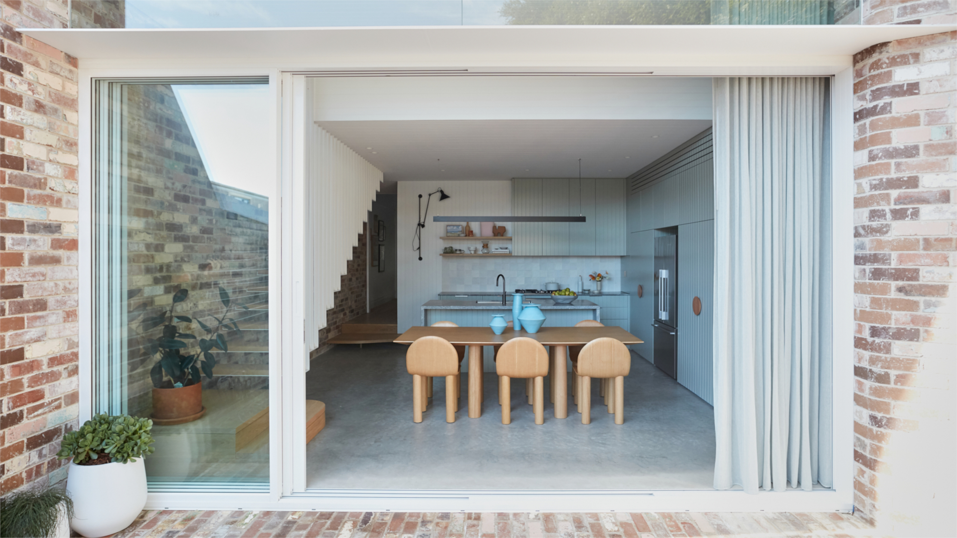
When the world began to lock down two years ago, Caitlin Parker-Brown and her husband, Tim, had just moved into their Sydney modern home that had taken them seven months to re-model.
It was good timing. The WFH directive meant the couple were to spend more time there than they had anticipated, but it also allowed them to appreciate how every detail of Caitlin’s design made the house function so well for their growing family. ‘We just felt so lucky that we were able to spend all the lockdowns in our beautiful new home,’ says Caitlin.
The house, which is situated in Marrickville, a former industrial area now known for its micro-breweries and creative businesses, was a shabby, single-storey, two-bed in need of some serious TLC. Caitlin teamed up with the architects Potter & Wilson to come up with the solution of reconfiguring the back-half of the house to create more space. She describes the new look of her home as, ‘Cottage made contemporary’.
Her signature use of clean, clear, muted color is used to great effect throughout the house, from the soft sage kitchen units to the peaches and cream guest shower. The exact selection of hues for her own home came about unexpectedly: ‘It was inspired by the exposed brick wall,’ she explains. The couple used bricks saved from the parts of the building that had been knocked to build the new feature wall and it was the remnants of old paint left on those bricks that prompted Caitlin’s choices.
It’s that level of detail that is one of the USPs of Caitlin’s design business. She set up Parker Studio in 2018, a couple of years after the couple had spent a stint living and working in Toronto, Canada. Not one to do things by halves, she also gave birth to the couple’s eldest son, Archer, not long after launch. He has since been joined by his little brother, August, born just as Oz opened up again...
Exterior
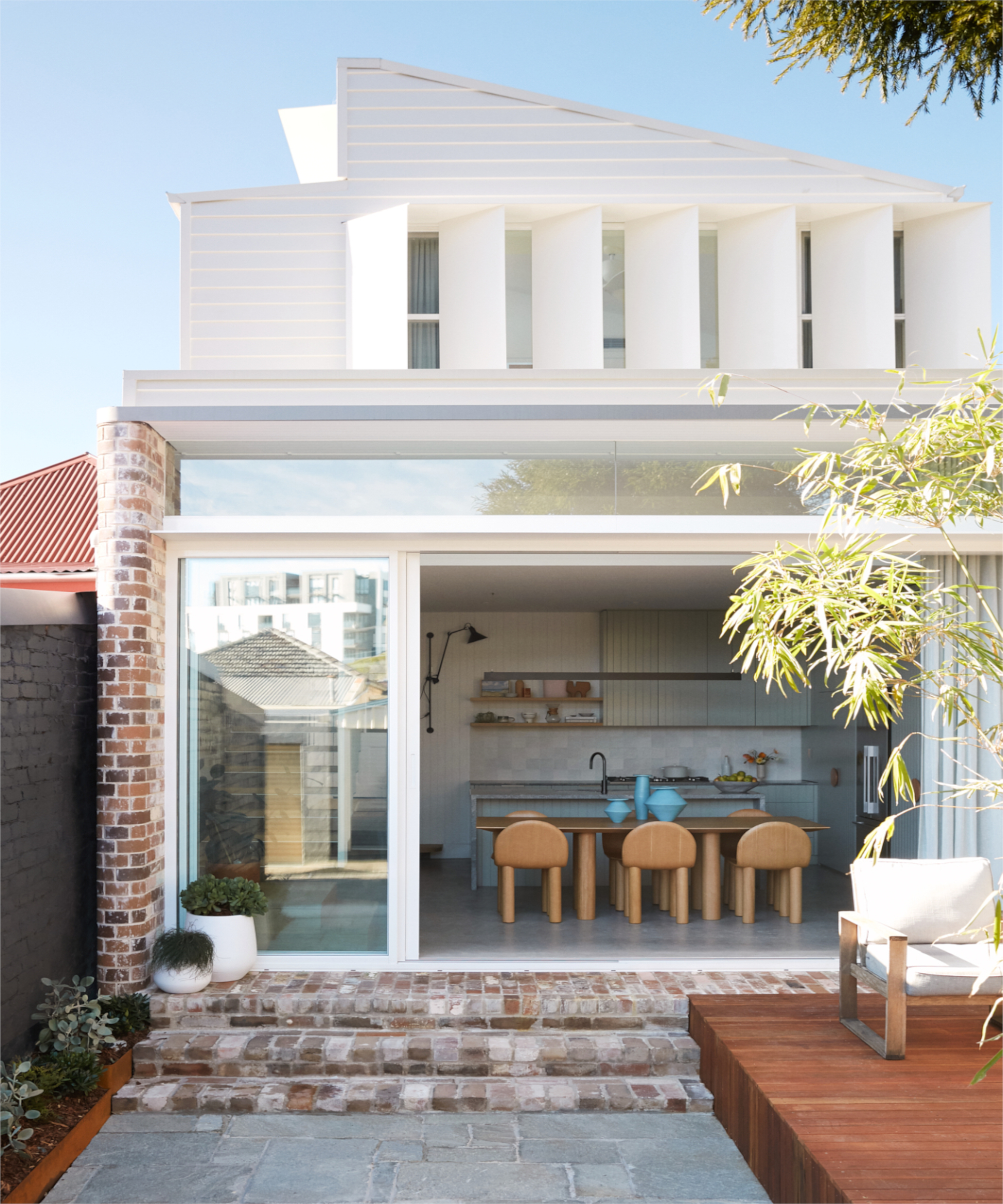
Caitlin was determined to respect the building’s history while making it work for 21st century living. ‘We wanted to keep as much of the house’s character as possible by retaining and restoring original features,’ she says. But she was realistic about needing more space and light so was after modern home extension ideas. ‘We knocked down the dilapidated rear part and extended out the back, side and put on a second-storey.’
Caitlin’s considered, minimalist-leaning design, allows the period parts to morph seamlessly into the modern additions. She was going to acid-wash the reclaimed bricks, but once they went up decided to keep them as they were as they had more character
Be The First To Know
The Livingetc newsletters are your inside source for what’s shaping interiors now - and what’s next. Discover trend forecasts, smart style ideas, and curated shopping inspiration that brings design to life. Subscribe today and stay ahead of the curve.
Stackable glass doors were chosen and a polished concrete floor to help make for a seamless transition between it and the garden – which she designed with her brother Dane, a landscaping specialist. ‘We all love the kitchen and dining area…it gets flooded with light which is beautiful’
Kitchen diner
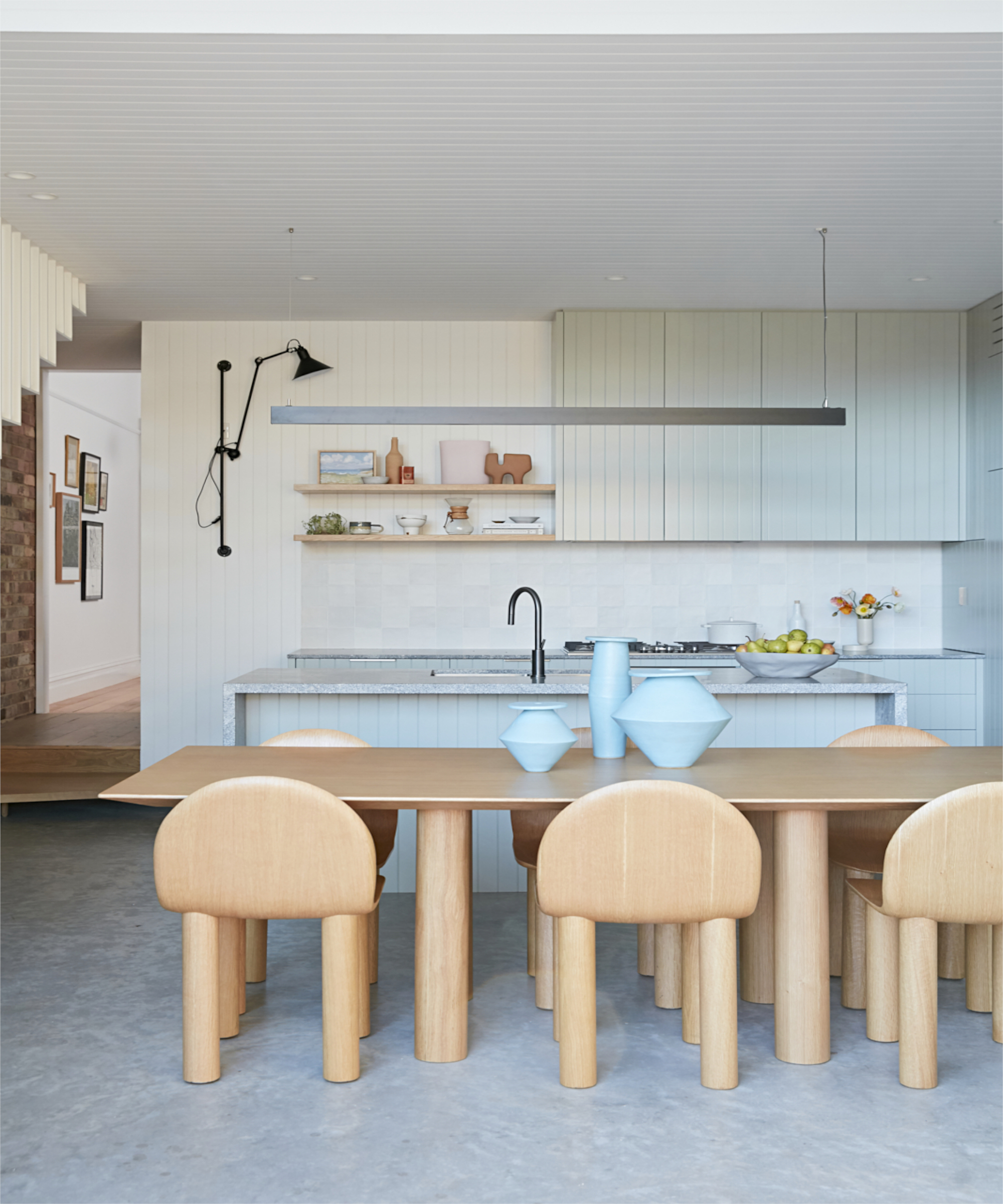
The family’s engine room, unsurprisingly, is the light, bright and, thanks to Caitlin’s exactingly designed custom storage, spacious kitchen/diner. ‘Tim and I both appreciate good food and find joy in cooking, so this part of the house was very important for us,’ she explains. ‘It makes me happy to have the space to spread, prepare, cook and serve food.’
One of the room’s key features is its sliding wall of windows. ‘We were limited by the footprint of the house, so having the kitchen and dining area fully open up across the back has been the best asset,’ says Caitlin. It gives the family plenty of opportunities to enjoy the great outdoors – a liking they share with many of their fellow Aussies.
‘I wanted to avoid a white kitchen with white walls as it can end up leaving a space feeling flat,' adds Caitlin. ‘I choose black for both the feature wall light and LED strip light over the island as I wanted to create some contrast against the soft colours in the space.'
Kitchen utility
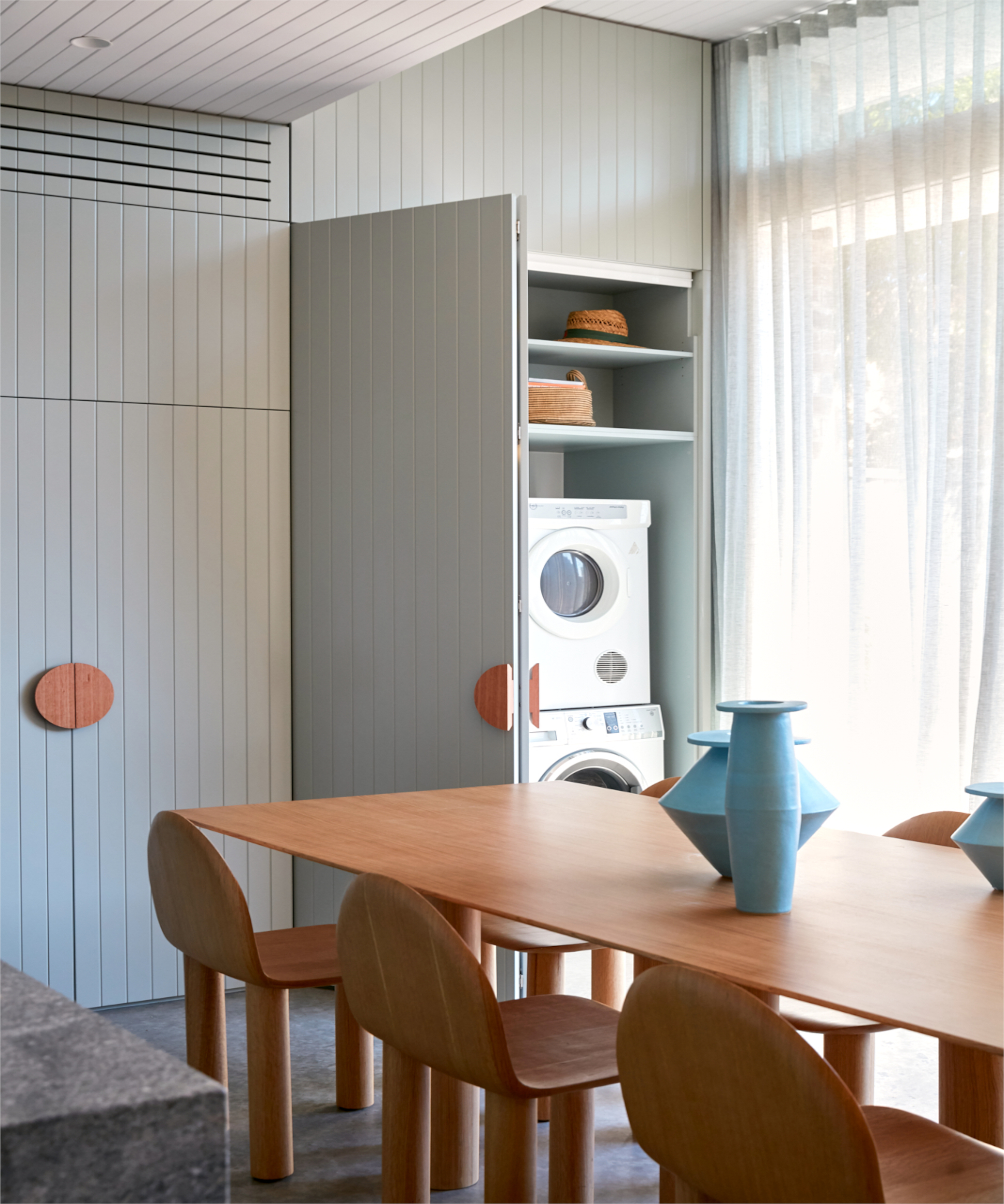
Stylish storage ideas were key for Caitlin, so she had the joinery built right up to the ceiling to maximise every inch. A ‘laundry’ is concealed behind the bifold doors by the dining table.
The groove detail on the kitchen joinery was continued onto the ceiling: ‘It leads the eye up,’ explains Caitlin.
Living room
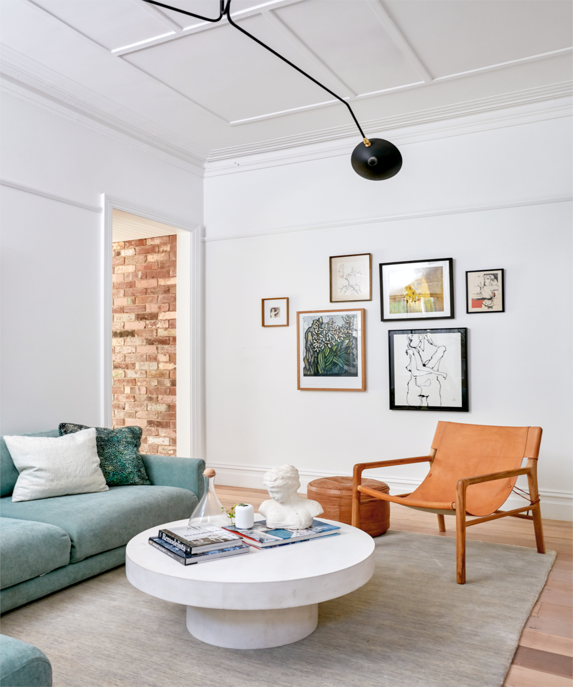
It was the remnants of old paint left on salvaged bricks from the remodel that prompted Caitlin’s color choices and living room color ideas, seen in things like the tan furniture items, pastel hues and natural floors.
‘The vintage coffee table is a piece we bought when living in Toronto. We loved it so much we shipped it home with us.’
Main bedroom
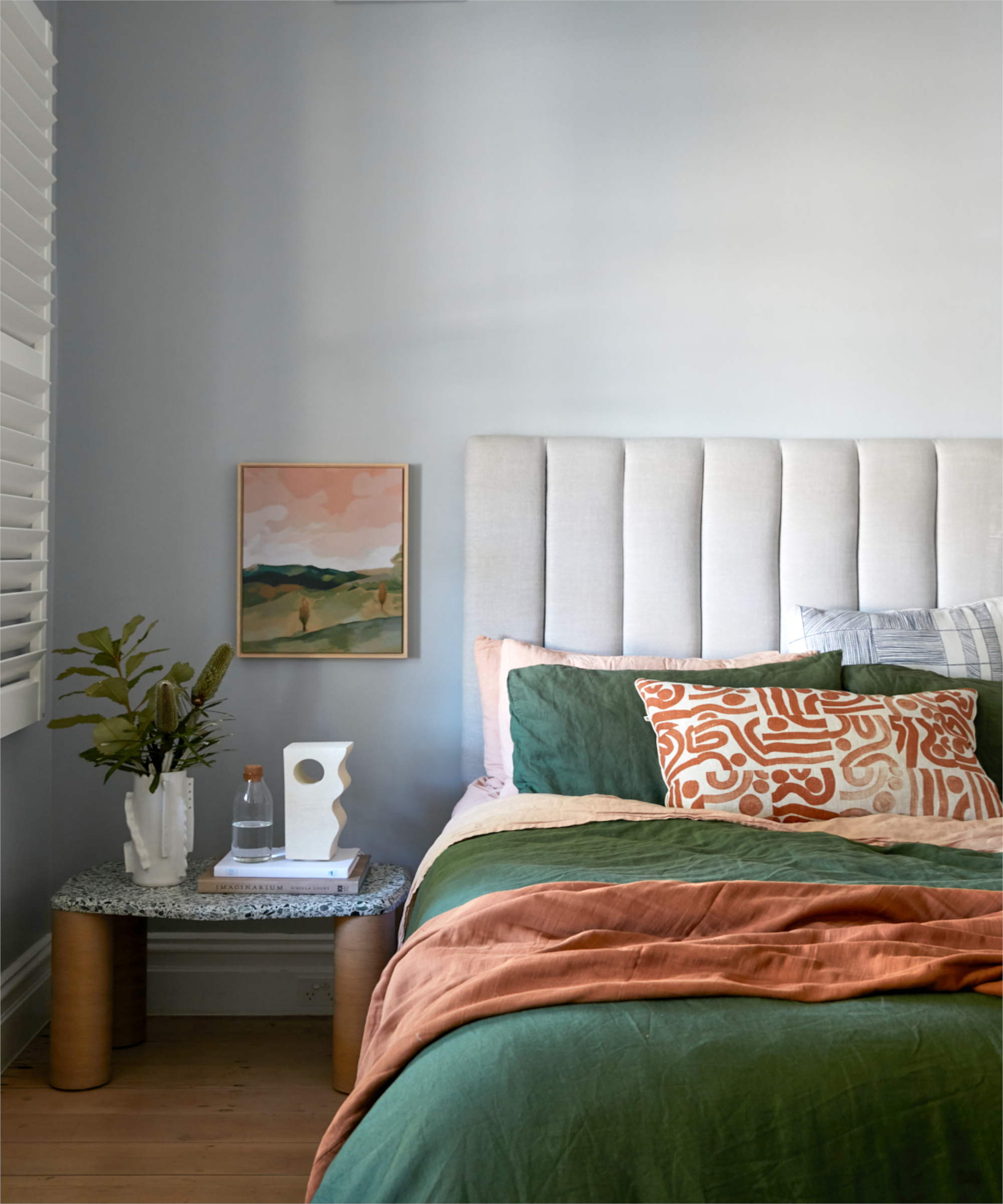
Neutral bedroom ideas have inspired here, as a base for building color. ‘I like to bring in colour with the bed linen, which I change through the seasons. It keeps the room looking fresh,’ says Caitlin.
Home office
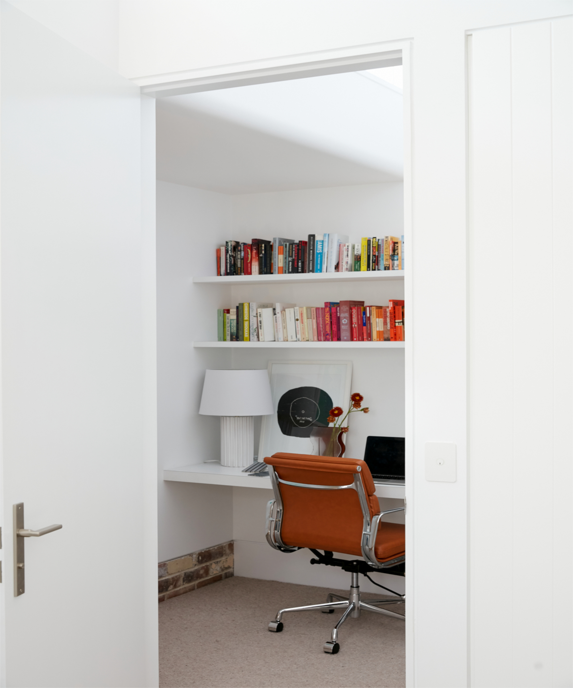
After some home office decor ideas? Aren't we all in this post pandemic world! This clever study could almost be a wardrobe. ‘I arranged the books by colour which makes the bookshelf look more organised than it really is!’
Nursery
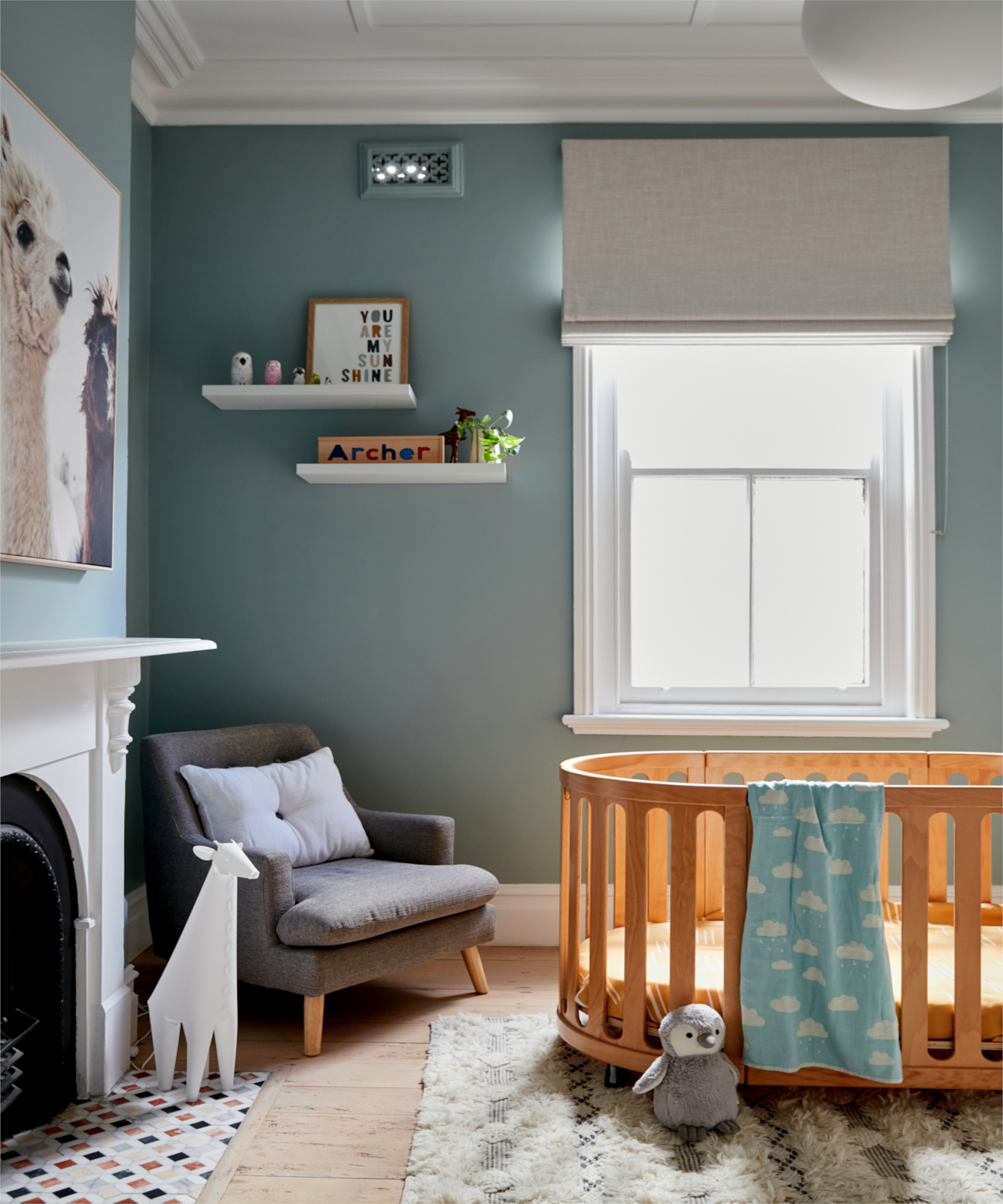
This stylish nursery bedroom idea is beautifully gender neutral with its subtle tones, elegant furnishings and cute artwork. One of Caitlin’s favourite details in this room are the marble mosaic hearth tiles: ‘They have a cute and playful vibe.’
Bathroom
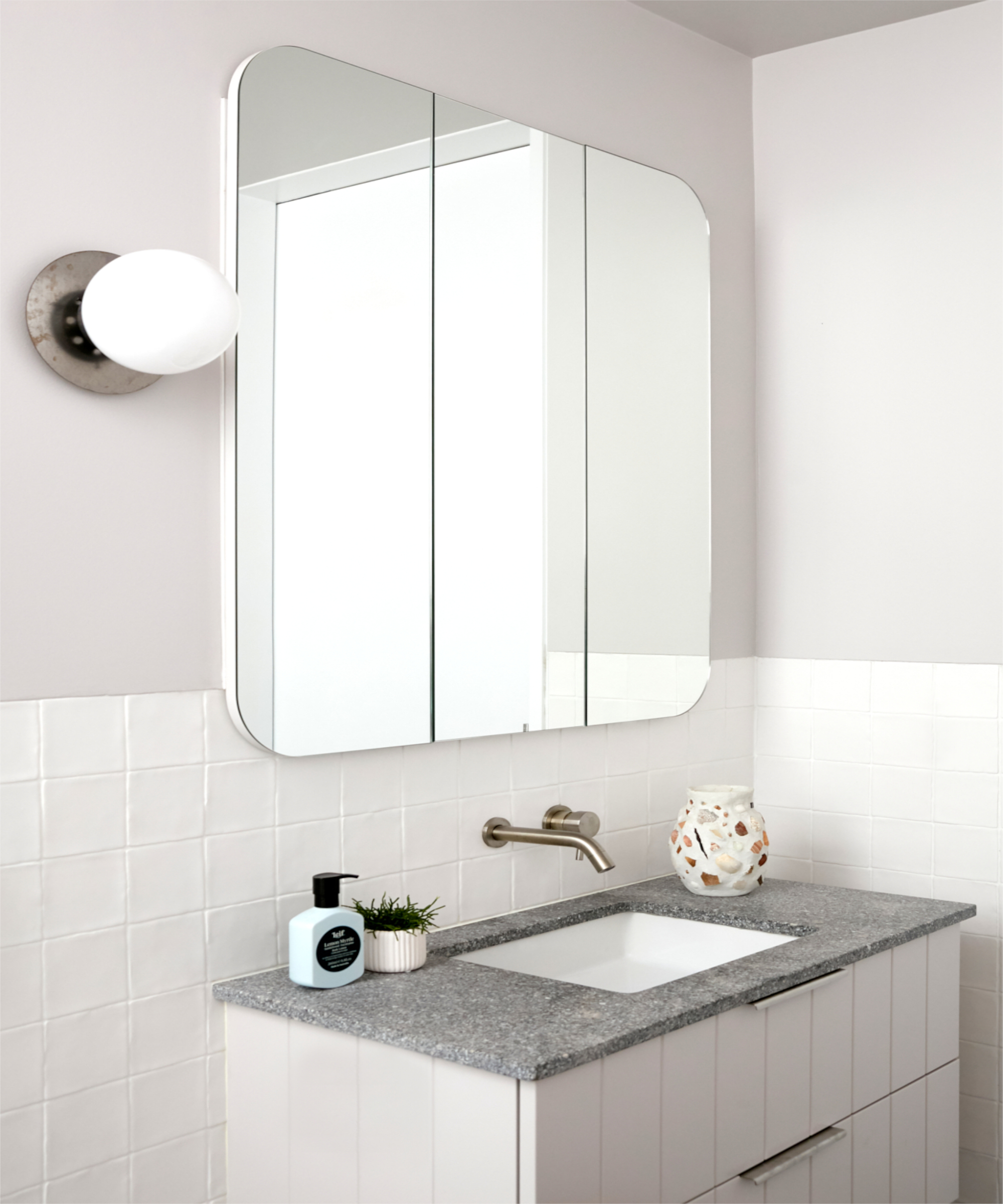
Caitlin used paint to introduce subtle color into the shower room. Pared-back pale tones keep this modern bathroom feeling fresh. ‘Plus, if you want to change it in a few years, it can be painted over with minimal cost’
Next Caitlin is on the hunt for some new outdoor furniture: ‘We would like to set up a small dining area outside,’ she says. It’s in part to make their favourite space even more welcoming for the friends and family now allowed to join them – and, when over, may just get lucky by scoring a taste of the couple’s cooking…
See more: a cool and contemporary East London home that features pink plaster walls throughout
As journalist with over 25 years experience, Kara has held staff positions at ELLE Decoration, Sunday Times Style and The Express. She has been a longtime contributor to Livingetc, and also been a regular writer for titles such as House Beautiful. She has always focussed on design and interiors, and her first book, At Home with Plants, was written with florist Ian Drummond and published in 2017.
-
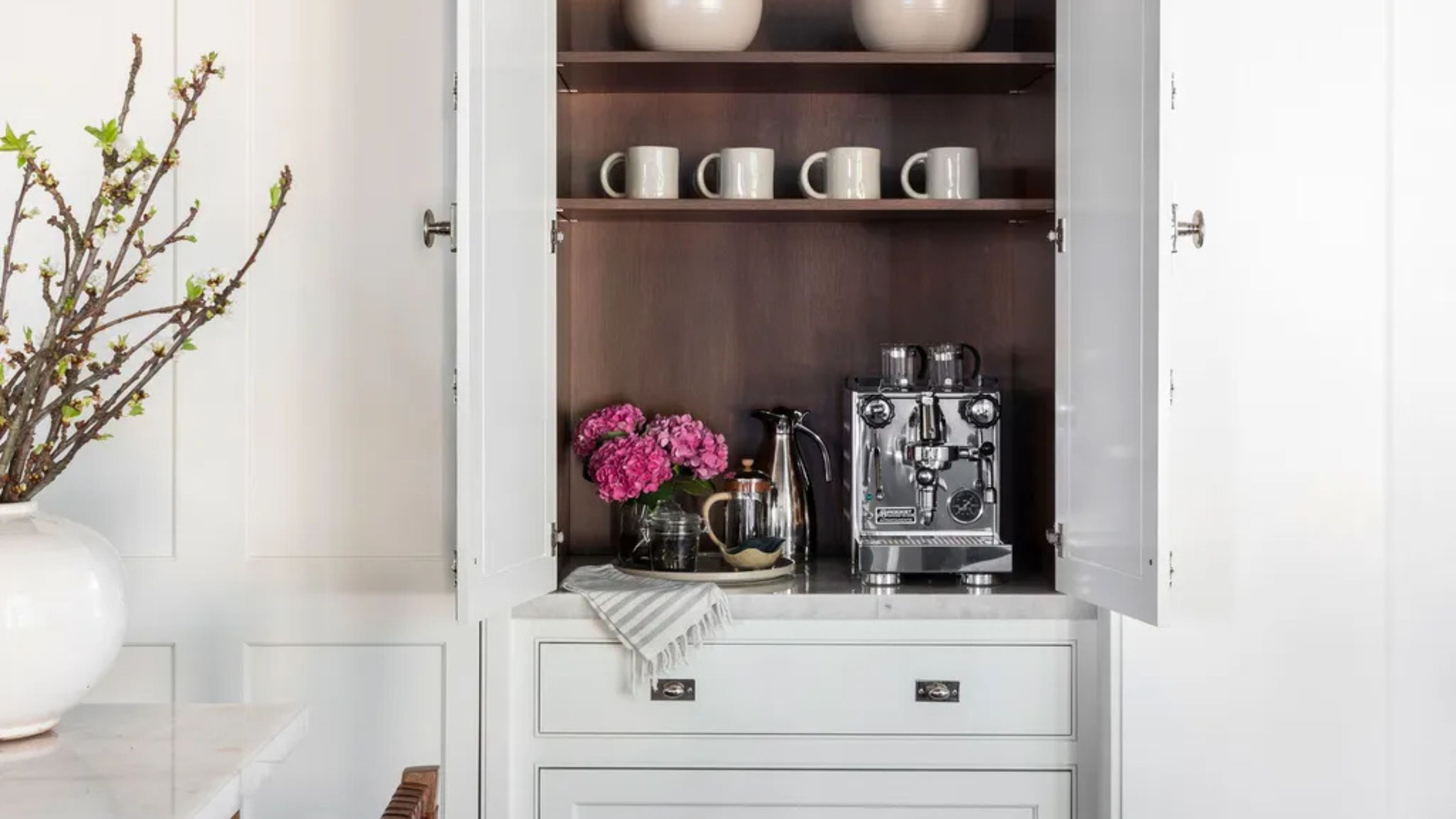 Turns Out the Coolest New Café is Actually In Your Kitchen — Here's How to Steal the Style of TikTok's Latest Trend
Goodbye, over-priced lattes. Hello, home-brewed coffee with friends. TikTok's 'Home Cafe' trend brings stylish cafe culture into the comfort of your own home
By Devin Toolen Published
-
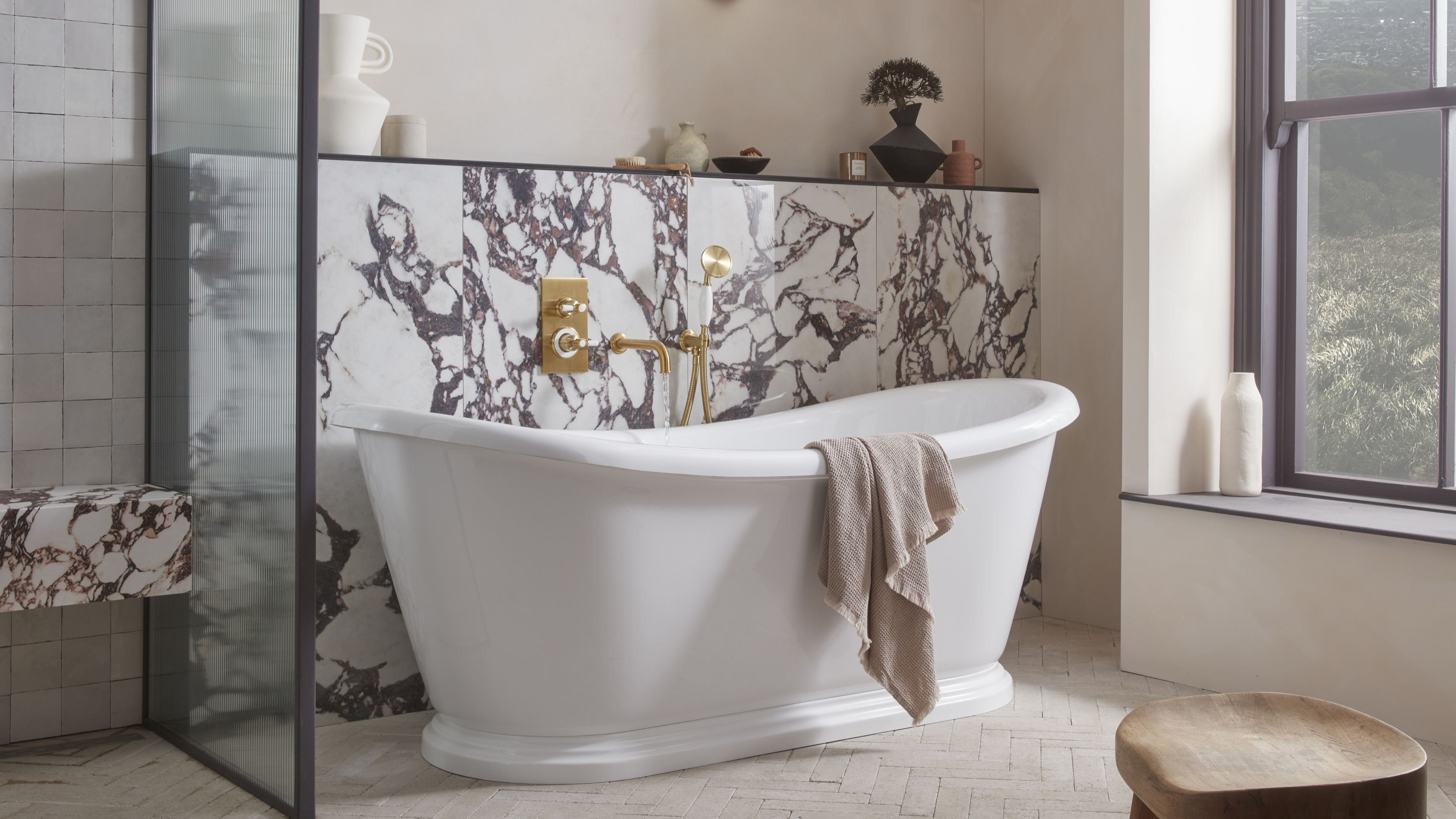 5 Bathroom Layouts That Look Dated in 2025 — Plus the Alternatives Designers Use Instead for a More Contemporary Space
For a bathroom that feels in line with the times, avoid these layouts and be more intentional with the placement and positioning of your features and fixtures
By Lilith Hudson Published