This apartment in a Victorian villa in London has the feel of a graceful members' club
One couple transformed a dark and gloomy listed apartment in a Victorian villa in London into a chic family home
THE PROPERTY
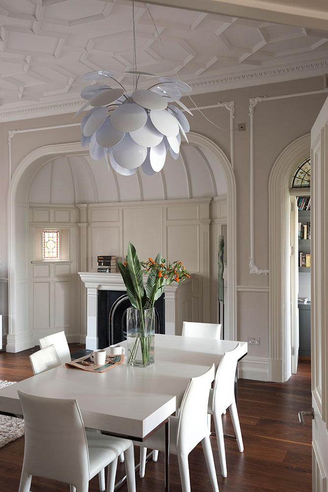
A ground-floor apartment in an early Victorian villa in north London. The modern home comprises of a living/dining room, kitchen/breakfast room, study, two bedrooms – one with an en suite shower room – a family bathroom and a playroom.
When the couple bought the north London apartment, set within an elegant, 19th-century red-brick villa, they inherited – by default – an inefficient use of space. No one ever used the glorious, but dark, living room and their six-year-old twin girls played together in the hallway while their mother cooked in the cramped kitchen.
The owners surmised that their predecessors didn't like sunshine, because the main living areas were arranged on the wrong side of the house. And they certainly didn't cook...
See more wow-factor modern homes
HALLWAY AND LIBRARY
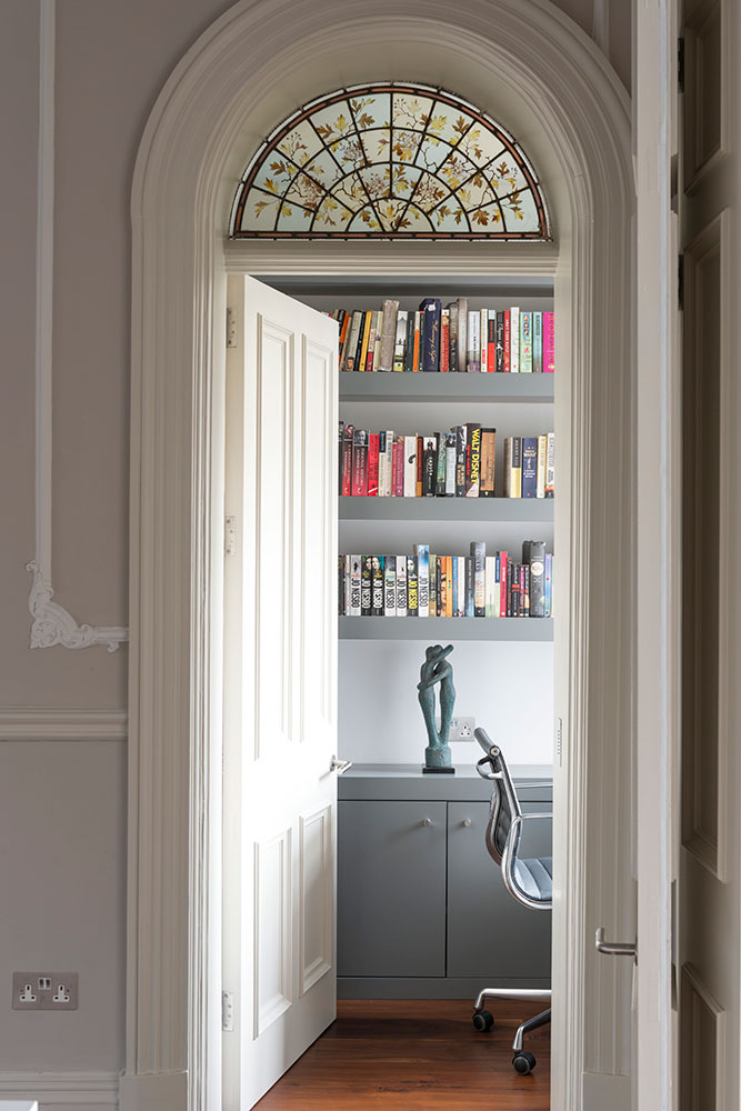
To achieve the look they wanted, the couple brought in architects Gregory Phillips and Tim Wylie, who happily took on the challenge of updating the Grade-II listed apartment. 'They enjoyed introducing contemporary elements to a traditional space.'
Original mouldings aren't an obvious starting point for clutter-free living living, but these classic features give the clean lines and minimalist pieces warmth and elegance.
The result is a home with the feel of a graceful members' club – all cool whites and subdued greys, as well as the wonderful moulded ceilings. The library-cum-office, which peeks out behind one of the original arched doorways, adds a bookish touch, along with a shot of colour – thanks to the spines in the library.
Be The First To Know
The Livingetc newsletters are your inside source for what’s shaping interiors now - and what’s next. Discover trend forecasts, smart style ideas, and curated shopping inspiration that brings design to life. Subscribe today and stay ahead of the curve.
OPEN-PLAN LIVING/DINING ROOM
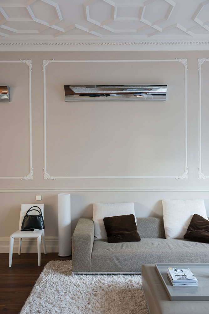
Starting again is a brave thing to do, especially if you've spent a lifetime accumulating precious pieces for your home. 'But when we found this apartment, it's exactly what we were inspired to do,' says the owner. 'We felt that the incredible mouldings and opulent original features deserved a style that paid tribute to them. Creating this home has been a journey of finding out what we really love about design.'
So out went the traditional Japanese Step Tansu cabinet, a lacquered coffee table and, much to the shock and surprise of her husband's parents, all of the family's framed photos. In their place came B&B Italia furniture and a relaxed way of living where the doors are always open.
See Also: Living room ideas -24 decorating tricks to inspire
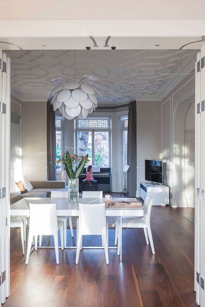
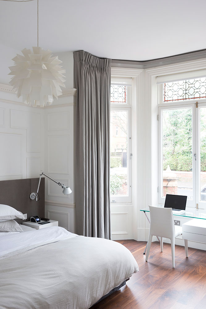
The couple were particularly keen on getting the floor right. As soon as architect Gregory Phillips showed them the engineered walnut, they decided to run it through the apartment.
KITCHEN
A minimal and functional kitchen was of paramount importance. Italian specialist Modulnova more than fulfilled the brief. There is even a hidden drinks cabinet for serious Sunday morning coffee-making and an ingenious cutaway worktop to lend lightness and delicacy.
MASTER BEDROOM
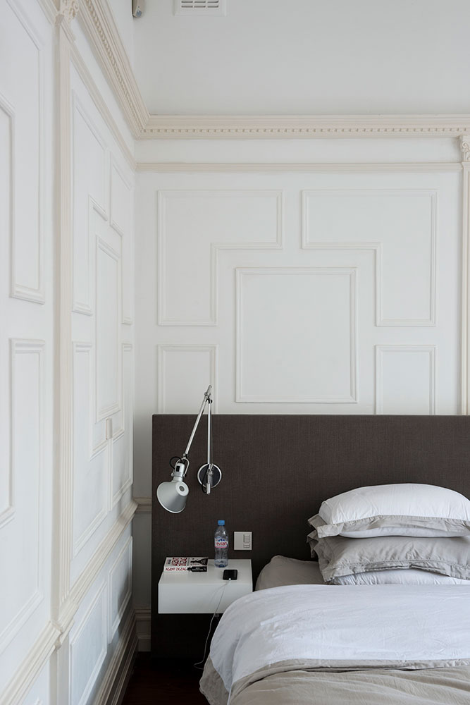
The cupboards here don't quite reach the ceiling. A design suggested by the architects means the ornate cornicing remains intact.
BATHROOM
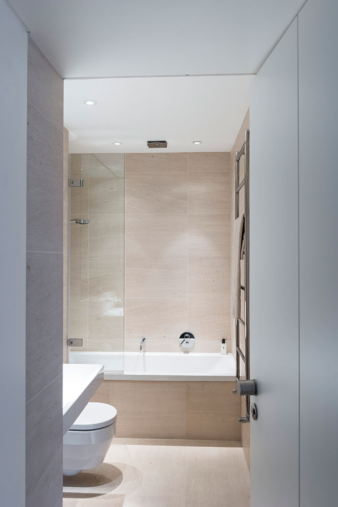
Large-format tiles in a pale shade accentuate the height of the space. A design suggested by the architect means the ornate cornicing remains intact and the owner has somewhere to put their speakers.
Although the flat is sophisticated, it's very much a home for the whole family. Recently, the couple pushed back the dining table, arranged the chairs into neat rows and invited friends over for a piano recital from the girls – complete with post-concert canapés – an idea unthinkable the way the apartment was previously configured.
It just proves how a thoughtful alteration of space and light can have so many unseen advantages.
Photography / James Merrell
See Also: Master bathroom ideas -19 stunning design ideas for a dreamy master bathroom
The homes media brand for early adopters, Livingetc shines a spotlight on the now and the next in design, obsessively covering interior trends, color advice, stylish homeware and modern homes. Celebrating the intersection between fashion and interiors. it's the brand that makes and breaks trends and it draws on its network on leading international luminaries to bring you the very best insight and ideas.
-
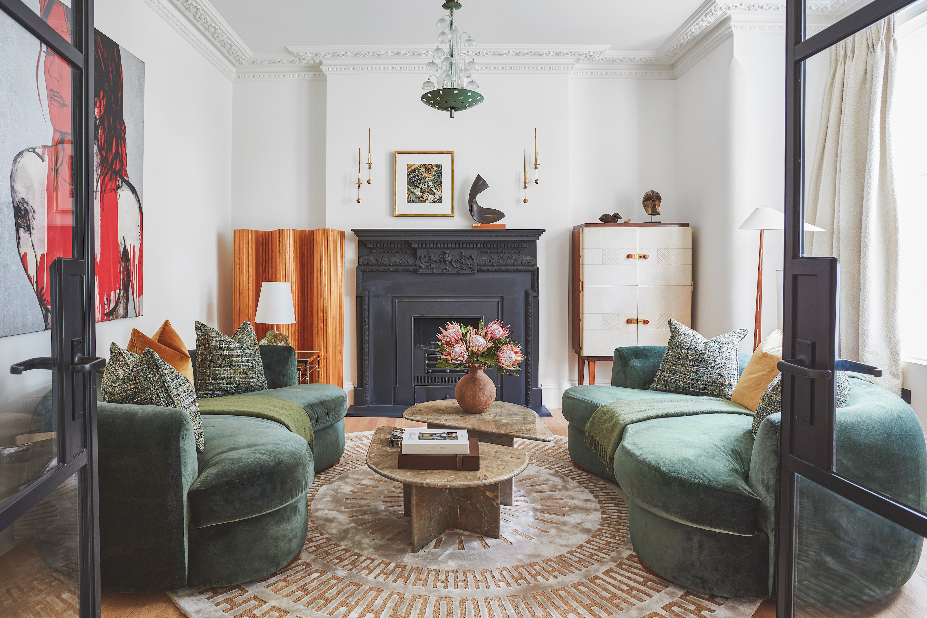 The 'New British' Style? This Victorian London Home Embraces Its Owners' Global Background
Warm timber details, confident color pops, and an uninterrupted connection to the garden are the hallmarks of this relaxed yet design-forward family home
By Emma J Page
-
 Muji Living Room Ideas — 5 Ways to Harness The Calming Qualities of This Japanese Design Style
Inspired by Japanese "zen" principles, Muji living rooms are all about cultivating a calming, tranquil space that nourishes the soul
By Lilith Hudson