A New Color Palette Rewrote the Story of This Art Deco Gem, Previously Untouched for Over Half a Century
The glam palette draws from lively stone and Schumacher fabrics to create a chic Manhattan perch for these empty nesters
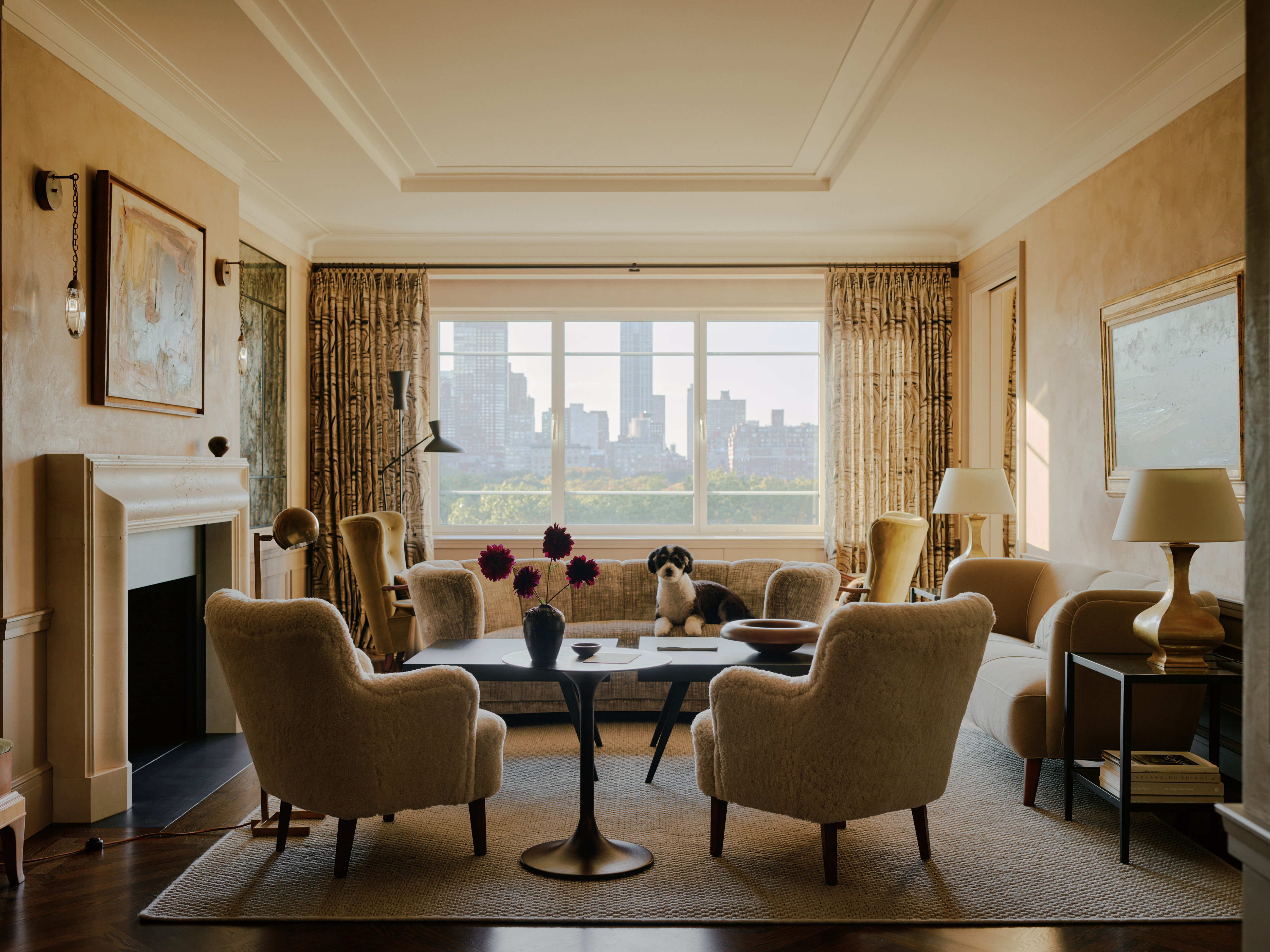
“The apartment was in total estate condition,” recalls Simon Babin, Studio Director at BUILTIN Studio. Tucked high within an Art Deco building on Fifth Avenue, the Upper East Side apartment had a functional layout and fantastic views of Central Park. But the interior views? Well, those hadn’t been renovated since the building was constructed in 1948.
That’s not a premise BUILTIN finds terribly intimidating. The NYC architecture and interior design practice, founded by Gary Eisner and Terence Kinee, has a knack for updating outdated apartments. They knew a few simple changes — and plenty of glamorous touches — could transform the space into a modern home that matched the homeowners’ new lifestyle.
“Our clients, Linda and Ben McGrath, are empty nesters who were downsizing from their Park Avenue apartment and searching for a place that matched their energy for cosmopolitan living,” explains Simon. “Which meant finding a place with a stunning city view and the bones to create a layout for flexible entertaining.”
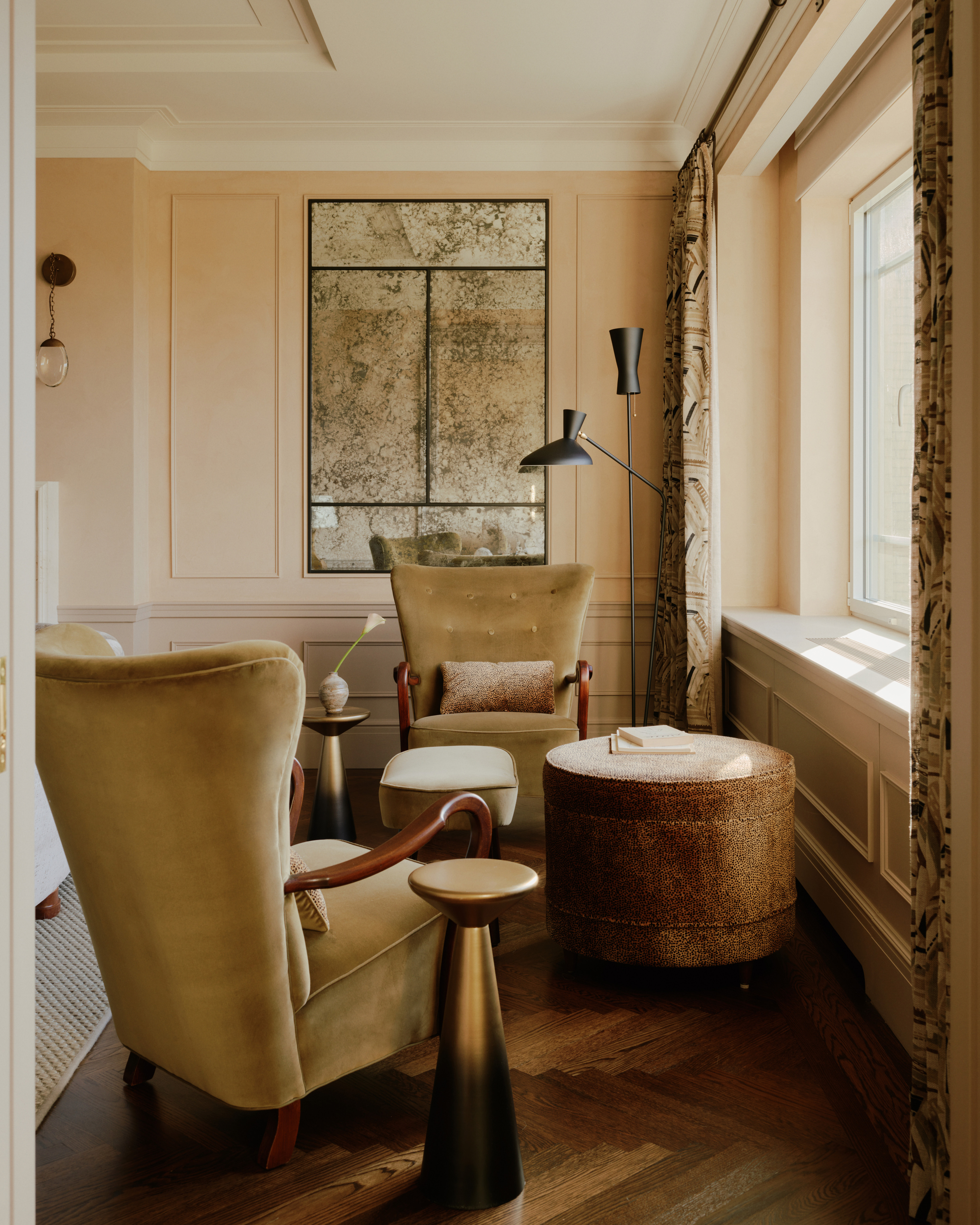
"We found the antique mirror to be hugely successful in making the space feel larger while also bringing natural light deeper into the apartment," says Simon. "From certain areas the park is reflected back at you, highlighting the views and bringing greenery into the room’s palette for most of the year."
To maximize the space, BUILTIN reworked the layout with major entertainment value, making it flexible for big and small gatherings while framing views over the park. But they also infused the interiors with warmth, creating a palette inspired by lively stones and eye-catching fabrics — all tinged with a touch of Manhattan glamour.
"You enter the home and are immediately greeted with a sense of lightness and warmth," says Simon. He's referring to the main living room, where matte Venetian plaster walls brighten the mood from day to night. Basing the tonal look on Benjamin Moore's 'Muslin' paint, several rounds of mockups resulted in walls that soften the atmosphere, easing guests into the space.
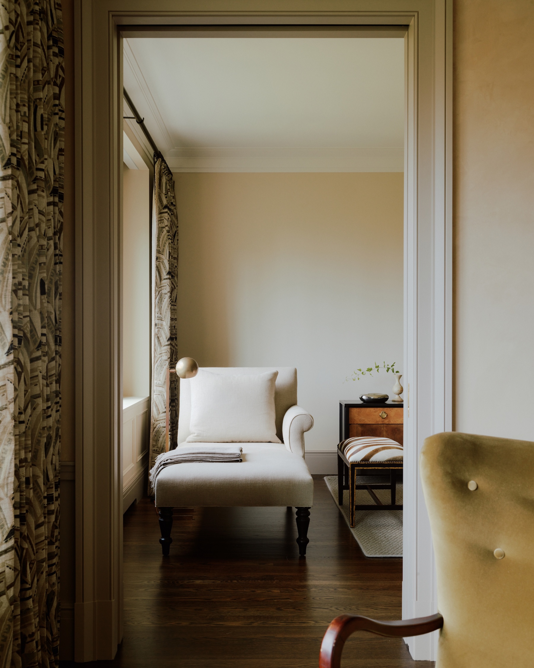
Building connections from room to room, BUILTIN updated the layout with modern openings, all in bespoke trims echoing Art Deco interior design’s stepped lines and clean ornamentation. Taking continuity to the next level, a clever use of textiles deepens a new connection — thanks to a subtle pocket door — between the the primary bedroom and living room.
“Our choice to carry the same drapery throughout really gives an illusion of a larger space continuing beyond the wall,” says Simon says, noting how park-facing windows appear continuous when the pocket door is open. The pattern-on-pattern fabric, Schumacher’s Deco Leaves, nods to the building’s Art Deco history in a neutral colorway, one that ended up influencing much of the home's palette.
"We collectively spent many hours reviewing fabrics together to see what worked and what impact those selections had on the rest of the materials," says Simon, who balanced rich Schumacher patterns with textural Hartman + Forbes fabrics with natural fibers. "In most cases we started with a fabric Linda discovered or responded to and built up from there," he says.
Be The First To Know
The Livingetc newsletters are your inside source for what’s shaping interiors now - and what’s next. Discover trend forecasts, smart style ideas, and curated shopping inspiration that brings design to life. Subscribe today and stay ahead of the curve.
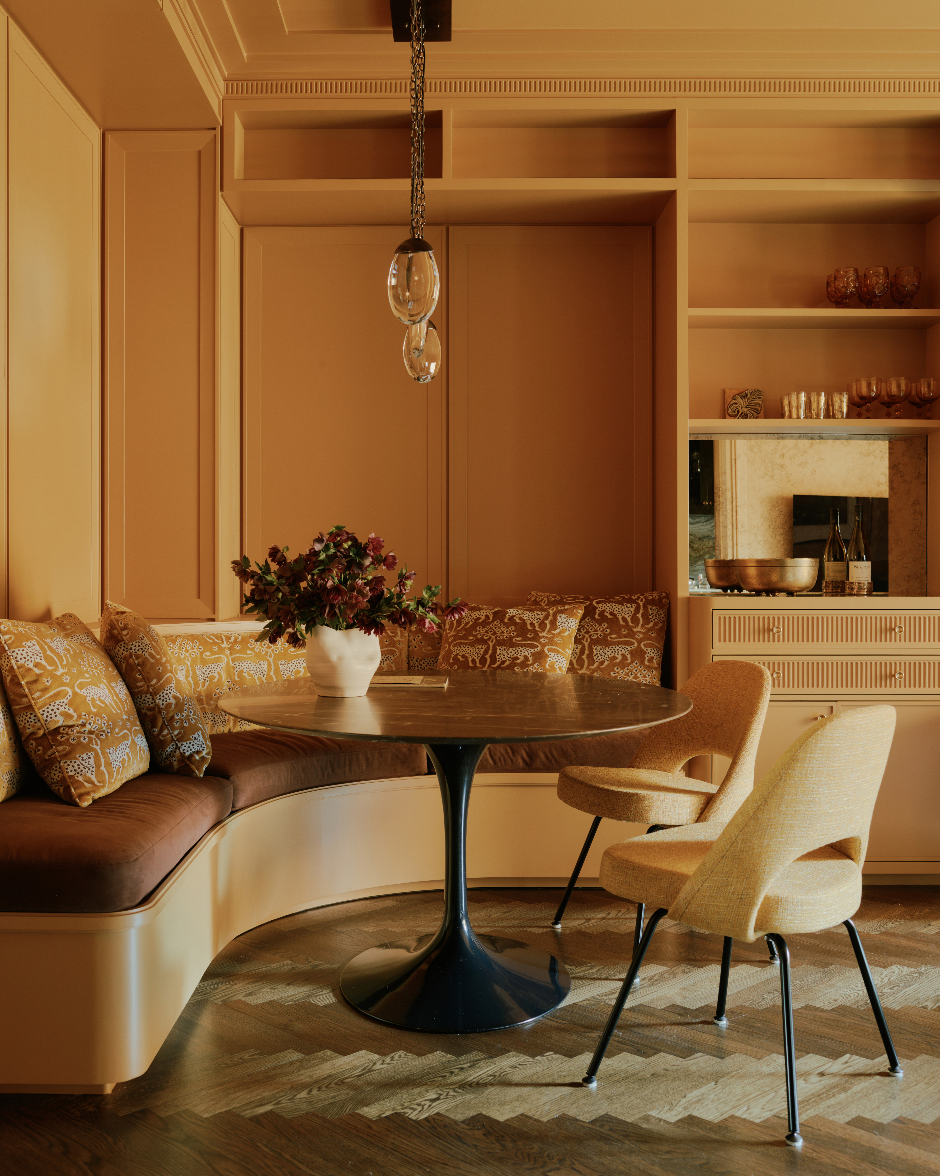
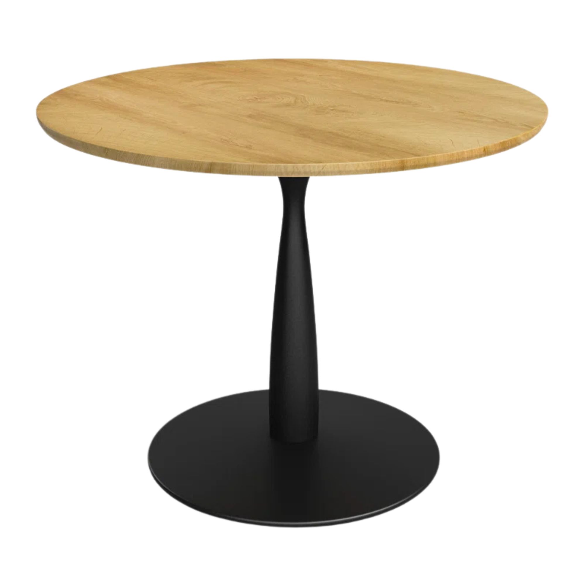
While Linda and Ben's former home was much larger, their new apartment required savvy space-saving without sacrificing on sophistication. “In downsizing, the clients were giving up a formal dining room, but it was still important to them to have a table large enough to host at least six people,” says Simon.
The solution? BUILTIN crafted banquette seating with a gentle curve. “Not only a space saver, but we also designed it to be integrated into the corner to give an intentional feeling of containment and coziness,” says Simon.
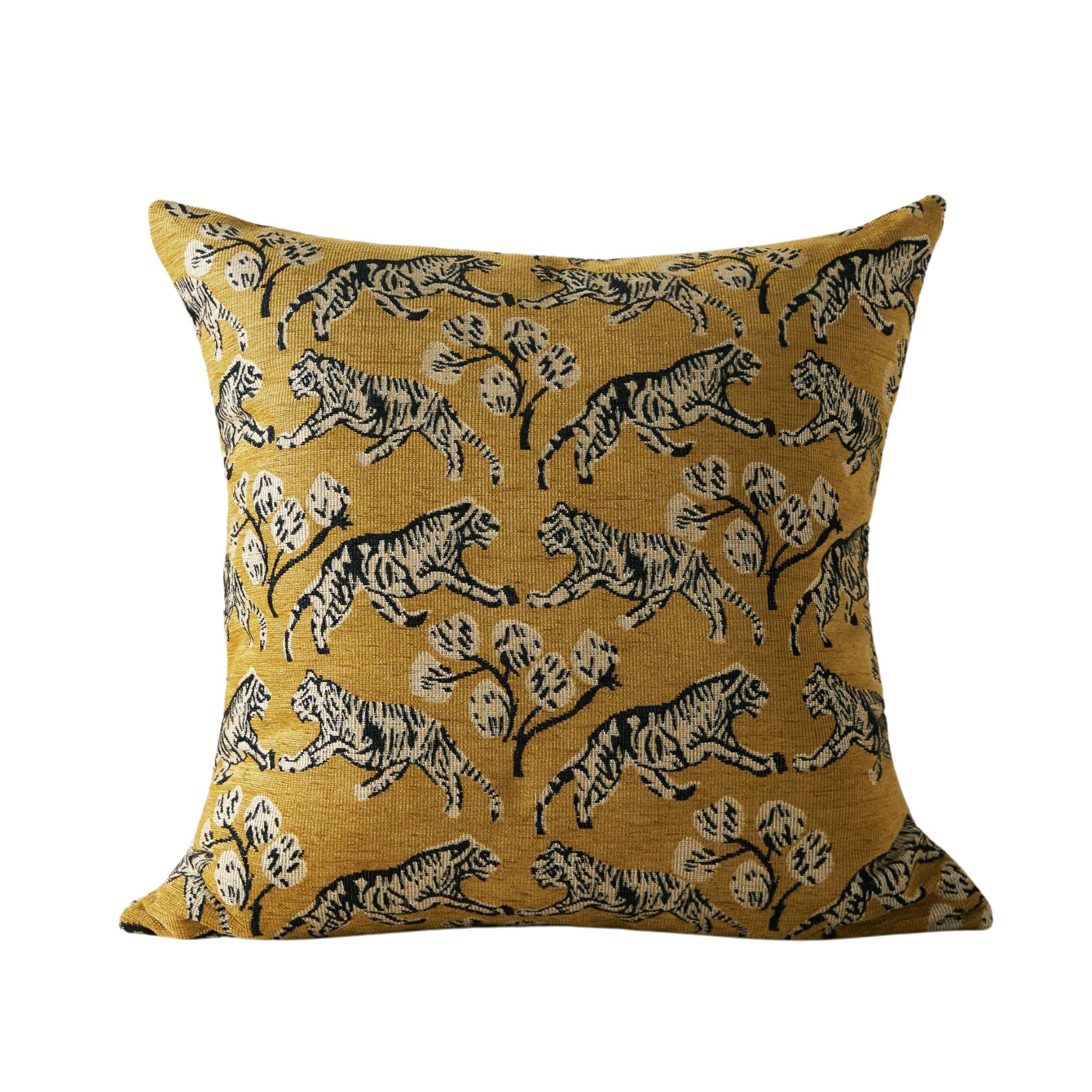
Linda was smitten with a particular Woodland Leopard Velvet textile (also made by Schumacher) which BUILTIN used as upholstery on the backrest as well as additional pillows. The material, with a golden colorway and a soft luster, inspired the room's overall palette — like the fabric itself, the space radiates with warm luminance.
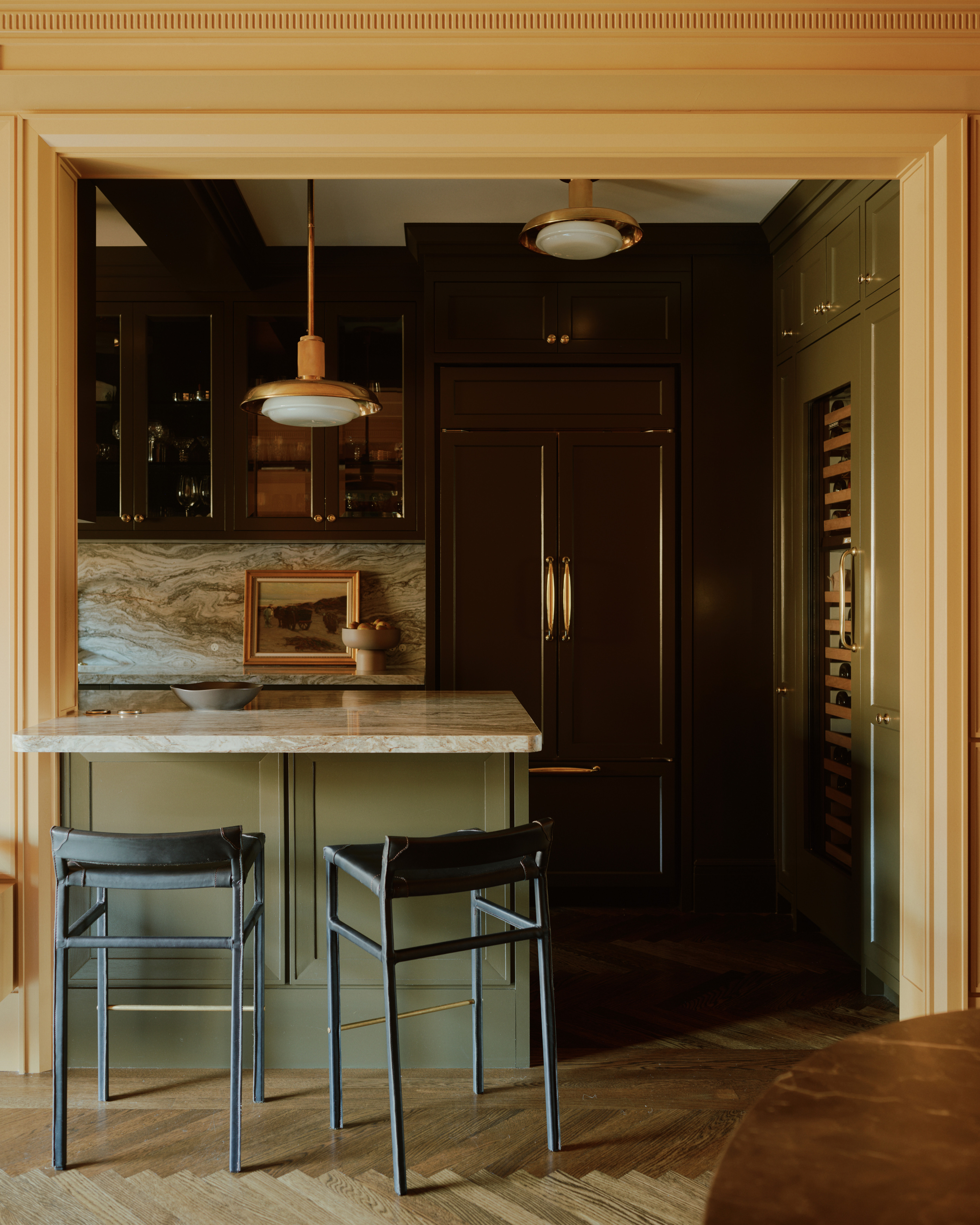
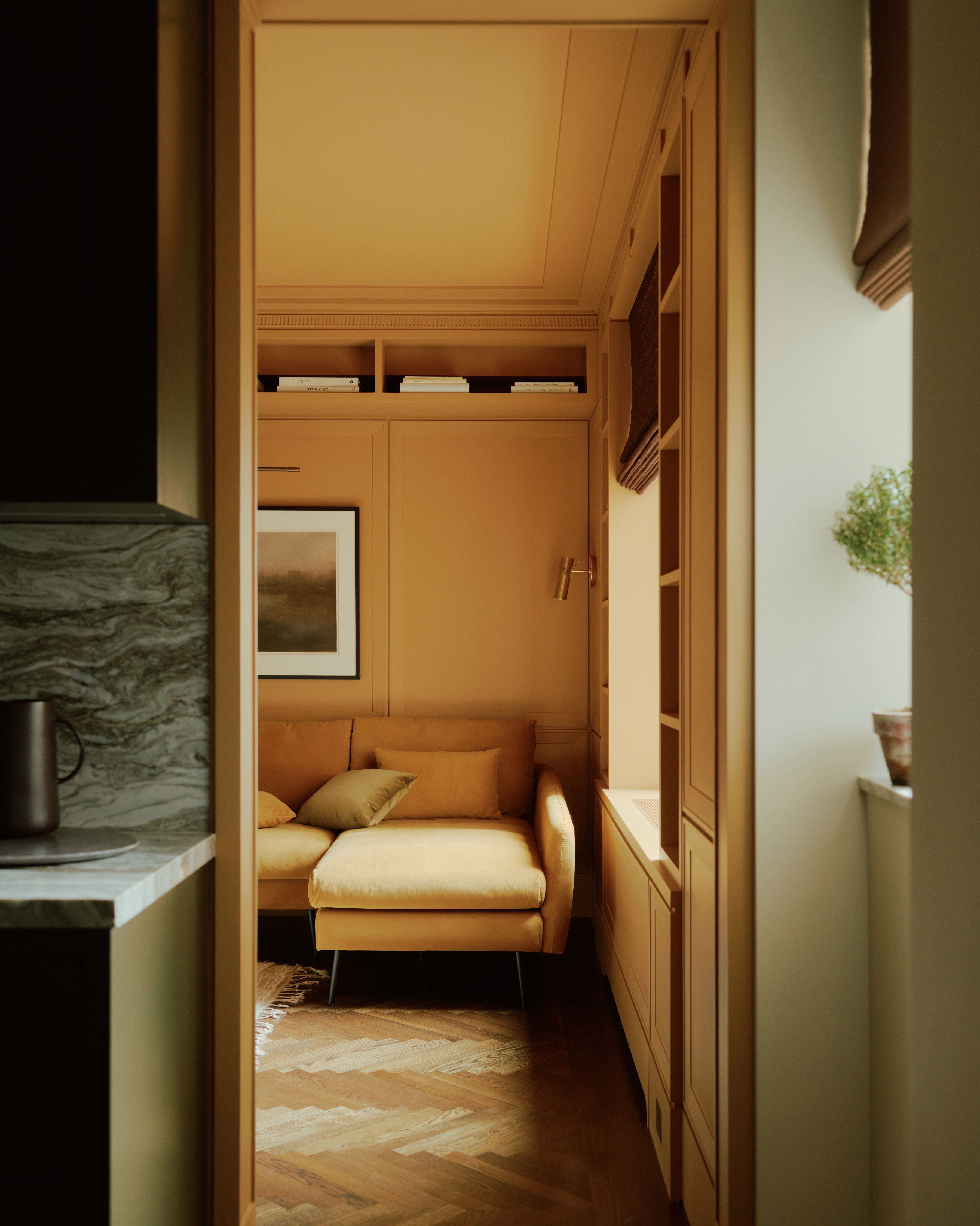
New openings also developed the palette in unexpected ways. Making the most of a tricky layout, a new portal into the galley kitchen connects the family and dining area — now something of a focal point with elegant framing, the transition created an opportunity for a dynamic shift in color.
"The kitchen to dining opening became even more exciting as we developed the color story," says Simon, noting how the honeyed glow in the dining area turns into darker tones in the kitchen. "Going bold with the dark green and yellow really highlighted the portal and the shared connection of occupying two spaces as people gather around the peninsula."
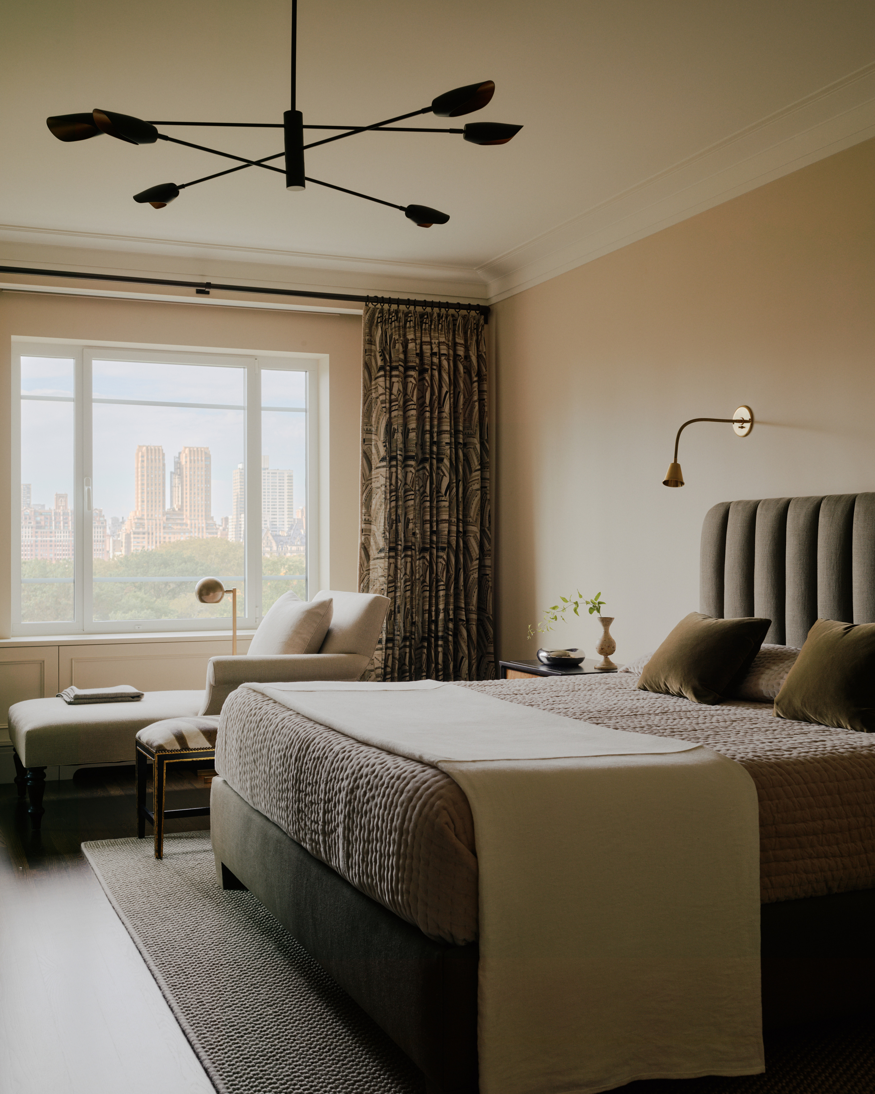
"The owners were seeking to make a calm bedroom that would be a little simpler than their previous apartment," explains Simon of the subtle scheme.
With an eye on the view, BUILTIN opted for a simple scheme in Linda and Ben's bedroom. Their former apartment was slightly more ornate — they had a passion for Biedermeier furniture, a streamlined yet classic look from the 19th-century — but keeping the space calm with clean lines and a contemporary palette created a canvas for mixing eras.
"Pieces like the nightstands that they brought over from their last home really help warm the space and do not feel out of place in this context," adds Simon.
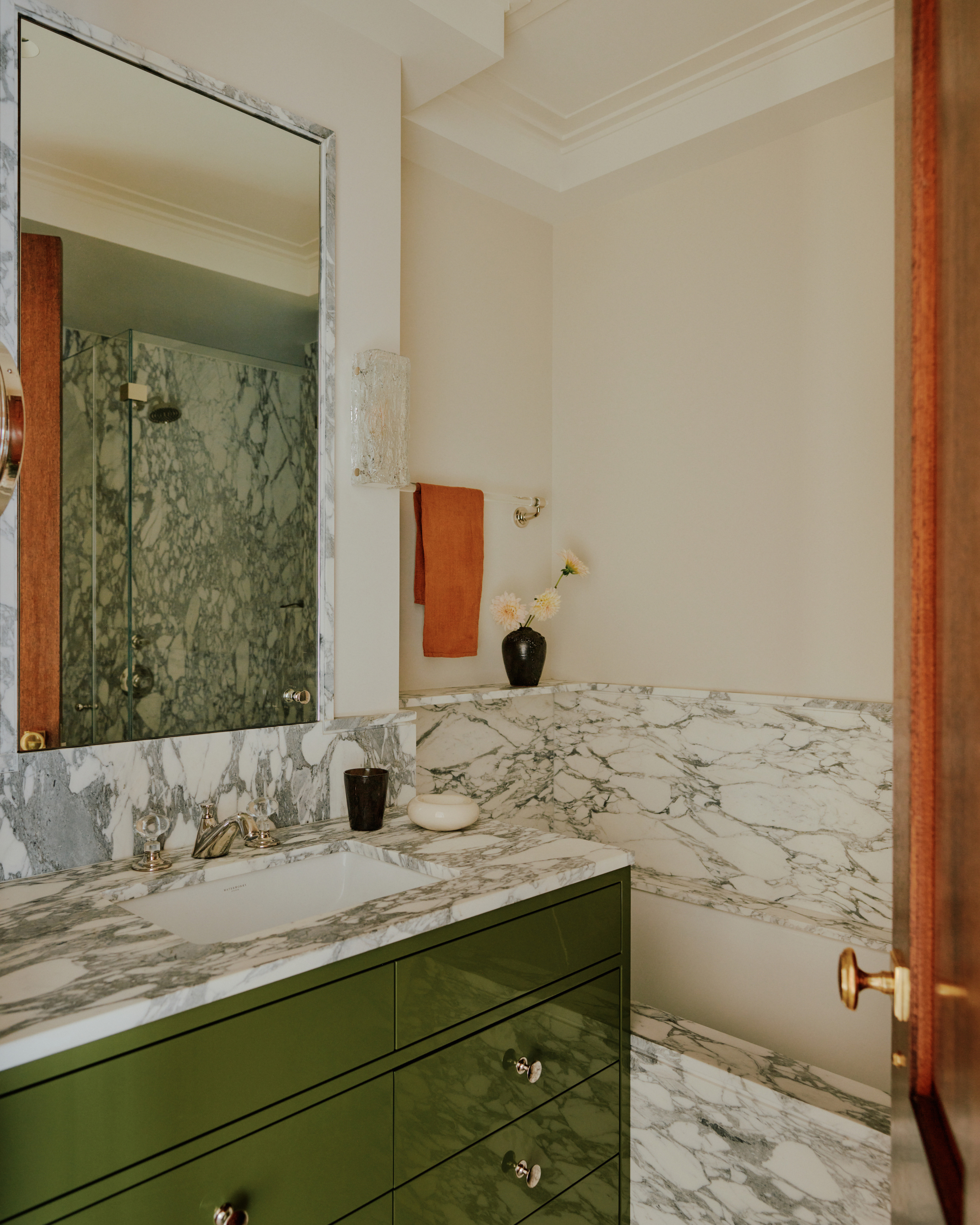
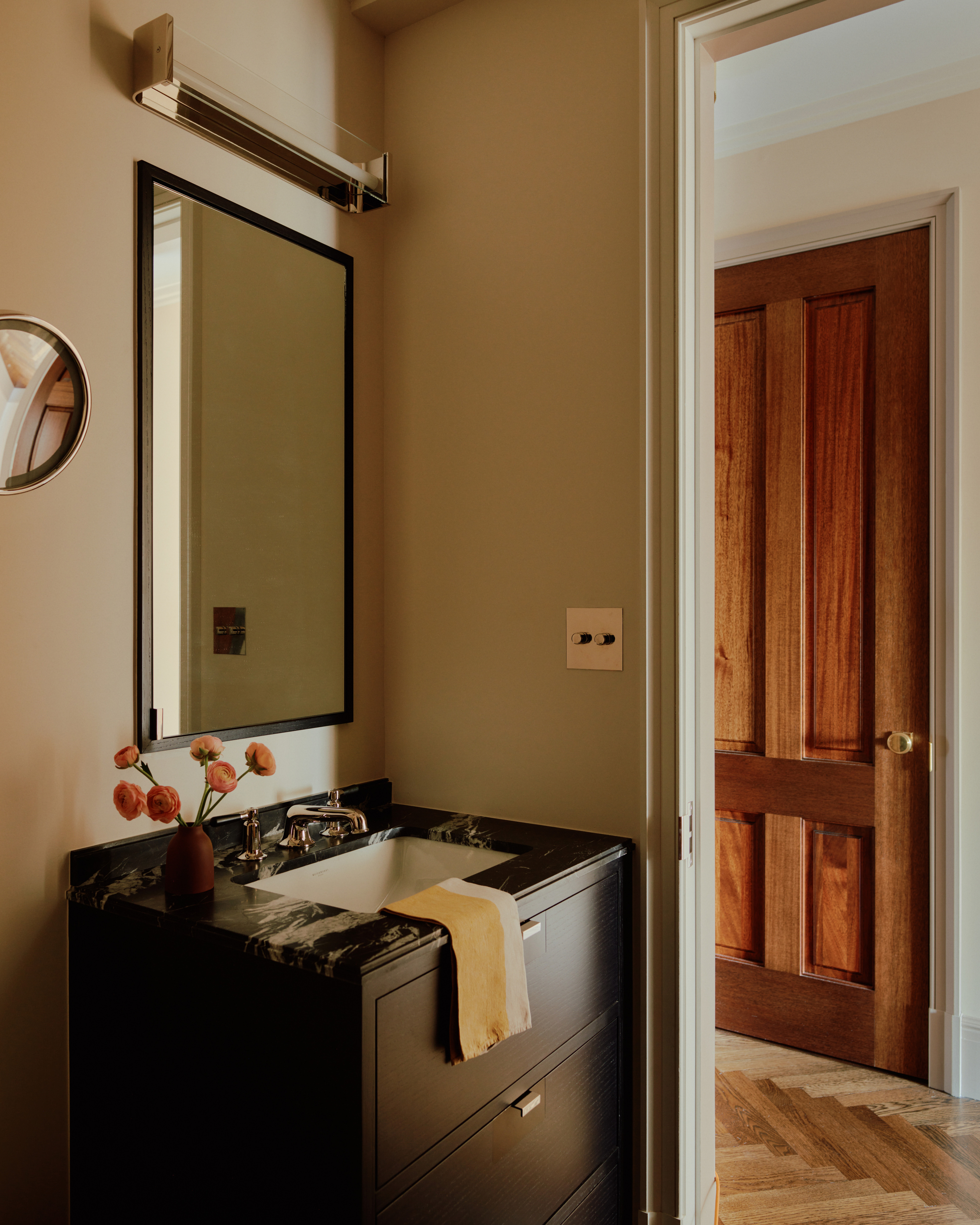
Naturally, the bathrooms carved out space for experimentation with stone, which led to many fieldtrips to stoneyards. "We all went in with very little expectation for the species we’d come back with," says Simon. "We were drawn to fun veining and stones with a lot of movement, while remaining [considerate and aware] of the undertones and selecting ones that had an underlying warmth."
With three full modern bathroom ideas to curate, two were designed and designated as private spaces for Ben and Linda to call their own. "This meant two completely different material palettes along with both masculine and feminine design elements," adds Simon.
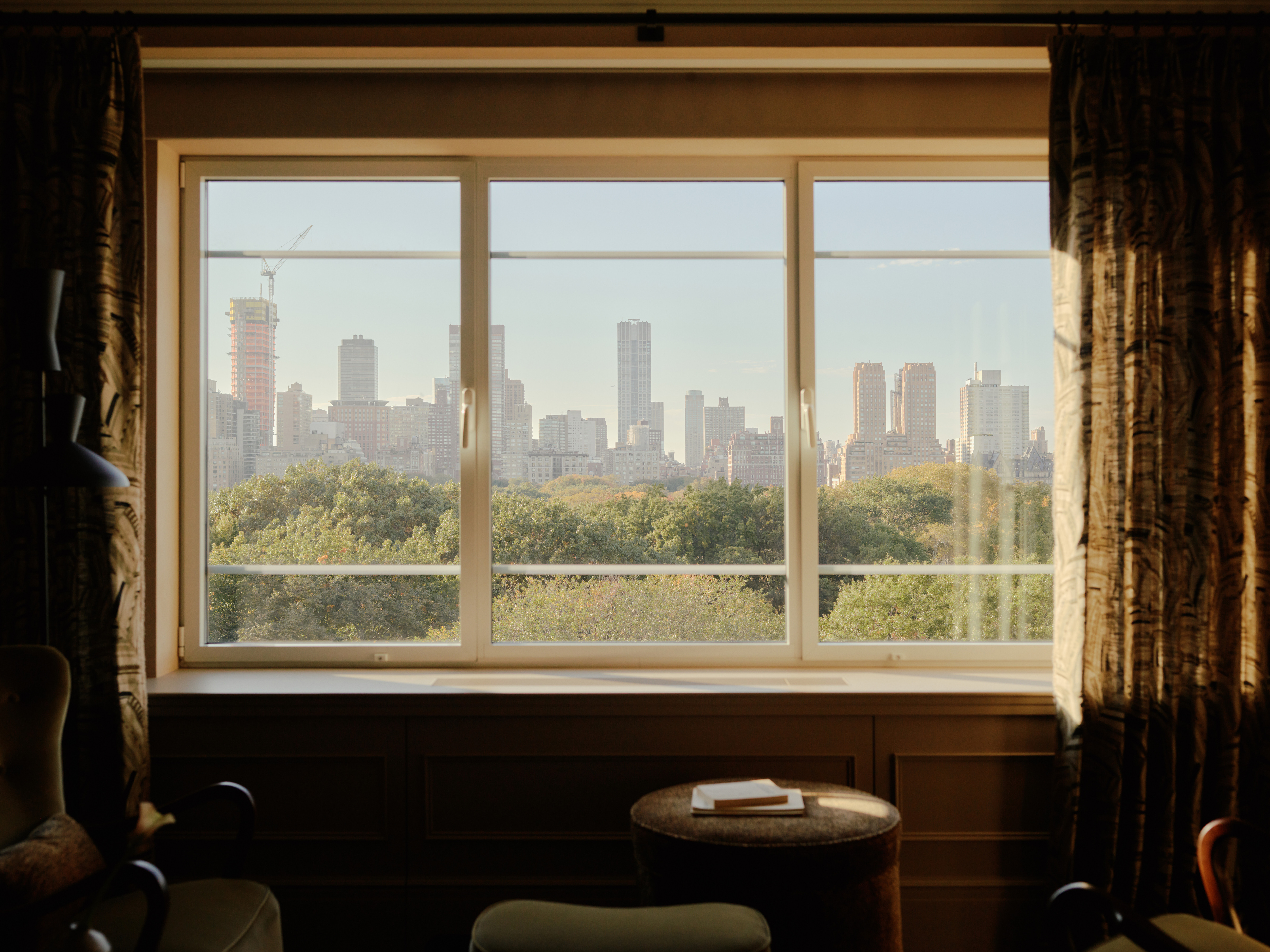
But of course, the star of the show remains the setting, a visual connection to the cityscape all throughout the home. For two empty nesters — and their dog, too — the once-dated apartment is now fully updated for a new chapter of life in Manhattan.
“We wanted not only guests, but Ben and Linda to feel the excitement of city life,” Simon adds. “And it really does hit you as you are sitting in the living room, enjoying a cocktail, and looking out over the twinkling lights.”
Keith Flanagan is a New York based journalist specialising in design, food and travel. He has been an editor at Time Out New York, and has written for such publications as Architectural Digest, Conde Nast Traveller, Food 52 and USA Today. He regularly contributes to Livingetc, reporting on design trends and offering insight from the biggest names in the US. His intelligent approach to interiors also sees him as an expert in explaining the different disciplines in design.
-
 The 'New British' Style? This Victorian London Home Embraces Its Owners' Global Background
Warm timber details, confident color pops, and an uninterrupted connection to the garden are the hallmarks of this relaxed yet design-forward family home
By Emma J Page
-
 Muji Living Room Ideas — 5 Ways to Harness The Calming Qualities of This Japanese Design Style
Inspired by Japanese "zen" principles, Muji living rooms are all about cultivating a calming, tranquil space that nourishes the soul
By Lilith Hudson

