Explore a colorful Australian eco home that feels like part of the landscape with internal courtyards, glass walls and wooden clad rooms
Sustainable and seriously stylish there's so much to be inspired by the Biophilic design of this modern home

The Livingetc newsletters are your inside source for what’s shaping interiors now - and what’s next. Discover trend forecasts, smart style ideas, and curated shopping inspiration that brings design to life. Subscribe today and stay ahead of the curve.
You are now subscribed
Your newsletter sign-up was successful
The property
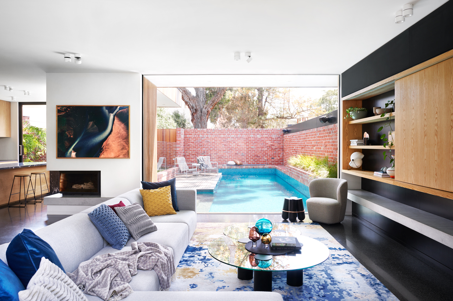
For a suburban dwelling, situated in the middle of a cul-de-sac in Melbourne, this modern home really feels connected to nature – green outlooks through every outlook, floor to ceiling windows, internal courtyards filled with mature trees, warm wooden clad walls. And that was the aim; despite being in a city, this property has been designed, both inside and out to be a serene, calming space, an escape from busy life for the homeowners (a family of five plus their dog Otto, a miniature schnauzer).
Architectures Melbourne Design Studios and interior designers The Stylesmiths are behind this high-tech eco-friendly project. Split over two levels and consisting of four bedrooms, two internal courtyards, pool, fireplace and large living areas, it feels like a vibrant family home filled with light and color and those all important natural elements. Let's take a tour...
Dining space and kitchen
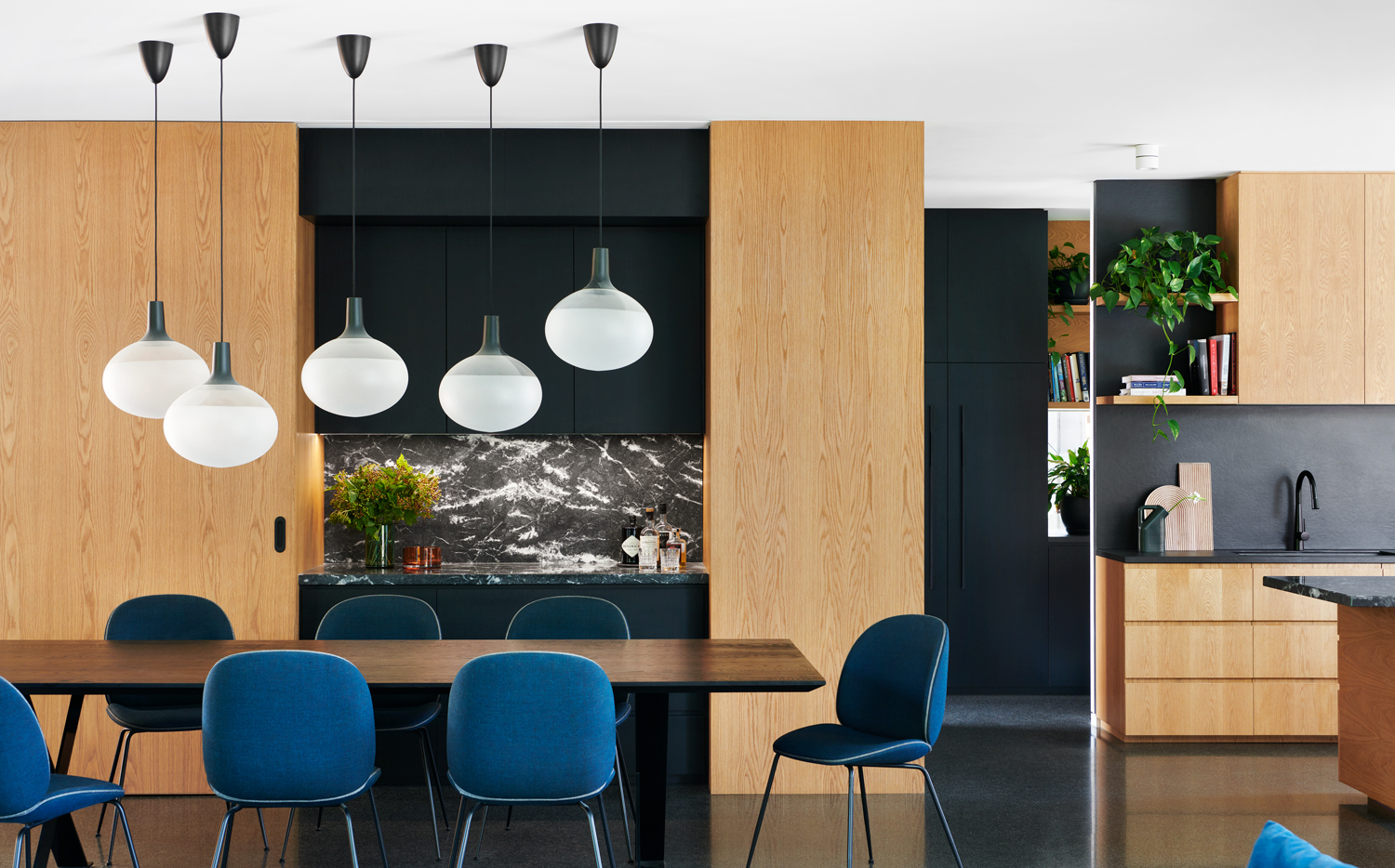
The first floor is almost all open plan or broken plan, consisting of the kitchen, dining area, and living room. American oak ties together all of the zones and is used in the kitchen cabinets, sliding doors in the dining room, and the shelving and TV unit. The velvet blue dining chairs also mirror the deep cobalt blues used in the living space.
Living room
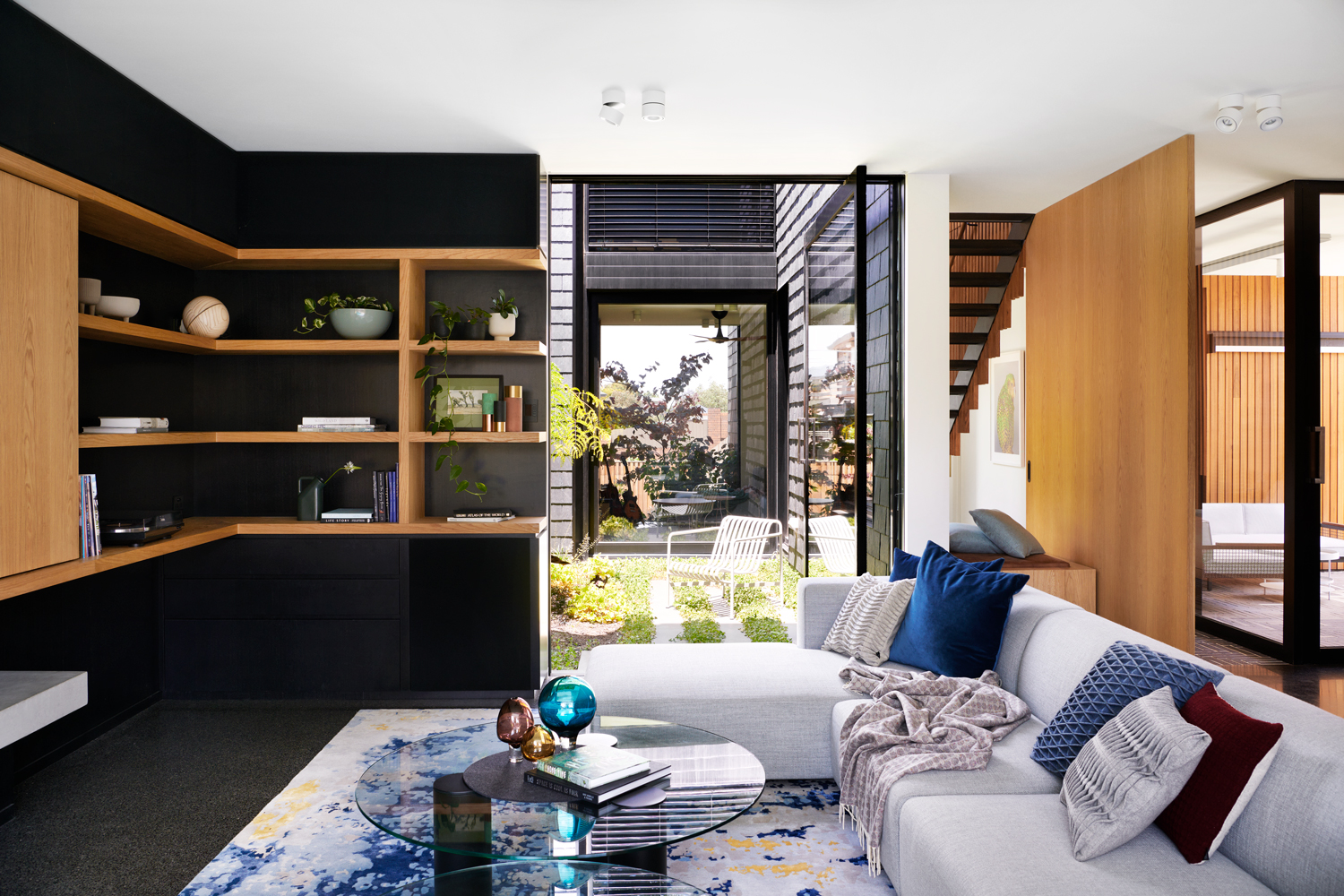
Leading on from the kitchen and dining space and separated by a large corner sofa is the family living space. The lead designer on the project, Silvia Roldan, was very focused on creating a color palette that felt both calming and reflective of the colors outside, but also made the rooms feel warm and inviting.
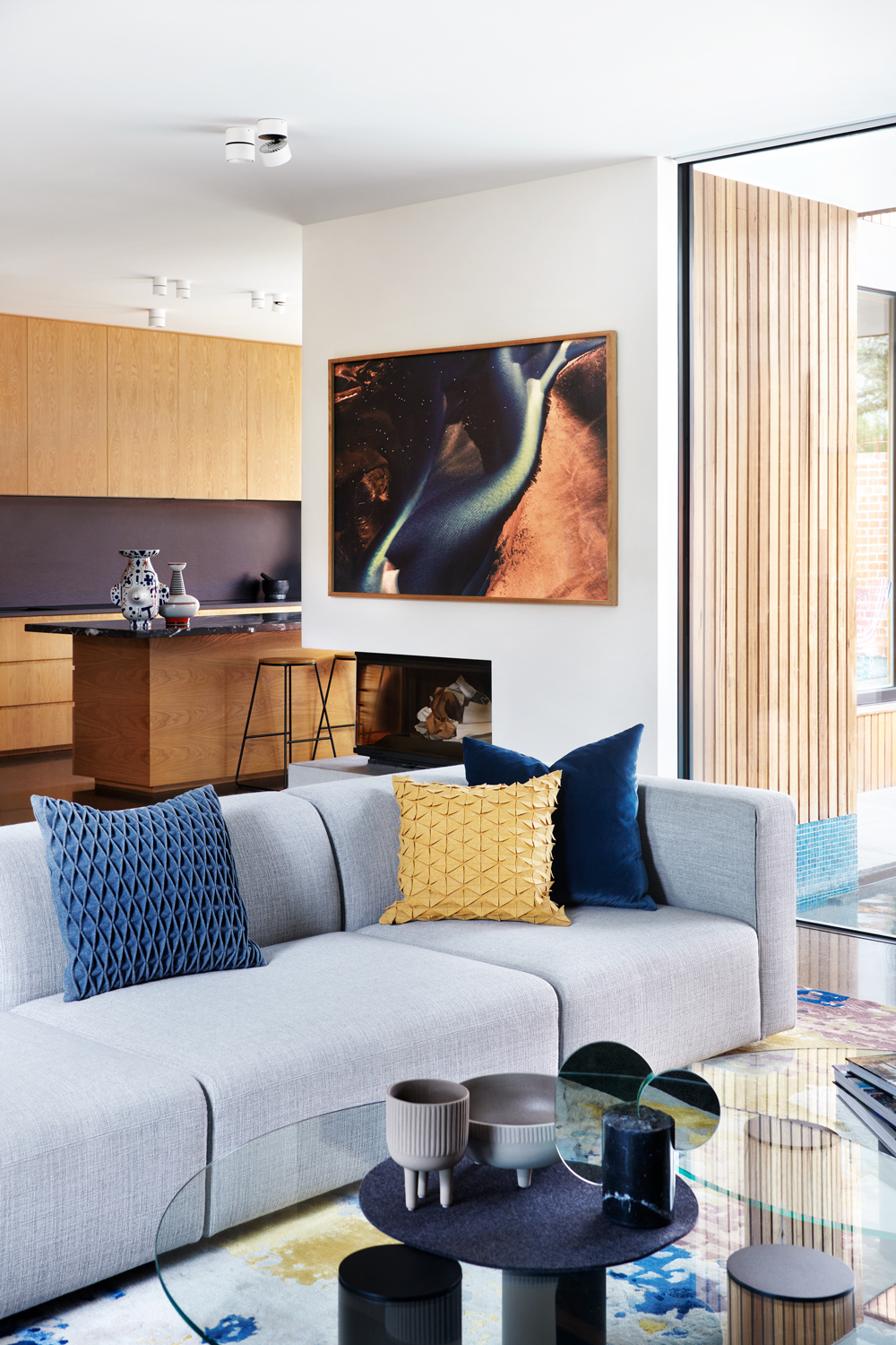
Exactly that is achieved with the deep blues and soft greys, that feel very more and sophisticated. The accents of mustard yellow add a slight warmth to the room and brings out the yellows in the rug too.

Textures, as well as colors, were carefully considered throughout the whole home, but the living room is a particularly tactile space. Boucle fabrics, handwoven rugs, felt folded cushions, chunky weaves and plenty of wood all come together to create a room that feels cozy and laid back.
The wall unit in the living room cleverly disguises the TV behind doors as well as provides the perfect place to add decor, books and houseplants.
The Livingetc newsletters are your inside source for what’s shaping interiors now - and what’s next. Discover trend forecasts, smart style ideas, and curated shopping inspiration that brings design to life. Subscribe today and stay ahead of the curve.
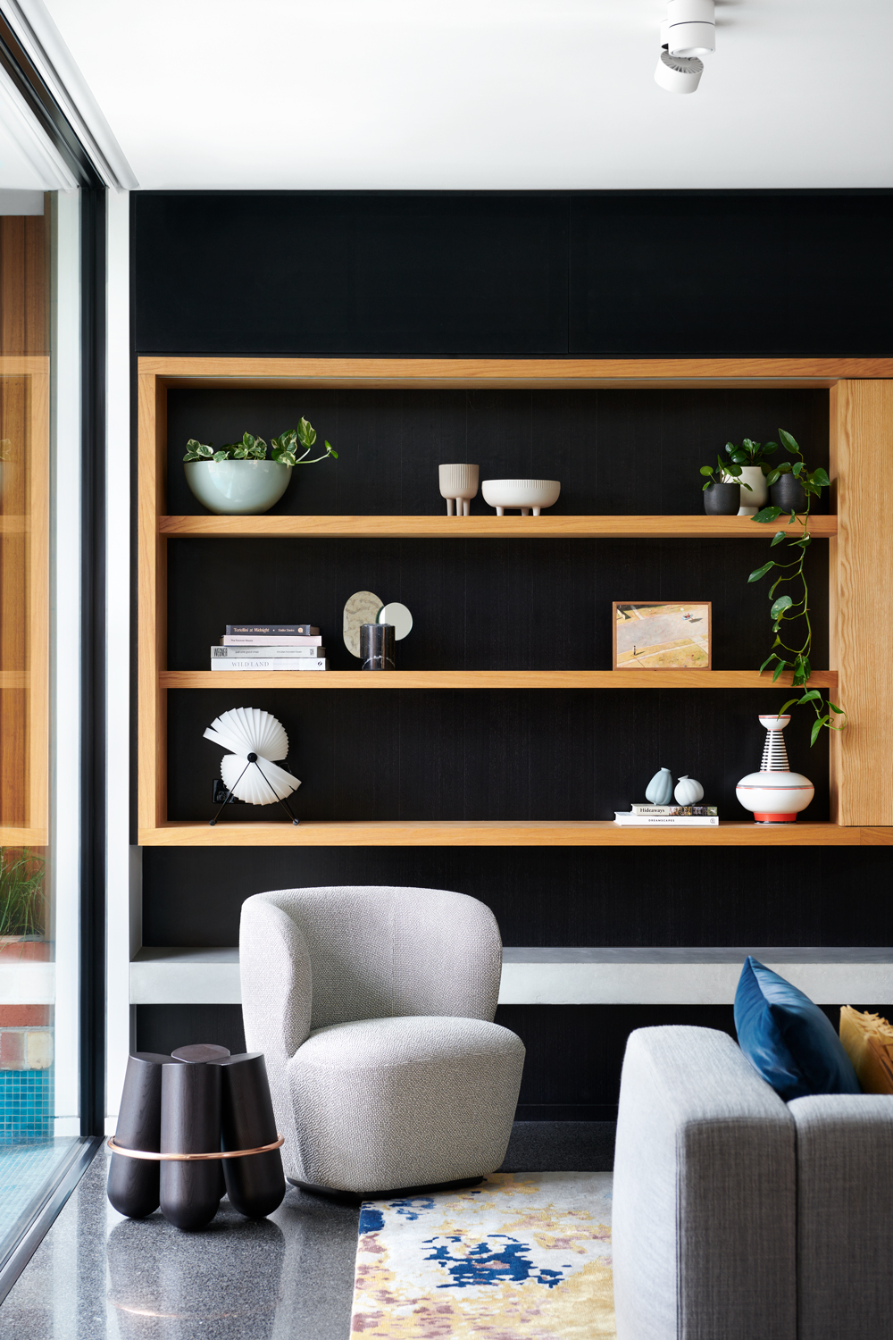
- See also: 24 modern living room ideas – easy updates, designs, trends, and color schemes that will make you want to redecorate
Staircase and hallway
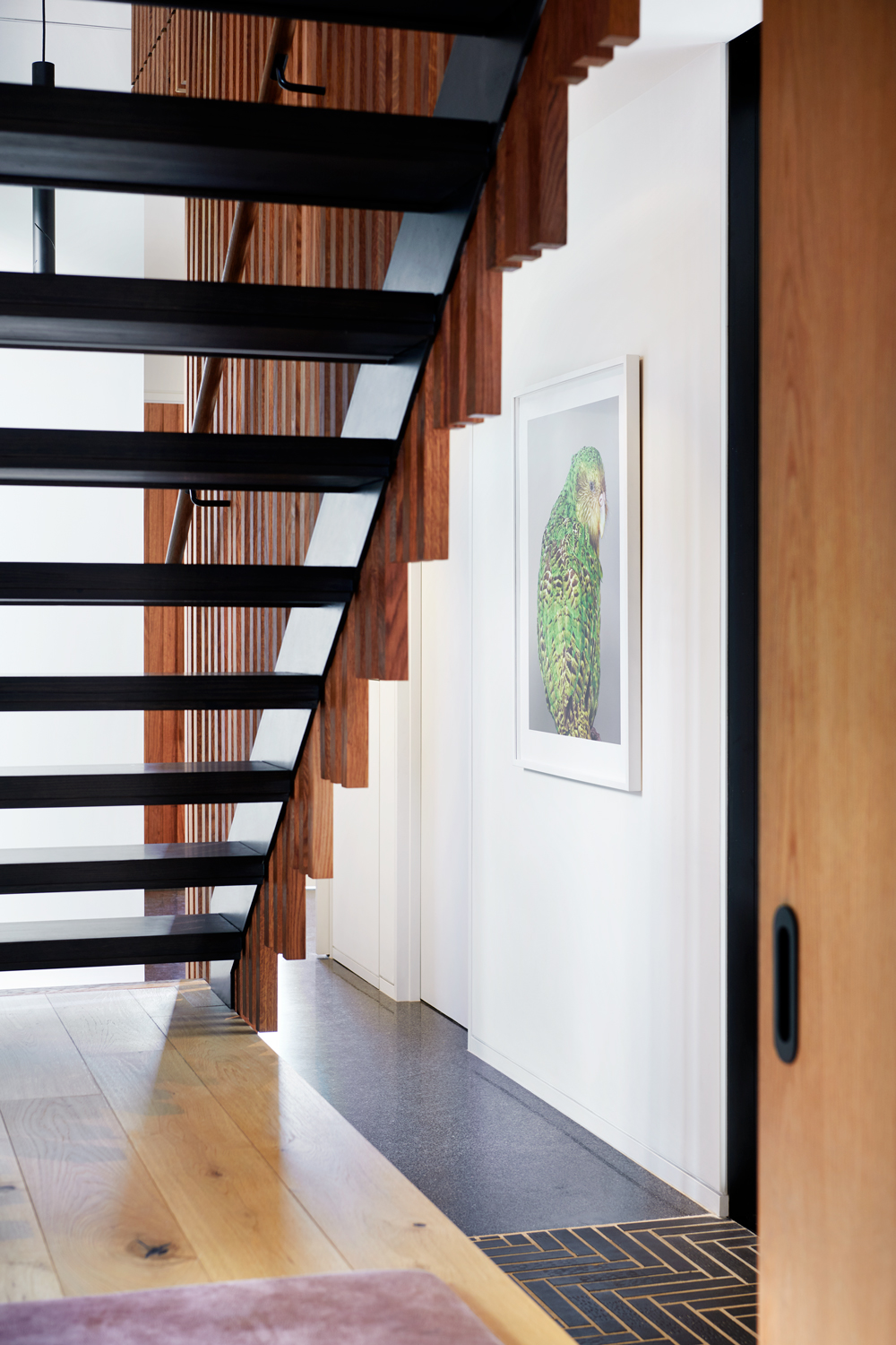
The main staircase is separated by a wall of vertical timber beams that allow light to filter through from the first floor down into the hallway below.
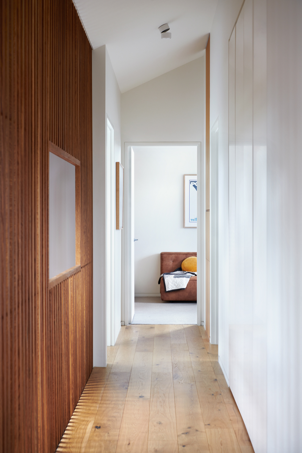
The design continues up onto the floor above, creating almost a mezzanine in the hallway and bringing tonnes of light into this narrow space.
Having plenty of natural light and ventilation was a key part of the design as the homeowners always wanted the home to have that connection with nature and they wanted to be able to feel the seasons inside their home. Features like this semi-solid wall does just that as there's a seamless flow through the home, with few solid walls and plenty of opportunity for light and fresh air to come in.
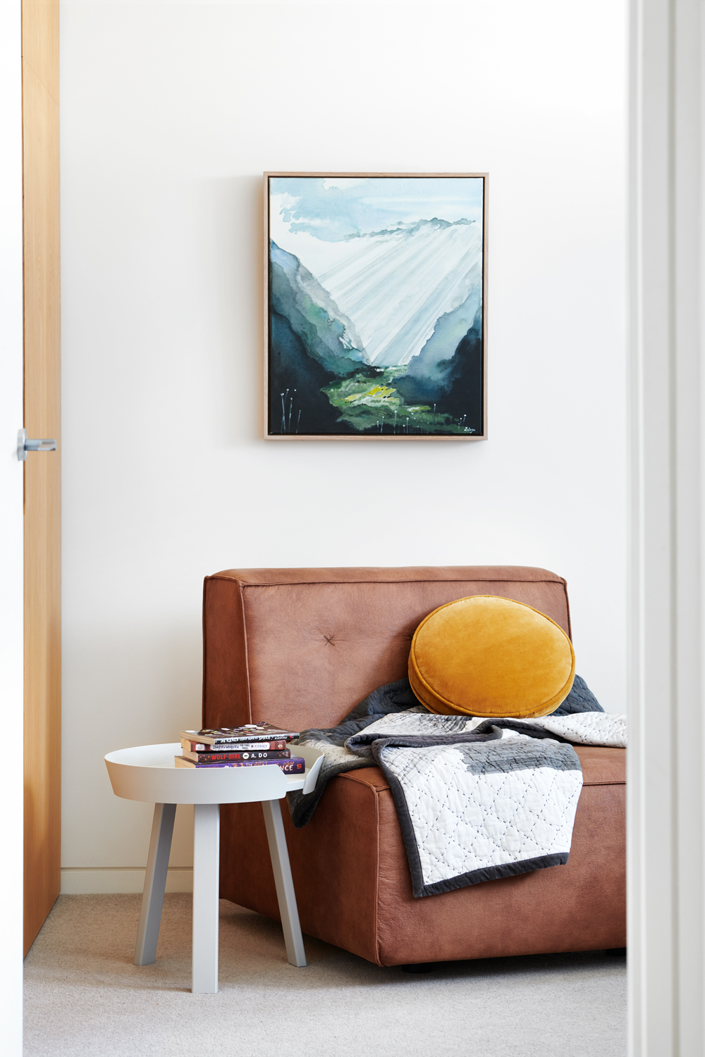
- Inspired by this beautiful design? Head over to our staircase ideas feature.
Master bedroom
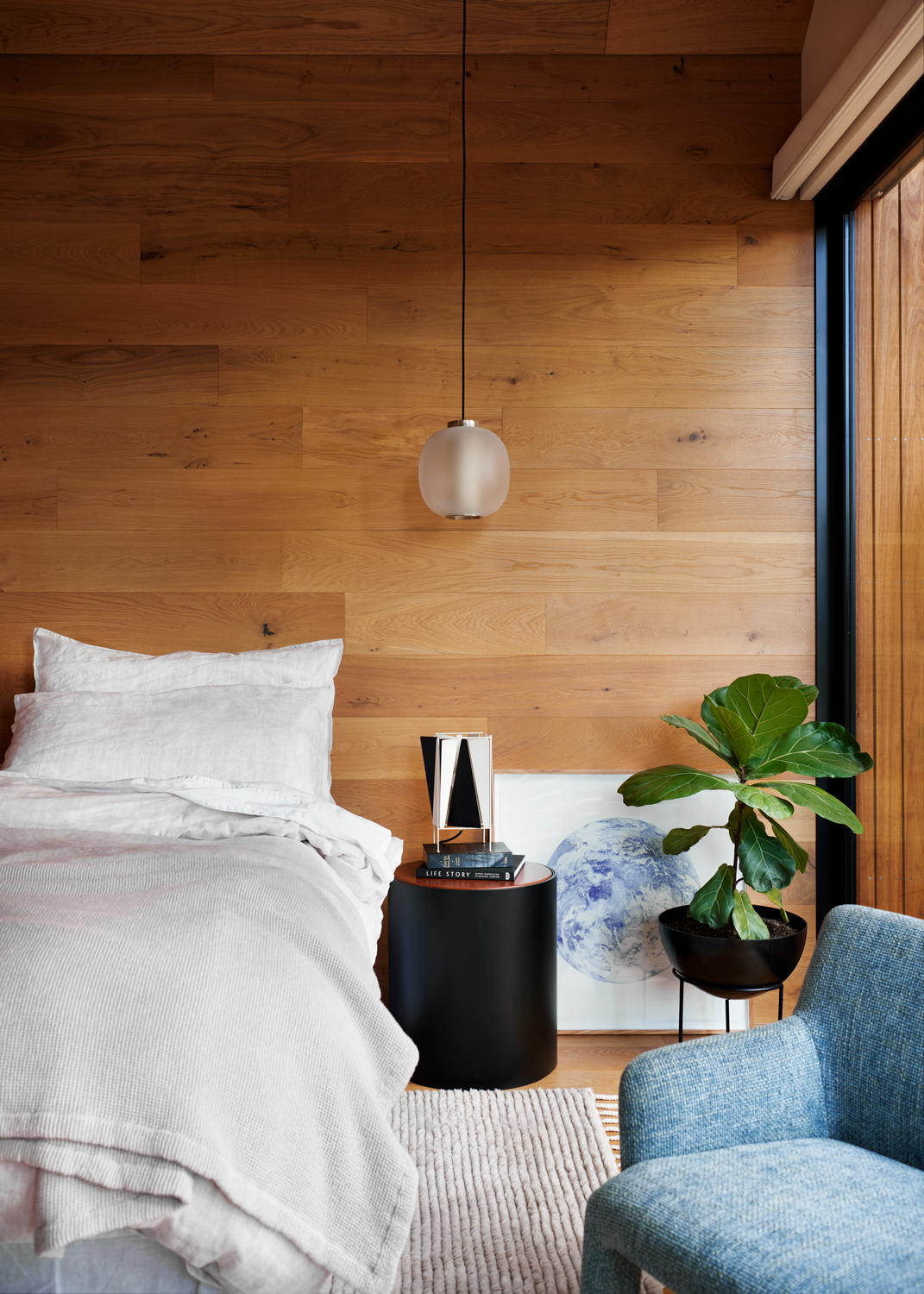
The wood-paneled master bedroom feels gloriously warm and inviting and there's that connection here too with the other room with the use of the same warm oak wood.
As part of trying to create a more sustainable home, everyone involved in the project was particularly keen to support local home-grown design, so most of the decor and furniture in the bedroom and throughout the home are sourced and manufactured locally.
First floor sitting room
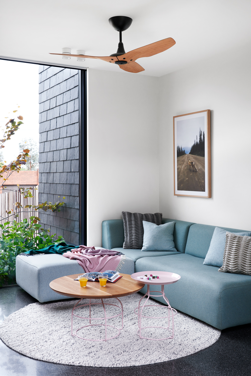
There's also a casual snug sitting room on the first floor. The mix of pinks and blues is fresh and modern but it's those huge windows that make the room feel so light and open. The garden outside almost looks like it's growing into the indoor space.
Kid's bedroom
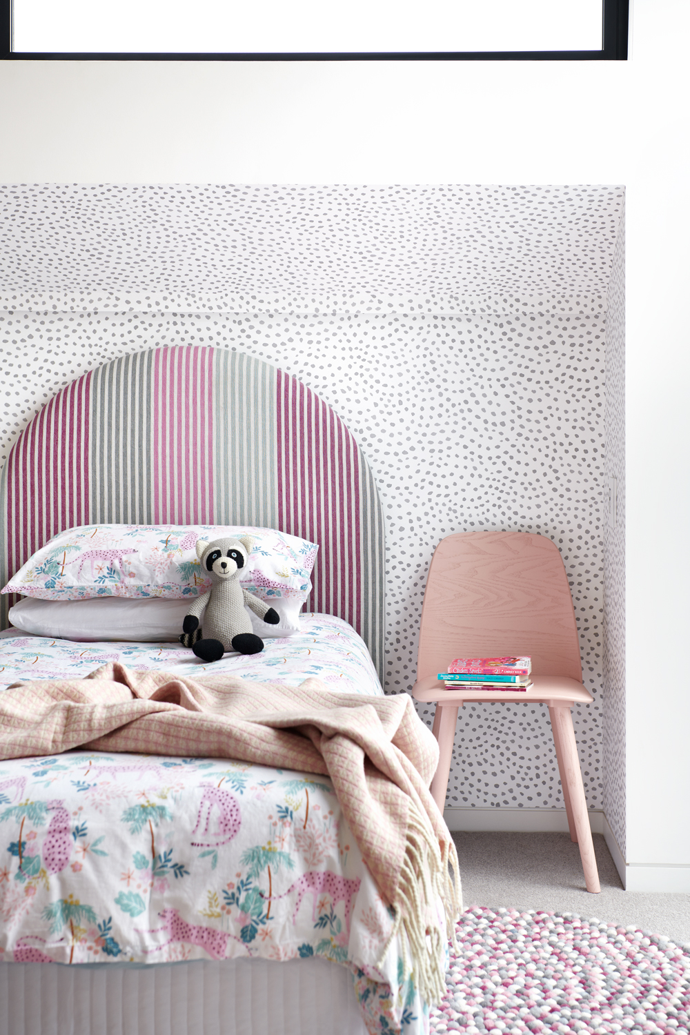
The kid's bedroom is full of whimsy and has a fun, creative vibe to it, just as childrens' rooms should. The bold clashing of the dotted wallpaper and striped headboard still feels cohesive because of the lovely subtle color scheme.
Internal courtyard
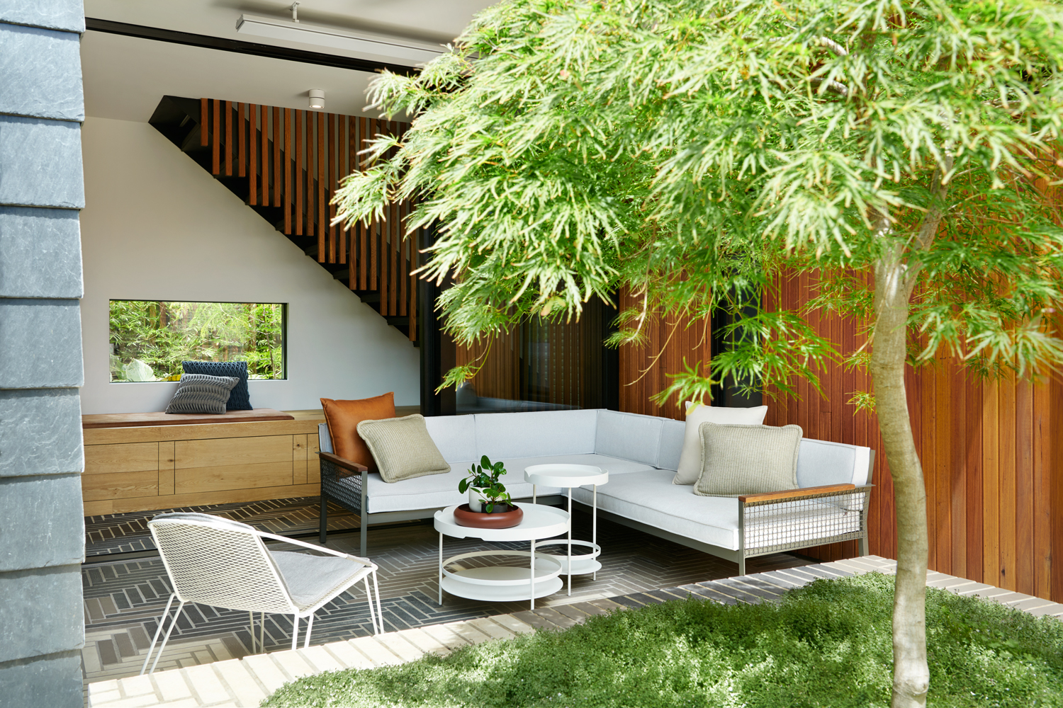
This is one of the two internal courtyards. A mature acre tree grows through the center, which instantly gives the serene feeling of a Japanese garden.
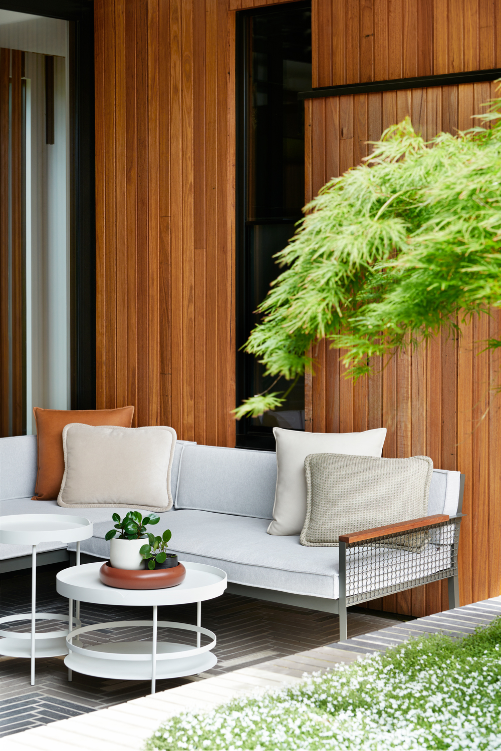
The simple minimalist furniture doesn't add too much visual bulk so light still flows easily around the outdoor living room. Floor-to-ceiling sliding doors blend the indoor open plan living area with the outside space.
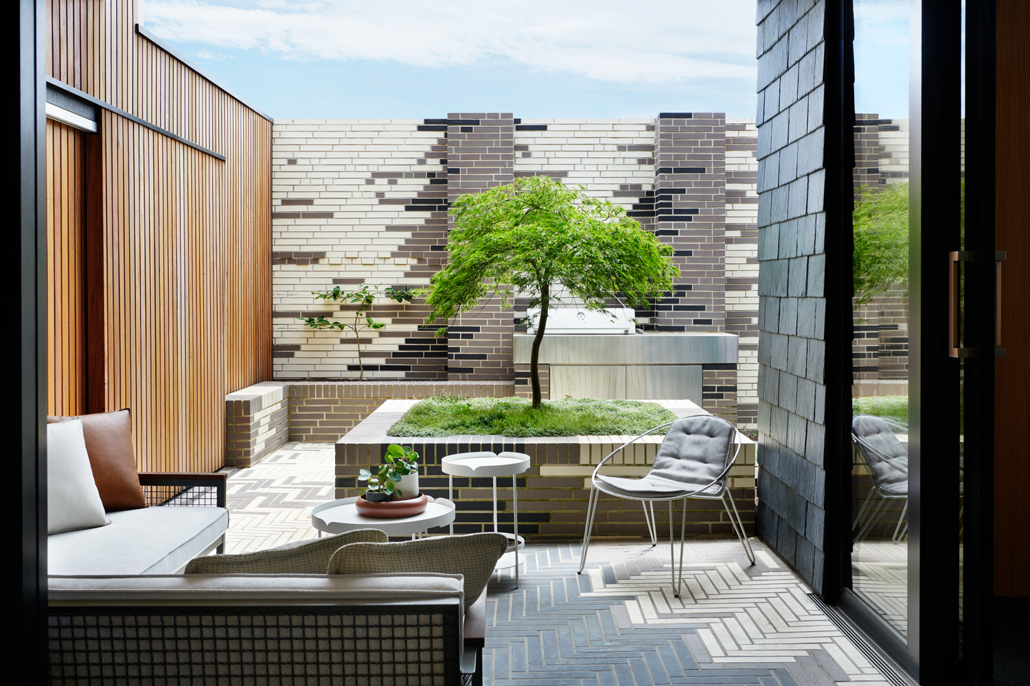
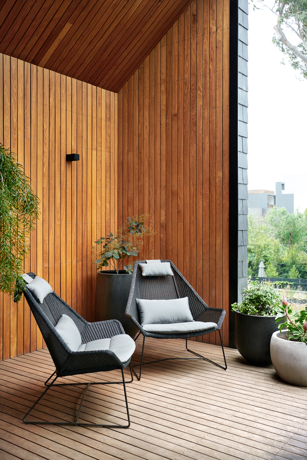
The wooden accents that can be found throughout the rest of the home are brought to the outside areas too, further emphasizing the house's connection with nature.

Formerly the Digital Editor of Livingetc, Hebe is currently the Head of Interiors at sister site Homes & Gardens; she has a background in lifestyle and interior journalism and a passion for renovating small spaces. You'll usually find her attempting DIY, whether it's spray painting her whole kitchen, don't try that at home, or ever-changing the wallpaper in her entryway. She loves being able to help others make decisions when decorating their own homes. A couple of years ago she moved from renting to owning her first teeny tiny Edwardian flat in London with her whippet Willow (who yes she chose to match her interiors...) and is already on the lookout for her next project.