Inside an award-winning floating home on Seattle’s Lake Union
Built on a 100-year-old foundation of log floats, this spacious and light-filled home is well worth an explore...
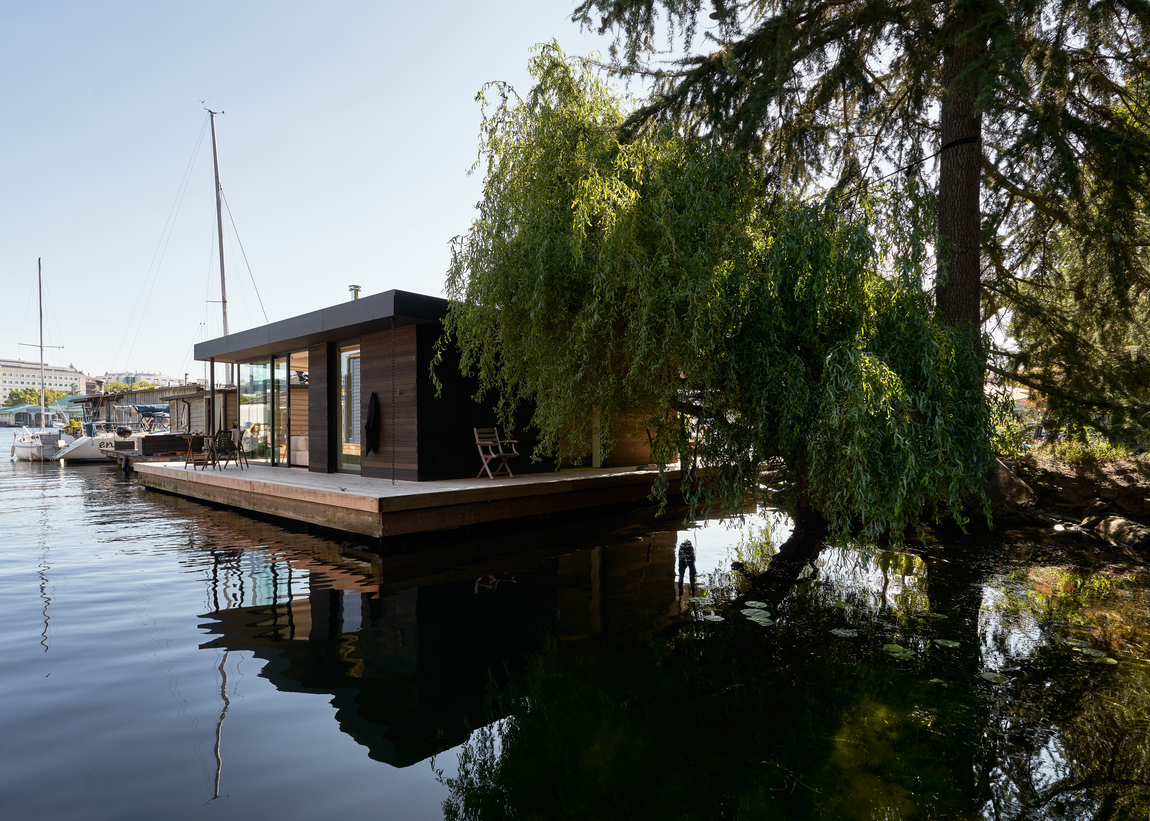

When your home literally floats on the water, it only makes sense for the design to be inspired by its surroundings. How the water moves, how it reflects light, how it changes color throughout the day, all of this and more was the inspiration for Suzanne Stefan, co-founder of Studio DIAA who is not only the architect and designer behind this modern home but is also the homeowner of this float home.
'One of our favorite aspects of design is to observe the nuances of light unfolding in space. Sometimes you can predict these moments of light, and sometimes they are complete surprises. When it happens, you feel time slowing. In designing this home, our primary interest was light.' explains Suzanne. 'We have an old willow tree in the lake garden next to the home, and the branches and leaves filter light in an unexpected way as it engages the surface of the water. Being in the house, it's been a delightful reminder that light is generous, the trees are generous, the water is generous-- nature always works so hard for us.'
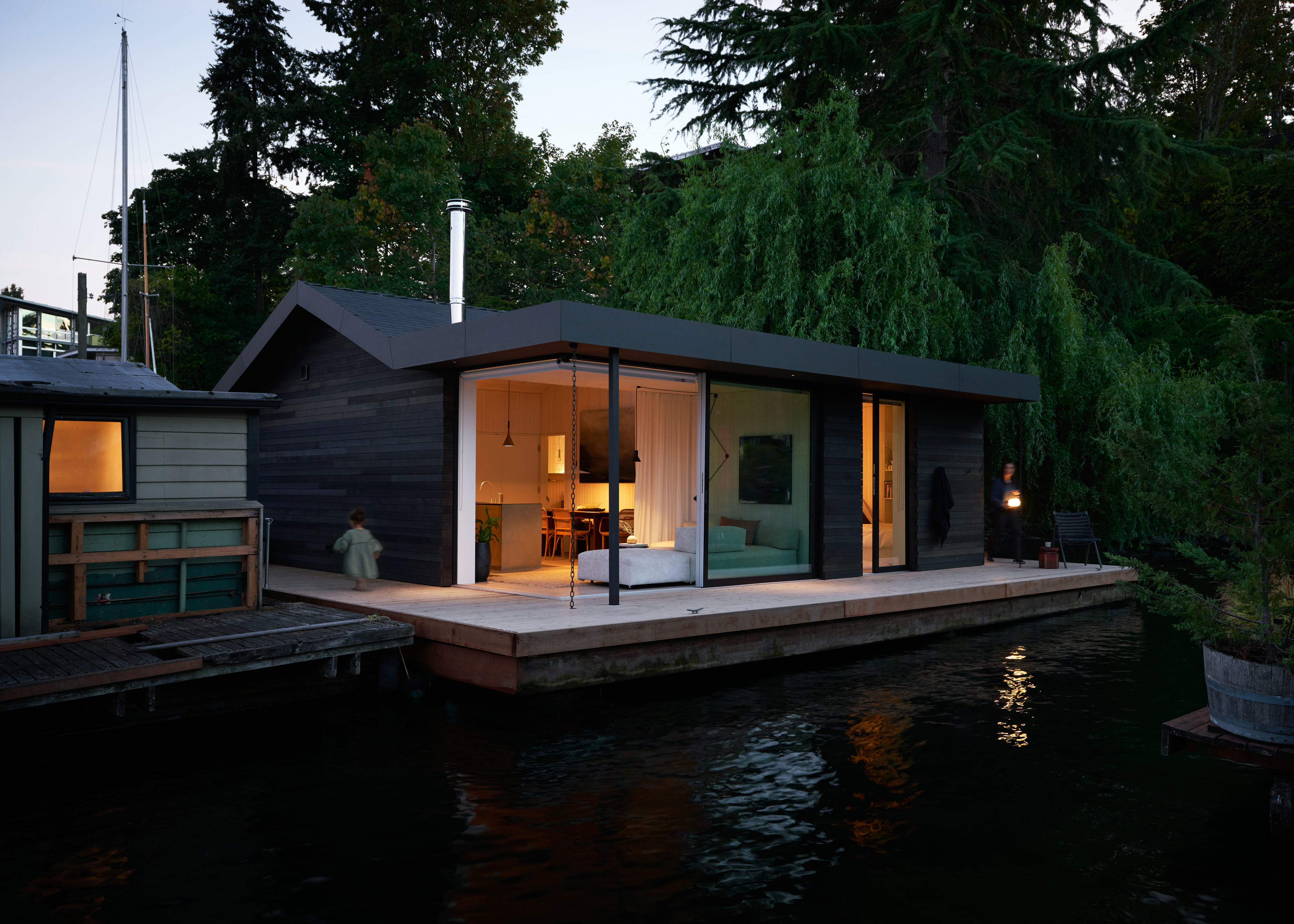
Situated along the north end of Lake Union in Seattle, underneath this new build floating home lies a 100-year-old log float foundation. Its spacious interiors are made up of two bedrooms, a bathroom, and a large open-plan kitchen-diner. There's also a decking that wraps around the build and is accessible from every room – you'll see that that seamless flow from indoors to out is a key feature of the home. Then there's the 'guest house' a.k.a Suzanne's vintage Swedish sailboat that's parked alongside. Intrigued? Let's take a tour...
While the outside of the home is all dark wood and weathered silver tones, chosen to mimic the surrounding Cedar trees, the inside is quite the opposite. Whitewashed walls meet soft light woods and pale color palettes, which of course were also picked with nature in mind. The lighter hues amplify the light, pulling it inside and bouncing a gentle glow around each room.
The floating home is divided into two clear zones, one a large open plan kitchen living room and the other containing the two bedrooms and the bathroom. Glass doors can be found in every room which leads out onto the deck, creating an effortless flow between both the two zones and the outside space.
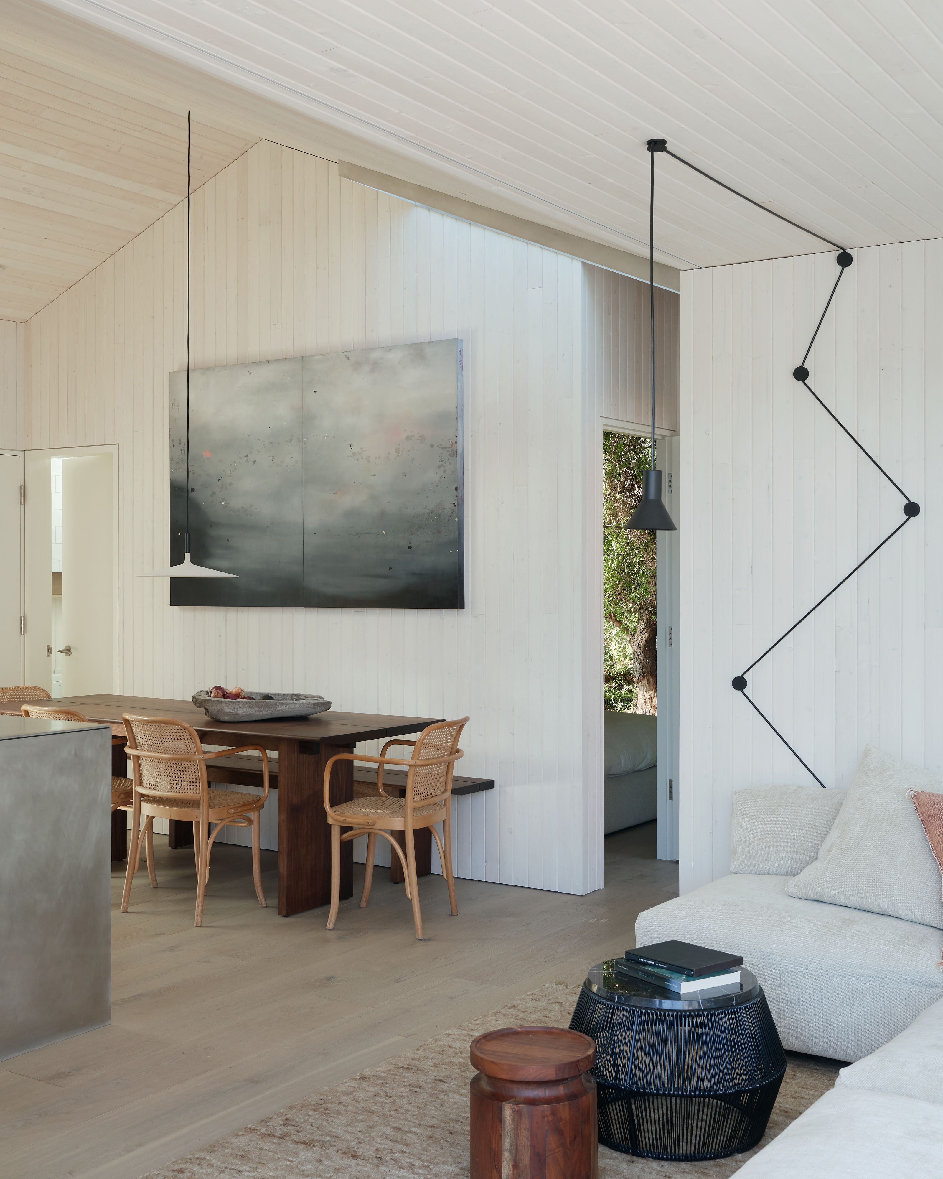
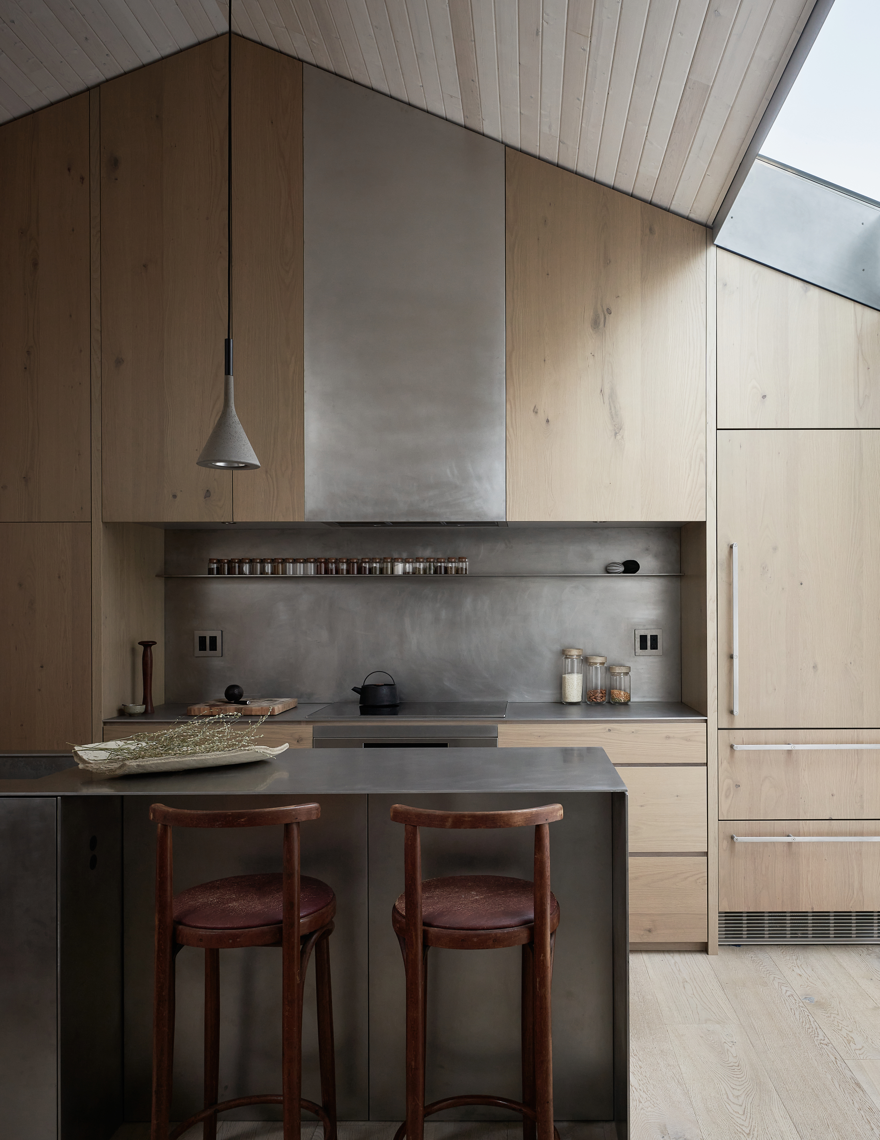
The kitchen itself is white oak, which is the perfect contrast to the industrial-style stainless steel island and countertops. All the appliances are concealed, giving the kitchen a sleek, streamlined look that works best in open-plan spaces. Cane dining chairs sit around a dark stained wooden table, adding plenty of texture to the room.
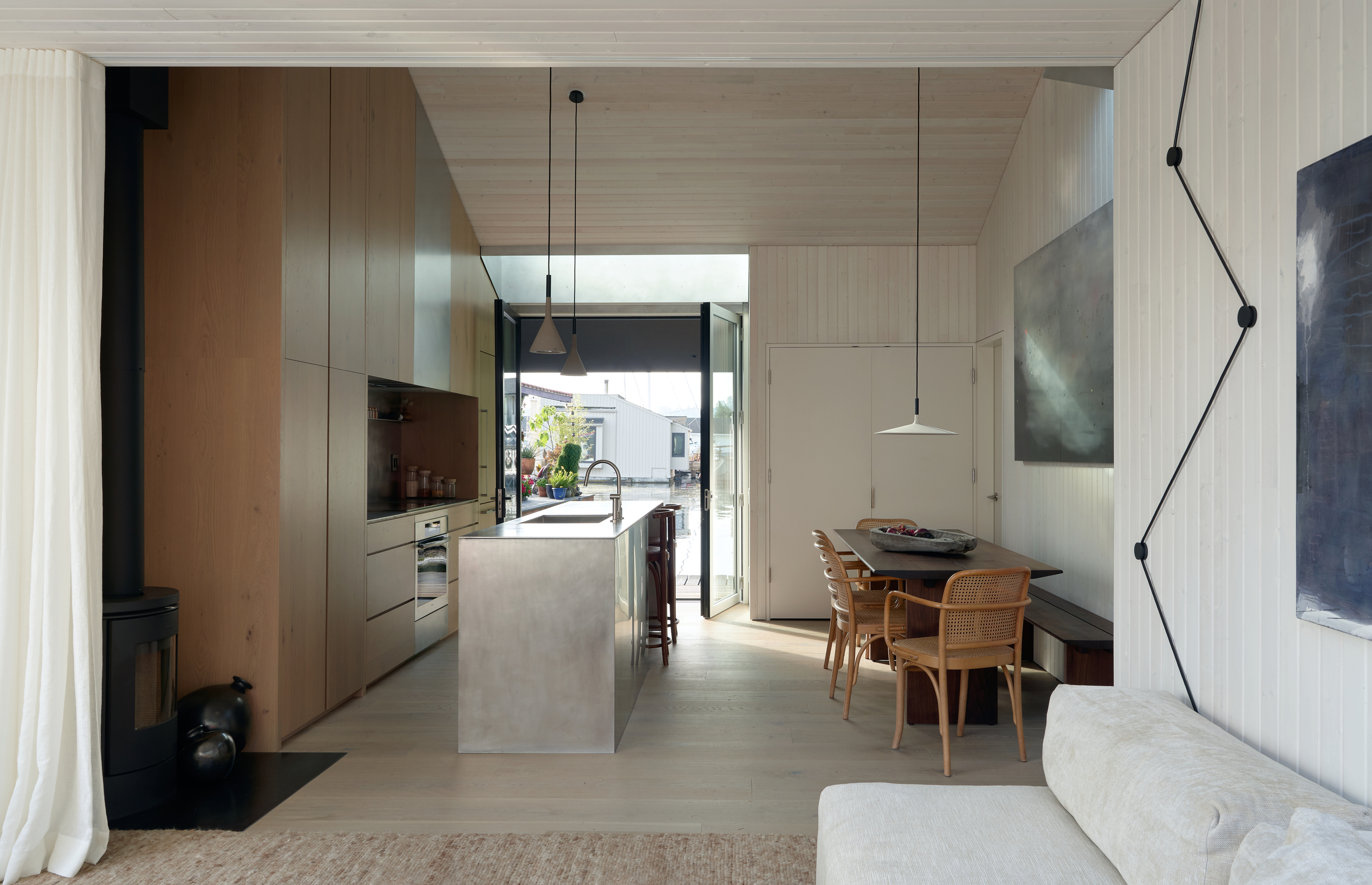
- Find more kitchen ideas in our full gallery.
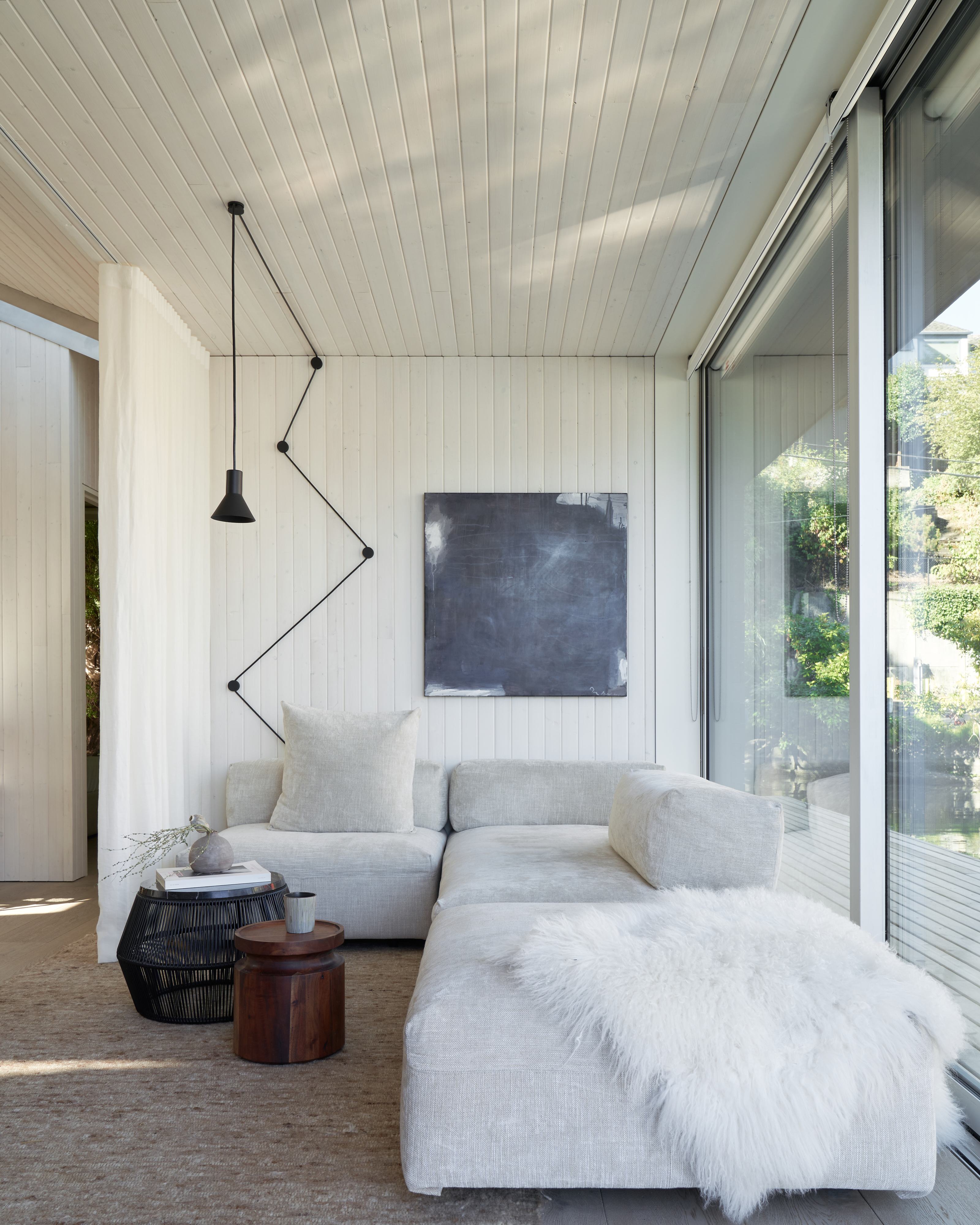
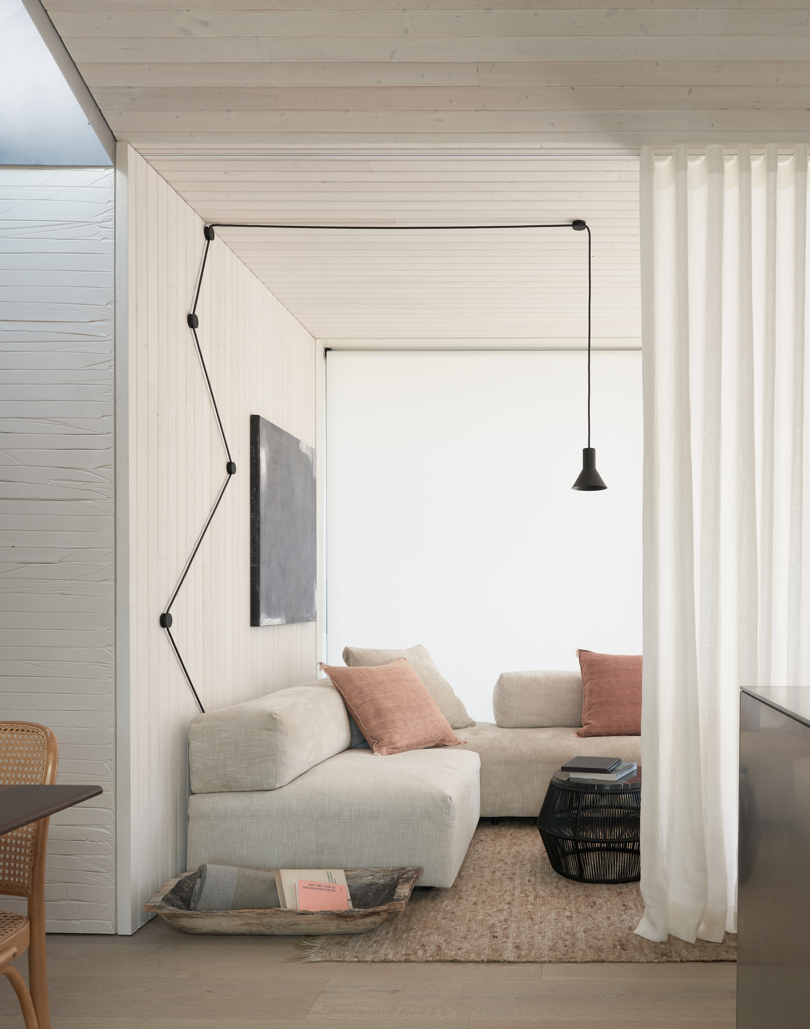
The living room sits in the corner of the open-plan space, with a pale cloud grey sofa hugging the edges of the room. The vibe in here is minimalistic, but there are rustic touches too like the rattan coffee table and weather-worn wooden trug. The sheepskin adds a slightly Scandi feel.
Be The First To Know
The Livingetc newsletters are your inside source for what’s shaping interiors now - and what’s next. Discover trend forecasts, smart style ideas, and curated shopping inspiration that brings design to life. Subscribe today and stay ahead of the curve.
Floor to ceiling windows fill the room with light and offer beautiful views over the lake and the sliding door opens up onto the decking. There's a retractable sheer curtain that can be used to separate the living room from the kitchen.
Bedroom
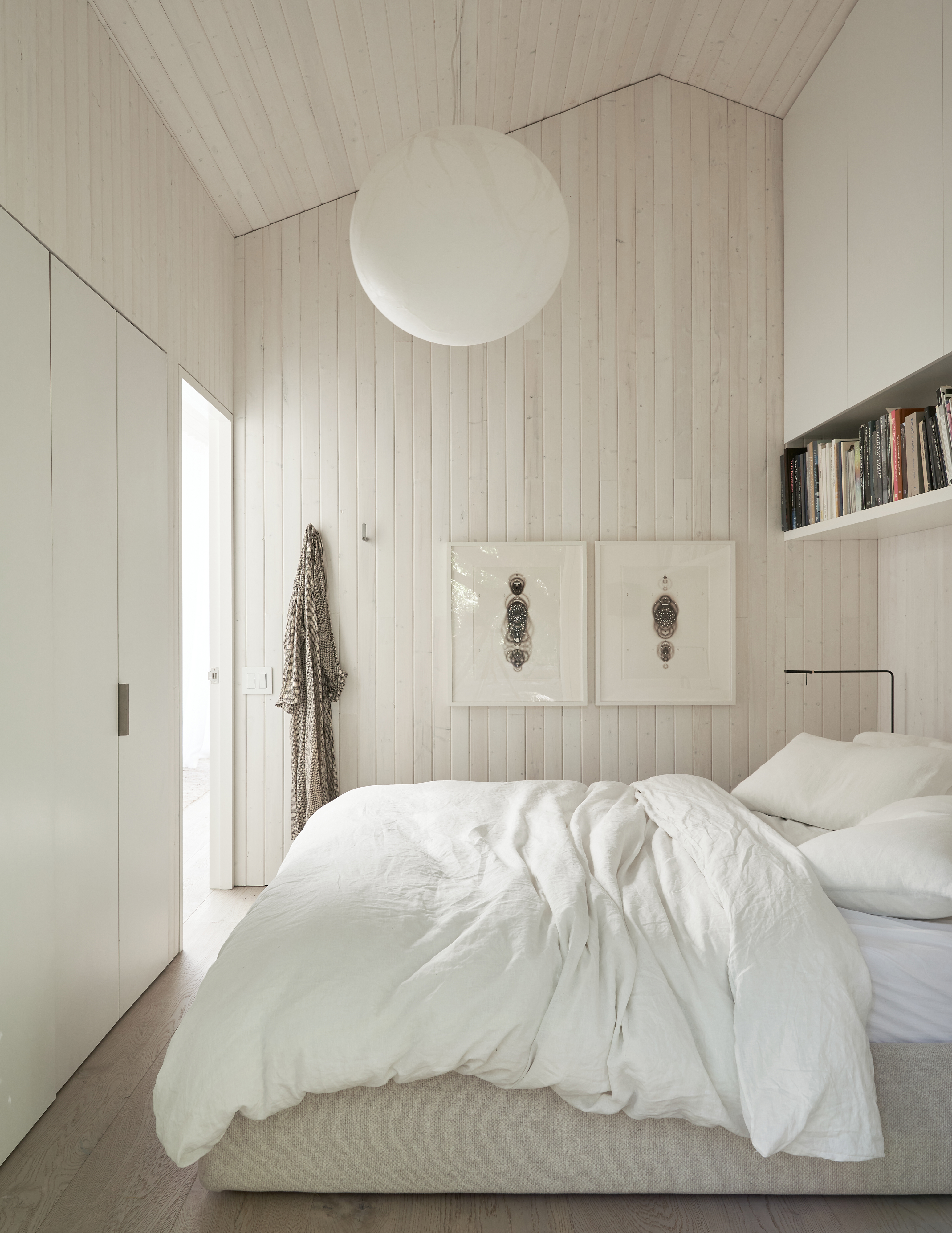
The bedroom follows an all-white scheme too with whitewashed oak-paneled walls and floors, sleek white built-in cabinets for storage and slubby linen sheets to further add to that lovely, lived in relaxed feel that's found all around the rest of the home.
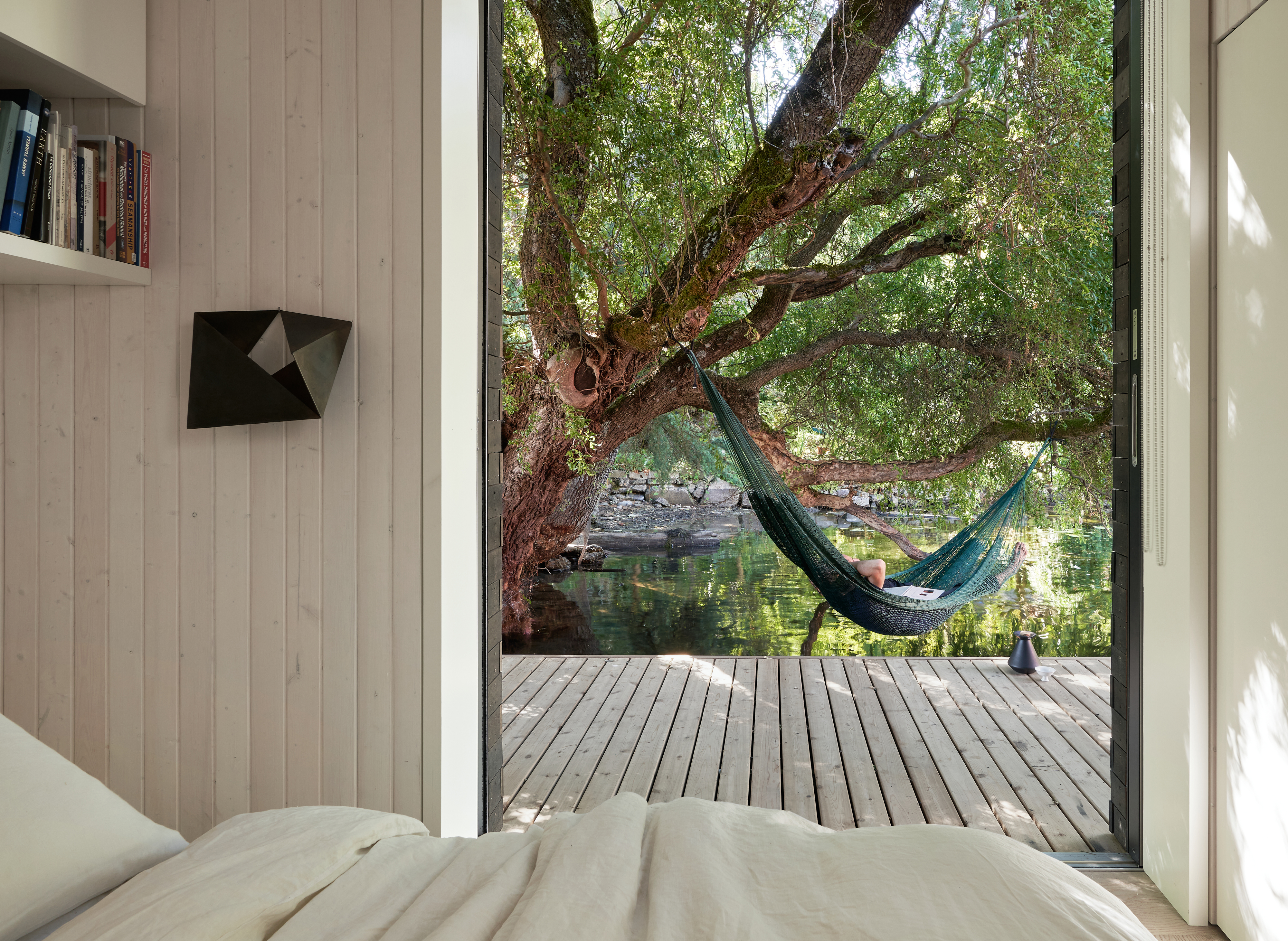
In here too, sliding doors lead out onto the decking where a hammock hangs on low hanging branches above the water.
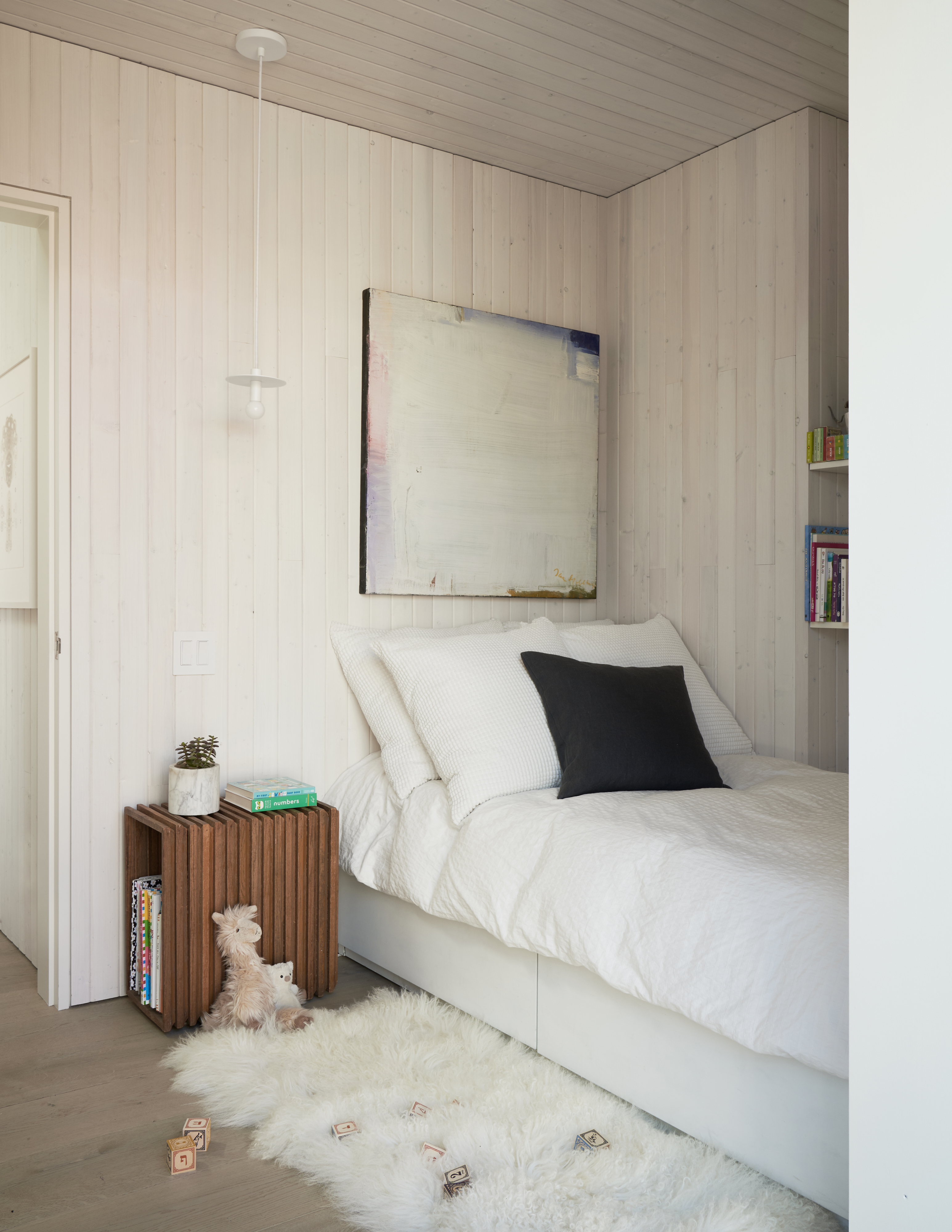
The second bedroom has a very similar laid-back Scandi style with matching pale paneling and flooring. The sheepskin rug adds softness underfoot and brings a tactile texture into all the clean lines and wooden finishes going on in here. Built-in open shelves leave space for books and decor to give the room added personality.
Bathroom
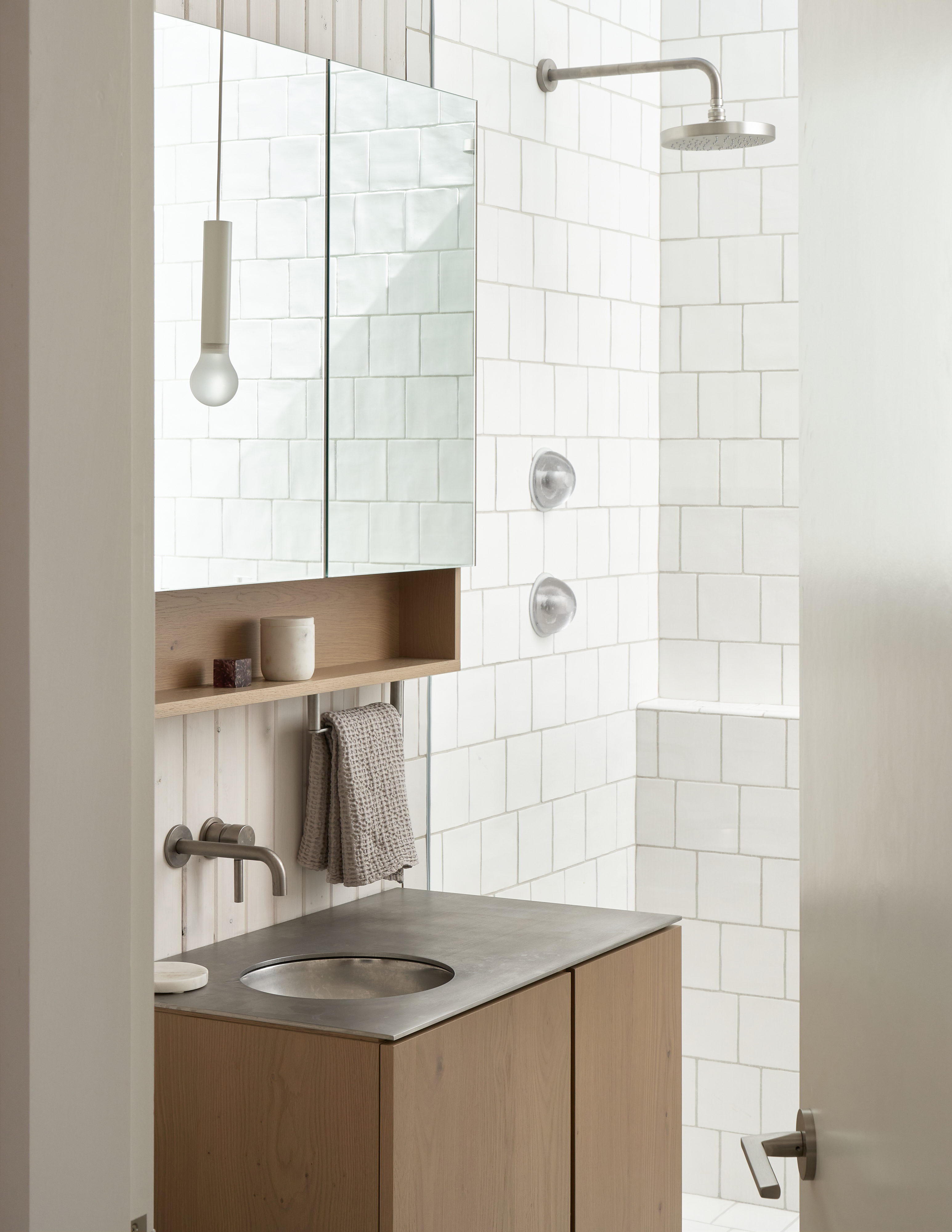
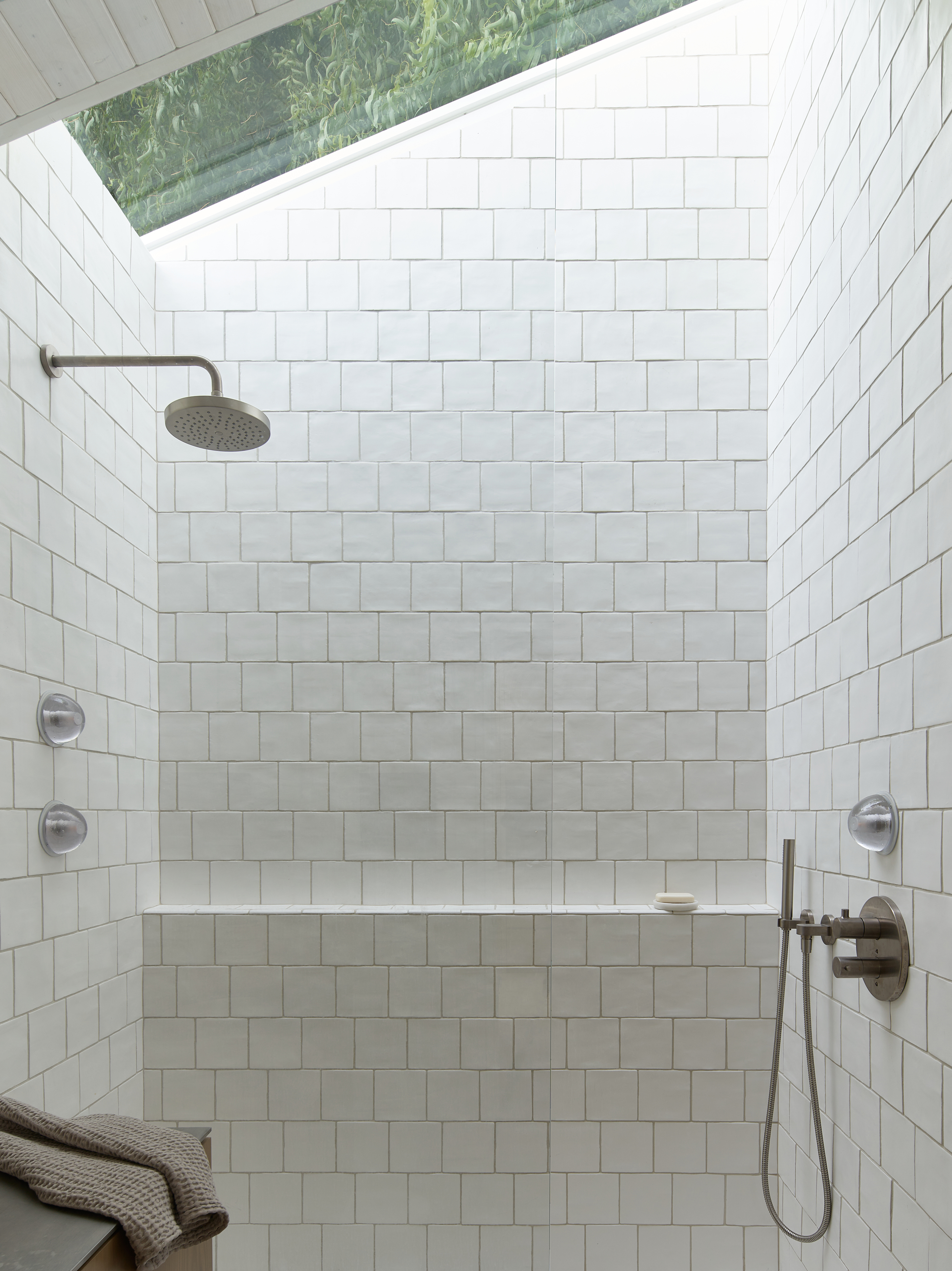
White zellige tiles clad all the walls in the light-filled bathroom. A skylight runs across the top of the walk-in shower, offering a tree-filled view above and giving the distinct impression of being outside whilst in. The same oak used on the kitchen cabinets is used on the bathroom units, creating a cohesive feel between the two spaces.

Formerly the Digital Editor of Livingetc, Hebe is currently the Head of Interiors at sister site Homes & Gardens; she has a background in lifestyle and interior journalism and a passion for renovating small spaces. You'll usually find her attempting DIY, whether it's spray painting her whole kitchen, don't try that at home, or ever-changing the wallpaper in her entryway. She loves being able to help others make decisions when decorating their own homes. A couple of years ago she moved from renting to owning her first teeny tiny Edwardian flat in London with her whippet Willow (who yes she chose to match her interiors...) and is already on the lookout for her next project.
-
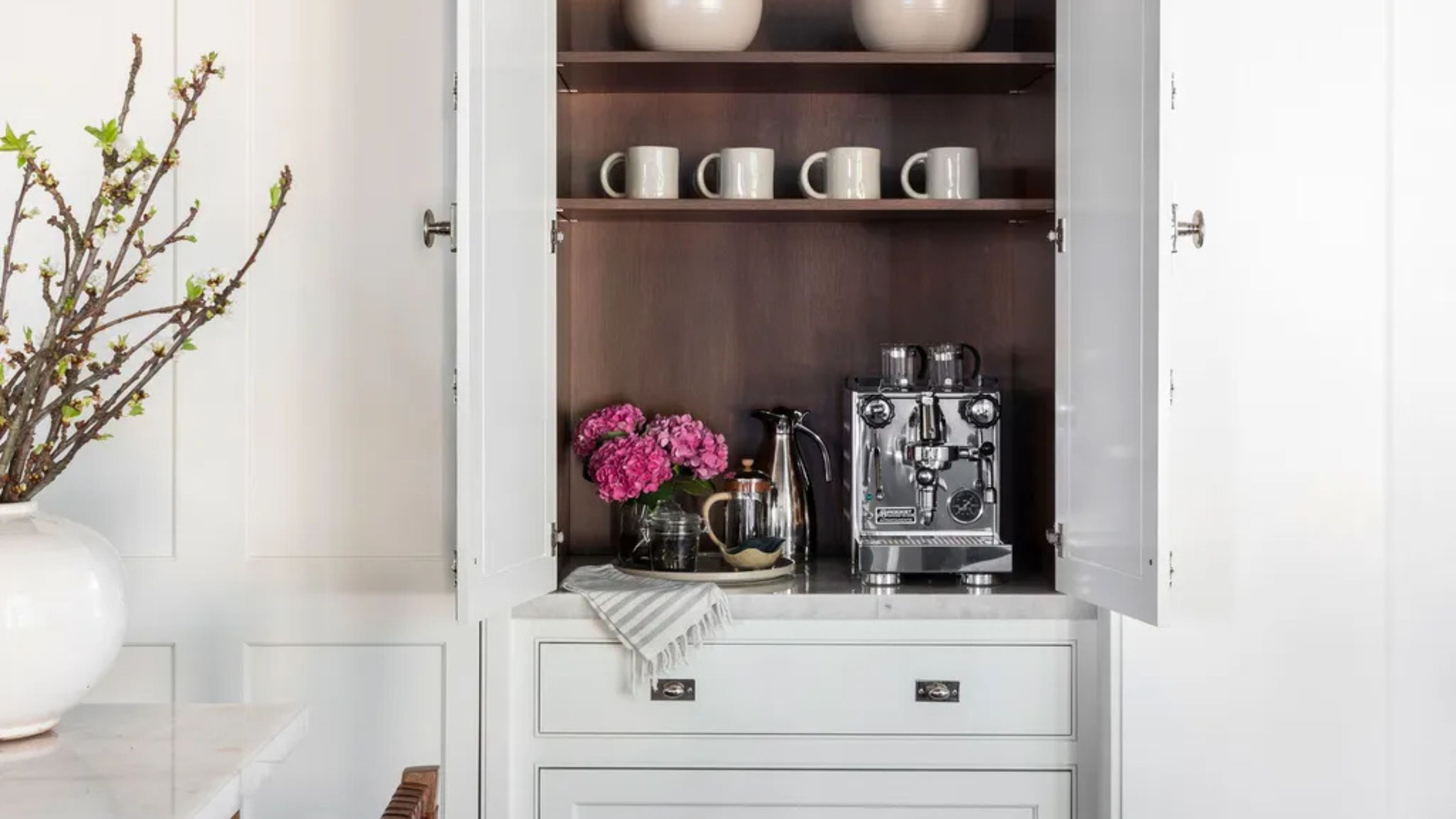 Turns Out the Coolest New Café is Actually In Your Kitchen — Here's How to Steal the Style of TikTok's Latest Trend
Goodbye, over-priced lattes. Hello, home-brewed coffee with friends. TikTok's 'Home Cafe' trend brings stylish cafe culture into the comfort of your own home
By Devin Toolen Published
-
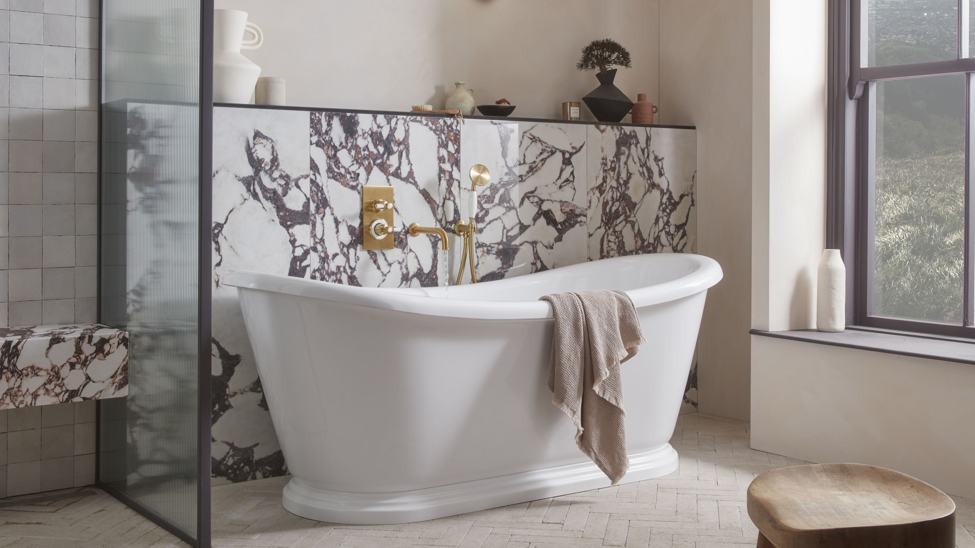 5 Bathroom Layouts That Look Dated in 2025 — Plus the Alternatives Designers Use Instead for a More Contemporary Space
For a bathroom that feels in line with the times, avoid these layouts and be more intentional with the placement and positioning of your features and fixtures
By Lilith Hudson Published