Dreamy, Uplifting, and Sophisticated — This Paris Apartment's Color Scheme Is the Design Equivalent of Spring Awakening
French design firm Batiik Studio reimagines a decades-old Marais apartment as a pastel-drenched ode to spring
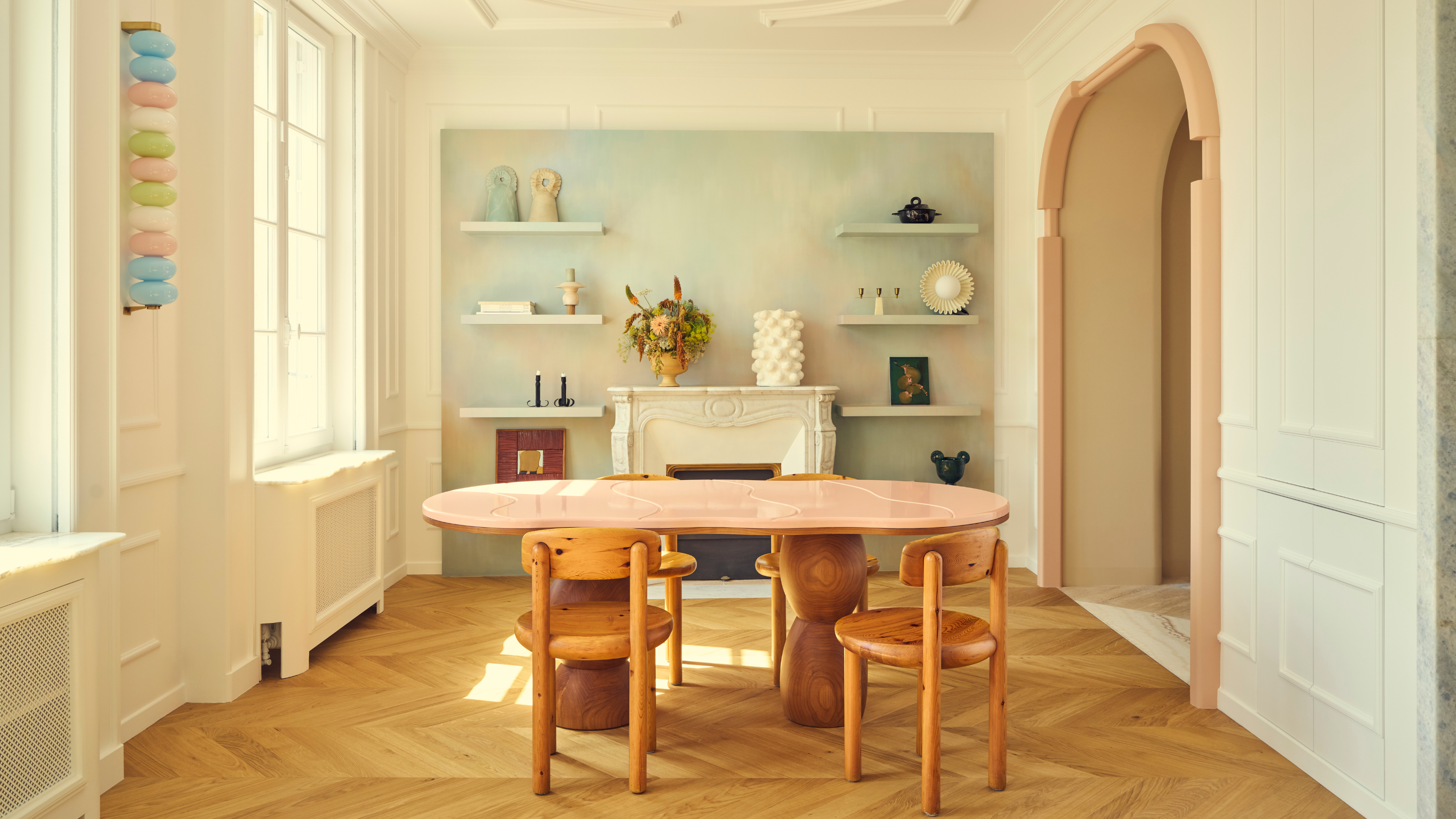

High above the cobbled streets of Le Marais — the kind where perfume shops outnumber grocery stores and no one wears sneakers unironically — a certain kind of spring has taken root. The flat, designed by the ever-fashionable French firm Batiik Studio, is a sun-drenched pied-à-terre. It’s abloom — a full flush of seasonal optimism rendered in pastel lacquer, warm grainy woods, and the occasional sculptural flourish: bas-relief, knotted, or otherwise.
The minds behind the interior transformation, architect Rebecca Benichou and designer Florence Jallet, are a complementary pair: one, a spatial specialist with an eye for constraint-led elegance; the other, a set design alumna whose artistic sensibility brings a cinematic softness to every room. Together, they breathed new life into a flat untouched since the 1980s.
Their client, Geraldine Tan — who collaborated closely with the duo throughout the project — wanted a colorful, expressive bolt-hole that still nodded to Parisian interiors and tradition. So they kept the herringbone parquet, ceiling mouldings, and antique fireplace — but layered them with veiny marble stone, custom joinery, and a modern palette of murmuring pastels.
'Joséphine,' as the project was eventually named, became “a warm and luminous atmosphere — it’s a space where you instantly feel at ease,” says Florence Jallet. That ease could also be called confidence.
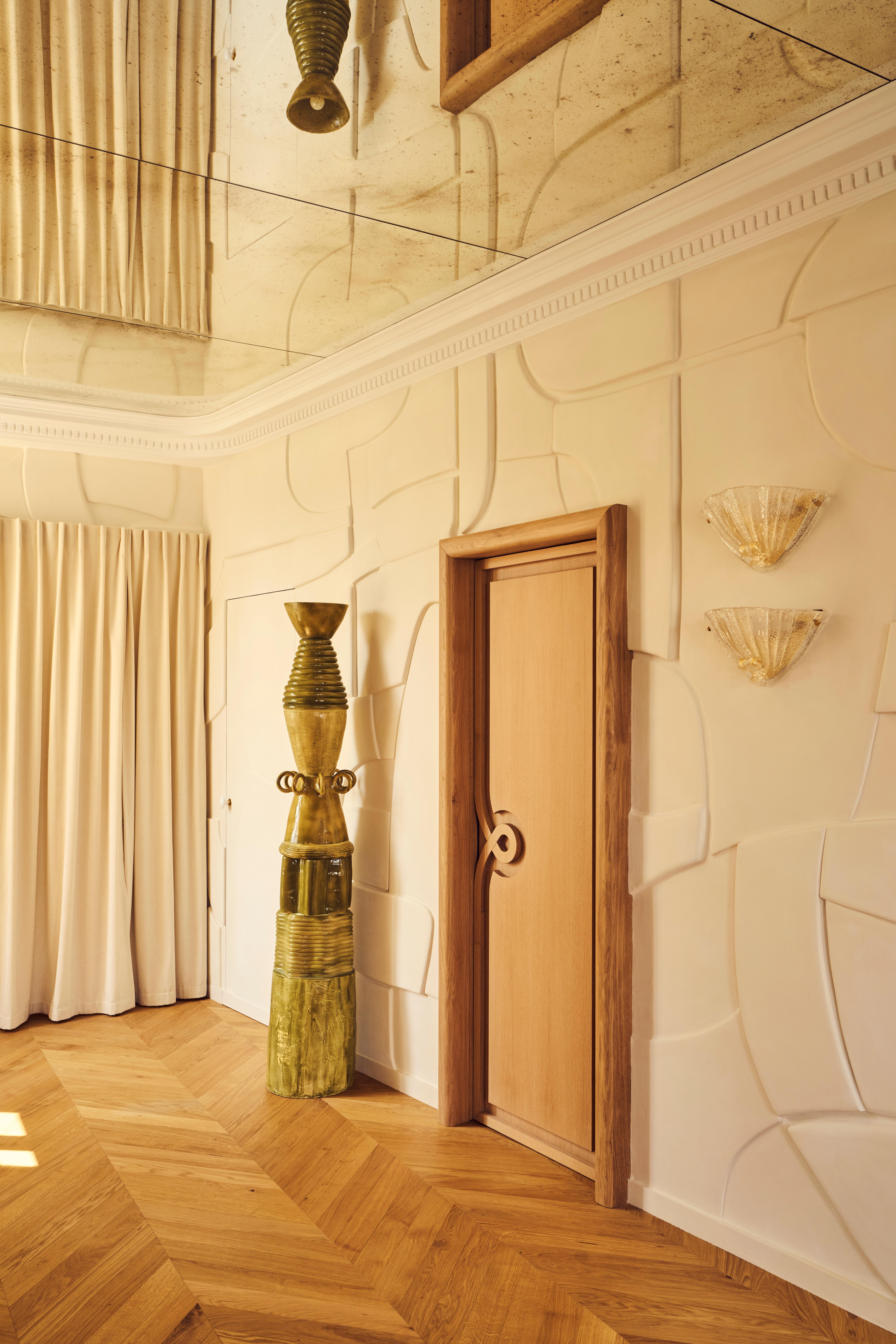
Bas-relief by Redfield & Dattner introduces a sculptural tension to the foyer — classic in spirit, contemporary in execution.
Full creative freedom (a first, even for the duo) yielded their most exuberant work to date. Bas-relief wall sculptures, avant-garde stone marquetry, an unapologetically oversized headboard — each feature feels more like a flourish. Still, it’s not insufferably fanciful — it’s the restraint between flourishes that makes the space sing. Not every flower in the garden blooms at once.
And while most of us won’t be commissioning Batiik anytime soon (they’re currently designing a ready-to-wear flagship, a boutique hotel, and multiple flats as we speak), Joséphine offers more than just inspiration — it’s proof that spring doesn’t require florals. Or gingham. Or newness for newness’ sake.
Spring decor ideas, here, are a sensibility: a lightness, a lift, a soft-shoe shuffle into optimism. The palette might be whispering, but the message is clear: warmth is back.
Be The First To Know
The Livingetc newsletters are your inside source for what’s shaping interiors now - and what’s next. Discover trend forecasts, smart style ideas, and curated shopping inspiration that brings design to life. Subscribe today and stay ahead of the curve.
Room by room, ahead — the details worth copying, coveting, and casually claiming as your own.
Entrance
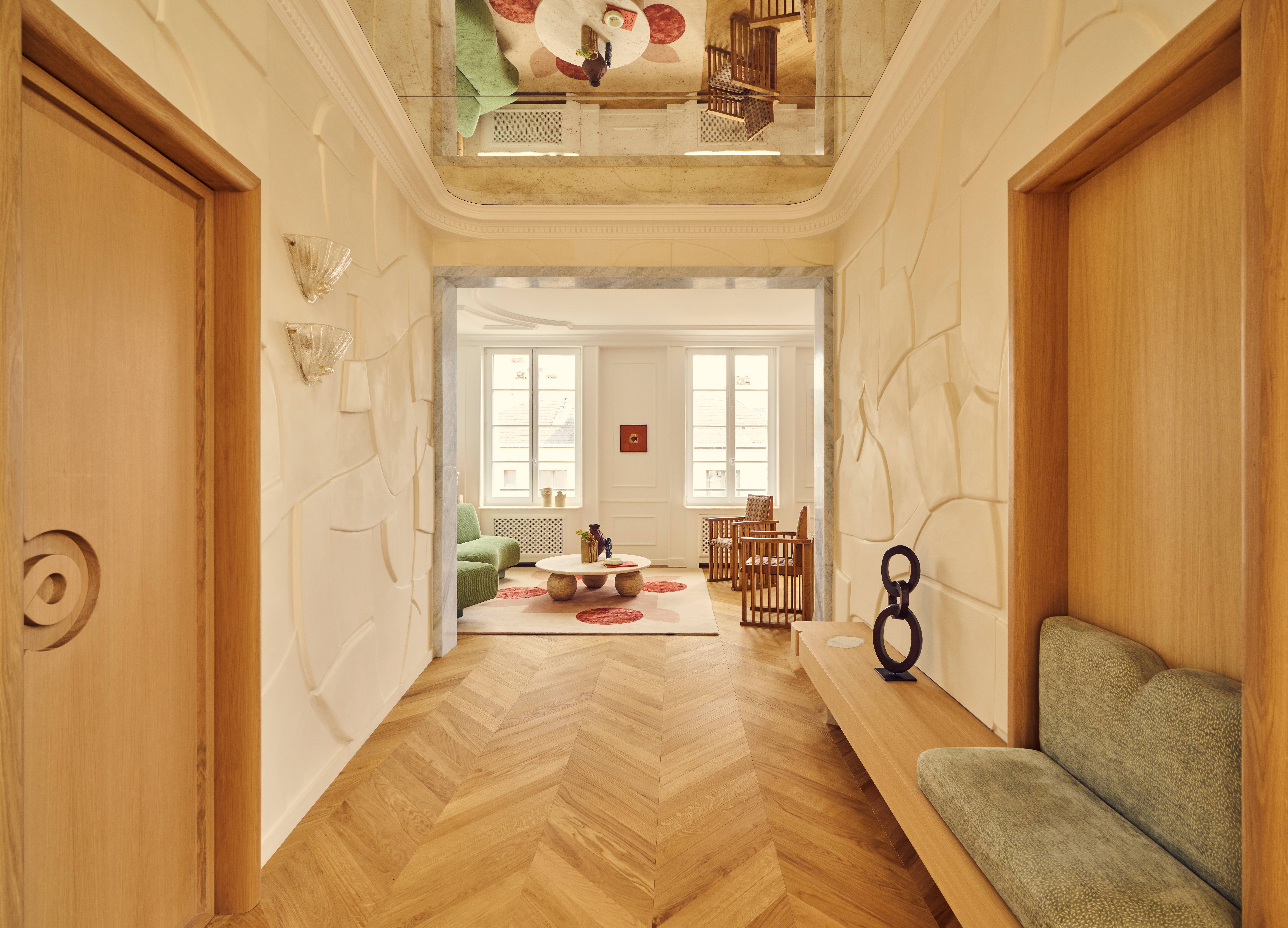
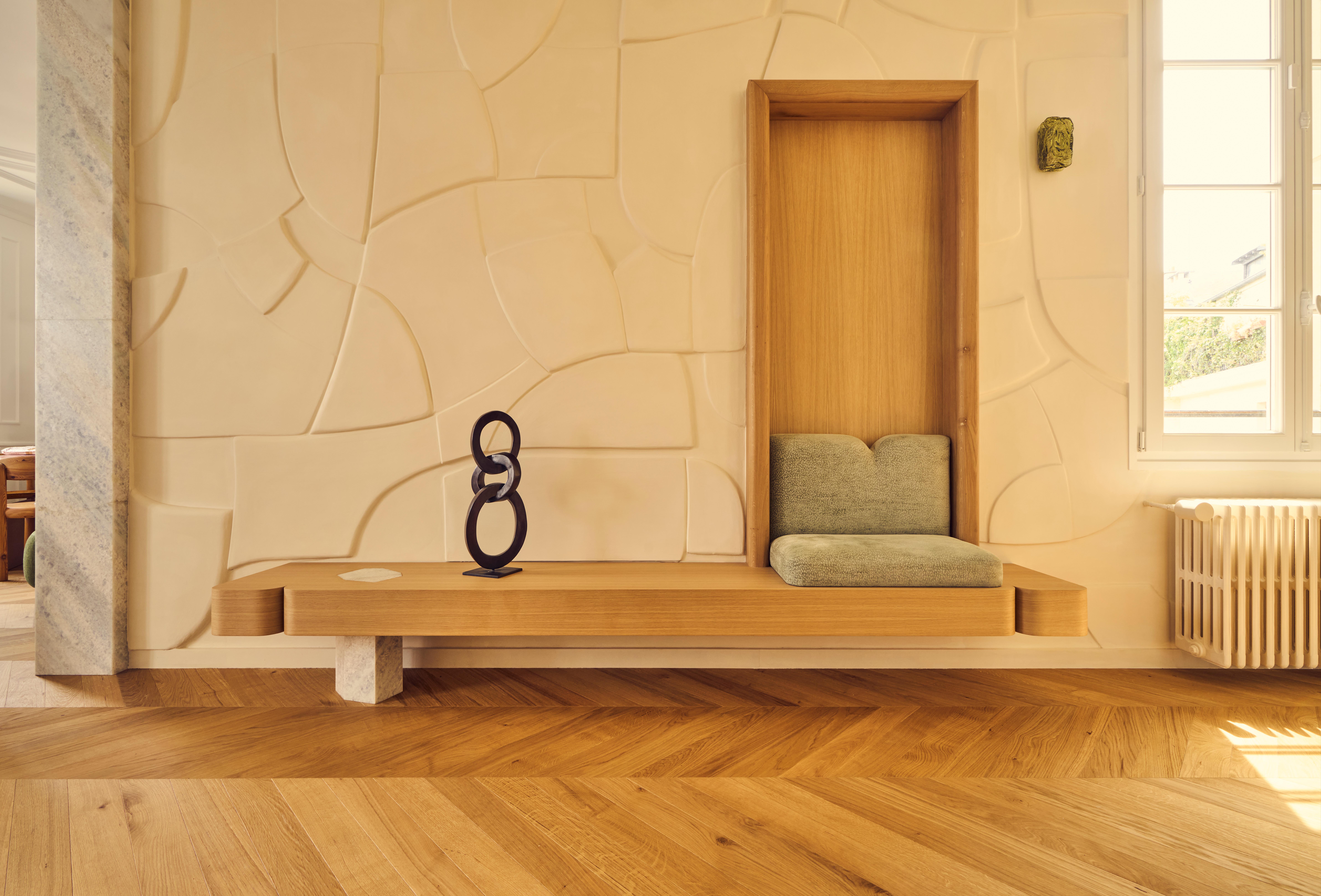
In Paris flats of a certain age, quirks are inevitable — and often, an advantage. At 125 m², Joséphine isn’t sprawling, but the entrance is unusually generous. Functionally, it serves as the home’s circulatory system, connecting the laundry, bedrooms, and central living space — but rather than treat it as a mere pass-through, Batiik seized the opportunity to create a tonal overture.
“We wanted to preserve the perspective from the entry to the living room,” says Rebecca. “It was an existing feature we liked.” To heighten the drama, Florence adds, they installed a ceiling-mounted antiqued mirror, reflecting the natural light from the windows and drawing the eye through.
The walls, meanwhile, are anything but blank: a bespoke bas-relief installation by Redfield & Dattner transforms the corridor into a gallery-like moment. The result is a foyer that reads less like transitional space, and more like a deliberate beginning.
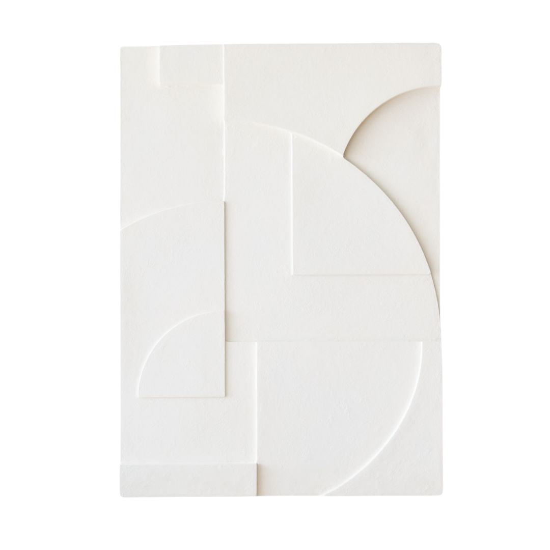
If a custom bas-relief ceiling isn’t quite in the cards, this sculptural West Elm wall art delivers a similar geometric moment — crisp, tonal, and textural. Display as a trio along a corridor or entry wall to nod to Joséphine’s gallery-caliber drama.
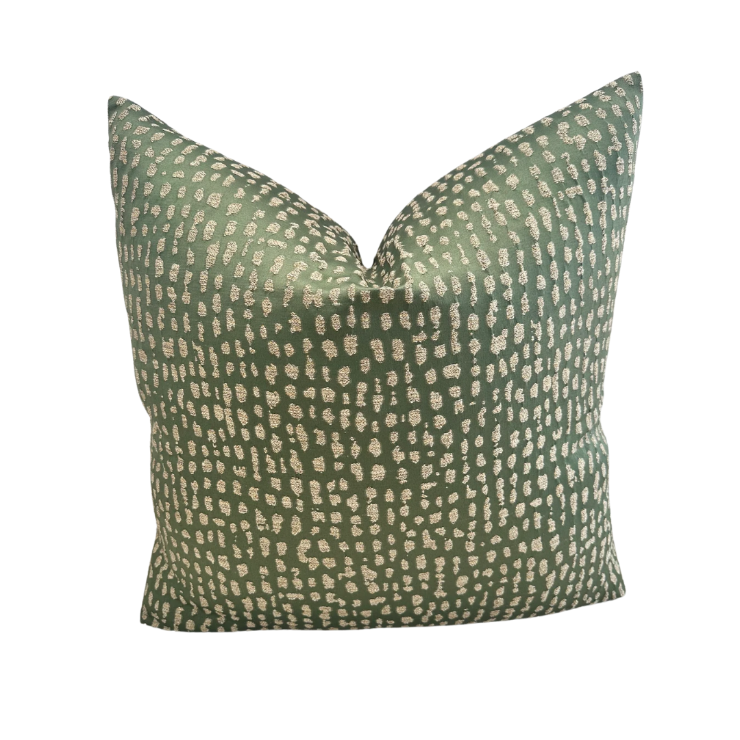
Take note of the entryway’s speckled cushions — fawn-adjacent, but in moss green — a small, charming detail that brings in the outdoors. This feather-filled version offers the same soft whimsy and pairs beautifully with warm wood seating.
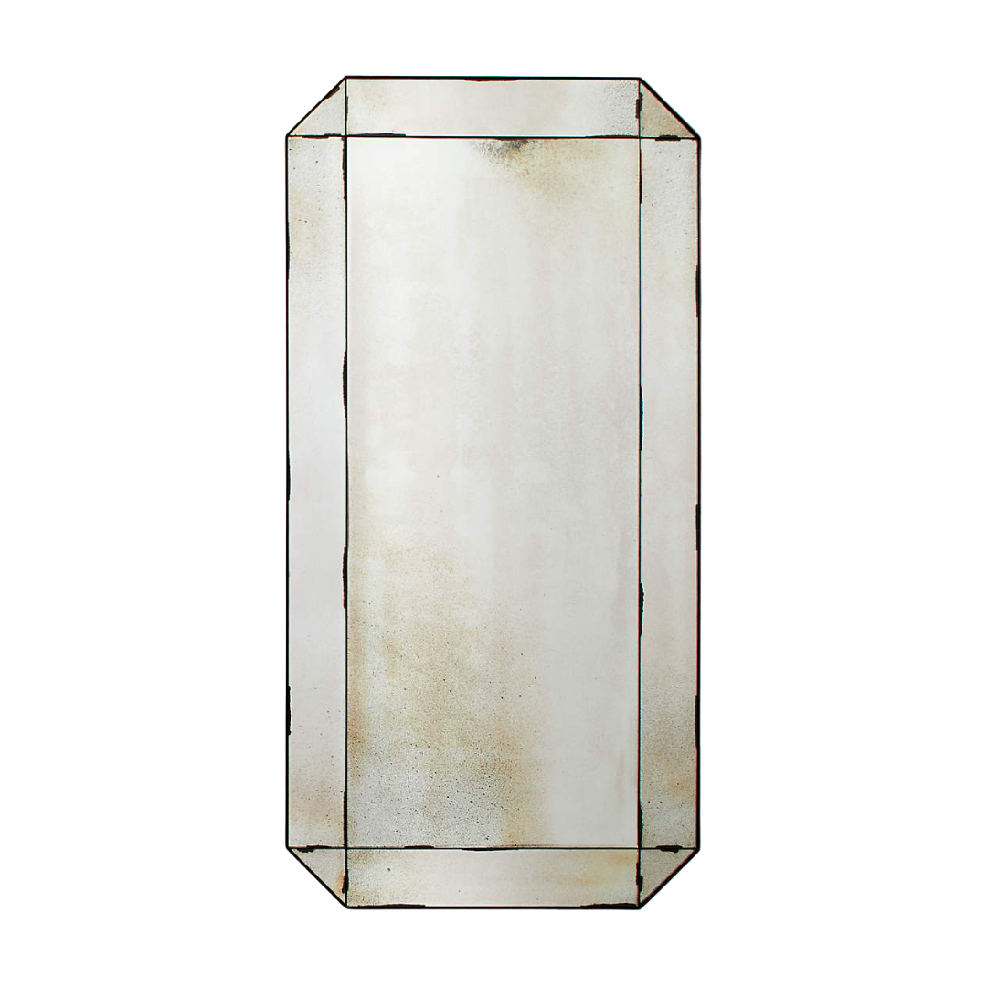
While mounting this particular antiqued accent mirror to the ceiling might not be the best idea, it captures the same character as the project’s mirrored ceiling panels and refracts natural light in all the right ways. Not a bad way to make an entrance.
Living / Dining Room
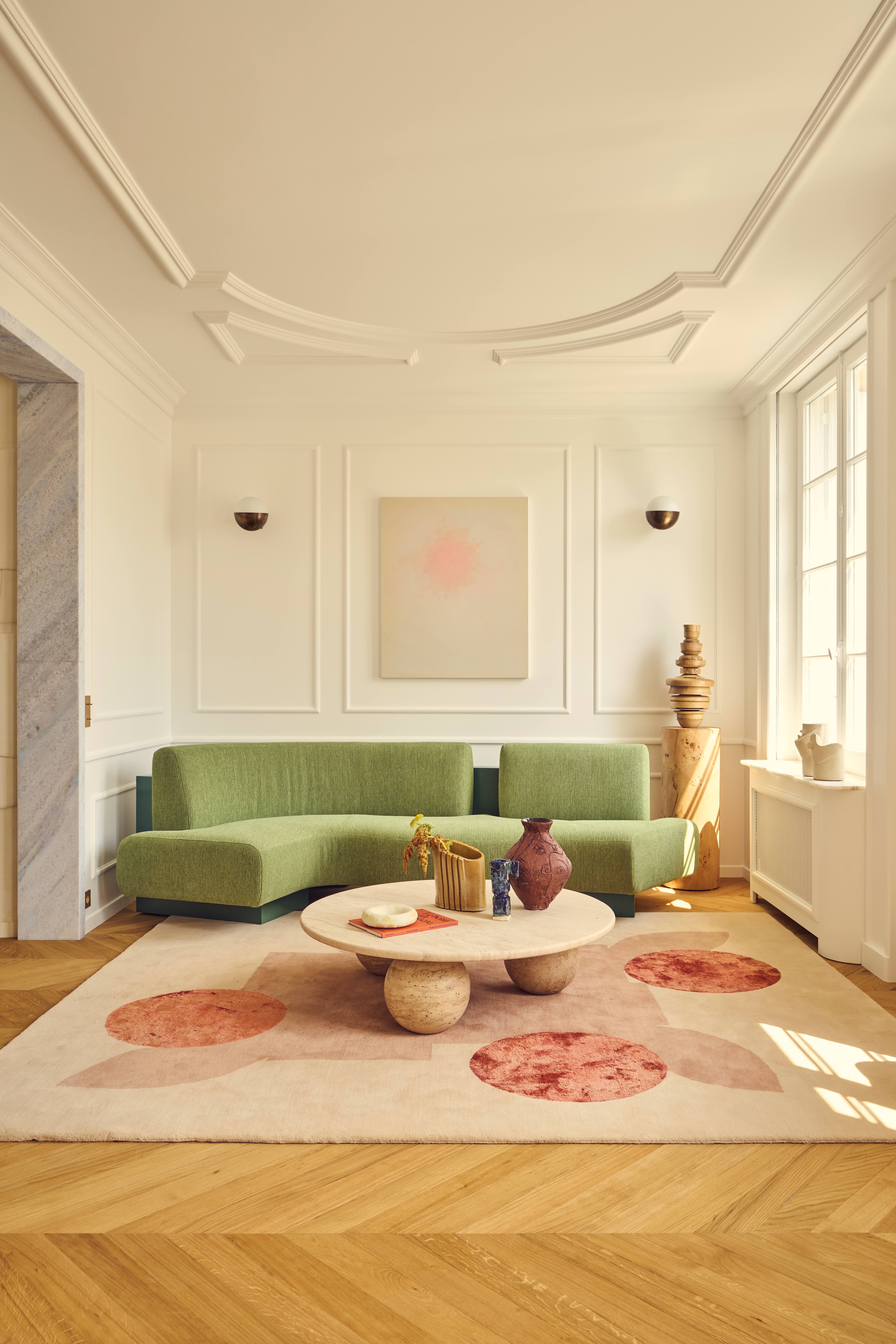
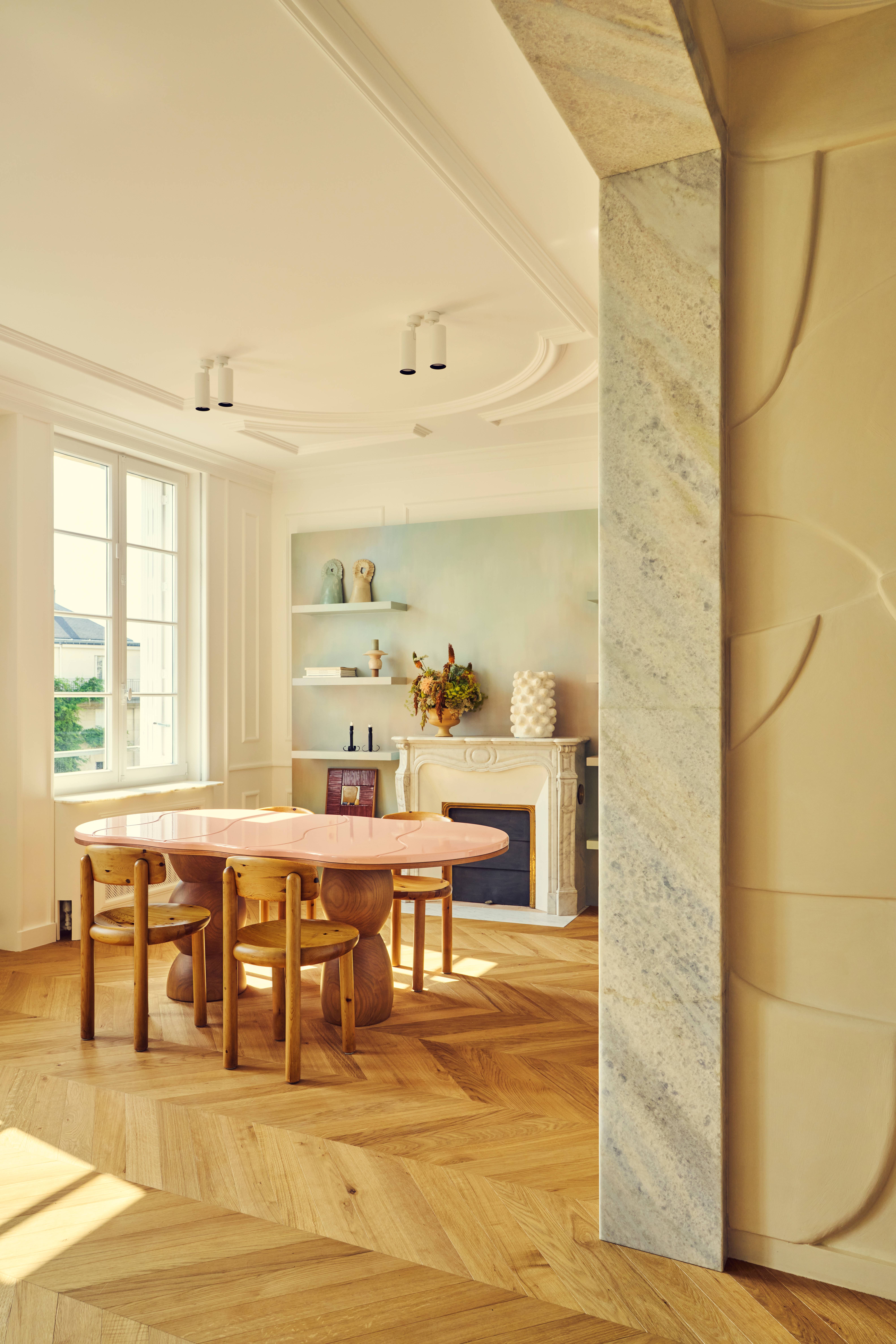
Technically open-plan, the living and dining spaces at Joséphine are less about demarcation and more about dialogue — one room informing the next, with recurring architectural gestures that tie them together. Herringbone parquet and ornate ceiling moldings anchor the space in its Haussmannian heritage, while everything layered on top brings it into the now.
The dining area’s original fireplace, preserved and unpretentious, offers a textural counterpoint to the more contemporary moments: a geometric stacked-base table topped with pink lacquer and squiggle-etched inlay; a custom moss green sofa with soft, organic curvature nestled snugly in the adjacent corner.
"Since so much was made to measure, we balanced it out with vintage furniture and lighting,” says Florence — a smart play that tempers the bespoke with a sense of history. Nothing too precious. Nothing too matching. But everything in conversation.
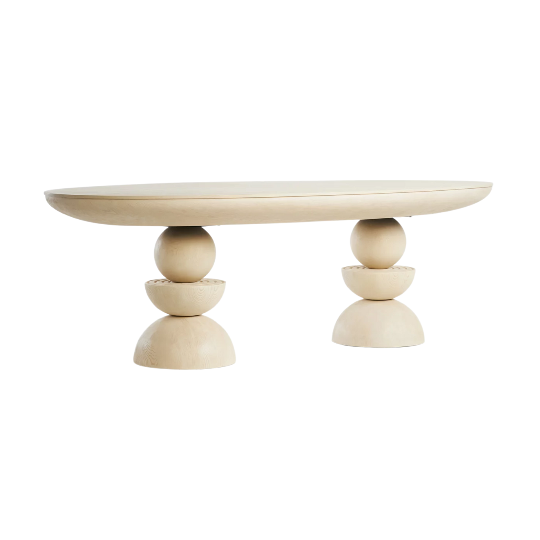
The original dining table in Joséphine is one-of-a-kind — a sculptural centerpiece if ever there was one. While a replica doesn’t exist (nor should it), this Sonali Double Pedestal Table from Anthropologie echoes the spirit: stacked geometry, soft curves, and a sense of quiet drama.
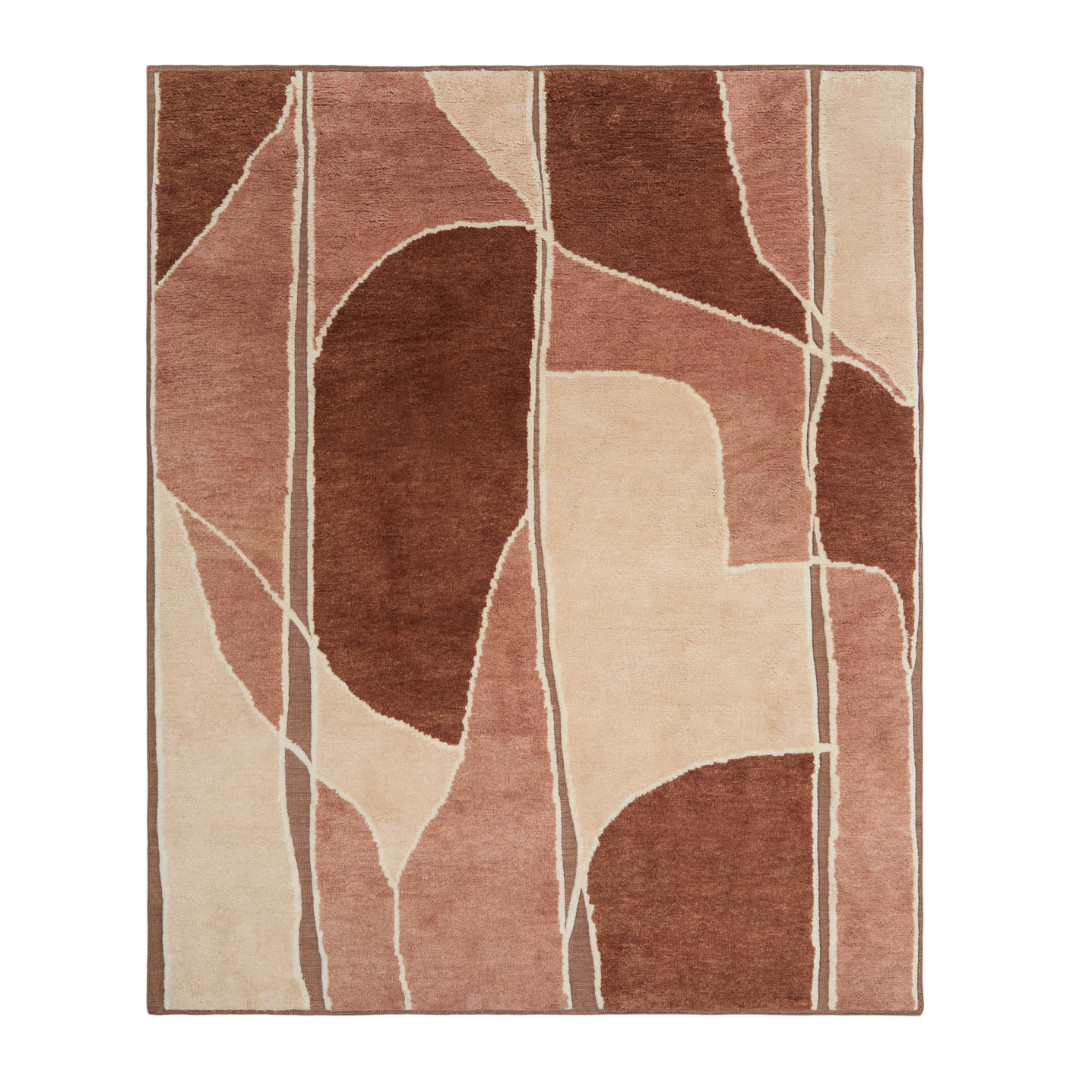
From Aimee Song’s new Lulu and Georgia collab, this tonal terracotta abstract rug offers the same artful warmth as the Joséphine living space — romantic without trying too hard, grounded enough for substantial furniture.
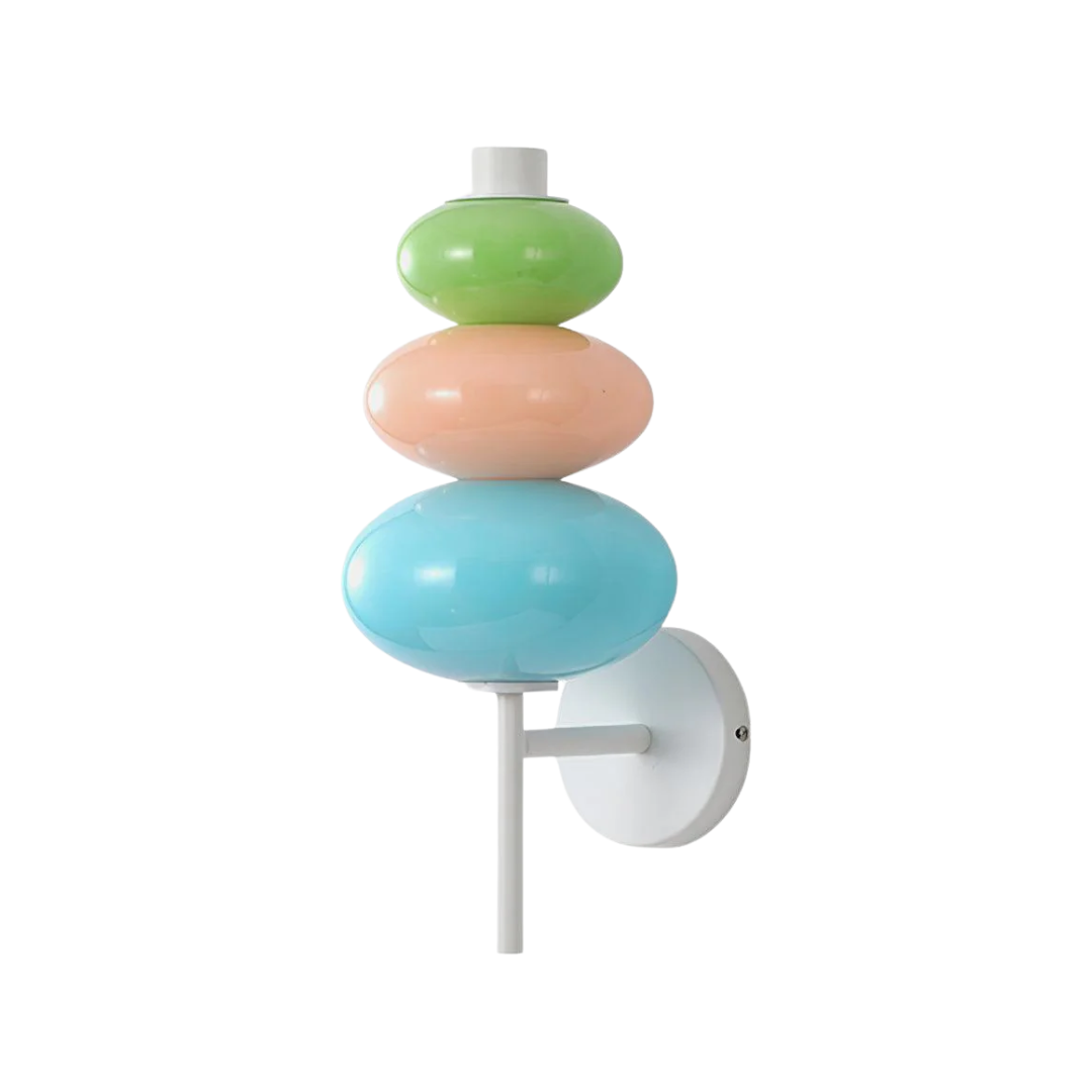
We’ll admit it — we squealed. These stacked pastel shades might not be the sconce, but they are definitely the vibe. Whether you see Easter eggs or a vintage candy necklace, the palette is pitch-perfect — tying the room together in one whimsically polished gesture.
Kitchen
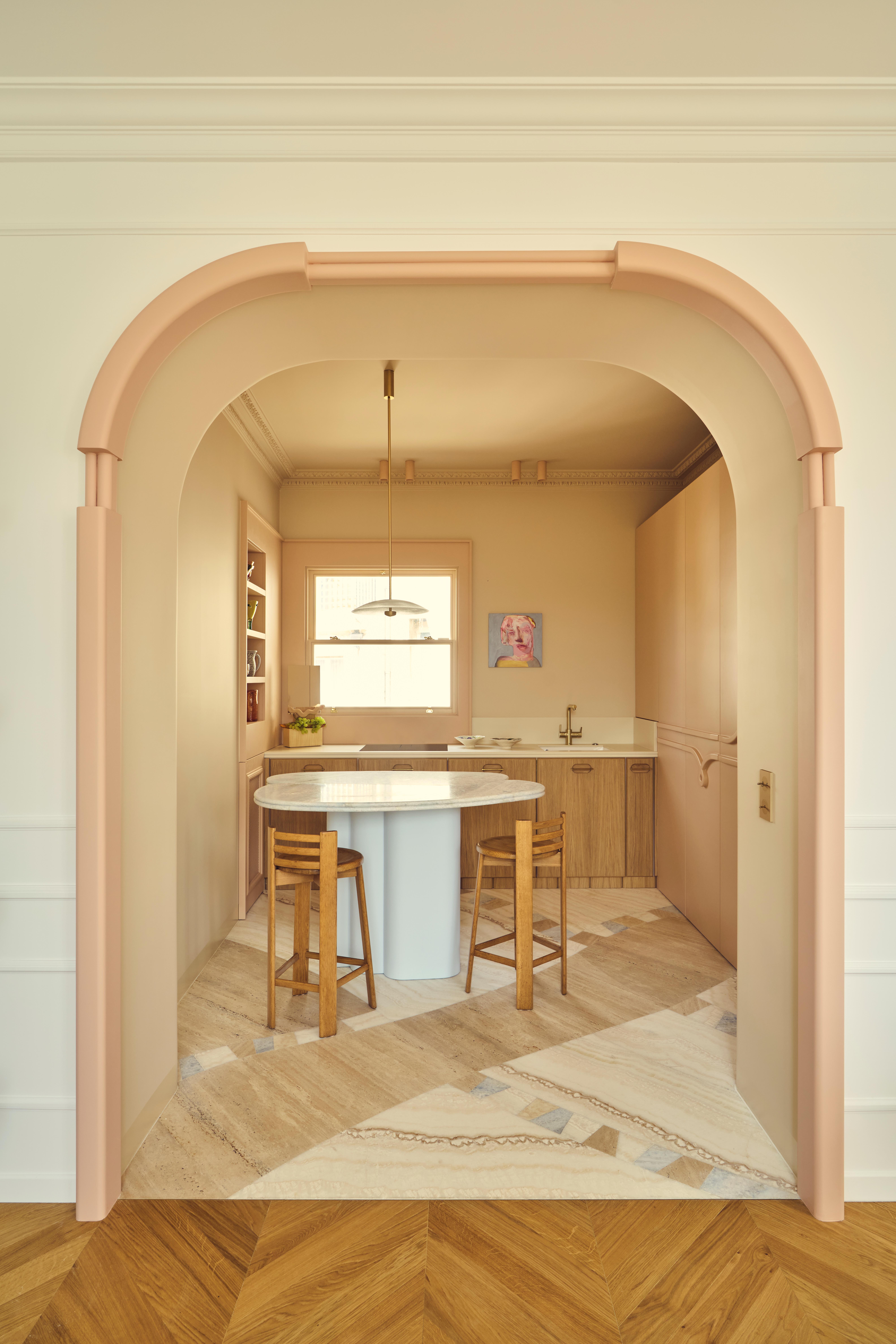
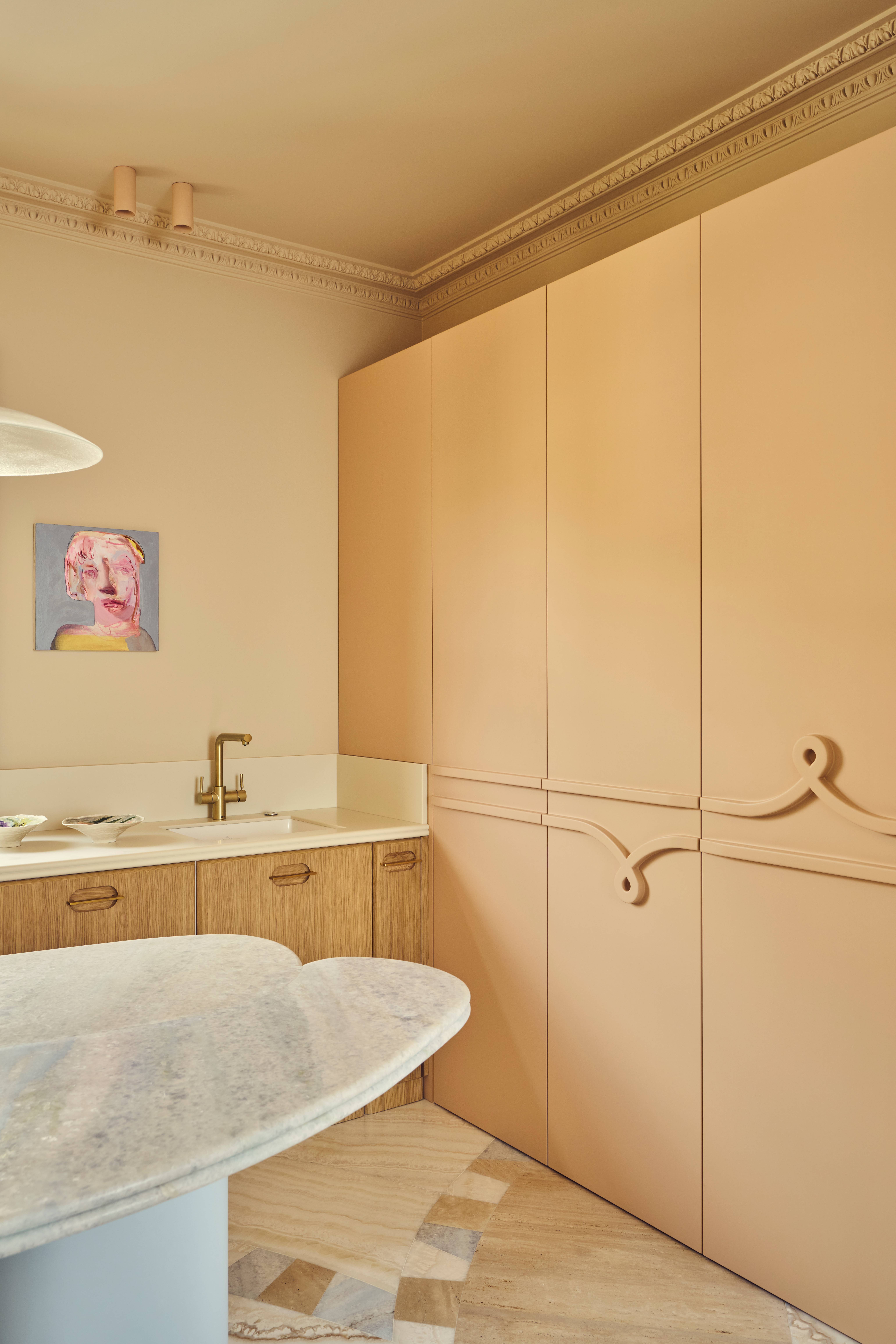
From the dining room area, a slim passage leads to the kitchen — a layout limitation the team embraced rather than resisted. “We couldn’t enlarge it due to load-bearing walls, so we emphasized the transition with a custom-designed arch,” says Rebecca.
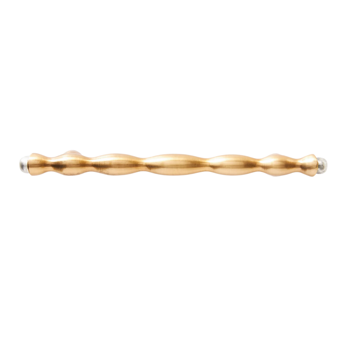
What lies beyond is a tonal surprise: a monochrome peach dream of a kitchen, its cabinet fronts adorned with knotted wood pulls — a recurring motif that quietly anchors the project like a designer’s calling card.
“The knot detail appears in other parts of the flat,” Rebecca explains, a kind of high-design 'Where’s Waldo' that gives the apartment the seamless cohesion you’d expect in a beautifully branded hotel or members’ club.
Despite the graphic marble marquetry and pink-washed tones, the kitchen never tips into overt femininity. There’s restraint in the materials — matte woods, quiet lighting — that keep the whole thing grounded. A barely-there pendant floats above, almost invisible, like punctuation you don’t notice until it’s missing.

These stools lean just warm enough: mid-century in sensibility, slightly Scandi in shape. Their presence offsets the more sculptural elements in the kitchen — quiet, well-proportioned, and exactly what the space needs to feel finished but not overdone.
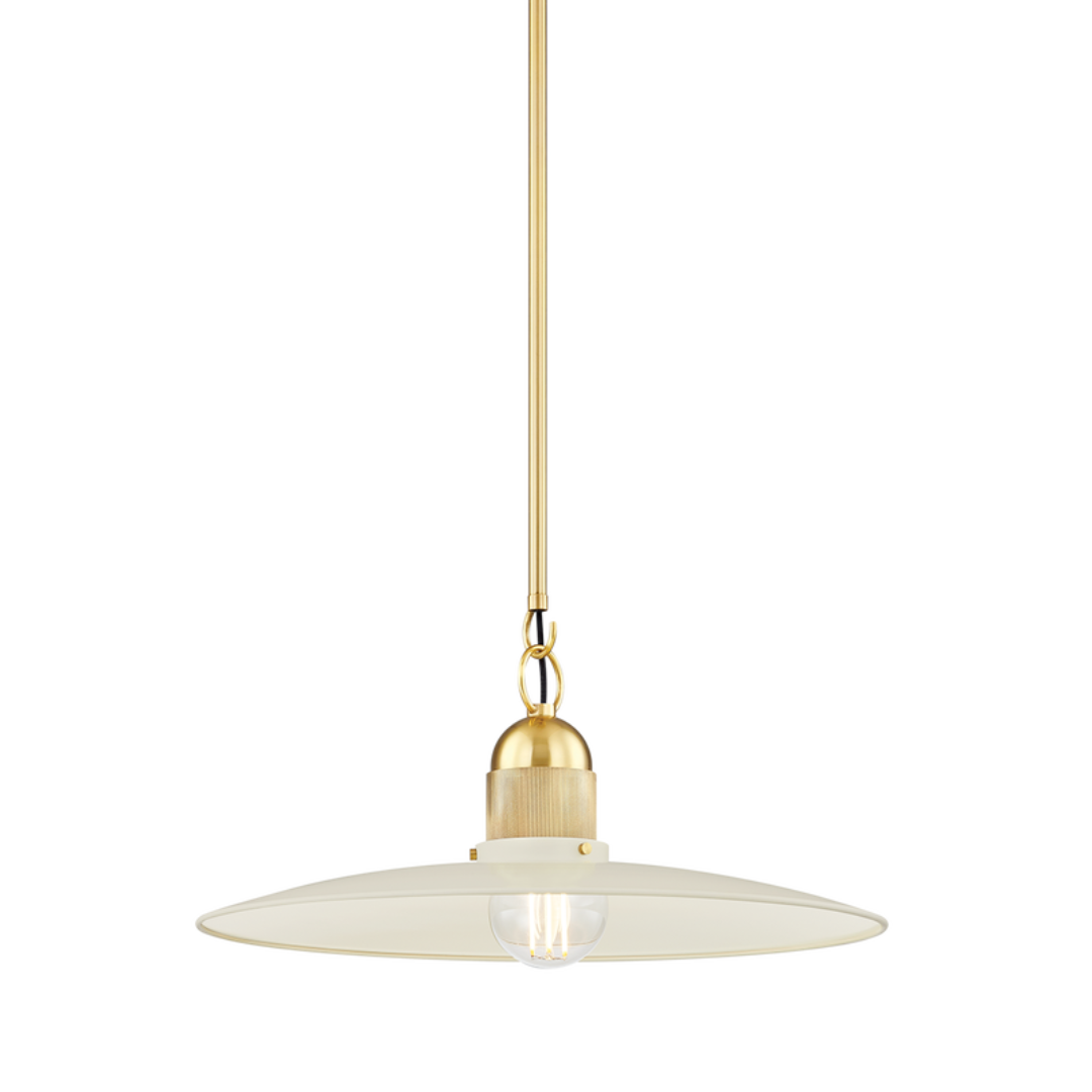
This cream-and-brass pendant light by Mizi stays out of the way, but still says something. The detailing is subtle, the drop just right.
Main Bedroom
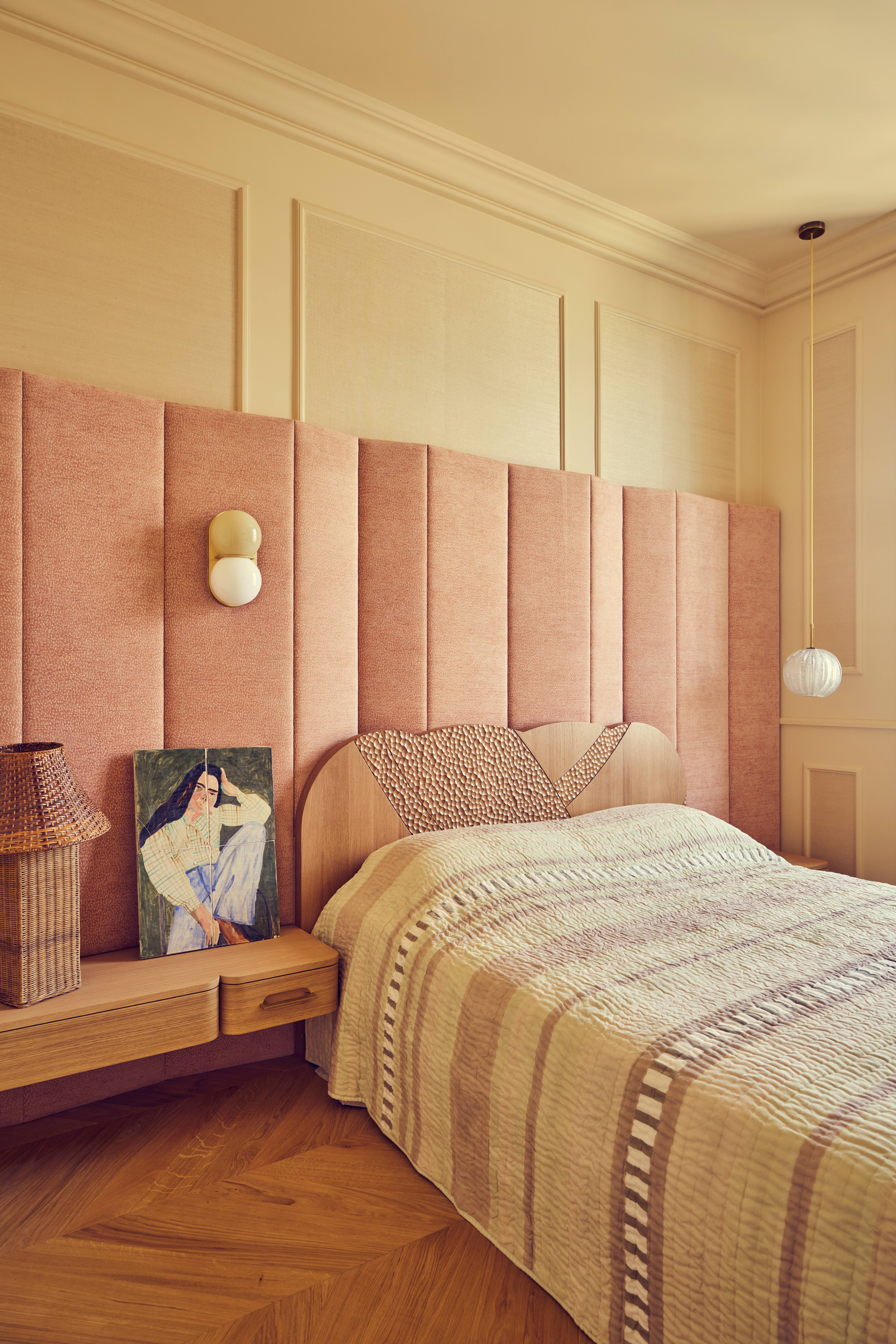
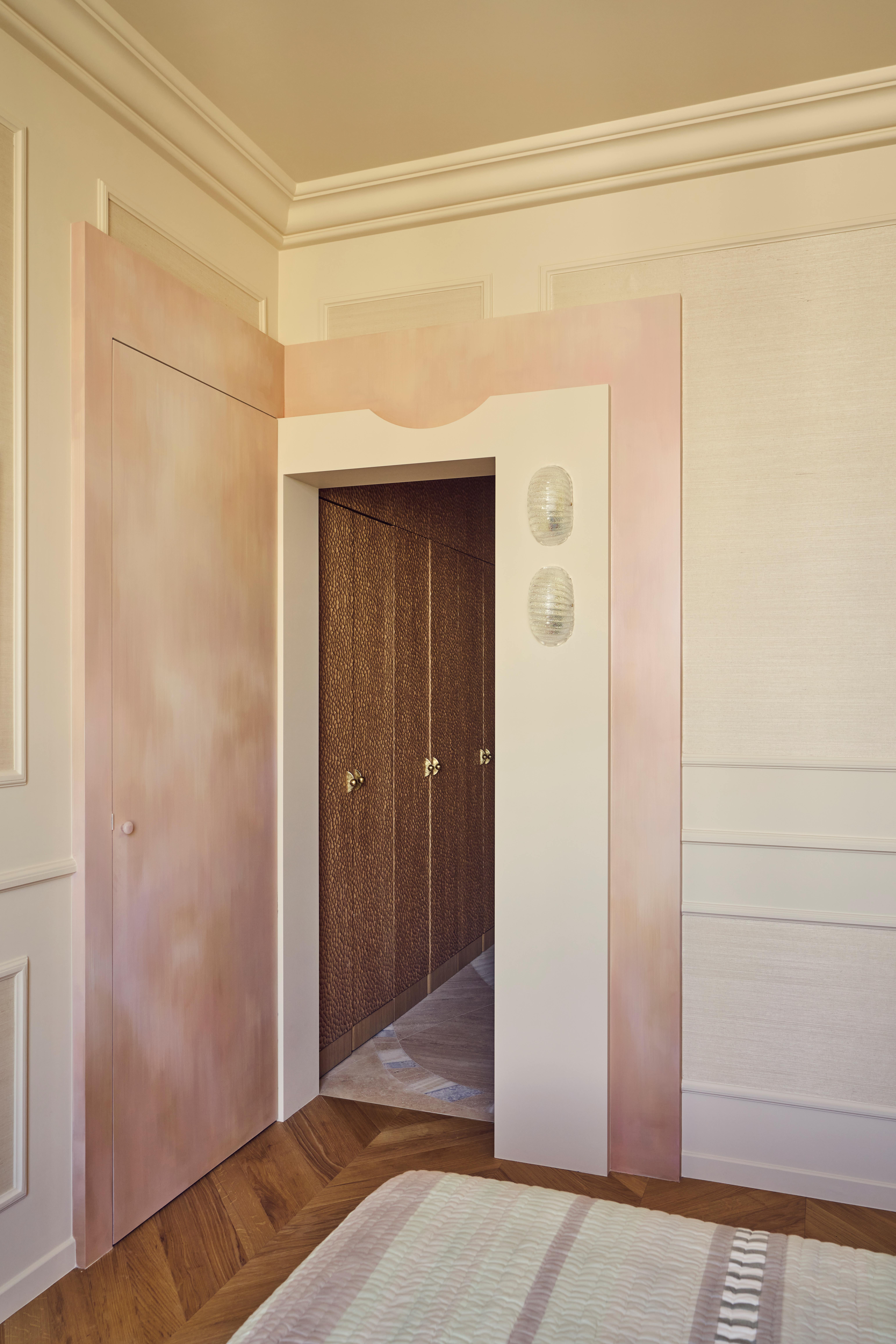
The main bedroom feels like an exhale. “A true hotel suite,” is how Rebecca and Florence describe it — and the feeling is immediate. The palette, a blur of warm neutrals and barely-pink tones, is calm but not sleepy.
It’s a room with a presence, anchored by bespoke extended headboard paneling that spans the entire wall and a carved wooden detail designed to protect the fabric — thoughtful, architectural, somewhat couture.
To the left, a softly painted corridor — sort of a barely-there peachy aurora borealis — leads to the walk-in wardrobe and ensuite. Painted by Redfield & Dattner, it’s one of the many handcrafted details that give the space its resonance.
The lighting placement is unorthodox. A sconce on one side of the bed, an impossibly thin pendant on the other — perfectly balanced, not quite matching. The takeaway isn’t about the fixtures themselves, but their positioning and the tone they emit. Always warm. Always dynamic. Always flattering.
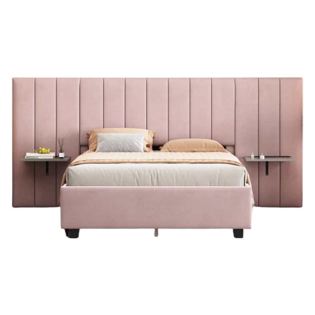
This blush-toned headboard panel reads as a soft neutral, especially paired with thoughtful details like integrated shelving — the perfect home for your perfectly curated bedside displays. Bold. But oddly versatile.
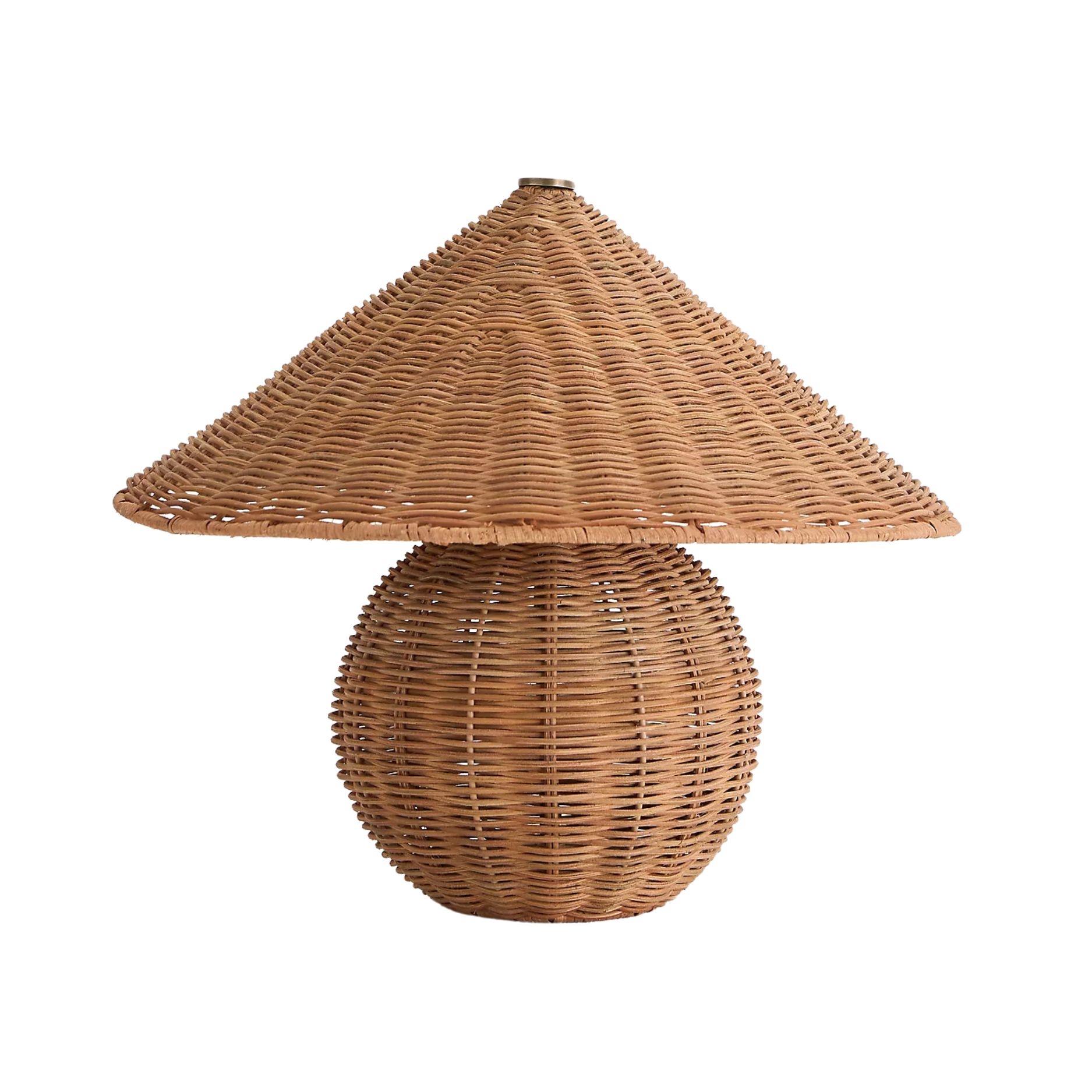
A rattan table lamp adds exactly the right amount of texture — tactile without being heavy. It's the kind of grounding detail that keeps a pastel palette from feeling saccharine. Plus, anything that eliminates the need to use overhead lighting at 2 a.m. deserves a spot on the nightstand.
Four timely takeaways from Batiik Studio’s Joséphine project:
1) Spring doesn’t mean saturated. Joséphine trades the typical saturated blooms for barely-there pastels — peach, lilac, butter — used with restraint and offset by honest materials like stone, wood, and grainy plaster.
2) Newness needs history. Rebecca and Florence are quick to point out how vintage pieces counterbalance their more experimental, custom work. A charming contradiction — old with new, patina with polish — brings essential depth. Even in a modern build, a well-worn chair or sculptural lamp can lend some soul.
3) Lighting is everything — and it must be warm. Not everyone gets a sun-soaked Parisian flat, but light, as seen here, can be finessed. Go ambient and layered: sconces, table lamps, even a pendant (or two). The goal isn’t brightness; it’s glow — like golden hour, indoors.
4) An argument for artful. Art isn’t just for walls — it’s in the squiggle of a dining table base, the oversized statement headboard, the knotted cabinet pull. Choose details that feel just strange enough to make you hesitate — that flicker of doubt? That’s where the warmth gets in.
That’s the season talking.

Formerly covering fashion at L’Officiel USA, style maven Julia Demer brings her love of design to Livingetc’s world of interiors. As the title’s New York-based Style Editor, Julia's work reflects a sharp eye for detail and an innate passion for aesthetics. Her journey began with a strong foundation in design, honing her craft at renowned establishments like The Row and even establishing her own eponymous fashion brand. Julia’s design background is evident in the way she thoughtfully curates shopping edits, always maintaining a focus on emerging trends while preserving timeless sensibilities. For Julia, fashion and interiors go hand in hand, reflecting her lifelong commitment to perfecting the art of style.
