Before & After — How Emily Henderson Turned an Underutilized Loft Space Into an Inspiring Home Office
Stylist, interior designer, and TV host Emily Henderson takes us through the re-design of this bright, spacious loft

The Livingetc newsletters are your inside source for what’s shaping interiors now - and what’s next. Discover trend forecasts, smart style ideas, and curated shopping inspiration that brings design to life. Subscribe today and stay ahead of the curve.
You are now subscribed
Your newsletter sign-up was successful
Having an office up in the air can be quite an exhilarating experience — and by that, we mean inside a loft! This space raised above the house inherently feels private and is wonderfully tucked away from the home's hubbub. And this is why Emily Henderson, founder of Emily Henderson Design was completely married to the idea of having a small, cozy writing room here, where she would be blissfully disconnected yet within the hearing range of her children.
Her home in Lake Arrowhead, CA featured an unused, woody loft. 'To be honest, I’m not sure what the previous homeowners used it for,' says Emily. 'Likely another lounge space. But for me, it was the perfect place to write while still being able to watch/hear my young kids play.' The design was carefully thought out, where furniture, furnishings, and more were picked out to create a wonderful sense of layering. Where the large windows provide constant light and views, a feeling of comfort and warmth wafts through the space.
We caught up with Emily to find out exactly how she made over this loft space into her style of home office.
Article continues belowBEFORE
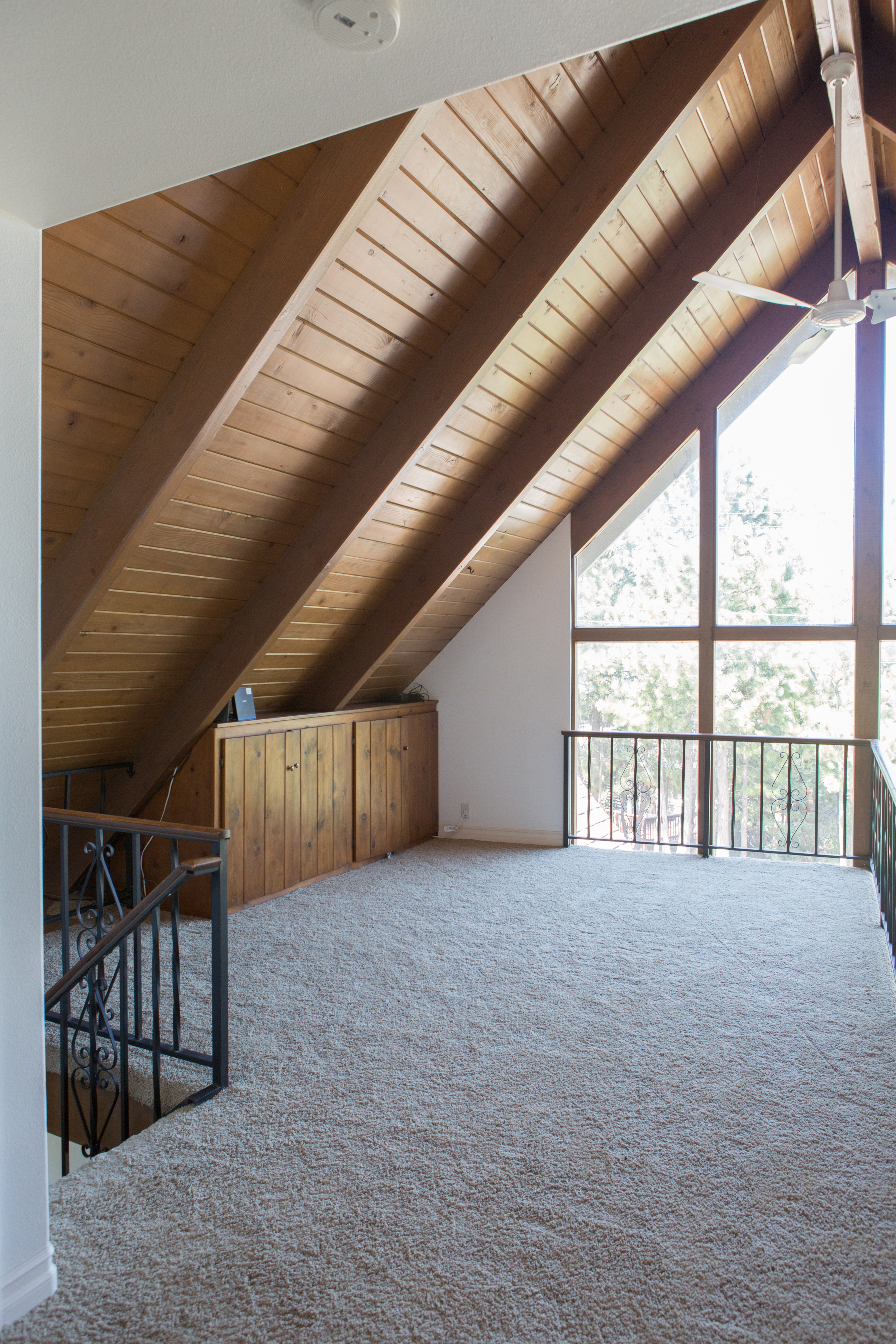
This loft space wasn't being made the most of, but Emily Henderson, founder of Emily Henderson Design, decided to use it as a place to write, blog, and think.
'The whole house has a minimal, warm Scandi style so that was the direction of this space too,' she says. 'Especially since it’s open to the main living room so they needed to “talk” to each other.'
After


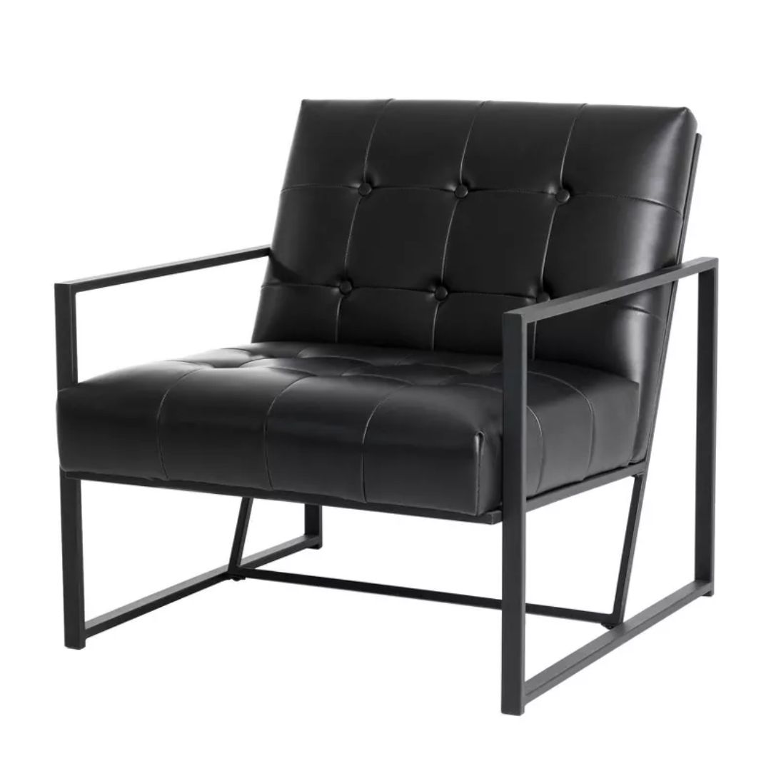
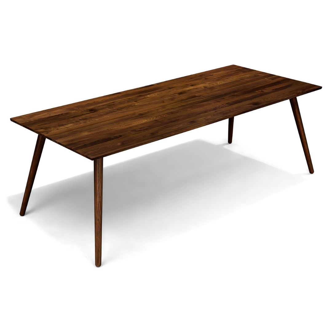
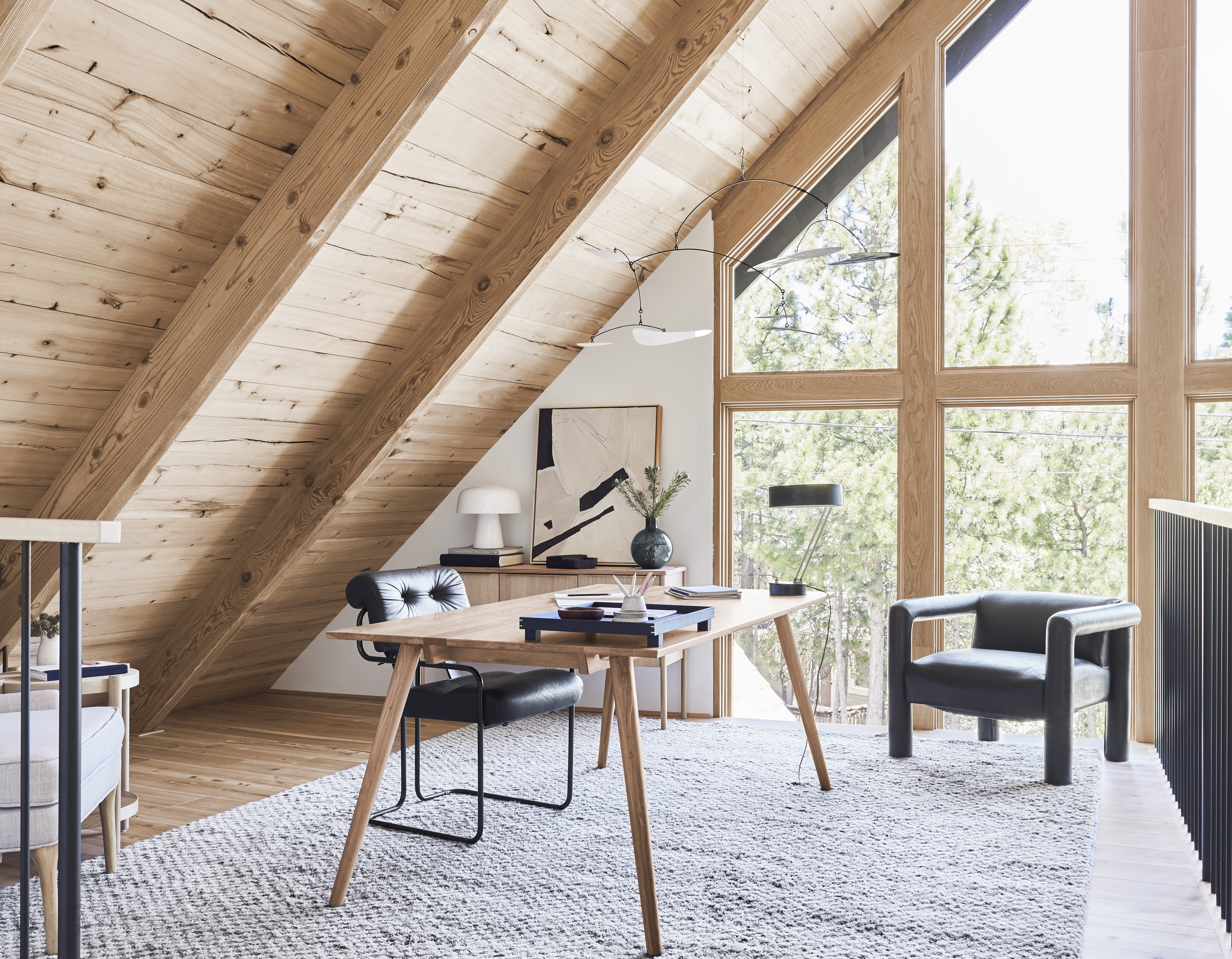
For the re-design, Emily decided on a neutral color scheme. Since the space receives a lot of light and is surrounded by trees, 'we didn’t want to distract from that and add a ton of color or pattern,' she shares. For the furniture, she chose large, statement pieces that make working a breeze and add to the room's aesthetics. 'We added a vintage Guido Faleschini chair from one of my favorite LA vintage shops, MIDCENTURYLA, and the table is an awesome dining table from Article,' she says.
The black vintage chair (previously used in the living room but later moved here) sits in a corner. 'In the other corner, we have my Target wingback that just creates a cozy vibe,' shares Emily.
The Livingetc newsletters are your inside source for what’s shaping interiors now - and what’s next. Discover trend forecasts, smart style ideas, and curated shopping inspiration that brings design to life. Subscribe today and stay ahead of the curve.

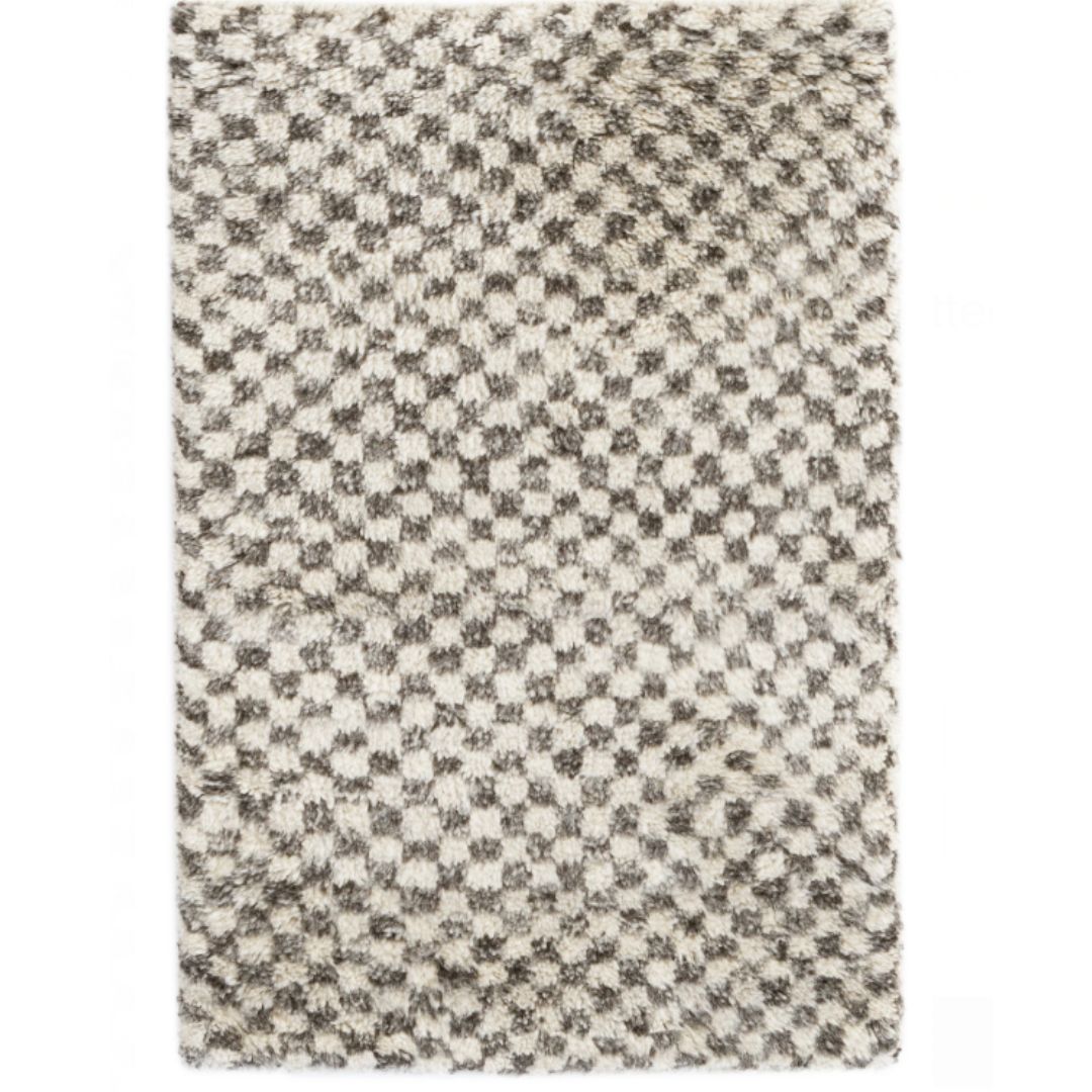
A cozy rug adds softness to this all-wood space. 'The rug is from Annie Selke - Citra Grey Hand. It’s a great wool rug that’s well made,' adds Emily. 'I’ve used it in a bunch of other spaces before so I know that it’s very hardworking.'
When it came to choosing storage for this small space, the designer went in for a handy cabinet. 'I needed somewhere to house all of my parenting and self-improvement books,' she says. 'That cabinet from Skagerak does it. Plus, it’s so pretty and has gorgeous hardware.'


While the office was not a difficult decorating project, the designer did face some limitations when it came to the tone of the wood. 'The original wood was dark orange and after a year of trying to come up with a solution, we walnut blasted it and then it created a super deep texture that made it pink and orange,' she says. 'Brian Henderson was the one who figured it out. We re-cladded the tongue and groove (the horizontal wood pieces in between the rafters) and just sanded down the texture of the rafters (or beams).'
'We used the same reclaimed beech wood as the flooring and cabinets throughout the house, from Ross Alan Reclaimed Lumber,' Emily adds. 'I think this ended up costing about $7k in labor—or at least that is how we were quoted, but since we paid “time and material,” it might have taken more time and thus cost more. If it were on a normal ceiling, it wouldn’t have cost nearly as much, but because it’s so high, it required scaffolding which means you have to hire a company to bring it in, and then doing any work over your head just takes so much more time than say, recladding walls.'
This loft is now a seamless space, where the floor and ceiling come together wonderfully. 'I love how peaceful and uncluttered this space is now,' says Emily. 'I can focus on work while I’m sitting up there. Plus the light from the big windows is pretty magical.'

Aditi Sharma Maheshwari started her career at The Address (The Times of India), a tabloid on interiors and art. She wrote profiles of Indian artists, designers, and architects, and covered inspiring houses and commercial properties. After four years, she moved to ELLE DECOR as a senior features writer, where she contributed to the magazine and website, and also worked alongside the events team on India Design ID — the brand’s 10-day, annual design show. She wrote across topics: from designer interviews, and house tours, to new product launches, shopping pages, and reviews. After three years, she was hired as the senior editor at Houzz. The website content focused on practical advice on decorating the home and making design feel more approachable. She created fresh series on budget buys, design hacks, and DIYs, all backed with expert advice. Equipped with sizable knowledge of the industry and with a good network, she moved to Architectural Digest (Conde Nast) as the digital editor. The publication's focus was on high-end design, and her content highlighted A-listers, starchitects, and high-concept products, all customized for an audience that loves and invests in luxury. After a two-year stint, she moved to the UK and was hired at Livingetc as a design editor. She now freelances for a variety of interiors publications.
