Before & After — A Neglected Room Transformed Into a Beautiful Home Bar
Vani Sayeed Studios converted a neglected room in this Massachusetts home into a jewel-toned, modern wet bar fitted with robust storage

More often than not, spare rooms that have great potential to be beautiful and functional get relegated as dumping spots, and the entire home's paraphernalia finds its way there. Such is the story of this Massachusetts home, until the clients met Vani Sayeed, founder of Vani Sayeed Studios, who decided to give the approximately 8'x8' space its own character and use.
'This small space was not being used in a meaningful way,' she says. 'It was a random storage area for the clients, and since it was just off the kitchen and living room, the clients and I decided to create an exciting, fun, and user-friendly bar area here.'
The transformation of this space is nothing less than astounding and as the designer shares — 'it was an opportunity to go bold!' Take a look at how this modern home's spare room was metamorphosed with color, wallpaper, and smart storage.
Before
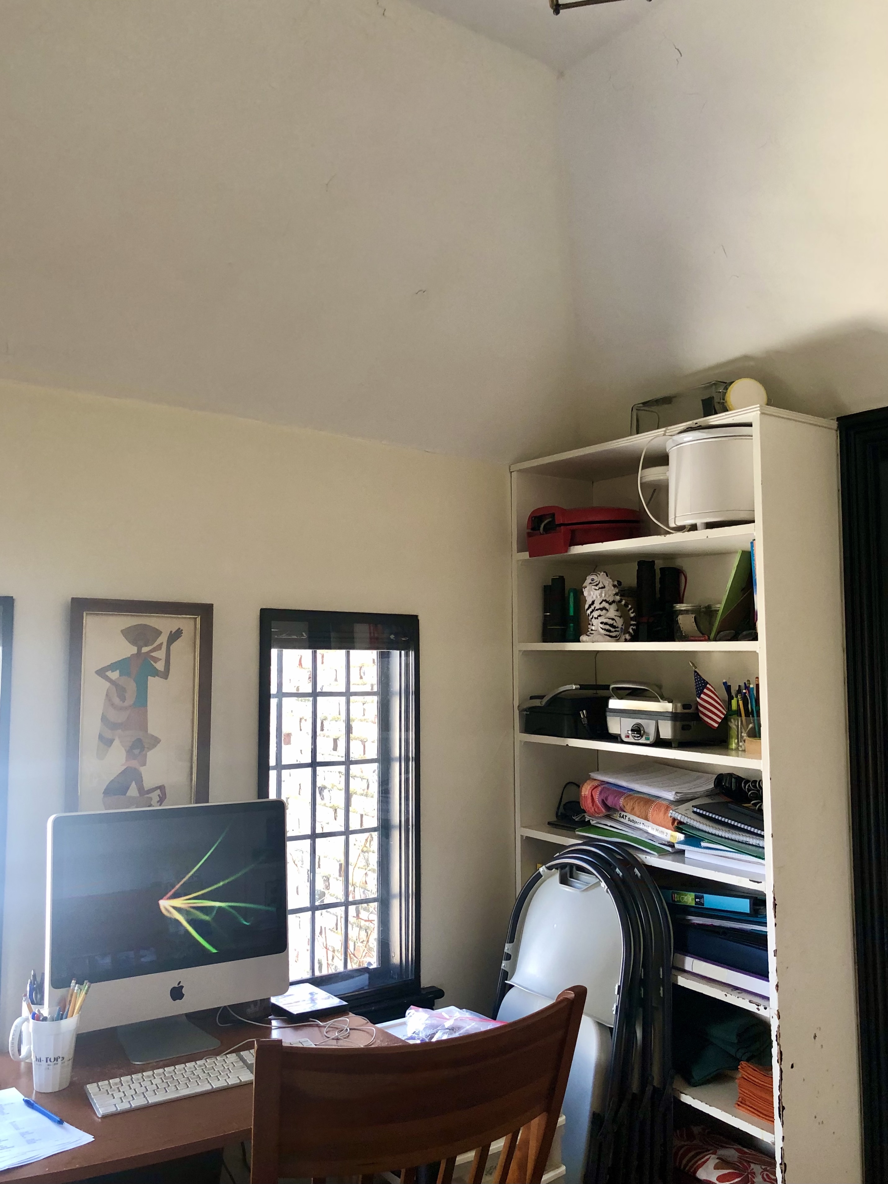
Before the home bar was set up, the original space housed a few furniture pieces and boxes.
'The space was under-utilized, with popcorn walls and ceiling,' says Vani Sayeed of Vani Sayeed Studios. 'It was furnished with a random table and a few built-in shelves full of items that were no longer used by the clients. For the reno, while no real structural changes took place, all the cabinetry was demo'ed and the walls and ceiling were brought down to studs after which we added insulation and new sheetrock.'
After
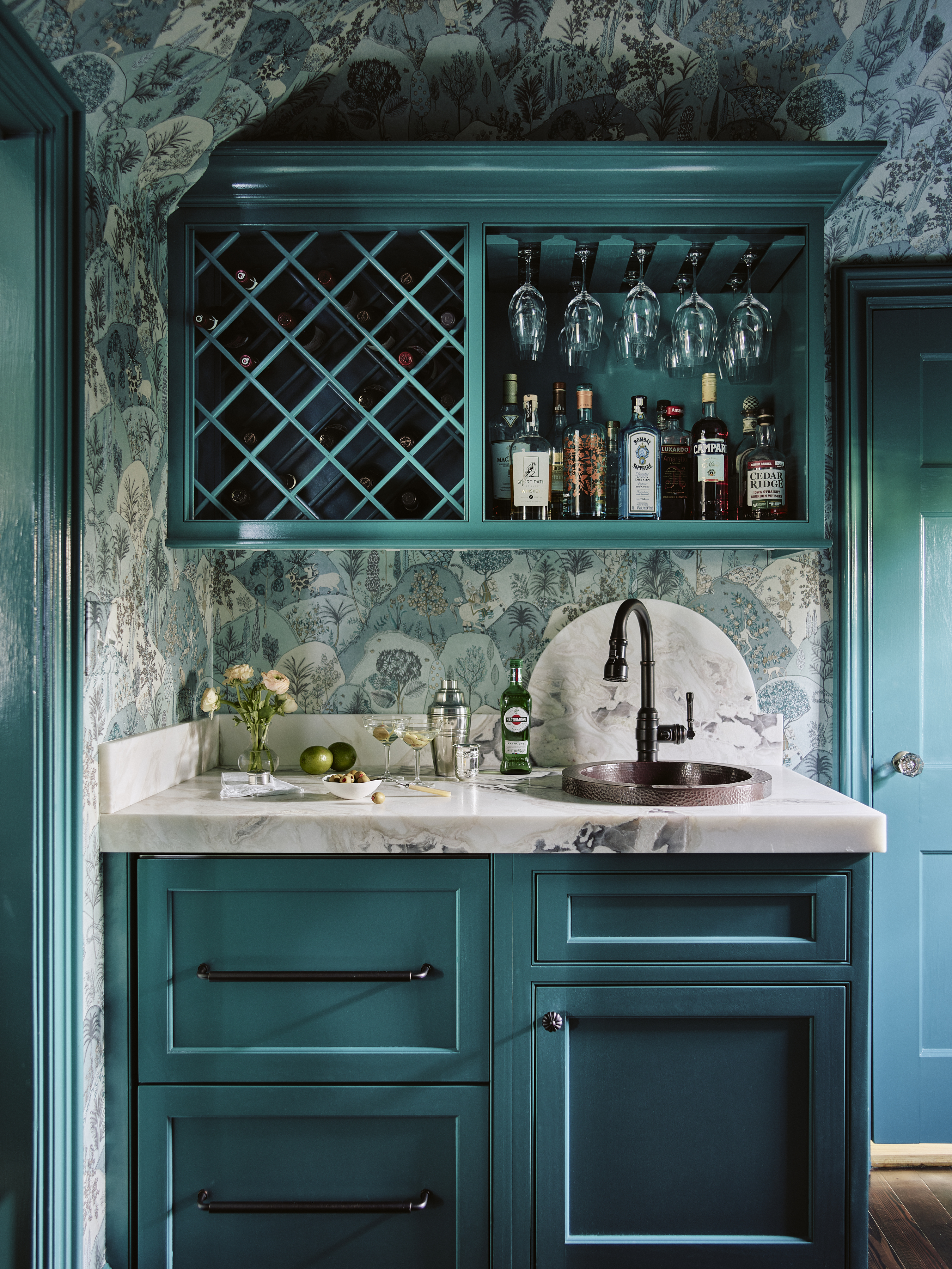
The space, though small, was the perfect candidate for a wet bar that provided that perfect pause between two busy rooms — the kitchen and the living room.
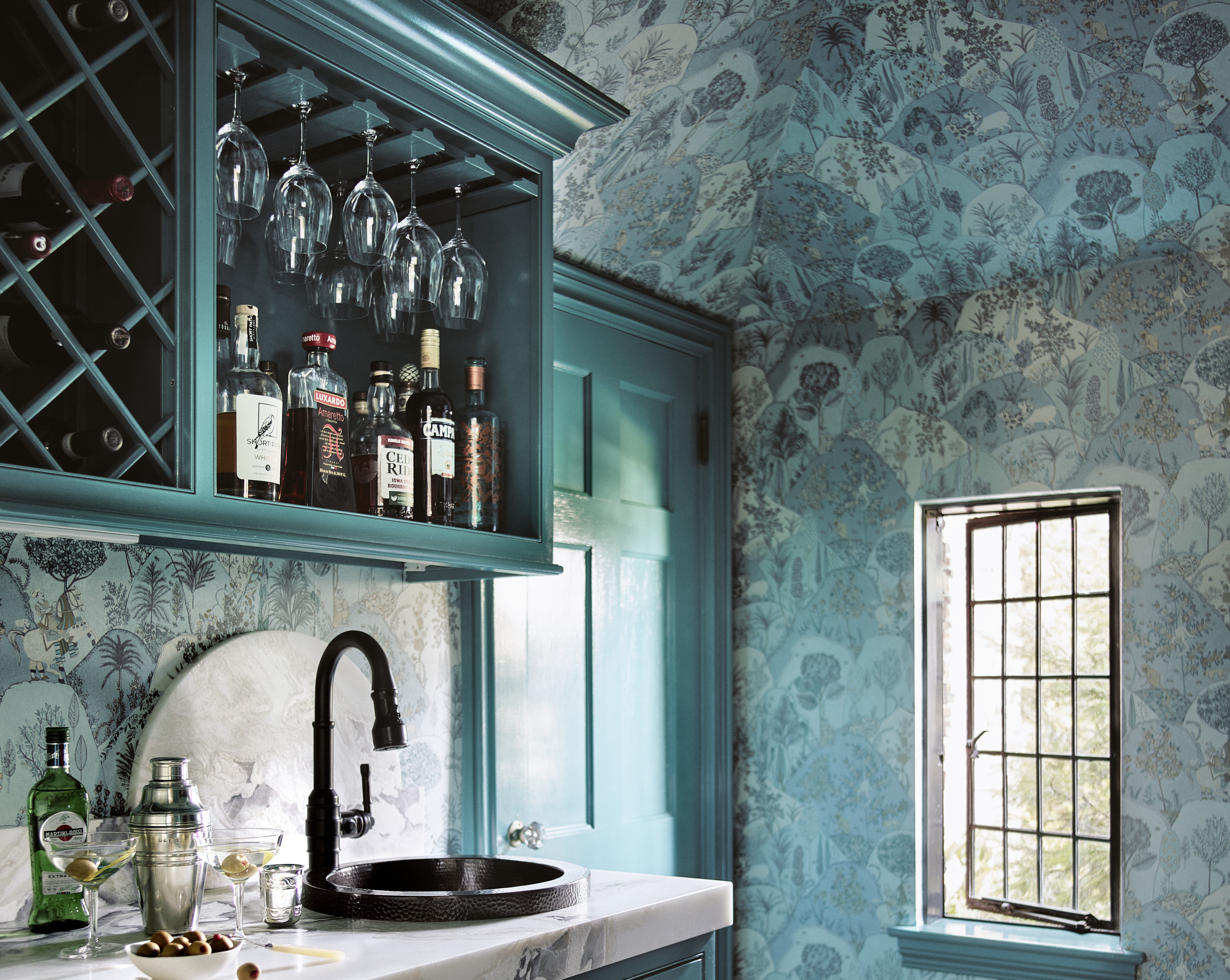
'The goal was to have a high-functioning wet bar with refrigeration and ample storage for liquor, barware, and crystal,' says Vani. 'To create this space, we designed a standard 24" countertop with refrigerator drawer cabinets below and a wine rack for overhead storage. The countertop is in a beautiful leathered quartzite with a hand-hammered sink from Native Trails. Adjacent to this we installed a narrow, tall built-in cabinet that looks like a piece of furniture with leaded glass doors. I sourced the melon-shaped lantern in a market in India and had it re-wired for the space. And, I added a pullout hidden counter for the extra surface area. The cabinetry is in hi-gloss paint which reflects light and makes the room appear larger.'
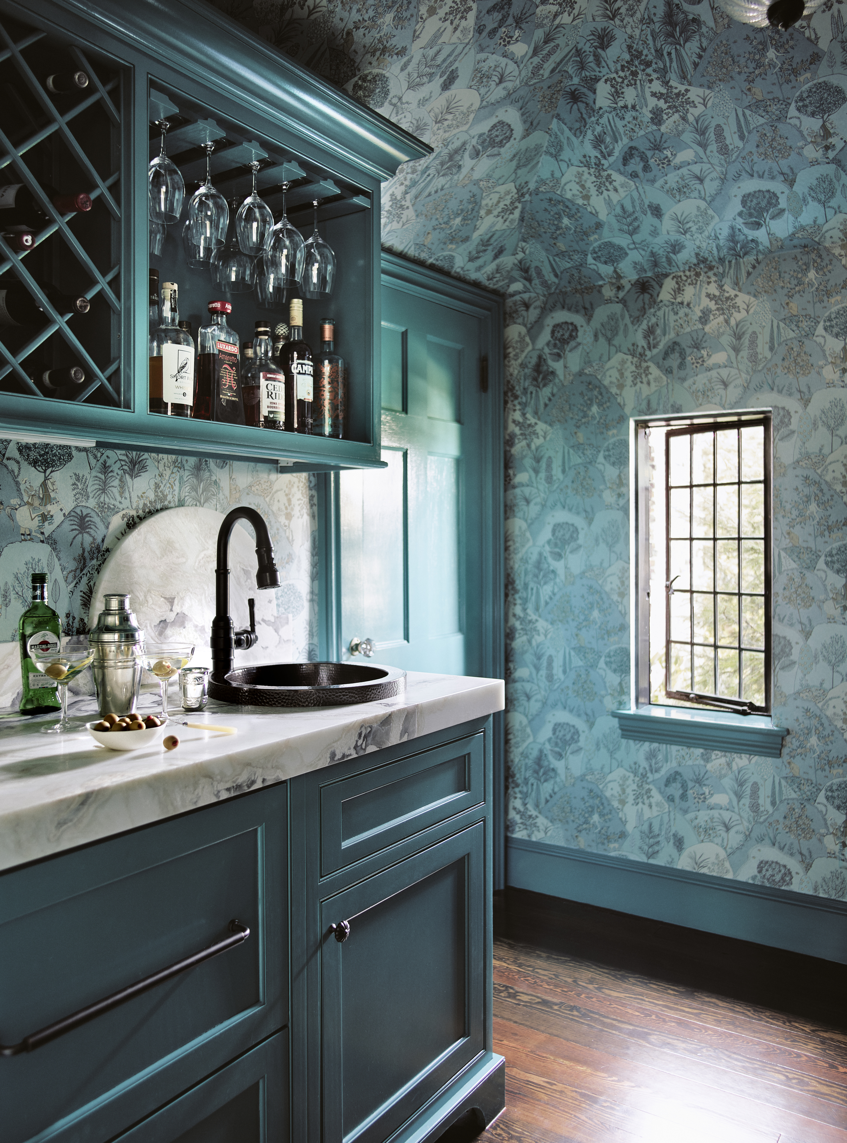
Small in size, this bar works as a lovely cocktail corner filled with color and inspiration.
'This home, a 1920s brick Tudor, is located on top of a hill and our clients are avid gardeners with a love for the outdoors,' says Vani. 'We proposed to bring the outdoors inside and were inspired by the Aravali wall covering by Osbourne and Little with its scenes of the rolling hills, the soft greens and teals. The room is small and has a pitched ceiling, so we decided to cover all the surfaces with a wallpaper to blur the edges and make the room appear larger and seamless.'

The space now emerges as the beautiful, eye-catching focalpoint of the home, decorated with a colors that make you rfeel happy and energetic. 'During the renovation, we were challenged with maximizing the storage in the space because it has no windows on two walls, and features doors on the other two, but we overcame it with color and fresh patterns,' says Vani.
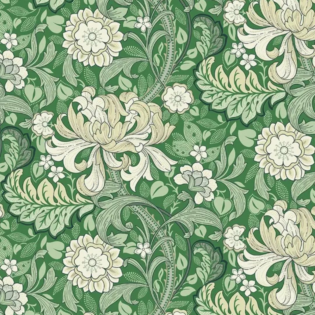
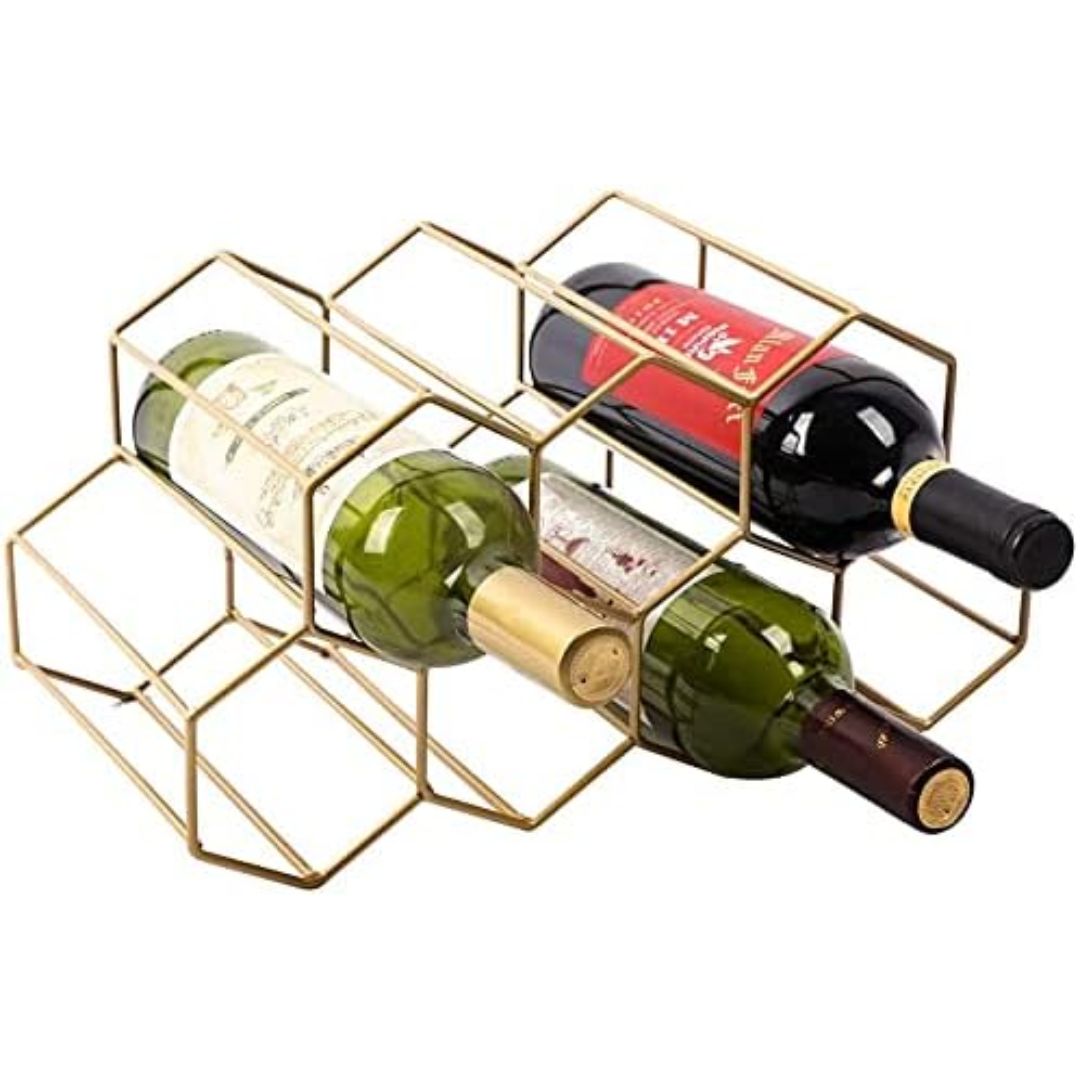
Get the look
The Livingetc newsletters are your inside source for what’s shaping interiors now - and what’s next. Discover trend forecasts, smart style ideas, and curated shopping inspiration that brings design to life. Subscribe today and stay ahead of the curve.

Aditi Sharma Maheshwari started her career at The Address (The Times of India), a tabloid on interiors and art. She wrote profiles of Indian artists, designers, and architects, and covered inspiring houses and commercial properties. After four years, she moved to ELLE DECOR as a senior features writer, where she contributed to the magazine and website, and also worked alongside the events team on India Design ID — the brand’s 10-day, annual design show. She wrote across topics: from designer interviews, and house tours, to new product launches, shopping pages, and reviews. After three years, she was hired as the senior editor at Houzz. The website content focused on practical advice on decorating the home and making design feel more approachable. She created fresh series on budget buys, design hacks, and DIYs, all backed with expert advice. Equipped with sizable knowledge of the industry and with a good network, she moved to Architectural Digest (Conde Nast) as the digital editor. The publication's focus was on high-end design, and her content highlighted A-listers, starchitects, and high-concept products, all customized for an audience that loves and invests in luxury. After a two-year stint, she moved to the UK and was hired at Livingetc as a design editor. She now freelances for a variety of interiors publications.

