Before & After: See how a Tasteful Redesign Turns This Home from Old-Fashioned & Frumpy to Soft & Serene
The interior designer behind this project blended a coastal style with classic heirlooms to create a characterful and relaxing home

The Livingetc newsletters are your inside source for what’s shaping interiors now - and what’s next. Discover trend forecasts, smart style ideas, and curated shopping inspiration that brings design to life. Subscribe today and stay ahead of the curve.
You are now subscribed
Your newsletter sign-up was successful
Coastal chic and a traditional antique aesthetic couldn't be further apart style-wise. And yet, the interior designer behind the dramatic transformation of this Maryland home successfully blends both for a soft, serene, and sophisticated space that's sure to inspire your future decorating plans.
Located in Maryland's Chevy Chase neighborhood, the homeowners built this expansive 8,000-square-foot property in 2014, but it would be nearly ten years before their dream home became a reality. As well as raising two young boys with his wife Ariel, husband Rajesh De held senior appointments in the White House, meaning plans for their envisioned redesign were put on hold.
When the time finally came, they asked Virginia-based interior designer Kristen Harrison, owner of Bungalow 10 Interiors, to work her magic. The finished product is a light and airy home, peppered with family heirlooms like rugs and furniture pieces that inject character into the space.
Article continues below'My clients really did have different tastes that we were trying to merge together,' explains Kristen. 'In essence, they wanted something that leaned more traditional, but had hints of coastal that weren’t blatantly obvious. They have two children and two dogs, so picking performance materials was very important to them. They'd also been in this house for almost 10 years and had never really spent the time to make it their own, so they wanted it to feel finished and pulled together, finally.' Here, we take a closer look inside the modern home to find out exactly how that vision came to life.
Entryway
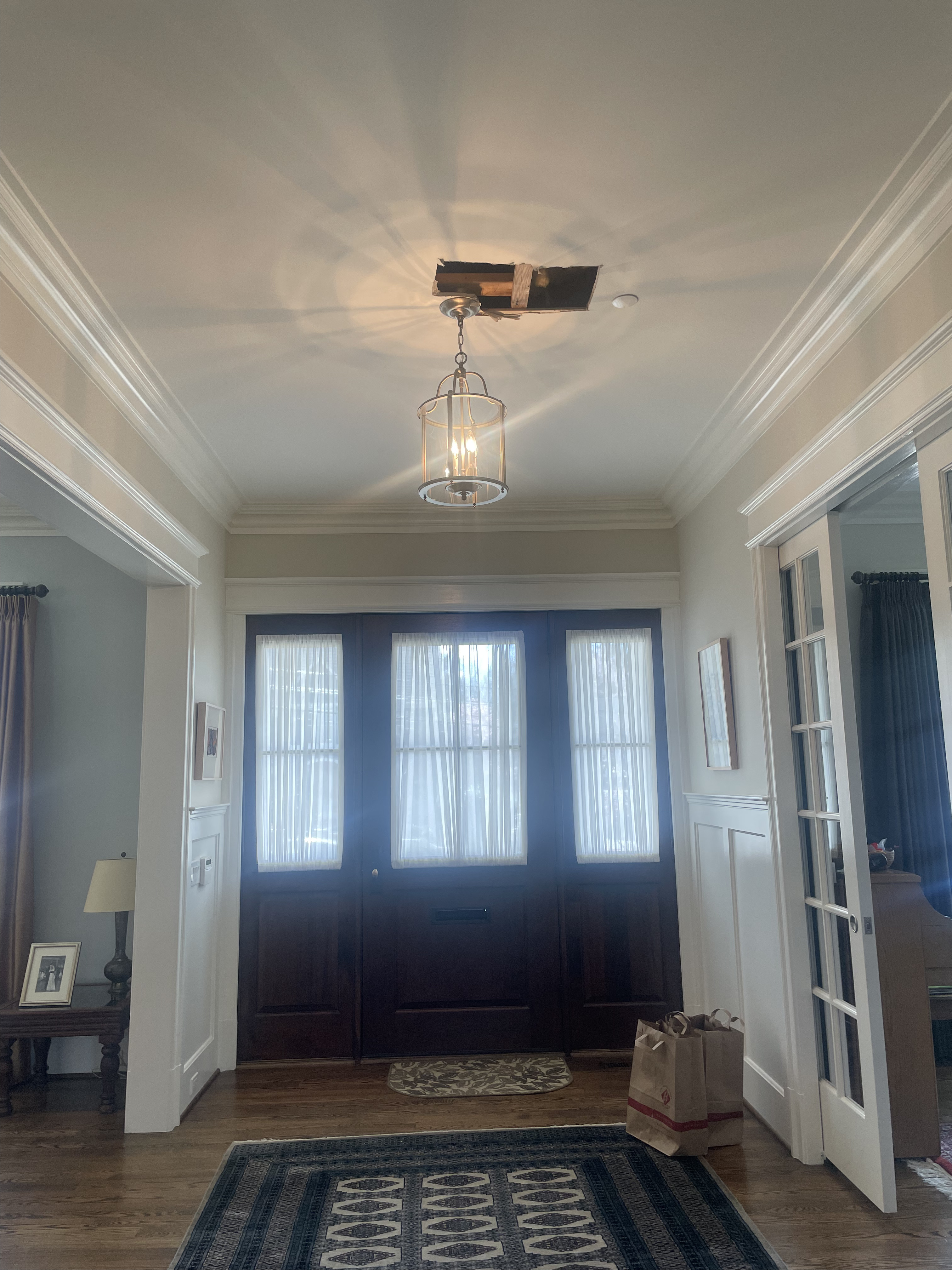
The entryway before the renovation
Prior to the renovation, the entryway was a sore spot that felt dark, dim, and far from welcoming. Kristen of Bungalow 10 Interiors knew she had to breathe new life into the space, and that started with brightening up the interior.
With a rustic mango wood table as the centerpiece, Kristen added Schumacher’s weeping pine wallpaper and a Verdigris lantern from Visual Comfort (pictured below). Raj and Ariel both have a love for beautiful rugs so, to further accentuate the space, they introduced a handwoven rug from Jaipur. Most of the existing rugs in the house held sentimental value since they were handed down from Raj’s late parents, so incorporating them into the new design was important to the family.
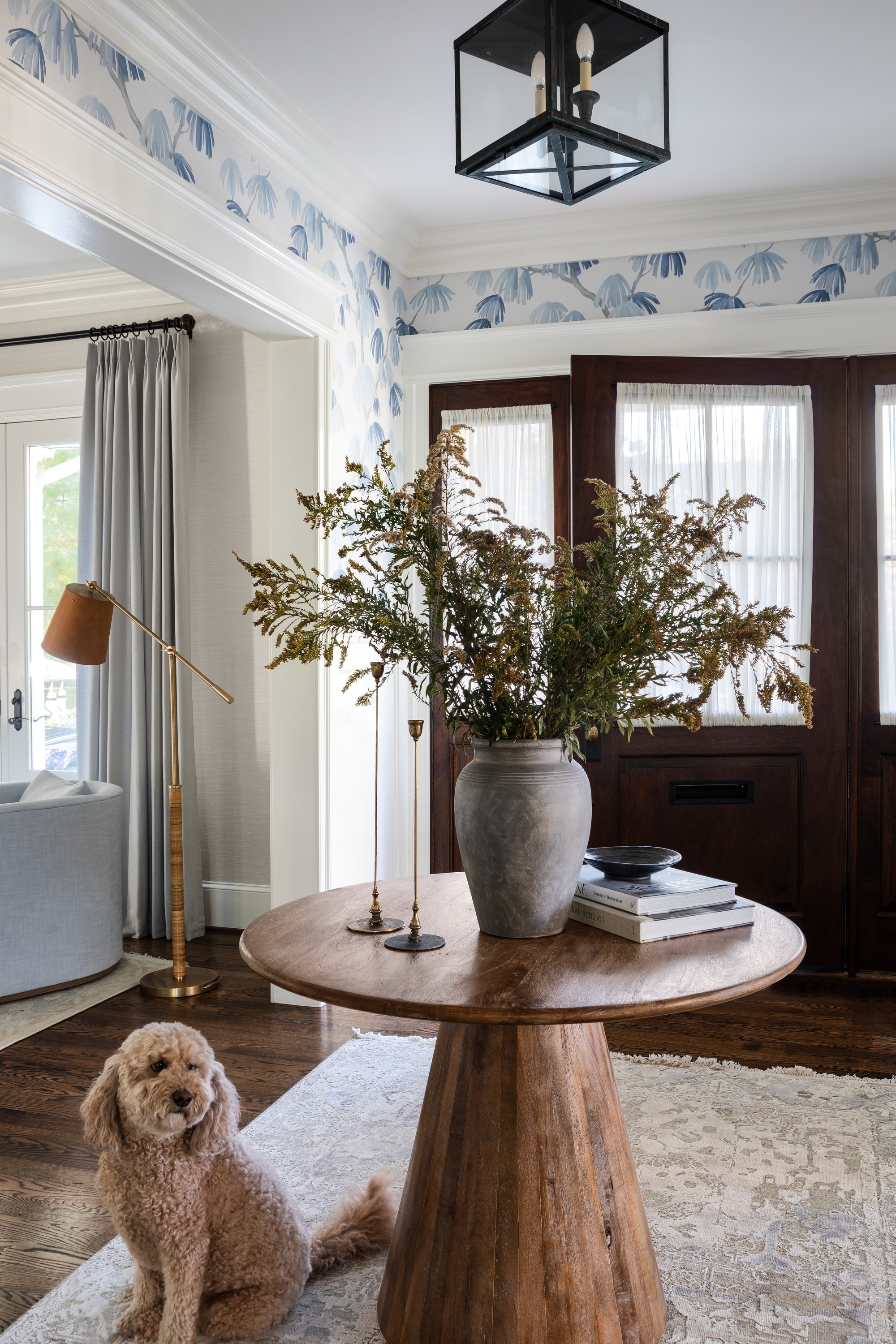
The entryway after the renovation
The space now feels so much brighter and airier, and Kristen says the fresh wallpaper is the main contributing factor. 'It was such a change to walk in and see such a beautiful statement on the walls,' she says. 'It makes you look around at your surroundings instead of just walking right through it. That was a bit of a fight to have them trust me to do it, and the most gratifying feeling is that they ended up loving it.'
The Livingetc newsletters are your inside source for what’s shaping interiors now - and what’s next. Discover trend forecasts, smart style ideas, and curated shopping inspiration that brings design to life. Subscribe today and stay ahead of the curve.
Kitchen
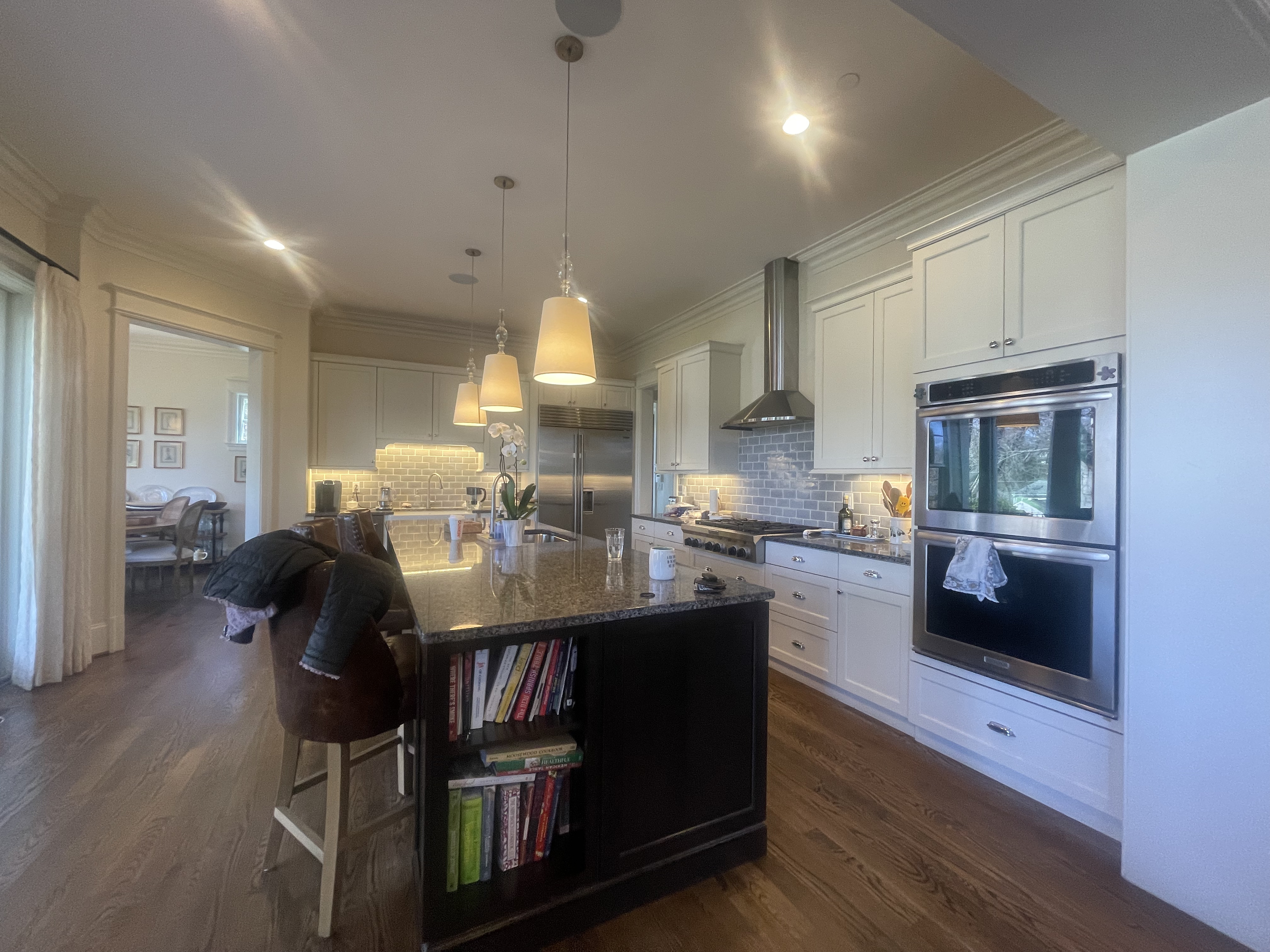
The kitchen before the renovation
Before Kristen set to work in the kitchen, the cabinets were yellowing and they still had the same granite counters from when the house was originally built. There was a general lack of color and vitality overall, and as the heart of the home, the family knew they wanted to make this a more livable, convivial space for them to gather.
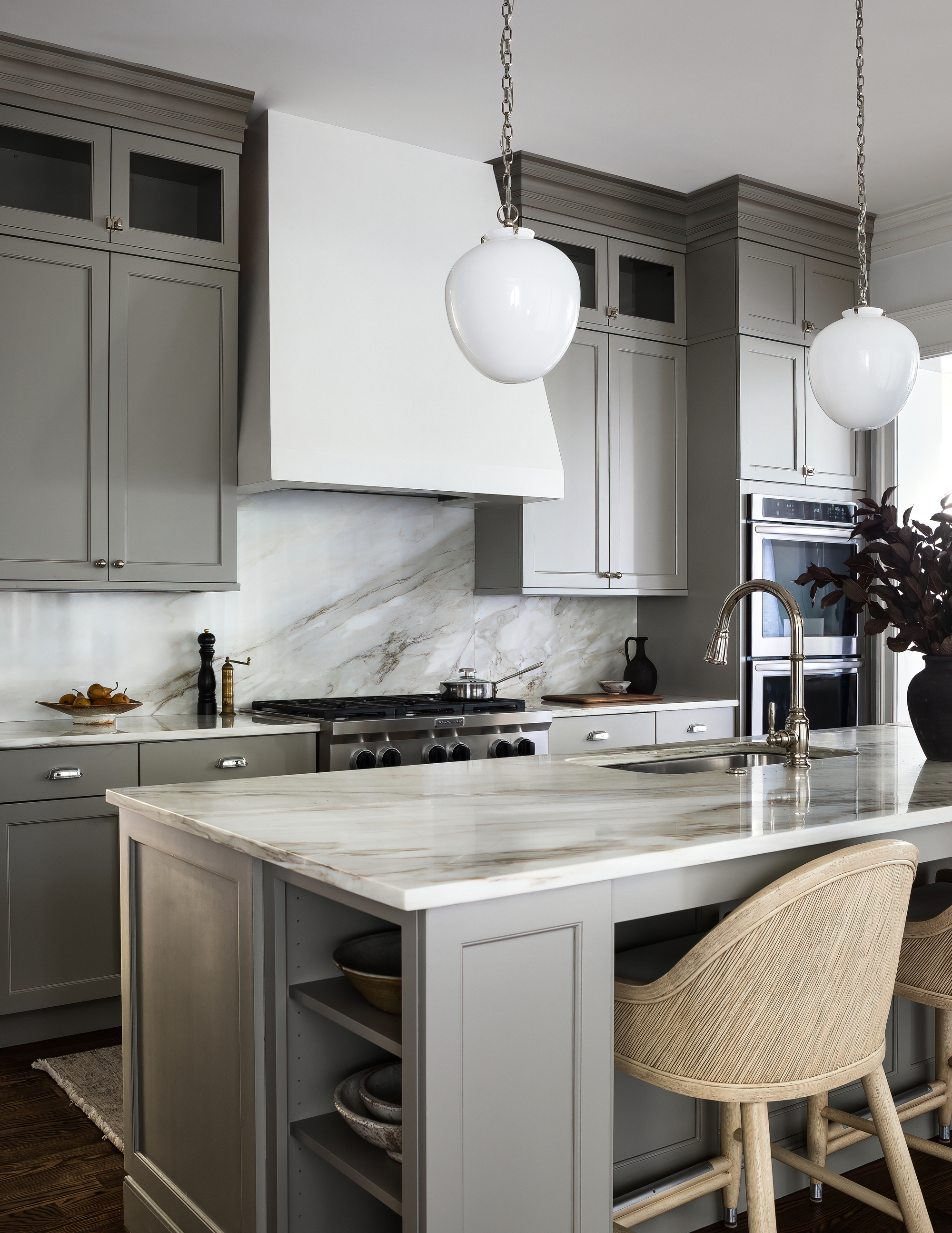
The kitchen after the renovation
To create a more cohesive theme, Kristin swapped the pendants out for a more contemporary option, and took the cabinets up to the ceiling to improve storage before painting them a beautiful greige tone. She also added a stunning calacatta marble for the counters and backsplash, with rustic bar stools from Palecek.
Perhaps most laudable is the way Kristen has made the gray kitchen cabinets feel super welcoming and far from 'cold'. 'A lot of clients still really like gray tones and it can be hard to warm them up,' she says. 'To complement the color scheme, we swapped the hood and built it in plaster, and changed the countertops to a beautiful warmer-toned marble.'
Breakfast room
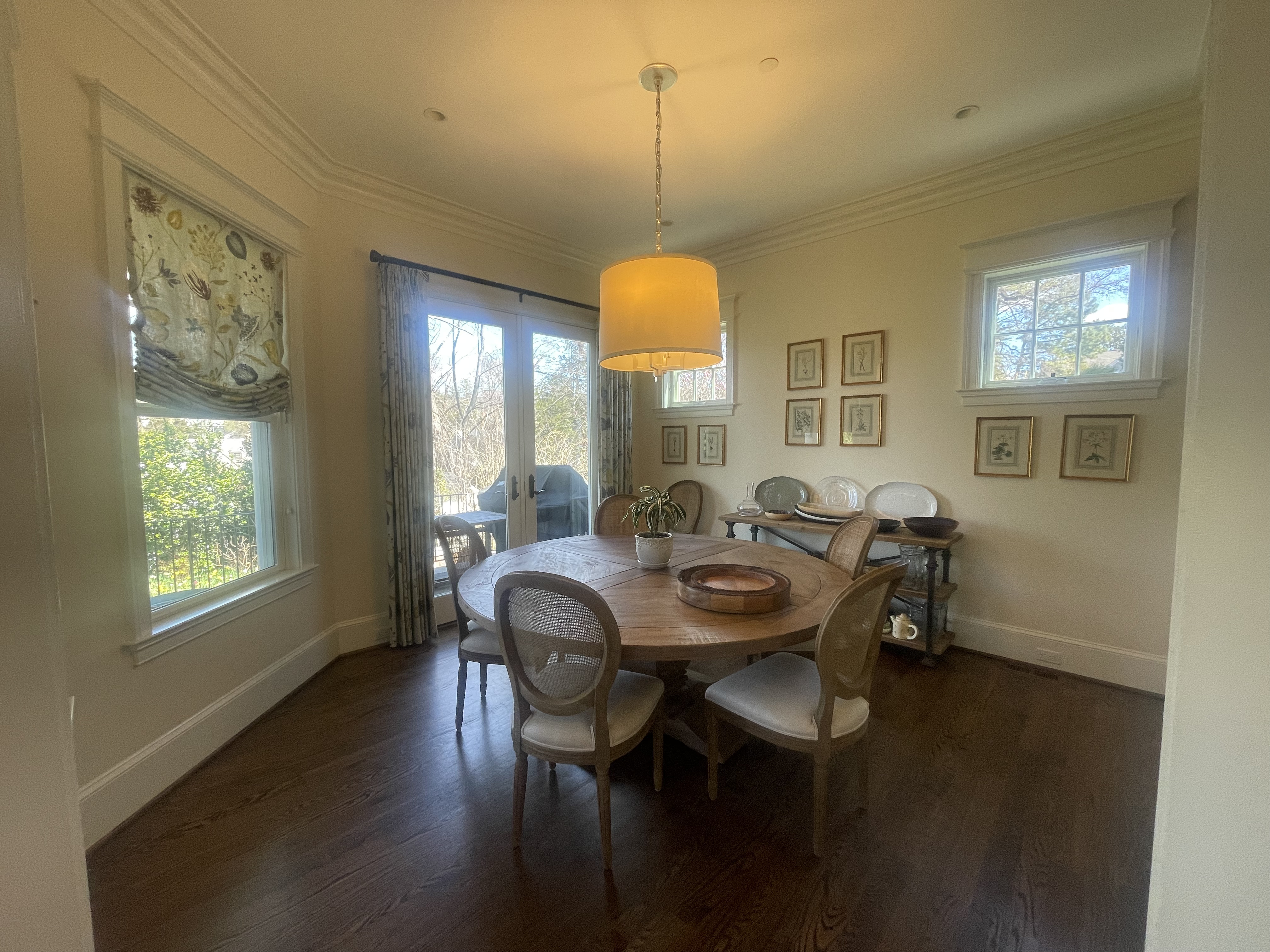
The breakfast room before the renovation
The adjoining breakfast room had an outdated farmhouse vibe but felt cavernous and lackluster, despite the generous windows. To create a brighter feel, Kristen again opted for an airy wallpaper, chose contrasting furniture, and simplified the shades and curtains to allow for more light.

The breakfast room after the renovation
The breakfast nook now feels like the perfect calming space to enjoy a morning cup of coffee. Kristen swapped the chairs to fabric (Sunpan), added a beautiful Palecek pendant, and added a cabinet to store all of Ariel’s entertaining essentials. Overall, the space feels far more visually balanced.
'We wrapped the walls in a really beautiful woven blue wallpaper and opted for fabric seats around the table,' says Kristen. 'We swapped the heavily patterned drapery with crisp white and changed the light to something way more natural. They were relatively small changes that had a major impact on the overall feel of the space.'
Dining Room
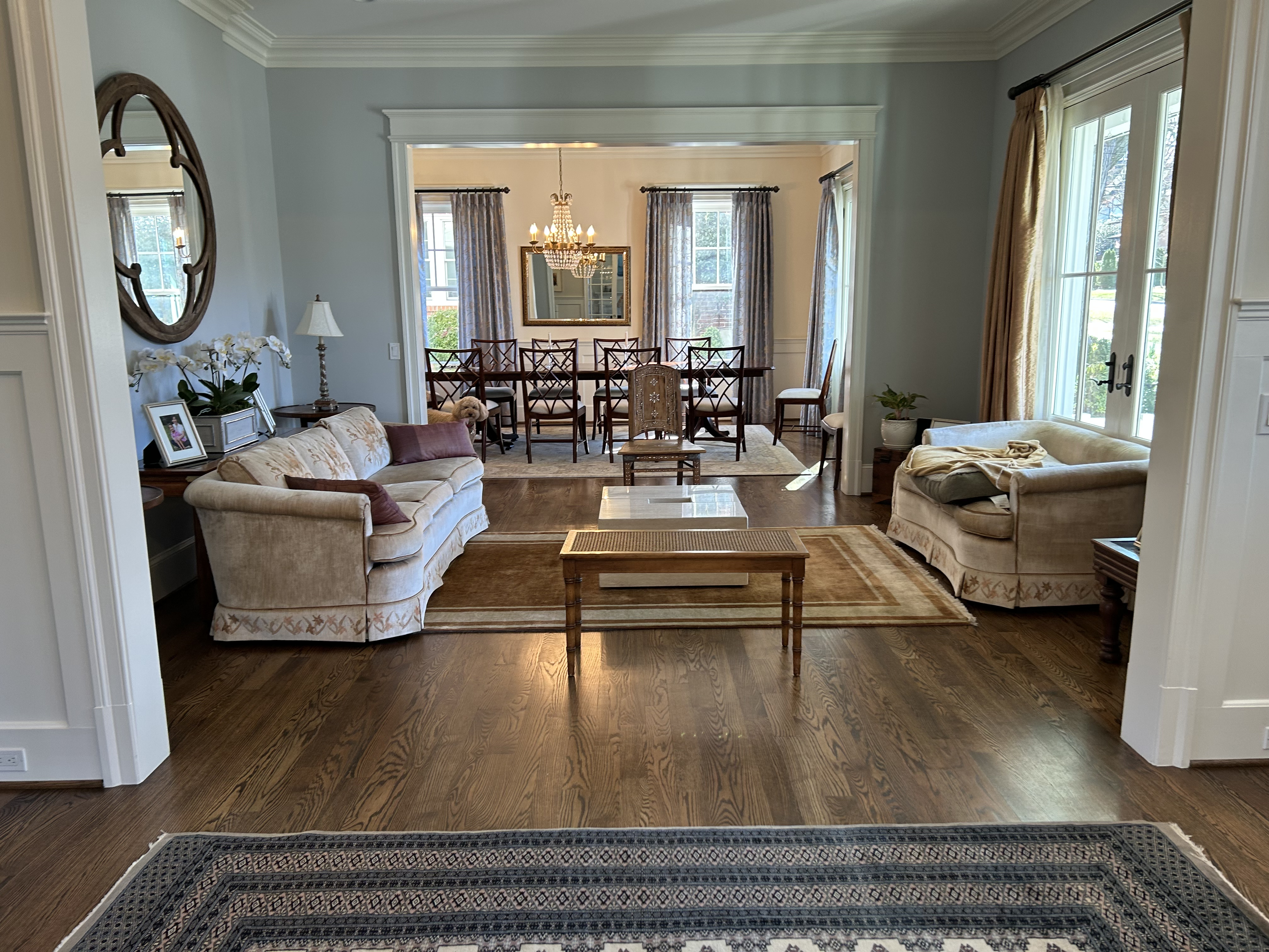
The dining room before the renovation
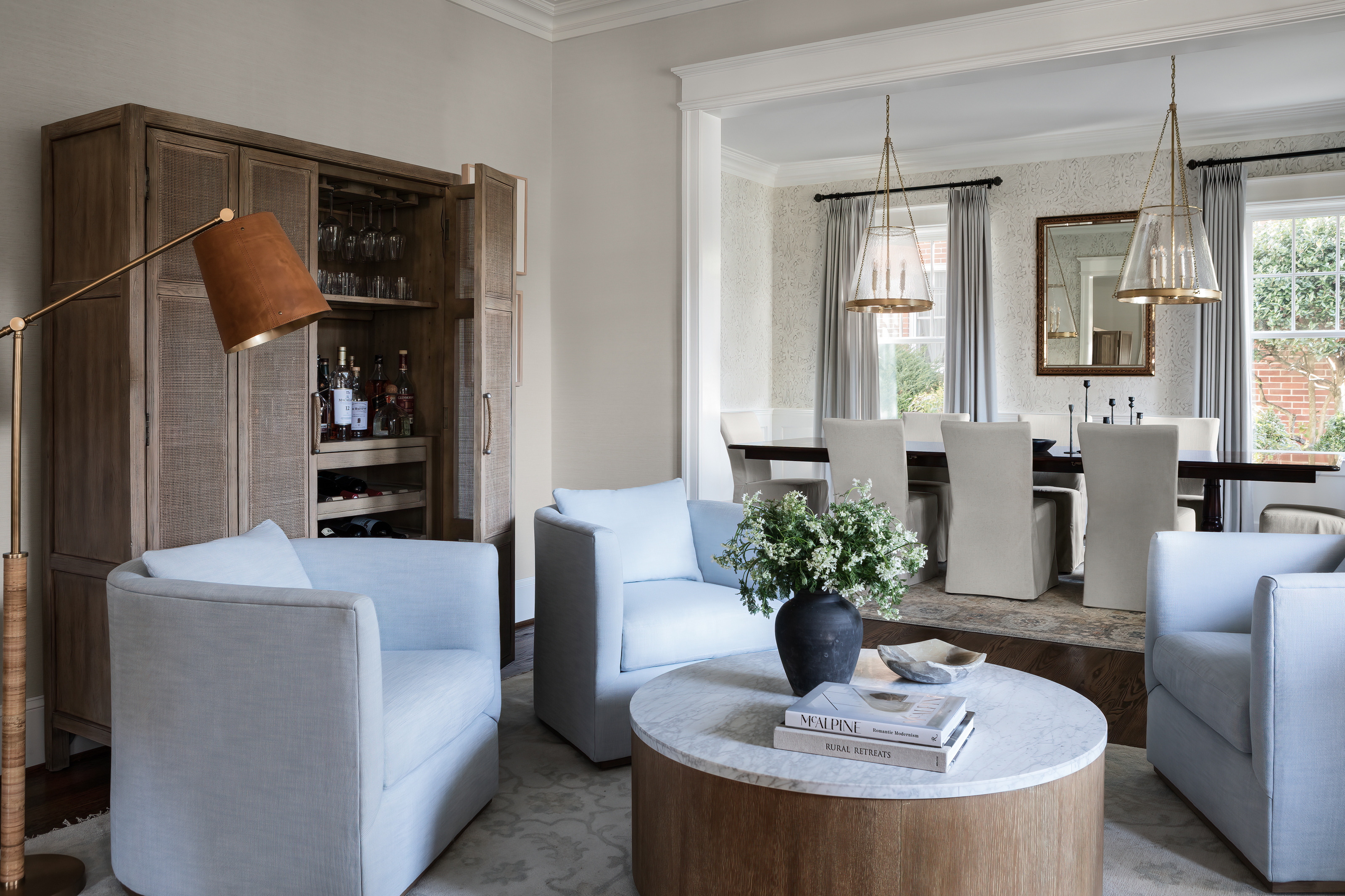
The open-plan living area led on to a generous dining room (seen in the background above), but a lack of softer furnishings made it feel on the formal side. 'It was important for the family to keep their dining room table, which was also given to them by Raj’s family, as was the rug,' says Kristen. 'We decided to fully update the room by using Morris & Co Pimpernel wallpaper, two Marie Flanigan for Visual Comfort pendants, and new fabric seating. Simple changes that gave the room a completely different feel.'
There's now a real sense of cohesion in the space, but the pendants are perhaps the real standout. 'Those are from Marie Flanigan’s collection with Visual Comfort,' notes Kristen. 'They are absolutely stunning in person and reflect the most beautiful light pattern.'

The dining room after the renovation
If you're spotting a trend throughout Kristen's design, so are we. Throughout the home, wallpaper works wonders at tying a theme together and adding a softer yet brighter feel to the walls. It's something designers are beginning to appreciate again after wallpaper fell out of favor throughout the early noughties.
'I think wallpaper has been welcomed back with open arms,' Kristen says. 'It’s a way to add interest, pattern, and texture to a room, especially when you mostly gravitate towards solid color furniture. A great way to incorporate wallpaper into a home is to try it out in a small space. Turn that space into a jewel box and see how finished it feels. Experiment small!'
Living room

The living room before the renovation
The main living room felt frumpy and old-fashioned, instantly dating the interiors and not reflecting the personal style of the homeowners. This realization of two distinct styles - ones that seem so opposing - is something Kristen achieves so well.
'One was very coastal, and one was very traditional,' she explains. 'One loves light colors and calm, and the other loved darker vegetable dye rugs and more ornate pieces.' Kristen has successful retained more classic elements and pared them with a cool, coastal chic touch for a space that feels characterful and contemporary all at once.
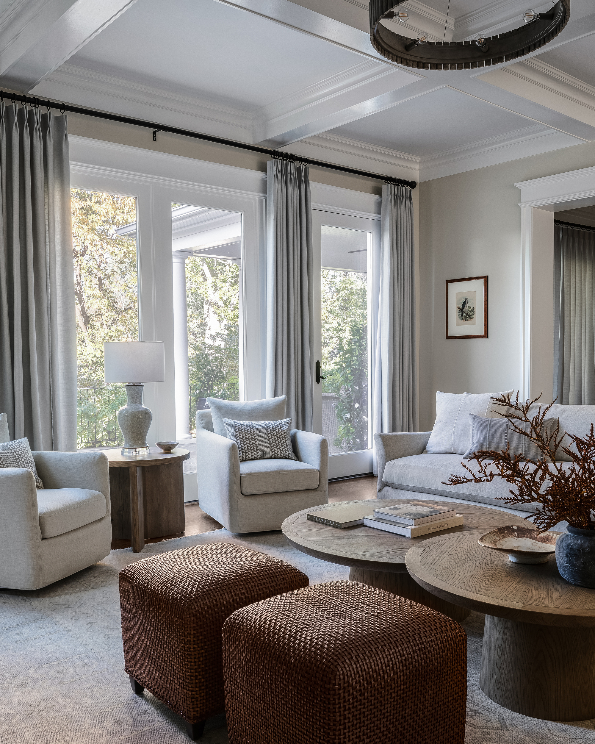
The living room after the renovation
The modern living room is now a relaxing space for the family to gather, with lots of natural light flooding the space. The soft, neutral palette used throughout helps to create a real sense of cohesiveness, flowing from room to room, but it's in this space that it feels the most triumphant.
'I think the best advice I can give is to try and come up with a color palette that you’d like to incorporate in most of the spaces,' says Kristen in relation to building a scheme. 'Use that to guide you in your decisions on the bigger important pieces first, and then branch out to accessories to pull it all together. I always tell my clients to pick what they like. You don’t become someone completely different because you are renovating your home. Stick with what you gravitate towards.'
Kristen's design has also allowed beautiful architectural details, such as the coffered ceiling, to really sing. 'I think most people never even noticed them because there were a lot of distracting things happening in this space before the renovation,' she says. 'I try to always tell my clients that you want the least amount of interruption to the eye possible, especially when you have such beautiful details in a home.'
Powder Room

The powder room before the renovation
The powder room was considerably modern but lacked any thoughtful attention or a defined aesthetic. The way the sconces were positioned made the space feel off-balance, and a lack of color and character made this small space unremarkable.
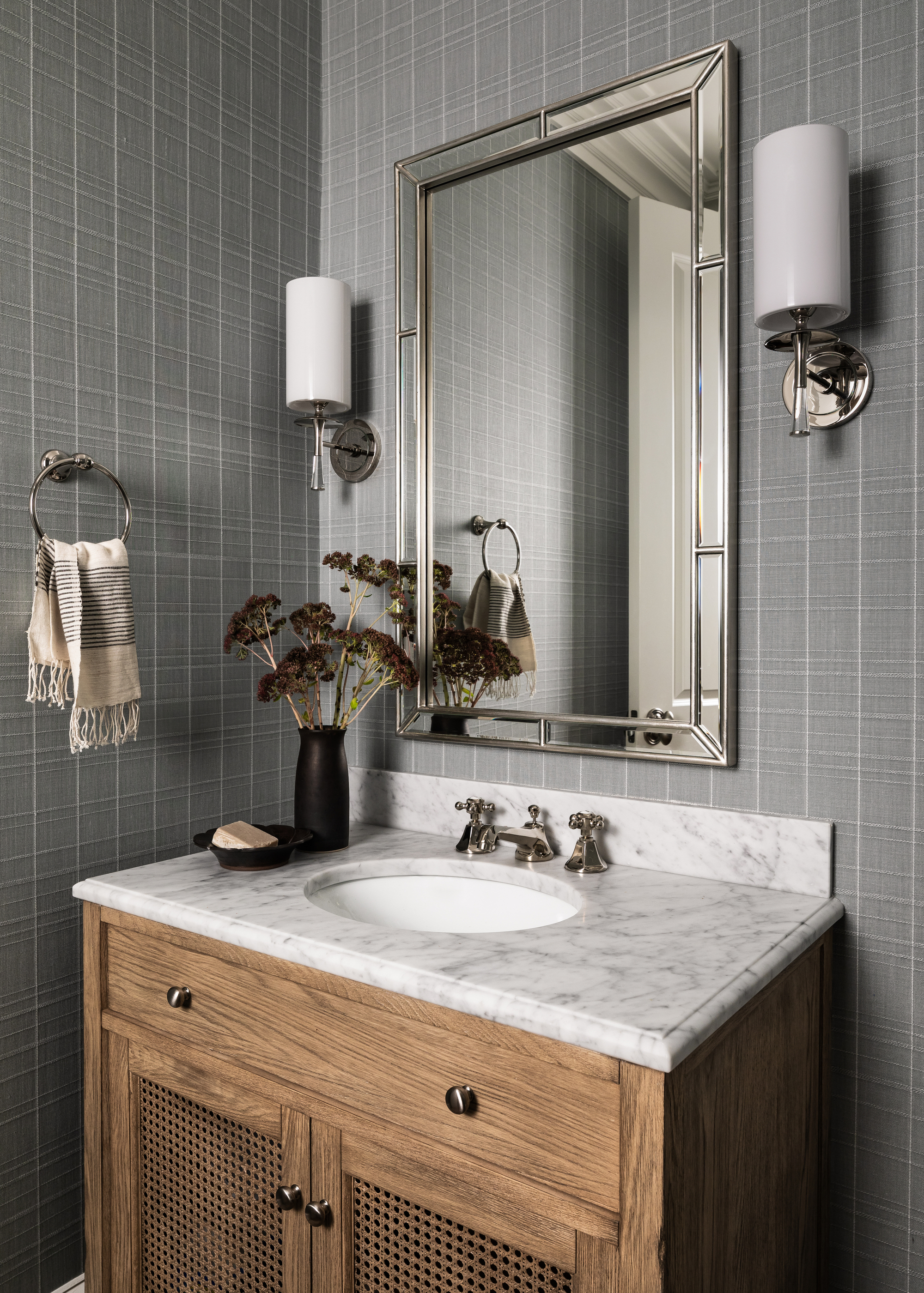
Now, though, the powder room features a classic vanity with a carrara marble top, Ashley Stark wallpaper, and (well-balanced!) sconces that tie the space together. Despite the contemporary feel, it has a vintage influence that feels so timeless.
'I think the textured wallpaper adds a really nice touch,' notes Kristen. 'You'll notice that most of these rooms, even though they look painted in some pictures, are actually wallpapered if you look closely. The powder room was a great space to bring all of the other elements we added throughout the house into one area: color, texture, raw wood, and clean lines. We really tried to make decisions that would stand the test of time and not be considered trendy, and I think we were able to do that relatively well.'
Get the look

Lilith Hudson is a freelance writer and regular contributor to Livingetc. She holds an MA in Magazine Journalism from City, University of London, and has written for various titles including Homes & Gardens, House Beautiful, Advnture, the Saturday Times Magazine, Evening Standard, DJ Mag, Metro, and The Simple Things Magazine.
Prior to going freelance, Lilith was the News and Trends Editor at Livingetc. It was a role that helped her develop a keen eye for spotting all the latest micro-trends, interior hacks, and viral decor must-haves you need in your home. With a constant ear to the ground on the design scene, she's ahead of the curve when it comes to the latest color that's sweeping interiors or the hot new style to decorate our homes.
