Before and After — This Kansas Kitchen Went From Dark and Dated to Open and Bright, Here's How
Thanks to Forward Design Architecture, this once-old-fashioned kitchen now feels breezy and is wonderfully connected to the home's primary rooms

The Livingetc newsletters are your inside source for what’s shaping interiors now - and what’s next. Discover trend forecasts, smart style ideas, and curated shopping inspiration that brings design to life. Subscribe today and stay ahead of the curve.
You are now subscribed
Your newsletter sign-up was successful
This project was the remodel of a Tudor-modern style home; one that belonged to Victor L. Regnier, one the city's largest residential developers. The ask: to make the spaces, especially the kitchen, feel more connected to the home and give the residence a 21st-century turnaround.
Chris Fein, the founder and principal of Forward Design Architecture decided to keep some of the more historic, and characteristic elements in the kitchen intact while connecting the space with the rest of the house. The 120-square-foot room was also given a fresh design theme, with newer color palettes, all layered with unique materiality. A feeling of openness now commands the space.
Take a look at this kitchen makeover and draw all the inspiration you need to transform yours!
Article continues belowBEFORE
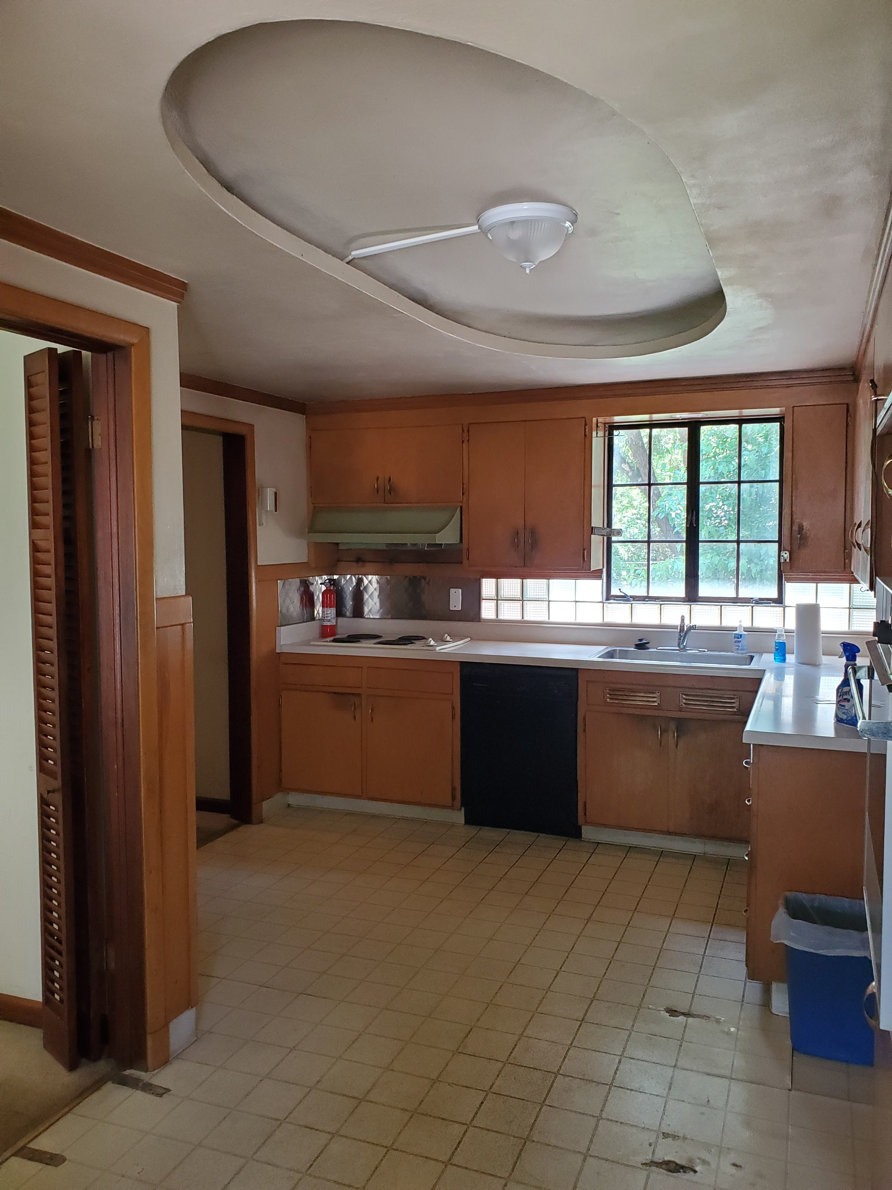
The original kitchen was a dark space, dominated heavily by wooden kitchen cabinets.
In the kitchen, the locations of doors to the garage outside and private spaces were all located to limit the functionality of the small kitchen. In addition, the connection to the living room and dining room was limited to a small 30” doorway. This restricted the connectivity and isolated the kitchen from the living space.
"The house was a historic home that had an Art Deco Modern feel," shares Chris Fein, the founder and principal of Forward Design Architecture. "We wanted to make a contemporary kitchen that felt like it belonged to the original house."
AFTER

The idea was to expand the kitchen and open up the space to more light, breeze, and function.
The Livingetc newsletters are your inside source for what’s shaping interiors now - and what’s next. Discover trend forecasts, smart style ideas, and curated shopping inspiration that brings design to life. Subscribe today and stay ahead of the curve.
"We eliminated the door and widened the opening to the living and dining room, and moved the door to the garage," says Chris.
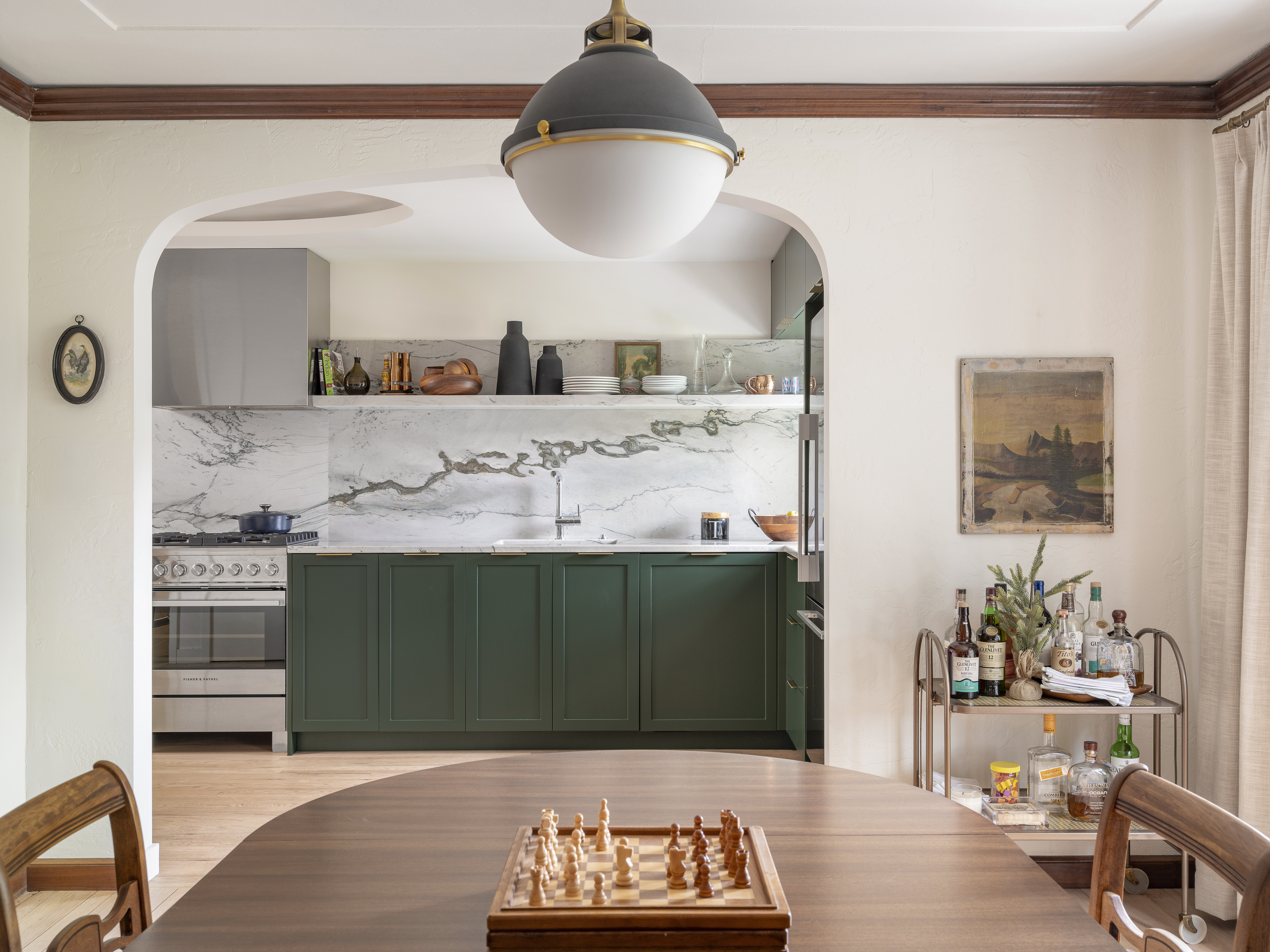
The wall to the living room was opened up with a large pointed archway, matching those found in the living areas. The space was then converted into a U-shaped kitchen to increase the room's circulation area.
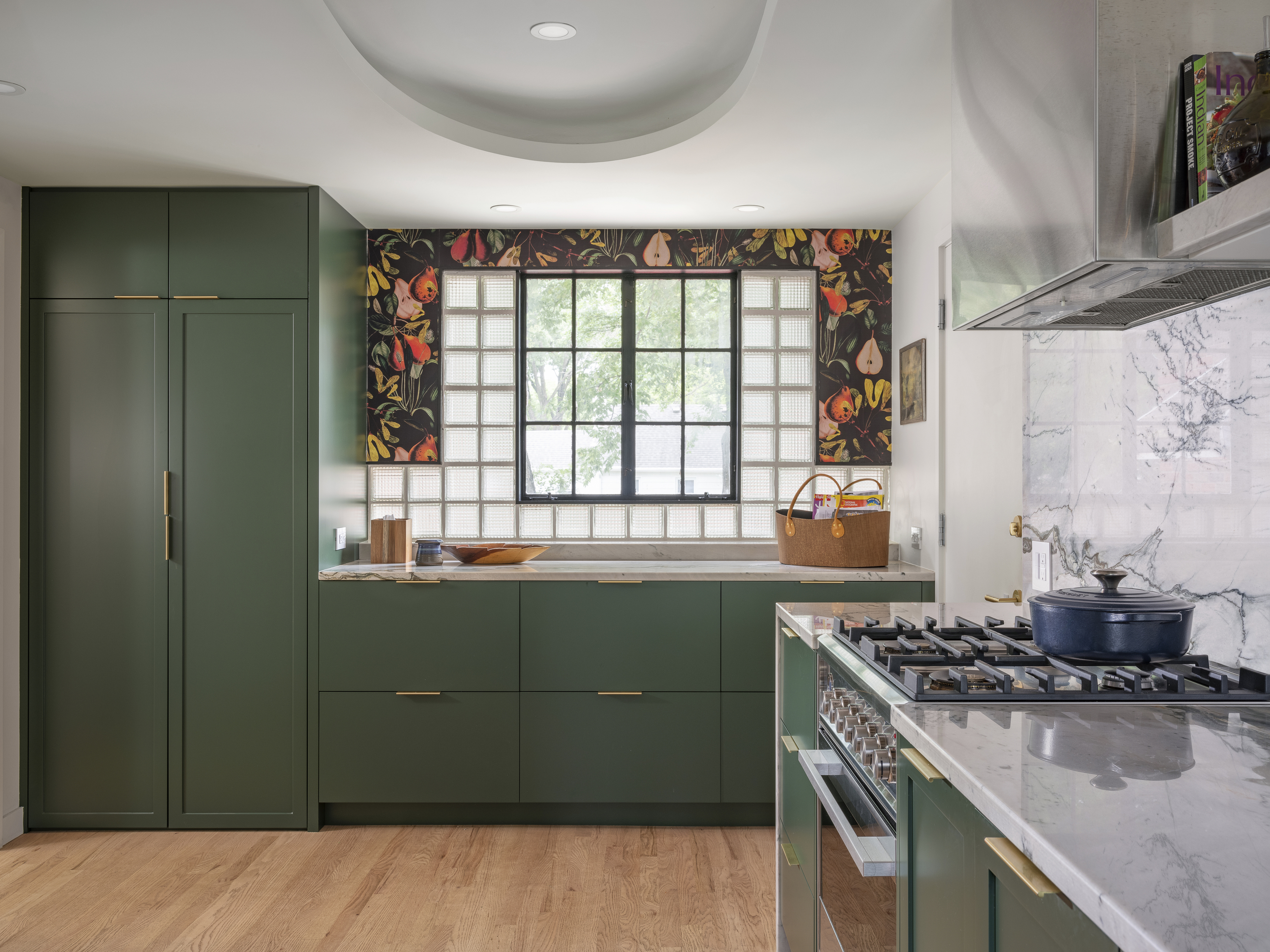
The glass block and steel windows were an original feature of the house. "We had them restored and one moved," says Chris. "The glass block and steel windows along with the amoeba ceiling light were original and became the backbone of the new design."
As for the kitchen storage, "the bulk storage was placed in the full-height cabinets," adds Chris. "We maximized their number to avoid upper cabinets. In a kitchen small upper cabinets just make the space feel smaller."
The painted kitchen cabinets added an elegance to the room. "The color is Farrow & Ball Duck Green. It was chosen to give the space a contemporary touch."

For the kitchen backsplash, Chris chose quartzite. "We wanted the feel of a natural stone, and the color and figure of this stone paired with its price point made it the best selection," he adds.
As for the kitchen lighting, Chris wanted to go in for task-specific lighting. "We did restore the amoeba cove light as a mood/experience light," he shares. "But we added 4" downlights in specific task-related areas. The quartzite shelf that runs the length of the cabinets has an integrated LED strip light that makes working in the kitchen easier."
The kitchen is now an open, breezy, and easy-to-use room, wonderfully connected to the rest of the house. The new layout and storage truly make it a space for all seasons.

Aditi Sharma Maheshwari started her career at The Address (The Times of India), a tabloid on interiors and art. She wrote profiles of Indian artists, designers, and architects, and covered inspiring houses and commercial properties. After four years, she moved to ELLE DECOR as a senior features writer, where she contributed to the magazine and website, and also worked alongside the events team on India Design ID — the brand’s 10-day, annual design show. She wrote across topics: from designer interviews, and house tours, to new product launches, shopping pages, and reviews. After three years, she was hired as the senior editor at Houzz. The website content focused on practical advice on decorating the home and making design feel more approachable. She created fresh series on budget buys, design hacks, and DIYs, all backed with expert advice. Equipped with sizable knowledge of the industry and with a good network, she moved to Architectural Digest (Conde Nast) as the digital editor. The publication's focus was on high-end design, and her content highlighted A-listers, starchitects, and high-concept products, all customized for an audience that loves and invests in luxury. After a two-year stint, she moved to the UK and was hired at Livingetc as a design editor. She now freelances for a variety of interiors publications.
