Before & after: by taking just one piece of furniture out, this family's 'flex' room works so much better
Once a dark, dull property, this home now ticks all the boxes of elegance, functionality, and a sense of calm
Home design should serve the way we live, enable our daily activities with ease, allow space for calm and retreat for the family together, and also privacy for individuals. At the same time, it should serve as a space of beauty and calm, where one can shut the door on the world and relax in their own personal oasis.
In this family home in Maryland, this was not the case. Dark rooms with minimal, not quite useful furniture, and practically absent design or style scheme, the challenge was to give the space a 180-degree transformation that would exude elegance and sophistication while supporting the needs of all the inhabitants and guests.
It’s not a bad thing that the owners had been living in the property before the redesign, as the needs of the space, and how they were using it, were very clear from the start. With the help of interior designer Kate Ballou, founder of Hendrick interiors, this home ended up becoming a light, serene space, with rooms allowing for multiple uses and functions.
A ‘flex’ living room design that allows the family to have full control of its use, an office/guest bedroom that is both functional and inviting, colors and textures that create a sense of calm - this home has it all, and I spoke to the interior designer to talk me through how her modern decorating ideas achieved such a seemingly effortless look.
The property and its challenges
This 3,380-square-foot, single-family home in Chevy Chase, Maryland, just minutes from Washington, D.C. belongs to a family of two lawyers and their two children, ages three and five. The request was for a home that was beautiful, but also practical, and realistic for a family with small kids. The concept and delivery to achieve this was trusted to Kate Ballou of Hendrick Interiors, whose strategy was to pick sophisticated pieces, in family-friendly materials.
Before any decorating work took place, the clients wanted to start by focusing on creating more storage space with built-in shelving in the living room, and additional kitchen cabinets. ‘Otherwise, it was more or less a blank slate in terms of furnishings, carpets, and lighting. Their existing furniture felt tired, dark, and a bit conservative for their taste,’ explains Kate.
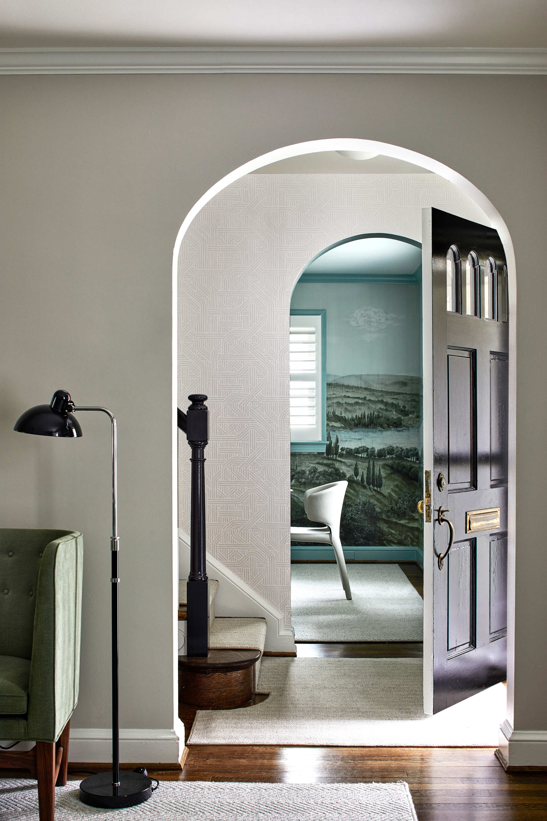
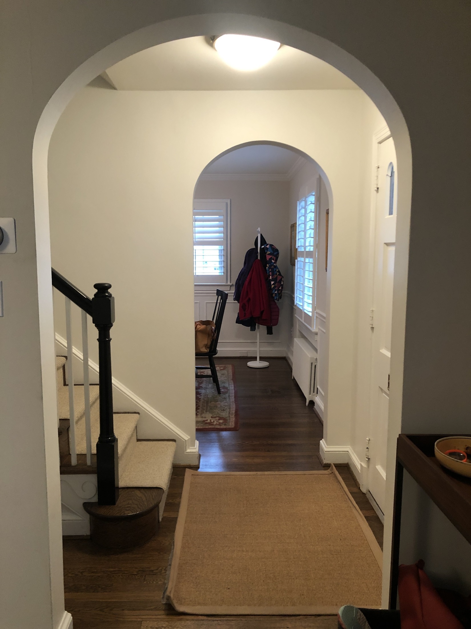
With no remodeling involved, the client’s requests needed to be achieved through furniture layout and decoration. There were of course challenges to account for. ‘The center hallway meant that circulation happens constantly through all of the living spaces, so one of the main challenges was keeping the furniture plan open and flexible with appropriately scaled pieces,’ Kate tells me. There is no such thing as an easy, perfect project. With every property come particularities and the designer worked with them, to deliver the client’s brief.
Be The First To Know
The Livingetc newsletters are your inside source for what’s shaping interiors now - and what’s next. Discover trend forecasts, smart style ideas, and curated shopping inspiration that brings design to life. Subscribe today and stay ahead of the curve.
A formal living room designed as a ‘flex’ space
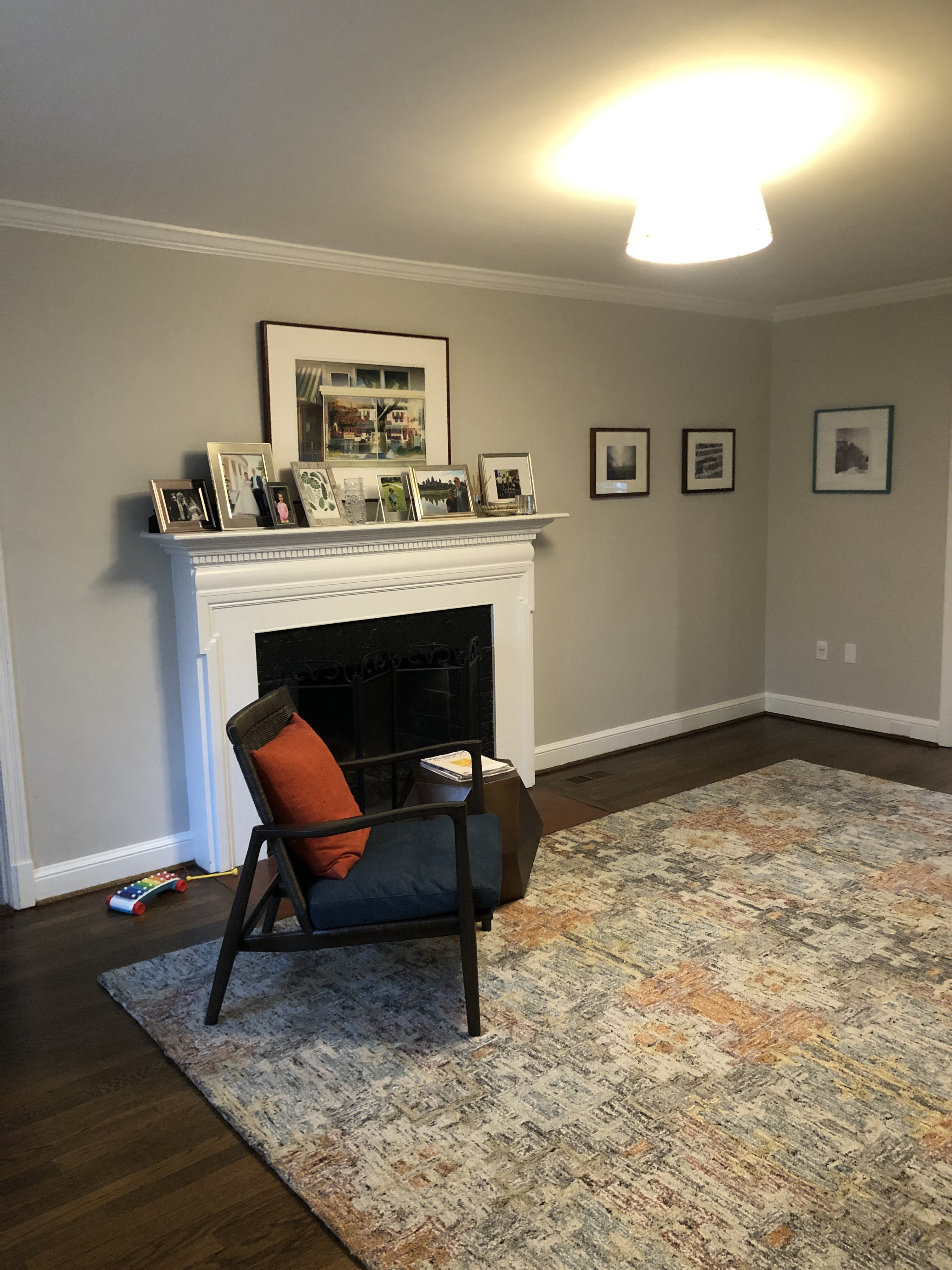
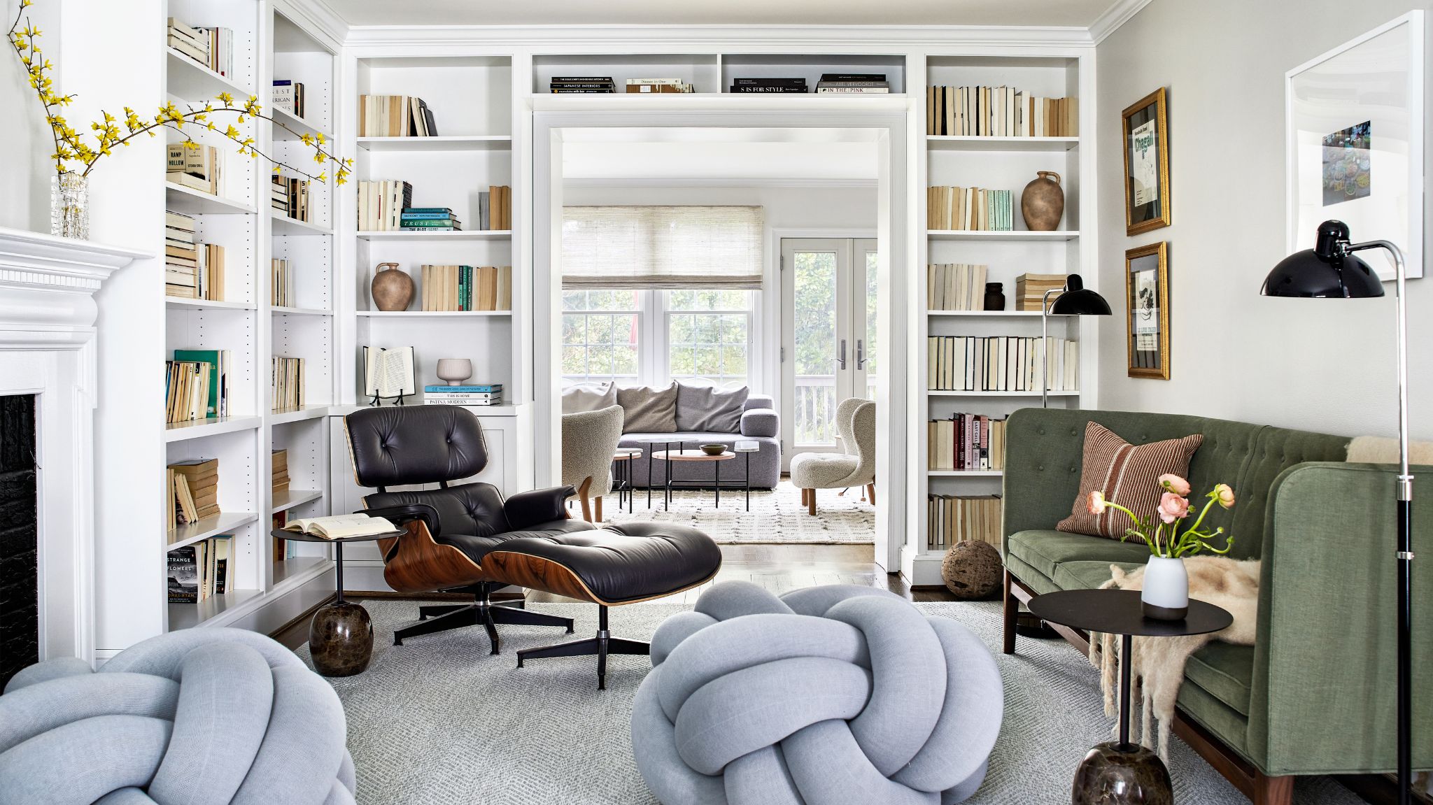
The formal living room needed to embrace multiple functions as a gathering space, but also pass-through, because of its location. ‘The living room ended up being a pass-through space because of the narrow center hall,’ explains the designer. ‘My clients requested that the room not feel overfilled with furniture, but still function as an occasional sitting room. Because of the constant circulation through this space, we kept the sofa on a smaller scale and chose the very fun floor knot poufs as an unexpected element with a small footprint.’
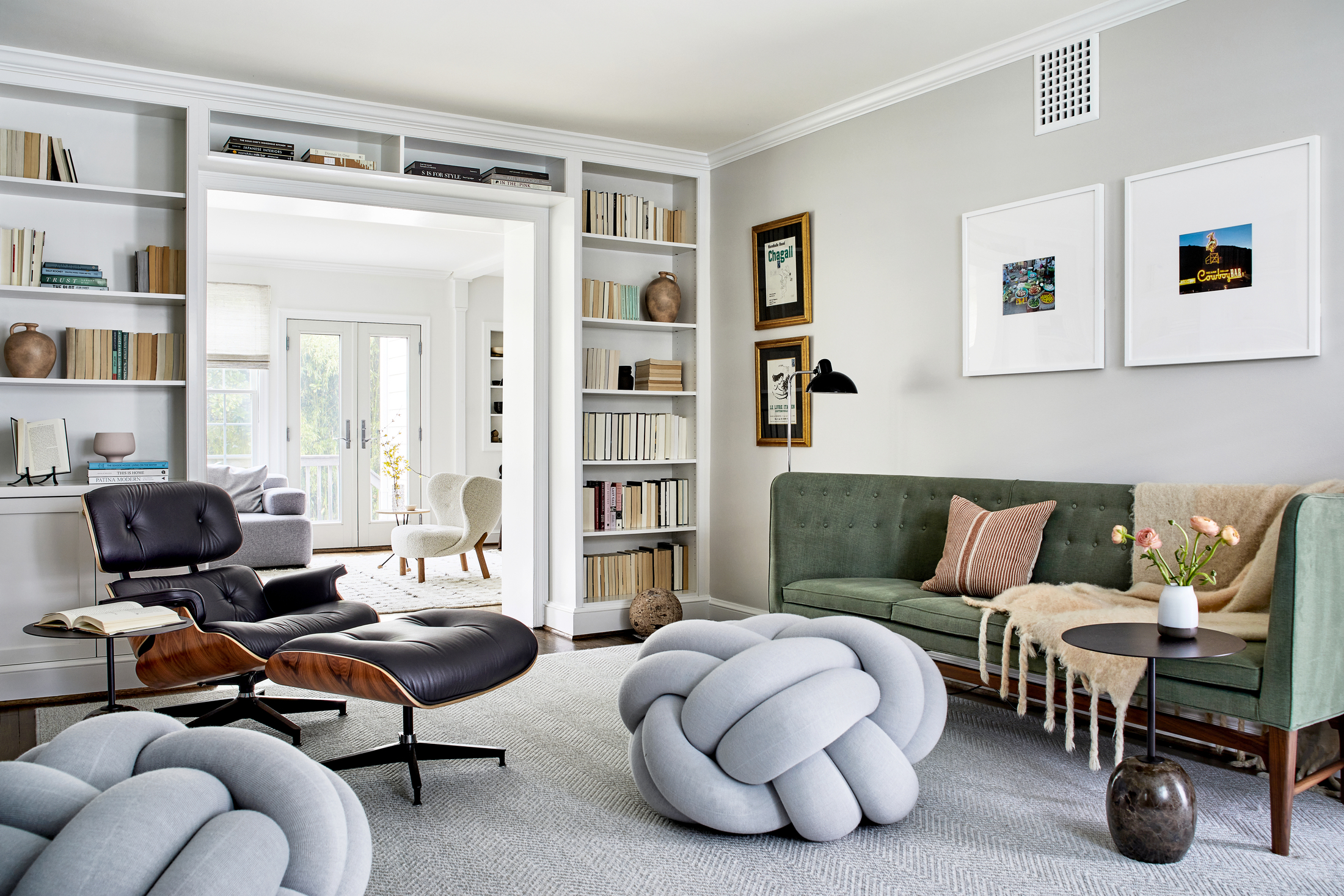
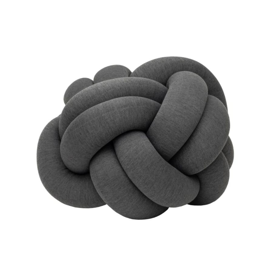
Removing the coffee table allowed for that ease of circulation between spaces. However, to soften the formality of the space, and to the delight of the two young daughters, the designer chose Design House Stockholm’s Knot floor pillows which add a sense of playfulness to the space. ‘The client’s daughters love the floor knots - it allows them to relax and feel included in what is otherwise a more formal adult space,’ adds Kate.
A beautiful example of home office/ guest bedroom combination
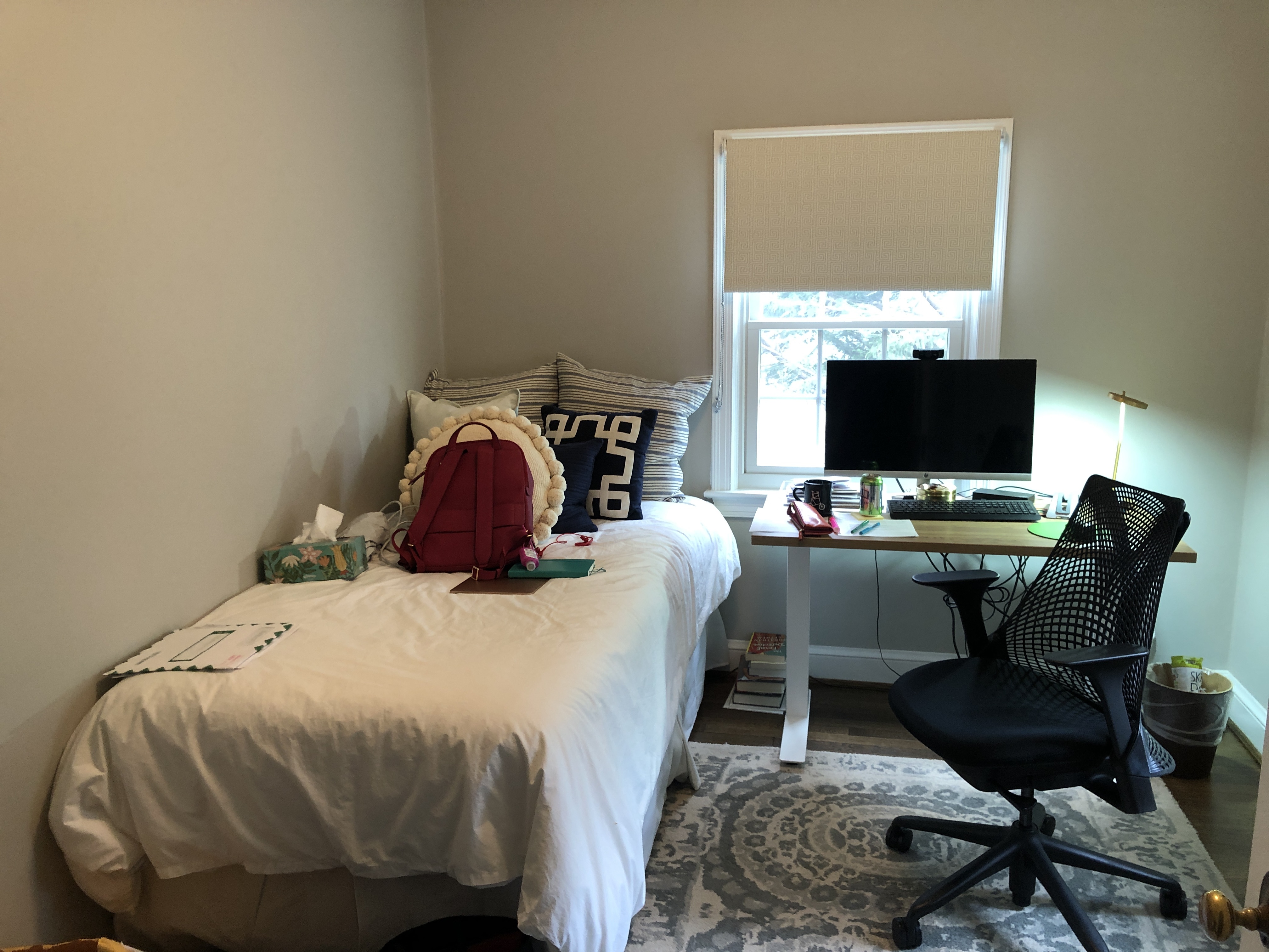
The home office proved to be one of the more challenging spaces to design as it needed to also function as a guest bedroom for occasional family visits. Here there was a question of playing with the layout options, reorientating the bed and desk, as well as incorporating built-in desk and storage solutions that pull the design together cohesively. In what is otherwise not a big room, adding wall-to-wall carpeting made the space feel larger.
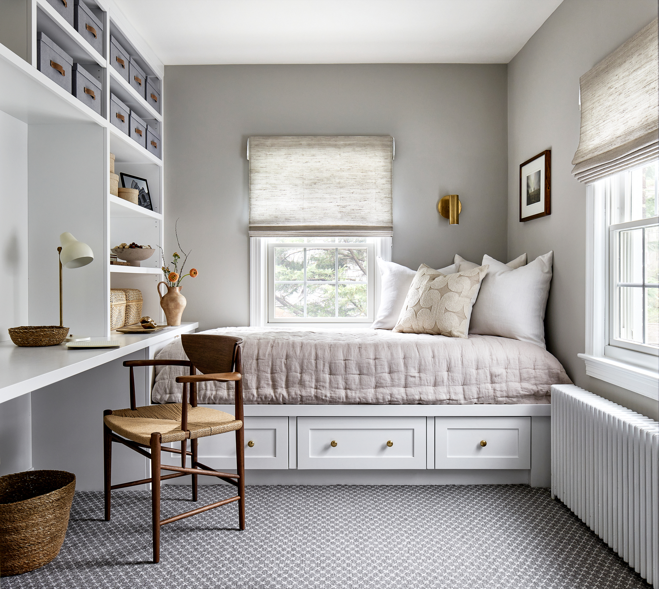
‘Initially, my client had a separate desk facing the window at the end of the room, and the bed was in the corner along the long wall. By switching their locations, I was able to provide them with a huge amount of storage and the bed feels more like a daybed, rather than a bed that someone uses a few times a year. The built-in design also feels cohesive to the rest of the home and is so much more organized than separate elements,’ explains Kate, proving that simple layout changes can go a long way in the design of a room, while nothing beats bespoke millwork for any storage challenges.
A ‘jewel-like’ dining room that stands out
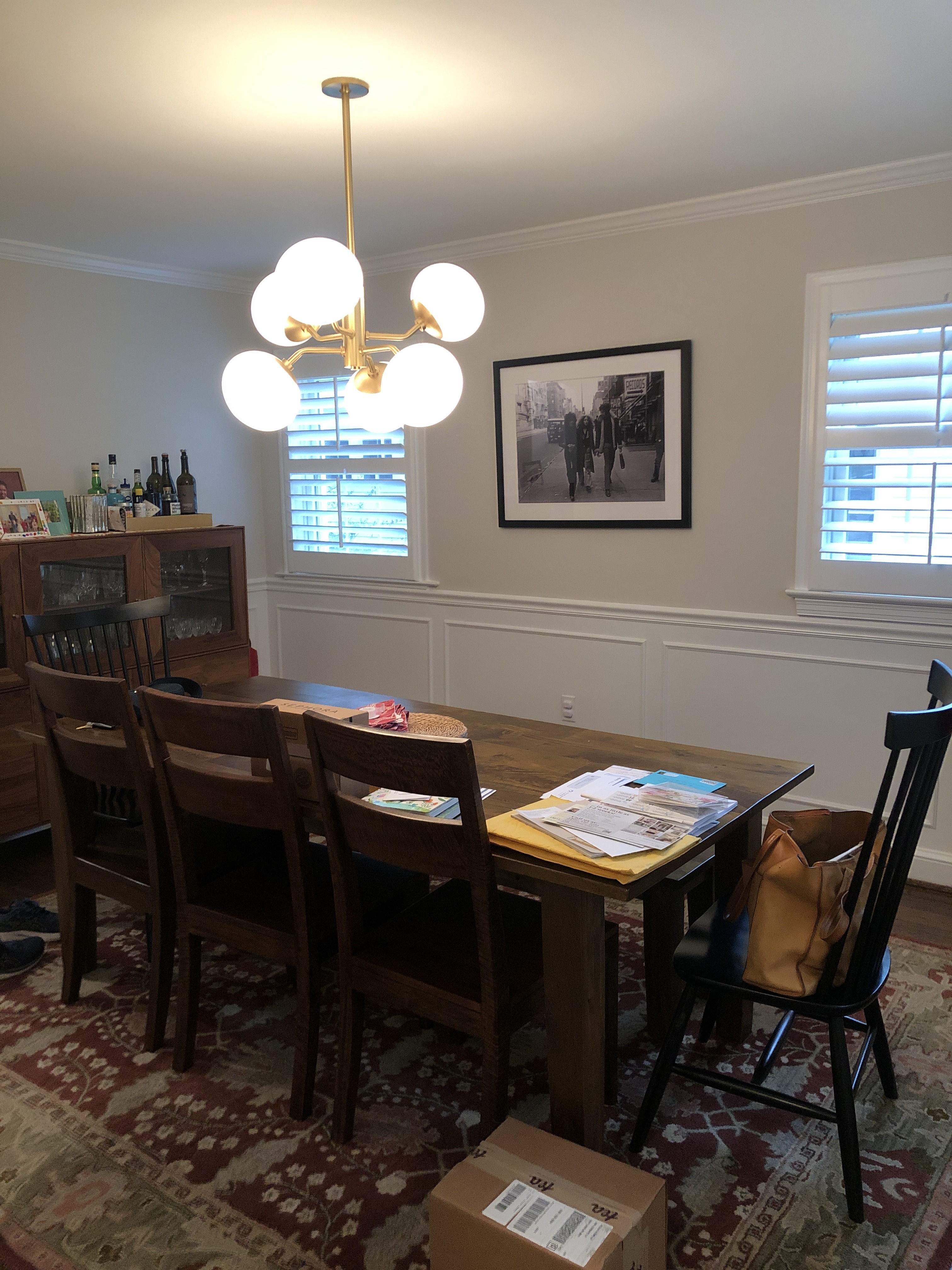
I love seeing a ‘surprise’ room in a home. A space that is still aligned with the design scheme and mood, but will stand out with a bolder design, or bring something unexpected into the mix. ‘The dining room needed something special to make it feel more refined. We fell in love with the scenic wallpaper and let that set the tone for the color story throughout the house,’ explains Kate.
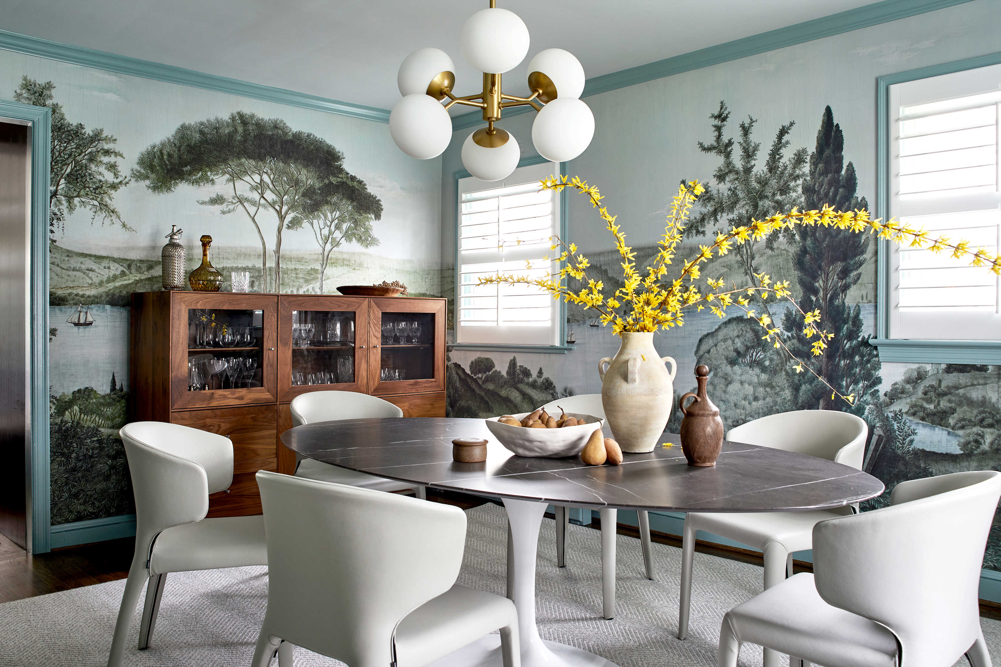
The mix of contemporary and traditional is beautifully balanced through the pairing of a more traditional, scenic wallpaper with modern, minimalist furniture. This approach can be seen throughout the home. The designer adds that ‘natural wool carpets in soft color palettes ground the spaces and tie the overall design together and nod to the more traditional and original elements of the 1930s colonial.’
A family TV room that is chic and ‘hard-wearing’
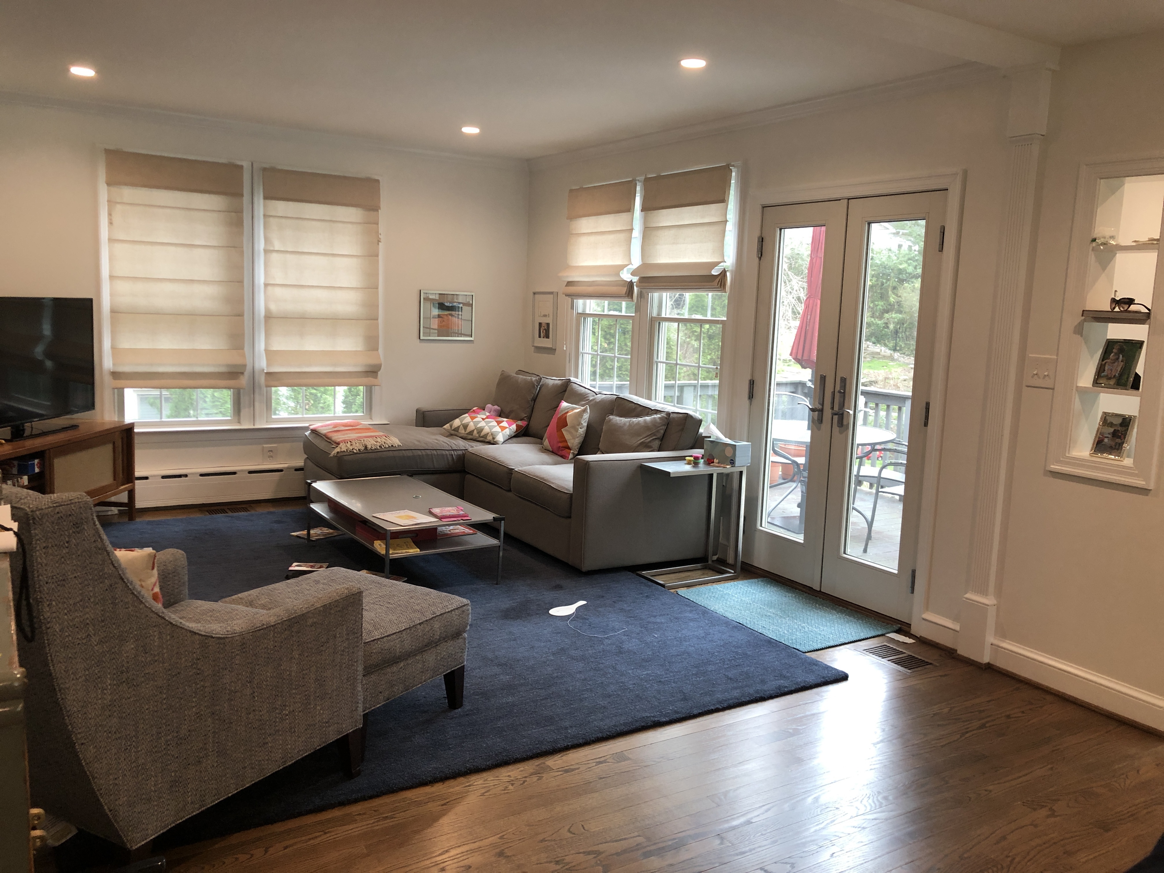
This is a space for the whole family to spend time together in, so it needed to be a welcoming, comfortable space, but more ‘hard-wearing’ so that everyone can relax without worrying too much about the furniture.
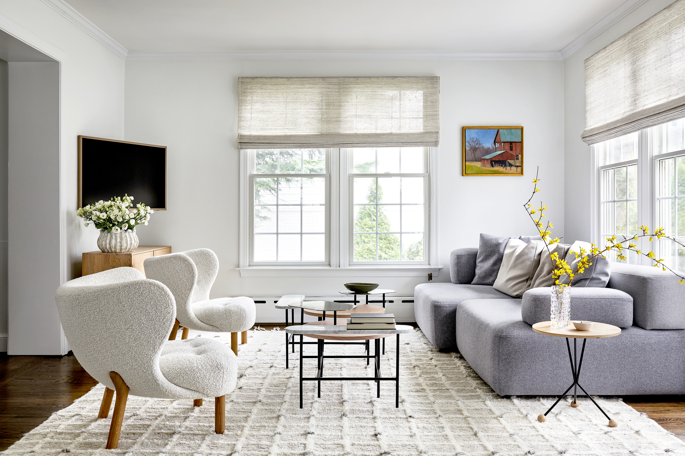
‘The upholstery fabrics on the sofa have a high wool content to naturally repel spills and can be easily cleaned. The sofa while very comfortable for lounging, always looks tailored because there are no loose seat cushions. The nature of the design allows my client’s daughters to play freely and naturally in the room,’ explains Kate.
How to create a sense of retreat in a busy family home
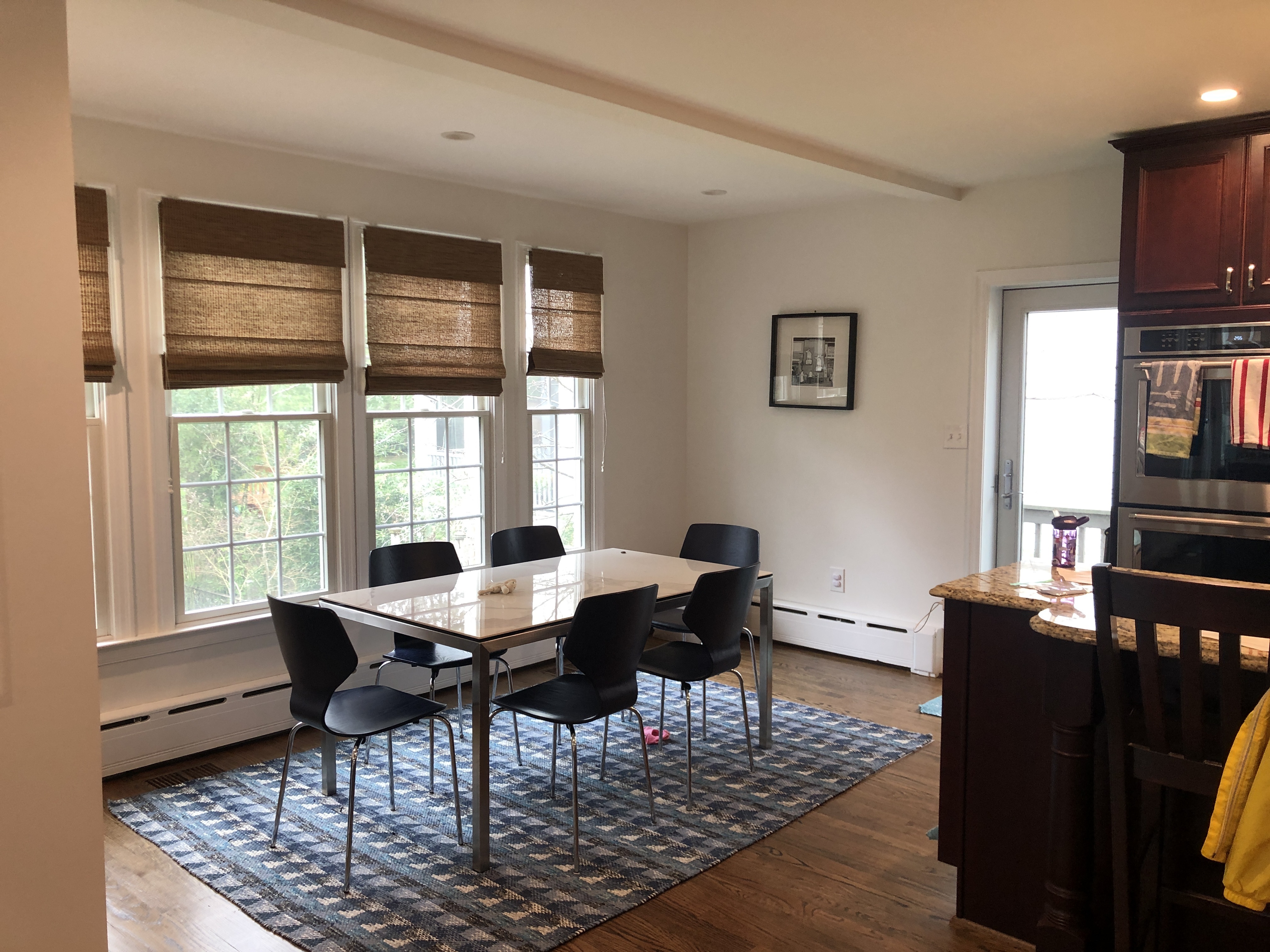
The ideas of ‘calming’ and ‘family home’ might sound like opposites, but the designer achieved just that with the transformation of this property. The concept, she shares, comes from an unexpected source. While sharing inspiration material swatches, the client instantly fell in love with the serene historical setting of Iksel’s “Romantic Bosphorus” wallpaper for their formal dining room, and the palette for the home evolved from there.
Focusing on the tranquility of the wallpaper, Kate Ballou's concept for the home was a “breath of fresh air”. Using soft neutrals with subtle hue variations, the designer kept each room interesting by adding muted blues and greens. ‘Color is so important in creating a serene space. I use color, but in soft and natural tones that are soothing to your eyes,’ she explains.
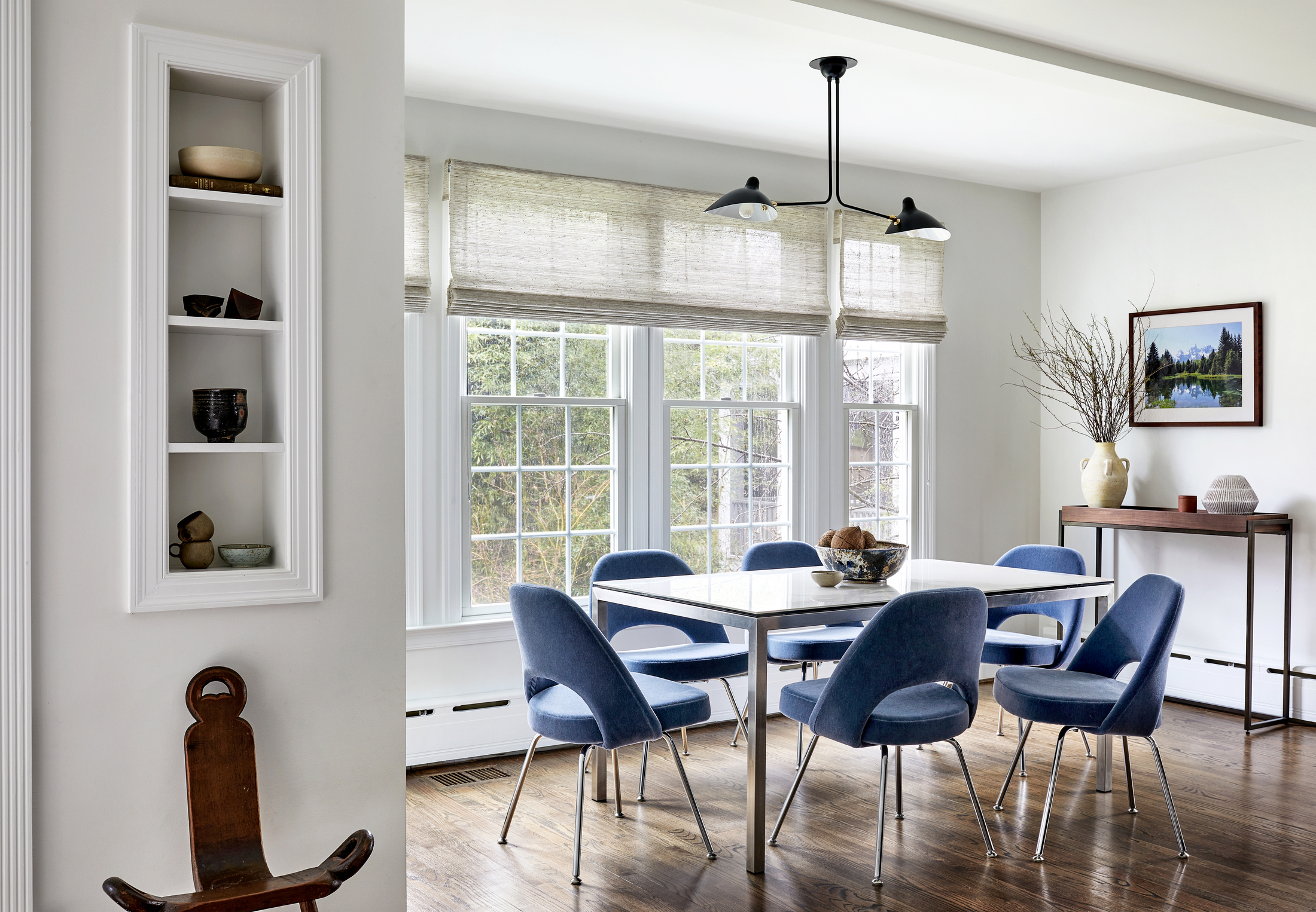
With her client’s young and active family in mind, materials were selected that would be durable, but still unique and fresh, thus ensuring peace of mind for the owners through a relaxed living experience. ‘Add pieces or materials that are unexpected and special, so you have an element of surprise and joy when you move throughout your home,’ advises the designer. ‘A retreat should feel calm but not lifeless, it should awaken your senses in a gentle way.’ And this home is a true testament to that. Blending functionality, multi-use, durable materials with soothing colors, pleasant textures, and comfortable living, a space was created that is perfect for a modern family.
Get the look of this home's chic living room with these buys
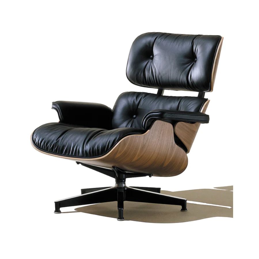
Price: $4,895
As much as this is an investment piece, you won't find many other pieces of furniture that will have the same impossibly cool effect as an Eames lounge chair.
Raluca formerly worked at Livingetc.com and is now a contributor with a passion for all things interior and living beautifully. Coming from a background writing and styling shoots for fashion magazines such as Marie Claire Raluca’s love for design started at a very young age when her family’s favourite weekend activity was moving the furniture around the house ‘for fun’. Always happiest in creative environments in her spare time she loves designing mindful spaces and doing colour consultations. She finds the best inspiration in art, nature, and the way we live, and thinks that a home should serve our mental and emotional wellbeing as well as our lifestyle.
-
 My 10 Favorite Designs at Milan Design Week 2025 — Out of the Hundreds of Pieces I Saw
There is a new elegance, color, and shape being shown in Milan this week, and these are the pieces that caught my eye
By Pip Rich
-
 Iridescence Is Chrome’s More Playful, Hard-to-Define Cousin — And You're About to See It Everywhere
This kinetic finish signals a broader shift toward surfaces that move, shimmer, and surprise. Here's where to find it now
By Julia Demer
