Before & After: This Once Dated, Wood-Clad Home now Channels Cozy Fairytale Cabin Vibes
The hillside home puts a contemporary twist on the cottage-core style
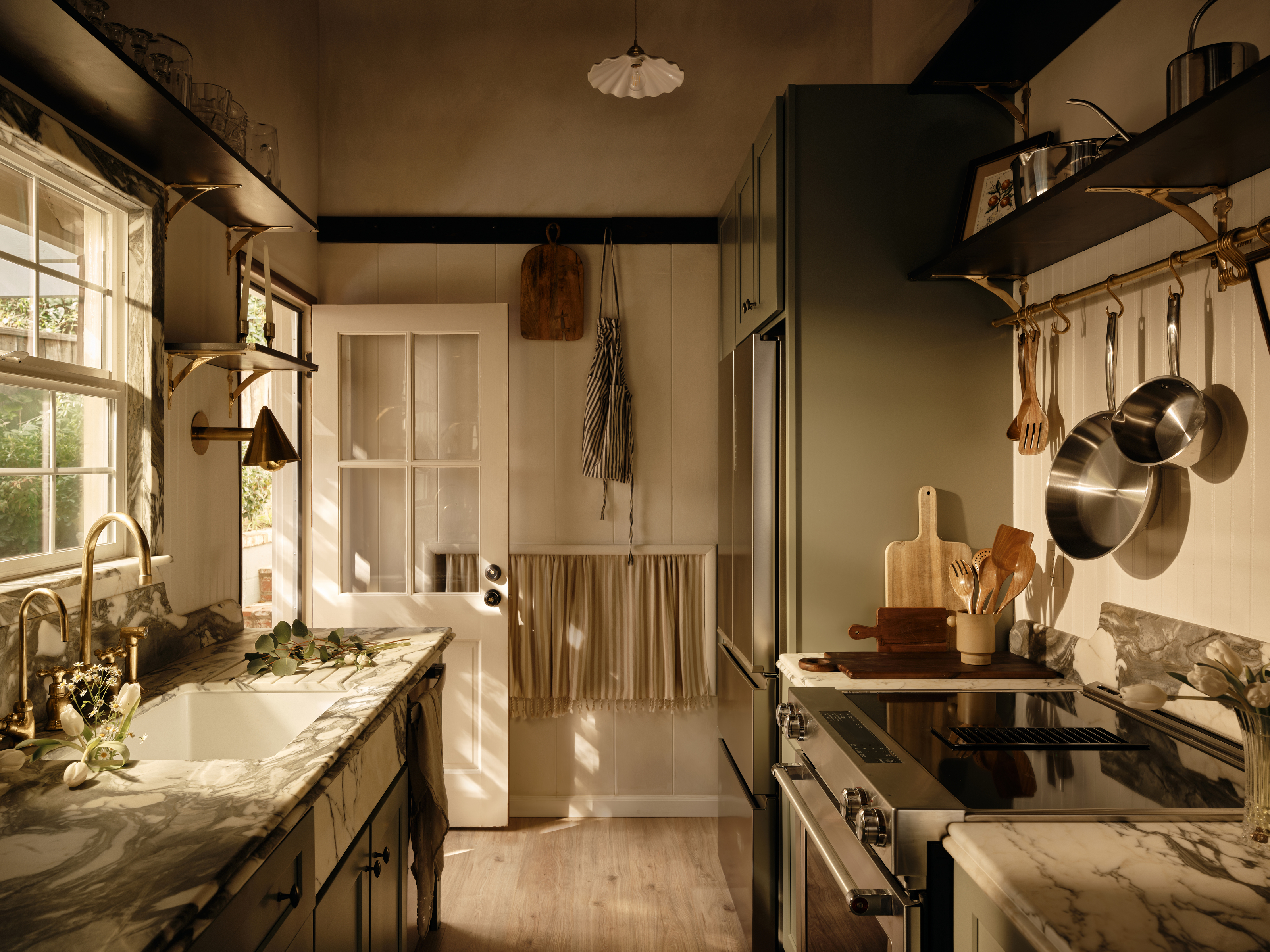

If you love the idea of a Californian cabin straight out of a storybook, then this is the dream home for you. Originally built in the 1950s, this split-level hillside home features two bedrooms and two bathrooms, and the newly renovated fairytale-like interior is one of the most charming and captivating we've ever seen.
Prior to the renovation, the cavernous interior was overwhelmed by dark wood, thick old carpets, and shutters on every window. Since then, the entire home has been remodeled by LA-based designer Naomi Gibson of Gibson House except the original tall ceilings with exposed wood beams, a feature Naomi was keen to preserve to retain some of the original character. The result is a small countryside home that channels cozy chalet energy, featuring lots of marble, warm woods, and vintage flair for an eclectic and curated look that still feels cool and contemporary.
‘The entire house was really outdated but it had such beautiful bones with some clever changes, like moving the doors in both bathrooms and raising the ceiling line in the kitchen,’ explains Naomi. One of the major challenges was trying to configure a thought-out layout despite floorplan limitations. Since the home is built into the hillside, trapezoid-shaped rooms made selecting furniture incredibly challenging, something Naomi overcame by incorporating a large rounded DeSede sectional, a cozy bench under the corner windows in the office, and walls of mirrors to make the rooms feel wider.
The home now feels refreshed and modern with luxurious and unexpected touches around every corner. Here, we take a closer look at this rustic modern home to find out how Naomi and her team worked their magic.
Front Porch
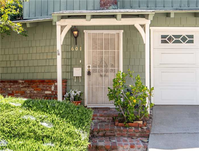
The front porch before the renovation
Before the Gibson House team worked their magic, the front porch, while charming, looked unkempt. Lacking curb appeal, Naomi and her team knew that the property's exterior was in need of a spruce-up, so they decided to remodel the porch, retile the roof, and repaint the walls.

The front porch after the renovation
‘The house was a sad shade of green, so we painted the exterior Sherman-Williams' Alabaster White and it made the charming shingles and contrast brick really sing,' says Naomi. 'We gave the landscaping a refresh with fragrant jasmine, sage, and lavender, and added a tiered vintage horse fountain. To my surprise, the fountain has become a watering hole for dozens of little birds, as though it’s always been there.’
Kitchen
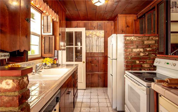
The kitchen before the renovation
The dark, wood-clad kitchen felt drab and dated, with aging floor tiles and retro appliances. While the heavy wood and brick interior had a rustic charm that Naomi wanted to retain, she knew the space needed a contemporary redesign.
Be The First To Know
The Livingetc newsletters are your inside source for what’s shaping interiors now - and what’s next. Discover trend forecasts, smart style ideas, and curated shopping inspiration that brings design to life. Subscribe today and stay ahead of the curve.

The kitchen after the renovation
With a vintage-inspired aesthetic, the charming space now feels super cozy. Sage green cabinetry, dark veined marble countertops, and brass hardware make for a rustic kitchen feel that's classic and timeless.
Naomi emphasizes the importance of maintaining a good balance of materials and having a light hand in the design of a vintage-inspired space. 'For example, I added a beadboard backsplash in small amounts, a peg rail at the transition from the wood paneling, and an oversized pot rail from Devol,' she says. 'To keep it modern, I used sleek brass sconces, tiny almond cabinet knobs, and stainless steel appliances.'
Pairing dark wood with delicate marbles makes a real statement with a contrastive feel, something Naomi claims makes the space feel more inviting and 'livable', 'like you won’t mess it up if you also bring in shoes and toys and books and real-life mess,' she says. 'The calming effect of natural materials but the movement of stone and wood just feels so good together!'
Living Room
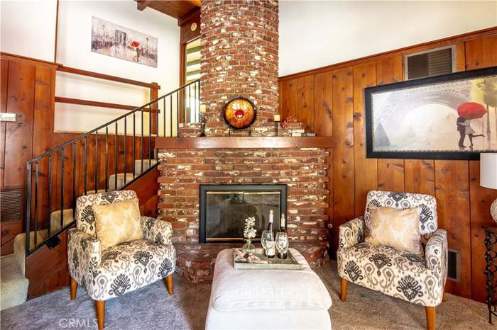
The living room before the renovation
The living room featured a huge brick fireplace that offered the perfect spot to unwind, but the interiors detracted from the impressive brick work. With an overwhelming amount of red-brown in the room and heavy thick carpet, the space felt dated and dark.

The living room after the renovation
Now, though, Naomi has done away with the overbearing wood-clad walls. 'The house was too small to keep all of them, it needed a lighter resting point for the eye to really appreciate the wood in contrast,' she says. 'Instead of demolishing them, I painted them with limewash so I could keep the vertical line details and subtle texture.'
The fireplace also became a mainstay, modernized with a marble surround that gives it a more expensive feel and a dramatic look. 'I loved the curve of the fireplace and its floor-to-ceiling presence - but it was originally all brick which felt so heavy and dark,' notes Naomi. 'We first skim-coated it in concrete and then applied Meoded Marmorino plaster to give it a slightly shiny finish. I worked closely with my marble fabricator to frame out the hearth and facet the stone around the fire to bounce the light of the flames out into the room.'
Dining Area
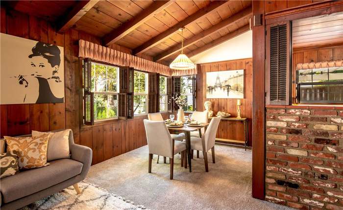
The dining area before the renovation
The cabin-style dining room felt warm and inviting, but once again, the overwhelming wood tones aged the space. Naomi and her team knew they still wanted a super warm and inviting space despite a more modern aesthetic, so they went heavy on the layered textures, including wood, leather, mirrors, wool rugs, jute, and linen.

The dining area after the renovation
The new dining room now feels like something out of a fairy tale with rustic chairs, linen curtains, and statement candle stick holders. 'The brutalist bench was imported from Belgium via Chairish,' says Naomi. 'The vintage Danish chairs are from Amsterdam Modern while the lion clawfoot table is from a thrift store. And the teak Brutalist light fixture is from The Netherlands via Etsy.'
The overall feel channels cozy cabin vibes, with a touch of cottagecore thrown in for good measure. ‘We’ve been calling it a little canyon chalet,' Naomi explains. 'It has the feels of a house you would find in Laurel Canyon mixed with a cabin in Big Bear. I love to mix design styles to create a “collected and traveled” feeling in the home.'
Master Bedroom
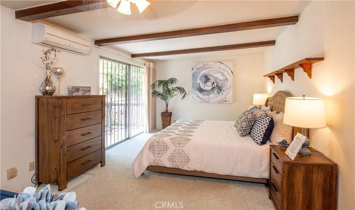
The master bedroom before the renovation
The master bedroom felt lackluster and lacked any personality, something Naomi altered completely by removing the carpet, painting the walls, and reconfiguring the floorplan to make the most of the beautiful balcony.
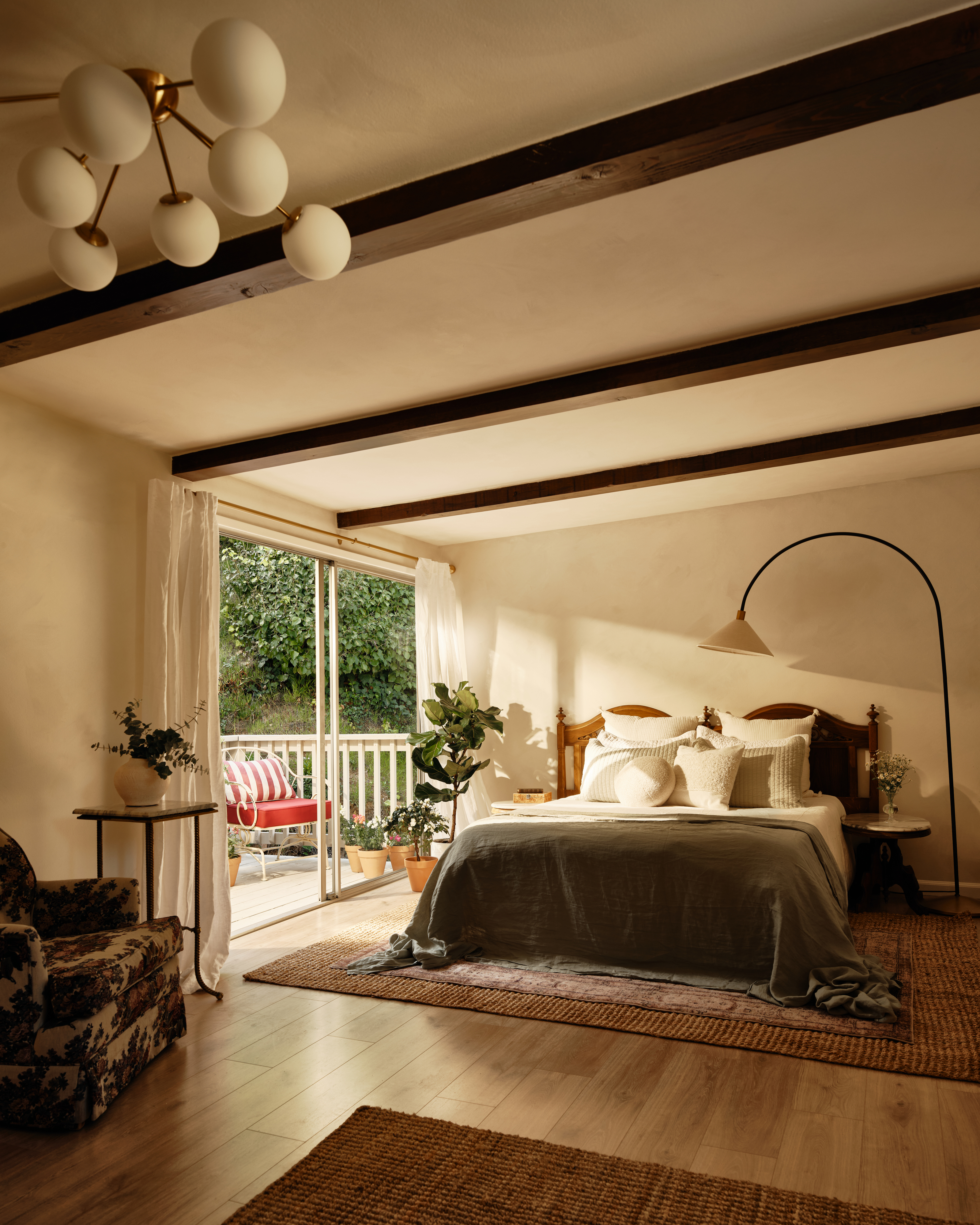
The master bedroom after the renovation
With its limewash walls, dark wooden beams, and linen textiles, the space now feels far calmer. 'The clean wood floors instead of carpet really lighten up the space,' adds Naomi. 'I also stripped and stained the painted wood beams in the bedrooms, and added custom dramatic wall sconces to bring in lots of soft light. Removing the old wet bar, adding a large round picture window, and moving the bed placement opened everything up.'
Bathroom
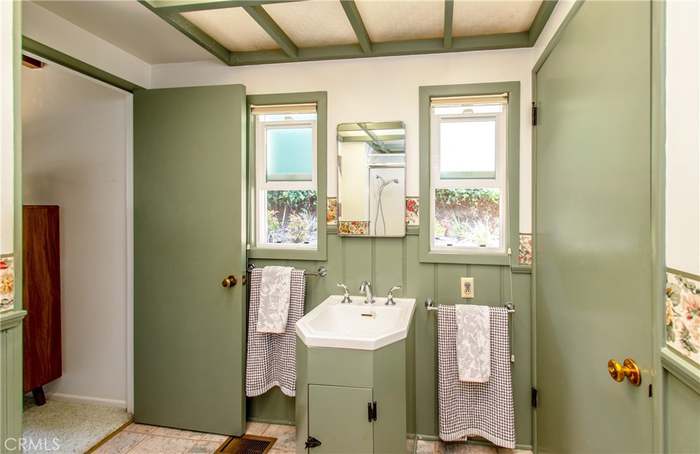
The bathroom before the renovation
Lastly, the previous bathroom was painted a calming sage green with a coffered ceiling and cute symmetrical windows. It failed to maximize the space, however, and the Jack and Jill layout made it even harder to make use of the space.
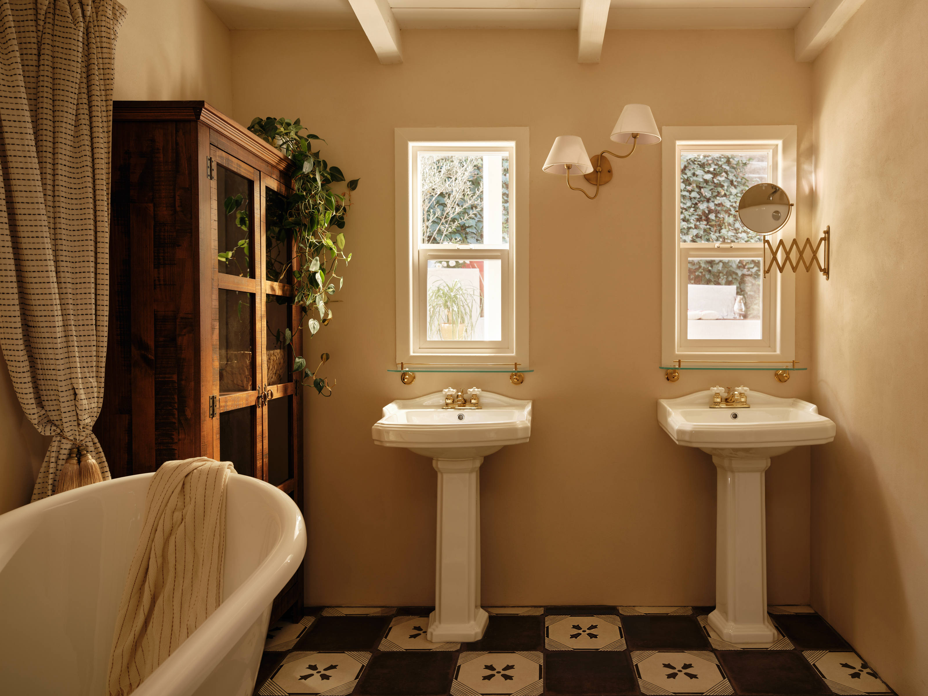
The bathroom after the renovation
Instead, Naomi closed off one side of the room and added double pedestal sinks for a more practical bathroom that offers double the utility. 'When designing this bathroom I was really inspired by old-world bathrooms that feel like the white porcelain fixtures are “plopped” down in the room,' she notes. 'It makes the space feel bigger and calmer, and allows me room to add a large vintage wood cabinet.'
We can't get enough of the rustic charm throughout this hillside home. If you're designing a small space, let this transformation act as evidence that leaning into a cozy vibe really can work in your favor if you want the most inviting feel possible.
Get the look

Lilith Hudson is a freelance writer and regular contributor to Livingetc. She holds an MA in Magazine Journalism from City, University of London, and has written for various titles including Homes & Gardens, House Beautiful, Advnture, the Saturday Times Magazine, Evening Standard, DJ Mag, Metro, and The Simple Things Magazine.
Prior to going freelance, Lilith was the News and Trends Editor at Livingetc. It was a role that helped her develop a keen eye for spotting all the latest micro-trends, interior hacks, and viral decor must-haves you need in your home. With a constant ear to the ground on the design scene, she's ahead of the curve when it comes to the latest color that's sweeping interiors or the hot new style to decorate our homes.
-
 The 'New British' Style? This Victorian London Home Embraces Its Owners' Global Background
Warm timber details, confident color pops, and an uninterrupted connection to the garden are the hallmarks of this relaxed yet design-forward family home
By Emma J Page
-
 Muji Living Room Ideas — 5 Ways to Harness The Calming Qualities of This Japanese Design Style
Inspired by Japanese "zen" principles, Muji living rooms are all about cultivating a calming, tranquil space that nourishes the soul
By Lilith Hudson

