Explore this stunning Belgian townhouse - a lesson in decorating with white
This family’s pared-back Belgian townhouse is the perfect place for a party
THE PROPERTY
A five-storey townhouse and modern home in the centre of Antwerp in Belgium. The owner has a design studio on the ground floor. There’s a living room, dining room, kitchen and terrace on the first floor. The second floor has the owner’s bedroom, an en-suite bathroom and dressing room. another bedroom and en suite. A third bedroom, another bathroom and a WC are on the third floor. The upper level has two further bedrooms and a roof terrace.
ENTRANCE HALL
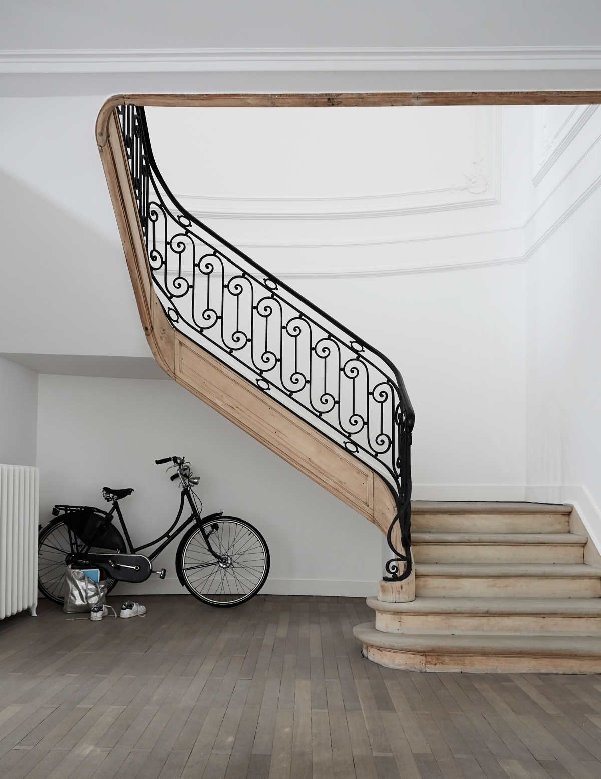
With a glamorous staircase that’s just made for sweeping down, wood floors ideal for dancing across and white walls that set off a designer dress to perfection, there couldn’t be a more perfect place for entertaining. But this stunning townhouse isn’t just a one-night wonder – it enjoys a 365-days-per-year existence as a family home and work space too.
See Also: Chic Hallway Ideas That Make An Entrance
DINING ROOM
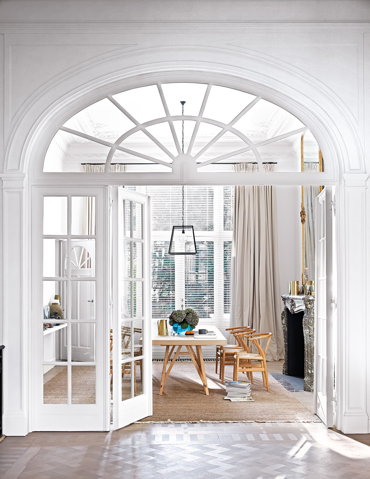
The house dates back to the late 19th century, but wears its modern, multitasking persona well. The scale of the building helps – graceful floor-to-ceiling windows flood each room with light; high ceilings give its occupants space to breathe; floors seem to go on forever.
Every room in the house is used, so it still feels alive and warm even when the kids are away. The home owner opened it up to make the most of the light and original features, but also added soft fabrics and rich textures to ensure it stays cosy and inviting.
The dining room encapsulates a timeless look: a marble fireplace, modernist chairs and a contemporary table creating a serene and stylish space.
LIVING ROOM
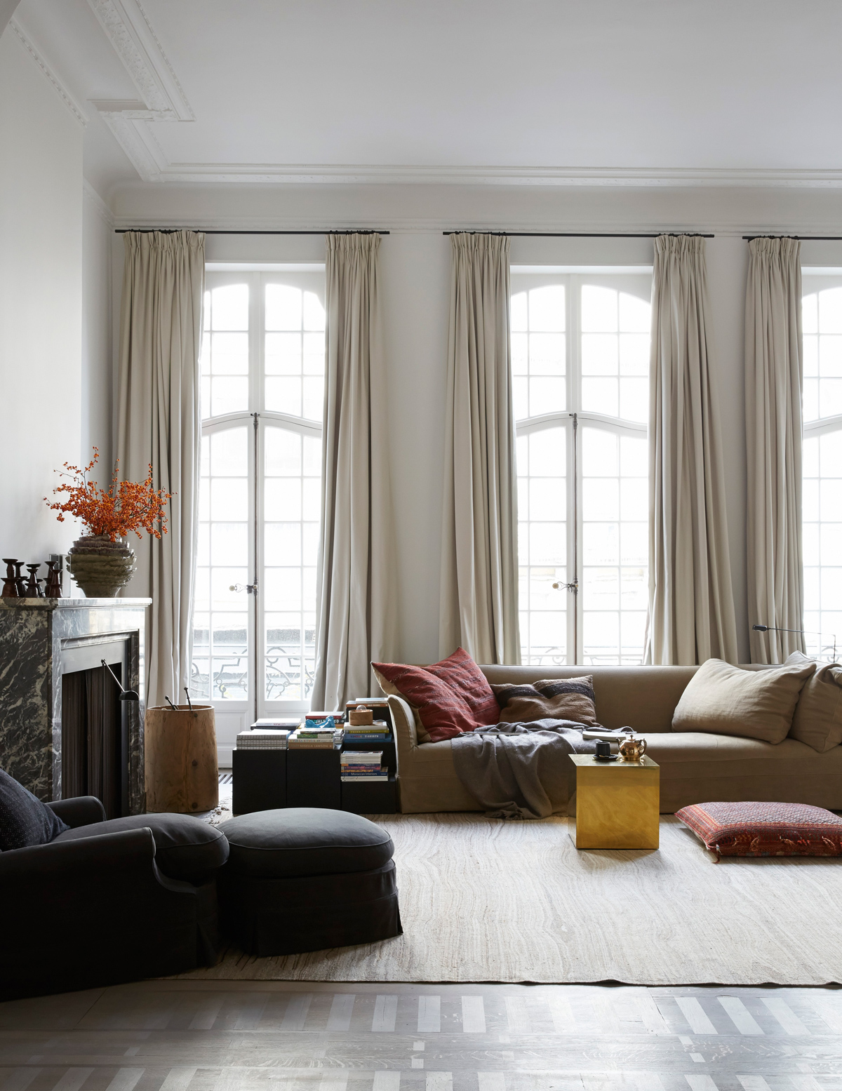
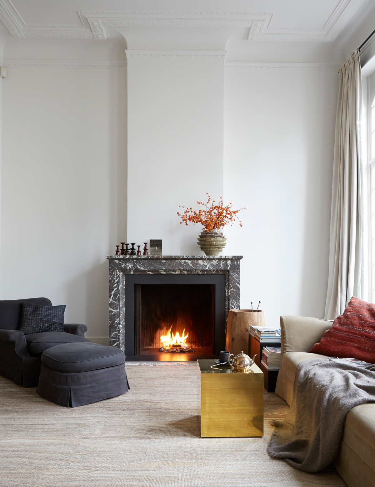
The townhouse has period proportions – floor-to-ceiling French windows open out on to a balcony.
Be The First To Know
The Livingetc newsletters are your inside source for what’s shaping interiors now - and what’s next. Discover trend forecasts, smart style ideas, and curated shopping inspiration that brings design to life. Subscribe today and stay ahead of the curve.
As in the rest of the property, the floorboards were kept bare.
As the space is so vast, the curtains needed to be really long and heavy to suit the scale of the windows and the chairs had to be oversized so they didn’t get lost in a room.
Books, photos and the spinning sails of a suspended mobile all add depth to the rooms.
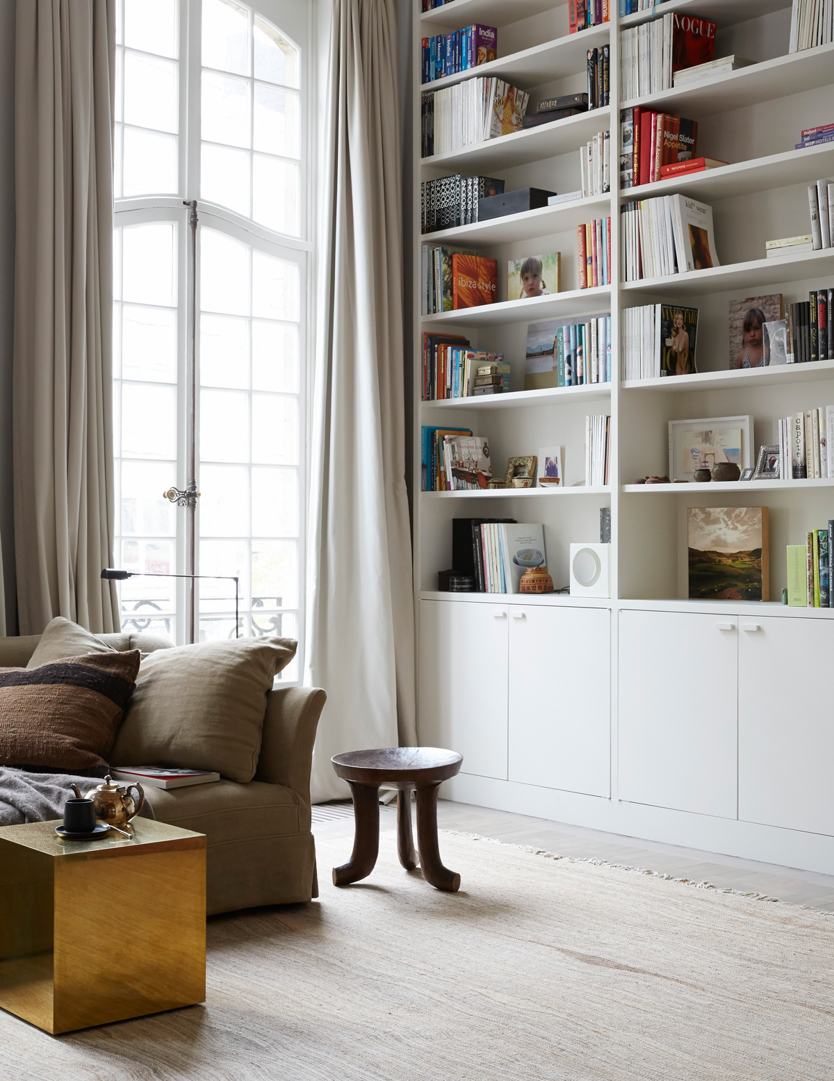
The living room is left mostly uncluttered, with minimal furniture, so softness and colour was added by way of cushions, to help the space look more warm and inviting.
See Also: Cosy living room ideas
KITCHEN
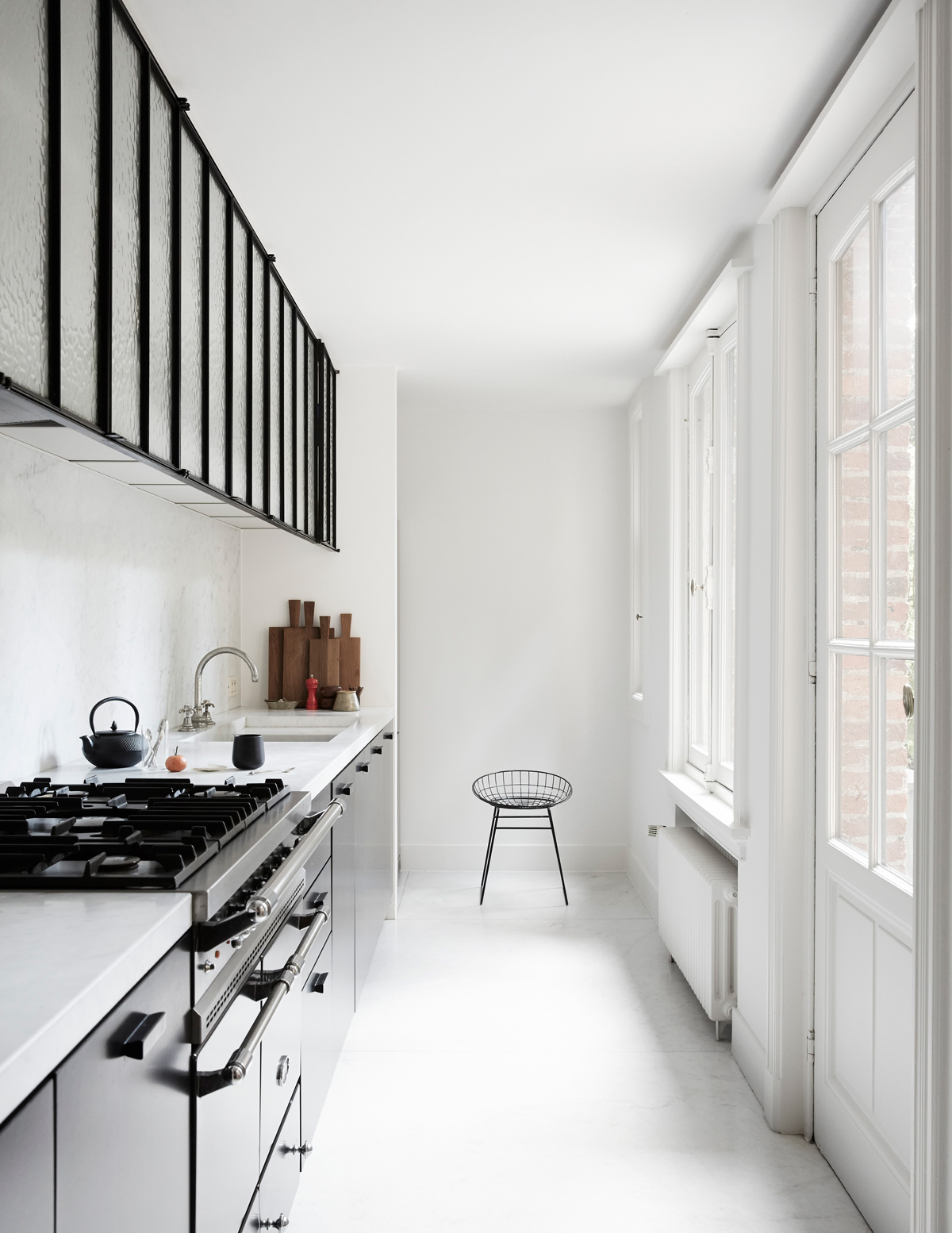
This kitchen is long and narrow, but it was left in its original position, rather than being moved to a larger room. It’s really functional and the glass wall units and adjacent terrace add a sense of space.
FIRST-FLOOR LANDING
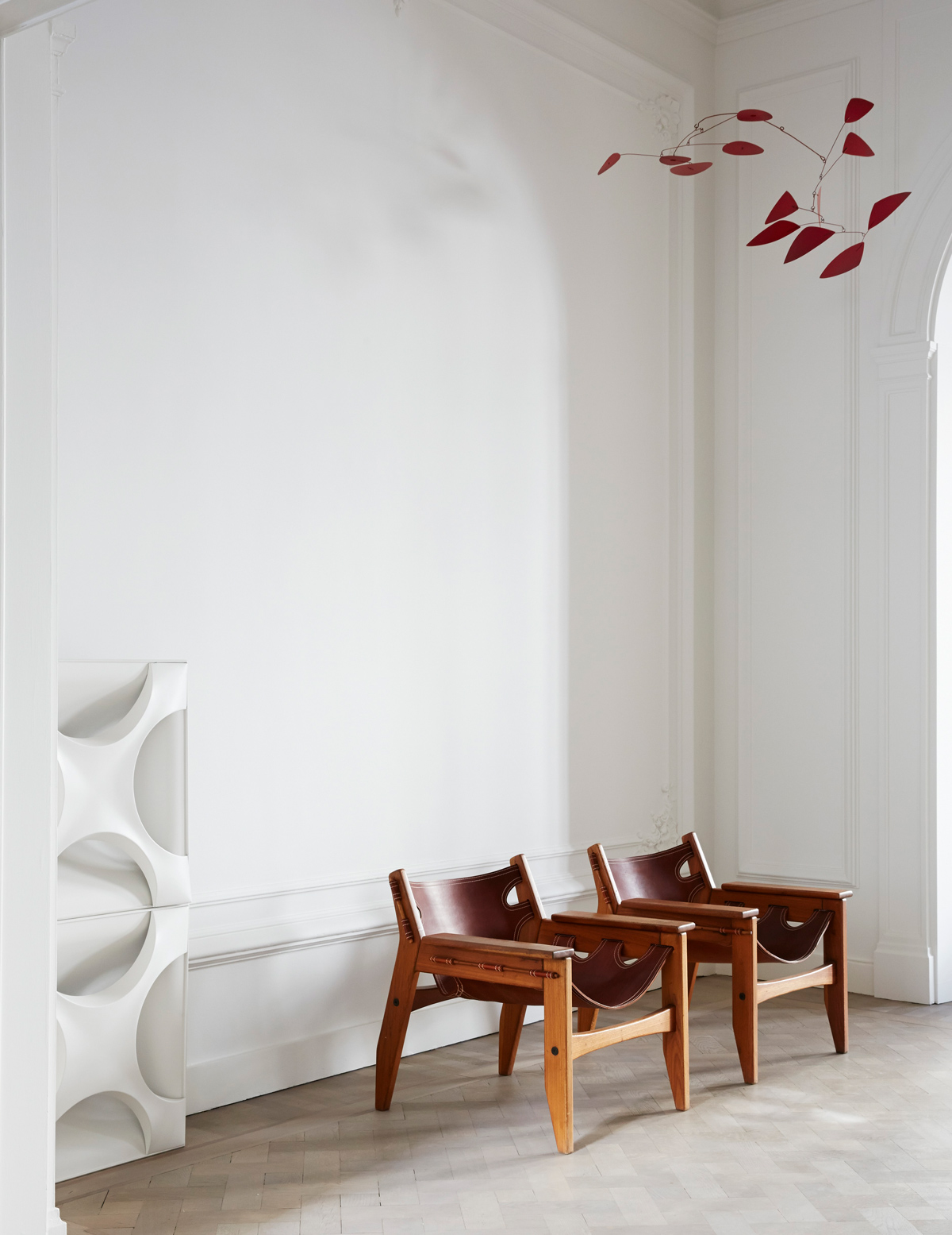
Panelled walls and light-coloured floors help frame a carefully selected edit of artwork and furniture.
EN-SUITE BATHROOM
Clever carpentry is the secret to this glamorous scheme. Double doors divide it from the bedroom, while inside, the ‘cupboards’on either side of the bath conceal the loo and the shower.
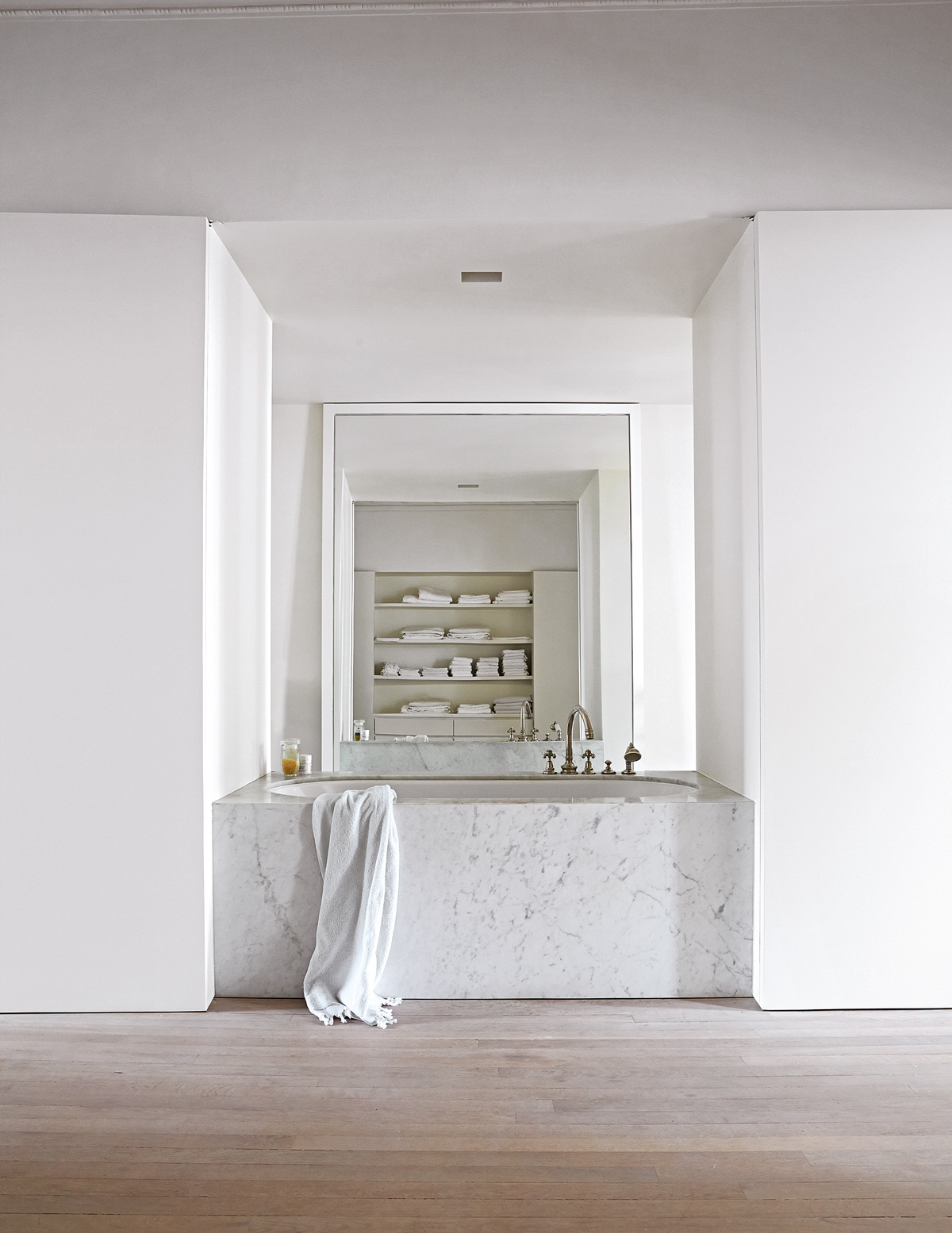
More cabinetry provides storage for nail varnishes and make-up.
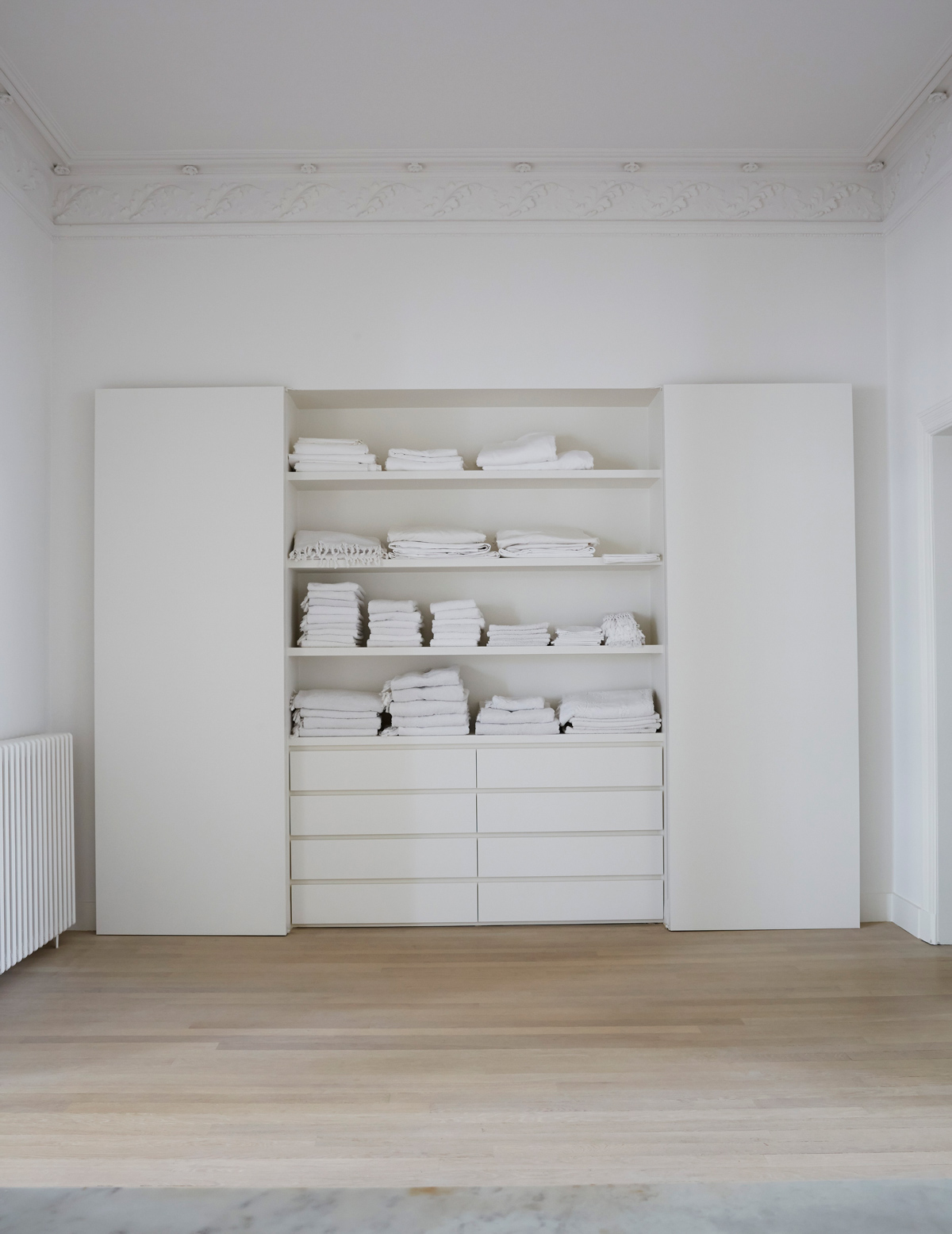
MASTER BEDROOM
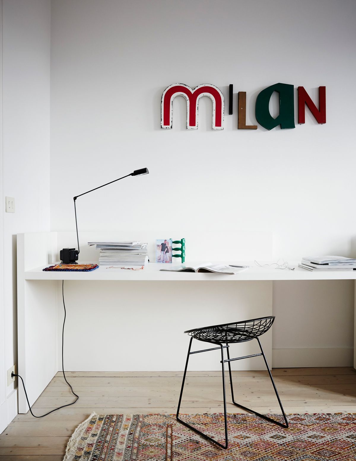
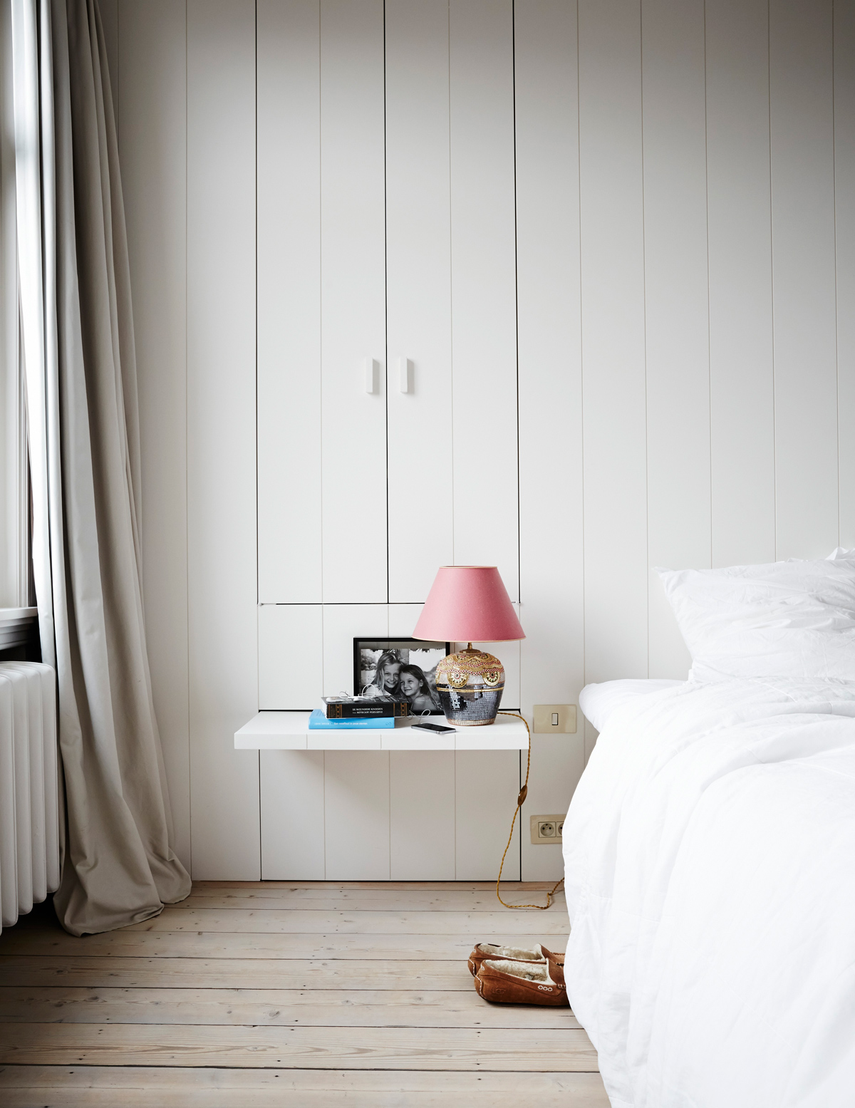
To create a timeless look, everything in this home was pared back, with just a very few materials recurring throughout – Carrara marble, unvarnished wood, glass – and a palette of black, white and taupe. The only bling is a gilt mirror on a marble fireplace.
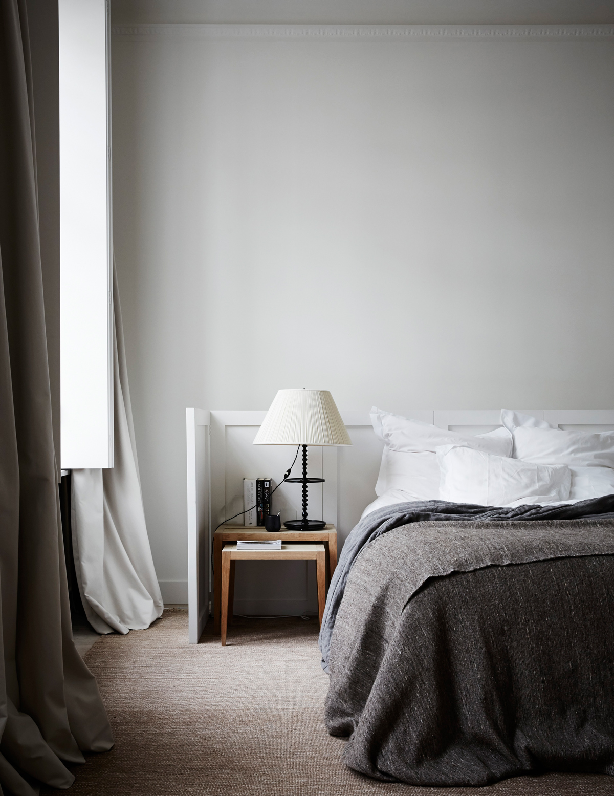
The fireplace in the bedroom is blocked up, so it was filled with a collection of magazines. It keeps them out of the way, and adds a quietly quirky touch.
GIRLS' BATHROOM
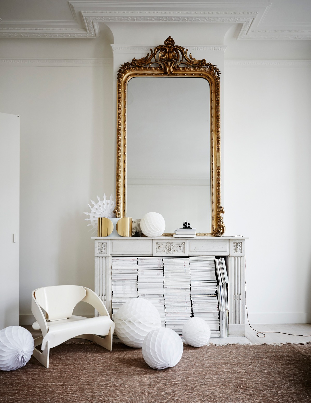
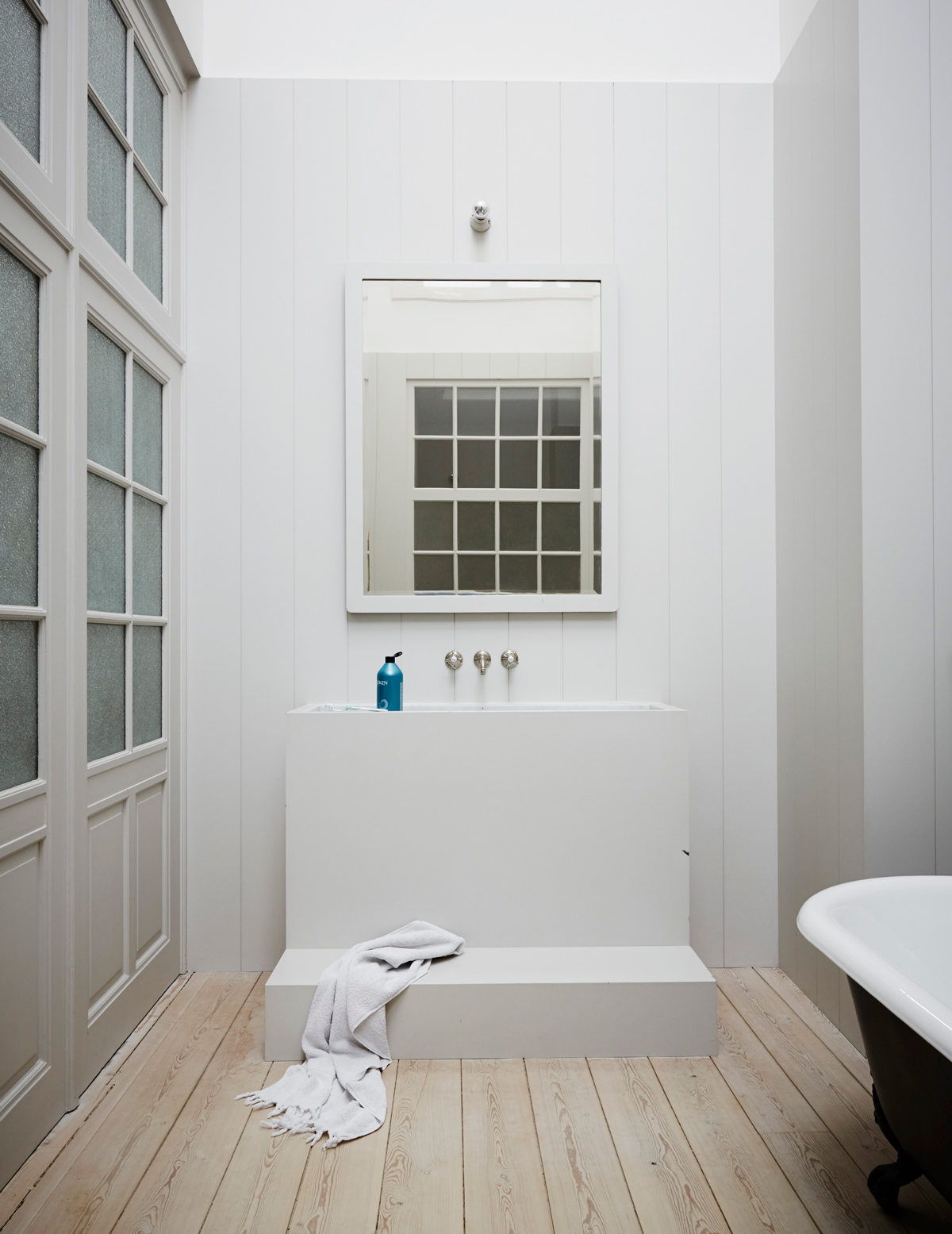
Cladding the walls in tongue-and-groove panelling adds to the stripped-back feel. The inset basin is another clever touch.
GIRLS' ROOM
Kilim rugs brought back from Turkeyadd warmth and texture to the décor.
EXTERIOR
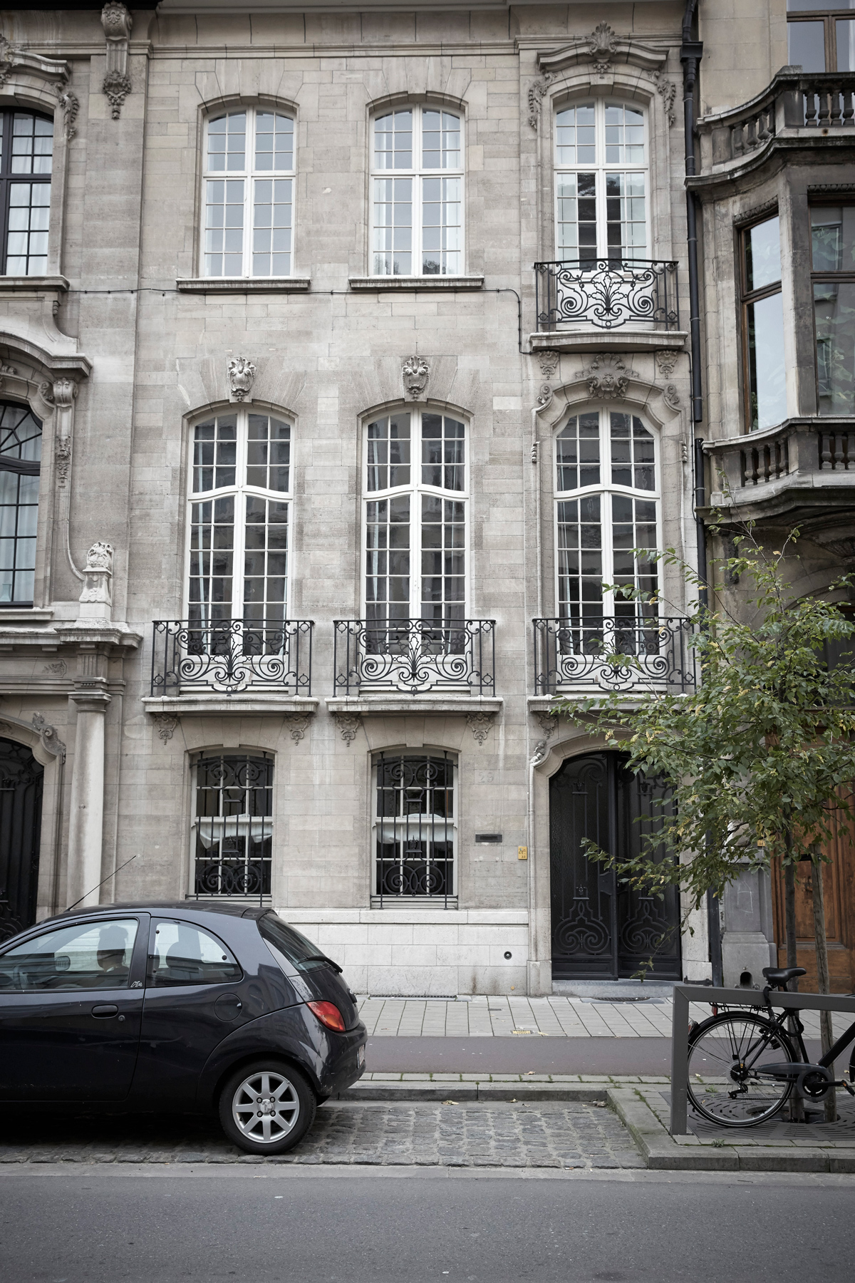
Grey granite punctuated by huge panes of glass and wrought-iron balconies makes a grand impression.
See more of this architect’s work at vincentvanduysen.com
Photography / Paul Massey
The homes media brand for early adopters, Livingetc shines a spotlight on the now and the next in design, obsessively covering interior trends, color advice, stylish homeware and modern homes. Celebrating the intersection between fashion and interiors. it's the brand that makes and breaks trends and it draws on its network on leading international luminaries to bring you the very best insight and ideas.
-
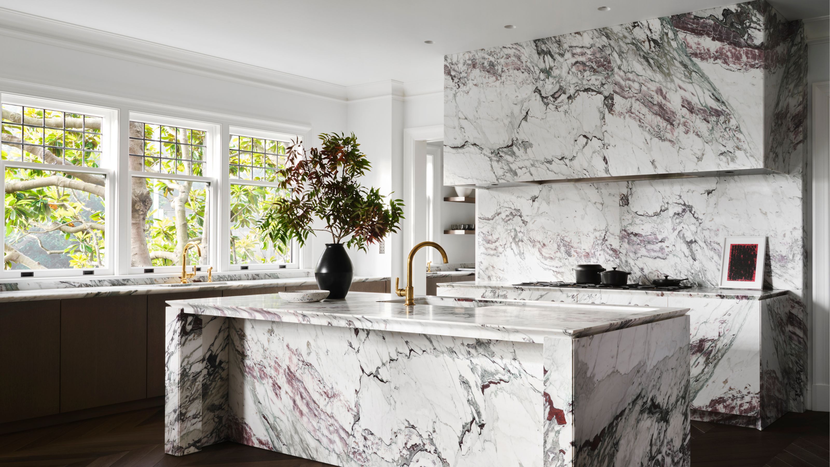 5 Kitchen Stone Trends We’ll See in 2025 — Experts Highlight the Show-Stopping Finishes Taking Center Stage
Let’s be honest: there’s nothing more lasting and versatile for kitchen surfaces than stone. These are the timeless choices you should make in 2025
By Aditi Sharma
-
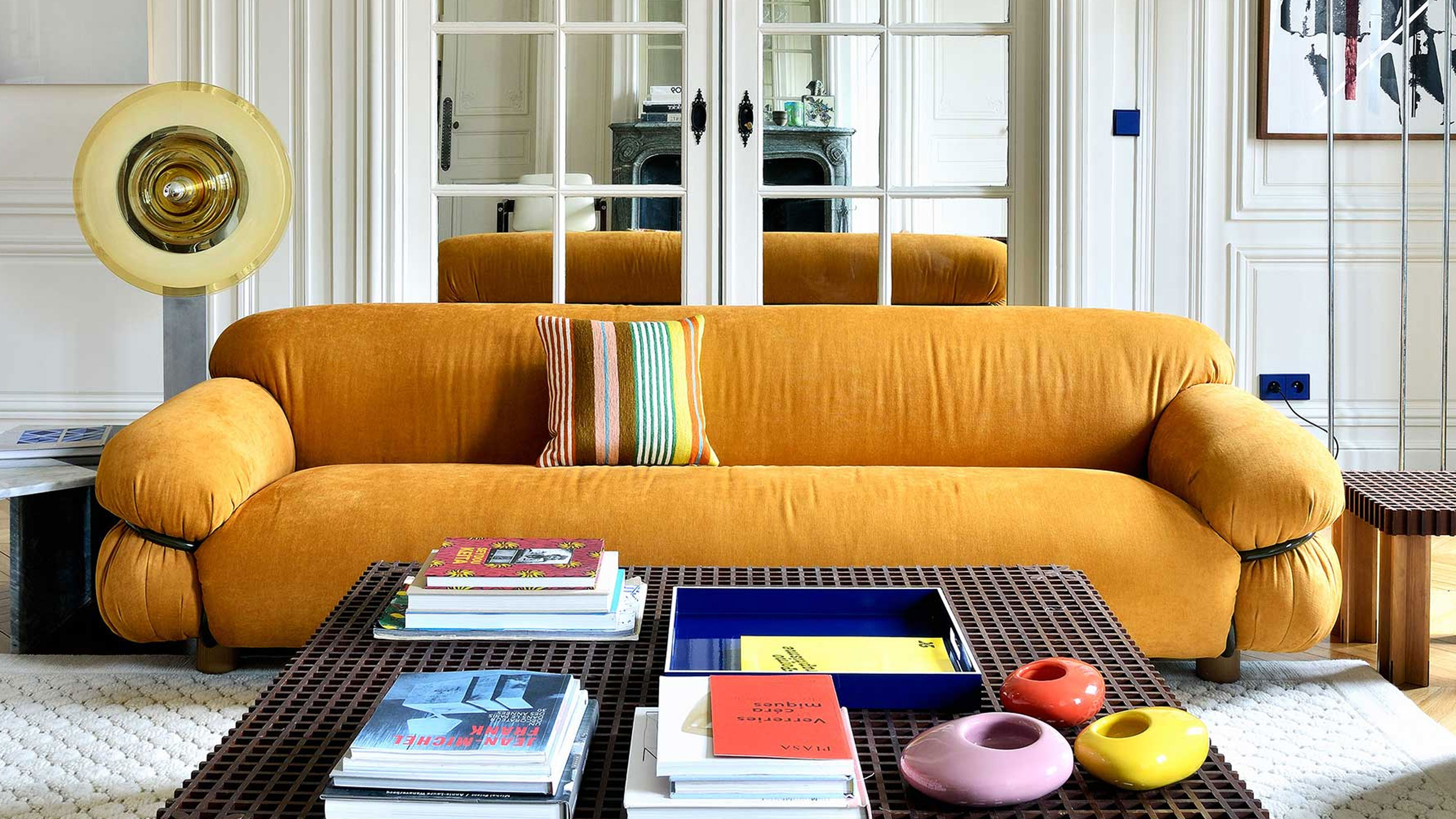 What Does the Color Yellow Mean in Interior Design? A Color and Design Psychology Expert Explains
Whether you love or hate it, yellow always seems to elicit a strong reaction from people — here, we explain why
By Karen Haller