What Our Favorite 7 Projects From London Design Festival Reveal About Makers' "Next Big Thing"
The British capital's design marathon might have just come to a close, but what do the installations unveiled teach us about the aspirations currently redefining the future of this field? Here are some predictions

The Livingetc newsletters are your inside source for what’s shaping interiors now - and what’s next. Discover trend forecasts, smart style ideas, and curated shopping inspiration that brings design to life. Subscribe today and stay ahead of the curve.
You are now subscribed
Your newsletter sign-up was successful
The 22nd edition of the London Design Festival has just left the British capital after nine days punctuating the city with striking installations, monumental public projects, and avant-garde showroom launches. While enthusiasm around the event is bound to fizzle, there's no time like the present to look back at some of the projects we loved most from its expansive programming and explore the significance they hold beyond their showcase run.
From casting new light on temporarily forgotten architectural styles and reinventing craftsmanship through a tech-led, contemporary lens, to stressing the influence that everyday objects play in our lives, each of the seven design exhibitions below demonstrate how today's designers and makers are embracing their practice to connect the dots between the past, present, and future of design and humanity as a whole. How? Scroll to learn more.
1. Putting Concept Front and Center
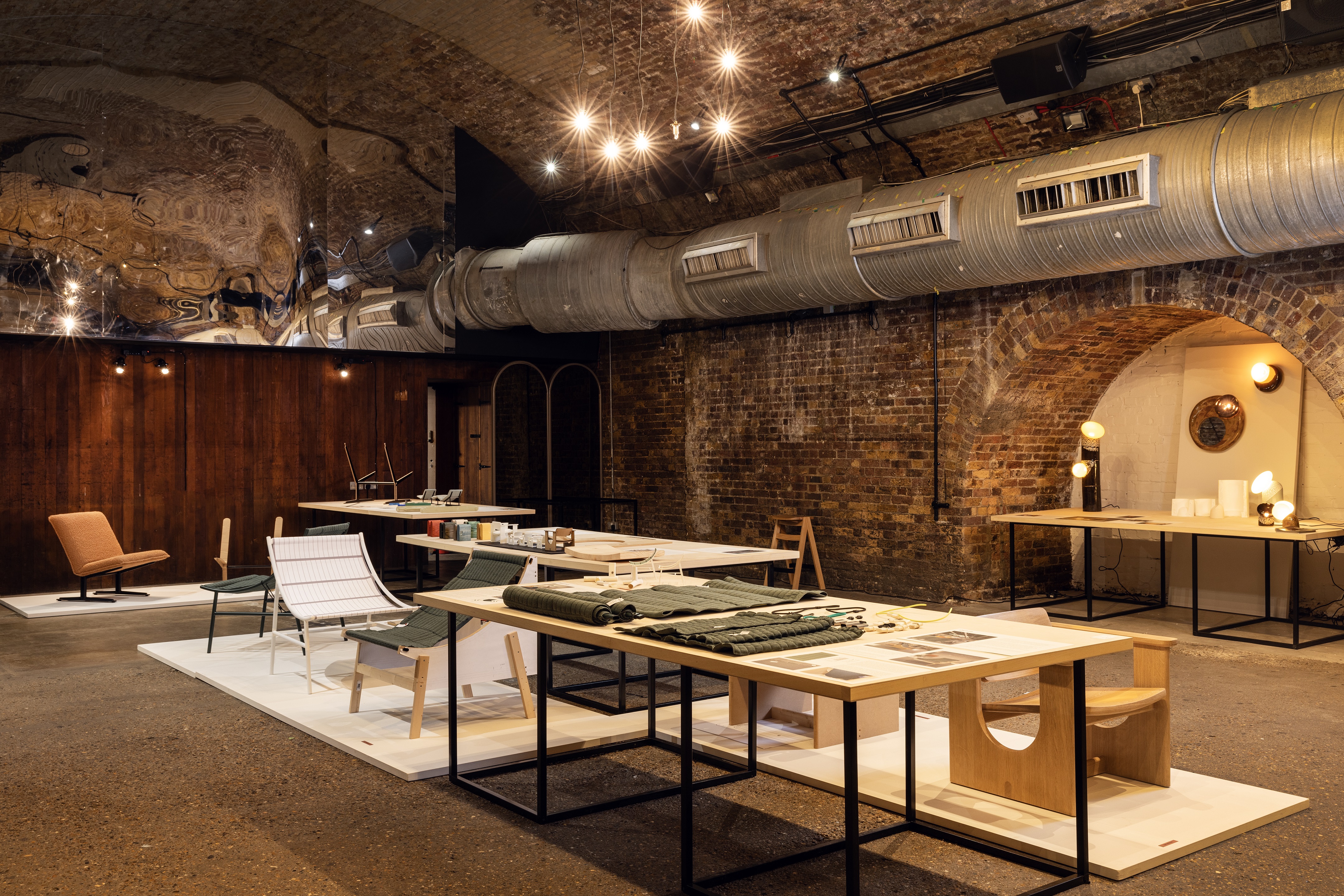
Furniture drops, exhibition launches, and showroom activations rarely reveal anything about the process that went into making specific design objects. Instead, they are traditionally presented in their finished form. Design studios Atelier Thirty Four, David Irwin, and SmithMatthias, the three founding members of LDF's group exhibition Proof of Concept, wanted to change that. "We came up with Proof of Concept to shine a light on the often-overlooked stages of the design process — those moments of innovation that face real challenges, from limited funding to finding support from larger manufacturers," they tell me. Offering people a rare glimpse at the thoughtful and considered work that goes into bringing an idea to life, the showcase "is a celebration of the ingenuity and perseverance of designers across disciplines".
Article continues belowBringing together furniture, product design, ceramics, textiles, and architectural projects by ten emerging designers and studios, Proof of Concept guided visitors through "the journey behind every creation, whether it made it to market or not," add the co-founders. Here, sketches, models, prototypes, tests, and development artifacts were spotlighted within the warmly lit atmosphere of Shoreditch Design Triangle's 83 Rivington Street along with the end result, inviting viewers to engage with the history of each item from start to finish.
Highlights included a minimalism-inspired sling chair by David Irwin which, informed by the notion of circularity, was "crafted from a single material made from recycled content" to minimize waste while retaining comfort; Atelier Thirty Four's upholstered cast-iron 1909 Lounge Chair, a mid-century modern furniture piece developed in partnership with different local manufacturers to celebrate the human connections behind great craftsmanship; and the solid timber Arcade Chair by SmithMatthias, an experience and planet-optimized item whose beautifully essential design is meant to "be treasured."
2. Unlocking Furniture's "Playfulism"
Unexpected silhouettes are reshaping the essence of contemporary design, as reported in both our Trends issue and in a recent article on rising studios Soft Geometry and Sam Klemick. So, what is the rise of whimsical furniture all about? For British artist and designer Faye Toogood, the mind behind LDF's Poltrona Frau-backed A Squashed Space installation, these playful creations stem from an urge to enhance the human experience through homeware, removing both physical and metaphorical obstacles that can hinder its most enjoyable fruition.
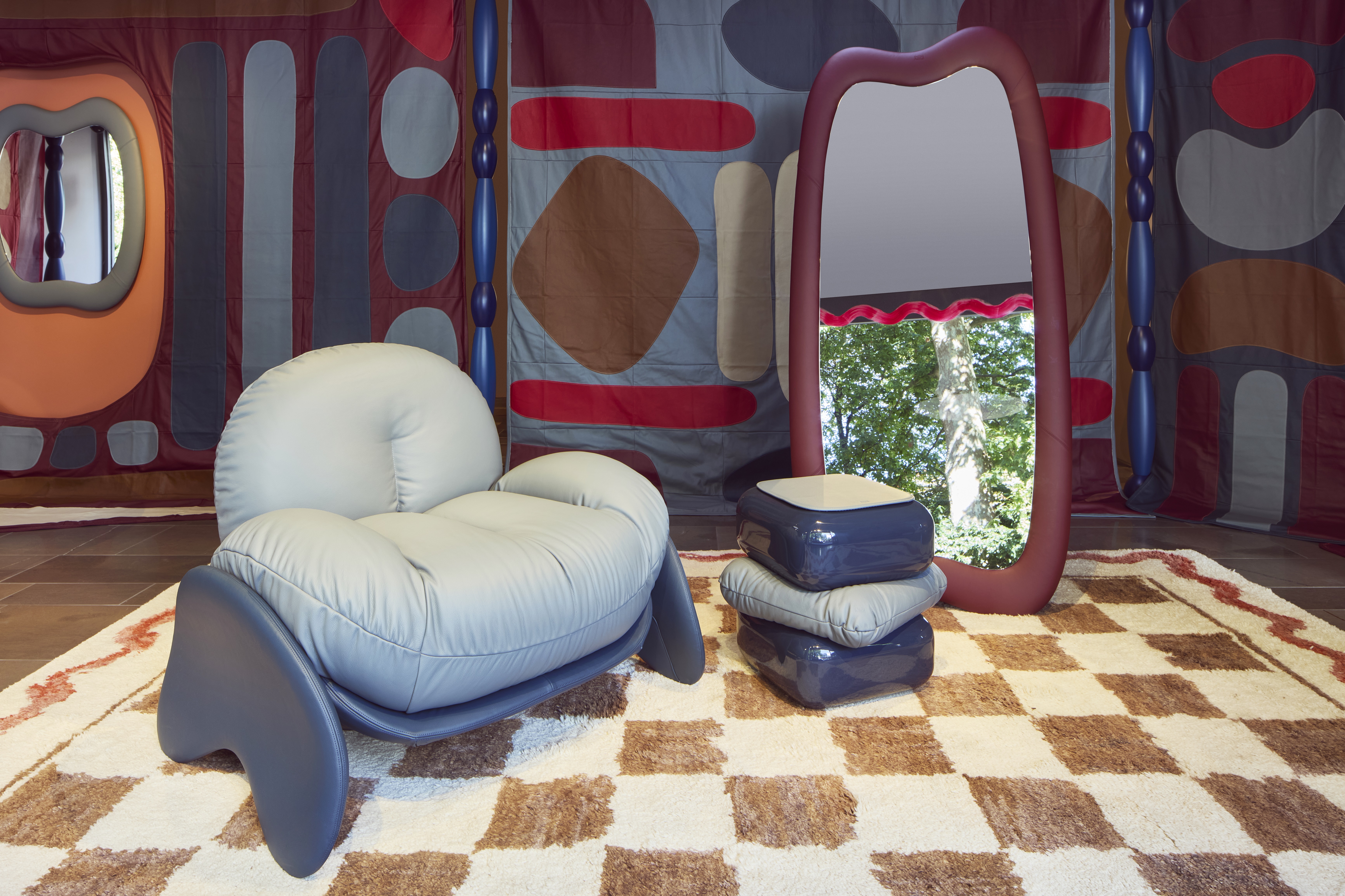
First presented during Milan Design Week this spring, "the pieces [of the Squash Collection] embrace you, there's nothing rigid about them," Toogood says of the series at the center of her London exhibition, which transformed Poltrona Frau's local flagship store into a muffled tapestry of colorful textiles and leather. Conceived as an encounter between English folklore and Italian horsepower, the project surrounded visitors with creature-like, cartoony armchairs, side tables, mirrors, and rugs.
The Livingetc newsletters are your inside source for what’s shaping interiors now - and what’s next. Discover trend forecasts, smart style ideas, and curated shopping inspiration that brings design to life. Subscribe today and stay ahead of the curve.
To counter the stern lines of avant-garde contemporary design, A Squashed Space turned the seriousness of the field on its head. How? By encouraging the audience to interact with "a room that isn't built, but draped, walls that aren't really there, a space that is imposing but intimate, and a frozen spontaneous gesture that pairs exquisite craft with the glee of a child’s blanket fort," concludes the designer.
3. Reframing Heritage and History
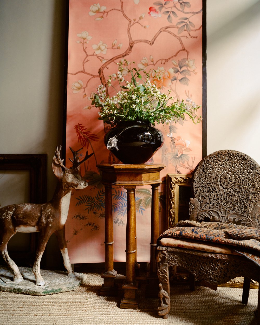
A collaboration with British wallpaper trends-setting brand de Gournay, French-American artist and designer Sophie Lou Jacobsen's latest homeware collection, Tulipa, reinterprets the house's acclaimed Chinoiserie offering through the filter of her timeless and sophisticated glasswork. Comprising vases, candle sconces, pendant lights, and mirrors, this new hand-crafted series — informed by 18th- and 19th-century furniture and decor — cements the maker's ability to activate her designs through evocative storytelling, further expanding on the success of her sensually bucolic Giardino Secreto collection.
On display at de Gournay's London showroom through October, Tulipa demonstrates "a profound appreciation for the magic of craftsmanship, the romantic history of decorative arts and the hold that the past has on all of us in the present," the brand and Jacobsen explain. Here, the gold leaf details and thriving flora of de Gournay's coveted wallpapers find a new home in the sinuously molded, precious vessels and home ornaments of the New York-based designer, whose inspired approach to crafting bridges the gap between seemingly disparate eras.
4. Letting Design Tell the Story
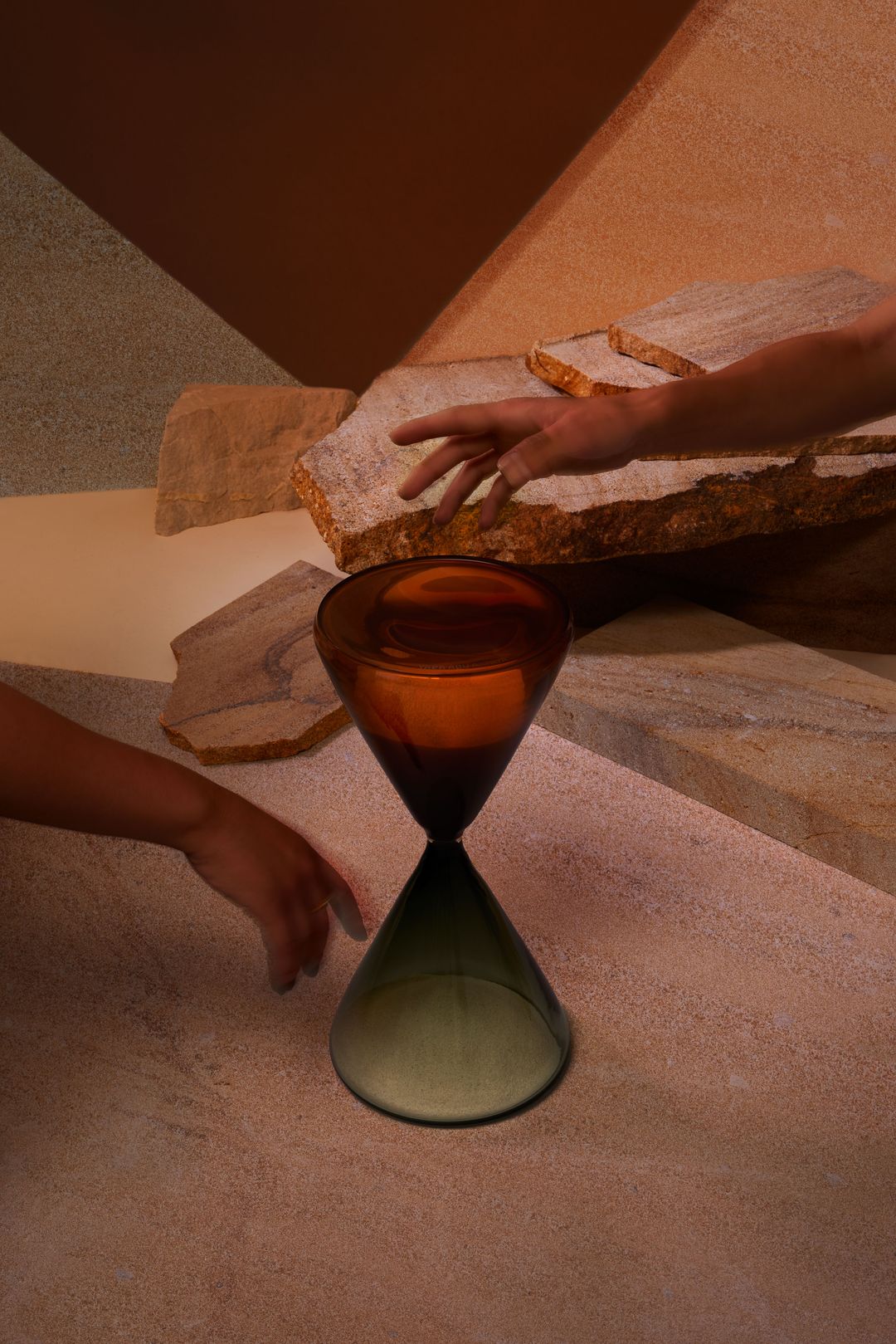
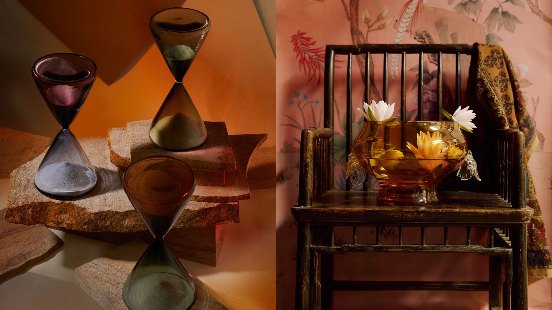
Yara Abu Aataya's ~ 1 hour glass collection might be less functional and straightforward in its design conception than many of the projects I chose to include in this roundup, but the message behind this exhibition was one of the most powerful I encountered along my LDF itinerary. Presenting a series of pastel-shaded hourglasses and home accessories, the showcase pondered one fundamental question: "Can we afford the luxury of time?" In an era where instant telecommunications and just-as-fast-paced product consumption have become the norm, this cinematic design project made the passage of time tangible, prompting us to reassess its importance within our everyday lives.
Reflecting the designer's Czech-Palestinian identity, the stunningly crafted, bi-colored hourglass at the center of the collection — realized by Aataya in collaboration with technology-led studio Shard Art — stood as a metaphor for the transient essence of the human experience and the multiple, imperceptible facets that compose it. More than anything else though, the neon light, the vases, and the luminaire gathered in this body of work strived to tell us a story, leveraging the immersive power of design to ensure we'd find an hour to listen to it.
5. Reviving Mid-Century Modernism
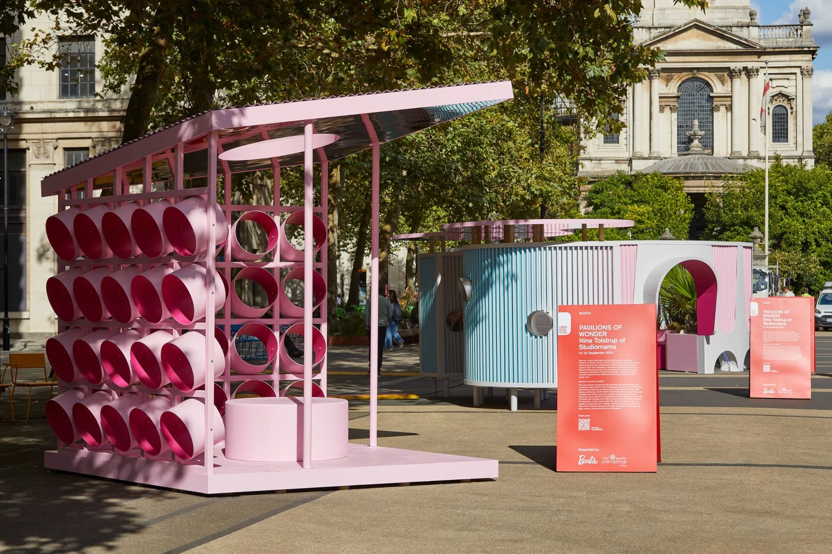
Still find yourself wondering, what is Barbiecore? Take a look at this year's LDF Landmark Project, Pavilions of Wonder, and you'll find all the answers. The brainchild of Studiomama's co-founder Nina Tolstrup, this fantastical, interactive public installation was hands-down one of the most Instagrammed highlights of this edition. Powered by Mattel, Inc.'s Barbie®, and Visit Greater Palm Springs, and situated on the Strand Aldwych, Pavilions of Wonder drew on Barbiemania to immerse passersby into a candy floss, surreal dimension.
At the heart of this monumental urban intervention were three different structures, namely the Barbie DreamHouse, an architectural garden, and a kaleidoscopic light wall. Tolstrup's aesthetics-packed project had an instantly iconic feel to it. Still, what made it stand out to me, among the hundreds of initiatives unveiled during LDF, was its refreshing take on Greater Palm Springs' mid-century modernism, which is currently having momentum.
In July, I wrote about how, in New England, architects and designers are going back to the future, looking to the styles of the past — including modernism — to make informed decisions on the evolution of their craft. Paying homage to the architectural genius of E. Stewart Williams, Albert Frey, and Richard Neutra, Pavilions of Wonder brought indoor-outdoor living-inspired sprawling gardens and hypnotic effects to the heart of London. In doing so, Tolstrup made their legacy more easily digestible and playful for all, celebrating the authenticity of a movement that never grows old.
6. "Making Room" for Community
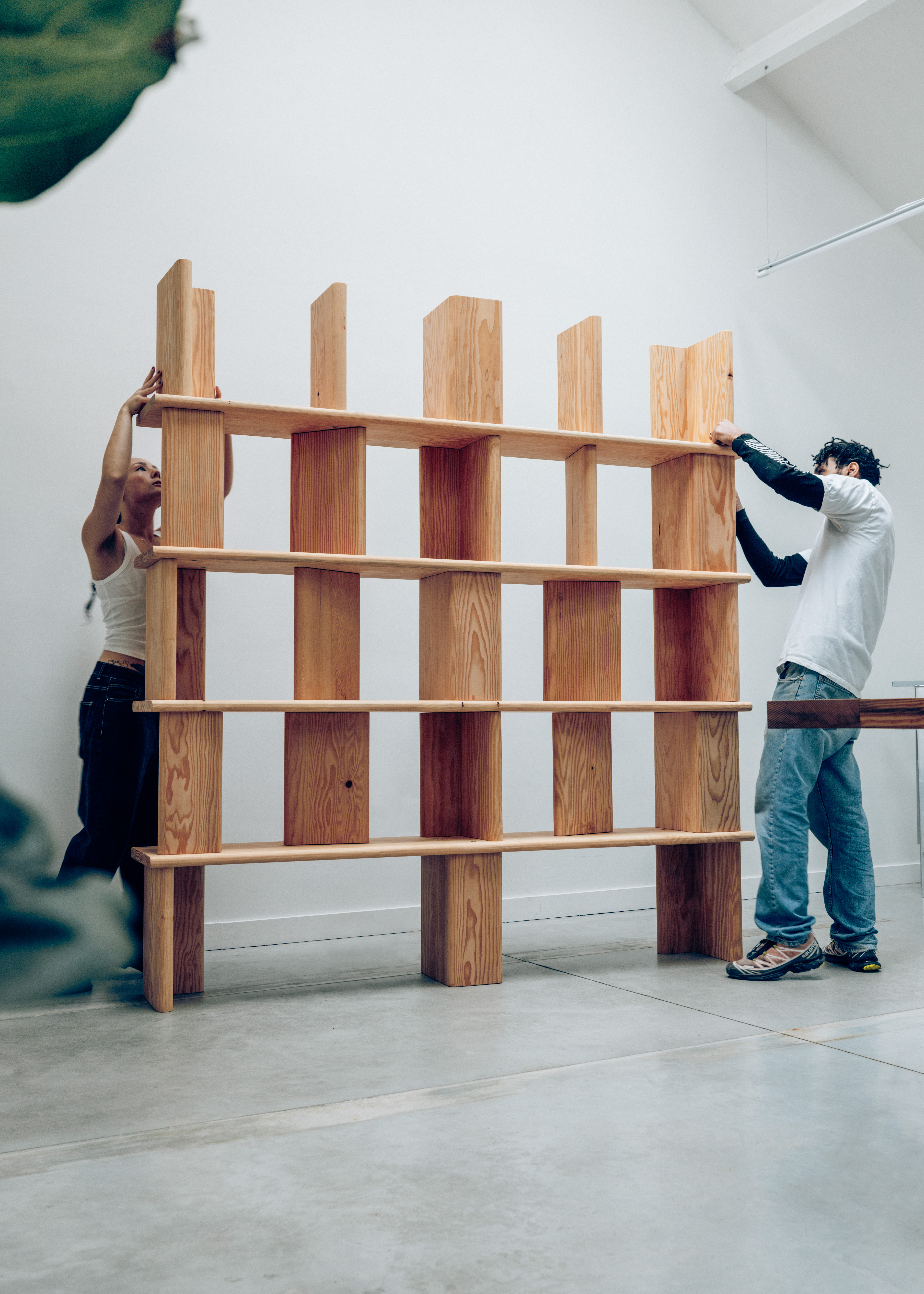
I am a firm believer in the influence that community has on advancing the different layers of culture — from art and design to fashion, music, and literature — so it is only fitting that my favorite activation from the 22nd edition of LDF brought creativity's social element to the fore. In Making Room, rising creatives Andu Masebo and Mikey Krzyzanowski transformed Brompton Design District into a platform for experimentation and a gathering space, hosting an eight-day, dense program of workshops, talks, reading groups, and artistic discussions, developed in collaboration with some 20 international personalities.
Inaugurated by a furniture-making laboratory led by Masebo himself on September 14, the event immediately put its fruits into practice by utilizing the items created on that occasion to aid the comfort of visitors throughout its entire duration. Part of the Jane Withers Studio-curated The Practice of Learning, Making Room mimicked the stimulating atmosphere of quintessentially social environments like libraries, classrooms, artist studios, and living rooms "to encourage people to engage with the world around them through design", fostering collective knowledge and action.
7. Chasing Positive Societal Change
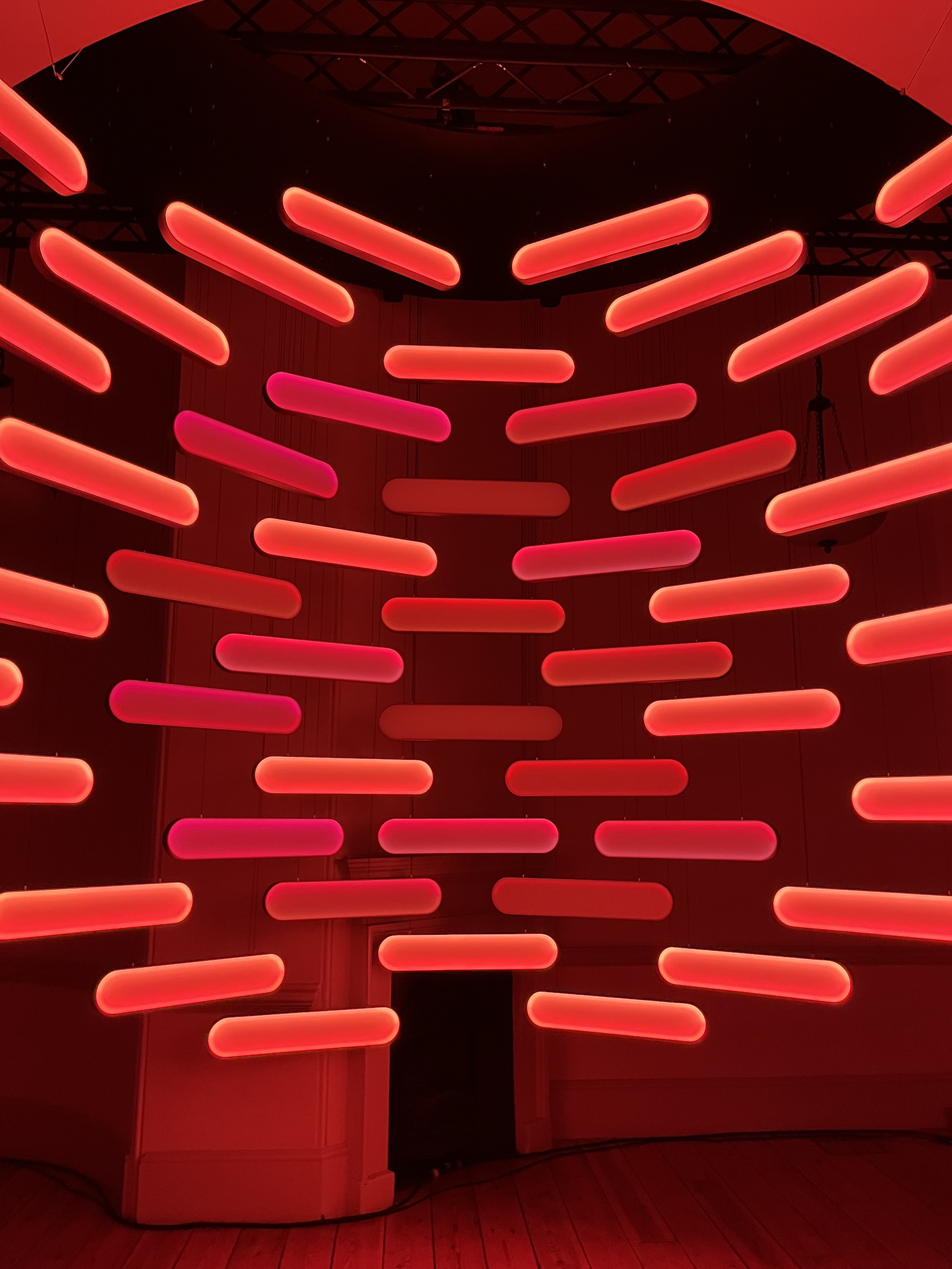
Much like sunflowers, humans are constantly seeking the sun, and that's because — whether we are aware of it or not — the amount of sunlight we are exposed to daily is crucial to our mental and physical well-being. In her hypnotic Somerset House installation The Sun, My Heart, Dutch designer Marjan van Aubel investigated our vital relationship to this celestial body by inviting the public to step into a neon-lit room designed to make the benefits of solar-human interaction instantly palpable. Composed of multiple modified lighting supports, the piece reproduced the sun's daily cycle while emitting soundscapes sourced from NASA's solar recordings, absorbing visitors in a truly unforgettable, interactive experience.
The piece, which stimulated the brain's theta waves normally produced during deep relaxation, synchronized the audience's hearts with the sun's rhythms to raise awareness of solar energy's hidden potential. Active at the intersection of sustainability, design, and technology, the Dutch trailblazer confronted the audience with her mesmerizingly executed vision of a sun-powered future — hinting at the pioneering function innovative design can fulfill in the transition to sustainable energy.

Gilda Bruno is Livingetc's Lifestyle Editor. Before joining the team, she worked as an Editorial Assistant on the print edition of AnOther Magazine and as a freelance Sub-Editor on the Life & Arts desk of the Financial Times. Between 2020 and today, Gilda's arts and culture writing has appeared in a number of books and publications including Apartamento’s Liguria: Recipes & Wanderings Along the Italian Riviera, Sam Wright’s debut monograph The City of the Sun, The British Journal of Photography, DAZED, Document Journal, Elephant, The Face, Family Style, Foam, Il Giornale dell’Arte, HUCK, Hunger, i-D, PAPER, Re-Edition, VICE, Vogue Italia, and WePresent.