Big on comfort, high on style, this London home works hard for all the family
Interior designer Cherie Lee has worked her magic to make this home both elegant and serene, as well as family friendly
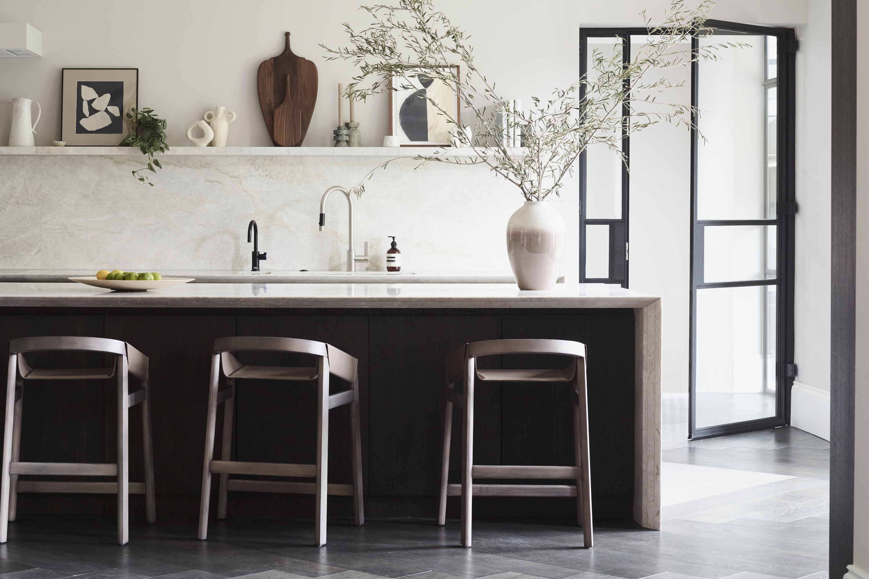
This two-floor ground and lower ground floor modern home has been converted from a four storey Victorian house in north-west London.
This handsome historic-meets-contemporary apartment looks like it belongs to a glamorous young couple with a thriving social life, and although that’s an apt description, on the flip side they also have three growing children - and a puppy. That it so successfully combines durability with elegance is down to both the couple’s design aesthetic, and the skill of interior designer Cherie Lee of Cherie Lee Interiors.
The couple - he works in private investment and she is a stay at home mum - had discovered Cherie on Instagram, finding her design ethos matched their own and they worked as a team to create a fresh and cohesive look that functioned for all the family.
TV room
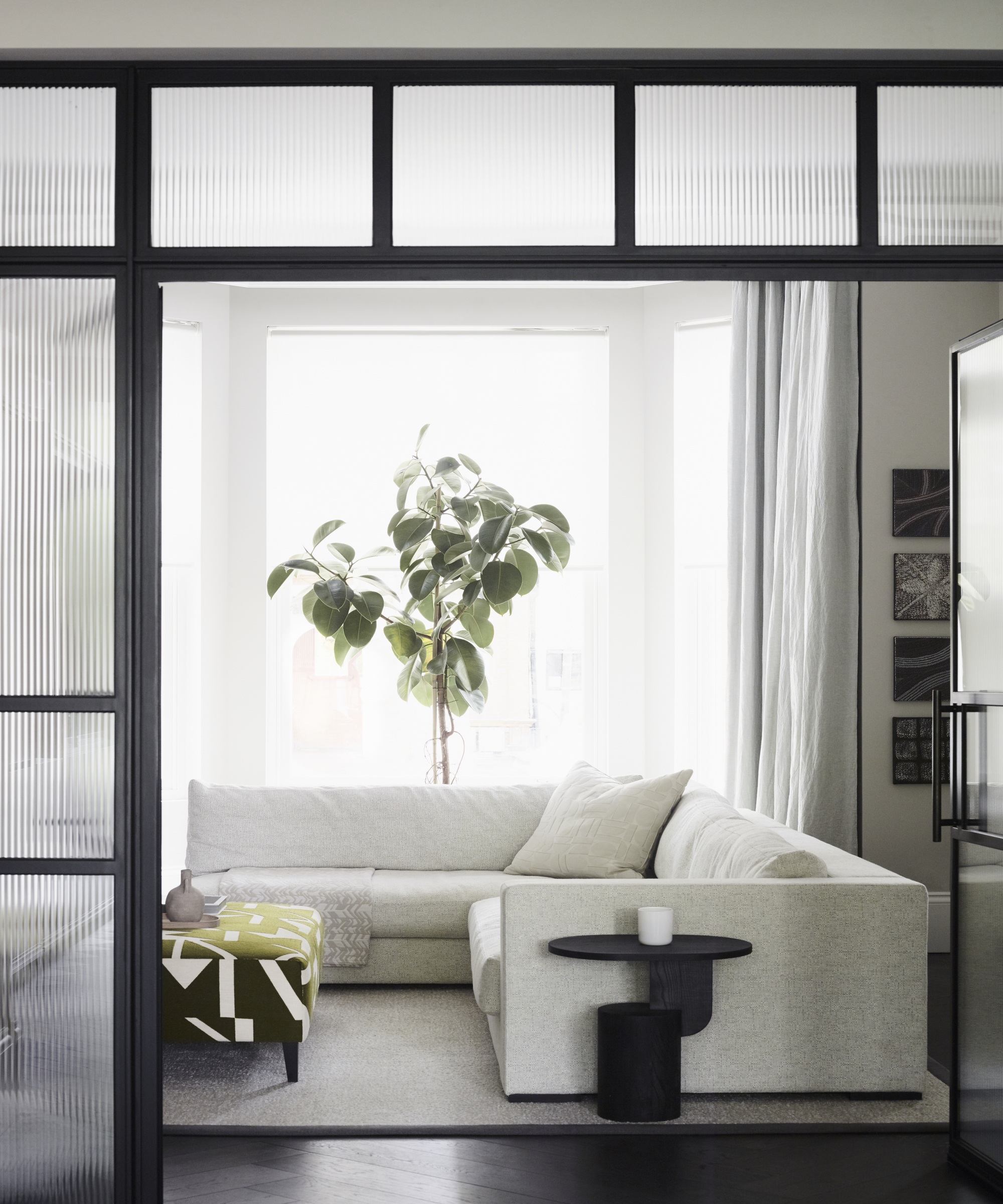
‘The couple had already bought two apartments in this large Victorian house in north-west London and converted them into one large lateral home,’ says Cherie. ‘But they felt the layout was disjointed and didn’t flow properly.’
When she came onboard it was largely a shell with little furniture, and the kitchen was sited in what is now the media room. ‘The wife felt shut away from guests when entertaining and from the family on a day to day basis,’ says Cherie. ‘So the priority was to relocate the kitchen to a more prominent position and to create a design for it that blended with the overall aesthetic of the ground floor living space.’
Comfort was of the essence here with deep, oversized, seating. Metal doors with reeded glass for interest close off the open-plan space if required.
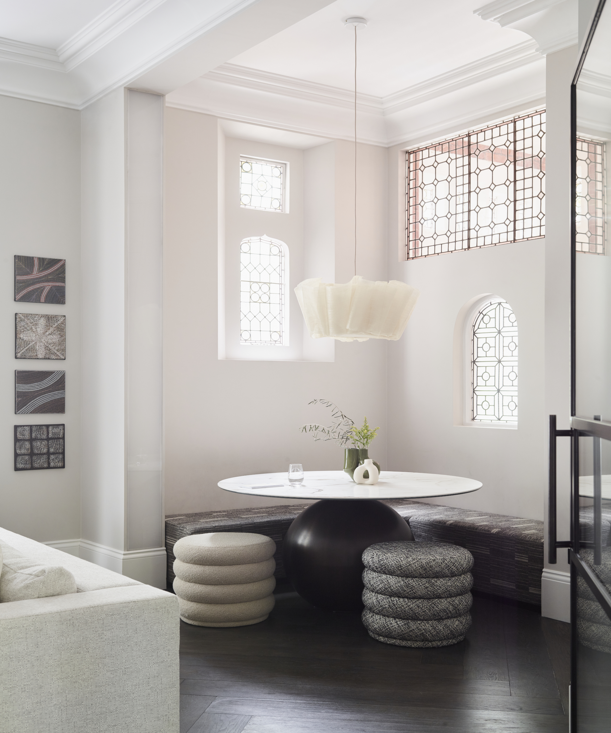
This is a multifunctional space, designed to sit with a coffee, play a family board game, or for the children to do their homework (which is usually piled high with cushions), rather than retreating to separate bedrooms.
Be The First To Know
The Livingetc newsletters are your inside source for what’s shaping interiors now - and what’s next. Discover trend forecasts, smart style ideas, and curated shopping inspiration that brings design to life. Subscribe today and stay ahead of the curve.
‘Comfort was key along with keeping an organic feel to the materials used - natural stones, rich timber and relaxed textiles,’ says Cherie. A sense of understated luxury pervades the space with the combination of the existing dark herringbone wood flooring, moulded ceilings and dramatic lighting.
Beautiful bespoke furniture was worth investing in, say the owners. It caters exactly for their needs and makes the home individual.
Living area
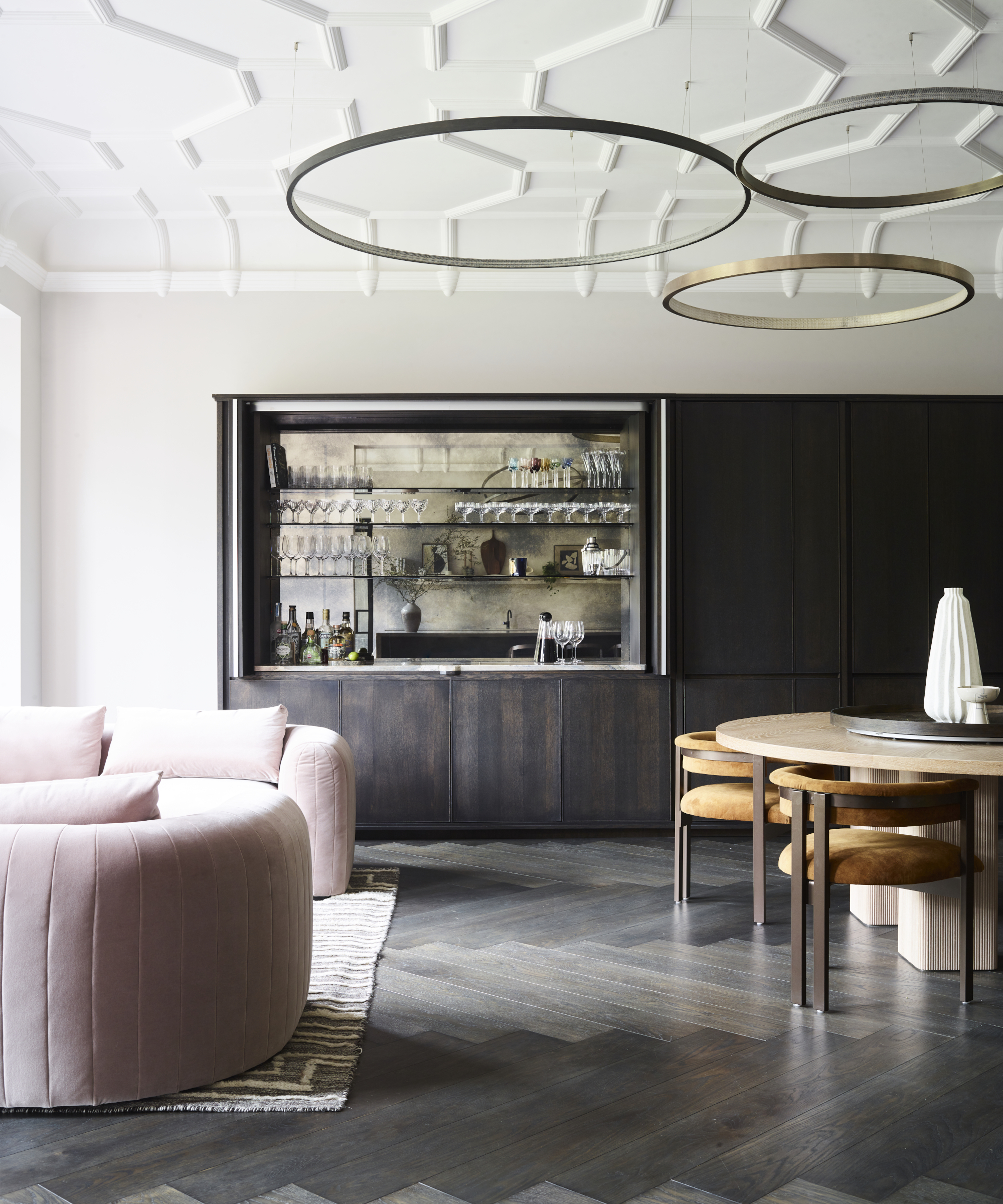
It was decided that the backdrop would be a warm, neutral palette with dark timber accents. ‘The couple were open to the use of color and playfulness (like the foxed glass cocktail bar and the cloud ceiling in the teenager’s bedroom) if incorporated in the right way,’ says Cherie.
The versatile design ideas means the space works hard for its money. The bar can be closed off when guests go home and the seating around the table can expand (with moveable banquettes) to hold twelve. As well as providing ample storage, the bar area has an ingenious secret door which leads to a cloakroom.
There is a clever hidden door to a cloakroom next to the bar, which itself can be shut off when the family are not entertaining. The whole unit provides ample storage.
Kitchen
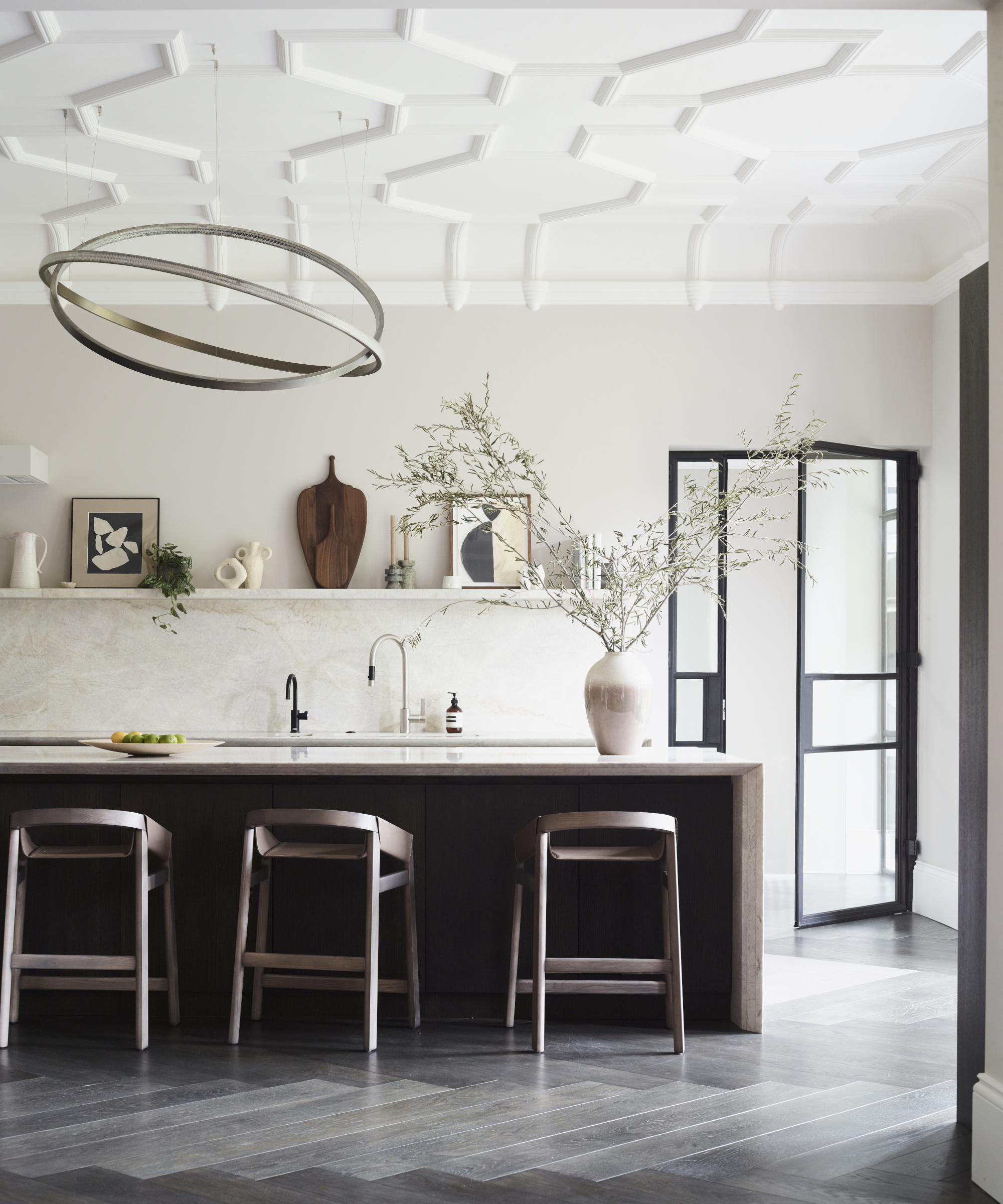
Crucial to the new layout was placing the modern kitchen along a wall where it felt an organic part of the living space. Designed in understated stone with concealed appliances, it flows harmoniously into the sitting and dining areas which lead to the tv room.
‘Each family member can be in an individual space yet still essentially be in one room,’ says Cherie. A mix of natural materials was used to ensure that the space felt calm and part of the living room, rather than too utilitarian.
Main bedroom
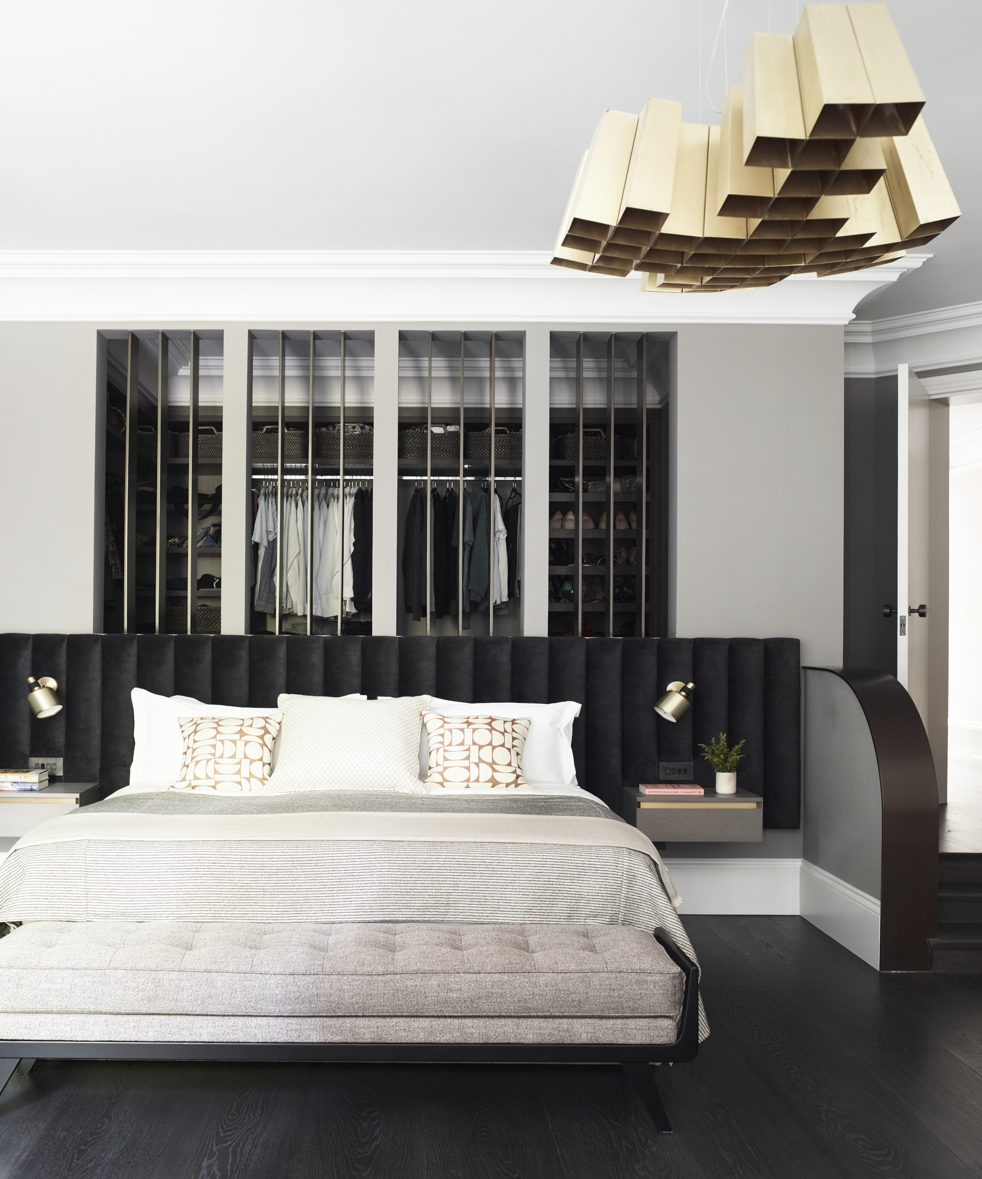
Clever design ideas continue in the bedrooms. The couple’s bedroom, in cosseting earthy shades, has a wrap around headboard to frame the sleeping area and an indulgent walk-in closet idea and ensuite.
Cherie waned to design a headboard that stretched the entire wall and really helped to frame the sleeping area. The color palette was dark with earthy accents and contrasts with the lightness of the seating area adjacent.
‘There is definitely a formal nature to some areas, inspired by the tall ceilings and original architecture of the home but the clients wanted to avoid it looking too glamorous or showy. The balancing act was essential,’ says Cherie.
Bathroom
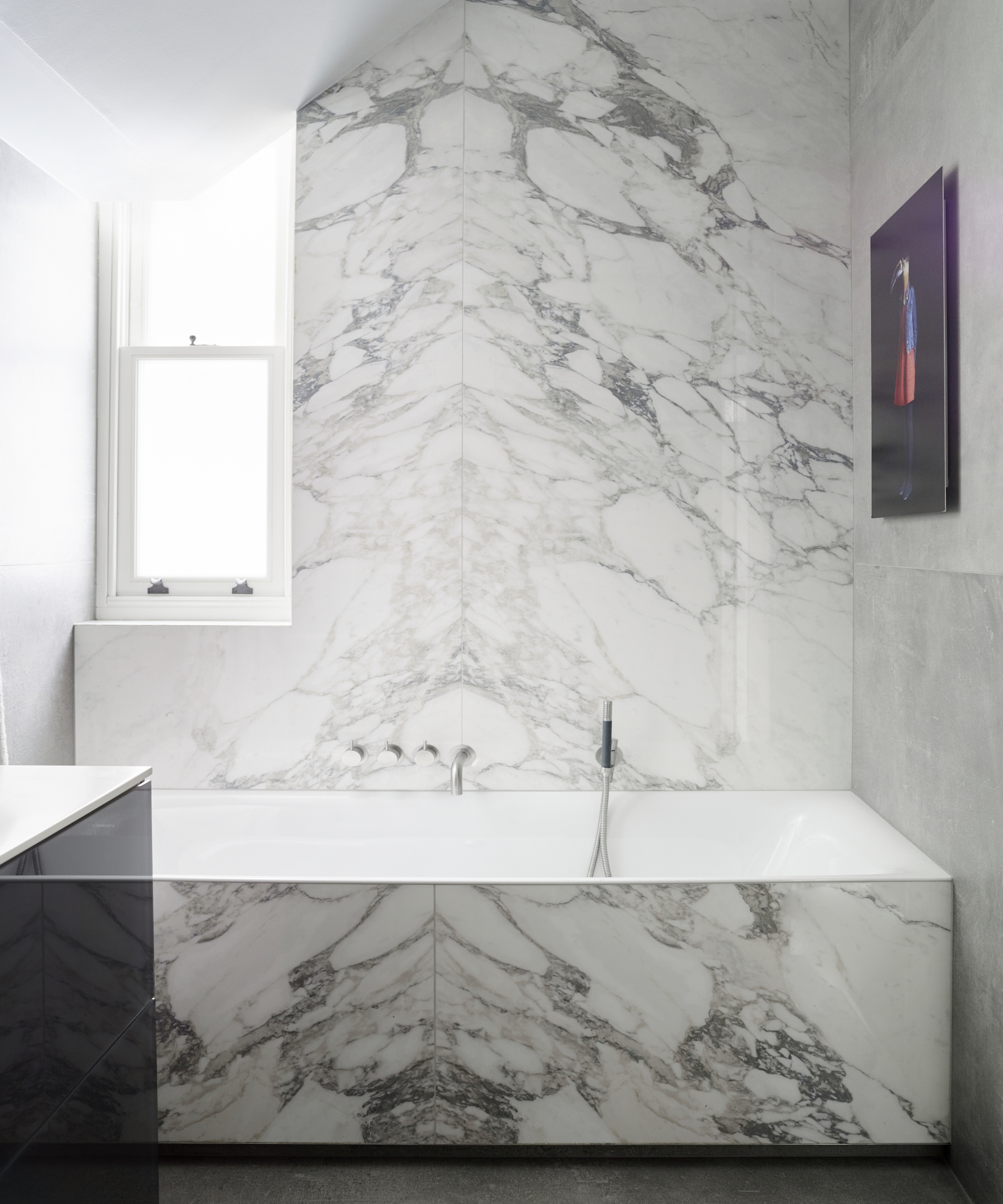
The bedrooms have ensuite shower room ideas while this family bathroom is hardwearing yet dramatic.
Daughter's bedroom
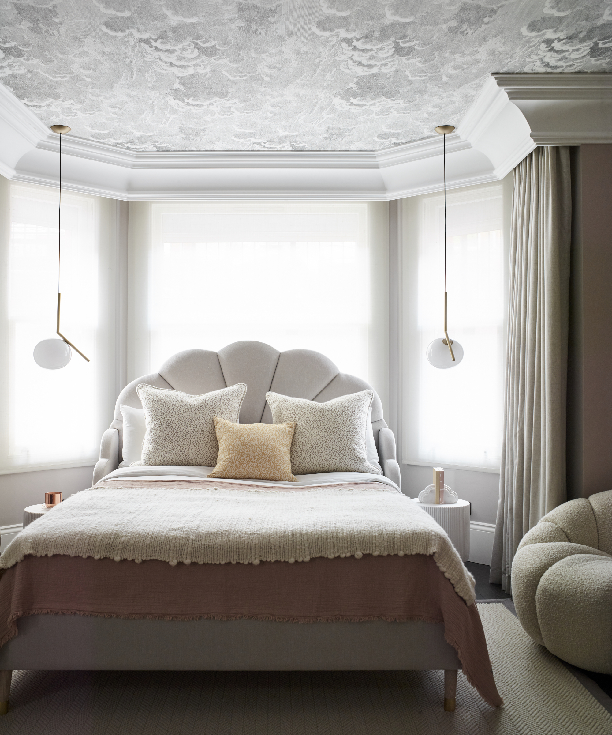
The children’s rooms dip into soft shades of pink and blue, each with an oversized pinboard for expressing creativity. Large items, such as the statement headboards are kept neutral for longevity.
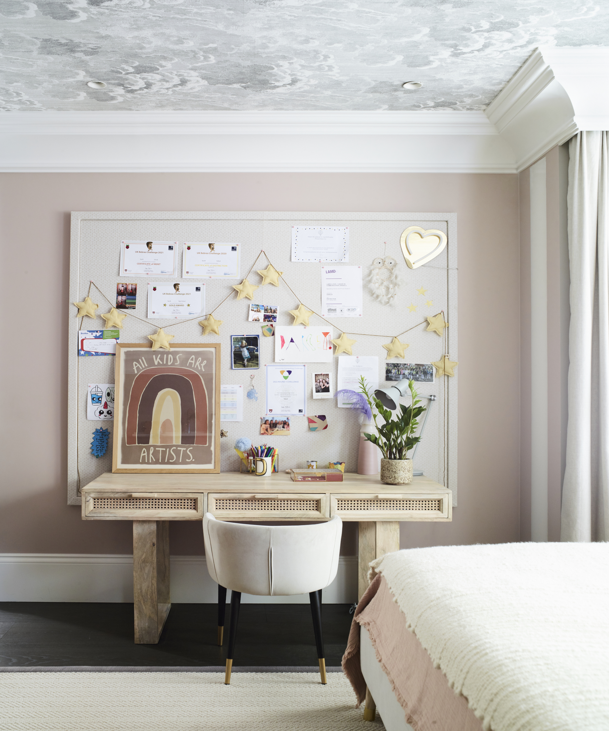
A transitional room that will evolve to early adulthood, balancing fun and sophistication in just the right amounts while an oversized pinboard, creating a home office feel, offers lots of space for self-expression without damage to the walls.
Son's bedroom
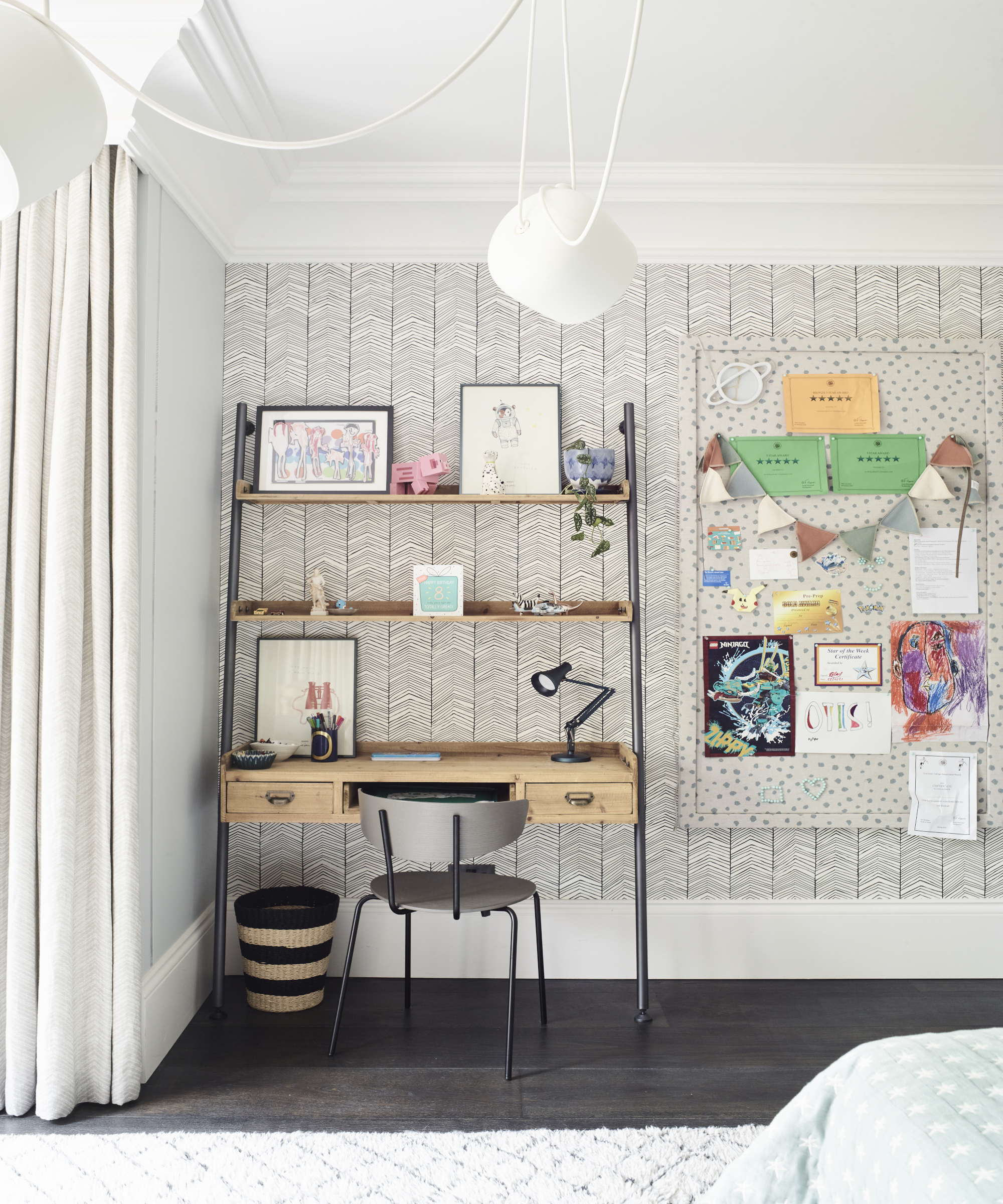
Simple, timeless design means that although the son of the family is only eight, his room will evolve as he grows. A corner was used to create a fun work area to encourage creativity.
See more: A new layout and earthy tones has completely transformed this south London semi
A legendary houses editor, Mary Weaver held the job of Homes Editor on Livingetc for over a decade. She set the aesthetic for which the brand has become known. She is now a freelance stylist, art director and writer, regularly contributing to Livingetc and overseeing the brand's successful House Tours franchises of live and webinar events.
-
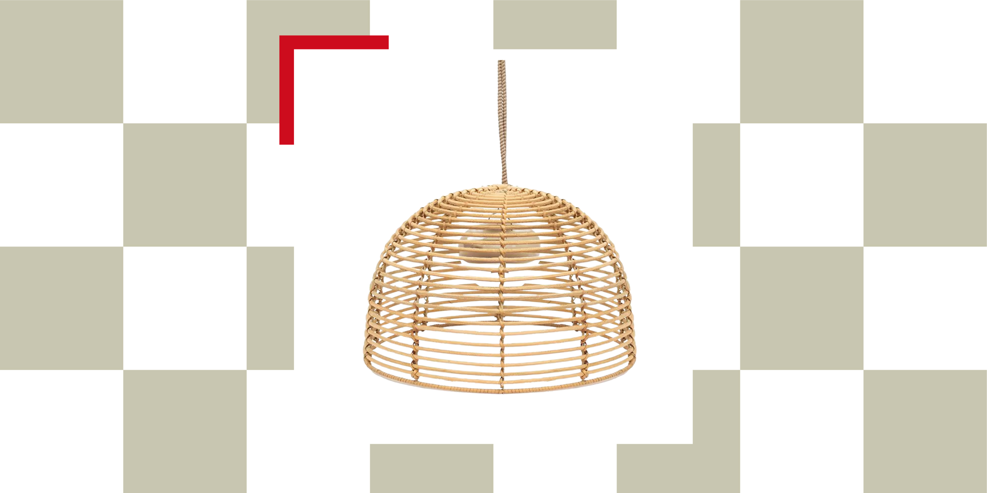 I Just Found a Stylish Wireless Pendant Light That Makes Your Garden Look (and Feel) Like a Living Room
This rattan-like pendant light is wireless and rechargeable — making it a functional and stylish choice for your outdoor space
-
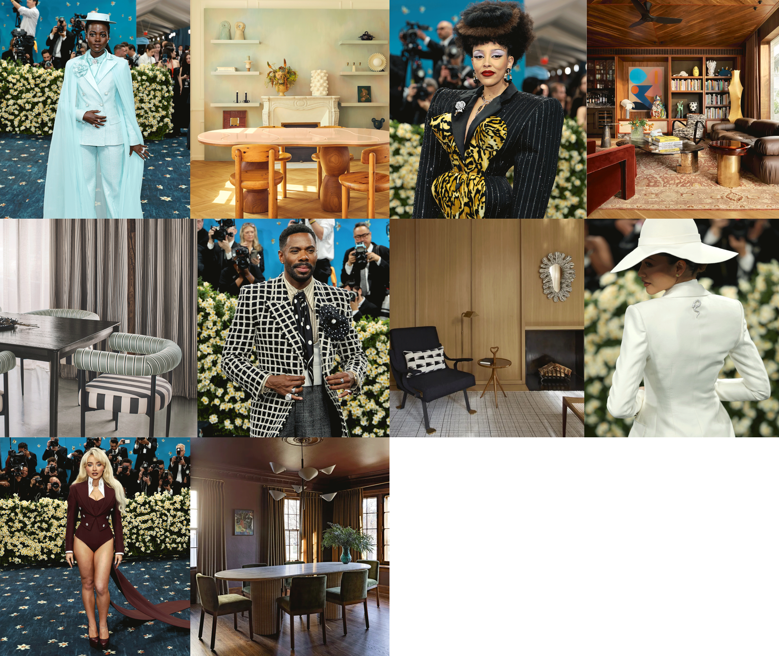 Icy Blue, Stripes, and the Design Equivalent of Shoulder Pads — 2025's Best Met Gala Looks as Interior Trends
The Met Gala carpet was alive with fashion trends that translate into the schemes designers are creating for the most exciting homes right now, too