We're calling it - the way this calming home uses this one material is minimalism perfected
Cedar House in Washington is a minimalist home that manages to feel wonderfully warm and welcoming, too
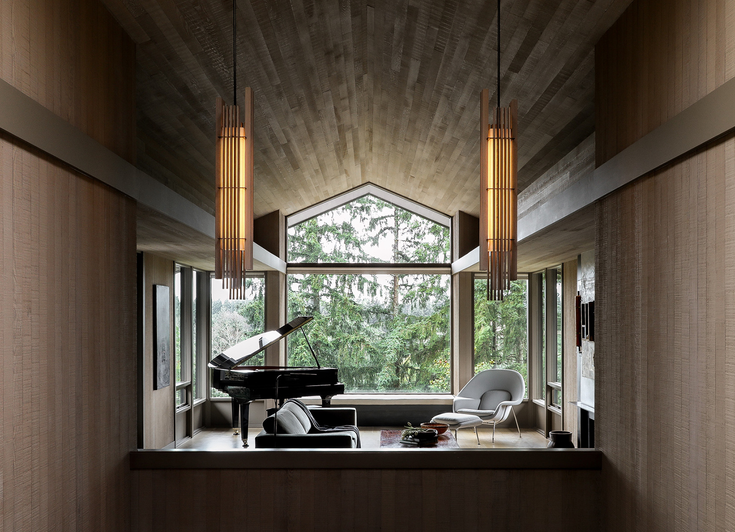
Clyde Hill, a suburb of Seattle, is a leafy and pleasant place to live. It's family-friendly, it's got good public schools...and best of all is its stock of architecture that mostly dates back to the 1970s. So it's in good working order, built to a good size and spec and pretty much a blank canvas that can be modernized in any way you choose.
In fact, the owners of this modern home, that has been renovated by Graham Baba Architects wanted to keep its original spirit, its 1970s wood cabin vibes. Originally built by the noted architect Ralph Anderson it is surrounded by landscaped terrain and has the peace and calm of being out in the forest.
And so by using wood in clever and wonderful ways, the house has become an urban sanctuary, a haven that is a shining example of what minimalism in interior design can look like today - uplifting and welcoming. 'The warmth of the woods invites occupants in and envelops them with a feeling of protection and refuge,' says Leann Crist, Principal at Graham Baba Architects, a sensibility we can all take inspiration from.
The entryway
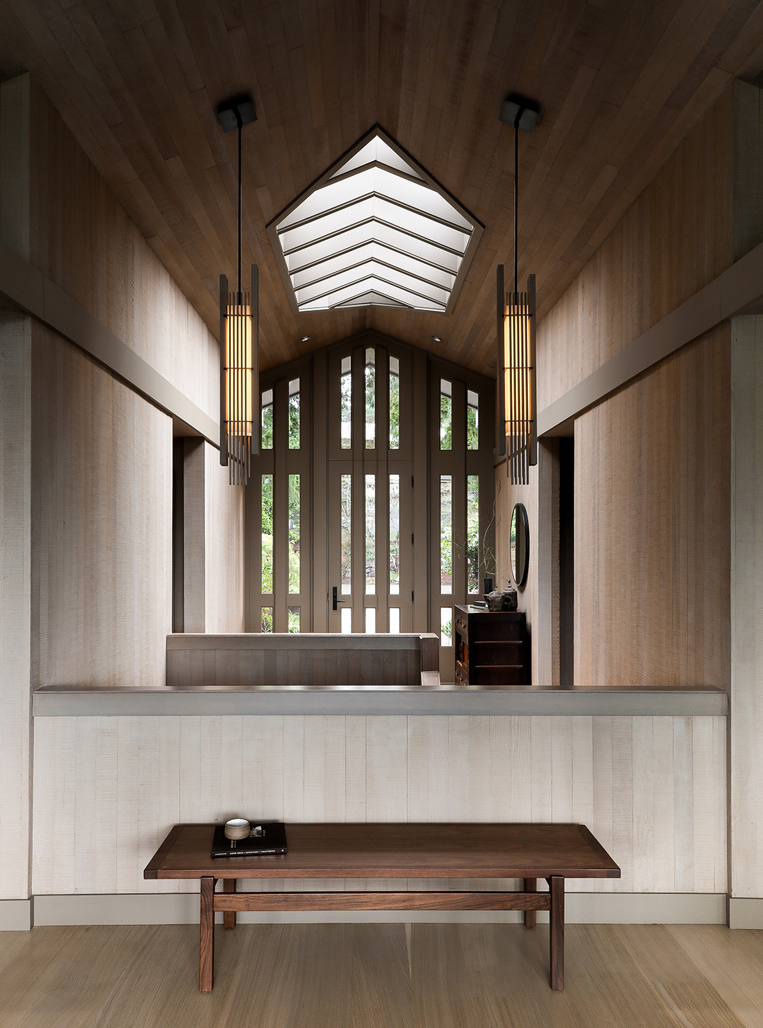
The tall, vaulted foyer - the central axis of a T-shaped floorplan - sets the tone for what is now called - understandably - Cedar House. On stepping into the entryway you're greeted with an expanse of cedar wood, a minimalist space that soars above you with the exuberance of a church. Proof that even - or perhaps especially - when there's a lack of stuff that if you get the materials right the result can be just as
'The original wood cladding at soffits, walls and ceilings is stained cedar,' says Leann. 'The orientation of the wood ceiling and soffits draws attention toward the main feature of the living room: the large, framed views of the natural surroundings.'
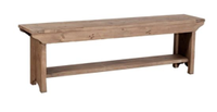
Irina rustic lodge bench, Kathy Kuo Home
Made from reclaimed pine and stained a rich dark color this simple entryway bench allows you sit and ponder....or at least have a place to take off your shoes on the moment you get home.
Living room

The minimalist living room didn't need as much work, though was updated with new lighting and rift sawn white oak flooring. Brightening the decor like this was a priority generally, allowing all that light from the big picture windows to truly gleam.
Dining room
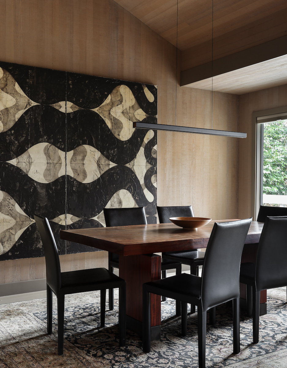
In the dining room, the designers mixed blonde wood walls with dark wood furniture - a look that's harder to pull off than you might think. The trick is to bring the darker pieces into the center of the space, and wrap them in paler woods, meaning that the decor remains feeling light and bright.
Be The First To Know
The Livingetc newsletters are your inside source for what’s shaping interiors now - and what’s next. Discover trend forecasts, smart style ideas, and curated shopping inspiration that brings design to life. Subscribe today and stay ahead of the curve.
'The dark wood furniture grounds the room and becomes the focal point while being distinct from the walls and ceilings of the architecture,' Leann says. 'The lighter walls surround the dining experience with a warm glow. The original wood cladding is stained cedar. The new wood flooring is rift sawn and stained white oak, which was used throughout the main level. The table is made from Bubinga wood and steel.'
Kitchen
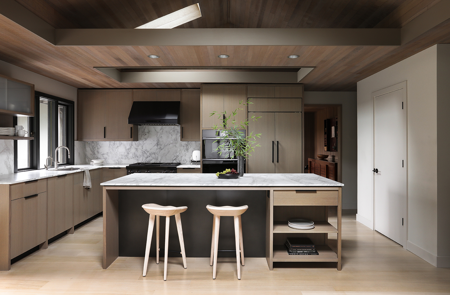
The minimalist kitchen - which had been remodelled already by previous owners - was outdated and finished in materials that made the room seem darker than it really was. New, lighter finishes were introduced, including a Calacatta marble counter and backsplash, drywall, and custom white oak cabinetry. The marble-topped island, designed to resemble a piece of furniture more than built-in cabinetry, is the heart of the space, offering a place for cooking, gathering, and entertaining.
The use of wood in the kitchen is interesting here, too. It appears on the floor, cabinets and ceiling in three different colors, styles and direction.
'The finishes were very carefully selected and reviewed on site during construction to strike the right balance between color, warmth and value (dark/light),' Leann says. 'It was a delicate task to create thoughtful material interventions without disrupting the original character of the architecture.'
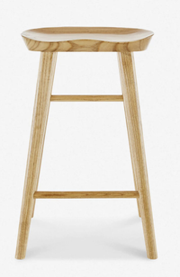
Jonah counter stool, Lulu and Georgia
The simple lines of this slightly rustic stool fit perfectly into a minimalist interior. Pleasingly - and crucially - the groove in the seat is comfortable to nestle in.
The blend of tones was very intentional. 'We thought of the existing cedar wood cladding on the original ceilings and walls as a distinct material from the new cabinets and flooring,' she adds. 'We wanted varying textures and grains that all work in harmony together. The floors are wide plank rift sawn white oak, and the finish was kept close to natural by lightening them just a bit, toning down some of the warm hues inherent to white oak. The white oak cabinets were slightly darkened and grayed, serving as a bridge between the lighter natural floors and the existing wood clad ceiling. The original cedar cladding on the walls was replaced with drywall to brighten up the whole space and provide some contrast to the wood textures and tones.'
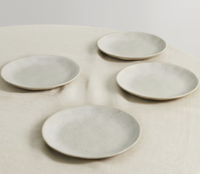
Glazed stoneware plates by Soho Home at Net-A-Porter
These charmingly irregular plates have just the right texture and hand worn finish to work in a peaceful, minimalist kitchen. They are interesting, but only quietly so, and utterly beautiful.
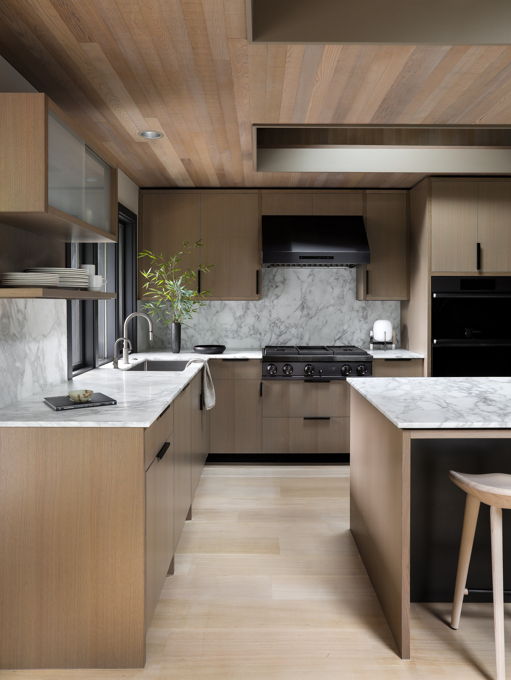
Intriguingly, the direction of the ceiling planks runs at odds with that of the wood kitchen flooring planks - another clever way to add some curated detail without breaking the peace of this minimalist space.
'Throughout the main level, the original wood soffits tend to be laid out to be parallel with the long axis of the room,' Leann says. 'The flooring direction was determined at the main entry to the home, which runs along the primary axis of the vaulted main living space and mirrors the direction of the existing cedar soffit.'
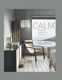
The subhead of this beautiful book is 'interiors to nurture, relax and restore,' and that's exactly what they do. Full of relaxing spaces it's wonderful to leaf through, to take inspiration - or just a sense of calm - from.
The editor of Livingetc, Pip Rich (formerly Pip McCormac) is a lifestyle journalist of almost 20 years experience working for some of the UK's biggest titles. As well as holding staff positions at Sunday Times Style, Red and Grazia he has written for the Guardian, The Telegraph, The Times and ES Magazine. The host of Livingetc's podcast Home Truths, Pip has also published three books - his most recent, A New Leaf, was released in December 2021 and is about the homes of architects who have filled their spaces with houseplants. He has recently moved out of London - and a home that ELLE Decoration called one of the ten best small spaces in the world - to start a new renovation project in Somerset.
-
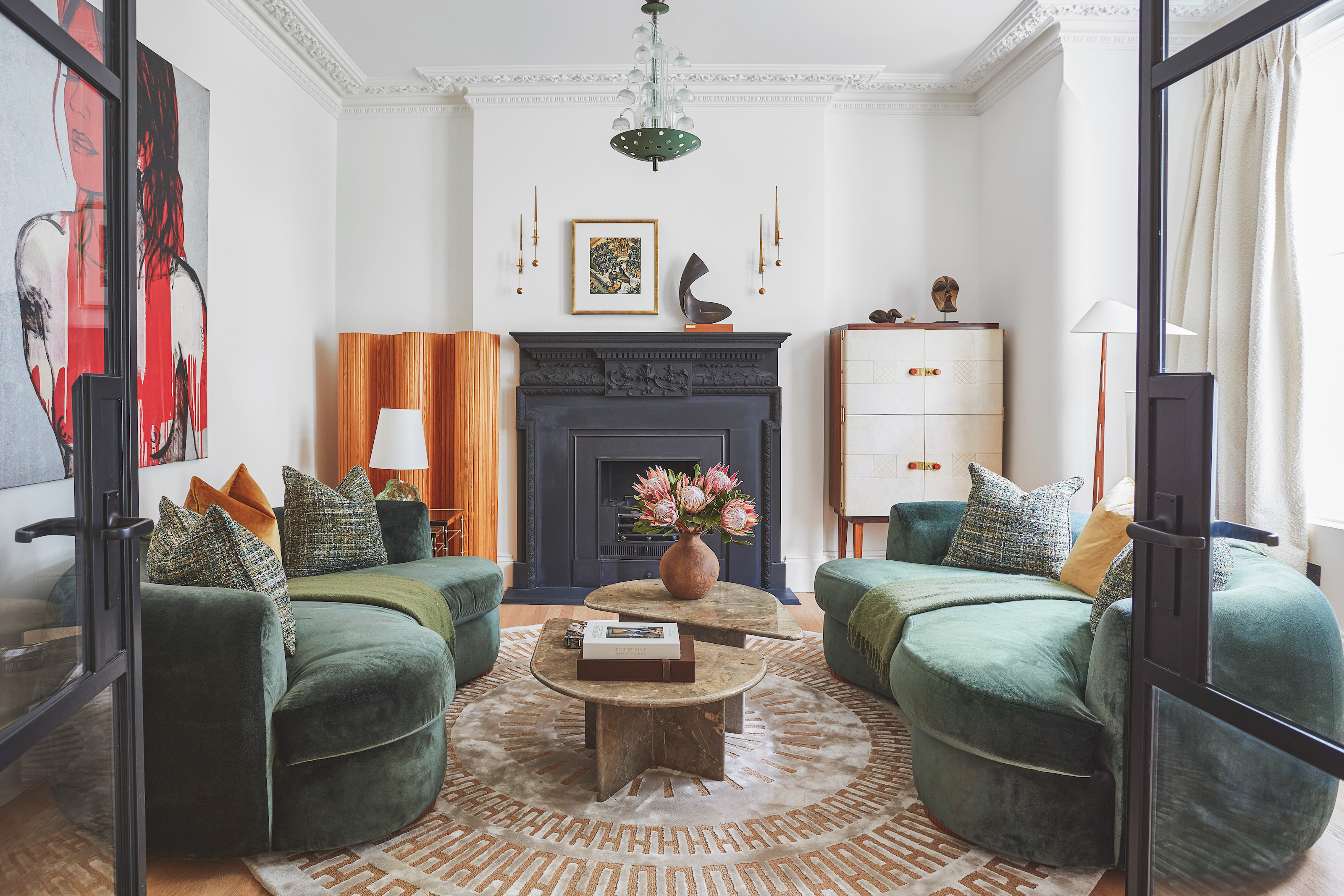 The 'New British' Style? This Victorian London Home Embraces Its Owners' Global Background
Warm timber details, confident color pops, and an uninterrupted connection to the garden are the hallmarks of this relaxed yet design-forward family home
By Emma J Page
-
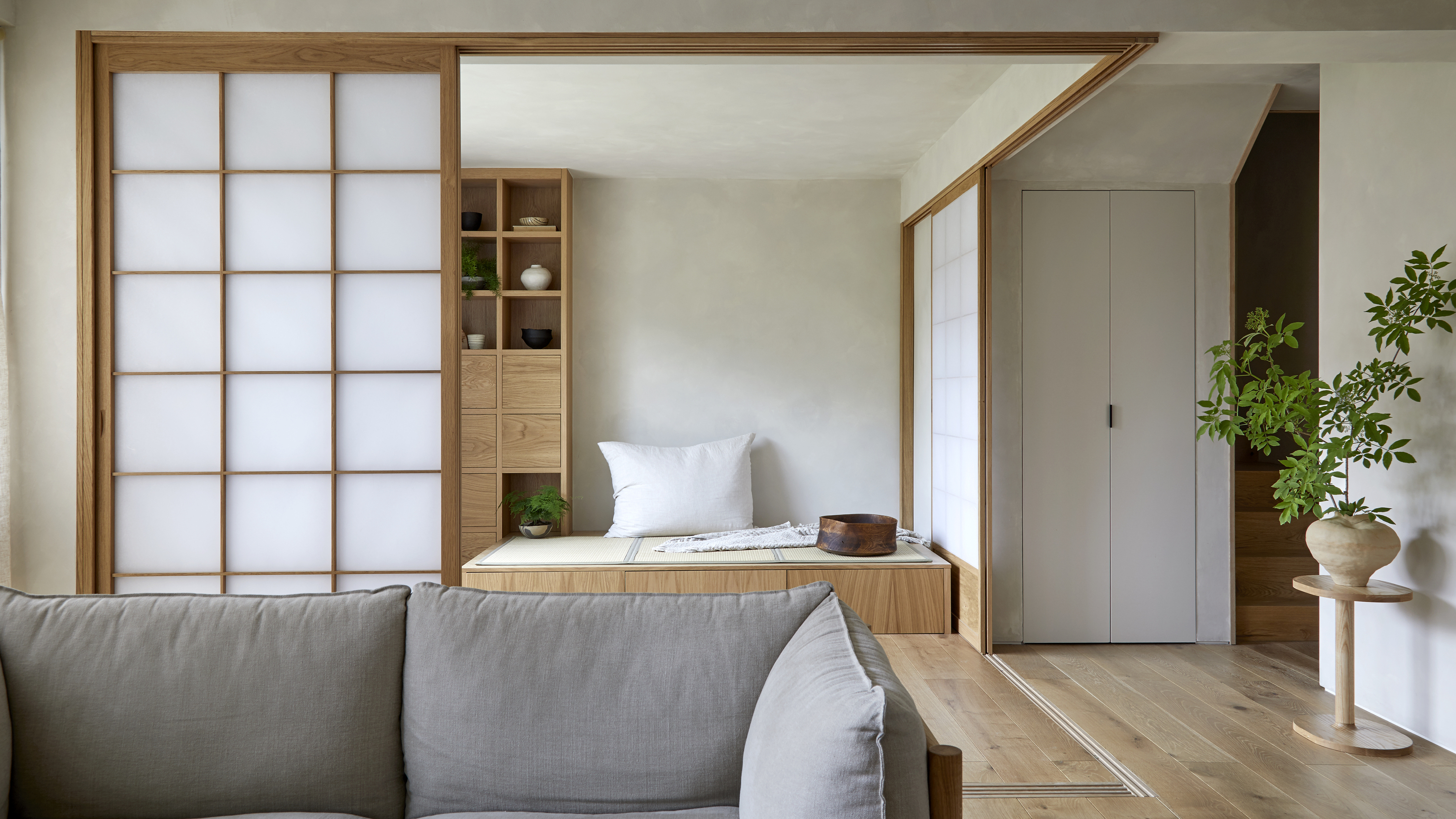 Muji Living Room Ideas — 5 Ways to Harness The Calming Qualities of This Japanese Design Style
Inspired by Japanese "zen" principles, Muji living rooms are all about cultivating a calming, tranquil space that nourishes the soul
By Lilith Hudson
