This calming Los Angeles house uses clever tricks to add color and texture we can all be inspired by
This neutral, airy home may have a minimalist palette but Hollis Jordyn Design have used some clever ways to add personality
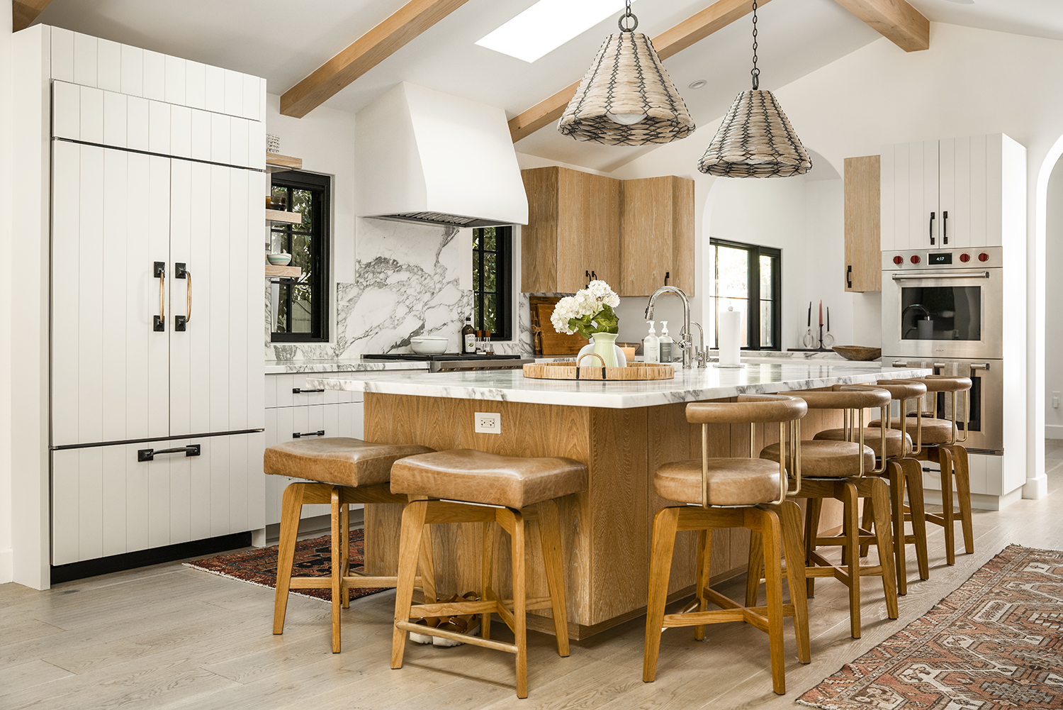
When a home belongs to a jeweller, and they have an interest in natural stone, but they also want a neutral palette, that could seem like a tricky brief. But actually, for interior design studio Hollis Jordyn Design, this was an opportunity to think about how to bring subtle warmth and luxe undertones to the space.
'Our client, Andrea Fohrman, works in the jewelry industry with a lot of natural stone and we really wanted the design of her home to reflect her style and taste,' says studio co-founder Hollis LaPlante. 'We were able to accomplish this by taking the home down to the studs and creating a layout and flow that made sense for entertaining while being bright and airy. Most of the palette was neutral with earthy pops of color, which adhere to the natural coloring and texture of stone.'
The 2,207-square-foot traditional style home in the San Fernando Valley sits on an 8,811-square foot lot with 3 bedrooms and 4 bathrooms.
'Though the palette is neutral we were able to give it so much personality with the textures, patterns, and placement of the materials used,' says Hollis's partner Jordyn Grohl. 'Layering also is a good way to enrich a space.'
The result is a modern home full of a warmth that shows itself gradually, through clever use of color and fabric. A masterclass in creating an inviting - yet calm - family home.
Kitchen
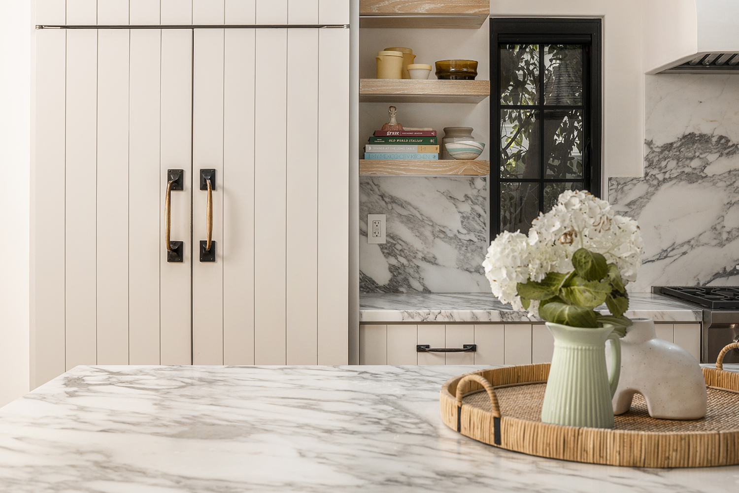
The modern kitchen is as neutral as most of the rest of the home, but its use of texture on the cabinet doors give the space the character of a much more rustic house.
'The slats add visual interest to the cabinets that are white and lend themselves to a modern farmhouse style,' Hollis says.
Be The First To Know
The Livingetc newsletters are your inside source for what’s shaping interiors now - and what’s next. Discover trend forecasts, smart style ideas, and curated shopping inspiration that brings design to life. Subscribe today and stay ahead of the curve.

And look beyond the neutral color scheme to see just how many different materials are used here. Marble, leather, wood and even wicker (for the lampshades) , creates a rich overall impression. 'Mixing the materials used in the kitchen and throughout the home creates a beautifully layered effect that adds a lot of dimension,' says Hollis. 'Having different textures working together elevates the design of the space.'
The pendant lights are from Lumens and the barstools are custom-made by SET Acronym. 'We love how they blend in with the island,' Jordyn says.
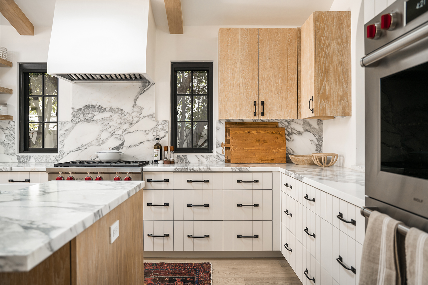
And despite being such a tight palette, this is actually a two tone kitchen, with cabinets in two materials. The unpainted wood wall cabinets mirror the island - a neat touch to create a sense of cohesion.
'The kitchen commands a lot of space,' Jordyn says, 'so in the interest of keeping things light and airy, we felt it best to break up the design with two-tone cabinets. The light-stained wood allows for a natural and earthy feel, which warms up the space and is grounded in the island. The white farmhouse-style cabinets create a subtle visual interest that provides an airy touch to the kitchen and makes the space feel fresh and inviting.'
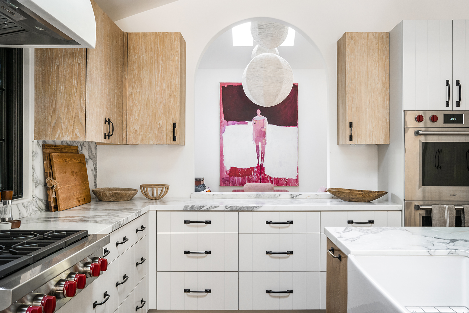
The arched window through to the dining room is a nod to open plan living but in a way that means diners can't see any mess made in the kitchen.
'We remodelled the entire house so we were able to restructure the flow and layout of the home,' Hollis says. 'We wanted an open plan, however, to maximize the number of kitchen cabinets we added a half wall with an archway. The large scale of the arch allows for the feel of an open concept and also a pass-through station into the dining room.'
Dining room
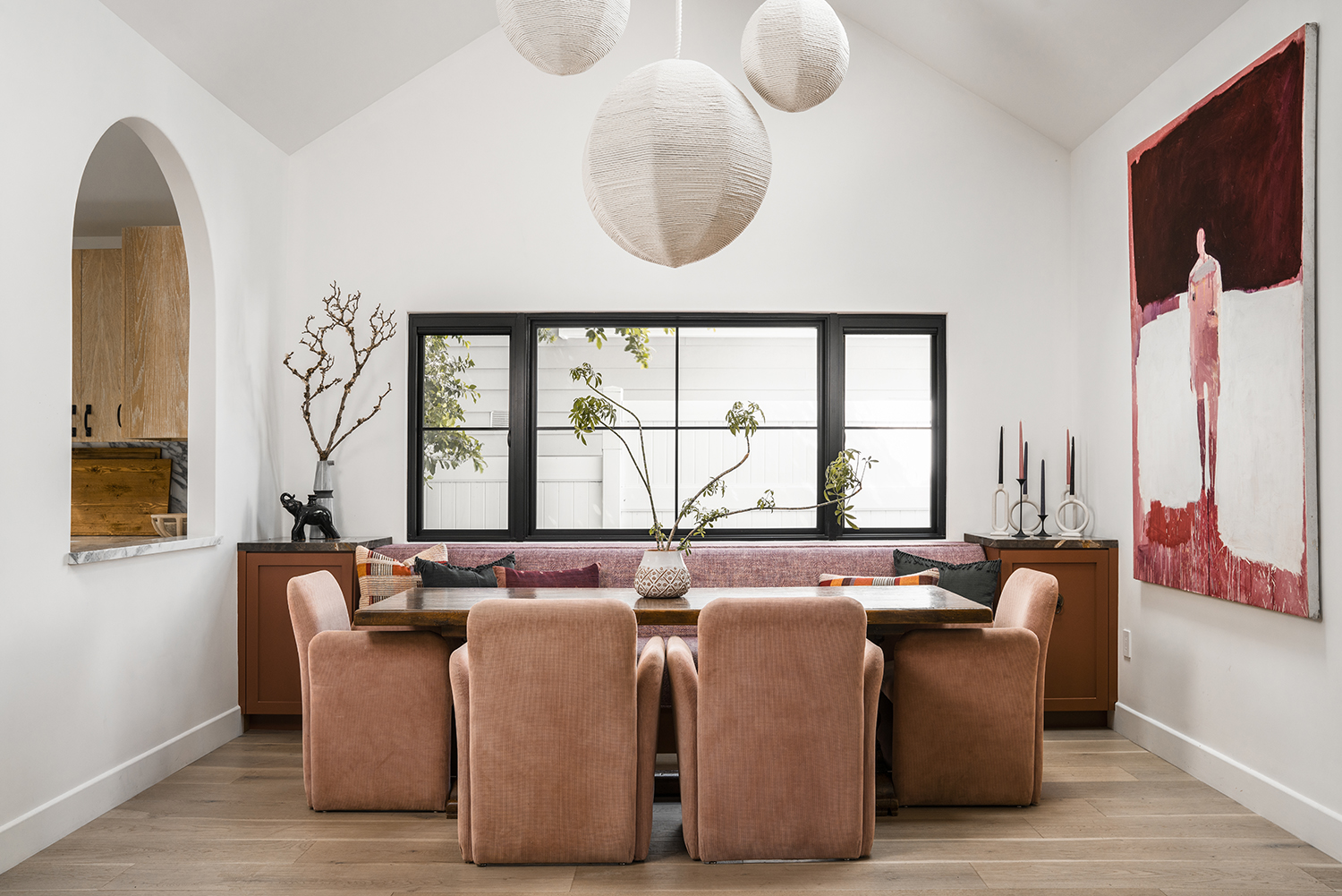
Taking the pared back whites and creams of the kitchen and injecting them with a bit of extra wamrth, the designers have landed on a palette of blush for the dining room.
'We felt the use of the lavenders and lilacs along with soft pinks gave a cool warmth to the dining area,' Jordyn says. 'This is a place where people gather and enjoy connectivity with each other, so we wanted the space to reflect the warm feeling of that experience.'
The dining room chairs are from Sunbeam Vintage. 'We love the velvety dusty rose color of the fabric and the curvature in the lines,' Hollis says.
The large-scale roped sculptural chandelier is from Cuff home studio.
TV Room
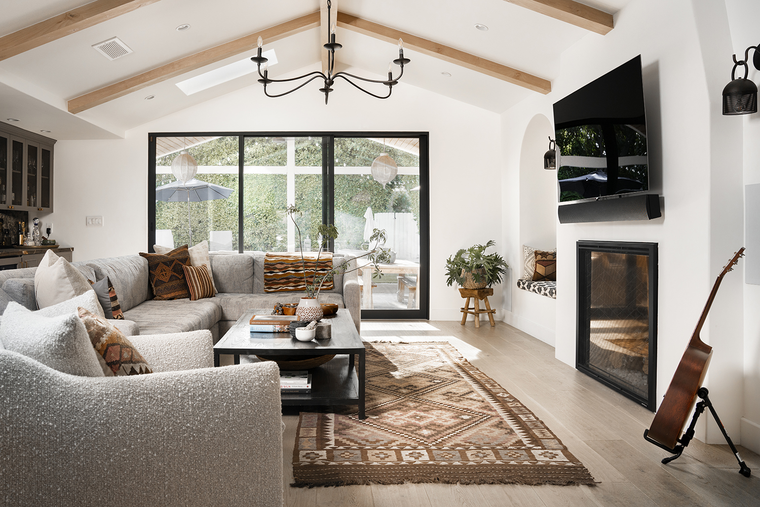
For the first time in this home, pattern and print has been used in subtle ways - blending into and not jarring with the rest of the living room.
'We think the use of prints here works particularly well because the environment is very neutral and the prints themselves are just more saturated hues of the existing neutrals in the space,' Hollis points out. 'The use of these earth-toned patterns enriches the space and gives it a bit of edge and lots of visual interest.'
The sofa is a custom design made by Landon Cole Furniture and the neutral Aztec rug is from Blue Parakeet.
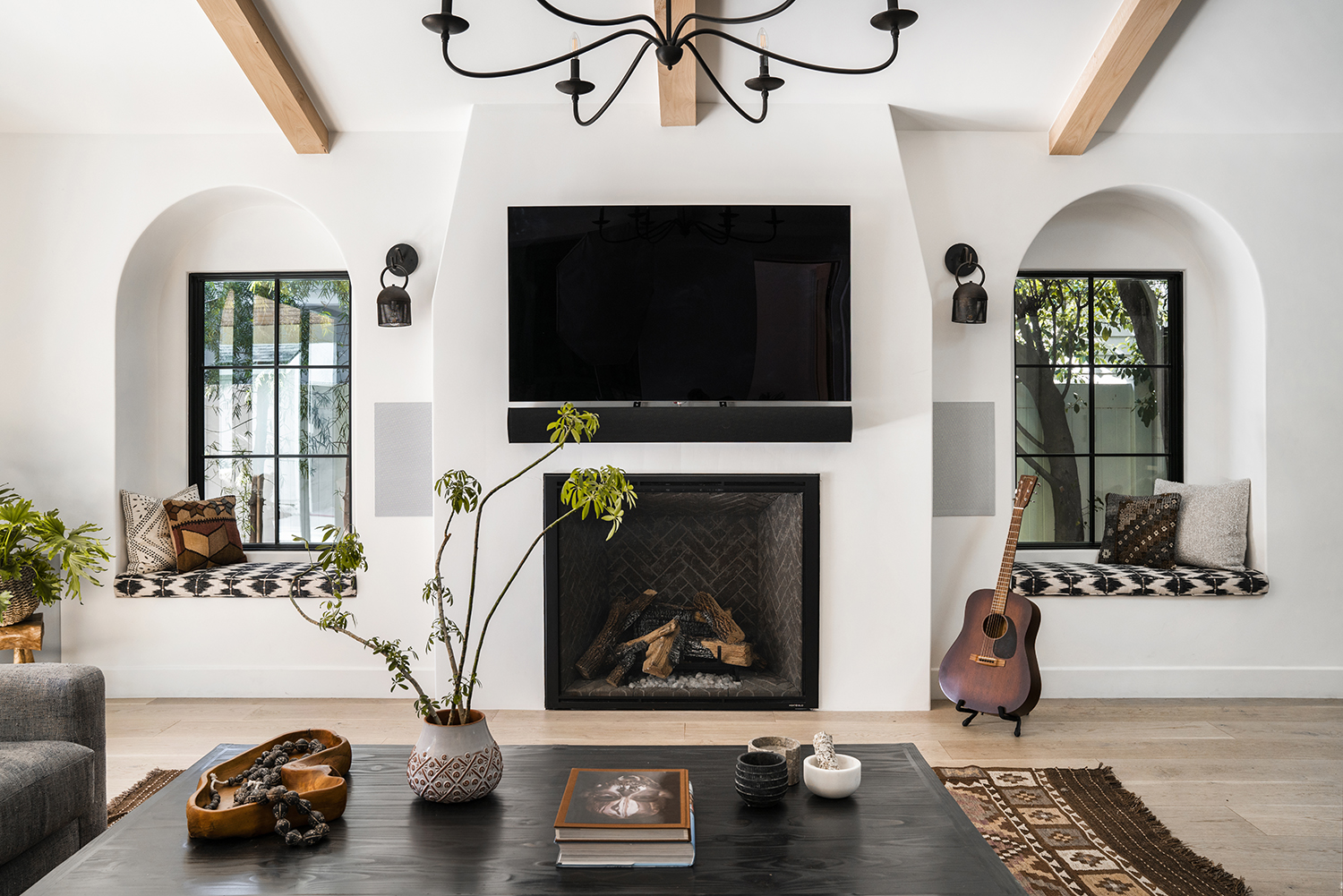
Either side of the living room TV are two homely nooks, turned lovingly into window seats. 'These are a great place to cozy up with a book and feel the sunshine,' Jordyn says. 'We also wanted to increase the seating space in the room for a place for guests to perch when the client is entertaining.'
These are fairly easy to recreate in a small space, and all you need is a little area no bigger than the lower half of your body. 'Ideally, the window seat should be big enough to stretch out your legs and relax,' Jordyn adds.
Bedroom
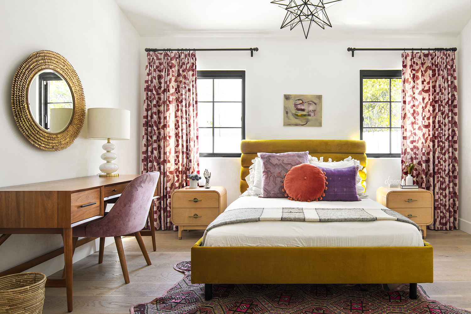
The designers felt the bedroom was a good place to up the color ante, and , lavender is a big bedroom trend right now, with people as varied as Brigette Romanek, Tom Dixon and Robert Stilin all being drawn to its relaxing properties.
'For the most part, the rest of the house has a neutral palette and so we really wanted to create a space that felt a bit warmer and cozy,' Hollis says. 'We achieved this by adding gold, pink and lilac tones in the window treatment, on the bed, the floor and the desk area. What’s lovely is being on the bed looking into the gorgeous pink bathroom and the feeling of being surrounded by warm comforting colors.'
This plush citronella velvet bed frame was purchased from Lulu and Georgia, while the drapes were custom made. 'We loved the combinations of the light and dark pink geometric pattern on the fabric for the window treatments,' Hollis says.
Bathroom
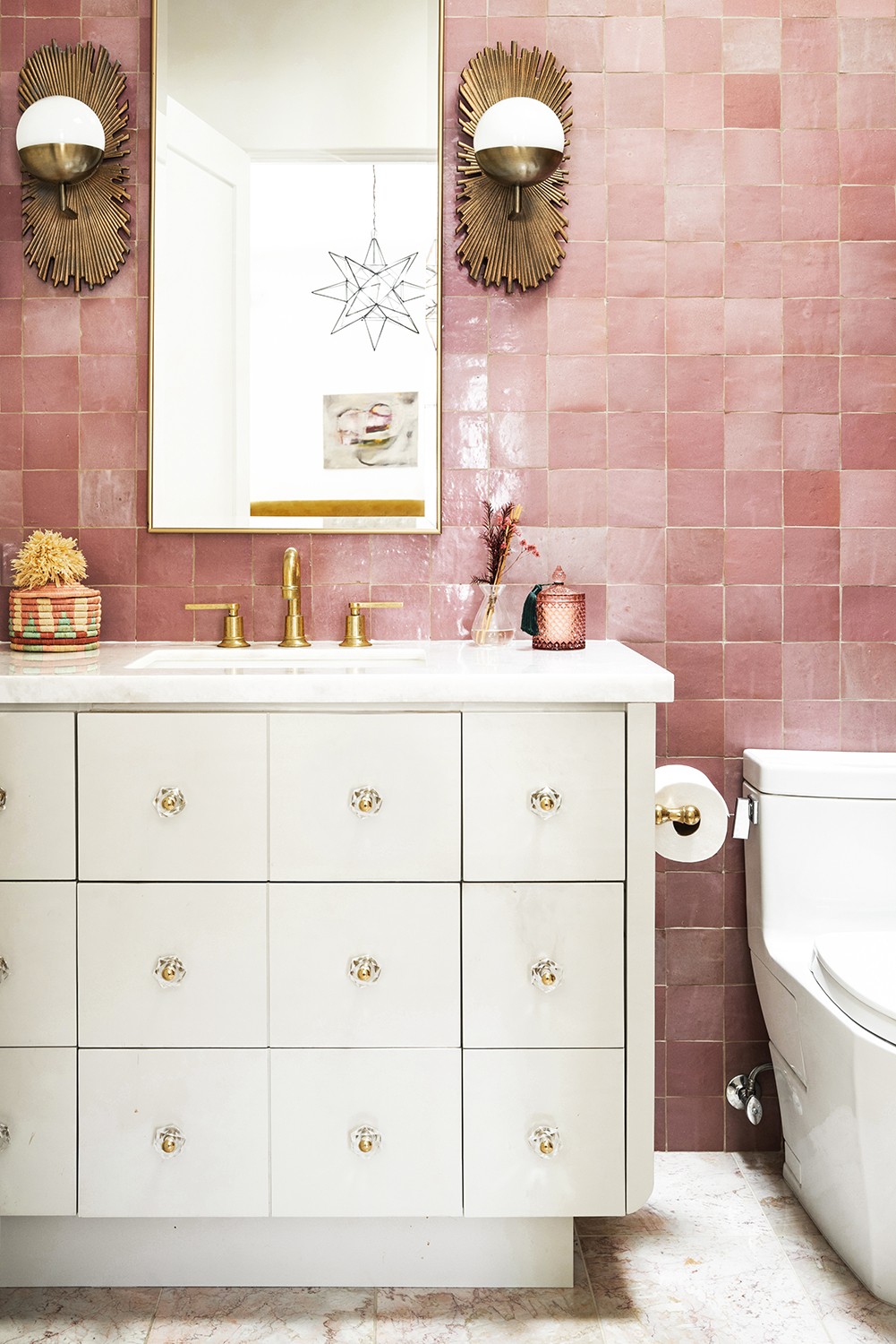
This colorful bathroom still has the serenity of a spa-like space, thanks to the way the light and glass changes the colors gradually. 'We love how the tile hues change behind the glass and therefore create an added element of dimension,' says Jordyn.
The tiles are from Zia Tile whole the bulb sconce lights were found at Anthropologie.
See more of Hollis and Jordyn's work at Hollis Jordyn Design.
The editor of Livingetc, Pip Rich (formerly Pip McCormac) is a lifestyle journalist of almost 20 years experience working for some of the UK's biggest titles. As well as holding staff positions at Sunday Times Style, Red and Grazia he has written for the Guardian, The Telegraph, The Times and ES Magazine. The host of Livingetc's podcast Home Truths, Pip has also published three books - his most recent, A New Leaf, was released in December 2021 and is about the homes of architects who have filled their spaces with houseplants. He has recently moved out of London - and a home that ELLE Decoration called one of the ten best small spaces in the world - to start a new renovation project in Somerset.
-
 My 10 Favorite Designs at Milan Design Week 2025 — Out of the Hundreds of Pieces I Saw
There is a new elegance, color, and shape being shown in Milan this week, and these are the pieces that caught my eye
By Pip Rich
-
 Iridescence Is Chrome’s More Playful, Hard-to-Define Cousin — And You're About to See It Everywhere
This kinetic finish signals a broader shift toward surfaces that move, shimmer, and surprise. Here's where to find it now
By Julia Demer