It's hard to believe this calming apartment is in NYC - it's full of design tips for how to create an urban oasis
A surprisingly calming ‘indoor-outdoor’’ space overlooking the city skyline was achieved by this designer who told me exactly how he’s done it
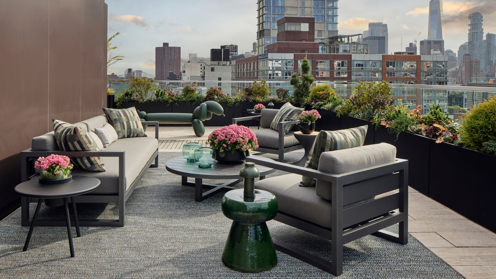
In a city where apartment living is most common, calming outdoor space is hard to come by. However, interior designer Justin Charette turned a terrace overlooking the NYC extensive views into an elevated (both practically and figuratively) space that feels like a very cohesive extension of the interior.
What was achieved is a space that doesn't look like your typical outdoor terrace - but more like an outdoor living room. All the practicalities of material durability for an outdoor space were thoughtfully planned so that form and function are immaculately balanced.
I spoke to Justin about his brief, thought process, and design narrative and got the best ideas for you to try and implement at home.
The brief, the space, and the vision
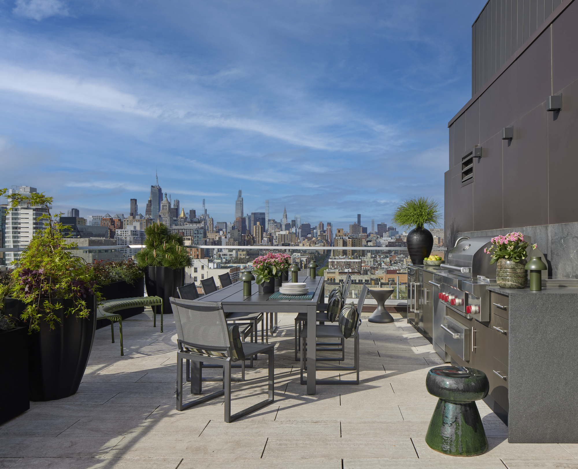
The home is located in the vibrant, artistic East Village and Justin wanted the home to reflect that, and feel fresh, not stuffy. ‘This was accomplished through the color palette and with young artists’ work featured throughout the space,’ designer Justin Charette tells me.
The homeowner, a mid 50’s bachelor with college-aged children wanted his home to feel complete, but not overcrowded, and really showcase the NYC views. Art curation was also an important element that I noticed was also used in the outdoor area. ‘With careful editing, I was able to achieve a layout that lets the eye focus on views from every window, and place large-scale art in each room.’ The thoughtful art placement adds character and a layer of interest.
The overall look of the apartment is a great example of both timeless and modern interior design. ‘I wanted it to age gracefully without leaning on too many trends that couldn’t be easily changed out at minimal cost,’ explains Justin.
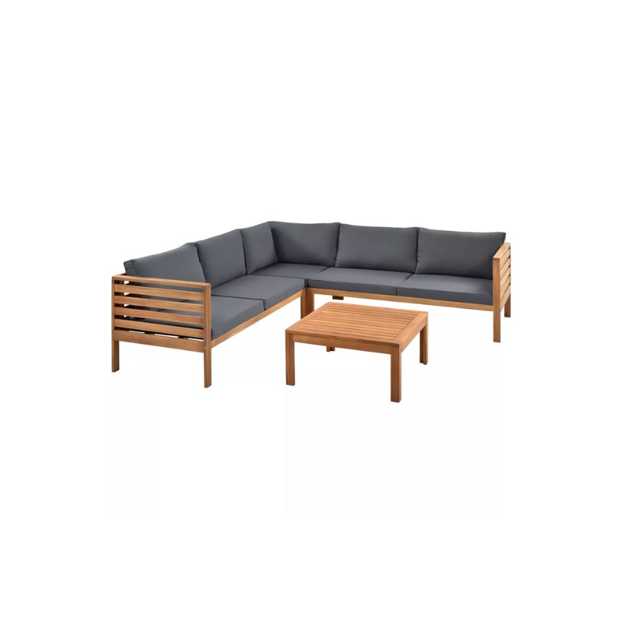
Price: $720
This outdoor sofa has a more elevated look due to it's wood frame and dark grey cushions.
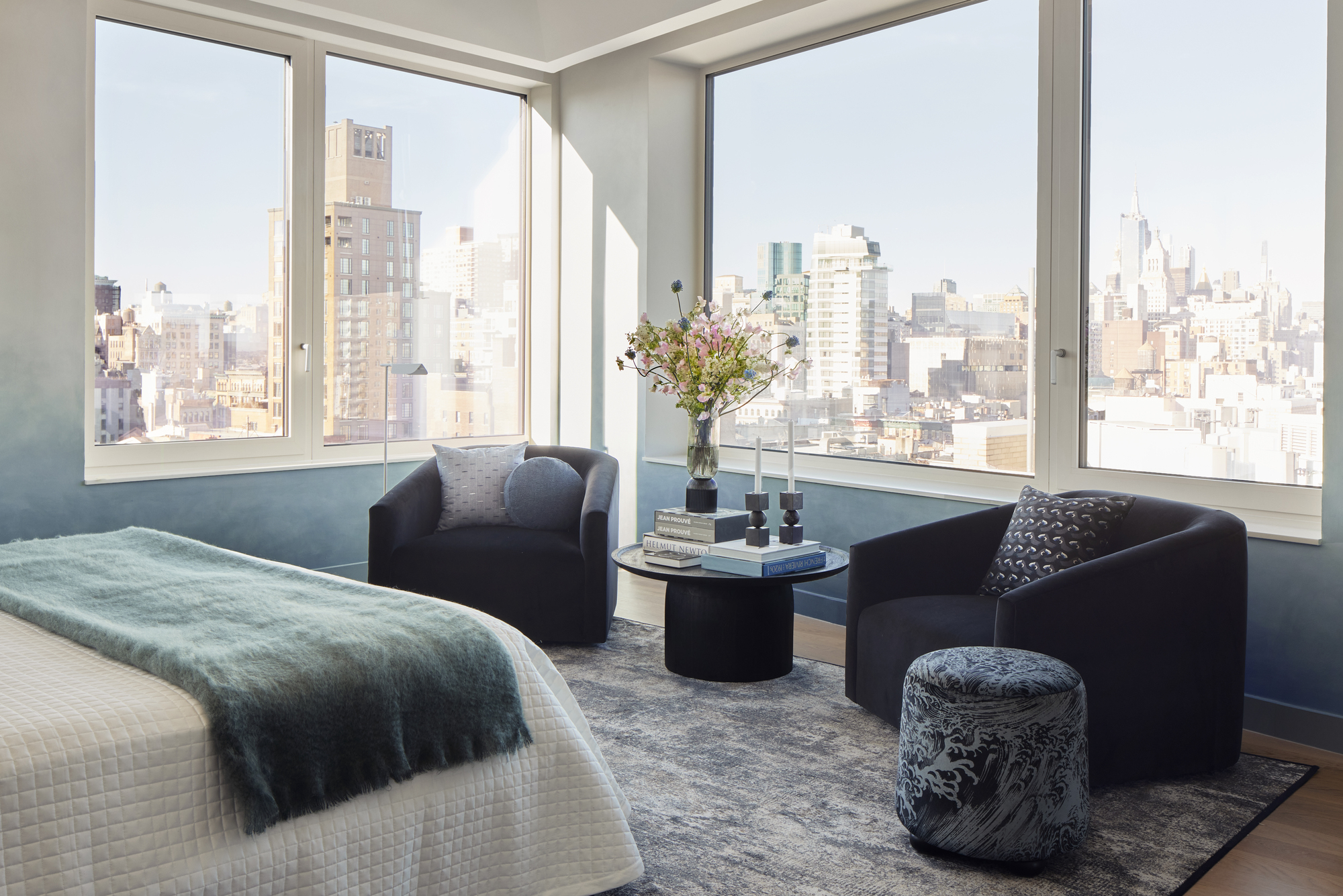
The overall light and neutral color schemes allow the artworks throughout to stand out. In the primary bedroom, the blue ombre effect walls really give a feeling like one is sleeping among the clouds. Again, that indoor-outdoor feel that the design so subtly yet effectively nods to.
Be The First To Know
The Livingetc newsletters are your inside source for what’s shaping interiors now - and what’s next. Discover trend forecasts, smart style ideas, and curated shopping inspiration that brings design to life. Subscribe today and stay ahead of the curve.
Justin didn’t stick to traditional rules when picking his colors. ‘I didn’t shy away from pops of pink and other brighter colors not often found in a bachelor pad. The overall feeling is handsome and masculine, without being too overt.’
How the terrace feels so calm
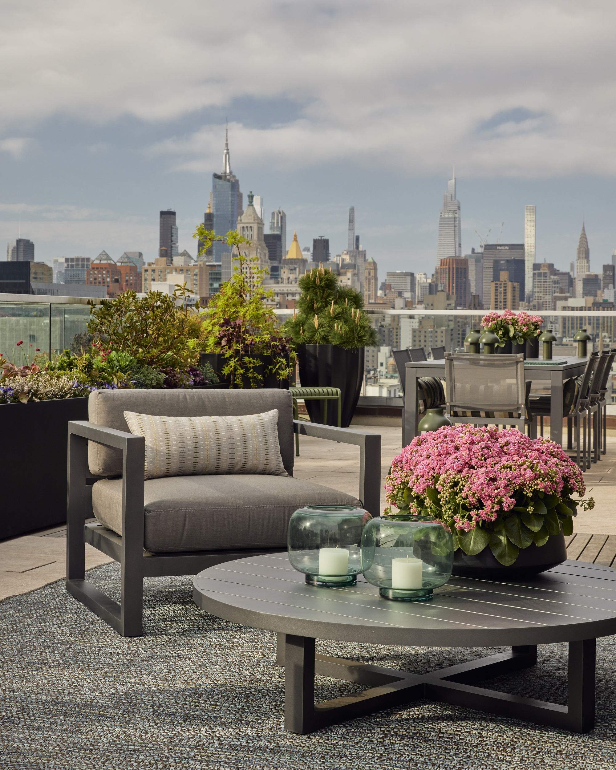
What I enjoy the most about the design of this apartment is how the outdoor space flows so seamlessly from the interior. Justin tells me this was indeed his intention. It doesn’t feel like your usual terrace, but more like a calming oasis that is a continuation of the inside space.
‘The color palette feels similar, and I wanted it to feel comfortable but stylish like the rest of the Penthouse.’
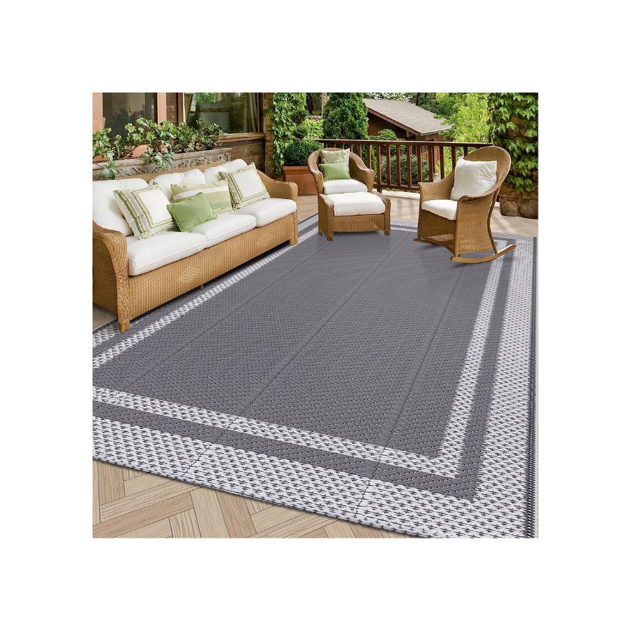
One of the ways in which this look was achieved was by avoiding the use of typical outdoor furniture. ‘I used a weaved indoor-outdoor rug from Stark Carpet. It gives a sense of texture. For the furniture, I selected an array of small tables made of high-performance materials, as well as performance fabrics to give the resemblance of indoor furniture, while still being able to handle the elements.’ The biggest challenge proved to be that the terrace got full exposure to the sun all day so the designer needed to choose plantings that could withstand the heat.
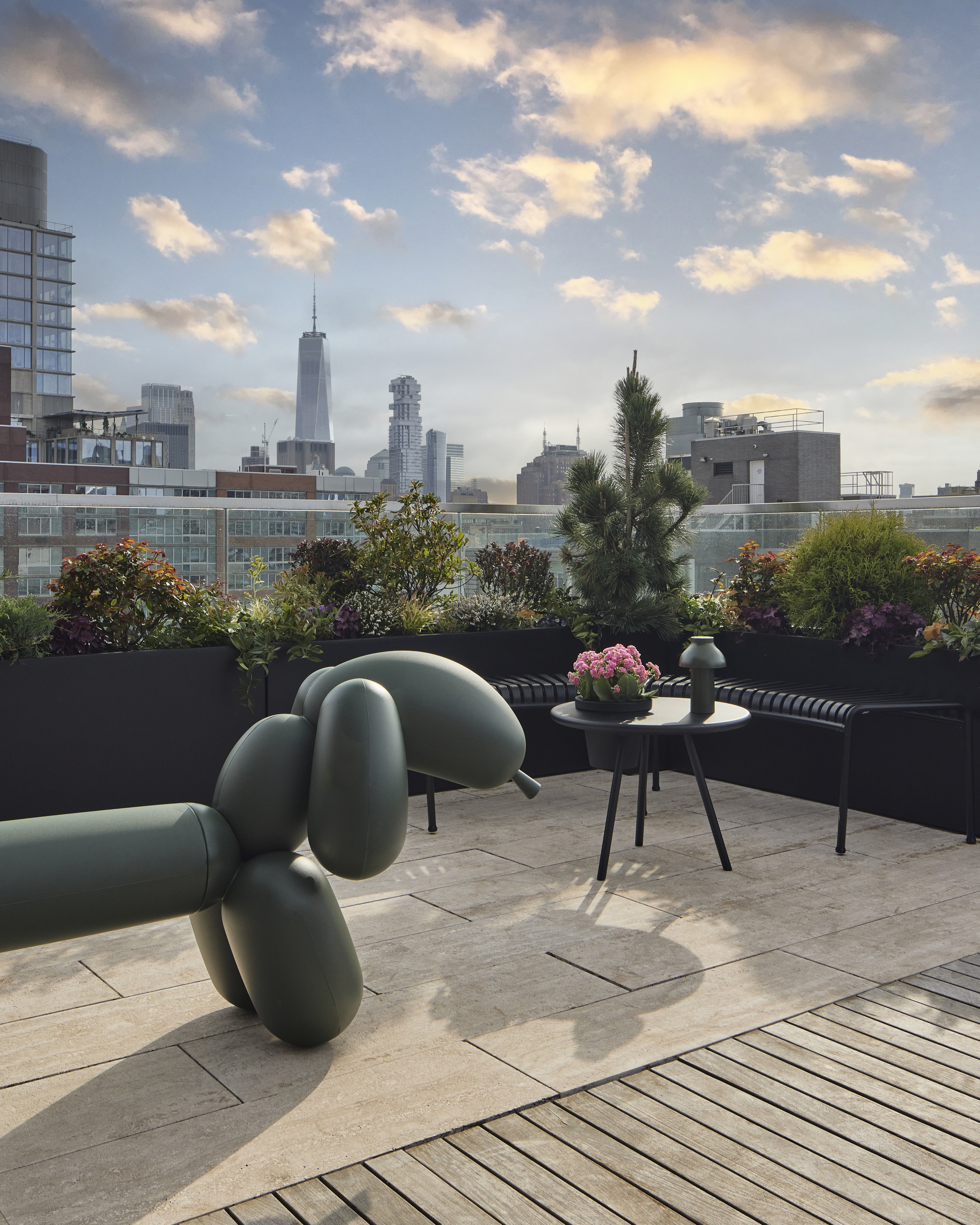
The thoughtful use of artworks, less typical in an outdoor setting adds to the subtle ‘living space’ feel, and again is a successful combination of form and function. ‘For the terrace, I used a large sculpture of a Weiner dog. It also serves as a bench.’
Justin explains that his client didn’t want the terrace to feel like it was a typical backyard set-up, considering the beautiful skyline views that make it special. ‘The specific consideration was to make sure it felt elevated and considered.’
It definitely looks elevated and considered and I for one am inspired by the smooth transition from the indoors to this calming outdoor oasis overlooking busy NYC.
Raluca formerly worked at Livingetc.com and is now a contributor with a passion for all things interior and living beautifully. Coming from a background writing and styling shoots for fashion magazines such as Marie Claire Raluca’s love for design started at a very young age when her family’s favourite weekend activity was moving the furniture around the house ‘for fun’. Always happiest in creative environments in her spare time she loves designing mindful spaces and doing colour consultations. She finds the best inspiration in art, nature, and the way we live, and thinks that a home should serve our mental and emotional wellbeing as well as our lifestyle.
-
 The Weighted Blanket That Doesn’t Make You Sweat (and the Eye Mask to Match)
Luxury has weight. And apparently, volcanic minerals
By Julia Demer
-
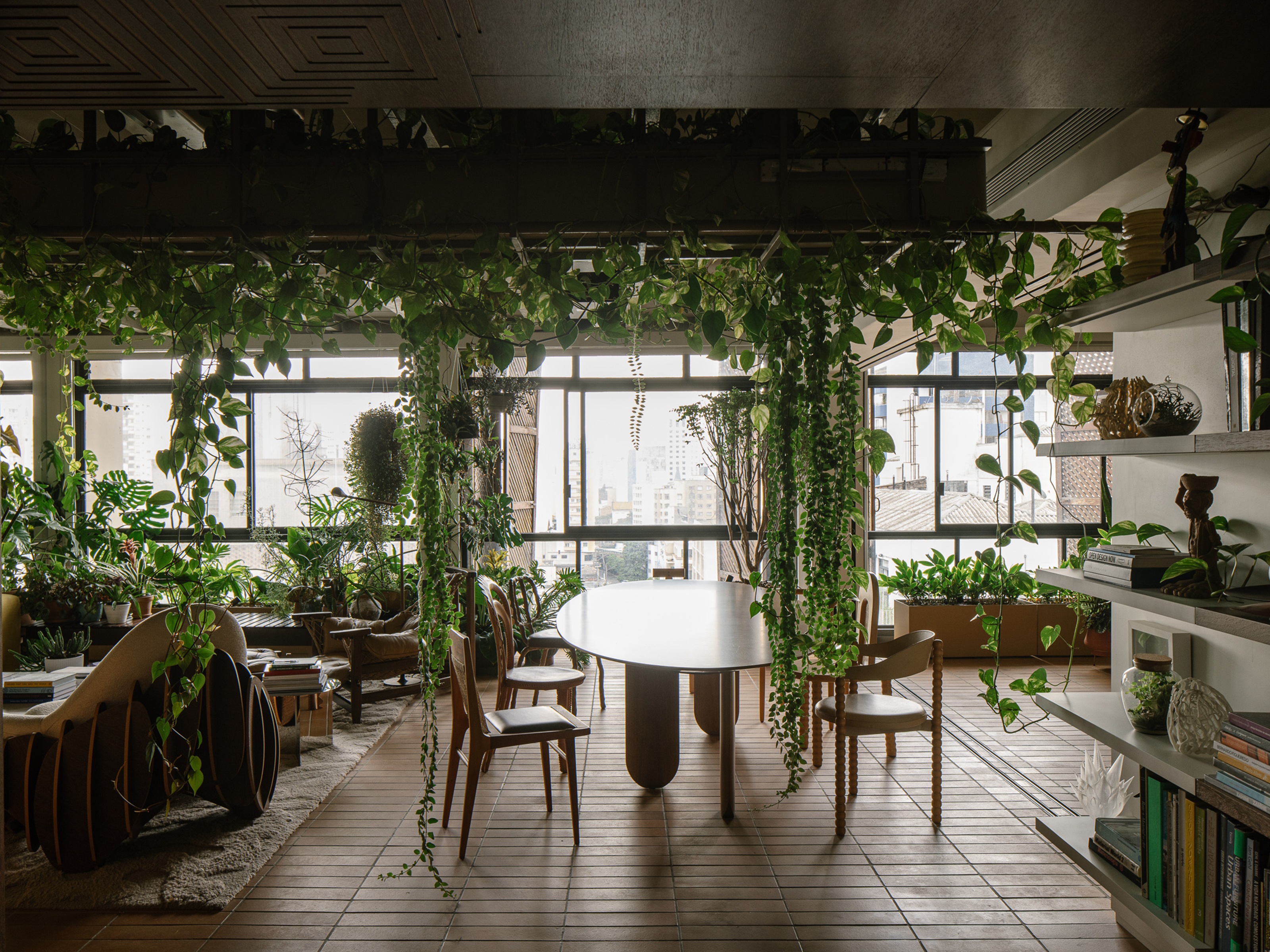 What Is Biophilic Interior Design? I'm an Actual Biophilic Designer, and This Is How to Apply It to Your Home
A biophilic designer explains the core principles of this practice, and the easy ways you can apply it to your home's design
By Marianna Popejoy
