This characterful house in Austin, Texas, shows how minimalism can be warm and inviting
Neutral palettes, flashes of gold and a drinks station of dreams, SLIC Design's project in Texas is a minimalism masterclass

Austin is officially the coolest city in America. It's where trends begin, creatives live, and the rest of the design world takes note. But it's also one of the hottest cities in America - its summers can regularly reach 100F with a thick, swampy heat that means shade is essential.
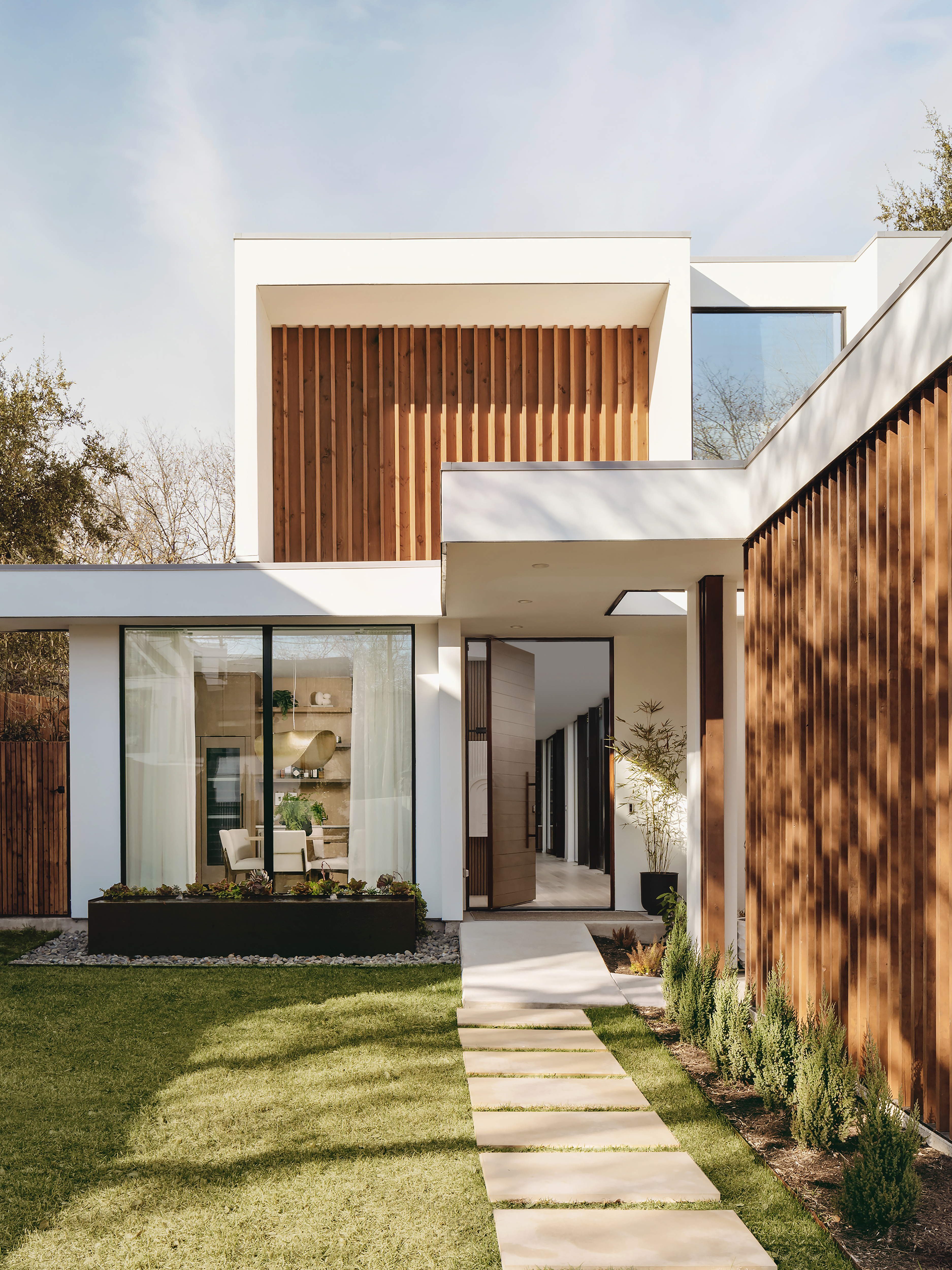
That was the thinking behind this new build modern home in Bouldin, one of Austin's trendiest neighborhoods. Envisioned by Sara Cukerbaum and her team at SLIC Design, it's a clever blend of ideas that celebrate all of Austin's wonderful natural light and also helps anyone in the home to feel chilled - in both senses of the word.
'This home featured floor to ceiling glass so we did not struggle with natural light,' Sara says. 'In homes that aren't as lucky, we focus on a cool color palette, materials with high sheen and mirrors, which tend to reflect the light and bounce it around the home.'
The cool palette is in evidence here - natural woods, pale greys and flashes of bronze help to create a soothing enviroment. Everything you see here has been purposefully selected. 'Each piece,' Sara says, 'was selected because it spoke to the client, her aesthetic and how she wanted to live in the space.'
As ever, the key to a neutral scheme is to mix in a layer or extra texture, be it the occasional fabric of metallic shine. 'I love to add elements of gold, always!' Sara says. Particularly in a neutral scheme. In this home, the brass accents added warmth to an otherwise neutral palette. It also served as a dramatic pop, something bold for guests as they entered the home.'
Kitchen
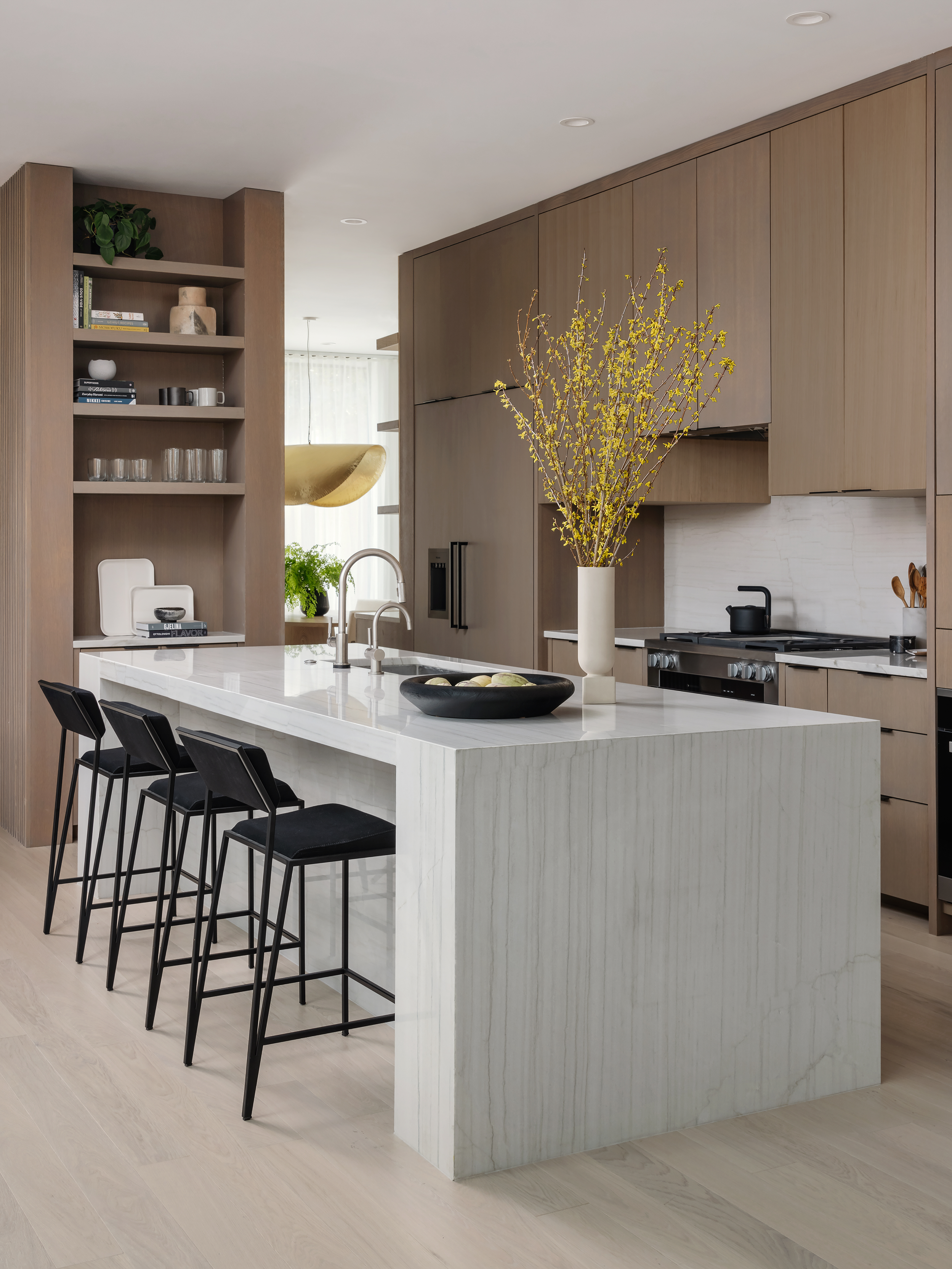
The sleek modern kitchen feels cool just to look at it. With countertops made from white Macaubas Quartzite and cabinets in Shinnoki Desert Oak Stain the result is a gleaming space that is both airy and relaxed. By carrying the surface over the side of the island and down the edges in a waterfall style, there is nothing to break the eye.
'This island was particularly long at about 12 feet,' Sara says. 'The asymmetric stone block on one end of the island anchored the kitchen, also drawing attention to this beautiful quartzite.'
Be The First To Know
The Livingetc newsletters are your inside source for what’s shaping interiors now - and what’s next. Discover trend forecasts, smart style ideas, and curated shopping inspiration that brings design to life. Subscribe today and stay ahead of the curve.
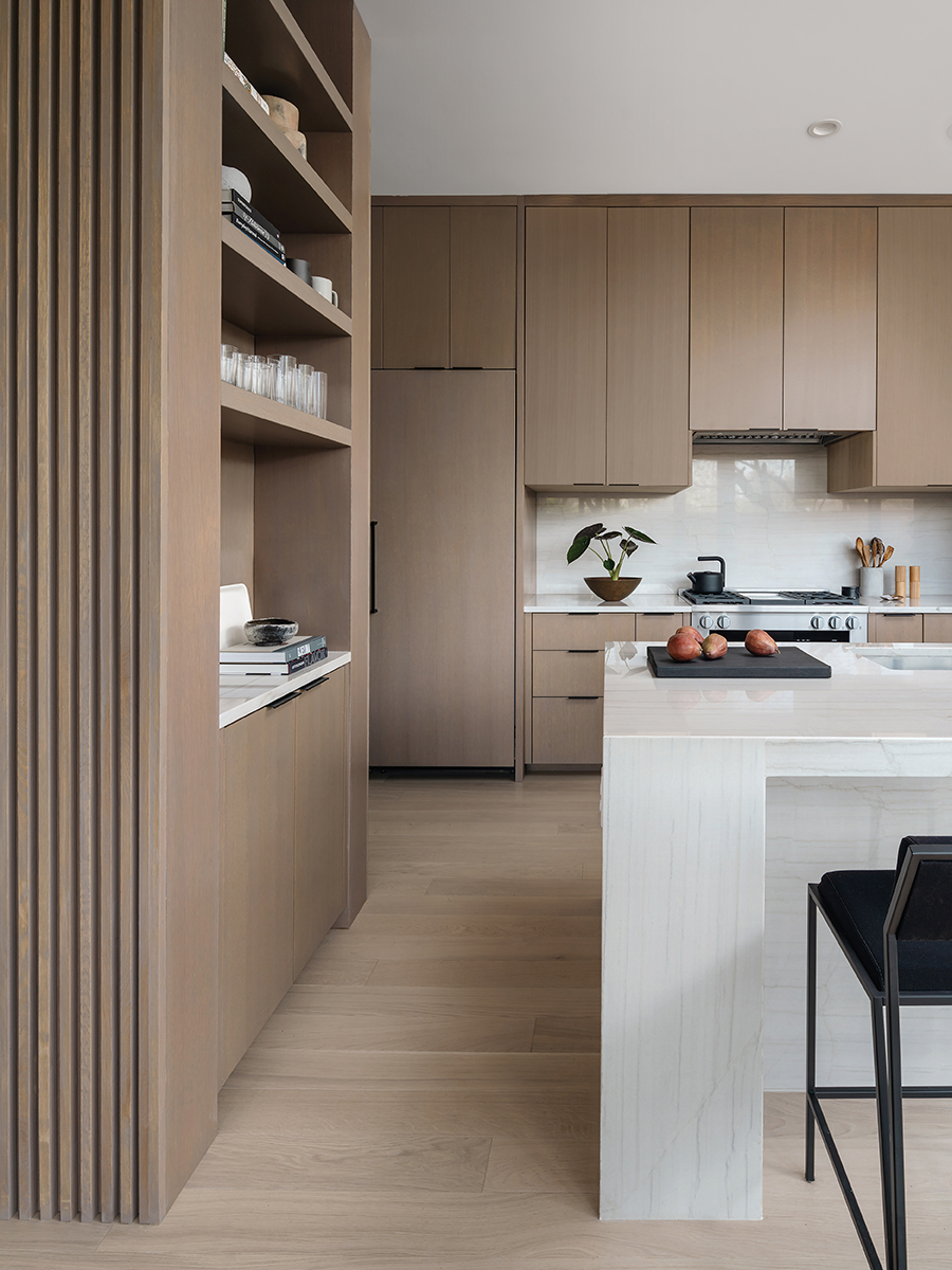
Breaking the clean lines of the kitchen cabinets is a section of open shelving, a way to add some personality and charm by a curation of objets.
'The client cooks a lot and wanted a modern way to display all her cookbooks,' Sara says. 'Originally, the island was a peninsula off the wall so we decided to create an opening so there would be more circulation.'
Dining area

While this dining room space is located right off the entry, it is a very private room in the house. The client really wanted this space to remain intimate for small dinner parties. To add to this sense of this intimacy, fabric comes into play in the form of sheer linen curtains from Canvas Showroom.
'We added a lot of textiles to the space including the sheer linen drapery,' Sara says. 'This drapery softens the natural light and creates a beautiful natural texture to the space. It softened the modern lines of the room.'
The pendant light is Light Object 018 by Naama Hofman, sold by Galerie Philia Furniture out of Geneva, Switzerland via 1stdibs and is perfect for this minimalist dining room. 'It has since been named the golden taco, which is pretty fitting for us taco loving Austinites,' Sara jokes.
Drinks station
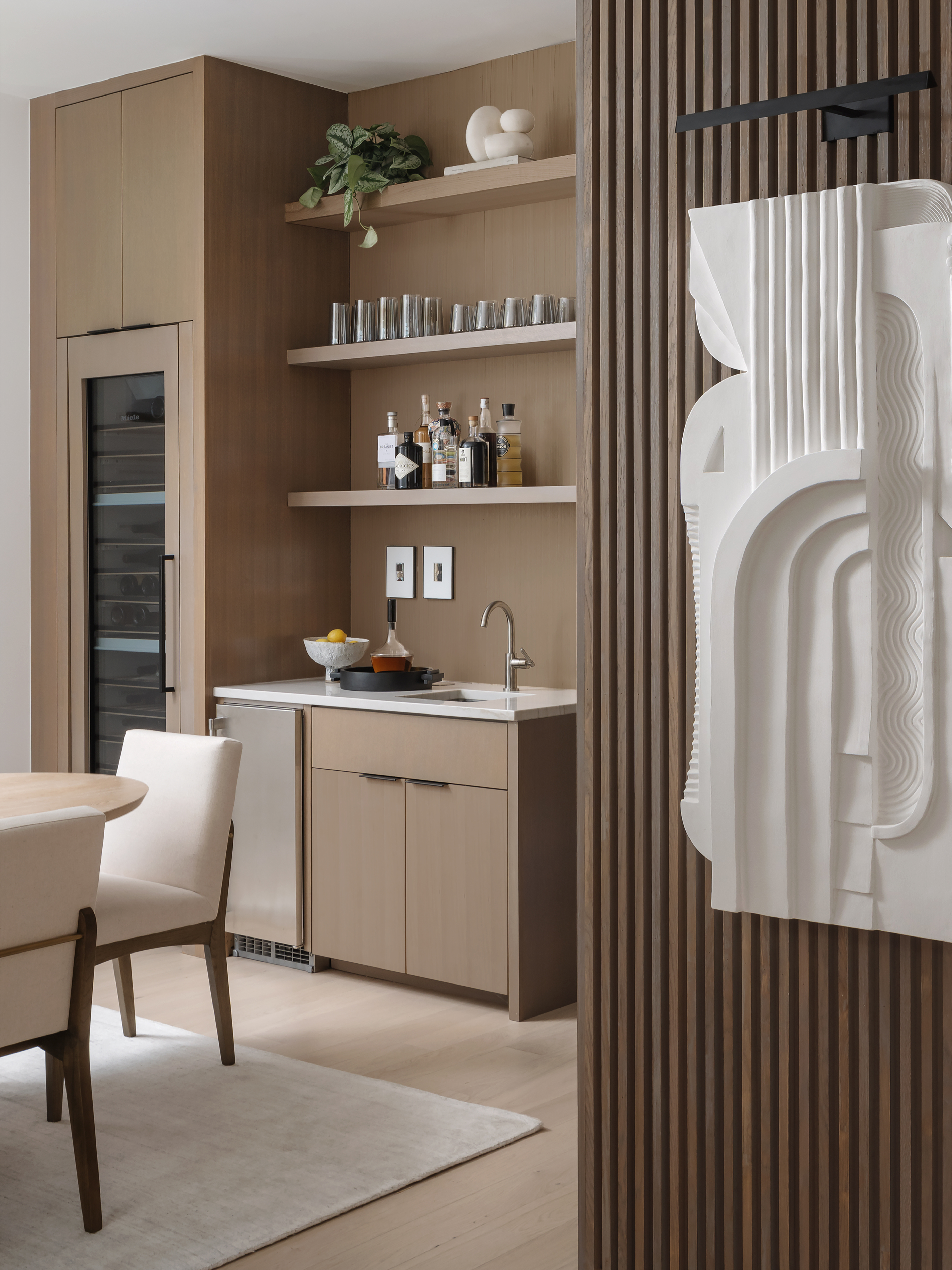
On seeing Sara's in-built home bar, you might start to wonder if any dining area is complete without a drinks station! 'Since the client hosts a lot of dinner parties, she asked for a full functioning bar where she could mix up specialty cocktails without having to walk to her kitchen,' Sara says.
Here, a sink, wine fridge and glassware storage makes the ideal set up. 'It doesn't need to be a big space,' Sara says. 'Efficiency is key when mixing up drinks!'
All the built-ins in the home are a rift cut oak with a desert stain. The stain creates a warm taupe finish to the oak veneer.
Relaxed dining area
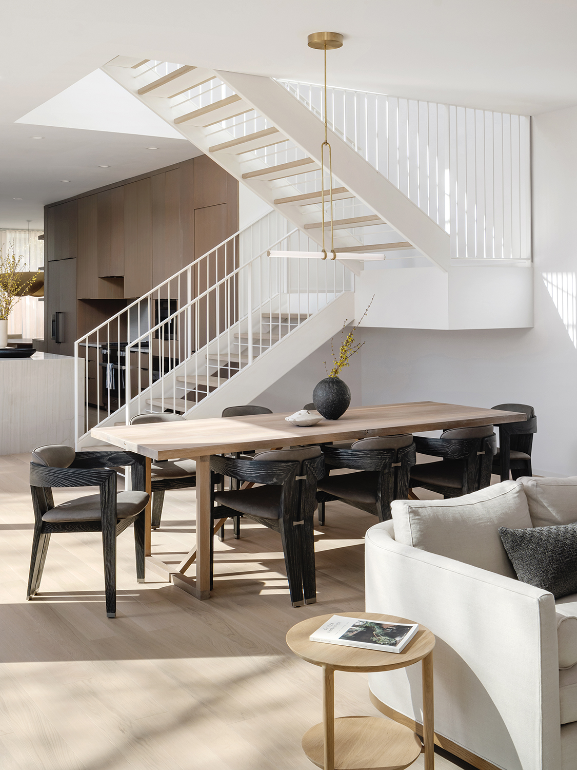
'The floor plan was 95% defined when the client hired us for the interior design,' Sara says. 'Since we were not able to move the staircase, we designed a floating steel staircase with minimal lines and painted the steel white. The clients had originally planned on painting the stairs black but we pushed them to think outside the box and go with white steel stairs so the space would feel more open. In the end, the stairs became more sculptural and less divisive.'
The stairs actually became the perfect partition to help zone the open plan living space, creating this relaxed dining area near the kitchen, but not entirely connected to it.
Living area
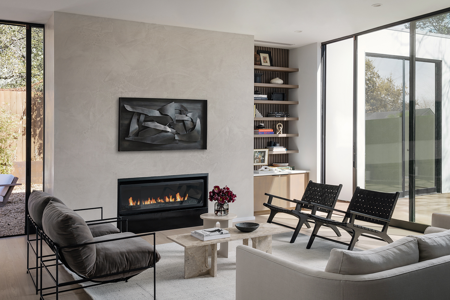
'The downstairs living area was intended to serve as a space for casual get togethers so we wanted to have several seating areas for the client's guests,' Sara says, explaining the way chairs are grouped together, facing towards each other.
Despite the light and bright windows, this living room is actually surprisingly cosy. 'Textiles and decor are the best way to soften a space with lots of glass,' Sara says. 'The shelves to the right of the fireplace and the warm textiles in the living room create warmth and attraction away from the expansive glass. It's a very delicate dance because we want the space to take on its own personality without stealing from the home's architecture. It's a designed minimalism that creates that perfect balance.'
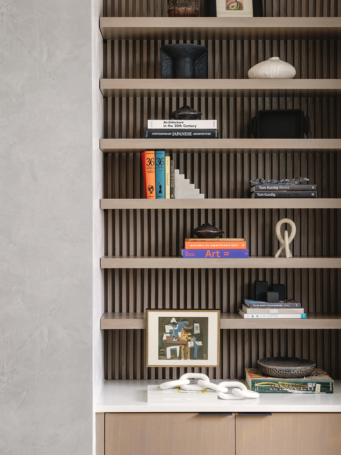
The living room shelves are so much more than just storage - they've become a neat way to display art. 'This was a last minute decision when I was styling the client's home,' Sara says. 'I wanted to create more dimension to compete with the slats on the back of the shelves. By bringing artwork to the edge of the shelves, your eye really captures the depth and dimension.'
Bedroom
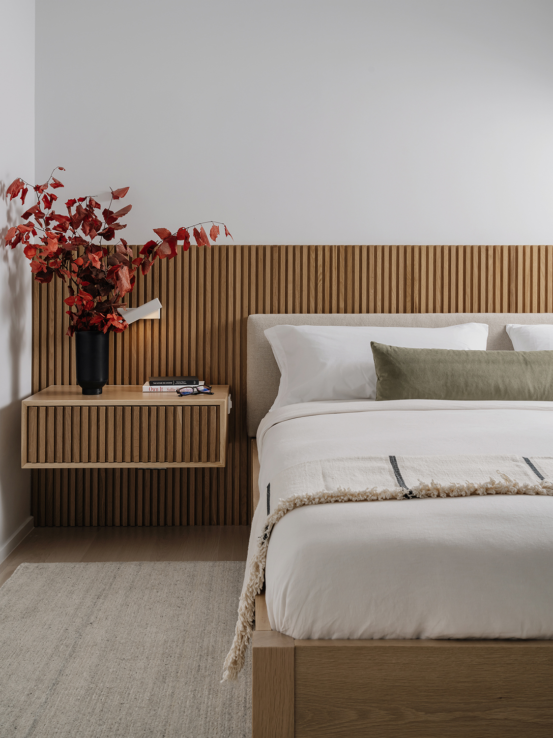
The wooden slats make an appearance in the modern bedroom, too, creating a really cohesive decor scheme. 'The client asked us to create a home that felt fluid and with strong continuity,' Sara says. 'When we were exploring different ideas for their bedroom, the built-in slat bed was the one they were drawn to the most. It was that refined and warm minimalism that won in the end.'
The area rug is from Restoration Hardware.
Bathroom
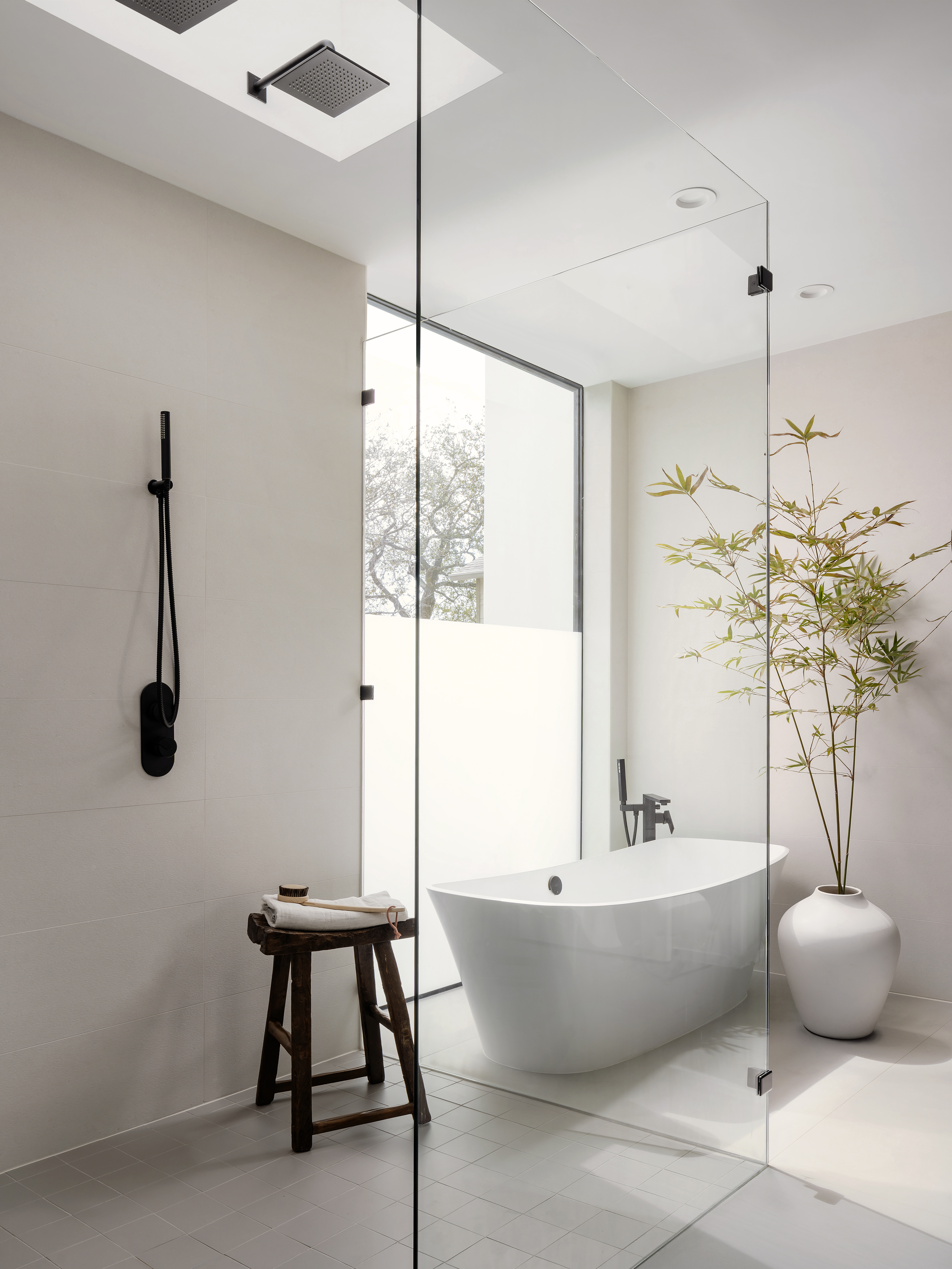
The modern bathroom takes the zen-like calm of the rest of the house and sets the dial firmly towards 'spa.'
'The best way to create a bathroom that is spa-like is to make sure you have some warmth such as wood or natural stone,' Sara says. ;In this space, we used wood paneling around the bathroom. The rest of the room is covered in large format stone tile. Most spa-like spaces show real restraint, highlighting the ways minimalism can be so warm and inviting.'
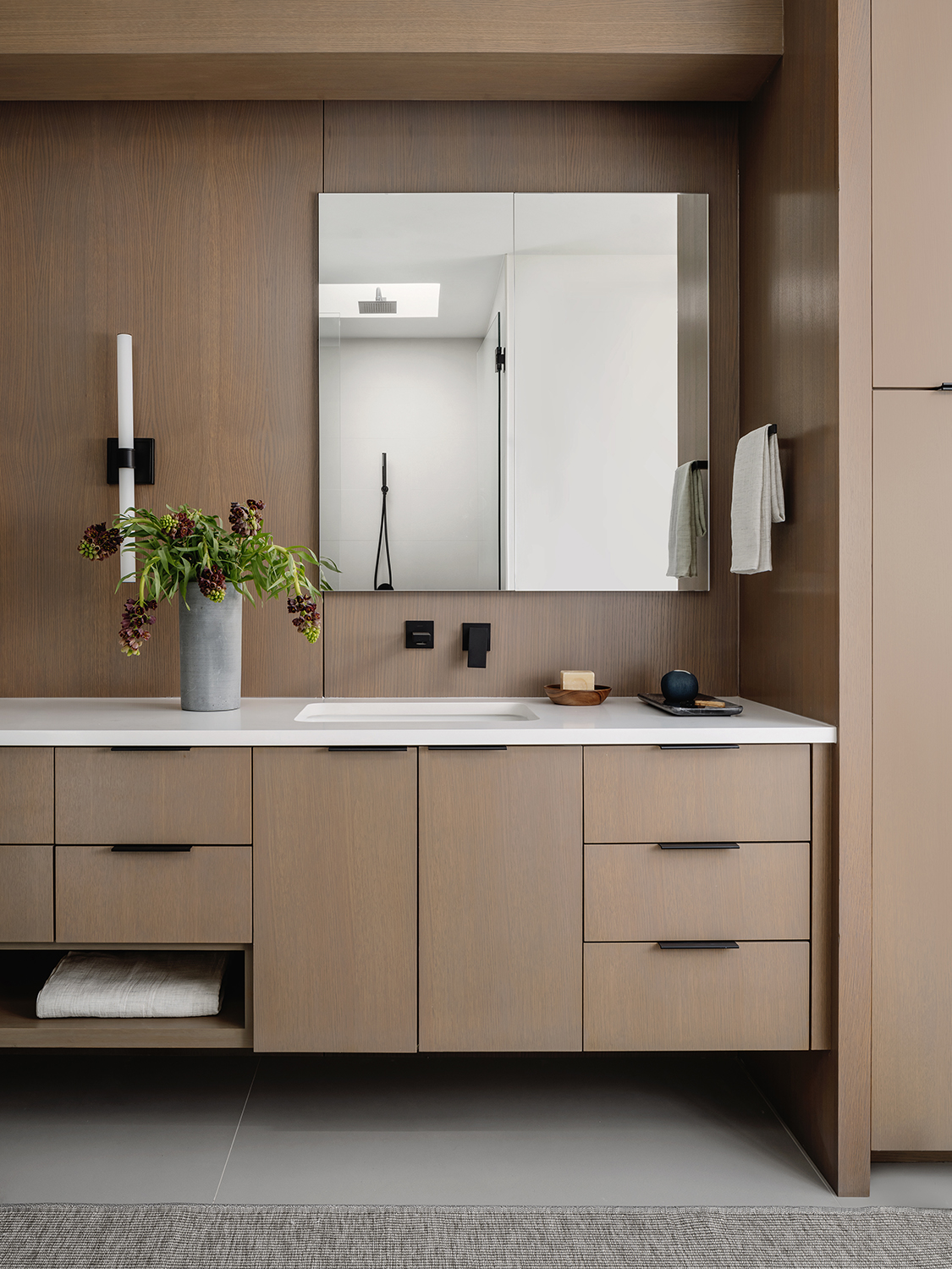
See more of Sara's work at SLIC Design.
The editor of Livingetc, Pip Rich (formerly Pip McCormac) is a lifestyle journalist of almost 20 years experience working for some of the UK's biggest titles. As well as holding staff positions at Sunday Times Style, Red and Grazia he has written for the Guardian, The Telegraph, The Times and ES Magazine. The host of Livingetc's podcast Home Truths, Pip has also published three books - his most recent, A New Leaf, was released in December 2021 and is about the homes of architects who have filled their spaces with houseplants. He has recently moved out of London - and a home that ELLE Decoration called one of the ten best small spaces in the world - to start a new renovation project in Somerset.
-
 Burl Wood Decor Is 2025’s Most Coveted Comeback — Here’s How to Get the Storied Swirls for Less
Irregularity is the ultimate luxury, but you don’t need an antiques dealer to find it
By Julia Demer Published
-
 5 Garden Features That Instantly Add Value to Your Home — While Making Your Outdoor Space More Practical, too
Get to know all the expert tips and tricks for making your backyard a standout selling point for your home.
By Maya Glantz Published