Discover a modern London townhouse that's ahead of the curve
Interior designer Irene Gunter has brought a symphony of glass and arched edges to this reimagined Chelsea home
The Livingetc newsletters are your inside source for what’s shaping interiors now - and what’s next. Discover trend forecasts, smart style ideas, and curated shopping inspiration that brings design to life. Subscribe today and stay ahead of the curve.
You are now subscribed
Your newsletter sign-up was successful
Irene Gunter of Gunter & Co calls the owner of her latest project – a 1950s London townhouse – ‘an open-minded client.’ This faith in the firm has led to a remarkable transformation, giving the house an entirely new identity with a bold design language.
‘It was built in after the Second World War and had a garage and a driveway. We immediately saw the opportunity to make it less car and more human friendly,’ says Irene, whose introduction of curved forms throughout the house brings a softer more palatable character optimised for the human gaze.
ENTRANCE HALL
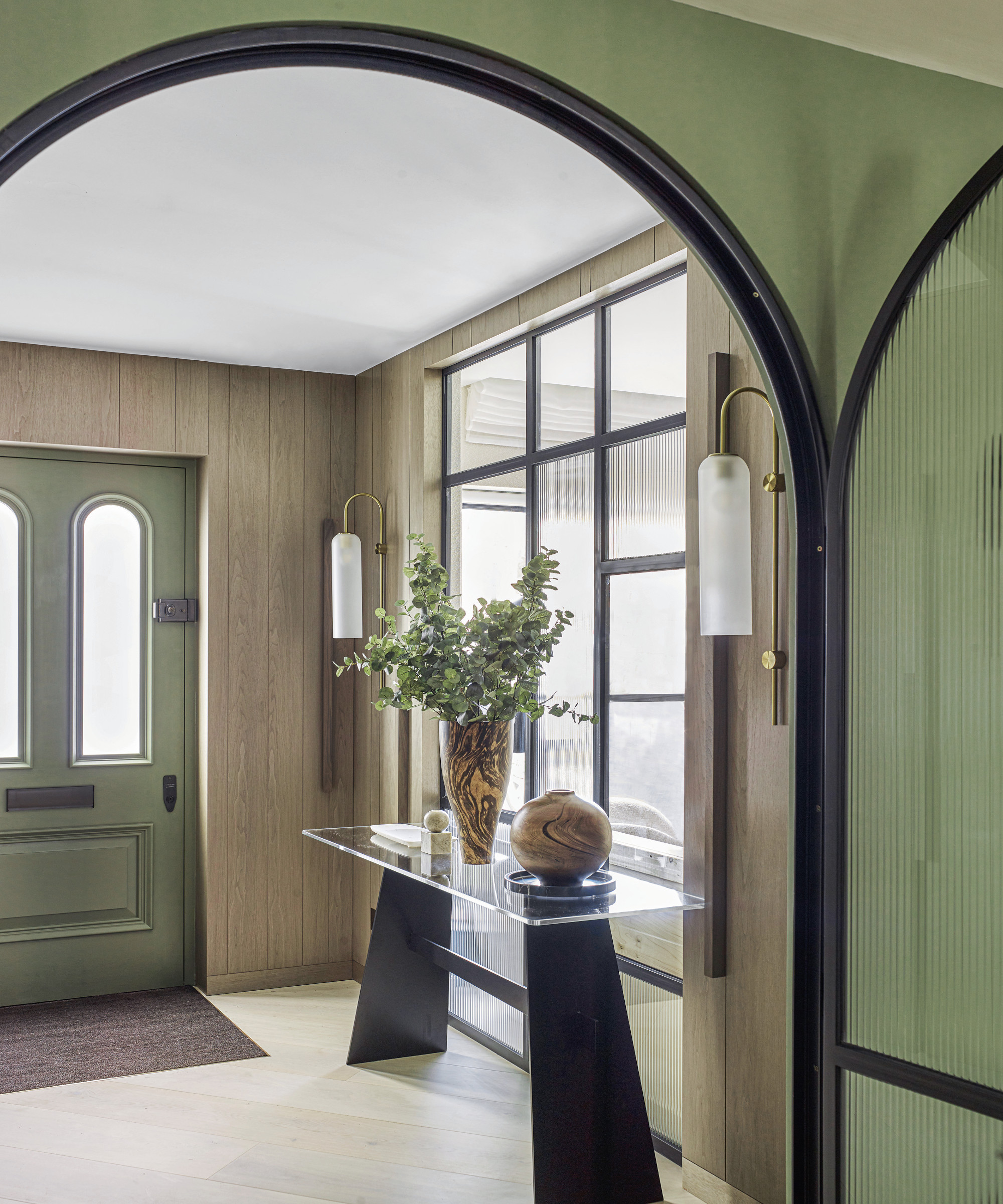
‘We inherited a mishmash of rooms. We wanted to salvage the situation by stripping it back to the bare bones. After adding up all the ingredients, we decided the building needed a more modern identity,’ Irene explains.
Article continues belowGutting the house completely, Irene and her team worked closely with McGuinness Architects to arrange an entirely new layout including two new staircases. ‘At one point, you were able to walk into the house and all you saw were joisted floors and the roof,’ Irene notes.
In the hall, timber panelling allowed the option to incorporate plenty of storage. 'It’s a much longer-term solution than painted walls, which get scuffed so quickly’, says Irene.
LlVING AREA
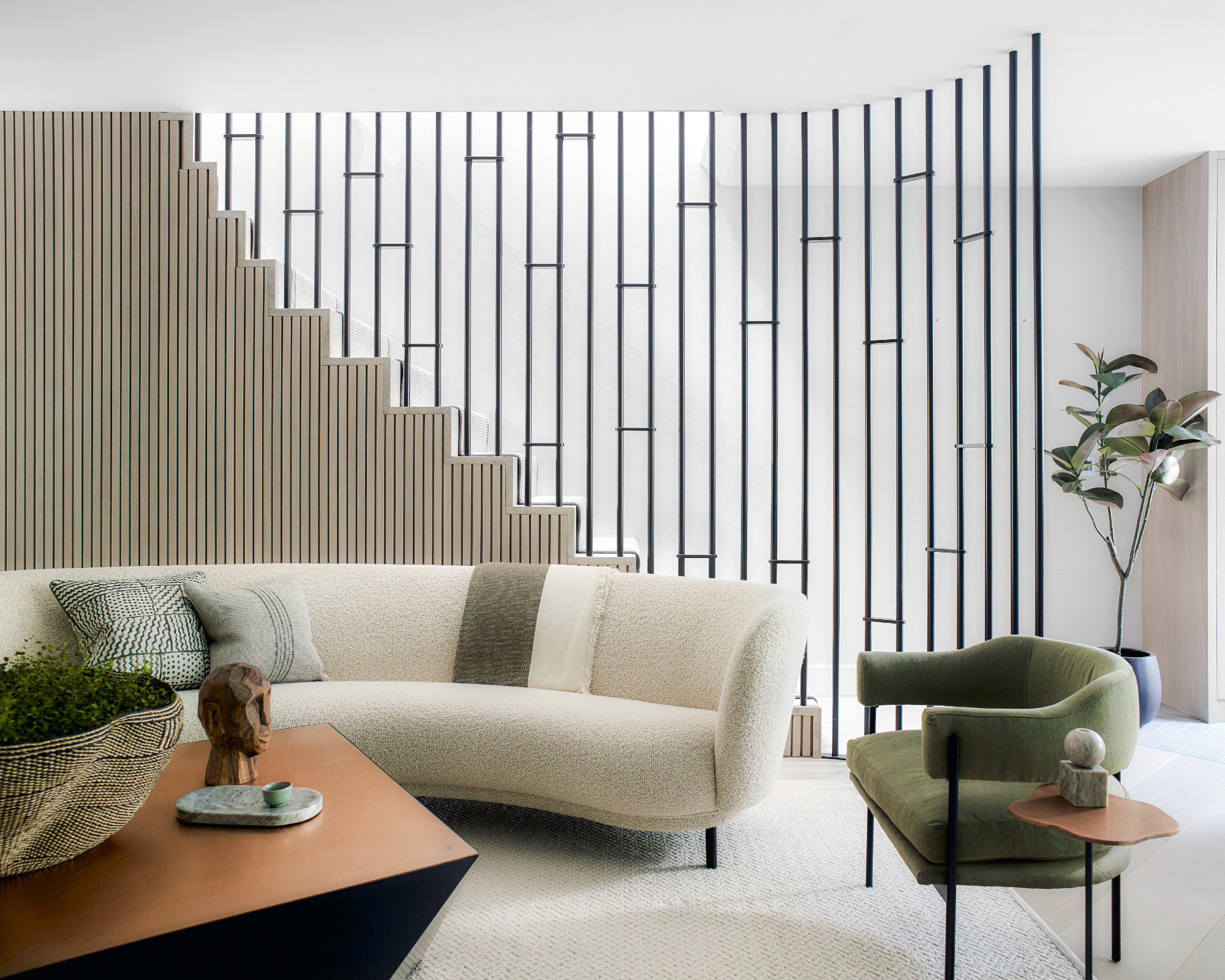
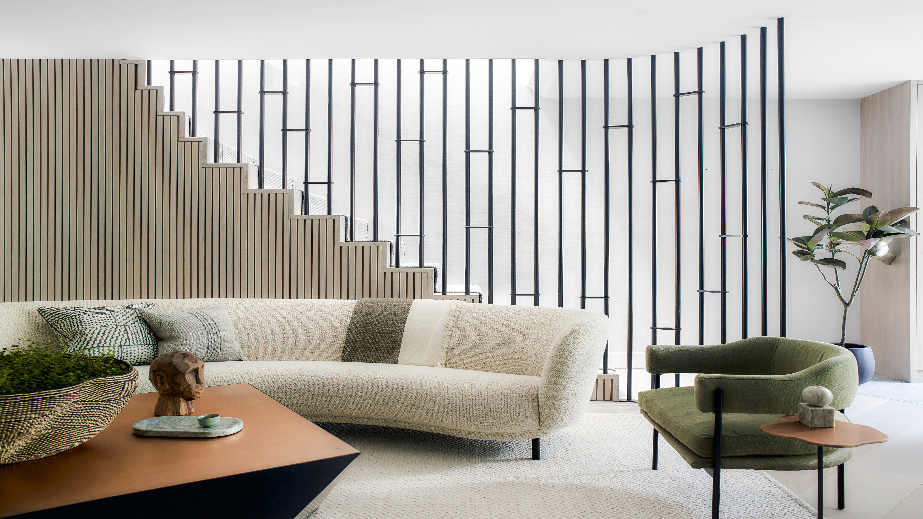
The metal partition serves as a balustrade for the stairs, curving around to form a cosy enclosure for the seating.
‘I introduced curves everywhere, from the arc of the doors to the steel balustrade that wraps around the sitting room. In terrace houses, there are so many angles everywhere, the curves make an interior feel more friendly and welcoming,’ Irene observes. ‘If you use curves, on a subconscious level it makes people feel more at ease because it’s a much softer environment to be in.'
The Livingetc newsletters are your inside source for what’s shaping interiors now - and what’s next. Discover trend forecasts, smart style ideas, and curated shopping inspiration that brings design to life. Subscribe today and stay ahead of the curve.
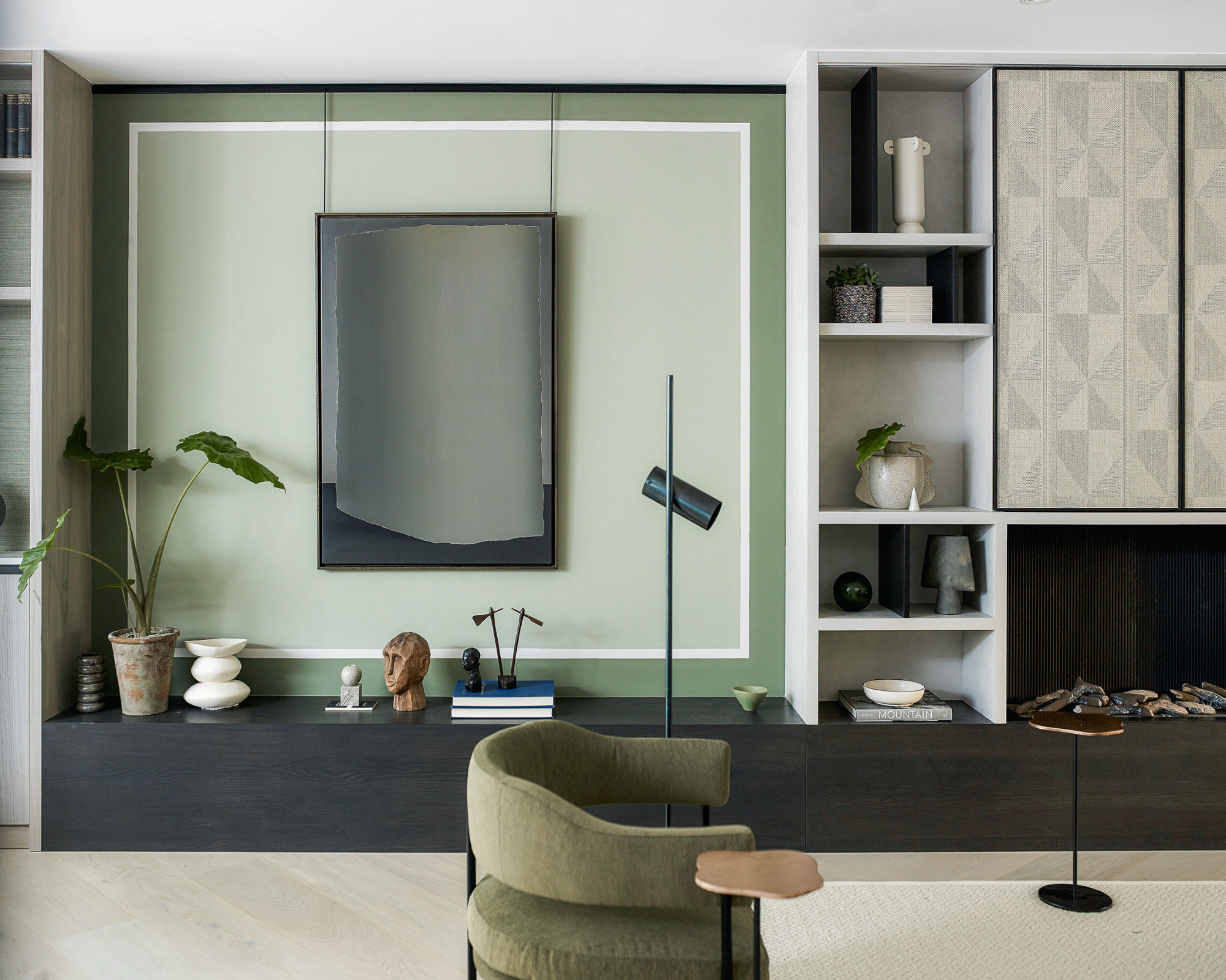
‘It’s unusual for me to be so restrained with color,' adds Irene. 'I made a deal with my colleague that any time I told them to use more color, they had to hold me back.’
DINING AREA
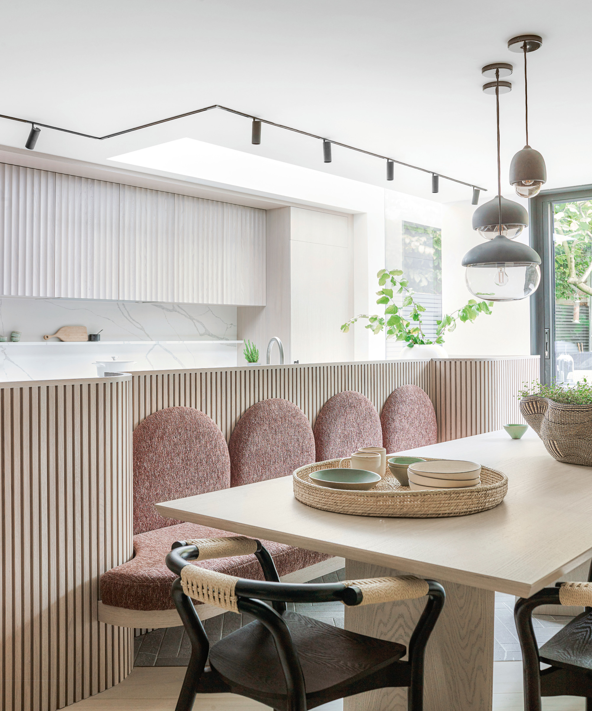
The fluted wood cladding of the island rises above the work surface to conceal food preparation mess while the banquette seating is a space saving solution allowing a thoroughfare to the garden.
KITCHEN
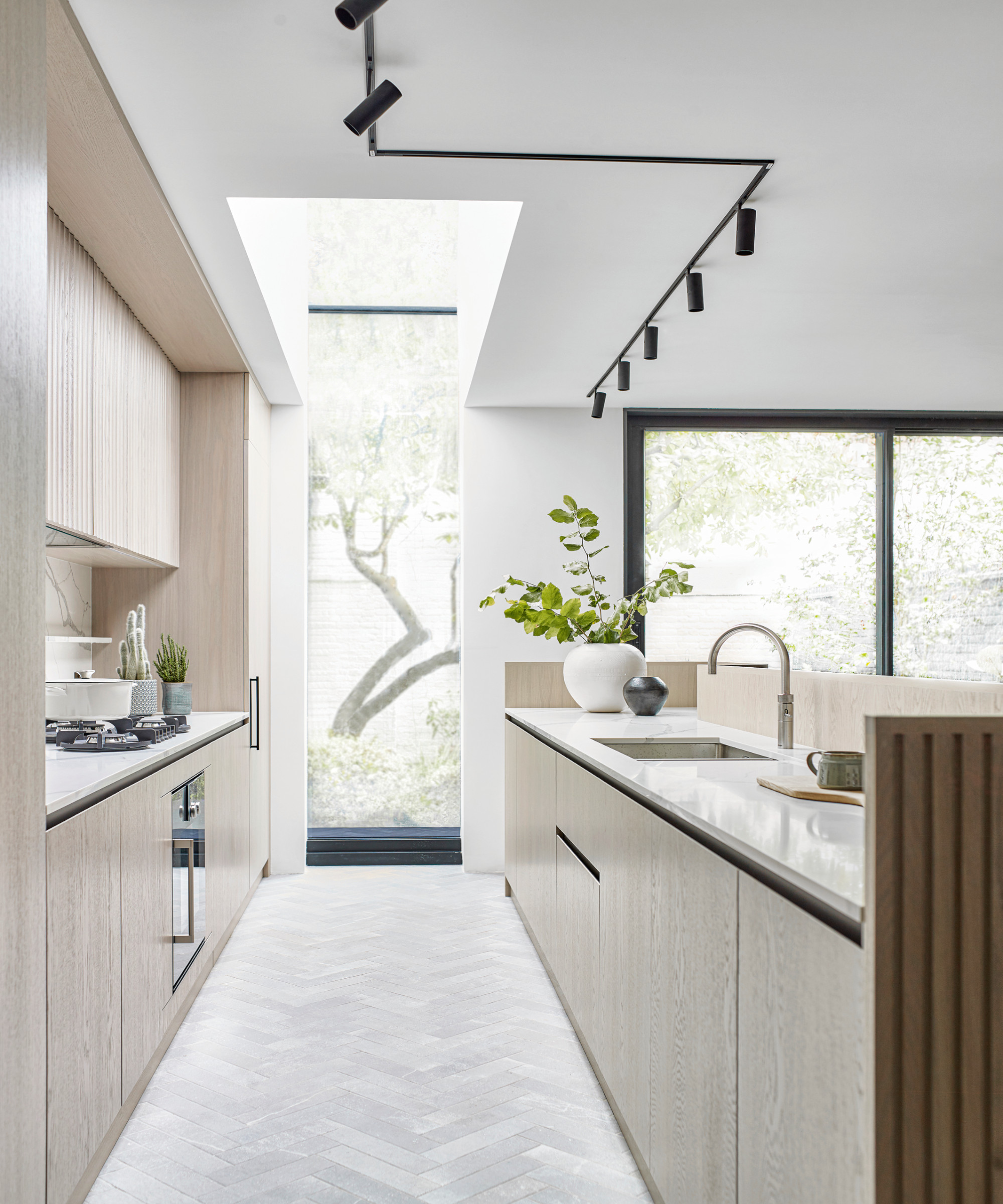
The large doors and cutaway skylight accentuate the connection to the garden while the curved scalloped surfaces on the cabinetry are a continuation of the motif throughout the house.
A calm, restrained palette given accents prompted by the greens of the garden gently coaxes visitors into a state of languor. ‘We used a lot of lime-washed oak veneer in the cabinetry which was prompted by the timber floor,' says Irene. 'We didn’t want anything to be too jarring, so apart from the greens, we used a blended palette of neutrals.'
STUDY
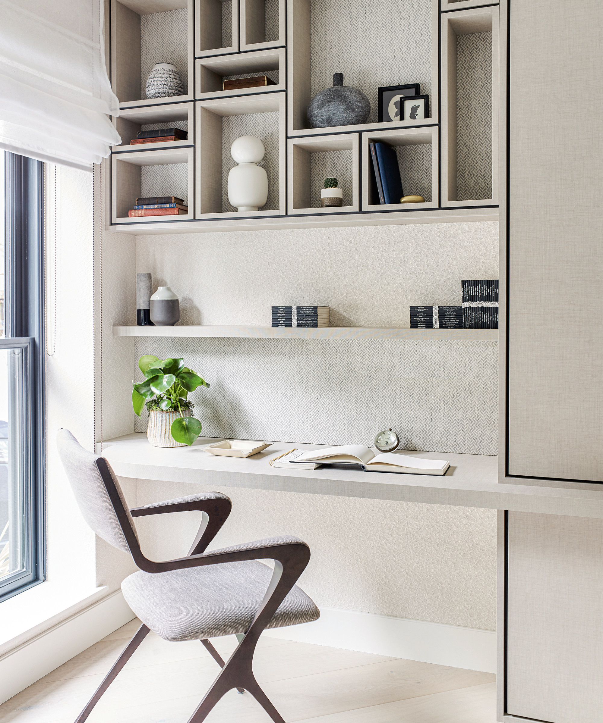
The floor planks run diagonally in the study and elsewhere giving the impression that the house is much wider than in reality.
BEDROOM
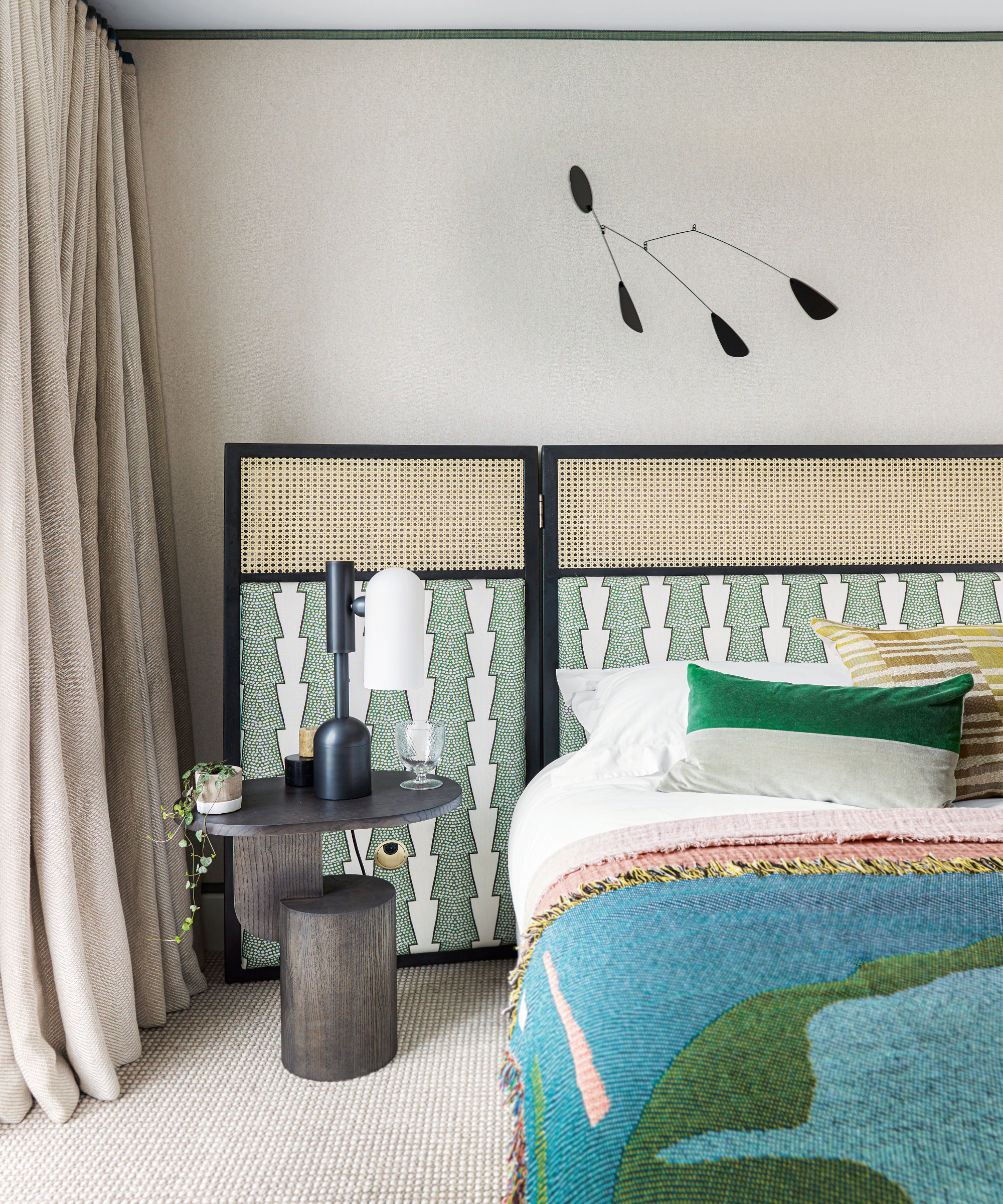
‘We felt this ochre seagrass would work well with our schemes of neutrals and blacks,' says Irene. 'It was the starting point for the whole room and brings a warm and cosy feel.'
EN-SUITE BATHROOM
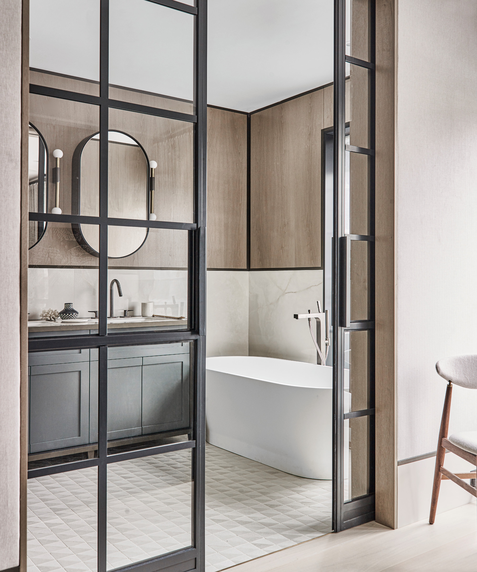
‘The tiles on the floor are like a mosaic. You don’t see where one stops and another starts. The seamless surface makes the space appear larger,’ says Irene.
BEDROOM
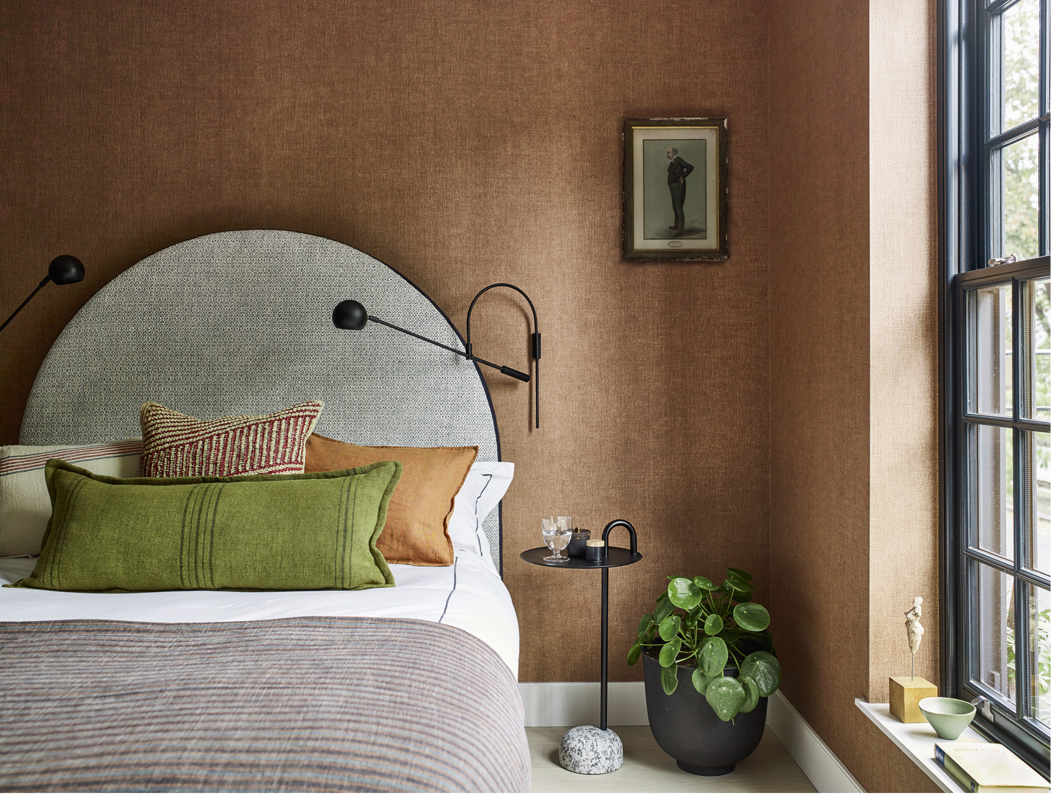
Heavier wool fabrics and a wraparound headboard bring a cossetting vibe to this bedroom.
BATHROOM
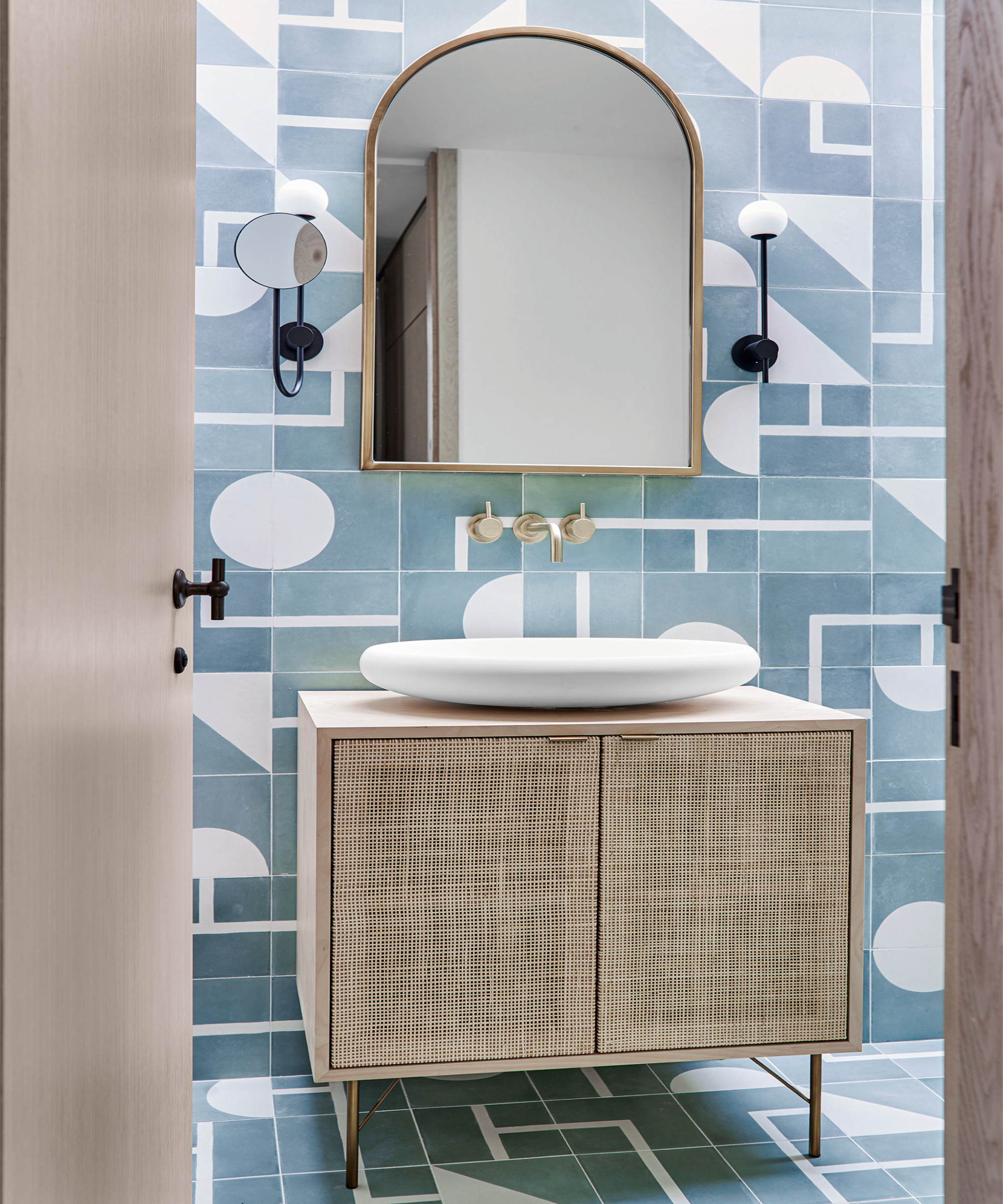
Without windows, this space is lit from a skylight above. The smooth tactile form of the basin brings contrast to the more angular forms.
The black features fit with the modern architectural language while the bronze and brass bring a warming quality.
'We were conscious that the interior should be quite modern but not overly trendy,' says Irene. 'So in five years it will stand the test of time and not look dated.’
See also: a colorful, maximalist home was inspired by the whimsical designs of iconic luxury British hotels
Formerly the editor of Superyacht Business magazine and the features editor of Homes & Gardens, Juliet has her feet firmly planted in the luxury lifestyle sector. She is an interiors and architecture writer, editor, and strategist with a passion for crafting balanced, finely tuned, and engaging copy. As well as writing for Livingetc, Juliet has contributed to Grand Designs, 25 Beautiful Homes, Country Homes & Interiors, and a raft of yachting publications.