Color Decoded: This Gray Living Room Has a Secret Vibrancy-Boosting Power
Our color expert Amy Moorea Wong deciphers a living room scheme with a grown-up palette – and explains how to get the look

The Livingetc newsletters are your inside source for what’s shaping interiors now - and what’s next. Discover trend forecasts, smart style ideas, and curated shopping inspiration that brings design to life. Subscribe today and stay ahead of the curve.
You are now subscribed
Your newsletter sign-up was successful
Design journalist and author Amy Moorea Wong is an expert on color in interior design. To help decode the secrets behind a successful palette, she picks her favorite schemes and breaks them down, from the wow moments to the hidden details, and everything in between.
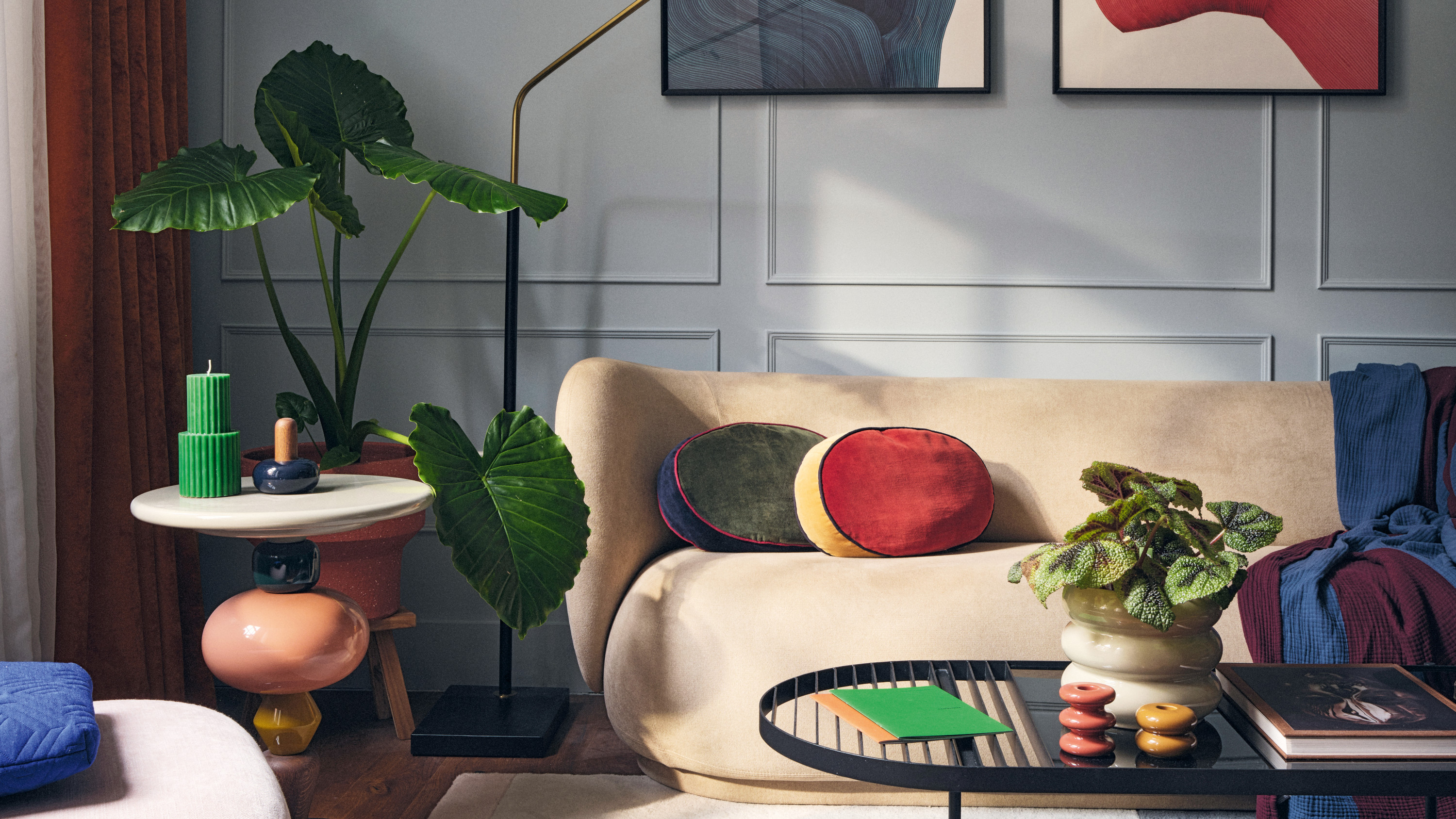
This is a gray living room. But is it fair to put it into the "gray rooms" pile so quickly? We have grown to associate gray with dullness, hardness and the unimaginative – and yet this adventurous space by London-based boutique design studio Maison RA-D is delightfully none of the above. Yes, the walls in this living room are gray, yet they’re also warm, soft, welcoming. They’re like putting on a favorite jumper, wrapping yourself in a beloved comforter. They feel soothing, like everything is under control.
Color, meanwhile, comes from everything except the walls – but how does this scheme manage to bring it all together? Read on to discover the interior design tricks behind this palette.
Article continues below 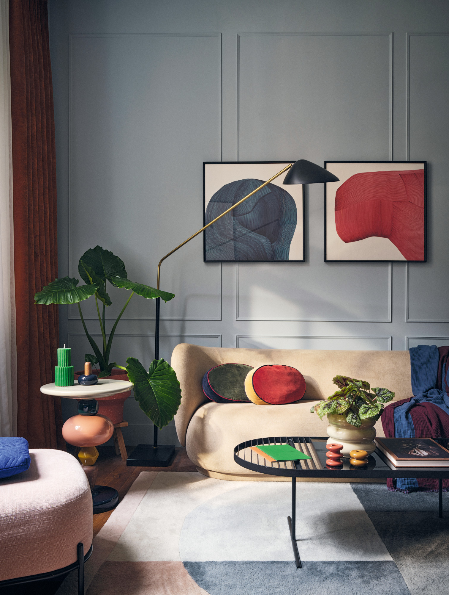
The introduction of color starts gently, with the dense, architectural blue and red of the Ronan Bouroullec artworks pulling in similar shades – the blue-gray rug, the navy throw, the red in the curtain and terracotta plant pot – while the brighter tones grace us on small objects. Larger pieces are gentler, the sofa (Rico by Ferm Living) a neutral stone shade, the lounge chair a barely-there blush and the rug a blush/gray combo. We’re easing in.
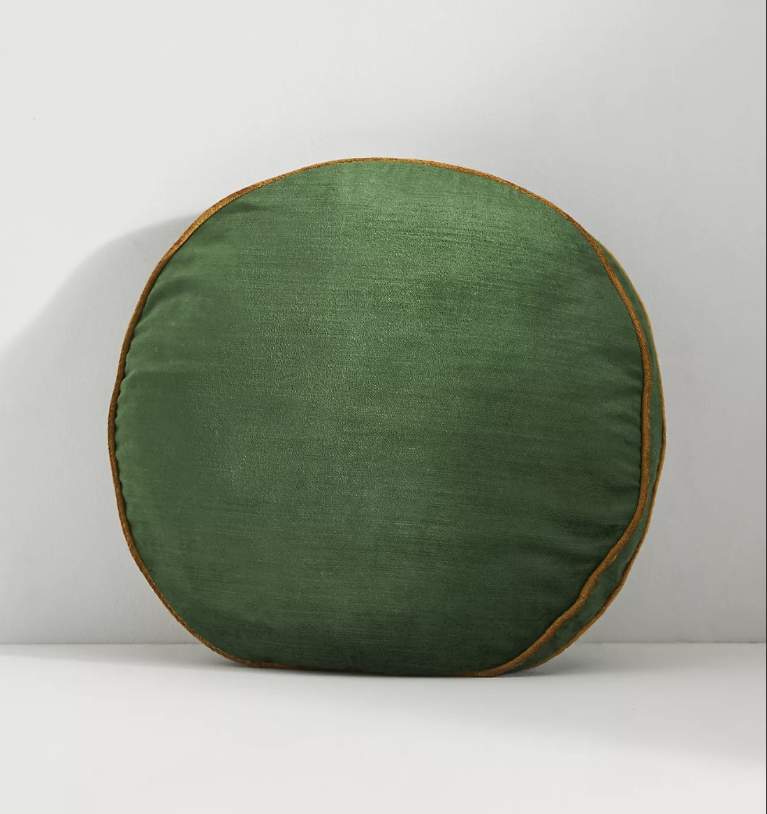
The cushions are the game-changers. Small though they may be, they wield great power in this gray living room, bringing in brightness with zhuzhed up, amplified versions of the tones that surround them. They graze against "bold" territory – the red just about hitting cherry, the yellow lightly suggestive of sunshine. Reeling in attention, they almost trick us into thinking the darker shades of the space’s red/blue/yellow/green uniform are more vibrant than they truly are. "They’re primary colors!" one side of the brain shouts, while the other cautions you to re-examine.
Let’s talk about the blush. It's a bit of a curveball, isn’t it? Exactly what you don’t expect to find nestled into the nook of a shadowy primary shades plus grey scheme. What it does – and I am of the opinion that pink is almost unique in possessing this power – is softens with (for want of another word) "prettiness". It speaks of sugar, petals, lightness and delicacy, quietly interjecting some grace and some didn’t-think-you’d-see-me-here-did-you mischievousness into the expanse of heavier hues. In short: it gently livens up the place, while standing at the halfway point of the bridge between color and monochrome.
The smaller pieces are where things get interesting. You may have already noticed the cushions are round – shapes progress into the even more experimental and sculptural from there. The am-I-supposed-to-play-with-this Shuffle side table by &Tradition (it really does come apart), its glossy wooden segments neatly coordinating with the room’s palette while making up its own rules about shape. The curves of all of the furniture (supplied by Viaduct), as well as the forms made within the artworks. The undulating lines of the small candlesticks. Even the oversized statement leaves of the plant. Nothing is as you’d imagine a room lined with gray paneled walls to be like.
The Livingetc newsletters are your inside source for what’s shaping interiors now - and what’s next. Discover trend forecasts, smart style ideas, and curated shopping inspiration that brings design to life. Subscribe today and stay ahead of the curve.
This is a grown-up rainbow, the gray backdrop boosting the rich hues that lie against it like an encouraging parent. "The neutral gray background combined with the colors convey a formal interior landscape with a whimsical twist," says Maison RA-D founder Rodney Alday. "The base palette is dynamic, elegant and comfortable, celebrating the feature pieces and creating a sense of drama." And so gray’s secret power is revealed – it’s a color intensifier.
While the space’s shapes and colours seem wild, it all aligns beautifully. Forms
are united by their roundness and avant-garde silhouettes, while the bold palette is minimal – limited to the almost-the-same variations of the five lead colors plus gray. Thrilling yet tranquil. Chaotic yet composed. Experimental yet enduring.
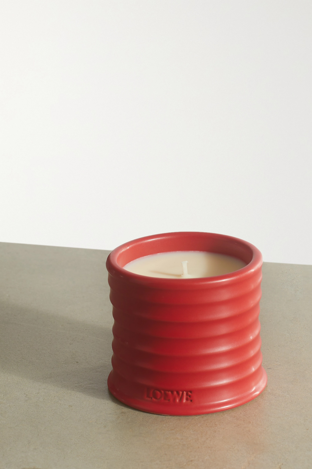
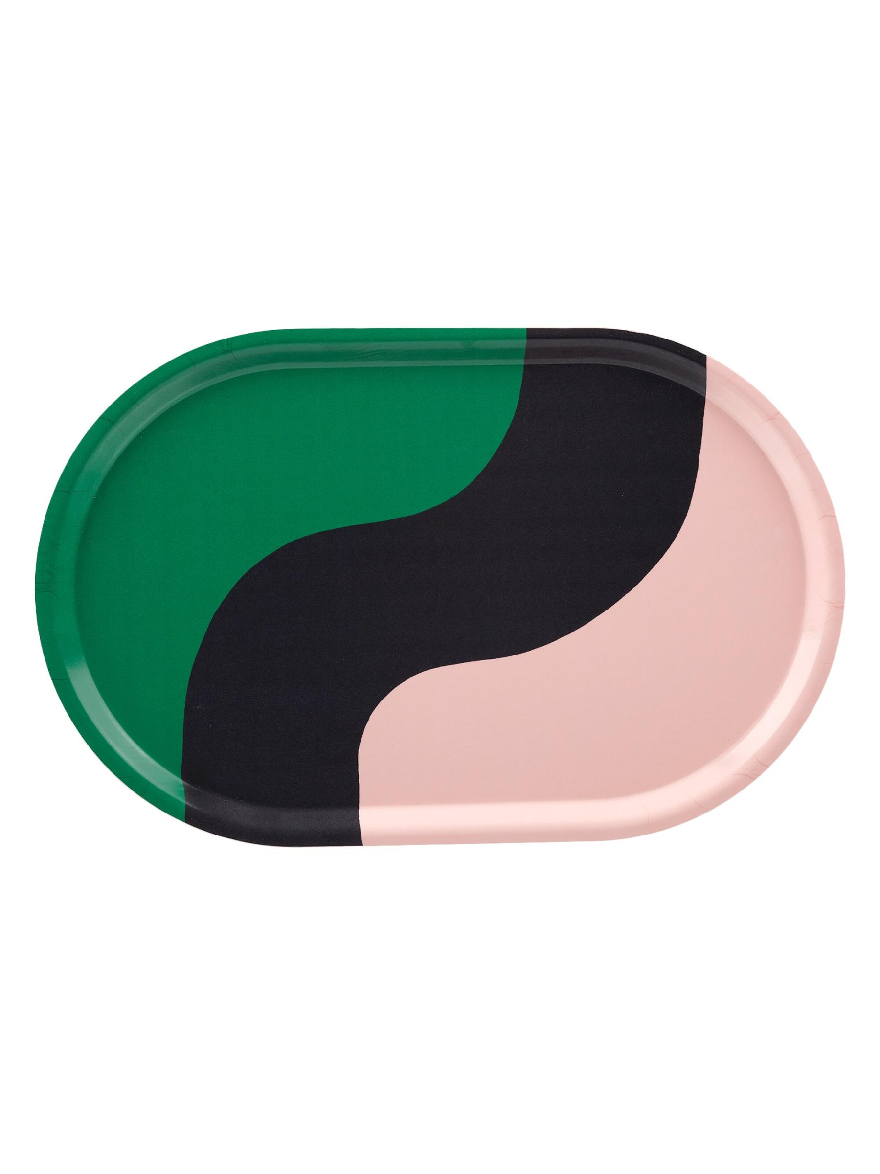
Shop the palette
Amy Moorea Wong is a color authority and contemporary interior design writer who has specialized in all things decorating for over a decade. Amy is Livingetc magazine’s Colour Expert, Interiors Editor at The Glossary magazine and a Contributing Editor at Homes & Gardens magazine, and she frequently contributes to an array of global publications to share her insights on interior design zeitgeist. Her book Kaleidoscope: Modern Homes in Every Colour explores a collection of cool colorful homes fizzing with creativity, surprises, and inspiration.


