Inside a colorful London townhouse that's filled with unique designs, quirky artwork and bold shades
This stunning London home is a lesson in how to bring color into any space...

The Livingetc newsletters are your inside source for what’s shaping interiors now - and what’s next. Discover trend forecasts, smart style ideas, and curated shopping inspiration that brings design to life. Subscribe today and stay ahead of the curve.
You are now subscribed
Your newsletter sign-up was successful
The property
In recent years we may have all appeared to embrace more color, we've swooned over brightly decorated homes, created Pinterest boards filled with bold rooms that mix every hue under the rainbow, with the promise that we will move on from our beloved neutrals and start bringing these colors into our own rooms.
But when it comes to actually adding bolder colors to our spaces, it's tricky to know how to create rooms that will feel bright and fresh and colorful but will still be liveable and won't date too quickly or we won't become tired of the shades. Where do you start with creating a new color scheme that's both bold and safe? Well, this modern home is a lesson in just that...
Kitchen
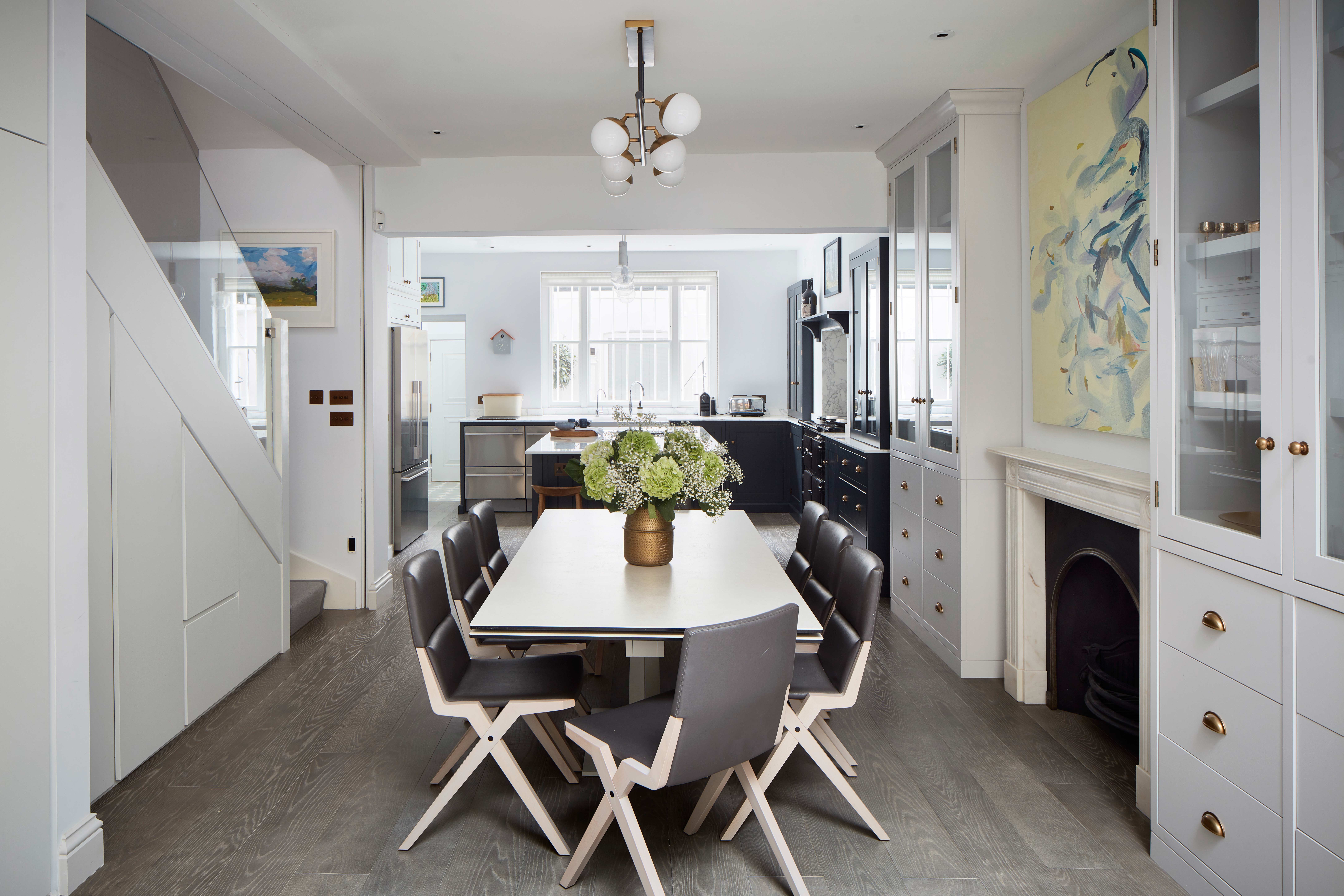
Designed by British studio Yellow London, this renovation project transformed a dated townhouse into a beautiful, contemporary family home. A sensitive design approach, combines vibrant pops of color, mixed with art, antiques and unique finds to create a richly layered look, that's both contemporary and classic.
Article continues below 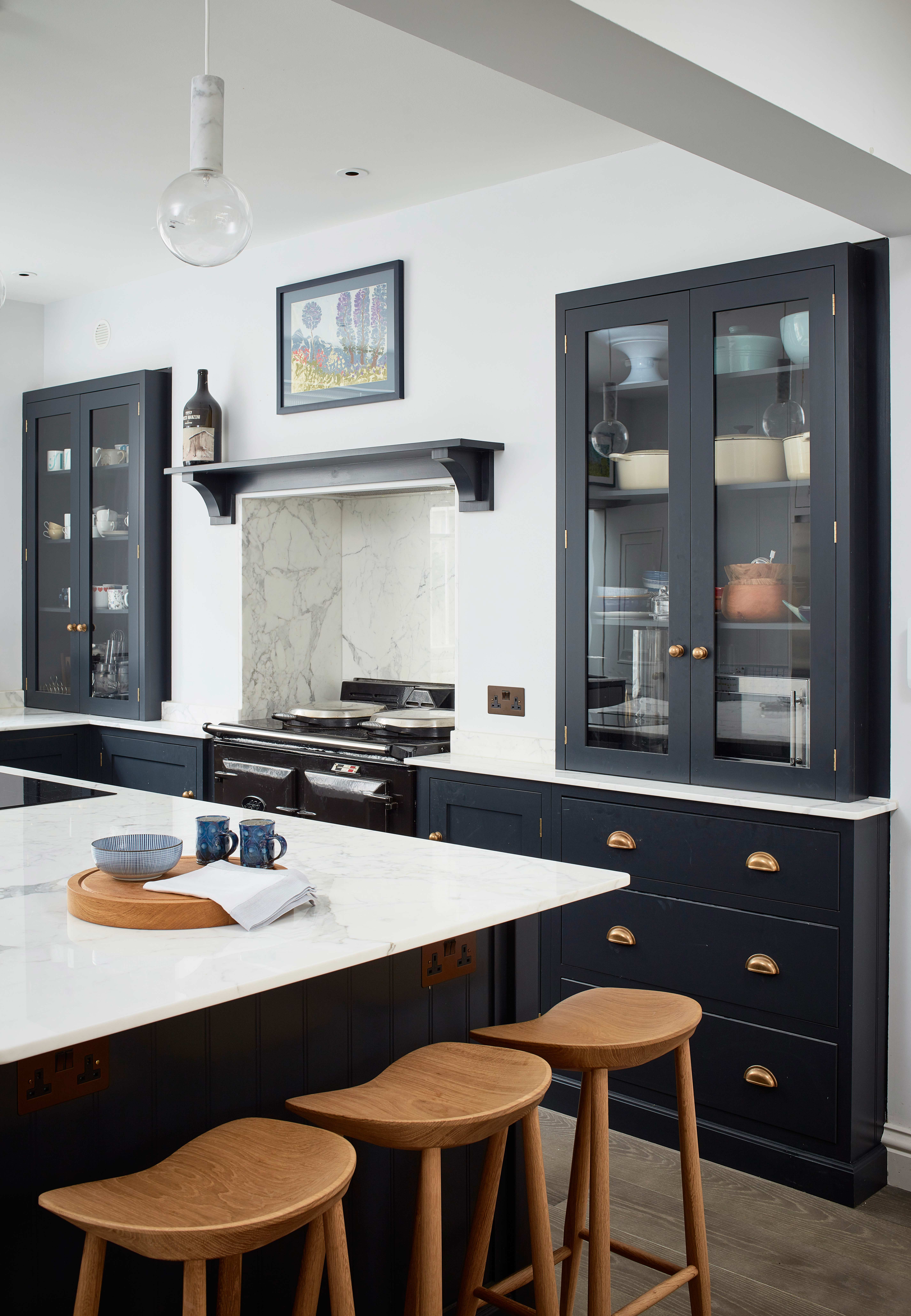
The kitchen is kept mostly neutral with dark blue and white cabinetry from deVOL, it's elegant and actually quite traditional to match the property's original features. But the distinctive abstract artwork positioned centrally in the room gives it the quirky, colorful edge that can be found through the rest of the home.
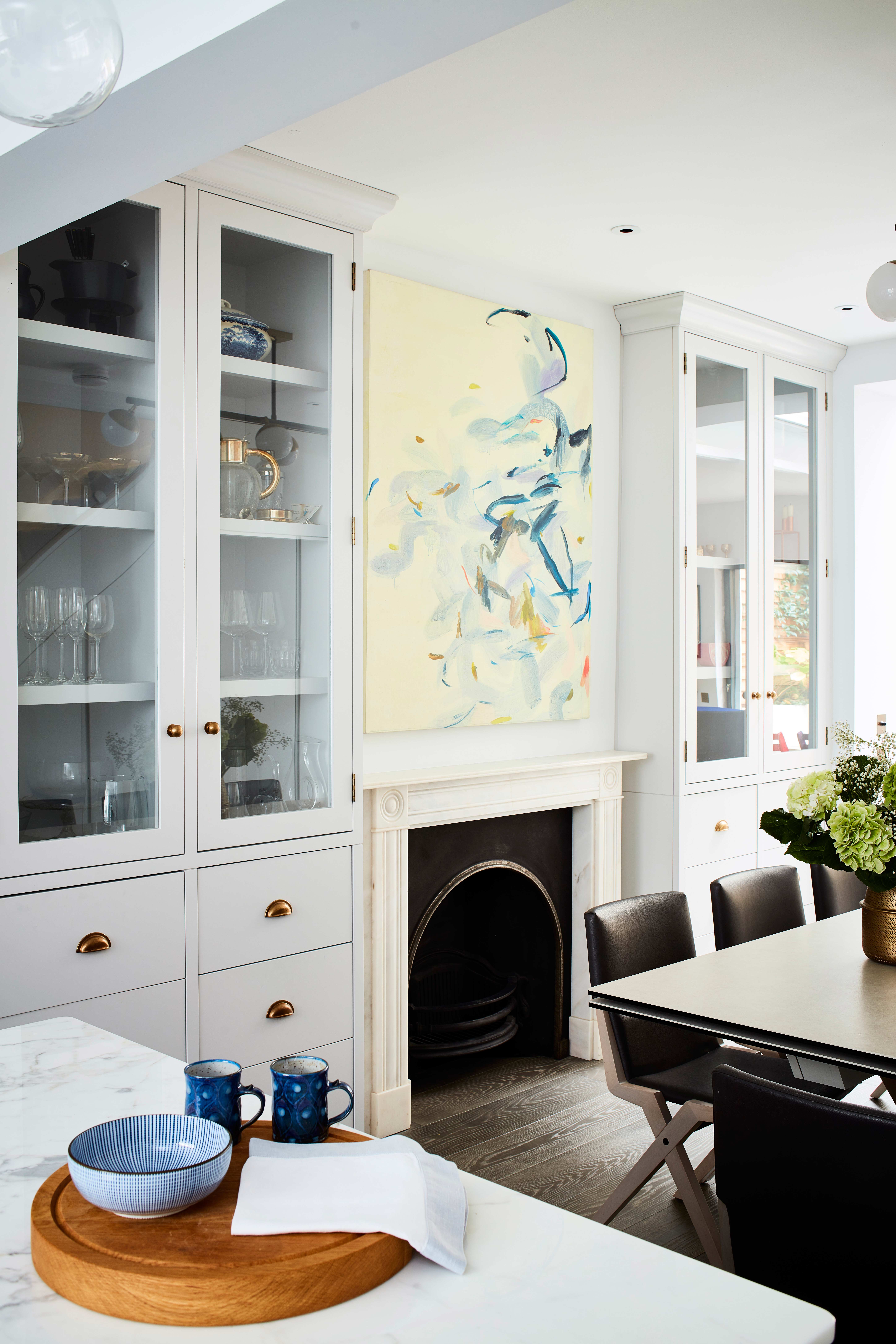
You'll see this kind of symmetry throughout the rest of the home too. The designer's Cath and Liv really focus on creating symmetrical or slightly asymmetrical spaces, whether that be through the main focal point such as a fireplace in the sitting room and kitchen or the headboard in a bedroom, or through the smaller details like the cushions on the sofa to lamps on a dresser.
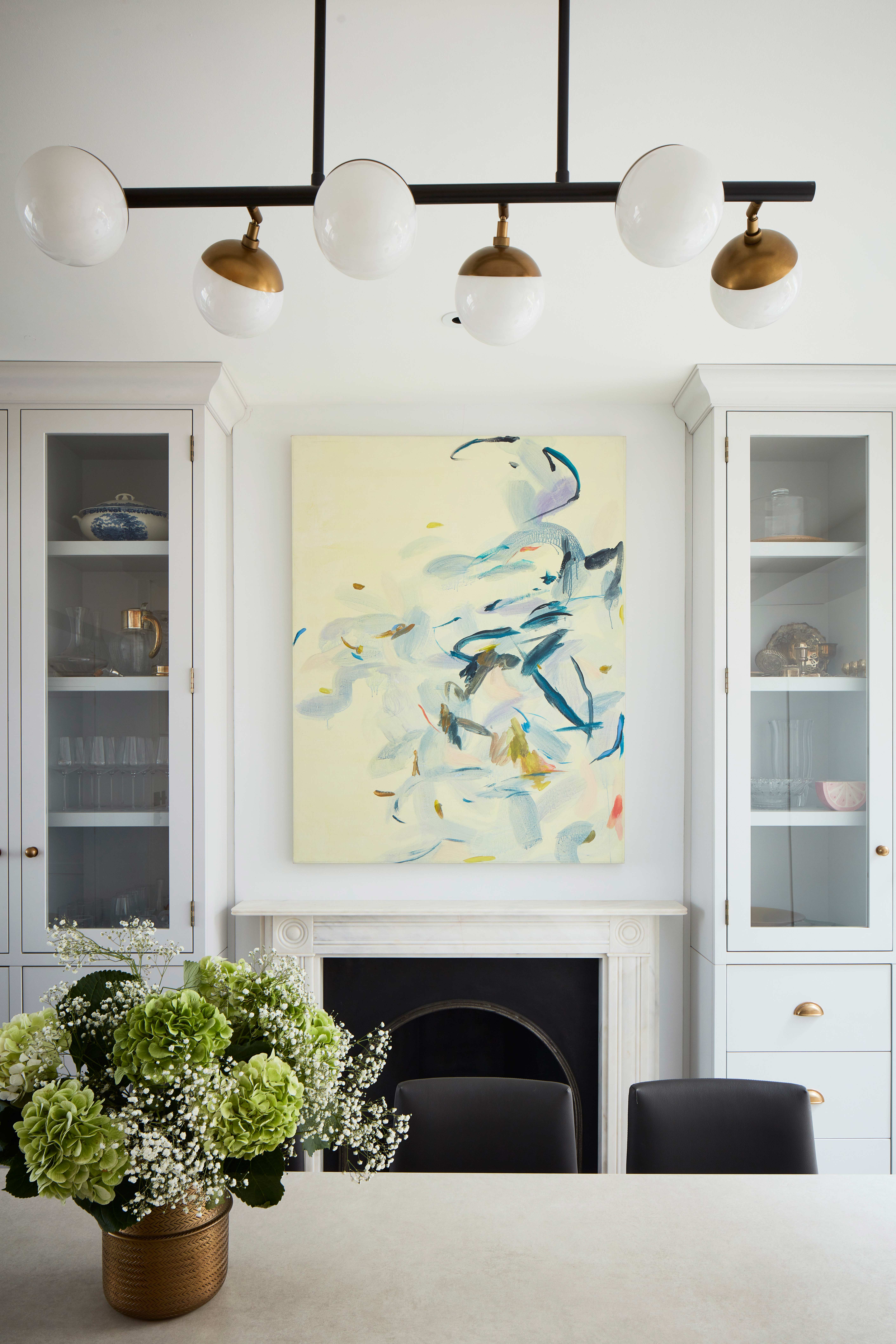
Find more inspiring modern kitchen ideas in our gallery.
Living room

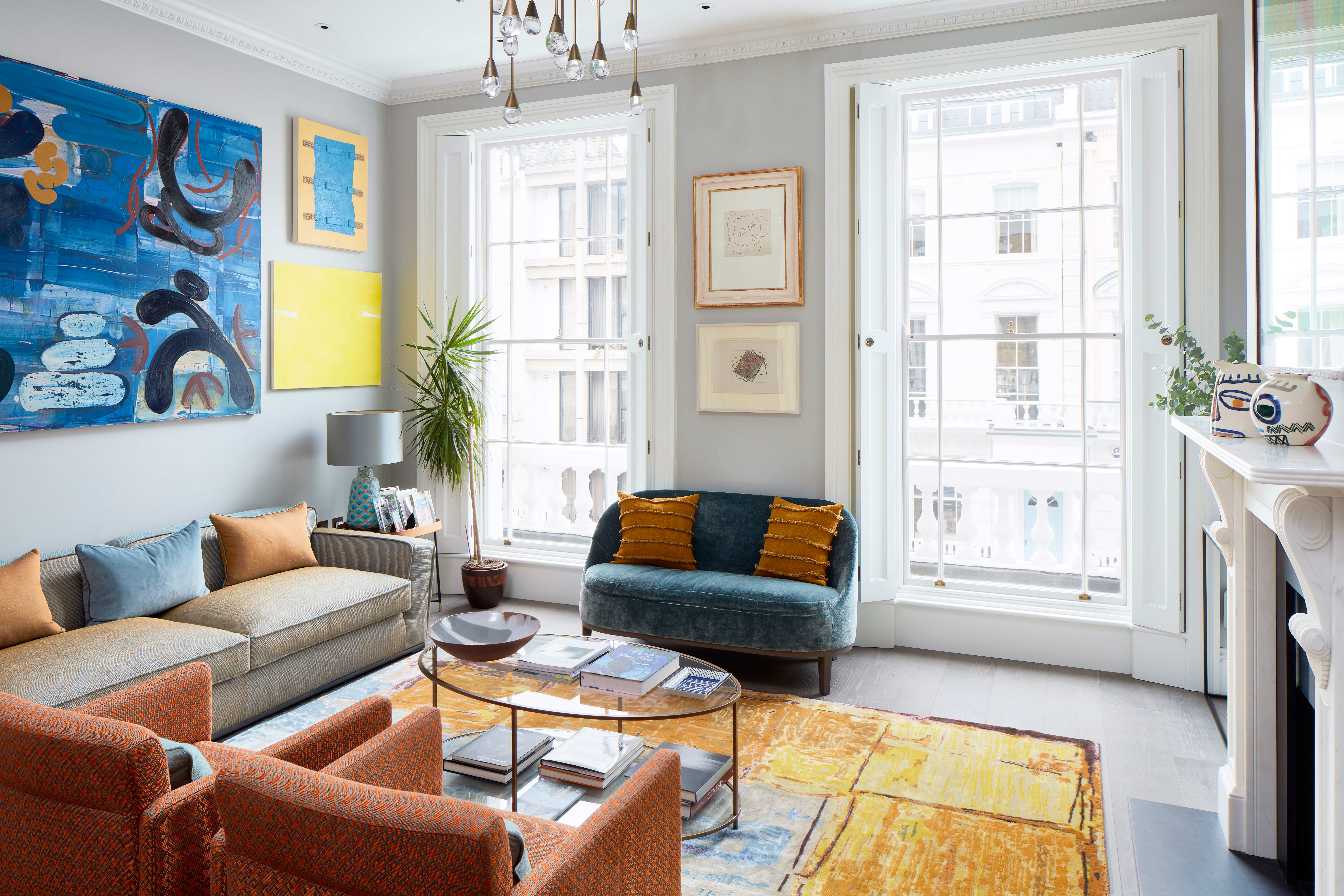
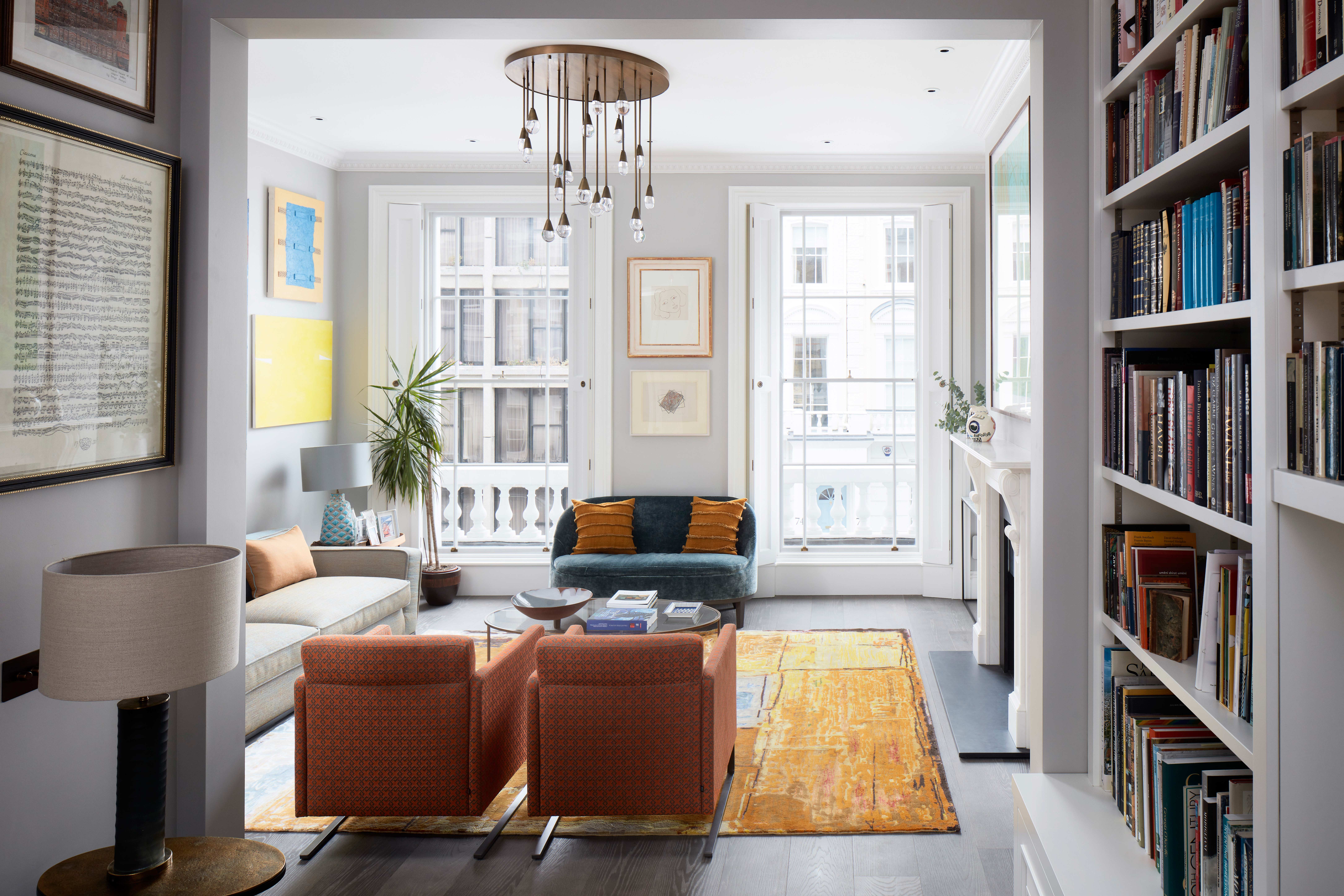
The perfect color scheme for the living room was actually designed around the homeowner's art collection. The walls are kept fresh and neutral, painted with a soft, warm grey as are the carpeted walls but bolder orange and blue tones were chosen for upholstery and cushions to mirror the colors in the artwork.
The Livingetc newsletters are your inside source for what’s shaping interiors now - and what’s next. Discover trend forecasts, smart style ideas, and curated shopping inspiration that brings design to life. Subscribe today and stay ahead of the curve.
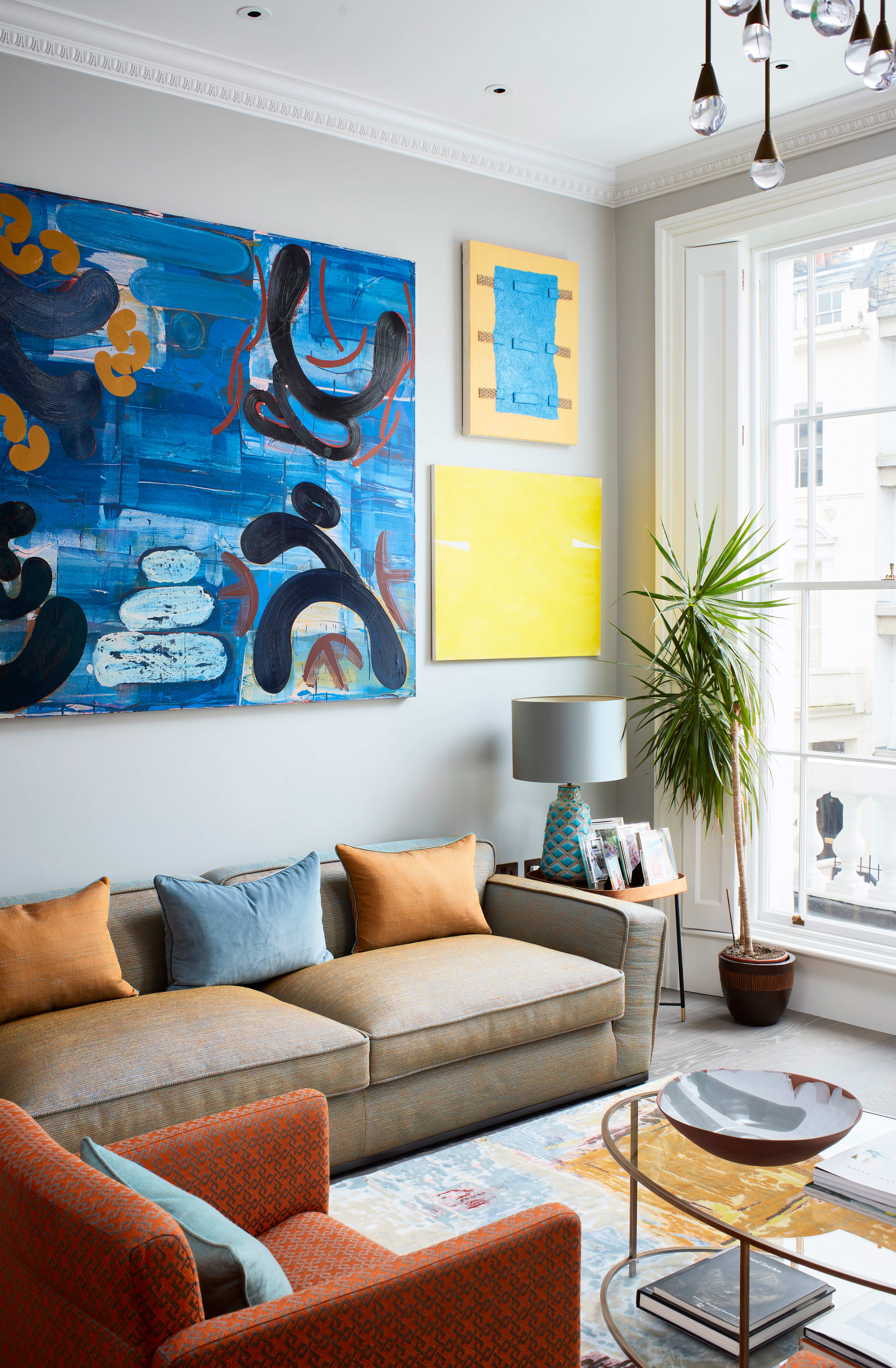
A bespoke contemporary chandelier was created for the property, made up of large handblown glass droplets. A modern take on the antique chandelier that would have hung in this room originally.
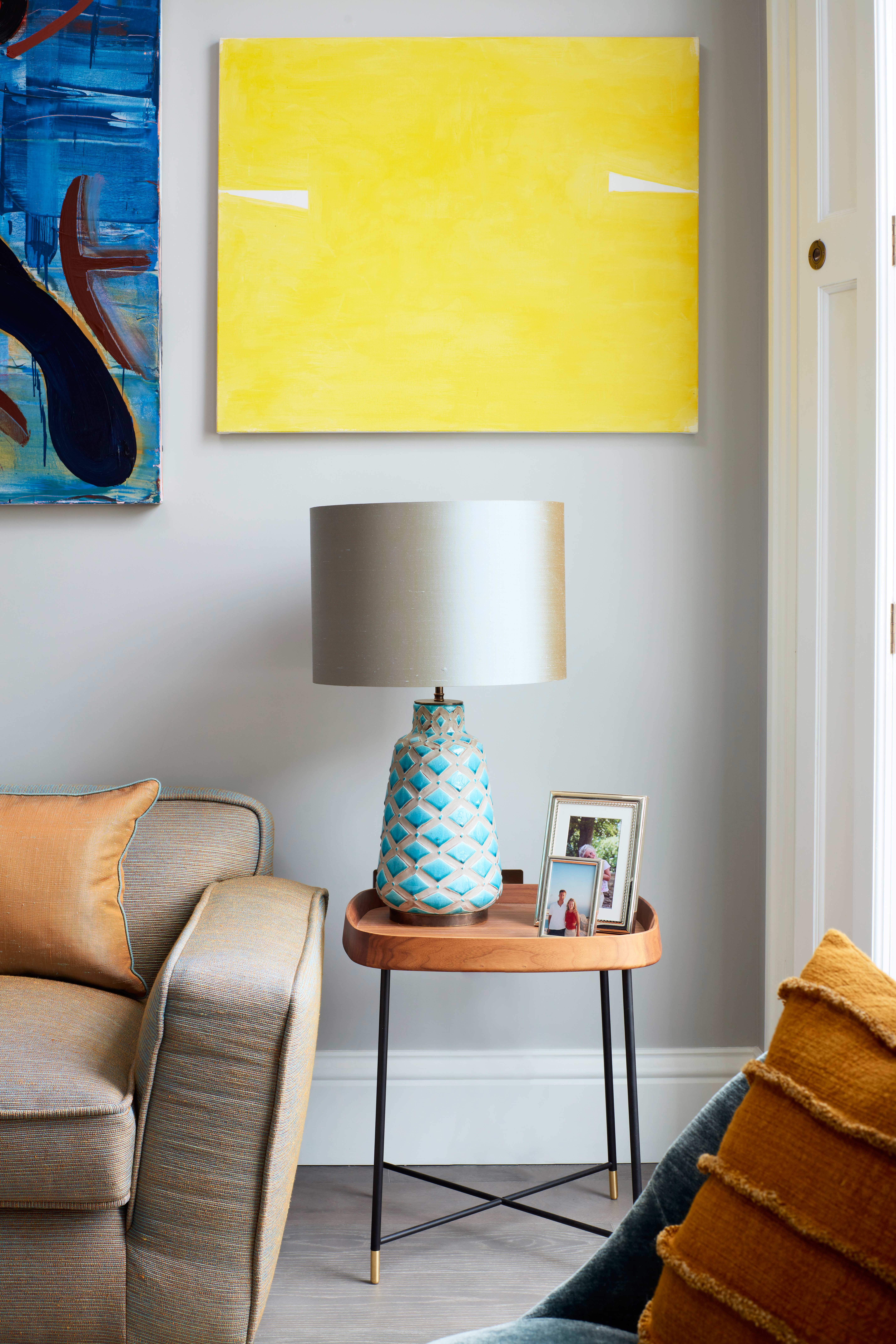
The yellow artwork ties in beautifully with the large yellow area rug that adds warmth and texture to the grey walls.
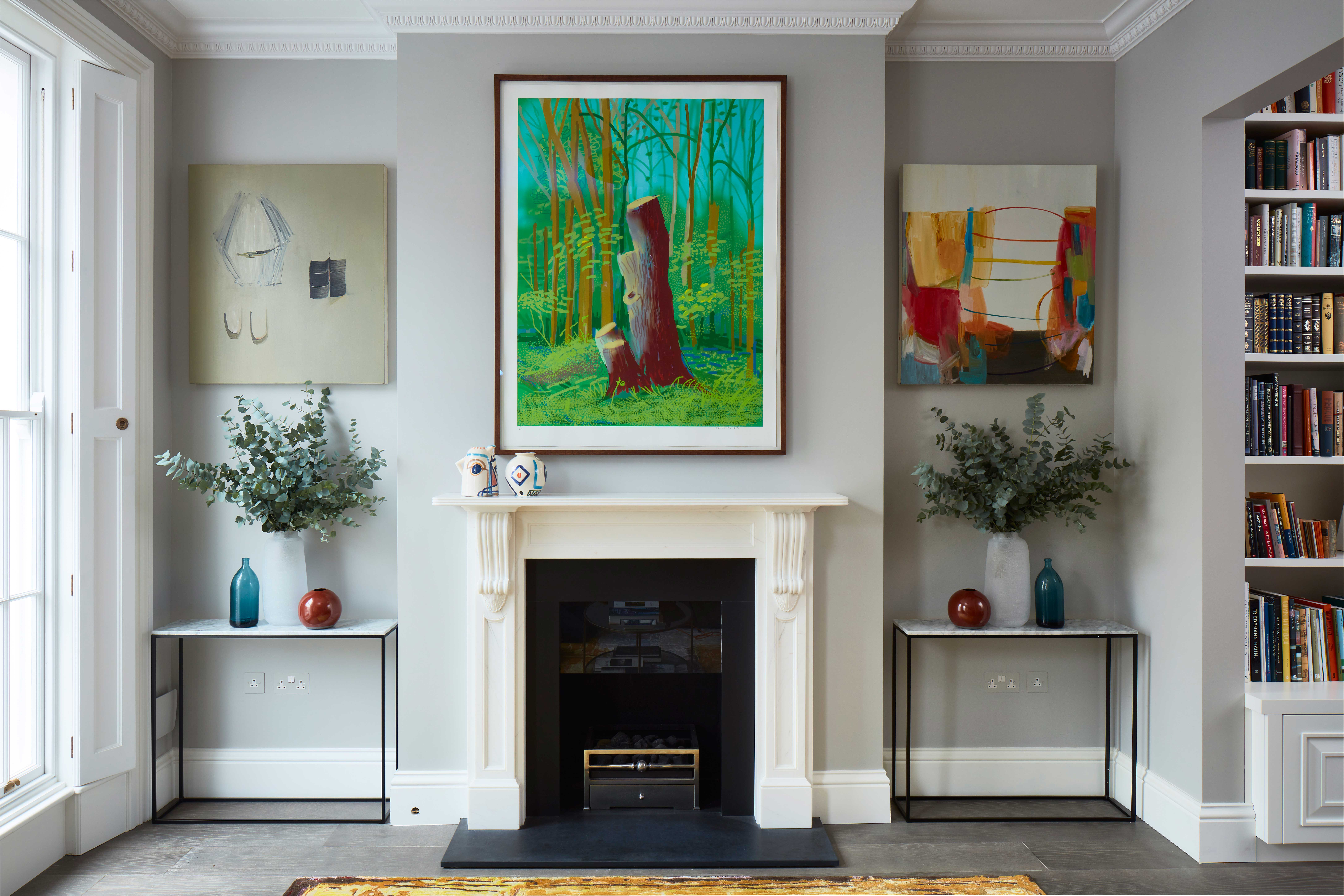
Symmetry can again be found in the living room, with the fireplace standing between two matching console tables. The symmetry creates a very formal feel but the mix of artwork adds that quirk and stops the room from looking too stiff and tradtional.
Snug
Adjoining the living room in a cozier, more informal snug with a large corner sofa and an impressive built-in bookcase.
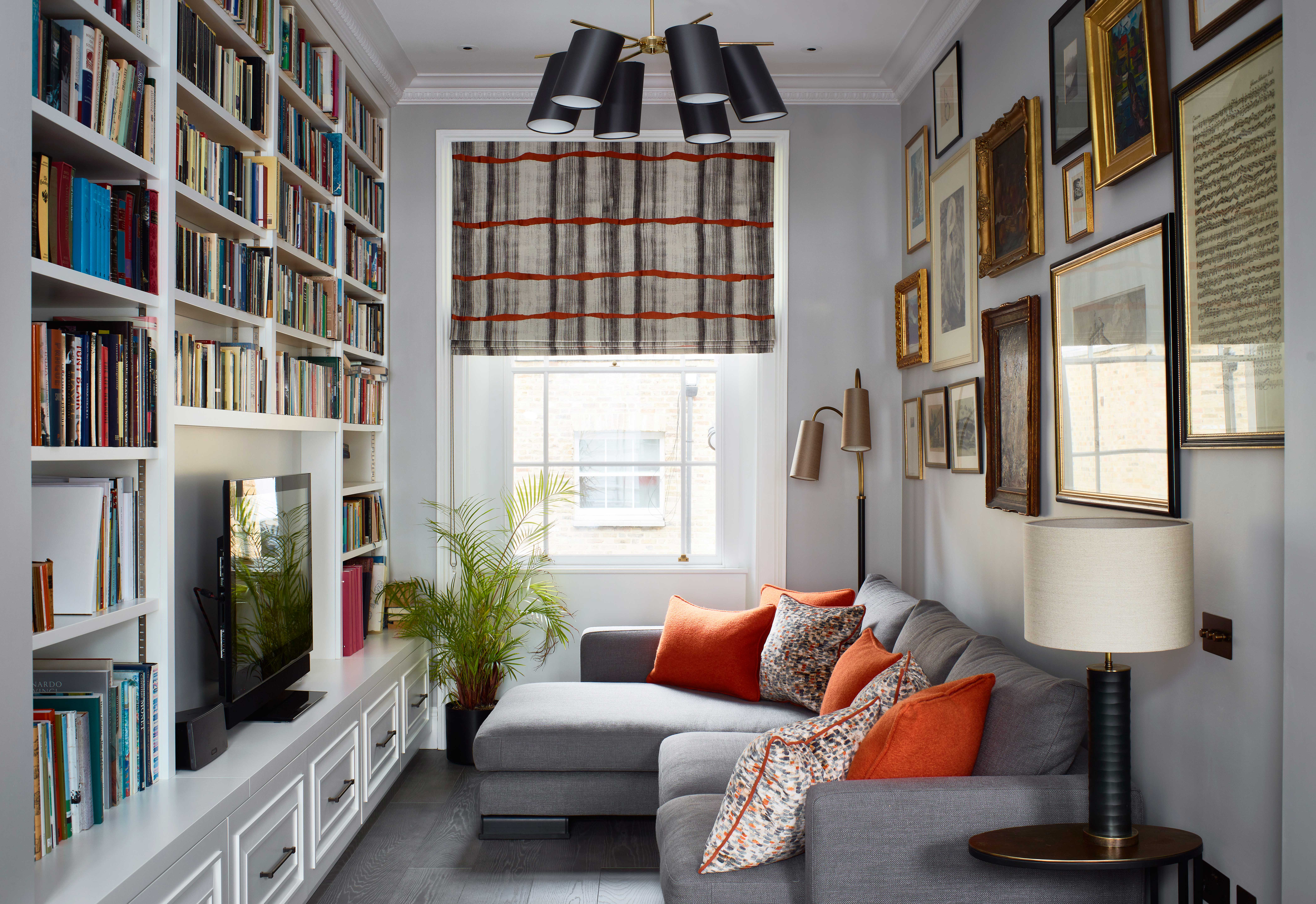
The gallery wall is made up of more traditional artwork than can be found in the other rooms. It gives the space a more intimate, period look that perfectly suits the smaller proportions.
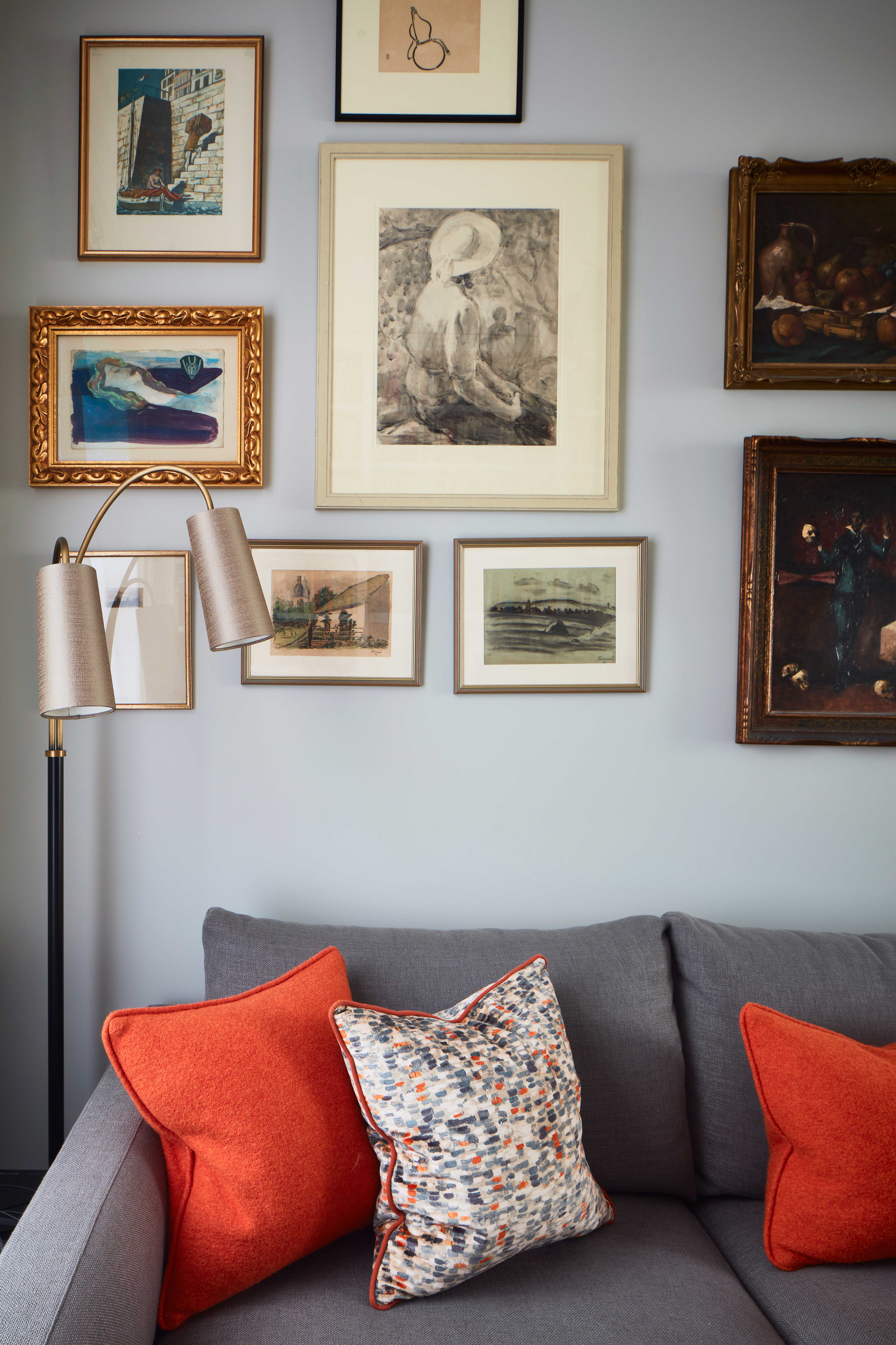
Find more gallery wall ideas in our full feature.
Hallway
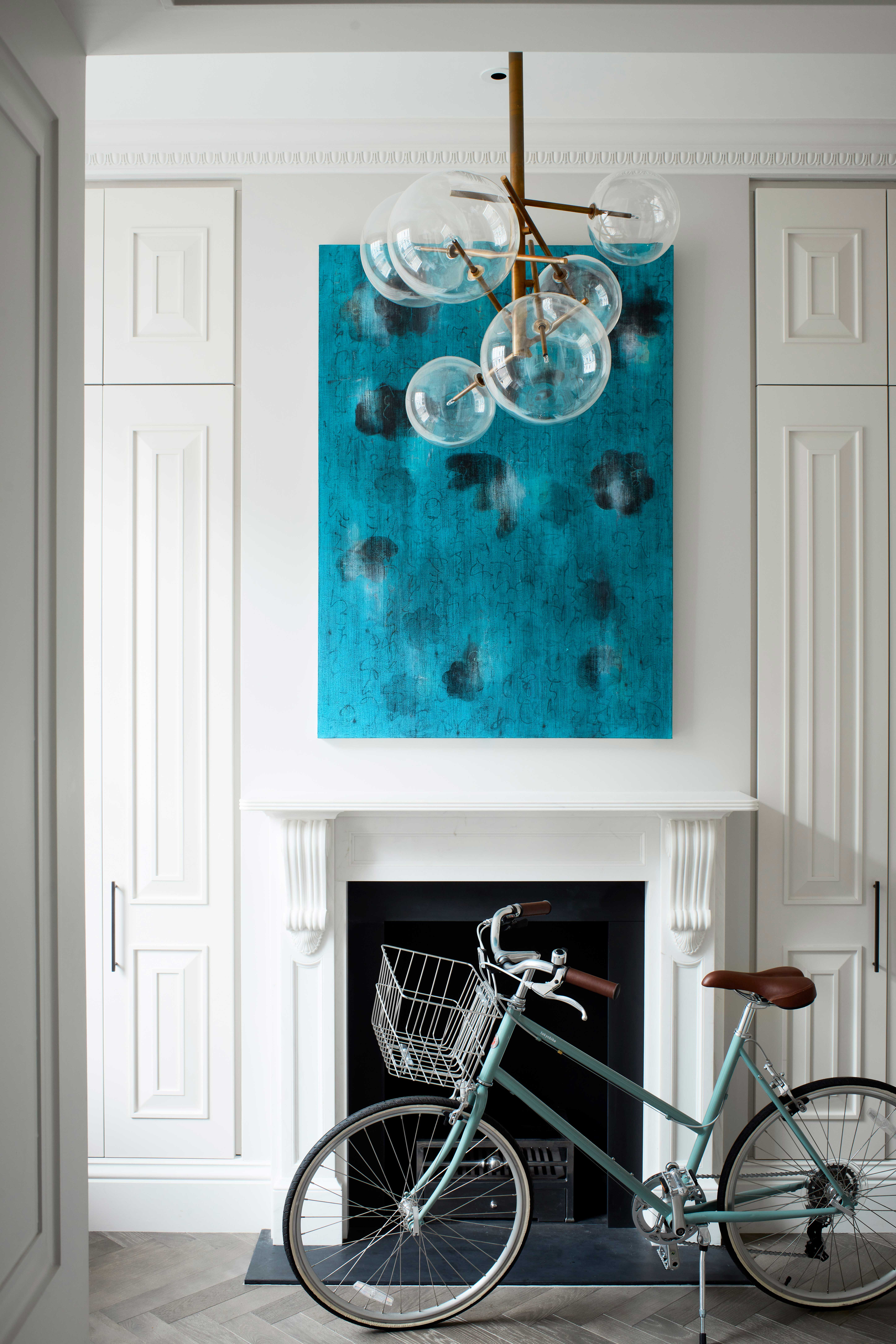
The hallway mirrors the fireplaces in both the kitchen and the sitting room, with a single statement piece of artwork adding a pop of blue to the otherwise all-white space.
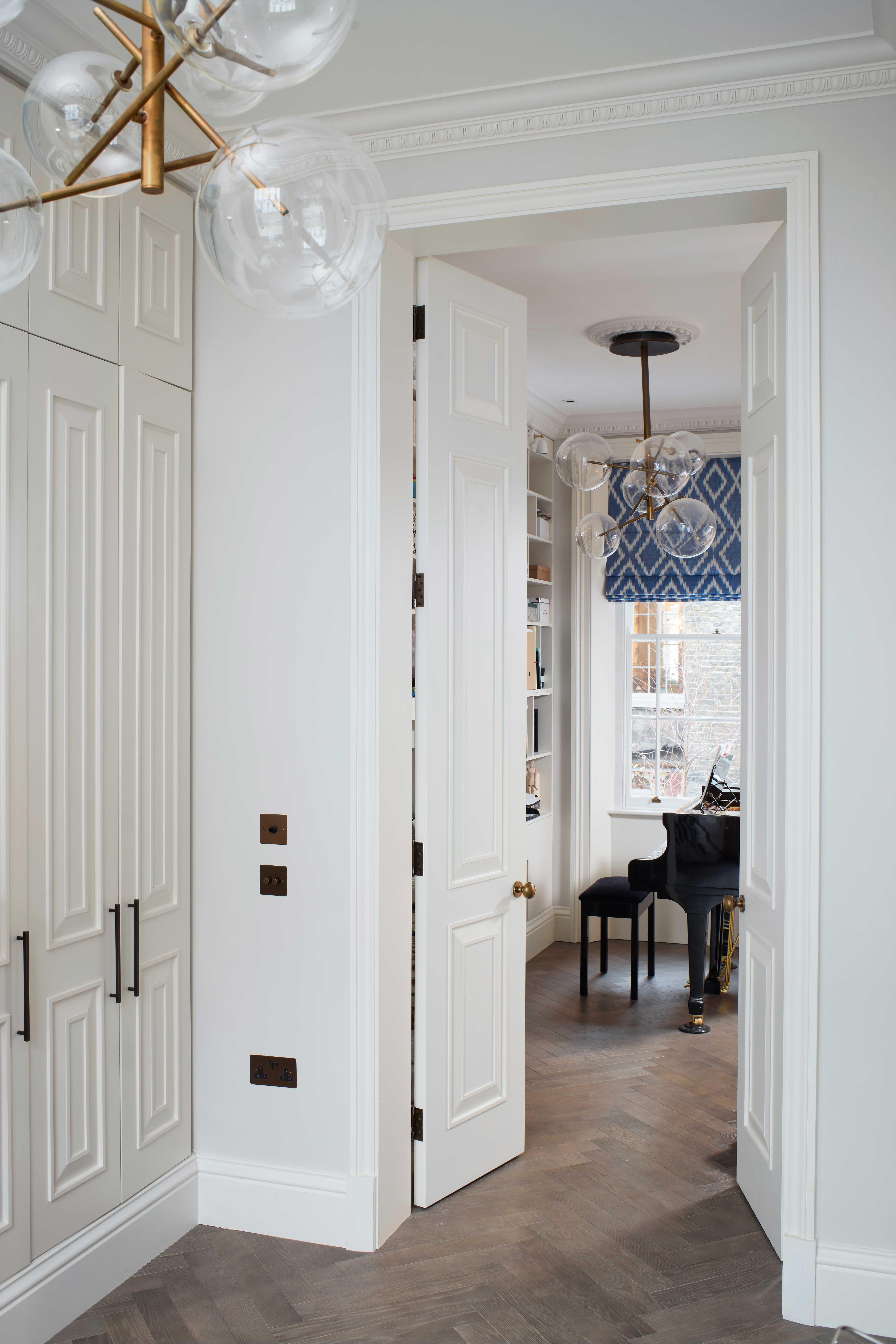
Subtle floor to ceiling built-in cupboards provided ample storage and fit seamlessly into the space.
Master bedroom
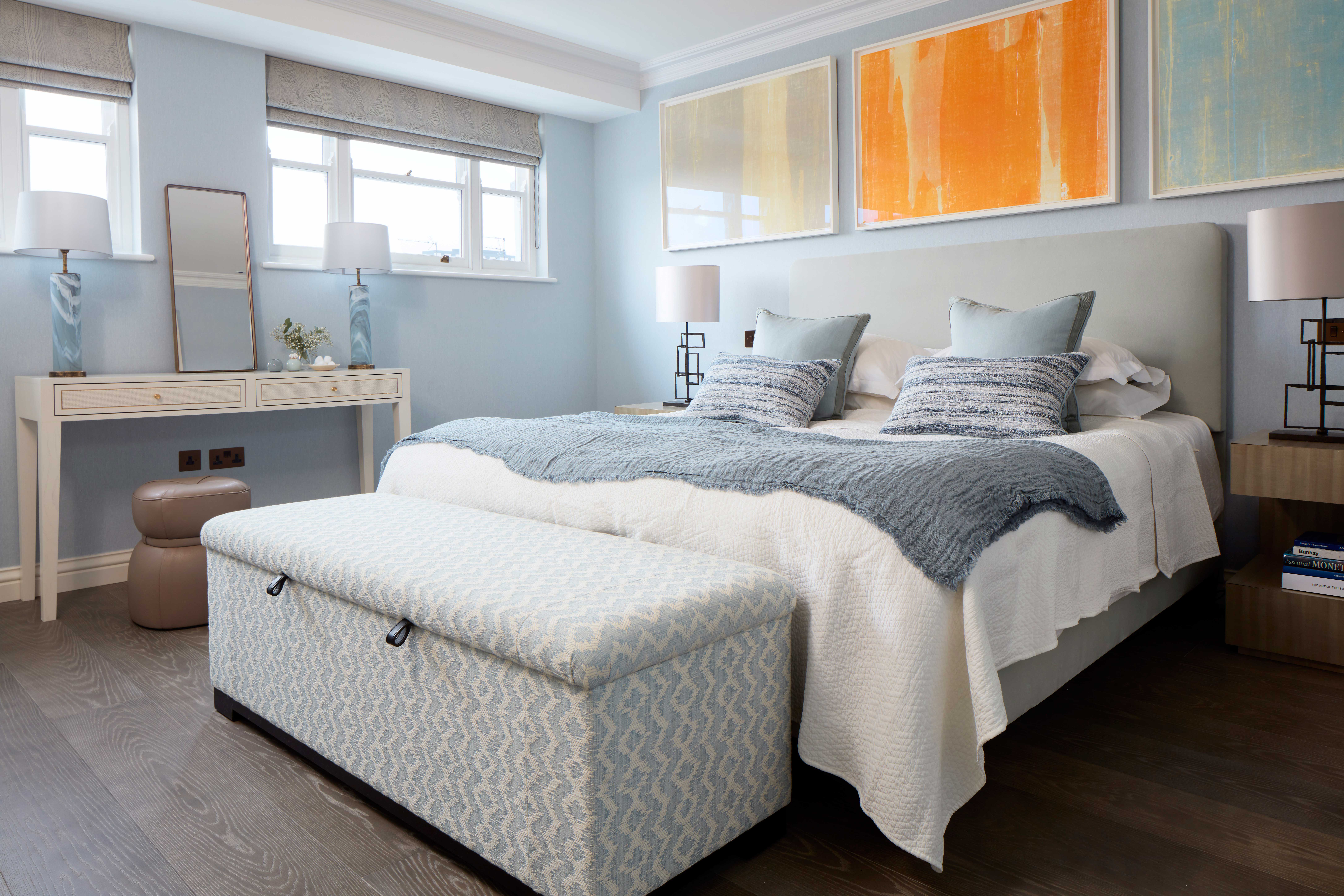
Blues and oranges can also be found in the master bedroom. The client's brief was to create a calming sleep space but still have those pops of bold color from their art collection.
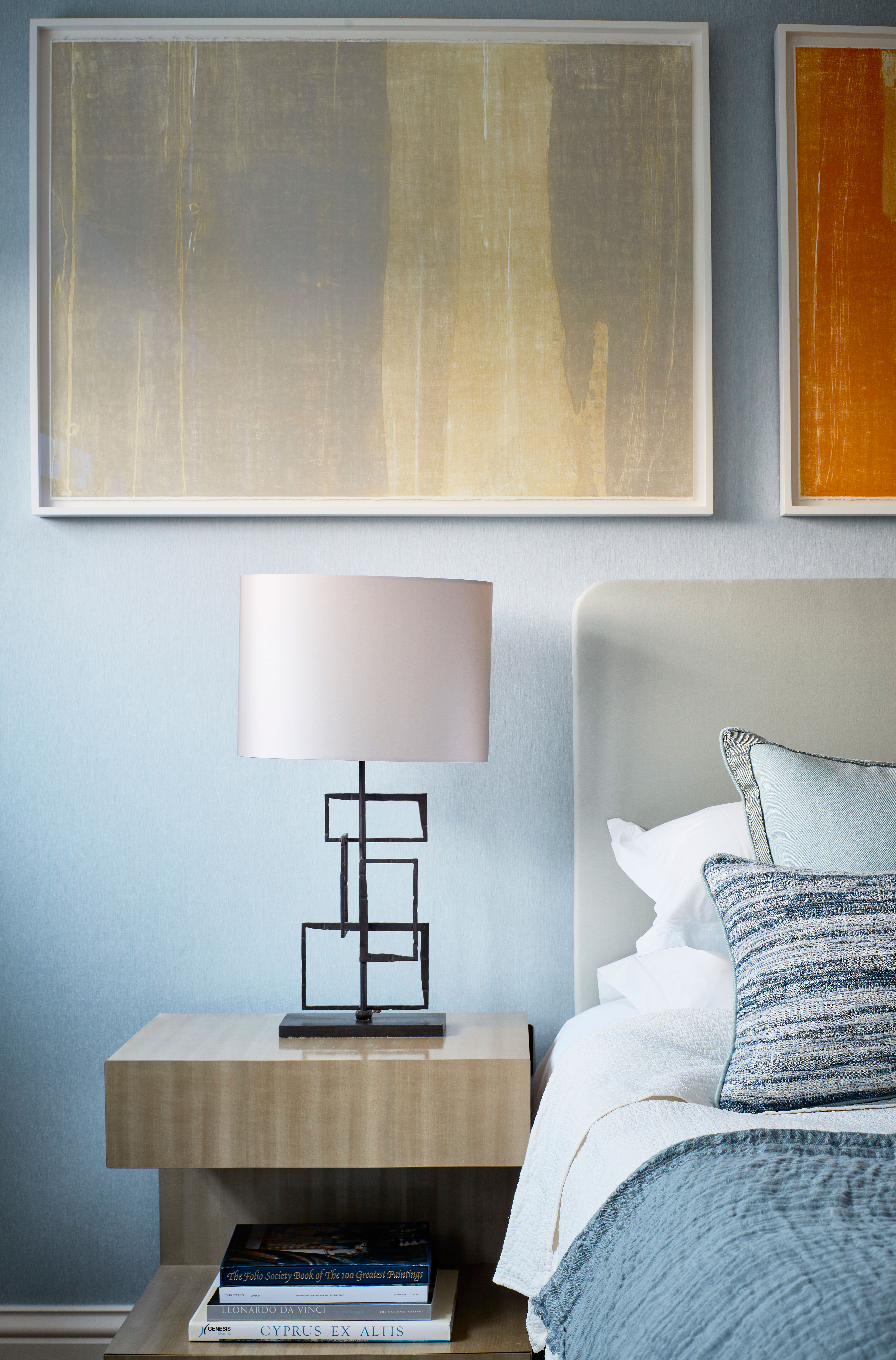
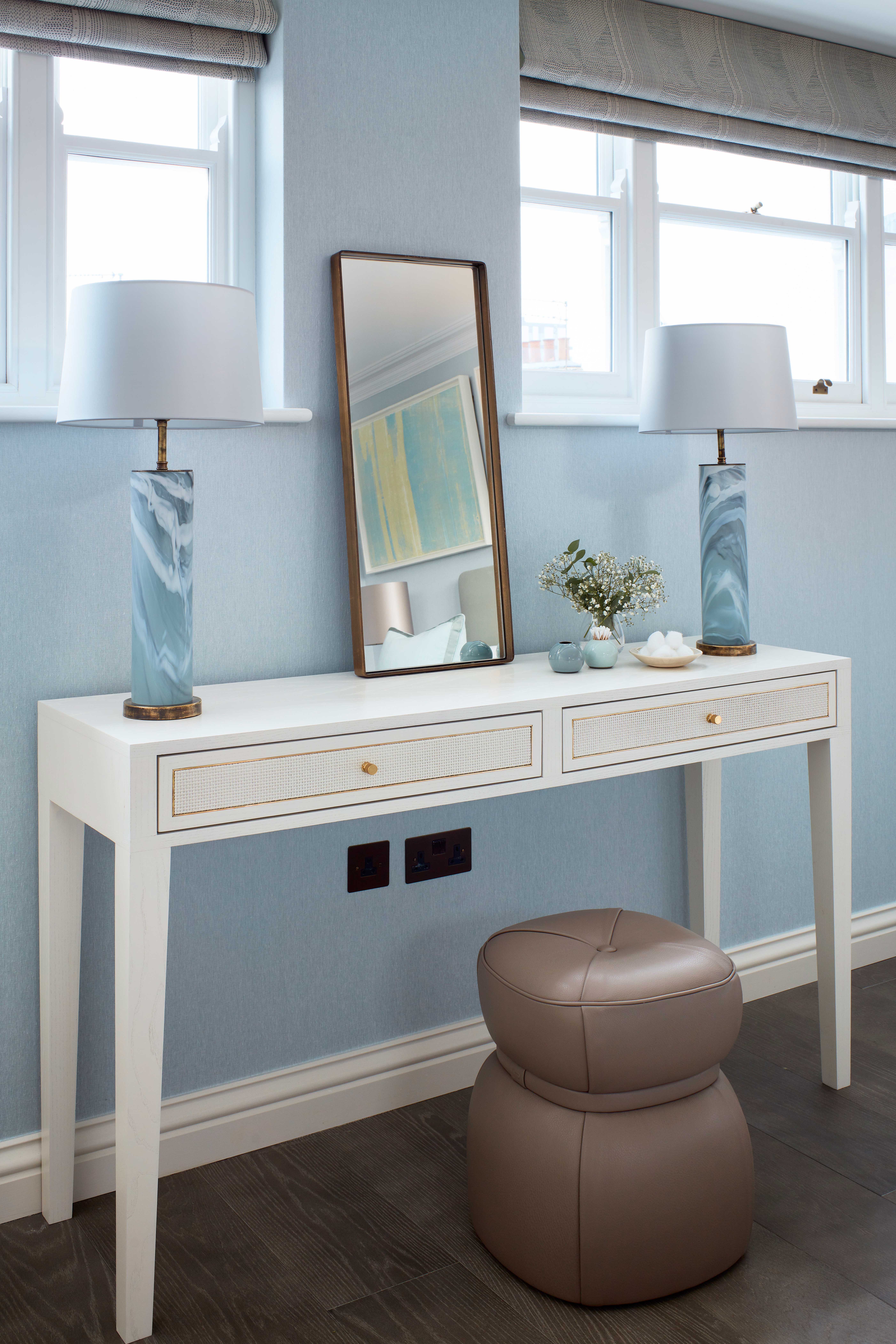
The pale blue walls do add instant serenity to the space, and it's so pale it's almost like a cool-toned neutral. Layered with similar blues in slightly different shades and the lovely mix of soft textures create a classic bedroom scheme. The injection of color comes from the orange and yellow paintings, but even those don't overwhelm the soft blue scheme.
Home office
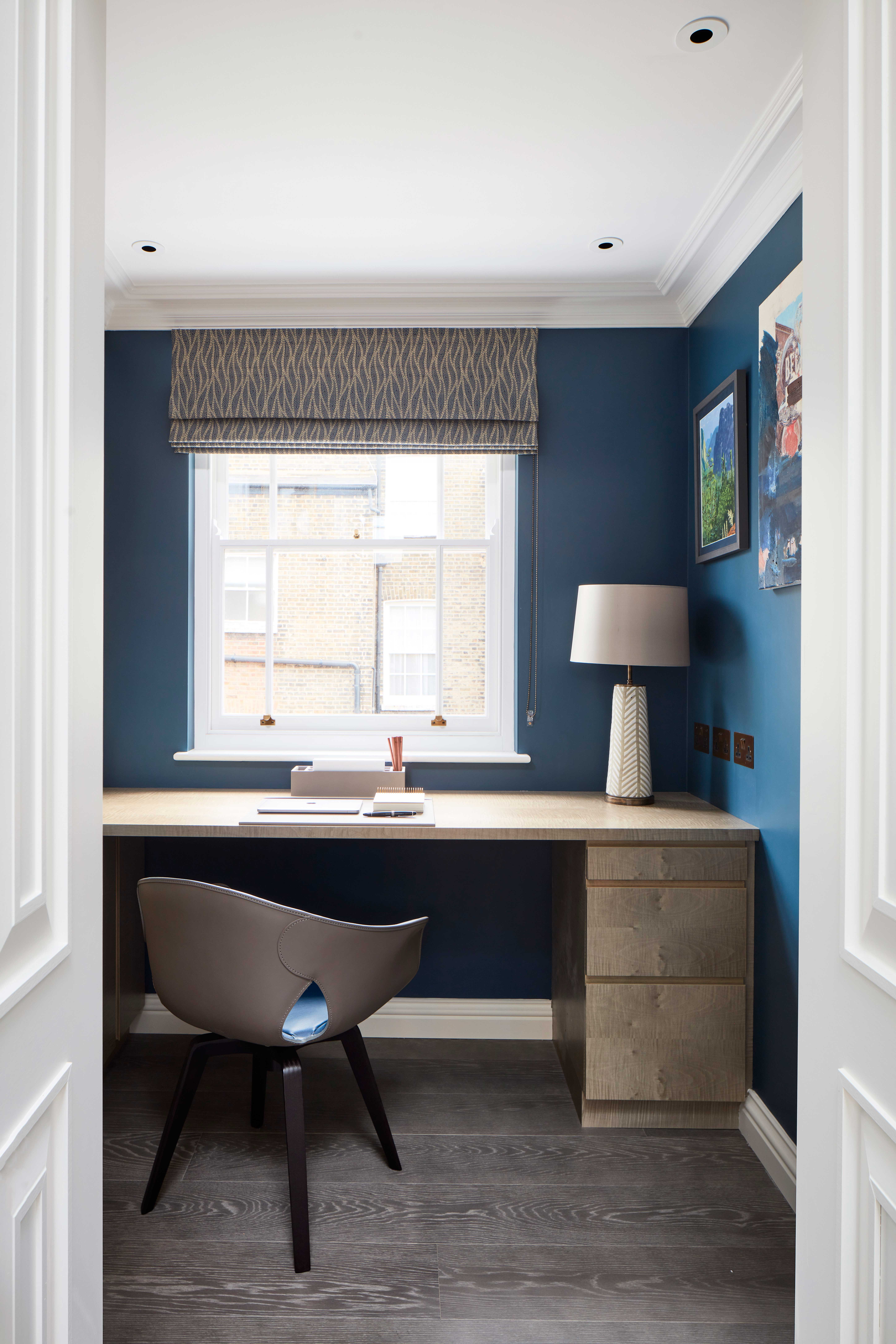
The blue scheme continues into the home office, but here it's much deeper, moodier, and feels more sophisticated – the perfect blue for a work space. A wooden desk and the grey tones of the chair, blinds, and flooring add to the cool color palette.

Formerly the Digital Editor of Livingetc, Hebe is currently the Head of Interiors at sister site Homes & Gardens; she has a background in lifestyle and interior journalism and a passion for renovating small spaces. You'll usually find her attempting DIY, whether it's spray painting her whole kitchen, don't try that at home, or ever-changing the wallpaper in her entryway. She loves being able to help others make decisions when decorating their own homes. A couple of years ago she moved from renting to owning her first teeny tiny Edwardian flat in London with her whippet Willow (who yes she chose to match her interiors...) and is already on the lookout for her next project.