A Regency townhouse in Bath that's a rainbow of Farrow & Ball's most coveted hues
Behind the soft honey-hued sandstone walls lies bold shades, whimsical pattern and a wonderful mix of old and new designs

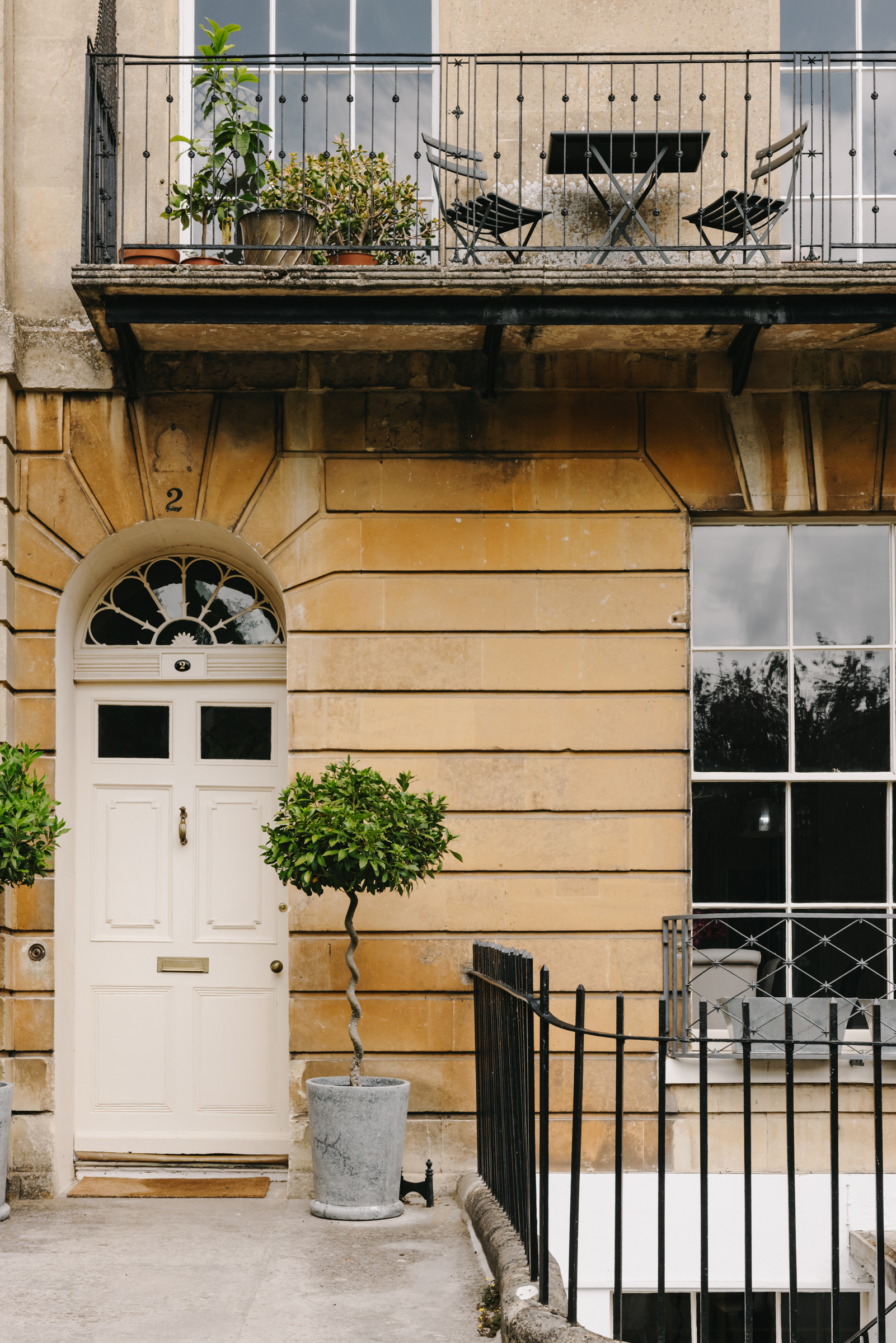
The historic town of Bath is synonymous with houses like this one. Huge sash windows, sweeping curves, delicate cast-iron balconies, and, of course, the iconic honey-hued Bath Stone. And with this Grade I-listed townhouse, the beautifully restored interiors match the elegant facade.
Situated within a Regency terrace made up of nine properties, with views over both the city and the rolling summerset hills, Sion Hill Place was actually named one of the six best streets to live on in the UK. The home is spread over five storeys, with five bedrooms, four bathrooms, two reception rooms, and a self-contained apartment, complete with a kitchen and bathroom on the lower ground floor.
And the soft colors of the exterior give no clue to the delights that lie behind that subtle white door. Farrow & Ball's pale chalky colors mix with bold hues, and whimsical wallpaper adorns the walls, traditional furniture (some of which was salvaged from the original house) sits with contemporary shapes. The overall effect is a beautiful home, filled with personality and intrigue. Let's take a tour...
- Be inspired by all of our modern home tours
Hallway
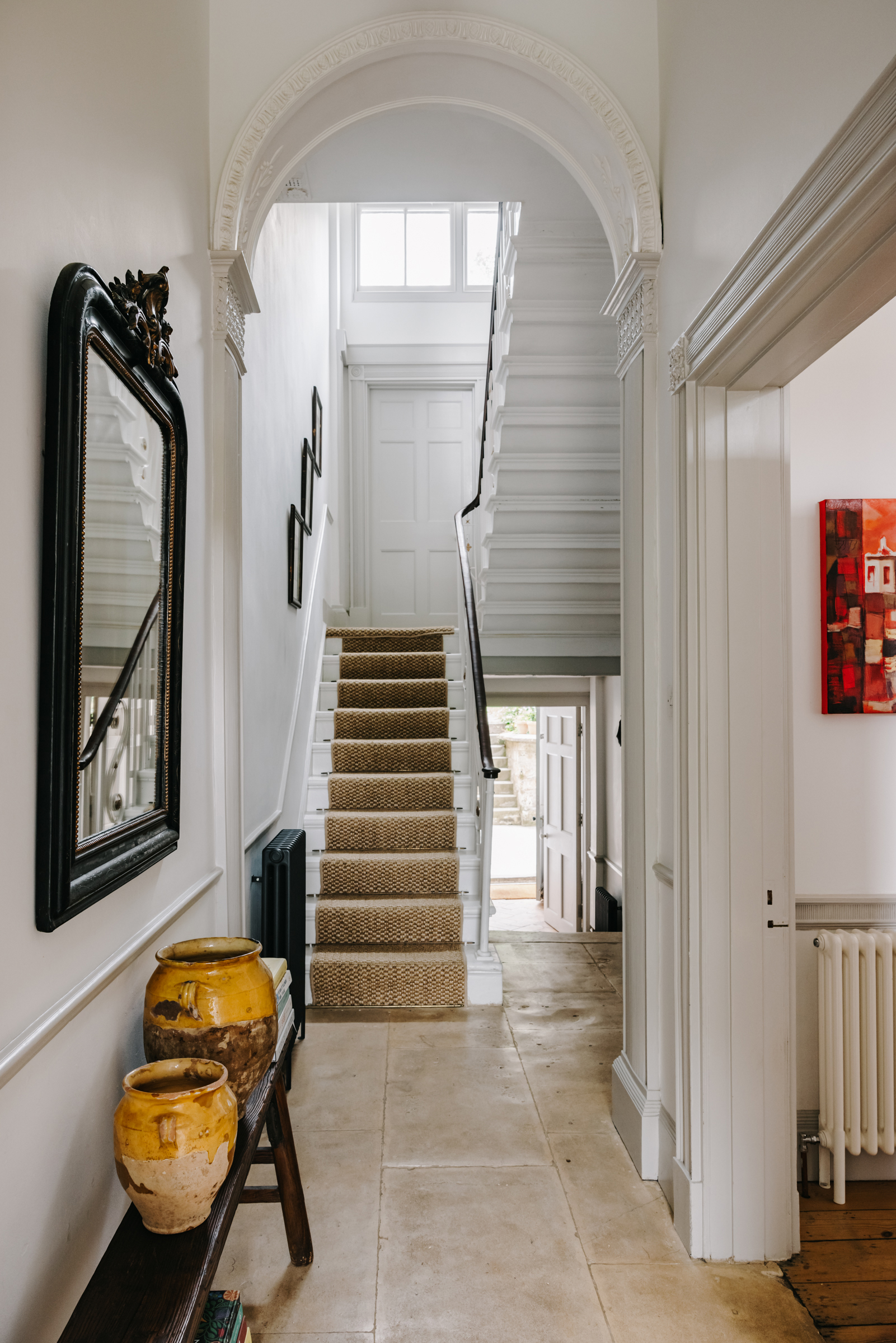
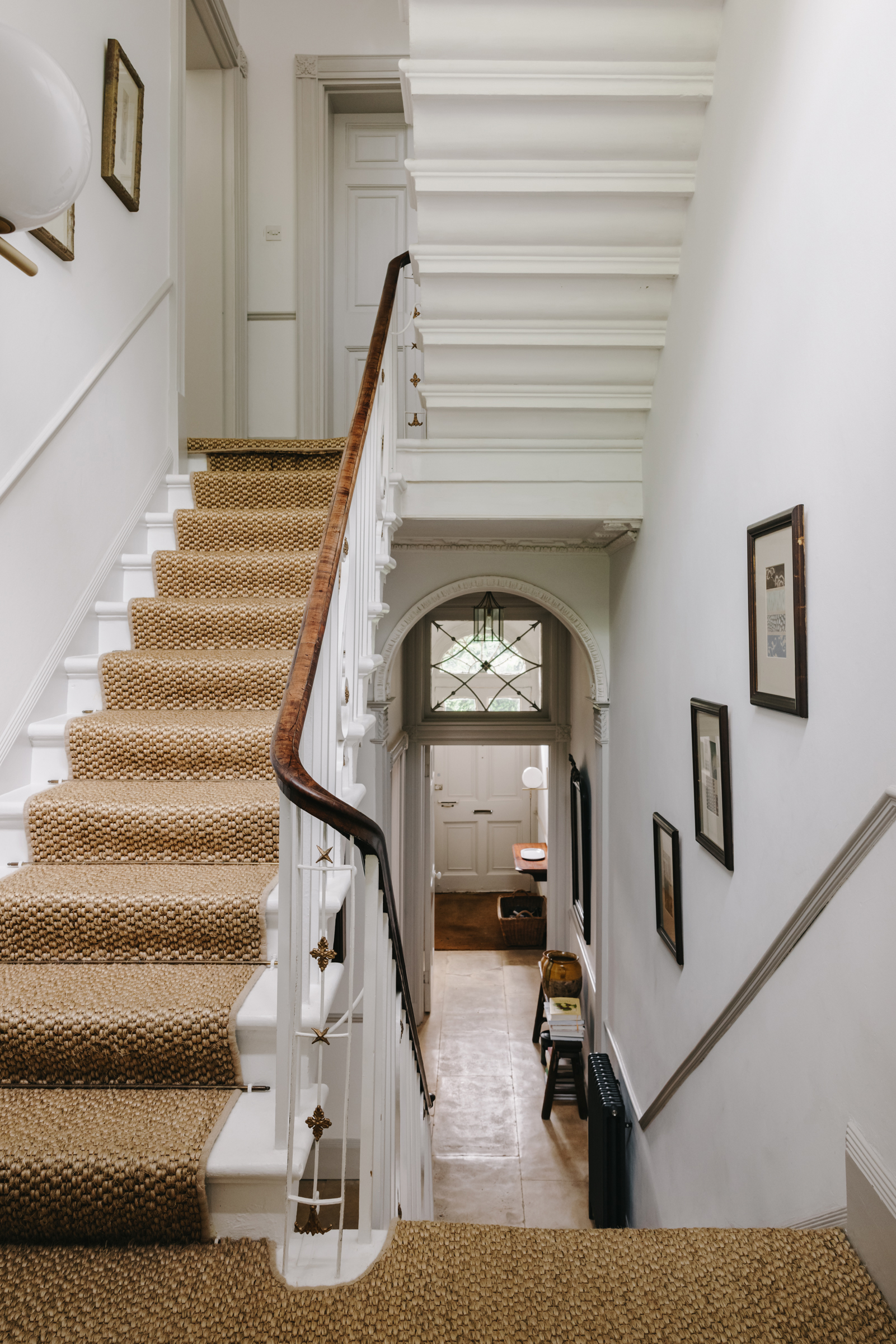
Aged flagstones lead through a light and airy hallway with towering ceilings and beautifully intricate door architraves, molding, and cornicing that mirror the details throughout the rest of the home.
The same chalky white, ‘Wevet’ by Farrow & Ball, is used throughout the hallways and landings of the home, giving the spaces a soft, lit from within quality that only enhances all the natural light that flows through the house.
- Be inspired by more of our hallway ideas.
Kitchen diner
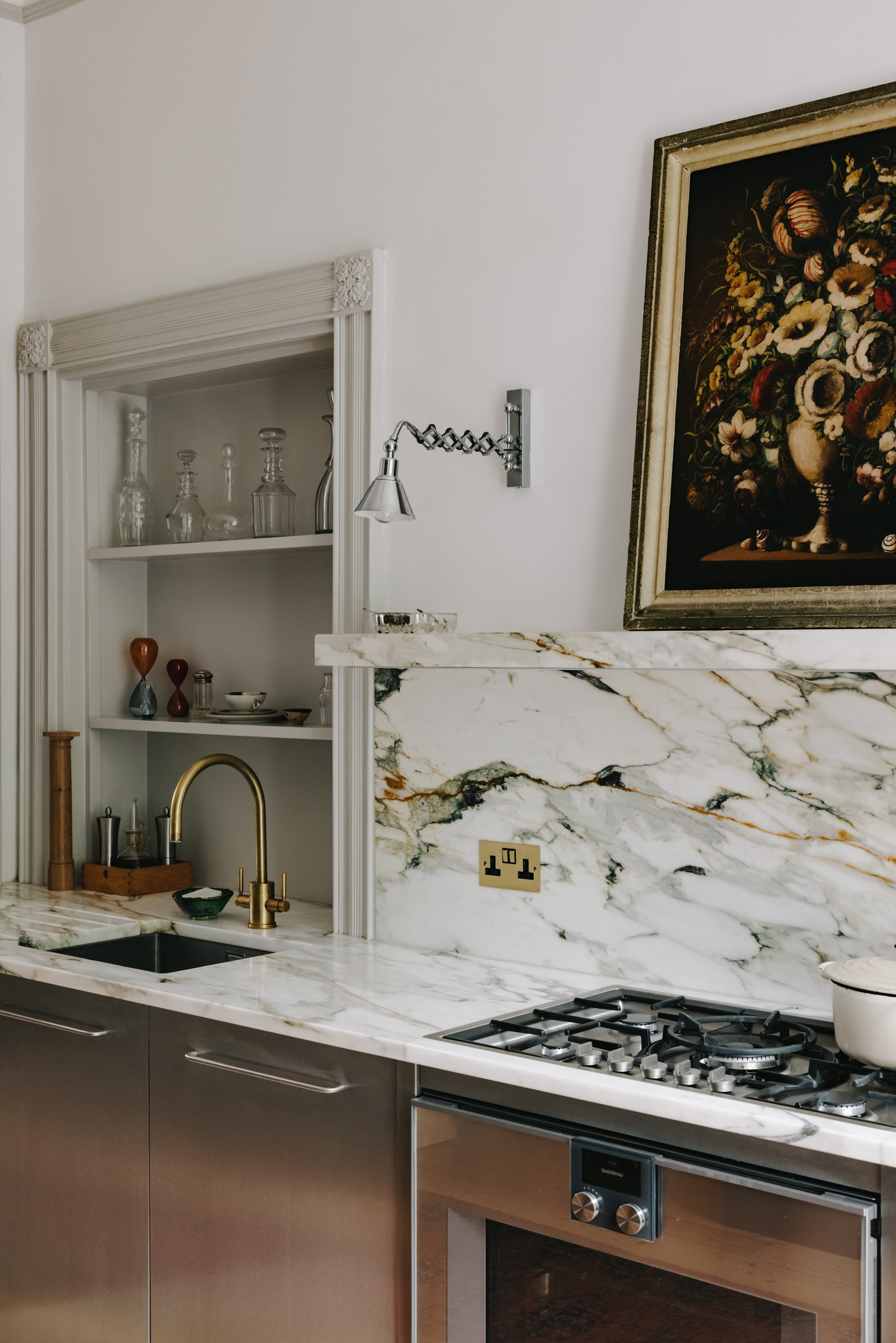
The semi-open plan kitchen and dining room take up the ground floor, stretching from front to back with light pouring in from both of the huge 12-pane sash windows. The kitchen itself has a modern feel with Carrara Oro marble work surfaces sitting on top of stainless steel cabinetry.
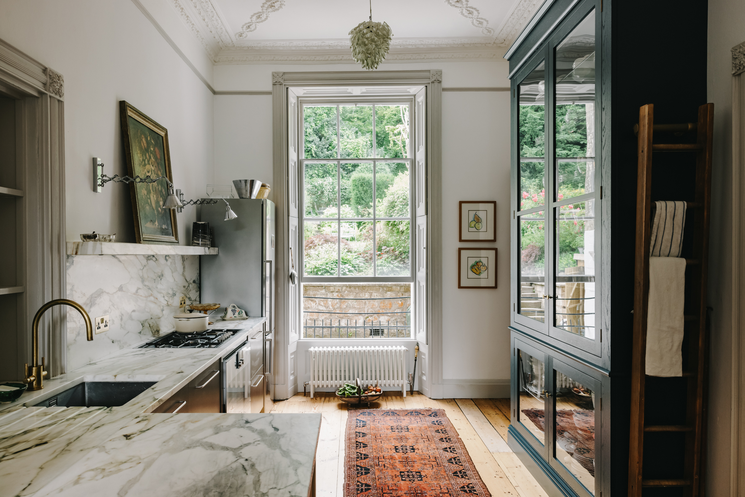
Slab marble splashbacks continue the beautiful veining up the walls and a matching picture ledge offers a space for decor and storage. A more traditional, Shaker-style glass-fronted cabinet sits opposite, painted in a deep midnight blue to add some depth to the room and reflect light back into the space.
Be The First To Know
The Livingetc newsletters are your inside source for what’s shaping interiors now - and what’s next. Discover trend forecasts, smart style ideas, and curated shopping inspiration that brings design to life. Subscribe today and stay ahead of the curve.
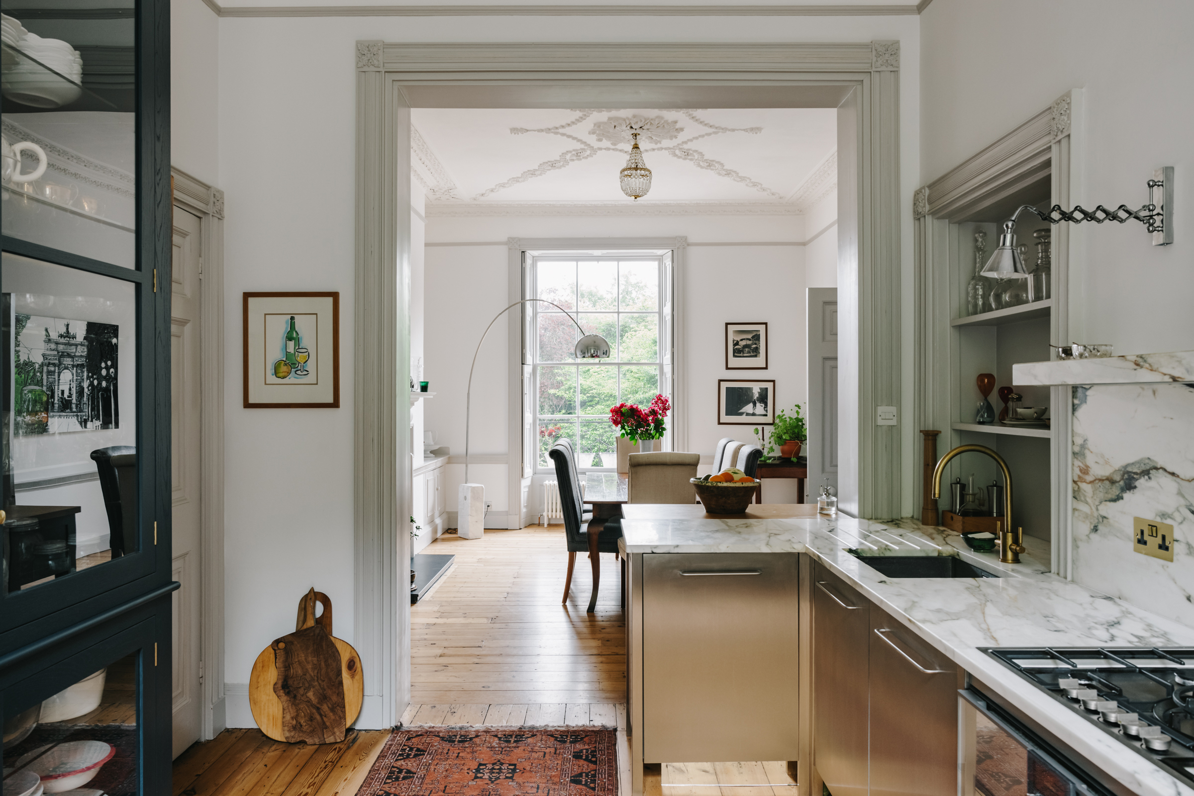
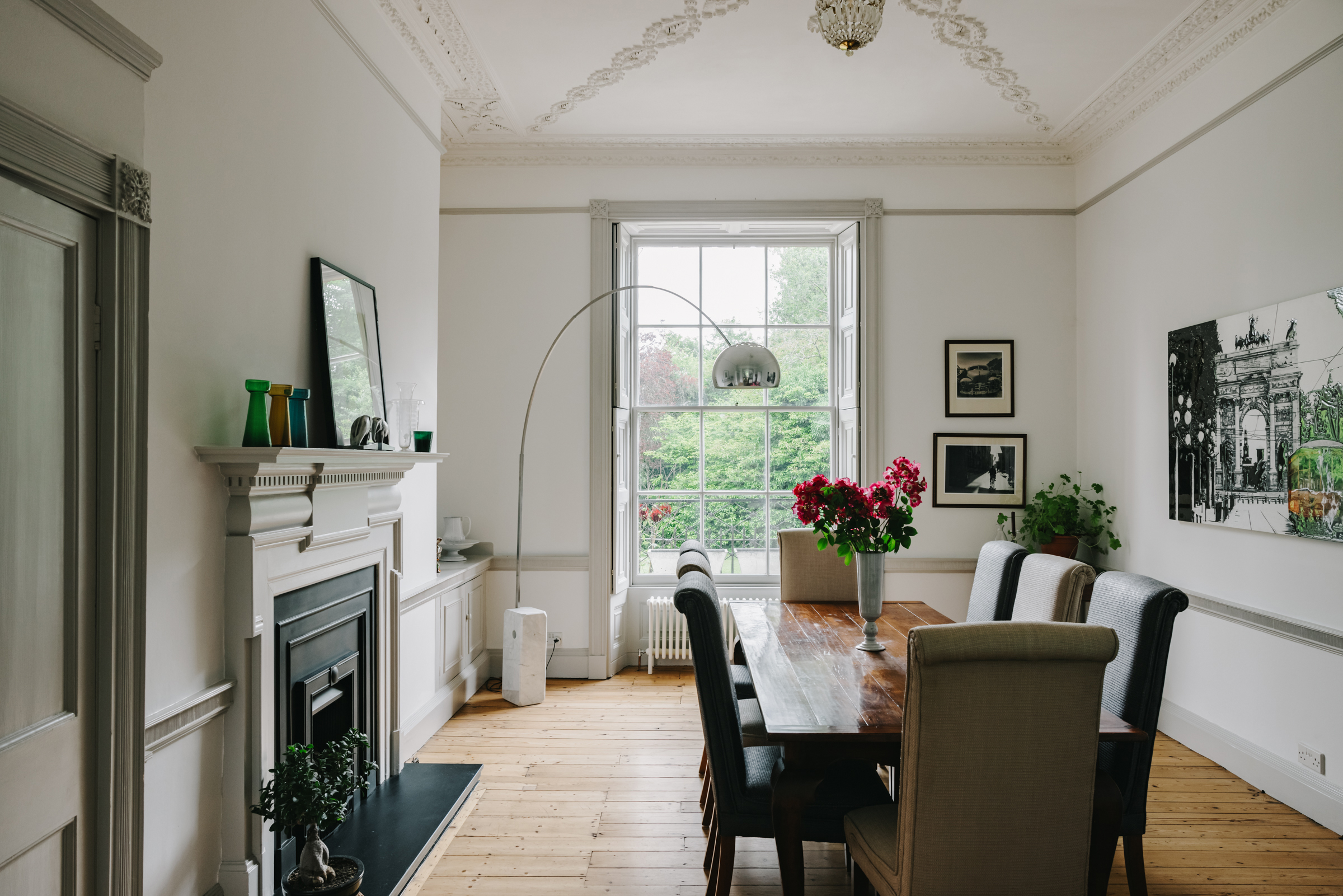
Through the open door frame is the spacious dining room. The original chimney breast and fireplace are the focal point of the room and the strapwork plaster ceilings in the neoclassical style are original too, unifying this space with the kitchen, where the same design is mirrored.
It's in here you start to see the subtle mixing of old and new – the traditional high-polish mahogany dining table, the collections of both contemporary and antique decor and the Arco floor lamp all work together to create a space that feels chic and modern with plenty of nods to the houses original style.
- See all our inspiring kitchen ideas.
Drawing room
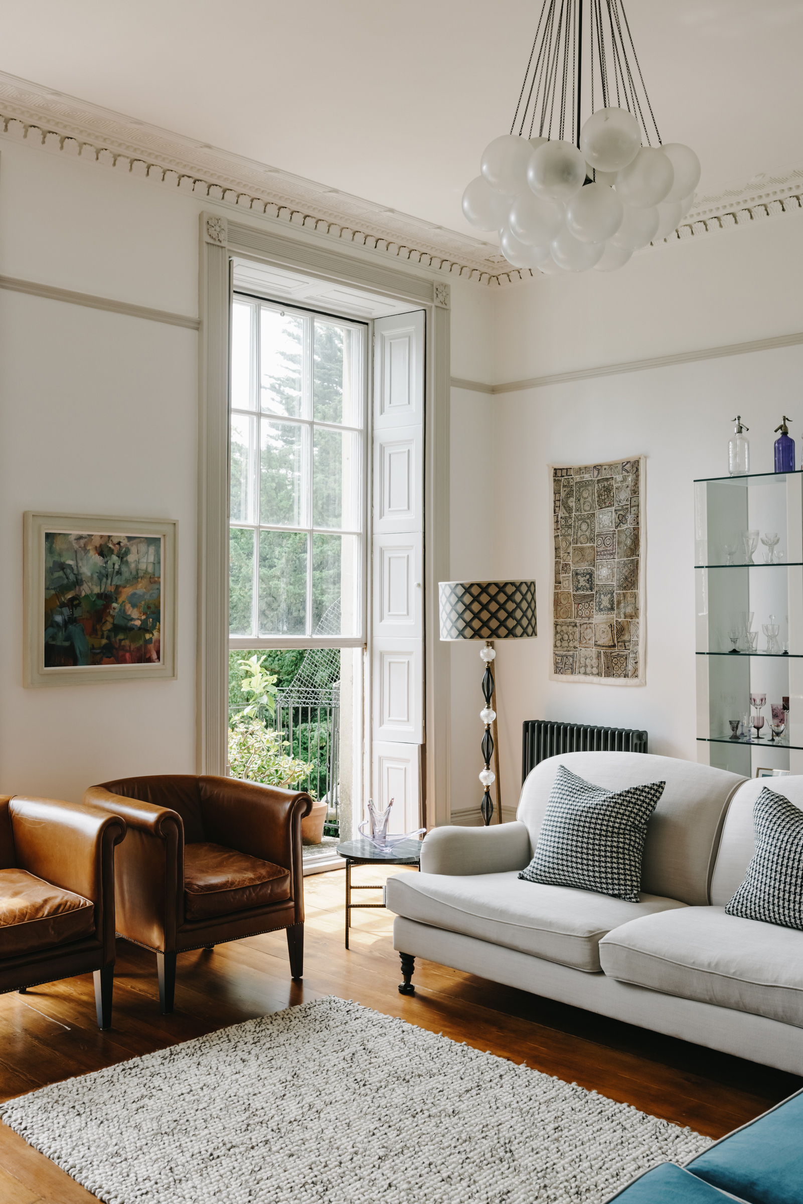
Up the stone staircase is a large elegant drawing room with views out through the large sash windows overlooking the gardens. As in the kitchen below, the ceilings tower above the furniture, and yet there's a coziness to the grandeur of the room, with the mix of tactile fabrics and rounded shapes. Plus, the layout makes the room feel smaller and more intimate.
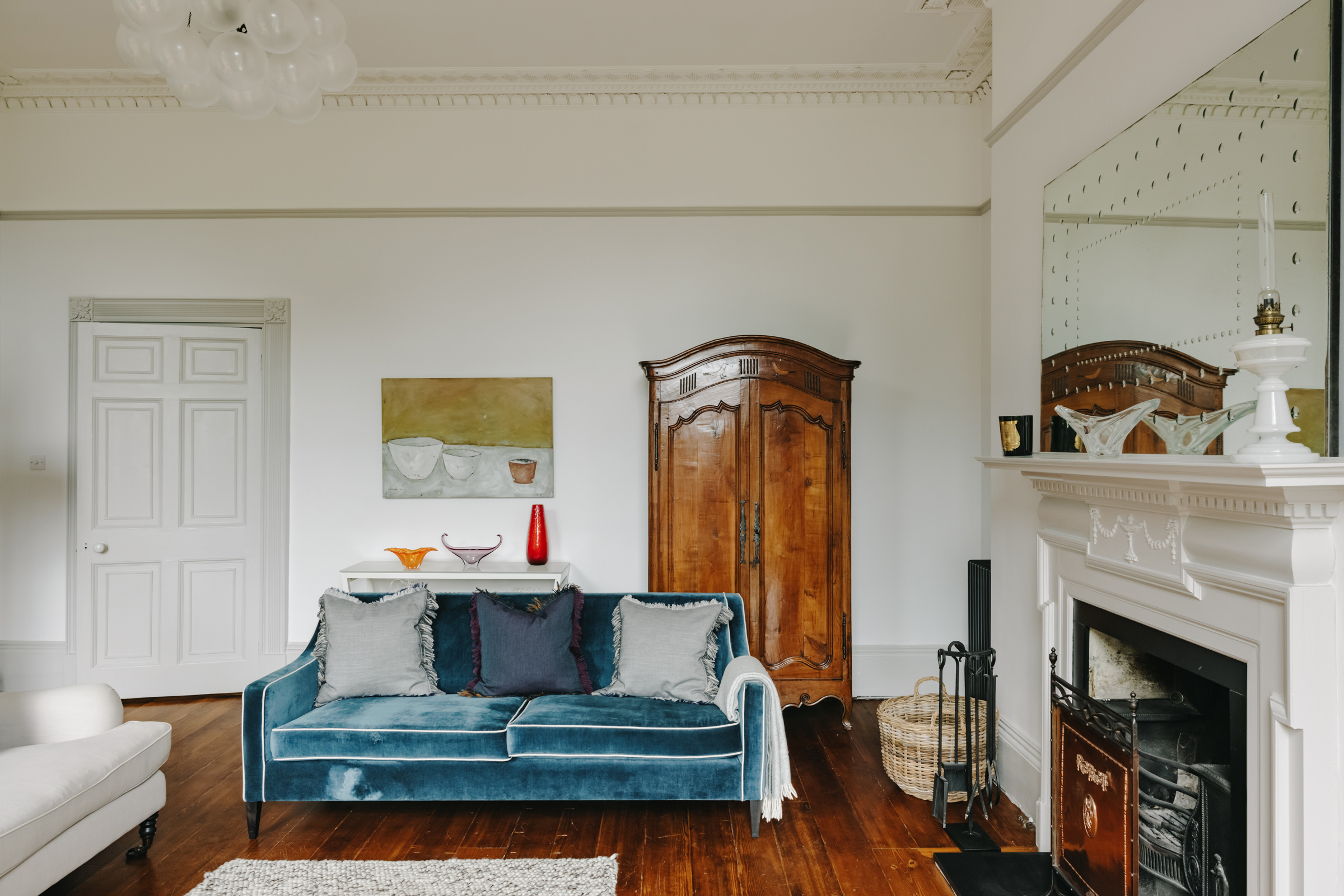
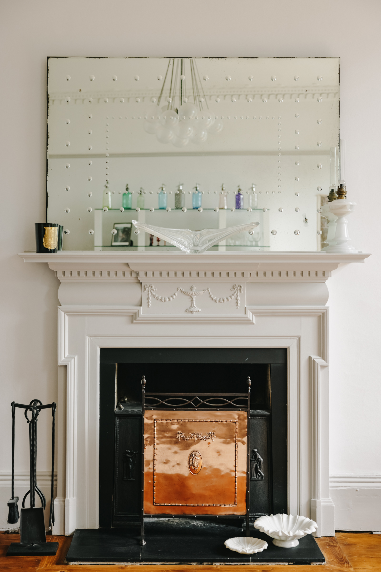
The impressive original fireplace only adds intimacy and brings some of the beautifully ornate carvings that can be found on the ceiling down to eye level. It also adds to the mixing of styles in this room. The fireplace maintains the original charm of the space, despite it being filled with more quirky modern pieces.
- Find more living room ideas and inspiration in our full feature.
Master bedroom
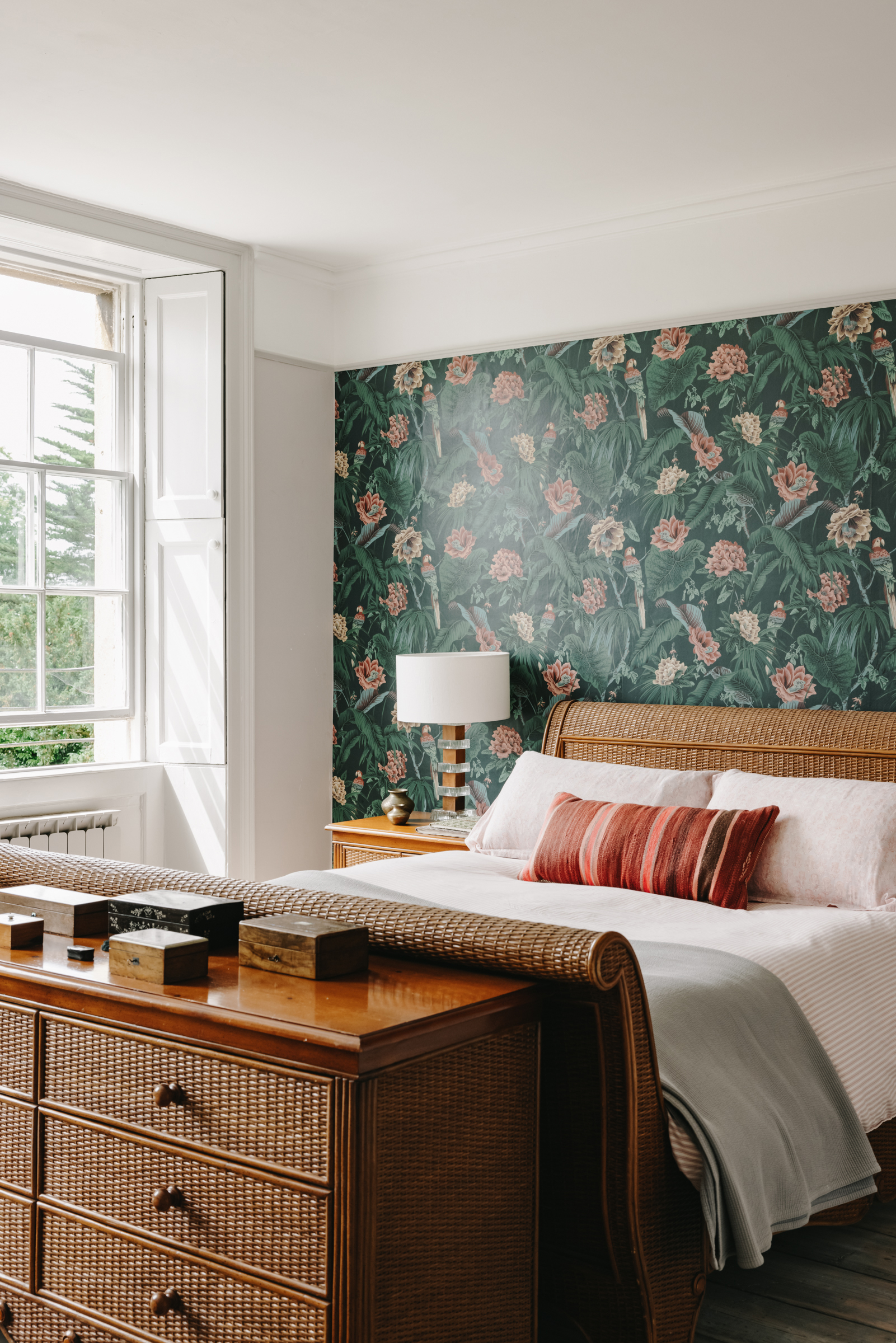
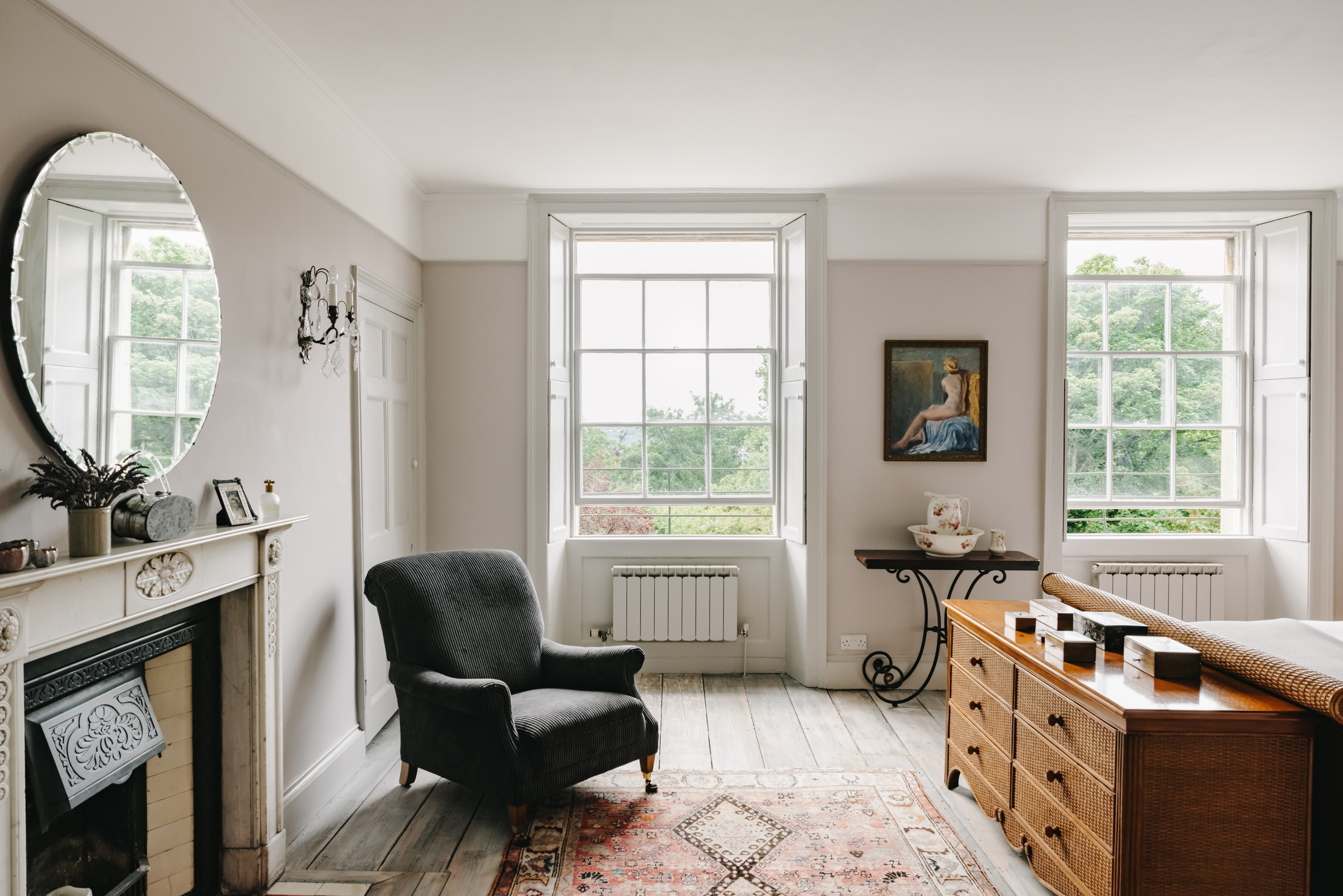
The master bedroom is again a quirky mix of old and new. The feature wall of exotic tropical-inspired prints feels bold and contemporary, and yet it really works as a backdrop for the retro rattan matching furniture. And there are even older antiques and features in the mix too, that again work with the era of the house – the intricate wall sconces, delicate floral print jug, and the vintage artwork.
Guest bedrooms
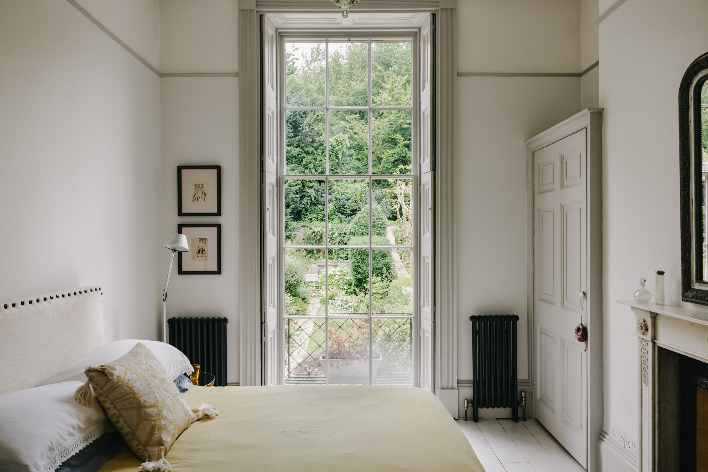
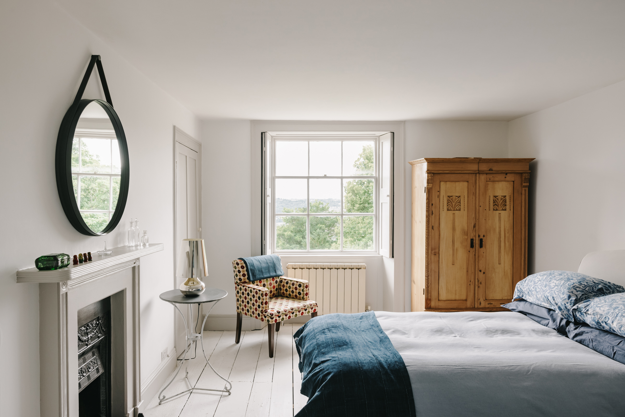
On the upper storey is three more guest bedrooms, one of which is used as a walk-in wardrobe. The largest of the rooms enhances the light from the largest window in the home, keeping with a soft neutral scheme of warm whites and greige tones.
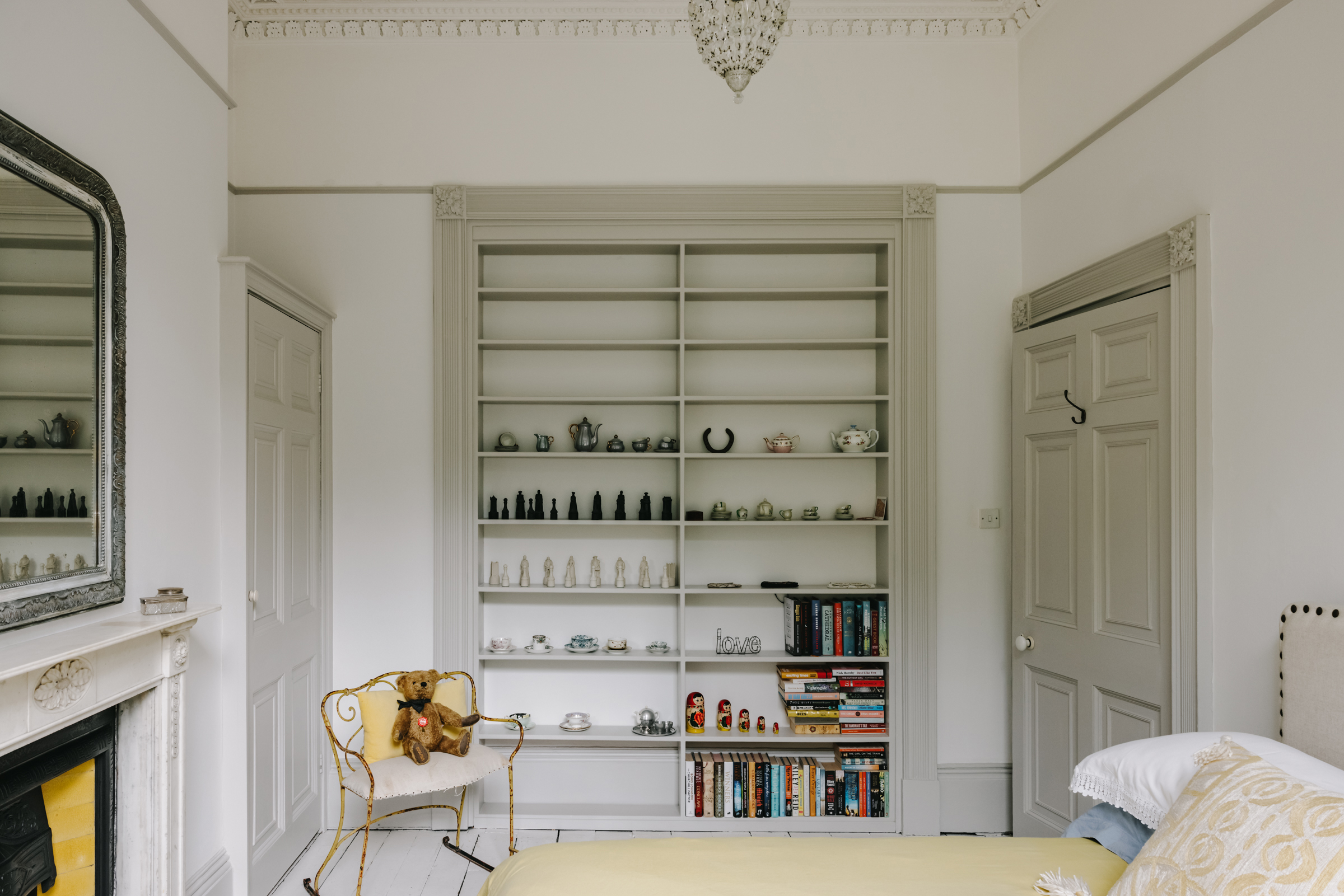
As with most of the alcoves in this home, storage has been built in and what once would have been a large door frame between the two bedrooms has been filled to add a spacious shelving unit.
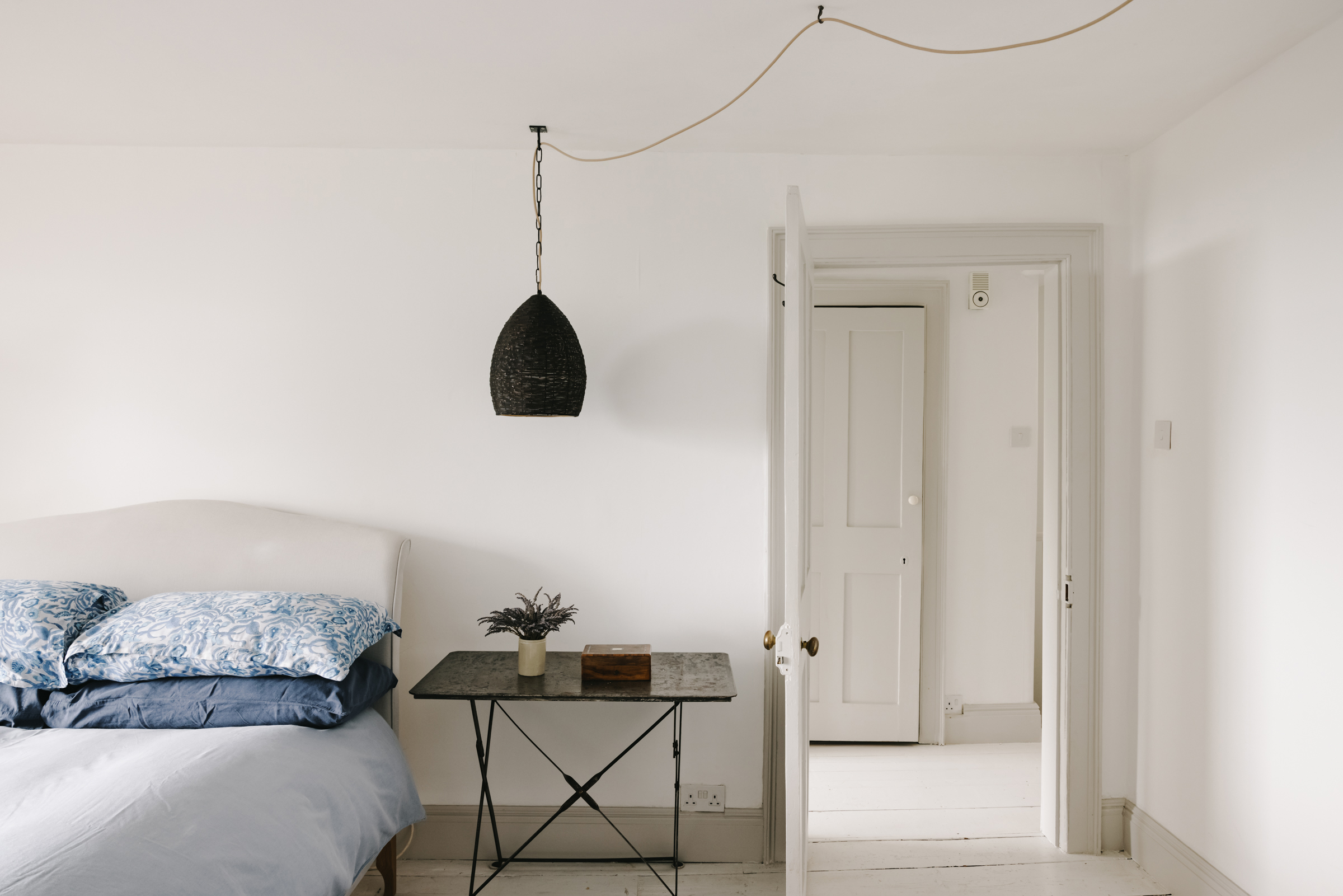
The second guest bedroom has a much cooler palette of soft blues and crisp whites. There are still the grey tones used on the woodwork, but it's a cooler grey to work with the less sunny, east-facing aspect.
Family bathroom
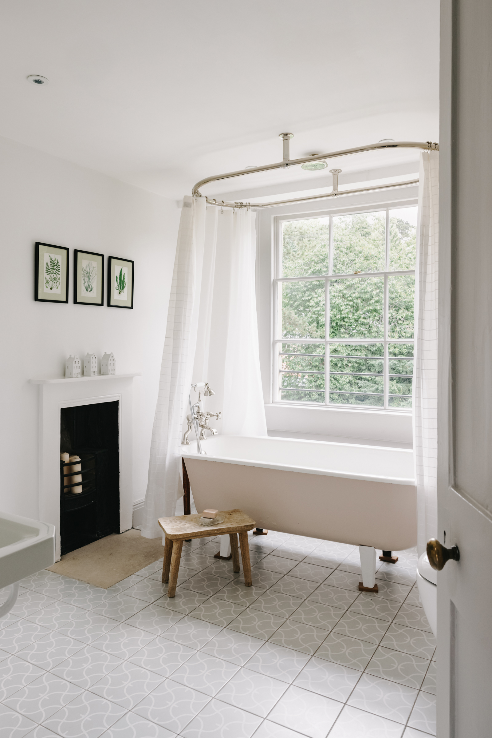
The light and airy family bathroom can be found on the top floor too. The plaster pink cast iron bath was bath discovered in the house’s vaults and repurposed. The subtly patterned floor tiles are by Fired Earth. They aren't overly contemporary but they do add a slightly modern edge to this otherwise very traditional bathroom.
Apartment
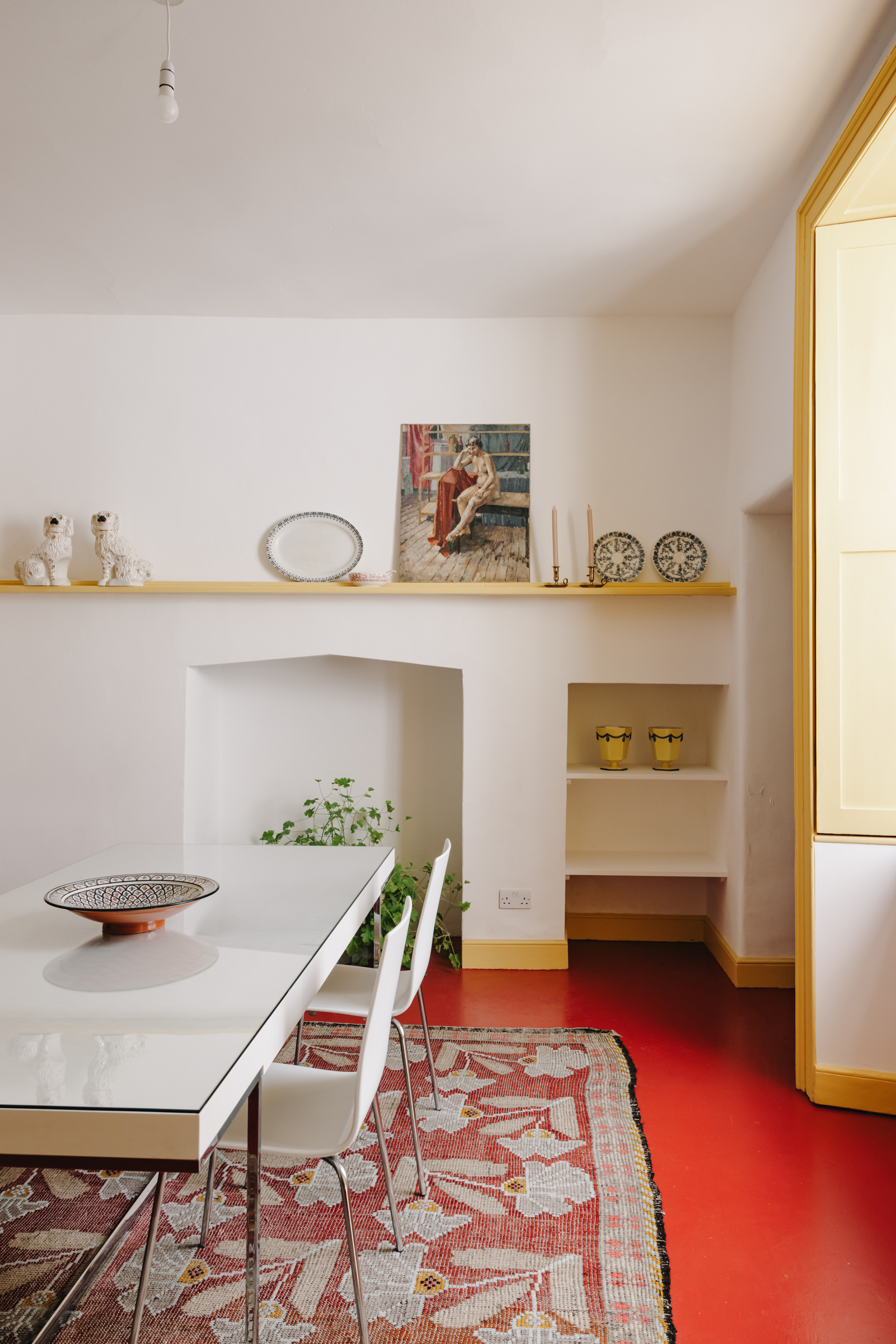
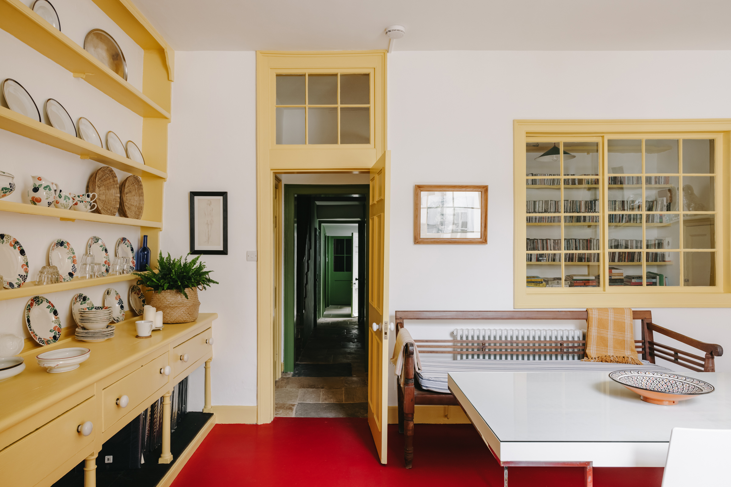
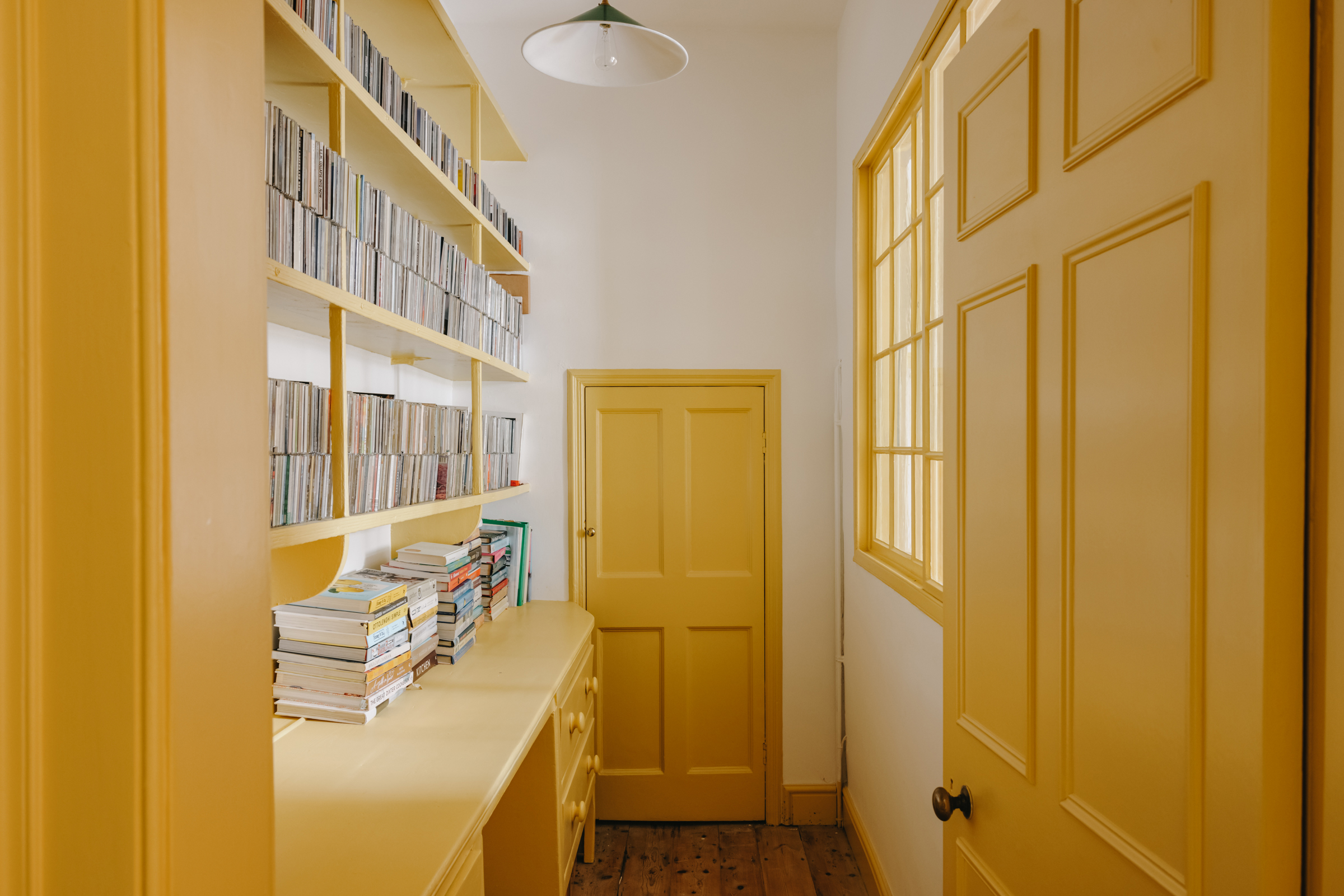
The lower ground floor, which once would have been the servant's quarters, has been converted into a two-bedroom self-contained apartment. Unlike the neutral palettes of the rooms above, this space really plays with fun and bold hues. Yellows, greens, and reds all come into the scheme to create a basement space that feels full of light and color.
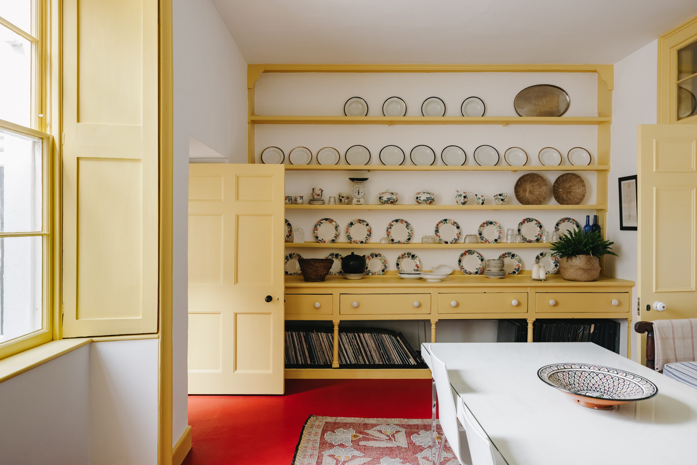
The dining area and living room still has the original dresser, given a new lease of life with a coat of Farrow and Ball's sunny Sudbury Yellow. The woodwork has been painted to match and it continues into the pantry too.
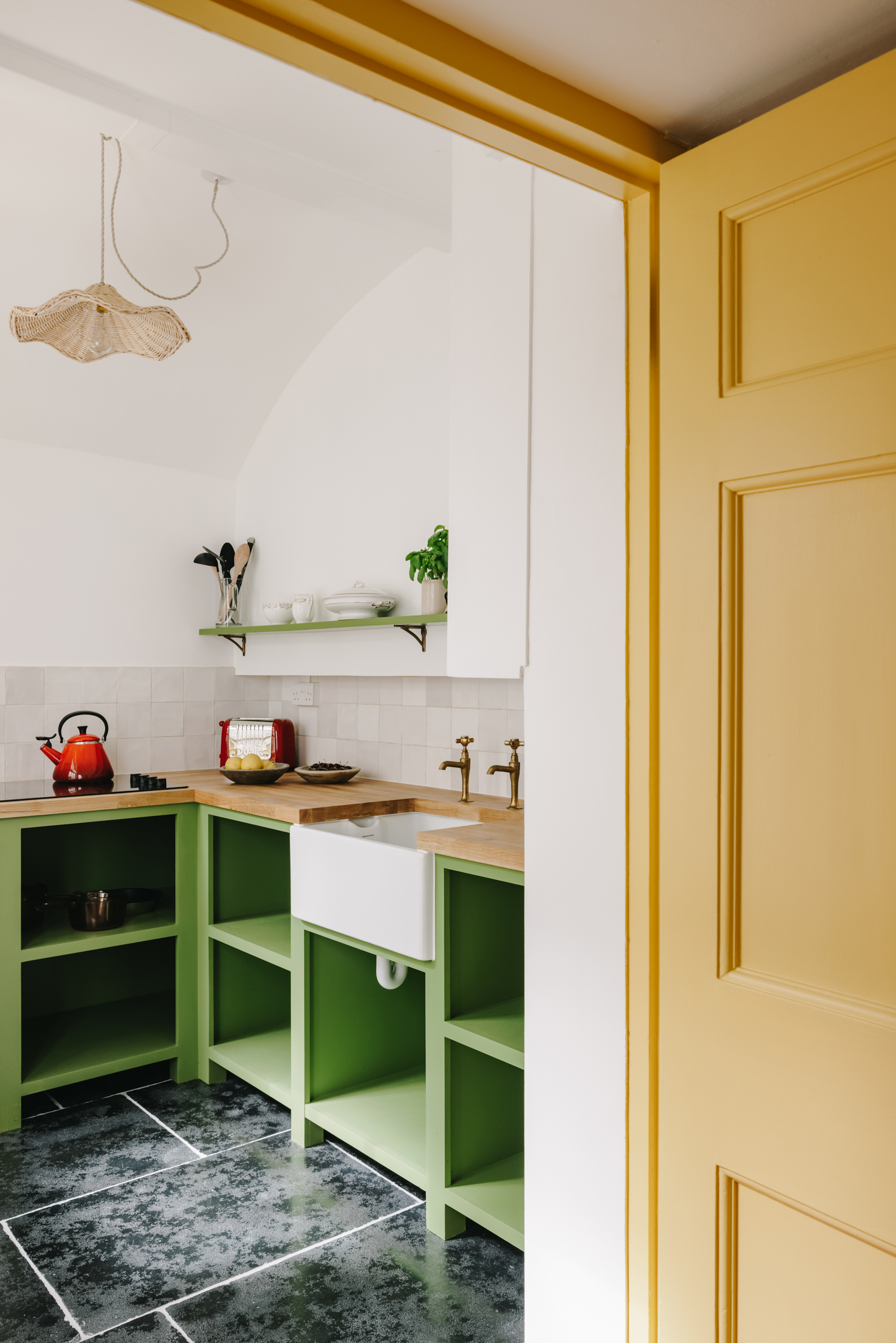
A small kitchen is painted in a lively moss green, the perfect contrast to all those warm yellow tones.
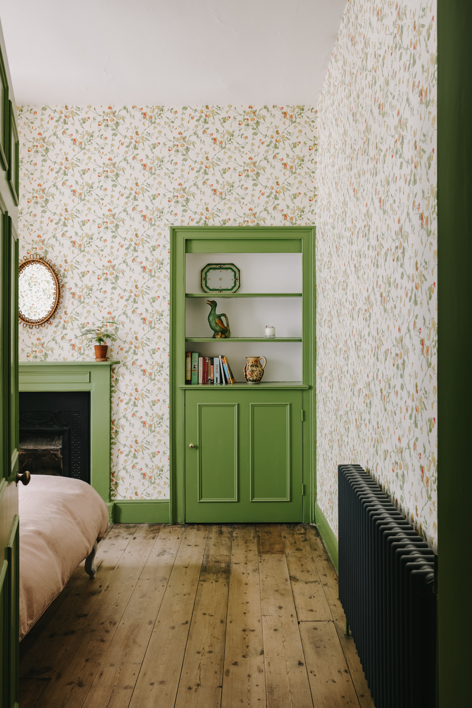
And that same green can be found in the bedroom. The walls are covered in a traditional Colefax & Fowler print, but that pop of bright green gives it a fresh, contemporary edge.
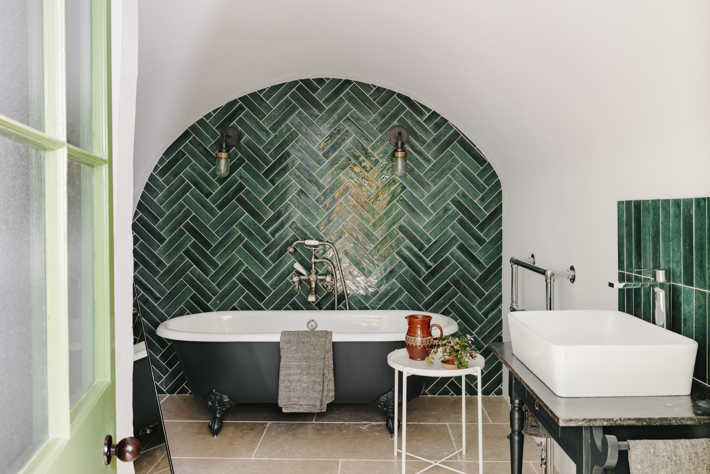
The bathroom, which was once the building's cold storage vault, feels decidedly more modern with the deep green zig-zag tiles and charcoal tub. But there's still an aspect of antiquity in here, the vanity is a second-hand find and the claw-foot bath itself may have had a modern update but it too wouldn't have been out of place in this home back in the 1800s.

Formerly the Digital Editor of Livingetc, Hebe is currently the Head of Interiors at sister site Homes & Gardens; she has a background in lifestyle and interior journalism and a passion for renovating small spaces. You'll usually find her attempting DIY, whether it's spray painting her whole kitchen, don't try that at home, or ever-changing the wallpaper in her entryway. She loves being able to help others make decisions when decorating their own homes. A couple of years ago she moved from renting to owning her first teeny tiny Edwardian flat in London with her whippet Willow (who yes she chose to match her interiors...) and is already on the lookout for her next project.
-
 The 'New British' Style? This Victorian London Home Embraces Its Owners' Global Background
Warm timber details, confident color pops, and an uninterrupted connection to the garden are the hallmarks of this relaxed yet design-forward family home
By Emma J Page
-
 Muji Living Room Ideas — 5 Ways to Harness The Calming Qualities of This Japanese Design Style
Inspired by Japanese "zen" principles, Muji living rooms are all about cultivating a calming, tranquil space that nourishes the soul
By Lilith Hudson