Step inside this modern Hamptons beach house that expertly plays with colors, shapes and scale
Leave all your assumptions about 'beach houses' at the door, this sprawling property is a lesson in quirky contemporary decor

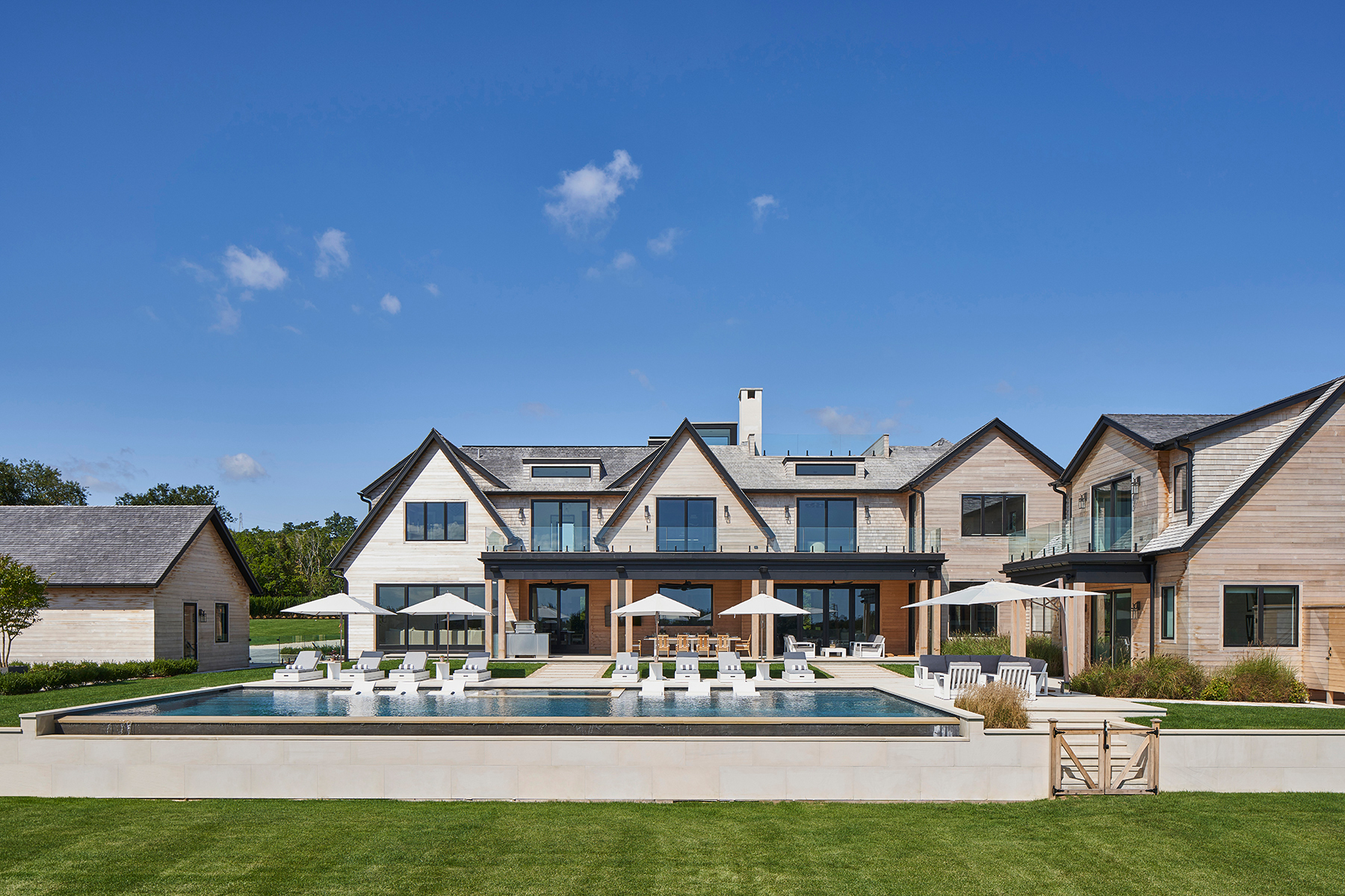
The property
When you think 'beach house' perhaps you envision a weather-beaten, clapboard cottage, a bolt hole by the sea decorated with blue and white stripes and nautical-inspired decor. Well, this enormous beach house in Hampton's could not be further from that vision. Known as 'Modern Zen' this modern home spans over 14,000 square foot, has eight bedrooms, ten bathrooms, numerous living rooms, tennis courts, plus of course, a pool and pool house.
To decorate this gorgeous expanse of 'beach house' the homeowners brought on interior designer Michelle Gerson. The direction was pretty simple, create the vibe of the home's namesake – Modern Zen. A cool and casual interior that felt light and airy and had a seamless connection with the outside space. Let's take a tour...
Kitchen
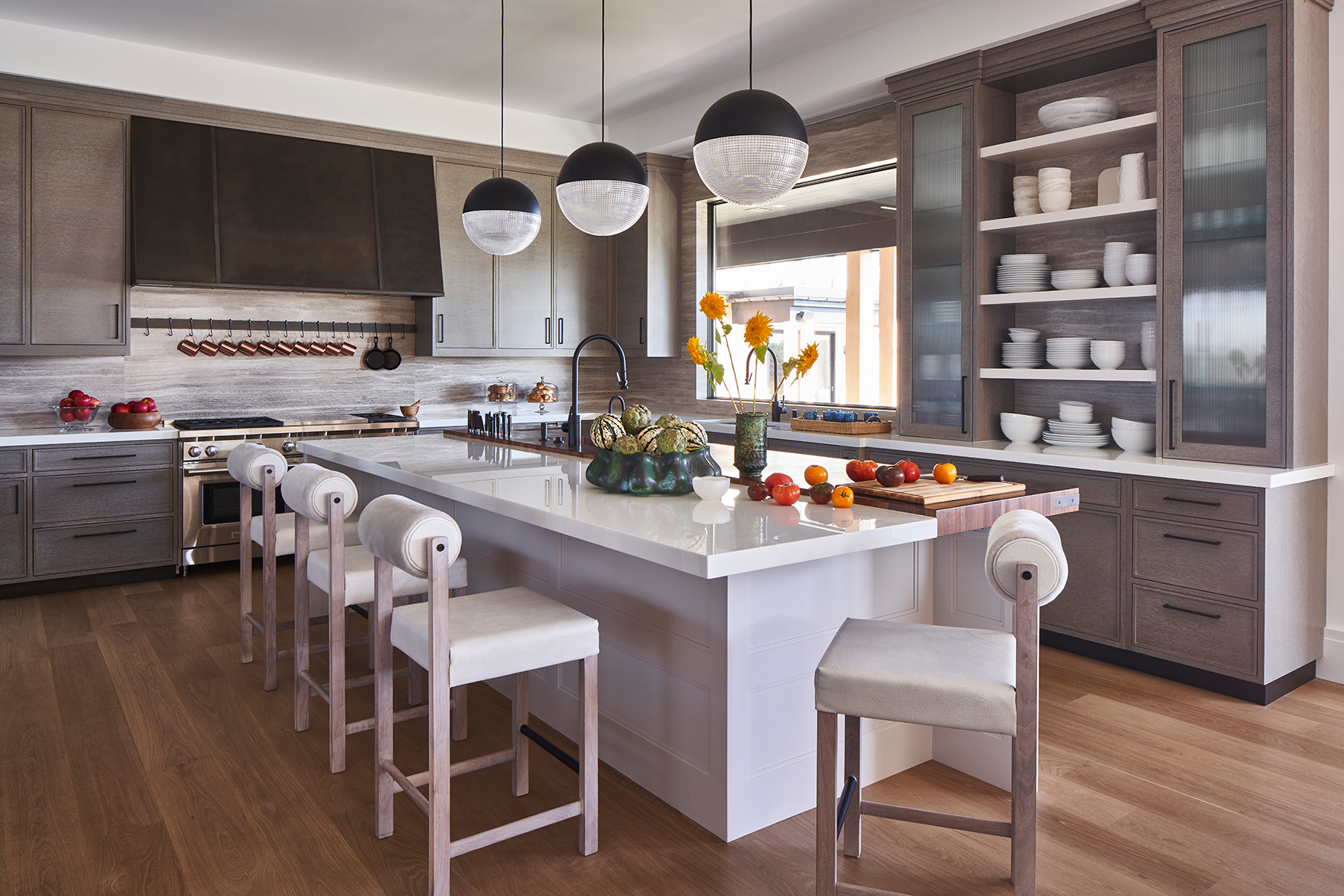
The property is a family's holiday home, so having a kitchen that was both functional and sociable was key. The stunning white kitchen island brings adds some freshness to the taupey grey wood of the kitchen cabinets but it also creates a more casual dining space and an area to gather around that feels less formal than the dedicated dining room.
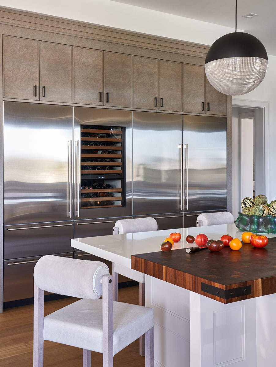
The colors used for the kitchen are cool-toned, giving the space a sophisticated modern edge, but all the rustic wooden accents like the built-in chopping board, the island seating, and oak-toned flooring add an inviting warmth.
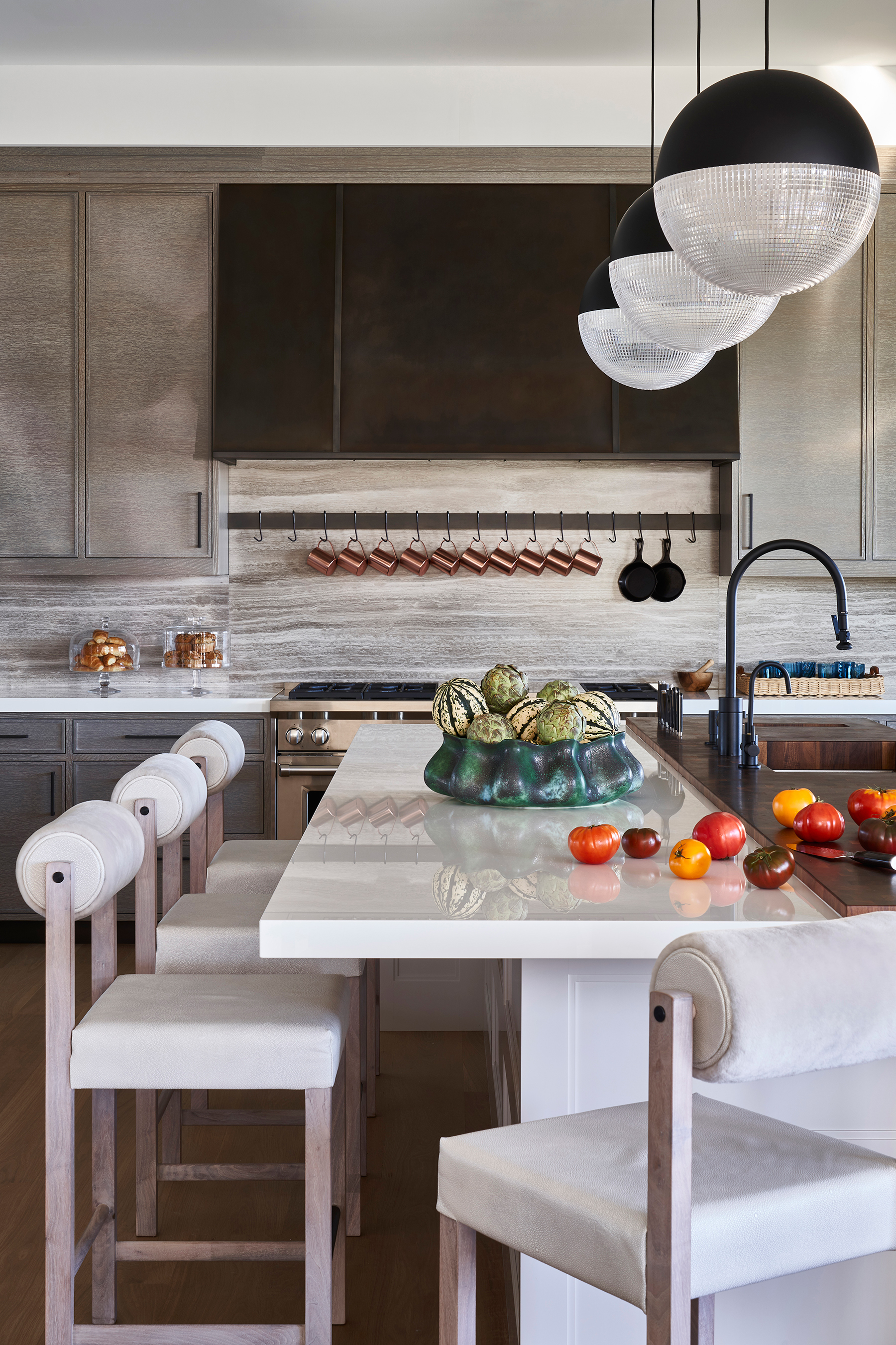
- Find more inspiring modern kitchen ideas in our gallery.
Breakfast nook
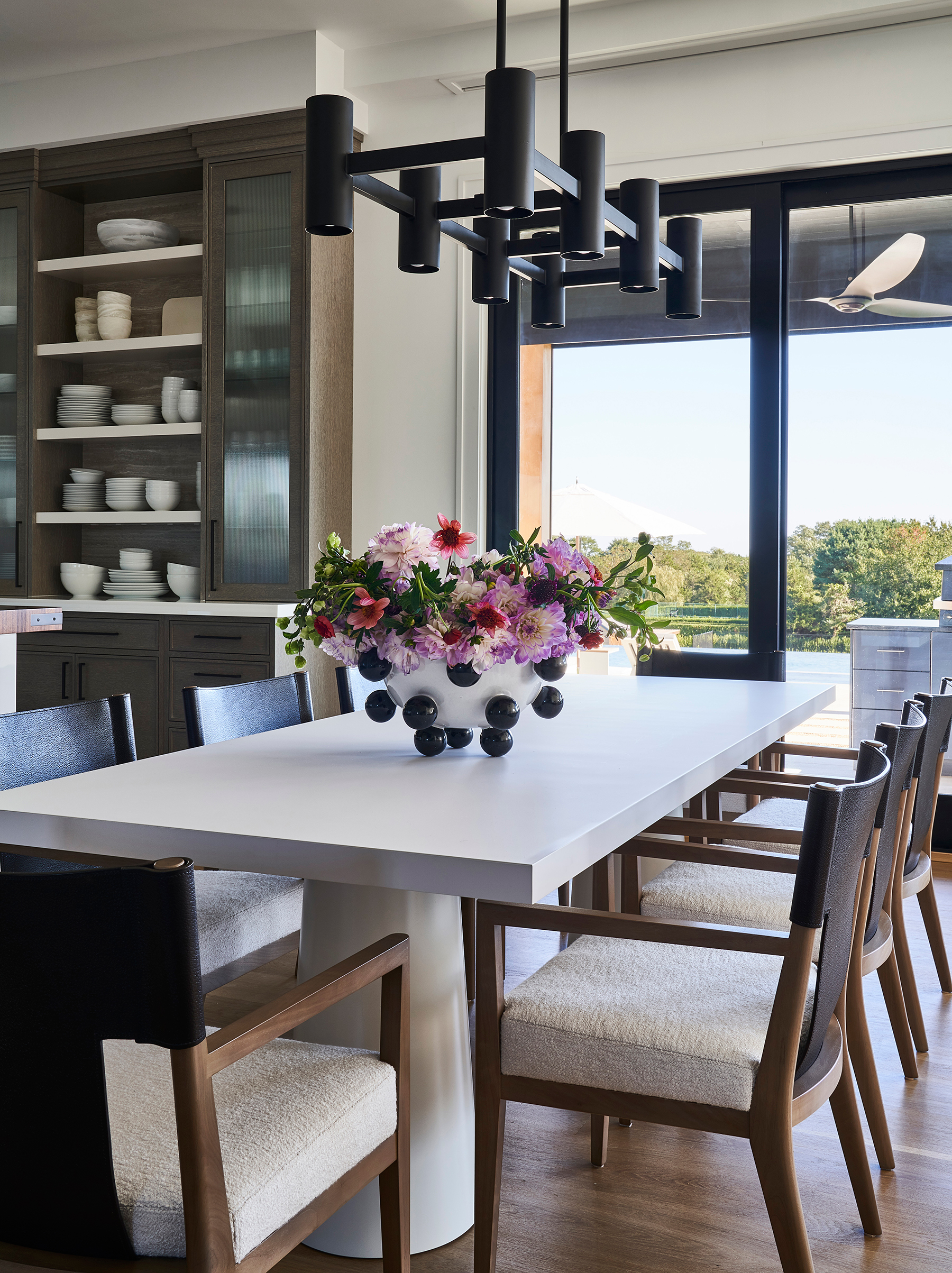
At one end of the kitchen is a breakfast nook, again another casual dining area that looks out over the pool area. Large sliding doors create a seamless flow between outdoor and in, joining the kitchen with an outdoor dining area.
Pantry
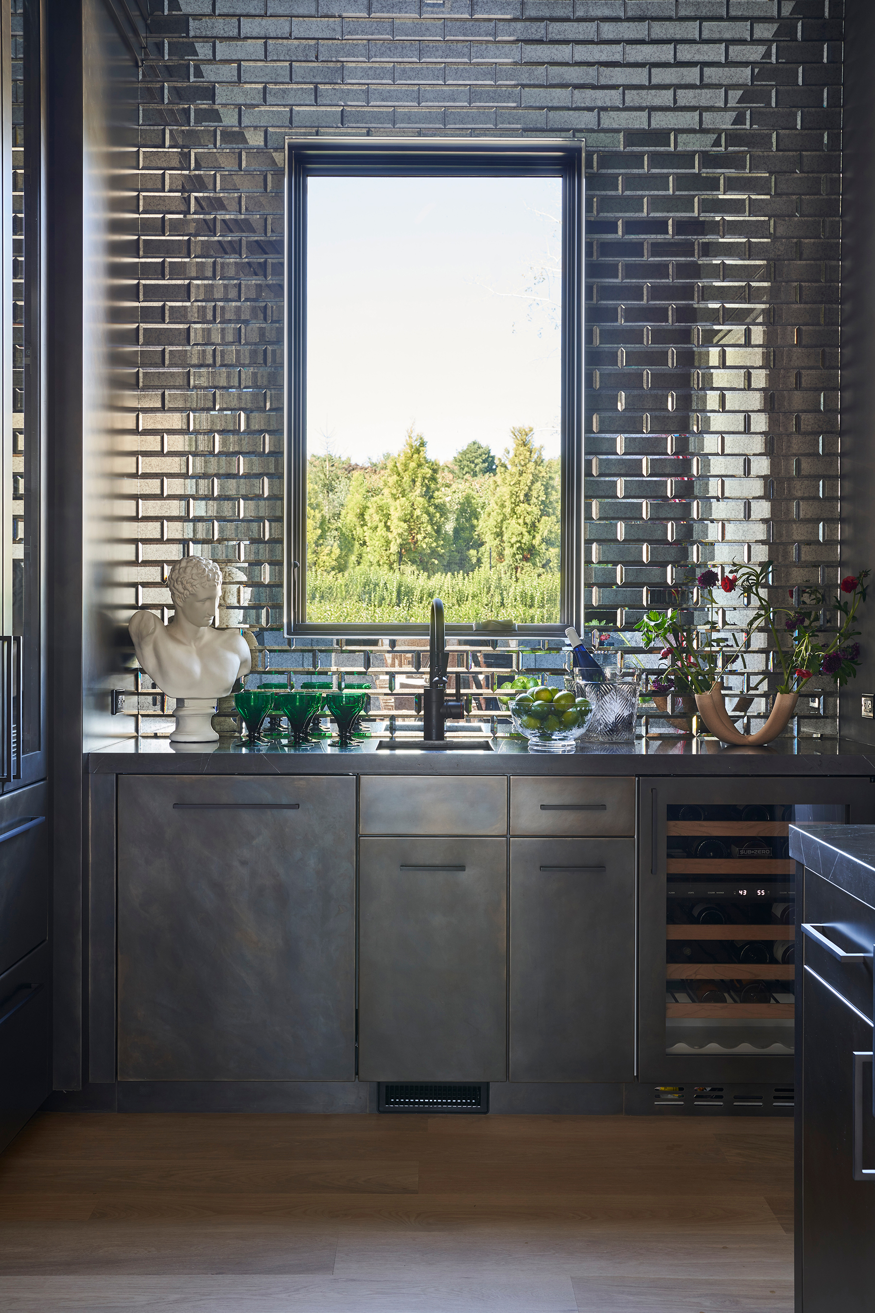
In contrast to the cool, light colors of the kitchen, the stunning pantry is all about the deep, moodier hues. Because the space is obviously smaller, and not as heavily used as a kitchen would be, it can handle this darker color scheme and really stands out in the house as being the most dramatic space.
The metal-clad cabinetry is custom made and the splashback made up of antique mirrored tiles, which reflect the light around the space.
The Livingetc newsletters are your inside source for what’s shaping interiors now - and what’s next. Discover trend forecasts, smart style ideas, and curated shopping inspiration that brings design to life. Subscribe today and stay ahead of the curve.
- Already inspired by this space? Find more pantry ideas.
Dining room
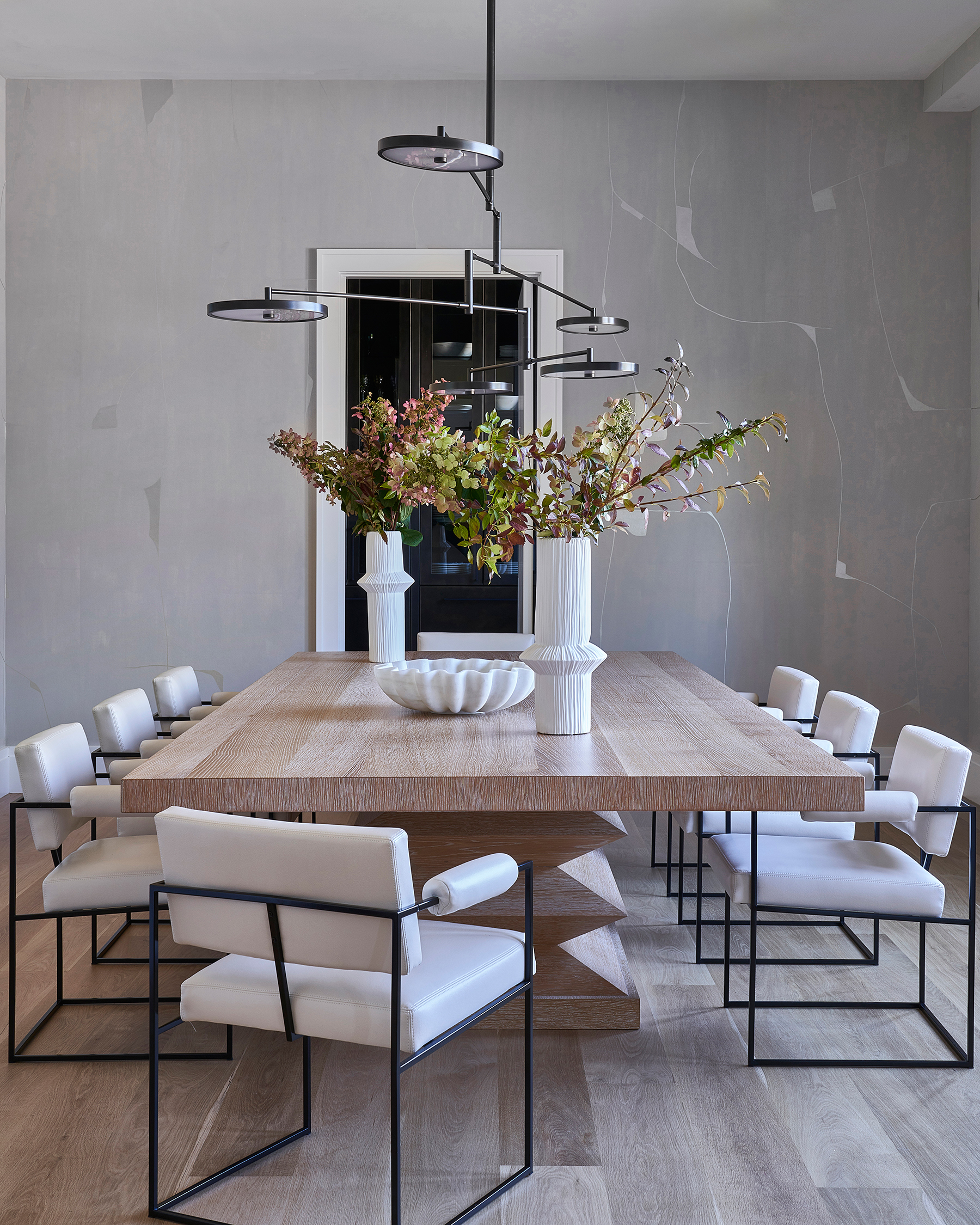
A more formal dining room can be found between the kitchen and the pantry.
Living areas
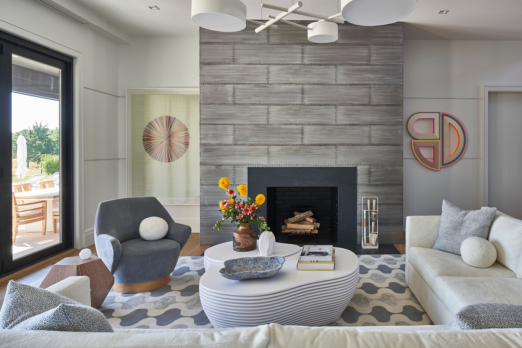
There are numerous living areas to choose from throughout the property – a formal living room, a family room, an upstairs sitting room and a sunroom.
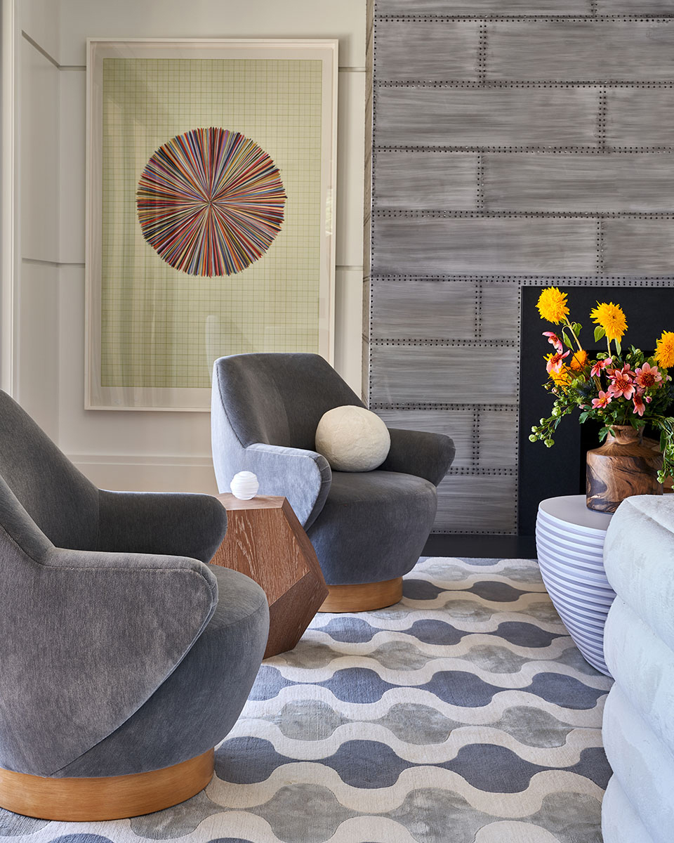
The main living room is filled with curves – curved armchairs, curved sofa, gorgeous layered curved coffee table, even the throw cushions are rounded. In contrast to all that softness, is the industrial-style steel fireplace that was designed to look like a vintage airplane.
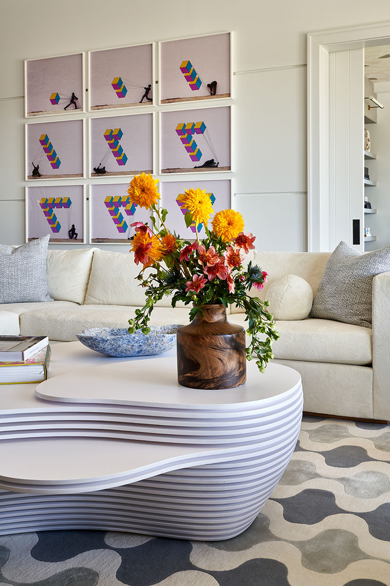
Pops of color are brought into this neutral space with the artwork. Artwork features heavily throughout the home as a way out bringing in color – you'll find pieces by Andy Warhol, Tom Wesselmann and Bev Fishman to name just a few.
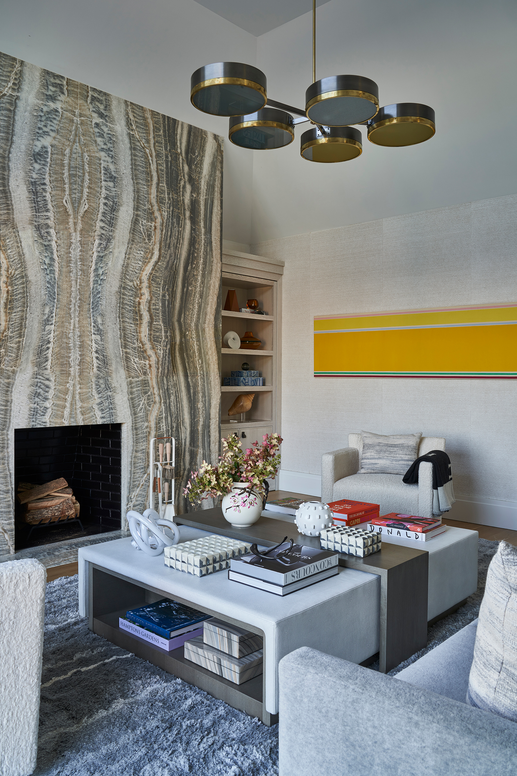
The fireplace is again the focus in the smaller, but perfectly formed, master sitting room. The colors running through the grey onyx mirror the scheme used in the rest of the room, with the pop of yellow for contrast.
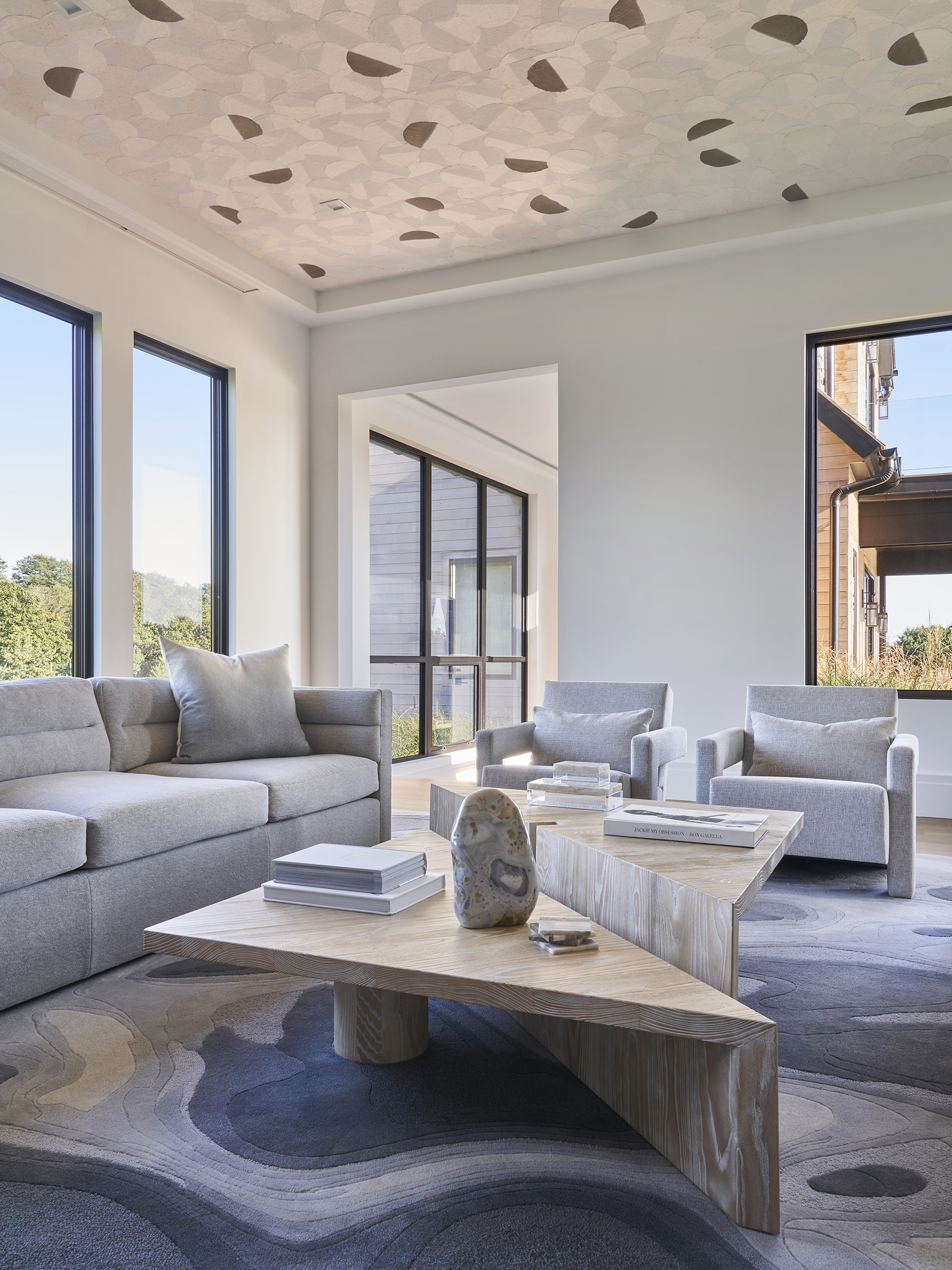
The playful shapes continue in the sunroom, where the marble-like patterns of the flooring and ceiling, clash and yet compliment the clean line of the coffee table and sofas.
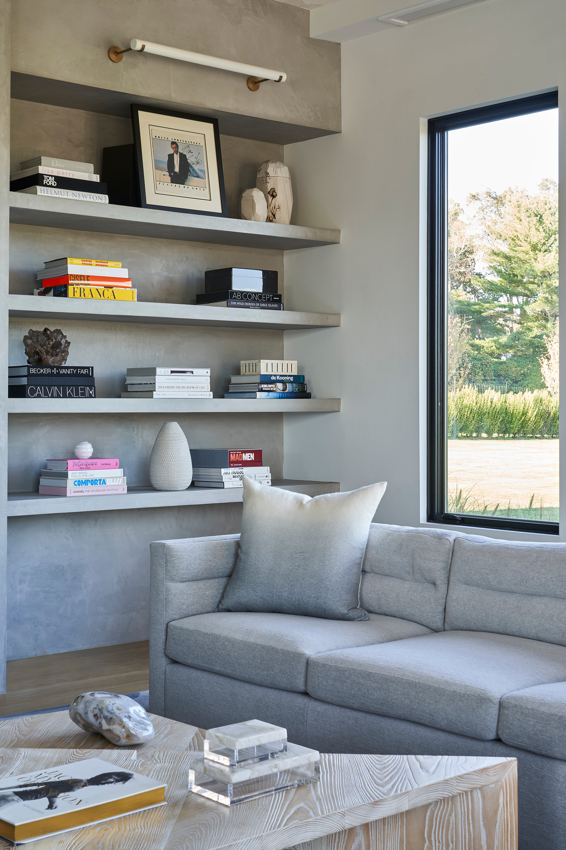
- See also: Grey living room ideas - interior designers share tips for using this moody neutral
Master bedroom
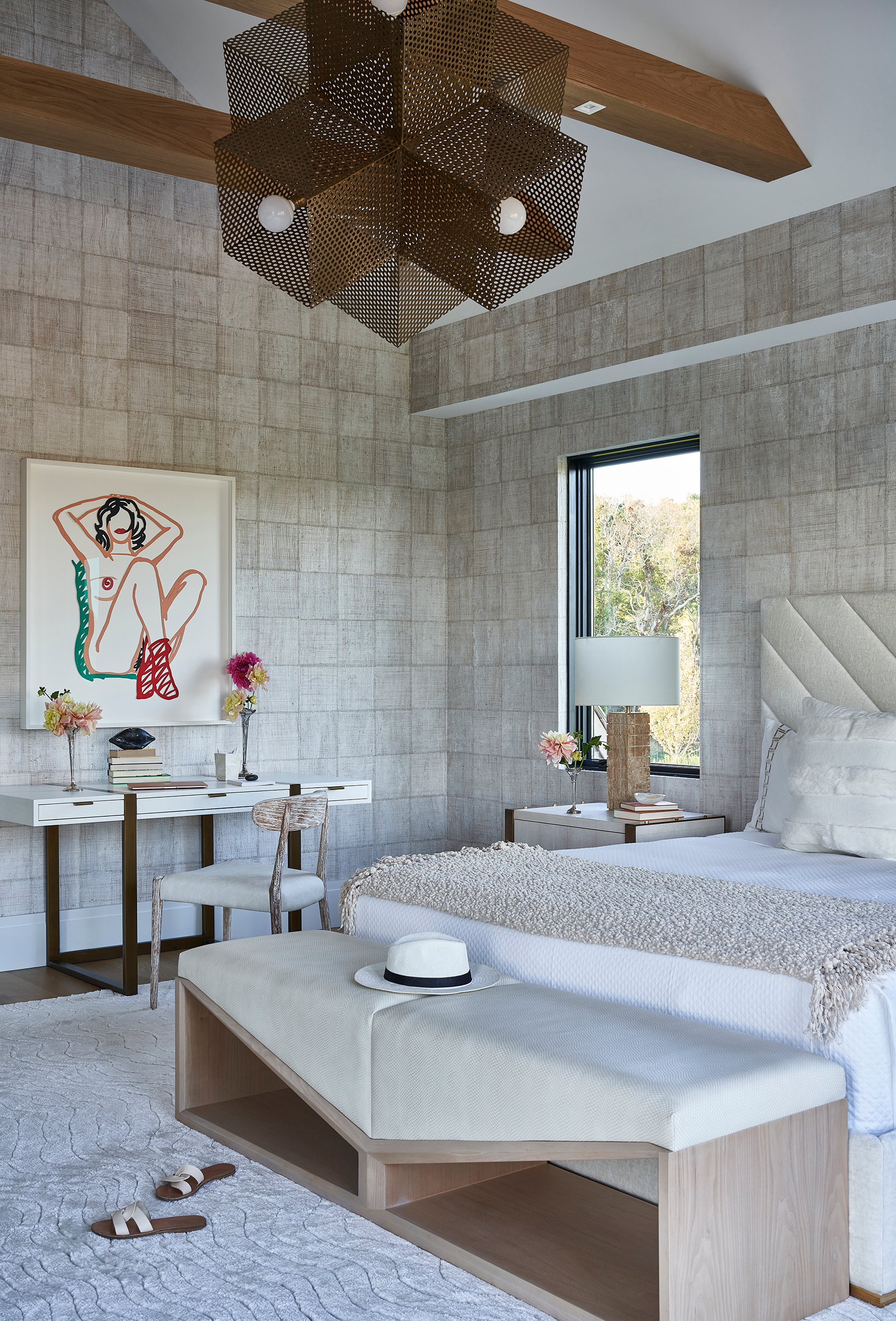
The light and airy color palette continues upstairs in the master bedroom. Layers of creams, white and pale greys create a lovely relaxed, tonal effect and all the textures give the room a modern rustic vibe. Again, it's the contemporary artwork that brings in the perfect amount of color and give the space an edge.
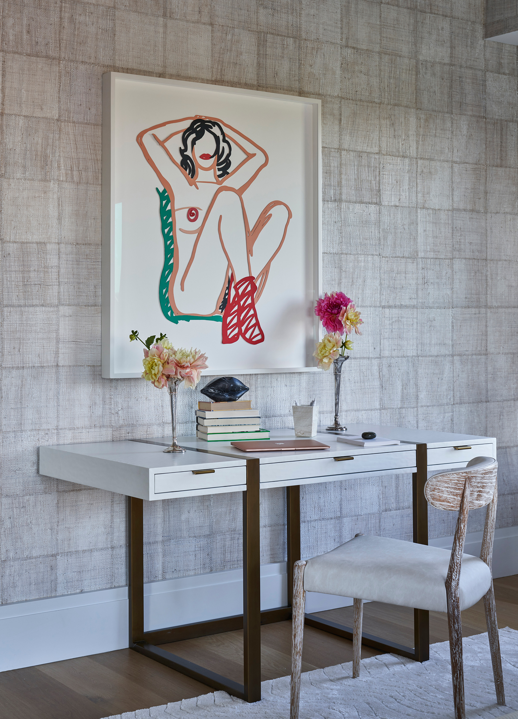
- Find more master bedroom ideas in our gallery.
Master bathroom
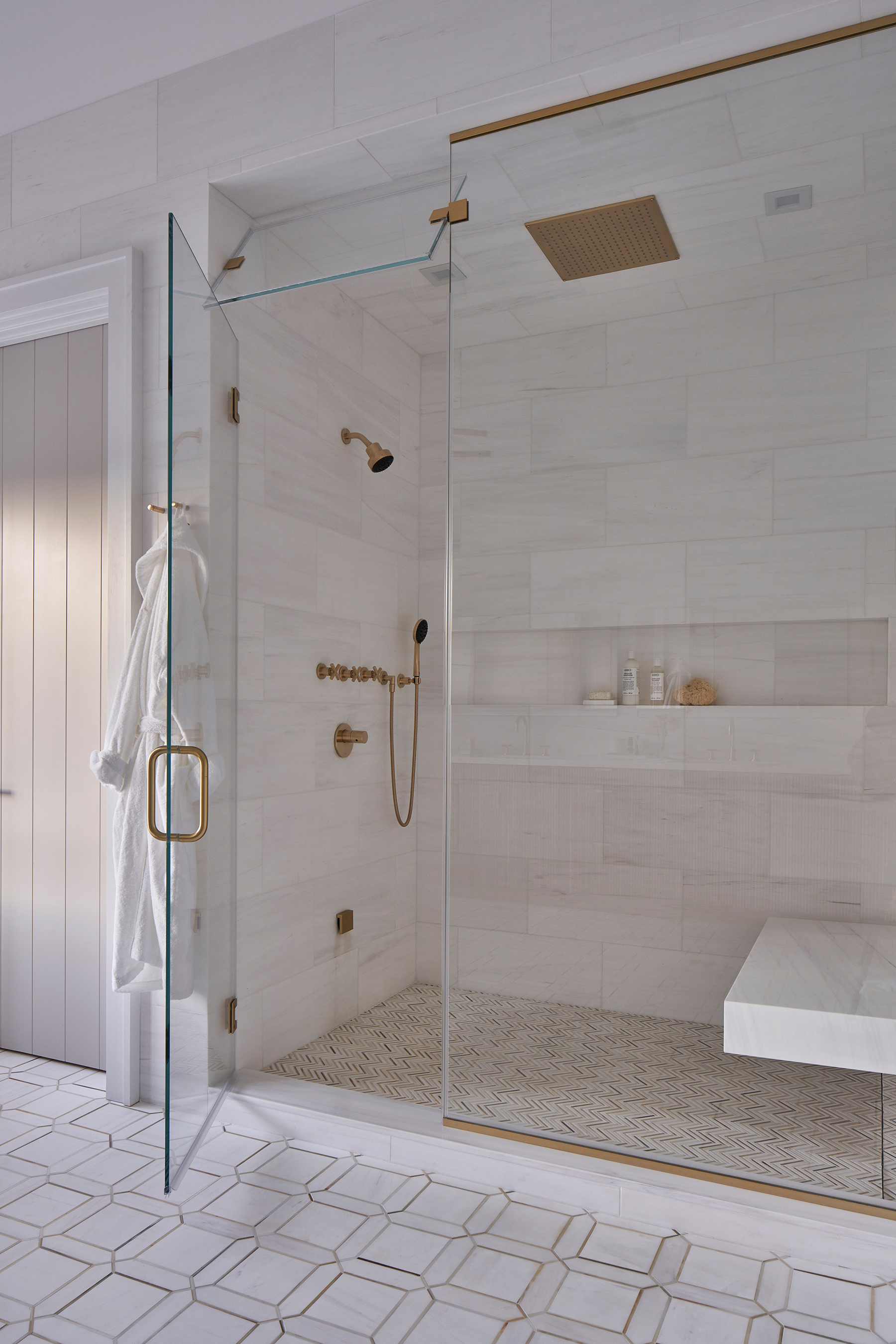
While the master bathroom may look minimalist, there is in fact plenty of texture going on here. The floor tiles, shower tiles and wall tiles, although having the same pale colors running through them all bring a different finish to the room.
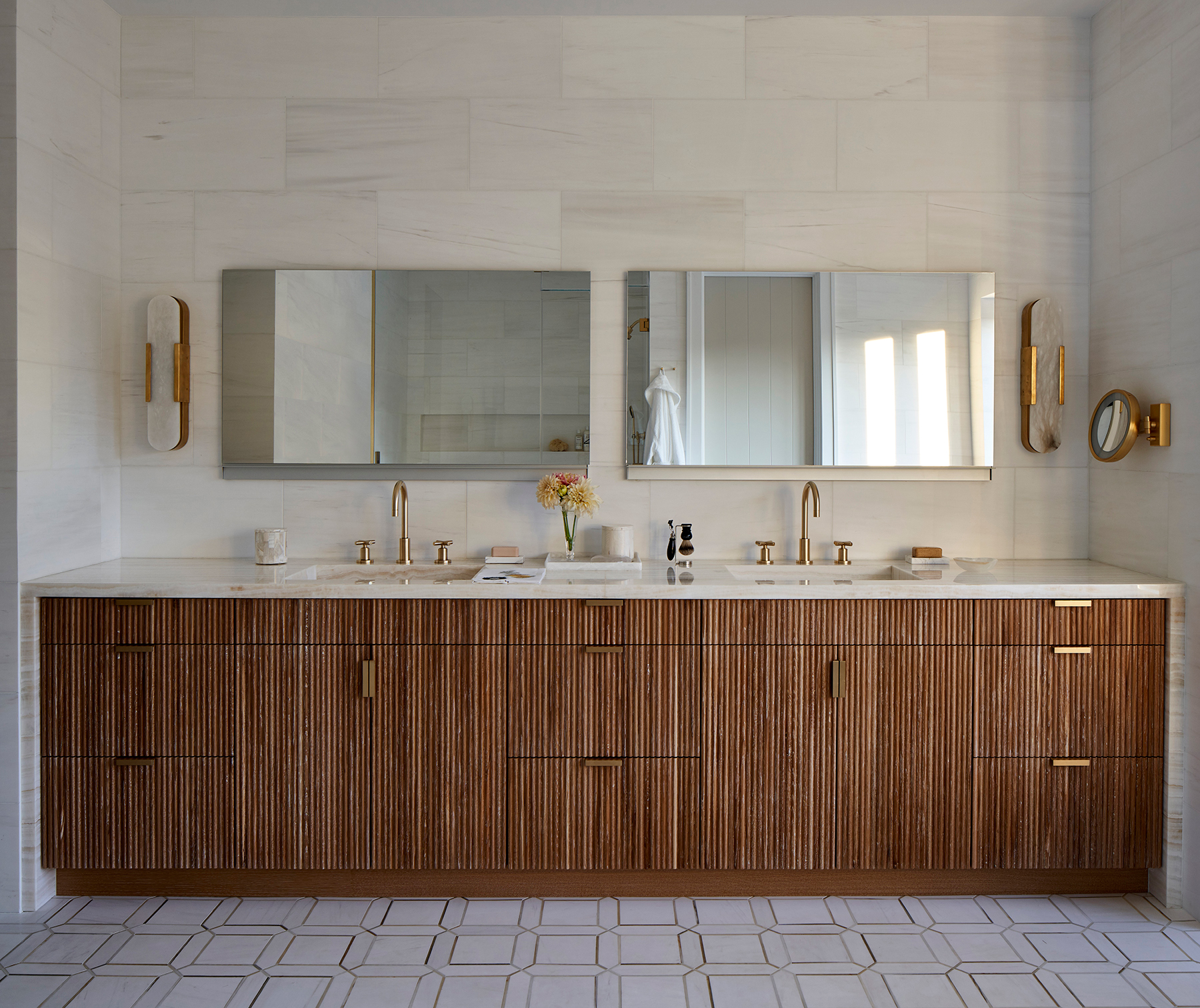
The integrated sinks are made of a vanilla onyx that matches the warm tones of the gold accents. They sit atop a wooden fluted vanity that brings just more subtle textures into this minimalist, modern bathroom.
Guest bedroom
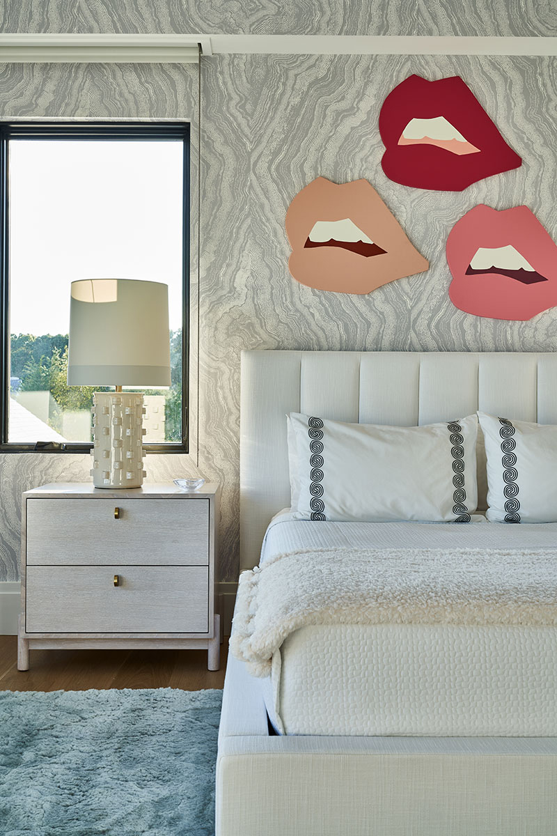
The marble wallpaper used in the guest bedroom mirrors all the marble textured that can be found downstairs. Again, you can see how the modern artwork gives this neutral bedroom a touch of creativity and edge as well as add color.
- Find more guest bedroom ideas in our gallery.
Guest bathroom
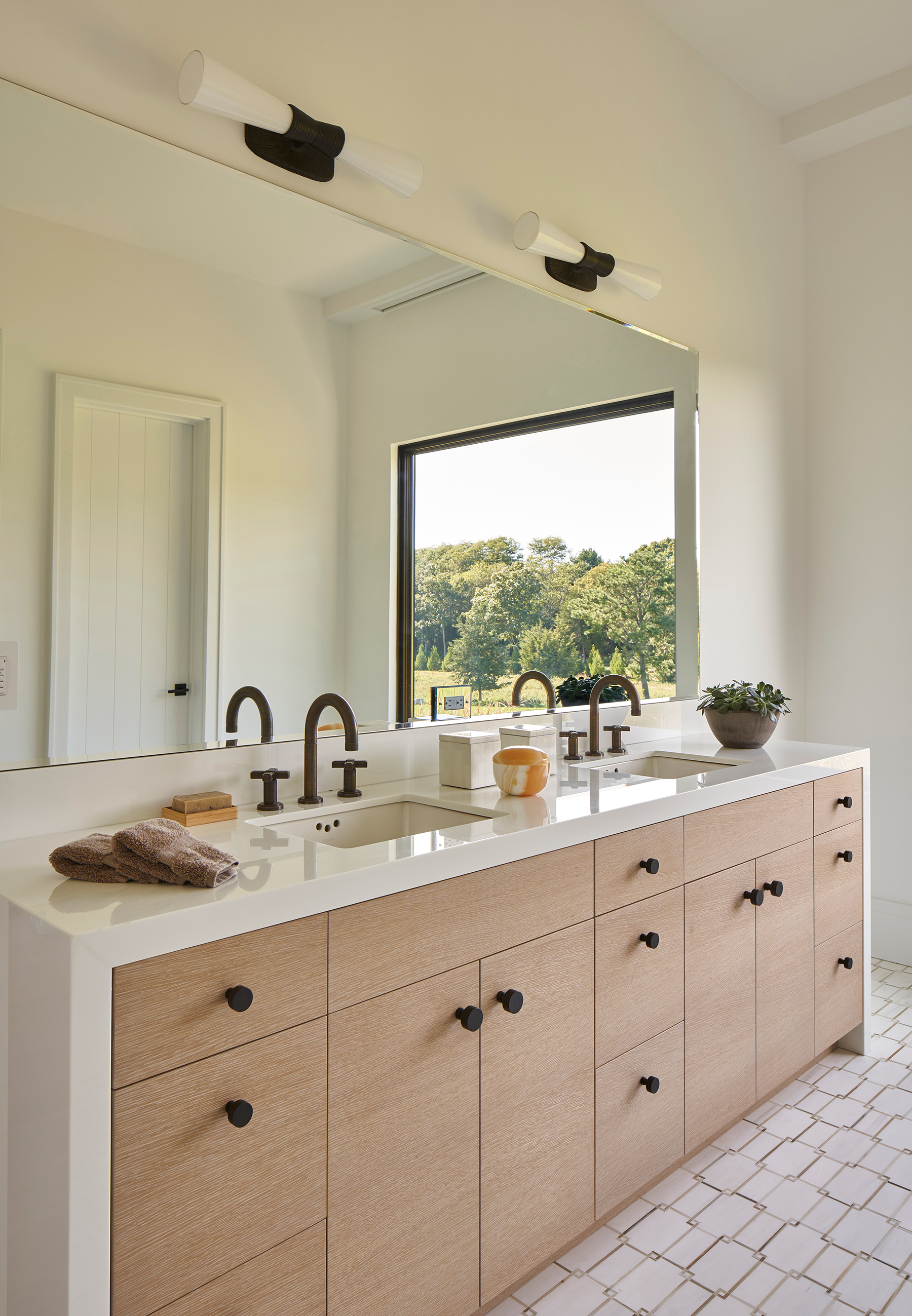
Warm woods and vanilla-toned marbles can be found in the guest bathroom too. The black hardware and lighting, plus the brass taps give the room a more contemporary feel.
Pool house
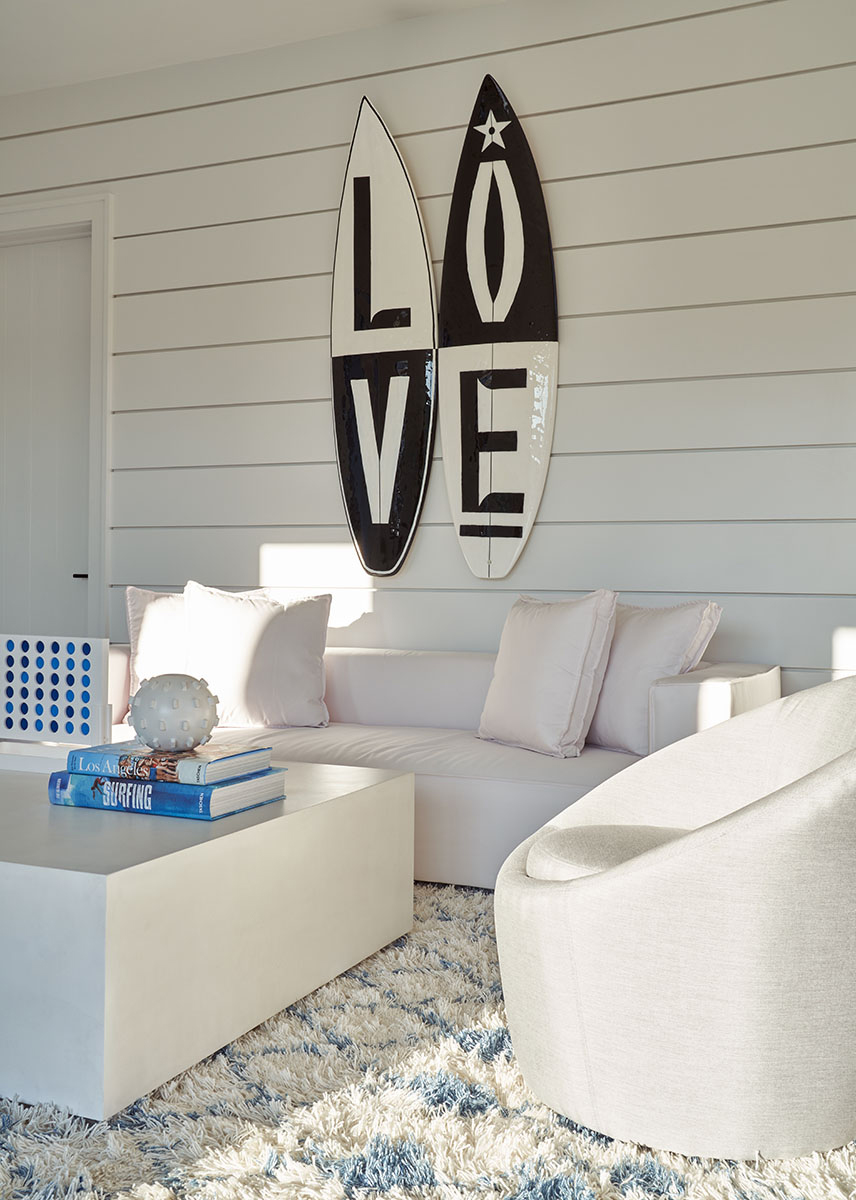
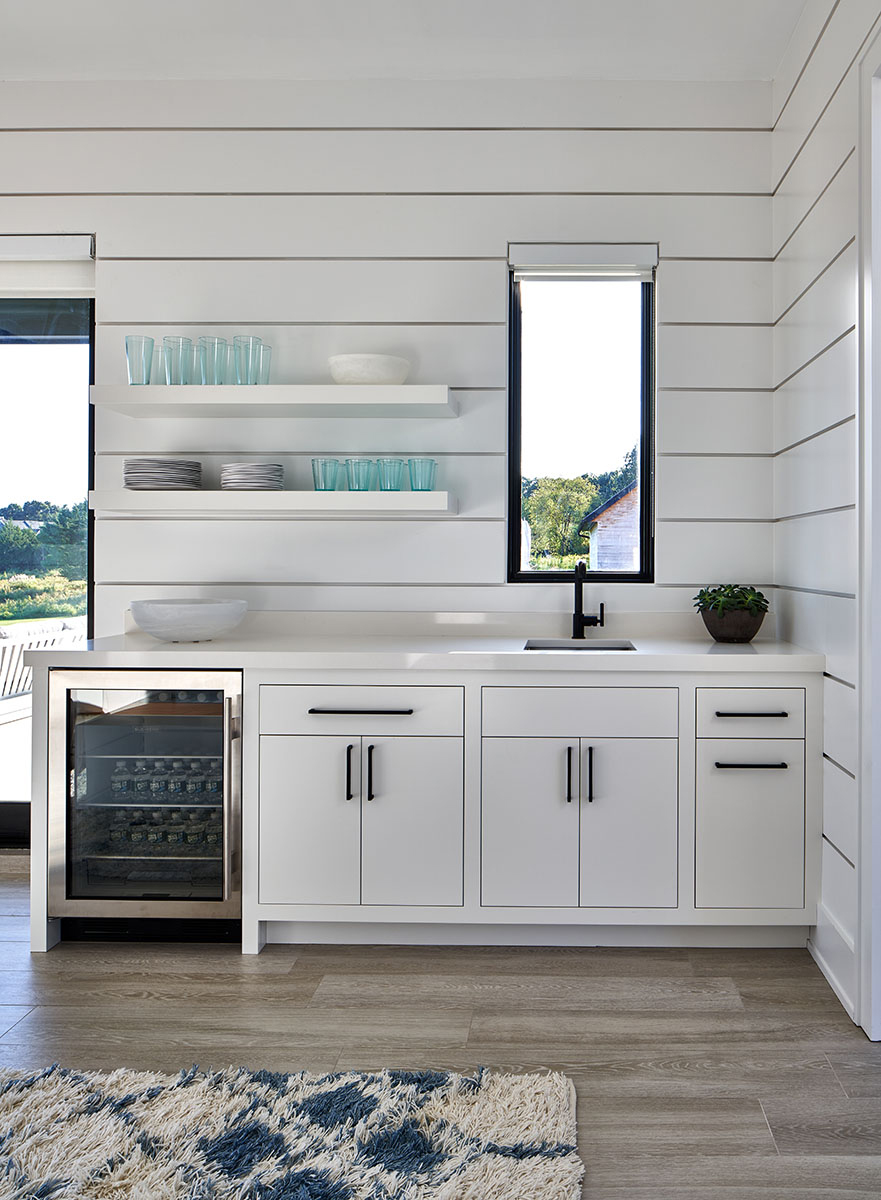
It's in the pool house you will find that more classic beach house feel. Surfboards adorn the shiplap paneled walls and the blue and white scheme gives the rooms a fresh, holiday feel.
Pool area
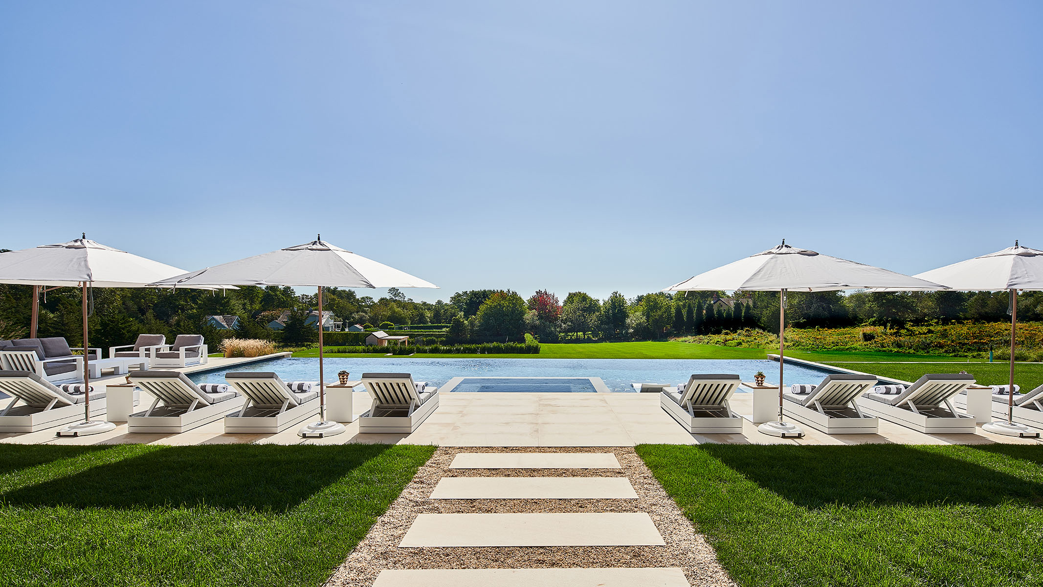
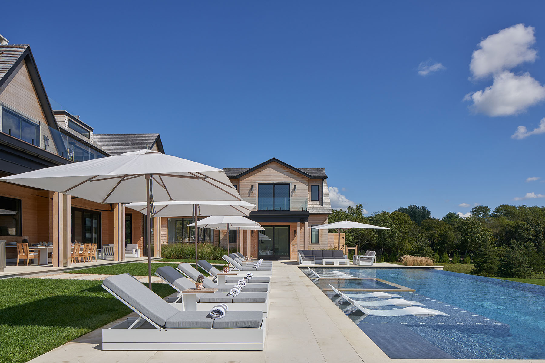
The impressive pool area spans the whole length of the house, and can be easily accessed from all the downstairs living areas. Sun loungers and umbrellas run the length of the pool, and you'll find loungers built into the shallows too.
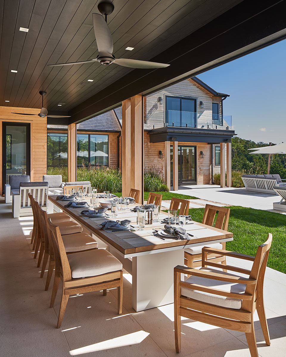
An outdoor dining area can be found leading on from the kitchen.

Formerly the Digital Editor of Livingetc, Hebe is currently the Head of Interiors at sister site Homes & Gardens; she has a background in lifestyle and interior journalism and a passion for renovating small spaces. You'll usually find her attempting DIY, whether it's spray painting her whole kitchen, don't try that at home, or ever-changing the wallpaper in her entryway. She loves being able to help others make decisions when decorating their own homes. A couple of years ago she moved from renting to owning her first teeny tiny Edwardian flat in London with her whippet Willow (who yes she chose to match her interiors...) and is already on the lookout for her next project.