The secret to bringing soul and character to a new build? Just follow these 3 'unflipping' tips, says this designer
This LA designer cleverly 'unflipped' a new build bungalow by following these three design tips
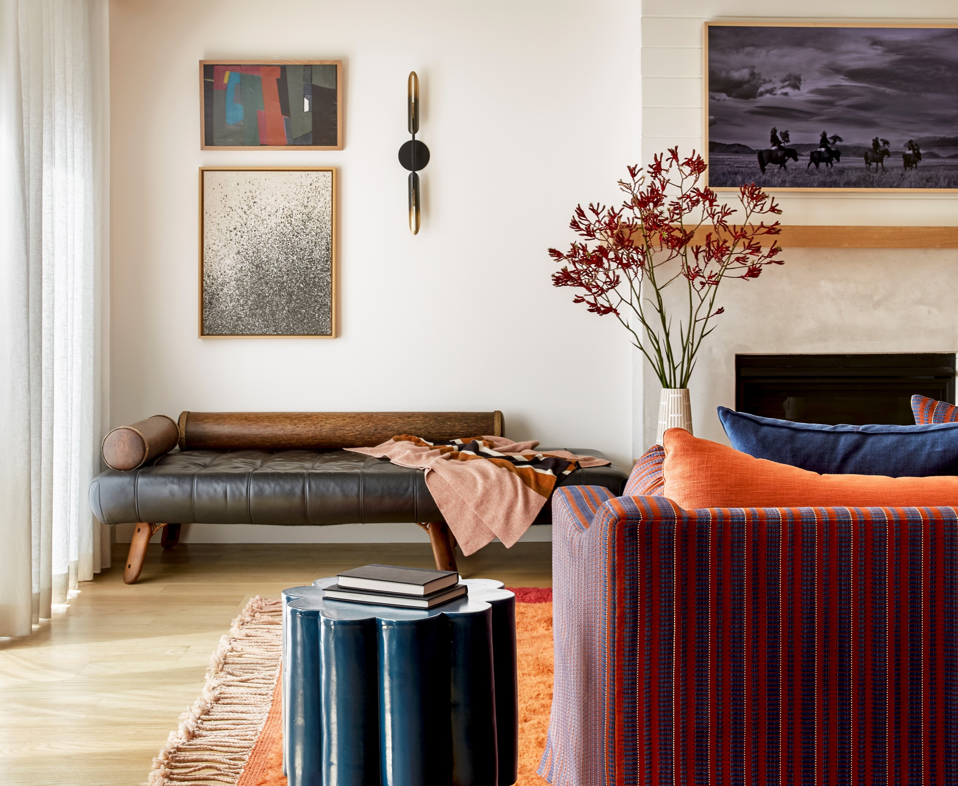

The problem with new builds is that they can so often feel distinctly lacking in soul and character, and that coveted 'lived-in' feeling that develops after years of living in the same house.
But there are solutions to combat the sterile feel that so often comes with new build homes, and with clever design techniques, you can create the illusion of a lived-in home.
This is something that has been proved to be true by designer Dee Murphy, who perfectly flipped, or rather 'unflipped' (as Dee puts it), this Los Angeles bungalow in the city's smallest neighbourhood, Larchmont Village, bringing some much-needed soul and character into the home. I spoke to Dee to find out the main three pillars she focused on to bring some color and personality into this modern home.
1. Embrace a fearless use of color and pattern
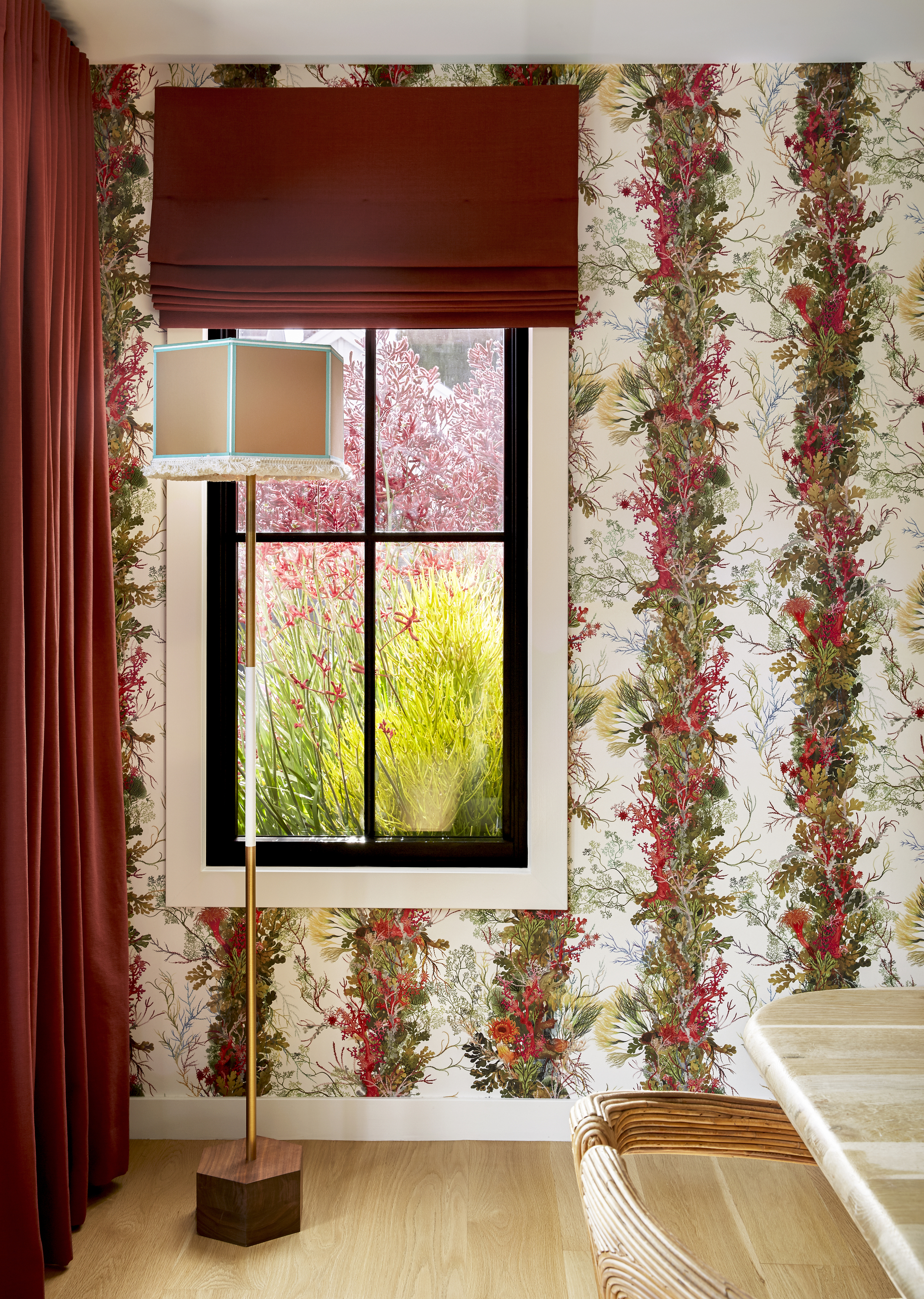
Number one on the list of ways to bring personality into the home is to embrace color and pattern in abundance. Dee Murphy used bold primary pops of color and a heavy use of pattern that floods each of the rooms with so much warmth, bringing that 'lived-in' feel.
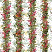
Dee started with a striking wallpaper choice in the dining room - Timorous Beasties’ Seaweed Column - the central character in Dee’s story for the design of the home. 'In this project, the client was drawn to this particular wallpaper, with a textile overlay. Not only does it provide almost every color of the rainbow… it is tactile, like a fuzzy peach! When this is your clients’ jump off point, you know you are in for some fearless design,' says Dee.
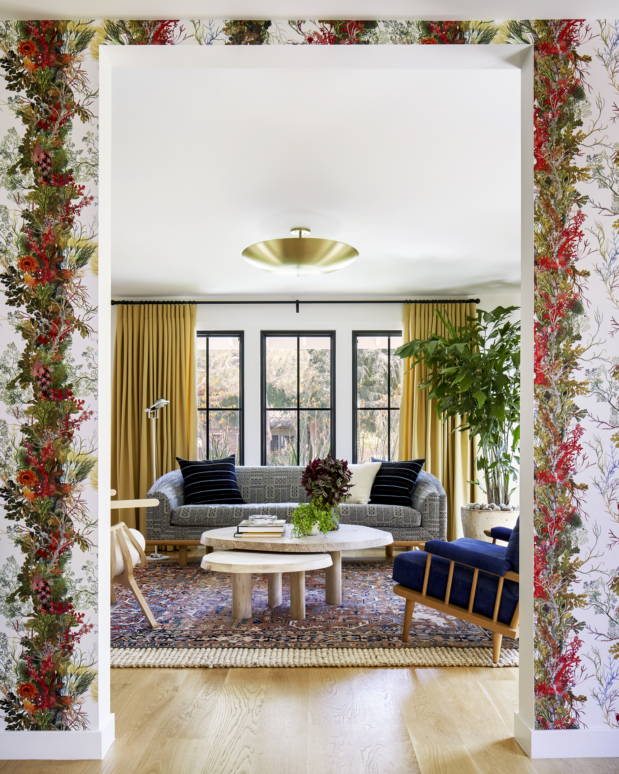
The wallpaper cues the bold reds, orange, blue and chartreuse hues throughout the rest of the house. 'The wallpaper boasts so many colors, we had an almost unlimited choice when it came to devising a palette for the connecting rooms,' says Dee. 'If you look in one direction, the living room is grounded in a deep blue, and in the other direction the kitchen cabinets are bathed in a beautiful green - Farrow & Ball's Duck Green, while the family room is dressed in a daring orange!'
'The dining area had to work for both everyday use and celebratory occasions and the deep burgundy window treatments gave us the dose of formality we were looking for. Once the clients saw how fun bold can be, they let loose everywhere!'
Be The First To Know
The Livingetc newsletters are your inside source for what’s shaping interiors now - and what’s next. Discover trend forecasts, smart style ideas, and curated shopping inspiration that brings design to life. Subscribe today and stay ahead of the curve.
Timorous Beasties Seaweed column wallpaper
A beautiful botanical print that gets more and more interesting the longer you look at it. It's also available in a darker colorway, which could make for a striking addition to a small powder room in need of some character.
For the living room and family room, it is the rug choice that was most important to Dee, and the Persian rug style helped kick off the color scheme and provide a direct tie to the seaweed wallpaper. The rug allows for blues and reds to follow, and pared back white walls allows the color palette come to life through the choice of furniture.
2. Bring in vintage pieces to add soul
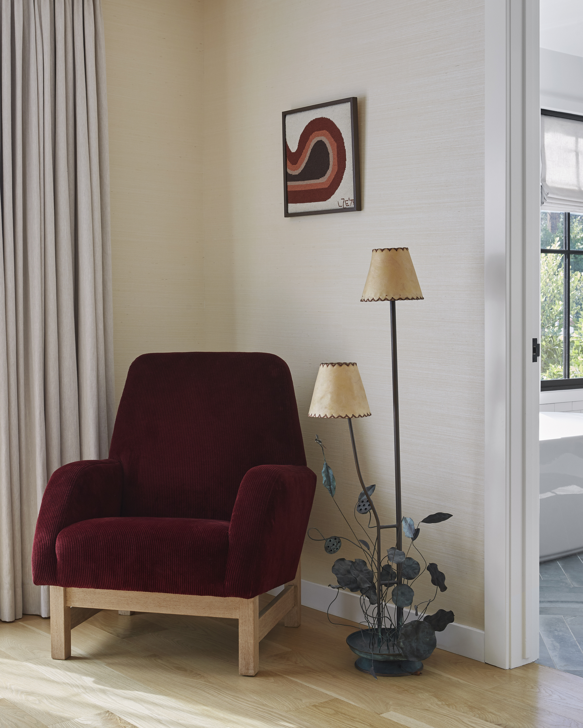
For Dee, 'every home needs something weird and attention grabbing to make a house a home,' so the designer enlisted the help of vintage pieces from LA's top dealers such as Nickey Kehoe, and from discovered shops such as Tricia Benitez Beanum's LA emporium, Pop Up Home. This was a priority for Dee as she wanted to add warmth, interest and texture to the interiors to provide a calmness that would counteract the boldness of the colors in the wallpaper, rugs and seating.
'The vintage pieces needed to have a modern appeal,' explains Dee. 'This is crucial to match the more modern aesthetic of the home, but also needed to provide the warmth and unique value that only vintage can provide.'
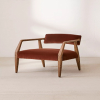
I love the rusty red upholstery of this accent chair. It's a vintage piece, but you can recreate the look with this from Urban Outfitters. With an elegant wooden frame, it brings a sculptural element to your home.
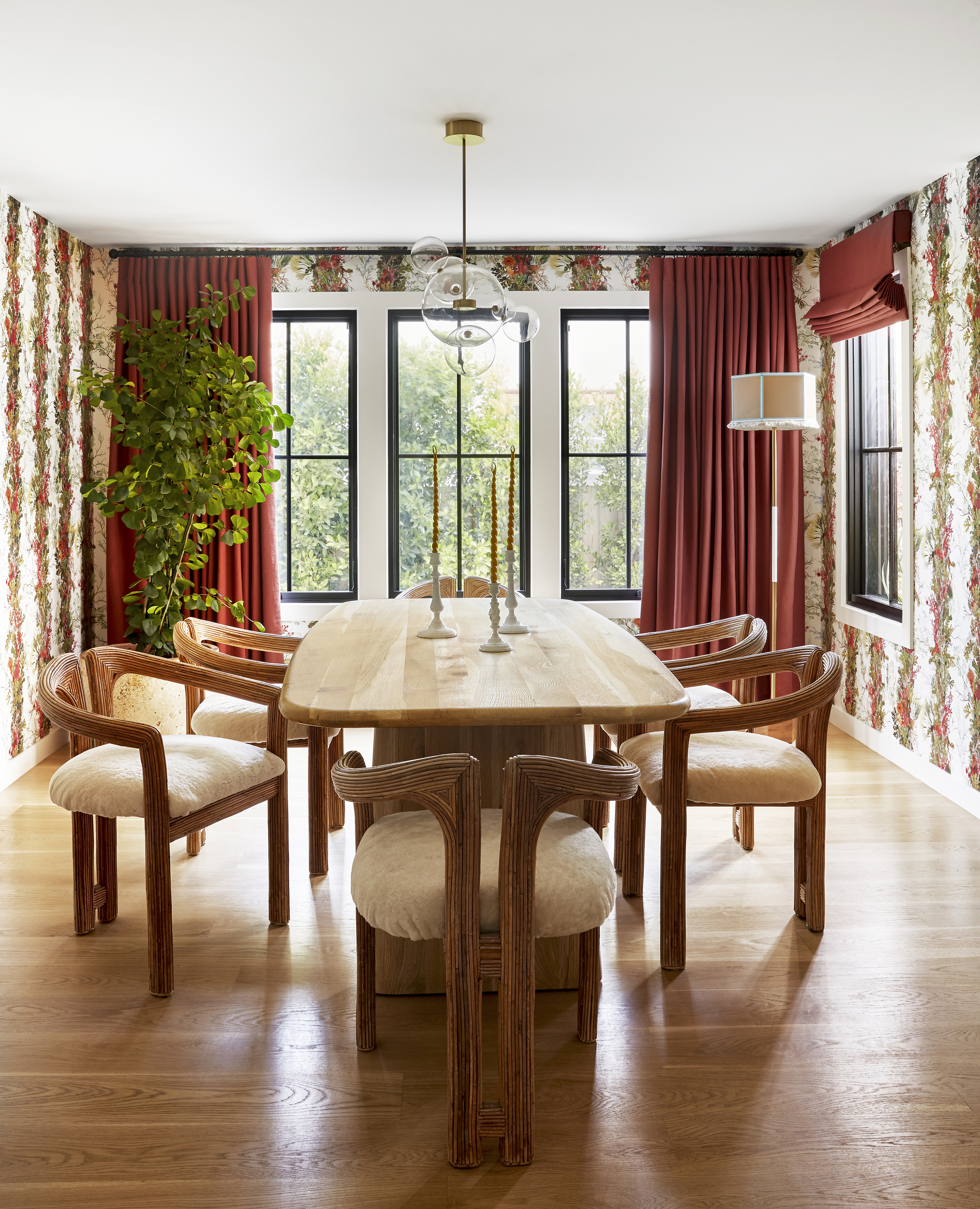
'A house feels like a home through the layering of materials,' says Dee. 'I always mix in vintage pieces (they immediately strip away the coldness of a new build), and I make sure to be conscious of textures (leather, ceramic, wood, stone) that look collected over time, like it took years to acquire them.
'The items need to tell a cohesive story. I look at every surface and think about what texture or shape is missing, and go from there.'
When it comes to Dee's favorite piece, it's a three-way tie between the dining room chairs (above), the French ceiling light in the little girl's bedroom, and the funky floor lamp in the primary suite.
3. Remember the finer details and switch up the hardware
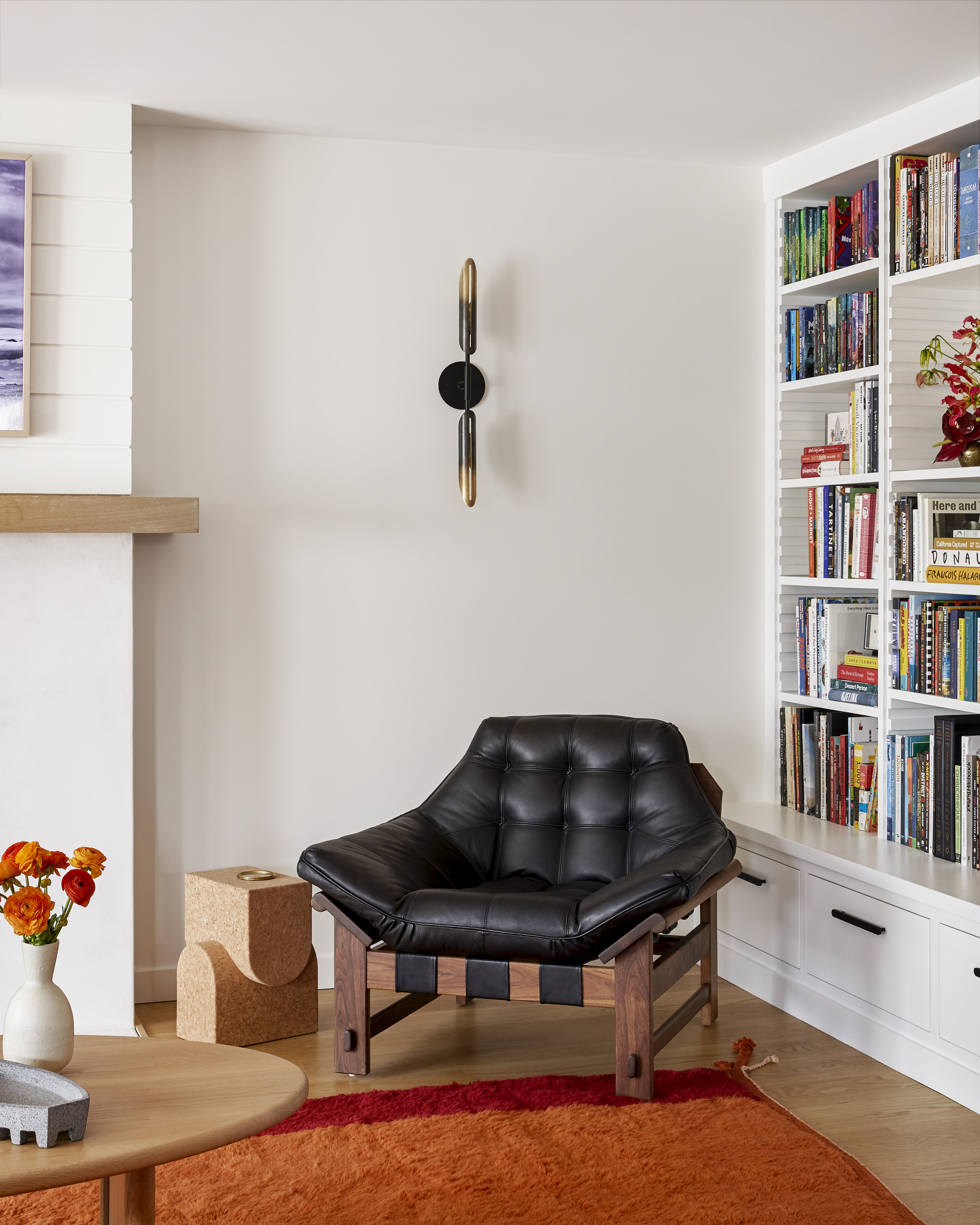
Sometimes, it's all about the finer details, and to really commit to 'unflipping' the space, Dee took down every single light fixture, replaced all of the hardware, stripping away some of the newness.
'We replaced every single light fixture in the home as well as every hardware choice, down to the very last doorknob and handle' says Dee.
'Never underestimate the power of your lighting. It is another opportunity to play with materials (we used glass, metal, fabric, and more in this house!), and to add a stamp on the property that is uniquely you.'
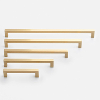
Edgecliff pull from Schoolhouse
Update your hardware and add a glimmer of gold with these pulls from Schoolhouse. Super simple but striking, the Edgecliff brings a touch of modern luxury to a room and the solid brass makes it a tactile addition to any room's hardware.

Former content editor at Livingetc.com, Oonagh is an expert at spotting the interior trends that are making waves in the design world. She has written a mix of everything from home tours to news, long-form features to design idea pieces, as well as having frequently been featured in the monthly print magazine. She is the go-to for design advice in the home. Previously, she worked on a London property title, producing long-read interiors features, style pages and conducting interviews with a range of famous faces from the UK interiors scene, from Kit Kemp to Robert Kime. In doing so, she has developed a keen interest in London's historical architecture and the city's distinct tastemakers paving the way in the world of interiors.
-
 The 'New British' Style? This Victorian London Home Embraces Its Owners' Global Background
Warm timber details, confident color pops, and an uninterrupted connection to the garden are the hallmarks of this relaxed yet design-forward family home
By Emma J Page
-
 Muji Living Room Ideas — 5 Ways to Harness The Calming Qualities of This Japanese Design Style
Inspired by Japanese "zen" principles, Muji living rooms are all about cultivating a calming, tranquil space that nourishes the soul
By Lilith Hudson
