Discover a contemporary city sanctuary that's filled with light
A Neoclassical townhouse which beautifully blends modern design with period details, is a cocoon against the outside world
‘One of the things that struck us most about this house is the sense of serenity.’ Evelyn Moreels says of her family’s new modern home.
Swapping a larger property in the green and sleepy suburbs of Ghent for a townhouse in the centre, Belgian designer Evelyn Moreels braced herself for a faster pace but instead found a sanctuary. ‘The garden is surrounded by high walls and the glazing in the windows is very thick so we hear nothing of the outside world. It’s like living in a cocoon,’ she explains.
‘Normally I work out all the design and layout myself, but in this case, I felt I could use the help of Pascal Bilquin, an architect I had been working with for the last two years on client projects,’ Evelyn says. ‘Pascal is an architect with a talent for creating symmetry and finding new ways for light to come into the building.’
Following the renovation, the dignified and calm character of the building has not gone unnoticed, with the shifting daylight striking an ethereal note. ‘The light falls on the front façade in the evening, and as the night draws in, the atmosphere becomes more mysterious,’ Evelyn observes. Let's take a look around...
Hallway
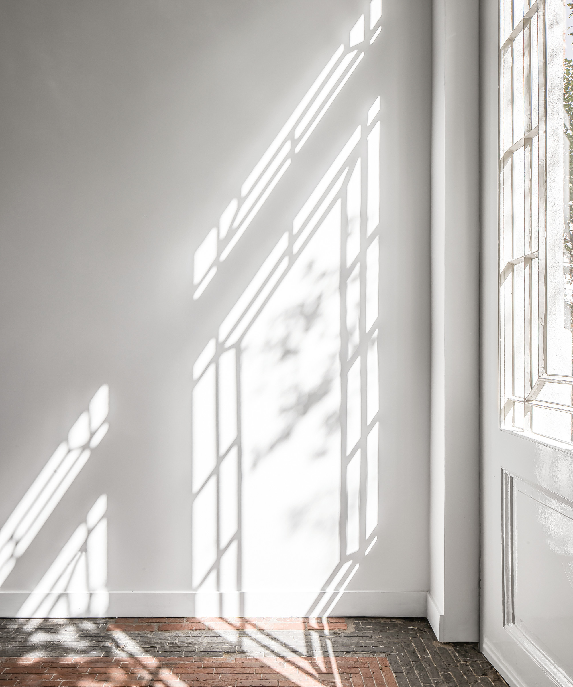
‘When it came to the color palette, I let the spirit of the house tell me what to do,’ Evelyn reveals. ‘Because of the high ceilings, original floors and staircase, I was somehow reminded of Paris, but I wanted any reference to have a modern twist.'
'I felt that white was the best colour in most rooms as it would enable us to draw out the original mouldings,' she says. 'There are elements of black but these are restricted to the study and some furnishings and light fittings.’
A lack of furniture and crisp white walls ensure the grand architectural details are the focus in the hall and throughout the rest of the property.
Be The First To Know
The Livingetc newsletters are your inside source for what’s shaping interiors now - and what’s next. Discover trend forecasts, smart style ideas, and curated shopping inspiration that brings design to life. Subscribe today and stay ahead of the curve.
Kitchen
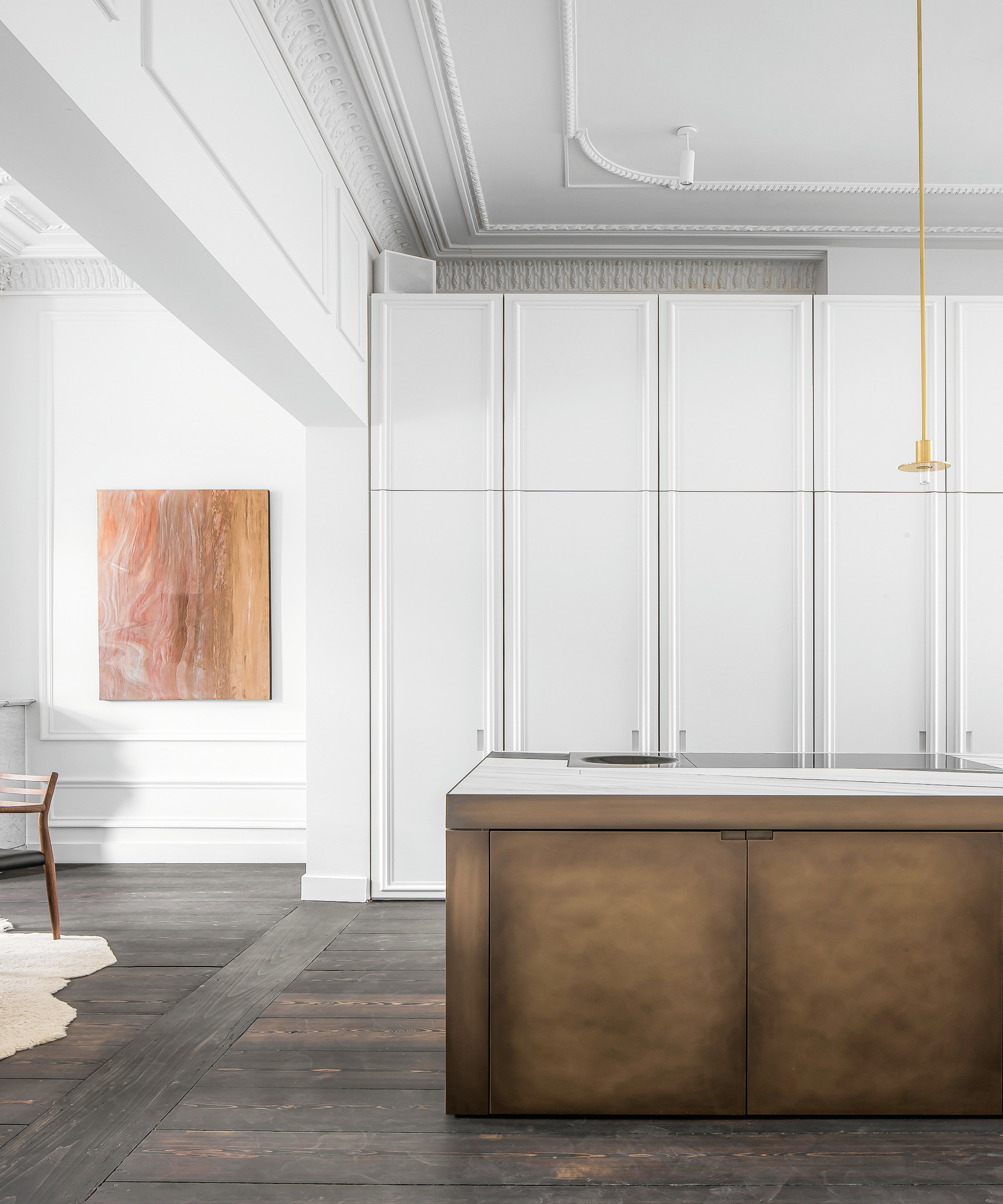
The beading on the cabinetry mimics the panelling in the dining room creating a sense of cohesion between rooms. While the white walls pull the original mouldings into focus and set artwork off to its best advantage.
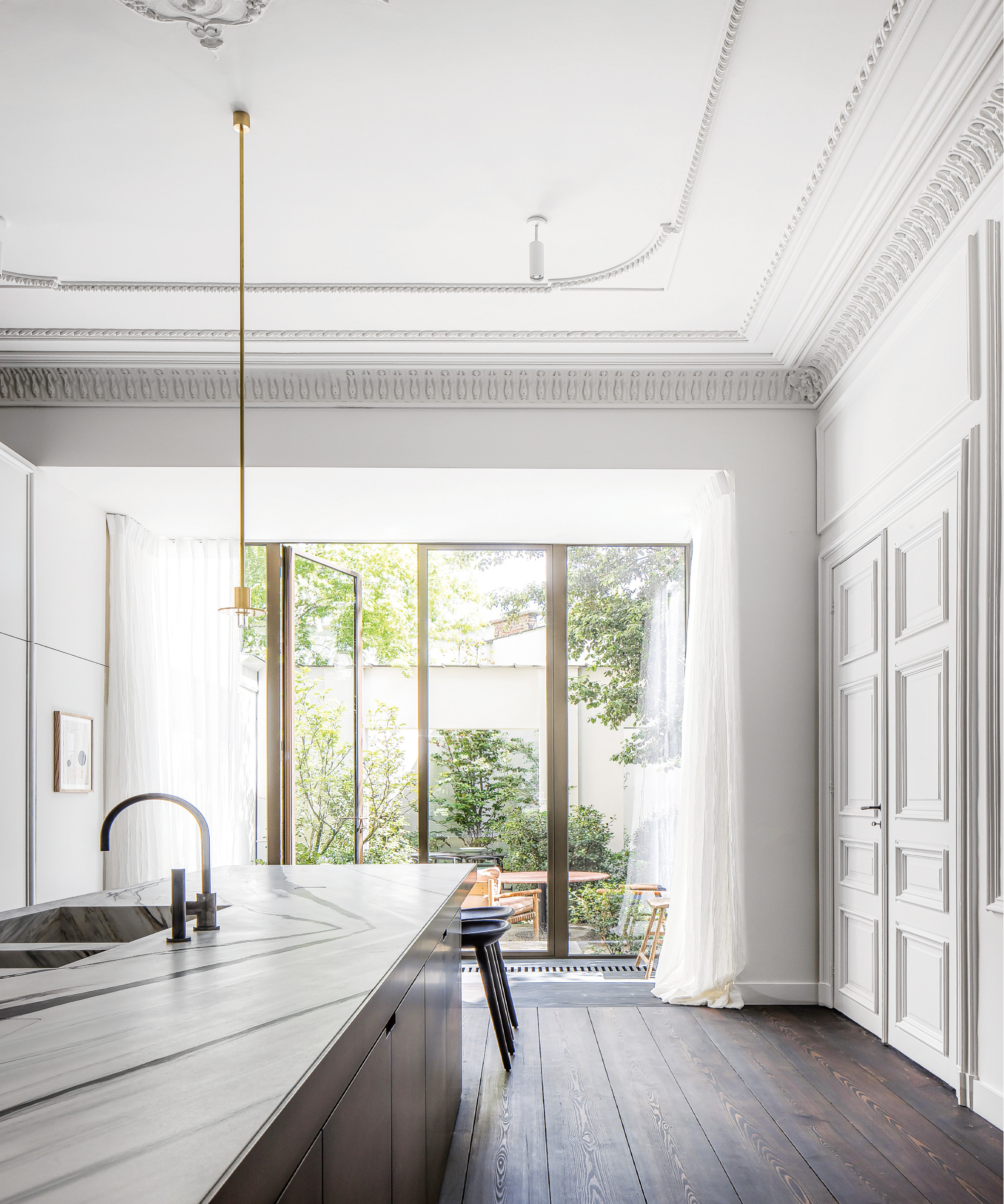
Dining room
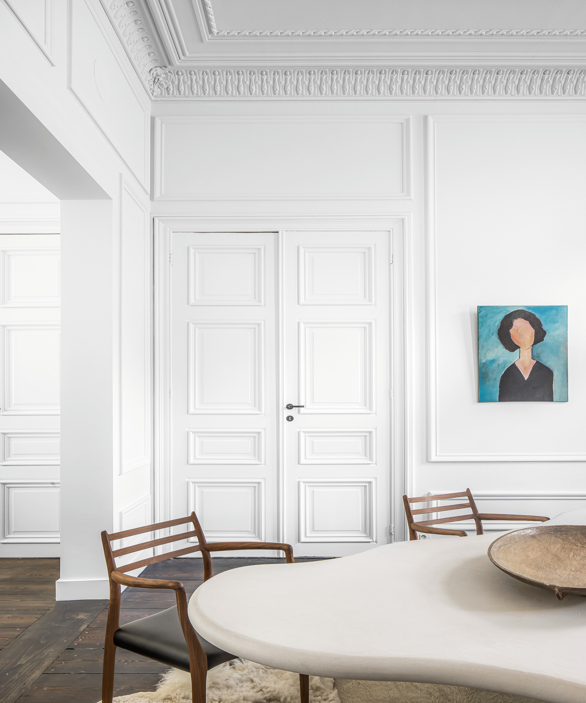
‘The unconventional shape of the dining table works for the whole family but it also allows a more intimate and close setting for just the two of us,’ says Evelyn.
Living room
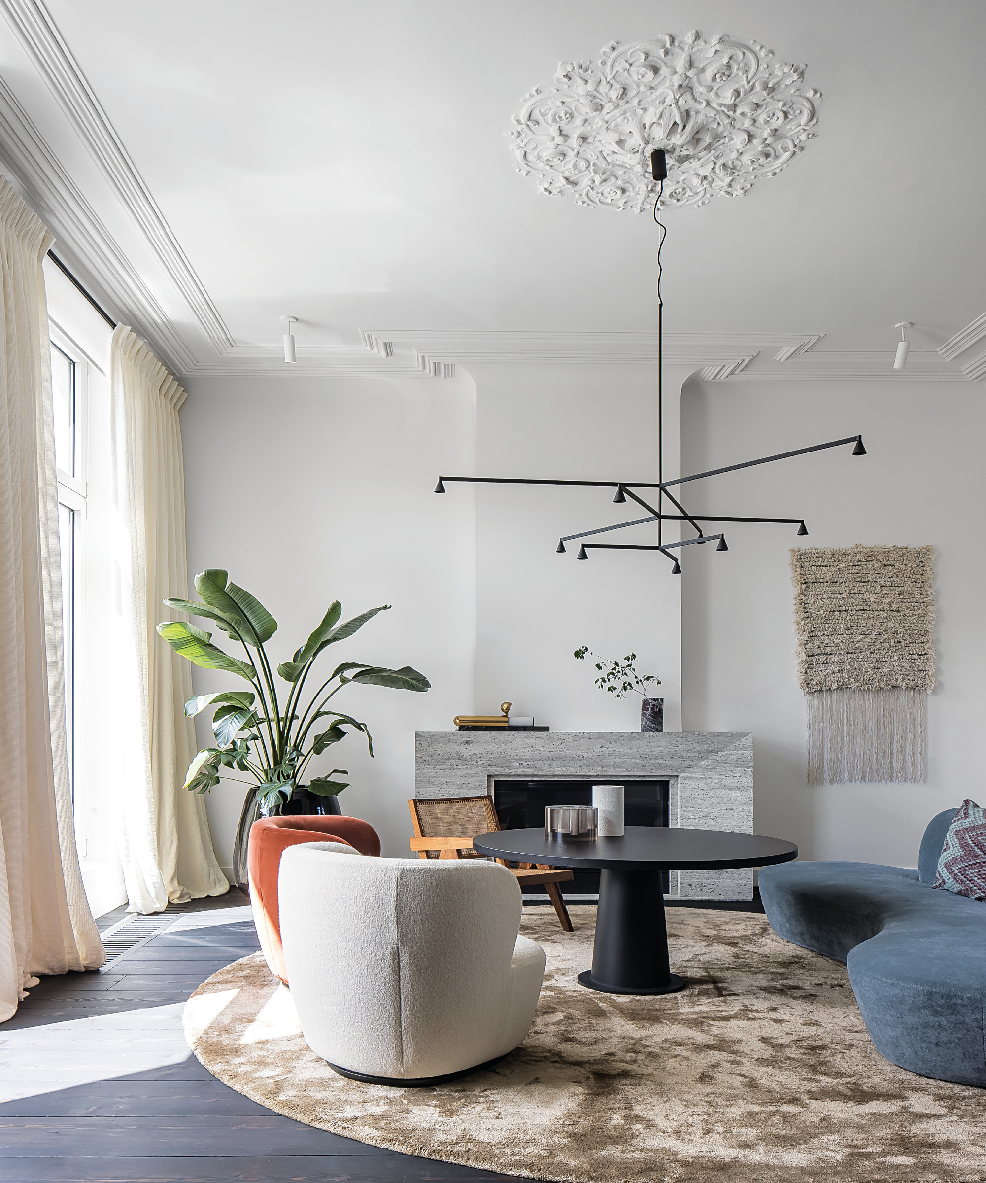
The sharp form of the fire surround gives the contemporary furnishings a modernist context amid all the period detail.
‘We love having drinks here by the gas fire. The view of the sunset over the park is fantastic,’ says Evelyn.
Staircase
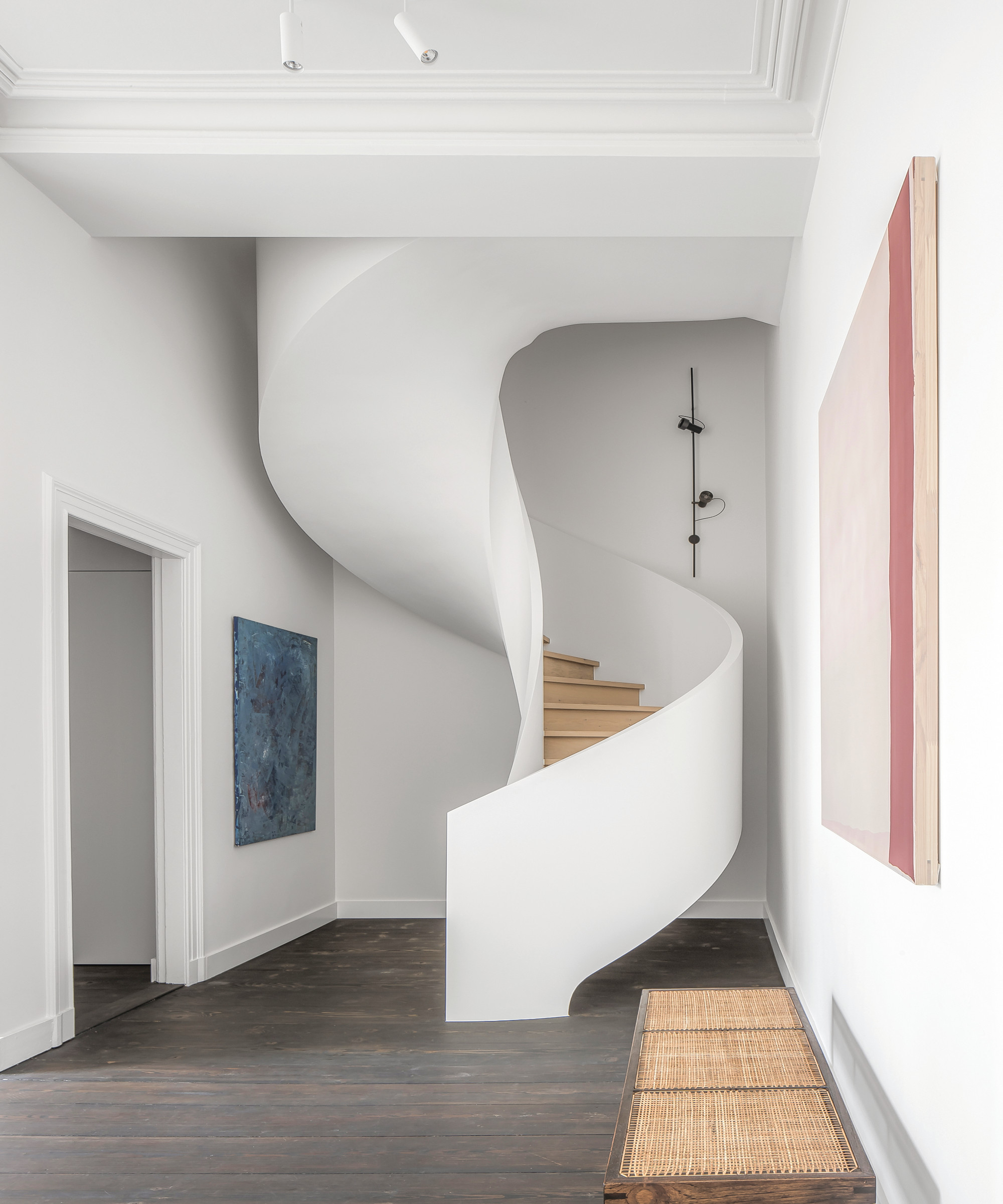
A showstopper of a modern staircase, between the first and second floors replaces an ugly spiral stairway.
The staircase was too big when it arrived on site so had to be cut into pieces and assembled. Its sculptural form and the white walls give the space an art gallery-like feel.
Landing
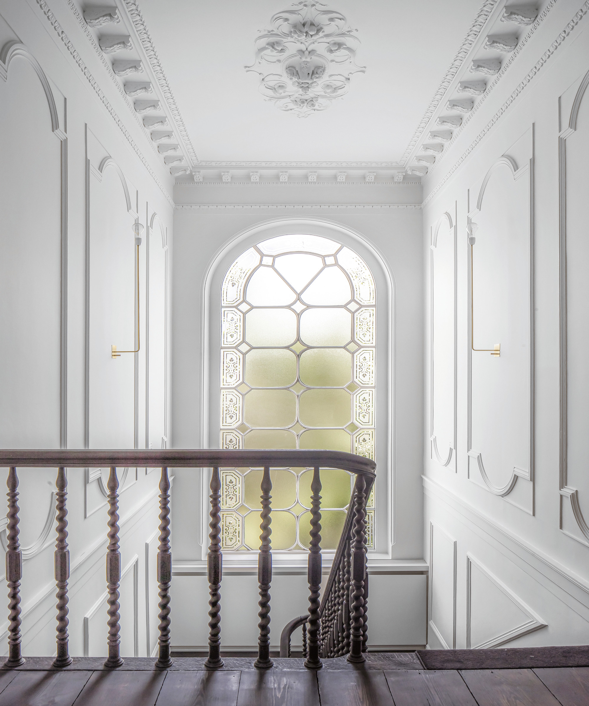
Original panelling was repainted in white to show the moulding to its best advantage.
Bedroom

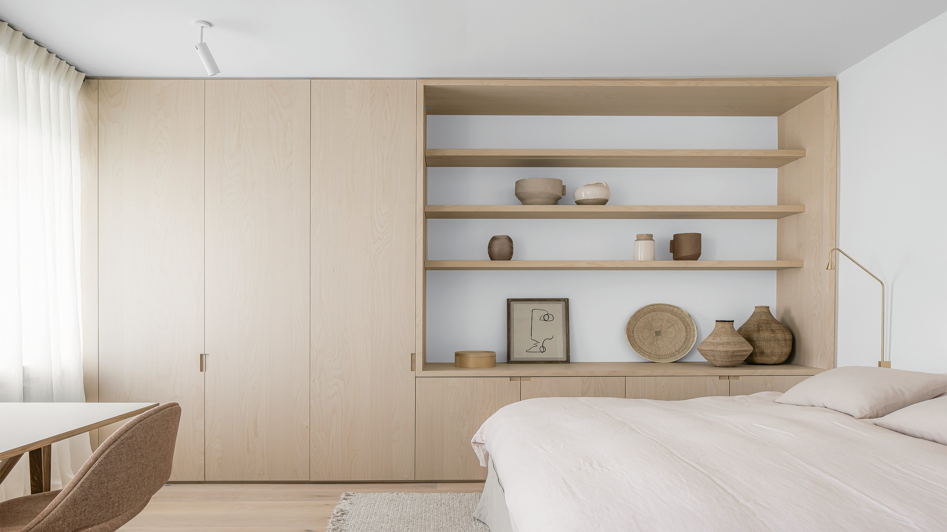
The plush and calm mood of a hotel room has been achieved in this modern bedroom with pale cabinetry in birch wood, seagrass accessories and a pale neutral palette.
Garden
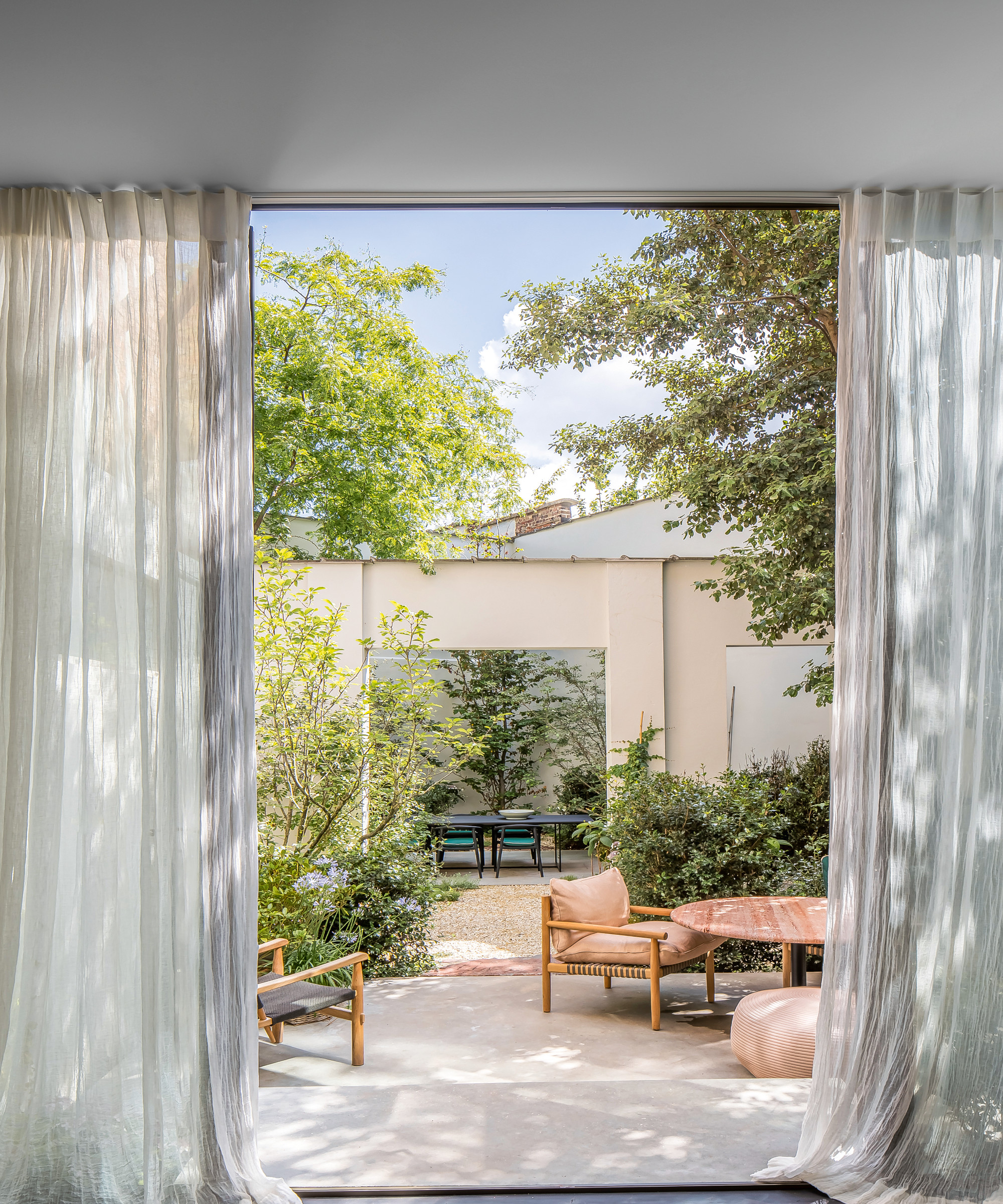
'The garden feels like an oasis in the midst of the city centre,’ says Evelyn. Landscape gardener Aldrik Heirman strategically planted mature shrubs to soften the architecture and create the illusion of more space. ‘On a sunny day, under the covered terrace in the courtyard garden you can really imagine you’ve been transported to Ibiza.’
A precious enclave amidst the city, once the world is back on its feet, Evelyn plans to throw open the doors and welcome her guests.
See also: this playful San Francisco townhouse that celebrates fun and glamour
Interiors and architecture writer Juliet Benning regularly writes for Livingetc and Homes and Gardens, as well as Grand Designs and Country Homes and Interiors. She was once the features editor of Homes and Gardens, and also contributes to 25 Beautiful Homes magazine.
-
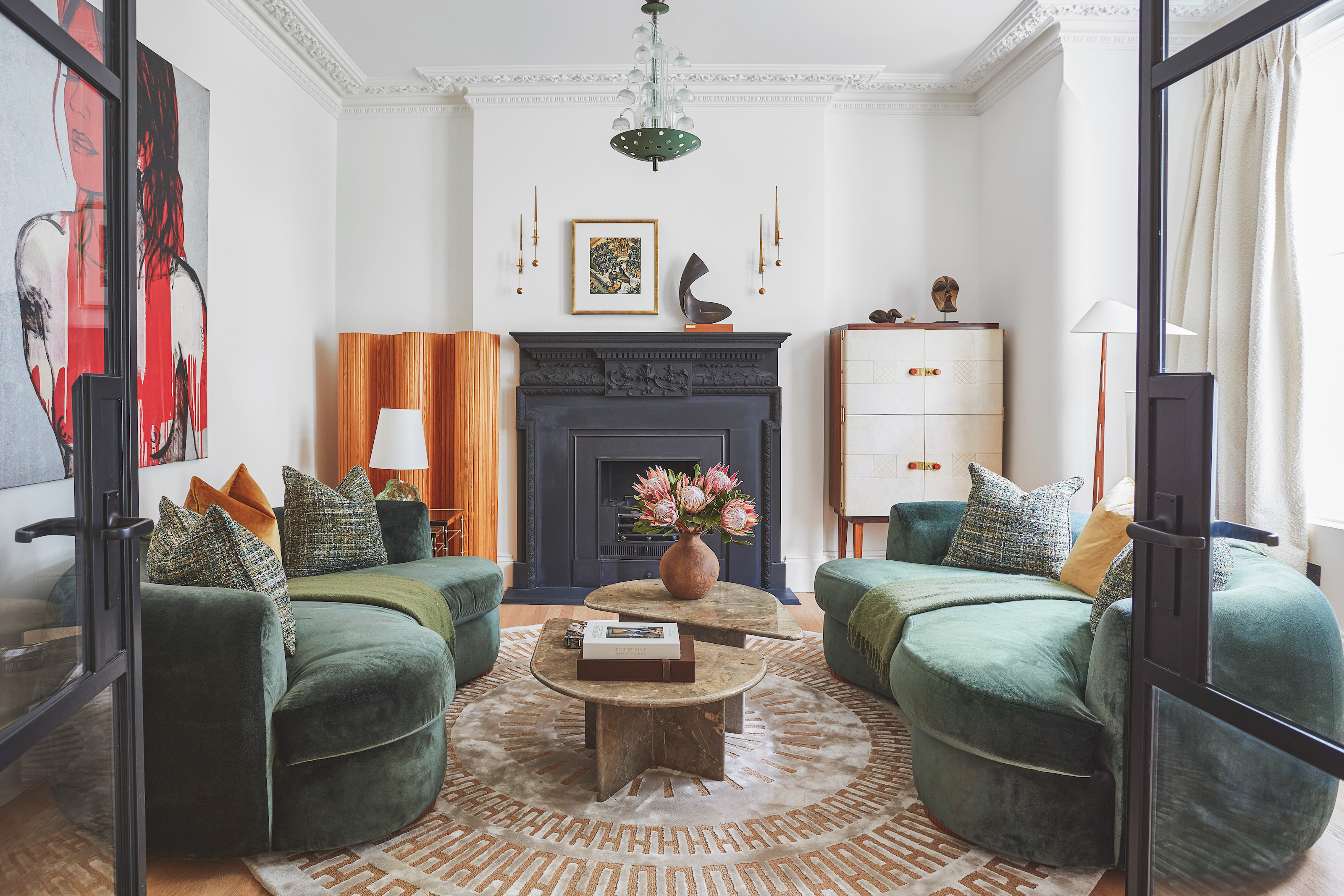 The 'New British' Style? This Victorian London Home Embraces Its Owners' Global Background
Warm timber details, confident color pops, and an uninterrupted connection to the garden are the hallmarks of this relaxed yet design-forward family home
By Emma J Page
-
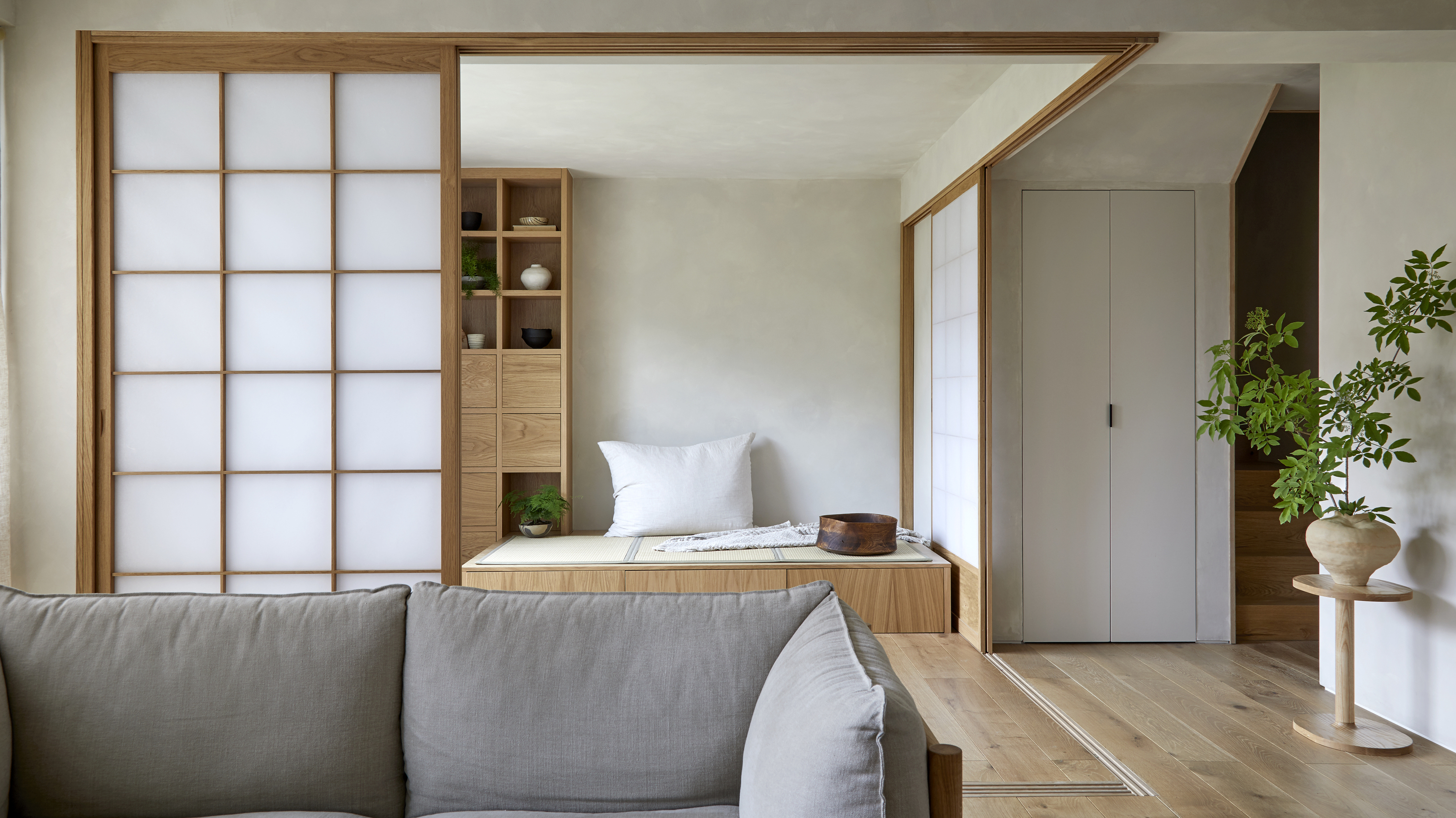 Muji Living Room Ideas — 5 Ways to Harness The Calming Qualities of This Japanese Design Style
Inspired by Japanese "zen" principles, Muji living rooms are all about cultivating a calming, tranquil space that nourishes the soul
By Lilith Hudson