A cool and contemporary East London home that features pink plaster walls throughout
A creative couple have designed their dream home which juxtaposes the patina of age and modern lines brilliantly
The Livingetc newsletters are your inside source for what’s shaping interiors now - and what’s next. Discover trend forecasts, smart style ideas, and curated shopping inspiration that brings design to life. Subscribe today and stay ahead of the curve.
You are now subscribed
Your newsletter sign-up was successful
When two designers live, work, eat and sleep together, you expect that things may get a little intense. Then if you throw into the mix, ‘doing up a large modern Victorian house together’ the pot might just boil over.
But not in the case of Gemma Ruse and Xavier Sherrif who seem to operate on a zen like calm, while simultaneously channelling creativity and productivity.
They have been together since art school days at Central St Martins, and started their company StudioXAG six years later, creating ground-breaking retail installations for clients around the globe like Christian Louboutin, Adidas, Liberty, Selfridges and Anya Hindmarch.
Article continues belowWhen it came to their own east-London house renovation, not surprisingly it felt a little like work at times. ‘The challenge was that we’re both designers with very strong aesthetics and quite fussy too so while I was leading the project we agreed that Xavier would have the power of veto if he really disliked something,’ says Gemma. ‘There were no real falling outs and he tended to come round if I was passionate about a decision - or I simply showed him just my chosen version,’ she smiles.
Living room
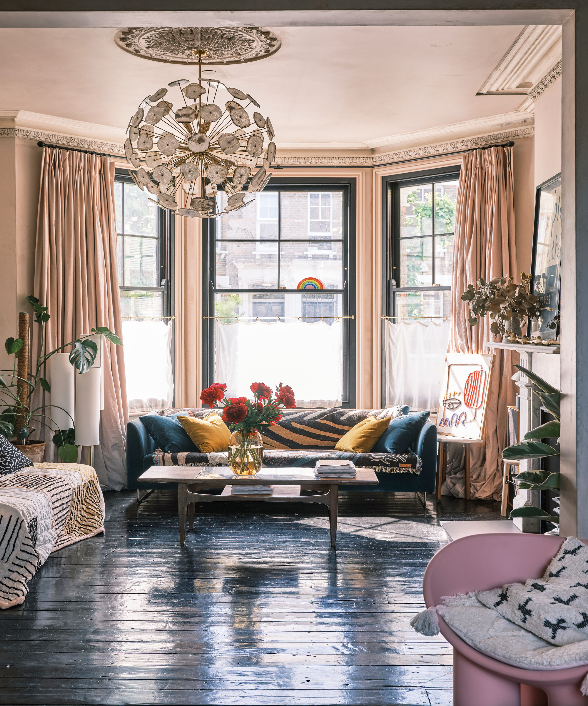
'StudioXA plays to our strengths and was reflected in the house renovation with Xavier more involved in the technical side,’ she says. Gemma had a clear vision, influenced by the house’s tall ceilings and air of faded grandeur, right from the start.
‘I wanted it to look authentic, a juxtaposition of the old and the new coming together, rather than a fake Victorian house,’ she says. ‘It was about mixing clean modern lines with the patina of age and creating a home that felt calm, cohesive and contemporary, while respecting what had been there before.’
Missing authentic period pieces, like fireplaces in the living room and the couple’s bedroom, were found on Ebay and reclaimed radiators were installed. ‘All the interventions we made were a deliberate contemporary contrast, like the massive oversized doors, concrete kitchen and Japanese-style courtyard that sits in it,’ she says.
The Livingetc newsletters are your inside source for what’s shaping interiors now - and what’s next. Discover trend forecasts, smart style ideas, and curated shopping inspiration that brings design to life. Subscribe today and stay ahead of the curve.
New sash windows in the living room are outlined in black, which is elegant without being harsh and ties in with the kitchen patio doors. The ceiling was cut out to enhance the beautiful central rose.
Kitchen
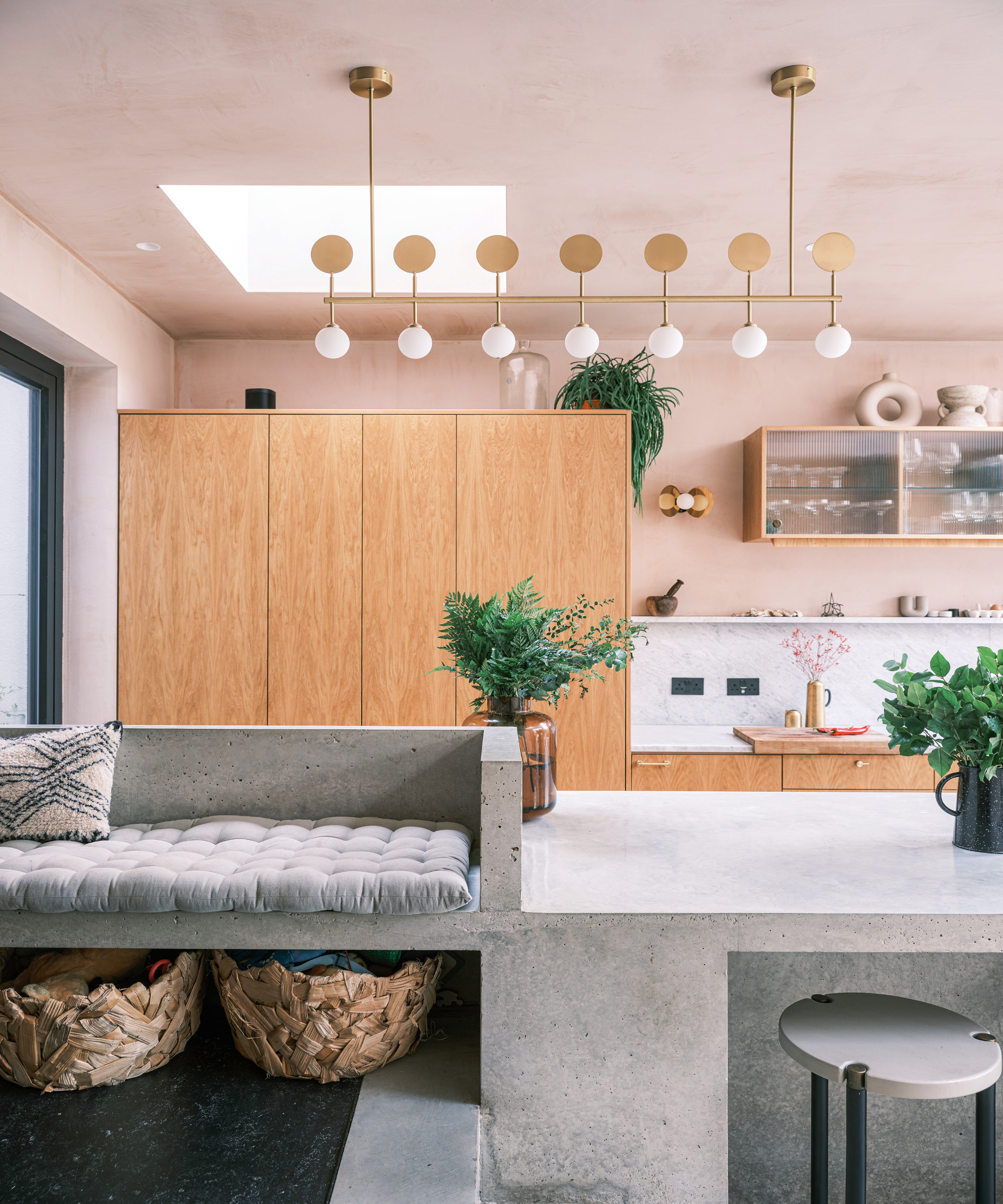
The cabinetry in this space conceals the ovens, keeping them hidden from three-year-old Raffi who is 'into pushing buttons.' The concrete seating is used as a snug area.
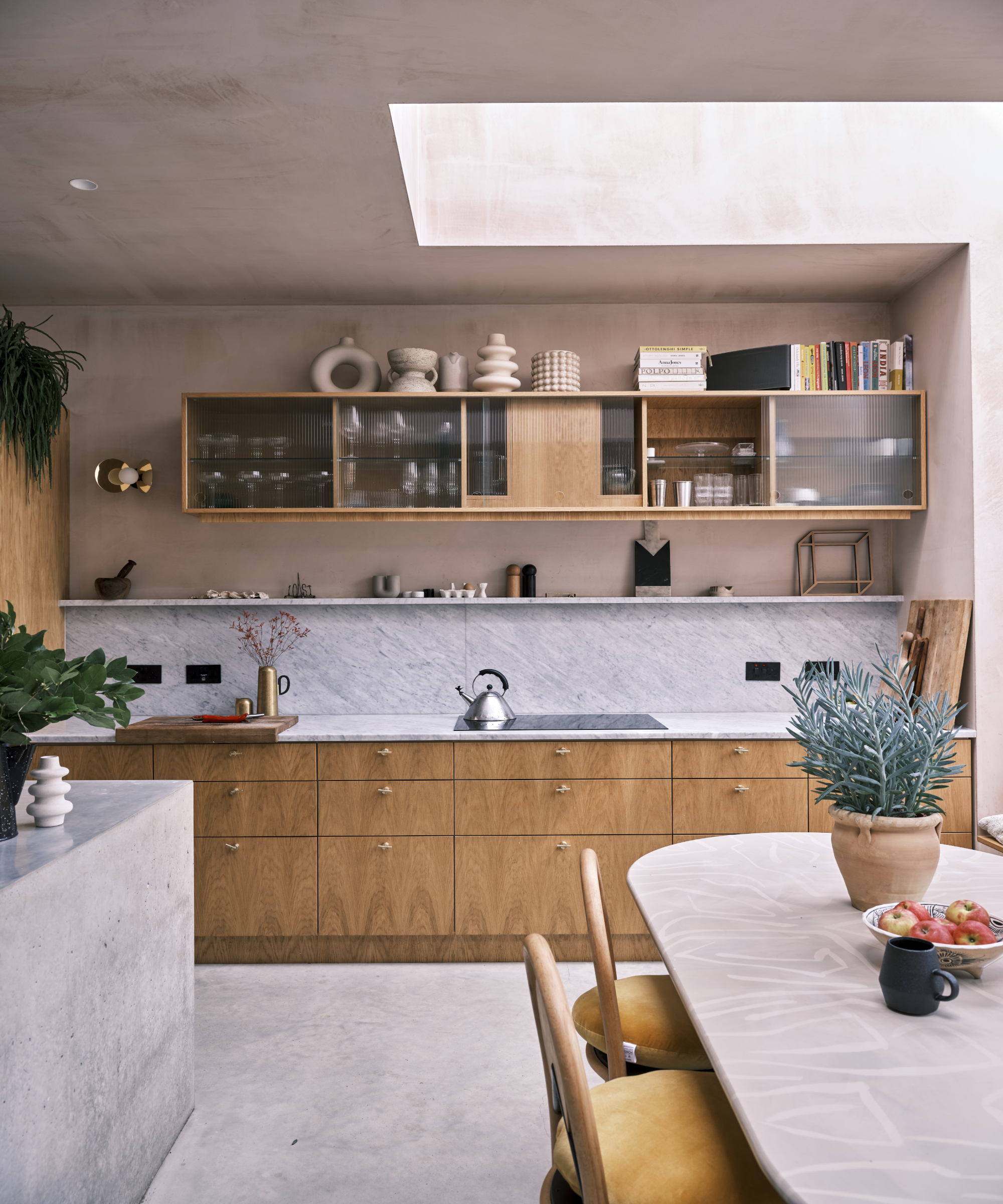
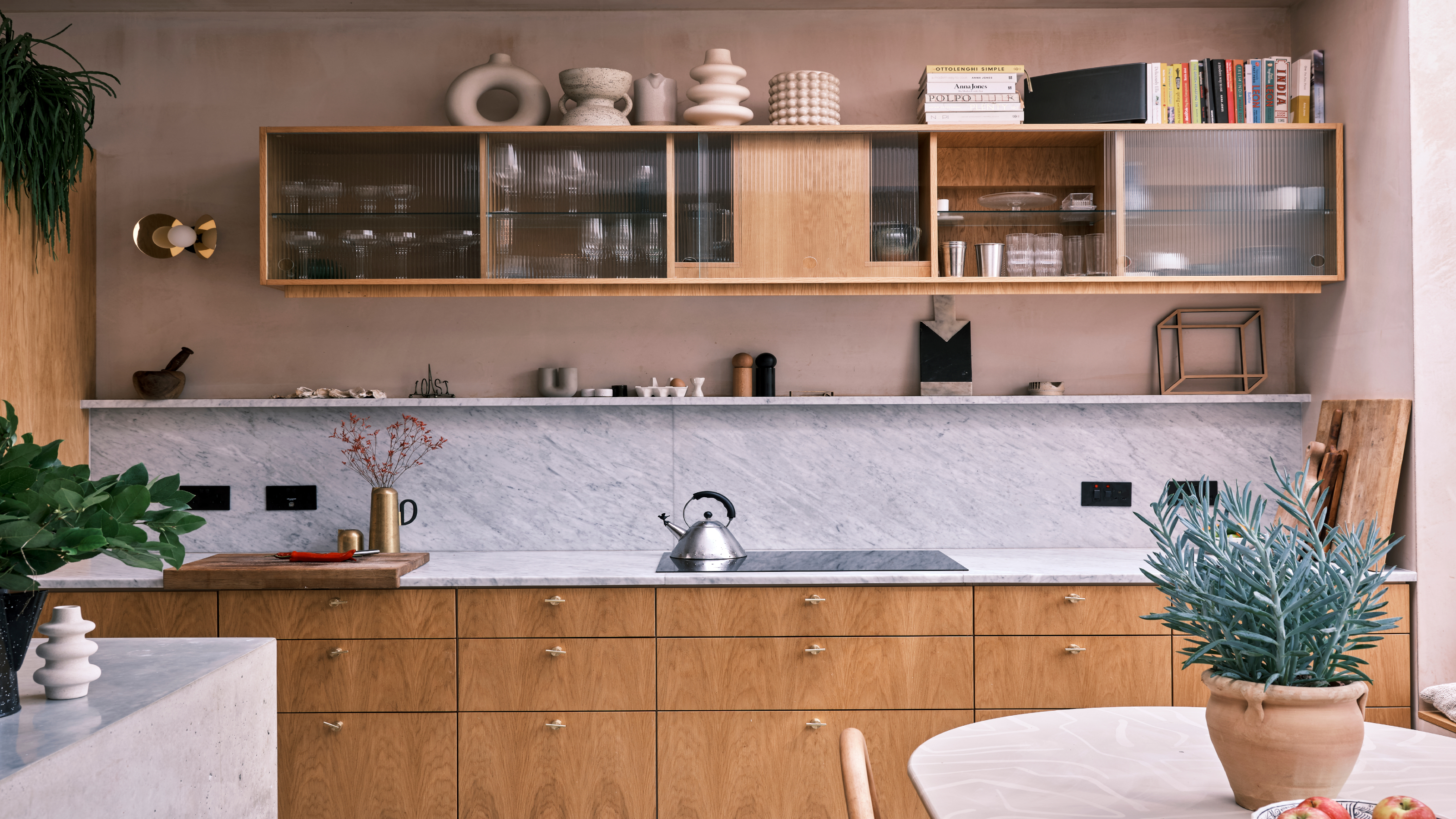
For the cabinetry, the couple chose crown-cut oak veneer (which has a bit of an art deco vibe) for its longevity and added brass handles for glamour.
Dining area
The couple had looked at similar houses nearby, lured by their two and a half thousand square footage.
‘We saw many beautiful homes that gave us inspiration for layouts and ideas for when we finally bought this,’ she adds. ‘We were looking for a project but I don’t think we fully appreciated what we had taken on,’ she says of the house which came with 1970’s décor and strip lighting.
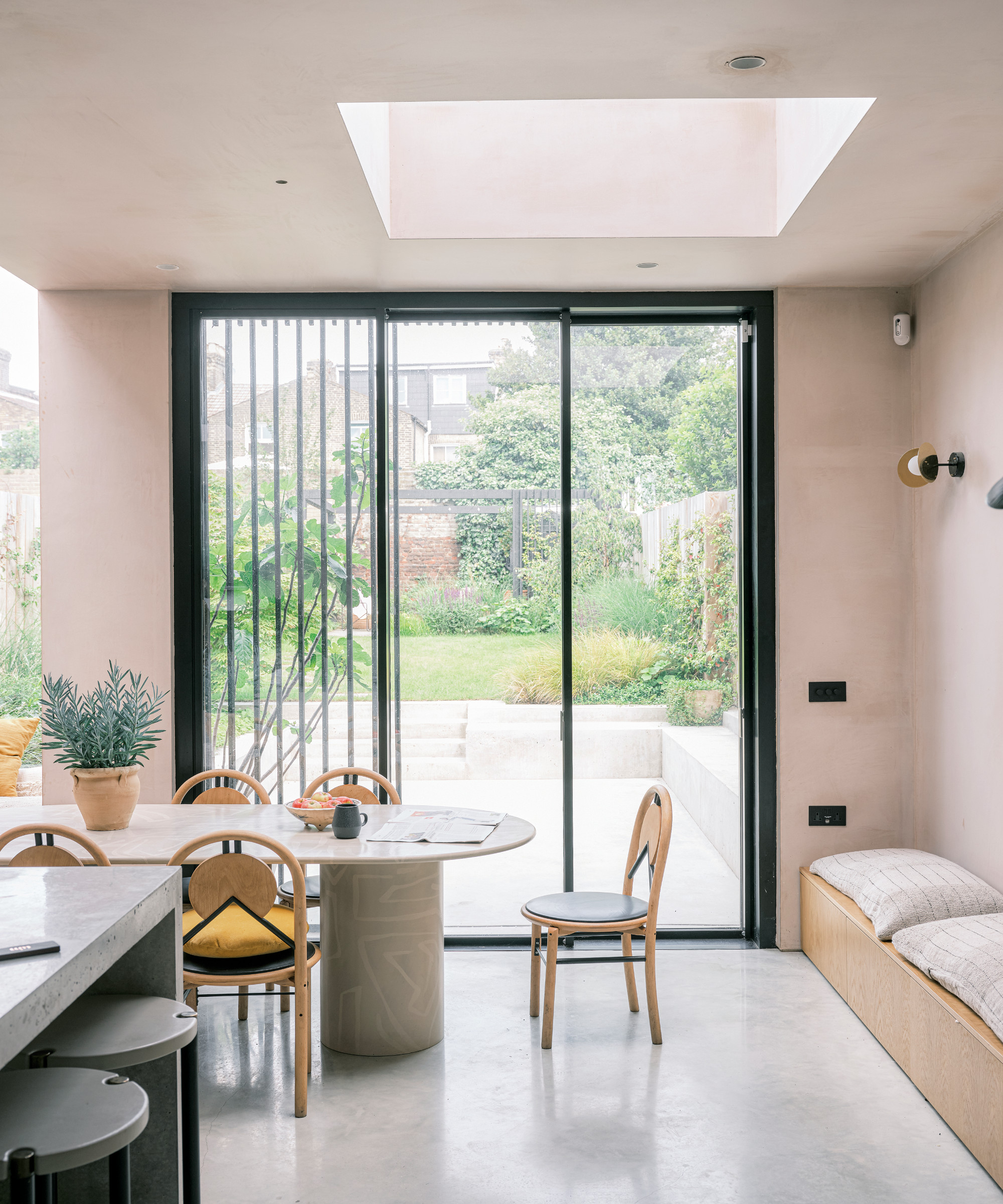
In this dining space, the floor was lowered to gain ceiling height and the concrete extends out to the terrace. The table, inspired by a 1970s Mario Bellini design, is painted with a Kelly Wearstler-style pattern.
Main bedroom
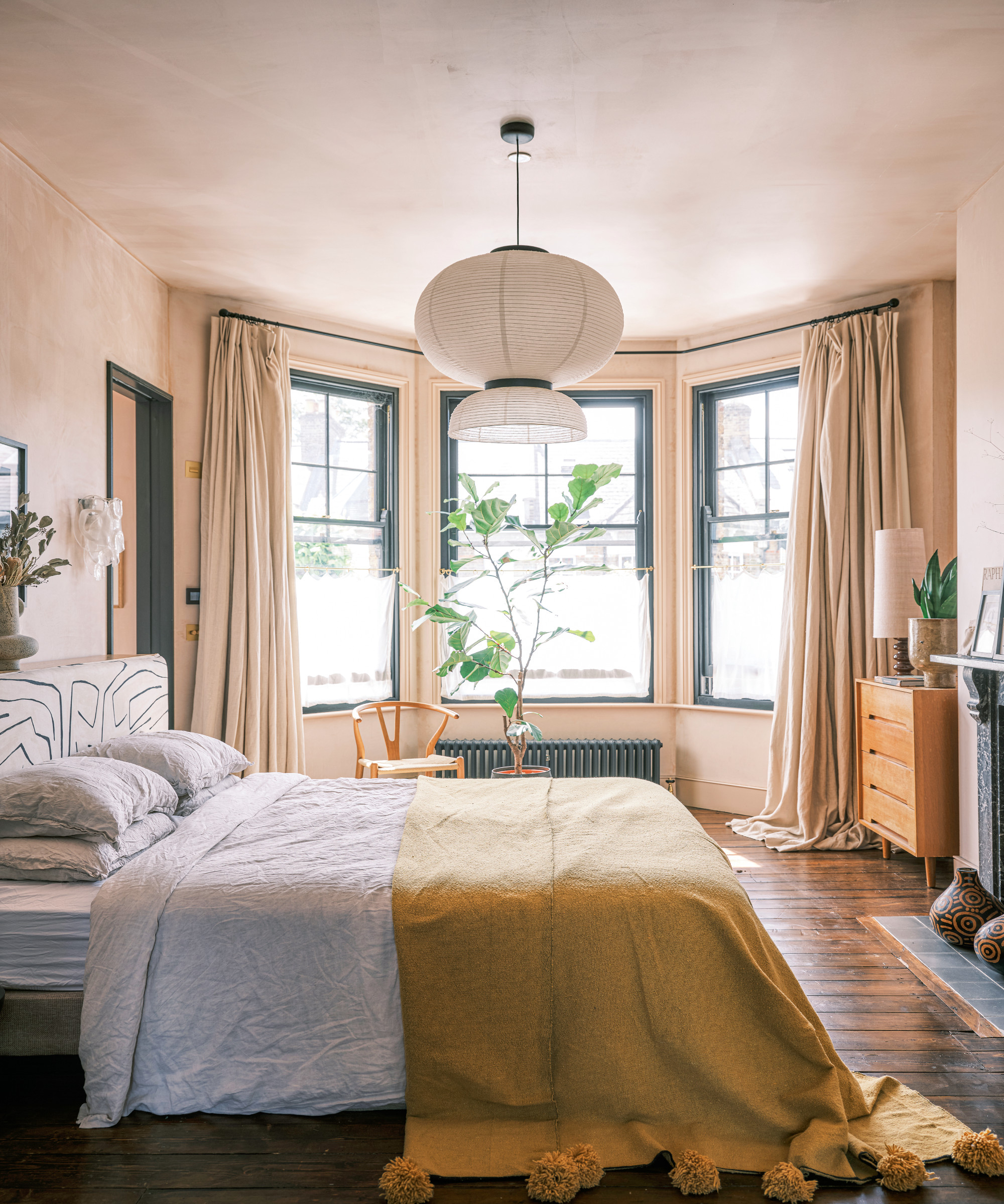
An entire floor, previously three rooms, is given to this space with its en suite shower room and dressing area. 'We designed it so the rooms could be reinstated if necessary, further down the line.' Gemma says.
Previously, the couple had been living in a maisonette nearby for 10 years and building up their business, when they embarked on a lifestyle change which saw them getting married, buying the house and having a baby… all at the same time.
‘We managed to move in for six months to get a feel for the space, find an architect, get planning permission then move out just before building work commenced and I gave birth!’ Gemma laughs.
‘I think we estimated about half the time and half the cost of what it ended up taking.’ They brought in architects Fraher & Findlay for their great portfolio and commitment to being on site every week to project manage - ‘essential for us.’
The firm worked on refurbishing and extending the property whilst honouring the couple’s creative personalities. The house has ended up with a number of threads running through it from Japanese to Art Deco and Kelly Wearstler influenced patterns.
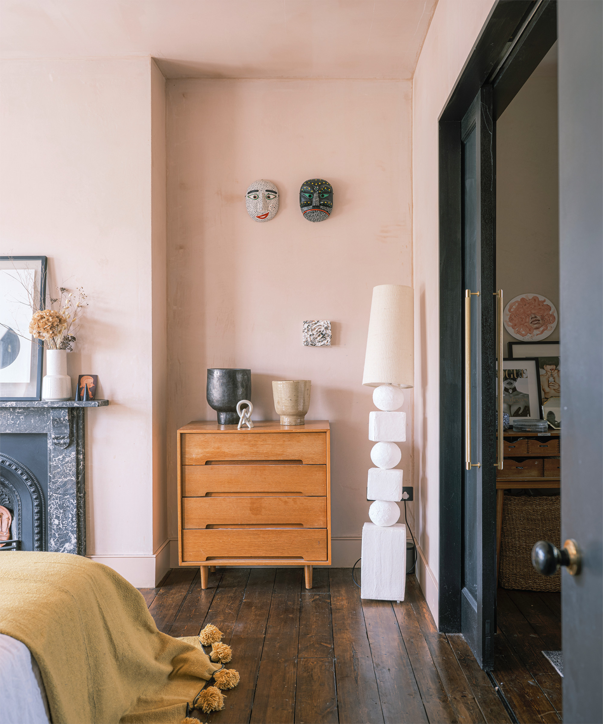
This curated corner features a sculptural floor lamp made by Gemma and masks brought back from a trip to Seoul.
Main bedroom and en suite
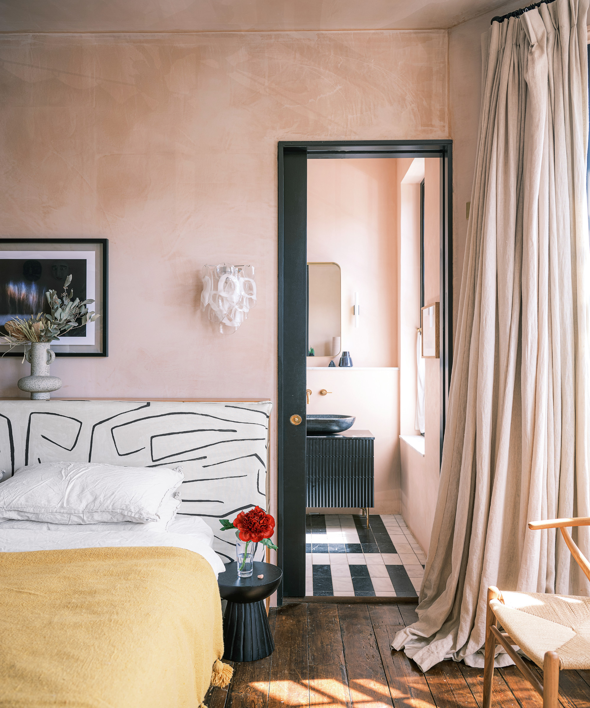
Like all the rooms in the house, this one has a backdrop of raw pink plaster highlighted by lines of black.
‘I feel we’ve added to its heritage and we’re saying it’s our forever home,’ says Gemma, ‘for now at least.’
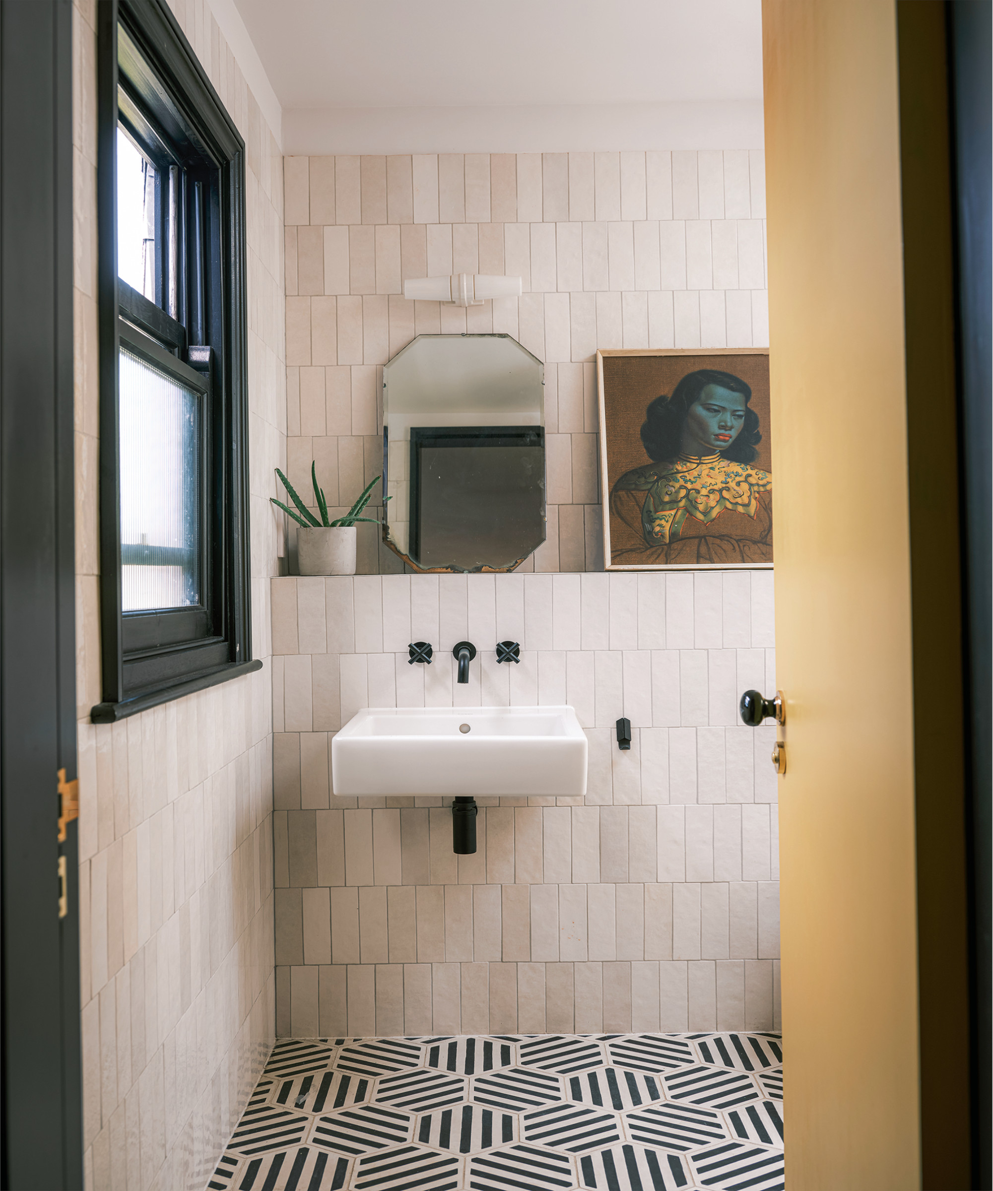
Guest en suite shower room
A legendary houses editor, Mary Weaver, held the job of homes editor on Livingetc for over a decade. She set the aesthetic for which the brand has become known. She is now a freelance stylist, art director, and writer, regularly contributing to Livingetc and overseeing the brand's successful House Tours franchises of live and webinar events.