Inside an eclectic New York apartment that was once a 19th century warehouse
With its beams and folkish textiles this eclectic New York apartment feels like a (very cool) country house in the heart of the city.
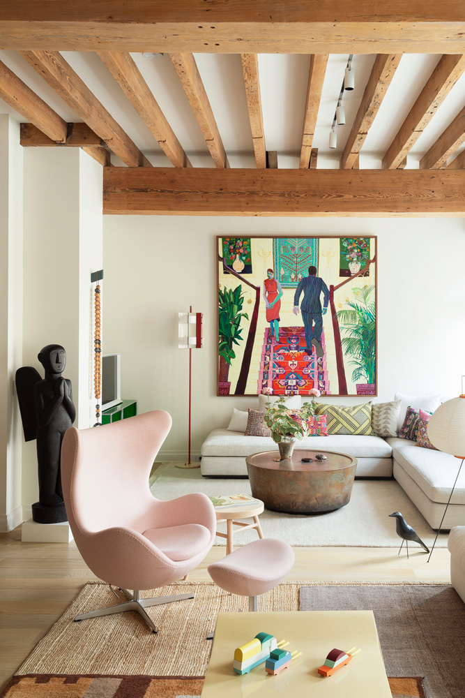
THE PROPERTY
A modern home duplex set on the second and third floors of a former 19th-century warehouse in New York’s West Village. There is an open-plan kitchen-diner/living area and a cloakroom on the lower floor. The master bedroom, master bathroom, guest bedroom, guest bathroom and study are upstairs.
LIVING AREA
Before it was converted, this six-storey building was a warehouse used to store paper for the publishing industry. It was the ‘rustic warmth and imperfections’ of the 19th-century architecture that fired Kimberlie Birks, a design writer’s imagination.
Although well-tended, the apartment was stuck in an early Nineties time warp of melamine surfaces and dark floors. Professional help was needed, however, so Kimberlie turned to Alexandra Champalimaud, a family friend who runs interior design practice Champalimaud Design.
What began tentatively as a discussion about window treatments led to the spirited changes that have transformed the two-storey apartment without compromising its architecture. The bones of the apartment were an important part of the design, but rather than dressing them up or painting them out Champalimaud Design preserved them as a backdrop for the new furniture and decorative elements.
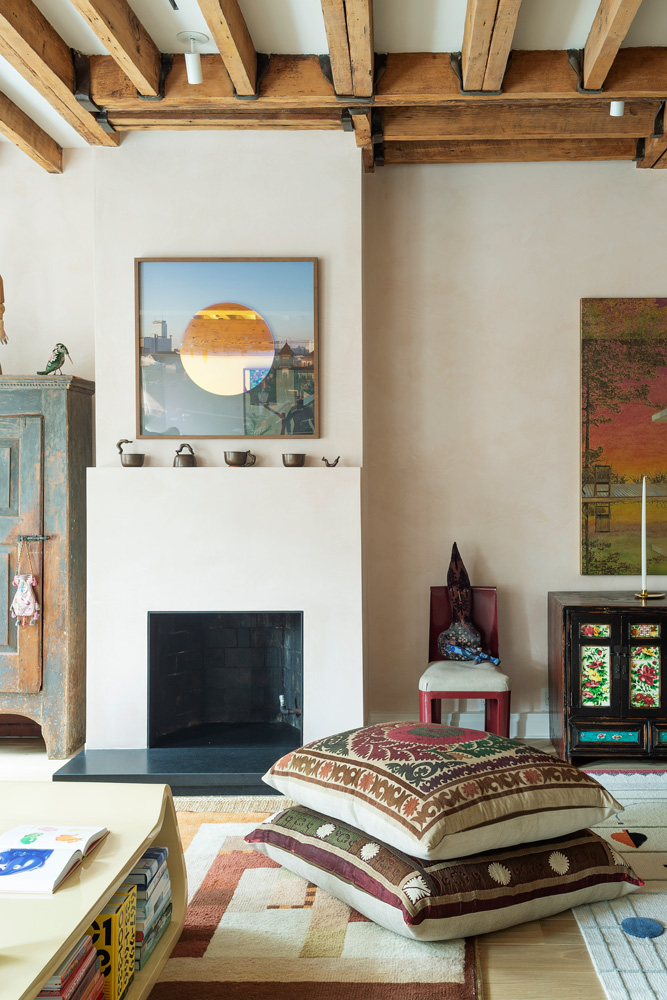
Above the fireplace, the artwork by Olafur Eliasson features a photograph withan orb of mirrored glass ontop.
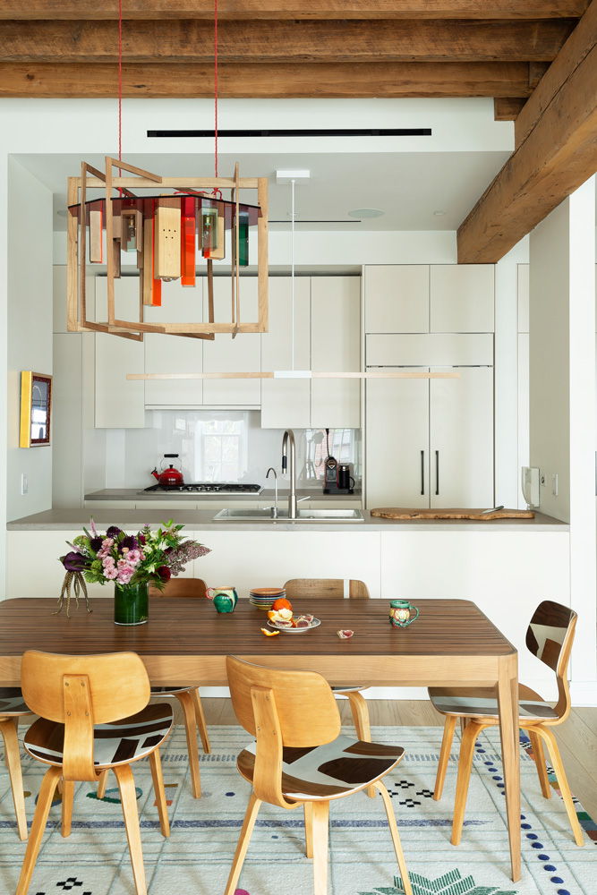
KITCHEN AND DINING AREA
Underfoot, white oak flooring replaced the unsympathetic mix of dark wood and cork tiles.
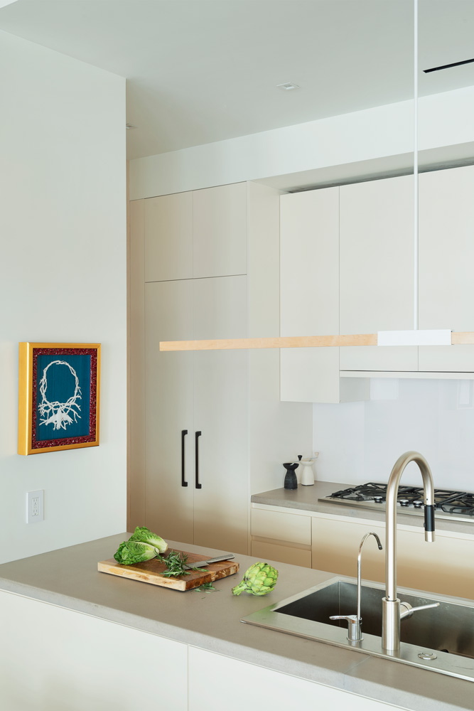
The largest alteration was made downstairs. A dividing wall was removed to create one fluid living, cooking and dining space where low sofas and nests of shapely tables emphasise the tall windows.
Be The First To Know
The Livingetc newsletters are your inside source for what’s shaping interiors now - and what’s next. Discover trend forecasts, smart style ideas, and curated shopping inspiration that brings design to life. Subscribe today and stay ahead of the curve.
At one end of the room, the industrial feel of an exposed brick wall was softened with a layer of pale pink plaster.
STAIRS
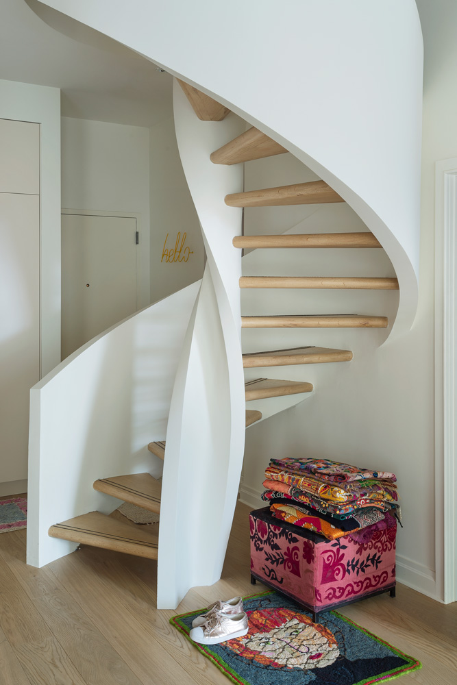
Removing the wall was a deliberate ploy to draw attention to the spiral staircase, which swirls like a piece of Modernist sculpture to the bedrooms upstairs.
CLOAKROOM
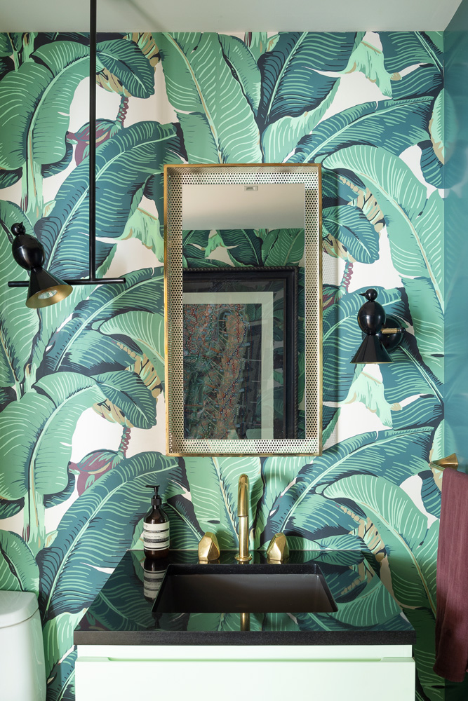
Kimberlie likes the contrast of quieter spaces with zanier corners, like the sink area in the cloakroom with its bold wallpaper.
See Also: 5 Chic Bathroom Wallpaper Looks To Tap Into
BEDROOM
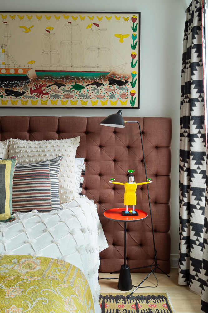
Kimberlie calls the master bedroom this her Kit Kemp room. The curtains are heavy but work well to block the light. The headboard was designedby Champalimaud. Its colour echoes the artwork from Nova Scotia, where she also found the yellow figurine on the table.
STUDY
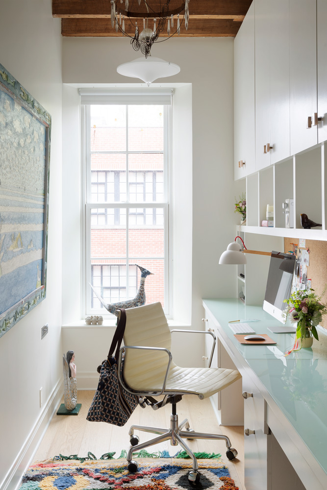
Kimberlie thought the narrow office might feel claustrophobic but she finds it cocooning.
Find out more about Champalimaud Design at champalimauddesign.com.
Kimberlie’s first book, Design for Children, is published by Phaidon (phaidon.com)
Photography / Matthew Williams
See more modern homes
The homes media brand for early adopters, Livingetc shines a spotlight on the now and the next in design, obsessively covering interior trends, color advice, stylish homeware and modern homes. Celebrating the intersection between fashion and interiors. it's the brand that makes and breaks trends and it draws on its network on leading international luminaries to bring you the very best insight and ideas.
-
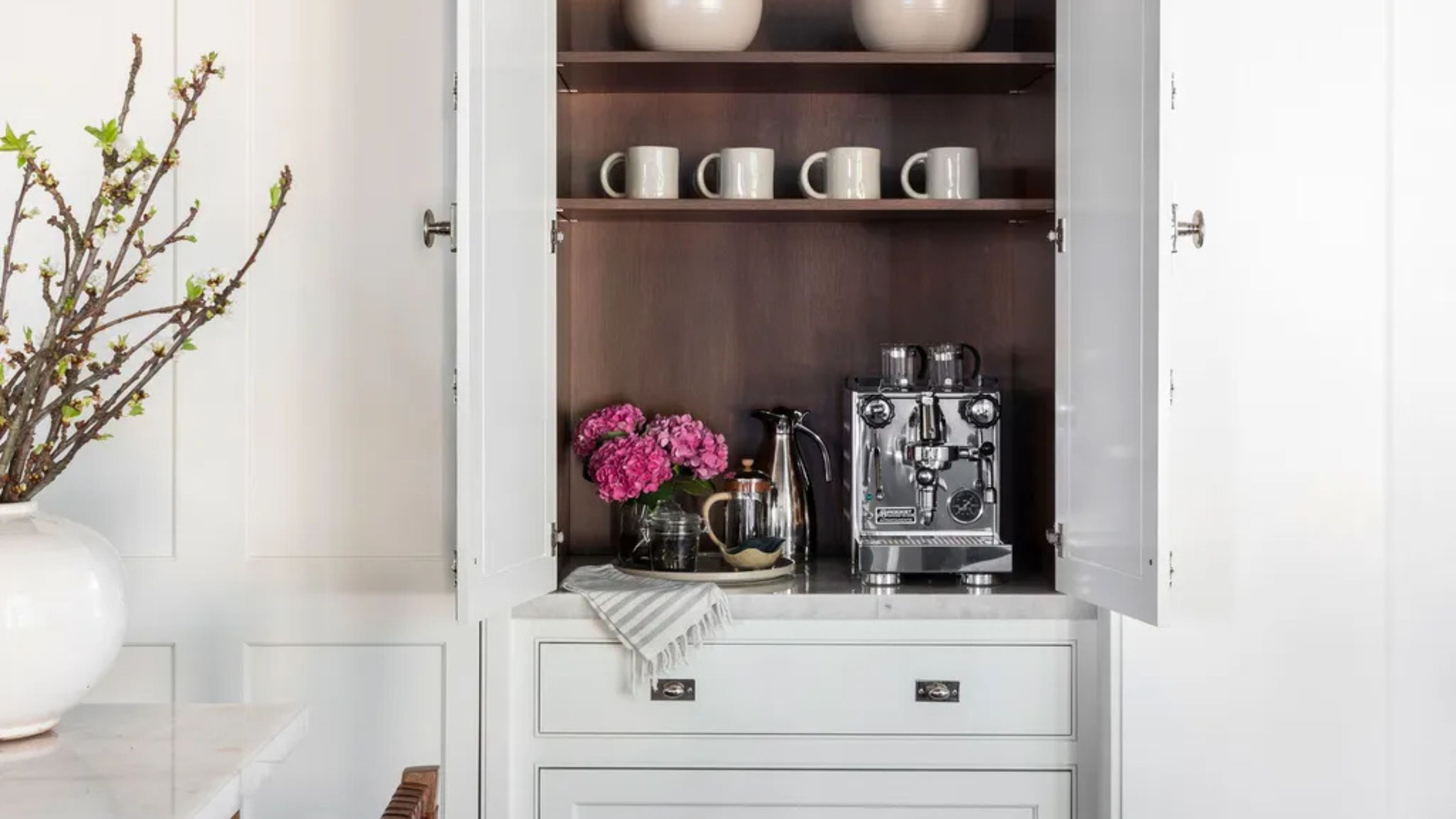 Turns Out the Coolest New Café is Actually In Your Kitchen — Here's How to Steal the Style of TikTok's Latest Trend
Goodbye, over-priced lattes. Hello, home-brewed coffee with friends. TikTok's 'Home Cafe' trend brings stylish cafe culture into the comfort of your own home
By Devin Toolen Published
-
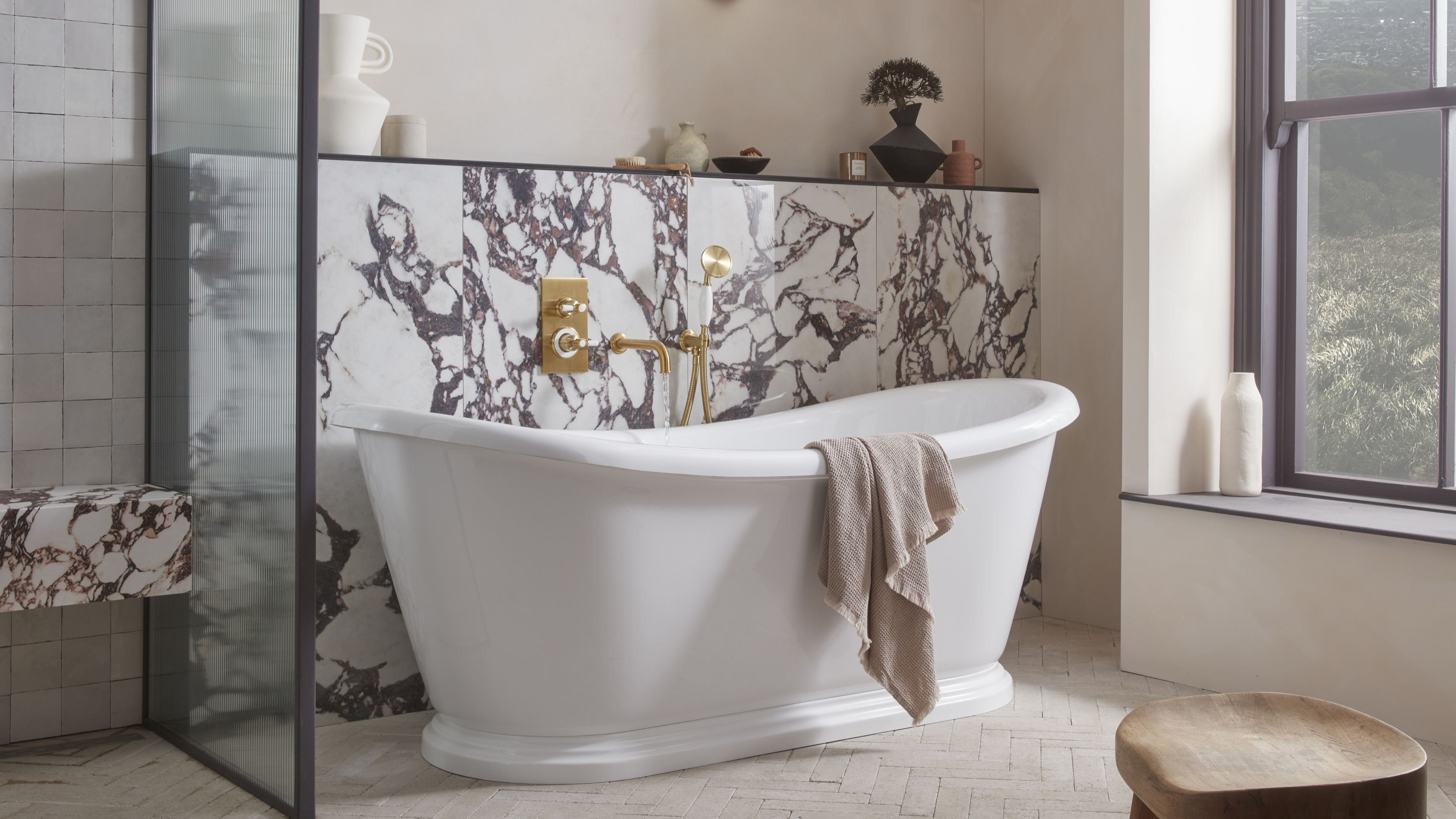 5 Bathroom Layouts That Look Dated in 2025 — Plus the Alternatives Designers Use Instead for a More Contemporary Space
For a bathroom that feels in line with the times, avoid these layouts and be more intentional with the placement and positioning of your features and fixtures
By Lilith Hudson Published