See how a detached Edwardian home in Buckinghamshire has been renovated and extended for modern life
This Edwardian detached home has been renovated and extended with a rear extension, side extensions and a loft conversion. It now features light, spacious interiors, a more open-plan layout, a stylish modern kitchen, Crittall doors and a wine room...

The Property
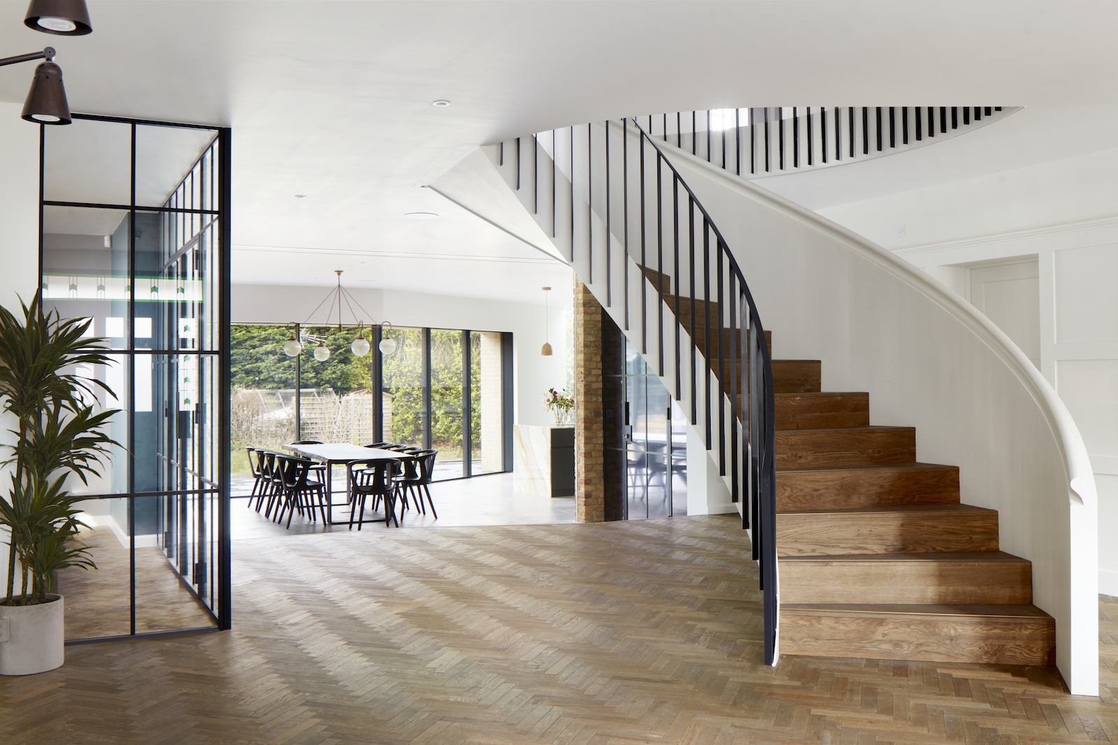
This stunning renovated Edwardian home in Beaconsfield, Buckinghamshire has received a modern refresh and is now a contemporary modern home – complete with an open-plan layout, Crittall partition doors and a stylish wine room.
The owners approached Scenario Architecture to design a substantial extension, and remodel the interior while respecting and celebrating the period character of the original house.
The house now stretches over 5,382 square feet (500m2) of interior space. The build took 18 months.
Entrance
The original front door with stained glass panels opens into a light and open hallway space.
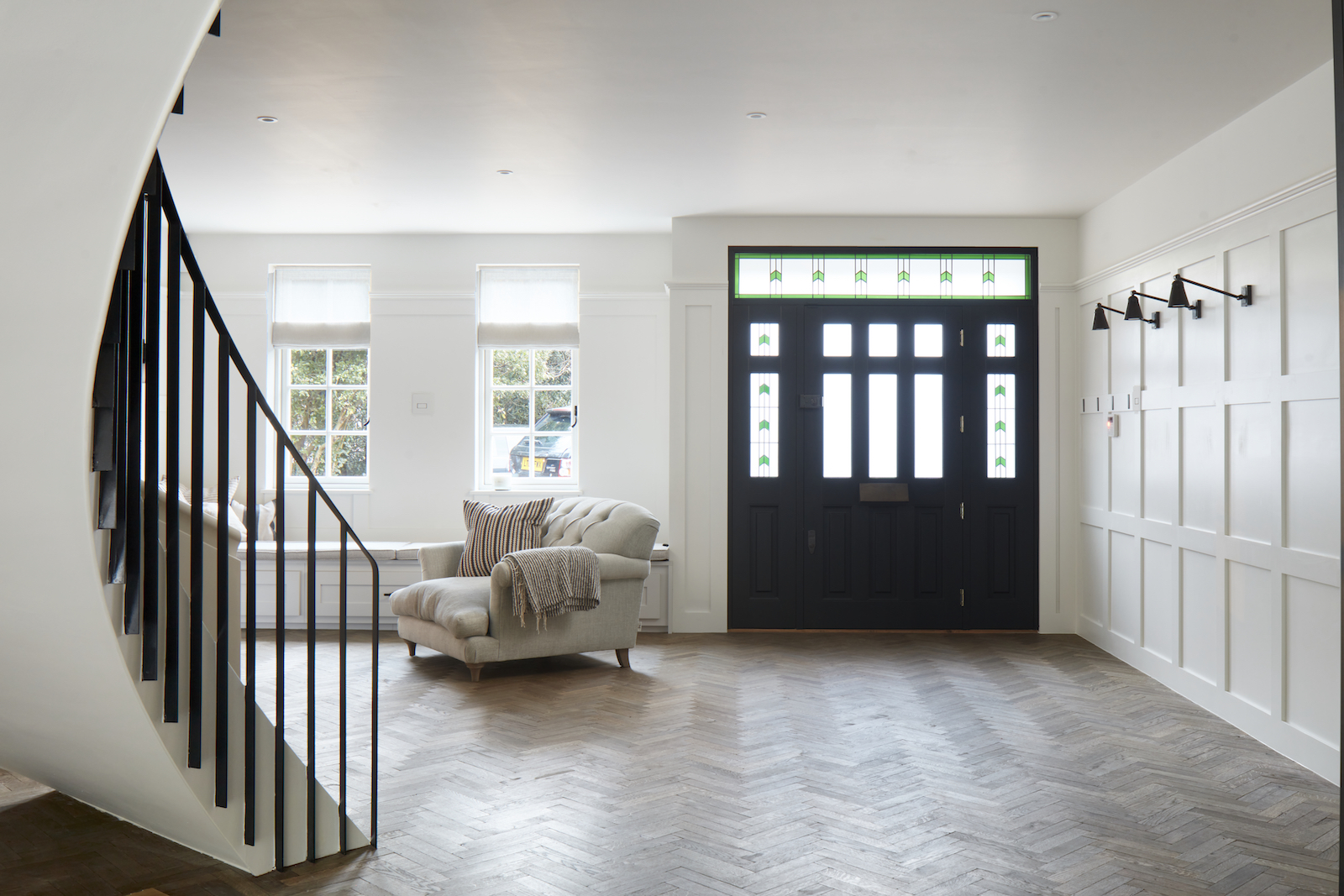
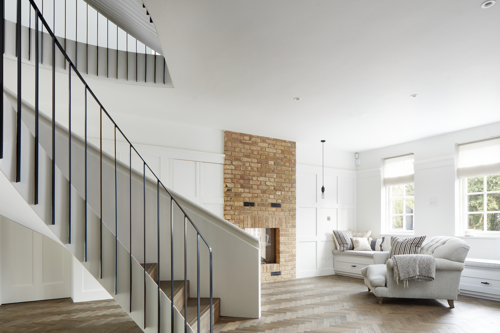
The central staircase follows the direction of the dining table, leading your gaze across the ground floor.
From the main entrance, the layout flows through Edwardian reception rooms into the newly added modern kitchen and dining areas, defined by a subtle change in level.
Herringbone parquet sweeps across the ground floor into the living spaces (both framed by Crittall partition walls), but flooring changes to a poured concrete floor in the kitchen and dining area.
Be The First To Know
The Livingetc newsletters are your inside source for what’s shaping interiors now - and what’s next. Discover trend forecasts, smart style ideas, and curated shopping inspiration that brings design to life. Subscribe today and stay ahead of the curve.

Kitchen and dining area
This grand Edwardian home is surrounded by an extensive, wraparound garden.
The large house was further extended with a contemporary rear extension which creates a better connection with the garden through wide, floor-to-ceiling sliding glass doors.
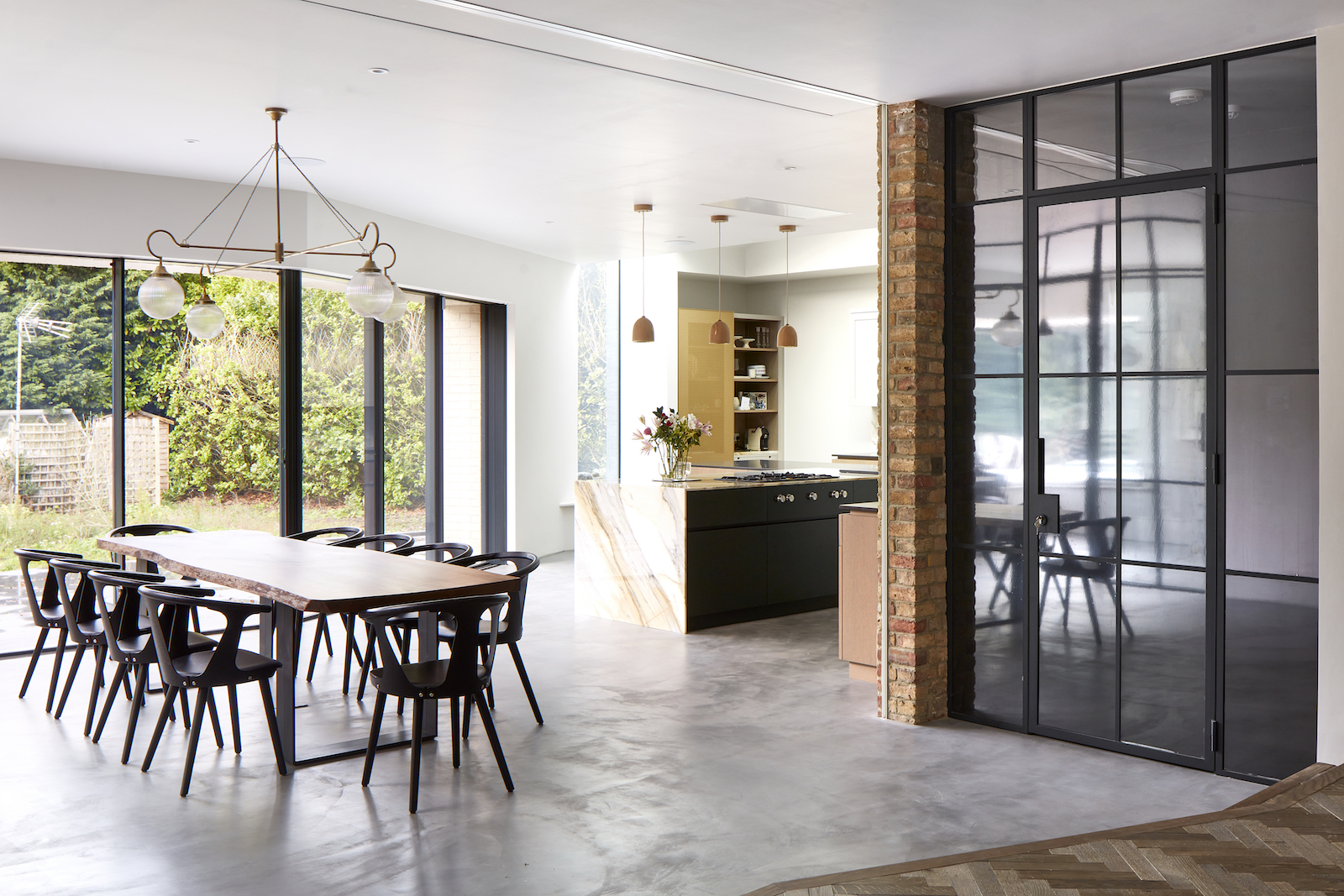
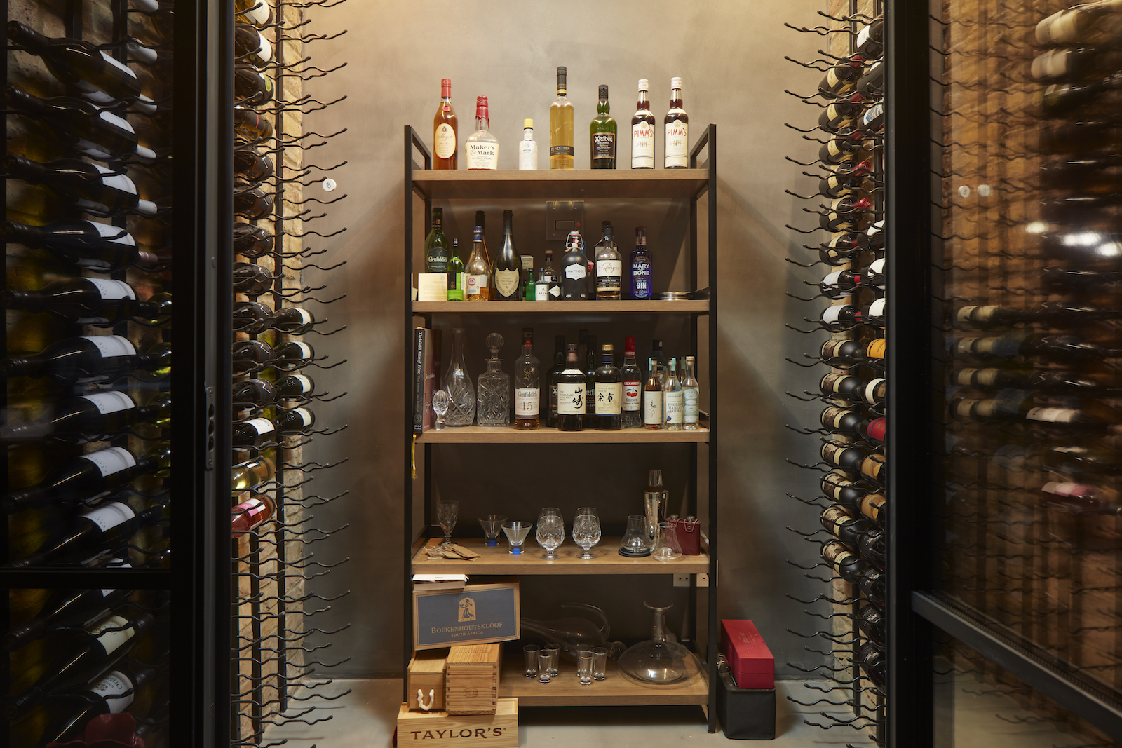
Behind smoked glass is a stylish, walk-in wine room, making a striking display out of the owners' wine collection.
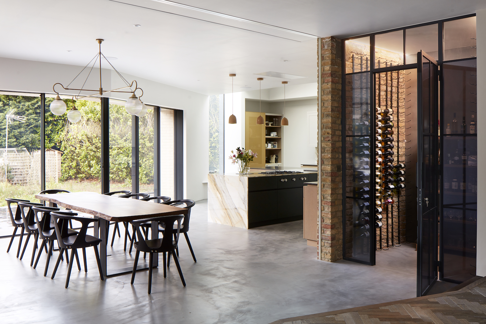
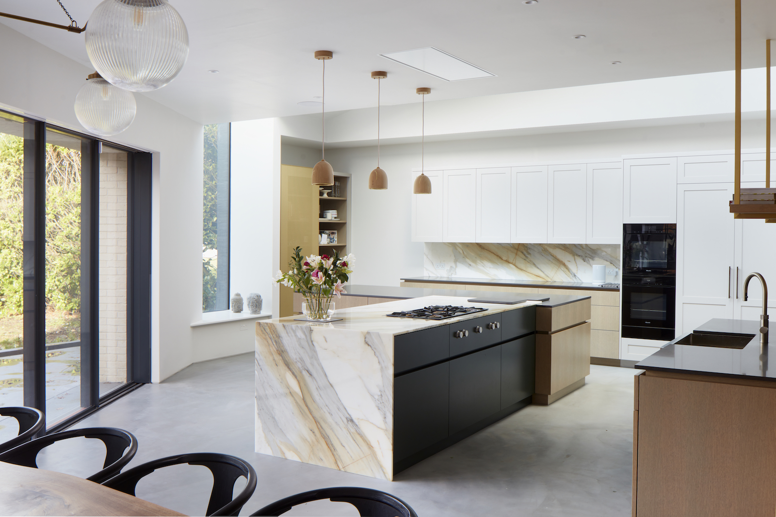
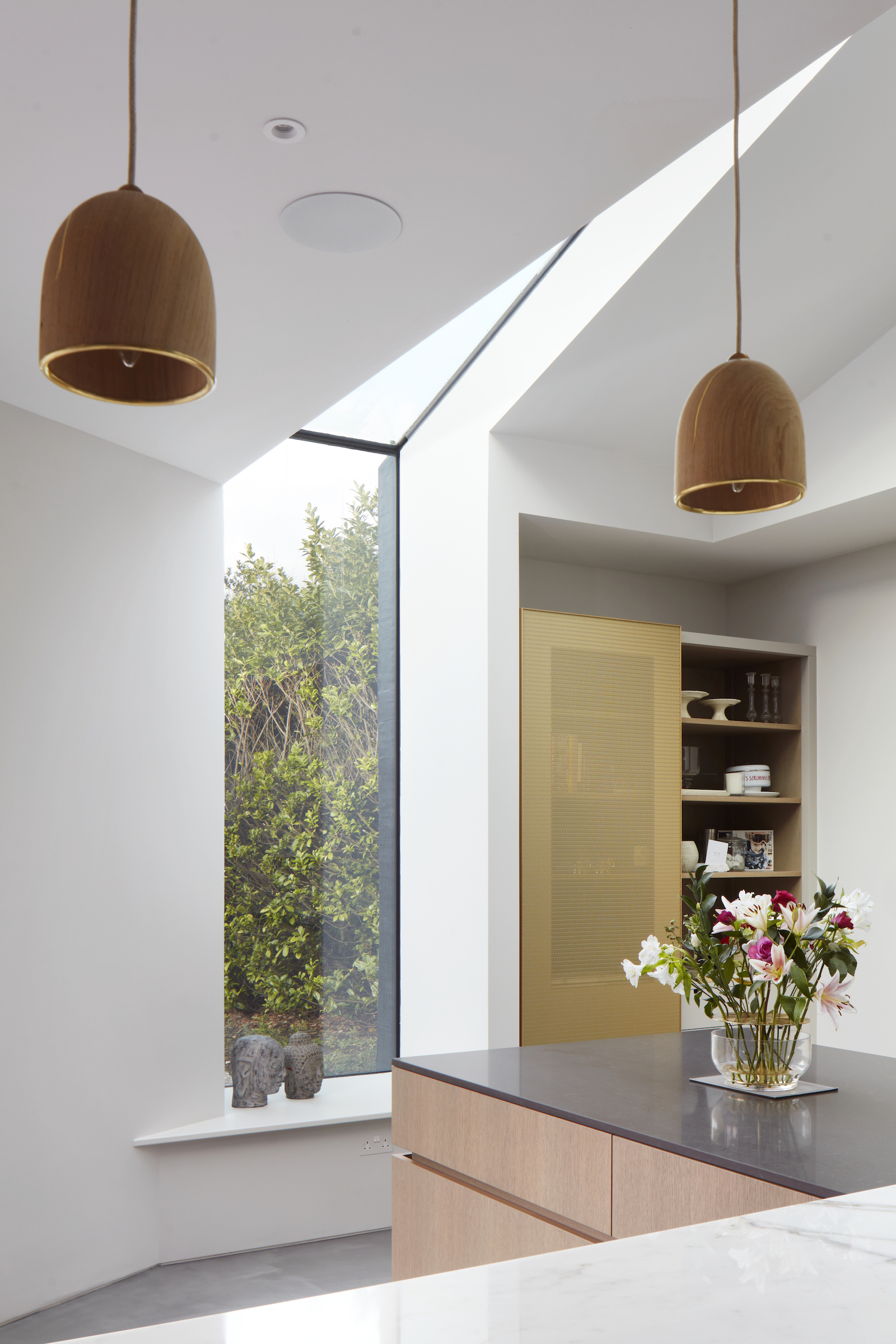
The modern kitchen features a stunning L-shaped modern kitchen island with kitchen island pendants and fresh, white kitchen cabinetry.
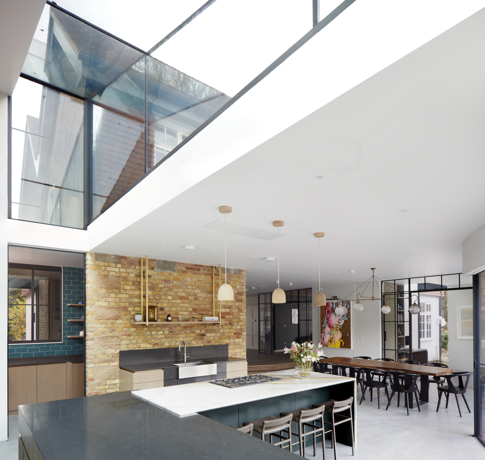
A generous sky light not only lets in lots of light but also highlights where the original structure ended and the new extension starts. It makes for a very light and bright modern kitchen.
A breakfast bar area is tucked away out of sight in the L-shape corner of the kitchen island.
There's a tucked away walk-in pantry too, with teal metro tile walls.
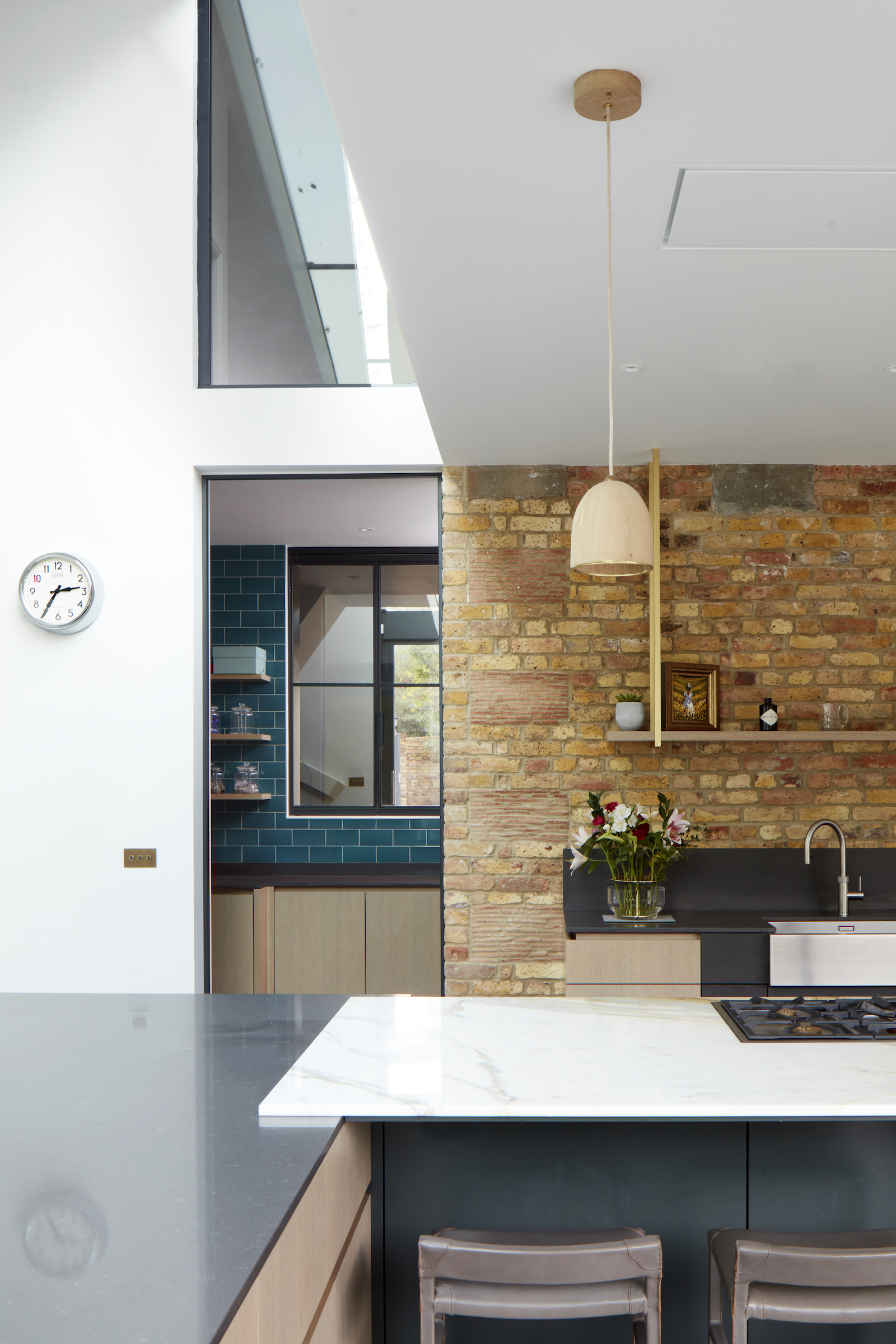
The interior colour palette was inspired by the local clay found in the roof tiles and the bricks, concrete base and reclaimed oak floors and accents of raw metal. Natural materials marry the Edwardian grandeur with the contemporary brick, ceramic tiles and metal.
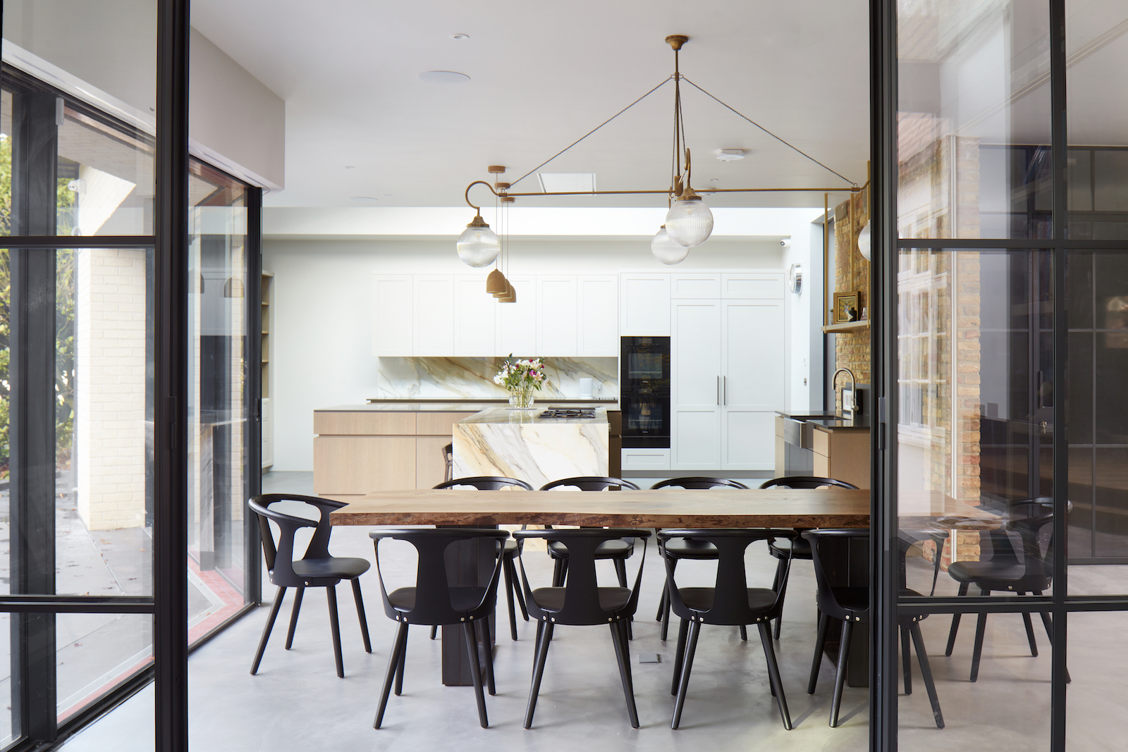
The open-plan kitchen flows through to a dining space that seats 10.
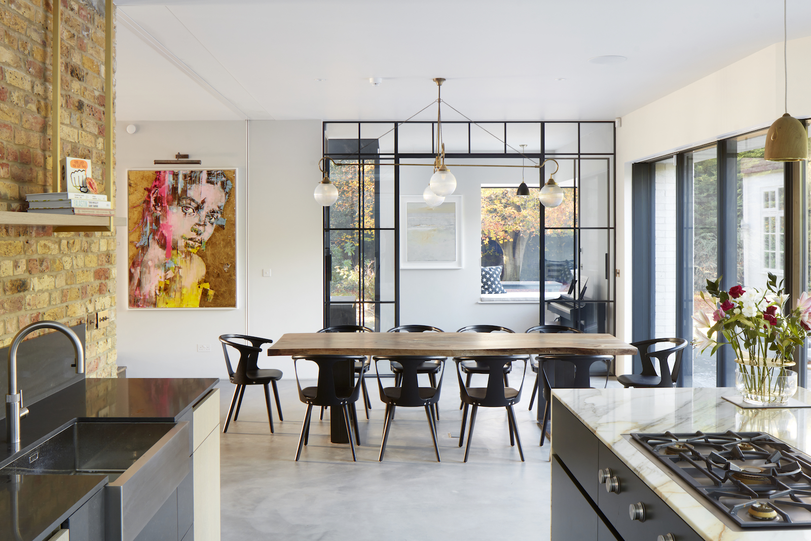
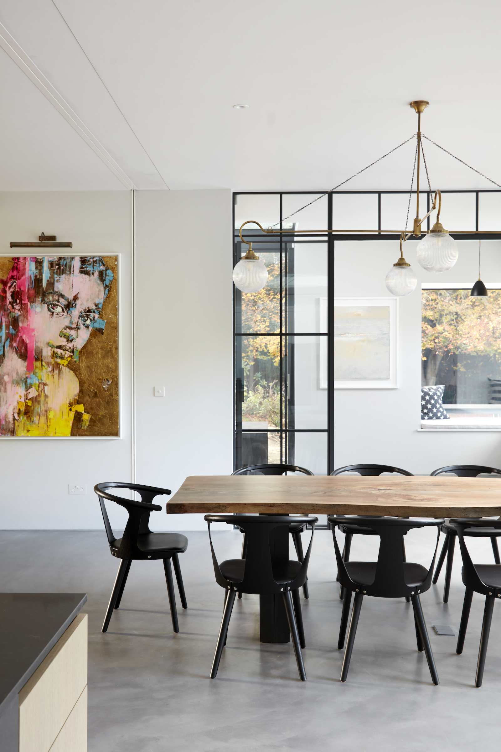
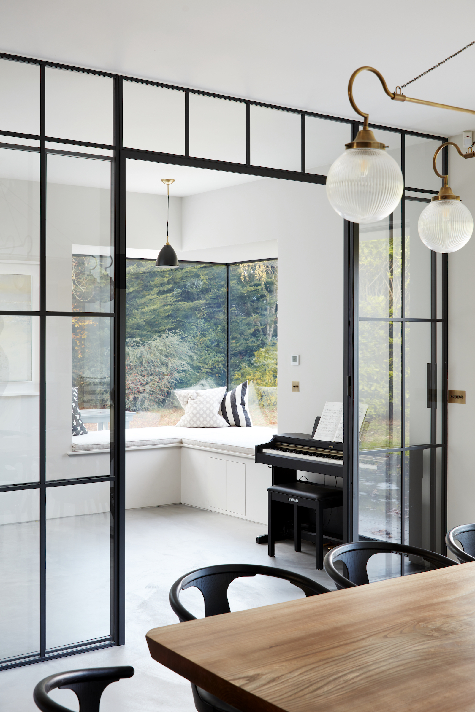
Crittall doors frame a light and bright reading room just behind the dining area.
Reading room
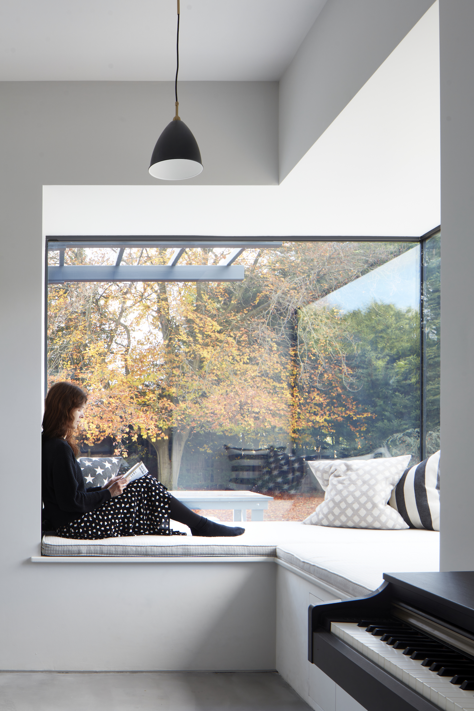
A Crittall partition separates the dining space from a cosy reading area with a built-in window seat.
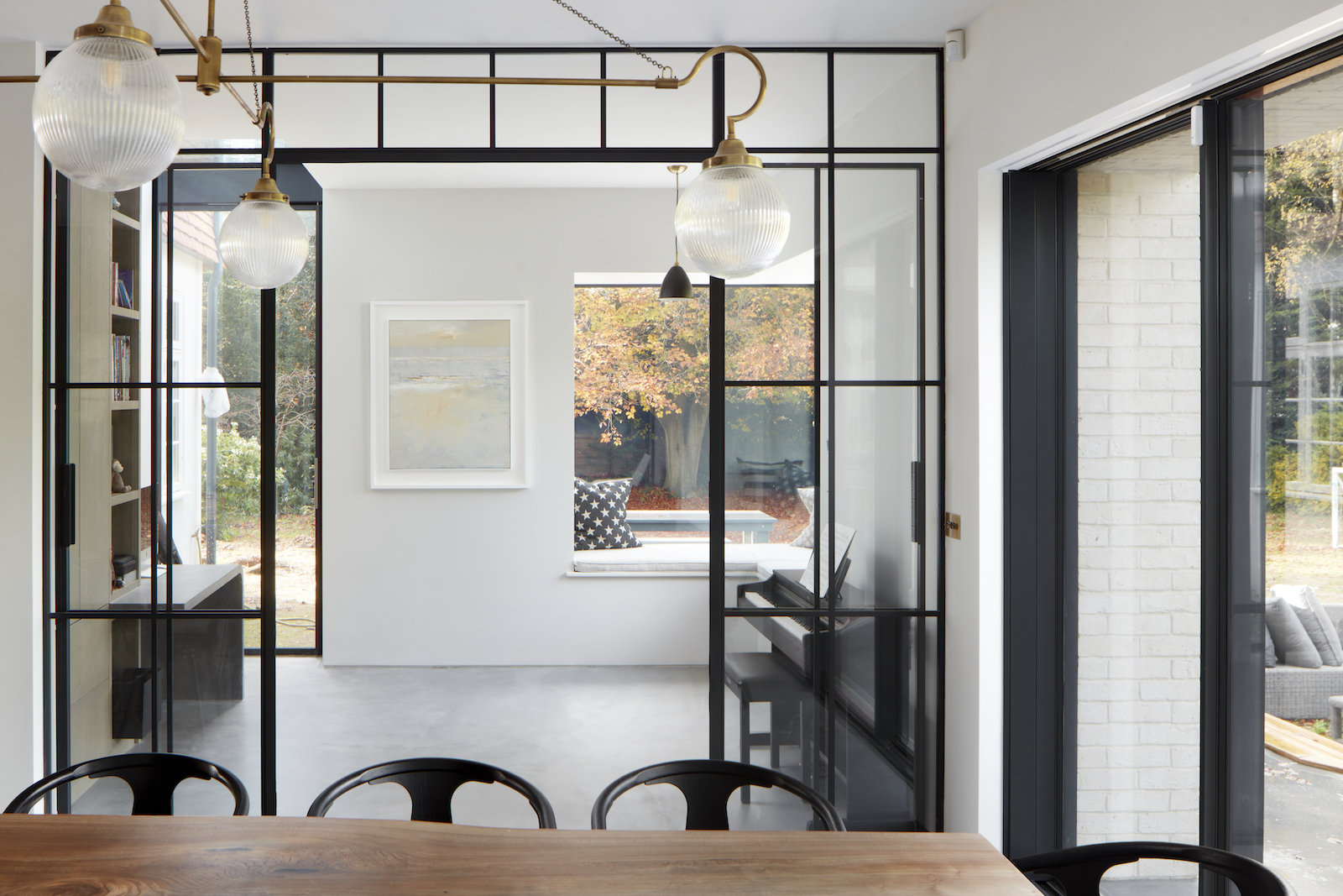
In this modern extension, large glazed openings and deep, integrated window seats result in an unmediated immersive connection to the garden.
Living room
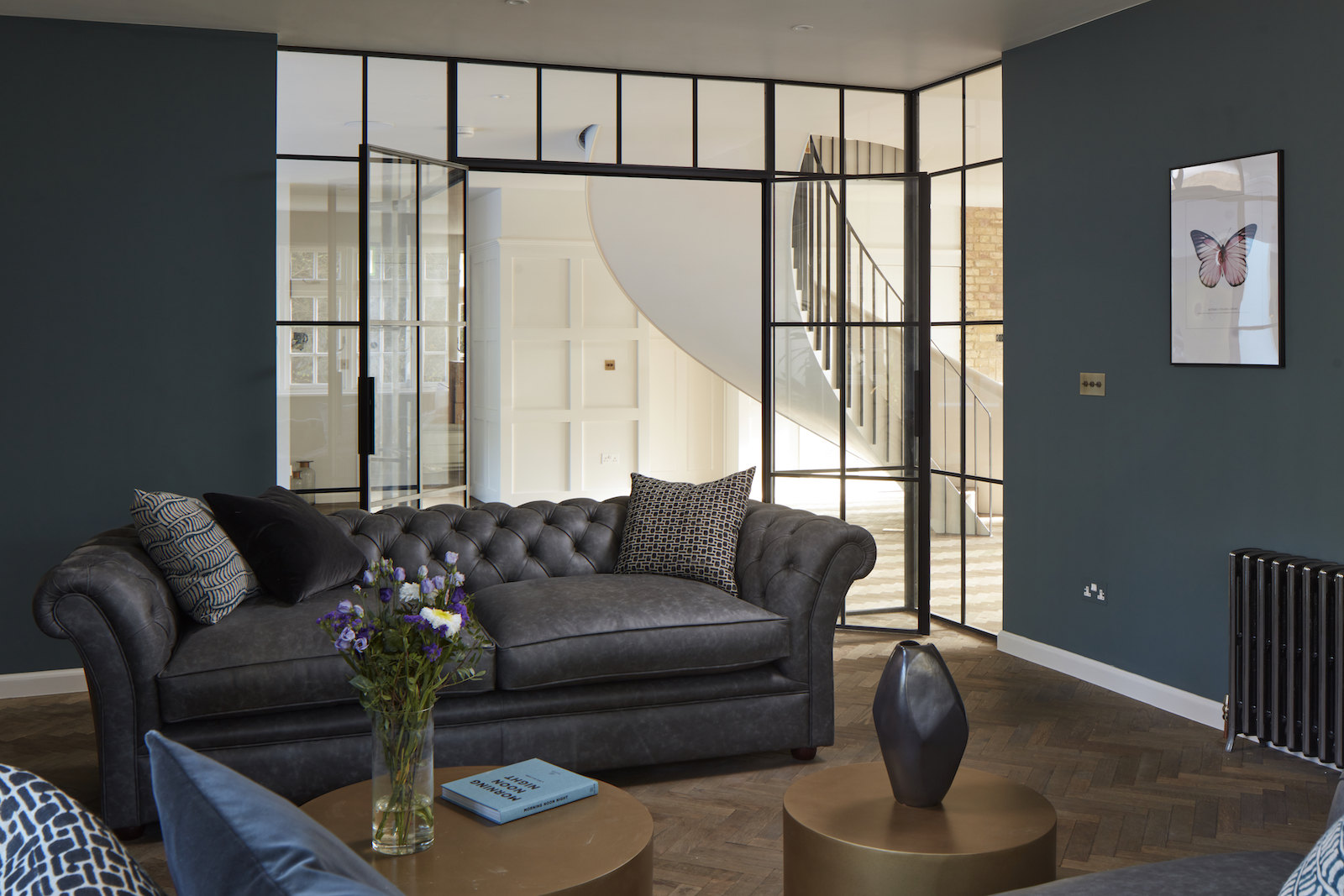
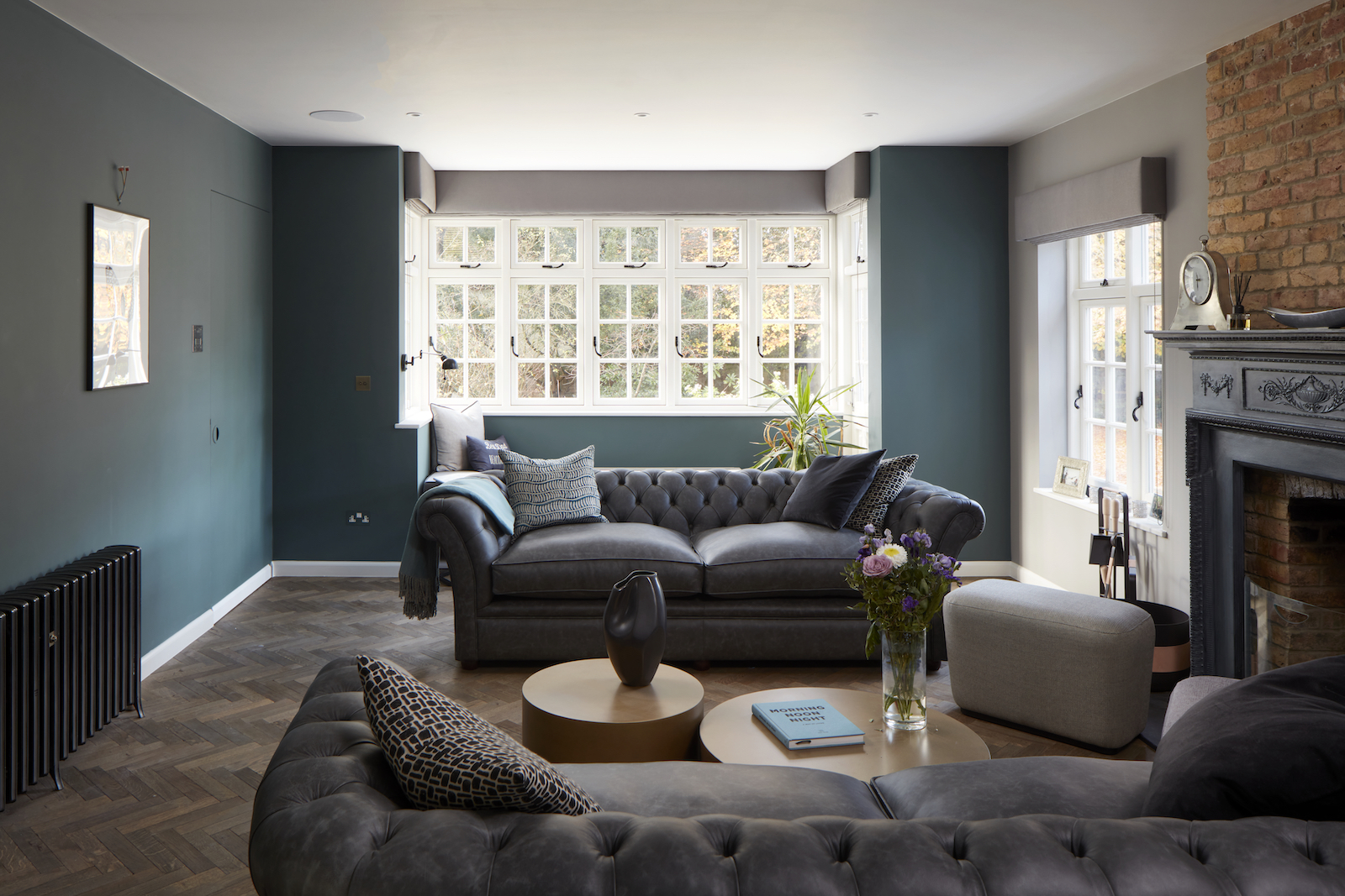
Near the main entrance is a dark living room, framed by a Crittall partition.
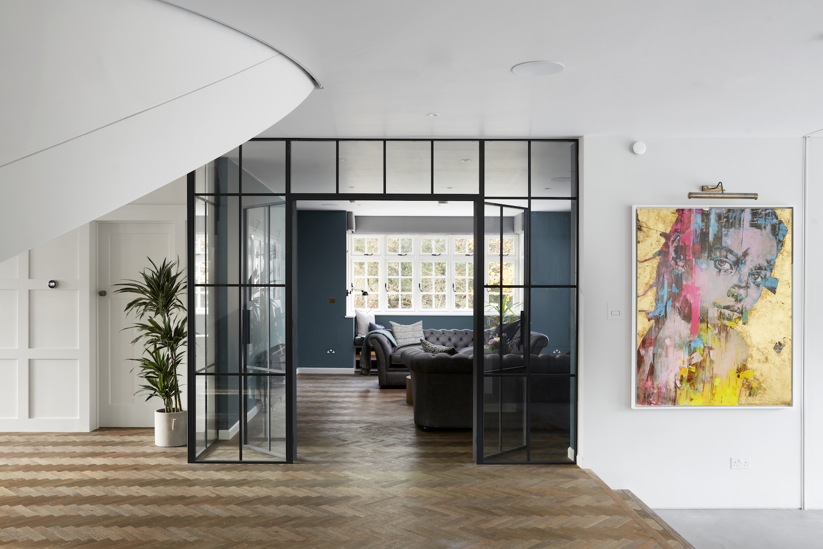
The dark walls make this a cosy, den-like space.
Boot room
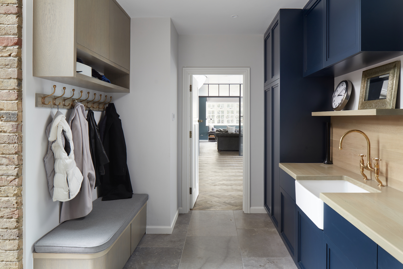
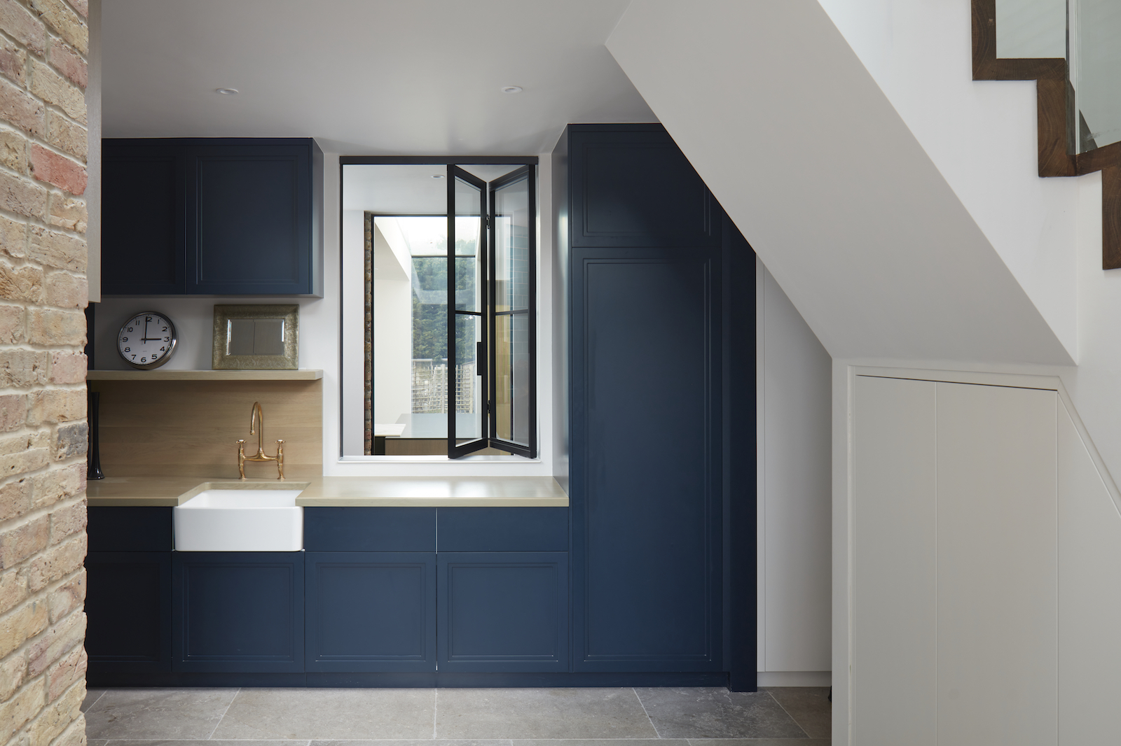
Across the entrance hall, directly opposite the dark living room is a handy laundry room / boot room. So on entering the home, you directly walk to the room on your left to remove coats, bags, shoes etc, and tidy away outdoor wear, keeping clutter out of the kitchen and living spaces.
Staircase
The modern staircase curls up to the first floor landing where there's a fireplace and window seats with views out the front of the house.
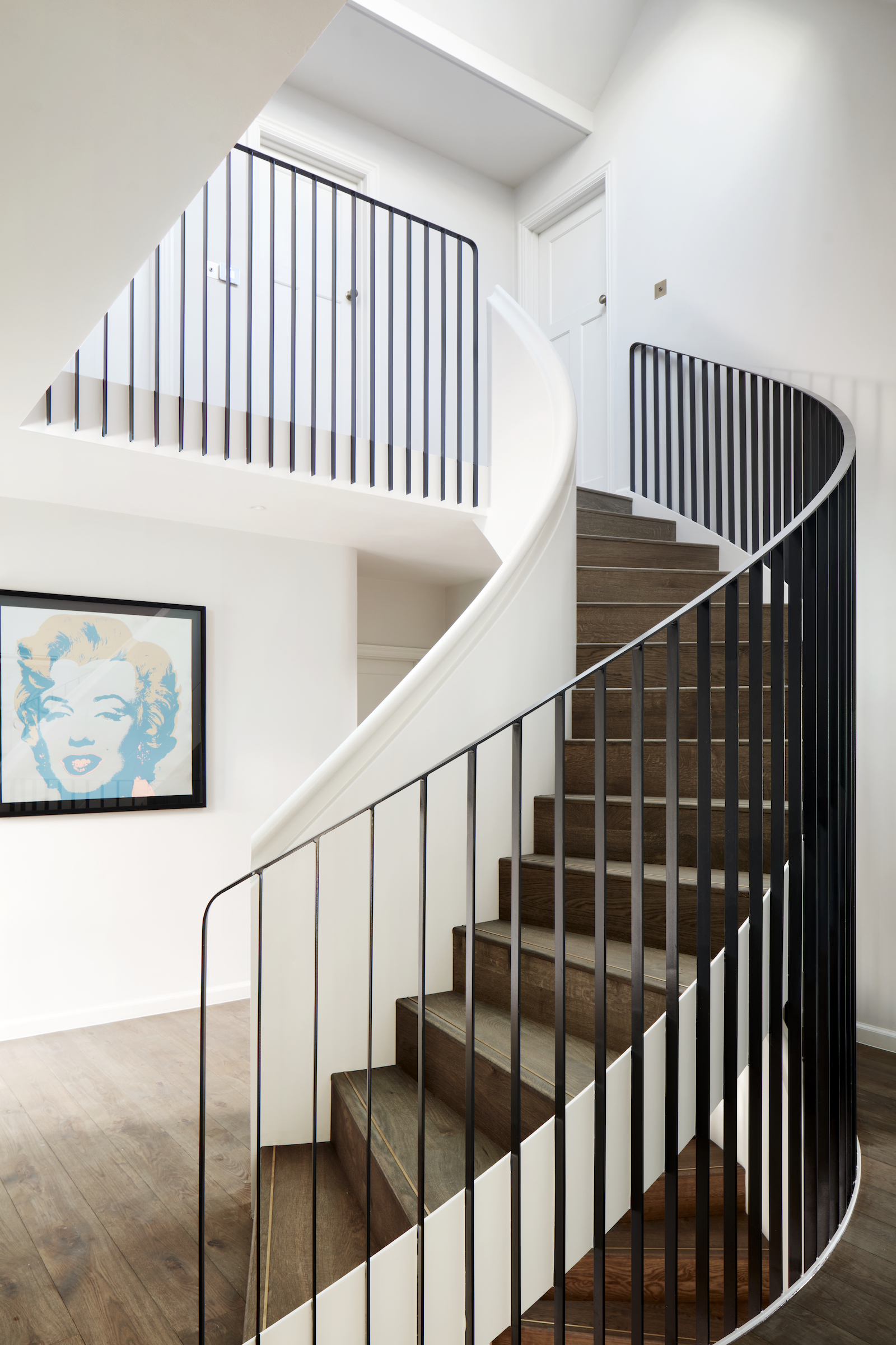
An identical staircase leads up to the top floor bedrooms.
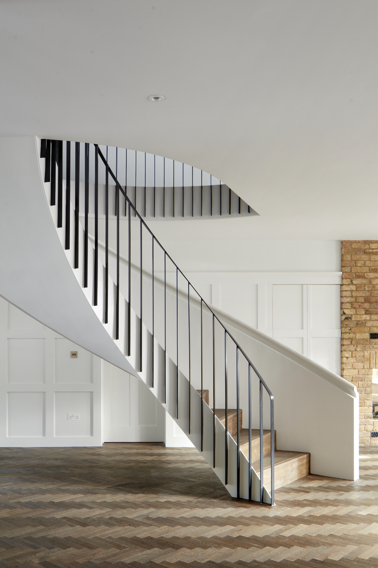
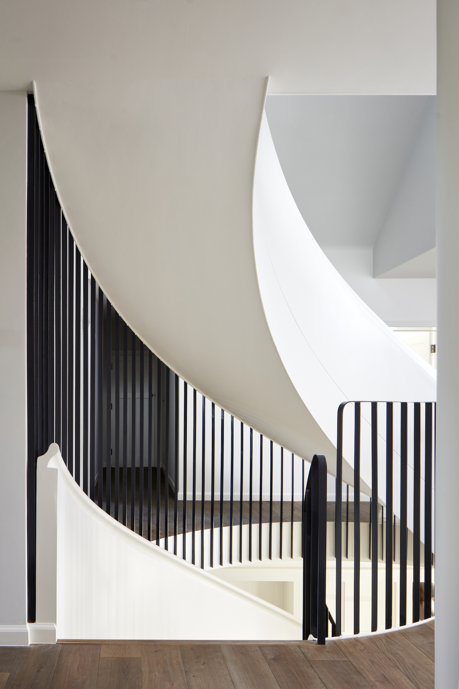
The bottom of the stairs is smooth, white and twisted like a piece of sculpture, while the banister stretches up to merge with the upper banister, creating a taller barrier for safety while also letting in plenty of light.
Family room
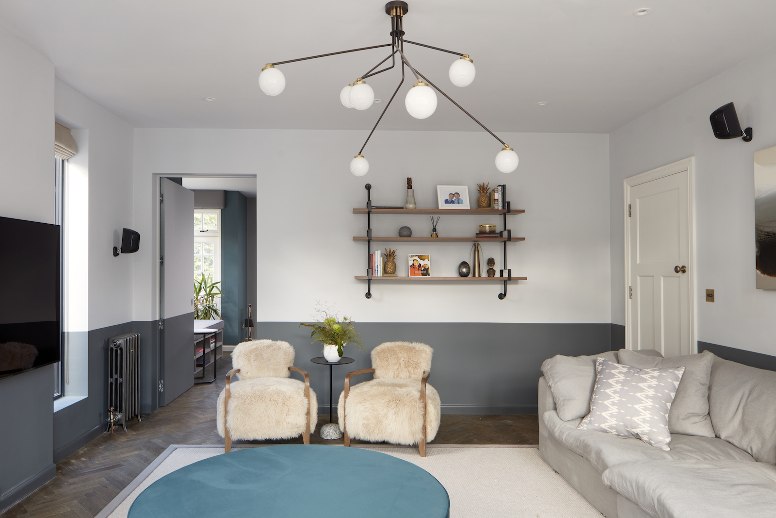
Upstairs there's a cosy, more relaxed family room for watching TV.
Master bedroom
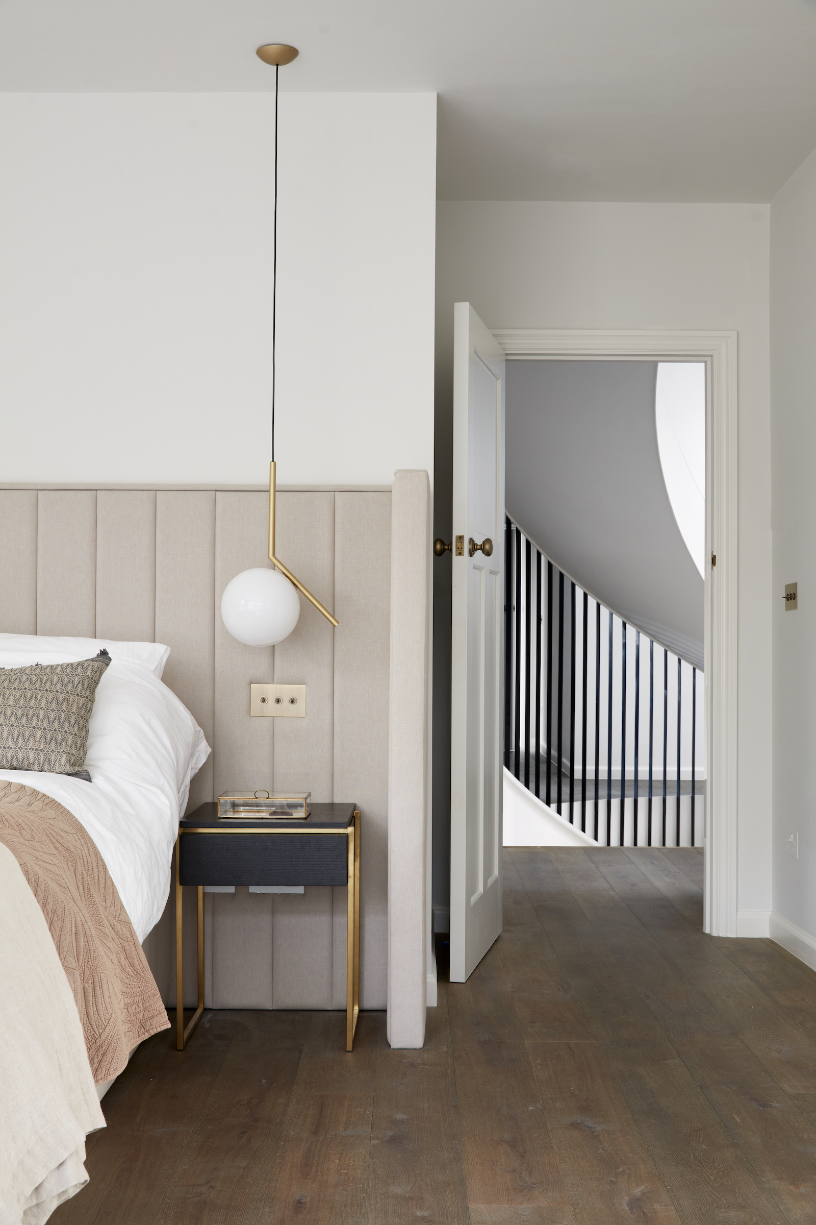
The master bedroom features striking headboard design that wraps around the bed. Modern bedroom lighting hangs down from the ceiling as bedside pendants.
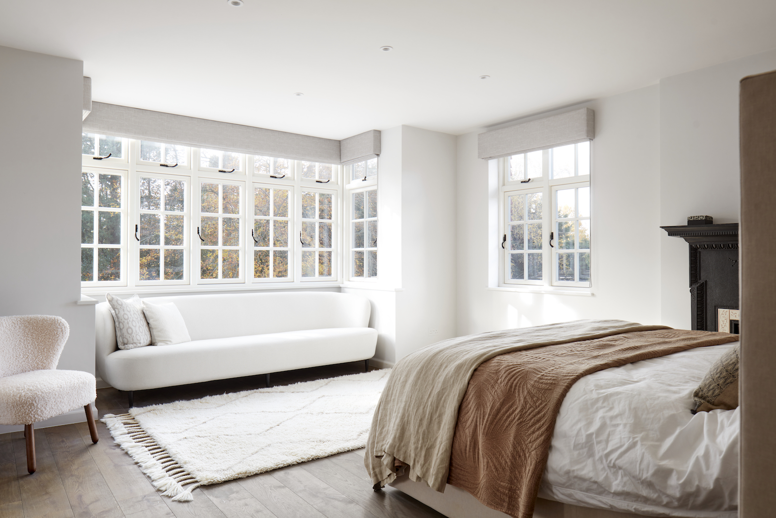
Lounge seating makes the most of the bay window area opposite the bed.
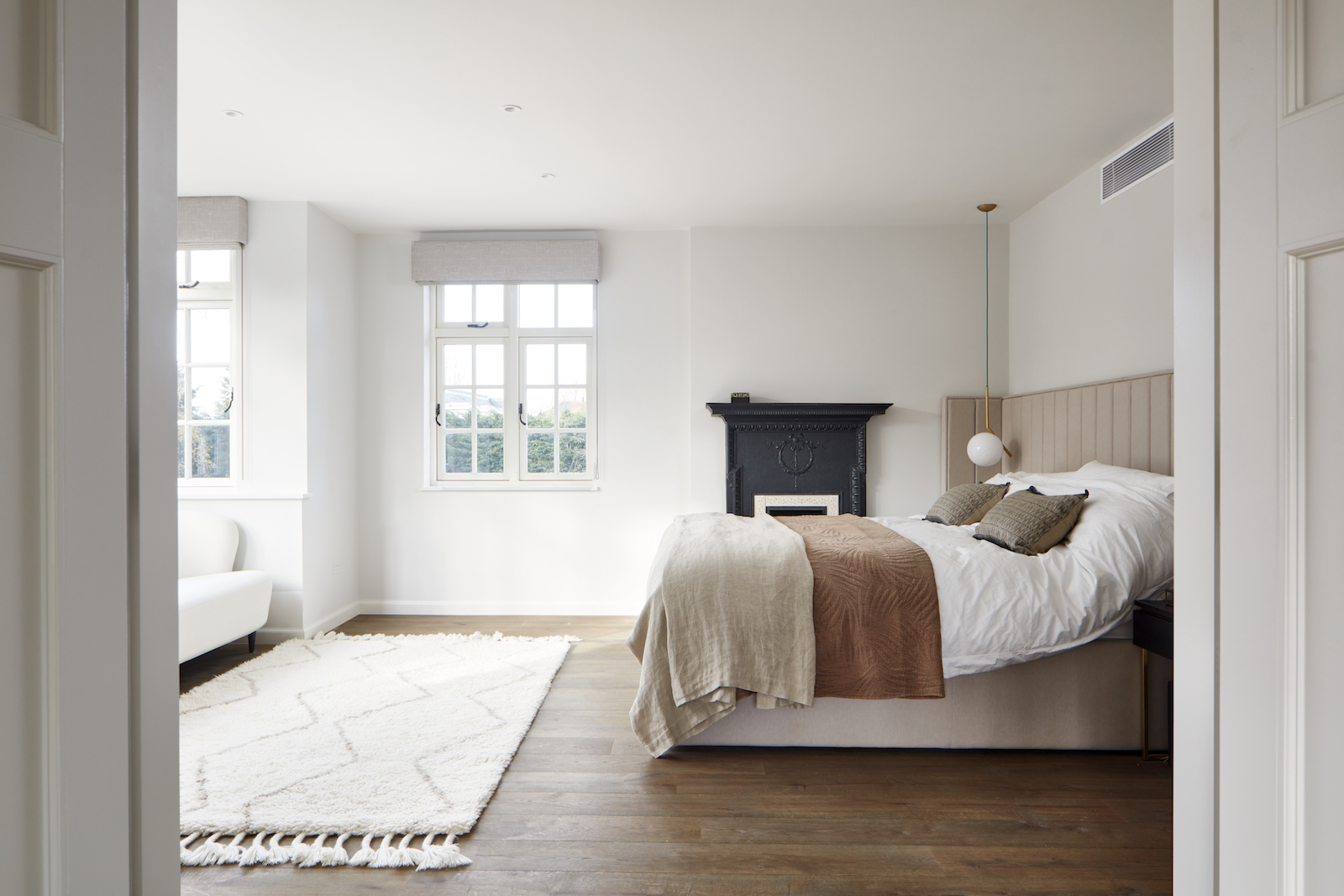
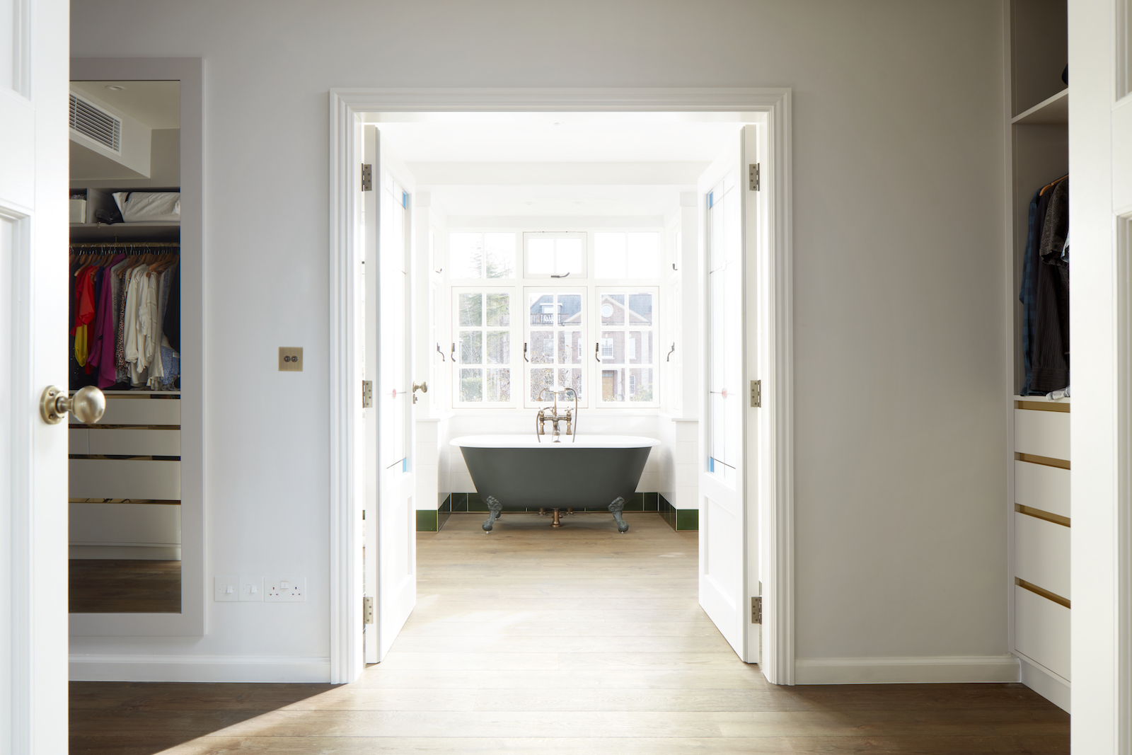
The bedroom leads through to a dressing room and a grand master bathroom.
Kids bedrooms
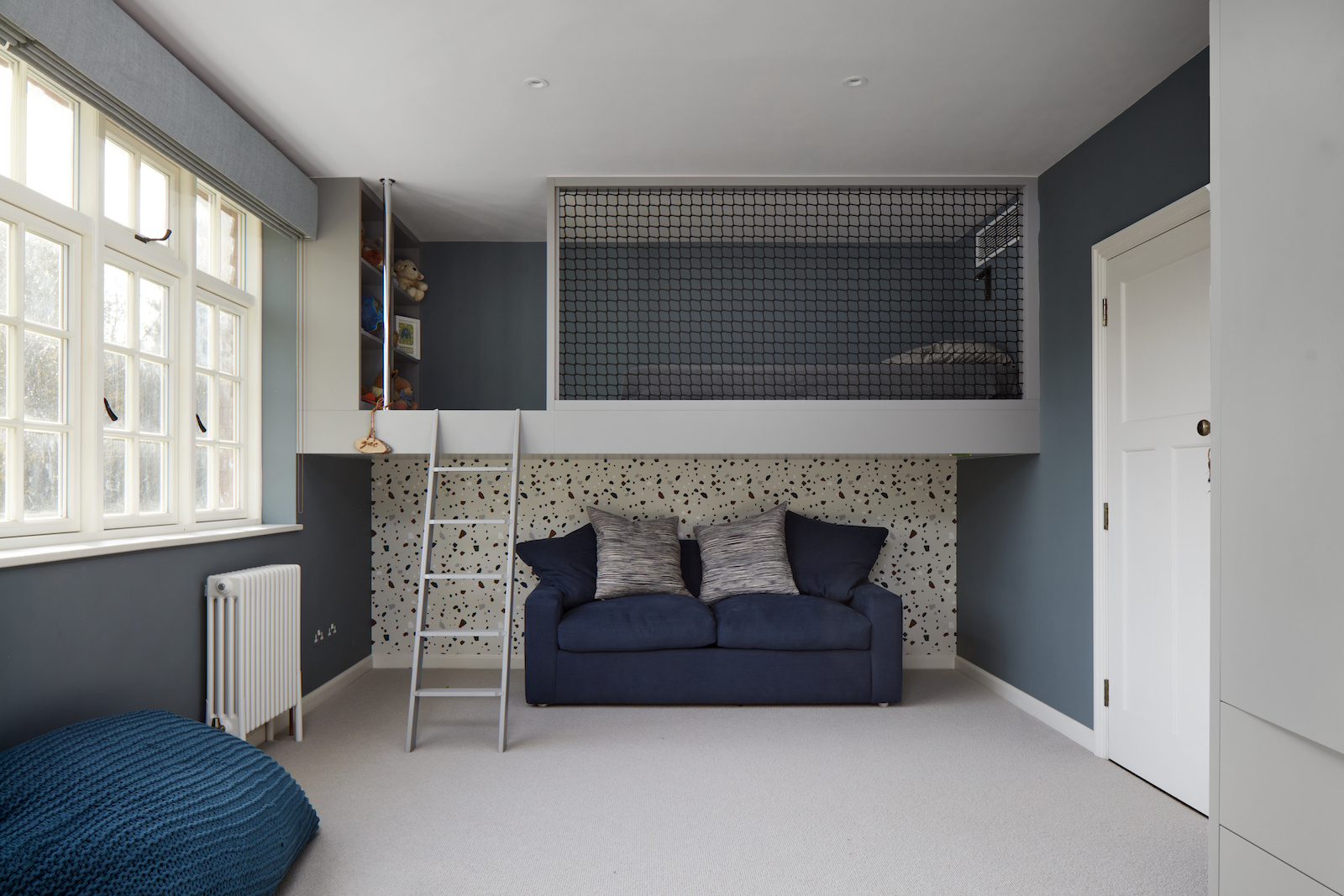
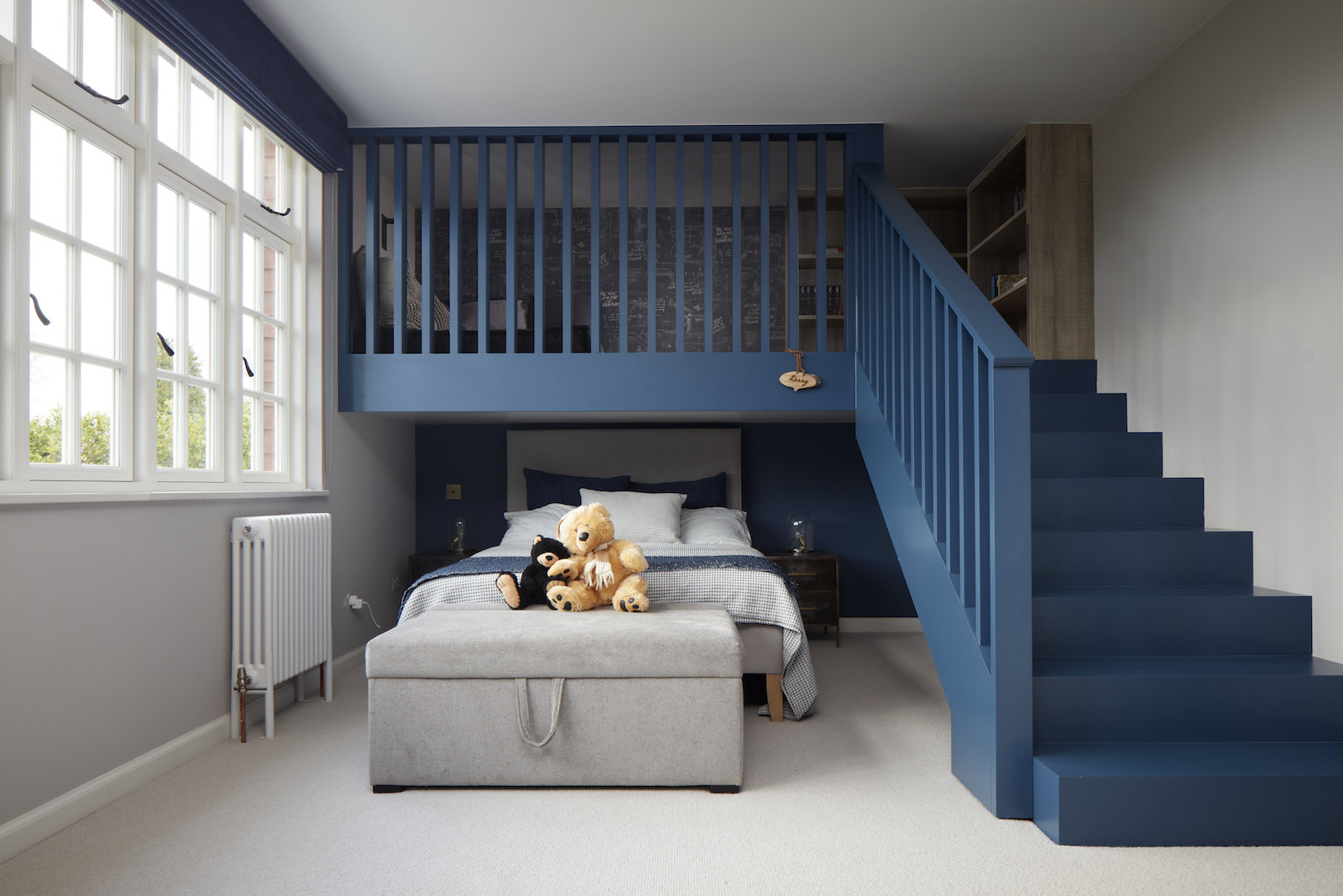
The kids' rooms both feature a blue colour palette and playful mezzanine levels. These spaces could double as a built-in bunk bed for sleepovers, and the mezzanine level creates extra floor space for toy storage, playing and doing homework.
Kids bathroom
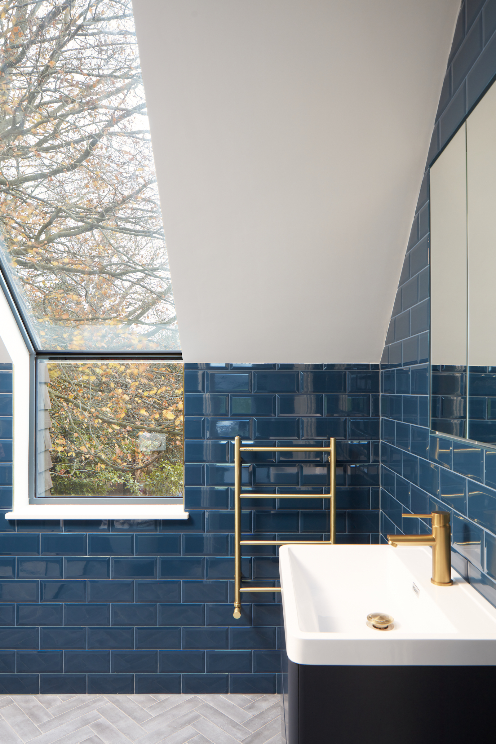
Following the blue theme, there's a blue metro tiled bathroom – a light space thanks to the skylight that slopes down and connects to the window, offering a long sight line into the garden.
Playroom
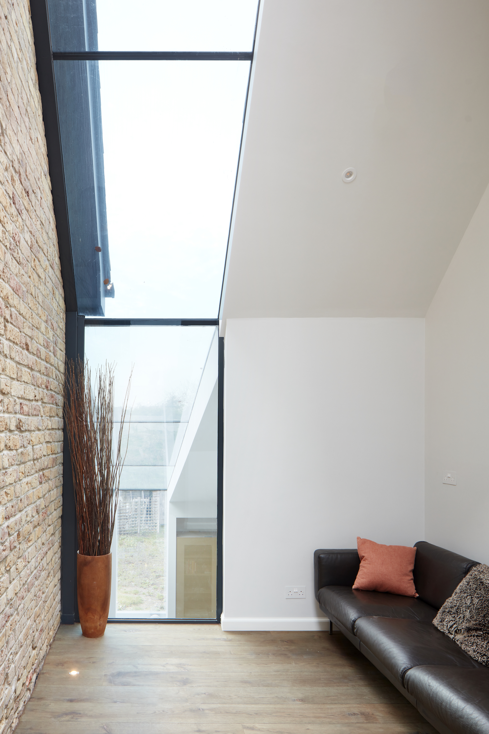
The side extension is more visible in the playroom, where the original exterior brick wall is still intact, and a long sky light offers views up to the roof, as well as down into the ground floor spaces.
The sloped skylight of this space continues down into the kitchen below, acting as the sloped skylight above the kitchen island – it's an impressive detail.
Loft
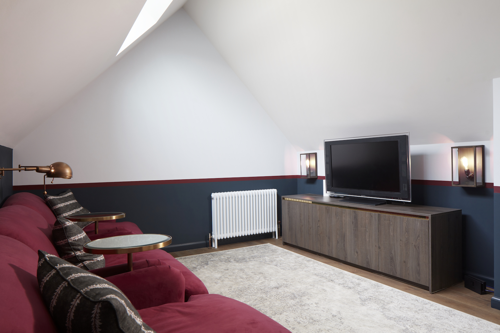
The loft conversion features a cosy TV area and a modern home gym.
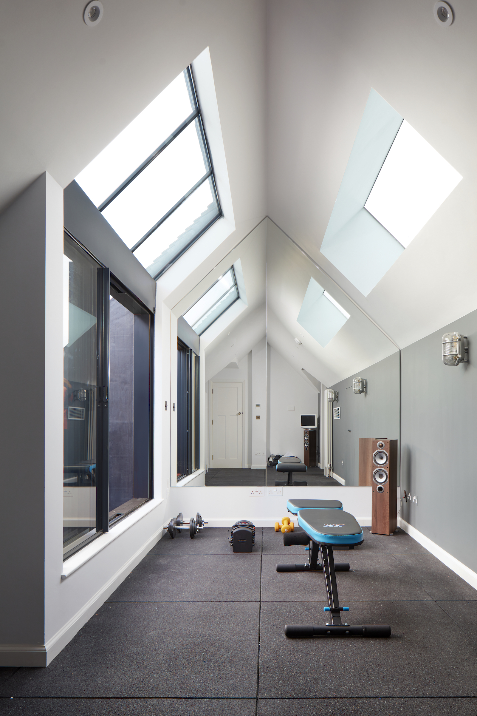
To keep the home gym a light, bright space, there are sky lights on both sloping ceilings, and the end wall is mirrored, bouncing light back into the room.
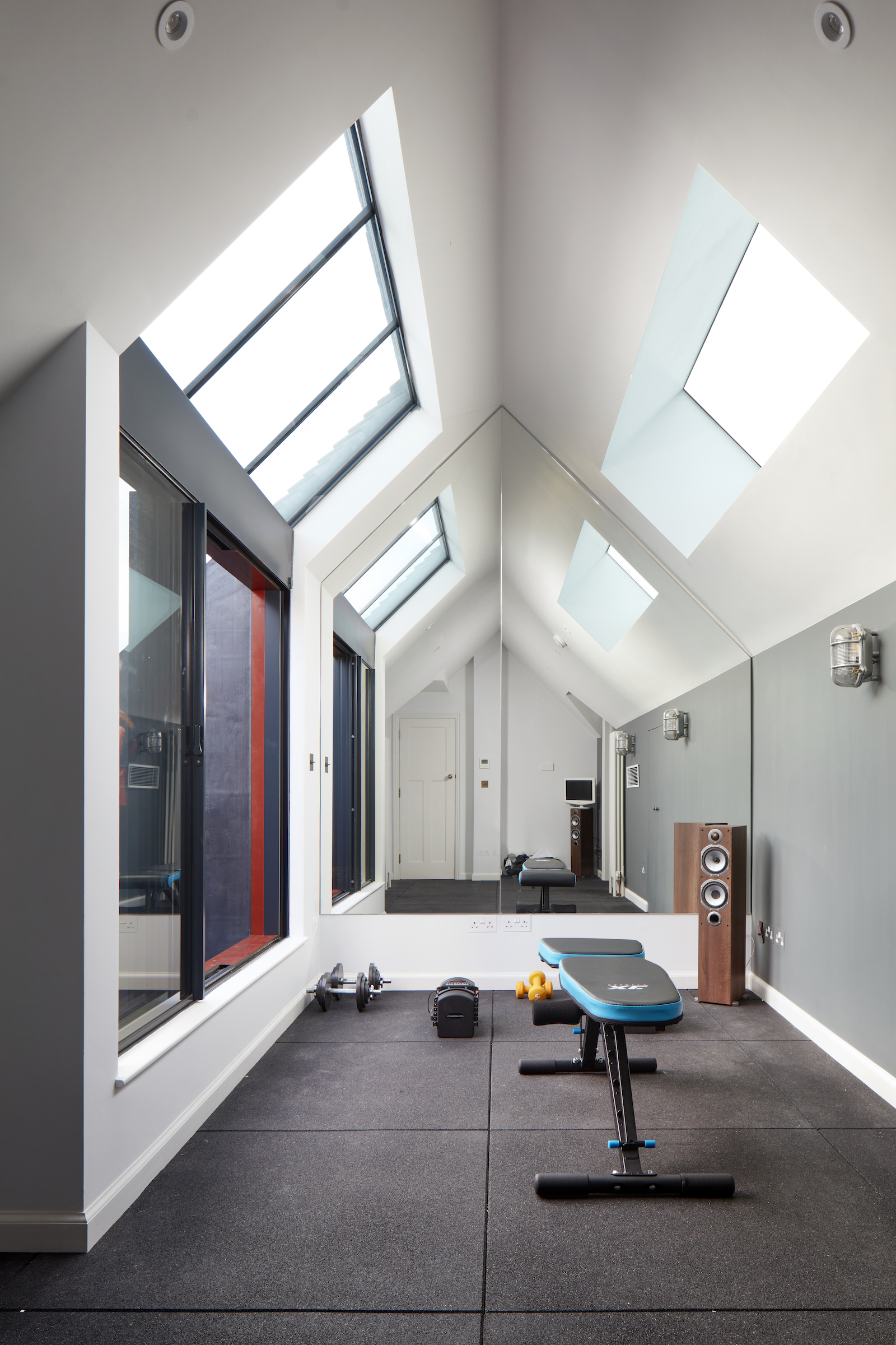
Sliding doors open onto a small balcony area, perfect for getting fresh air after exercise.
Architecture: Scenario Architecture
Interior Designer: Cherie Lee Interiors

Lotte is the former Digital Editor for Livingetc, having worked on the launch of the website. She has a background in online journalism and writing for SEO, with previous editor roles at Good Living, Good Housekeeping, Country & Townhouse, and BBC Good Food among others, as well as her own successful interiors blog. When she's not busy writing or tracking analytics, she's doing up houses, two of which have features in interior design magazines. She's just finished doing up her house in Wimbledon, and is eyeing up Bath for her next project.
-
 These 'Scenting Droplets' Might Be the Coolest (and Most Stylish) Way to Make Your Home Smell Amazing
If you're looking to switch out your incense sticks for something more fun, then you should know about Ripple+'s incense droplets. Let me introduce you.
By Amiya Baratan Published
-
 Lone Fox's Drew Michael Scott Drops a Vintage Capsule with Joon Loloi (And Some Seriously Good Tips For Thrifting Antiques)
Sourced straight from one of the world's biggest antique shows, Drew shares how to stay sane, cut through the noise, and score what you actually want
By Julia Demer Published