Every surface gleams in this incredible house which manages to feel like a luxury spa
Kingston Lafferty Design turned his house in Lovers' Walk, Ireland, into an opulent space where marble and polish take over every surface
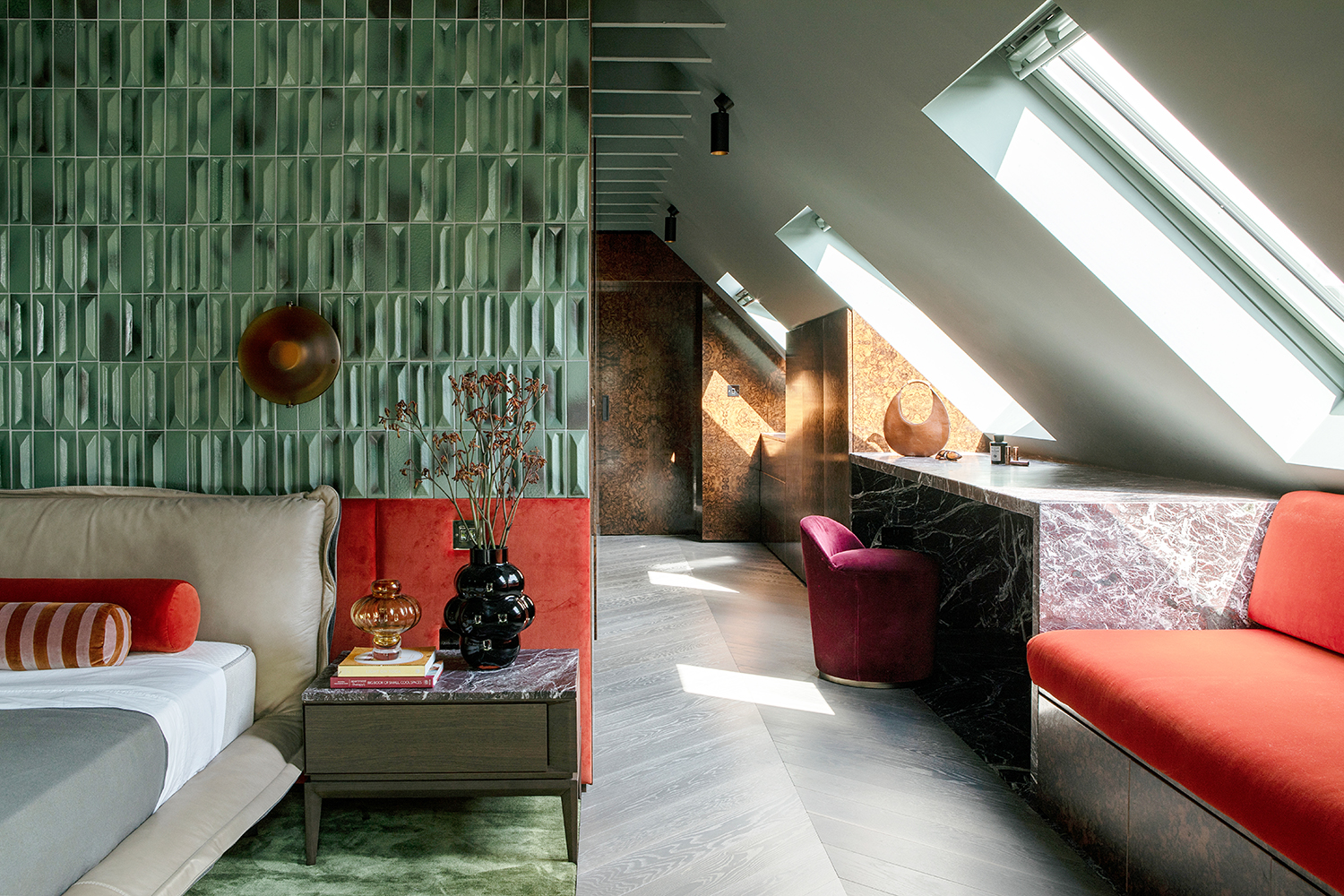
A 1940s-built home nestled into the cliffs of Cork, Ireland, Lover’s Walk is a pure, unadulterated opulence. Marbled surfaces, designer sofas and a feeling of utter luxury fills every space. But thanks to the clever design of Róisín Lafferty, founder of Kingston Lafferty Design, it still feels like somewhere you can take your shoes off, curl up, and relax.
‘The clients wanted to step outside their comfort zone with color and materials and create a unique family home that catered to the way they live and suited the context of the building and the location,' Róisín says of this beautiful modern home. 'We wanted to create an unexpected haven that transports the owners to another world, away from the hum drum of everyday life. A world that satisfies the senses, delights and excites and offers a playful, colourful and all-encompassing atmosphere to provide everyday happiness in.’
Kitchen
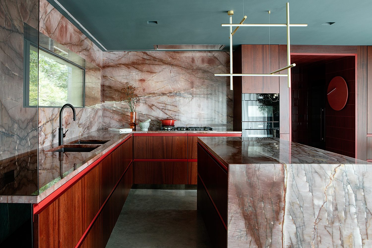
The modern kitchen, with its Cosmopolitan Quartzite stone counters and walls appears almost to have been carved out of the cliff face itself. ‘We wanted the stone to appear to have encompassed and grown from the space so designed it to encase the window reveals and wrap around the island, the veining and pattern continuing throughout,’ Róisín explains.
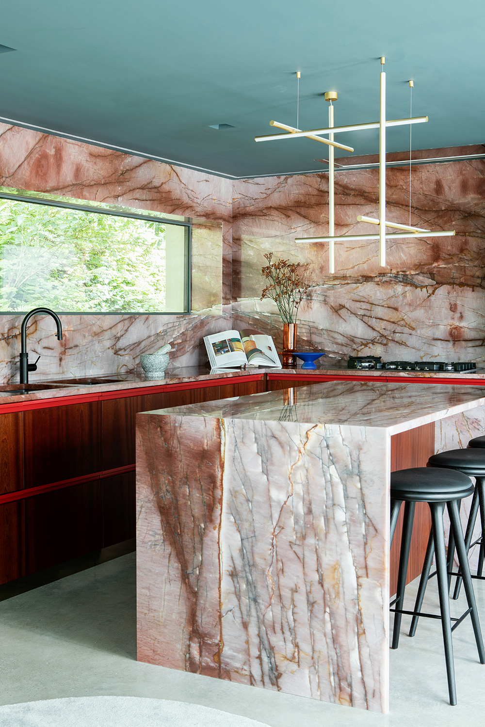
A polished concrete floor acts as a neutral foil for the extraordinary red tone of Cosmopolitan Quartzite on the kitchen island. The mahogany cabinets and red seams resonate with its rich hue.
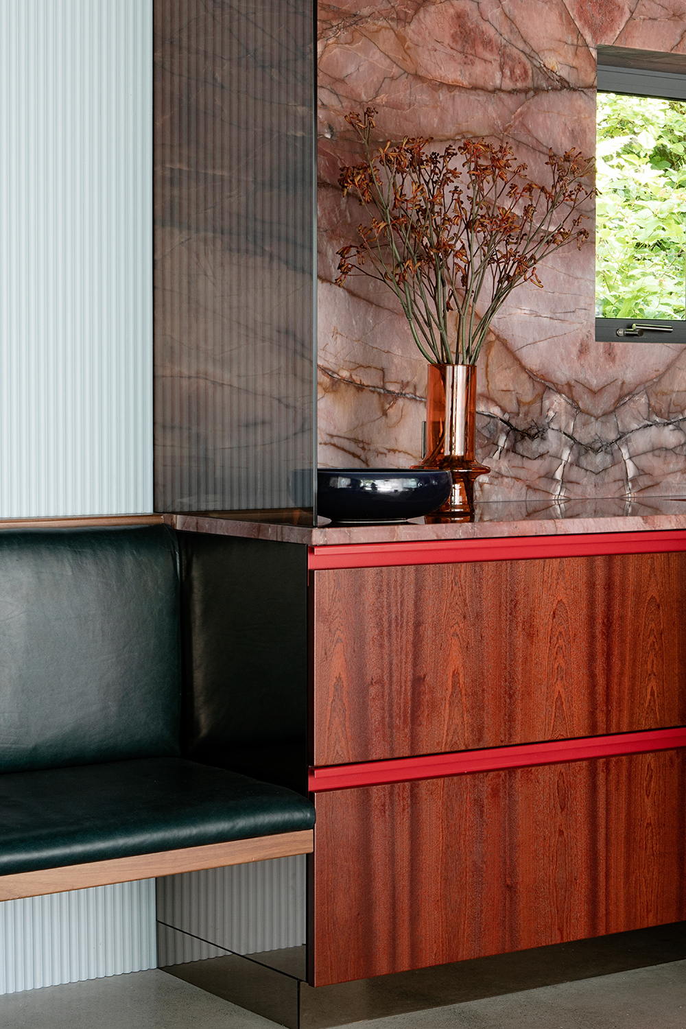
A smart way to add seating comes via this built-in bench. Cantilevered walnut and leather, it sits against a contrasting wall rod cladding painted in a soft baby blue.
Living room
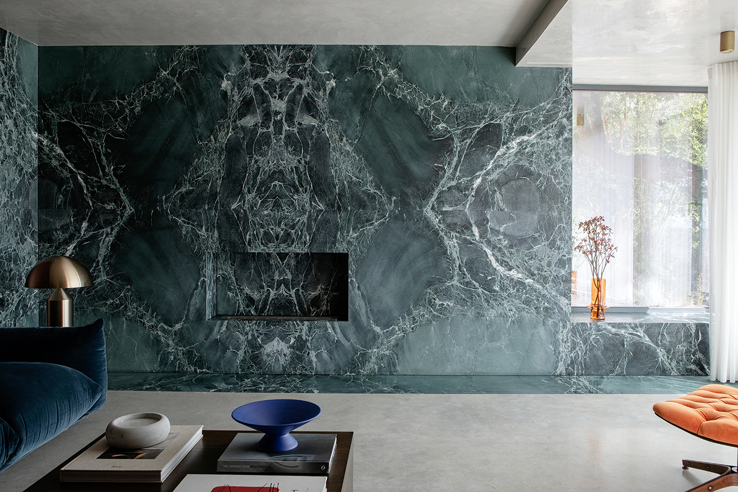
The old fireplace in the living room was removed and replaced with a bioethanol stove within a seamless wall of Verde Alpi marble. A plump low sofa invites relaxation. ‘There is a stylized and dramatic feel running through the home which the clients say provides a surprising sense of calm and homeliness. A wonderland to live in,’ says Róisín.
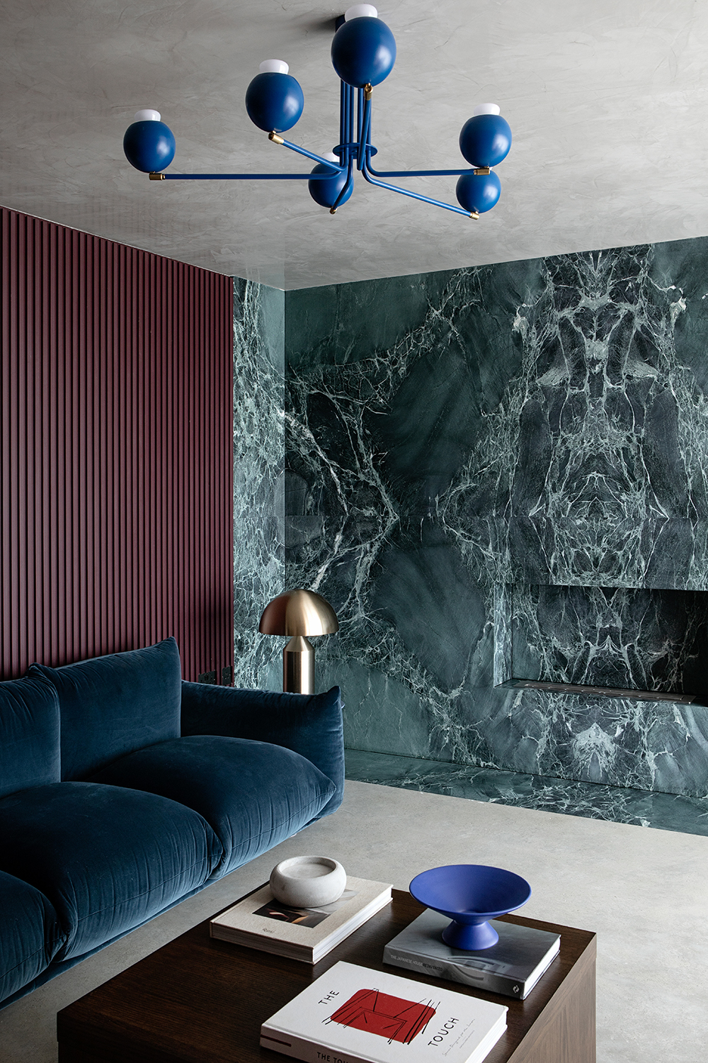
Each element of furniture and lighting was deliberately chosen both to be individually sculptural, balancing mid-century sophistication and elegance with bulbous and solid, organic forms. The contrast and color tones link all spaces together whilst all of the joinery seamlessly leads you room to room. It is a home with such intriguing materiality, such aesthetic conviction that it has a unique sense of home and is entirely a world of its own.
Be The First To Know
The Livingetc newsletters are your inside source for what’s shaping interiors now - and what’s next. Discover trend forecasts, smart style ideas, and curated shopping inspiration that brings design to life. Subscribe today and stay ahead of the curve.
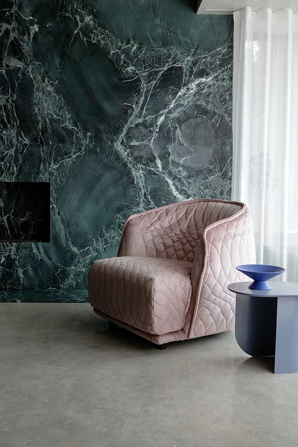
This bay window overlooks the city and has been deliberately reserved as a visually calm space. The restraint allows the armchair to pull focus.
Mr Chair by George Mulhauser from 1st Dibs.
Dining room
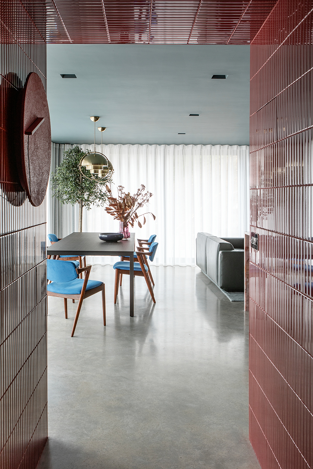
In the dining room, a sheer curtain covers two walls of glass that look over the backyard and creates diffused light and shadow.
Sheer fabric, Lizzo. Kai Kristiansen dining chairs in rosewood, reupholstered in vibrant blue Kvadrat fabric, sourced from 1st Dibs. Naan extending dining table by Cassina, available at Chaplins.
Main bedroom
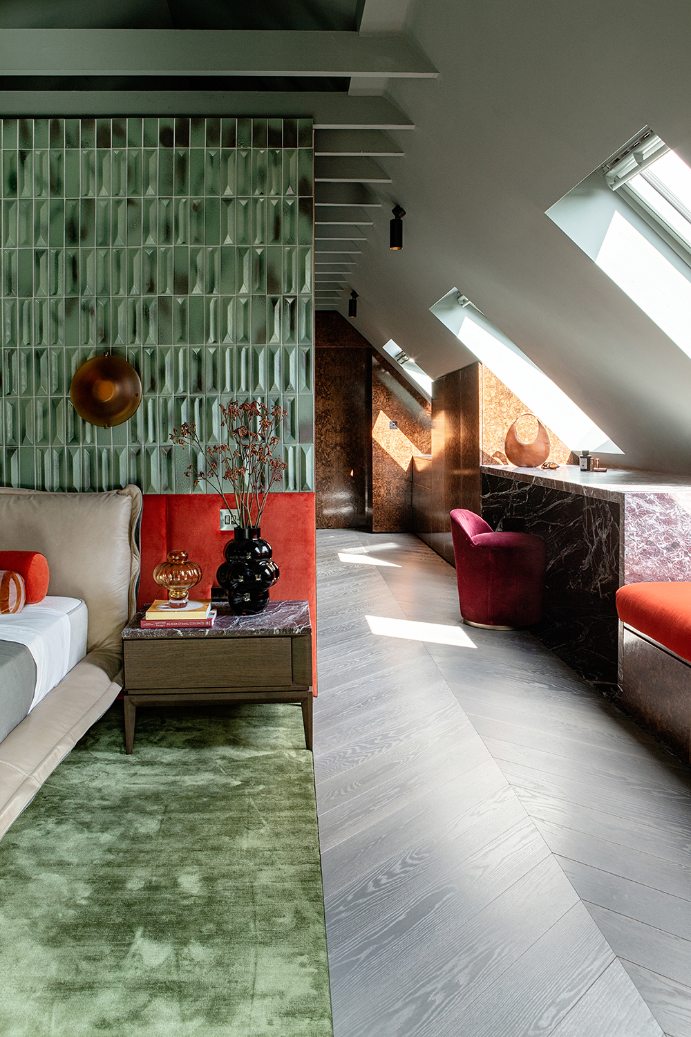
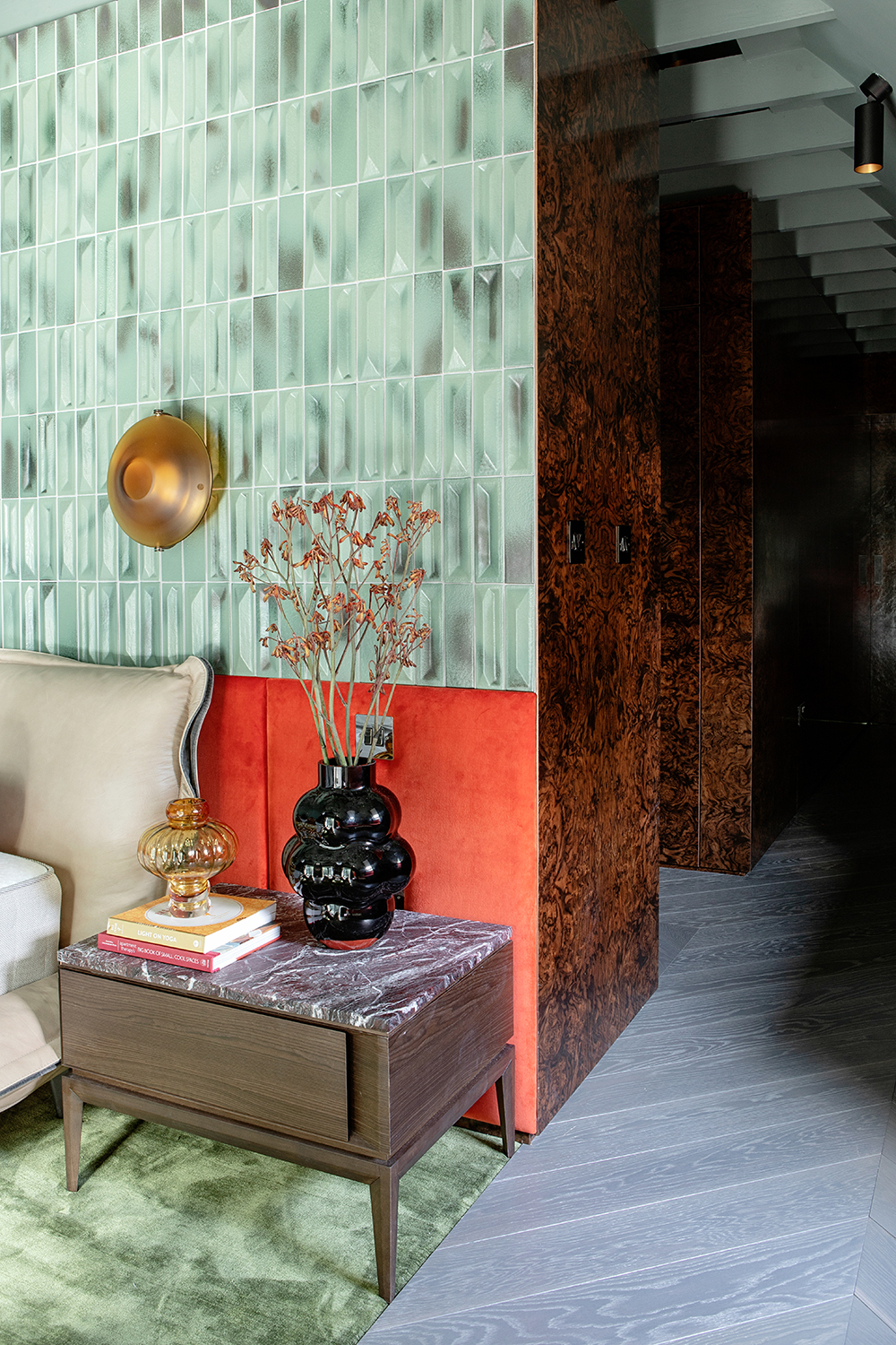
In the modern bedroom, Gio Ponti tiles change in tonality according to the light source. The client’s previous bed was absorbed into the upholstered headboard.
‘It’s a sensory space that wraps itself around you as soon as you step foot inside. When it came to specifying materials, it was all about balance, contrast and play,' says Róisín. 'The context of each setting and the location of each material used was hugely important to the tuning and creation of a unique harmony between natural and manmade, raw and polished, soft and hard and light and dark.’
Guest bedroom
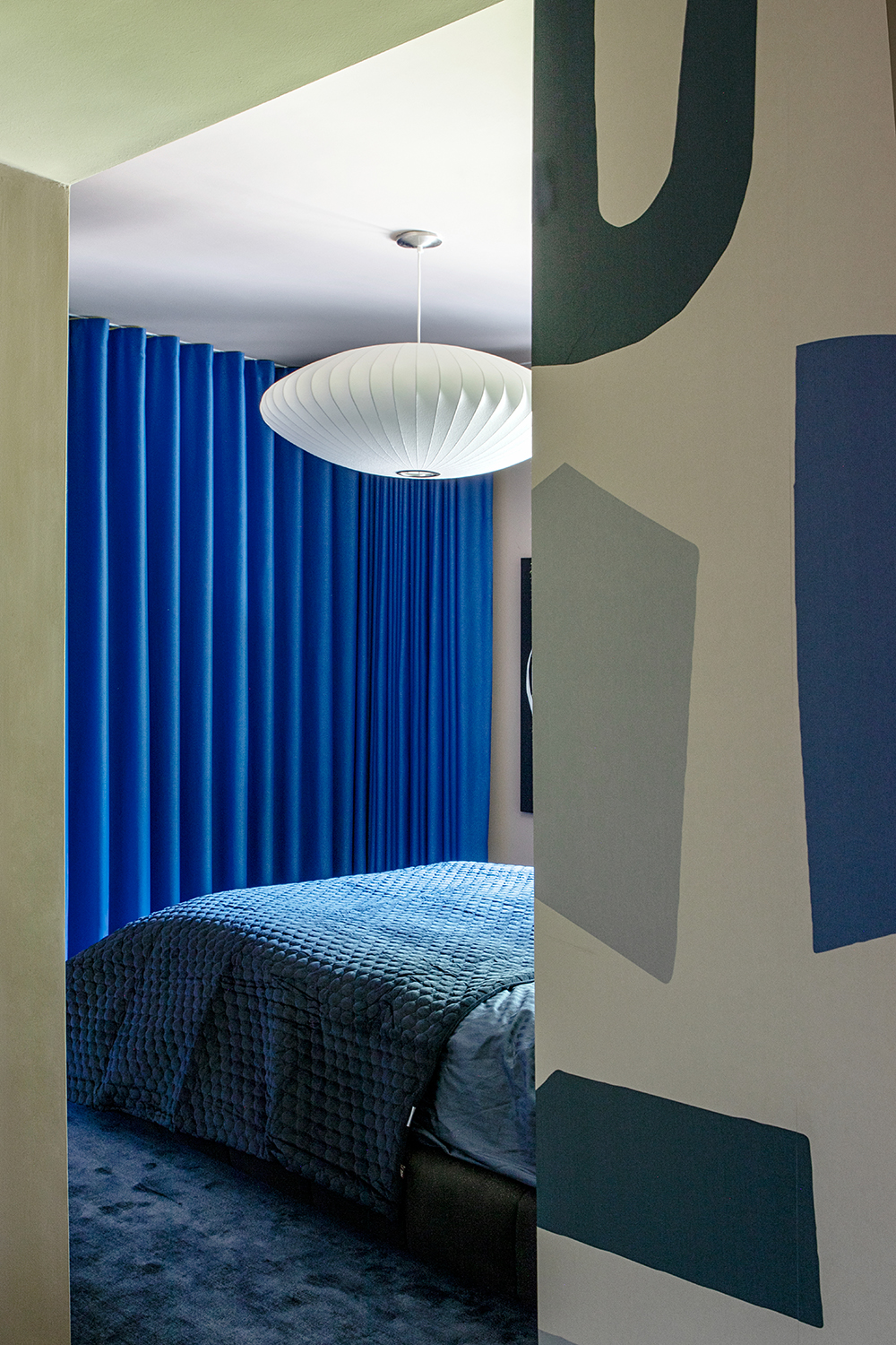
Any designer will tell you that the guest bedroom is an opportunity to have fun - people only sleep in it occasionally so you can go all out with the decor.
Here, the naïve colorful forms of this wallcovering strike an irreverent and playful note.
Bathroom
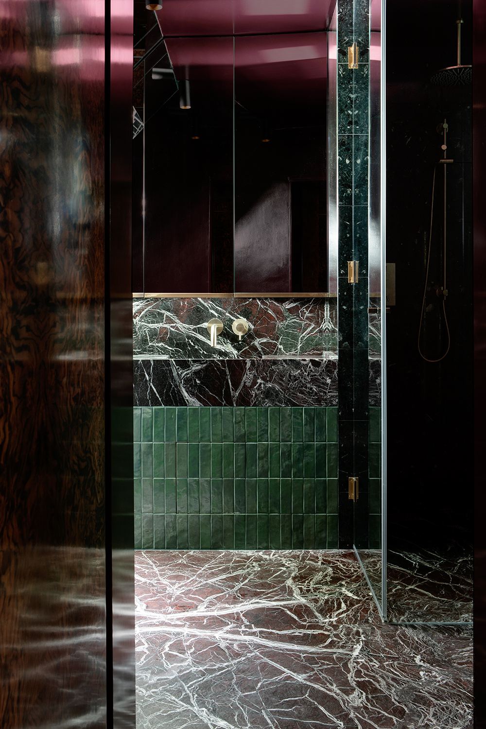
‘This is a project that is all about depth, richness, opulence, and detail,’ says Roisin, and the modern bathroom sums up this approach perfectly.
A seam of lights below the stone sink draws attention to the bottle green tiles. The small space has been maximised though mirrors.
Interiors and architecture writer Juliet Benning regularly writes for Livingetc and Homes and Gardens, as well as Grand Designs and Country Homes and Interiors. She was once the features editor of Homes and Gardens, and also contributes to 25 Beautiful Homes magazine.
-
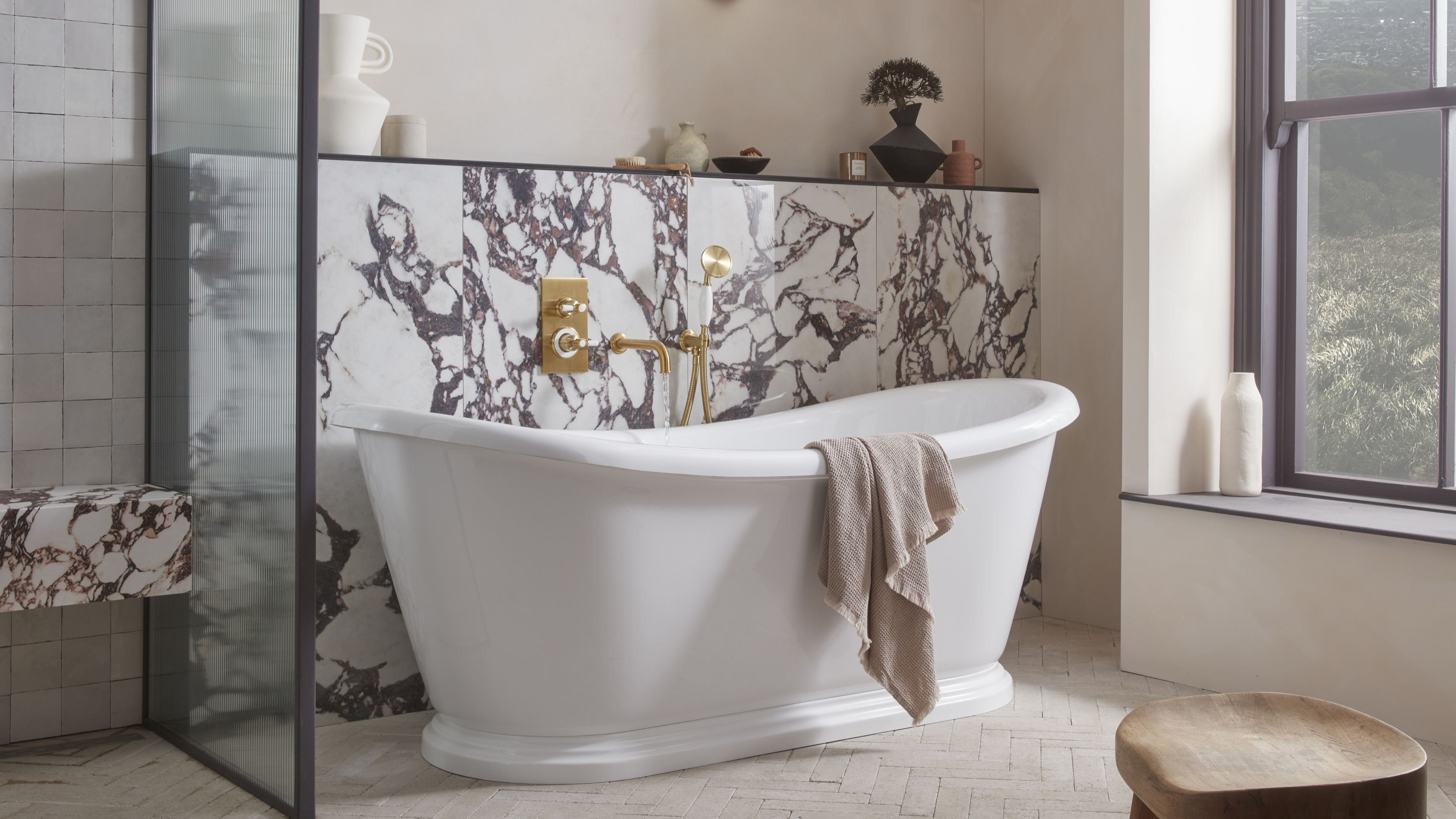 5 Bathroom Layouts That Look Dated in 2025 — Plus the Alternatives Designers Use Instead for a More Contemporary Space
For a bathroom that feels in line with the times, avoid these layouts and be more intentional with the placement and positioning of your features and fixtures
By Lilith Hudson Published
-
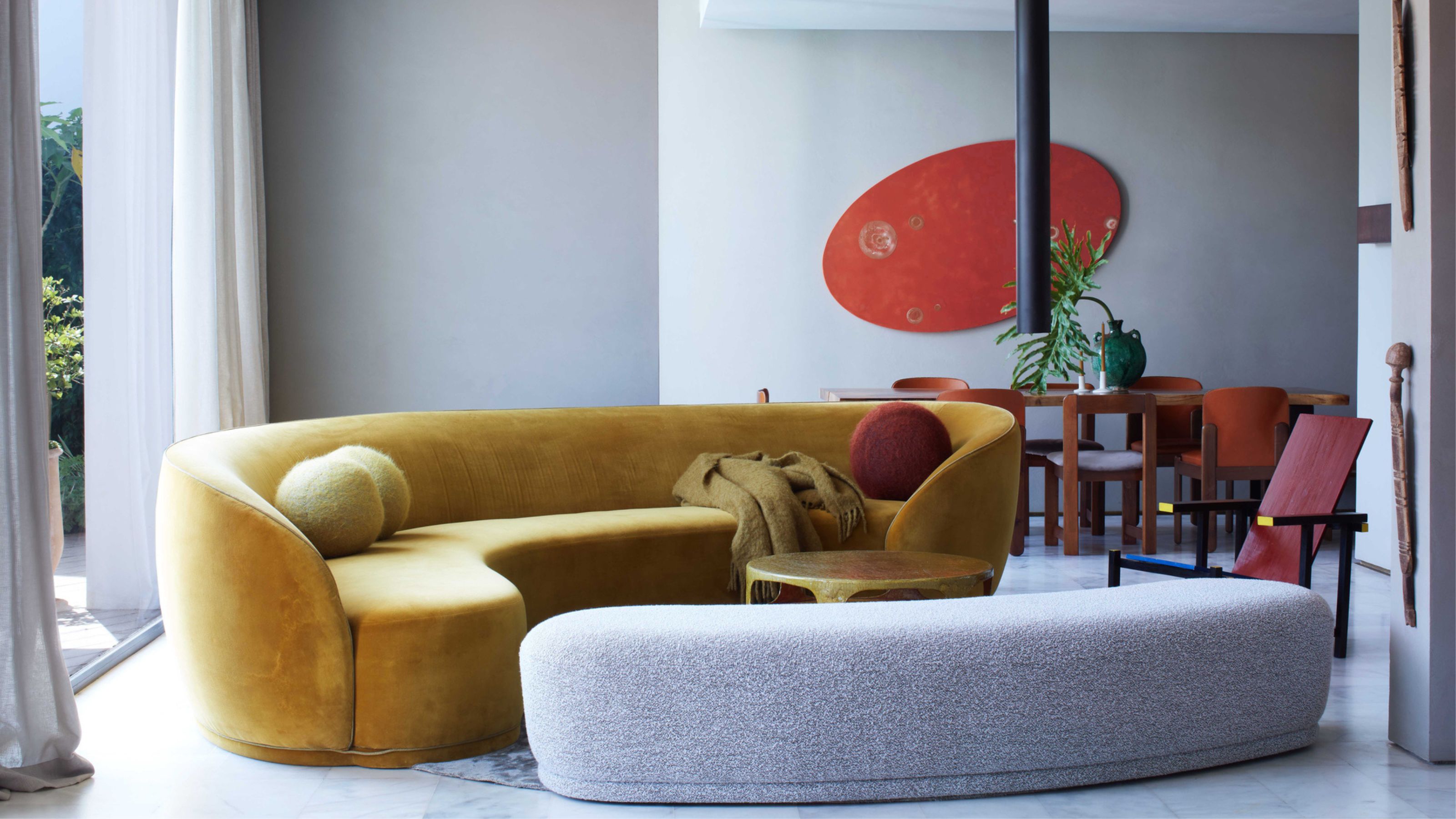 Why Decorating With Mustard Yellow Helps Fill Your Interiors With a Sense of "Confident Calm"
There is so much more to decorating with this turmeric-tinted sauce-wiggled-on-a-hotdog not-quite-yellow shade than meets the eye
By Amy Moorea Wong Published