This family home in Washington, D.C. is full of ideas to steal for displaying art in brilliantly personal ways
Designer Zoe Feldman has created a modern home full of contrast, clever color choices and inspiring ways to showcase art
'We wanted to transform the space into a happy, beautiful, and elevated place for entertaining through the use of color and pattern to create a beautiful , yet functional design,' says interior designer Zoe Feldman of Washington DC studio Zoe Feldman Design. 'As the owner, Susan, has kids and a dog.'
But this is no ordinary family home, where art is tacked up on the refrigerator and color choices are kept simple and liveable in case the dog shakes muddy water all over the walls. No, here the owner is Susan Tynan, founder of the online framing brand Framebridge, and like her business suggests, the emphasis is on display. That's bold colors, visual details picked out cleverly and daringly and, of course, an emphasis on art.
In fact, under Zoe's eye, the whole of this modern home feels like a work of art. The pink hall is just the perfect shade of rose petal, the dining room is richly navy. The pattern in the powder room is bold but beautiful, and works with the rest of the scheme. 'Our firm’s aesthetic is a modernized classicism influenced by art, fashion, architecture...and the homeowner's own individual style,' Zoe says. All of which comes into play in perfection here.
Kitchen
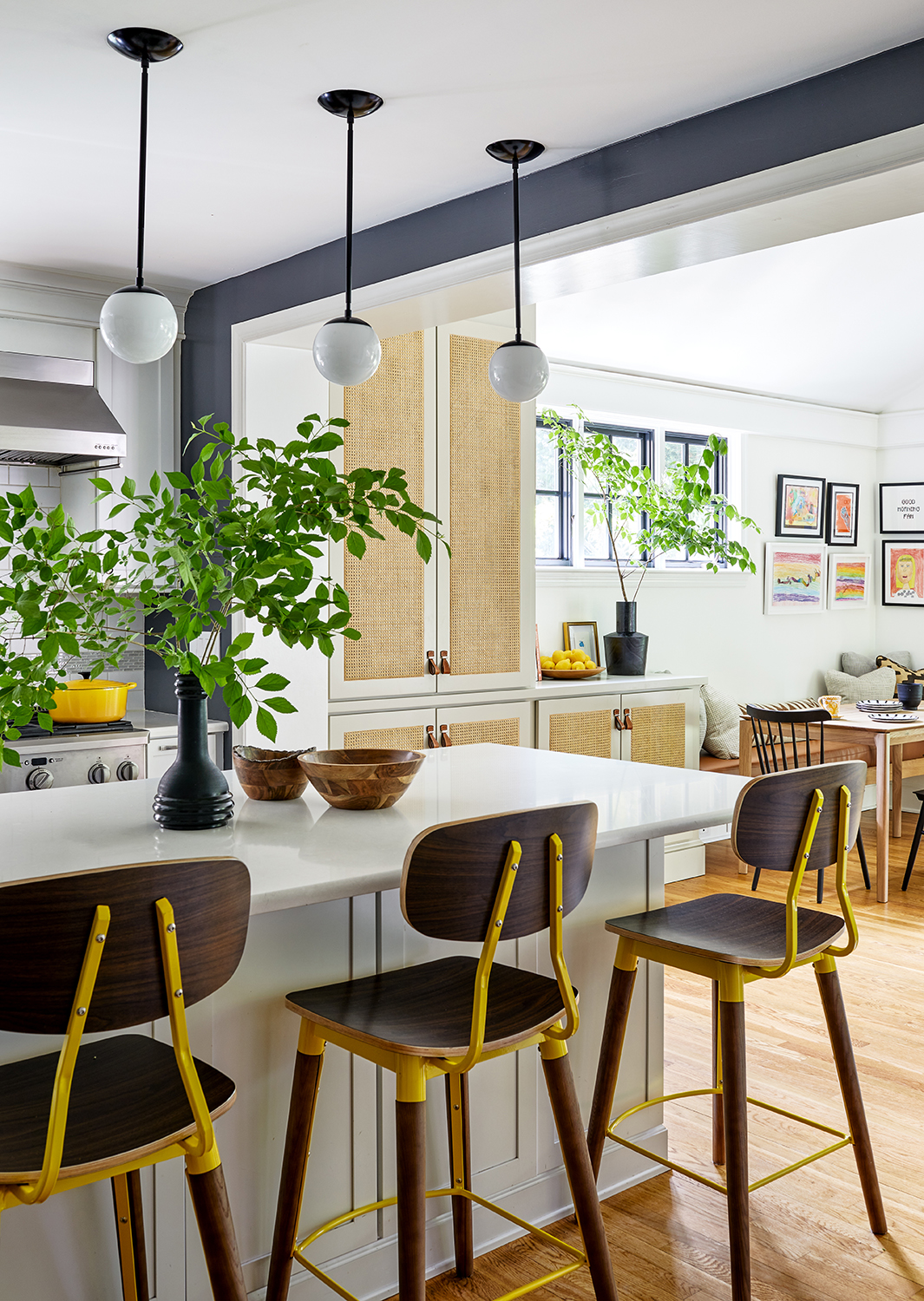
The modern kitchen itself is sleek, but the furnishings add just the right mix of materials and colors to lend an eclectic, vintage feel. 'This goes back to our emphasis on style mixing,' Zoe says. 'Kitchens experience a lot of wear and tear, especially with children, so finishes and furniture should be durable while still feeling like a part of the rest of the home.'
The space is a masterclass in how to add personality to a functional space, with the pops of yellow from the Industry West bar stool stealing focus in just the way you'd want them to.
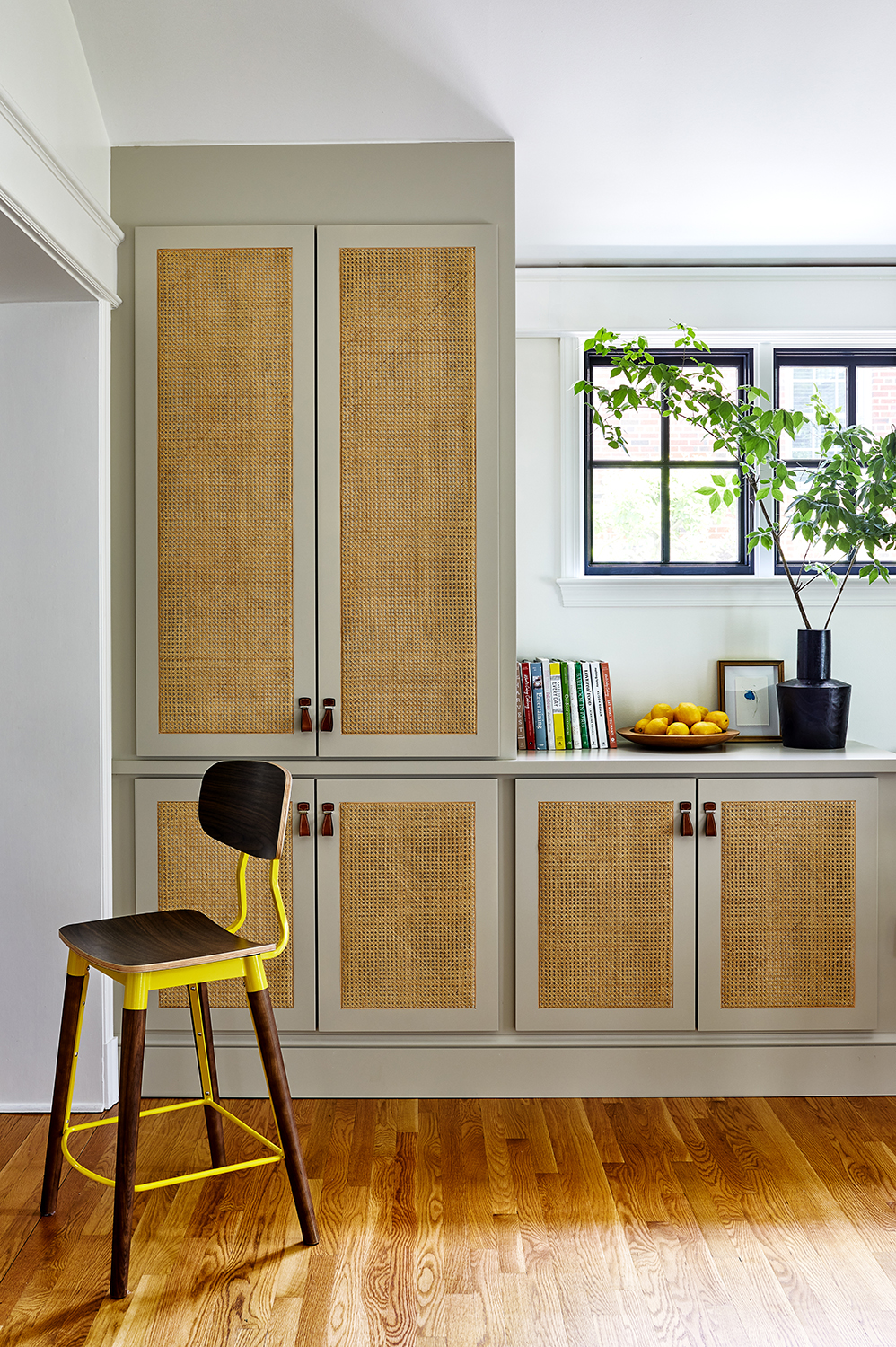
In any home, storage is key, but getting modern kitchen cabinets right is particularly key in a family home where every inch really counts. Here, the cupboards link the kitchen to the open plan family dining area, flowing around the window.
'Working in tight spaces in DC, we have become pros at problem solving the inevitable storage solutions that tighter spaces incur,' Zoe says. 'We have found that integrating closed storage in furniture and built-ins is a great way to keep clutter out of site and out of mind, without sacrificing organization.'
Be The First To Know
The Livingetc newsletters are your inside source for what’s shaping interiors now - and what’s next. Discover trend forecasts, smart style ideas, and curated shopping inspiration that brings design to life. Subscribe today and stay ahead of the curve.
Family dining area
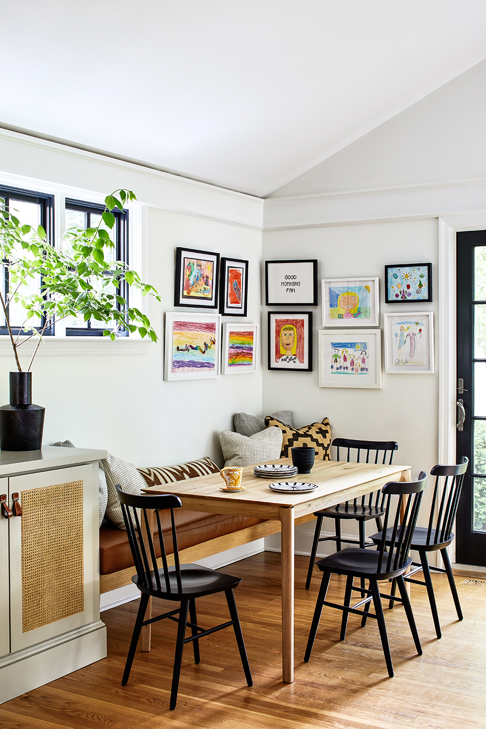
With the homeowner Susan having set up Framebridge, there was always going to be some clever gallery wall ideas to steal. And here, the art helps to differentiate between the dining area and open plan kitchen, creating a cozy corner that feels slightly enclosed.
'The closely hung art gives a “bulletin board,” spontaneous feel without the mess,' says Zoe, offering a perfect solution for how to deal with all those masterpieces kids create. 'This area showcases lots of kids’ artwork and is extremely colorful, so the slim black frames tie everything together. We typically like to go with two to three inches of space between frames when clustering frames in tighter areas to keep the layout consolidated without feeling too cluttered.'
As the perfect backdrop to all that art, it had to be Benjamin Moore's Simply White., one of the most versatile and best white paints for interior walls.
Entryway
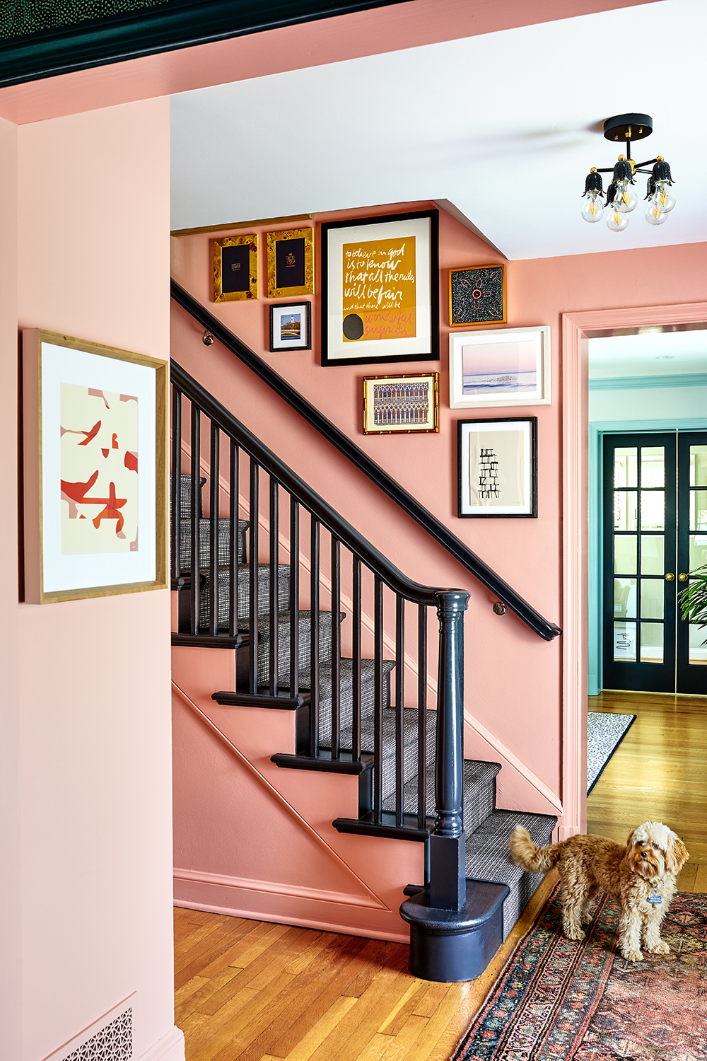
The entryway is another spot in the house to showcase Susan's art. And while the pink paint is such an obvious neutral on which to hang some framing, it still works as a considered background.
'We chose Benjamin Moore's Georgia Peach because it showcases the art so beautifully and creates such a powerful and impactful moment when you walk in teh house,' Zoe says. 'It feels really fresh, but also classic. It’s amazing what a great background it is for all of the frames!'
The interior door casings are the same color in a semi-gloss finish, while black - as one of the most modern colors that goes with pink - for the stairs and stair rail makes a brilliantly striking choice.
Living room

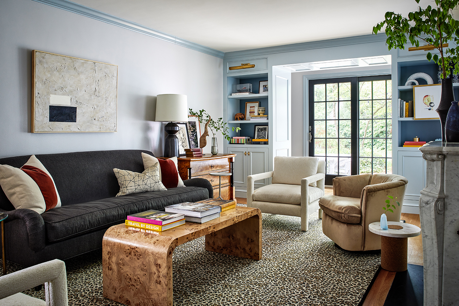
While this may be the more formal of the pre-war colonial house's living rooms, that's not to say there are some fun design moments. The leopard print living room rug being a case in point.
'To be fair, we tend to consider leopard print a neutral as the organic shapes and earth toned coloring is straight out of nature!' Zoe says. 'Leopard print tends to soften a space with a print that is organic in form and color, while still achieving a moment of impact through the small scale pattern with high contrast. Again, we love the tension between organic and modern, or neutral and bold.'
The coffee table is from Worlds Away.
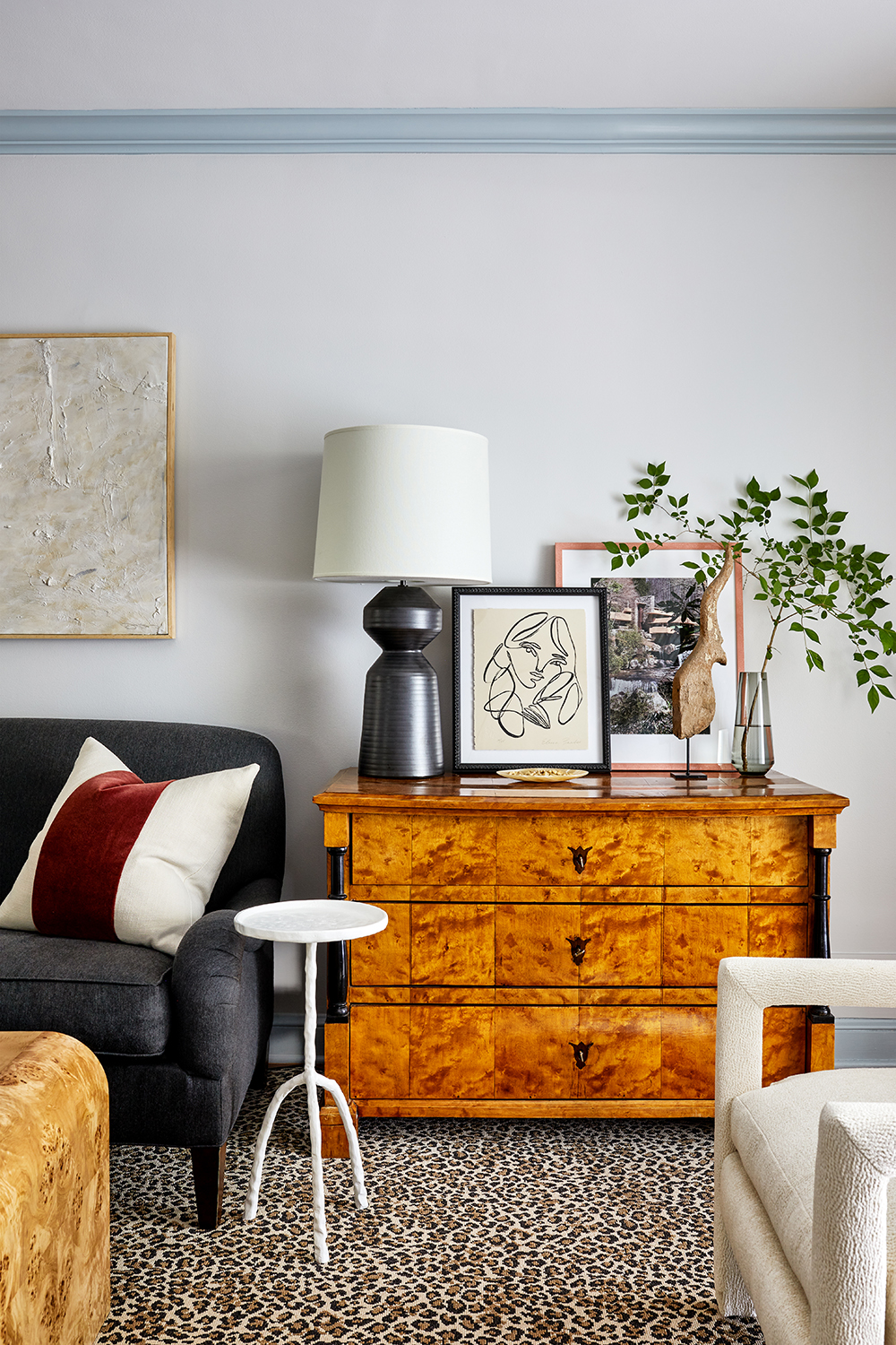
Zoe think that using pattern is not something anyone should be fearful of. 'You’d be surprised at how well it works in so many spaces,' she says. 'Consider the scale of your prints in relation to one another, and again, treat leopard print as a neutral. Also, remember to give moments of relief. Without creating these moments of relief, your eye will not know where to look & the space will begin to feel too much like maximalism.'
This talking point area rug is by Stark Studio from Chairish. And because it needed a subtle contrast, the blue living room walls are painted in Brittany Blue by Benjamin Moore, while the molding is the same color but in gloss paint.
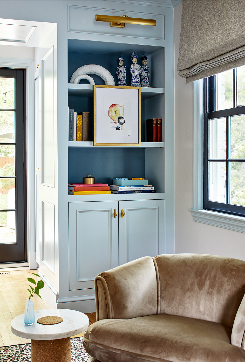
Even the living room shelving has been utilized as a way to display art. 'Susan and I both love art hung on shelving.' Zoe says. 'It looks very layered and reminiscent of an English country library.'
By keeping the built-in shelves the same color as the walls it stops the eye from really noticing its there, allowing the art to be the true hero.
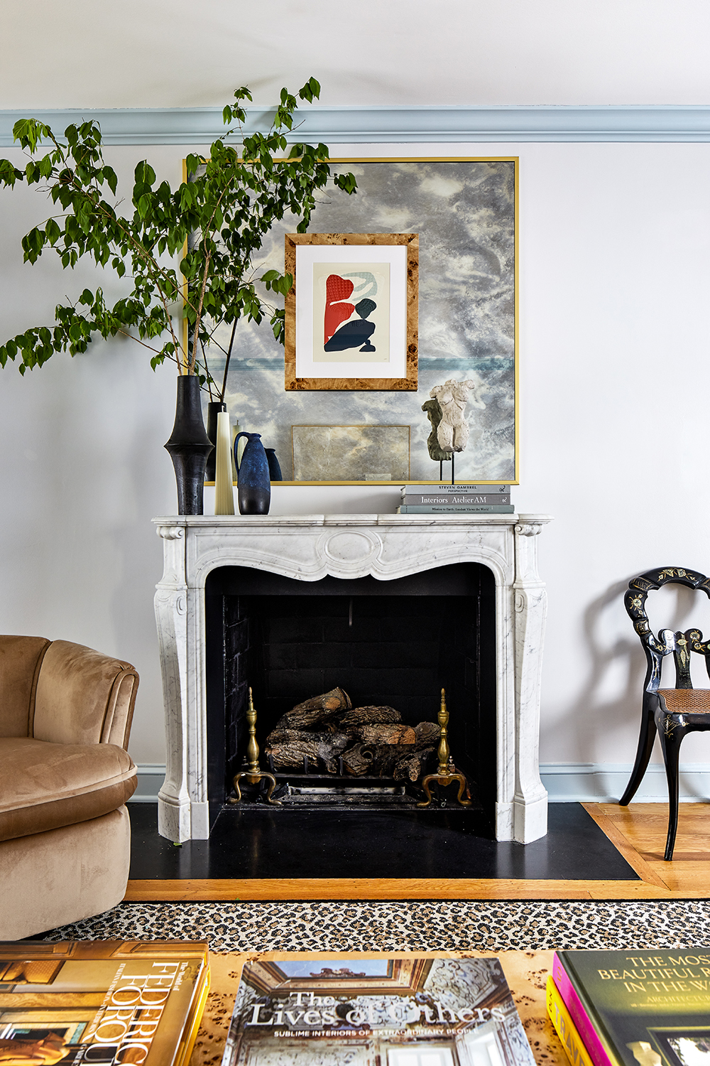
The fireplace becomes a focal point crying out for art, too. When it comes to picking which pieces to display, Zoe says there are no hard and fast rules, though cautions that a little bit of consideration goes a long way.
'Art is very personal,' Zoe says. 'Frame whatever you love, think about scale and proportion, but don’t be too precious about it.'
Dining room
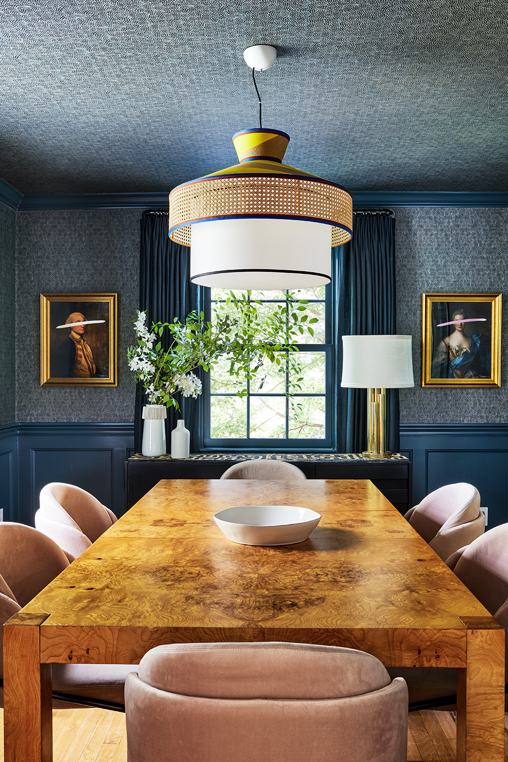
The drama of the color used in the dining room creates a space that feels sophisticated, heightened by the gleam of the dining table. But there is contrast here, in the powder pink chairs and the wit of the art, which brings the mood back down, hinting at a place where good times are to be had.
'The dark blue depicted in both the paint and wallpaper selections act as a direct contrast for the warmer hues seen in the burl wood table and blush dining chairs,' Zoe says. 'Pairing moody tones with something much softer, such as blush, creates a tension that results in a space that feels curated. Without the juxtaposition, the space would fall flat and feel thematic.'
Taking the wallpaper up to the top of the dining room wall is intentional to how intimate the space becomes. 'Extending the wallpaper to the ceiling makes you feel ensconced in the space – we call it “the jewel box effect”' Zoe says. 'Especially in smaller spaces, wrapping bolder wall treatments or colors onto the ceiling creates a sense of coziness as the space tends to feel like it is “hugging you.”'
The wallpaper is Guinea in Blue Stone by Zoffany.
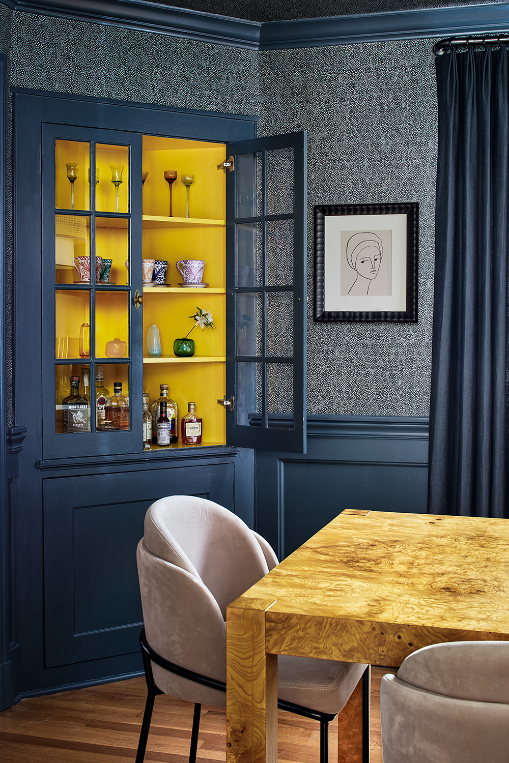
The flash of yellow in the drinks cabinet is inspired is another moment of keen artistic flair. 'The rest of the room is so moody that the yellow pop gives a moment of saturation and fun,' Zoe says, once again highlighting how key it can be to create a contrast.
Den
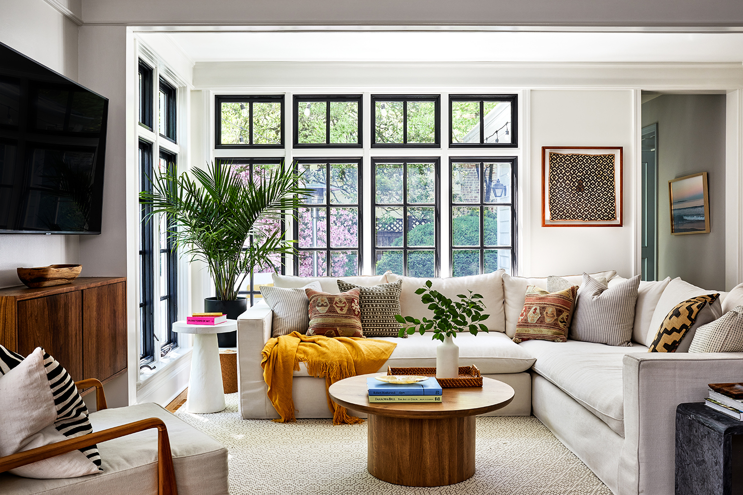
The den may be a place for hunkering down but that didn't stop Zoe from wanting to keep it light and bright and airy.
When it comes to the perfect family sofa dimensions, Zoe has some advice.
'Think about function, then form,' she says. 'This space, in particular, was one where function came as the most important component when selecting upholstery. With young kids, and a dog, Susan was looking for a selection that would stand the test of time, which is asking a lot for a white sofa. That being said, we were able to find a beautiful sofa that are also comfortable and wear-resistant. Think about how your family lives and what would improve the quality of your time together. A custom sofa is a great solution.'
This sofa is from Clad Home.
Powder room
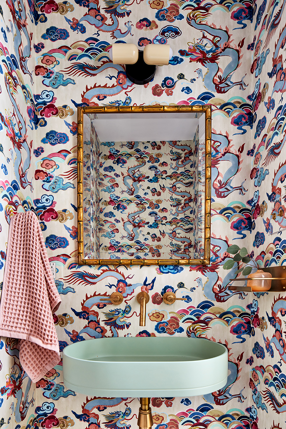
As with so many areas of the house, there is contrast at work in the powder room. Antique-style chinoiserie wallpaper meets a modern sink.
'We love the tension created by blending styles and eras so that no one room feels thematic,' Zoe says. 'Rooms feel fresh by creating a balance between high and low, old-world and modern—but finding that balance is very intuitive. Use of color also creates a space that feels considered and collected rather than disjointed.'
The Red Dragon Indigo wallpaper is from Carleton V, while the sink is from Nood.
Bedroom
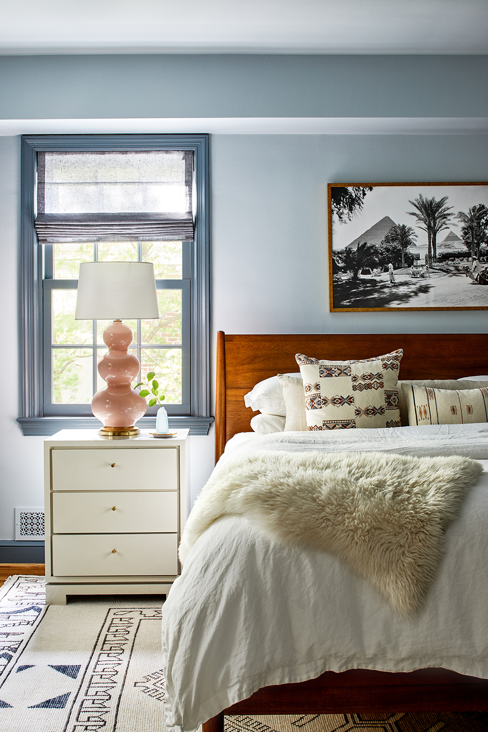
Blue and pink is paired once again, but unlike in the dining room, the blue is much softer. 'We loved how calm that blue was and were eager to use it again in the bedroom,' Zoe says. 'Both the blue and the blush tones are soft, which is perfect for brightening a bedroom that is naturally dark. Additionally, the right shade of blue can create a serene and calming space, perfect for anyone looking to unwind before bed.
This modern bedroom is painted in Oval Room Blue by Farrow and Ball, while the lamp is from Ballard.
See more of Zoe's work by Zoe Feldman Design.
The editor of Livingetc, Pip Rich (formerly Pip McCormac) is a lifestyle journalist of almost 20 years experience working for some of the UK's biggest titles. As well as holding staff positions at Sunday Times Style, Red and Grazia he has written for the Guardian, The Telegraph, The Times and ES Magazine. The host of Livingetc's podcast Home Truths, Pip has also published three books - his most recent, A New Leaf, was released in December 2021 and is about the homes of architects who have filled their spaces with houseplants. He has recently moved out of London - and a home that ELLE Decoration called one of the ten best small spaces in the world - to start a new renovation project in Somerset.
-
 Italian Kitchen Trends — 5 Emerging Ideas From the Chicest Italian Designers That I Predict Will Go Global in 2025
Fresh from Milan Design Week, these are the exciting finishes, styles, and innovative materials I can't wait to see in more kitchens this year
By Faiza Saqib Published
-
 Small Patio Ideas — 8 Clever Ways to Style Up Even the Tiniest of Outdoor Spaces
If you're dreaming of turning your small patio into a dream space the right combination of practical and creative ideas will help you max up its potential
By Sarah Wilson Published
-
 White walls, but never bland! This Italian apartment's colorful designer touches create an uplifting home
Studio Venturoni has transformed this Italian apartment, using vibrant color pops to bring character and charm to the space
By Oonagh Turner Published
-
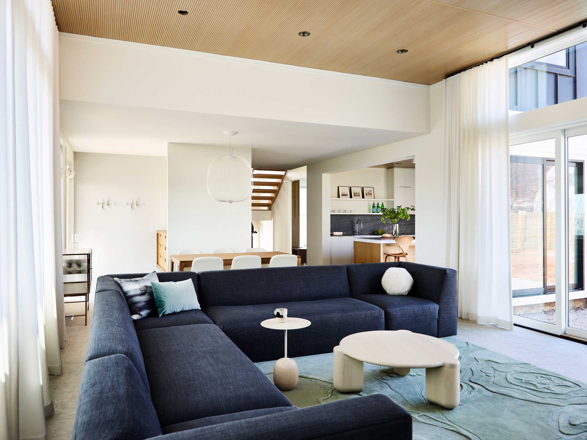 'It's a place to stay still and slow down' - how this Connecticut home took its cue from the 'slow living' trend
From a starting point of creating a home that was an antidote to the hustle and bustle of the city, the design of this project look to nature for inspiration
By Hugh Metcalf Published
-
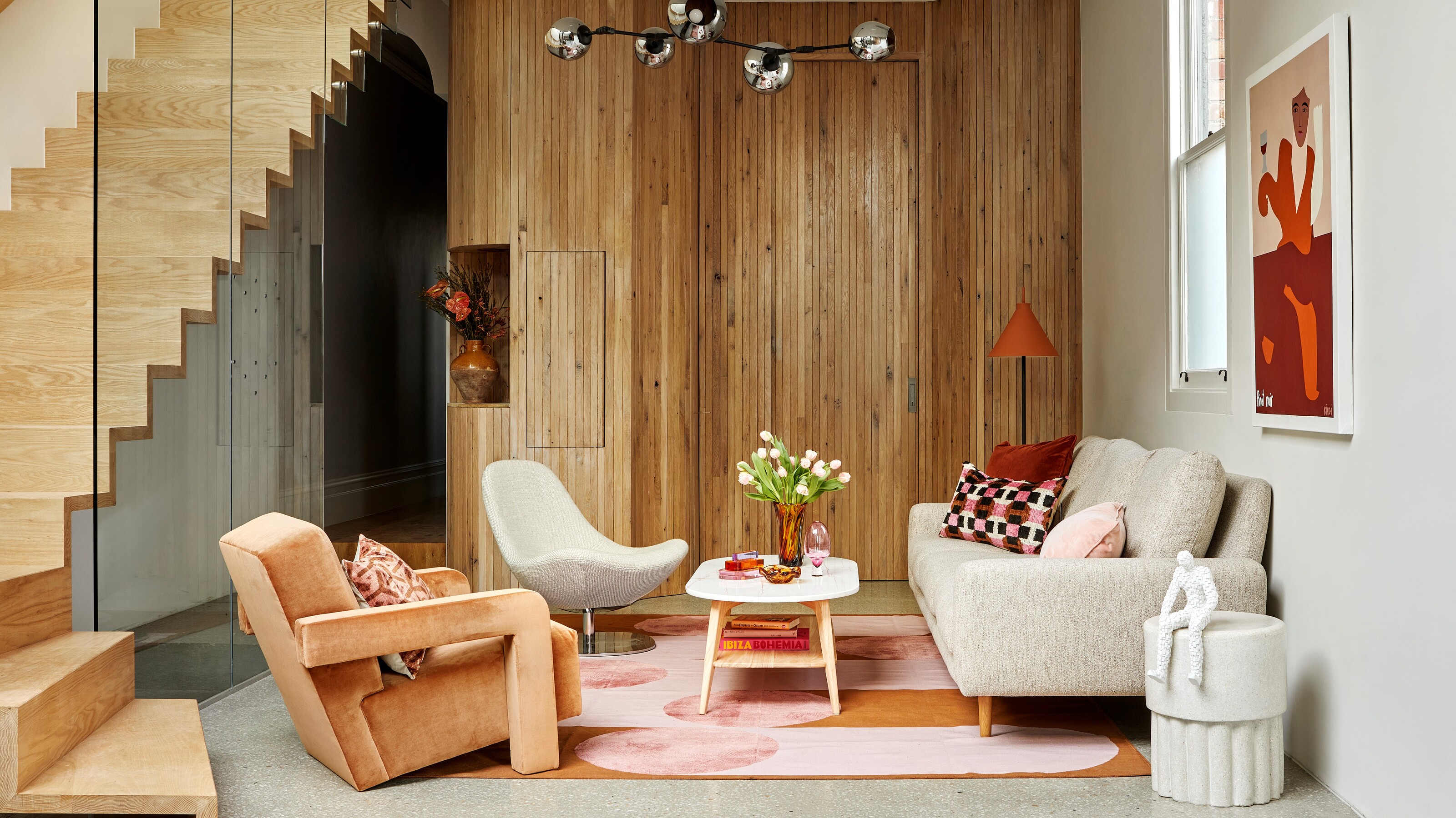 The 10 best living rooms of the year – our pick of the most beautiful designs we've seen
We've trawled through the archives to cherry-pick the living rooms that have stood out to us this year
By Oonagh Turner Published
-
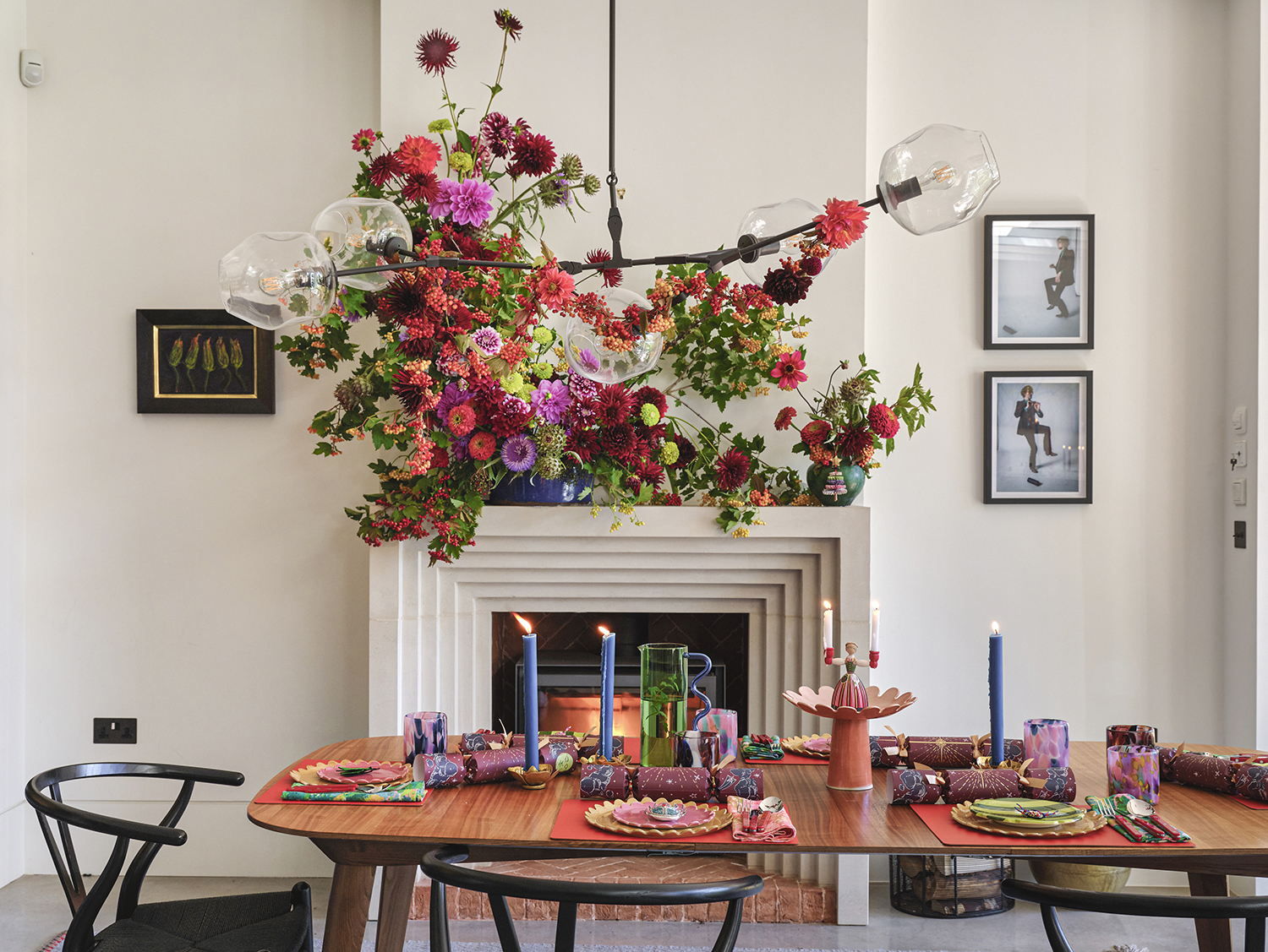 The more joy the better! This designer home shows how to do stylishly maximalist Christmas decor
Bursting with happiness, this colorful home is dressed for Christmas in the most abundant and beautiful of ways
By Mary Weaver Published
-
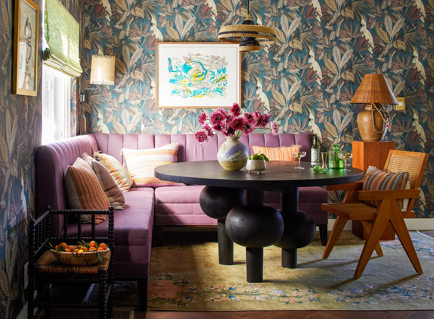 This LA home shows how to do modern eclectic style perfectly - with a utility room of dreams
Creative director Dabito used his interiors know-how to treat his 1950s bungalow to a medley of pattern and color
By Emma J Page Published
-
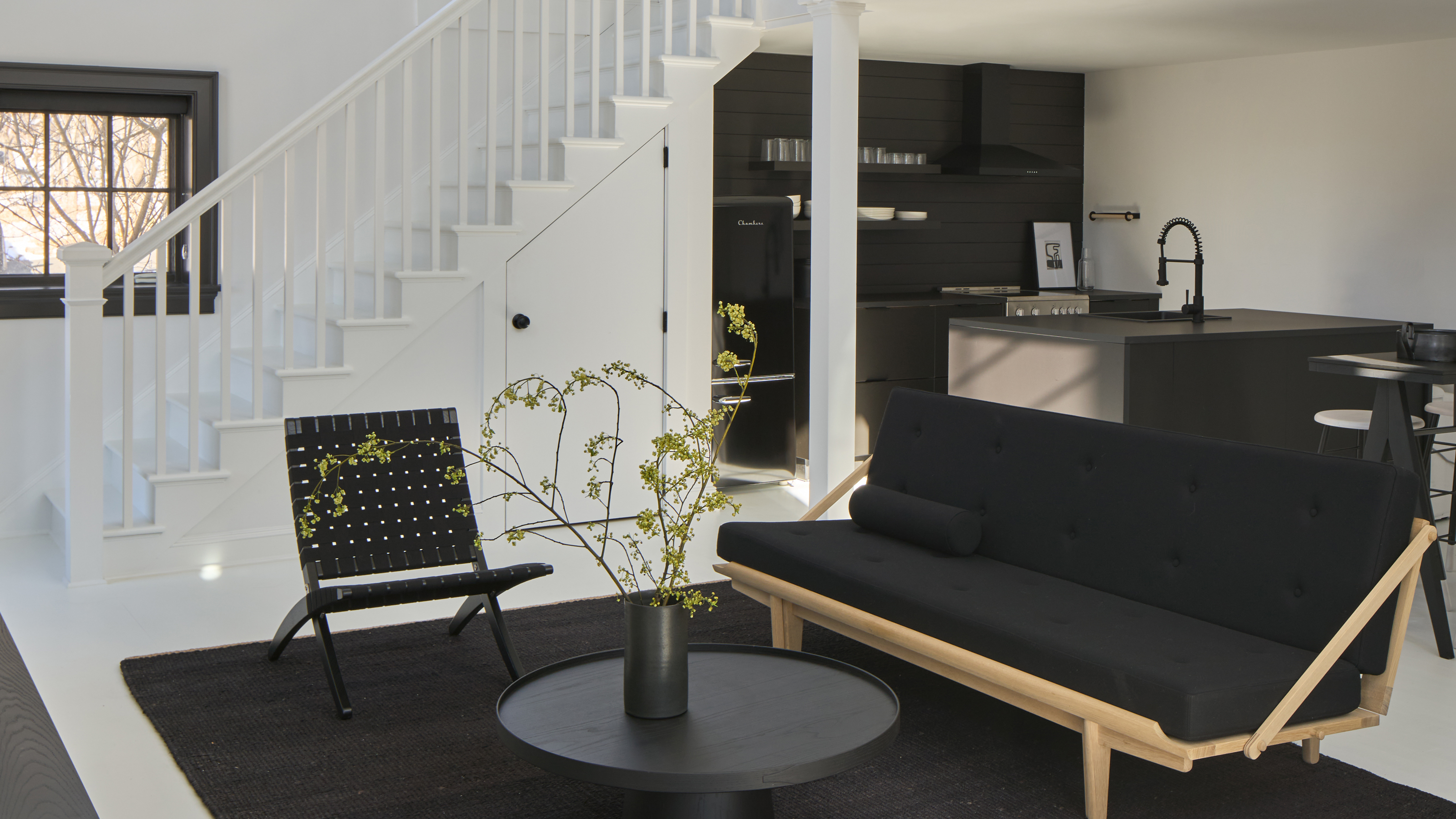 Can you decorate a home with just black and white? This modern cottage proves it's an option
For this guest house in Connecticut, the interior designers used a strict black and white color scheme. Here's how they made it work
By Hugh Metcalf Published
-
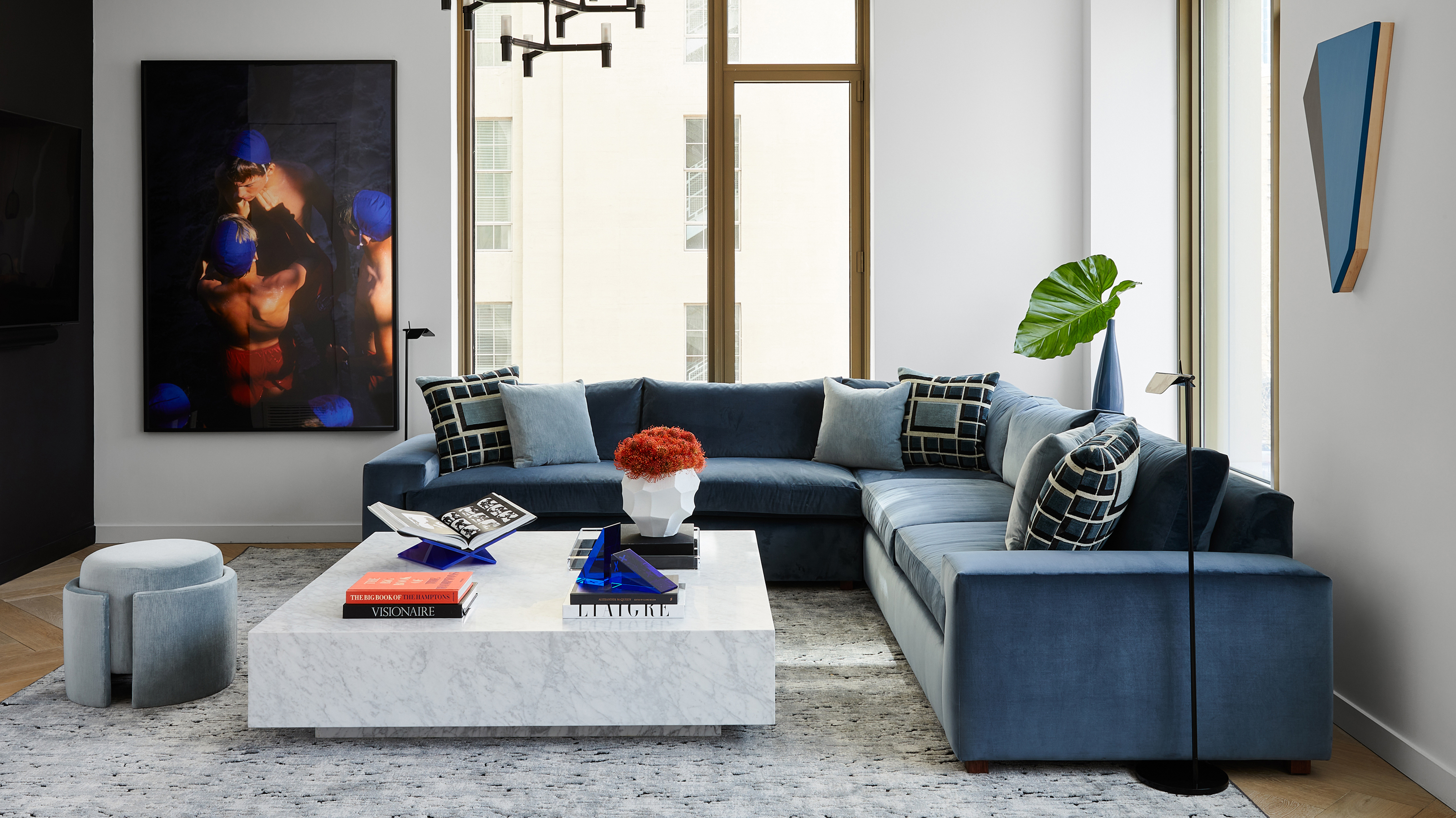 An interior designer completely redesigned this Manhattan apartment in just 90 days from start to finish
Justin Charette proved that a challenging deadline doesn't have to get in the way of creating a beautiful home
By Hugh Metcalf Published
-
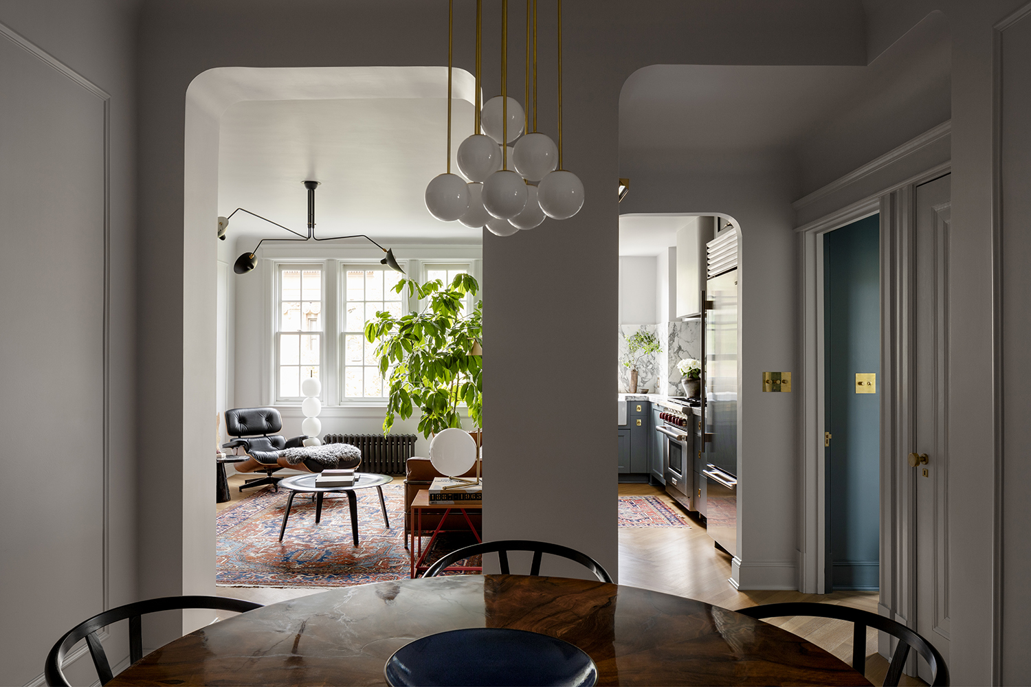 This architect's apartment is a masterclass in how to make a small space feel luxe
Architect Nicholas Potts has turned every corner of his city apartment into an art-filled space that feels opulent yet homely
By Pip Rich Last updated