Step inside this Fifties house in Cape Town with a burnished boho vibe
This Fifties house in Cape Town artfully blends lush foliage with luxe textiles and burnished finishes to create a relaxed mid-century industrial vibe...
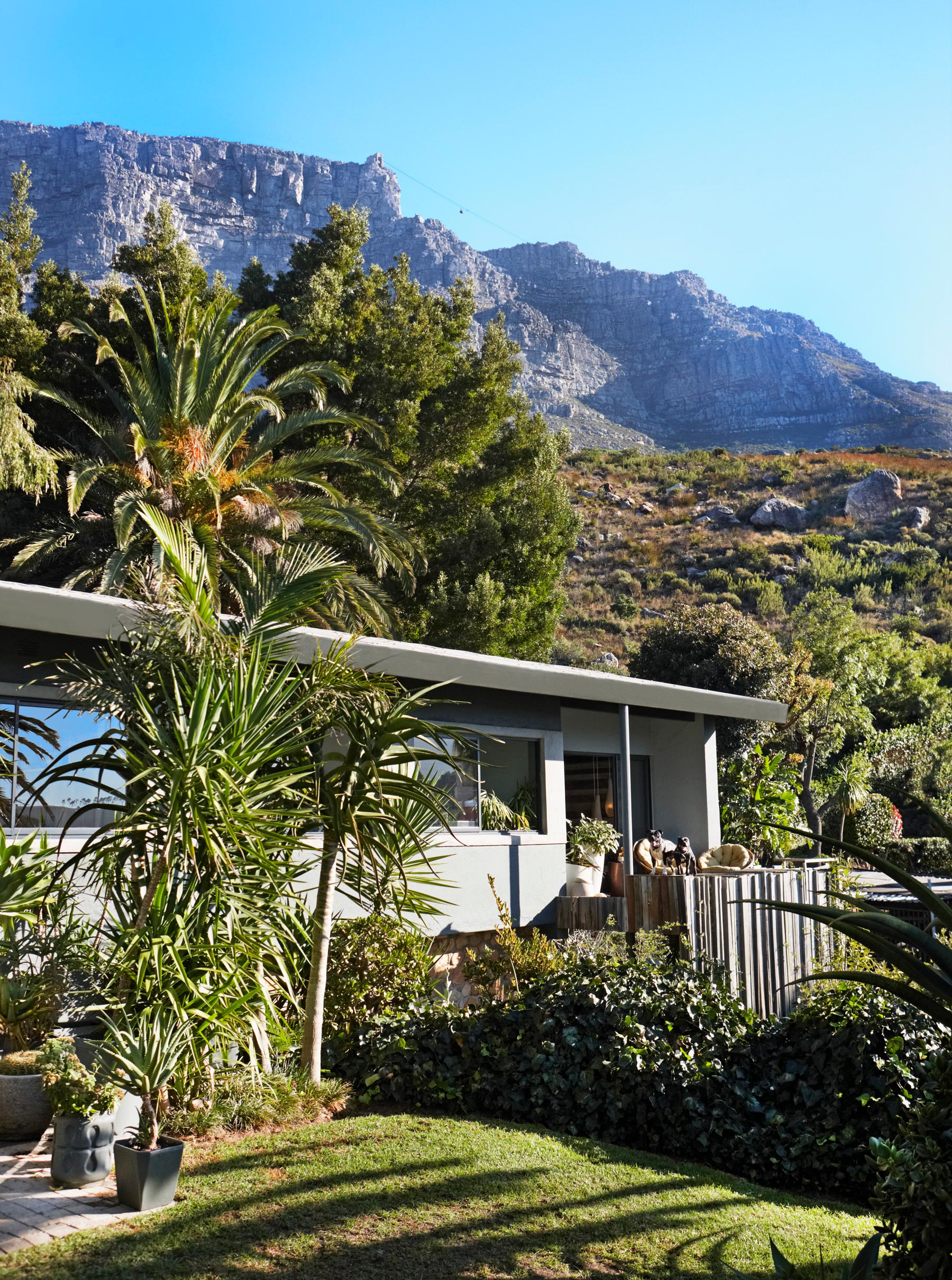
THE PROPERTY
A split-level Fifties house in Cape Town, South Africa. On the ground floor of this modern home, there is a kitchen-diner, living area and patio. The master bedroom with en suite, guest bedroom, home office, bathroom and WC are on the first floor.
See more modern homes across the globe
LIVING ROOM
Lush, luxe, burnished boho...That’s the vibe in this Cape Town eyrie, perched on the cliffs with a bird’s-eye view of Table Mountain.
The property was built in 1954 and actually featured in a magazine at the time – all black and white photographs of Bauhaus furniture and beehive hairstyles. Fast forward 55 years and the Mad Men gloss had definitely lost its shine – think Don Draper with a paunch and an ill-fitting safari suit.
It was on the market as a deceased estate, with a badly neglected garden and dated details like a natural rock fireplace in the living room and a heavy floral carpet covering the original parquet flooring. But it’s on the highest road in the Cape Town suburb of Oranjezicht, with a back gate that opens on to the mountain, and the owners could see its potential to be renovated to make the most of the 360-degree views.
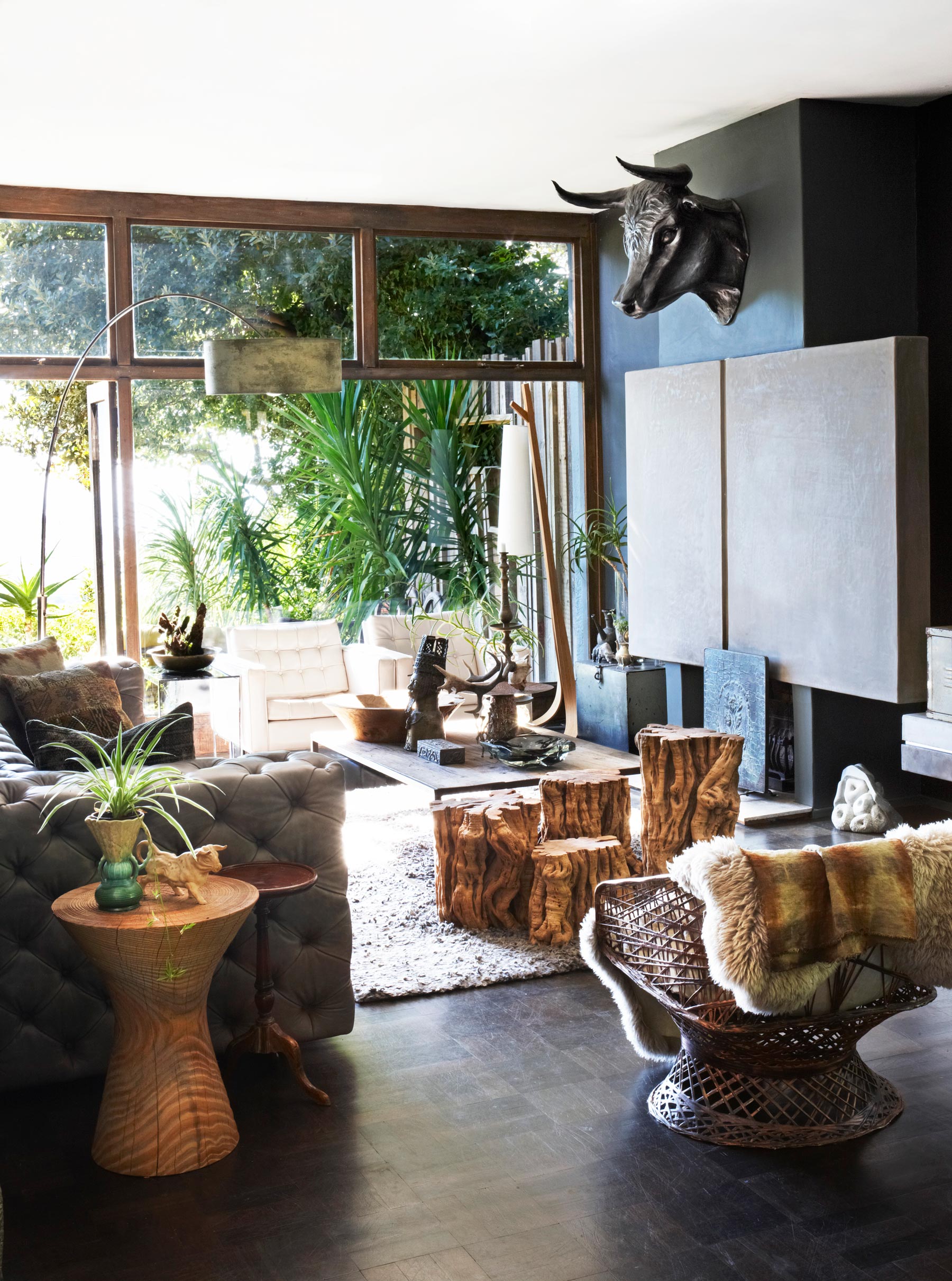
Rather than knock out the dated natural rock fireplace wall, the owners concealed it with a plaster screen, with lights behind to give a soft glowin the evening.
KITCHEN
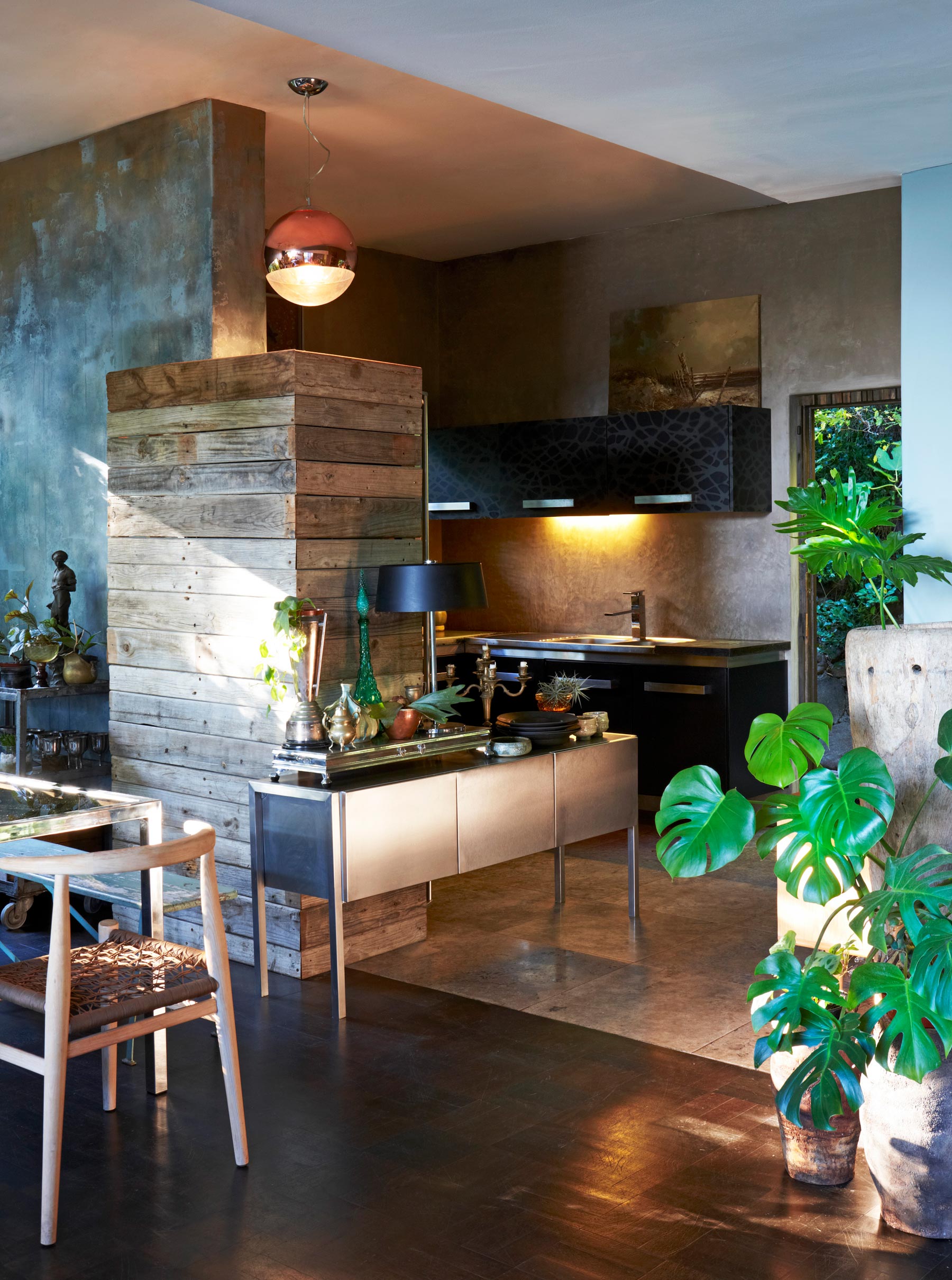
The designer-look kitchen is actually home-made units decorated with a stencil and sprayed with grey spray paint. Previously separate from the main living space, a wall was knocked down to open it up and provide a clear flow through to the back door.
Be The First To Know
The Livingetc newsletters are your inside source for what’s shaping interiors now - and what’s next. Discover trend forecasts, smart style ideas, and curated shopping inspiration that brings design to life. Subscribe today and stay ahead of the curve.
See Also: The best modern kitchen ideas - stylish, smart and chic
DINING AREA
The house was renovated on a tight budget, with even most of the furniture found at flea markets or up cycled.Relying on found or upcycled objects can be a risky business – what looks great on a stall can appear tacky and out of place once it’s unpacked at home – but a tight edit of colour and materials brings the scheme together.
A cluster of lamps and overlapping ceiling roses turn lighting into an art installation on the cheap.
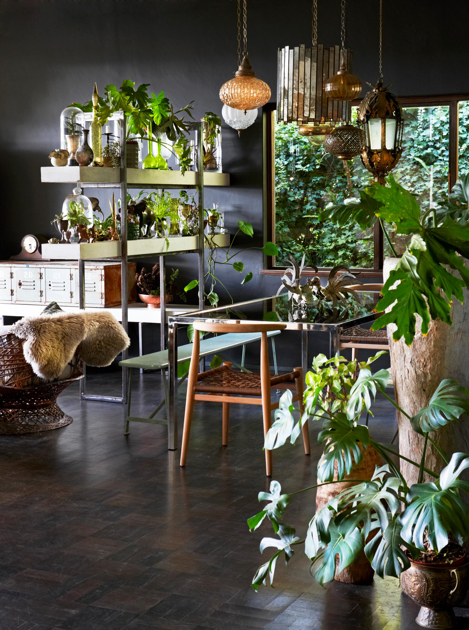
That rediscovered parquet floor makes an elegant base for a richly restrained palette – graphite walls, a charcoal kitchen, the ashy finish of a blowtorched sideboard. Bare wood picks up the golden tones and adds form, from the smooth curves of a bentwood chair to the knobbly mass of tree-stump side tables.
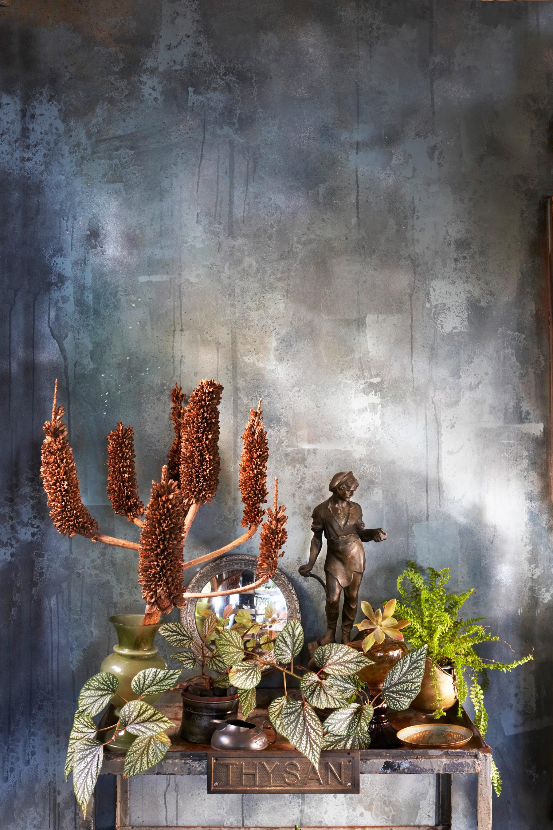
This is a house that invites you to reach and touch, following a fingertip trail of rough concrete, strokeable fabrics, smooth metal and faceted glassware.
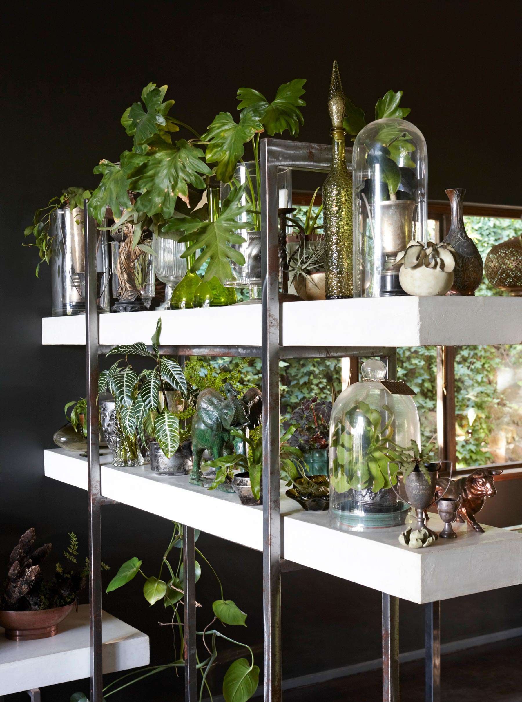
And then there’s the greenery… The garden is creeping indoors, it's like Eden in the making.
OFFICE
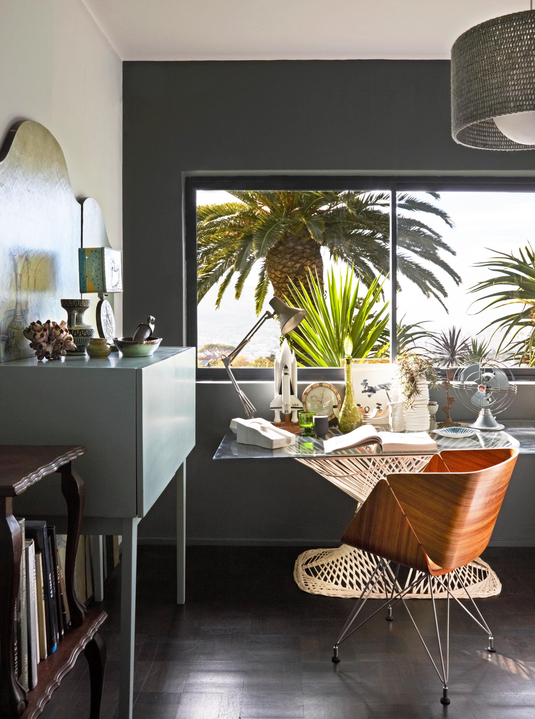
Upcycled and contemporary pieces complement each other in the home office. The glass table top was made from the original shower enclosure.
HALLWAY
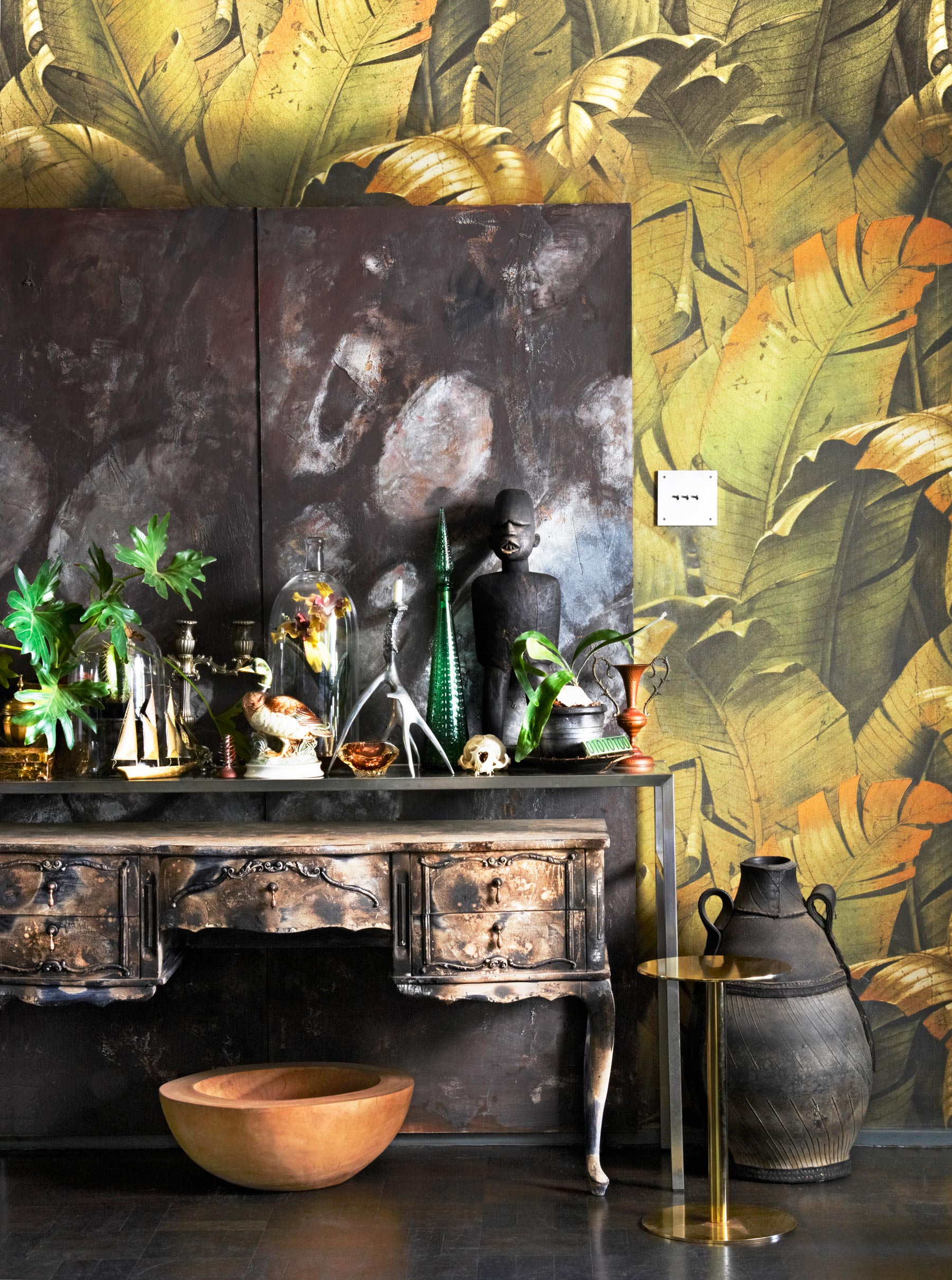
The entrance is a textbook example of layering – the wallpaper, screen and furniture create a 3-D tableau. The distressed sideboard was a white-painted flea-market find that was then blasted with a blowtorch. The wallpaper is taken from a photograph, resized and reprinted to a larger scale.
MASTER BEDROOM
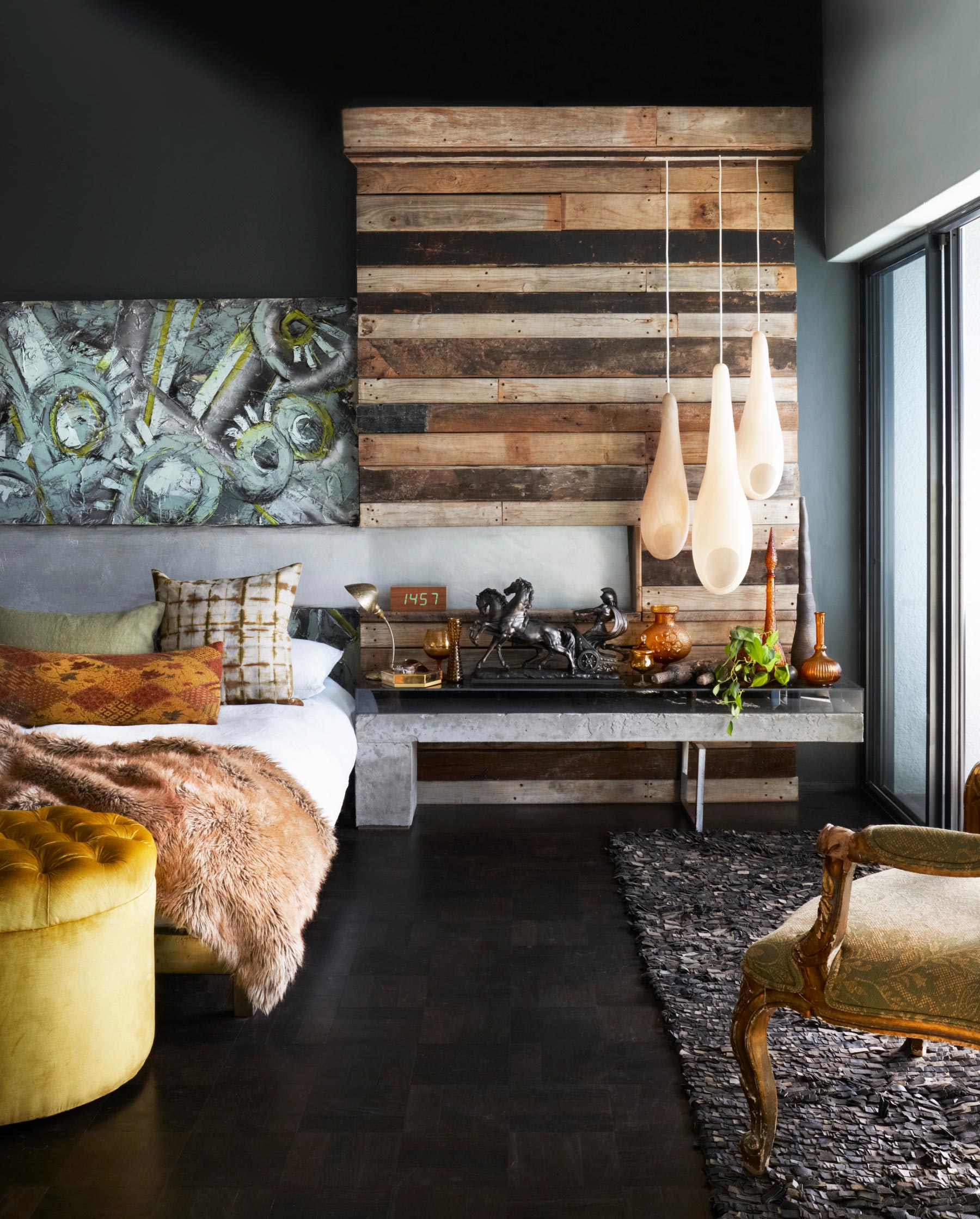
The wood wall was made from old grape pallets that a farmer had thrown away, mainly as a place to hang the three pod lights. The concrete and glass table beneath it was also a DIY job. Soft fabrics contrast with the hard surfaces and make the bed even more inviting.
BATHROOM
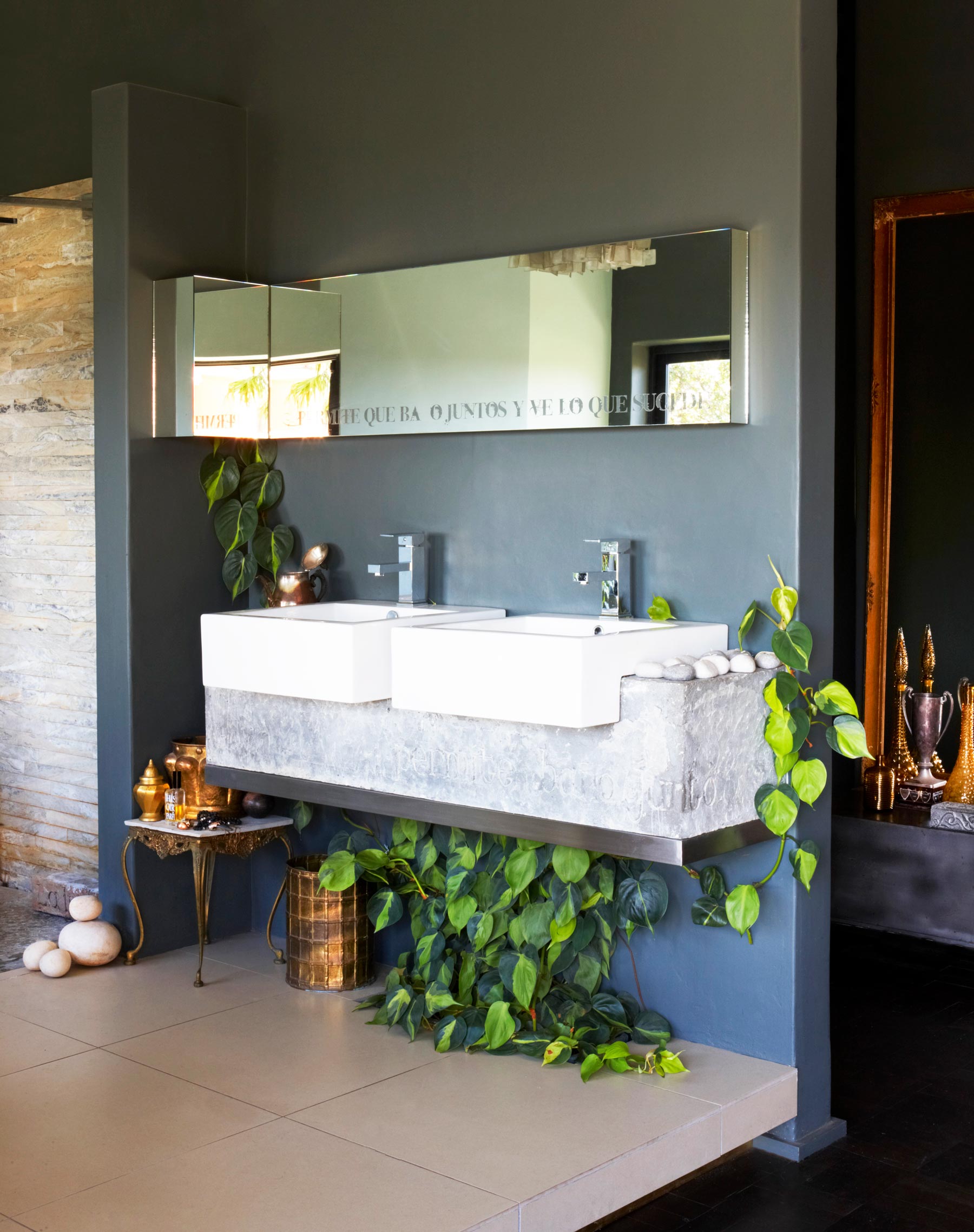
The en-suite modern bathroom was created from a guest bedroom. The ‘stone’ support for the basins was actually cast in concrete from a clay mould.
Photography / Micky Hoyle
For more of Micky’s work, seemickyhoyle.com.
See Also: 24 Guest bedroom ideas - Gorgeous guest room schemes to make visitors feel at home
The homes media brand for early adopters, Livingetc shines a spotlight on the now and the next in design, obsessively covering interior trends, color advice, stylish homeware and modern homes. Celebrating the intersection between fashion and interiors. it's the brand that makes and breaks trends and it draws on its network on leading international luminaries to bring you the very best insight and ideas.
-
 Jeremiah Brent Captures the Grit and Glamour of NYC in His New Loloi Collaboration
The TV-famous interior designer looked out of his own window — and hit the pavement — for a collection that turns city spirit into tactile design
By Julia Demer
-
 This Specific Fabric Print Is Literally Everywhere Right Now — Here's Why
It's whimsical, artistic, and full of character. We've called it already: Dedar's 'Tiger Mountain' is the fabric that will define 2025
By Devin Toolen