A Florida beach house that shows the beauty in imperfection
Designed to reflect the striking rawness of the ocean and dunes that surround it, this home is naturally stunning

Moving from the hustle and bustle of New York City to their new modern home in relaxed and sunny Florida is a dream that Neal and Liz Schuman realized after spending several winters in the idyllic environment of Jupiter Island, which borders the Atlantic Ocean.
The couple came to Christian Thomas and John Melhorn of Thomas Melhorn, who assisted them with land acquisition before designing and building the 9,000-square-foot house (including the guest home); a process that took three years to complete.
‘The conversations began very simply’, remembers Thomas. ‘The Schumans did not make specific requests for their home. Instead, they provided a list of 10 words and phrases to guide the design. Some of these included ‘peaceful retreat’, ‘outside in’, ‘harmonious with location’ and ‘environmentally responsible’.’
Marrying the local tradition with modern functionality, this family retreat was designed from the spirit of the place. ‘The setting drove the look and personality’, says Thomas. ‘The gentle curve in the cantilevered sloped rooftops was in response to the shape of the dunes from years of ocean breeze.’
Entrance hall
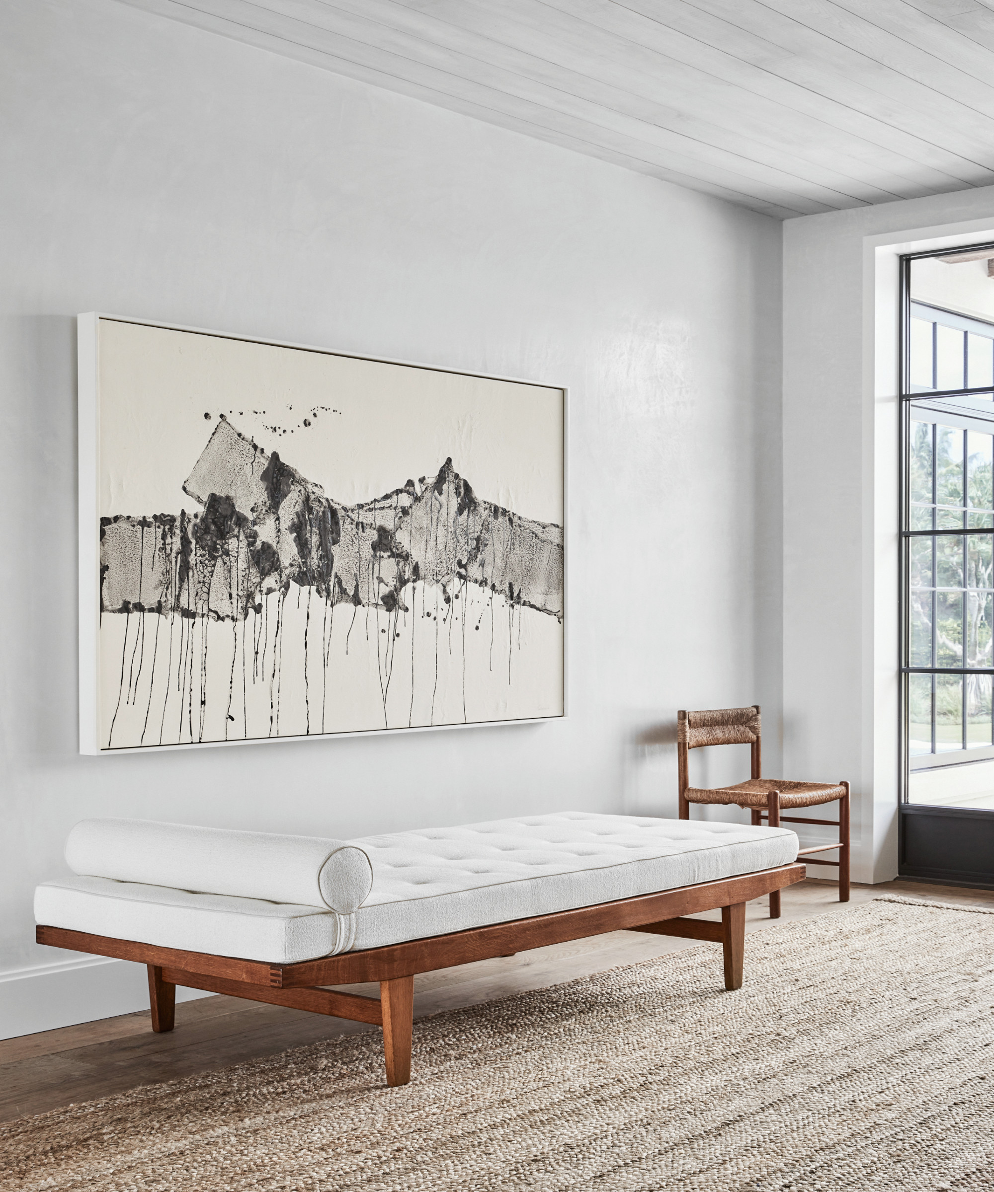
Plaster walls, a limed cypress ceiling and raw oak floors have been chosen to reflect the landscape outside.
‘This home is deeply rooted in classical proportions, but strays from any nod to classical architecture’, says Thomas. ‘More so, it is in response to the physical setting - the genius loci.’
Living room
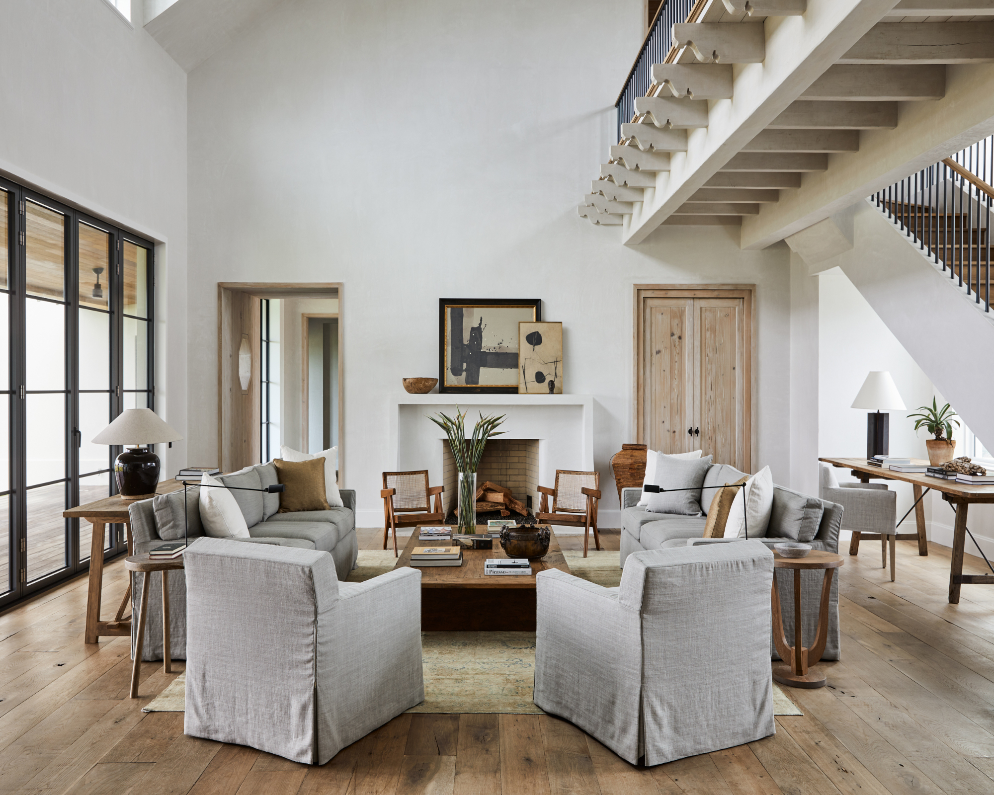
The greys of the surf and the beiges of sand are repeated in the hues of the linen slipcovers and wood of vintage tables.
Be The First To Know
The Livingetc newsletters are your inside source for what’s shaping interiors now - and what’s next. Discover trend forecasts, smart style ideas, and curated shopping inspiration that brings design to life. Subscribe today and stay ahead of the curve.
‘It is our belief that the more a material is toiled by humans, the less timeless it becomes’, confesses Thomas. ‘The floors, for example, were a work in progress up until the final board was installed; understanding the fuming process, its genesis and history, and trying to celebrate the variables that came with the process is what lead to a very soulful application.’
The expansive ocean views inspired the intentional 45-degree shift in the floor plan, allowing dwellers to enjoy the panorama from almost every room. The floor plan was also designed around the living room core instead of a traditional square or rectangular format, creating a welcoming space with a casual indoor/outdoor flow.
Kitchen
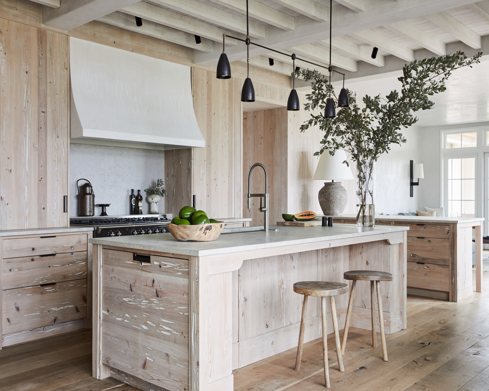
Interior designer Betsy Brown adds: ‘we chose to panel interior walls with local cypress that has been treated with a soft lime finish, giving a lovely white hue while still accentuating the grain of the wood.’
Breakfast area
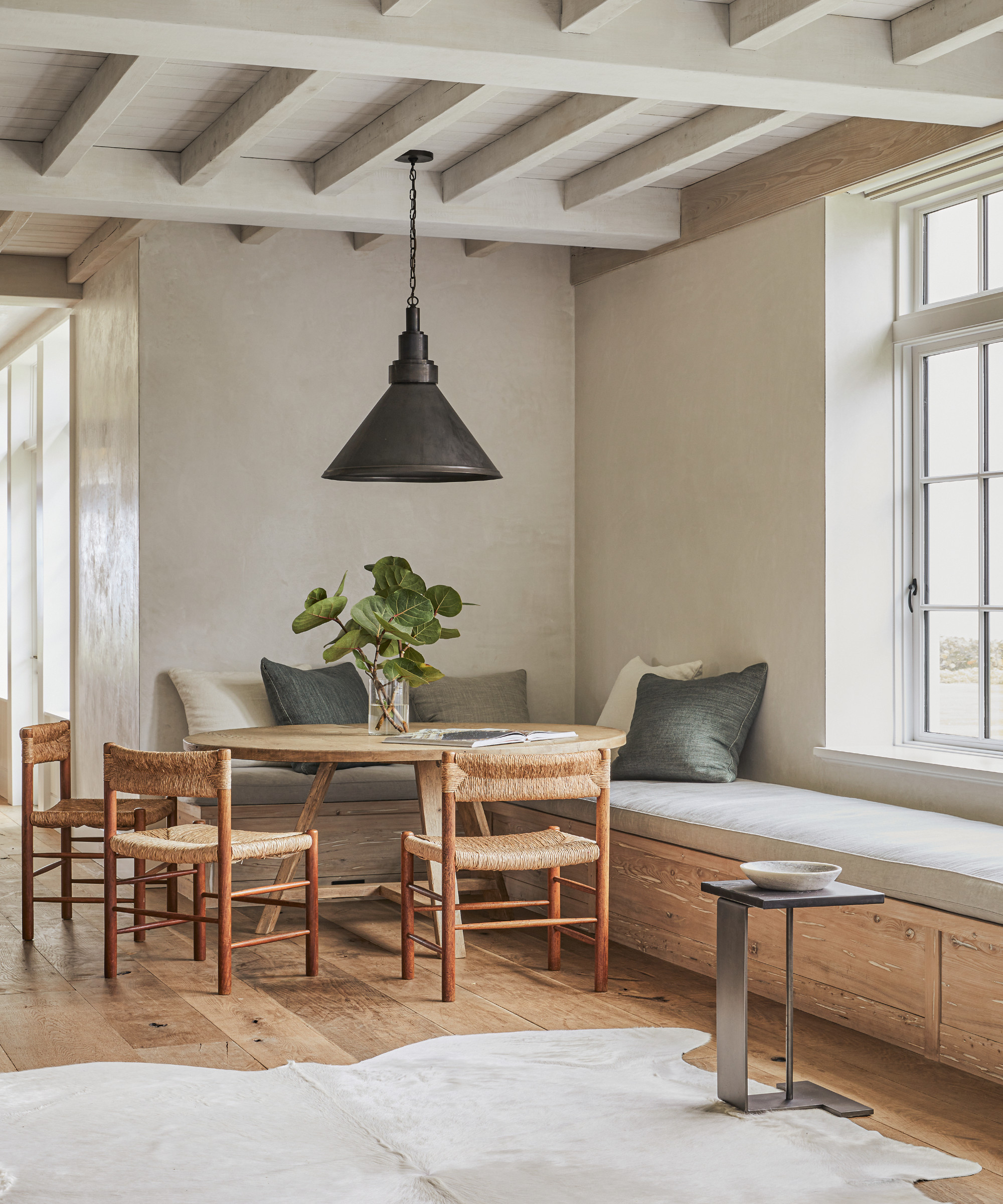
Combining white plaster, local shell stone, limed plaster, timber and organic fabrics with colours inspired by the surroundings, the palette subtly captures the essence of light, from sunrise to sunset.
‘Our attempt was to reflect the environment’, say Thomas and Brown. ‘The site is so spectacular that we felt our role was to be quiet and respectful of the setting.’
Meant to age gracefully and patina over time, the materials reflect the Japanese wabi-sabi philosophy, which consists in finding beauty in the imperfection and impermanence in nature.
A bespoke bench crafted from the same wood as the kitchen cabinetry links the two spaces.
Bedroom
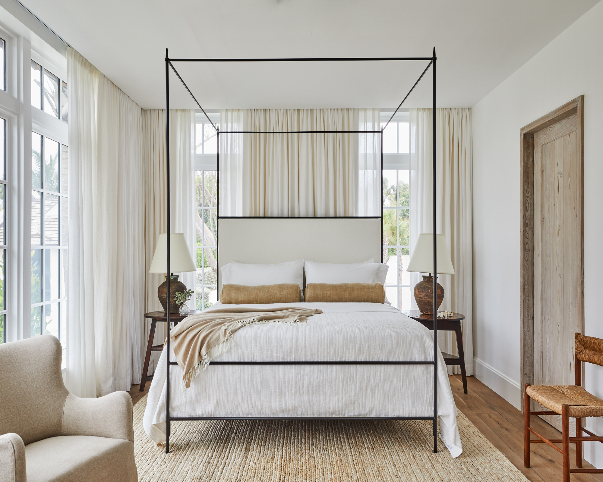
In the different areas, vintage furniture and objects with earthy tones prevail. ‘The idea was to use pieces that look like they could be moved from room to room and still belong in each space’, says Brown. ‘We wanted an easy, effortless flow.’
Bathroom
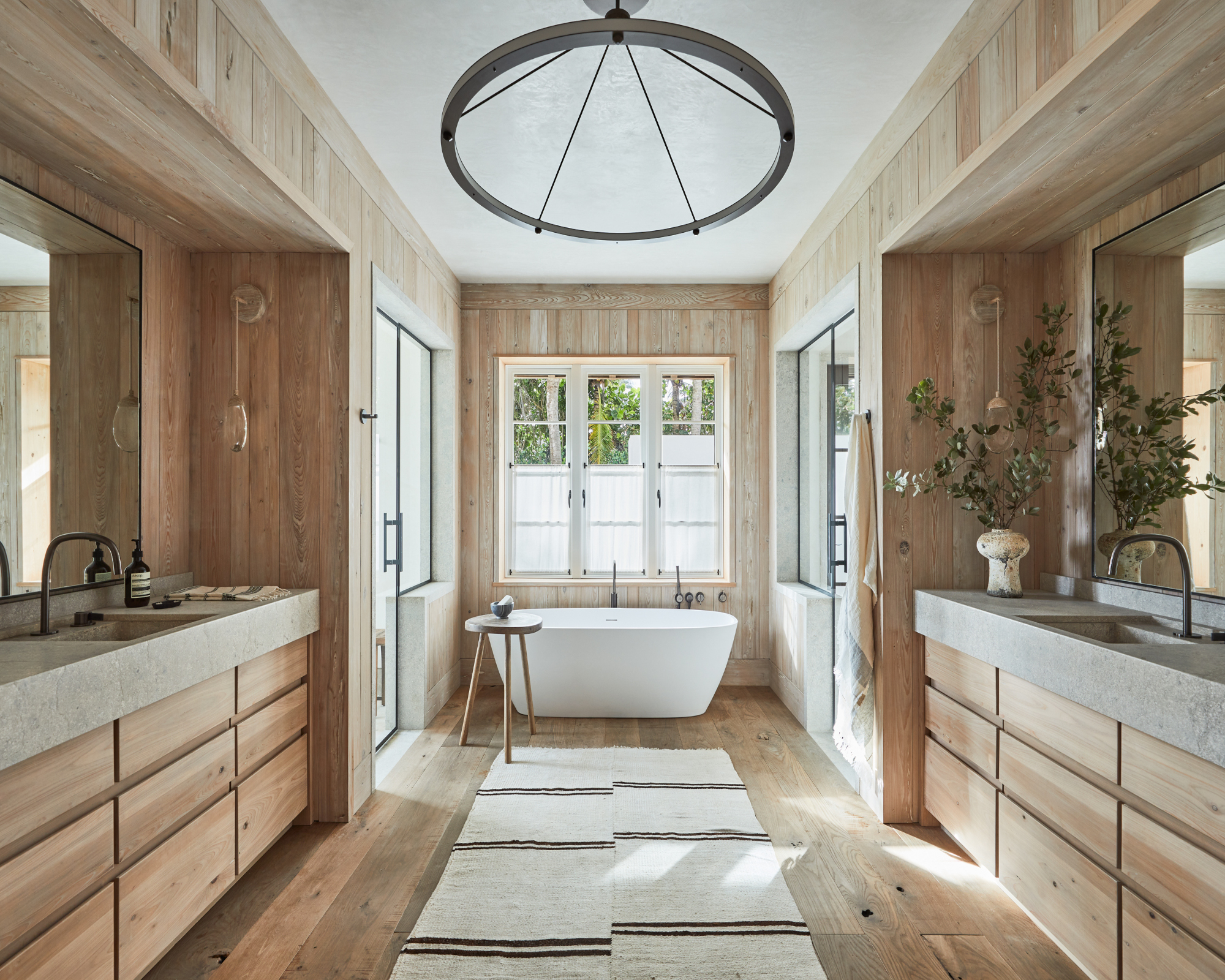
‘The goal was to create an unforced, authentic space with inherent luxury’, Brown says. ‘The clients were thinking beyond their own lifetimes. They wanted a house that would provide a gathering place for their family for generations.’
See more: this traditional townhouse in NYC has been turned on its head with a radical revamp
A French trilingual editor, content creator, and interior stylist living in Southern California. A compulsive reader of design, architecture, and lifestyle magazines, and an avid traveler, Karine lives and breathes interiors and is inspired by designers Nika Zupanc, Charles and Ray Eames, and Marcel Wanders; architects Luis Barragán and Frank Gehry; artists Gerhard Richter, Beatriz Milhazes, and Anish Kapoor. For the past 12 years, Karine has been contributing to international design, architecture, and fashion publications including Architectural Digest, ELLE Decor, Vogue Living, Design Anthology and MilK Decoration, among many others.
-
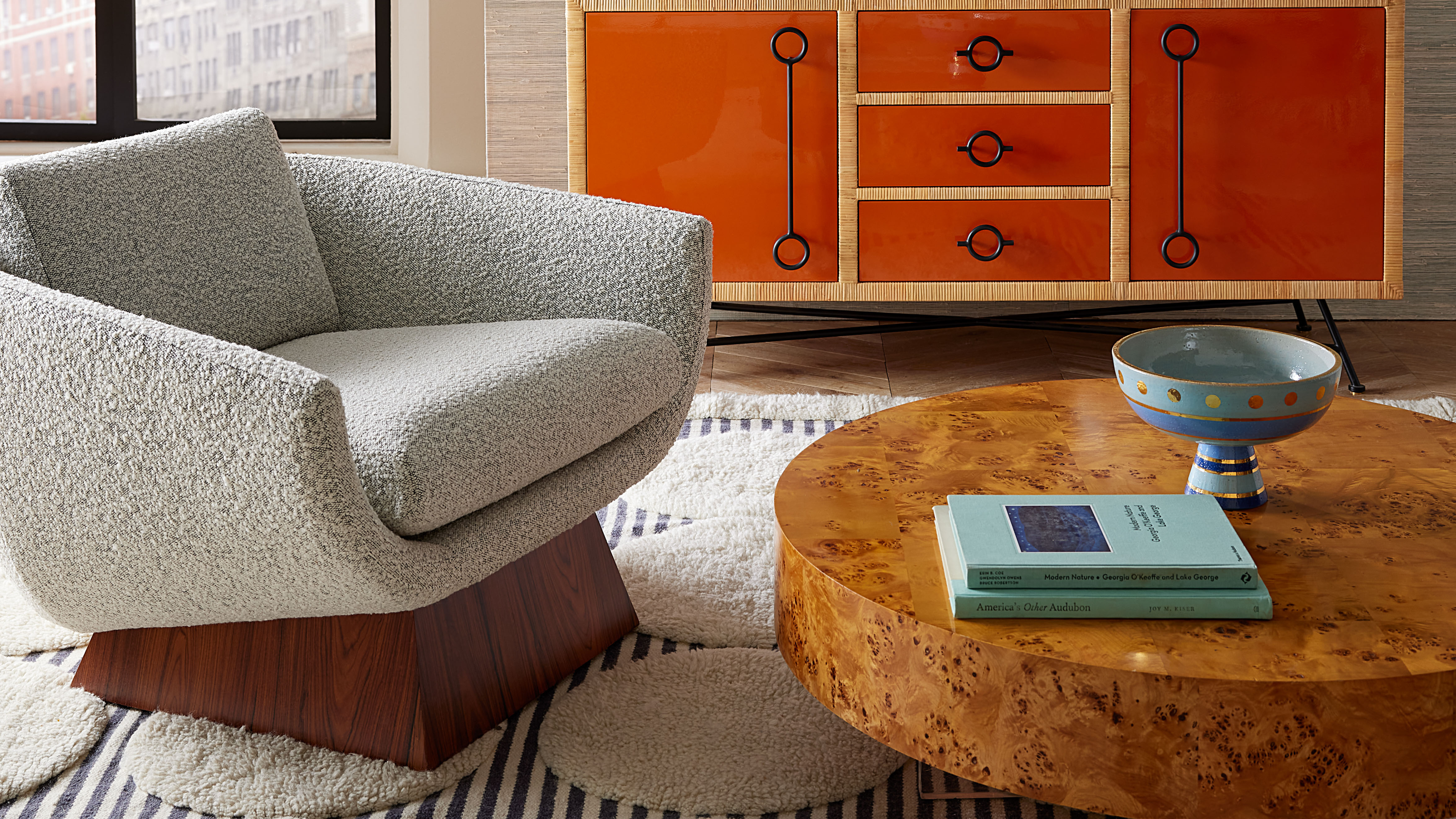 Burl Wood Decor Is 2025’s Most Coveted Comeback — Here’s How to Get the Storied Swirls for Less
Irregularity is the ultimate luxury, but you don’t need an antiques dealer to find it
By Julia Demer Published
-
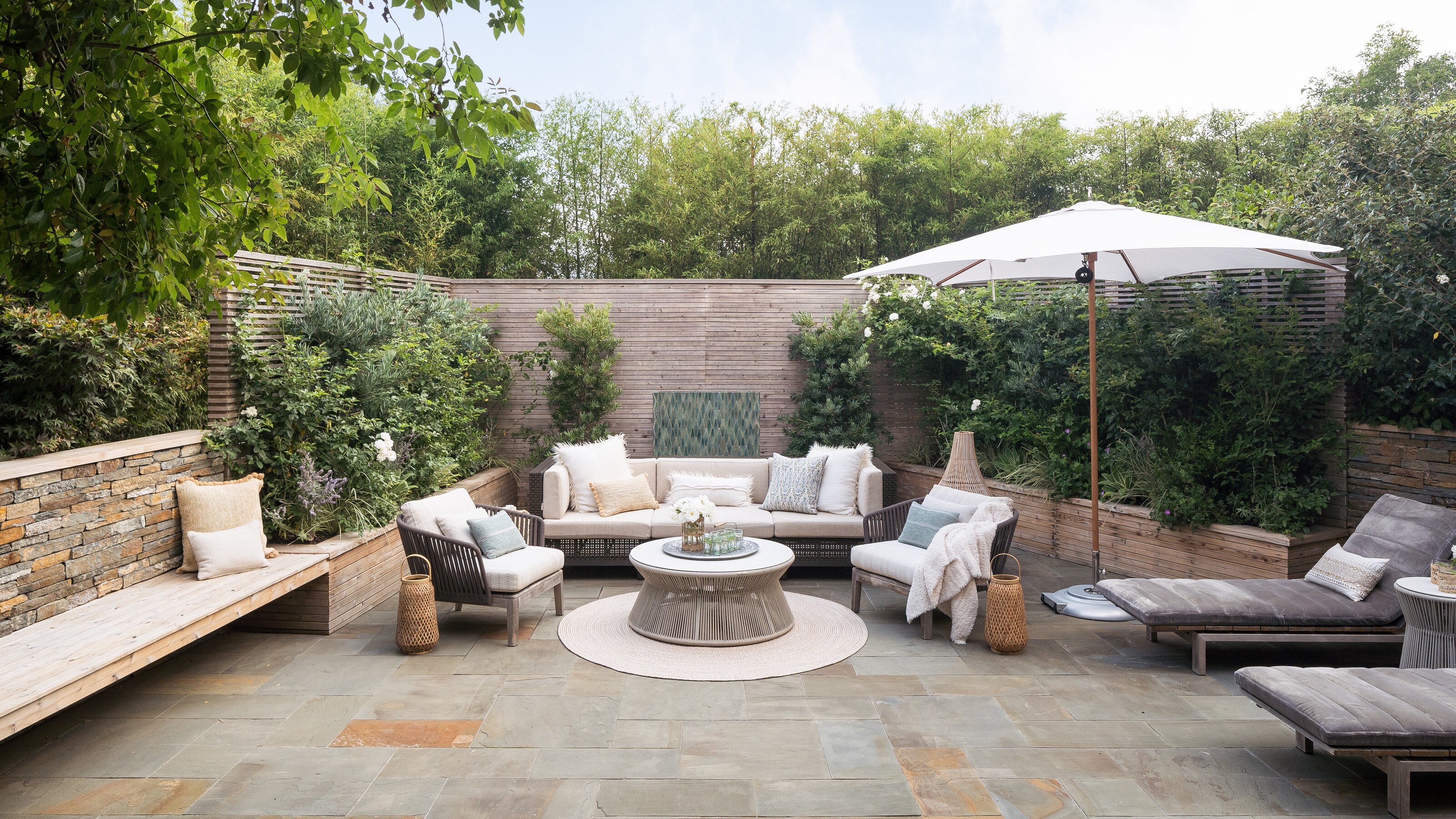 5 Garden Features That Instantly Add Value to Your Home — While Making Your Outdoor Space More Practical, too
Get to know all the expert tips and tricks for making your backyard a standout selling point for your home.
By Maya Glantz Published