'The trick is material richness' - this minimalist house gets warmed up by these clever designer tricks
Designers Fowlkes Studio have remodelled this townhouse in Washington, D.C., into a haven of warm minimalism, where unexpected materials add character and charm
Minimalism has evolved in the last year or so. It's no longer about a lack of things, but about creating spaces that are warm, textured, layered, inviting. Uncluttered, sure, but also with treasured items on display, clearly, unhampered by the detritus of everyday life so that you can really appreciate them.
And this 5,750-square-foot, five-bedroom, five bathroom modern home in the Kalorama neighborhood of Washington, D.C., shows how to do this mood perfectly. Remodelled by VW and Catherine Fowlkes, founders of the D.C.-based design agency Fowlkes Studio, it's airy, light and yet full of character. 'The clients wanted understated elegance and gravitated toward light grays and whites with occasional moments of color. But they also wanted material richness,' say VW and Catherine, and despite being a shining example of minimalism in interior design, this house provides that in spades.
Entryway
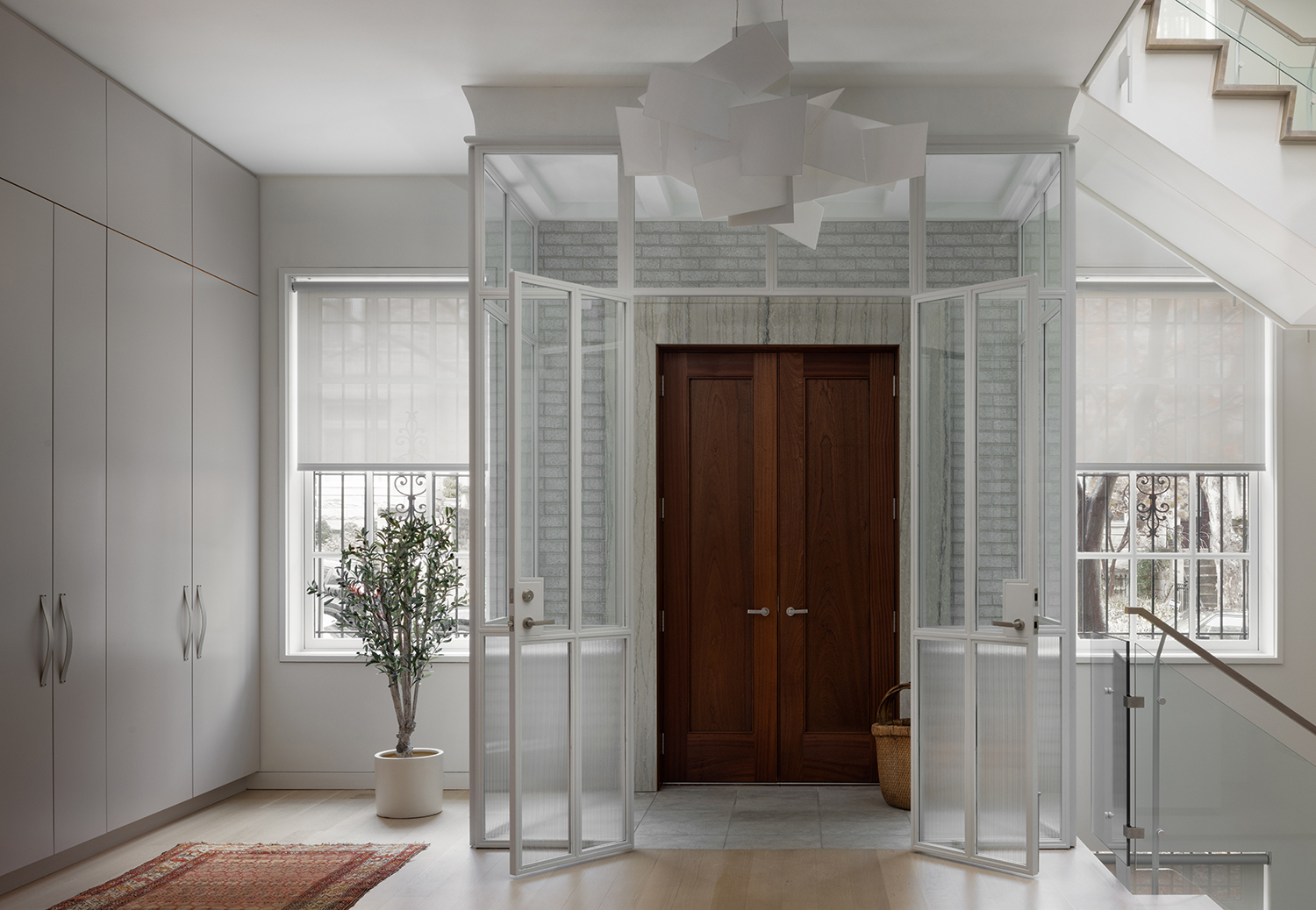
The Kalorama neighborhood of Washington, D.C., is known for being a wealthy area, but its townhouses are not typically vast. However this one was 25' wide and had 10' ceilings - so much more ample than a typical DC row house - and had not been touched in decades.
Following the remodel, the entryway now opens onto an open-plan living/dining area, with the front doors enclosed in glass, creating a vestibule where there wasn't one.
'The clients were moving from a more suburban setting with a gate and a driveway and a big backyard,' Catherine says. 'They had to get used to the idea that the big city was right outside their front door. So the vestibule offers an airlock so that the conditioned air does not rush out the door every time someone comes and goes, but it also offers a psychological buffer between the public and the private realm. Also, practically, it gives them a place to put stuff that inevitably builds up next to the front door: wet boots, dog leash, packages and so on.'
What it also does is add a sense of majesty, of a great first impression, without actually ruining the sightlines in anyway. The first minimalist trick Fowlkes Studio used to add character without cluttering the space.
Living area
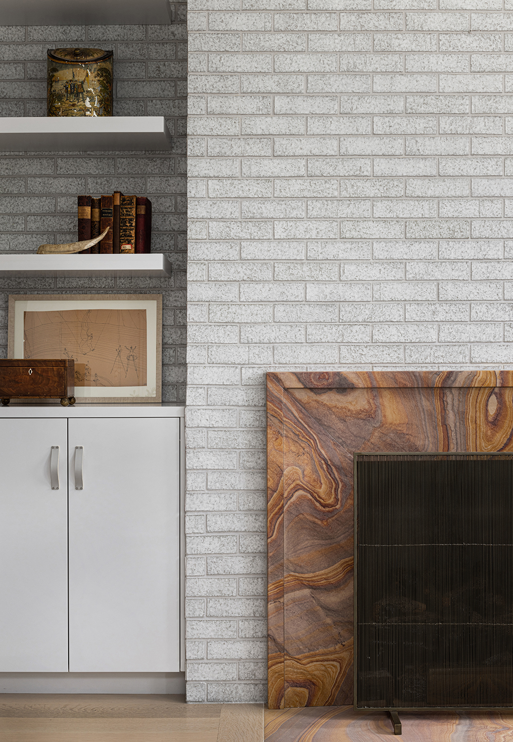
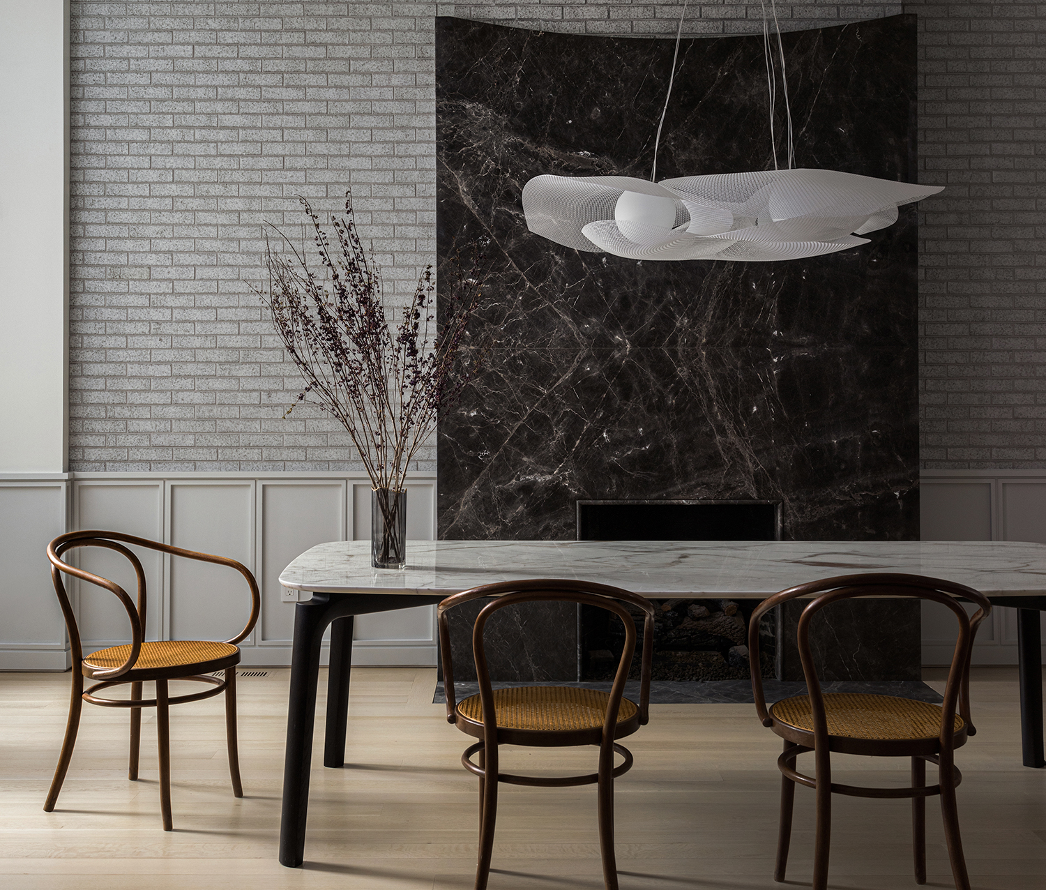
Despite the entryway leading onto a minimalist living room, there is no shortage of material richness here. The fireplace surround has such character with its rich brown marbling.
Be The First To Know
The Livingetc newsletters are your inside source for what’s shaping interiors now - and what’s next. Discover trend forecasts, smart style ideas, and curated shopping inspiration that brings design to life. Subscribe today and stay ahead of the curve.
'Stone is a material that can do a lot at once,' VW says of this material choice. 'It can be tough and rich. Smooth to the touch but visually textured. Modern but timeless. Upstairs in the more cozy spaces the fireplace surrounds are warmer - yellow on the second floor and pink on the third. Downstairs in the august dining room, the stone fireplace is a more formal grey.'
Dining area

Similarly to the rich brown fireplace, the brick wall behind the dining table is an unexpected choice for a minimalist dining room - wonderful but unexpected in this pared back space.
'In all the cases where we used stone on the walls - the fireplaces and the front entry in the vestibule - we tried to contrast it with its background,' Catherine says. 'This turned out to be brick, glazed brick or venetian plaster. Another rule we had for ourselves is that all of these moments took place on the exterior walls of the house, creating the sensation that the spaces are enclosed in a hard protective shell.'
Kitchen
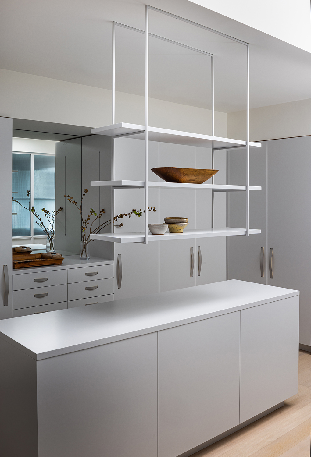
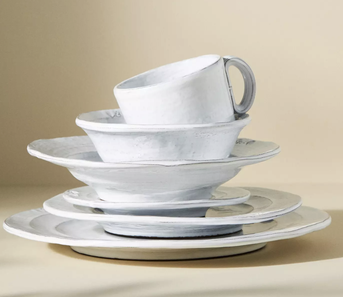
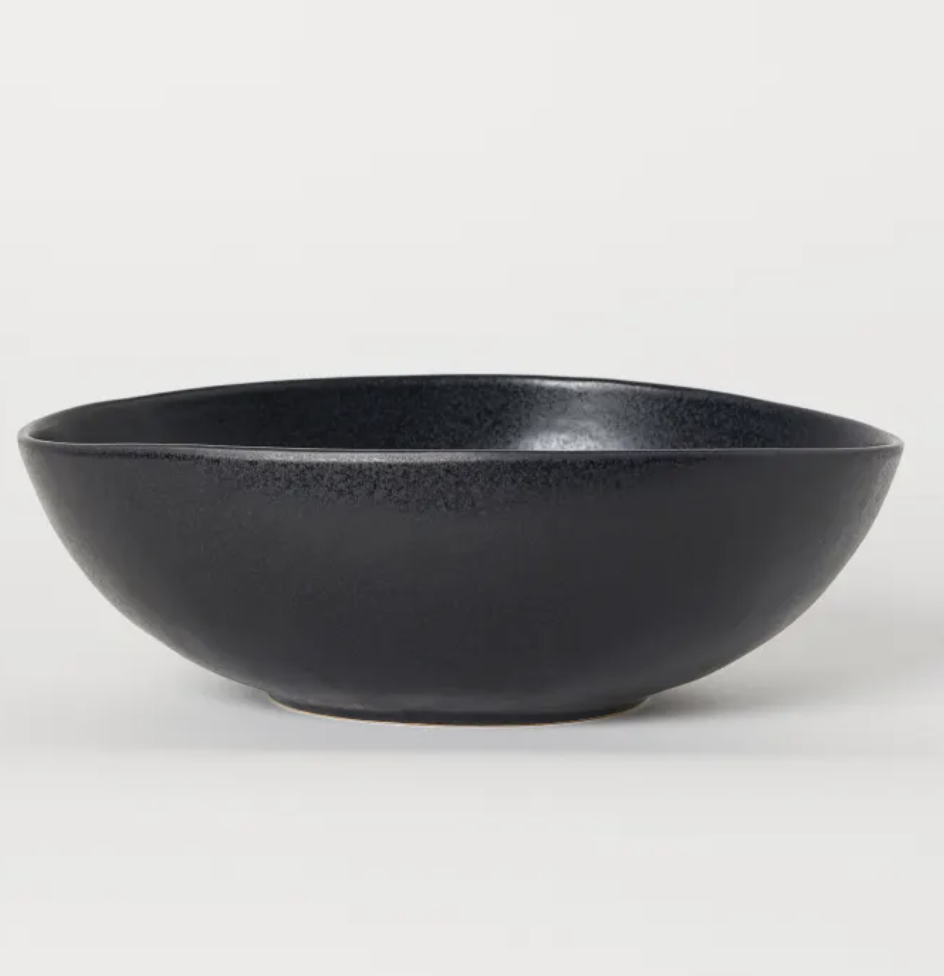
A classic modern minimalist kitchen approach is put only the most loved items on shelving, keeping the rest bare so that they look like art pieces rather than functional items. Here, the materiality of the chosen bowls completely transforms this otherwise very sleek space - imagine how different and empty it would seem without them.
Choose pieces that have rough or textured edges, subtle variations in color an a slight irregularity of form.
Shop the look
The editor of Livingetc, Pip Rich (formerly Pip McCormac) is a lifestyle journalist of almost 20 years experience working for some of the UK's biggest titles. As well as holding staff positions at Sunday Times Style, Red and Grazia he has written for the Guardian, The Telegraph, The Times and ES Magazine. The host of Livingetc's podcast Home Truths, Pip has also published three books - his most recent, A New Leaf, was released in December 2021 and is about the homes of architects who have filled their spaces with houseplants. He has recently moved out of London - and a home that ELLE Decoration called one of the ten best small spaces in the world - to start a new renovation project in Somerset.
-
 My 10 Favorite Designs at Milan Design Week 2025 — Out of the Hundreds of Pieces I Saw
There is a new elegance, color, and shape being shown in Milan this week, and these are the pieces that caught my eye
By Pip Rich
-
 Iridescence Is Chrome’s More Playful, Hard-to-Define Cousin — And You're About to See It Everywhere
This kinetic finish signals a broader shift toward surfaces that move, shimmer, and surprise. Here's where to find it now
By Julia Demer
