Frank Gehry - everything you need to know about this iconic architect
Frank Gehry's work has been hugely influential to modern design. From buildings to furniture, here's why
Still practising today, aged 92, Frank Gehry is a household name. He has played himself in The Simpsons, been the subject of 2006 documentary Sketches of Frank Gehry, which explored his work and legacy, and was awarded the Presidential Medal of Freedom by Barack Obama in 2016. Often dubbed ‘the world's most famous living architect’, many of Gehry’s buildings are now global attractions, and have the power to regenerate their entire regions. His works transcend architectural boundaries to become works of art in their own right, and have made Gehry one of the most acclaimed architects of the 21st century.
Who is Frank Gehry?
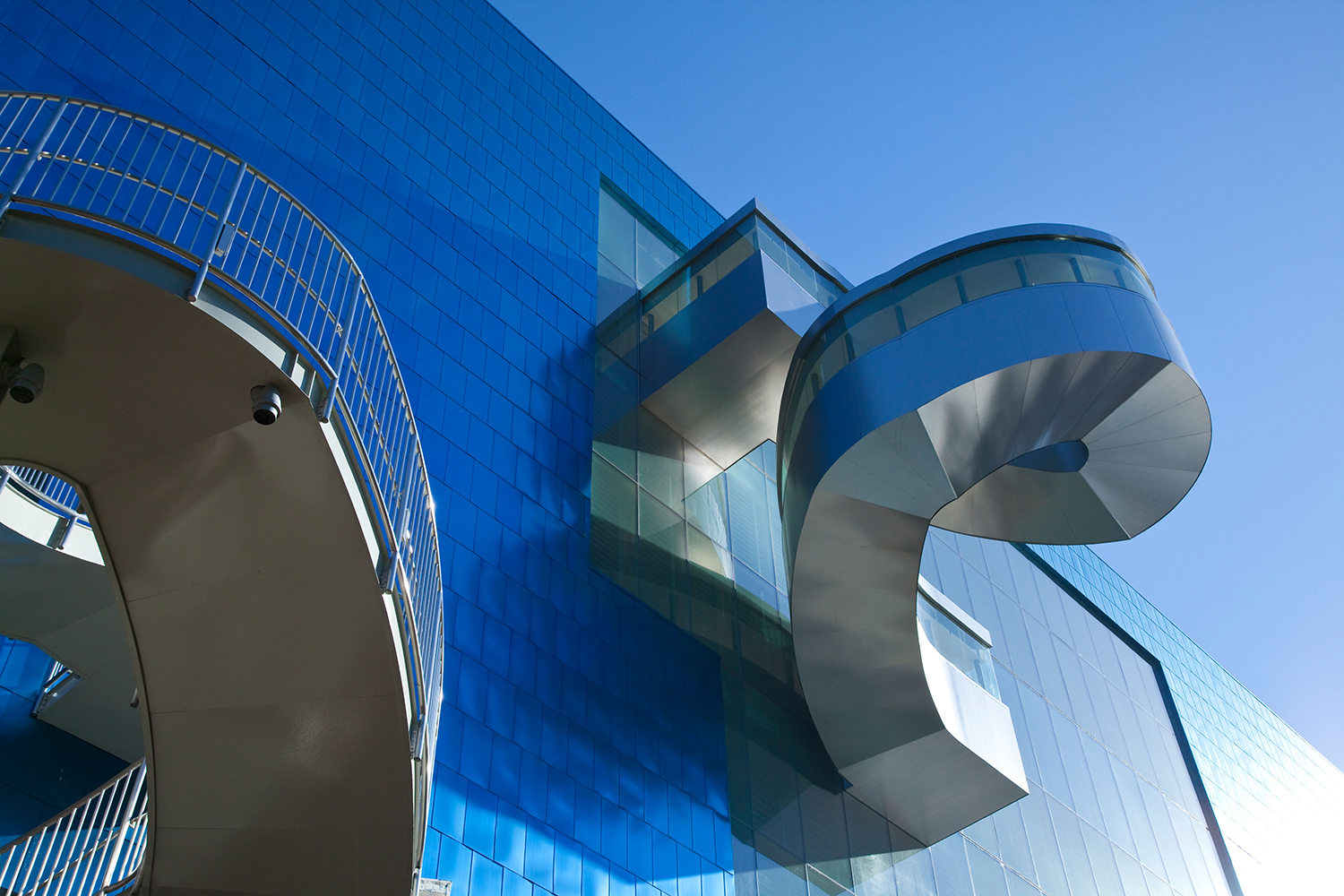
Exterior staircase of the Frank Gehry addition to the Art Gallery of Ontario in Toronto, Canada
Canadian-American architect Frank Gehry was born Frank Owen Goldberg in Toronto, Canada, in 1929. Gehry was creative from a young age thanks to a childhood of Saturday mornings spent in his grandfather's hardware store, where he would construct imaginary buildings and cities from wood chippings and other items he discovered – the use of unconventional and everyday building materials would come to be central to his work.
Moving to Los Angeles in 1949, and after sampling the professions of truck driving, radio announcing, and chemical engineering, the teenager turned to architecture, studying at the University of Southern California’s School of Architecture. The young creative married Anita Snyder, and the family changed their surname to Gehry in an effort to sidestep antisemitic abuse for their children. Gehry later regretted the name change, saying he ‘wouldn't do it today’.
Then followed a brief stint at Harvard Graduate School of Design, until Gehry became disillusioned with the program, leaving it uncompleted and instead moving to California to work with Victor Gruen Associates, being recruited into the army (where he designed furniture for soldiers), before establishing his own practice, Frank O. Gehry & Associates, in LA in 1962. Following the break-up of his first marriage, Gehry married Berta Isabel Aguilera in 1975.
While his early architectural projects were classically modernist, Gehry soon took on a more experimental style, embracing found objects and waste materials such as unpainted plywood, rough concrete, corrugated metal and cardboard in furniture and buildings. The architect’s avant-garde aesthetic soon caught the attention of the world, and by the 1980s he was making a name for himself designing Californian homes.
As his celebrity grew, Gehry’s work became increasingly grand and complex, the architect abandoning modernism for a deconstructivist style which challenged aesthetic conventions with its disjoined shapes and haphazard feel. Throughout his career, his distinctive designs have been dedicated to curvilinear shapes, fragmented forms, surprising materials and a brazen use of colour.
In his later years, Gehry served as a professor of architecture at Columbia University, Yale and the University of Southern California, and was awarded the prestigious Pritzker Prize in 1989 which honours a living architect ‘whose built work demonstrates combination of…talent, vision and commitment’ and ‘has produced consistent and significant contributions to humanity and the built environment through the art of architecture’. Jurors commended his consistent experimentation and compared his approach to that of Picasso.
Be The First To Know
The Livingetc newsletters are your inside source for what’s shaping interiors now - and what’s next. Discover trend forecasts, smart style ideas, and curated shopping inspiration that brings design to life. Subscribe today and stay ahead of the curve.
Frank Gehry buildings
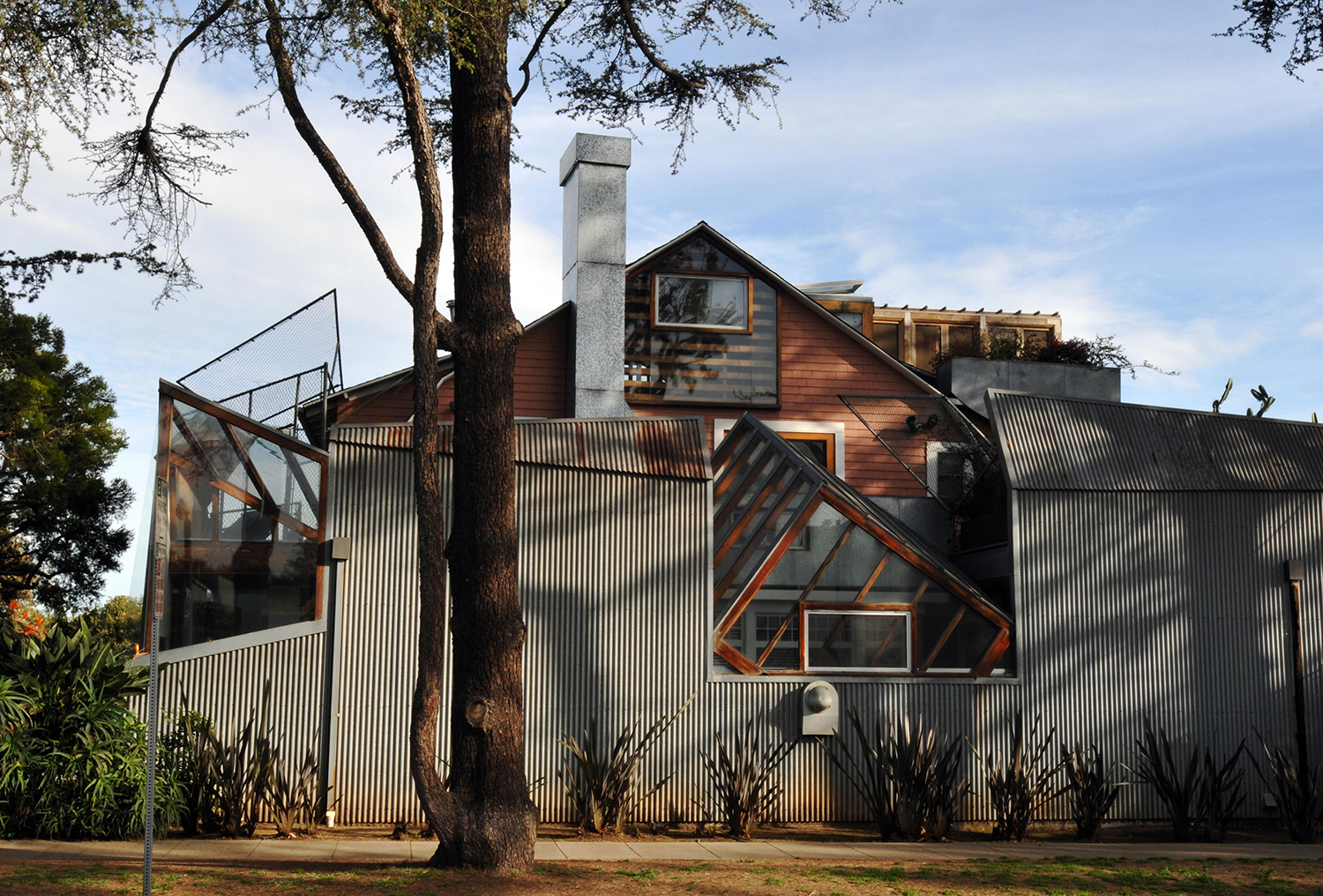
Frank Gehry's home, Gehry House, in Santa Monica, California
Gehry House, California, USA 1978
Redesigning his family home in 1978 launched Gehry’s architectural career, introducing his deconstructivist style of seamlessness, everyday industrial materials, flowing forms, and the merging of new and old to the world, inspiring many modern homes. The architect transformed the existing 1925-built bungalow with plywood, chain link fencing, corrugated steel, large skylights and angular wooden frames, commenting; ‘I bought an old house, and I put a new house around it.’ The building received a love-or-hate reception, catapulting the architect into the public psyche and mark the beginning of a litany of experimental structures. Still a pilgrimage site for architecture lovers, the house was awarded the prestigious Twenty-Five Year Award by the American Institute of Architects in 2012.

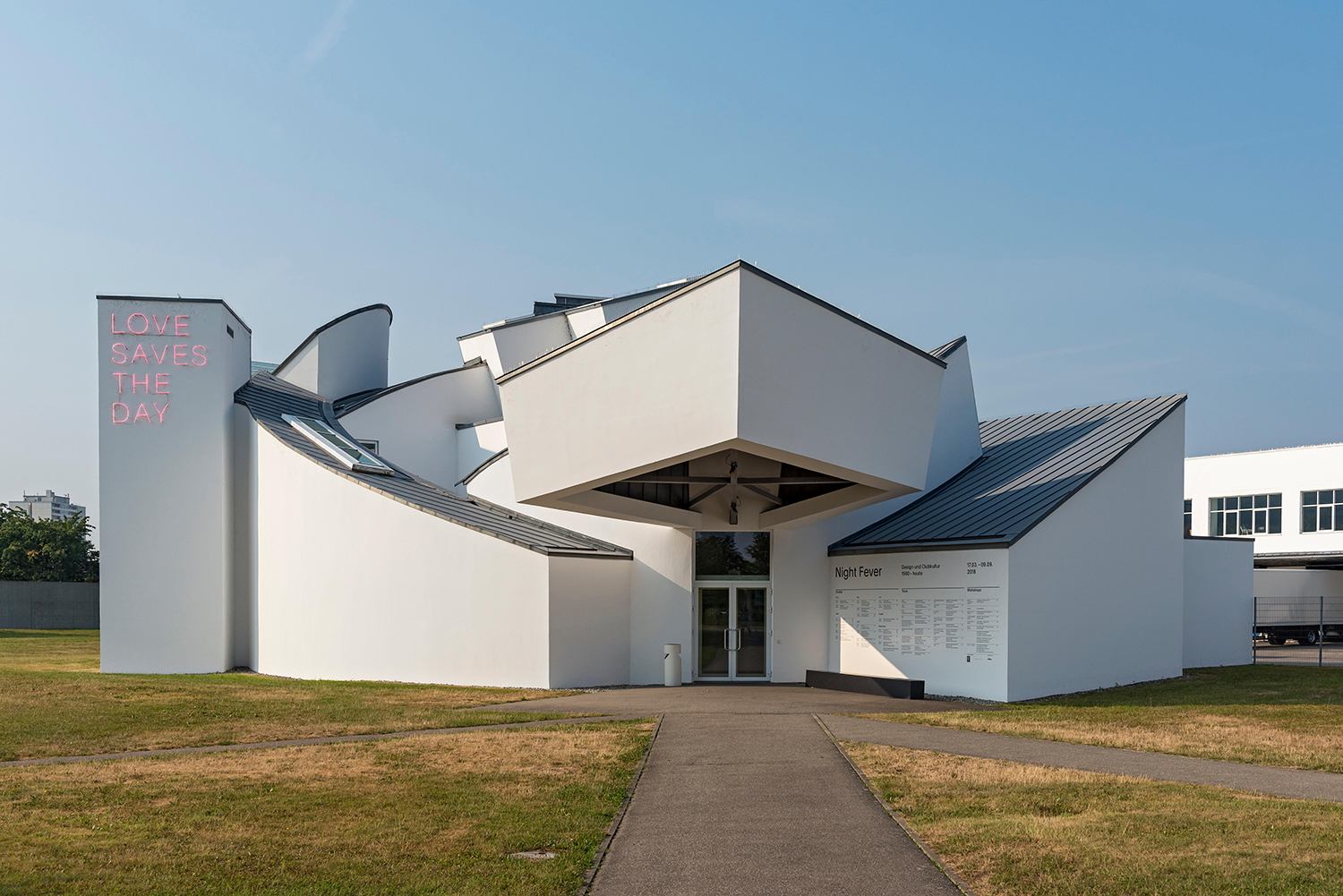
Vitra Design Musuem designed by Frank Gehry
Vitra Design Museum, Weil am Rhein, Germany 1989
Joining the ranks of up-and-coming architects to design buildings for furniture manufacturer Vitra’s campus – a list which now includes names such as Zaha Hadid, Herzog & de Meuron, Tadao Ando and Álvaro Siza – Gehry’s first European project is classically deconstructive with angular geometric forms. The design differs from the architect’s usual style with its limited material palette of white plaster and titanium-zinc alloy, and was the first time he had used curved forms to break up his signature angles, the architect noting; ‘I love the shaping I can do when I’m sketching and it never occurred to me that I would do it in a building. The first thing I built of anything like that is Vitra in Germany’.
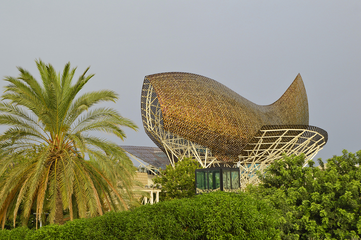
Fish (El Peix), a modern steel sculpture designed by Frank Gehry in Barcelona, Spain
El Peix (Fish), Barcelona, Spain 1992
Gehry has a long-held love of aquatics, which feature in many of his designs. Built as part of the 1992 Barcelona Olympics, fish sculpture El Peix is a bold landmark on Barcelona’s beachfront, 52 meters of golden stainless-steel mesh glittering in the sun and changing colour along with the light. The structure is a covering for the casino and restaurants below, created with three-dimensional, aeronautical-design software which marked a breakthrough in Gehry’s designs.
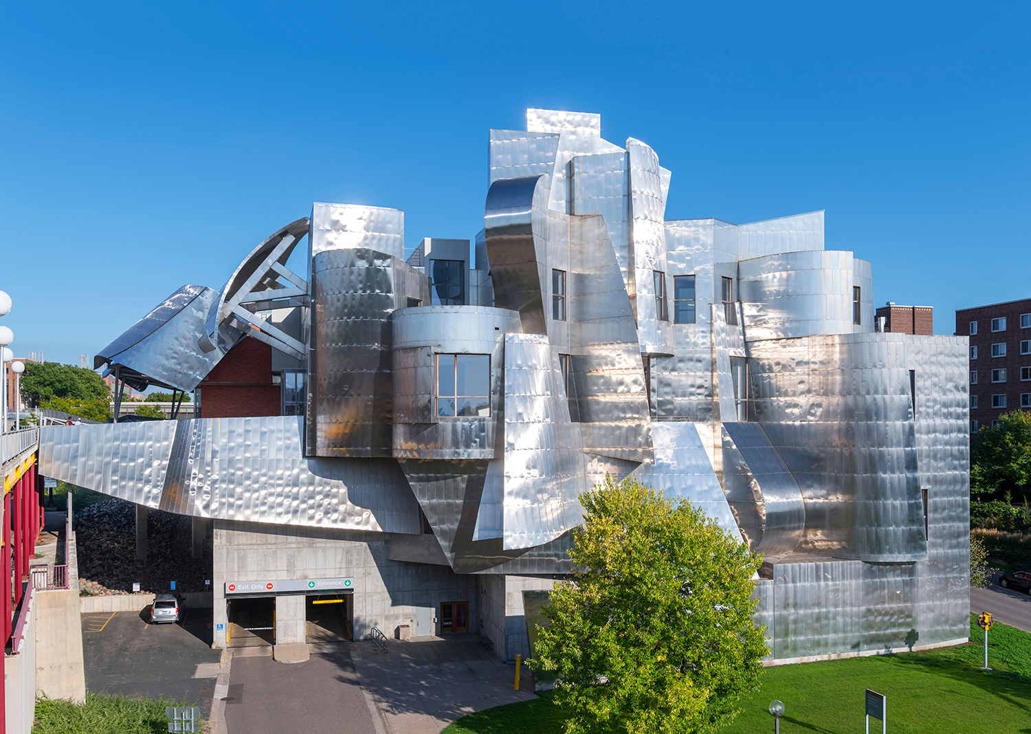
The Frank Gehry designed Weisman Art Museum, Minneapolis, Minnesota
Weisman Art Museum, Minnesota, USA 1993
A jumble of blocky curvilinear forms in haphazard angles overlooking the Mississippi River, and last of Gehry’s buildings based on a hand drawing, the architect has said the stainless-steel Cubist-style shape is an abstract representation of a fish jumping up a waterfall. A large brick-clad extension was added to the structure in 2011, also designed by Gehry, its swooping metal canopies designed with 3D modelling technology the second time around.
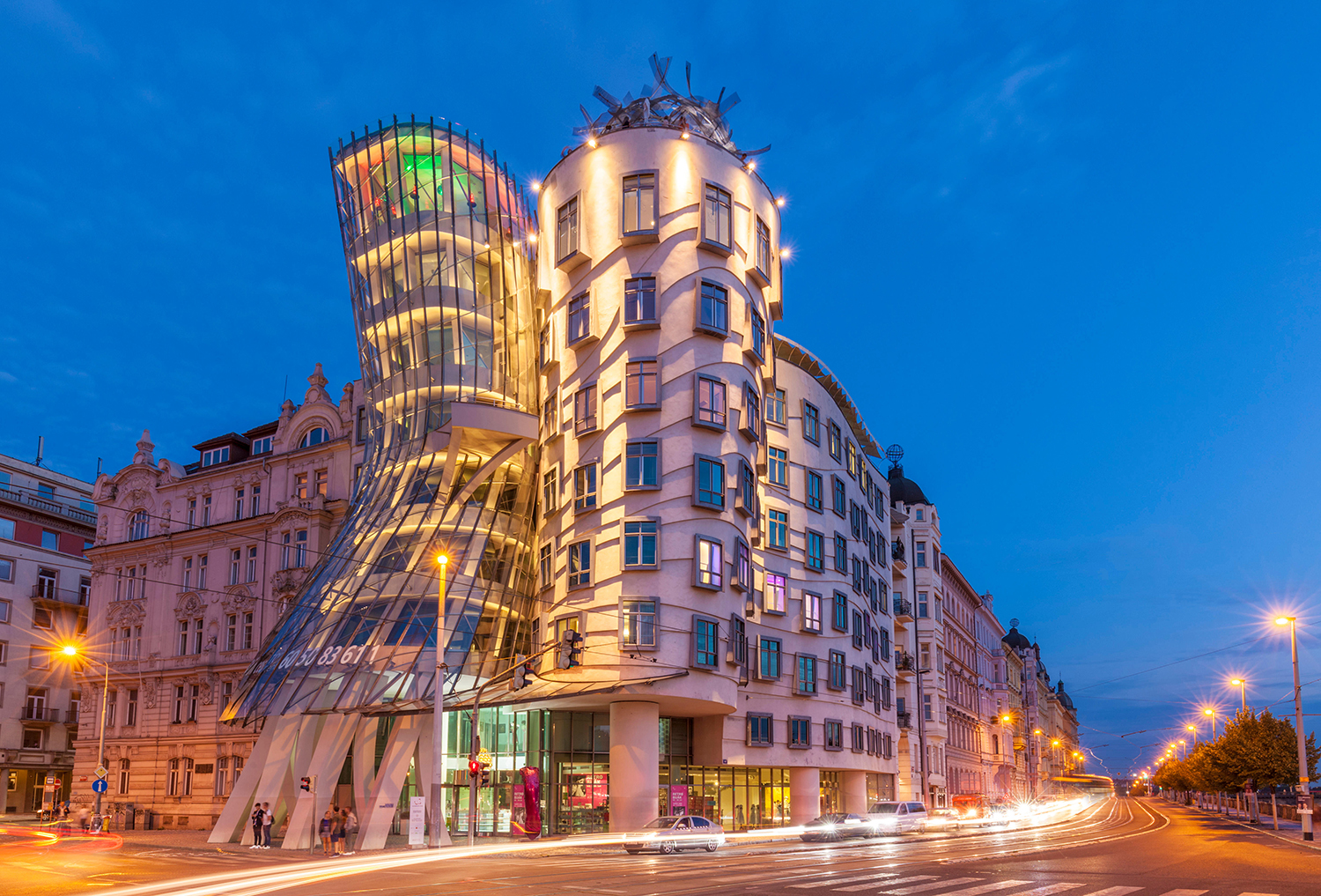
Dancing House Prague by Frank Gehry, Prague
The great work of architectures expresses feeling. When you visit and see them there's a transfer of feeling from the artist, the architect, other time through the ages, to now.
Frank Gehry
Dancing House, Prague, Czech Republic 1996
A pair of deconstructivist towers made from glass, steel and concrete panels in juxtaposing aesthetics, one cylindrical, one curvy, Gehry – and the world – nicknamed the duo ‘Fred and Ginger’ as a nod to their resemblance to dancers Fred Astaire and Ginger Rogers. The structures were initially controversial, criticised for disrupting Prague’s Baroque, Gothic, and Art Nouveau buildings, however have become a prized city attraction.
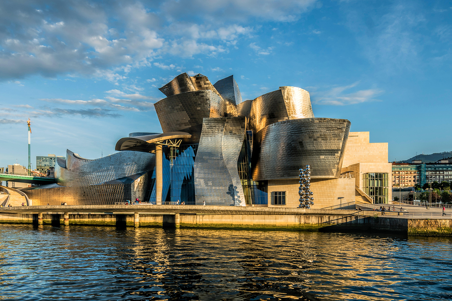
Guggenheim Museum Bilbao, designed by Frank Gehry
Guggenheim Museum, Bilbao, Spain 1997
An architectural behemoth in sandstone, glass, and metal following the flow of the Nervión river, Gehry’s curvaceous masterpiece is a series of complex swirling titanium forms – a nod to Bilbao’s history as a steel town – colliding in undulating waves, housing 19 contemporary art galleries. The trailblazing museum opened to an explosion of publicity and went on to become one of the most famous buildings of the 20th century, revitalising the city’s economy and reputation so dramatically that the once under-the-radar destination now draws in millions of visitors (and Euros) a year in a transformation dubbed ‘the Bilbao Effect’ and ‘the Guggenheim Effect’.
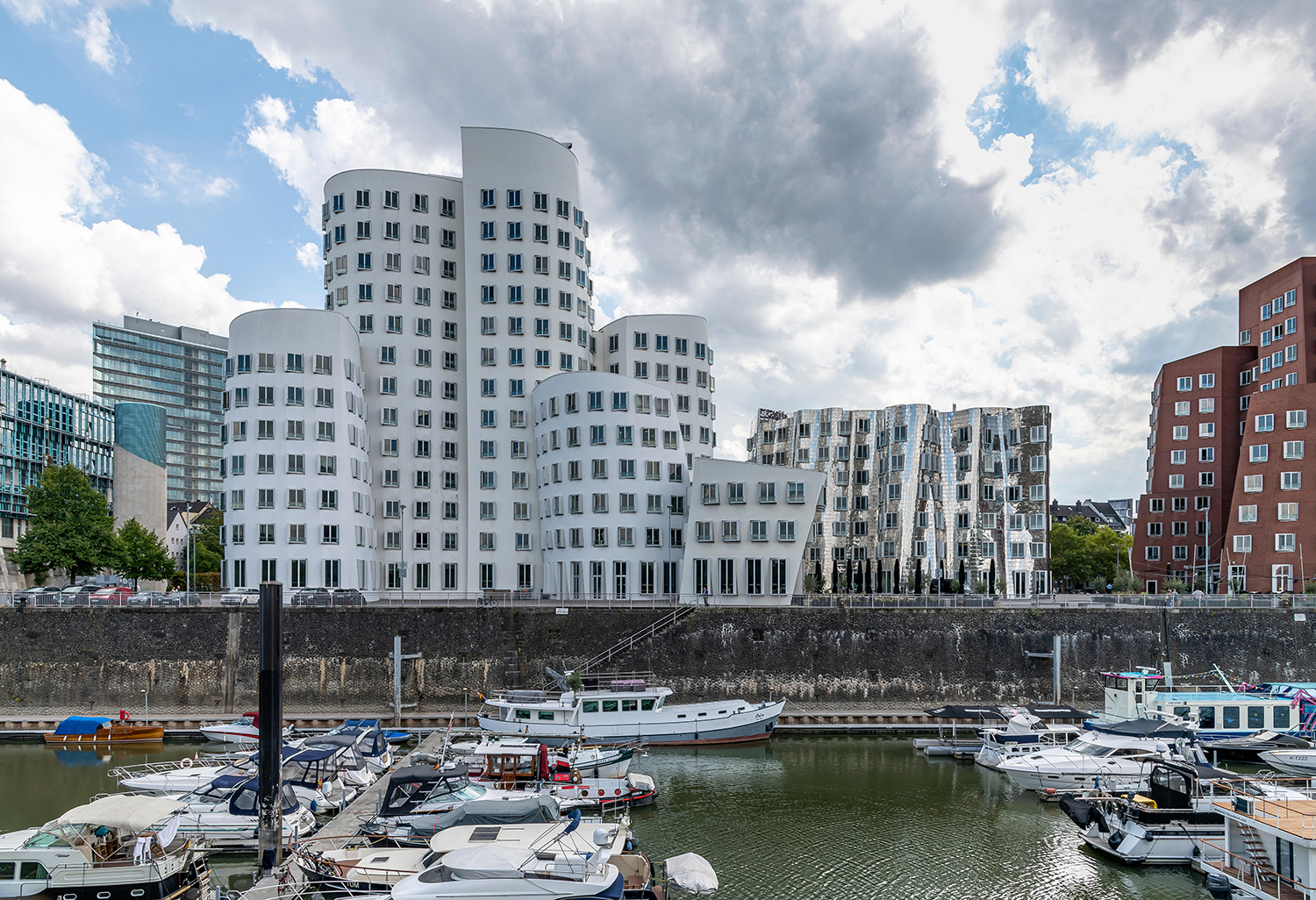
Media Harbour - MedienHafen - on the banks of the Rhein in Dusseldorff eaturing Frank Gehry's Neuer Zollhof
Neuer Zollhof, Düsseldorf, Germany 1999
A set of three office buildings on the Düsseldorf harbourside, the structures curve and lean at multiple angles, each given its own personality in contrasting styles and materials. The east tower comprises curvilinear volumes clad in a sea of white plaster, the west tower’s geometric angles are built in red brick, and the central building takes on a fluid shape in gleaming stainless steel, reflecting the colours of its neighbours. The structure’s popularity led to the waterfront being revitalised with buildings by other prominent architects such as David Chipperfield and Fumihiko Maki, and the buildings have been honoured with a spot on the German Monopoly board.
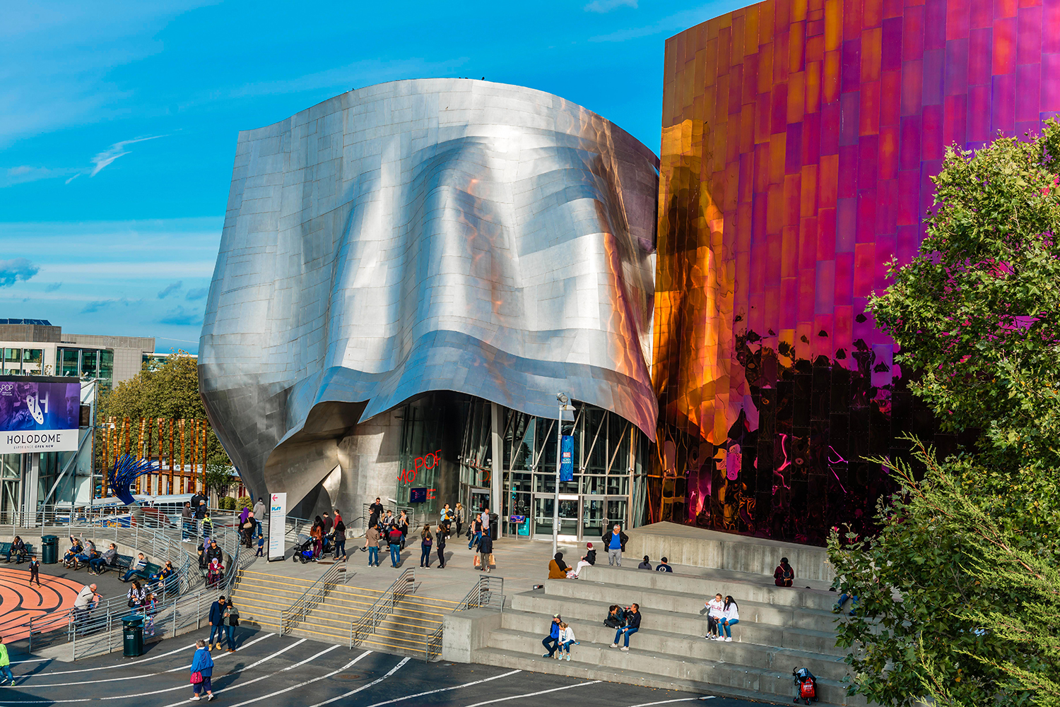
Museum of Pop Culture, MoPOP, designed by Frank Gehry in Seattle
Museum of Pop Culture, Washington, USA 2000
Aiming to create a rock n roll aesthetic, Gehry’s research for the MoPOP’s design included slicing electric guitars into pieces and using them to build architectural models. With the vibrant panelling melding colour and texture to convey the energy and ever-changing nature of music, the facades are made up of 21,000 individually cut and shaped painted aluminium and stainless-steel pieces, each responding to external light conditions at a slightly different angle.

The Maggies Cancer Care Centre in the grounds of Ninewells Hospital in Dundee, Scotland
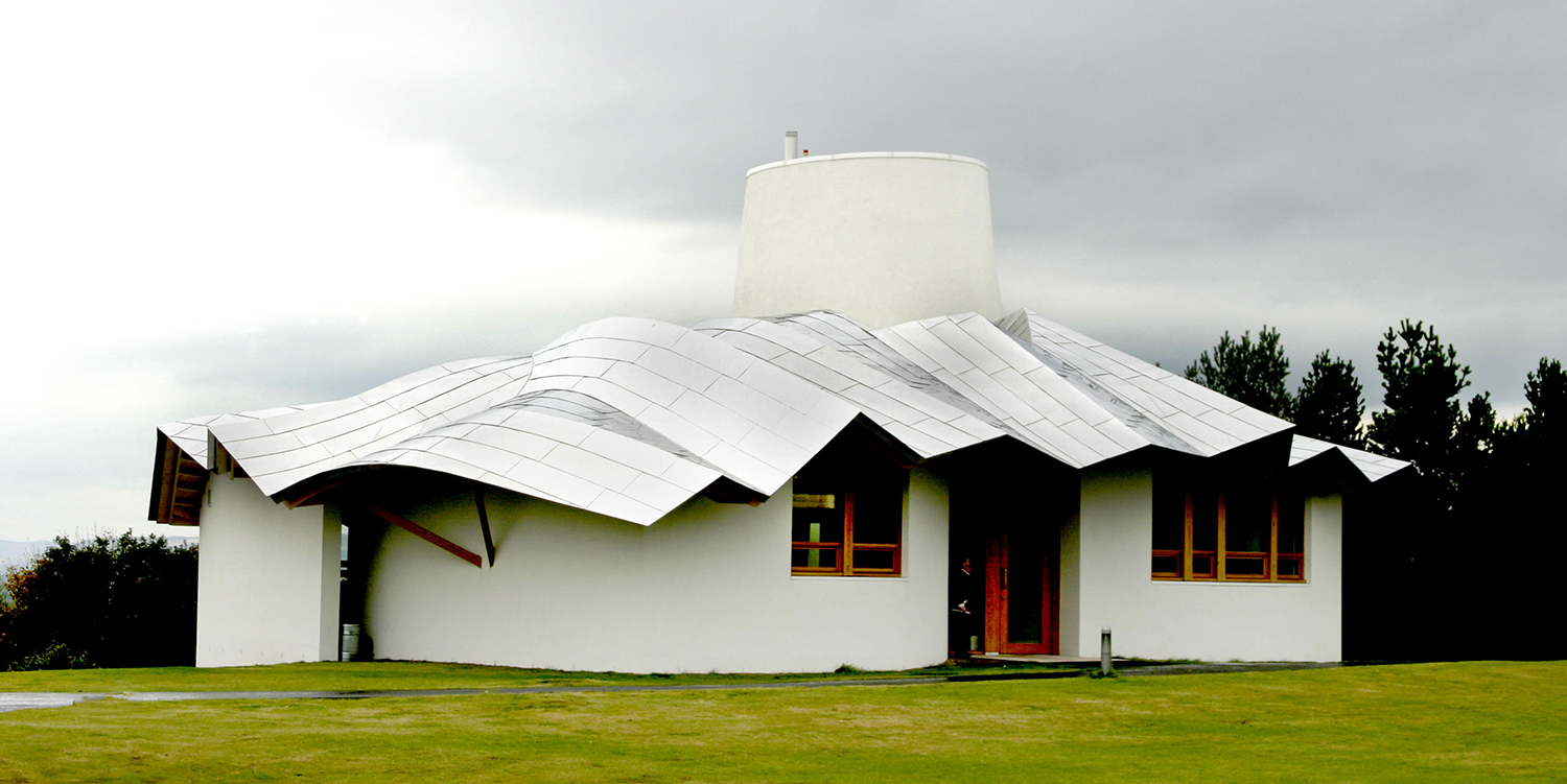
The Maggie's Cancer Care Centre sits in the grounds of Ninewells Hospital in Dundee, Scotland.
Maggie’s Centre, Dundee, Scotland 2003
Gehry’s only permanent UK building, cancer support charity Maggie’s Dundee outpost is a tranquil, intimate cottage perched on the crest of a hill, modelled on the traditional two-room Scottish ‘but and ben’ dwellings, with its wavy silver roof hinting at the deconstructivist. The architect said of the structure; ‘I think it’s an inviting building…I really hope that in some small way it might contribute to a sense of rejuvenated vigour for moving forward and living life’. Gehry’s statement roof is supported by a labyrinth and earthwork mounds by landscape designer Arabella Lennox-Boyd, and Antony Gormley artwork.
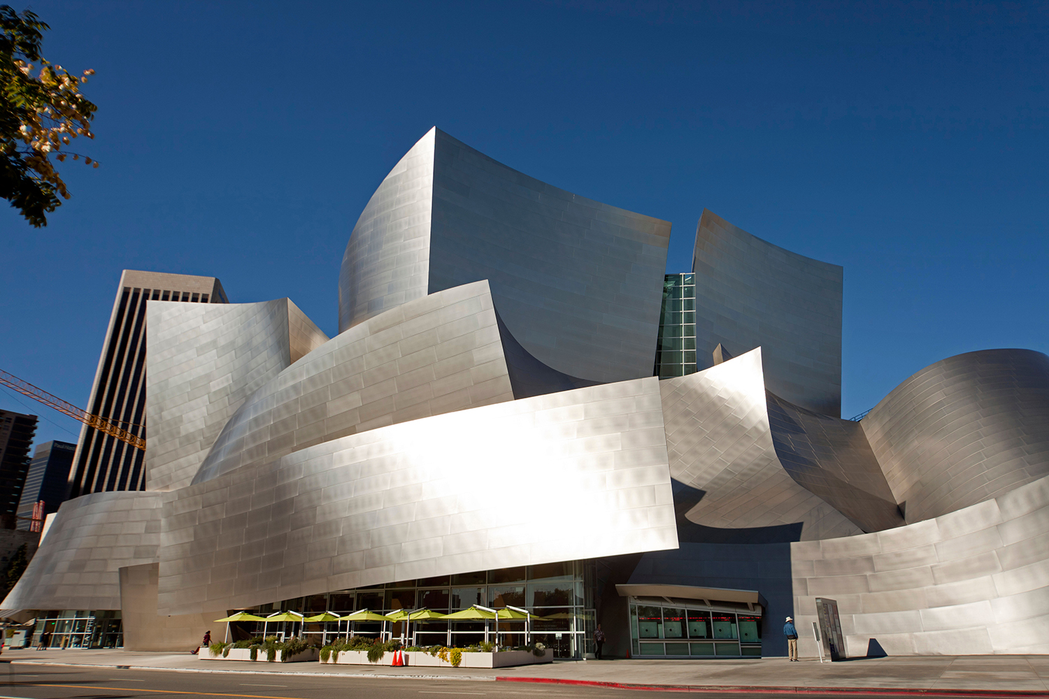
Walt Disney Concert Hall, Downtown Los Angeles, California
Walt Disney Concert Hall, California, USA 2003
With fifteen years been conception and completion – with a lot of stalling in between – the home created for Los Angeles Philharmonic is universally deemed worth the wait. With billowing stainless-steel panels positioned as if buffeted by the wind, the facade is an homage to Gehry’s love of sailing and a nod to musical movement in flowing deconstructivist shapes which are echoed inside by the curvilinear Douglas Fir-lined auditorium. Gehry worked with acoustical consultant Yasuhisa Toyota for the project, and the building is critically acclaimed for its outstanding audibility.
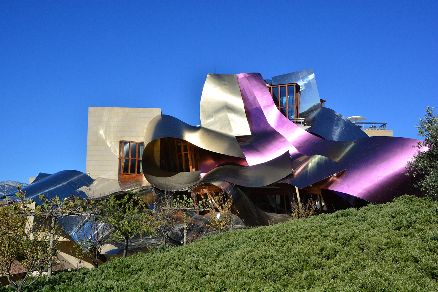
Winery of Marques de Riscal in Alava, Basque Country
Marqués de Riscal, Elciego, Spain 2006
An unexpected landmark among the surrounding fields and Medieval buildings, the Marqués de Riscal was Gehry’s first hotel, made up of sweeping ribbons of steel and titanium in silver and a deep purple tone which mirrors the Rioja produced in the vineyards and winery below. Similarly, to the Guggenheim, the extravagant design has played a dramatic part in rejuvenating and drawing tourists to a once sleepy corner of Spain.
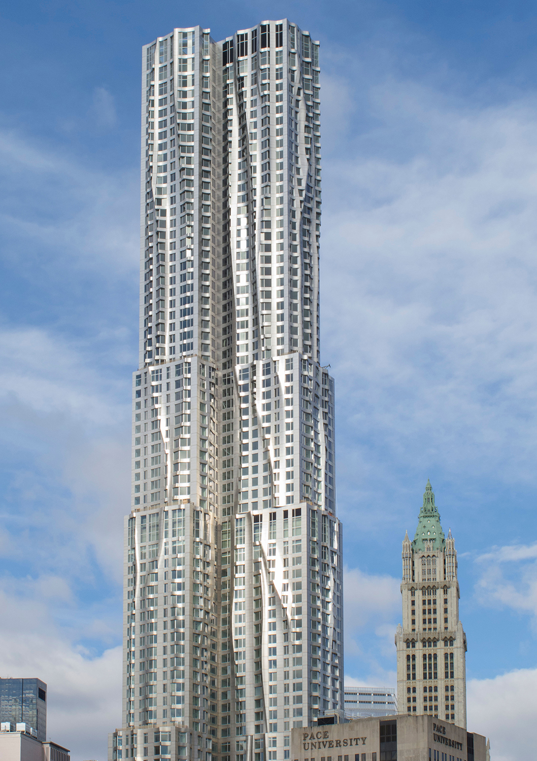
8 Spruce Street, New York, USA 2010
Gehry’s first skyscraper remained true to form with waves rippling up and down the 76-storey metal and glass façade, reflecting and changing with the city’s light. Designed to evoke the look of draped fabric, the façade is made up of 10,500 differently shaped stainless-steel panels. In 2011 the evocative building, which is also known as New York by Gehry, won the world's most renowned prize for high-rise architecture, the Emporis Skyscraper Award, the jury stating ‘8 Spruce Street stands out even in Manhattan’s remarkable skyline...it is a major new architectural landmark for New York’.
The Gehry Project, Toronto, Canada, in progress
A pair of twisting skyscrapers at 74- and 84-storeys planned to grace the Toronto skyline, this ongoing project by Gehry is cited to house apartments, a hotel, an art gallery and a university campus in twisting textured metal and glass. The now 92-year-old architect says of the design ‘I wanted the two towers to each have their own personality…to talk to each other, creating a dynamic and changing addition to the skyline depending where you were viewing them from in the city’.
Frank Gehry Louis Vuitton
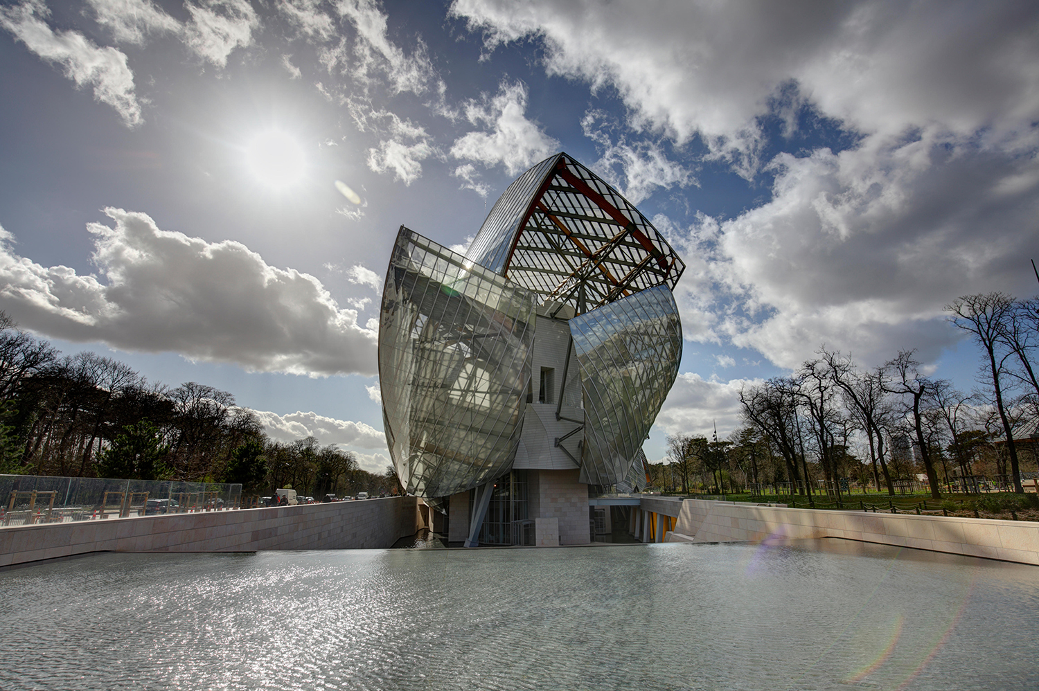
The Louis Vuitton Foundation by Frank Gehry, Paris, France
Starting as all of his creations do, as a line drawing in a notebook, Frank Gehry’s Fondation Louis Vuitton building makes a vivid statement among the trees of the Jardin d’Acclimatation, a section of the Bois de Boulogne park on the western outskirts of Paris. Opening in 2014 after six years of construction, the architect sought to design ‘a magnificent vessel symbolising the cultural calling of France’, drawing inspiration from ornate 19th century steel-and-glass greenhouses as well as the visage of a sailing ship.
Following an initial hand sketch, Gehry produced models in wood, plastic and aluminium experimenting with shapes and creating a sense of movement. The final design tests architectural boundaries, consisting of an angular central structure – the ‘Iceberg’ – made up of 19,000 individually designed reinforced concrete panels, surrounded by 12 ‘sails’ formed from 3,600 pieces of glass (each curved to the nearest millimetre).
The two-story structure contains 11 galleries, offices, education spaces, a museum store, restaurant and a 350-seat auditorium as well as multilevel roof terraces for events and installations.
Over 400 people contributed to the building’s design via an online 3D digital model, with the highly technical glass and concrete panels moulded by robots working from the shared plans. The result is a dreamlike building which seems frozen amid being caught by the wind, full of lightness and joy de vivre and finished with a Gehry-designed Louis Vuitton LV logo in stainless-steel poised above the ticket booth.
Frank Gehry sketches
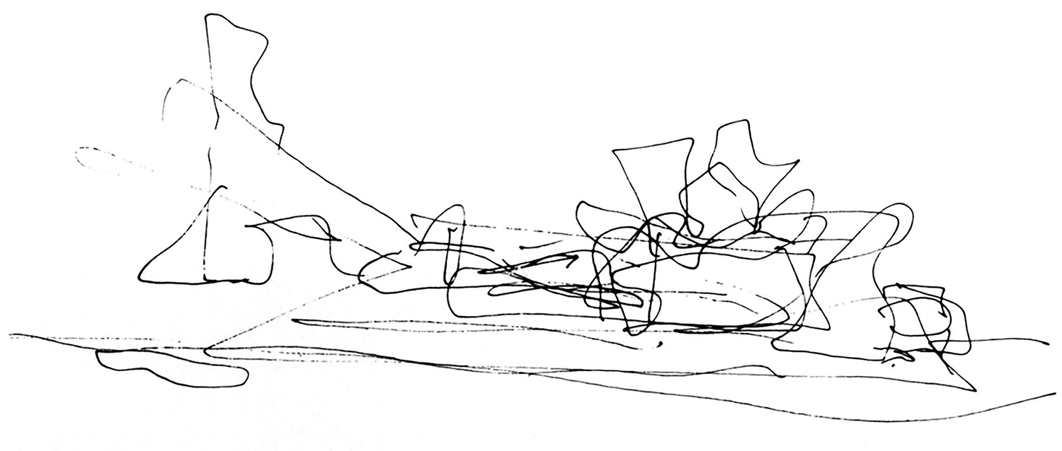
Sketches of the Guggenheim Museum in Bilbao by Frank Gehry
While he may humbly refer to them as ‘scribbles’, ‘messiness’ and quoting ‘I don’t think they mean anything to anybody except to me’, Gehry’s numerous sketches form the cornerstone of his design process and invite the viewer into his complex, energetic mind. Drawn by hand in black ink, the abstract pieces disregard specificity in favour of fluidity and freedom, bridging the gap between architecture and art as works in their own right.
Gehry’s sketches became a consistent part of his design language in the 1980s, although as far back as the 1960s the architect was producing abstract, gestural drawings for his early projects. Amassed to the thousands, Los Angeles’s Getty Research Institute holds an archive of approximately 1,000 sketches, as well as over 120,000 working drawings and more than 100,000 slides visually chronicling the first three decades of Gehry’s career.
Despite the development of computer visualisation technology, hand sketches still make up the start of Gehry’s design process. The 2006 film Sketches of Frank Gehry by director Sydney Pollack explores the process of turning these two-dimensional imaginings into tangible buildings, the architect working with his team to turn them into simple cardboard-and-tape models, computer renders and architectural drawings before bringing them into the real world.
The far-from-precise drawings often bear a striking resemblance to the final structures, with Gehry commenting; ‘At the end of the project we wheel out these little drawings and they’re uncannily like the finished building’.
Frank Gehry Chair
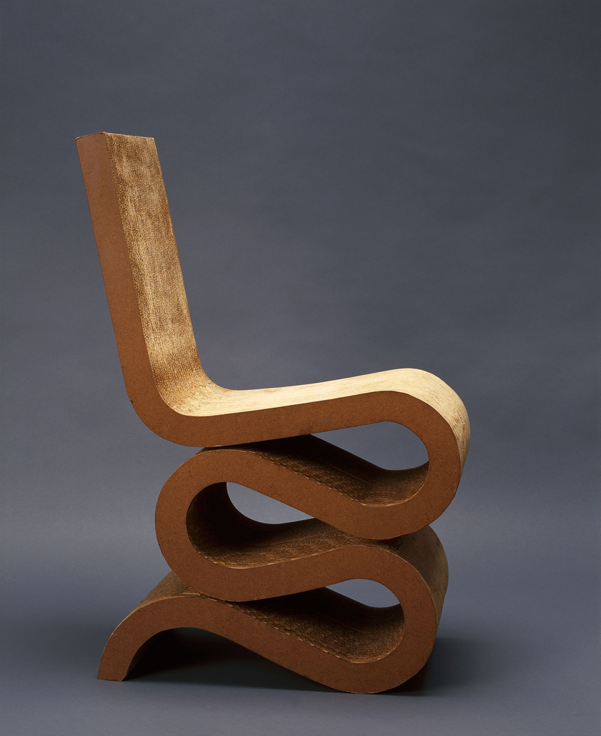
Frank Gehry's Wiggle Side Chair
Much like his buildings, chairs designed by Frank Gehry are of a sculptural, gravity-defying and otherworldly nature.
Say ‘Frank Gehry furniture’ and the piece that will spring into most people’s mind will be the iconic Wiggle Side Chair, a playful ribbon-like squiggle made up of layers of corrugated cardboard and fibre board, the technical way in which it is constructed making the s-shaped seat incredibly robust and strong as well as comfortable.
Created as part of a small project for a NASA meeting in 1969, for which the up-and-coming architect was given a miniscule budget, he turned a humble material into something ultra-contemporary and befitting of space travellers.
The Wiggle Side Chair is part of Gehry’s Easy Edges range of cardboard furniture, which included the chair, a side table and set of shelves, all of which the public and press went wild for, the New York Times wryly dubbing the collection ‘paper furniture for penny pinchers’.
The Easy Edges collection was produced until 1973, when Gehry stopped production worrying the furniture would overshadow his architectural work. Vitra eventually bought the rights to it, the brand still producing the innovative Wiggle Side Chair and Wiggle Stool today.
1979-1982 Gehry brought out the Experimental Edges collection, a series of 12 similar seating designs, made from thicker cardboard with a rugged, unfinished aesthetic.
Frank Gehry Fish Lamp
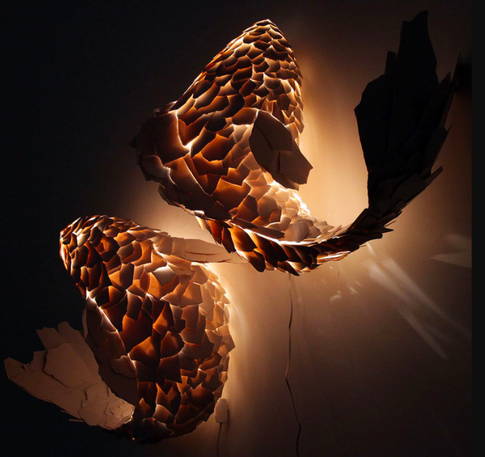
Produced 1984-1986, Gehry’s Fish Lamps came about by happy accident; when working on a commission for Formica with its new plastic laminate ColorCore, Gehry dropped a piece and it shattered into a small segment which was to become the architect’s first Fish Lamp scale. Individual scales were glued onto a wire frame, creating a sculptural school of graceful Koi-like fish which have the typical Gehry characteristics of fluidity, expression and whimsy.
The Fish Lights defy gravity as if moving through water, touching lightly on their bases or supports in a manner that is barely noticeable. When switched on, the material lets light shine though the scales, adding to the pieces’ ethereal feel.
Fish and water have been a recurring motif throughout Gehry’s work, the architect describing them as ‘a perfect form’, their sleek shapes loosely influencing the curvilinear designs of buildings ranging the 1997 Guggenheim Museum to the 2006 Marqués de Riscal, with the animal literally represented in the 1992 El Peix in Barcelona, the 1986 Minneapolis Sculpture Garden Standing Glass Fish and the 1987 Fishdance sculpture in Japan.
In 2012 Gehry revisited the Fish Lamps, creating a new shoal with larger, more jagged pieces of ColourCore, this time incorporating curled and flex elements and which can be fixed on a wall, pole, or flat surface.
Frank Gehry furniture
In 1989, Gehry approached renown American brand Knoll about creating a furniture collection which would reinvent bentwood. The result was a series of seats inspired by the apple crates the architect played on as a child, which transformed traditionally thick and heavy bentwood furniture into incredibly strong airy, lightweight pieces.
The range, which was launched in New York at the 1992 The Museum of Modern Art show Frank Gehry: New Furniture Prototypes, includes the Cross Check Chair, Power Play Chair and Ottoman, Hat Trick Chair, High Sticking Chair and glass-topped Face Off Table, all characterised by shapely strips of laminated maple constructed in woven, basket-like forms.
Frank Gehry chairs are very much an offshoot of the architect’s fluid approach to buildings, and as with his larger pieces, the furniture stemmed from a classic Gehry line drawing. Speaking in 1992 about the Wiggle Side Chair, Gehry explained; ‘I wanted the chair to come out of my own work, the shapes of my buildings’.
Frank Gehry quotes
‘People ask me if I'm an artist or an architect. But I think they're the same’.
‘Artists dismiss me as an architect, so I'm not in their box, and architects dismiss me as an artist, so I'm not in their box.’
‘I am not a 'star-chitect', I am an ar-chitect.’
‘Architecture should speak of its time and place, but yearn for timelessness.’
‘The great work of architectures expresses feeling. When you visit and see them there's a transfer of feeling from the artist, the architect, other time through the ages, to now.’
‘I think my best skill as an architect is the achievement of hand-to-eye coordination. I am able to transfer a sketch into a model into the building.’
‘Architecture and any art can transform a person, even save someone. It can for children - for anyone. It still does for me.’
‘I found the material that people hated the most and used the most. So, I was going and try and see if I could play with it sculpturally.’
‘Ninety percent of the buildings we live in and around aren't architecture. No, that's not right - 98 percent’.
‘I love working. I don't know what the word vacation means.’
‘Your best work is your expression of yourself. Now, you may not be the greatest at it, but when you do it, you're the only expert.’
‘That's why you go into architecture - at least I did - to do things for people. I think most of us are idealists. You start out that way, anyway.’
‘I like the idea of collaboration - it pushes you. It's a richer experience.’
‘Most of our cities built since the war are bland. They're modernist, they're cold, and now architects want to go back to that.’
‘Cardboard is another material that's ubiquitous and everybody hates, yet when I made furniture with it everybody loved it.’

Amy Moorea Wong is a color authority and contemporary interior design writer who has specialized in all things decorating for over a decade. Amy is Livingetc magazine’s Colour Expert, Interiors Editor at The Glossary magazine and a Contributing Editor at Homes & Gardens magazine, and she frequently contributes to an array of global publications to share her insights on interior design zeitgeist. Her book Kaleidoscope: Modern Homes in Every Colour explores a collection of cool colorful homes fizzing with creativity, surprises, and inspiration.
-
 Biophilic Decluttering — What to Take Out of Your Home (and What to Put in) for a More Natural Home
Try your hand at biophilic decluttering to ground your interiors, connect to the environment, and cure chronic clutter in one go. Here's how.
By Amiya Baratan
-
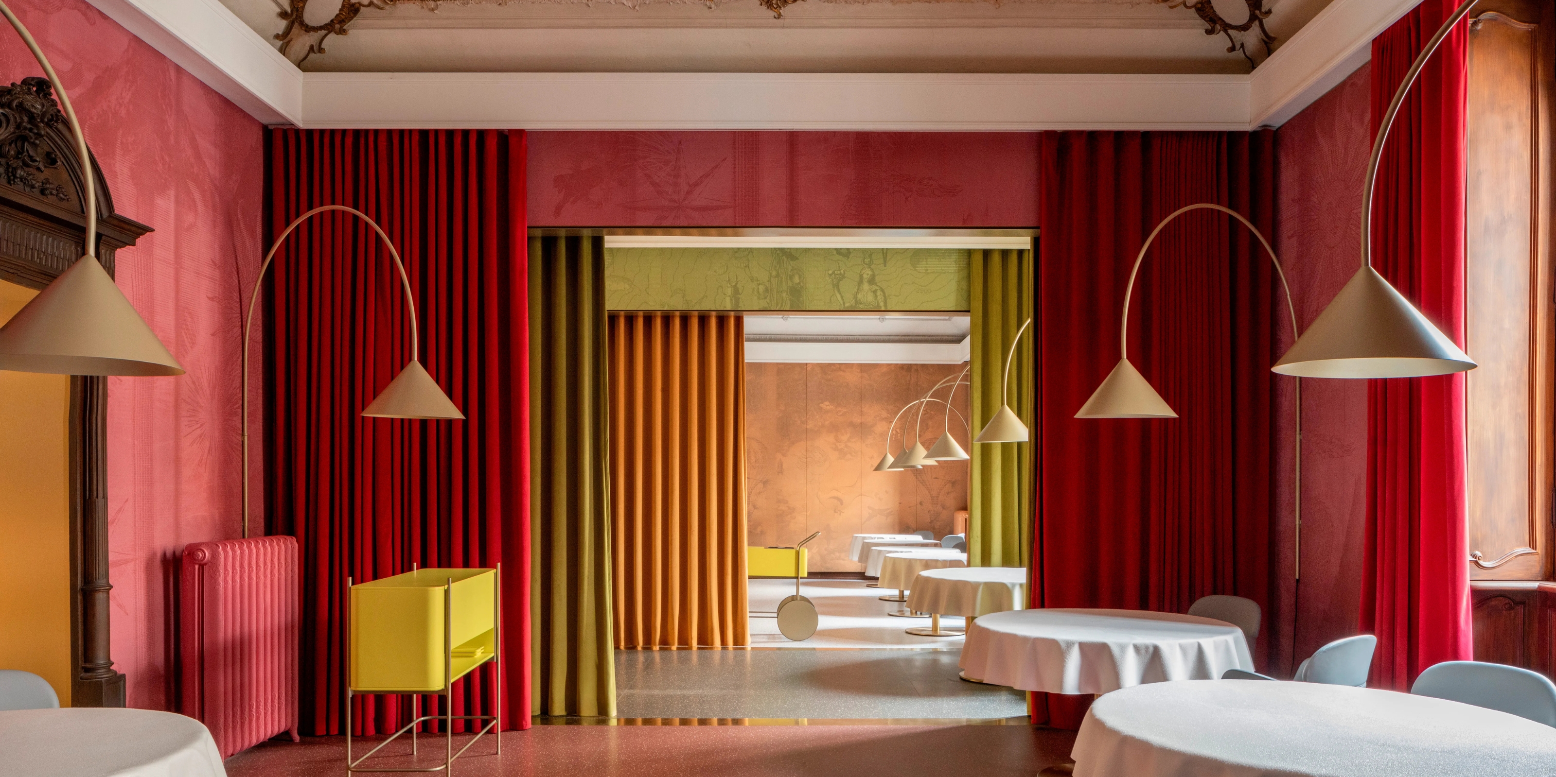 10 Arrestingly Beautiful Milan Restaurants Locals *Actually* Dine at — Selected for Their Interiors
Brought to you by our community of culture insiders, this edit of the best restaurants in Milan sees authentic Italian food and immersive design unite
By Gilda Bruno