This grand Georgian house in Kent rewrites history with its contemporary transformation
Sometimes history just needs a little nudge. Modern designs bring this Georgian house in Kent bang up to date, ensuring it celebrates its heritage without being weighed down by the past. The result is a style that blows the dust off the house’s handsome features, while adding the odd surprise...
The Livingetc newsletters are your inside source for what’s shaping interiors now - and what’s next. Discover trend forecasts, smart style ideas, and curated shopping inspiration that brings design to life. Subscribe today and stay ahead of the curve.
You are now subscribed
Your newsletter sign-up was successful
THE PROPERTY
A Georgian house in Kent, with Victorian and Edwardian additions. The ground floor of this modern home has a kitchen-diner, dining room with an adjoining family room, living room, utility room and WC. Upstairs on the first floor, there are five bedrooms (one en suite), an office and two bathrooms. There are three more bedrooms on the top floor and a media room and gym on the lower ground floor.
DINING ROOM
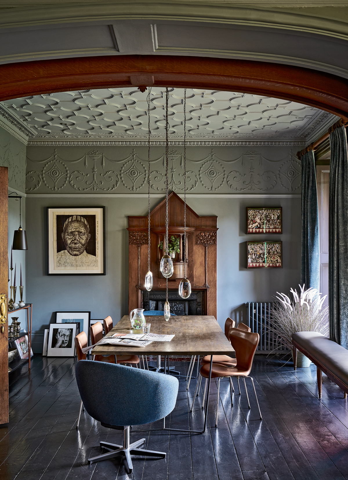
A soft grey paint shade tones down the decorative panelling on the walls and ceiling in the dining room (pictured above), linking with gunmetal-effect velvet curtains. Mid-century furniture and mesmeric lighting provide modern focal points.
Article continues belowThe grey softens the period decoration that gambols across the walls and ceiling, leaving just some key areas – the fireplace and a set of sliding doors – in the original dark oak, while the gentle curves of furniture by mid-century masters Arne Jacobsen and Yngve Ekström sit comfortably in the setting.
LIVING ROOM
Architecturally, this house is a masterpiece of balance and measure, designed by leading 19th-century architect Decimus Burton, with Regency Revival pillars, a portico and elegantly high windows to prove it. But, as the home demonstrates, sometimes it’s good to give history a bit of a nudge.
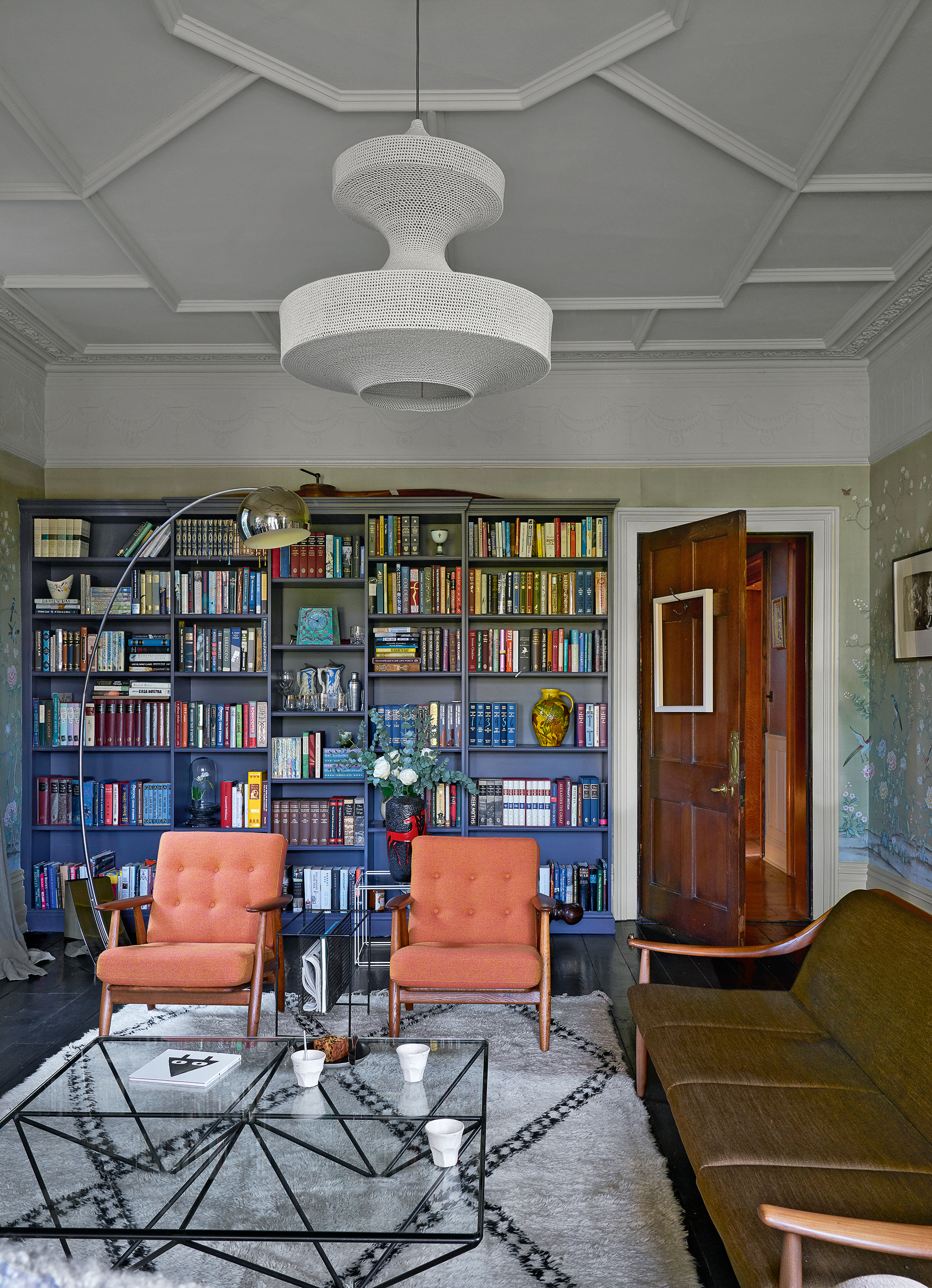
This is a style that blows the dust off the house’s handsome features, while adding the odd surprise. It’s a home where you can admire delicate cornicing and carved oak banisters, but then spot a Banksy or an audaciously glam Eighties coffee table – and where Persian rugs come in acidic green and pink rather than traditional shades. Think less English Heritage, more English eccentric.
While the house’s core dates from Burton’s heyday (the mid 1800s), later additions have brought Victorian panelling and some Arts and Crafts features into the architectural mix. Final flourishes include pulp fiction art and a sprinkling of offbeat but glam finds.
The Livingetc newsletters are your inside source for what’s shaping interiors now - and what’s next. Discover trend forecasts, smart style ideas, and curated shopping inspiration that brings design to life. Subscribe today and stay ahead of the curve.
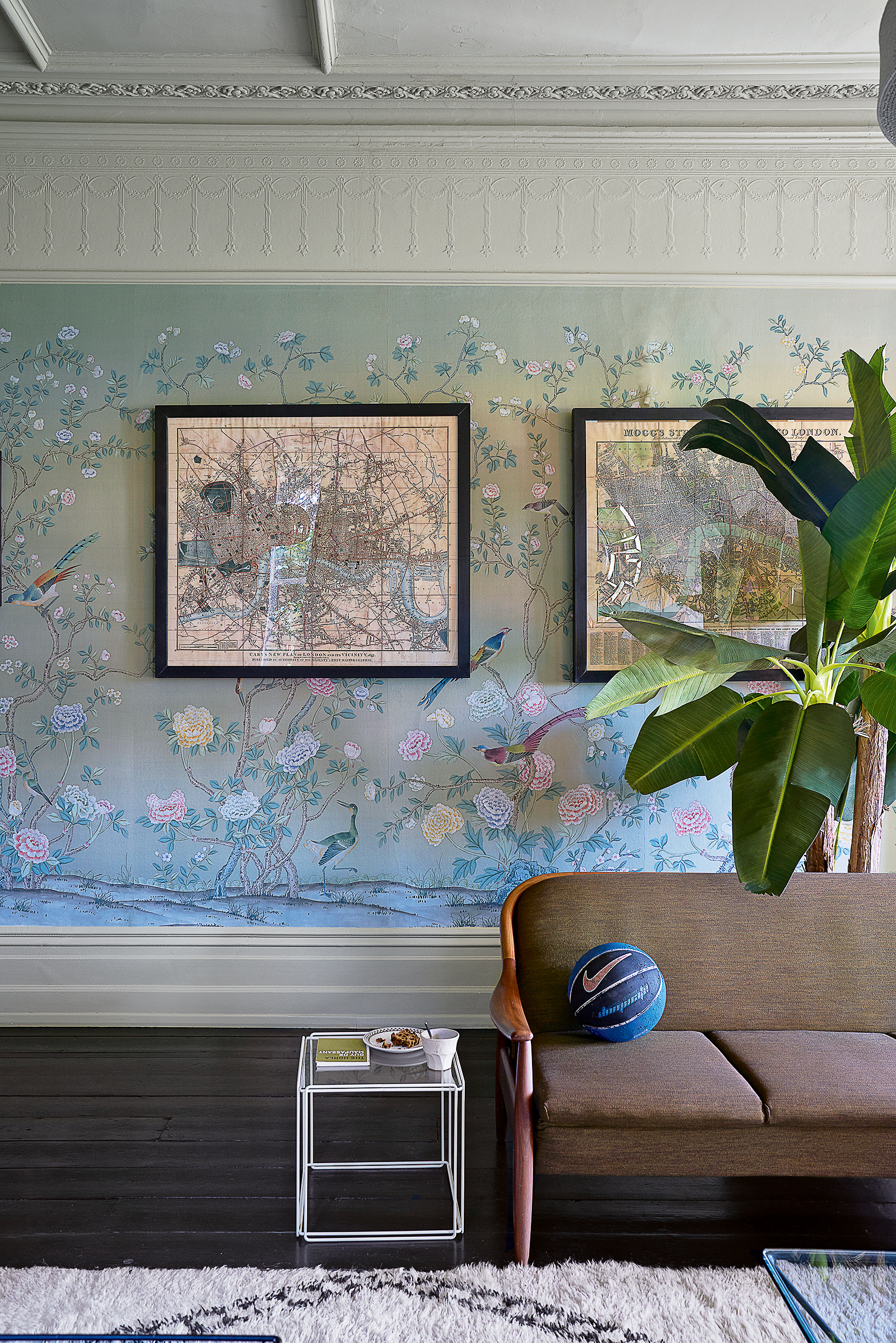
The house came with an ornate wallpaper that was too beautiful to lose, even though it errs towards a more traditional mood. The solution was to paint the other walls and ceiling in a pale green shade and add mid-century furniture for contrast.
FAMILY ROOM
The dark panelling and carvings are beautiful, but had started to feel rather overwhelming, so influences were brought in from other eras – ranging from the Sixties icons right up to pieces by contemporary makers – to create spaces that are coherent yet varied. The reworked rooms now have an elegance that suits the historic setting, but created with designs that hail from a wider, more interesting spectrum.
In the family room, the centrepiece is a split-level brass coffee table that wouldn’t have looked out of place in Stringfellows nightclub, circa 1983. It might not please an architectural purist, but sometimes adding a “little bit of wrong” can be very right.
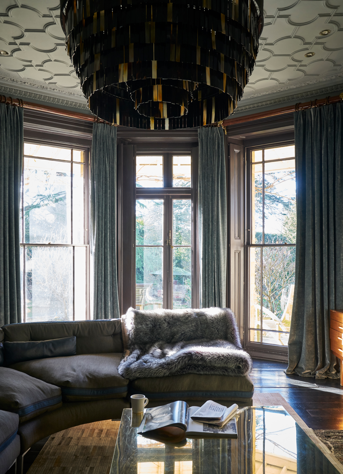
A dark, shimmering chandelier echoes the shapes of the architecture in the family room (pictured below), while striking a more contemporary note.
KITCHEN
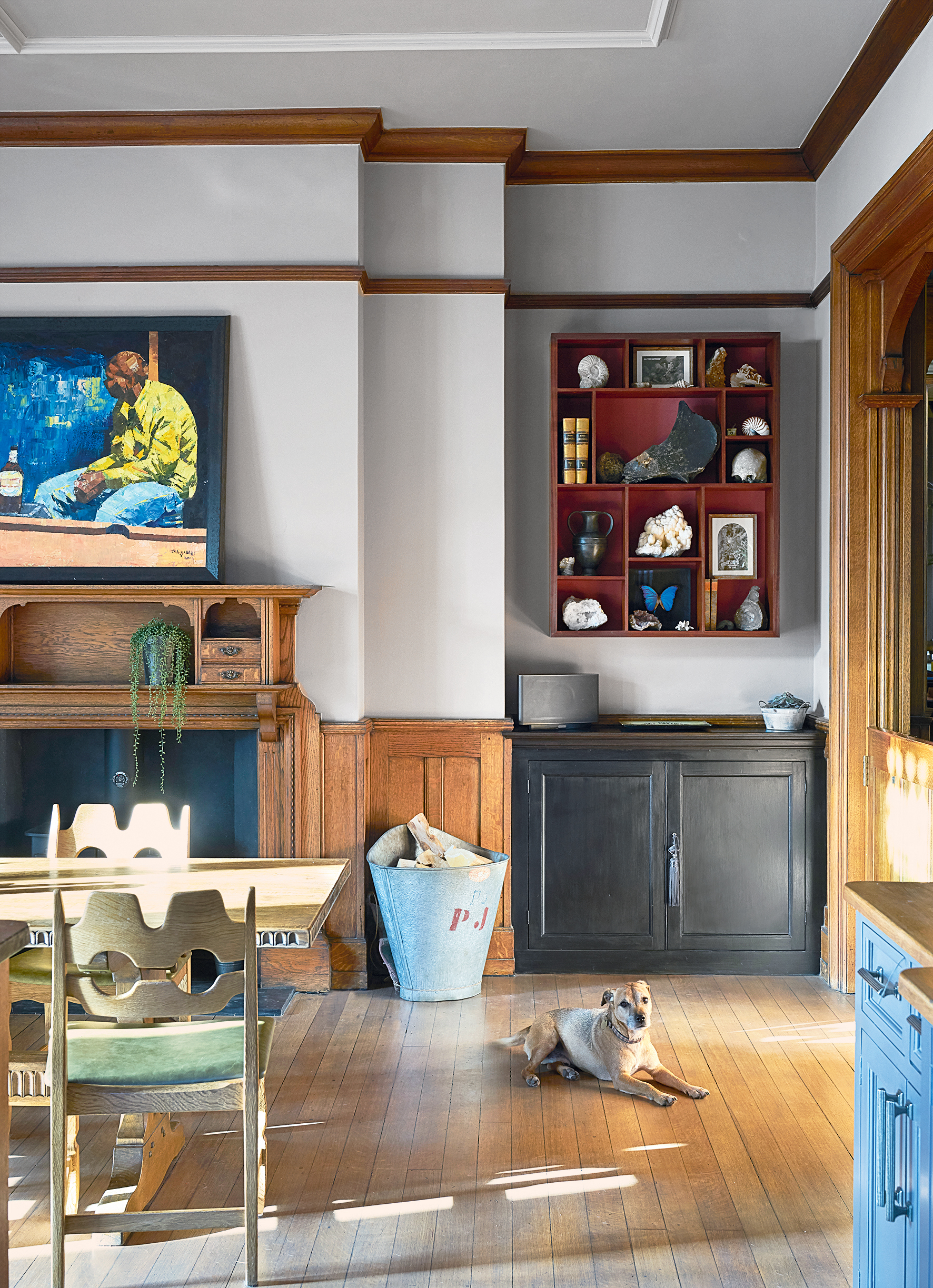
In the kitchen-diner, the room’s original dark oak woodwork were kept, but with gleaming pieces and sculptural shapes add to the mix to give the frame a lighter feel. A cluster of oversized vintage Holophane lights from Paris, bespoke brass shelving and iridescent glazed Moroccan tiles combine to give the darker features a style lift.
Tiling is taken up to the picture rail to accentuate the heightof the room, while vintage lighting, fluted glass-fronted cabinets and shelves that replicate luggage racks add extra gleam.
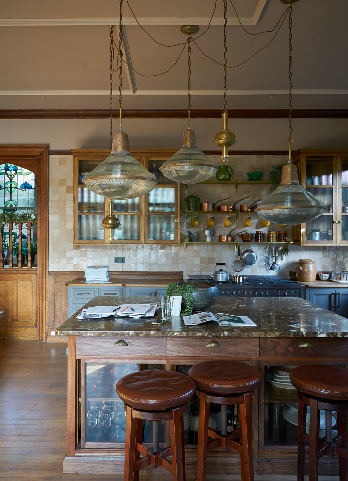
An old kitchen tablewas stripped of its previous glossiness for a softer finish and partnered with mid-century chairs. A pinky paint shade gives the oak panelling a fresh feel.
See Also: The 15 best modern kitchen ideas - stylish, smart and chic
FIRST FLOOR LANDING
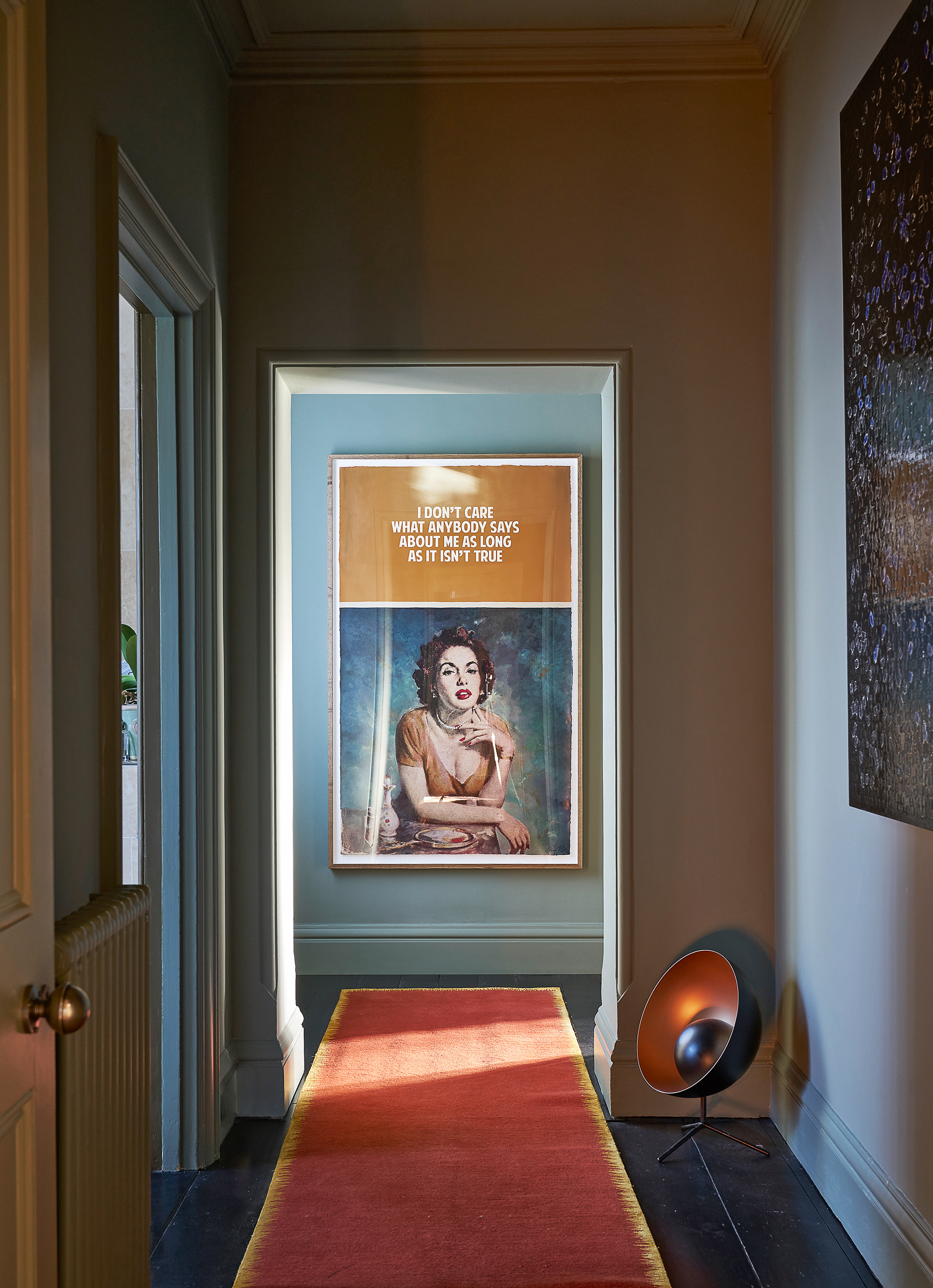
The renovation project was inspired by hotels and restaurant design.Hotels are also great at showing how modern design and art can work inside a historic setting. One trick that was borrowed from hoteliers was to create small break-out seating areas in the hallway and landing, turning unused corners into relaxing spaces.
The thick, vibrant rugs in The Greenwich Hotel in New York were the inspiration for this space – with an added dashof British artistic licence.
BOYS' BEDROOM
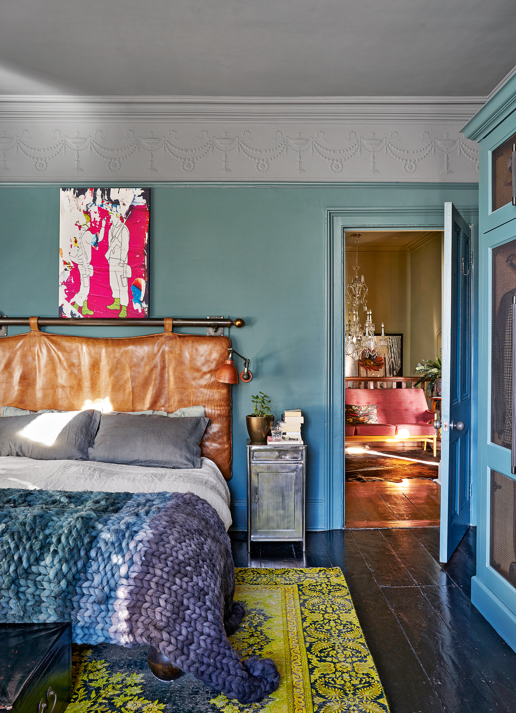
There’s a hint of locker-room luxe in here, with a hefty headboard made from an old leather gym mat and metal lockers as bedside tables.
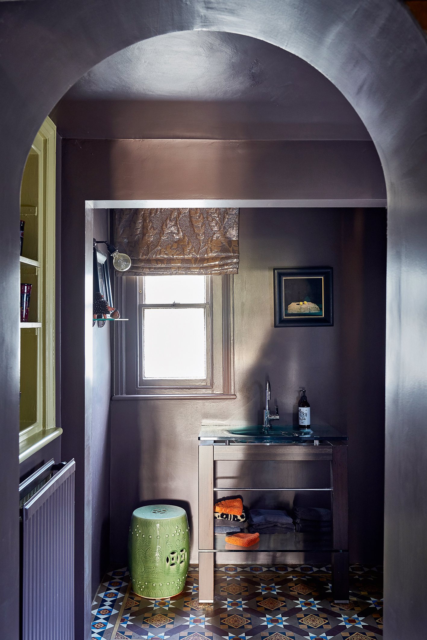
DOWNSTAIRS CLOAKROOM
Pops of colour and hyper-real photographic art liven up the downstairs cloakroom.
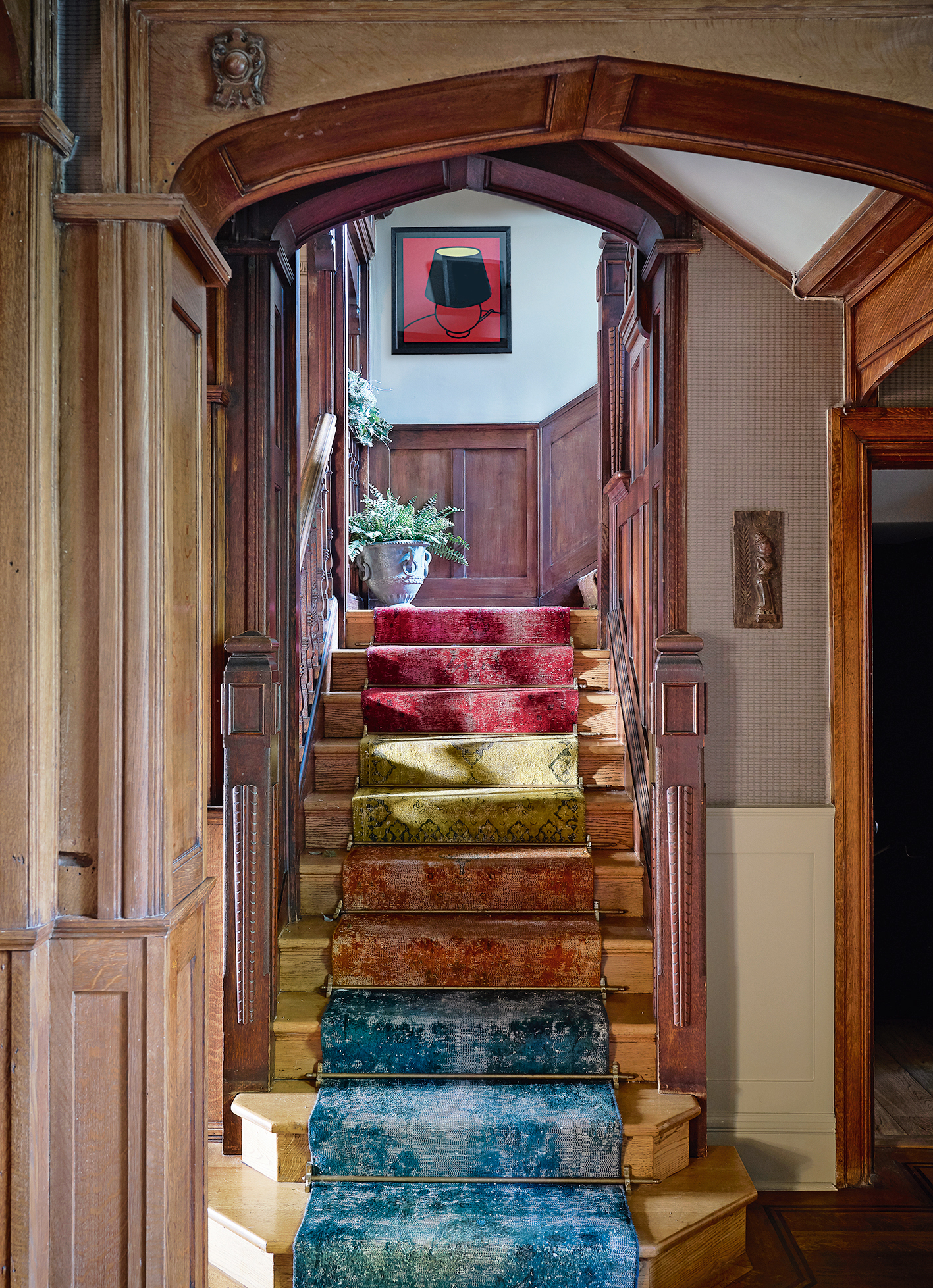
STAIRCASE
A stair runner dyed in rainbow shades gives the house’s dark wood detailing a new vibrance.
Interior design by Justine Hodgson-Barker at barker-design.com
Photography ⁄ James Merrell
See Also: Cloakroom and powder room ideas: small spaces, big patterns
The homes media brand for early adopters, Livingetc shines a spotlight on the now and the next in design, obsessively covering interior trends, color advice, stylish homeware and modern homes. Celebrating the intersection between fashion and interiors. it's the brand that makes and breaks trends and it draws on its network on leading international luminaries to bring you the very best insight and ideas.