Inside a sleek, elegant family house in Connecticut with super-luxe touches
Designer Britt Zunino has created a beautiful house in Connecticut that cleverly blends a sophisticated palette and innovative ideas with family life.
THE PROPERTY
A modern home with three storeys and a cellar in Greenwich, Connecticut, built in 1900 and extended by Pennoyer Architects. The cellar has a gym, family room, children’s play space, wine room and storage. The ground floor has a kitchen, sunroom, dining room, living room and library. The first floor has four bedrooms and bathrooms– one of them a master bedroom with separate dressing room and walk-in closet. There is also an additional guest bedroom and bathroom above the garage.
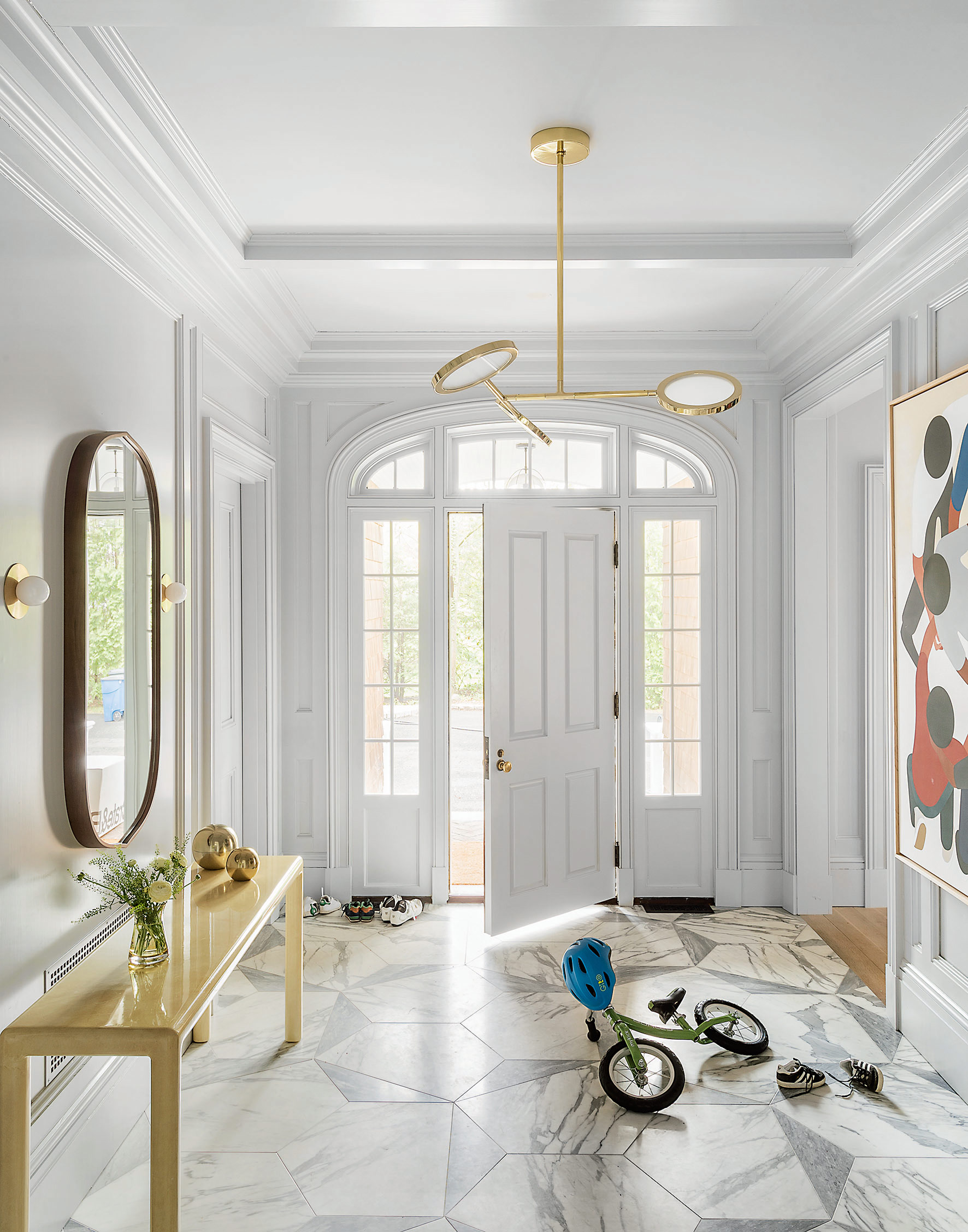
ENTRANCE HALL
In the entrance hall (pictured top), the floor features two types of marble cut into a fractured geometric patten – inspired by a photo of American artist Cy Twombly’s studio.It’s the first thing you see as you enter, so it sets the tone.
HALL
This stunning colonial-style house didn't always look like this. Dark red walls, heavy drapery and an overload of cherry wood – the house was in desperate need of a little TLC. The house was like a tired mum of five kids, who really needed a holiday – she needed to get a tan and a new outfit.
Step in Britt Zunino, co-founder of New York design practice Studio DB, who stripped everything back, painted the walls white and pale grey and sanded down the floorboards.
And what kind of person would the house be now the makeover is complete? It’s still the same mum but refreshed and with renewed confidence. She got a new haircut, an updated wardrobe, maybe a little Botox and she’s back feeling 10 years younger.
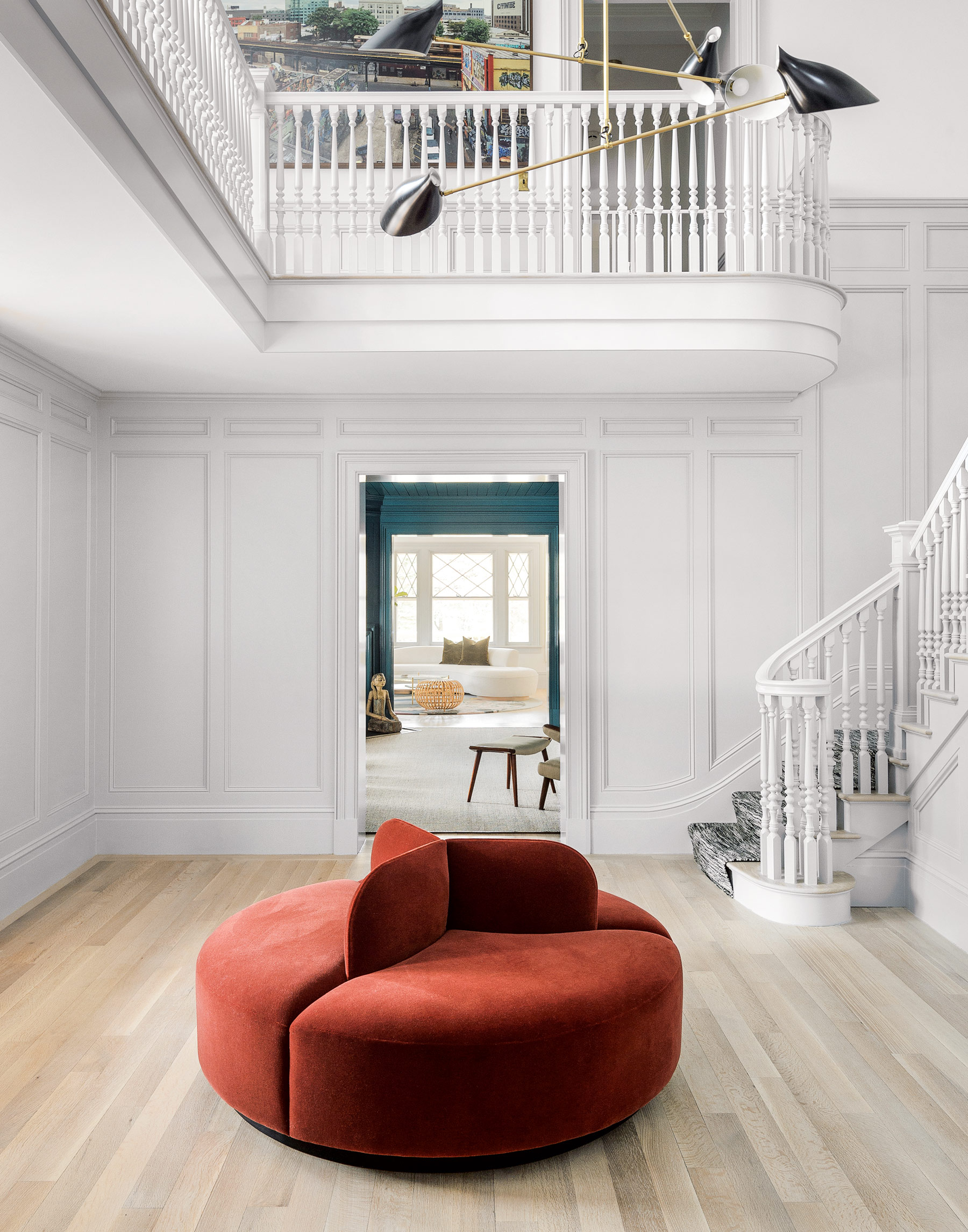
Keeping the furnishings and decor minimal in the hall (pictured above) creates a clean transition between the different rooms and storeys of the house.
LIVING ROOM
Being such a big house (8,500sq ft, across three storeys and a cellar), it was important to create visual connections between the rooms, so Britt repeated materials, colours and textures throughout. Brass, for example, is used for taps, tables and mirrors across the whole home and pink is repeated in the dining room, powder room and living room.
Be The First To Know
The Livingetc newsletters are your inside source for what’s shaping interiors now - and what’s next. Discover trend forecasts, smart style ideas, and curated shopping inspiration that brings design to life. Subscribe today and stay ahead of the curve.
You can look from room to room and see continuity, but every space still feels different. The elements are used in different ways, so the repetition feels subtle.
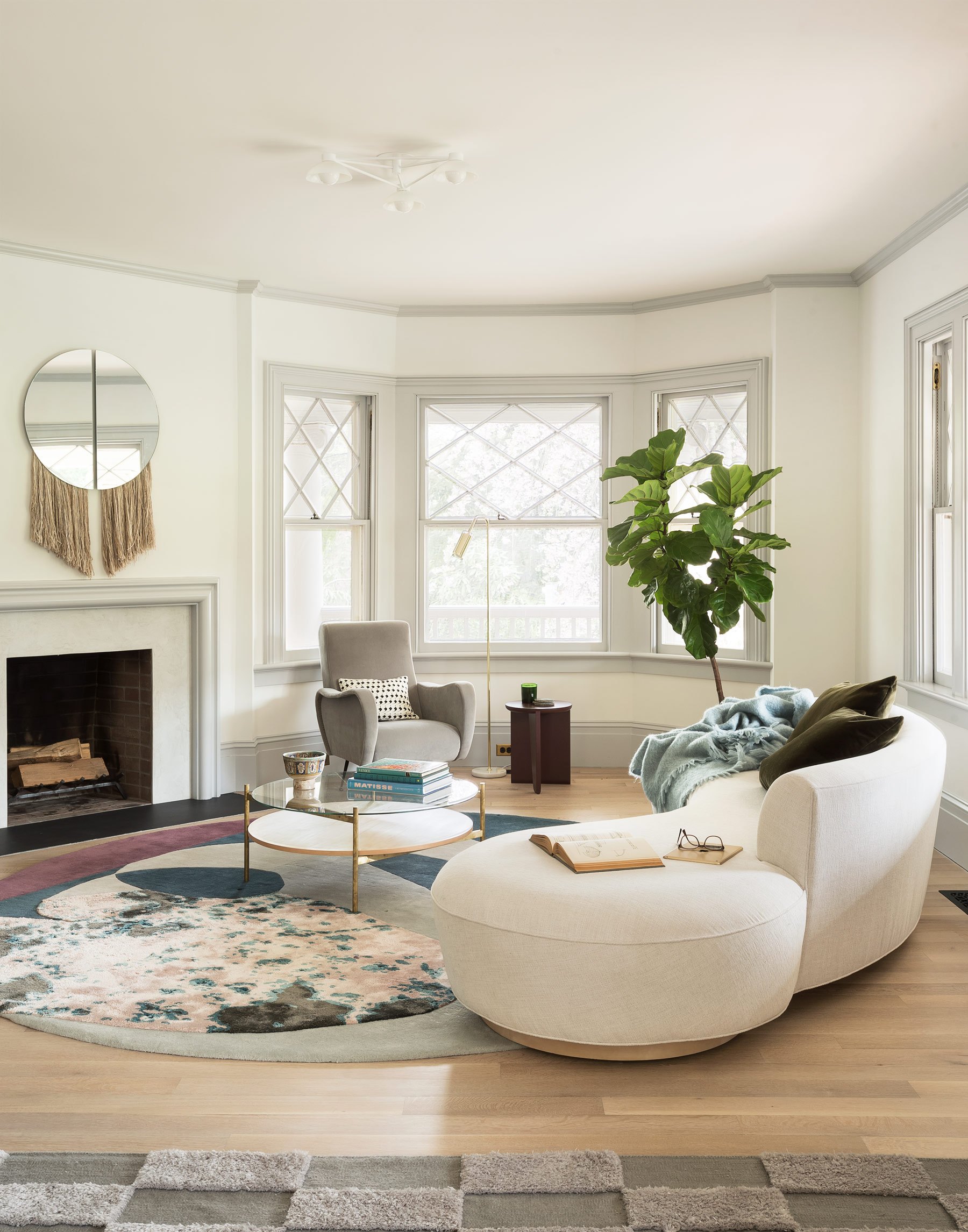
Britt used rounded furniture and accessories to echo the curves of the living room. The sinuous pieces of mid-century designer Vladimir Kagan inspired the design of the bespoke sofa.
DINING ROOM
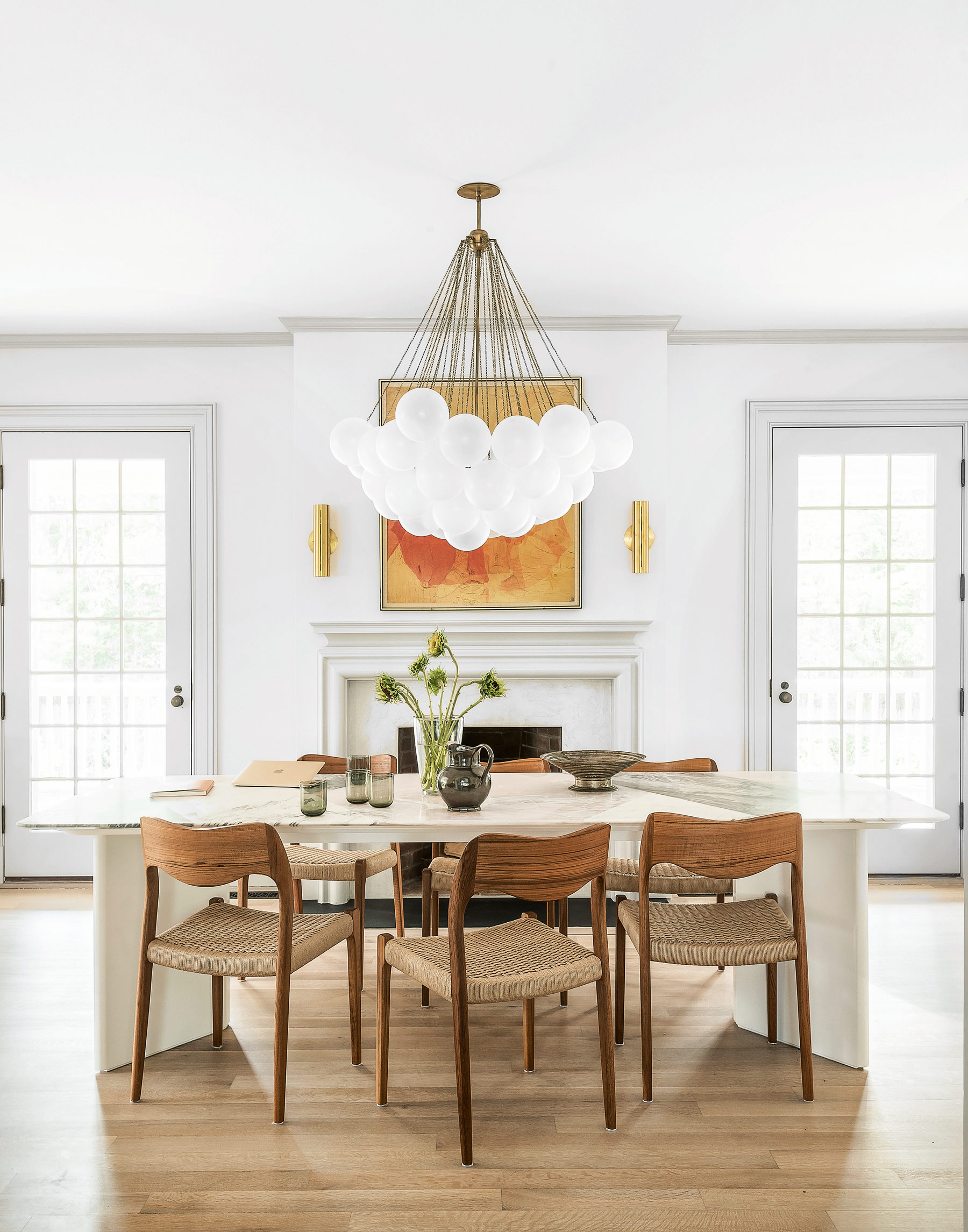
Slightly arched chairs and a show-stopping spherical chandelier offset the formality of the room.
See Also: Statement dining room lighting
LIBRARY
The library is a great example of Britt’s approach to colour and material– sophisticated but indulgent, the panelling covers the entire walls and ceiling. It offers a fresh take on a traditionally masculine space.
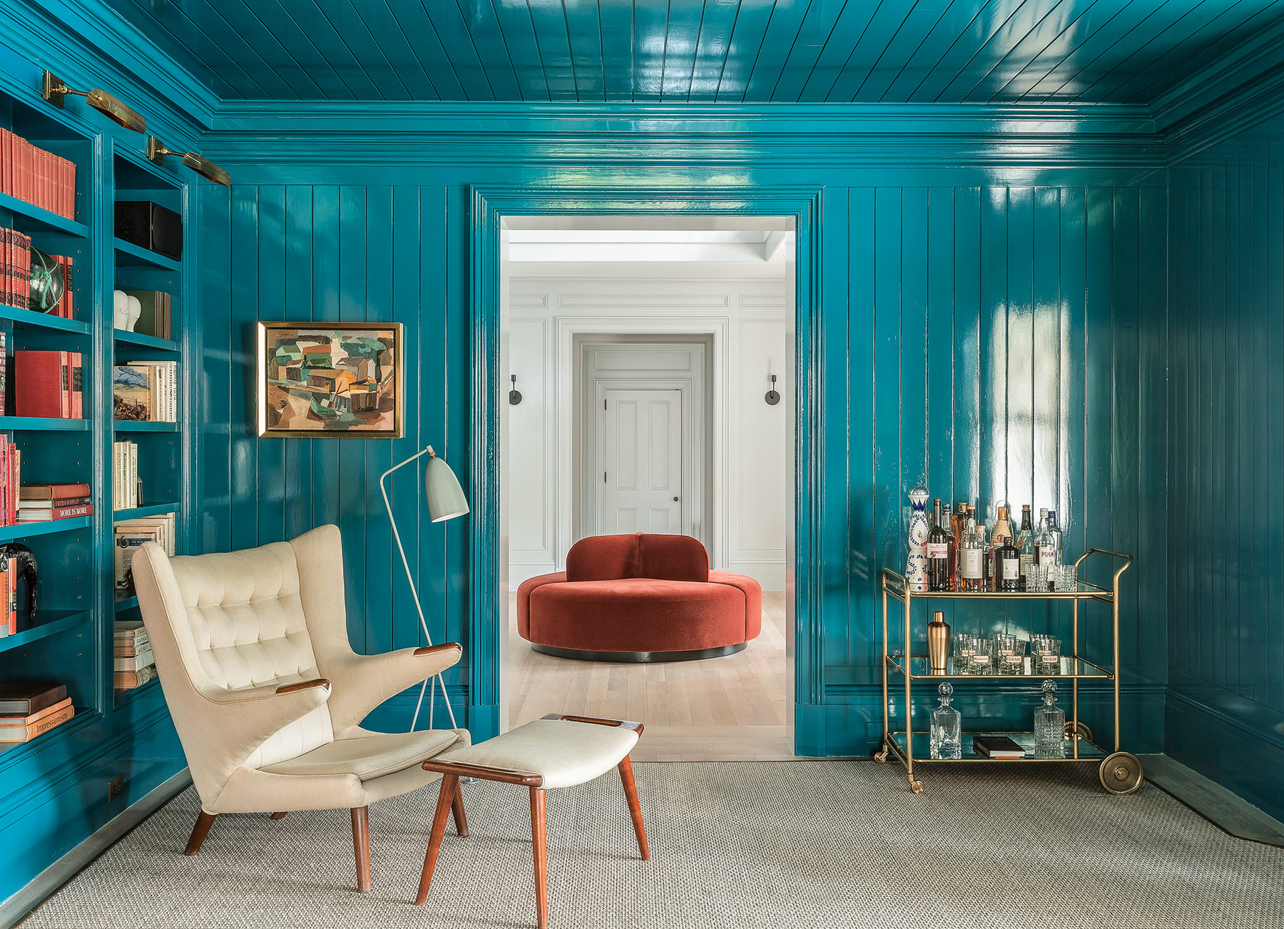
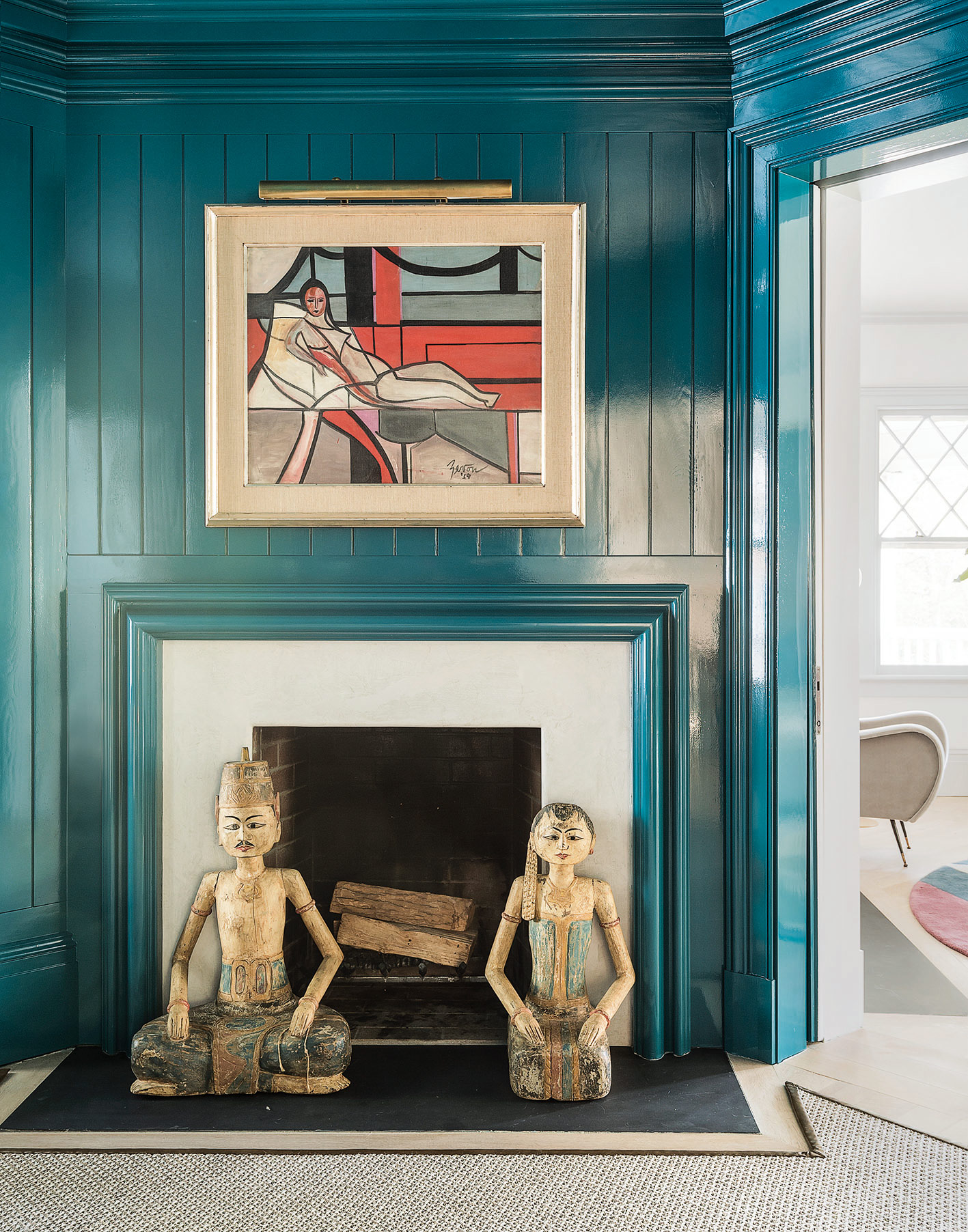
Hints of brass and shades of muted teal draw together the different components of the space and are echoed in the adjacent living room.
KITCHEN
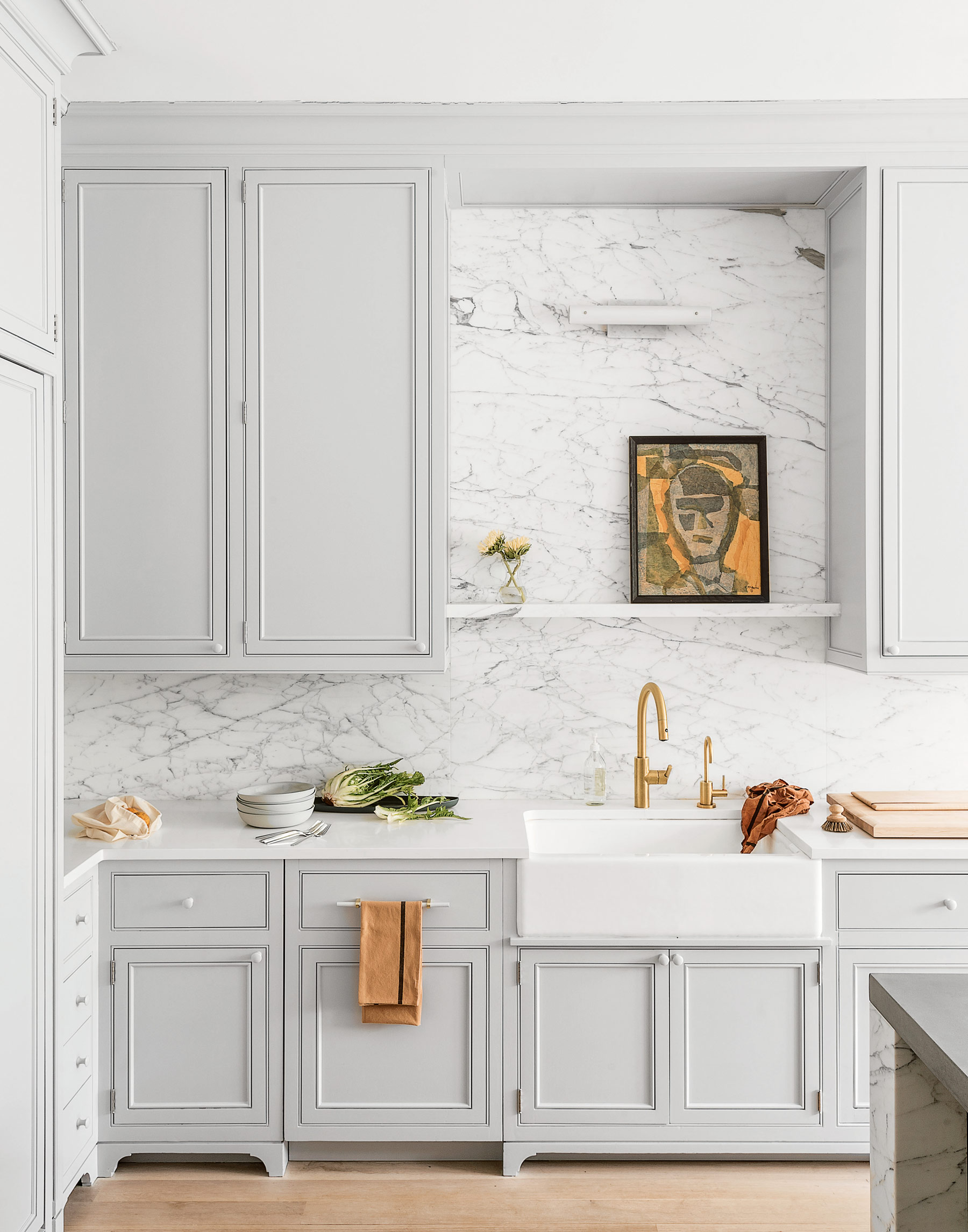
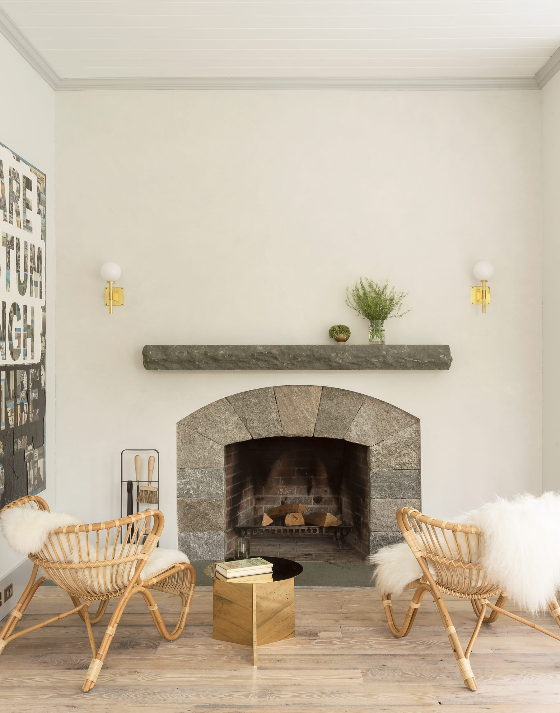
And while the materials and colours are restrained, the way Britt has used them is anything but shy. Marble covers the entire walls (and even the extractor hood) in the kitchen, and glossy teal paint envelops the library from wall to ceiling. As a result, the house feels luxurious – but not flashy. The details are in unexpected touches, like an asymmetrical brass light in the entrance hall, or a pair of welcoming rattan chairs next to the fireplace.
SUNROOM
Leading directly off the kitchen, the sunroom is one of the most frequently used spaces in the home.
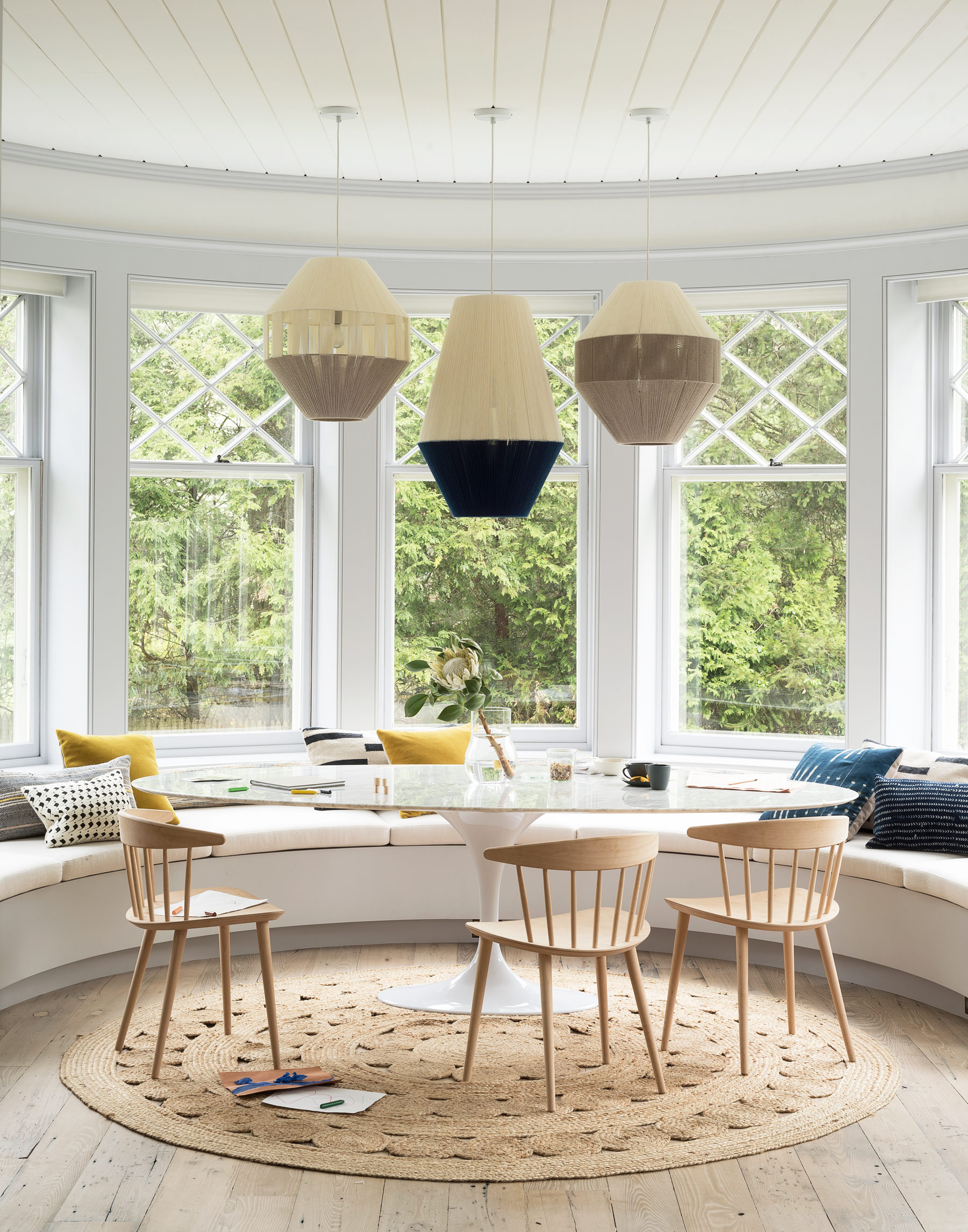
With small children and a dog living in this house, surfaces needed to be durable as well as beautiful, so Britt used easy-clean materials throughout, such as wool and jute rugs and outdoor fabric to cover the sofa in the living room and the banquette in the sunroom.
STAIRWELL
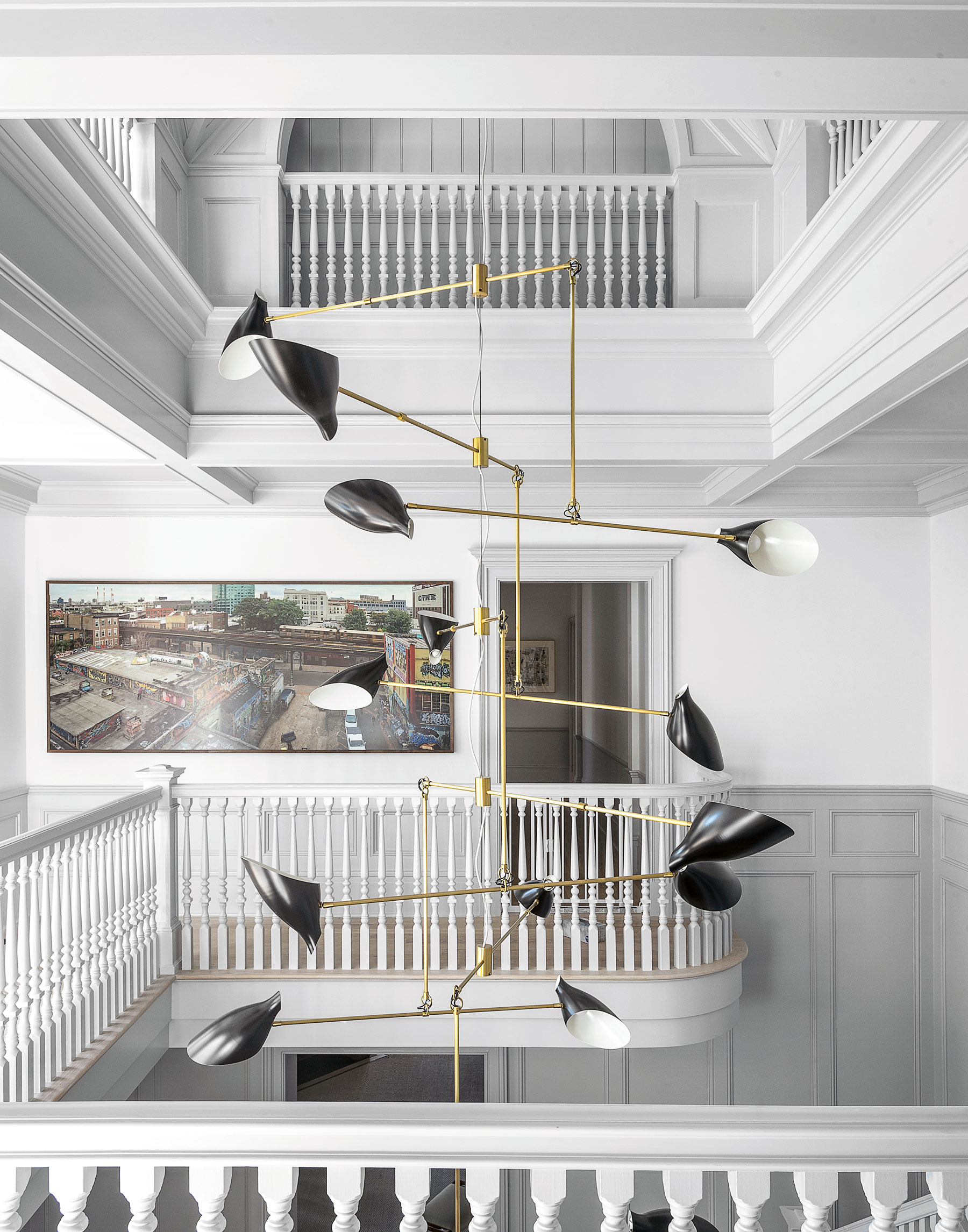
A multi-tiered light that transcends all three floors adds drama, while the simple design and monochrome scheme has a sophisticated, elegant effect.
CLOAKROOM
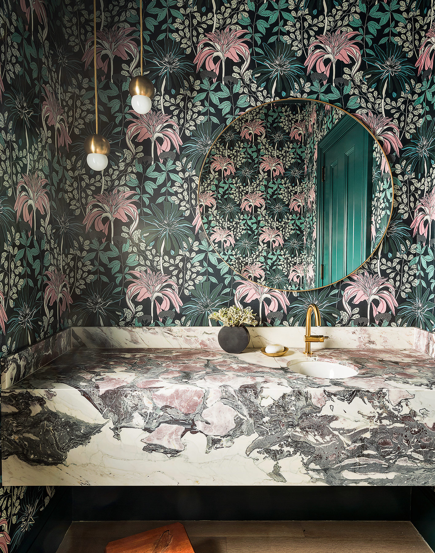
The bathrooms in this house are a little more playful. The style is bold, but it’s tempered by the more neutral and sophisticated spaces in the home. The colours can all be seen throughout the rest of the house: the pink is repeated in the dining room, the teal reappears in the library and marble is used in the entrance hall and kitchen.
See Also: Cloakroom and powder room ideas: small spaces, big patterns
GUEST BATHROOM
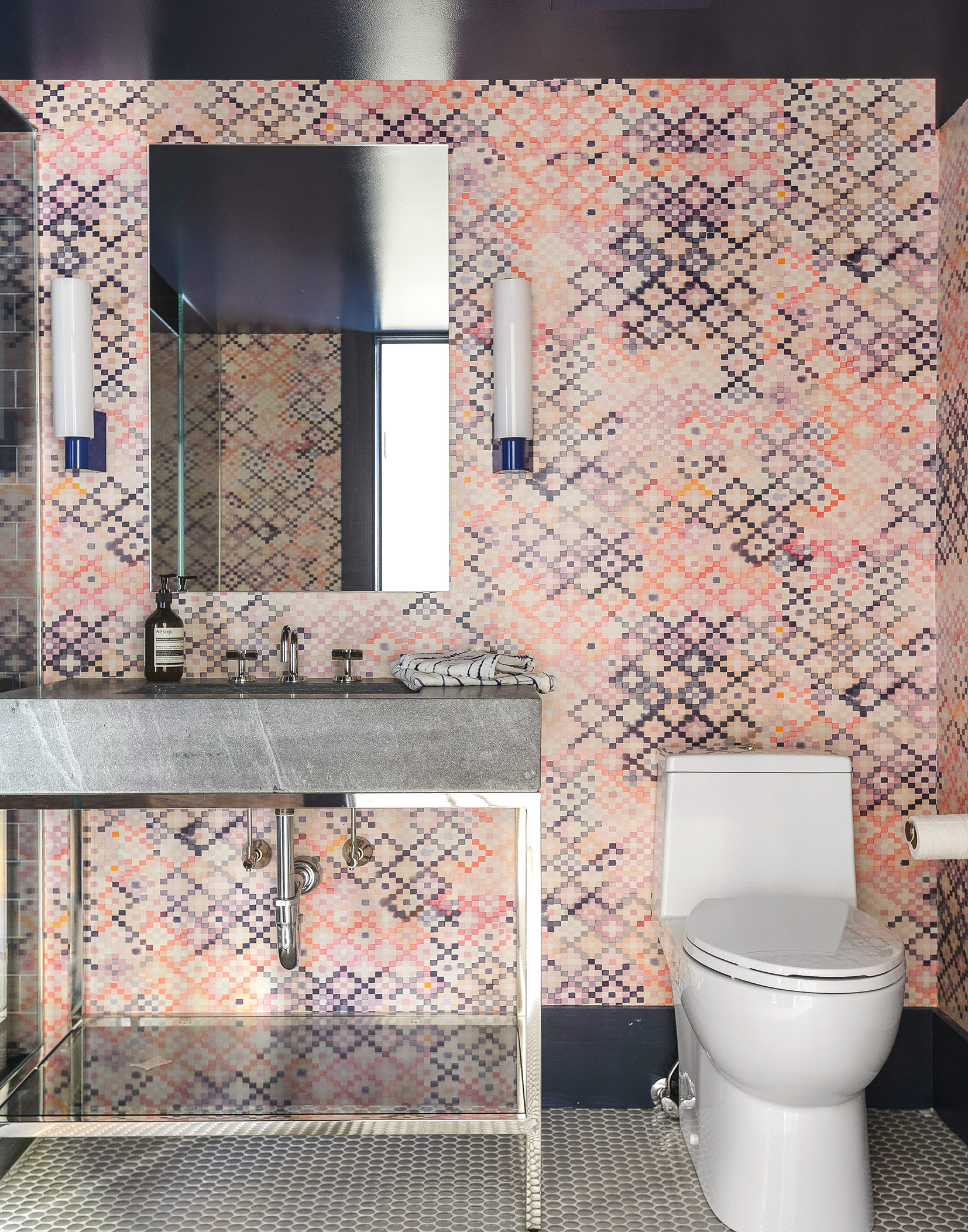
Small, more colourful rooms add personality and surprise to the otherwise neutral interior. Here, the feminine pink patterned wallpaper is offset bya more masculine stone washbasin.
CHILD’S BEDROOM
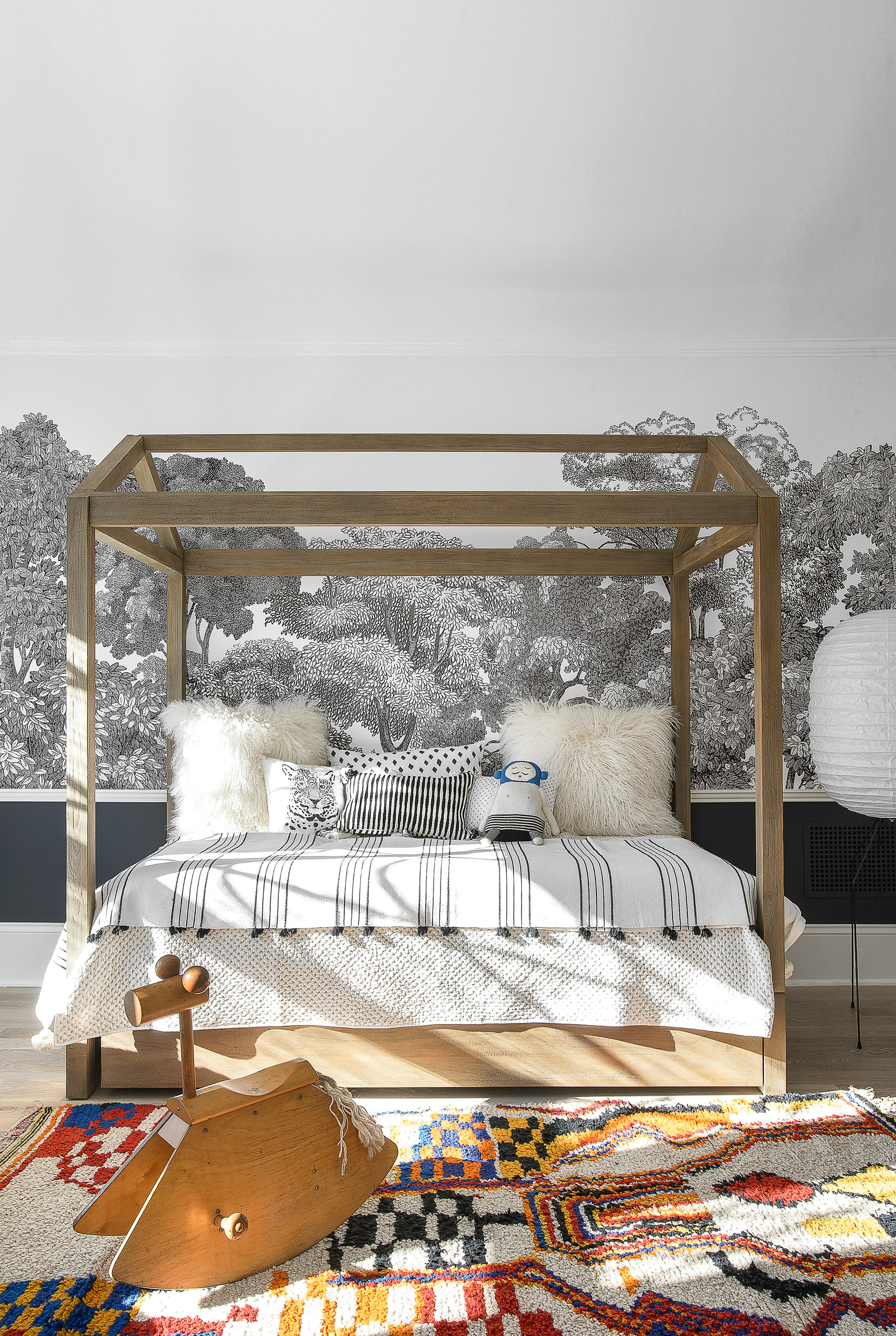
This room has a distinctly more relaxed feel to it than the rest of the house. In a big property like this, it’s important to make each roomfeel slightly different, to give it its own identity.
MASTER BATHROOM
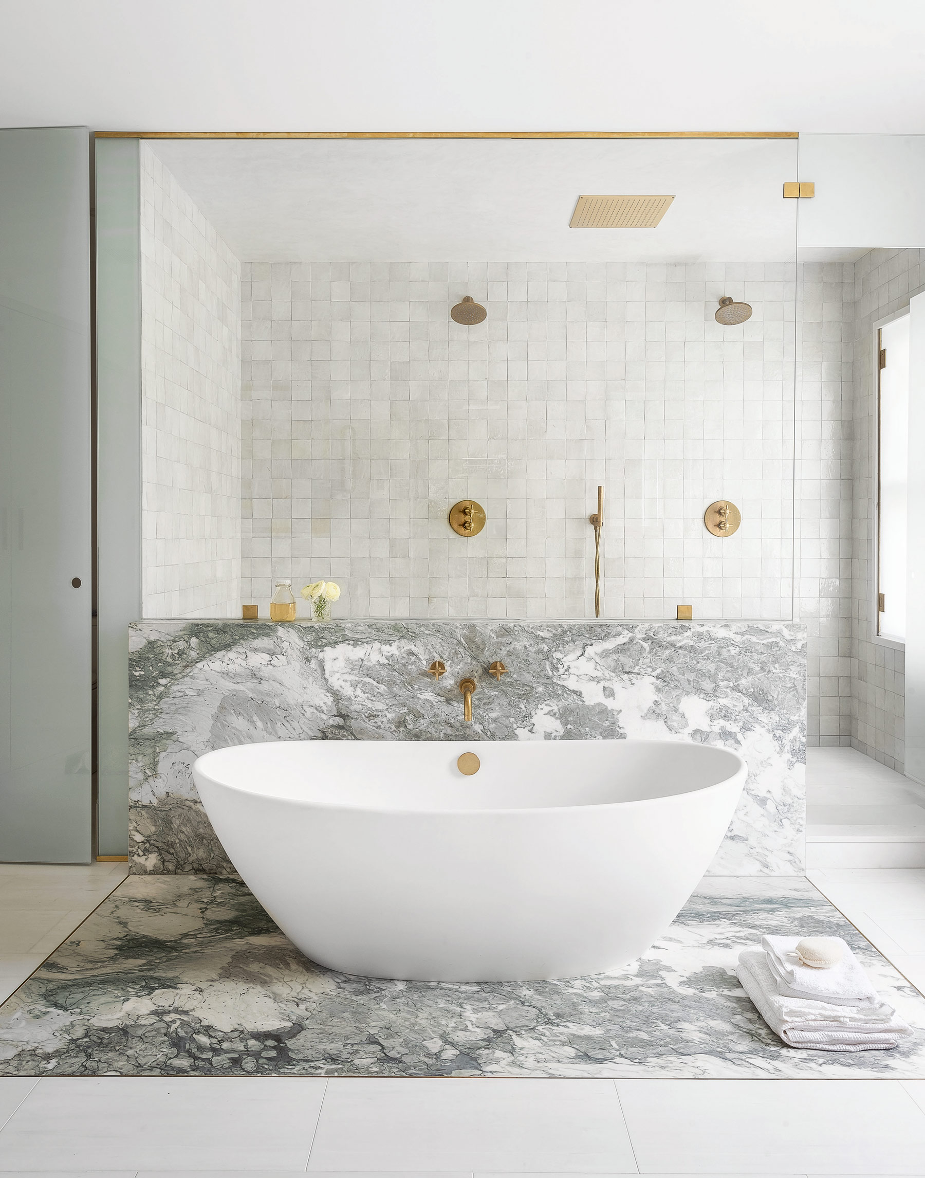
Minimal building work was needed for the renovation, save for the large master bathroom, which was converted from a bedroom. Britt had to restructure the floor so that all the tiles of this modern bathroom could be flush. That was one of the most challenging parts of the renovation, because it’s an old house, so it was hard to insert clean lines.
See more of Studio DB’s projects at studiodb.com
Photography ⁄ Matthew Williams
See Also: Master bathroom ideas - 19 stunning design ideas for a dreamy master bathroom
The homes media brand for early adopters, Livingetc shines a spotlight on the now and the next in design, obsessively covering interior trends, color advice, stylish homeware and modern homes. Celebrating the intersection between fashion and interiors. it's the brand that makes and breaks trends and it draws on its network on leading international luminaries to bring you the very best insight and ideas.
-
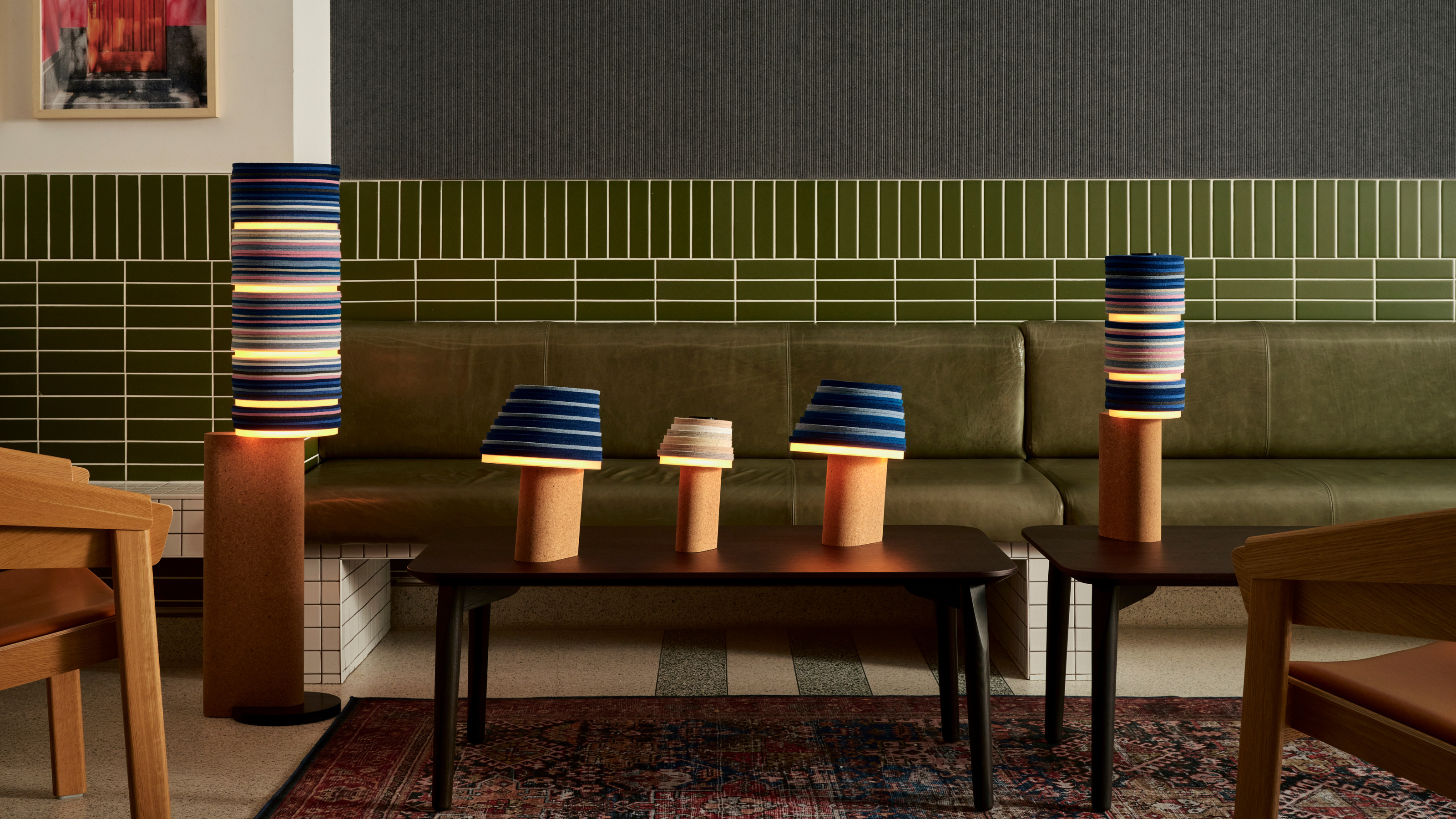 7 Sustainable Product Designs That Are Setting the Agenda for Environmentally-Conscious Homes in 2025
From pillows made from textile waste to sanitaryware made in the world's first electric kiln, these brands are revolutionizing sustainable design — for the better
By Devin Toolen
-
 NYC's New Rules Forced Me to Find a Chic Compost Bin — Here's 7 Options Significantly Cheaper Than the $300 Fine
Composting is now mandatory in NYC. Here’s how to do it stylishly
By Julia Demer