Step inside this stunning house in south London where amazing art sings against a white backdrop
This fabulous house in south London is also oozing with organic installations of growing greenery..
The property
A four-storey 19th-century house in south London. The ground floor of this modern home has a kitchen, living and dining room, sunroom and WC. On the first floor is the master bedroom, guest bedroom, study, walk-in wardrobe and bathroom. The children’s bedroom, family bathroom and studio are on the top floor. In the basement are two bedrooms, a home cinema, shower and garden room.
See more stunning modern homes
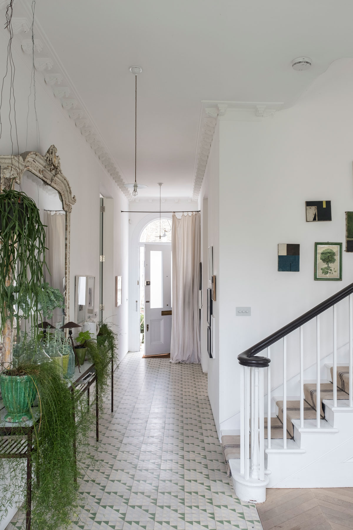
HALLWAY
Liza Giles is an artist and stylist with ‘an addiction to colour’ and rummaging through market stalls for vintage finds. Her husband Matt is an architect ‘into straight lines and modernity’. The result of this aesthetic collision? Not domestic strife, but a family home, where white-walled spaces sing with vibrant artwork and lean-lined furniture rubs shoulders with slubby linens and antique finds in an adroit marriage of compromise.
Partition walls were removed from the hallway (shown above) to create a seamless view through the house from front to back.
living room
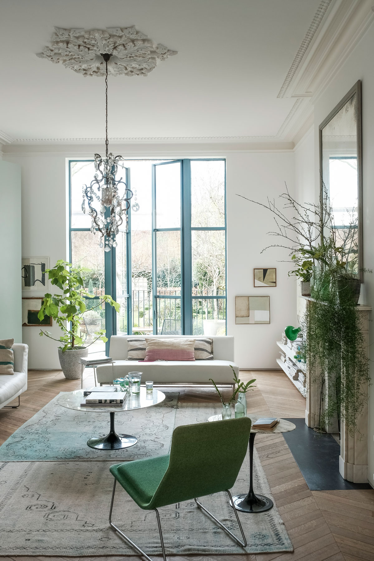
It was the lofty proportions of the house that drew the couple. Double-fronted but unloved, the house had done duty as a social club, then a family home. The period details had been ripped out and there was plasterboard everywhere, but the pair could see it had incredible potential.
Now, you’re struck by how light and seamless the house feels. Instead of traditional openings, soaring, 3m-wide double doors open from the hallway to the living space: a sweeping line designed to draw your eye to the back, where new, full-height windows open on to the garden.At the same time, lost details, such as fireplaces, were reinstated.
See Also: Living room ideas -24 decorating tricks to inspire
The Livingetc newsletters are your inside source for what’s shaping interiors now - and what’s next. Discover trend forecasts, smart style ideas, and curated shopping inspiration that brings design to life. Subscribe today and stay ahead of the curve.
dining room
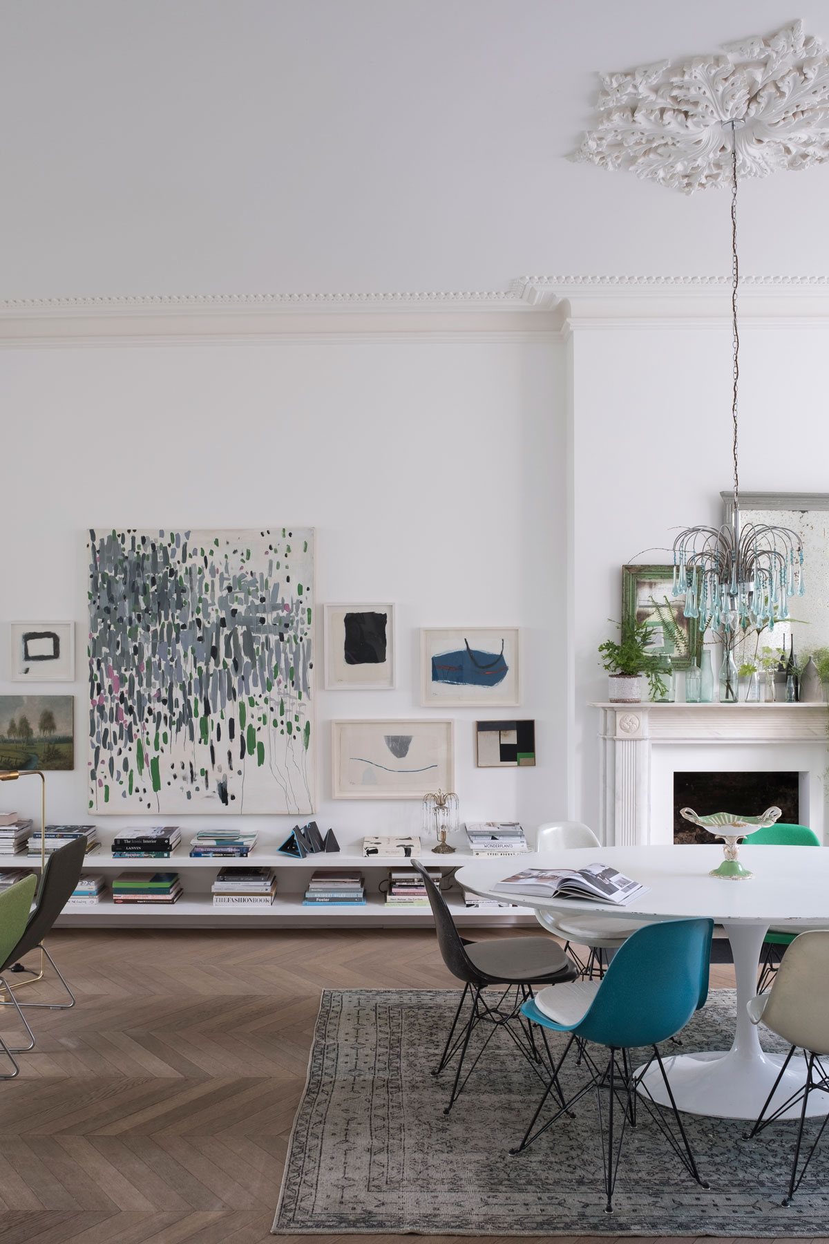
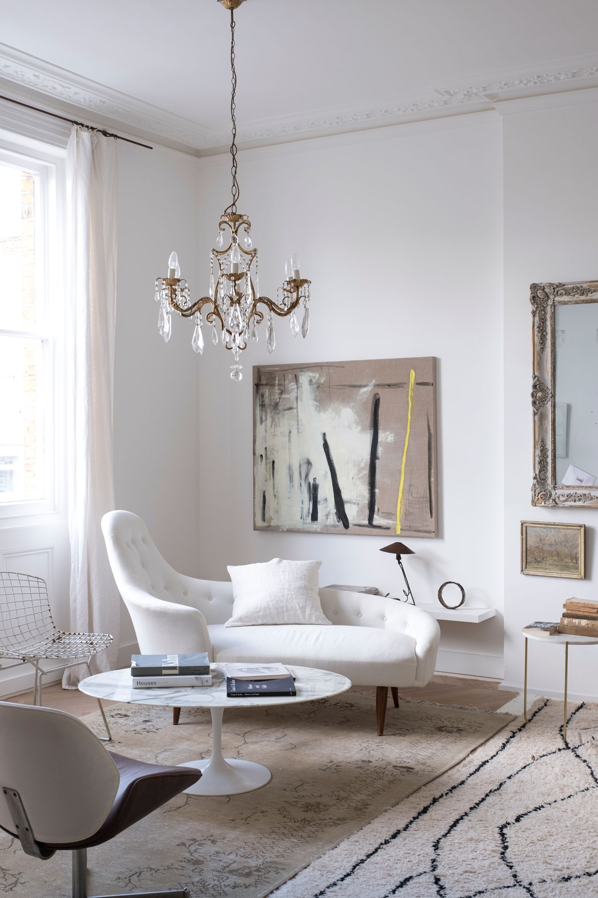
Drawing on her skills, Liza has humanised the scale of the house so it feels less imposing. Low-slung shelves link the front and back of the living areas; antique chandeliers glitter at eye level and paintings, many by Liza, hover above chair height, so that when you’re sitting down, the rooms feel intimate.
With her stylist’s eyefor contrast and composition Liza has created painterly displays of art and objects throughout the house.
sun room
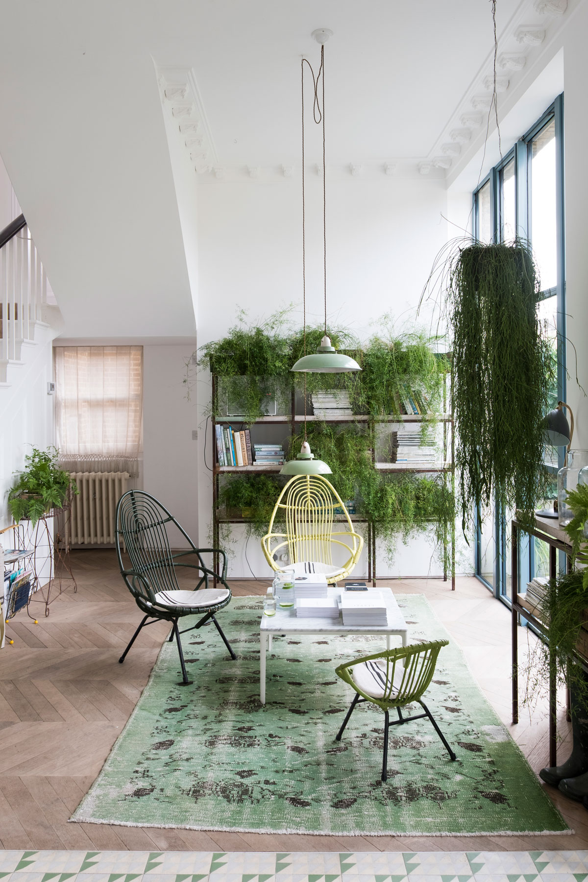
An old, narrow kitchen was removed and the space opened up to create this sunroom
KITCHEN
Everywhere there are flourishes of green – instead of overhead units, the focal point of the bespoke modern kitchen is the row of Indian glass paintings and the antique chandelier, hung deliberately low to relax the lofty proportions of the interior. Liza may be a stylist, but it’s a lived-in house.
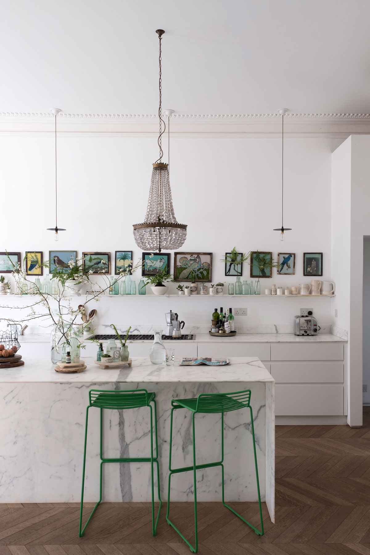
KITCHEN DETAIL
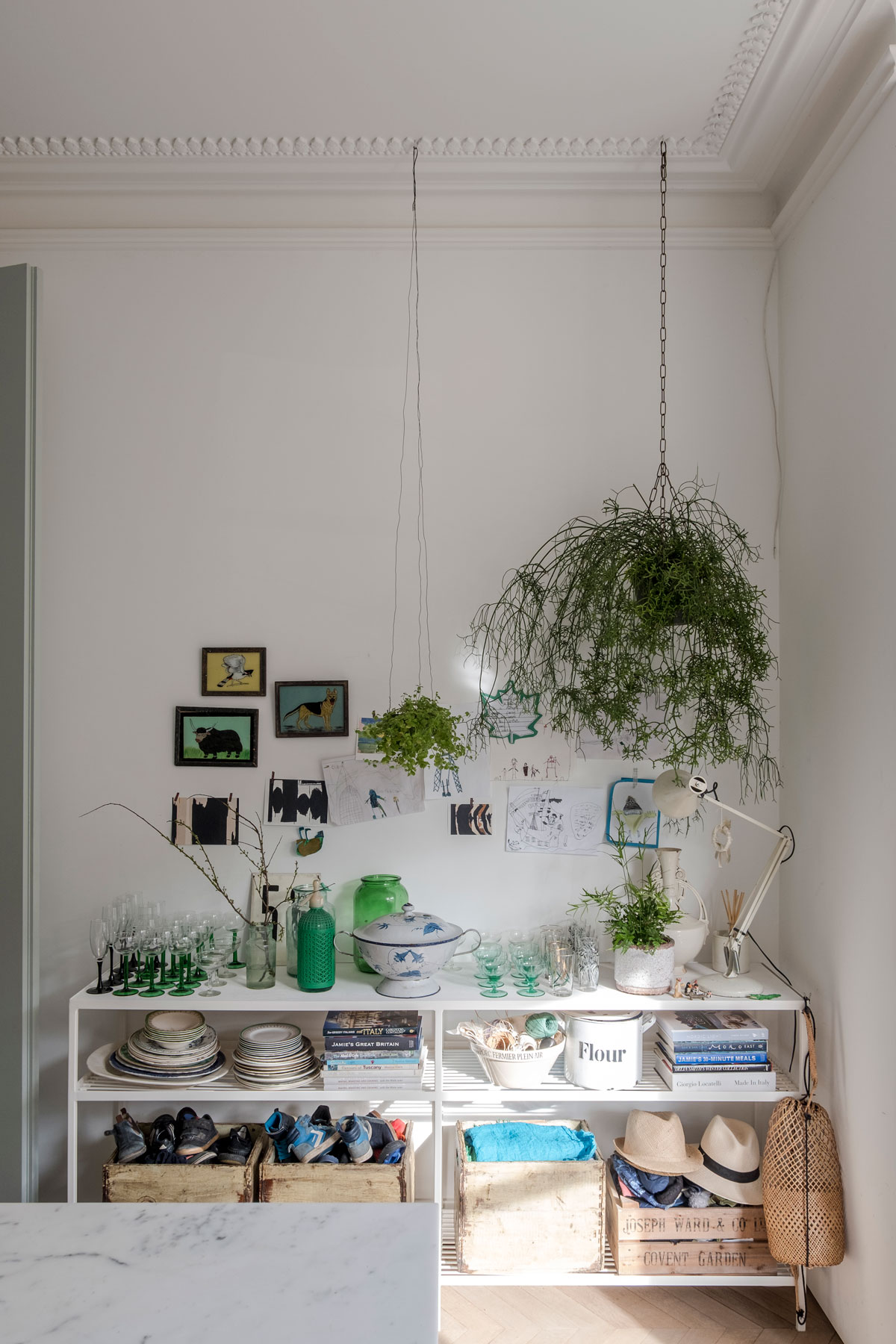
Liza has created intriguing displays throughout the house, mixing high-street finds with props used on shoots.
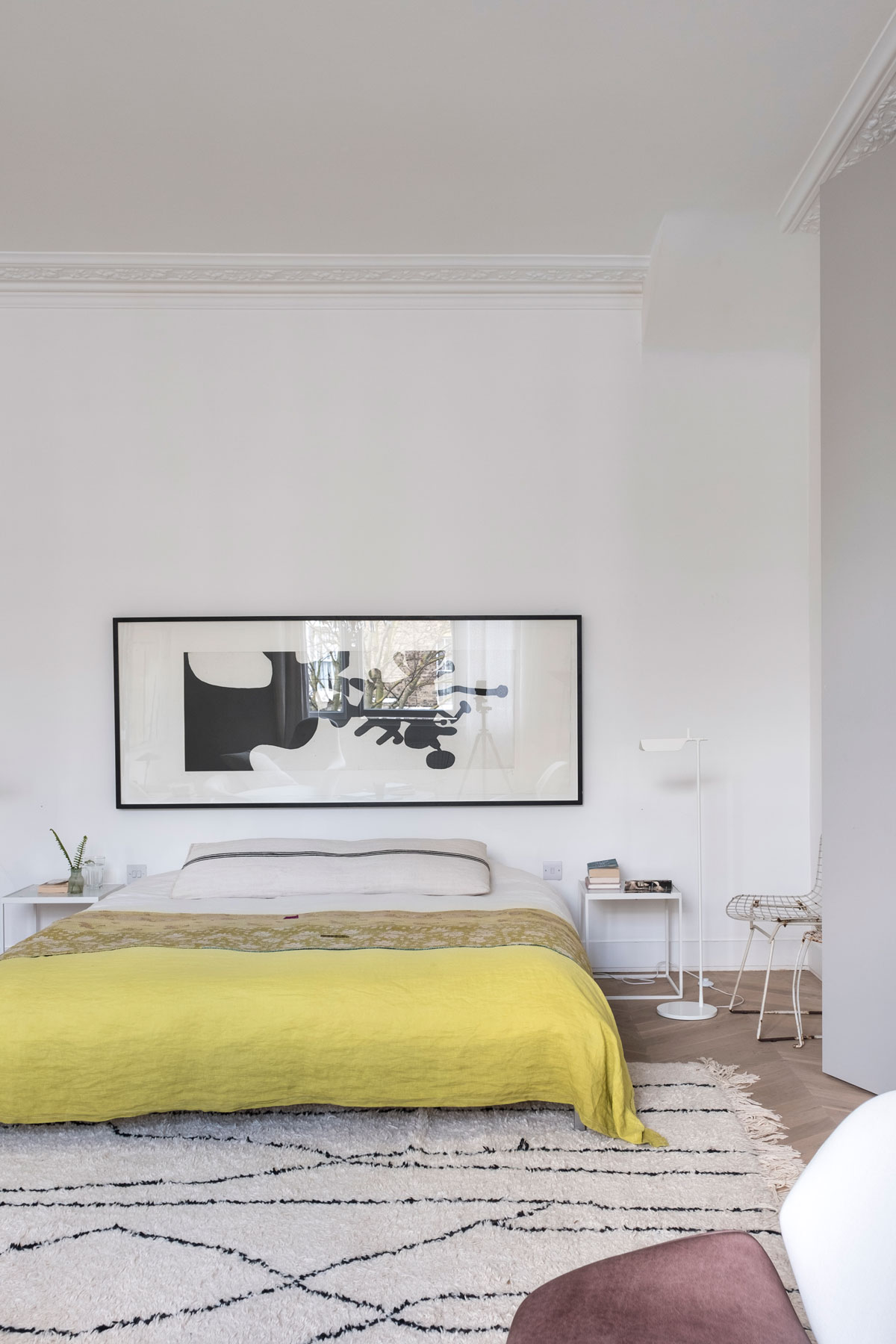
MASTER BEDROOM
Low-level furniture honours the soaring proportions of the interior, which served as a social club inthe seventies.
DRESSING AREA
Upstairs, partition walls were removed to create this light-filled dressing room, where over-laid rugs soften the clean lines of the architecture.
family bathroom
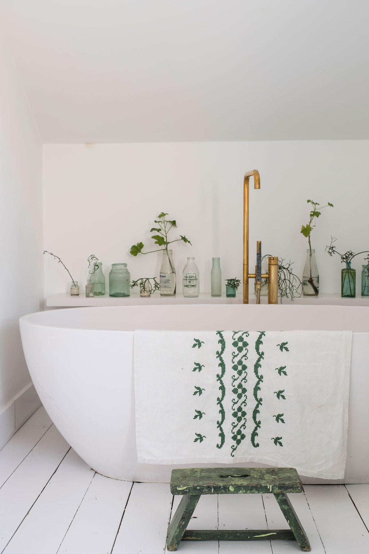
Tucked under the eaves of the top floor, the oval bath is a welcome sanctuary at the end of the day.
shower room
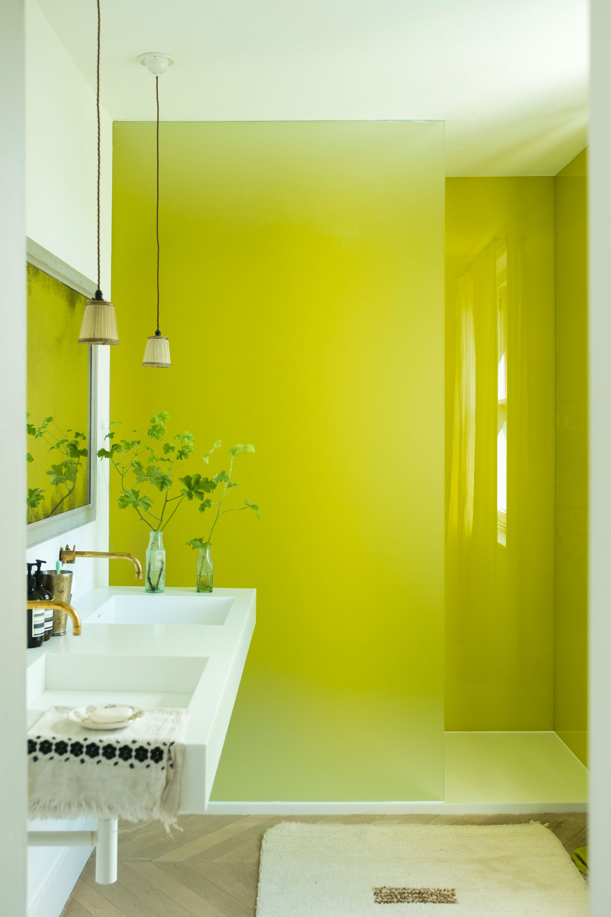
A burst of sunshine in the shower room makes mornings feel like spring all year round. The otherwise white-with-a-splash-of-green foliage colour scheme echoes the rest of the house.
To see more of Liza’s work, visit lizagiles.com
Check out Matt’s architectural practice at gilespike.com
Photography / James Merrell
The homes media brand for early adopters, Livingetc shines a spotlight on the now and the next in design, obsessively covering interior trends, color advice, stylish homeware and modern homes. Celebrating the intersection between fashion and interiors. it's the brand that makes and breaks trends and it draws on its network on leading international luminaries to bring you the very best insight and ideas.